

Supernova is a high-energy yellow that reads like pure sunlight—bold enough for branding, clear enough for UI accents, and modern enough for posters and packaging.
Below are curated supernova color palette ideas with HEX codes, plus practical tips to keep contrast strong and layouts balanced.
In this article
Why Supernova Palettes Work So Well
Supernova yellow naturally becomes a focal point, so designs feel instantly “directed”—your eye knows where to look first. That makes it ideal for CTAs, hero highlights, labels, and key stats.
It also pairs cleanly with modern neutrals (charcoal, slate, off-white), which helps you keep typography readable while still delivering a bright, energetic vibe.
When you add a cool counterbalance—teal, cyan, or violet—the palette feels contemporary and dimensional, like warm light against deep space.
20+ Supernova Color Palette Ideas (with HEX Codes)
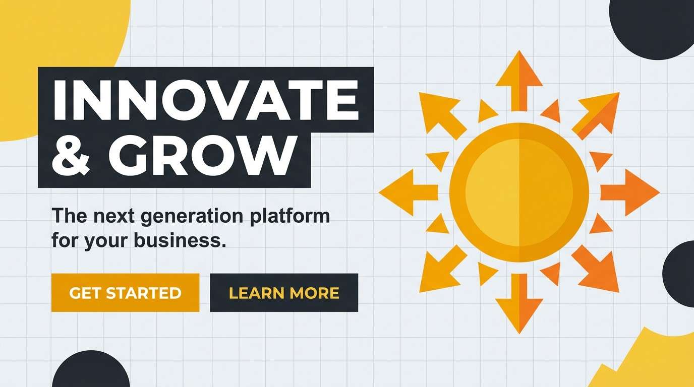
1) Solar Flare Studio
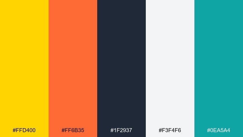
HEX: #ffd400 #ff6b35 #1f2937 #f3f4f6 #0ea5a4
Mood: bold, energetic, modern
Best for: brand identity and hero sections
Bold and energetic like a burst of sunlight against deep space, these tones feel punchy and contemporary. Use the yellow and orange as the attention layer, then anchor layouts with charcoal for readable type. For a clean system, keep light gray as the main background and reserve teal for links or micro-interactions. If you want a crisp supernova color palette, set yellow to buttons and keep orange for badges only.
Image example of solar flare studio generated using media.io
Media.io is an online AI studio for creating and editing video, image, and audio in your browser.

2) Nebula Citrus
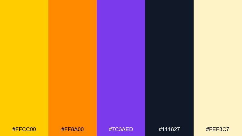
HEX: #ffcc00 #ff8a00 #7c3aed #111827 #fef3c7
Mood: vibrant, cosmic, playful
Best for: event posters and social graphics
Vibrant and cosmic, this mix feels like citrus light cutting through a violet haze. Pair the deep indigo-black with warm yellow to keep text sharp and legible. Purple works best as a background block or gradient edge, not a competing headline color. Tip: push the cream tone behind typography to soften the overall contrast without losing energy.
Image example of nebula citrus generated using media.io
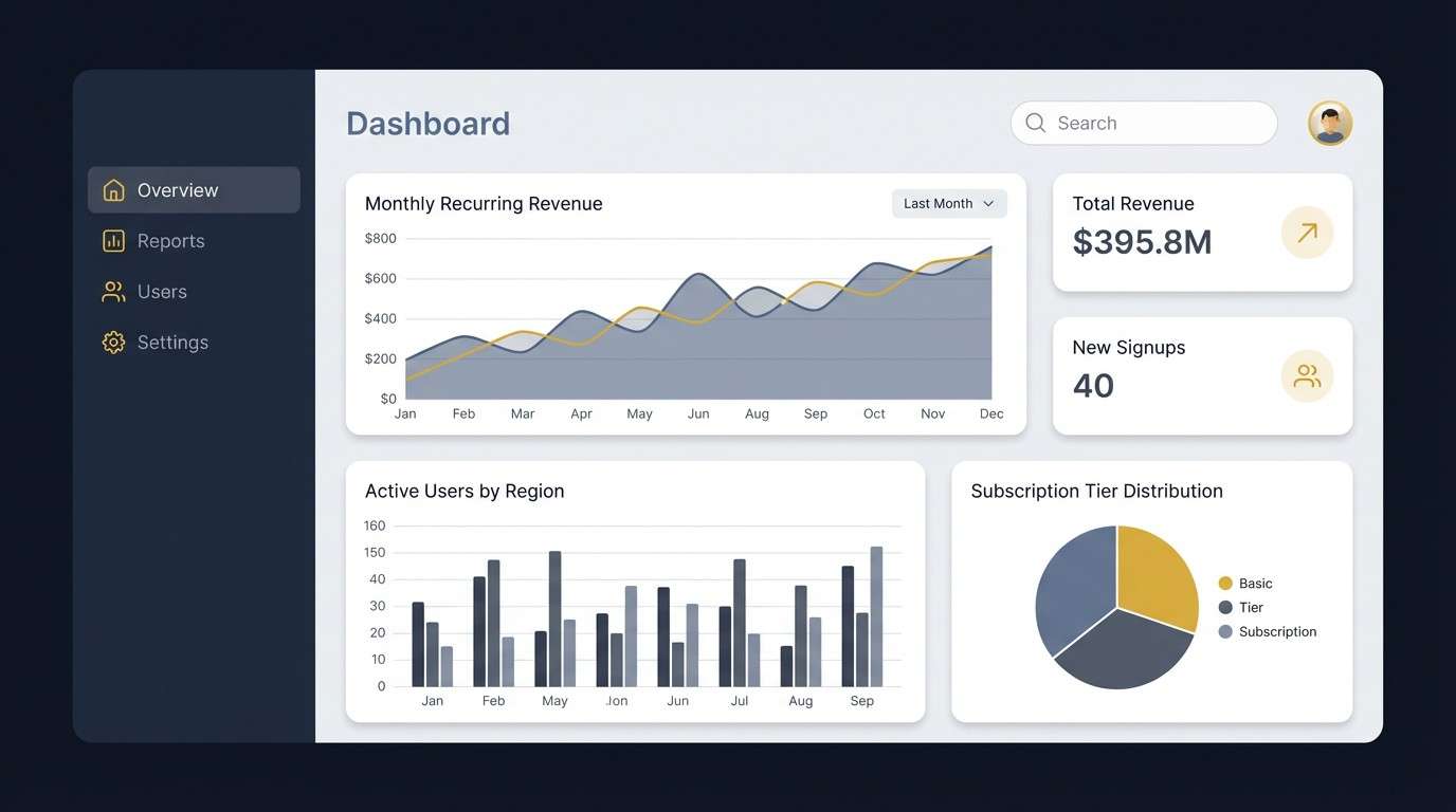
3) Midnight Orbit
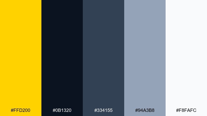
HEX: #ffd200 #0b1320 #334155 #94a3b8 #f8fafc
Mood: sleek, calm, high-contrast
Best for: dashboard UI and data visuals
Sleek and calm like city lights at night, the yellow reads as a precise signal against dark blues. Use the near-black for navigation and the slate range for charts, dividers, and secondary copy. Keep white as the surface for cards so the interface does not feel heavy. Tip: limit yellow to one primary action and one highlight state for consistency.
Image example of midnight orbit generated using media.io
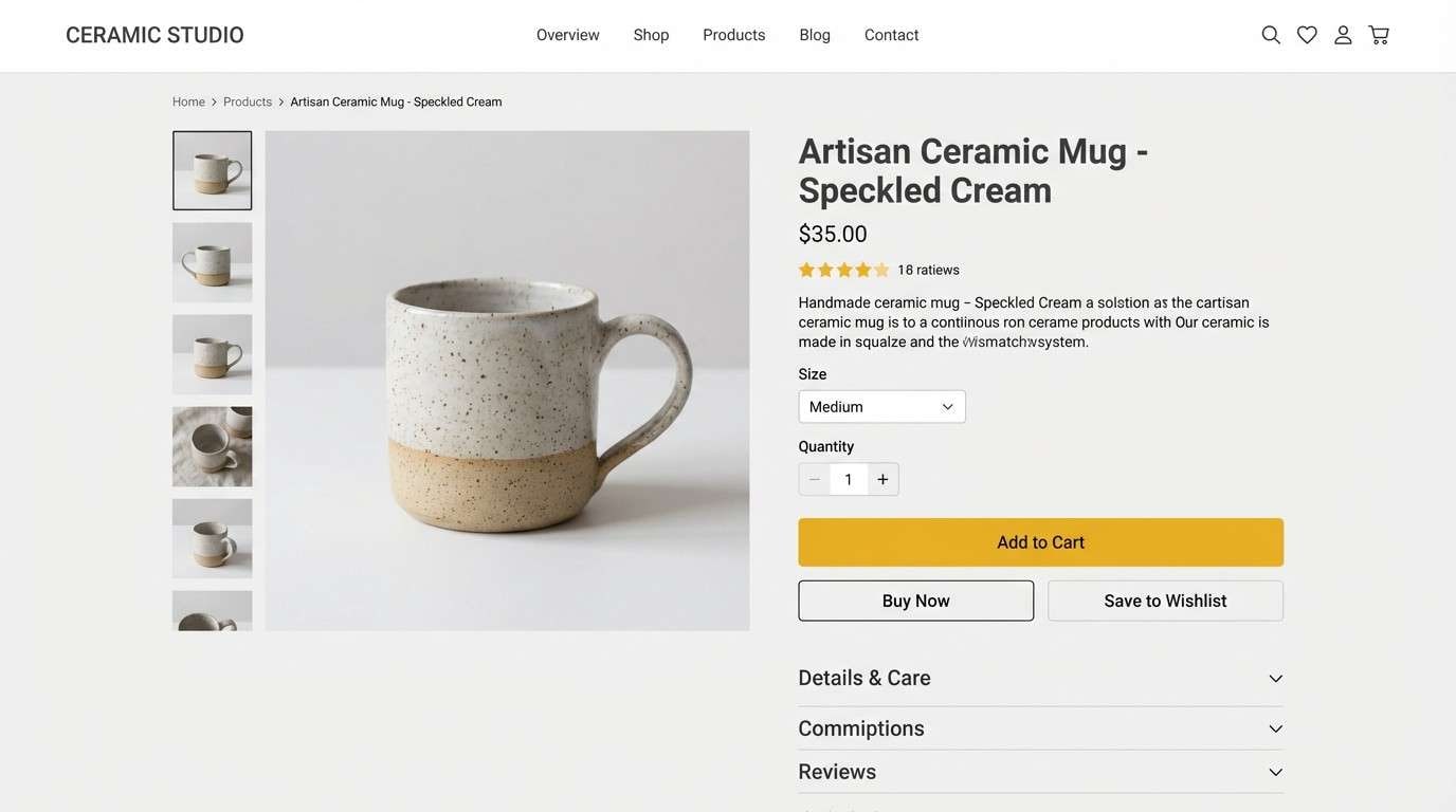
4) Starship Minimal
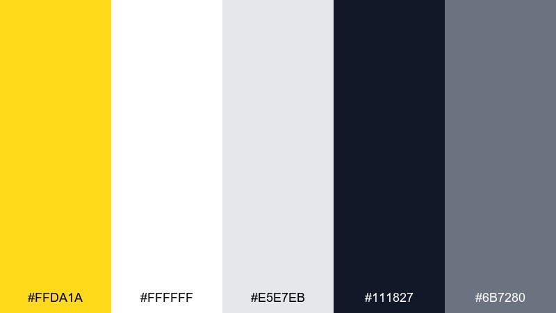
HEX: #ffda1a #ffffff #e5e7eb #111827 #6b7280
Mood: clean, minimal, editorial
Best for: product UI and minimalist web
Clean and minimal, these tones feel like polished metal lit by a warm beacon. Let white do the heavy lifting, then use the yellow as a single focal point for CTAs or active tabs. Charcoal handles headers and body text, while mid-gray keeps forms and dividers subtle. Tip: when in doubt, keep yellow coverage under 10 percent for a premium look.
Image example of starship minimal generated using media.io
5) Retro Rocket
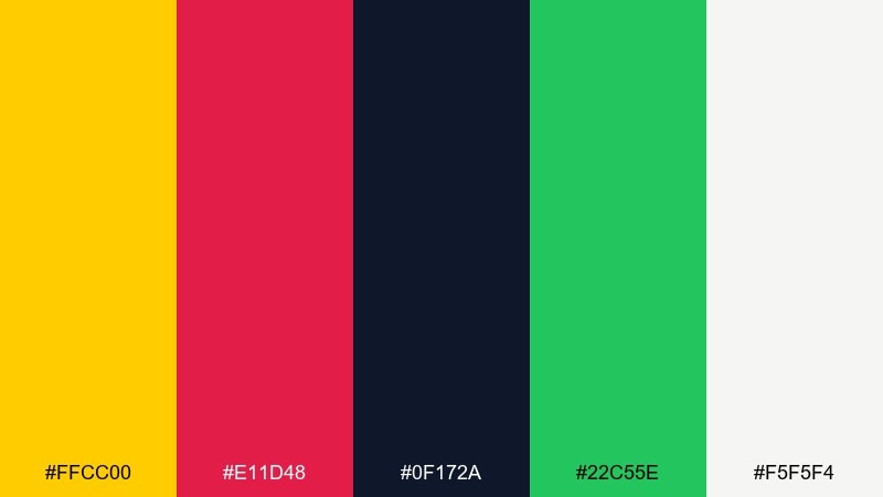
HEX: #ffcc00 #e11d48 #0f172a #22c55e #f5f5f4
Mood: retro, punchy, adventurous
Best for: merch graphics and sticker sets
Retro and punchy, it evokes old sci-fi covers with crisp ink and bright print blocks. Use the yellow and rose as the main duo, then keep navy as the outline and typography color. Green works best as a small surprise accent for icons or secondary stickers. Tip: add generous cream margins so the bright hues do not visually clash.
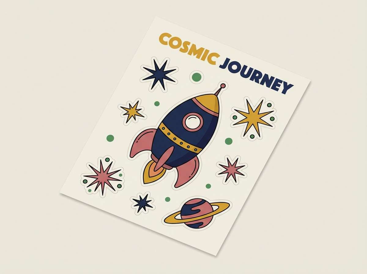
Image example of retro rocket generated using media.io
6) Desert Aurora
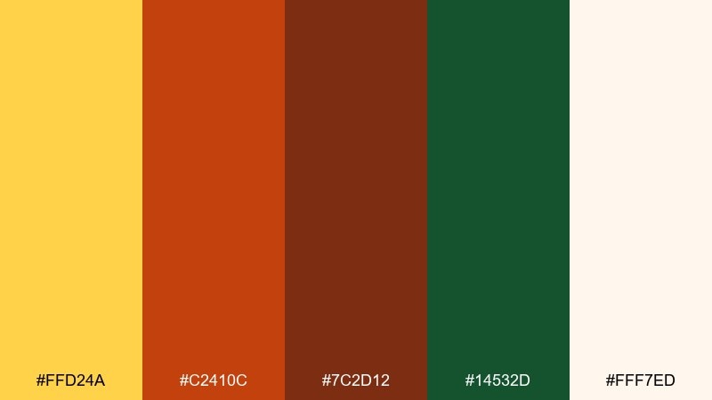
HEX: #ffd24a #c2410c #7c2d12 #14532d #fff7ed
Mood: earthy, warm, grounded
Best for: coffee packaging and artisan labels
Earthy and warm, it feels like golden light over desert clay and dusk greenery. These supernova color combinations work beautifully on kraft textures, but keep the cream tone as the base for readability. Use green sparingly for origin notes, stamps, or small icons to avoid a muddy mix. Tip: emboss the darkest brown for a tactile premium finish.
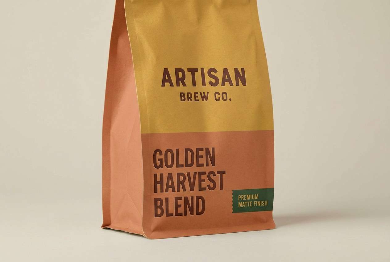
Image example of desert aurora generated using media.io
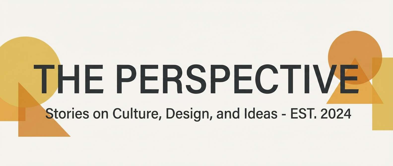
7) Citrine Clay
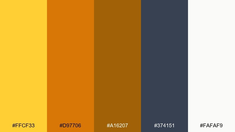
HEX: #ffcf33 #d97706 #a16207 #374151 #fafaf9
Mood: cozy, craft-forward, inviting
Best for: blog headers and lifestyle branding
Cozy and craft-forward, these tones suggest baked bread, glazed ceramic, and warm studio light. Pair the citrine yellow with soft stone-white for airy layouts, then use gray for long-form readability. Amber and ochre are ideal for highlights, buttons, and small illustrations rather than full backgrounds. Tip: keep photography warm-balanced so the palette stays harmonious.
Image example of citrine clay generated using media.io
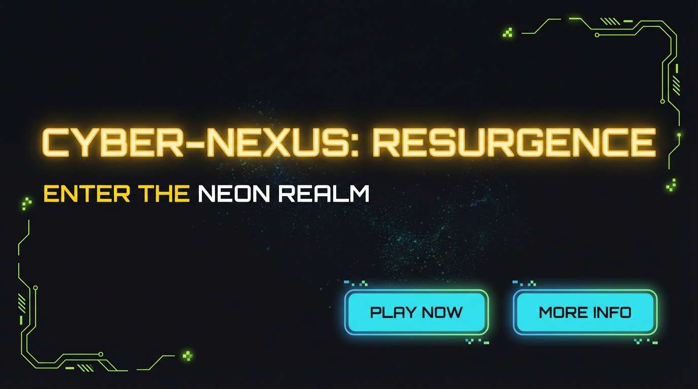
8) Neon Comet

HEX: #ffe100 #00d4ff #0a0a0f #a3e635 #f1f5f9
Mood: electric, futuristic, high-impact
Best for: gaming UI and promo banners
Electric and futuristic, it looks like a comet trail across a black sky. Build a supernova color scheme by letting neon yellow lead, with cyan reserved for secondary actions and status cues. Use lime for limited highlights like XP bars or achievement chips so it feels intentional. Tip: add subtle glow effects sparingly to keep the design crisp, not noisy.
Image example of neon comet generated using media.io
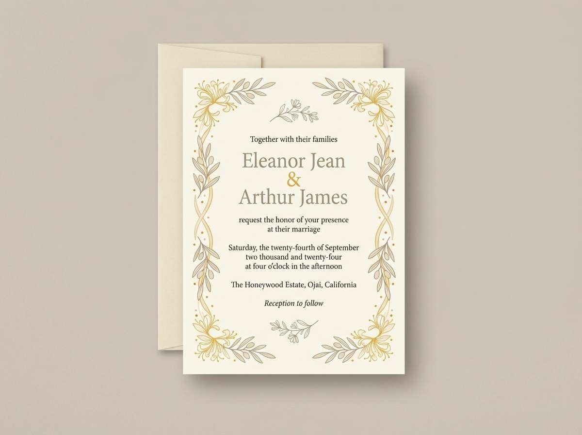
9) Honeyed Linen
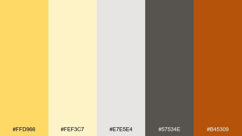
HEX: #ffd966 #fef3c7 #e7e5e4 #57534e #b45309
Mood: soft, airy, comfortable
Best for: wedding stationery and invitations
Soft and airy, it evokes sunlit linen, honey drizzle, and gentle shadows. Use the pale cream for the main paper tone, then bring in warm yellow for monograms or borders. Keep the stone gray and taupe for typography to maintain a refined look. Tip: pair with textured paper or subtle grain to make the warmth feel tactile.
Image example of honeyed linen generated using media.io
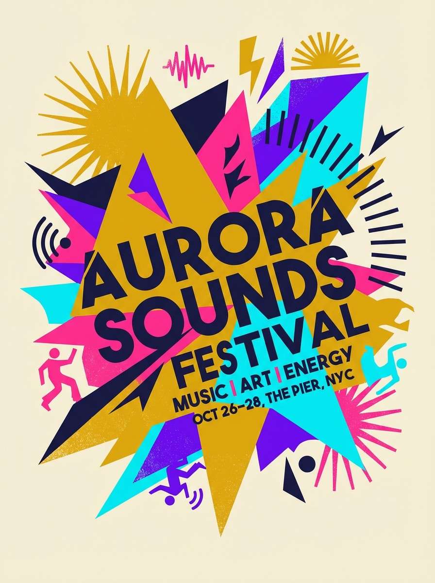
10) Cosmic Carnival
HEX: #ffcc00 #ff3d81 #7c3aed #06b6d4 #0f172a
Mood: playful, loud, celebratory
Best for: festival posters and streamer overlays
Playful and loud, these colors feel like neon confetti bursting under night skies. Make yellow your anchor, then rotate pink, purple, and cyan as supporting blocks to avoid visual chaos. Deep navy keeps the typography readable and gives the bright hues a stage. Tip: use big shapes and limited gradients so the palette stays punchy instead of messy.
Image example of cosmic carnival generated using media.io
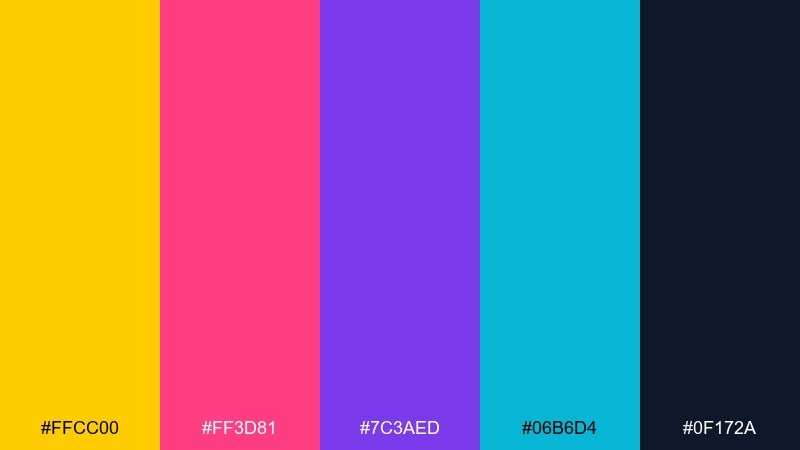
11) Saffron Shadow
HEX: #ffcd1f #1c1917 #44403c #a8a29e #f5f5f4
Mood: moody, elegant, premium
Best for: luxury branding and lookbooks
Moody and elegant, it suggests saffron light cutting through dark stone. The yellow works best as a small luxury signal: foil details, thin rules, or a single label stripe. Layer the warm grays for type hierarchy and spacing so the page feels editorial. Tip: keep backgrounds off-white rather than pure white for a softer premium finish.
Image example of saffron shadow generated using media.io
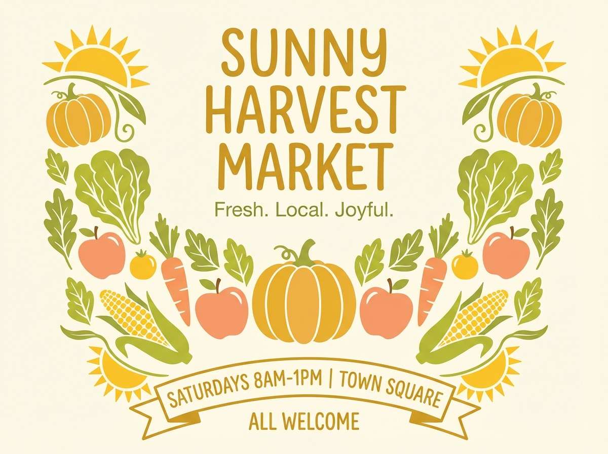
12) Glowing Harvest
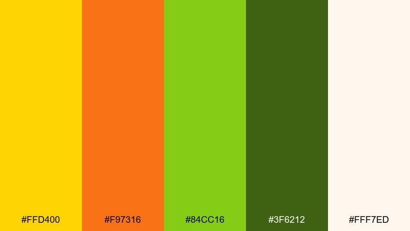
HEX: #ffd400 #f97316 #84cc16 #3f6212 #fff7ed
Mood: fresh, seasonal, optimistic
Best for: farmers market flyers and food branding
Fresh and seasonal, it brings to mind ripe citrus, pumpkin skin, and late-summer greens. For a strong supernova color combination, use yellow for headlines and orange for price tags or callouts. Keep the darker green for type or icon outlines so the greens do not overpower. Tip: add simple illustrated produce shapes to tie the warm and green tones together.
Image example of glowing harvest generated using media.io
13) Techno Sunspot
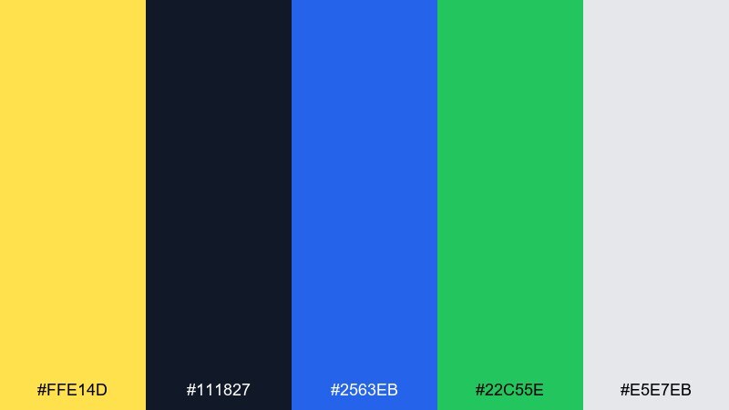
HEX: #ffe14d #111827 #2563eb #22c55e #e5e7eb
Mood: techy, confident, sharp
Best for: startup pitch decks and SaaS pages
Techy and confident, it feels like a bright status light on a polished control panel. Use charcoal as the base, then let yellow mark the primary emphasis points such as key metrics or highlights. Blue and green can split meaning: links versus success states. Tip: in slides, keep yellow only on one element per page to avoid competing focal points.
Image example of techno sunspot generated using media.io
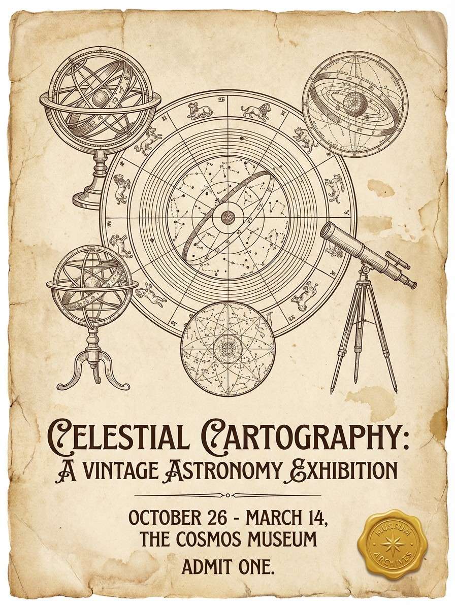
14) Vintage Observatory
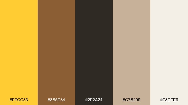
HEX: #ffcc33 #8b5e34 #2f2a24 #c7b299 #f3efe6
Mood: nostalgic, academic, warm
Best for: book covers and museum posters
Nostalgic and academic, it recalls brass instruments, aged paper, and dim library corners. Use the parchment tone as the backdrop, then set dark brown for titles and body text. Yellow becomes the highlight for badges, star marks, or small ornaments. Tip: add subtle paper grain and thin linework for an authentic vintage feel.
Image example of vintage observatory generated using media.io
15) Warm Marble

HEX: #ffe07a #f5f5f4 #d6d3d1 #78716c #ca8a04
Mood: quiet, refined, residential
Best for: interior mood boards and decor shops
Quiet and refined, it feels like warm sunlight across marble and brushed stone. Use the off-white and light gray as the main surfaces, then add yellow as a glow for featured items or labels. Mid-gray keeps text understated, while the deeper gold provides an upscale accent. Tip: pair with natural textures like linen, oak, and matte ceramics to keep it grounded.
Image example of warm marble generated using media.io
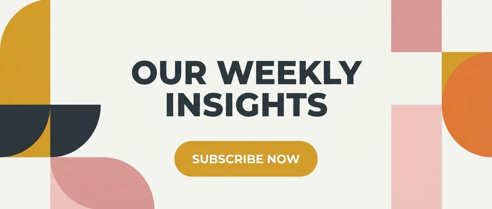
16) Festival Firelight
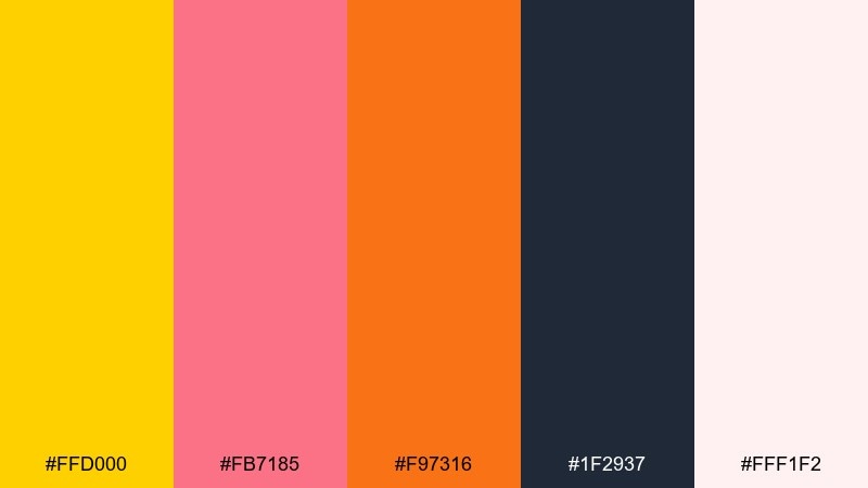
HEX: #ffd000 #fb7185 #f97316 #1f2937 #fff1f2
Mood: warm, social, inviting
Best for: email headers and launch announcements
Warm and social, it suggests lantern light, sparklers, and upbeat crowds. Use the dark slate for headline contrast and let yellow handle the primary call-to-action. Rose and orange are perfect for secondary buttons, badges, or small confetti motifs. Tip: keep backgrounds blush-light so the warm accents feel bright, not heavy.
Image example of festival firelight generated using media.io
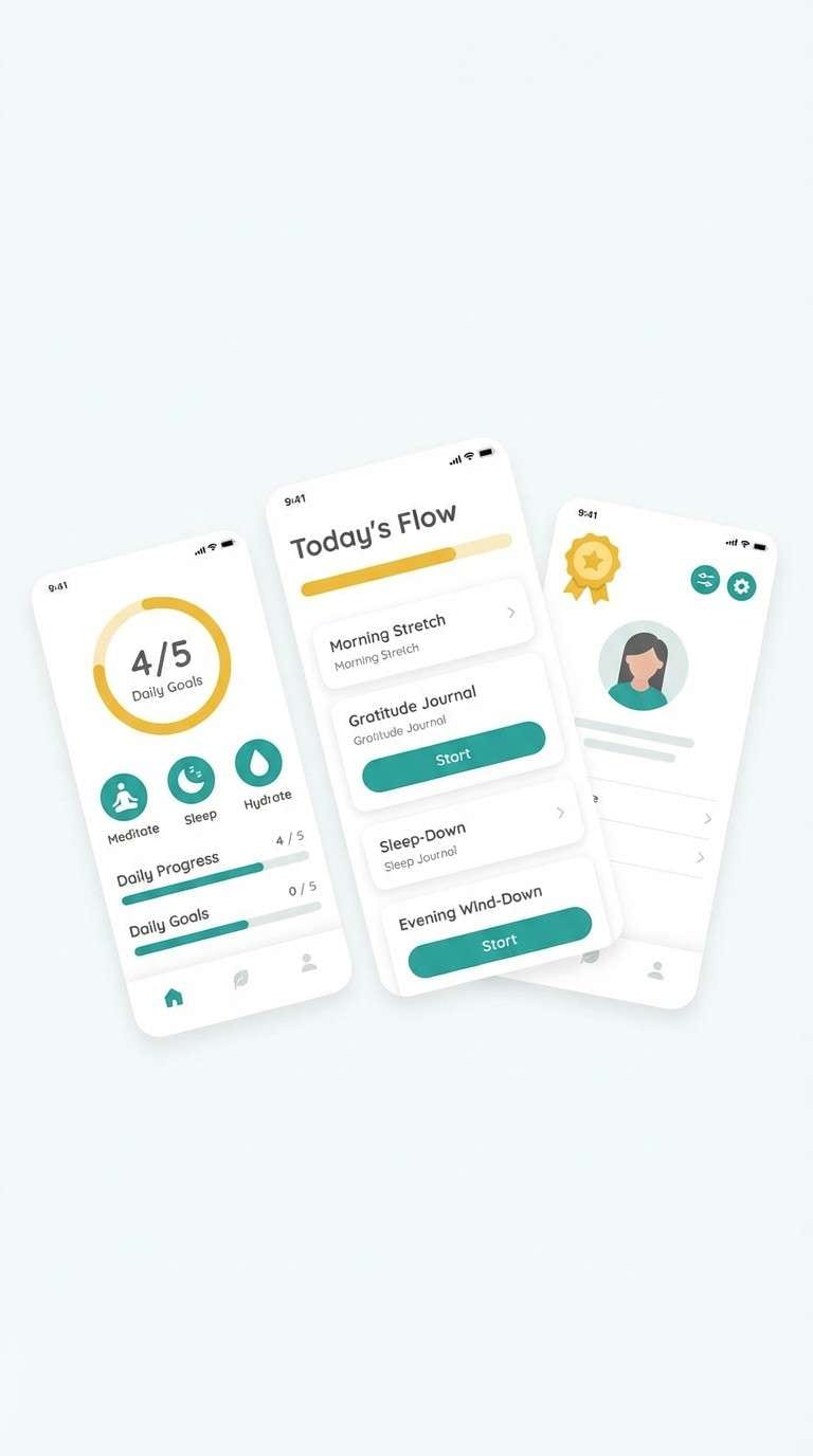
17) Zen Sunbeam
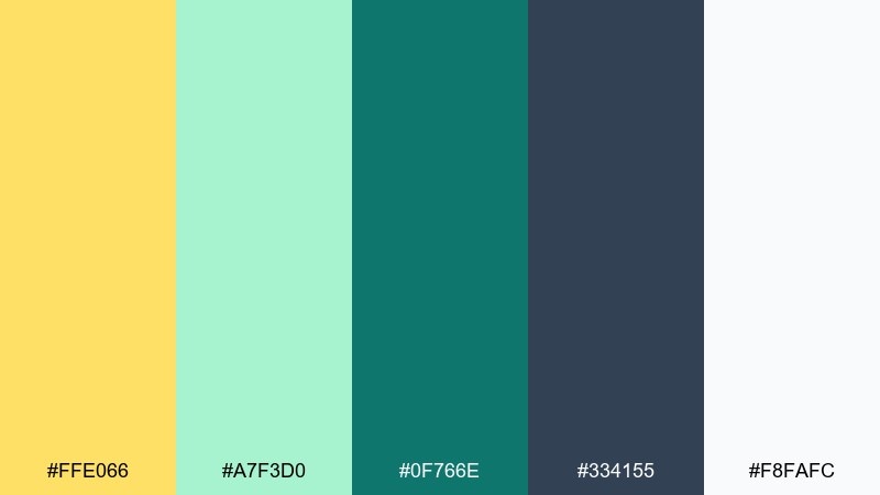
HEX: #ffe066 #a7f3d0 #0f766e #334155 #f8fafc
Mood: calming, fresh, balanced
Best for: wellness apps and meditation brands
Calming and fresh, it feels like a sunbeam over cool sea glass. Keep white as your breathing room, then use teal for navigation and structure. Yellow shines as a gentle reward color for progress, streaks, or affirmations. Tip: avoid using yellow for long text; keep it to small UI highlights and icons.
Image example of zen sunbeam generated using media.io
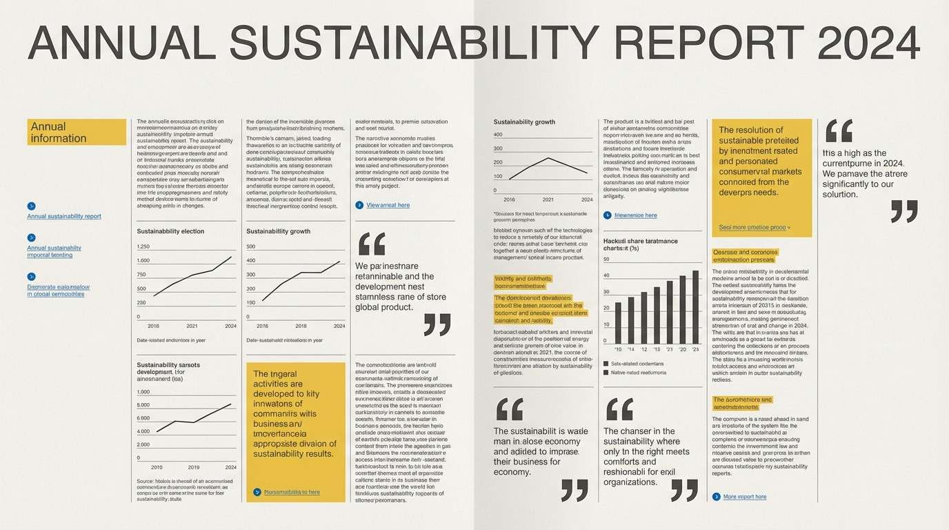
18) Editorial Gold
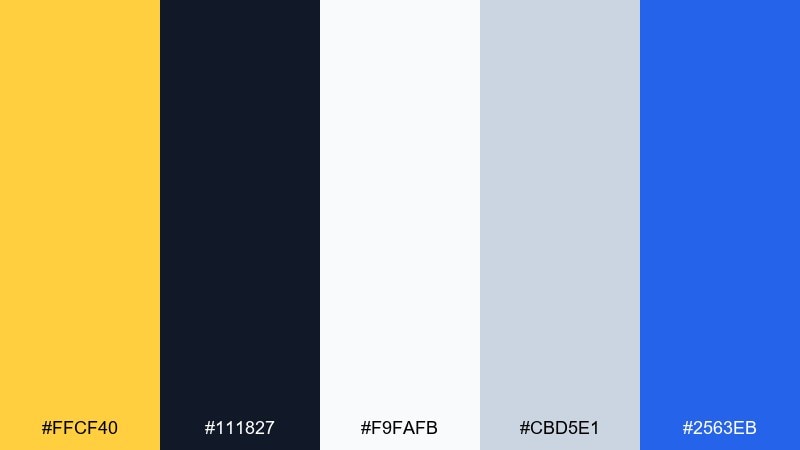
HEX: #ffcf40 #111827 #f9fafb #cbd5e1 #2563eb
Mood: smart, modern, publication-ready
Best for: reports and editorial layouts
Smart and modern, it reads like a sharp op-ed page with a bright highlight marker. Use charcoal for the core typographic system and keep backgrounds near-white for clarity. Yellow is ideal for pull quotes, section tabs, or key stats, while blue can signal links and references. Tip: use consistent spacing and one accent per module to keep the layout authoritative.
Image example of editorial gold generated using media.io
19) Playful Plasma
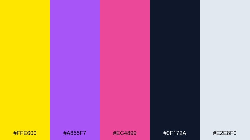
HEX: #ffe600 #a855f7 #ec4899 #0f172a #e2e8f0
Mood: fun, expressive, youthful
Best for: creator thumbnails and stream graphics
Fun and expressive, it feels like bright plasma ink splashed over a dark canvas. Push yellow as the main attention color, then use purple and pink for secondary shapes and labels. Keep navy for legible type and add the soft gray as a calm separator. Tip: outline small text in light gray so it stays readable over saturated accents.
Image example of playful plasma generated using media.io
20) Luxe Astral
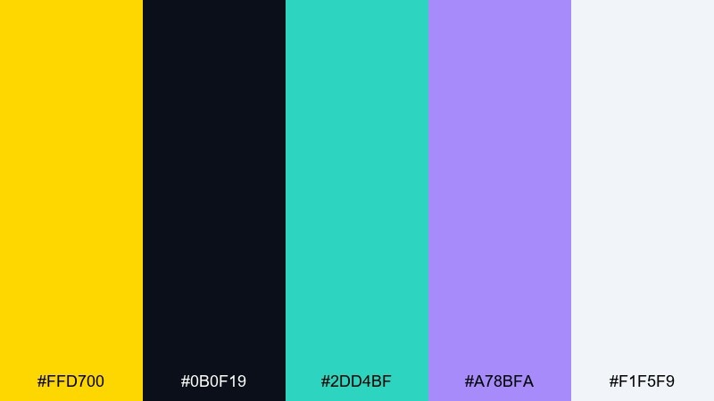
HEX: #ffd700 #0b0f19 #2dd4bf #a78bfa #f1f5f9
Mood: luxe, modern, night-sky
Best for: beauty product ads and premium promos
Luxe and night-sky rich, it suggests gold foil catching light over a deep midnight base. These supernova color combinations shine in ads when gold dominates and the cool accents stay minimal. Use teal for a crisp modern edge and lavender for a soft glow that feels high-end, not playful. Tip: keep the background nearly black and add one clean light reflection to sell the premium vibe.
Image example of luxe astral generated using media.io
What Colors Go Well with Supernova?
Supernova (a bright golden yellow) looks especially sharp with deep neutrals like charcoal, navy, and near-black because they create instant contrast for headlines and buttons.
For a modern edge, pair it with cool accents such as teal or cyan; the warm–cool split feels clean in UI and “tech” branding. Violet and lavender add a cosmic, editorial feel without dulling the yellow.
If you want a softer, lifestyle direction, use creamy off-whites, stone grays, and warm browns to keep the palette grounded and premium.
How to Use a Supernova Color Palette in Real Designs
Start with a neutral base (off-white or dark navy), then use supernova as the attention layer: primary CTA, key metric, sale tag, or a single hero highlight. Keeping it purposeful prevents the layout from feeling loud.
Protect readability by reserving supernova for fills, icons, and short labels—then set most text in charcoal/slate. If you place text on supernova, use a very dark ink and increase font weight for clarity.
To balance energy, add one supporting accent (teal, violet, or rose) and repeat it consistently for links, states, or small graphic motifs.
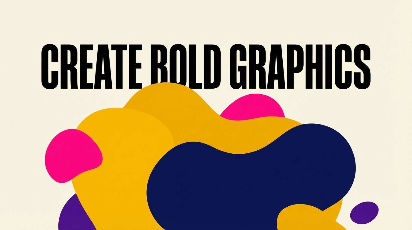
Create Supernova Palette Visuals with AI
If you have HEX codes but need real-world visuals, generate fast mockups with AI: posters, landing pages, packaging, thumbnails, or app screens—using the palette as your style guide.
On Media.io, you can paste a prompt, describe the layout, and specify supernova yellow as the dominant accent, then iterate until the contrast and mood match your brand.
Use the prompt examples above as templates—swap the format (banner, flyer, UI) while keeping the same color intent for consistent results.
Supernova Color Palette FAQs
-
What HEX code is closest to “supernova” yellow?
A common supernova-style golden yellow is #FFD400. In this article you’ll also see close variants like #FFCC00, #FFE100, and #FFD700 depending on warmth and brightness. -
Is supernova a good color for CTAs and buttons?
Yes—supernova is excellent for primary CTAs because it draws attention quickly. Use dark text (charcoal/navy) on the button and keep the rest of the UI more neutral so the CTA remains the clear focal point. -
What background colors work best with supernova?
For maximum contrast, use near-black, navy, or charcoal backgrounds. For a softer look, use warm off-white/cream backgrounds and let supernova appear as smaller highlights. -
What accent colors pair well with supernova besides orange?
Teal/cyan gives a modern, tech-forward balance; violet/lavender creates a cosmic feel; rose/pink brings playful poster energy; and greens can work for “fresh/food” themes when used sparingly. -
How do I keep a supernova color scheme from looking too harsh?
Reduce coverage (use supernova as an accent, not a background), add warm neutrals like cream/stone, and introduce one calm mid-tone (slate/gray) for spacing, dividers, and secondary text. -
Can I use supernova yellow for body text?
It’s not recommended for long text because readability drops quickly, especially on light backgrounds. Use supernova for highlights, icons, short labels, or underline/marker effects instead. -
How can I preview supernova palettes in real designs quickly?
Generate mockups with Media.io’s text-to-image: describe the design type (UI, poster, packaging) and specify supernova yellow as the main accent alongside your supporting HEX colors.


