

Fire engine red is a high-impact color that instantly signals speed, urgency, and confidence. It’s the kind of red that can carry a whole layout—if you balance it with smart neutrals and purposeful accents.
Below are 20 punchy fire engine red color palette ideas (with HEX codes) you can use for branding, posters, packaging, and UI—plus AI prompts to generate matching visuals fast.
In this article
- Why Fire Engine Red Palettes Work So Well
-
- siren glow
- vintage garage
- cherry espresso
- stadium spotlight
- minimal punch
- desert rally
- holiday classic
- noir cherry
- coral ember
- steel and scarlet
- candy apple pop
- rustic brick
- neon night drive
- bridal red accent
- art deco maroon
- kids carnival
- autumn bonfire
- coastal lifeguard
- tech dashboard red
- botanical crimson
- What Colors Go Well with Fire Engine Red?
- How to Use a Fire Engine Red Color Palette in Real Designs
- Create Fire Engine Red Palette Visuals with AI
Why Fire Engine Red Palettes Work So Well
Fire engine red is built for attention: it reads quickly at a distance, holds its own against dark backgrounds, and creates instant hierarchy for buttons, headlines, and key messages.
Because it’s such a strong hue, it pairs especially well with stable neutrals (charcoal, slate, ivory) that keep layouts legible and professional. Add one supporting accent (gold, teal, cyan, or blush) to shape the mood without diluting the impact.
In branding and UI, this red also works as a “signal” color—ideal for calls to action, alerts, or limited-time offers—so long as you apply it consistently and sparingly.
20+ Fire Engine Red Color Palette Ideas (with HEX Codes)
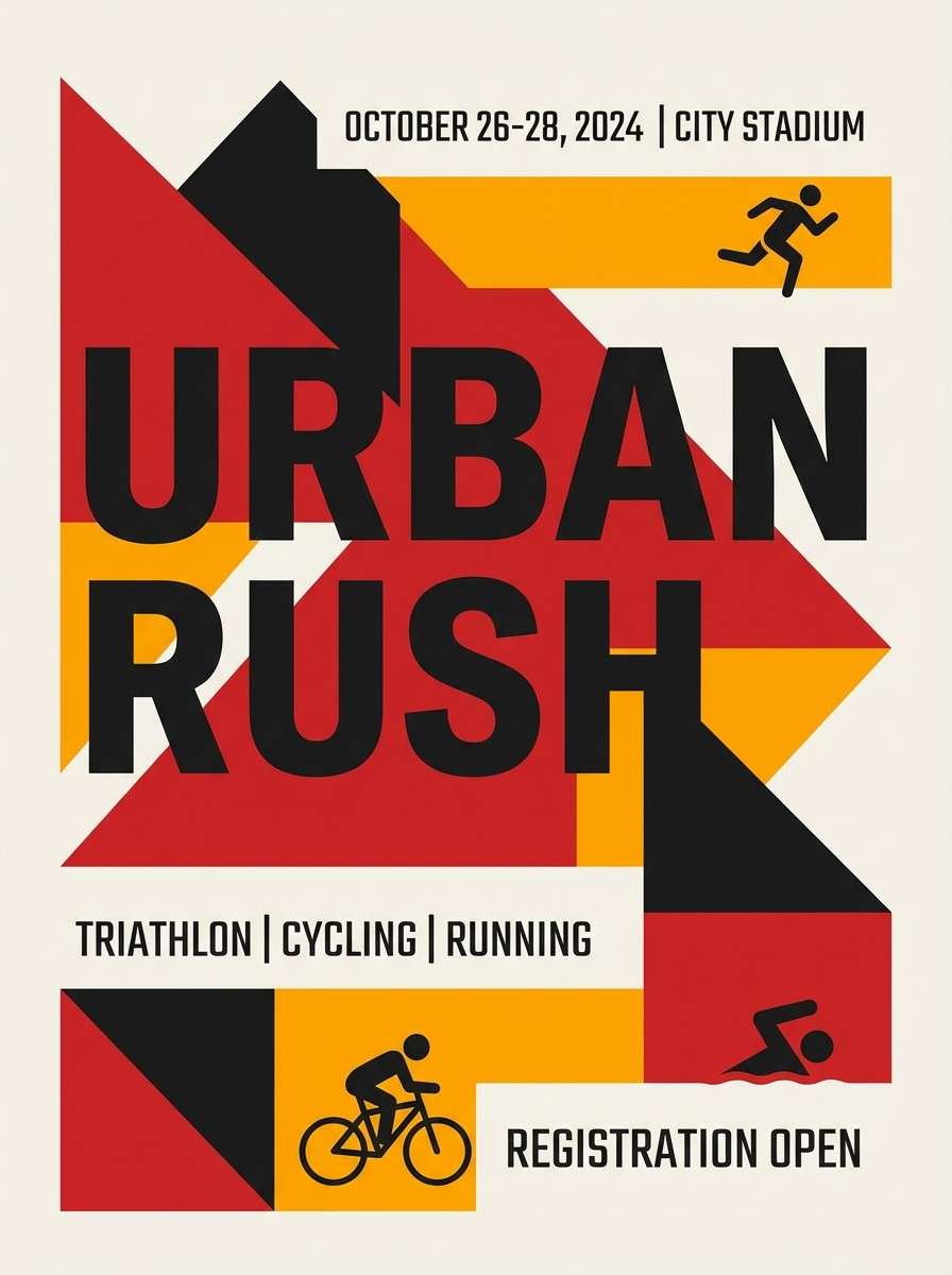
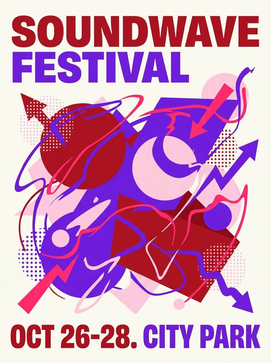
1) Siren Glow
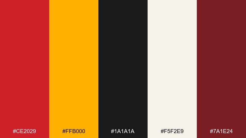
HEX: #CE2029 #FFB000 #1A1A1A #F5F2E9 #7A1E24
Mood: bold, urgent, energetic
Best for: sports poster design
Bold and urgent like flashing lights against night streets, these tones feel fast and fearless. The bright amber lifts the red, while charcoal and warm ivory keep the mix readable. Use it for sports posters, event promos, and hero headlines where impact matters. For a clean finish, reserve the red for calls to action and let ivory handle body text in this fire engine red color palette.
Image example of siren glow generated using media.io
Media.io is an online AI studio for creating and editing video, image, and audio in your browser.

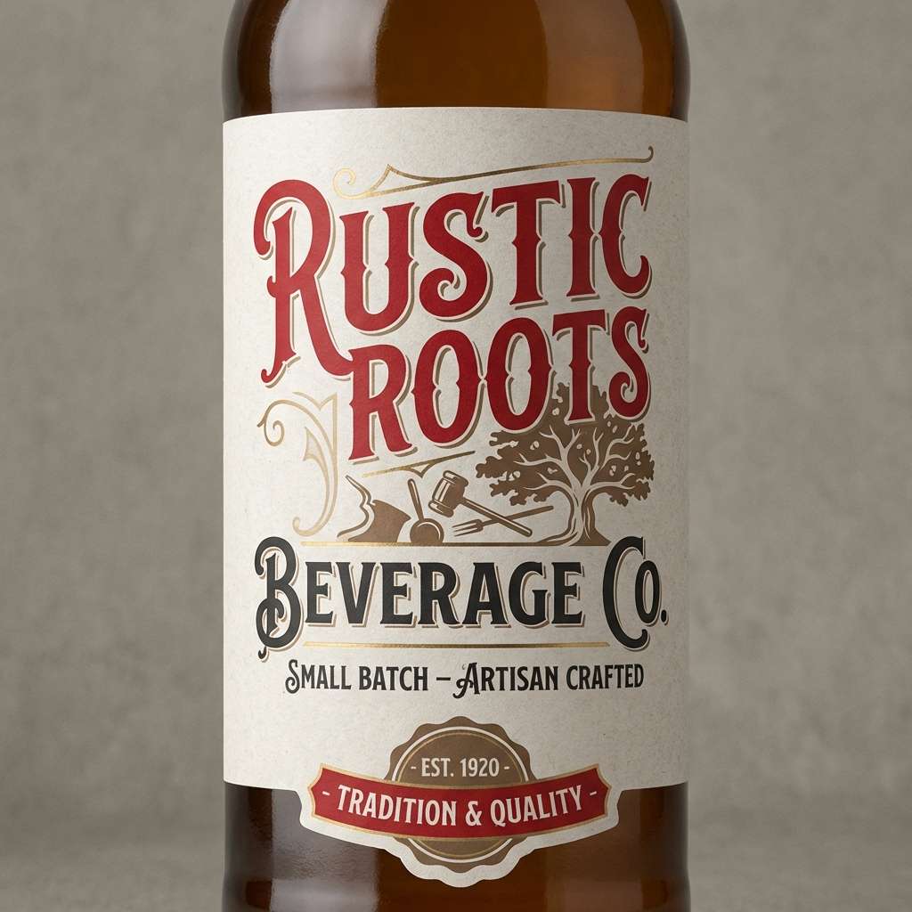
2) Vintage Garage
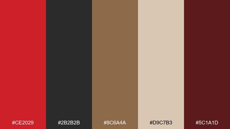
HEX: #CE2029 #2B2B2B #8C6A4A #D9C7B3 #5C1A1D
Mood: retro, rugged, workshop-warm
Best for: craft beverage label
Retro and rugged, it evokes painted metal, worn leather, and a classic workshop sign. Deep maroon and near-black add weight, while tan and beige soften the edges. These fire engine red color combinations work especially well for labels, patch-style logos, and heritage packaging. Tip: add subtle grain texture and keep the beige as your main background to preserve that vintage feel.
Image example of vintage garage generated using media.io
3) Cherry Espresso
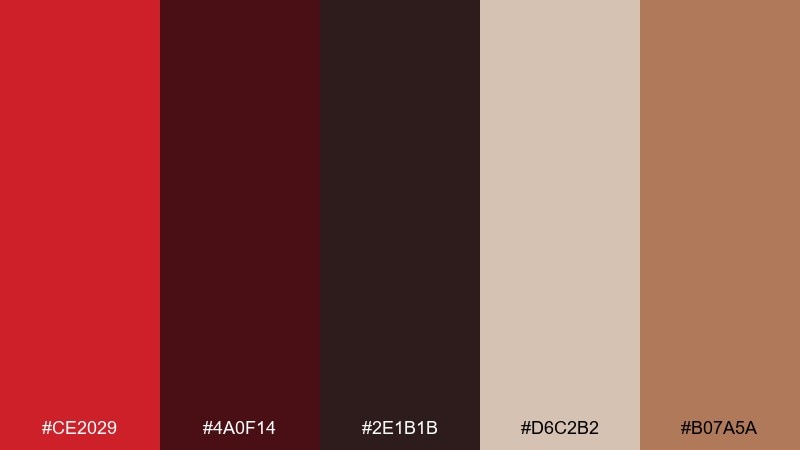
HEX: #CE2029 #4A0F14 #2E1B1B #D6C2B2 #B07A5A
Mood: moody, premium, intimate
Best for: coffee shop menu
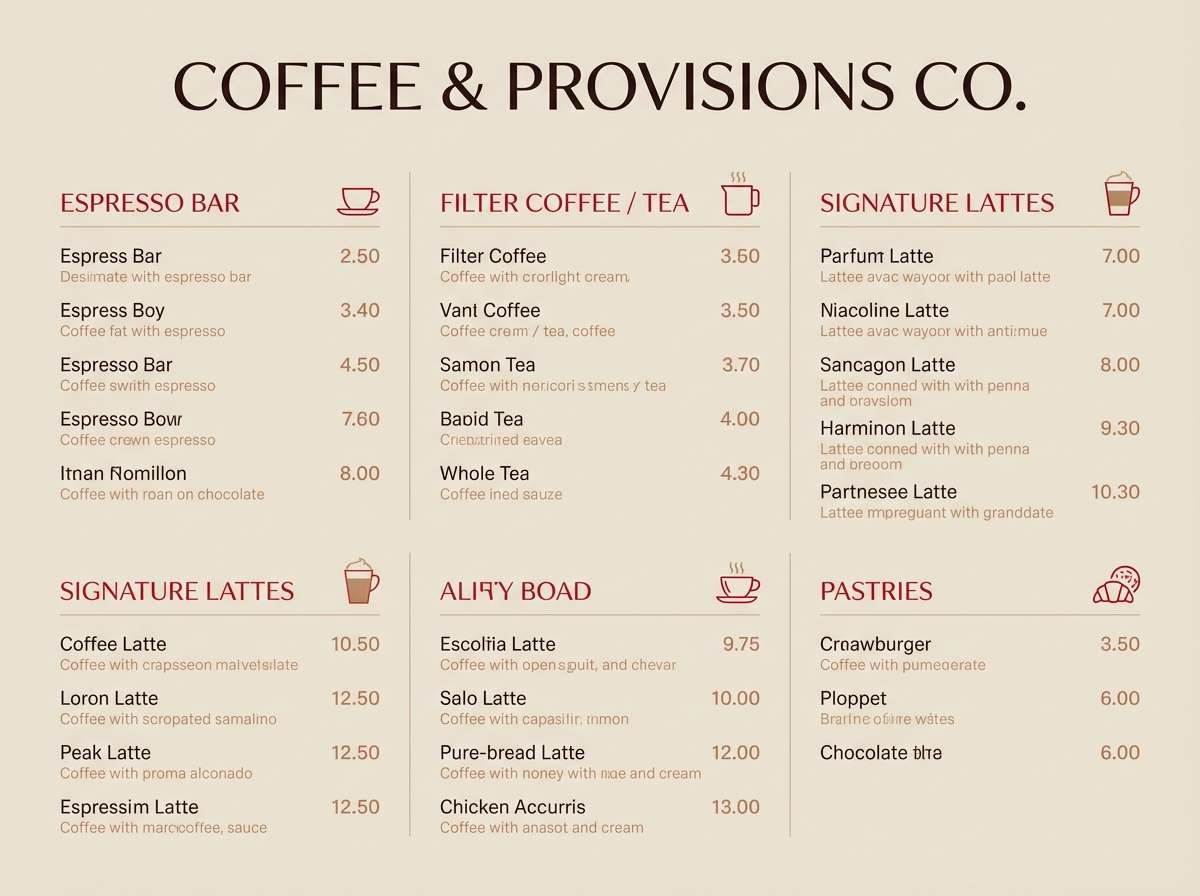
Moody and premium, it feels like cherry syrup poured into a dark espresso. The deep browns and burgundy create richness, while the creamy beige keeps type legible. Ideal for café menus, boutique food brands, and editorial-style price lists. Usage tip: set headings in red, then use the beige for panels so the darkest tones do not swallow your layout.
Image example of cherry espresso generated using media.io
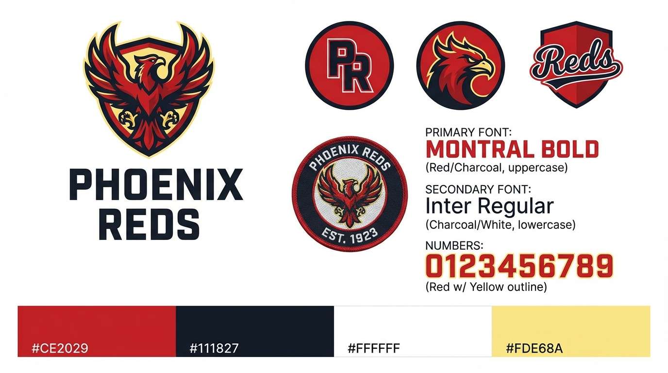
4) Stadium Spotlight
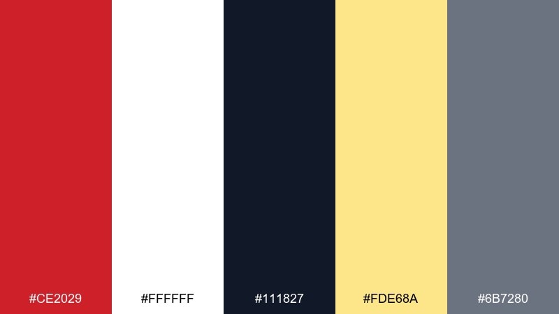
HEX: #CE2029 #FFFFFF #111827 #FDE68A #6B7280
Mood: clean, loud, high-contrast
Best for: team branding kit
Clean and loud, it evokes stadium lights hitting a crisp jersey. The sharp white and deep navy push the red forward without clutter, and the soft gold adds celebratory warmth. Great for team branding, merch graphics, and bold social templates. Tip: keep gold as a small accent on badges or dividers so the red stays the star.
Image example of stadium spotlight generated using media.io
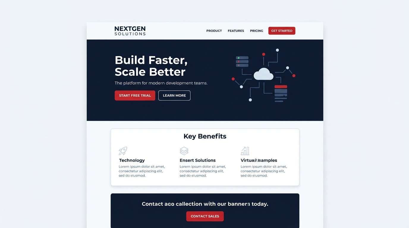
5) Minimal Punch
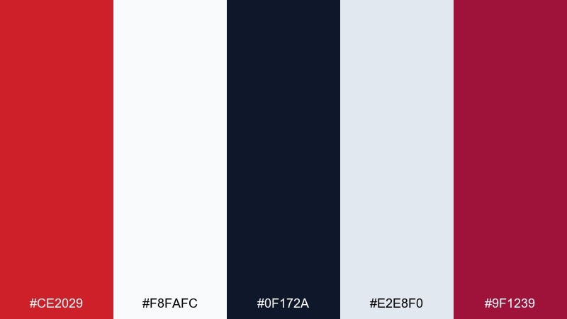
HEX: #CE2029 #F8FAFC #0F172A #E2E8F0 #9F1239
Mood: minimal, modern, confident
Best for: landing page UI
Minimal and confident, it feels like a sharp red underline on a clean page. Slate neutrals keep the interface calm, while the deeper magenta-red gives you a second emphasis level. Perfect for SaaS landing pages, pricing tables, and product feature callouts. Tip: use the primary red only for one action per screen, and rely on slate for secondary buttons.
Image example of minimal punch generated using media.io
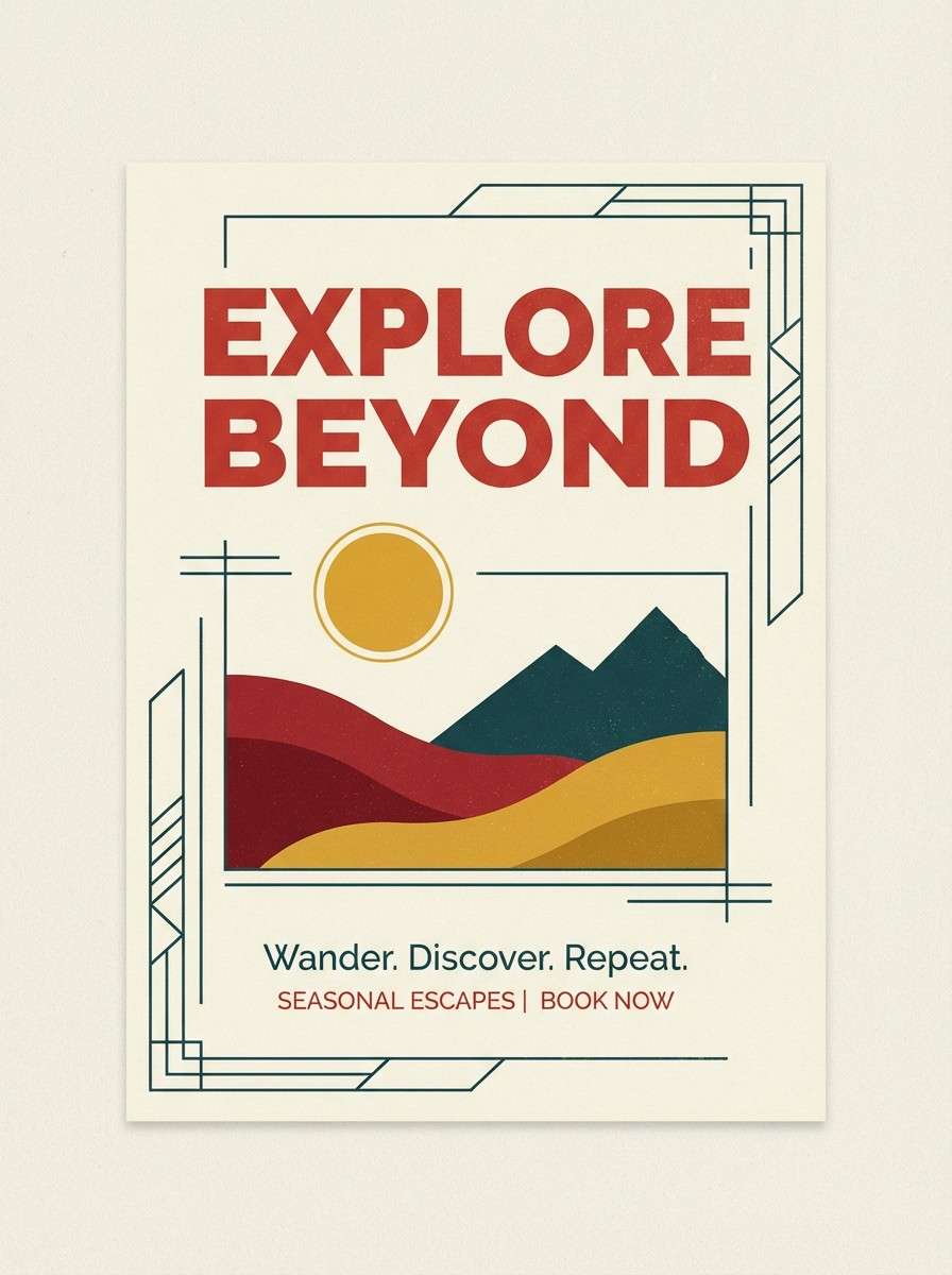
6) Desert Rally
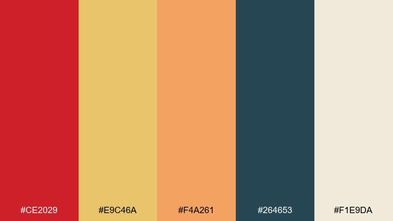
HEX: #CE2029 #E9C46A #F4A261 #264653 #F1E9DA
Mood: adventurous, sunbaked, outdoorsy
Best for: travel flyer
Adventurous and sunbaked, it brings to mind rally flags, dusty trails, and late-afternoon heat. Warm sand and apricot balance the red, while teal adds a cool counterpoint that feels fresh. This fire engine red color scheme shines on travel flyers, outdoor events, and destination banners. Tip: pair red headlines with teal subheads to separate hierarchy without adding extra colors.
Image example of desert rally generated using media.io
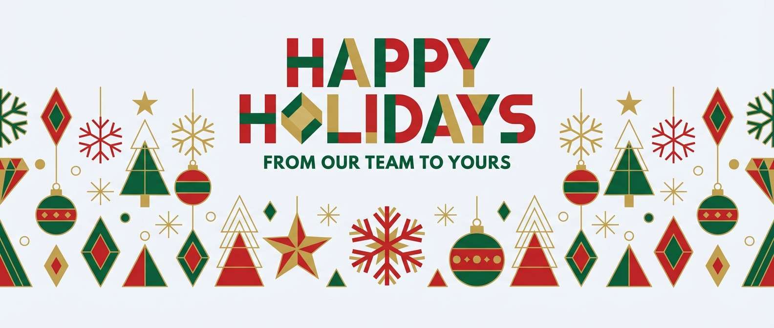
7) Holiday Classic
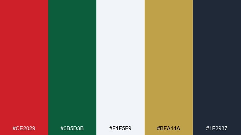
HEX: #CE2029 #0B5D3B #F1F5F9 #BFA14A #1F2937
Mood: festive, traditional, polished
Best for: seasonal email header
Festive and polished, it feels like ribbons, evergreen, and a touch of gold foil. The green deepens the red instead of fighting it, and the cool off-white keeps everything airy. Use it for seasonal email headers, gift cards, and storefront banners. Tip: keep gold for tiny separators or icons so it reads as premium rather than flashy.
Image example of holiday classic generated using media.io
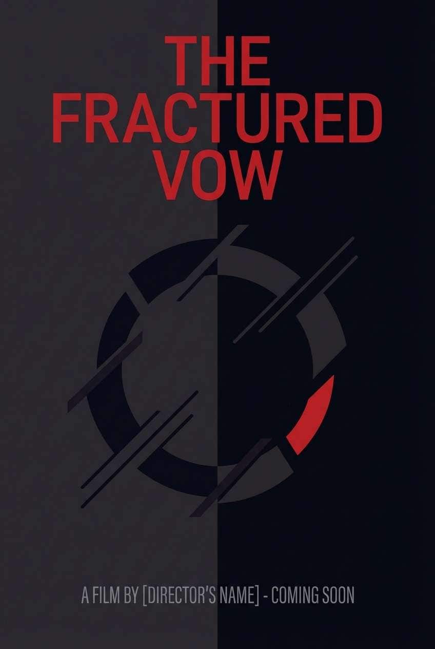
8) Noir Cherry
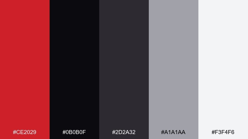
HEX: #CE2029 #0B0B0F #2D2A32 #A1A1AA #F3F4F6
Mood: cinematic, sleek, dramatic
Best for: movie poster concept
Cinematic and sleek, it evokes neon reflections on wet asphalt with a single cherry-red highlight. The near-black base makes the red feel intense, while soft grays support typography without glare. Best for thriller poster concepts, music promo graphics, and bold editorial covers. Tip: use a monochrome layout first, then add red only to the title or one key symbol.
Image example of noir cherry generated using media.io
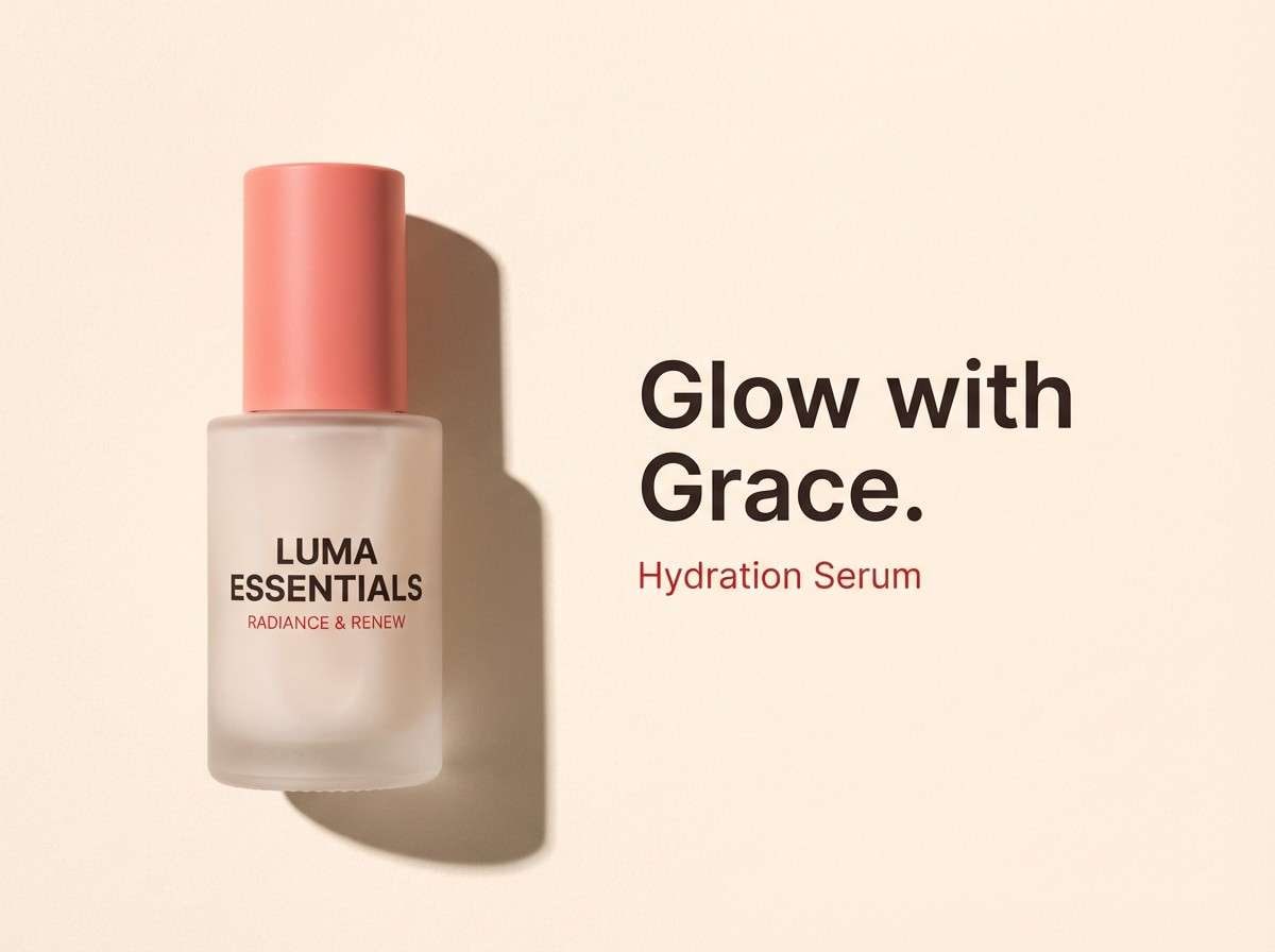
9) Coral Ember
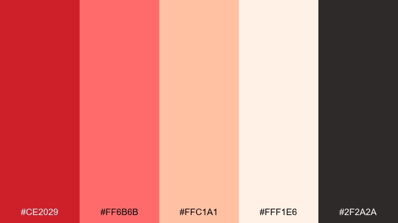
HEX: #CE2029 #FF6B6B #FFC1A1 #FFF1E6 #2F2A2A
Mood: friendly, warm, approachable
Best for: beauty product ad
Friendly and warm, it feels like a soft blush glow with an ember-red edge. Coral and peach lighten the intensity, while the deep brown-black gives your type enough contrast. Great for beauty ads, wellness promos, and lifestyle banners that want energy without aggression. Tip: use the light cream as negative space and let the corals do most of the gradient work.
Image example of coral ember generated using media.io
10) Steel and Scarlet
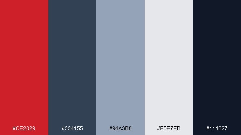
HEX: #CE2029 #334155 #94A3B8 #E5E7EB #111827
Mood: industrial, professional, tech-forward
Best for: B2B brochure
Industrial and professional, it suggests steel panels and a crisp safety stripe of red. Cool grays keep the palette corporate, while the dark navy anchors headings and charts. Ideal for B2B brochures, pitch decks, and product one-pagers with lots of data. Tip: make charts mostly gray and reserve red for one highlighted metric or key line.
Image example of steel and scarlet generated using media.io

11) Candy Apple Pop
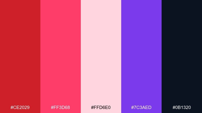
HEX: #CE2029 #FF3D68 #FFD6E0 #7C3AED #0B1320
Mood: playful, trendy, high-energy
Best for: music festival poster
Playful and trendy, it looks like glossy candy coating with a punch of purple nightlife. Hot pink and soft blush keep the red feeling modern, while the deep navy gives the whole set a stage-like backdrop. Use this fire engine red color palette for music festival posters, creator merch, or bold social campaigns. Tip: set large type in blush or pink, then use red only for the date and ticket callout.
Image example of candy apple pop generated using media.io
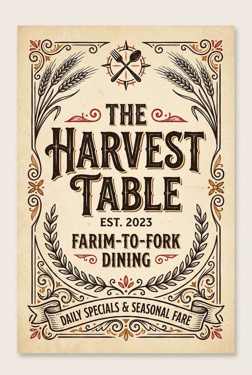
12) Rustic Brick
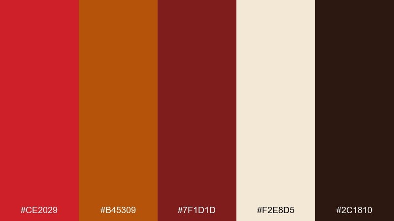
HEX: #CE2029 #B45309 #7F1D1D #F2E8D5 #2C1810
Mood: earthy, handcrafted, cozy
Best for: restaurant menu cover
Earthy and cozy, it feels like brick ovens, smoked spices, and handwritten specials. The burnt orange bridges the red into warm neutrals, while the creamy paper tone keeps it inviting. Great for restaurant menu covers, artisanal food packaging, and rustic brand identities. Tip: use the dark brown for body copy and let the reds appear as small stamps or section tags.
Image example of rustic brick generated using media.io
13) Neon Night Drive
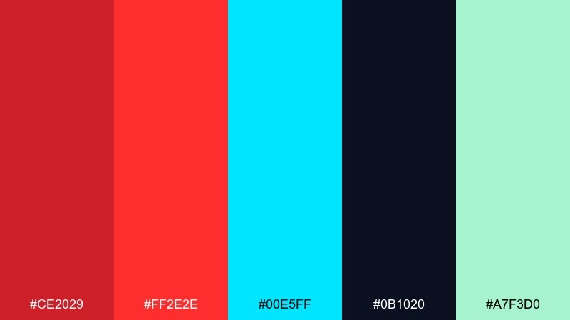
HEX: #CE2029 #FF2E2E #00E5FF #0B1020 #A7F3D0
Mood: electric, futuristic, nightlife
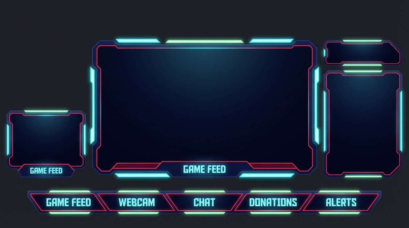
Best for: gaming stream overlay UI
Electric and futuristic, it evokes neon signage streaking past a night drive. Cyan brings that arcade glow, while the deep navy keeps the highlights crisp and readable. Perfect for gaming overlays, esports graphics, and punchy UI accents. Tip: keep the background almost entirely navy and use red and cyan as alternating highlight states to avoid visual noise.
Image example of neon night drive generated using media.io
14) Bridal Red Accent
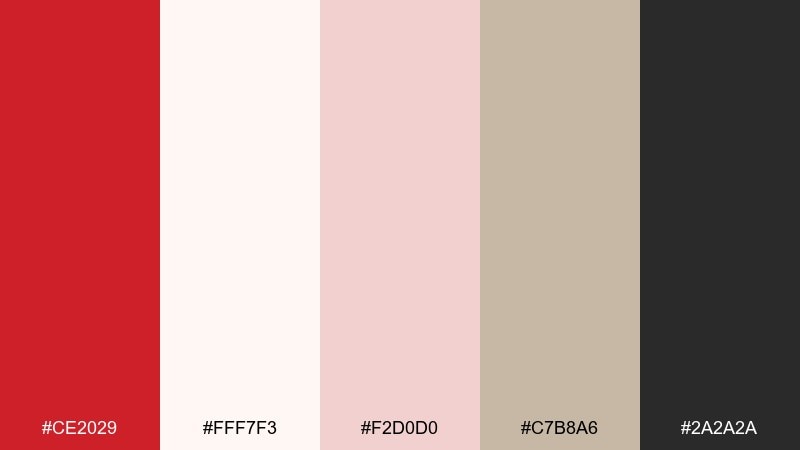
HEX: #CE2029 #FFF7F3 #F2D0D0 #C7B8A6 #2A2A2A
Mood: romantic, soft, elegant
Best for: wedding invitation suite
Romantic and soft, it suggests silk ribbons, blush florals, and a single red wax seal. Cream and blush make the palette airy, while charcoal keeps details sharp and formal. Ideal for wedding invitations, save-the-dates, and elegant stationery sets. Tip: keep red for a monogram, seal, or tiny border so the overall feel stays refined.
Image example of bridal red accent generated using media.io
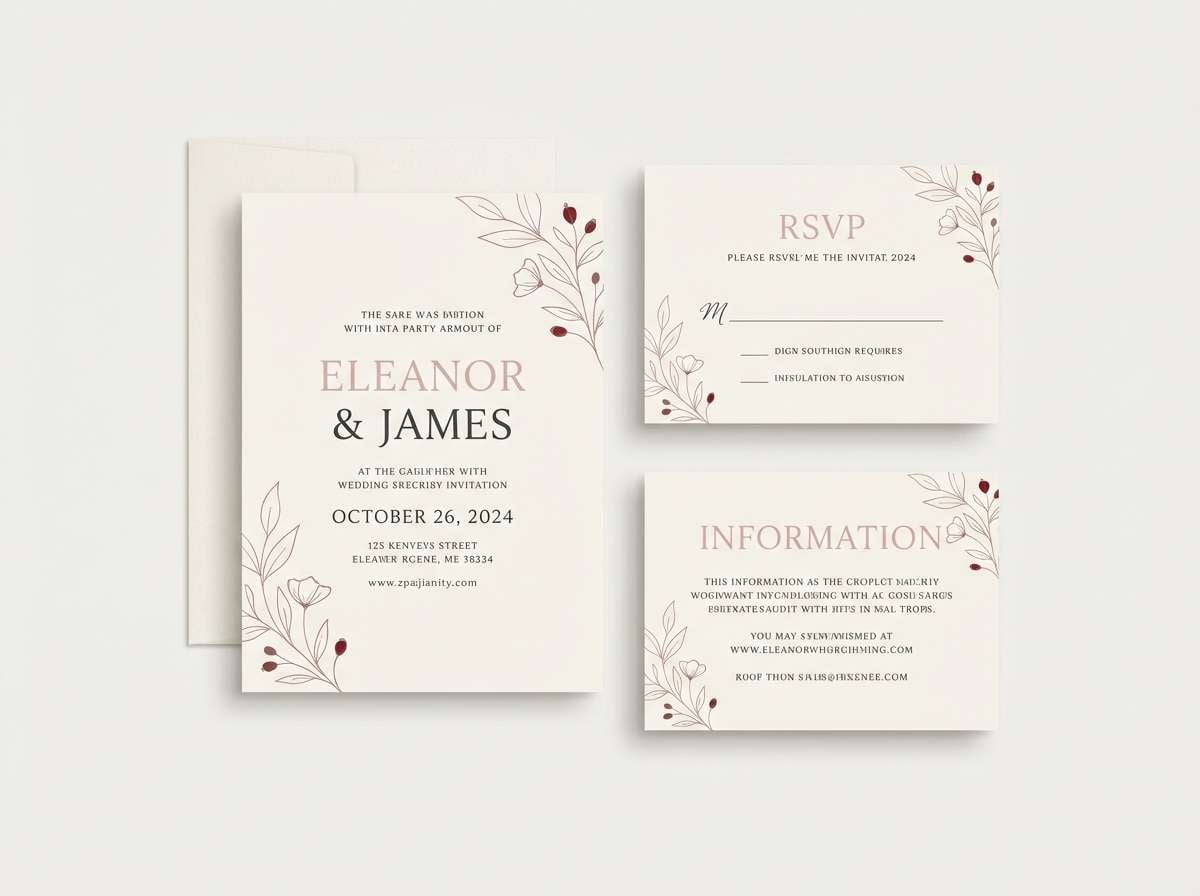
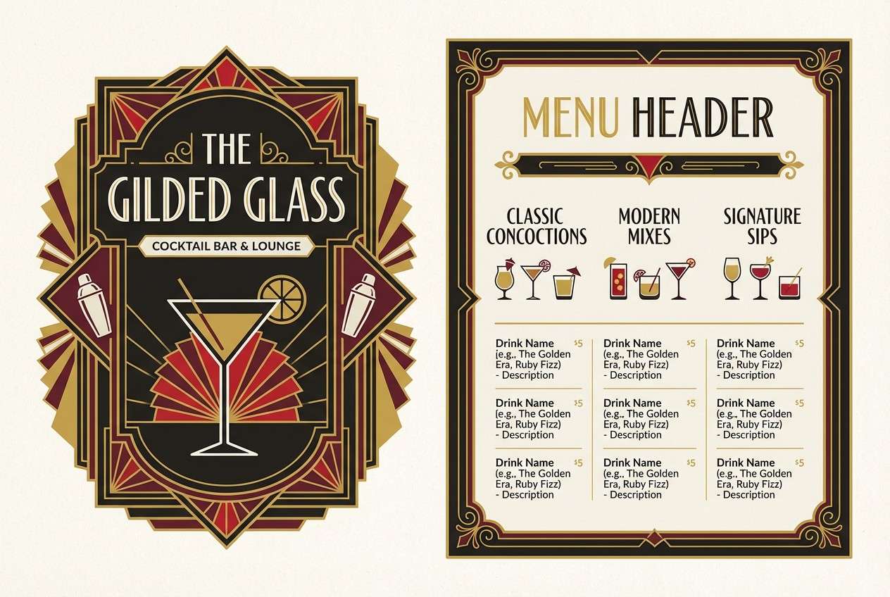
15) Art Deco Maroon
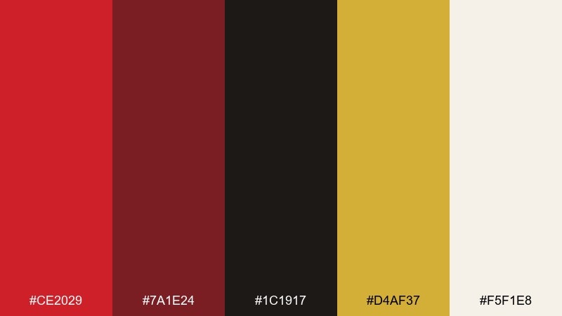
HEX: #CE2029 #7A1E24 #1C1917 #D4AF37 #F5F1E8
Mood: glamorous, vintage, upscale
Best for: cocktail bar logo
Glamorous and vintage, it recalls velvet booths, brass fixtures, and art deco geometry. Gold adds instant luxury, while black-brown and ivory keep the look grounded and readable. Strong for cocktail bar logos, menus, and premium packaging. Tip: use gold as thin lines or frames, and let maroon carry larger blocks so it prints cleanly.
Image example of art deco maroon generated using media.io
16) Kids Carnival
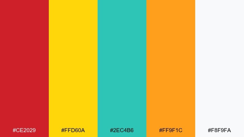
HEX: #CE2029 #FFD60A #2EC4B6 #FF9F1C #F8F9FA
Mood: cheerful, bright, playful
Best for: kids birthday flyer
Cheerful and bright, it feels like balloons, popcorn, and painted signs at a weekend fair. The sunny yellow and orange keep the red upbeat, while teal adds a fun twist without turning chaotic. Great for kids birthday flyers, school events, and playful brand posts. Tip: use the off-white as a big background area so the brights can breathe.
Image example of kids carnival generated using media.io
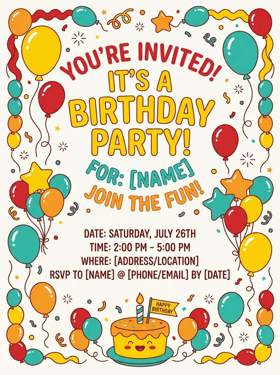
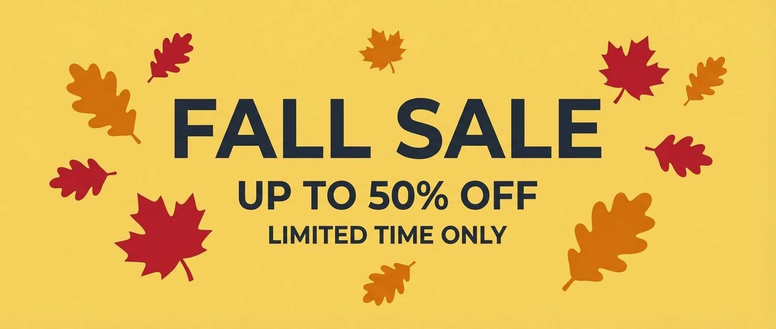
17) Autumn Bonfire
HEX: #CE2029 #D97706 #7C2D12 #FDE68A #1F2937
Mood: warm, rustic, seasonal
Best for: fall sale banner
Warm and seasonal, it brings to mind bonfire sparks and toasted leaves. Orange and amber create a natural gradient next to red, while the deep slate gives structure for type. Ideal for fall sale banners, harvest event promos, and cozy product launches. Tip: use amber for backgrounds and keep red for price tags or the main offer.
Image example of autumn bonfire generated using media.io
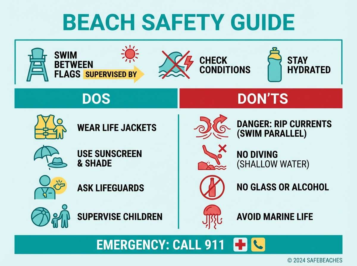
18) Coastal Lifeguard
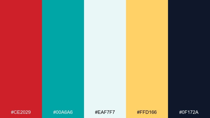
HEX: #CE2029 #00A6A6 #EAF7F7 #FFD166 #0F172A
Mood: fresh, sunny, sporty
Best for: beach safety infographic
Fresh and sporty, it feels like lifeguard flags against bright water. Aqua and pale ice tones cool the red down, while warm yellow adds sunlight without overpowering. A crisp fire engine red color combination for infographics, beach events, and summer signage that must read quickly. Tip: use aqua blocks for sections and place red only on warnings and key icons for instant scanning.
Image example of coastal lifeguard generated using media.io
19) Tech Dashboard Red
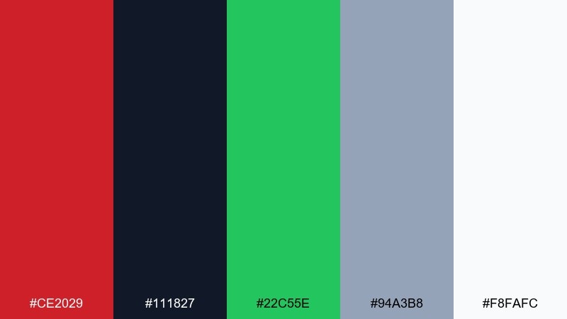
HEX: #CE2029 #111827 #22C55E #94A3B8 #F8FAFC
Mood: efficient, data-driven, crisp
Best for: analytics dashboard UI
Efficient and data-driven, it looks like status lights on a dark control panel. Red becomes a clear alert color, while green supports success states without confusing the hierarchy. Perfect for analytics dashboards, admin panels, and monitoring tools. Tip: set red only for errors and critical actions, and keep most UI surfaces in slate and off-white for focus.
Image example of tech dashboard red generated using media.io
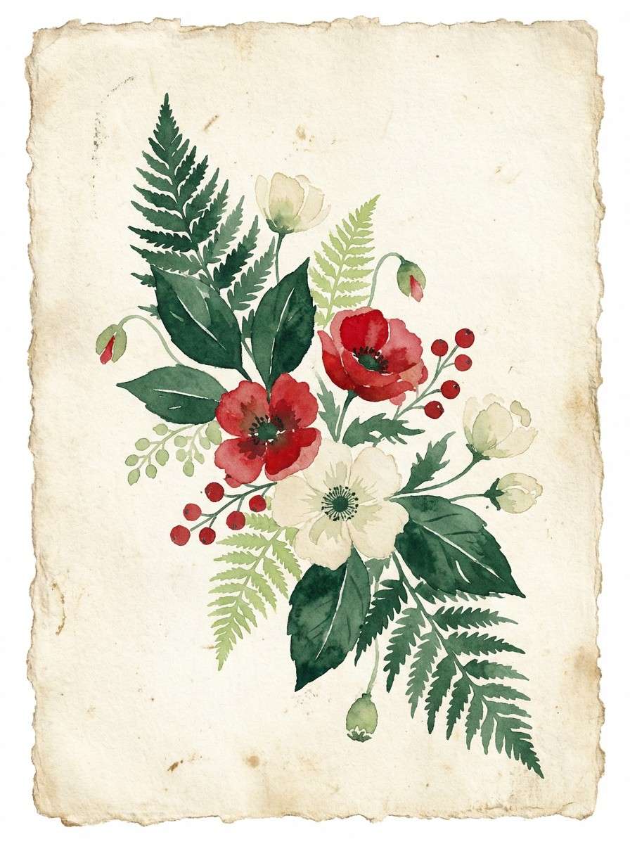
20) Botanical Crimson
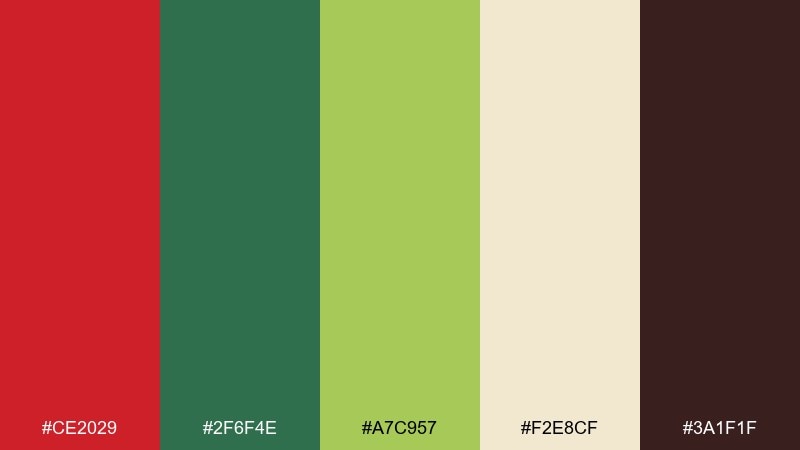
HEX: #CE2029 #2F6F4E #A7C957 #F2E8CF #3A1F1F
Mood: natural, vibrant, garden-fresh
Best for: watercolor botanical print
Natural and vibrant, it evokes crimson blooms framed by leafy greens and warm parchment paper. The greens keep the red from feeling too loud, and the dark brown adds an earthy anchor for outlines or captions. Ideal for botanical prints, farmers market branding, and eco-minded packaging. Tip: let the cream act as paper texture, then layer red in small petals or fruit accents for balance.
Image example of botanical crimson generated using media.io
What Colors Go Well with Fire Engine Red?
Fire engine red pairs best with grounding neutrals like charcoal, near-black, slate, and warm ivory—these keep readability high and prevent the red from overpowering the design.
For accents, gold and amber add a premium, celebratory tone, while teal and cyan create a sporty or futuristic contrast. Blush and peach can soften the intensity for wellness, beauty, or romantic themes.
If you want a bolder mood, lean into adjacent red family shades (maroon, magenta-red) for depth, then keep your background light or very dark to preserve contrast.
How to Use a Fire Engine Red Color Palette in Real Designs
Use fire engine red as a “signal” color: CTAs, price tags, key icons, and headline highlights. The simplest rule is one primary red action per screen or section, with neutrals doing most of the layout work.
For print (posters, packaging, flyers), reserve red for focal elements and balance it with warm paper tones or deep darks. This prevents visual fatigue and helps typography stay crisp.
In UI and dashboards, treat red as an alert state first—then as a brand accent second. Pair it with consistent spacing and a limited accent palette so users always understand what red means.
Create Fire Engine Red Palette Visuals with AI
If you have a palette but need matching visuals (posters, brand boards, menu layouts, or UI mockups), text-to-image generation is a fast way to explore styles without starting from scratch.
Reuse the prompts above, swap only the layout type (poster, label, dashboard), and keep the HEX colors consistent. This approach helps you build a cohesive set of assets across campaigns.
Generate multiple variations, then pick one direction and standardize where red appears (titles, buttons, warnings) for a cleaner, more professional system.
Fire Engine Red Color Palette FAQs
-
What is the HEX code for fire engine red?
A common digital HEX for fire engine red is #CE2029. It’s a vivid, high-energy red that stays punchy on both light and dark backgrounds. -
Is fire engine red better for CTAs than darker reds?
Often, yes. Fire engine red is brighter and tends to read faster, making it effective for primary buttons and urgent highlights—just use it sparingly to avoid “always urgent” fatigue. -
What neutral colors match fire engine red?
Charcoal, near-black, slate gray, cool white, and warm ivory are the most reliable. They keep contrast high and help red look intentional instead of overwhelming. -
What accent colors pair well with fire engine red?
Gold/amber for a premium feel, teal/cyan for sporty or modern contrast, and blush/peach for a softer lifestyle tone. Pick one accent and keep the rest neutral. -
How do I keep a fire engine red palette from looking harsh?
Use more negative space, add warm off-whites or creams, and shift large red areas into deeper reds (maroon/burgundy). Let fire engine red appear as highlights rather than full backgrounds. -
Can I use fire engine red in dashboards and admin UI?
Yes—treat it as an alert/error color first. Keep most surfaces in slate/white, and reserve red for critical states or one primary action to maintain clear hierarchy. -
How can I generate on-brand images from a fire engine red palette?
Use a text-to-image tool and include your HEX codes in the prompt. Generate a few variations (poster, label, UI mockup), then standardize where red appears for consistency.
Next: Red Violet Color Palette


