

Astronaut color palettes blend deep space navies, cool metals, and high-visibility accents—tones that instantly signal precision, exploration, and modern tech.
Below are 20+ space-inspired astronaut color combinations with HEX codes, moods, and practical tips for UI, branding, posters, and product visuals.
In this article
- Why Astronaut Palettes Work So Well
-
- orbital night
- lunar dust
- spacewalk neon
- mission patch
- capsule interior
- stargazer teal
- cosmic salmon
- zero gravity pastel
- meteorite bronze
- deep space navy
- satellite silver
- aurora window
- martian sand
- docking bay
- helmet reflection
- control panel
- nebula violet
- comet tail
- asteroid quarry
- galactic minimal
- radiant horizon
- cryo chamber
- What Colors Go Well with Astronaut?
- How to Use a Astronaut Color Palette in Real Designs
- Create Astronaut Palette Visuals with AI
Why Astronaut Palettes Work So Well
Astronaut palettes are built on contrast: deep navies and near-blacks create “space” and focus, while pale neutrals improve readability and add a clean, engineered feel.
They also borrow from real-world cues—spacesuits, control panels, telemetry screens, and mission patches—so the scheme feels credible for modern tech, science, and product design.
Finally, a single warm accent (gold, orange, coral, or red) gives instant hierarchy for CTAs, alerts, and highlights without cluttering the interface.
20+ Astronaut Color Palette Ideas (with HEX Codes)
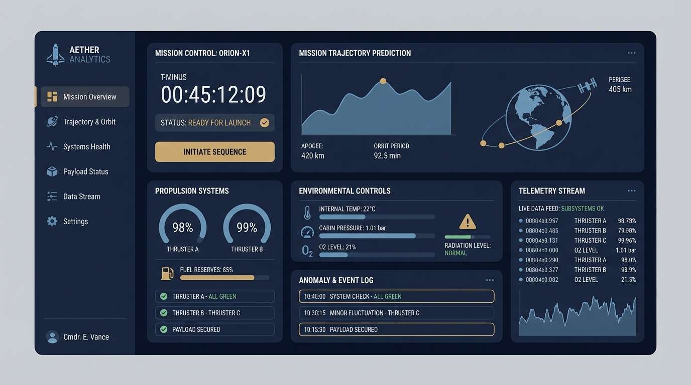
1) Orbital Night
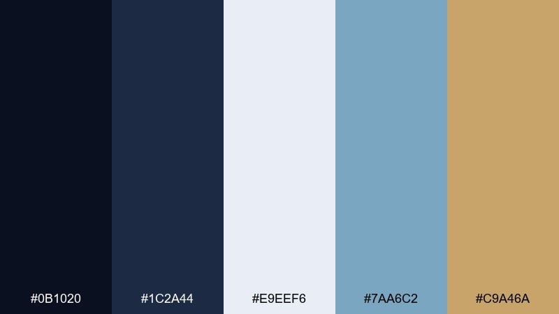
HEX: #0b1020 #1c2a44 #e9eef6 #7aa6c2 #c9a46a
Mood: cinematic, calm, technical
Best for: dark mode UI dashboard
Cinematic and calm like a quiet orbit over city lights. The deep navy base keeps interfaces focused, while icy off-white improves legibility without harsh contrast. Use the steel blue for charts and highlights, then add a small touch of warm gold for calls to action. Tip: reserve the gold for one primary button style to keep the UI feeling precise.
Image example of orbital night generated using media.io
Media.io is an online AI studio for creating and editing video, image, and audio in your browser.

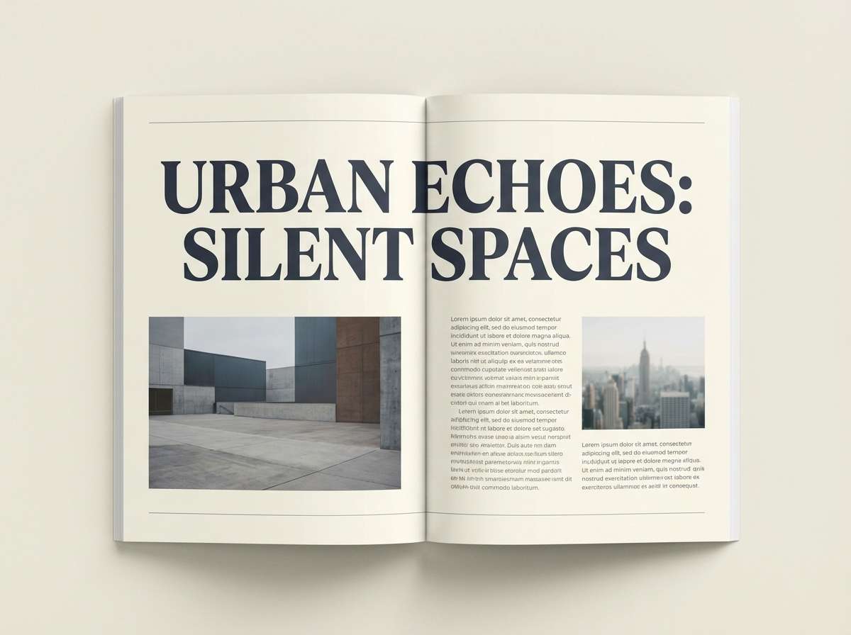
2) Lunar Dust
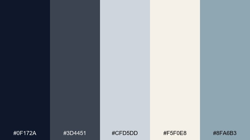
HEX: #0f172a #3d4451 #cfd5dd #f5f0e8 #8fa6b3
Mood: minimal, airy, refined
Best for: editorial magazine layout
Minimal and airy, like moon dust on matte paper. Cool grays and softened cream create a refined canvas for typography-heavy spreads. Use the slate navy for headlines and pull quotes, and let the pale neutrals carry the whitespace. Tip: pair with a condensed sans serif and keep photo treatments slightly desaturated for cohesion.
Image example of lunar dust generated using media.io
3) Spacewalk Neon
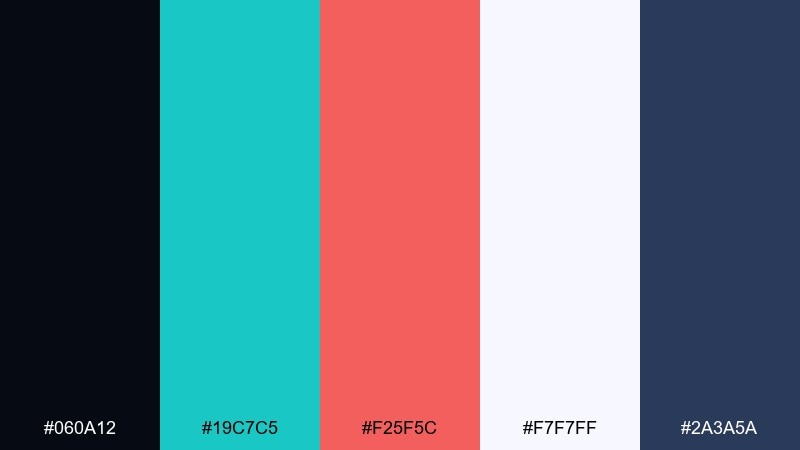
HEX: #060a12 #19c7c5 #f25f5c #f7f7ff #2a3a5a
Mood: electric, playful, high-contrast
Best for: music event poster
Electric and playful, like suit lights blinking against a black sky. The teal and coral create astronaut color combinations that pop hard against near-black, perfect for bold type and simple shapes. Keep the off-white for text blocks and spacing so the neon accents do not overwhelm. Tip: limit gradients and use crisp vector forms for maximum legibility at distance.
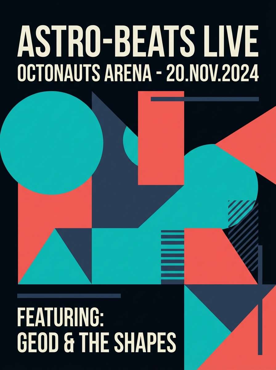
Image example of spacewalk neon generated using media.io
4) Mission Patch
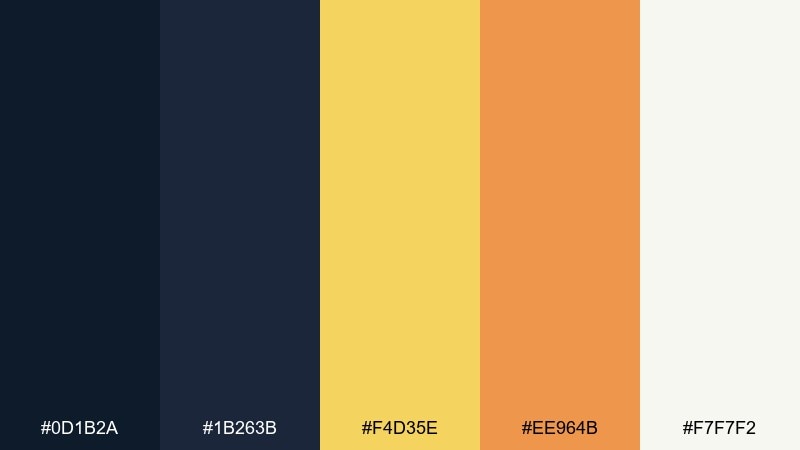
HEX: #0d1b2a #1b263b #f4d35e #ee964b #f7f7f2
Mood: bold, nostalgic, heroic
Best for: brand identity for outdoor gear
Bold and nostalgic, like embroidered patches and vintage mission decals. Navy anchors the set while sunny yellow and warm orange bring a heroic, can-do energy. Use the warm tones as badges, icons, and highlight stripes, and keep the off-white for labels and packaging copy. Tip: try thick outlines and simplified shapes to mimic patch stitching.
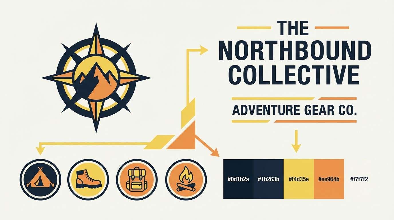
Image example of mission patch generated using media.io
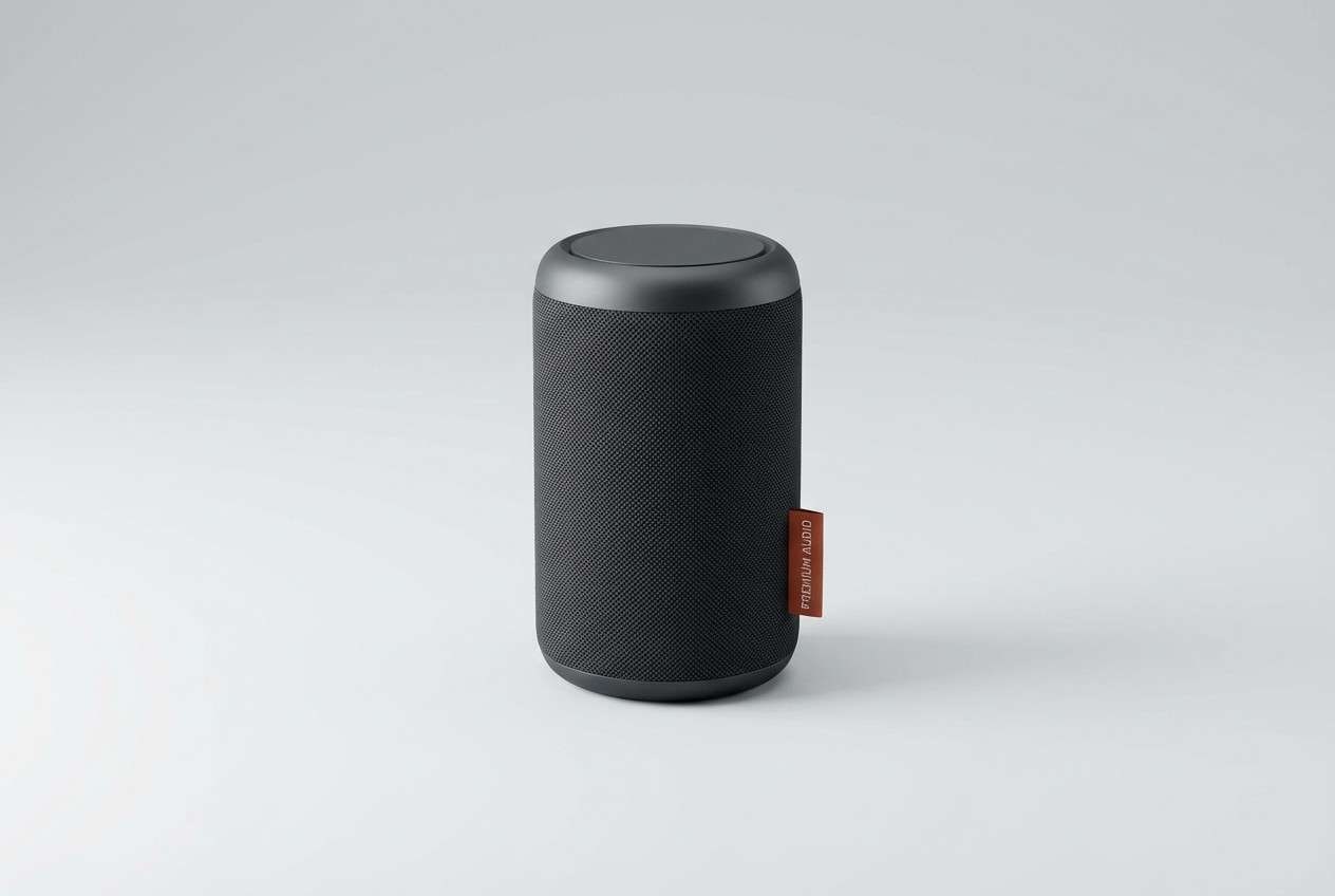
5) Capsule Interior
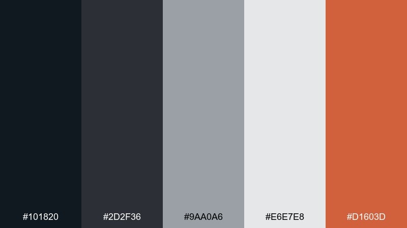
HEX: #101820 #2d2f36 #9aa0a6 #e6e7e8 #d1603d
Mood: industrial, grounded, modern
Best for: product ad for smart speaker
Industrial and grounded, like brushed metal panels inside a capsule. Charcoal and cool grays make the design feel engineered, while a clay-red accent adds warmth and focus. Use the accent sparingly for feature callouts and keep backgrounds clean and light gray for a premium look. Tip: add subtle shadows and soft reflections to emphasize the hardware feel.
Image example of capsule interior generated using media.io
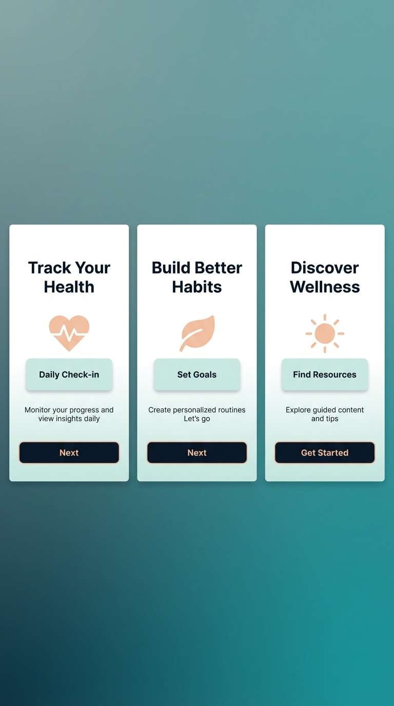
6) Stargazer Teal
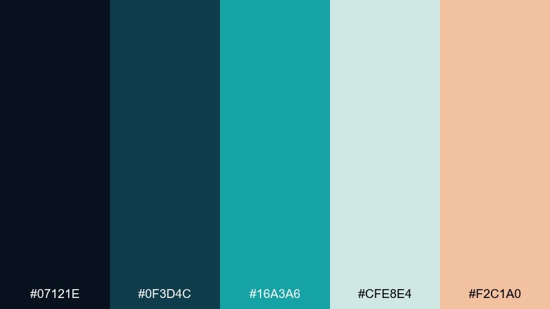
HEX: #07121e #0f3d4c #16a3a6 #cfe8e4 #f2c1a0
Mood: fresh, aquatic, soothing
Best for: wellness app onboarding screens
Fresh and soothing, like looking through a tinted visor over a calm sea. Teal layers build depth without feeling cold, and the soft peach adds a human, friendly touch. Keep the darkest navy for headers and use pale mint as the main background to stay light and breathable. Tip: use rounded cards and gentle gradients within the teal range for a smooth onboarding flow.
Image example of stargazer teal generated using media.io
7) Cosmic Salmon
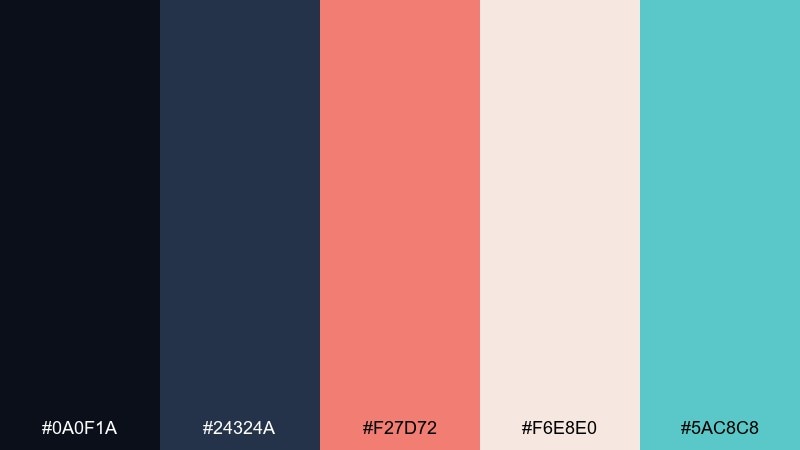
HEX: #0a0f1a #24324a #f27d72 #f6e8e0 #5ac8c8
Mood: warm, modern, optimistic
Best for: social media campaign graphics
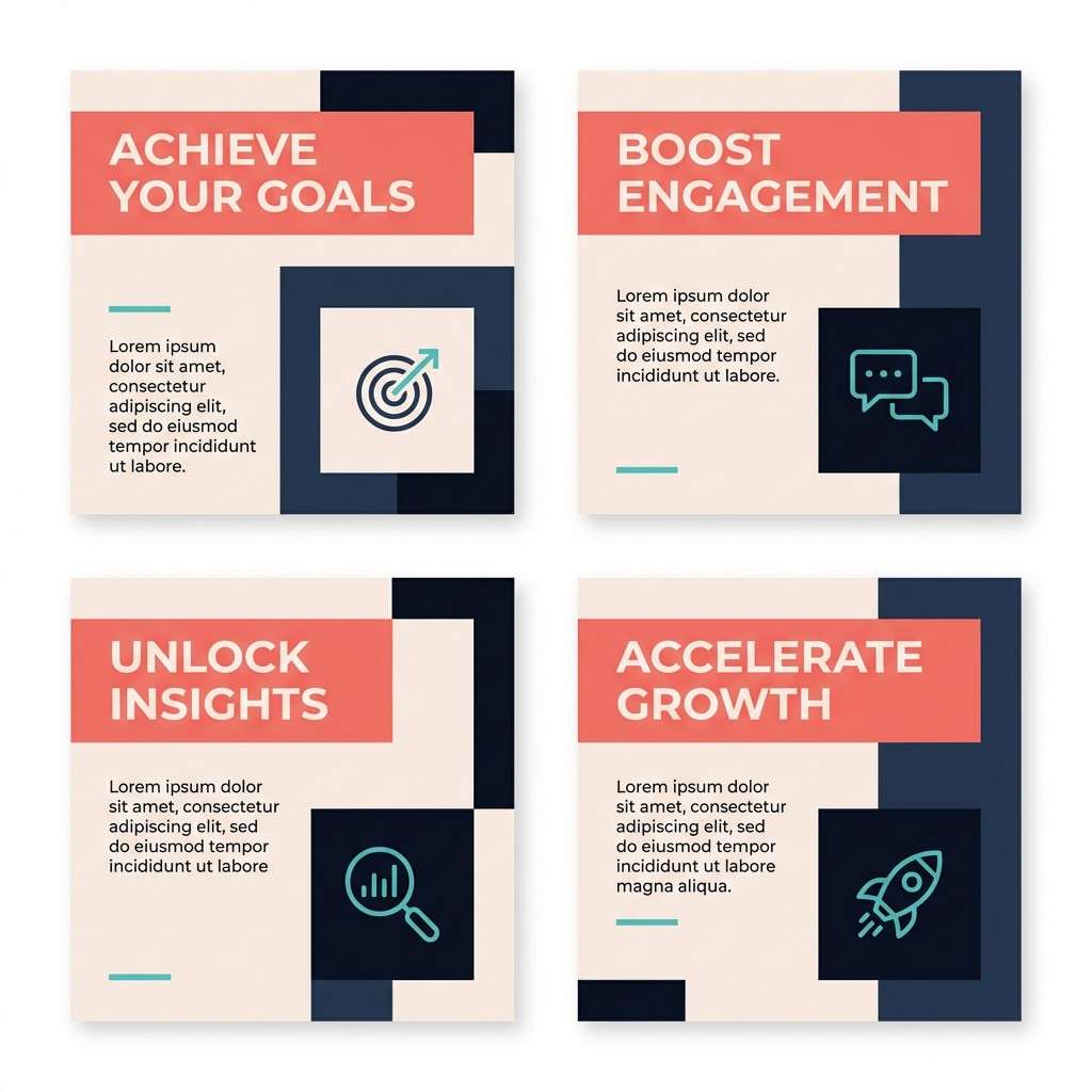
Warm and optimistic, like sunrise glow catching a station window. Salmon feels modern against inky blues, while soft cream keeps layouts airy and readable. Use teal as a secondary accent for icons and subtle underlines to balance the warmth. Tip: pair salmon headlines with navy body text for sharp contrast that still feels friendly.
Image example of cosmic salmon generated using media.io
8) Zero Gravity Pastel
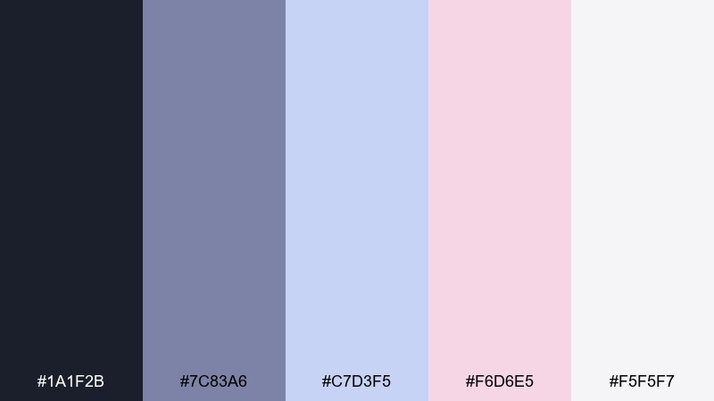
HEX: #1a1f2b #7c83a6 #c7d3f5 #f6d6e5 #f5f5f7
Mood: dreamy, soft, weightless
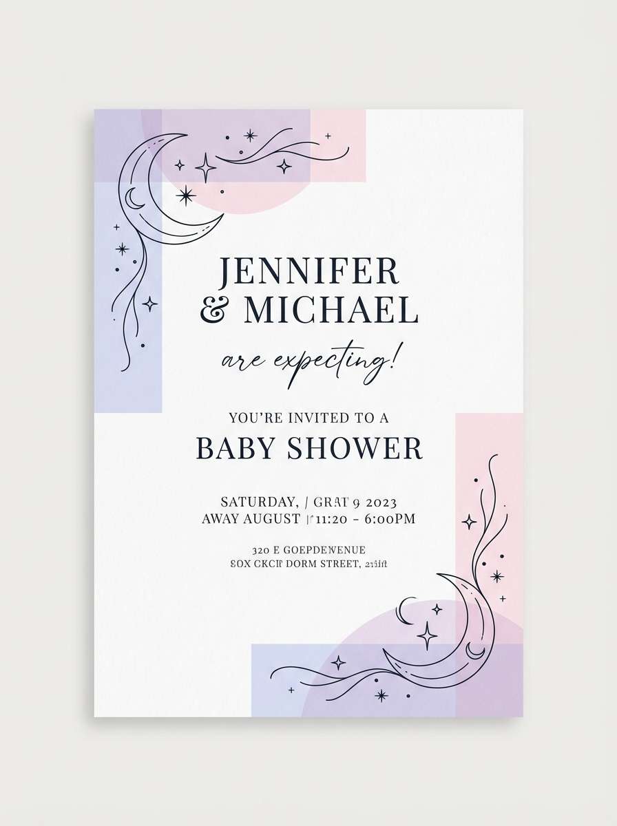
Best for: baby shower invitation design
Dreamy and weightless, like floating fabric under soft cabin lights. The lavender-blue base stays gentle while pastel pink brings sweetness without turning sugary. This astronaut color palette works best with plenty of white space, thin line icons, and clean serif type. Tip: keep print contrast high by using the deep charcoal for text and reserving pastels for borders and illustrations.
Image example of zero gravity pastel generated using media.io
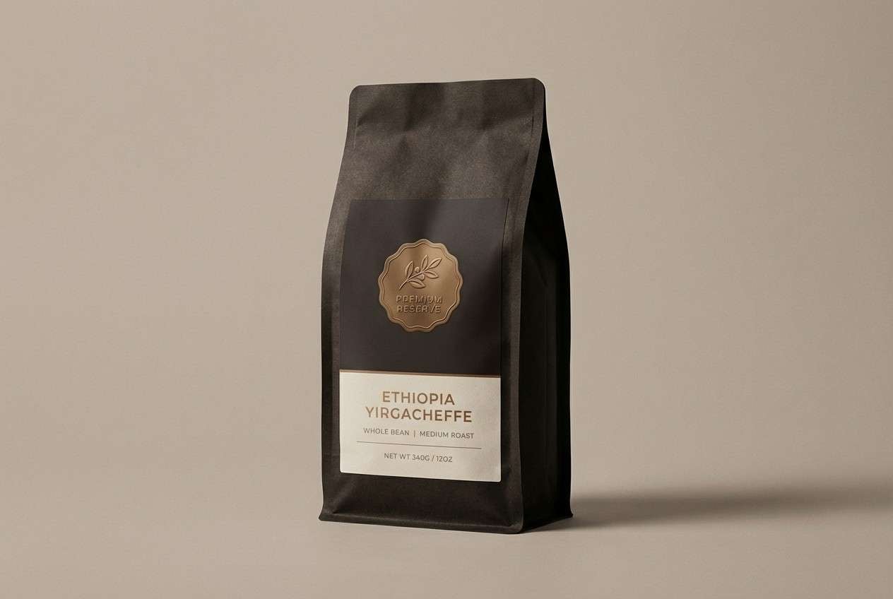
9) Meteorite Bronze
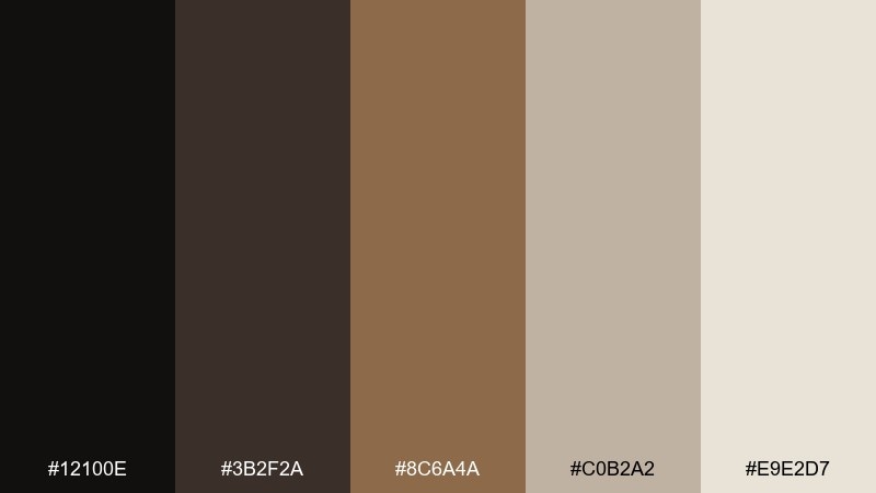
HEX: #12100e #3b2f2a #8c6a4a #c0b2a2 #e9e2d7
Mood: earthy, premium, tactile
Best for: coffee packaging design
Earthy and tactile, like polished stone warmed by bronze light. Dark espresso and cocoa tones feel premium, while soft beige keeps the look approachable on shelves. Use bronze as the hero accent for seals, foils, or a central badge, and keep typography high-contrast for readability. Tip: add subtle grain textures to echo the rugged, mineral vibe without cluttering the label.
Image example of meteorite bronze generated using media.io
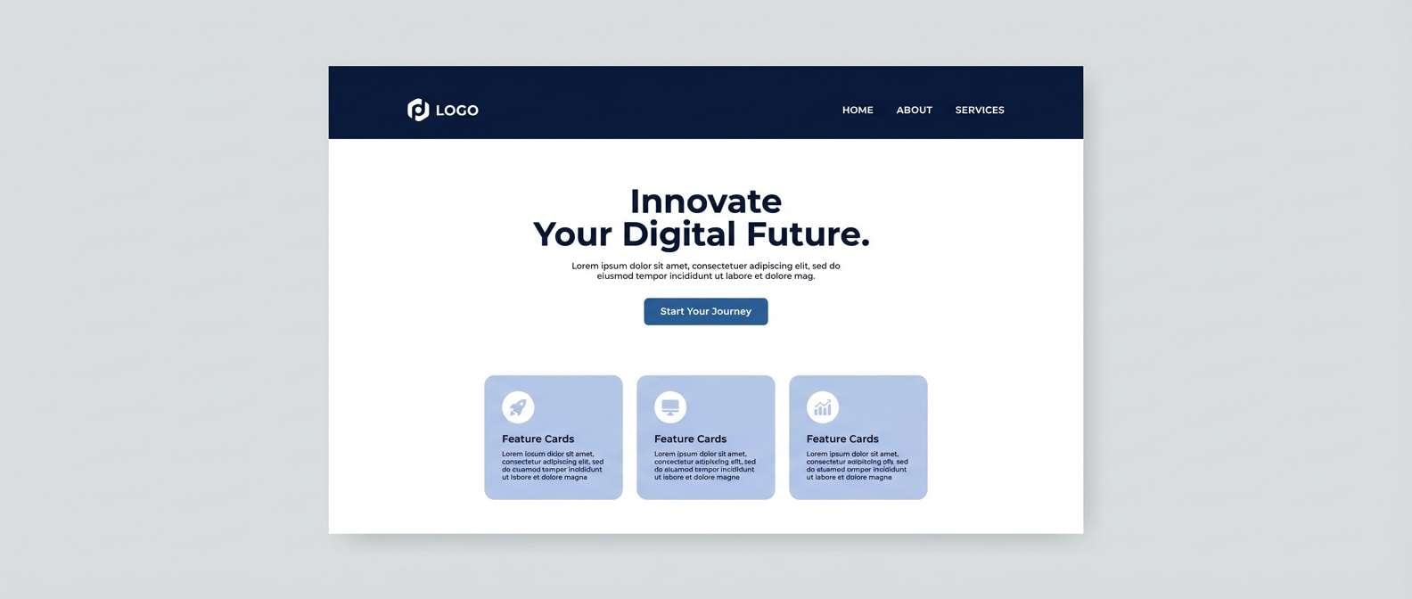
10) Deep Space Navy
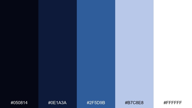
HEX: #050814 #0e1a3a #2f5d9b #b7c8e8 #ffffff
Mood: clean, confident, futuristic
Best for: SaaS website landing page
Clean and confident, like a night launch seen from far away. The navy-to-blue range builds a futuristic hierarchy for sections, buttons, and links. Use white for generous margins, then bring in the pale periwinkle for cards and feature blocks. Tip: keep illustrations simple and geometric so the deep blues stay the main visual story.
Image example of deep space navy generated using media.io
11) Satellite Silver
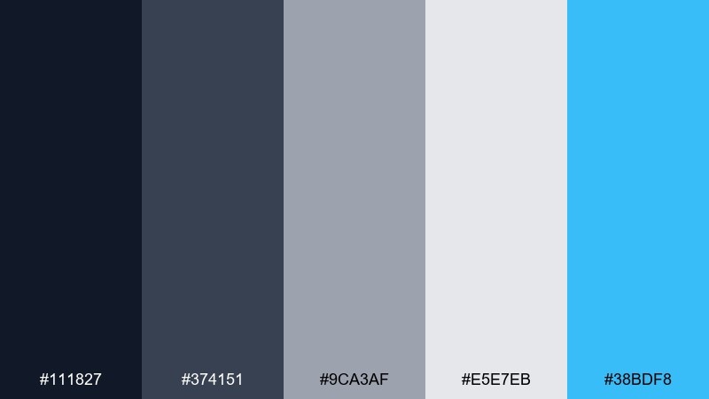
HEX: #111827 #374151 #9ca3af #e5e7eb #38bdf8
Mood: sleek, technical, crisp
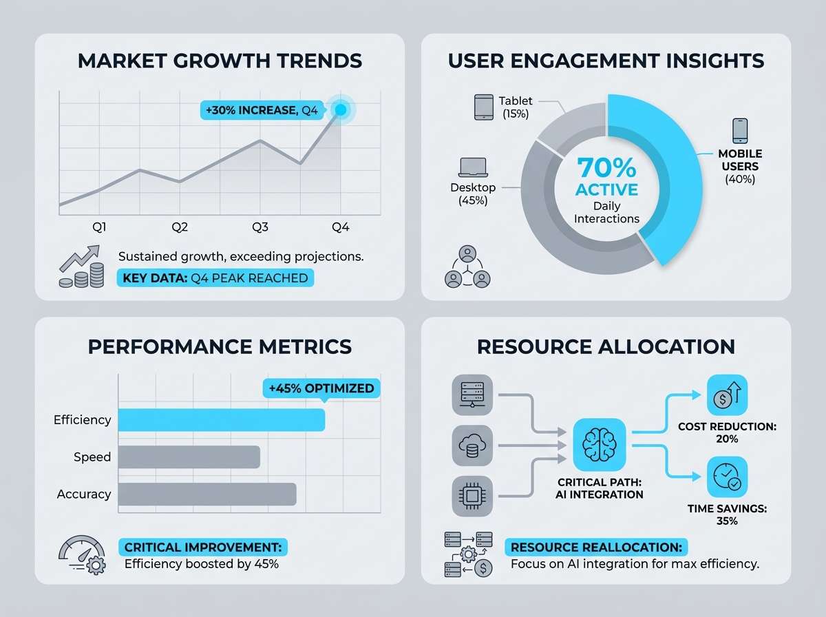
Best for: infographic design
Sleek and technical, like sunlit panels and clean telemetry readouts. Neutral grays keep data-heavy layouts organized, and the sky-cyan accent guides attention across charts. Use the darkest tone for titles and axis labels, with light gray blocks to separate sections. Tip: stick to two chart styles and let the cyan be the single highlight color for key numbers.
Image example of satellite silver generated using media.io
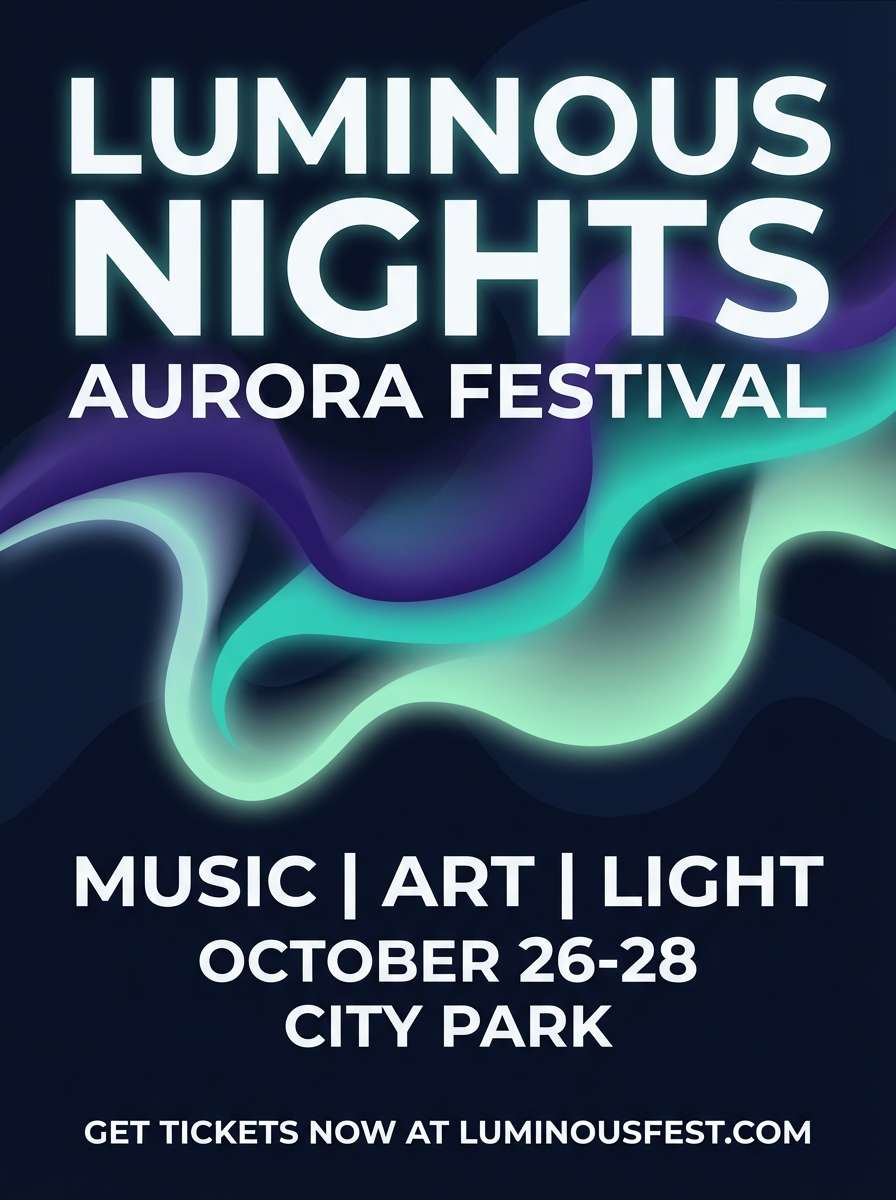
12) Aurora Window
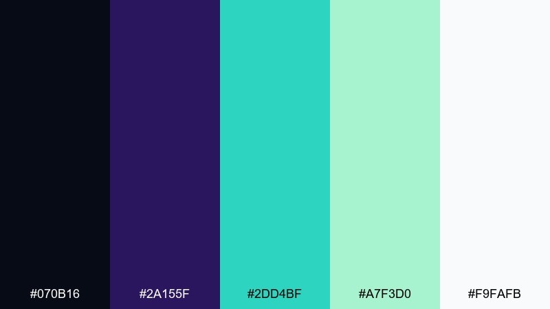
HEX: #070b16 #2a155f #2dd4bf #a7f3d0 #f9fafb
Mood: mystical, luminous, modern
Best for: festival flyer design
Mystical and luminous, like aurora ribbons seen through a cabin window. Violet adds drama while minty teals keep the vibe modern and upbeat. Use the darkest navy as the background to make bright typography and gradient shapes glow. Tip: add a soft glow effect to teal elements, but keep text flat for readability.
Image example of aurora window generated using media.io
13) Martian Sand
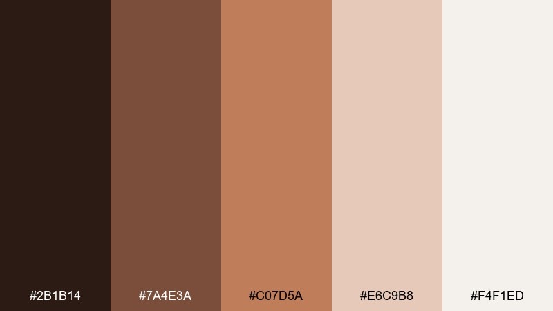
HEX: #2b1b14 #7a4e3a #c07d5a #e6c9b8 #f4f1ed
Mood: warm, rugged, natural
Best for: travel blog header graphics
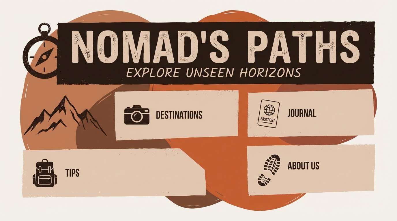
Warm and rugged, like red dust and rock layers under a pale sky. The brown-to-terracotta ramp feels grounded and story-driven for travel content. Use the light beige as a background and bring terracotta in for section dividers, icons, and highlight words. Tip: pair with documentary-style photography and keep overlays semi-transparent for a natural look.
Image example of martian sand generated using media.io
14) Docking Bay
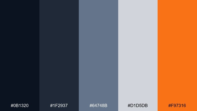
HEX: #0b1320 #1f2937 #64748b #d1d5db #f97316
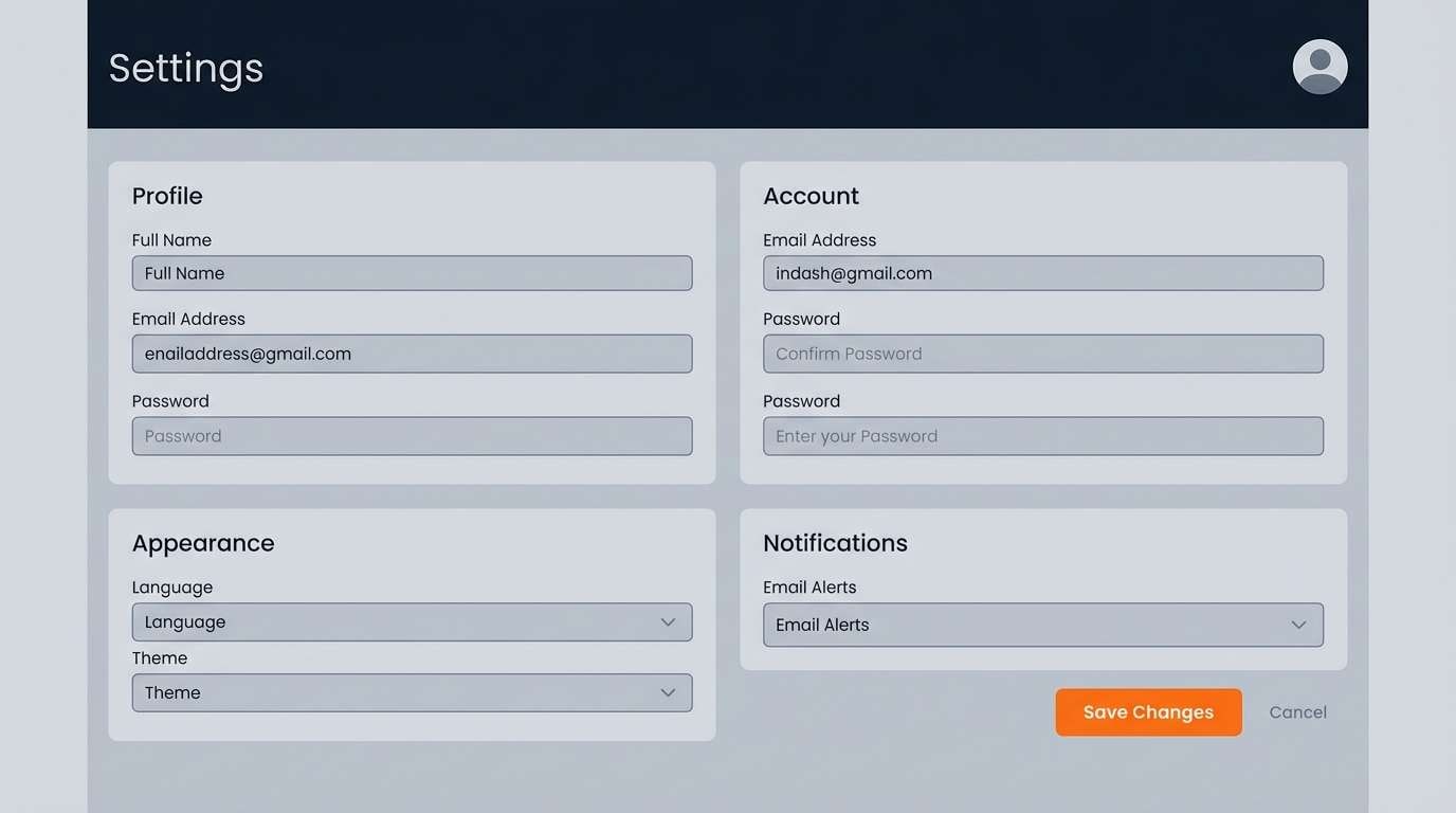
Mood: utilitarian, focused, high-clarity
Best for: web app settings page UI
Utilitarian and focused, like a well-lit docking bay with clear signage. Cool grays keep form-heavy screens organized, and a single orange accent helps key actions stand out. This astronaut color scheme pairs best with simple icons, strong spacing, and clear label hierarchy. Tip: use orange only for primary actions and warnings so it stays meaningful.
Image example of docking bay generated using media.io
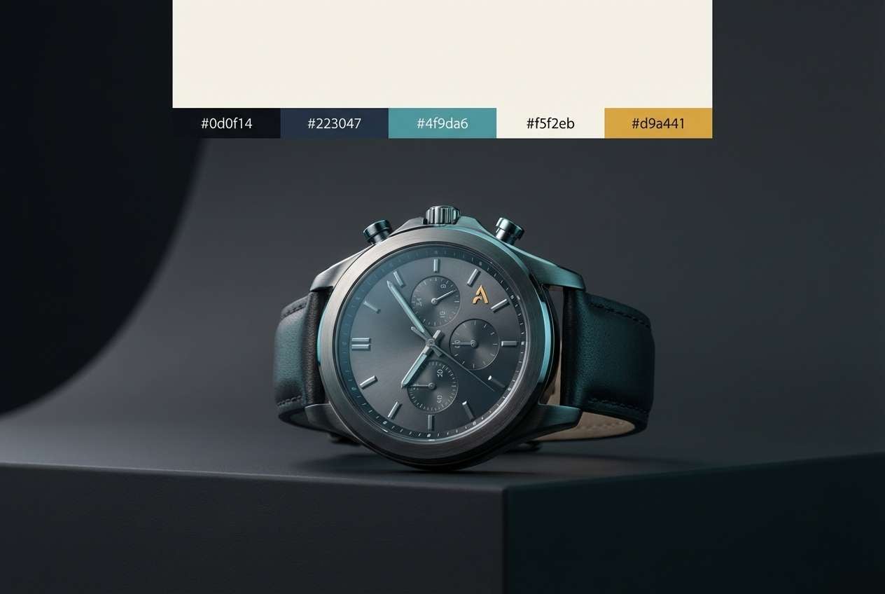
15) Helmet Reflection
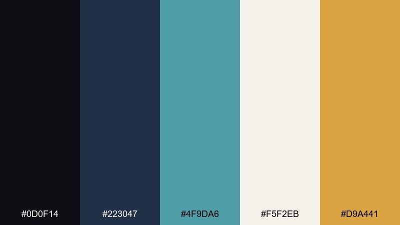
HEX: #0d0f14 #223047 #4f9da6 #f5f2eb #d9a441
Mood: polished, cinematic, luxe
Best for: premium watch ad
Polished and cinematic, like a visor catching light on a dark runway. Teal gives a cool reflective sheen, while warm gold reads as premium and intentional. Use the cream tone as negative space for copy, then keep dark charcoal for the hero background. Tip: make the gold a small focal point, such as a logo stamp or thin border, to avoid looking flashy.
Image example of helmet reflection generated using media.io
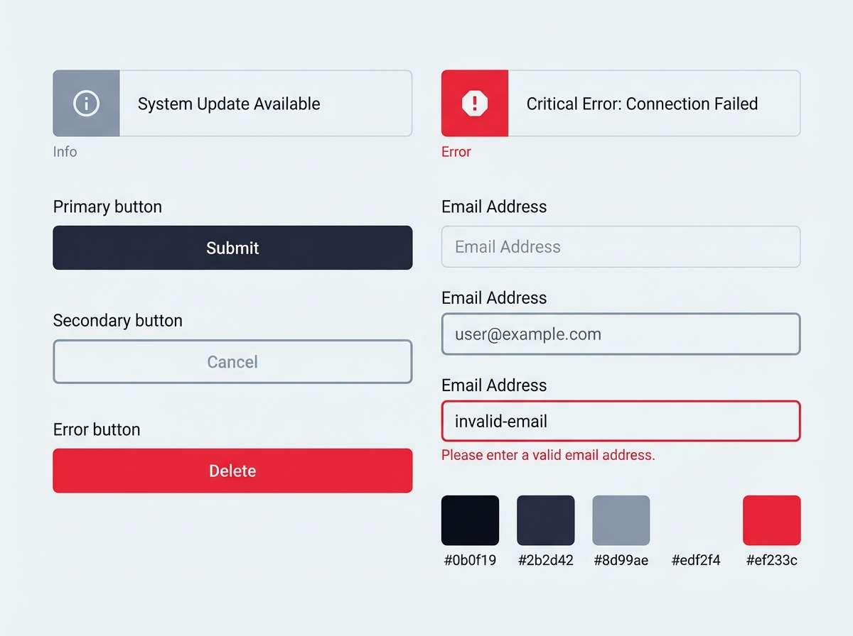
16) Control Panel
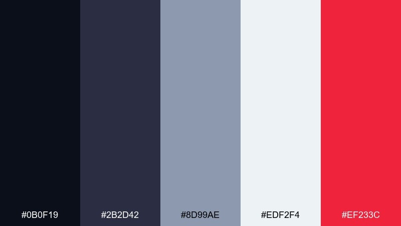
HEX: #0b0f19 #2b2d42 #8d99ae #edf2f4 #ef233c
Mood: alert, structured, modern
Best for: security alert UI component set
Alert and structured, like blinking warnings on a control panel. Cool neutrals keep the components consistent, and the sharp red demands attention for critical states. Use red only for errors and urgent notifications, and let the light background handle readability. Tip: add subtle borders in the mid-gray so cards separate cleanly without heavy shadows.
Image example of control panel generated using media.io
17) Nebula Violet
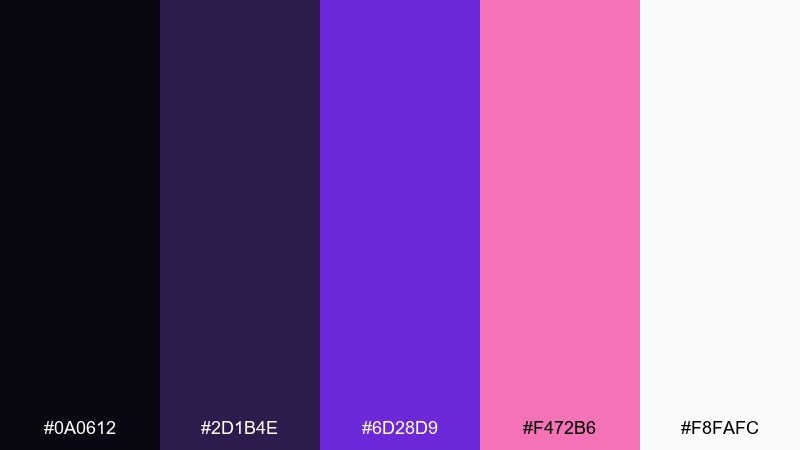
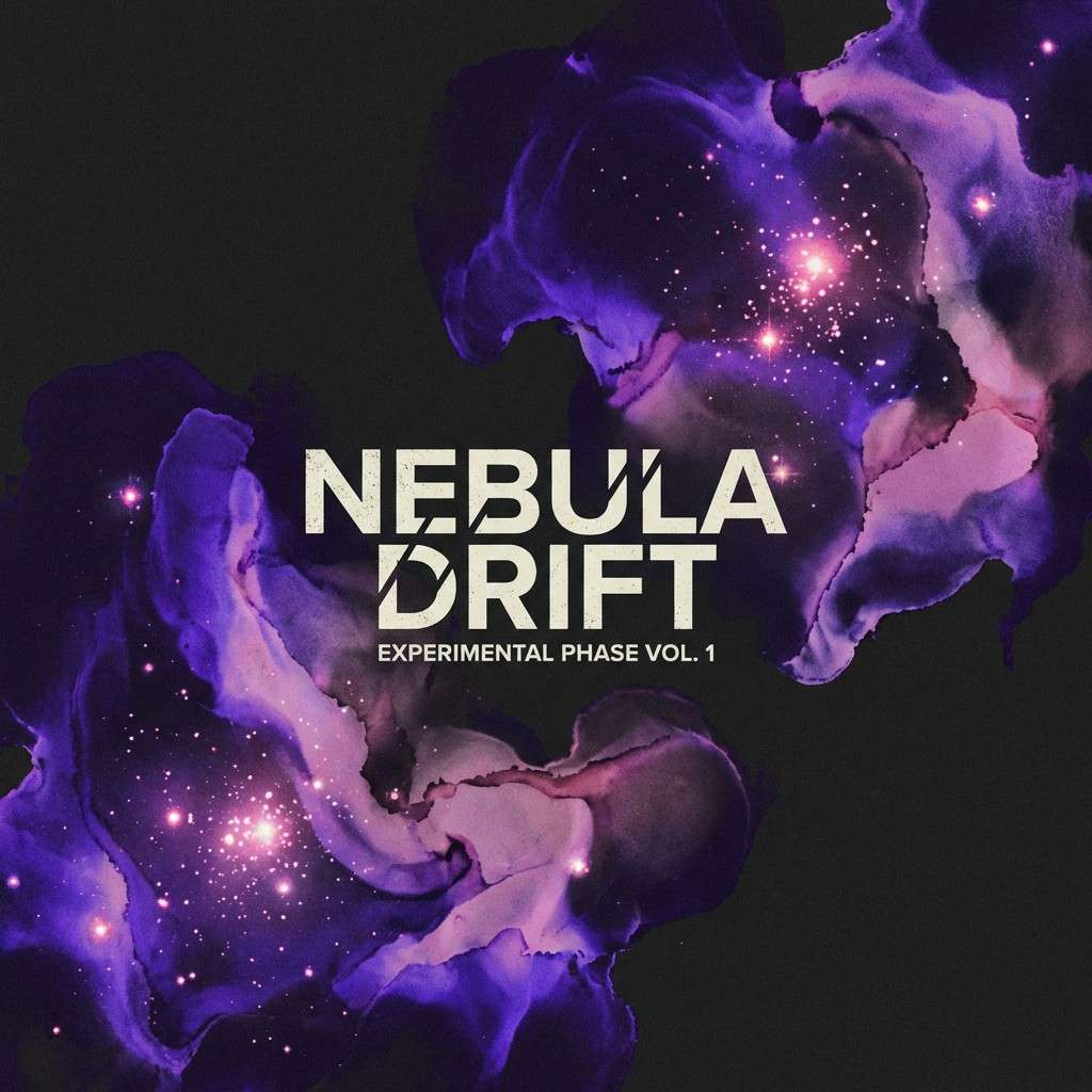
HEX: #0a0612 #2d1b4e #6d28d9 #f472b6 #f8fafc
Mood: creative, dreamy, expressive
Best for: album cover artwork
Creative and dreamy, like violet gas clouds lit from within. Saturated purple and pink make a bold focal point, while near-black adds depth and drama. Use the off-white for artist name and track details so type stays crisp over dark areas. Tip: keep imagery abstract and let the color contrast do the storytelling.
Image example of nebula violet generated using media.io
18) Comet Tail
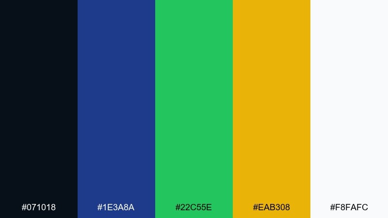
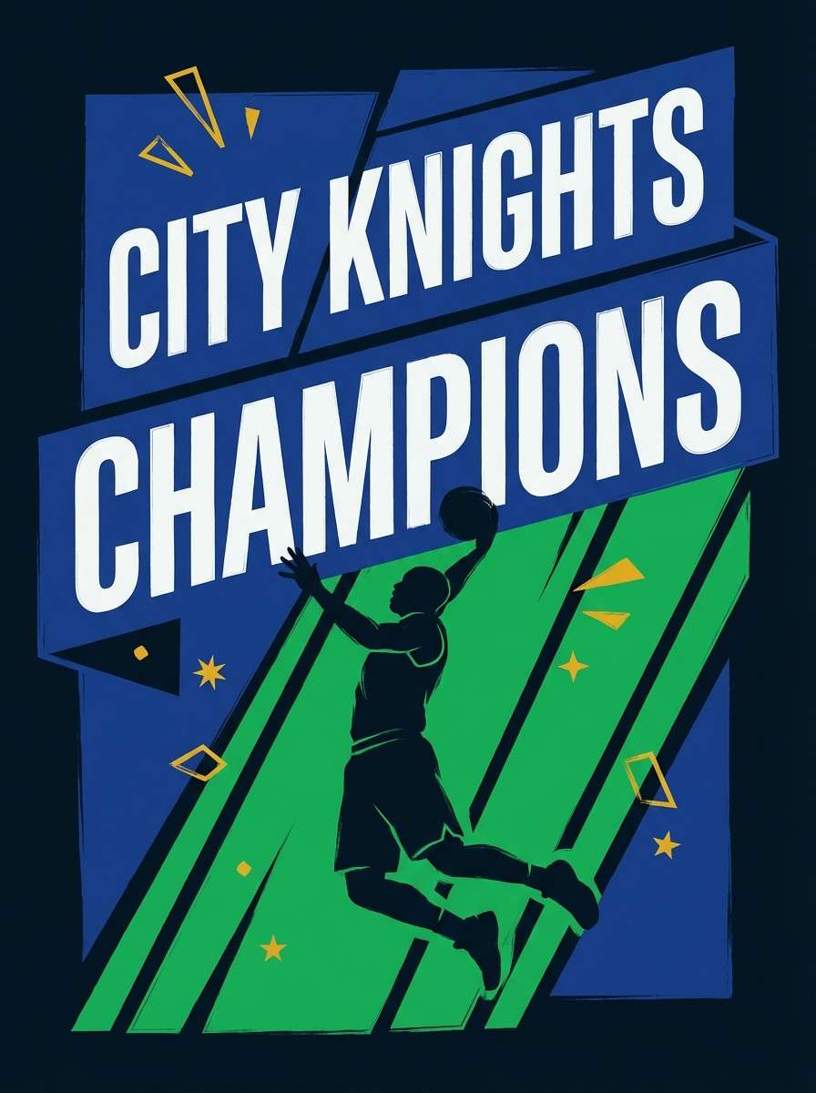
HEX: #071018 #1e3a8a #22c55e #eab308 #f8fafc
Mood: energetic, sporty, upbeat
Best for: sports team poster
Energetic and sporty, like a comet streaking across a night sky. The blue foundation feels strong, while green and gold add momentum and optimism. These astronaut color combinations work best with bold numbers, sharp angles, and a simple two-color hierarchy. Tip: pick blue plus one accent as dominant, and keep the second accent for small highlights only.
Image example of comet tail generated using media.io
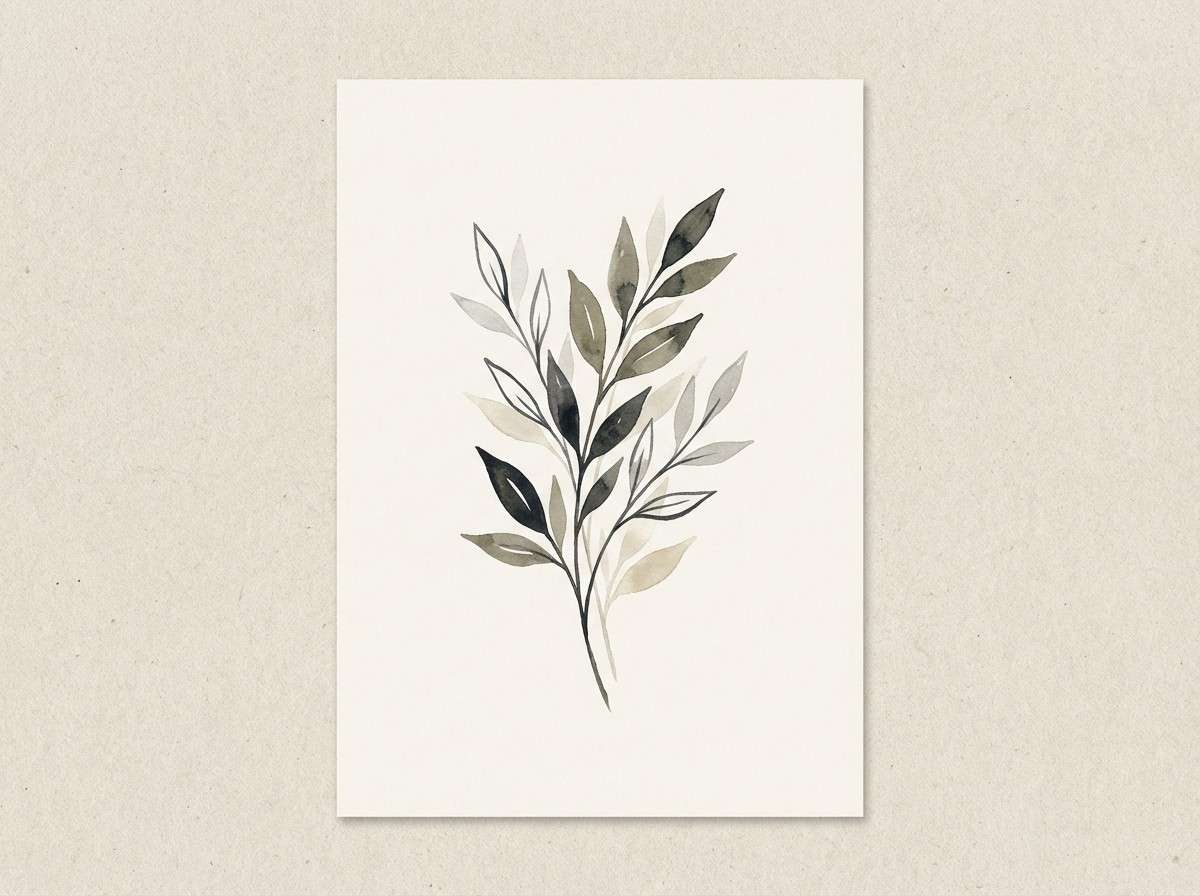
19) Asteroid Quarry
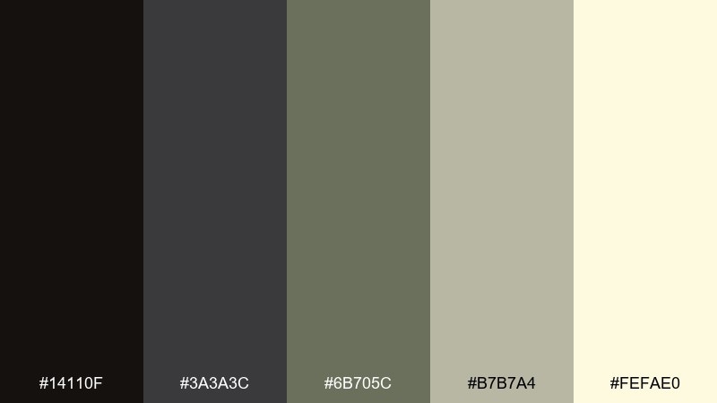
HEX: #14110f #3a3a3c #6b705c #b7b7a4 #fefae0
Mood: muted, organic, steady
Best for: botanical illustration print
Muted and organic, like stone, lichen, and pale desert light. The olive-gray tones feel steady and calming, ideal for natural subjects with a modern edge. Use the cream as paper tone and keep the darkest charcoal for outlines and captions. Tip: let one mid-tone green-gray dominate the illustration and layer the other neutrals as gentle shading.
Image example of asteroid quarry generated using media.io
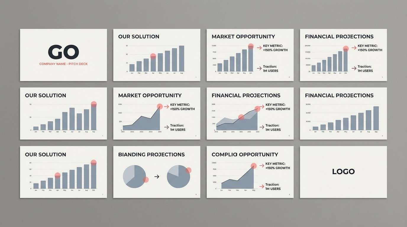
20) Galactic Minimal
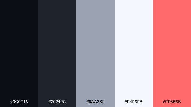
HEX: #0c0f16 #20242c #9aa3b2 #f4f6fb #ff6b6b
Mood: minimal, sharp, contemporary
Best for: startup pitch deck template
Minimal and sharp, like a clean lab with a single status light. Cool neutrals keep slides professional, and the soft red accent adds energy for key metrics and highlights. This astronaut color palette is strongest when you keep charts monochrome and use the accent only for one data series. Tip: set consistent spacing and rely on big headings to create rhythm across slides.
Image example of galactic minimal generated using media.io
21) Radiant Horizon
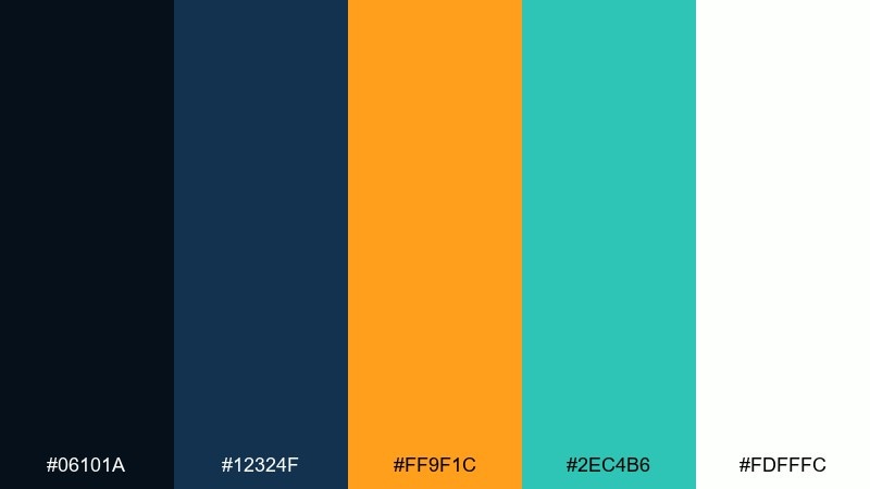
HEX: #06101a #12324f #ff9f1c #2ec4b6 #fdfffc
Mood: bright, adventurous, optimistic
Best for: travel app promotional banner
Bright and adventurous, like a horizon line glowing before liftoff. Orange feels bold and friendly, while teal keeps it fresh and modern. Use the deep blue for structure and navigation elements, then let white space make the accents breathe. Tip: keep the banner simple with one headline, one button, and two accent shapes for a clean conversion-focused layout.
Image example of radiant horizon generated using media.io

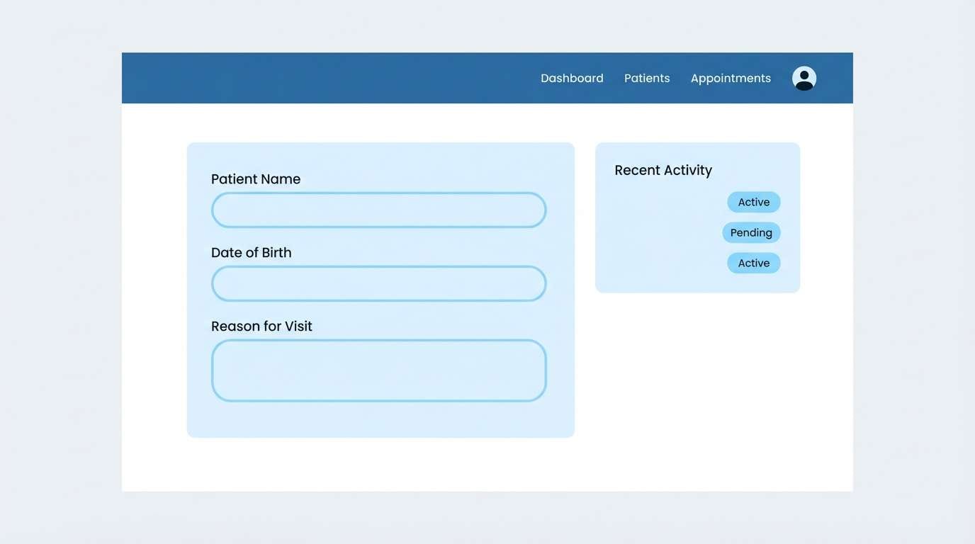
22) Cryo Chamber
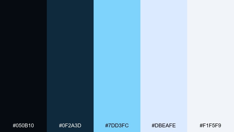
HEX: #050b10 #0f2a3d #7dd3fc #dbeafe #f1f5f9
Mood: cool, sterile, serene
Best for: healthcare web UI
Cool and serene, like frosted glass and quiet blue light. The blues stay clean and reassuring, which is ideal for medical or healthcare interfaces. Use the darkest tone for navigation, then apply the pale blues for cards, status pills, and gentle backgrounds. Tip: keep icon strokes thin and consistent so the UI feels clinical but still welcoming.
Image example of cryo chamber generated using media.io
What Colors Go Well with Astronaut?
Astronaut palettes pair best with deep navies/charcoals plus clean neutrals (off-white, silver, cool gray) to keep layouts readable and technical.
For accents, choose one “signal color” inspired by space hardware: safety orange, mission red, solar yellow, visor gold, or cyan/teal for UI highlights and data states.
If you want a softer astronaut look, add muted pastels (mint, periwinkle, blush) while keeping a dark anchor color for contrast and typography.
How to Use a Astronaut Color Palette in Real Designs
Start with a dark base for navigation or hero sections, then use light neutrals for surfaces (cards, panels, editorial margins) to create a cockpit-like hierarchy.
Keep accents disciplined: one primary CTA color, one secondary highlight color, and let the rest stay grayscale so the design feels precise instead of noisy.
In branding and posters, lean on bold blocks and clean geometry; in product visuals, add subtle shadows and metallic textures to echo capsule interiors and suit materials.
Create Astronaut Palette Visuals with AI
Want to see these astronaut HEX codes in action before you commit to a full design system? Generate fast concept mockups—UI screens, posters, packaging, or brand boards—using a short text prompt.
With Media.io, you can iterate quickly: swap accents, test contrast, and produce multiple layout directions while keeping the same color story.
Pick a palette above, reuse its prompt, then adjust the subject (dashboard, flyer, product shot) to match your project.
Astronaut Color Palette FAQs
-
What is an astronaut color palette?
An astronaut color palette is a space-inspired scheme that typically combines deep navies/near-black “space” tones, cool grays or off-whites for readability, and one high-visibility accent (teal, orange, coral, red, or gold) for hierarchy. -
Which astronaut colors are best for dark mode UI?
Use near-black or deep navy as the base, off-white for text, and one calm accent like cyan/teal or muted gold. Palettes like Orbital Night, Deep Space Navy, and Docking Bay are designed for clear contrast and focus. -
How do I keep an astronaut palette from looking too dark?
Increase the proportion of light neutrals (white, cream, pale gray/blue) on surfaces and reserve the darkest tones for headers, footers, and key frames. This keeps the “space” vibe without sacrificing readability. -
What accent color works best with deep navy astronaut tones?
Teal/cyan gives a modern sci‑fi glow, while orange/gold feels like mission hardware and “launch energy.” Coral/salmon is a friendlier option for social graphics and lifestyle branding. -
Are astronaut palettes good for branding?
Yes—especially for tech, aerospace, outdoor gear, and premium products. The dark base signals confidence and precision, and the accent color becomes a recognizable brand cue when used consistently. -
How many colors should I use from an astronaut palette?
A practical setup is 3–5 colors: one dark anchor, one light surface, one mid-tone for UI elements, and one accent for CTAs/alerts (optionally a second accent for small highlights only). -
Can I generate astronaut-themed visuals with these HEX codes?
Yes. Use the prompts above in Media.io Text-to-Image to create consistent mockups (dashboards, posters, packaging, flyers) while keeping the same astronaut color scheme across concepts.


