

Subway color palettes blend industrial neutrals, tile-inspired greens and teals, and high-visibility signal brights—making them instantly readable and surprisingly versatile.
Whether you’re designing a UI, poster, package, or brand system, these subway colors help you build strong hierarchy, clear contrast, and a modern urban mood.
In this article
Why Subway Palettes Work So Well
Subway palettes are built for clarity. Stations rely on high-contrast typography, simplified shapes, and repeatable color rules—so these combinations naturally translate into clean branding, posters, and UI systems.
They also balance cool infrastructure tones (charcoal, slate, steel, concrete) with human warmth (sand, paper cream, rust, brass). That contrast creates a “city-neutral” look that feels modern without being sterile.
Finally, subway color combinations are great for hierarchy: deep darks for headings, soft lights for surfaces, and a limited set of accents for calls to action, routes, badges, or alerts.
20+ Subway Color Palette Ideas (with HEX Codes)
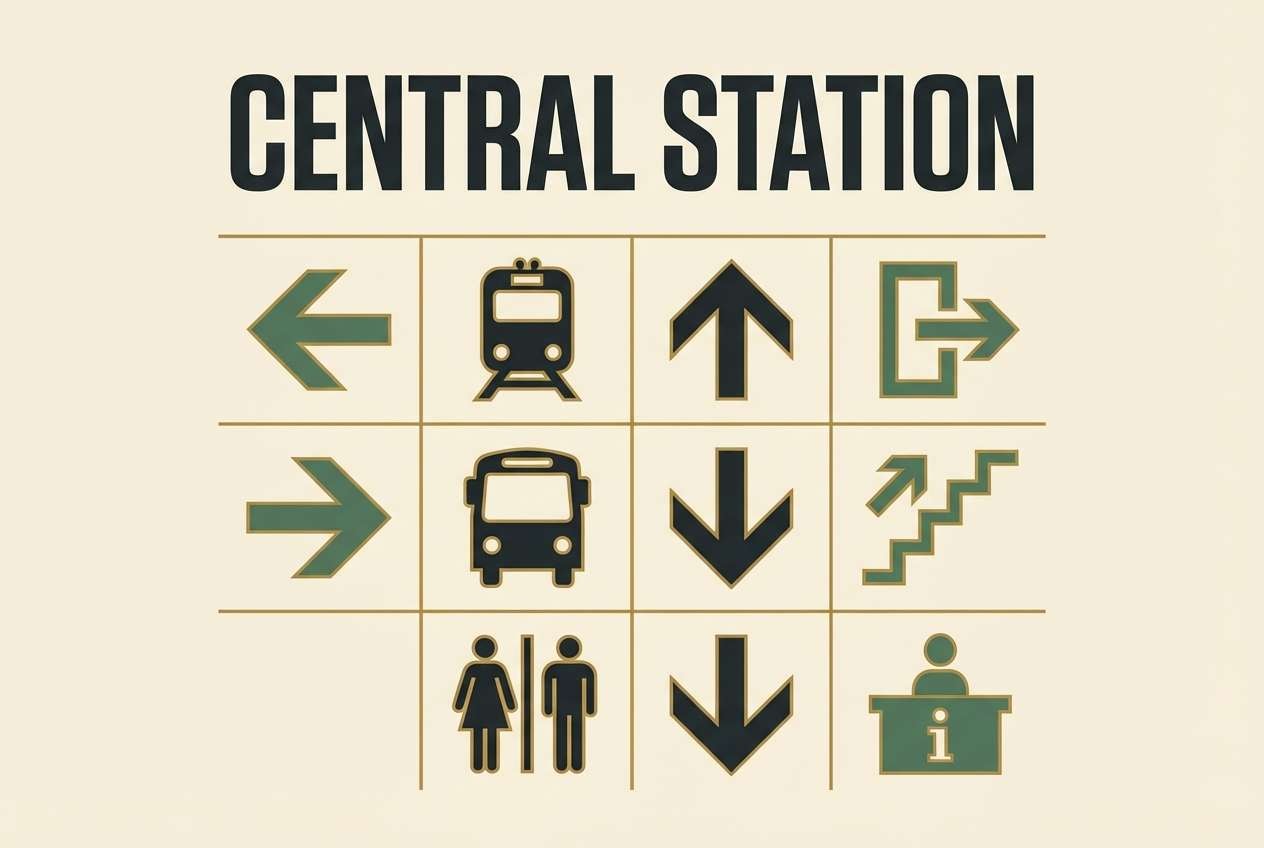
1) Platform Sage
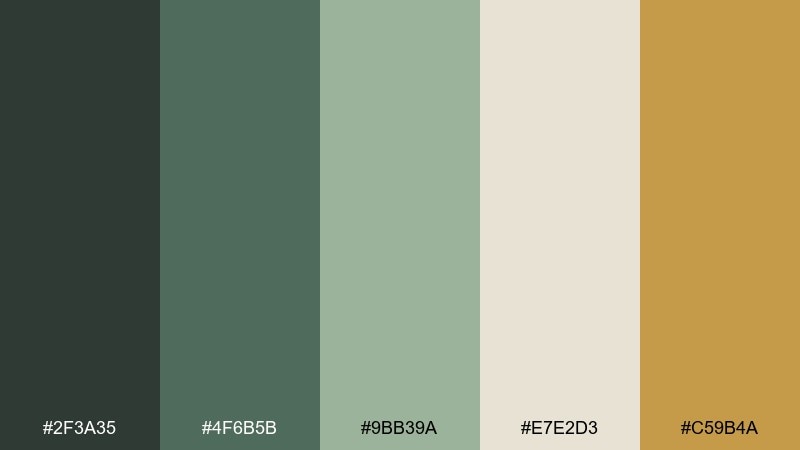
HEX: #2f3a35 #4f6b5b #9bb39a #e7e2d3 #c59b4a
Mood: calm, grounded, quietly urban
Best for: wayfinding signage, café branding, and city guide layouts
Calm and grounded like painted steel columns and worn station tiles, these greens feel quietly urban. The mix balances deep charcoal-sage with a soft warm neutral and a brass-like accent. It works beautifully for signage systems, menus, and brand marks that need clarity without shouting. Usage tip: reserve the gold tone for arrows or key labels so the subway color palette stays legible at a distance.
Image example of platform sage generated using media.io
Media.io is an online AI studio for creating and editing video, image, and audio in your browser.

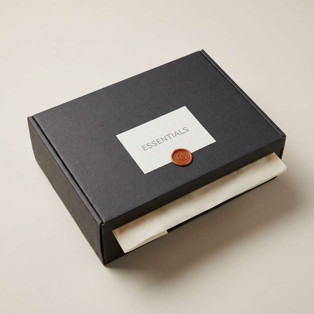
2) Turnstile Charcoal
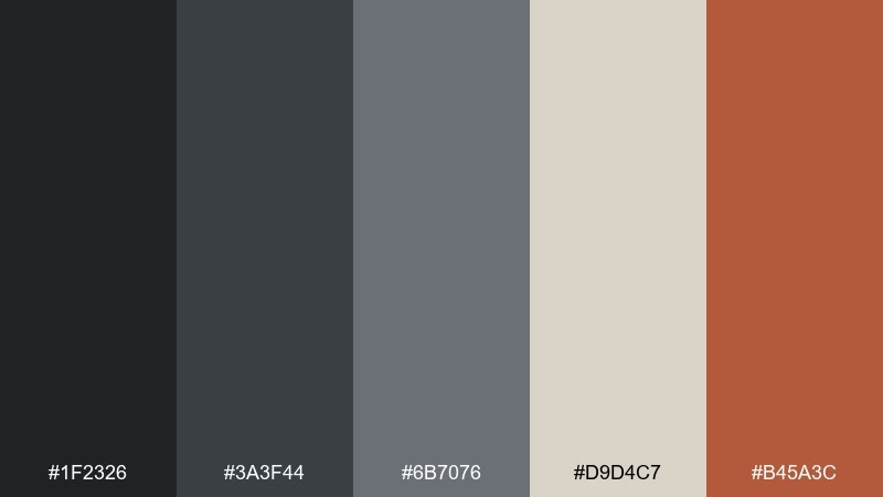
HEX: #1f2326 #3a3f44 #6b7076 #d9d4c7 #b45a3c
Mood: sleek, industrial, premium
Best for: streetwear packaging, label design, and monochrome branding
Sleek and industrial, it evokes turnstiles, rubber flooring, and late-night commutes. Soft greiges keep the charcoal range from feeling heavy, while the rust accent adds a tactile, metal-on-metal warmth. Use it for premium packaging, hang tags, and minimalist brand systems that need edge with restraint. Usage tip: print the rust tone as a spot color on matte stock for a high-end finish.
Image example of turnstile charcoal generated using media.io
3) Tilework Teal
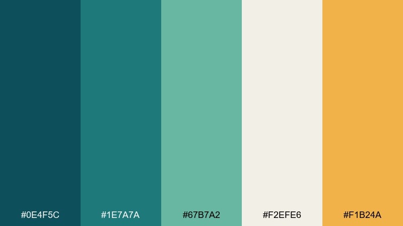
HEX: #0e4f5c #1e7a7a #67b7a2 #f2efe6 #f1b24a
Mood: fresh, patterned, retro-modern
Best for: restaurant menus, social templates, and tile-inspired posters
Fresh and patterned, these teals bring to mind glossy tilework and cool platform lighting. The creamy off-white keeps the set airy, and the amber pop adds a lively highlight. It is a strong subway color combination for menus, cafe social posts, and playful brand collateral. Usage tip: repeat the darkest teal for headings and use amber only for prices or calls to action.
Image example of tilework teal generated using media.io
4) Mapline Mustard
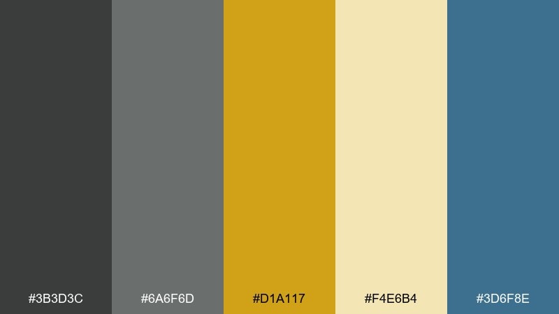
HEX: #3b3d3c #6a6f6d #d1a117 #f4e6b4 #3d6f8e
Mood: informational, upbeat, commuter-friendly
Best for: infographics, transit-style maps, and slide decks
Informational and upbeat, it feels like a clear route map under bright station lights. Mustard and pale paper tones keep the greys approachable, while the blue adds a calm secondary line color. Use it for infographics, decks, and diagrams where hierarchy matters more than decoration. Usage tip: assign mustard to primary routes and keep blue for secondary links so the layout reads instantly.
Image example of mapline mustard generated using media.io
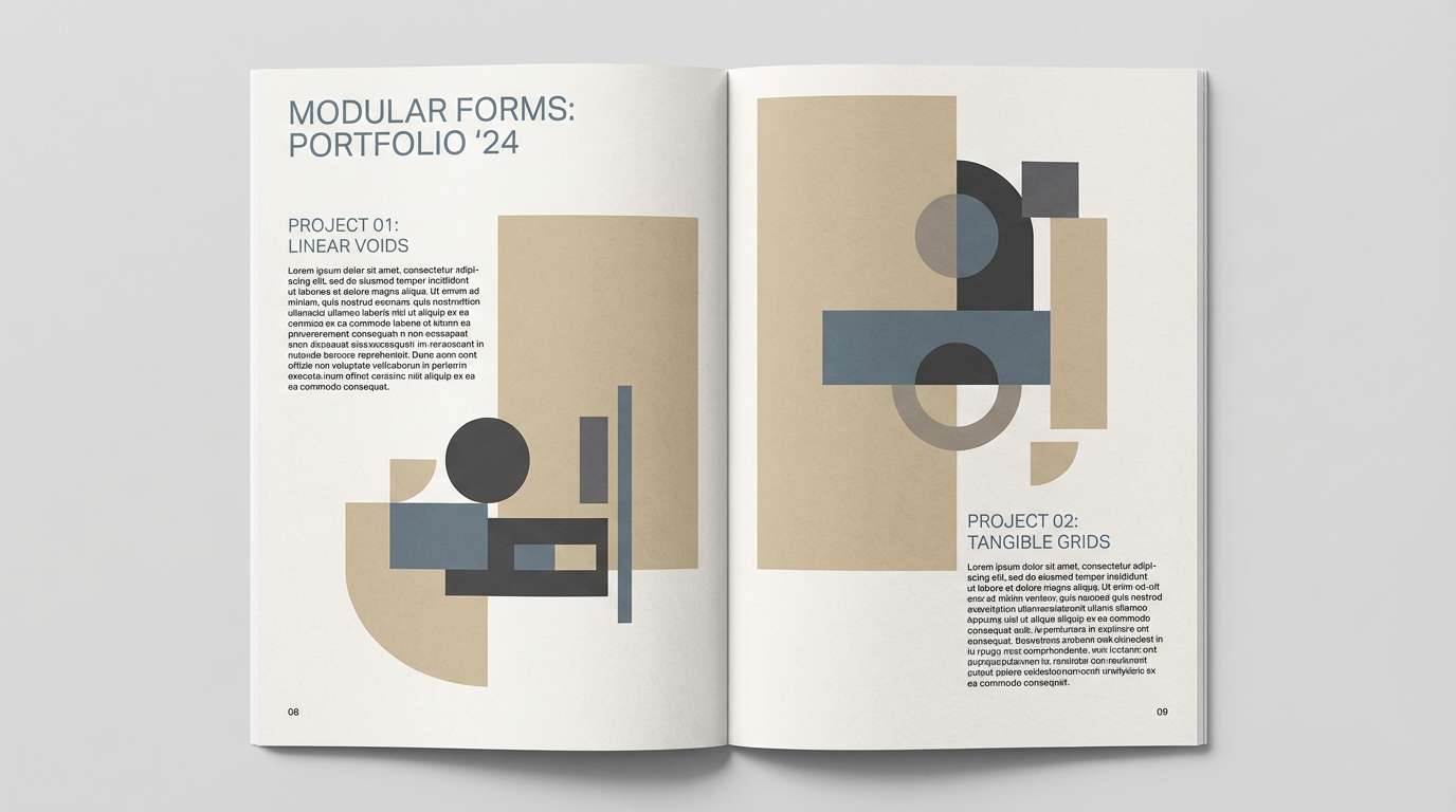
5) Steel & Sand
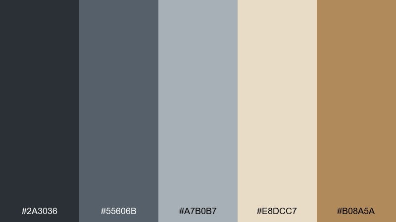
HEX: #2a3036 #55606b #a7b0b7 #e8dcc7 #b08a5a
Mood: architectural, neutral, refined
Best for: architecture portfolios, real estate decks, and product catalogs
Architectural and refined, these tones recall brushed steel, concrete, and sun-warmed stone. The palette stays neutral but never flat thanks to the sand and tan notes. It suits portfolios, catalogs, and layouts where imagery should stay in control. Usage tip: use the light sand as your page background to make steel blues feel crisp.
Image example of steel & sand generated using media.io
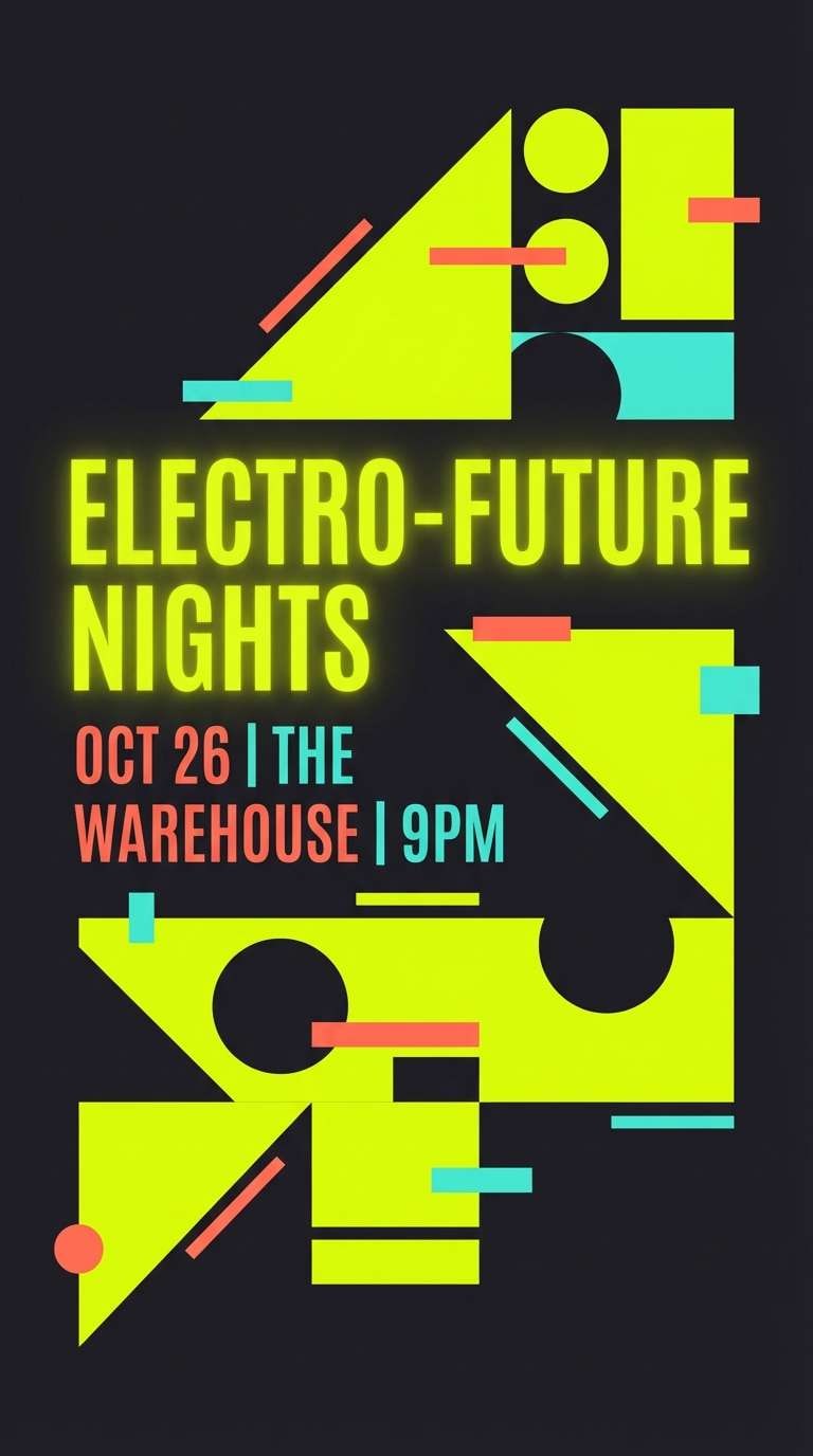
6) Neon Signal
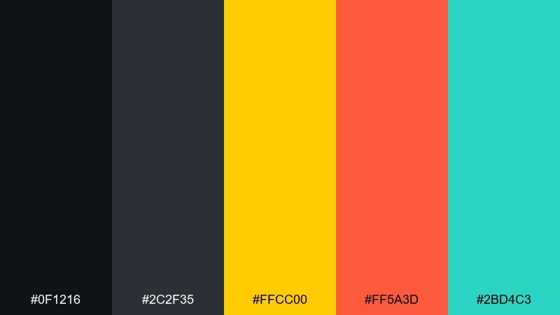
HEX: #0f1216 #2c2f35 #ffcc00 #ff5a3d #2bd4c3
Mood: electric, high-energy, nightlife
Best for: event flyers, music promos, and bold social ads
Electric and high-energy, it captures signal lights cutting through a dark tunnel. The near-blacks give you space for type, while yellow, coral, and aqua deliver instant impact. Use it for nightlife flyers, launch promos, and social ads that need a punchy focal point. Usage tip: pick one neon as the hero and keep the other two as small accents to avoid visual noise.
Image example of neon signal generated using media.io
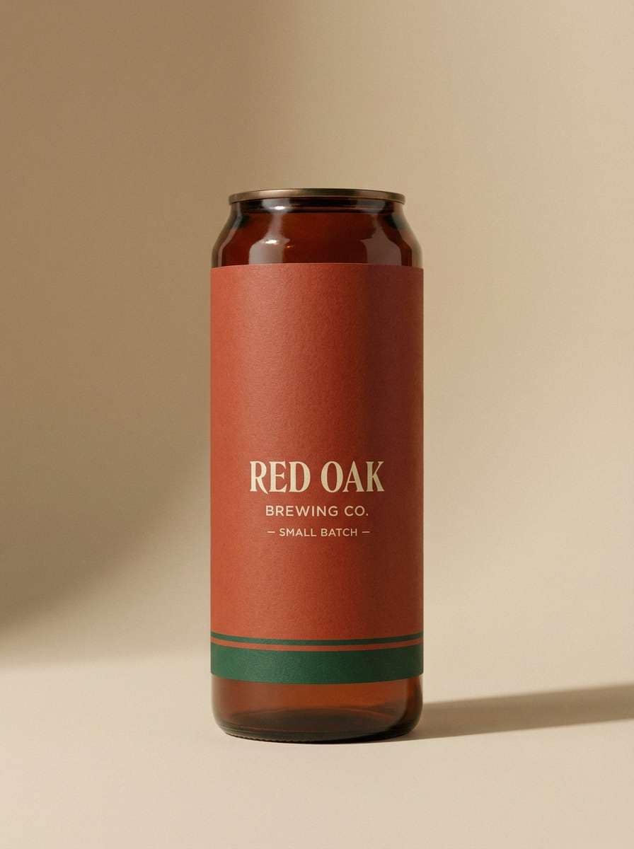
7) Brick Tunnel
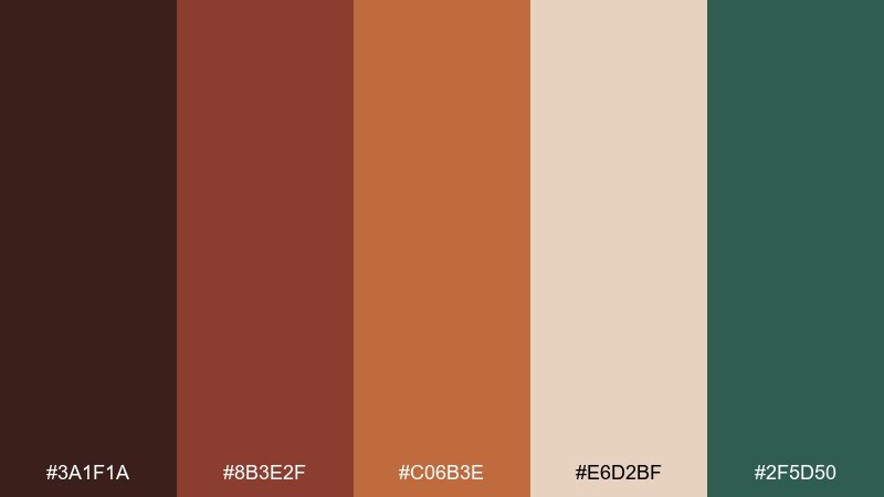
HEX: #3a1f1a #8b3e2f #c06b3e #e6d2bf #2f5d50
Mood: warm, gritty, handcrafted
Best for: craft beverage labels, food packaging, and rustic posters
Warm and gritty, it evokes brick arches, aged posters, and the glow of platform lamps. The cream neutral softens the reds, and the deep green reads like painted metal railings. It is ideal for craft labels, café packaging, and rustic event posters where warmth matters. Usage tip: keep the darkest brown for type to maintain contrast on the lighter paper tone.
Image example of brick tunnel generated using media.io
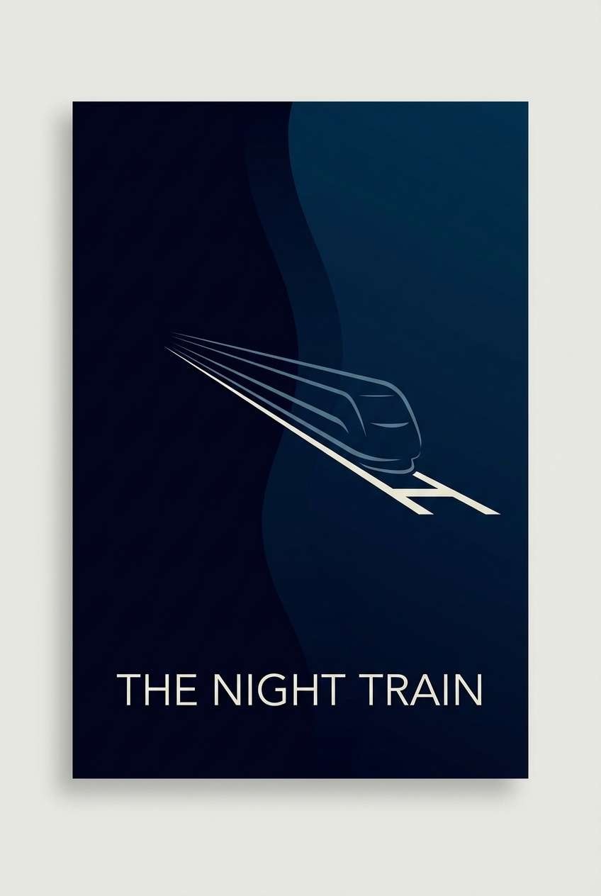
8) Midnight Rail
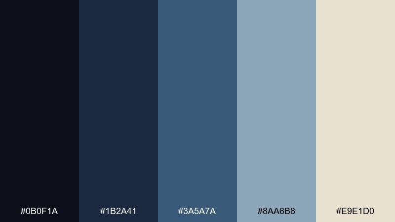
HEX: #0b0f1a #1b2a41 #3a5a7a #8aa6b8 #e9e1d0
Mood: cinematic, cool, nocturnal
Best for: movie posters, tech branding, and hero headers
Cinematic and nocturnal, these blues feel like headlights on wet tracks. The pale blue and warm off-white keep the mood from going too cold, giving you room for readable typography. It is a reliable set of subway color combinations for hero headers, streaming artwork, and tech brand landing pages. Usage tip: place off-white text on the two darkest blues and use the mid blue for buttons.
Image example of midnight rail generated using media.io
9) Concrete Mint
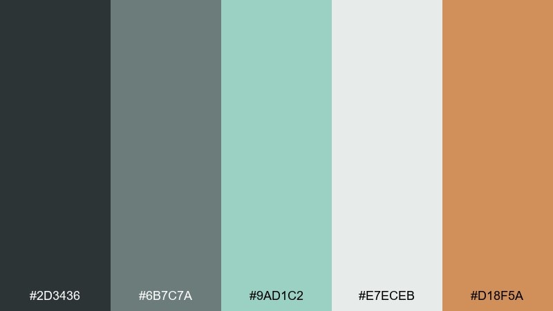
HEX: #2d3436 #6b7c7a #9ad1c2 #e7eceb #d18f5a
Mood: clean, soothing, contemporary
Best for: wellness app UI, dashboards, and modern newsletters
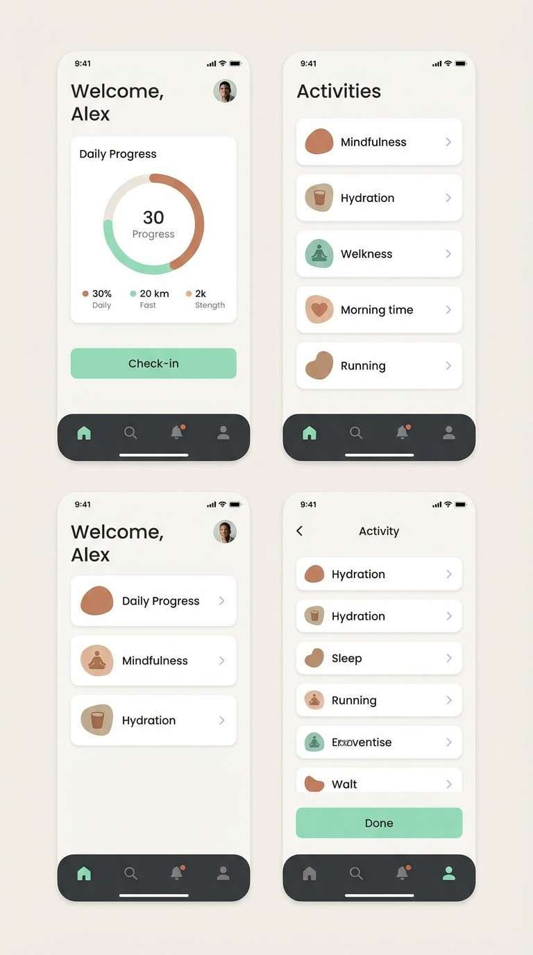
Clean and soothing, it suggests polished concrete paired with a minty glass glow. The pale neutral keeps screens bright, while the warm clay accent stops it from feeling clinical. Use it for wellness interfaces, email templates, and dashboards where calm clarity wins. Usage tip: treat the mint as your primary action color and reserve clay for warnings or highlights.
Image example of concrete mint generated using media.io
10) Ticket Booth Coral
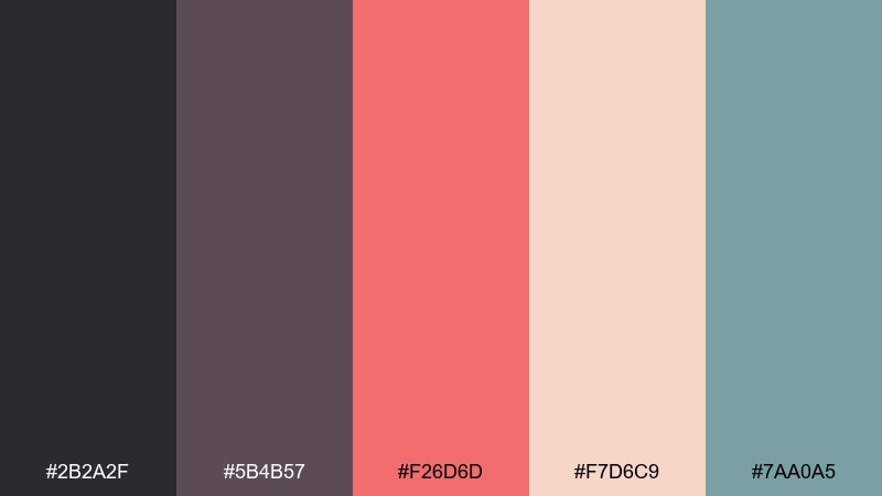
HEX: #2b2a2f #5b4b57 #f26d6d #f7d6c9 #7aa0a5
Mood: friendly, nostalgic, lively
Best for: party invitations, promo cards, and boutique branding
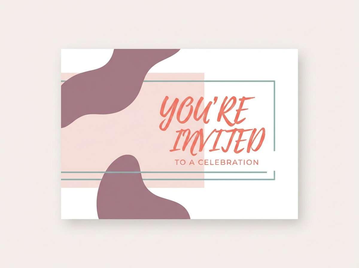
Friendly and nostalgic, it feels like stamped tickets and vintage booth lighting. Coral brings the warmth, while the dusty mauve and teal keep it balanced and slightly retro. Use it for invitation designs, promo cards, and boutique brands that want charm without going pastel-cute. Usage tip: pair coral with the darkest neutral for headlines so text stays crisp.
Image example of ticket booth coral generated using media.io
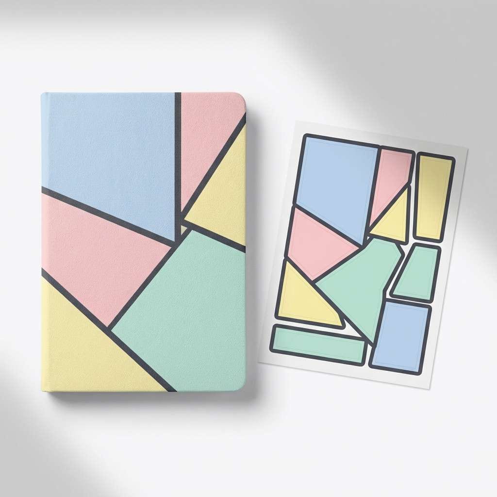
11) Graffiti Pastel
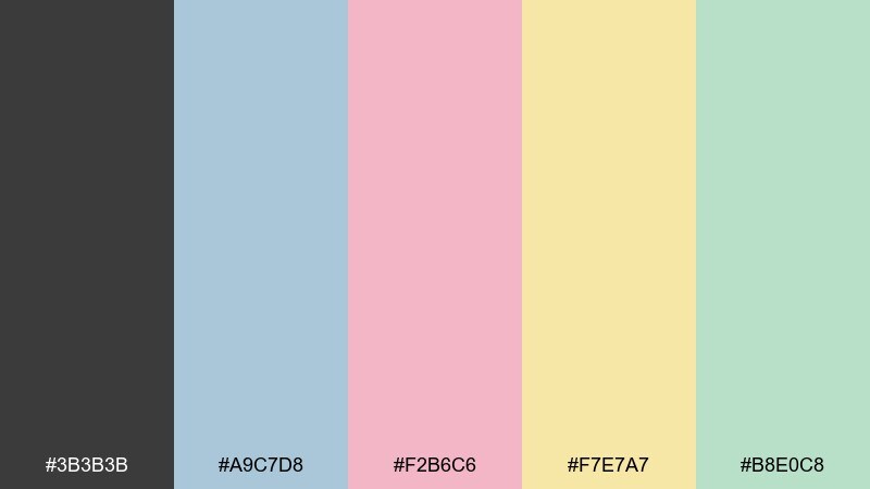
HEX: #3b3b3b #a9c7d8 #f2b6c6 #f7e7a7 #b8e0c8
Mood: playful, light, creative
Best for: kids stationery, sticker packs, and cheerful web graphics
Playful and light, it channels chalky paint marks against a dark wall. The pastels stay sweet but not sugary thanks to the grounding charcoal. It fits stationery, sticker packs, and friendly brand graphics where softness still needs structure. Usage tip: use charcoal outlines sparingly to keep the pastels feeling airy.
Image example of graffiti pastel generated using media.io
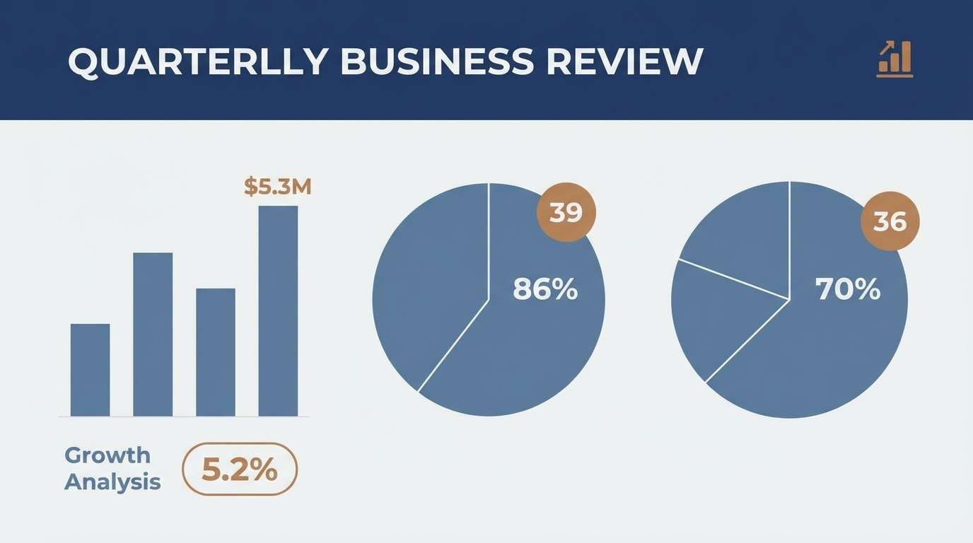
12) Commuter Navy
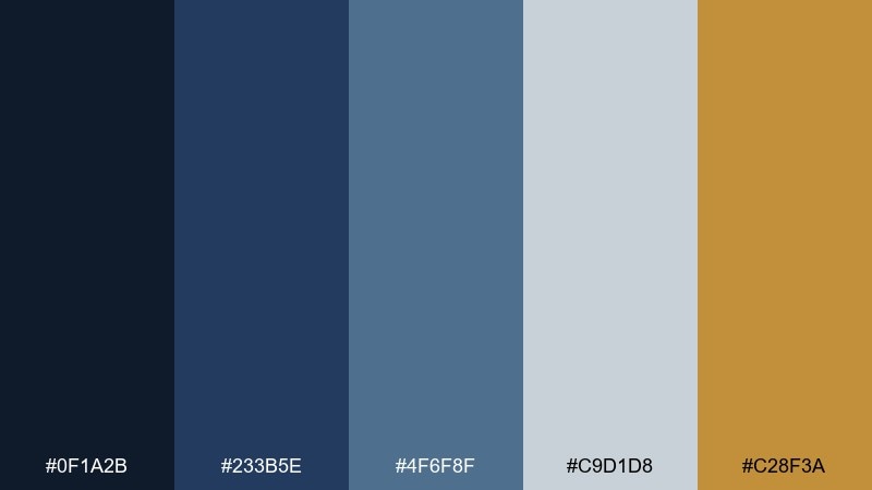
HEX: #0f1a2b #233b5e #4f6f8f #c9d1d8 #c28f3a
Mood: professional, steady, confident
Best for: business reports, SaaS branding, and data-heavy pages
Professional and steady, these navies feel like uniforms and polished handrails. Light grey-blue supports long-form readability, while the bronze accent adds a premium touch. Use it for reports, SaaS branding, and data pages that need trust and calm. Usage tip: keep bronze for key metrics or icons so the page does not skew warm.
Image example of commuter navy generated using media.io
13) Vintage Poster
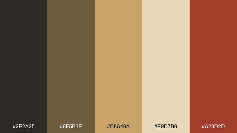
HEX: #2e2a25 #6f5b3e #c8a46a #e9d7b6 #a23d2d
Mood: retro, warm, collectible
Best for: retro posters, book covers, and café wall art
Retro and collectible, it brings the vibe of aged paper, sepia ink, and old station ads. The red-brown accent adds punch without breaking the vintage feel. Use it for book covers, café wall prints, and heritage-inspired branding. Usage tip: add subtle grain in design work while keeping text in the darkest brown for readability.
Image example of vintage poster generated using media.io
14) Rainy Station
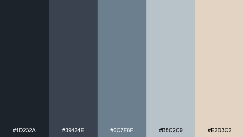
HEX: #1d232a #39424e #6c7f8f #b8c2c9 #e2d3c2
Mood: moody, soft, reflective
Best for: editorial layouts, photography presets, and blog themes
Moody and soft, it suggests rain on windows and hazy platform lights. The cool greys create depth, while the warm beige keeps skin tones and product shots from looking cold. Use it for editorial templates, blog themes, and understated brand identities. Usage tip: set headings in the near-black and use the warm beige as a highlight bar behind quotes.
Image example of rainy station generated using media.io
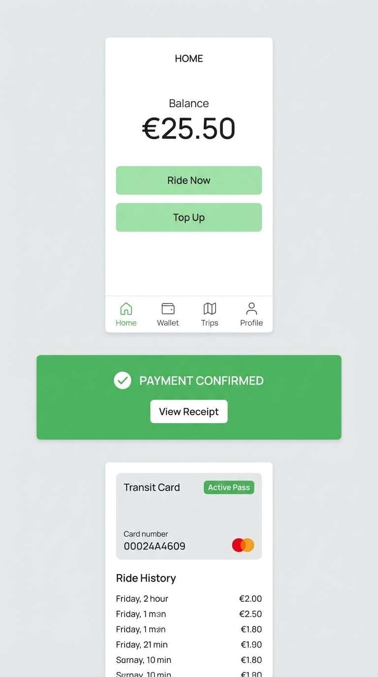
15) Clean Transit UI
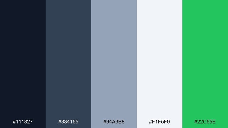
HEX: #111827 #334155 #94a3b8 #f1f5f9 #22c55e
Mood: crisp, functional, modern
Best for: app UI, booking flows, and interface components
Crisp and functional, these tones recall polished screens and clear platform displays. The slate neutrals keep layouts calm, while the green gives a confident success state. As a subway color scheme, it is excellent for booking flows, navigation components, and accessibility-first UI. Usage tip: use the lightest tone for surfaces and keep green for confirmations rather than primary navigation.
Image example of clean transit ui generated using media.io
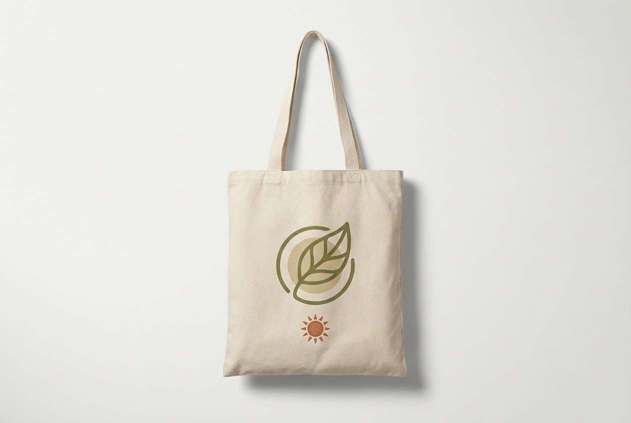
16) Weekend Market
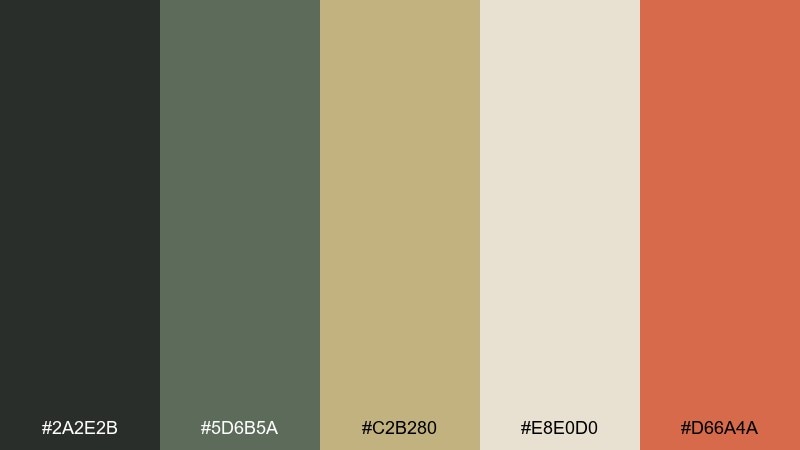
HEX: #2a2e2b #5d6b5a #c2b280 #e8e0d0 #d66a4a
Mood: earthy, welcoming, casual
Best for: market branding, tote designs, and lifestyle packaging
Earthy and welcoming, it feels like canvas totes, leafy stalls, and warm street snacks. Olive and sand create a natural base, while the terracotta accent adds an appetizing spark. Use it for market branding, lifestyle packaging, and hand-drawn logos. Usage tip: keep terracotta to small stamps or icons so the neutrals remain the main story.
Image example of weekend market generated using media.io
17) Minimal Monochrome
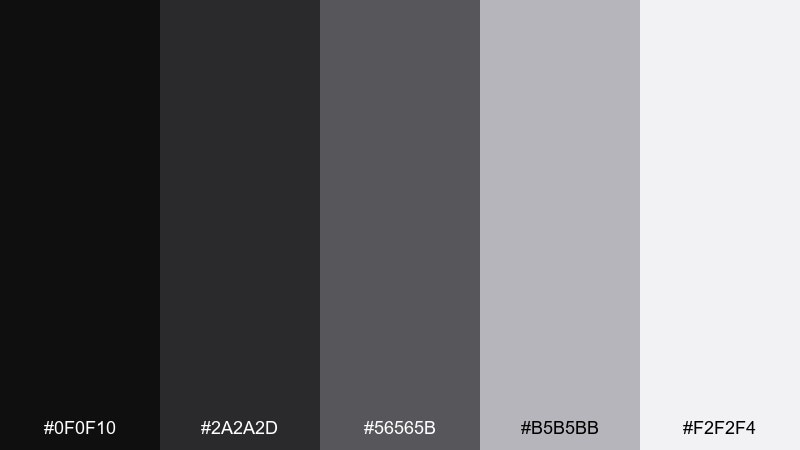
HEX: #0f0f10 #2a2a2d #56565b #b5b5bb #f2f2f4
Mood: minimal, sharp, timeless
Best for: portfolio sites, typography posters, and luxury UI
Minimal and sharp, it echoes clean typography on polished stone. The greys step smoothly from near-black to soft white, making hierarchy easy without extra color. Use it for portfolios, luxury UI, and typographic posters where spacing does the work. Usage tip: introduce contrast through weight and scale, not extra hues.
Image example of minimal monochrome generated using media.io
18) Sunset Platform
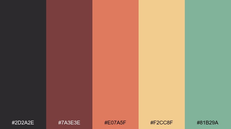
HEX: #2d2a2e #7a3e3e #e07a5f #f2cc8f #81b29a
Mood: warm, optimistic, creative
Best for: seasonal campaigns, café posters, and lifestyle socials
Warm and optimistic, it feels like sunset light spilling across a platform edge. Coral and honey tones bring energy, while the muted green keeps the mix mature. Use it for seasonal campaigns, café posters, and lifestyle social templates that need warmth without neon. Usage tip: set backgrounds in honey or cream and let coral handle the main call to action.
Image example of sunset platform generated using media.io

19) Copper Pipe
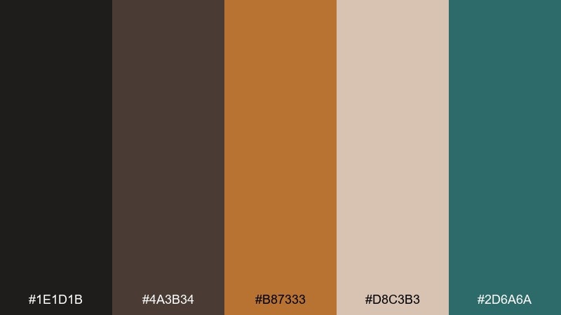
HEX: #1e1d1b #4a3b34 #b87333 #d8c3b3 #2d6a6a
Mood: crafted, earthy, boutique
Best for: product ads, home goods branding, and packaging accents
Crafted and earthy, it evokes copper pipes, workshop tools, and patinaed metal. The blush-beige softens the dark browns, while teal adds a cool counterbalance. Use it for home goods branding, product ads, and packaging that wants a handmade but modern feel. Usage tip: let copper be the hero on labels and keep teal to secondary badges for balance.
Image example of copper pipe generated using media.io
20) Quiet Morning
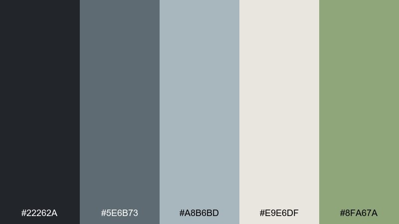
HEX: #22262a #5e6b73 #a8b6bd #e9e6df #8fa67a
Mood: soft, airy, understated
Best for: blog headers, stationery, and calm brand systems
Soft and airy, it feels like early light on steel and a hint of greenery near the entrance. Cool greys keep it modern, and the gentle green adds life without turning loud. Use it for stationery, blog headers, and calm brand systems that need a quiet signature color. Usage tip: apply the green to small dividers and icons so the layout stays serene.
Image example of quiet morning generated using media.io
What Colors Go Well with Subway?
Subway colors pair best with structured neutrals: charcoal, slate, steel blue-gray, and concrete tones. These shades create a strong foundation that mimics real station materials and keeps layouts feeling disciplined.
To add warmth, use paper-like off-whites, sand, tan, rust, terracotta, or brass-gold accents. That warm/cool push-pull is what makes a subway color palette feel urban instead of flat.
For bolder work, add a single “signal” highlight such as neon yellow, coral-red, or aqua. Keeping the rest of the palette muted helps the bright pop read like wayfinding—fast and intentional.
How to Use a Subway Color Palette in Real Designs
Start with roles, not swatches: choose one dark for text/navigation, one light for backgrounds/surfaces, and one accent for actions. Subway color combinations work because they’re assigned consistently, like route lines and station labels.
Keep contrast high for headings and UI labels (especially on mobile). If you’re using teals/greens, let off-white or sand handle background areas so the cool tones stay crisp and readable.
In print, subway palettes shine on matte stocks and uncoated paper. Use rust, brass, or mustard as a limited spot-style highlight for stamps, arrows, price tags, or key info blocks.
Create Subway Palette Visuals with AI
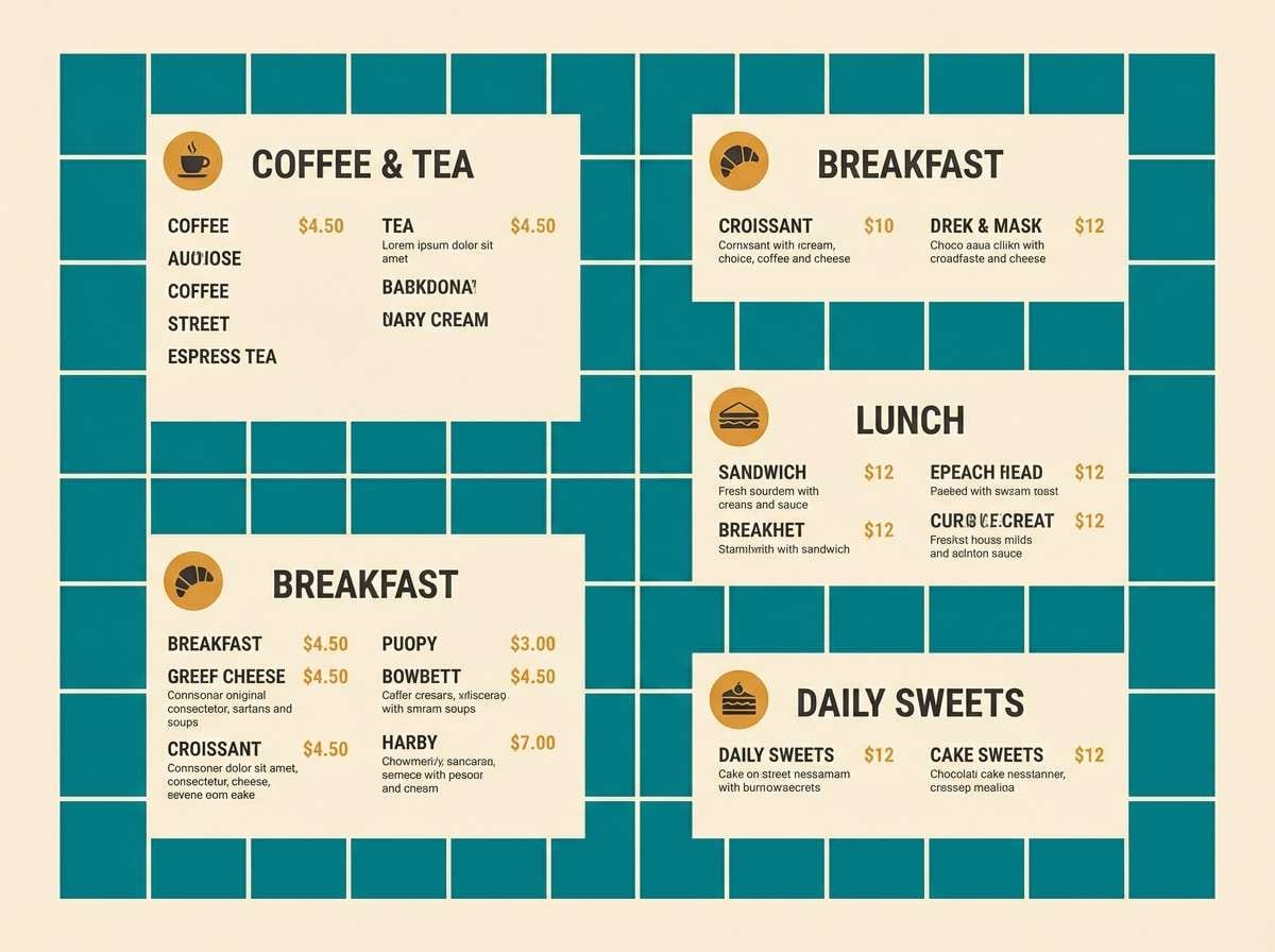
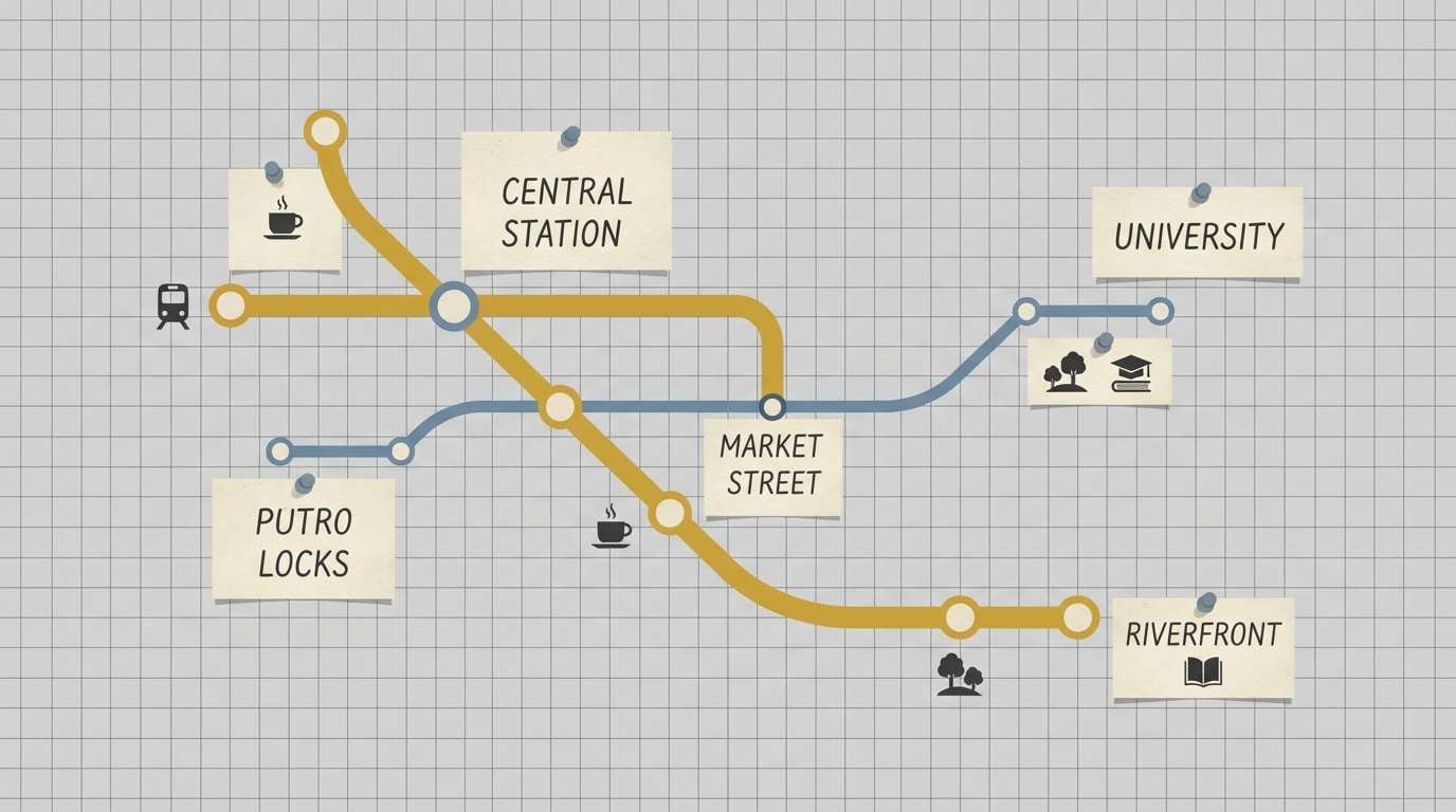
If you want to see your subway color palette in action, generate quick mockups—menus, metro-map infographics, app screens, packaging labels, or posters—before you commit to production.
With Media.io’s text-to-image tool, you can paste a prompt like the examples above, describe layout and mood, and iterate on styles while keeping the same urban palette direction.
Once you like a direction, reuse the prompt format to create a consistent set of visuals across your brand or campaign.
Subway Color Palette FAQs
-
What is a subway color palette?
A subway color palette is a set of colors inspired by transit environments—think charcoal rails, concrete and slate neutrals, tiled greens/teals, paper-like creams, and high-visibility signal accents used for wayfinding. -
Which subway colors are best for UI design?
Slate/charcoal plus a very light surface color is the most reliable base, then add one clear accent (often green, teal, or yellow) for states and CTAs. Palettes like Clean Transit UI or Concrete Mint are especially UI-friendly. -
How do I keep a subway palette from feeling too dark?
Use a light neutral (cream, off-white, or sand) as the main background and reserve near-black tones for text and navigation. Add one warm highlight (brass, rust, or tan) to soften the industrial feel. -
What accent color works best with subway neutrals?
Mustard, brass-gold, rust, coral, and teal are common “station accent” choices. Pick one hero accent and keep the rest minimal so the design reads like clear signage, not a collage. -
Are subway color combinations good for branding?
Yes—subway palettes naturally communicate reliability, clarity, and modern city energy. They’re great for cafés, streetwear, tech tools, city guides, and editorial brands that want structure with personality. -
How can I use subway palettes for posters or flyers?
Use a dark base for drama and legibility, then choose one “signal” color (neon yellow, coral, or aqua) for the focal point. Keep typography bold and simple to match the transit-poster vibe. -
Can I generate subway-style mockups with AI?
Yes. Use a consistent prompt structure (layout + subject + colors + style notes) and generate variations until the composition and contrast feel like real wayfinding or station advertising.
Next: Iris Color Palette


