

Iris is a versatile purple family that can read soft and calming, modern and techy, or bold and nightlife-ready depending on how you balance tints, midtones, and deep anchors.
Below are 20 iris color palette ideas with HEX codes, plus practical guidance for pairing, accessibility, and turning these palettes into real visuals for UI, branding, and print.
In this article
- Why Iris Palettes Work So Well
-
- misty lilac
- velvet orchid
- periwinkle breeze
- plum ink
- iris meadow
- amethyst cream
- dusk mauve
- digital violet
- vintage iris paper
- neon iris night
- rose quartz iris
- saffron accent
- minimal graphite
- blooming gradient
- coastal periwinkle
- royal ribbon
- soft focus
- botanical watercolor
- modern editorial
- copper twilight
- What Colors Go Well with Iris?
- How to Use a Iris Color Palette in Real Designs
- Create Iris Palette Visuals with AI
Why Iris Palettes Work So Well
Iris tones sit in a sweet spot between calm blues and expressive magentas, which makes them flexible for both minimal layouts and high-impact campaigns. With the right tints, iris can feel airy and “clean,” while deeper violets add authority and contrast.
They also play nicely with neutrals: warm creams for softness, cool grays for professionalism, and near-black purples for readable typography. That makes iris palettes reliable across UI, branding systems, and print.
Most importantly, iris colors build hierarchy easily. Light lilacs can carry large backgrounds, mid violets can define components, and deep eggplants can anchor text—without needing a lot of extra colors.
20+ Iris Color Palette Ideas (with HEX Codes)
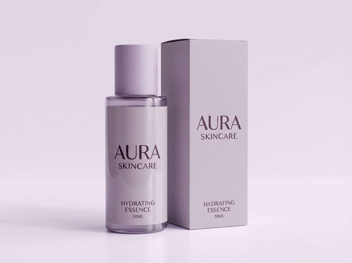
1) Misty Lilac
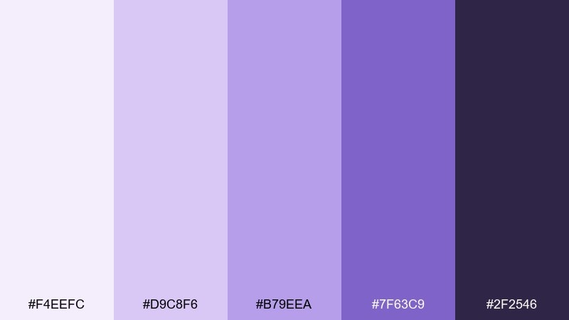
HEX: #f4eefc #d9c8f6 #b79eea #7f63c9 #2f2546
Mood: airy, calm, polished
Best for: skincare branding and product ads
Airy and calm like early fog over lilac fields, these tones feel clean without turning sterile. They work beautifully on skincare labels, hero banners, and before-and-after creatives where trust matters. Pair the mid violets with plenty of soft white space and let the deep eggplant act as your text anchor. Usage tip: keep gradients subtle and reserve the darkest shade for small type so the overall look stays light.
Image example of misty lilac generated using media.io
Media.io is an online AI studio for creating and editing video, image, and audio in your browser.

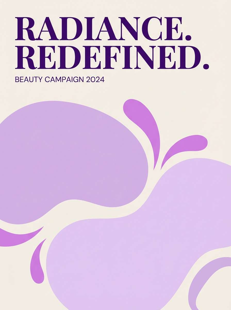
2) Velvet Orchid
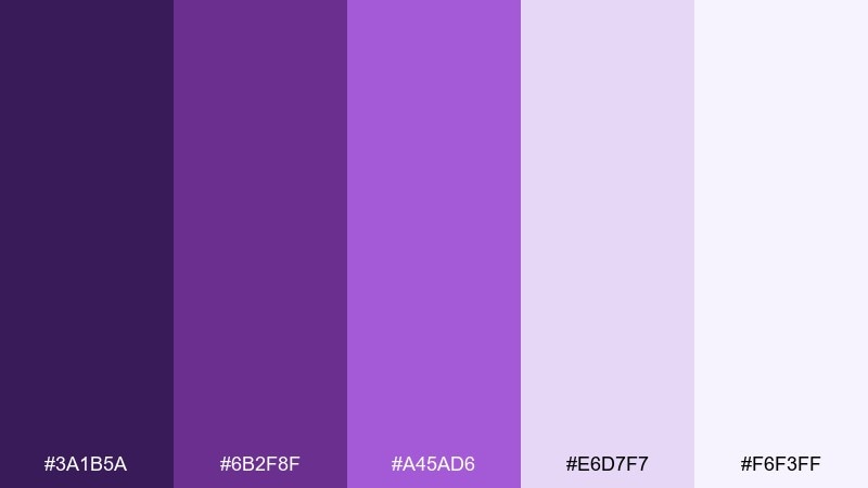
HEX: #3a1b5a #6b2f8f #a45ad6 #e6d7f7 #f6f3ff
Mood: luxurious, romantic, dramatic
Best for: beauty campaign posters
Luxurious and romantic, this mix evokes velvet petals under evening lights. It shines in bold beauty posters where contrast and depth sell the mood before the message. Let the dark violet carry headlines, then soften with pale lavender blocks to keep layouts breathable. Usage tip: use metallic foil or spot gloss on the mid-purple for a premium finish.
Image example of velvet orchid generated using media.io
3) Periwinkle Breeze
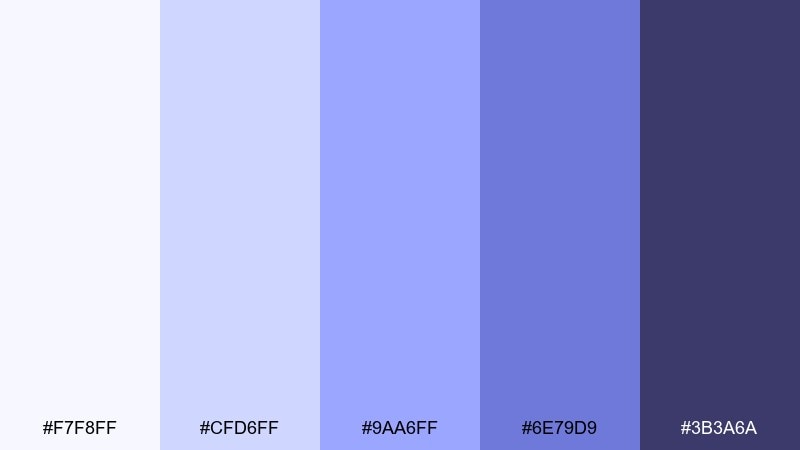
HEX: #f7f8ff #cfd6ff #9aa6ff #6e79d9 #3b3a6a
Mood: fresh, optimistic, modern
Best for: startup landing pages
Fresh and optimistic, these cool violets feel like clear sky after rain. For startup sites, the lighter tints make content approachable while the indigo base keeps CTAs and nav elements grounded. These iris color combinations look best with crisp sans-serif type and lots of spacing. Usage tip: choose one strong accent (the #6e79d9 tone) for buttons and keep everything else supportive.
Image example of periwinkle breeze generated using media.io
4) Plum Ink
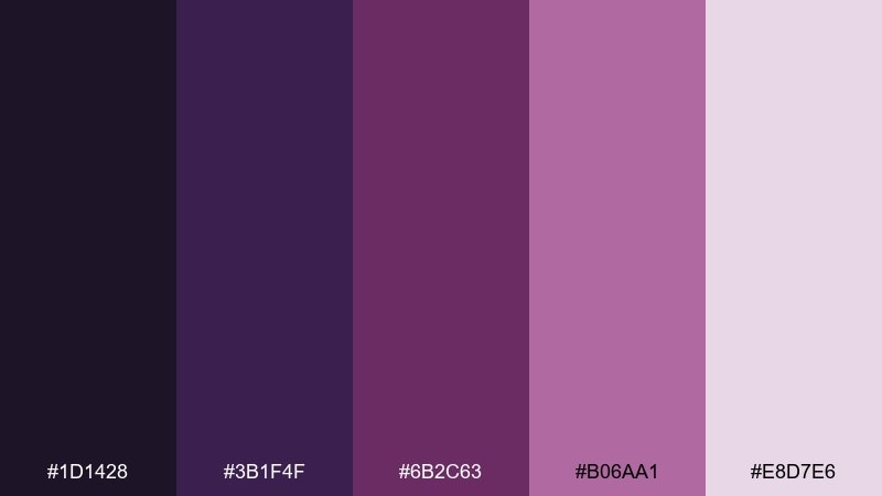
HEX: #1d1428 #3b1f4f #6b2c63 #b06aa1 #e8d7e6
Mood: moody, refined, editorial
Best for: book covers and album art
Moody and refined, this set reads like plum ink on textured paper. It fits book covers and album art where you want mystery without losing legibility. Pair the pale mauve as a quiet backdrop and keep the near-black purple for titles and artist names. Usage tip: add a single high-contrast focal element in #b06aa1 to guide the eye.
Image example of plum ink generated using media.io
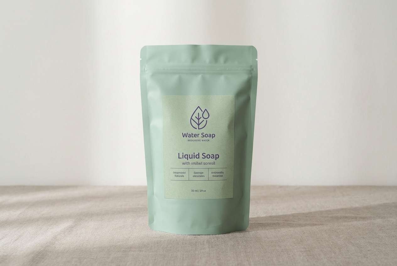
5) Iris Meadow
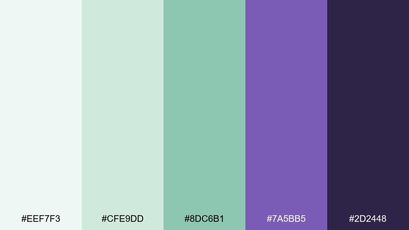
HEX: #eef7f3 #cfe9dd #8dc6b1 #7a5bb5 #2d2448
Mood: natural, balanced, soothing
Best for: eco-friendly product labels
Natural and balanced, these shades evoke meadow greens with violet blooms tucked between them. They suit eco labels and refill packaging where calm credibility beats loud hype. Pair the minty tints with kraft textures or off-white stock, then use the violet for brand marks and key claims. Usage tip: keep the green tones dominant and treat the purple as a deliberate accent to avoid a muddy mix.
Image example of iris meadow generated using media.io
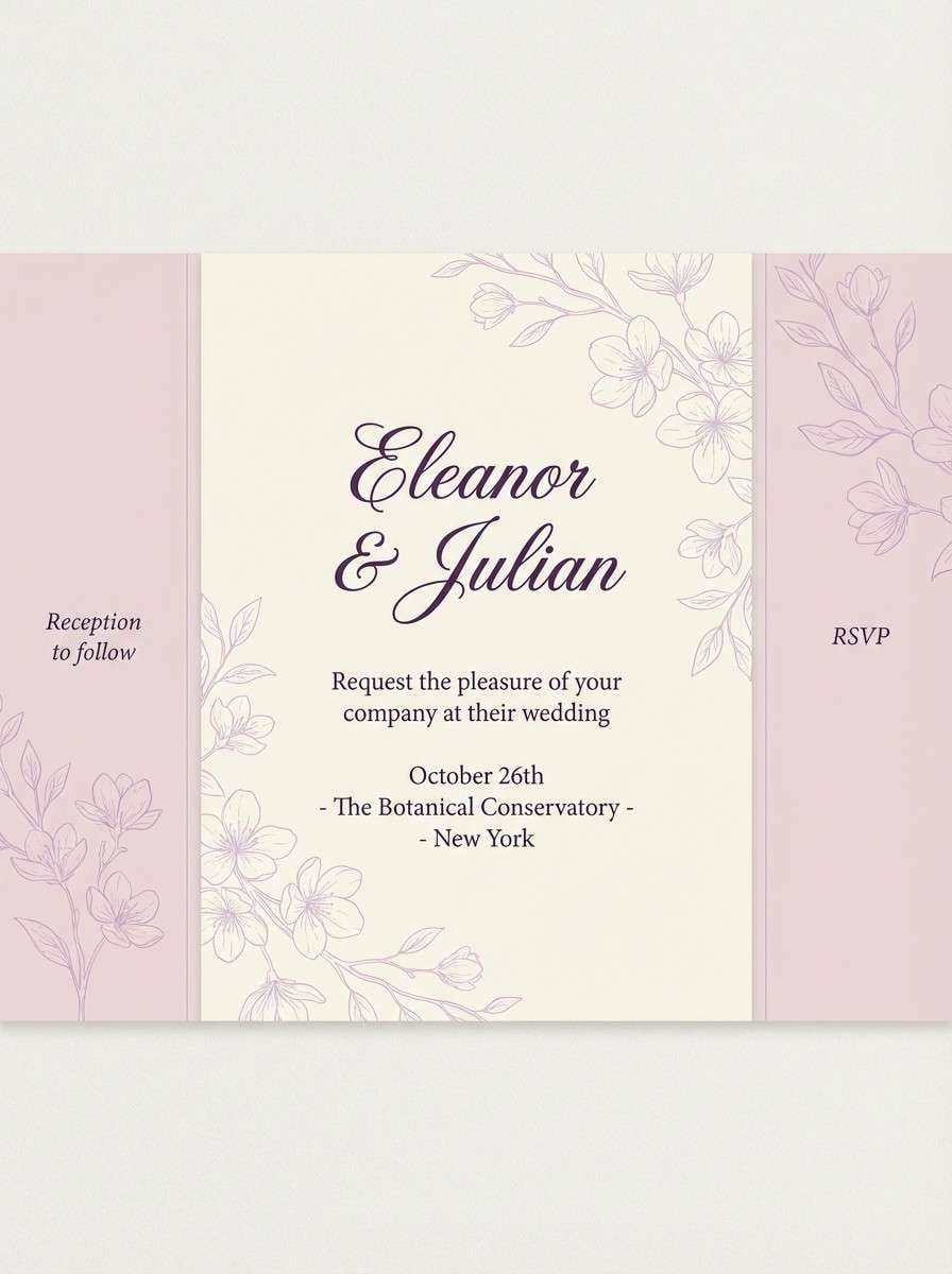
6) Amethyst Cream
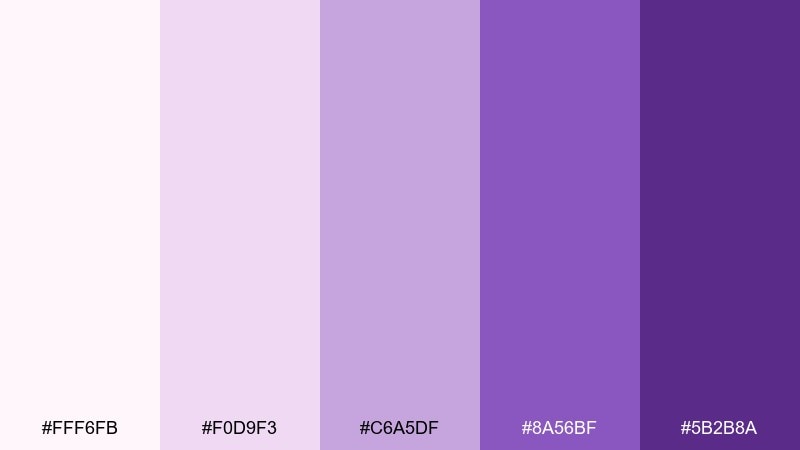
HEX: #fff6fb #f0d9f3 #c6a5df #8a56bf #5b2b8a
Mood: soft, cozy, elegant
Best for: wedding invitations
Soft and cozy, the tones feel like amethyst dusted over whipped cream. They are ideal for wedding stationery, especially when you want romance without heavy contrast. Pair the pale pink-lilac with delicate line art and reserve the deep purple for names and dates. Usage tip: use a warm paper grain and keep embellishments minimal so the color story stays the hero.
Image example of amethyst cream generated using media.io
7) Dusk Mauve
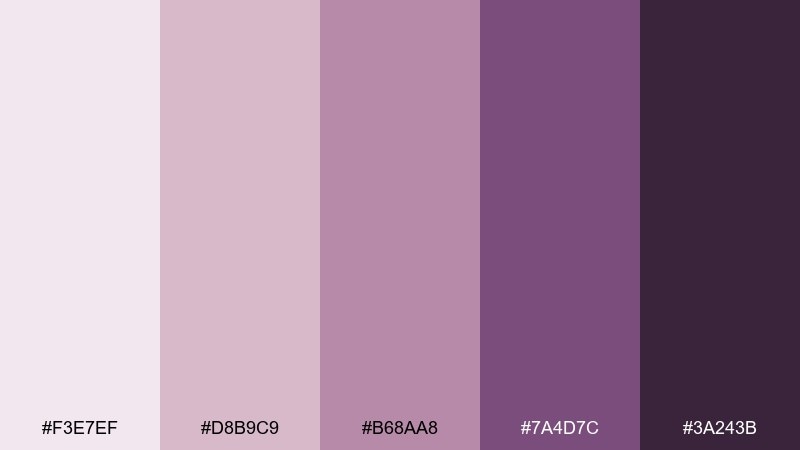
HEX: #f3e7ef #d8b9c9 #b68aa8 #7a4d7c #3a243b
Mood: warm, intimate, nostalgic
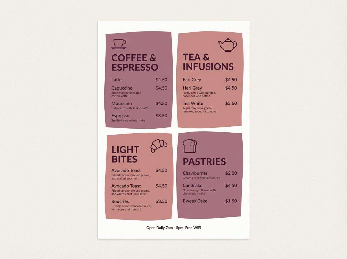
Best for: cafe menus and signage
Warm and intimate, this palette feels like dusk settling over a quiet street. It works well for cafe menus where you want a handcrafted, welcoming tone. Pair mauve backgrounds with dark plum text for readability, and use the mid tones for section dividers and icons. Usage tip: print a quick proof, because the mauves can shift warmer on uncoated paper.
Image example of dusk mauve generated using media.io
8) Digital Violet
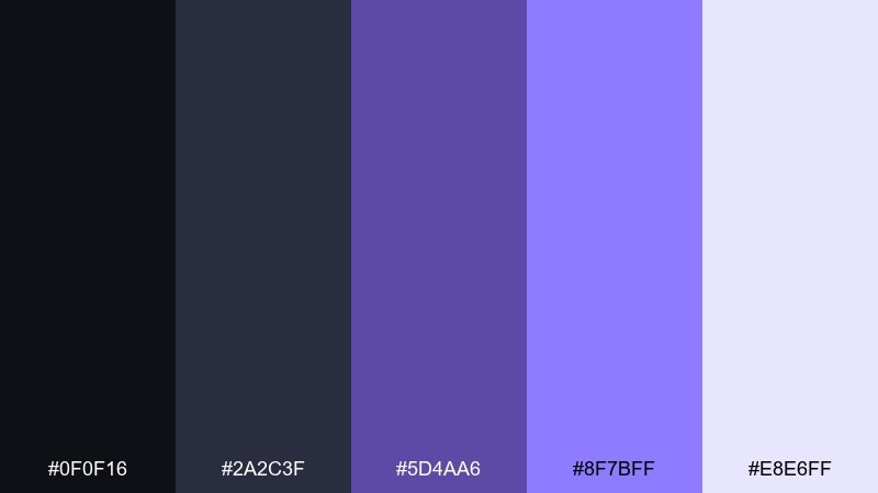
HEX: #0f0f16 #2a2c3f #5d4aa6 #8f7bff #e8e6ff
Mood: sleek, techy, high-contrast
Best for: dashboard UI design
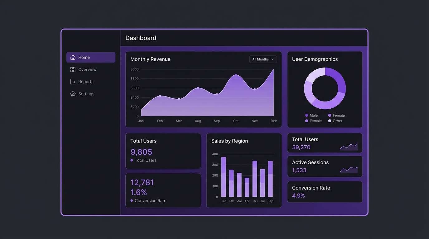
Sleek and techy, these violets glow like LEDs against a night screen. The iris color scheme is perfect for dashboards where you need focus states, charts, and alerts to pop without harsh neon. Use the near-black as the base, then reserve the bright lavender for primary actions and active tabs. Usage tip: keep chart colors limited and rely on tint variations for depth.
Image example of digital violet generated using media.io
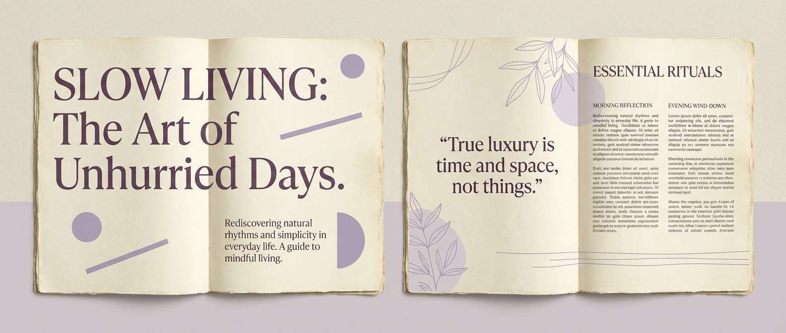
9) Vintage Iris Paper
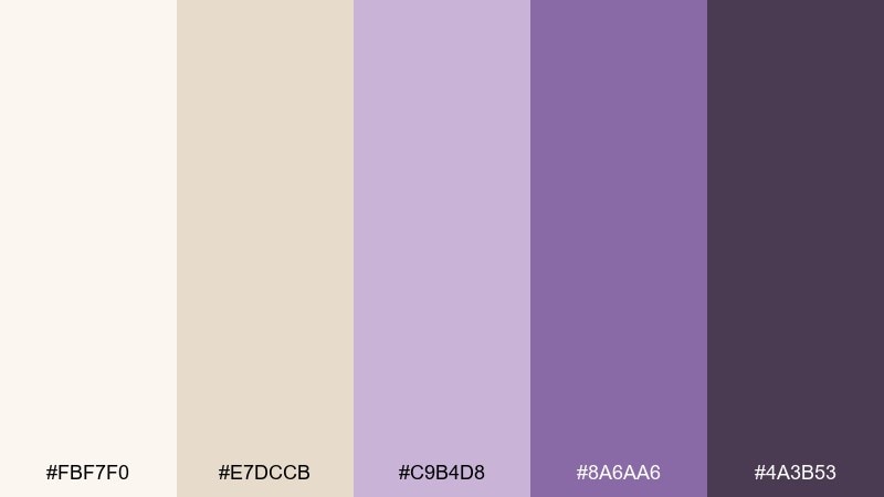
HEX: #fbf7f0 #e7dccb #c9b4d8 #8a6aa6 #4a3b53
Mood: heritage, gentle, literary
Best for: editorial layouts and zines
Heritage and gentle, these tones recall aged paper with lavender ink notes. They suit zines and editorial spreads where texture and pacing matter as much as color. Pair the cream base with muted purple captions, and keep the darkest shade for pull quotes and section titles. Usage tip: avoid pure black and use #4a3b53 for text to keep the vintage softness intact.
Image example of vintage iris paper generated using media.io
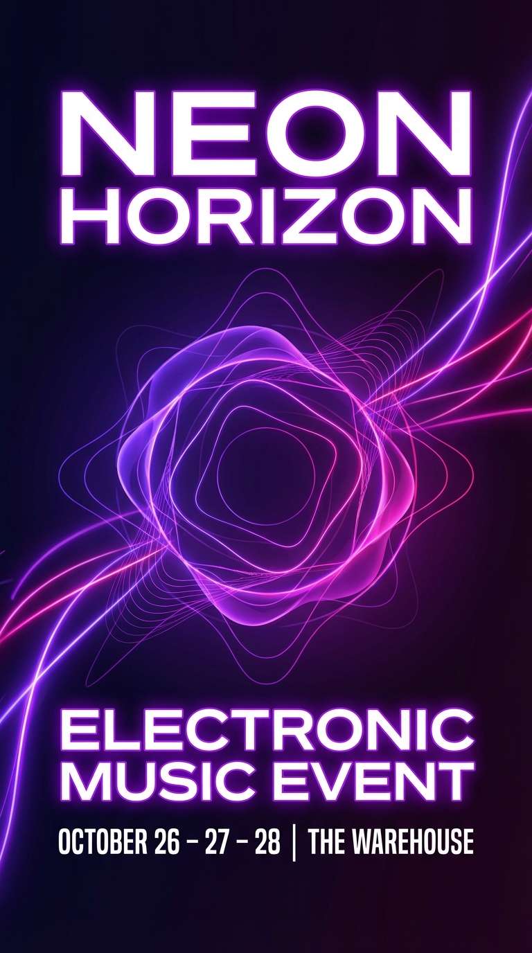
10) Neon Iris Night
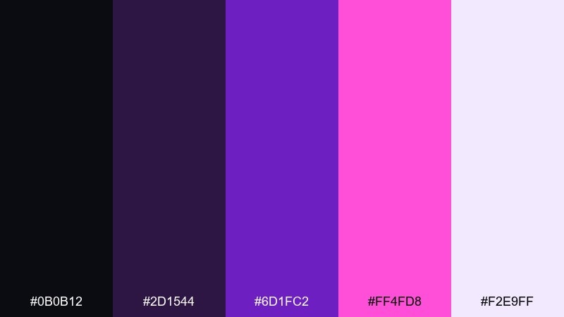
HEX: #0b0b12 #2d1544 #6d1fc2 #ff4fd8 #f2e9ff
Mood: electric, nightlife, bold
Best for: club event flyers
Electric and bold, this set feels like a neon sign buzzing in a dark hallway. It is made for club flyers, DJ lineups, and late-night pop-up announcements. Pair the hot magenta sparingly with the bright violet to highlight names and times, then let the deep shades carry the background. Usage tip: keep type large and high-contrast so the glow effect stays readable at a glance.
Image example of neon iris night generated using media.io
11) Rose Quartz Iris
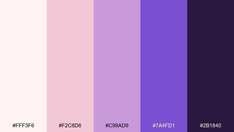
HEX: #fff3f6 #f2c8d6 #c99ad9 #7a4fd1 #2b1840
Mood: sweet, modern, expressive
Best for: social media ad creatives
Sweet and expressive, these tones feel like rose quartz catching violet light. They work well for scroll-stopping social ads where softness still needs contrast. Pair the blush backgrounds with the strong purple for headlines and use the mid lavender for badges and price tags. Usage tip: keep gradients short and directional so the ad looks crisp on small screens.
Image example of rose quartz iris generated using media.io

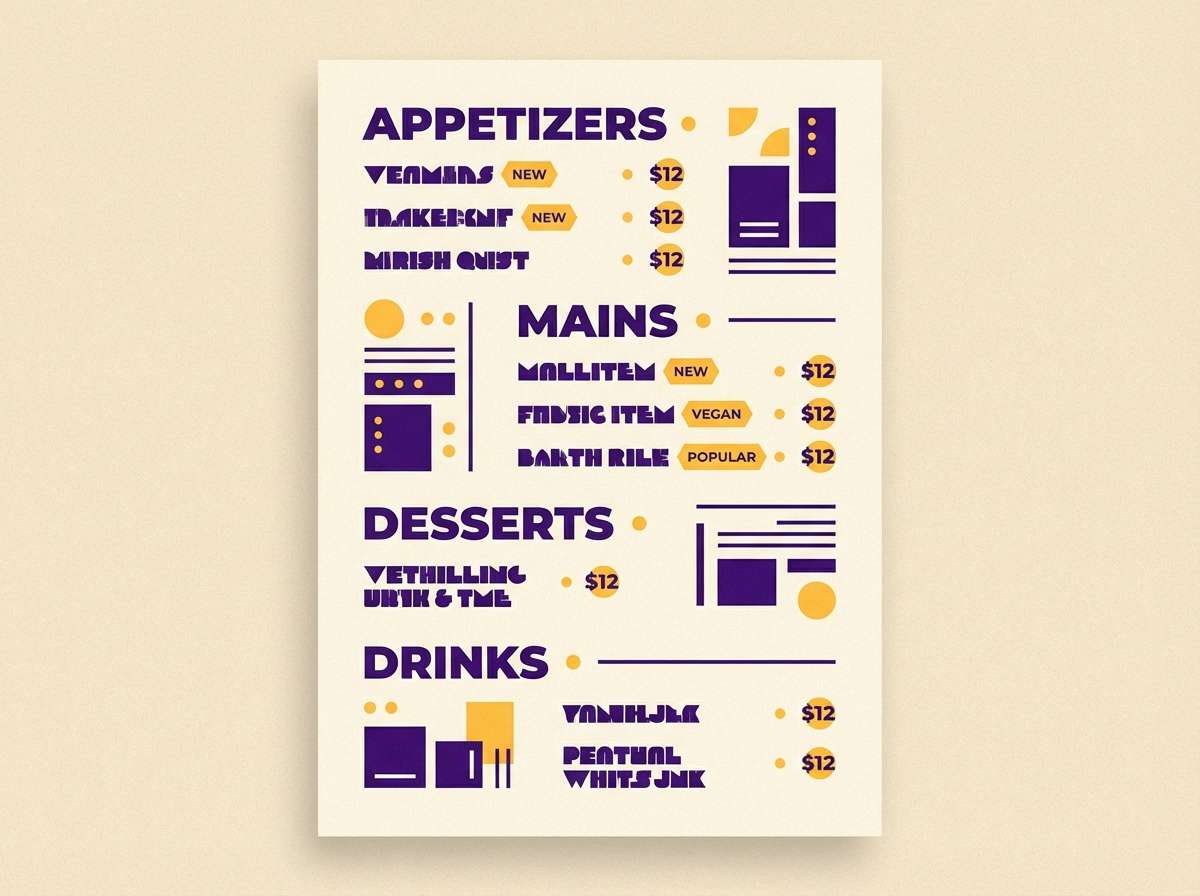
12) Saffron Accent
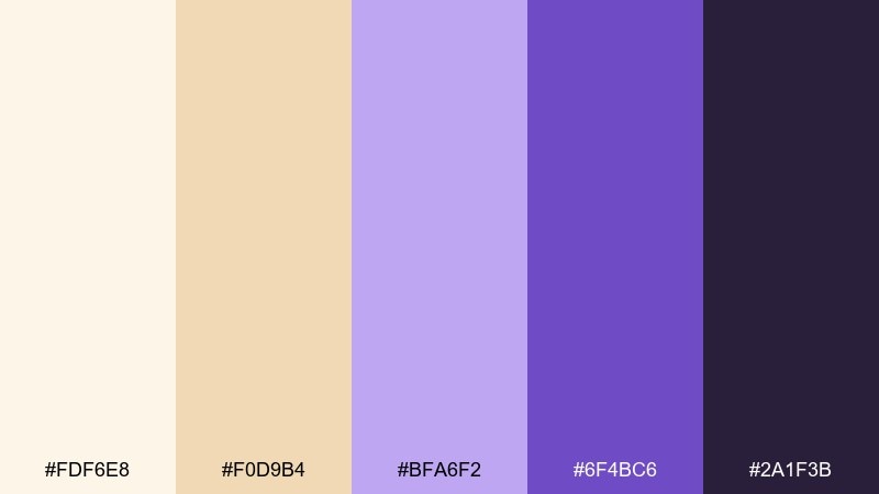
HEX: #fdf6e8 #f0d9b4 #bfa6f2 #6f4bc6 #2a1f3b
Mood: sunlit, playful, sophisticated
Best for: restaurant menus and promos
Sunlit and playful, the creamy base and saffron notes make the purples feel more appetizing than icy. It is a smart choice for restaurant promos, seasonal menus, and chef specials where you want warmth and polish together. Pair the deep violet for typography with saffron as a small highlight for prices or callouts. Usage tip: keep saffron to under 10 percent of the layout so it reads as a deliberate accent.
Image example of saffron accent generated using media.io
13) Minimal Graphite
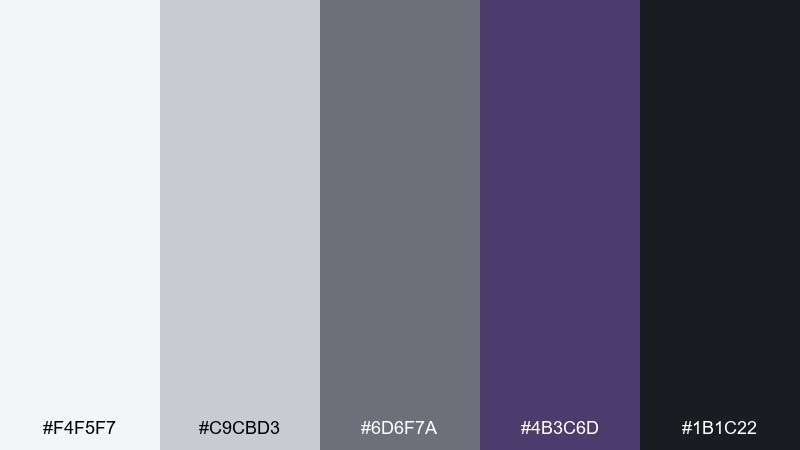
HEX: #f4f5f7 #c9cbd3 #6d6f7a #4b3c6d #1b1c22
Mood: minimal, professional, grounded
Best for: corporate slide decks
Minimal and grounded, this mix feels like graphite sketches with a quiet violet signature. It is excellent for slide decks that need to look serious while still feeling modern. Pair light gray backgrounds with charcoal text and use the muted violet only for key charts or section headers. Usage tip: keep icon strokes consistent and let tone changes do the heavy lifting instead of extra decoration.
Image example of minimal graphite generated using media.io
14) Blooming Gradient
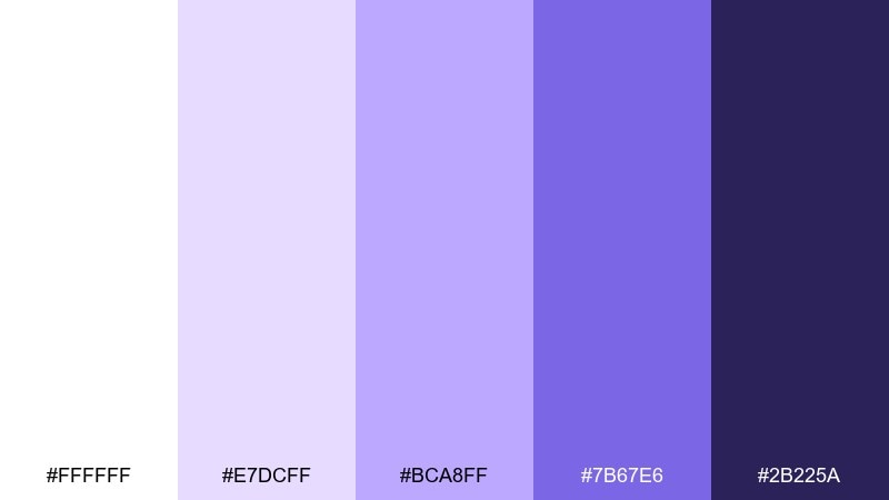
HEX: #ffffff #e7dcff #bca8ff #7b67e6 #2b225a
Mood: bright, clean, uplifting
Best for: SaaS onboarding screens
Bright and uplifting, these tints feel like petals opening in morning light. For onboarding screens, the gentle steps between shades make progress states and cards look friendly. Try these iris color combinations as soft gradients behind illustrations, with #2b225a for labels and microcopy. Usage tip: cap gradients at two to three stops so the UI stays sharp and accessible.
Image example of blooming gradient generated using media.io
15) Coastal Periwinkle
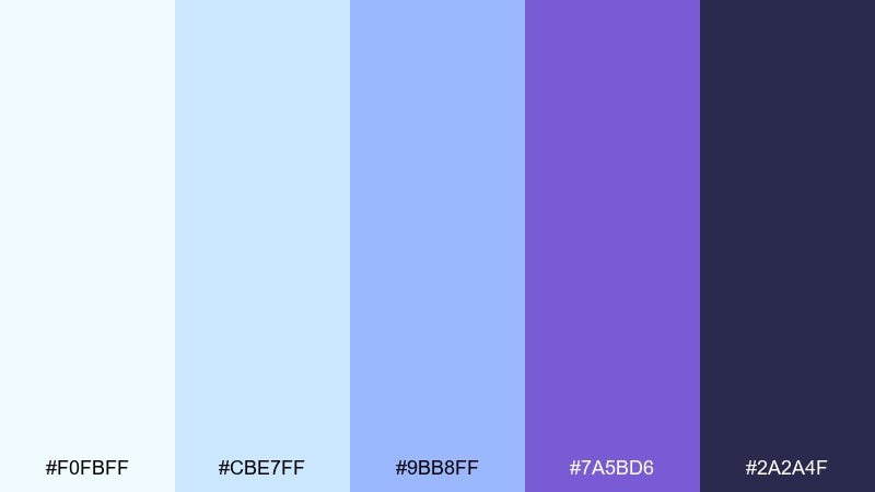
HEX: #f0fbff #cbe7ff #9bb8ff #7a5bd6 #2a2a4f
Mood: cool, breezy, serene
Best for: travel brochures and banners
Cool and serene, these colors evoke sea mist with a periwinkle horizon. They are great for travel banners that need to feel refreshing and trustworthy. Pair the pale blues with violet as a directional accent for buttons, map markers, or highlights. Usage tip: keep body text in the deep slate tone to maintain contrast over light backgrounds.
Image example of coastal periwinkle generated using media.io

16) Royal Ribbon
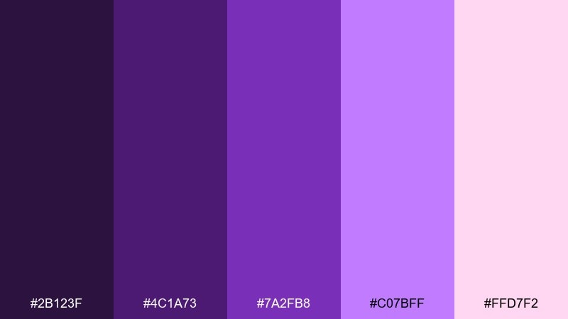
HEX: #2b123f #4c1a73 #7a2fb8 #c07bff #ffd7f2
Mood: regal, festive, confident
Best for: gift packaging and tags
Regal and festive, these tones feel like satin ribbons and velvet boxes. They suit gift packaging, limited editions, and celebratory tags that need a premium spark. Pair the deep royal purples with the blush pink as a softer counterbalance, and let the bright lavender carry small decorative shapes. Usage tip: use the blush only as a highlight so the purples stay dominant and luxurious.
Image example of royal ribbon generated using media.io

17) Soft Focus
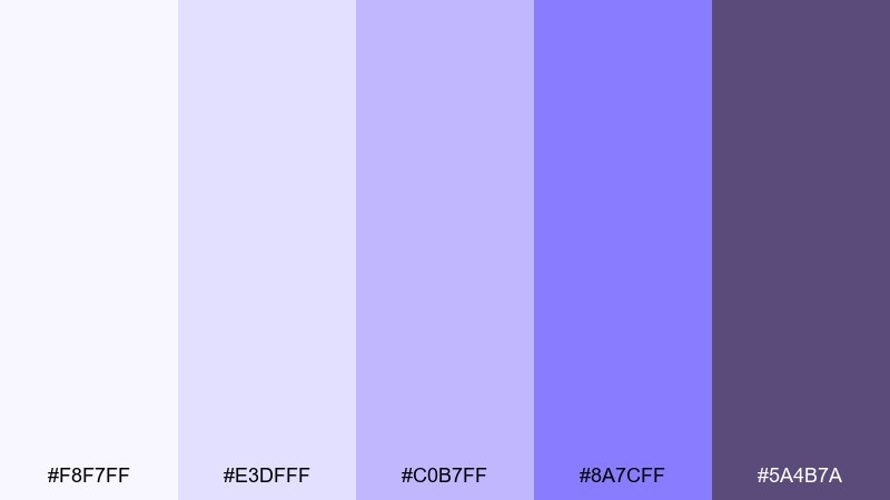
HEX: #f8f7ff #e3dfff #c0b7ff #8a7cff #5a4b7a
Mood: dreamy, gentle, modern
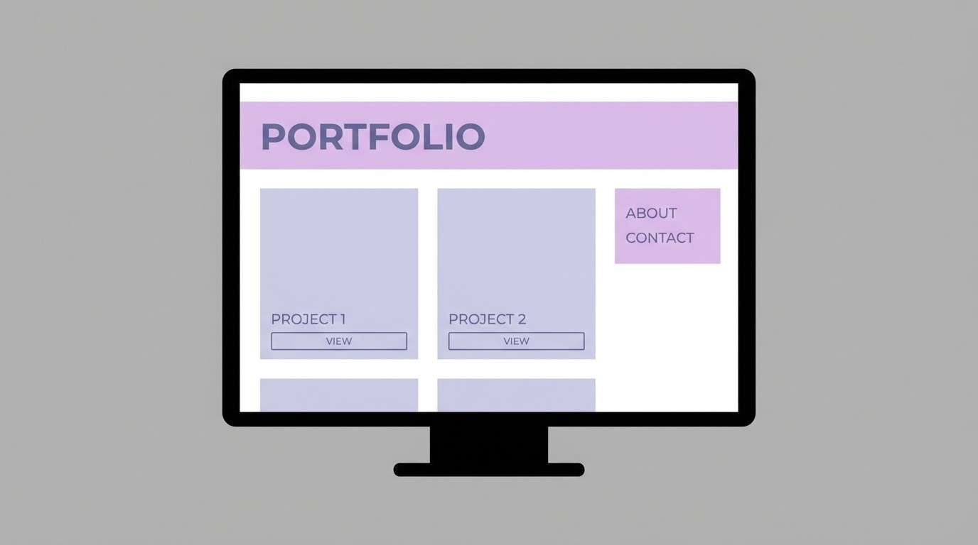
Best for: personal branding and portfolios
Dreamy and gentle, these shades look like a soft-focus lens over lilac light. For creators and consultants, an iris color palette like this keeps pages friendly while still feeling polished. Pair the mid lavender with a warm off-white and use the slate-violet for typography and separators. Usage tip: limit yourself to one accent element per section so the design stays calm and intentional.
Image example of soft focus generated using media.io
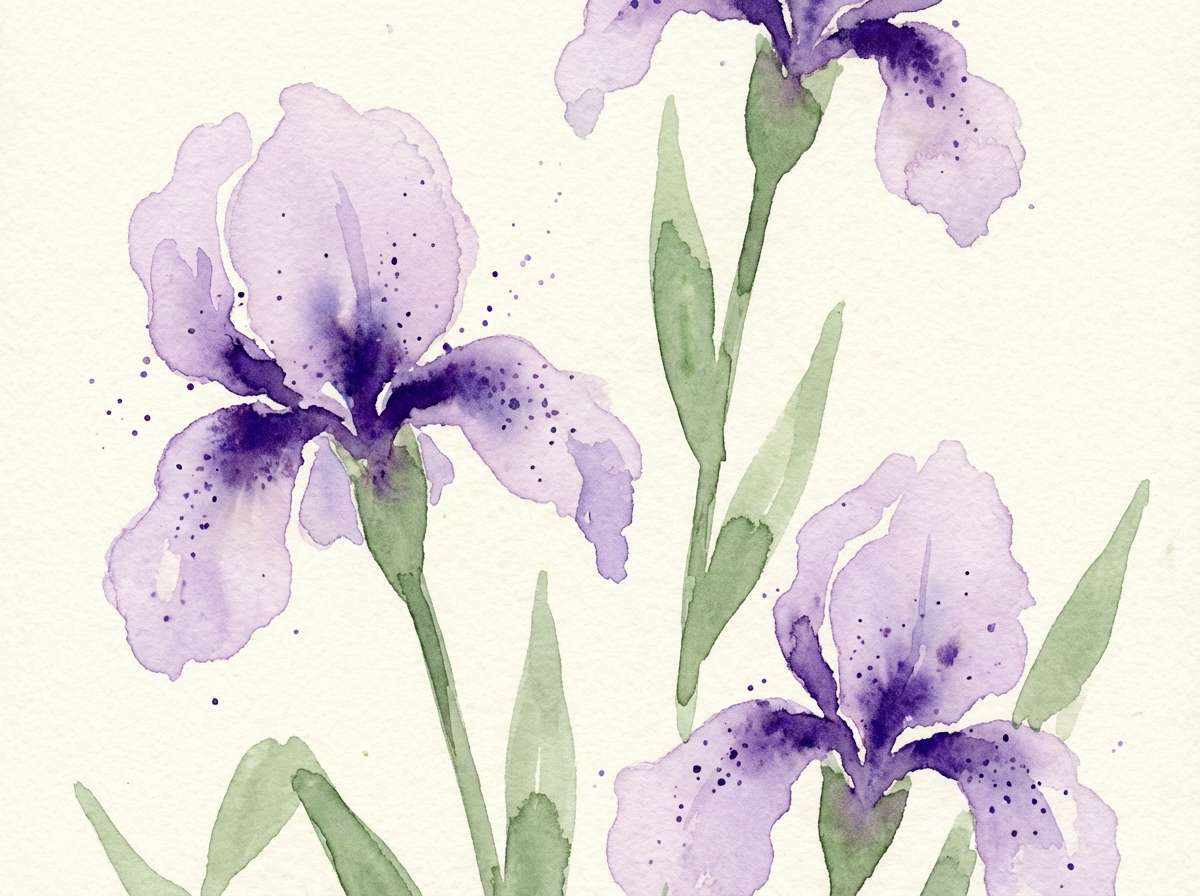
18) Botanical Watercolor
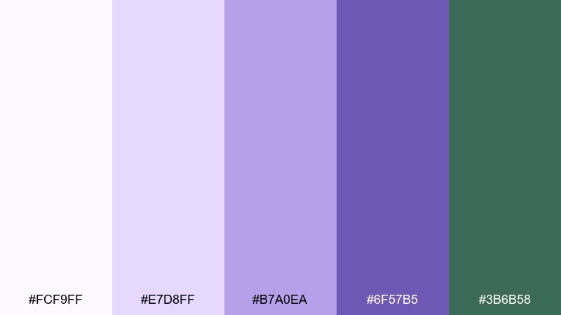
HEX: #fcf9ff #e7d8ff #b7a0ea #6f57b5 #3b6b58
Mood: botanical, artistic, tranquil
Best for: spring illustrations and stationery
Botanical and tranquil, this set feels like watercolor blooms with leafy depth. It is perfect for spring stationery, journaling printables, and illustrated packaging sleeves. Pair violet petals with the muted green for stems and borders, keeping the lightest tone as paper space. Usage tip: use wash-like texture in the light shades and keep outlines minimal for a hand-painted look.
Image example of botanical watercolor generated using media.io
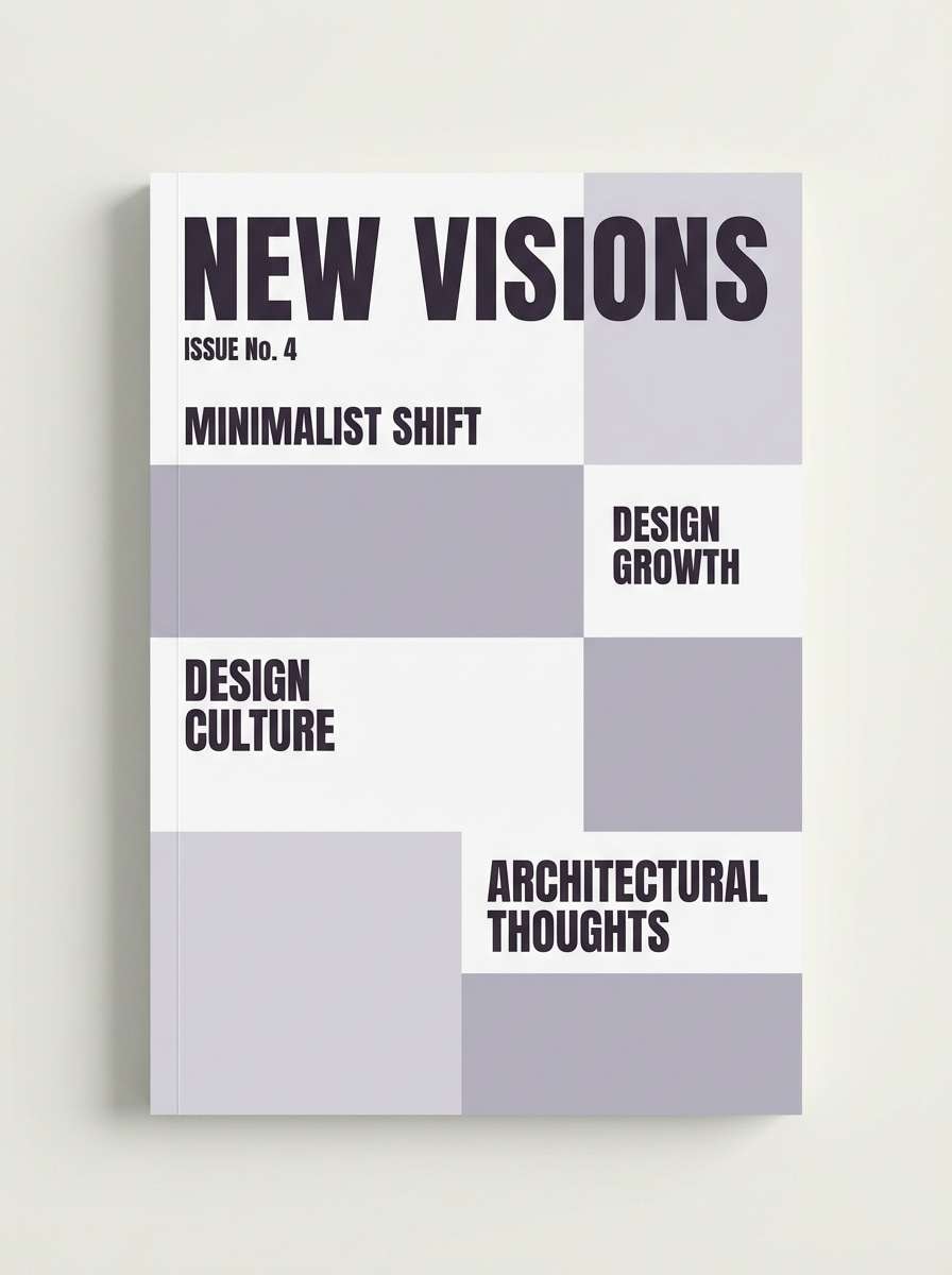
19) Modern Editorial
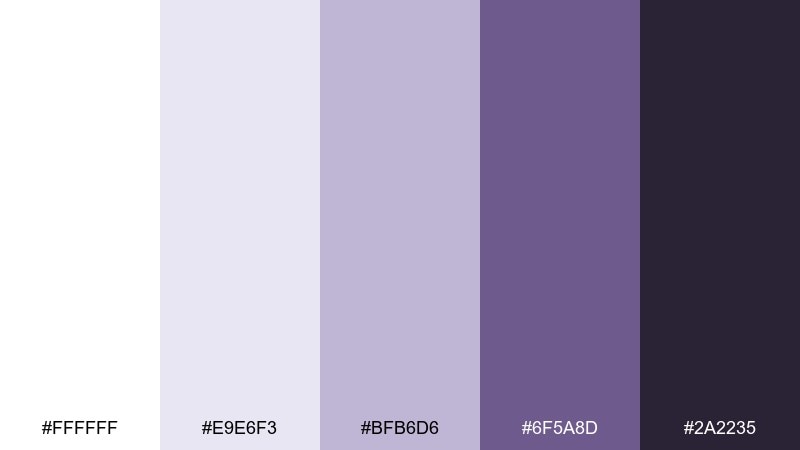
HEX: #ffffff #e9e6f3 #bfb6d6 #6f5a8d #2a2235
Mood: clean, tasteful, editorial
Best for: magazine covers
Clean and tasteful, these tones feel like a crisp magazine printed on bright stock. They are ideal for covers where type hierarchy needs to be sharp but not loud. Pair the pale lavender-gray with strong charcoal-violet headlines and keep supporting copy in the mid neutral. Usage tip: use large margins and consistent baseline grids to make the subdued colors feel intentional and premium.
Image example of modern editorial generated using media.io
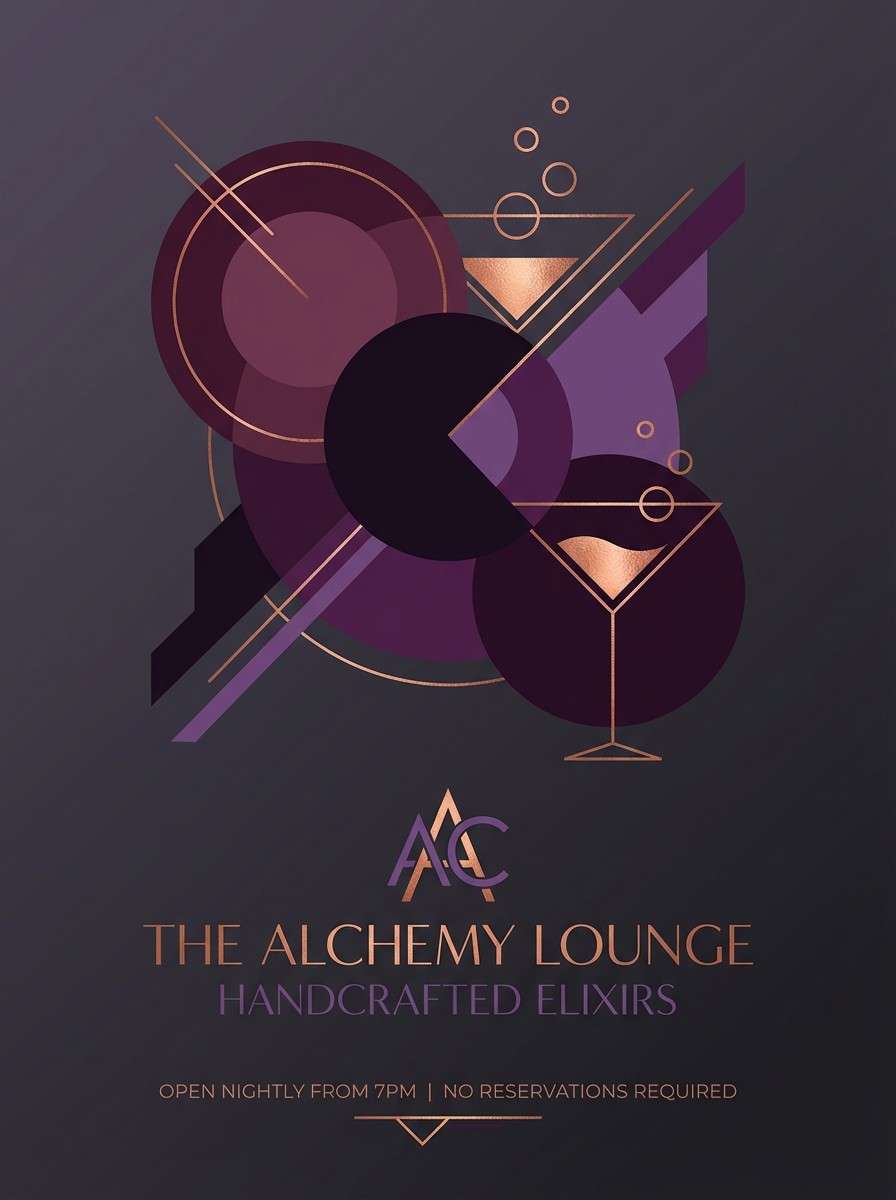
20) Copper Twilight
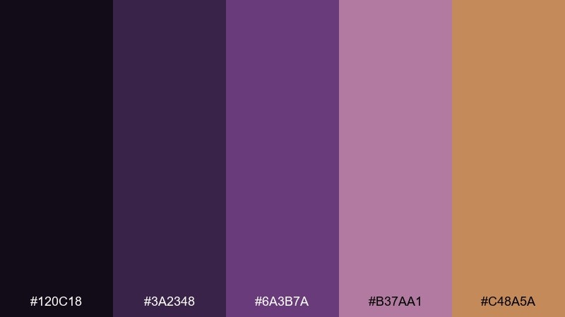
HEX: #120c18 #3a2348 #6a3b7a #b37aa1 #c48a5a
Mood: warm, cinematic, sophisticated
Best for: cocktail bar promos
Warm and cinematic, this mix reads like twilight purples with a copper glow. It is a strong fit for cocktail bar promos, tasting menus, and evening event banners. Pair the copper as a small highlight for dates or drink names, while letting the dark plum carry the atmosphere. Usage tip: add subtle grain to backgrounds so the deep shades feel rich instead of flat.
Image example of copper twilight generated using media.io
What Colors Go Well with Iris?
Iris pairs effortlessly with crisp neutrals like white, light gray, and charcoal, which help the purples feel modern and readable. For typography, deep eggplant or slate-violet often looks more refined than pure black.
For softer, romantic combinations, try blush pink, cream, and muted mauve. For fresher, brighter looks, periwinkle and cool sky blues keep iris feeling airy rather than heavy.
To add warmth and contrast, introduce small accents like saffron, copper, or warm sand. Keep warm accents controlled so the iris tones remain the main identity signal.
How to Use a Iris Color Palette in Real Designs
Start with one “job” per shade: a light tint for backgrounds, a midtone for components, and a dark anchor for text and navigation. This prevents purple-heavy designs from becoming flat or overly saturated.
For UI, reserve the brightest iris shade for primary actions (buttons, active tabs, focus rings) and keep supporting surfaces softer. For print, test a proof on your chosen stock—violets and mauves can shift noticeably on uncoated paper.
When in doubt, increase whitespace and reduce the number of simultaneous accents. Iris looks strongest when it has room to breathe and your hierarchy is driven by contrast, not extra decoration.
Create Iris Palette Visuals with AI
If you have HEX codes but need real mockups fast, generate on-brand visuals with AI and iterate in minutes. Iris palettes are especially good for testing mood shifts (airy vs. dramatic) by swapping a single anchor shade.
Use your palette as constraints in your prompt, then refine lighting, typography style, and composition until the look matches your product or campaign. Save the best result as a repeatable template for future assets.
Iris Color Palette FAQs
-
What is an iris color palette?
An iris color palette is a set of coordinated colors built around iris-like purples (from pale lilac to deep violet), typically supported by neutrals or complementary accents for balance and contrast. -
Is iris closer to purple or blue?
Iris usually sits between blue-violet and true purple. Some iris palettes lean cooler (periwinkle/indigo), while others lean warmer (orchid/mauve). -
What neutral colors work best with iris?
White, off-white, light gray, and charcoal are the easiest pairings. For a softer feel, use cream or warm beige; for a modern feel, use cool grays and near-black purple for text. -
How do I keep an iris UI accessible?
Use a dark anchor (deep violet/eggplant) for text and key UI elements, and keep large background areas in very light tints. Check contrast ratios for buttons and links, especially when using mid-purples. -
What accent colors make iris look more premium?
Small touches of copper, gold/saffron, or blush can elevate iris quickly. Keep accents limited so the palette still reads primarily as iris rather than mixed warm tones. -
Can I use iris palettes for corporate branding?
Yes—choose subdued iris shades (lavender-gray, slate-violet) and pair with graphite grays. This keeps the brand professional while still distinctive compared to standard blues. -
How can I generate iris palette images for presentations or ads?
Use Media.io text-to-image: describe the design format (poster, packaging, UI), specify the mood, and include your iris tones as dominant colors. Iterate prompts until the composition and contrast match your layout needs.
Next: Studio Color Palette


