

A studio color palette is built for control: clean backdrops, intentional contrast, and lighting-friendly tones that keep subjects and typography looking sharp.
Below are curated studio palettes—ranging from warm neutrals to moody darks and bright accents—each with HEX codes and practical use tips for branding, UI, and print.
In this article
- Why Studio Palettes Work So Well
-
- warm spotlight
- concrete and chrome
- softbox pastels
- neon tape notes
- matte black and linen
- clay studio
- film grain greens
- blue hour booth
- copper circuit
- paper cut cream
- slate and saffron
- sunset backdrop
- monochrome workshop
- aqua light leak
- vintage velvet
- digital chalk
- forest desk
- peachy soundstage
- quiet lavender gray
- bright white studio
- What Colors Go Well with Studio?
- How to Use a Studio Color Palette in Real Designs
- Create Studio Palette Visuals with AI
Why Studio Palettes Work So Well
Studio palettes are designed around predictable lighting and clear separation between foreground and background, which makes them dependable for product shots, UI screens, and print layouts.
They often combine calm neutrals with one or two disciplined accents, so you can control attention: headlines, buttons, and key details pop without making the composition feel noisy.
Because these color combinations mimic real materials (paper, concrete, linen, velvet, metal), they also translate well across mediums—staying believable on screens and in print.
20+ Studio Color Palette Ideas (with HEX Codes)
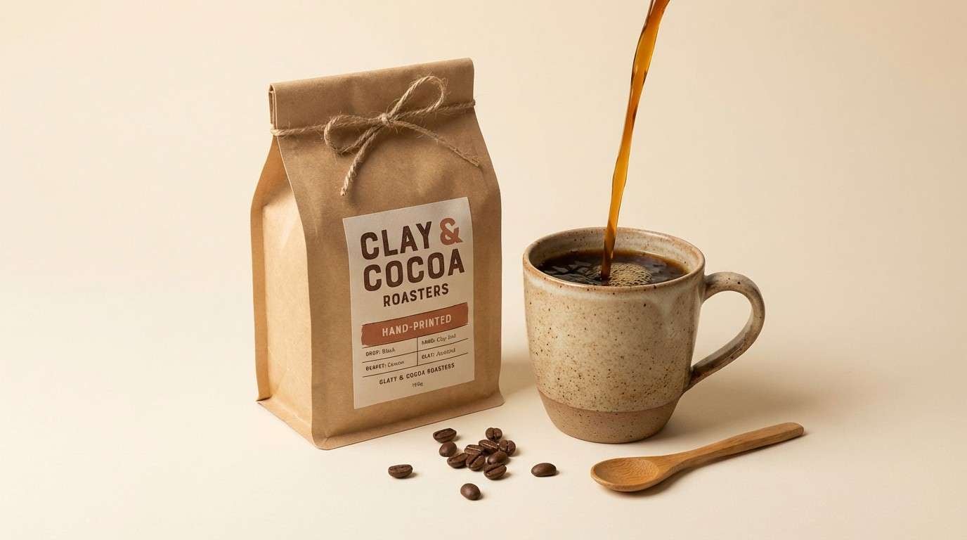
1) Warm Spotlight
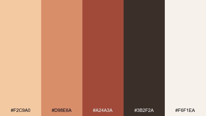
HEX: #F2C9A0 #D98E6A #A24A3A #3B2F2A #F6F1EA
Mood: cozy and cinematic
Best for: product ad for artisanal coffee packaging
Cozy, cinematic warmth like a tungsten spotlight hitting kraft paper and espresso crema. Use the tan and clay tones for the hero product, then ground the layout with deep cocoa for type and shadows. Cream works beautifully for breathing room and highlights without feeling stark. Tip: keep the darkest brown for small details so the ad stays rich, not heavy.
Image example of warm spotlight generated using media.io
Media.io is an online AI studio for creating and editing video, image, and audio in your browser.

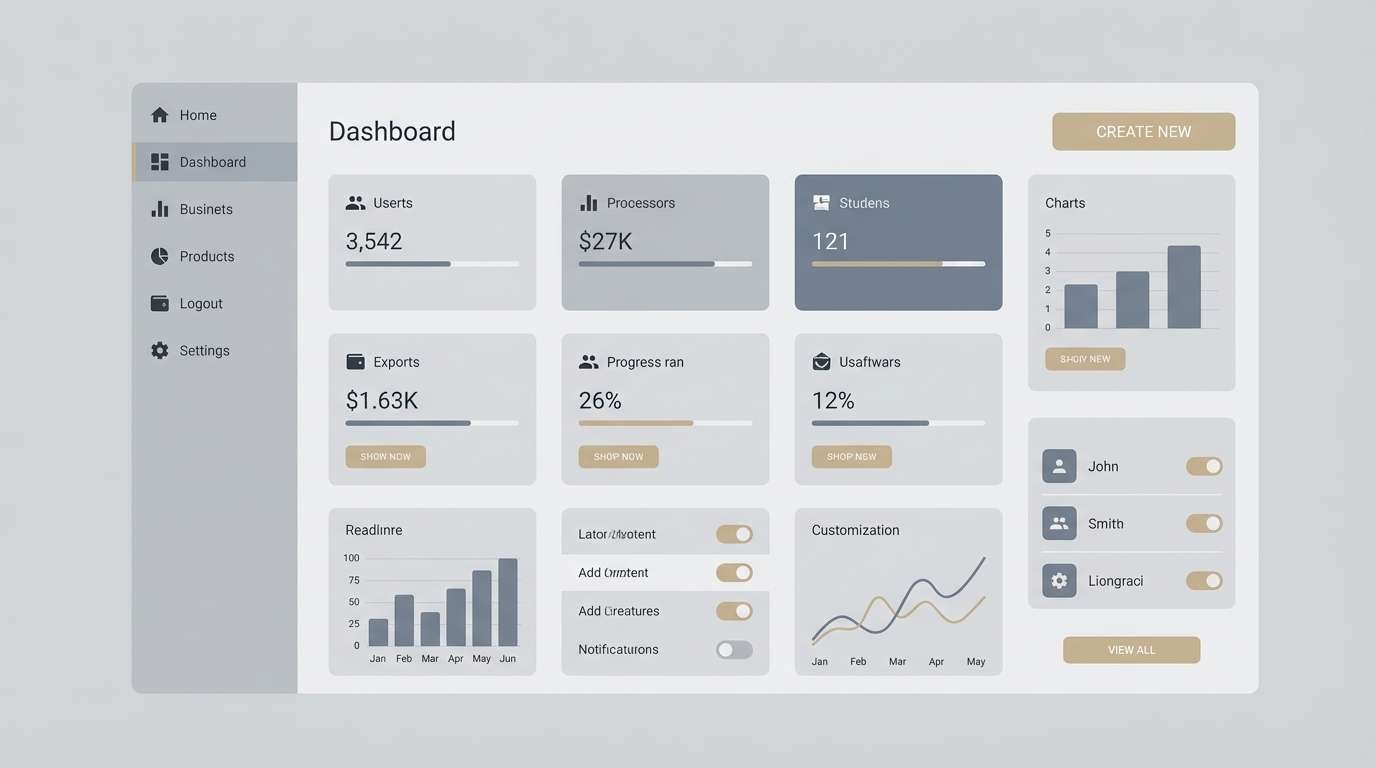
2) Concrete and Chrome
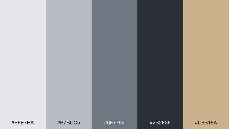
HEX: #E6E7EA #B7BCC5 #6F7782 #2B2F36 #C9B18A
Mood: industrial and precise
Best for: 2d ui dashboard mockup
Industrial clarity with the feel of polished metal, concrete floors, and crisp overhead light. These studio color combinations keep data-heavy screens calm while still offering contrast for charts and badges. Use charcoal for navigation, slate for secondary text, and the sand accent for calls to action. Tip: reserve the lightest gray for card backgrounds to avoid glare on long sessions.
Image example of concrete and chrome generated using media.io
3) Softbox Pastels
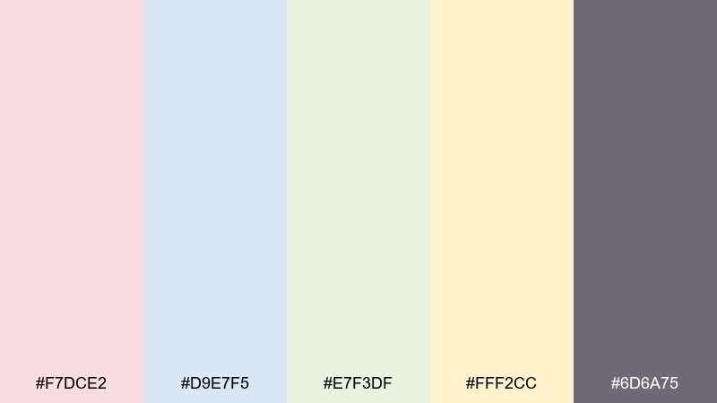
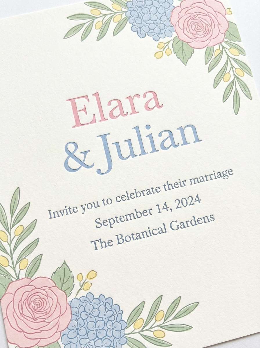
HEX: #F7DCE2 #D9E7F5 #E7F3DF #FFF2CC #6D6A75
Mood: airy and gentle
Best for: wedding invitation design on plain background
Airy pastels that feel like softbox light diffused through sheer fabric. Let one pastel lead (pink or powder blue) and use the others as small flourishes in florals, borders, or icons. The smoky violet is ideal for typography, keeping the look refined rather than sugary. Tip: add plenty of white space so the colors read as premium and calm.
Image example of softbox pastels generated using media.io
4) Neon Tape Notes
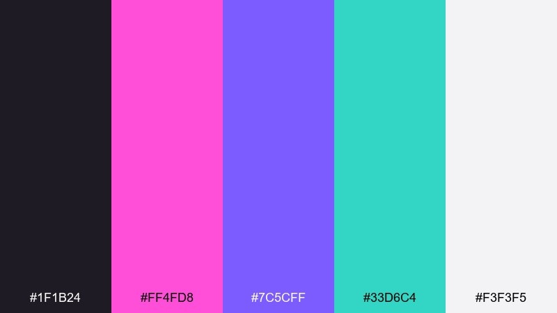
HEX: #1F1B24 #FF4FD8 #7C5CFF #33D6C4 #F3F3F5
Mood: electric and playful
Best for: music event poster
Electric club energy with neon tape lines cutting through a dark room. Keep the background near-black and let magenta or violet own the headline for immediate impact. Aqua works best for secondary details like date, venue, or iconography, while off-white keeps tiny text readable. Tip: use neon in solid blocks rather than gradients to avoid muddy printing.
Image example of neon tape notes generated using media.io

5) Matte Black and Linen
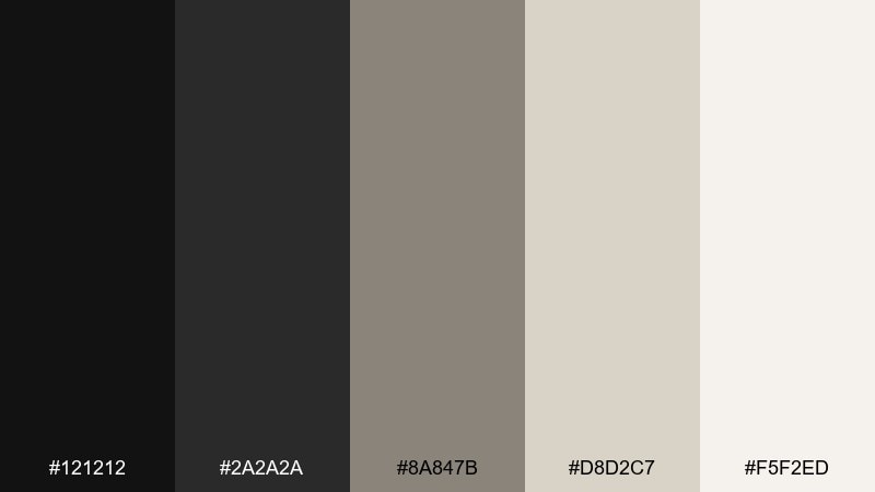
HEX: #121212 #2A2A2A #8A847B #D8D2C7 #F5F2ED
Mood: minimal and editorial
Best for: fashion lookbook editorial spread
Minimal editorial calm, like matte black ink on textured linen stock. Use the two dark tones for headlines and image captions, then layer linen and cream to create quiet hierarchy across spreads. The taupe works as a subtle divider or pull-quote background without stealing attention from photography. Tip: keep margins generous so the neutrals feel intentional, not empty.
Image example of matte black and linen generated using media.io
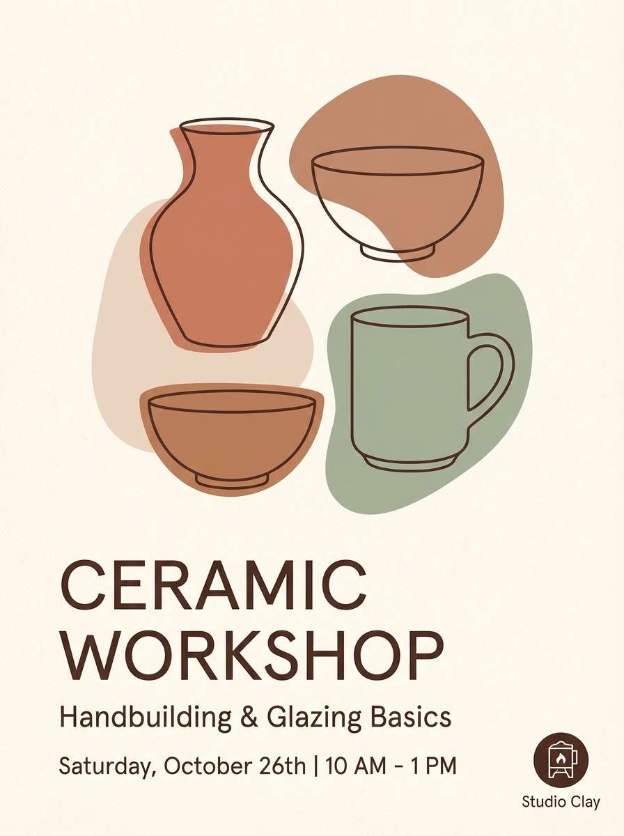
6) Clay Studio
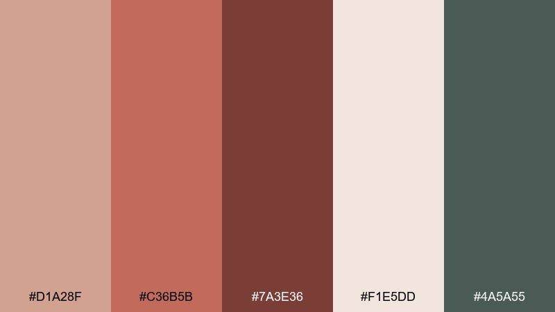
HEX: #D1A28F #C36B5B #7A3E36 #F1E5DD #4A5A55
Mood: handmade and grounded
Best for: ceramic workshop flyer
Handmade warmth that recalls wet clay, kiln heat, and earthy studio shelves. Let the terracotta shades carry titles and key details, then use the dusty cream as the main background to keep the flyer approachable. The muted green-gray adds a modern counterpoint for icons or section headers. Tip: pair with a tactile serif or a simple grotesk to balance craft and clarity.
Image example of clay studio generated using media.io
7) Film Grain Greens
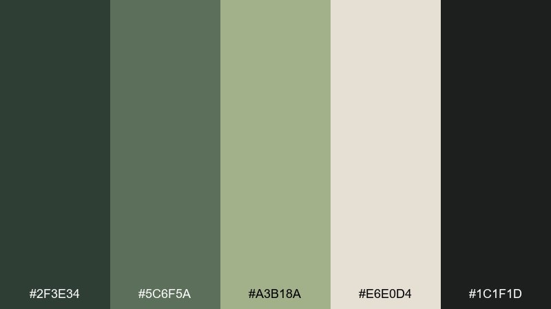
HEX: #2F3E34 #5C6F5A #A3B18A #E6E0D4 #1C1F1D
Mood: organic and moody
Best for: eco brand logo and stationery mockup
Organic and moody, like forest shadows captured on vintage film. Use the deep greens for the logo mark and the pale oat tone for stationery backgrounds to keep it airy. The mid sage shades work well for patterns, seals, and subtle brand textures. Tip: add a touch of grain in print elements to reinforce the analog feel without reducing legibility.
Image example of film grain greens generated using media.io
8) Blue Hour Booth
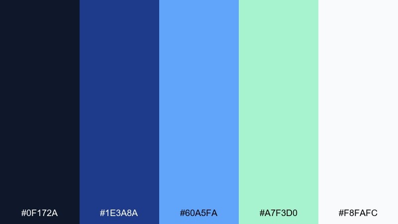
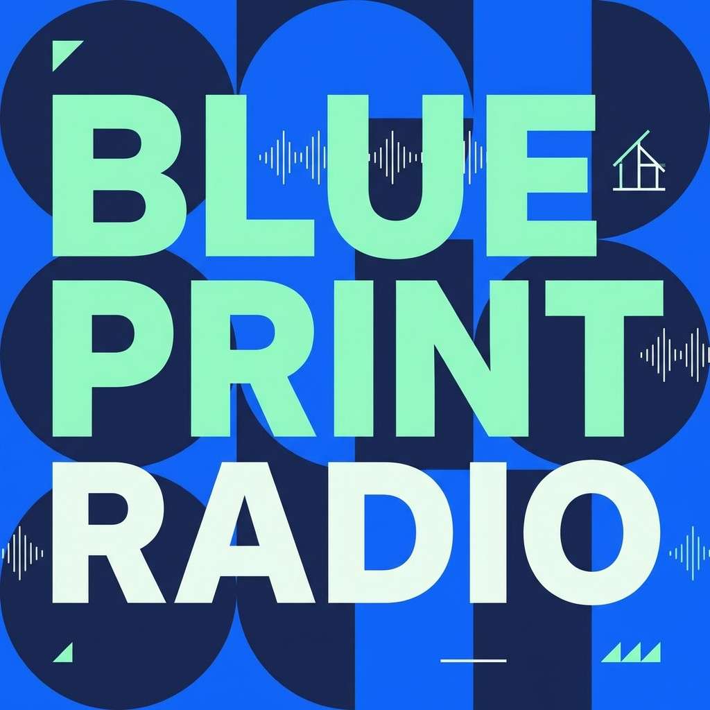
HEX: #0F172A #1E3A8A #60A5FA #A7F3D0 #F8FAFC
Mood: cool and modern
Best for: podcast cover art
Cool blue-hour light with a crisp, modern edge, like LEDs in a quiet recording booth. For podcast cover art, anchor the background in navy and let bright blue carry the title for instant scroll-stopping contrast. Mint works as a smart highlight for episode numbers or badges, while near-white keeps the composition clean. Tip: keep text weight bold so it stays readable at thumbnail size in this studio color palette.
Image example of blue hour booth generated using media.io
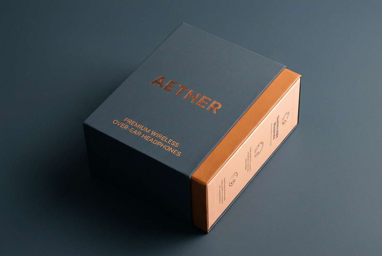
9) Copper Circuit
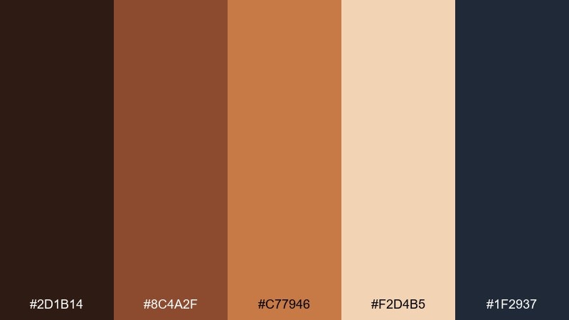
HEX: #2D1B14 #8C4A2F #C77946 #F2D4B5 #1F2937
Mood: warm and technical
Best for: tech product packaging for headphones
Warm and technical, like copper traces under a desk lamp. Use the dark charcoal-blue as the base for a premium box, then bring in copper and caramel for typography, icons, and trim. The pale peach tone works well for inside packaging or spec panels where you need readable contrast. Tip: apply copper as a spot color to make the packaging feel expensive without looking busy.
Image example of copper circuit generated using media.io
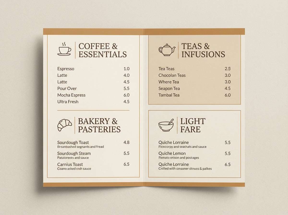
10) Paper Cut Cream
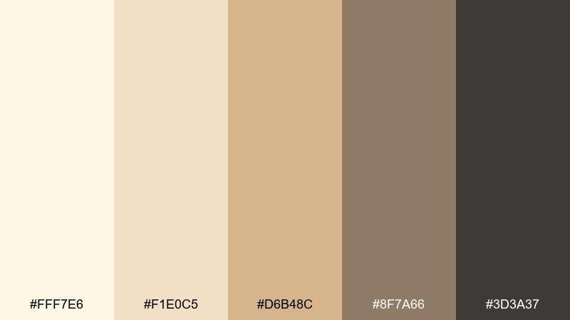
HEX: #FFF7E6 #F1E0C5 #D6B48C #8F7A66 #3D3A37
Mood: soft and welcoming
Best for: cafe menu design
Soft and welcoming, like layered paper cutouts in warm window light. Build the menu on cream and sand so the page feels friendly, then use mocha and charcoal for clear section titles and pricing. The mid caramel tone is perfect for small icons or subtle separators. Tip: keep photos warm-toned or monochrome so they blend naturally with the paper-like palette.
Image example of paper cut cream generated using media.io
11) Slate and Saffron
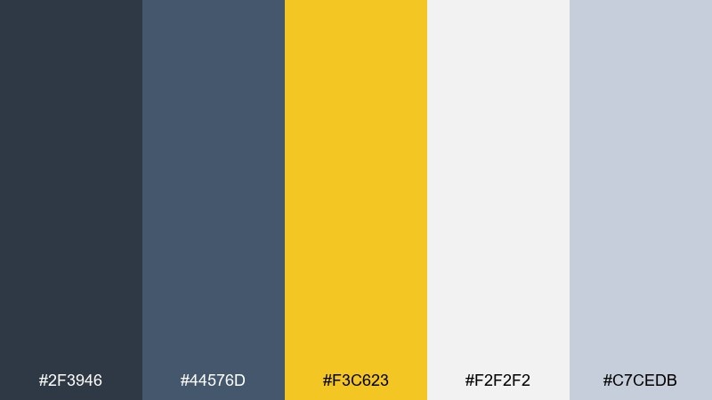
HEX: #2F3946 #44576D #F3C623 #F2F2F2 #C7CEDB
Mood: confident and bright
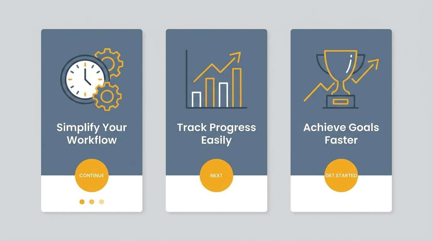
Best for: app onboarding 2d screens
Confident clarity with a bright saffron pop, like a highlight marker on a clean notepad. These studio color combinations work great for onboarding where you need calm structure plus a clear next step. Use slate for headers and body text, light gray for cards, and saffron only for primary buttons and progress indicators. Tip: limit the yellow to one action per screen to keep focus sharp.
Image example of slate and saffron generated using media.io
12) Sunset Backdrop
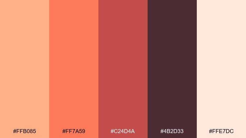
HEX: #FFB085 #FF7A59 #C24D4A #4B2D33 #FFE7DC
Mood: energetic and friendly
Best for: social media quote template
Energetic and friendly, like a sunset backdrop fading behind a set. Use peach as the main canvas, then set the quote in deep plum for strong contrast and an editorial feel. Coral and brick are ideal for emphasis words, stickers, or shape accents that guide the eye. Tip: keep only one accent shape per post so the text remains the hero.
Image example of sunset backdrop generated using media.io
13) Monochrome Workshop
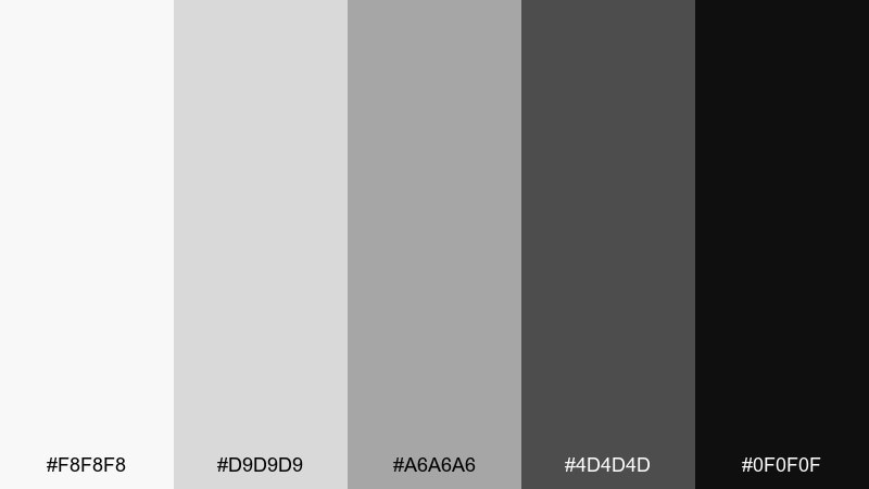
HEX: #F8F8F8 #D9D9D9 #A6A6A6 #4D4D4D #0F0F0F
Mood: clean and architectural
Best for: architectural portfolio layout
Clean, architectural restraint with the feel of drafting paper and graphite. Use near-white for margins and negative space, then step through the grays to build hierarchy for captions, project labels, and section dividers. The near-black is best reserved for key headings and small UI-like details such as page numbers. Tip: keep image borders light so photography stays crisp against the minimal grid.
Image example of monochrome workshop generated using media.io
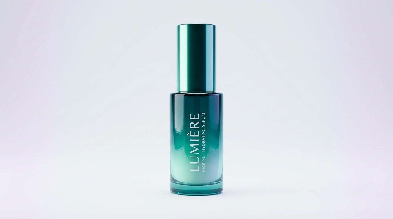
14) Aqua Light Leak
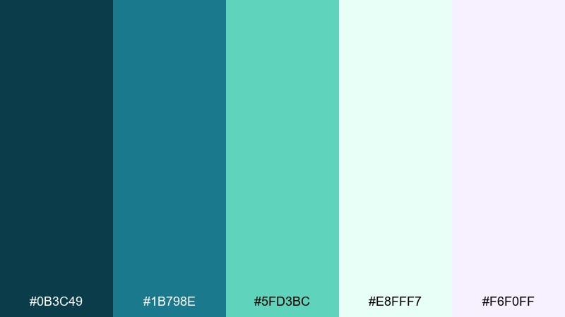
HEX: #0B3C49 #1B798E #5FD3BC #E8FFF7 #F6F0FF
Mood: fresh and luminous
Best for: skincare product ad with clean background
Fresh and luminous, like an aqua light leak across a clean studio set. Use teal as the anchor for the bottle label or headline, then let mint and ice-green carry the glow in highlights and reflections. The whisper-lavender tint adds a modern softness for secondary copy panels. Tip: keep the background very pale so the teal reads saturated and premium.
Image example of aqua light leak generated using media.io
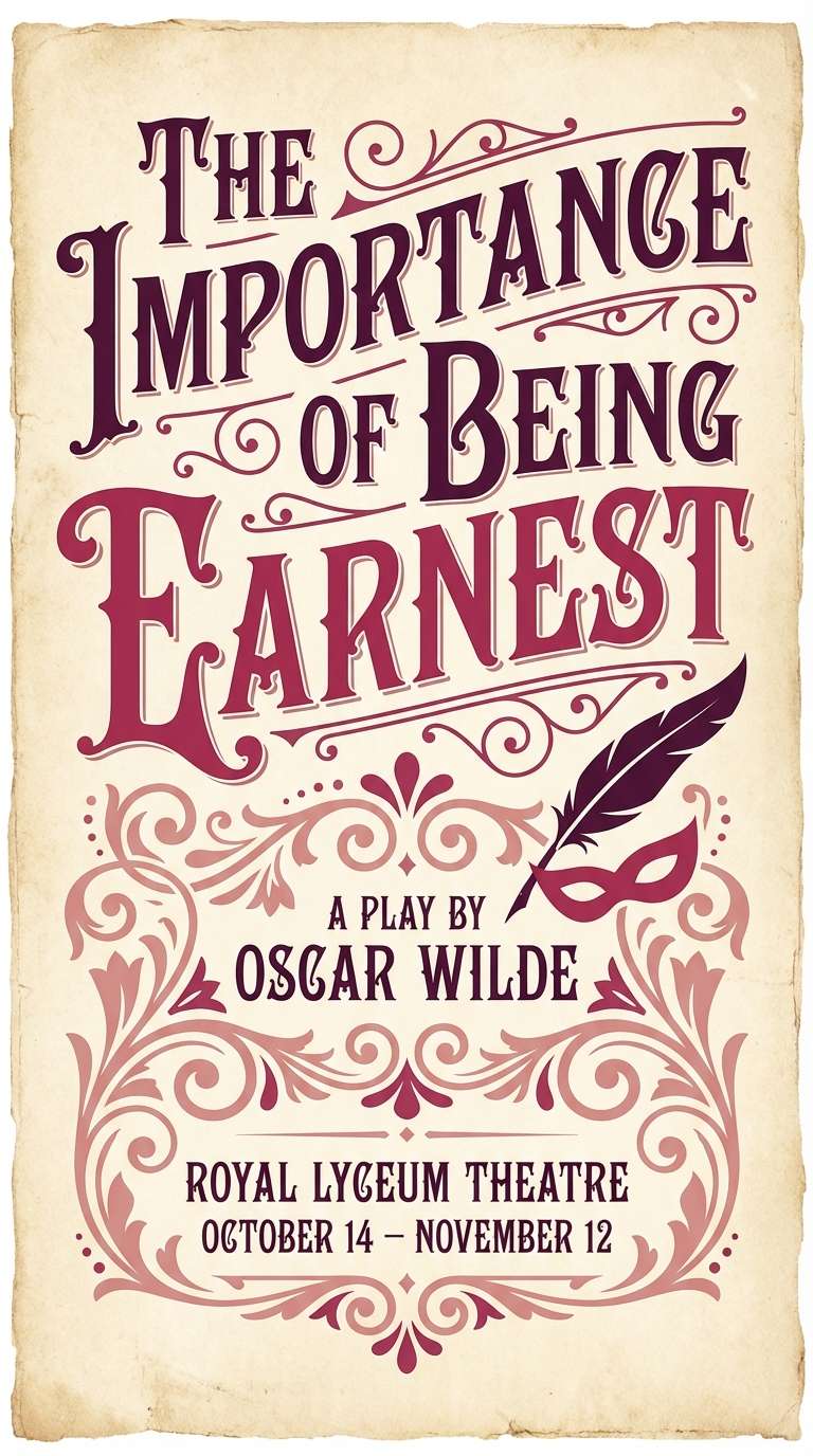
15) Vintage Velvet
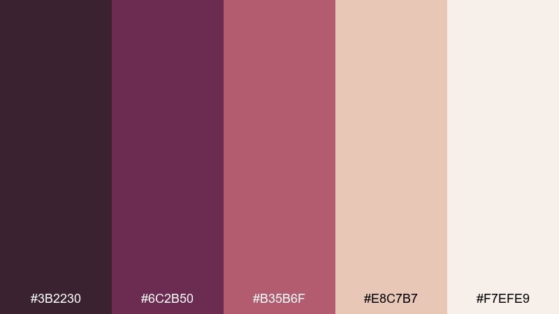
HEX: #3B2230 #6C2B50 #B35B6F #E8C7B7 #F7EFE9
Mood: dramatic and nostalgic
Best for: theater play poster
Dramatic nostalgia, like velvet curtains and stage lights warming up. Use the deep plum as the poster base, then layer berry tones for titles, cast names, and ornamental flourishes. Blush and soft cream help balance the drama and keep details legible from a distance. Tip: pair with a high-contrast serif to lean into the classic theater mood.
Image example of vintage velvet generated using media.io
16) Digital Chalk
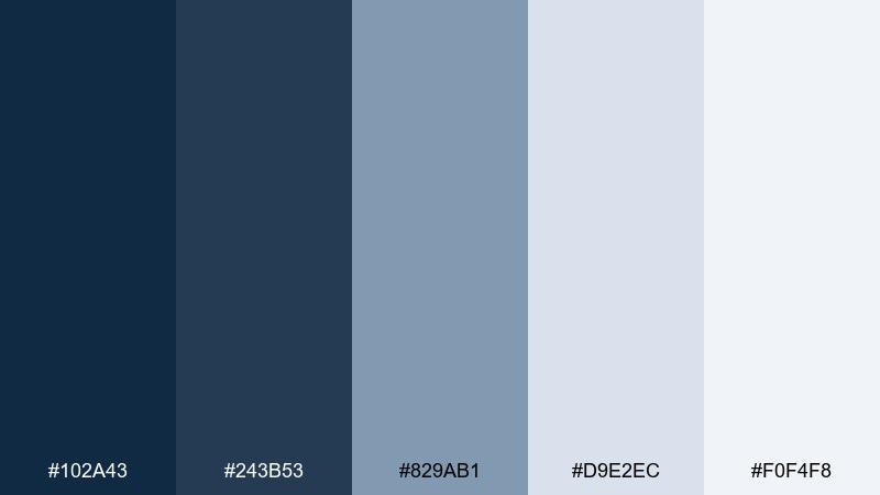
HEX: #102A43 #243B53 #829AB1 #D9E2EC #F0F4F8
Mood: smart and calm
Best for: online course landing page ui
Smart calm like chalk dust on a navy board, but polished for the web. Use the two deep blues for navigation and headings, then bring in misty blue-gray for cards and feature blocks. The pale tones keep the layout airy and reduce visual fatigue on long-form pages. Tip: add one strong accent element, like a single darker button, to guide the primary call to action in this studio color palette.
Image example of digital chalk generated using media.io
17) Forest Desk
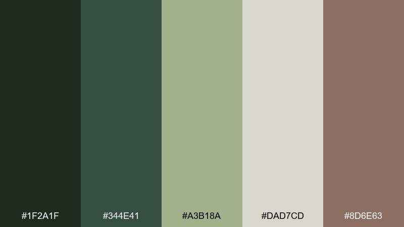
HEX: #1F2A1F #344E41 #A3B18A #DAD7CD #8D6E63
Mood: natural and restful
Best for: botanical watercolor wall art
Natural and restful, like pressed leaves on a quiet desk. Let the light sage and oat tones dominate the paper and wash areas, then deepen the composition with forest greens for stems and shadows. The muted brown adds warmth for botanical labels or a thin frame line. Tip: keep edges soft and layered so the watercolor texture feels believable and calm.
Image example of forest desk generated using media.io
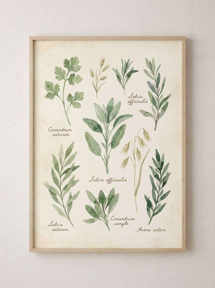
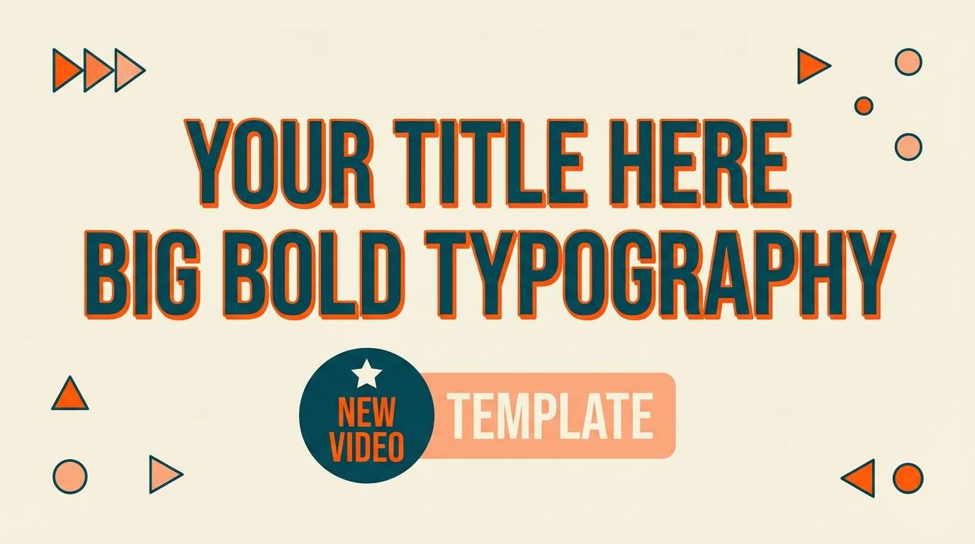
18) Peachy Soundstage
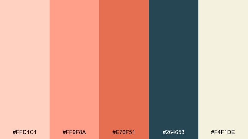
HEX: #FFD1C1 #FF9F8A #E76F51 #264653 #F4F1DE
Mood: bold and upbeat
Best for: youtube thumbnail template
Bold and upbeat, like a brightly lit soundstage with warm gels. Use peach and cream for the background and face-safe text areas, then hit key words with the vivid orange for instant energy. The deep teal is your contrast tool for outlines, drop shadows, and small UI-style badges. Tip: keep the orange to one focal element so the thumbnail reads fast on mobile.
Image example of peachy soundstage generated using media.io
19) Quiet Lavender Gray
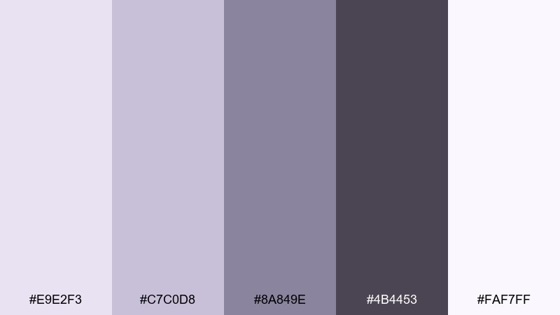
HEX: #E9E2F3 #C7C0D8 #8A849E #4B4453 #FAF7FF
Mood: soothing and introspective
Best for: mindfulness app ui mockup
Soothing and introspective, like dusk light settling over a calm room. Use the near-white lavender for backgrounds and modal panels, then step up to lilac-gray for cards and progress components. The deep violet-gray keeps typography readable without feeling harsh. Tip: keep contrast moderate and use the darkest tone only for primary actions to preserve the gentle mood.
Image example of quiet lavender gray generated using media.io
20) Bright White Studio
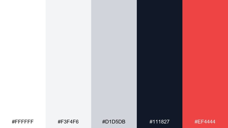
HEX: #FFFFFF #F3F4F6 #D1D5DB #111827 #EF4444
Mood: crisp and confident
Best for: startup pitch deck slide design
Crisp confidence with the feel of a bright cyclorama wall and sharp key light. Build slides on white and cool grays, then use near-black for headings so the deck reads clean in a room or on Zoom. The single red is best for one metric, one chart highlight, or a key takeaway per slide. Tip: keep red off body text and use it only as a directional accent.
Image example of bright white studio generated using media.io

What Colors Go Well with Studio?
Studio tones pair best with clean neutrals—white, cream, cool gray, charcoal—because they mimic common backdrops and keep lighting predictable across photos, UI components, and printed pages.
For accents, choose one “signal” color that reads fast (saffron, coral, mint, or red) and one supporting mid-tone (slate, taupe, sage). This gives you hierarchy without clutter.
If your project includes photography, match your palette’s temperature to the image lighting: warm browns and peaches for tungsten; cool blues and teals for LED or daylight setups.
How to Use a Studio Color Palette in Real Designs
Start with a background pair (white/cream + light gray), then define a text pair (near-black + mid-gray). This creates a stable base before you introduce any accent colors.
Use accents intentionally: buttons, links, badges, chart highlights, or one poster headline. Repeating the accent in tiny details (icons, separators) makes the composition feel cohesive.
For print, test contrast and saturation early—neons and deep tones can shift. Keeping one dominant neutral helps your studio palette stay consistent across paper stocks and finishes.
Create Studio Palette Visuals with AI
If you want to preview how a studio color palette looks in a poster, product ad, UI screen, or packaging mockup, generate quick concept images first and refine from there.
With Media.io, you can turn a short prompt plus your chosen vibe (warm spotlight, matte editorial, neon club, etc.) into on-brand visuals you can iterate in minutes.
Use the prompts above as a starting point, then swap the subject (skincare, coffee, app UI) while keeping the palette mood consistent.
Studio Color Palette FAQs
-
What is a studio color palette?
A studio color palette is a set of colors designed to look controlled and professional under “studio-like” conditions—clean backdrops, predictable contrast, and tones that support typography, product presentation, or UI clarity. -
Are studio palettes only for photography?
No. Studio palettes are popular in UI design, branding, pitch decks, and print because they balance neutrals and accents in a way that keeps layouts readable and visually structured. -
How do I pick an accent color for a studio palette?
Choose one high-attention accent (like saffron, coral, neon magenta, or red) and use it sparingly for primary actions or key highlights. Keep the rest of the system neutral for control. -
What background colors work best for studio-style designs?
White, cream, and cool light grays are the most common because they mimic seamless paper backdrops and keep shadows and text contrast easy to manage. -
How can I make studio palettes print-friendly?
Avoid overusing highly saturated neons, keep dark colors for small areas of ink coverage, and test contrast on your target paper stock. Neutrals help reduce unexpected shifts. -
Which studio palette is best for UI dashboards?
“Concrete and Chrome” or “Digital Chalk” work well for dashboards because they provide calm grays/blues for long sessions with a single accent for buttons, badges, or key chart points. -
Can I generate studio palette visuals with AI?
Yes. You can use Media.io’s text-to-image tool to generate mockups (posters, product ads, UI screens) by describing the scene and keeping the palette mood consistent in the prompt.
Next: Ruddy Color Palette


