

Ruddy colors sit in that warm red-to-terracotta zone that feels human, grounded, and instantly inviting. In branding and UI, they add personality without going neon or overly sweet.
Below are curated ruddy color palette ideas with HEX codes, mood notes, and real-use tips—plus AI prompts you can use to generate matching visuals fast.
In this article
Why Ruddy Palettes Work So Well
Ruddy tones blend the emotional energy of red with the stability of earth pigments, so they feel warm and trustworthy at the same time. That balance makes them easy to use across branding, packaging, editorial, and digital interfaces.
They also play nicely with neutrals: creams, parchment whites, taupes, and charcoals instantly calm a ruddy accent and keep readability strong. This makes ruddy especially practical for layouts that need both mood and clarity.
Because ruddy hues resemble natural materials (clay, brick, leather, spice), they read as “real” and tactile—even on flat screens. With the right contrast, they can look premium, cozy, or bold without becoming harsh.
20+ Ruddy Color Palette Ideas (with HEX Codes)
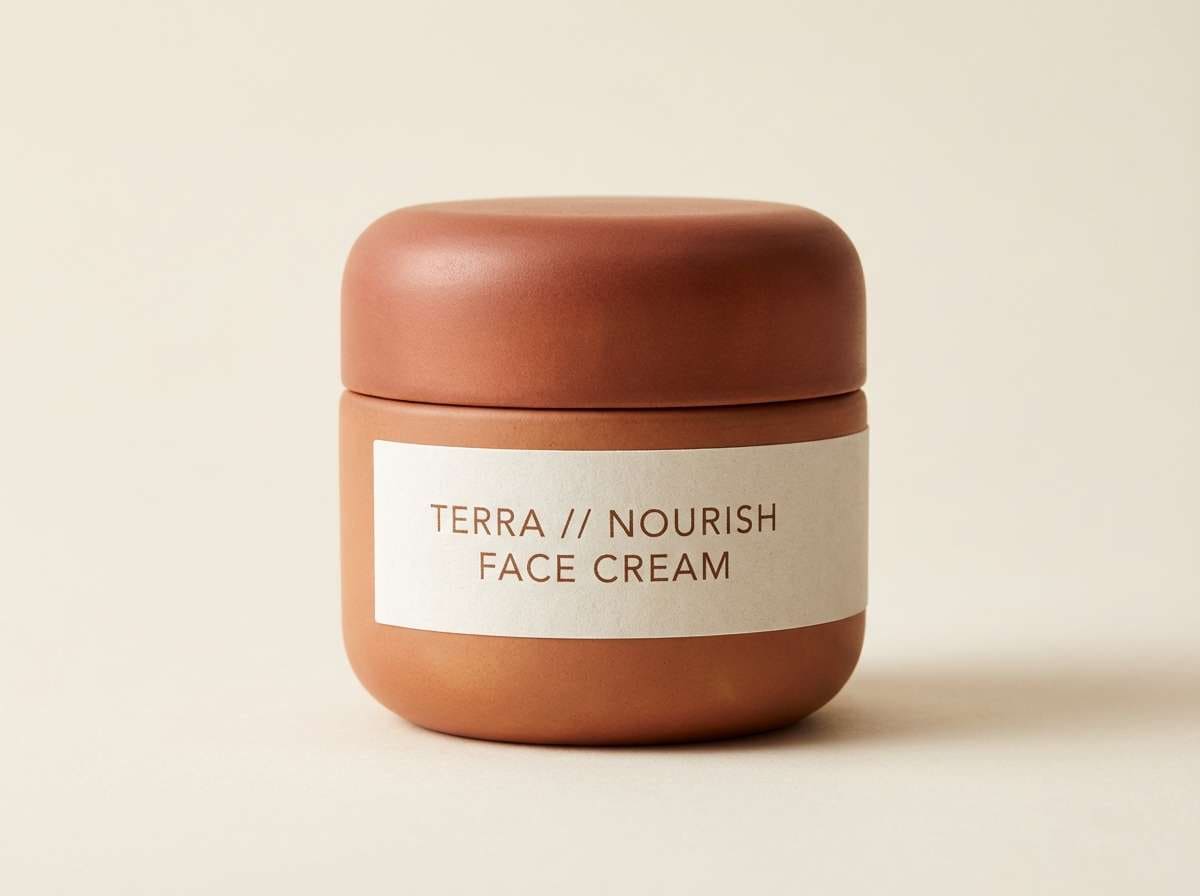
1) copper clay
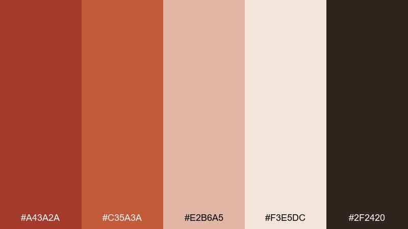
HEX: #A43A2A #C35A3A #E2B6A5 #F3E5DC #2F2420
Mood: earthy, handcrafted, cozy
Best for: ceramic branding and packaging
Earthy and kiln-warm, these tones feel like sun-baked clay, copper glaze, and a soot-dark studio shelf. They work beautifully on labels, hang tags, and textured paper where warmth needs to feel authentic. Pair with matte cream backgrounds and a small charcoal type layer for clarity. For a clean finish, keep the darkest shade for logos and use the lighter clay tint as negative space in your ruddy color palette.
Image example of copper clay generated using media.io
Media.io is an online AI studio for creating and editing video, image, and audio in your browser.

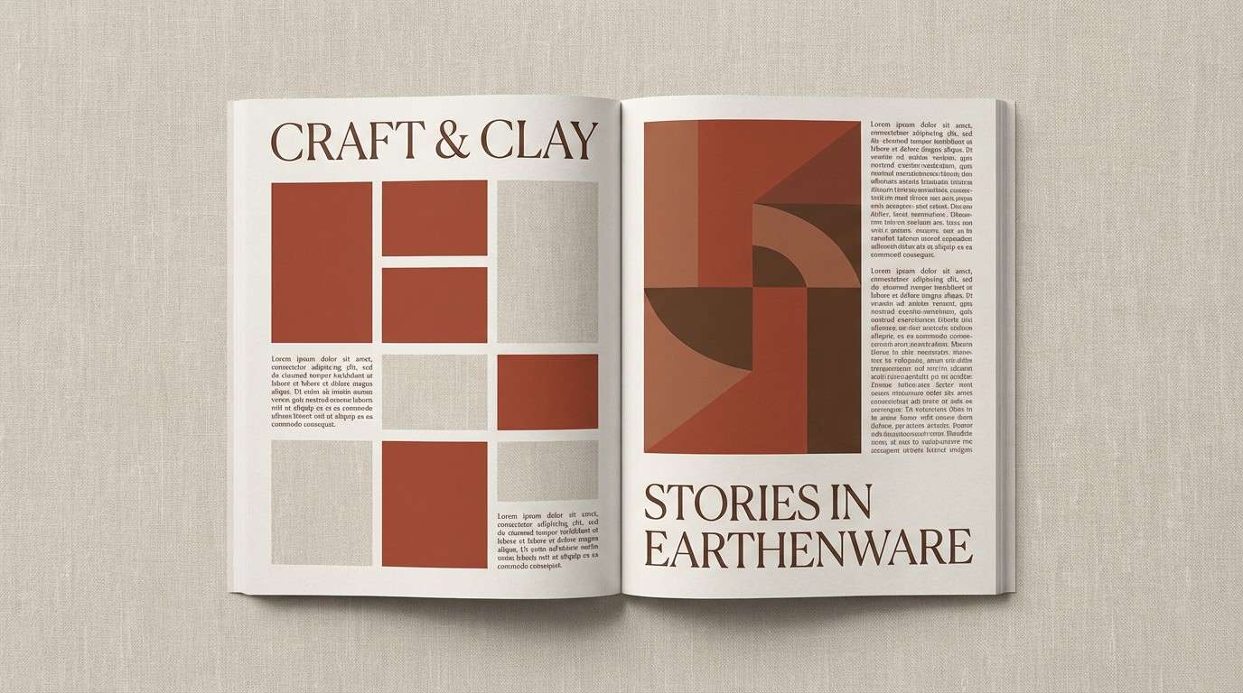
2) brick and linen
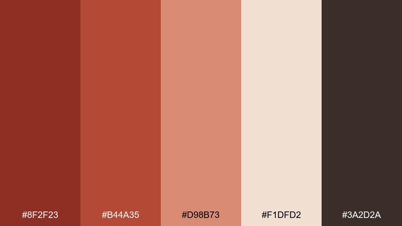
HEX: #8F2F23 #B44A35 #D98B73 #F1DFD2 #3A2D2A
Mood: editorial, grounded, timeless
Best for: editorial magazine layout
Grounded brick reds and soft linen neutrals evoke worn book covers and a quiet studio desk. They shine in spreads where headlines need warmth without shouting. Balance the darker cocoa tone for body text and use the pale linen as generous margins. Add subtle rules or section dividers in the mid brick for a cohesive editorial rhythm.
Image example of brick and linen generated using media.io
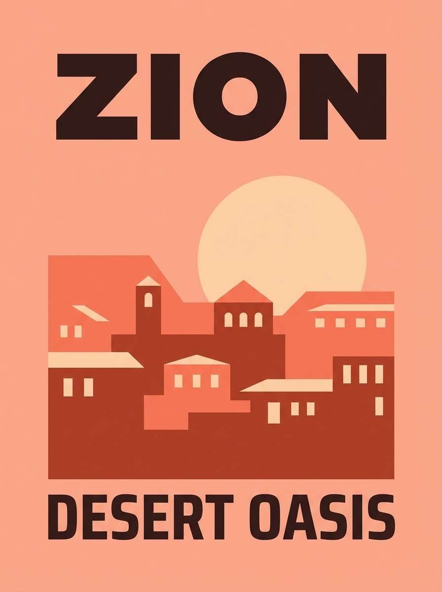
3) sunset terracotta
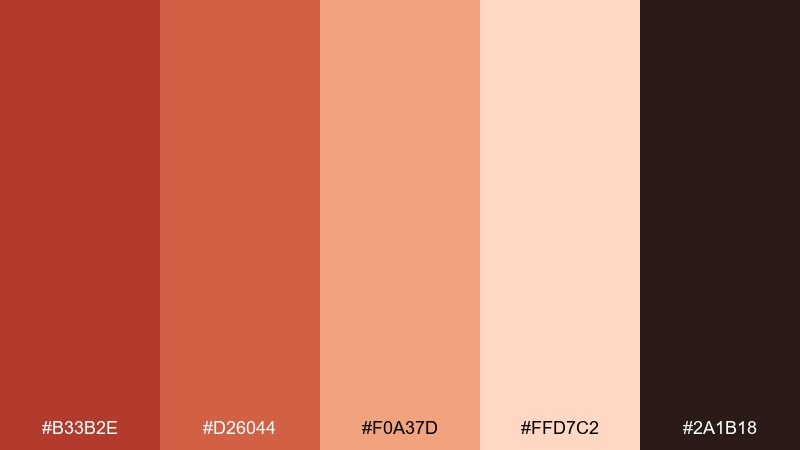
HEX: #B33B2E #D26044 #F0A37D #FFD7C2 #2A1B18
Mood: adventurous, glowing, optimistic
Best for: travel poster design
Glowing and sunlit, this mix feels like terracotta rooftops under a late golden sky. It suits bold typography, simplified landscapes, and retro-inspired graphics. Among these ruddy color combinations, the deep espresso shade keeps contrast crisp for titles and dates. Use the peachy tint as a soft gradient base to avoid overly harsh blocks of color.
Image example of sunset terracotta generated using media.io
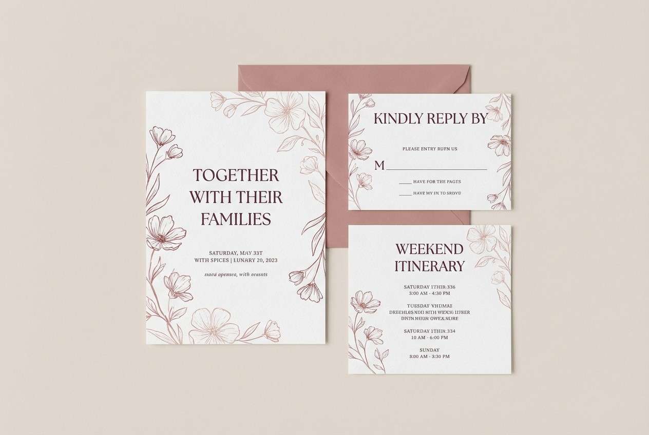
4) spiced rose
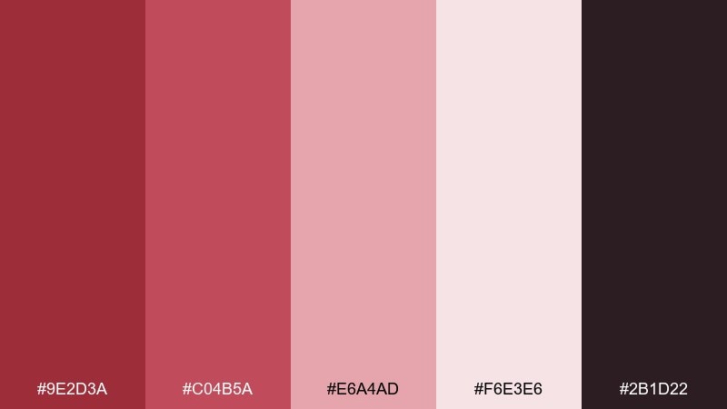
HEX: #9E2D3A #C04B5A #E6A4AD #F6E3E6 #2B1D22
Mood: romantic, refined, modern
Best for: wedding invitation suite
Romantic and softly spiced, these rosy reds feel like dried petals and velvet ribbon. They are ideal for invitations, RSVP cards, and envelope liners where elegance needs warmth. Keep the deepest tone for names and key details, and let the blushy mid tones carry decorative flourishes. A warm off-white paper stock will make the pinks feel richer and less candy-sweet.
Image example of spiced rose generated using media.io
5) rust and sage
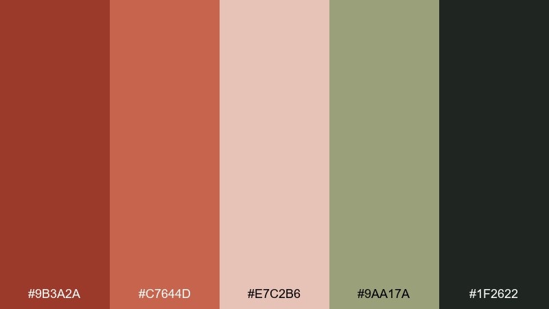
HEX: #9B3A2A #C7644D #E7C2B6 #9AA17A #1F2622
Mood: natural, balanced, calming
Best for: home decor mood board
Warm rust paired with muted sage brings to mind terracotta planters, olive leaves, and sunlit plaster walls. It works well for decor boards, paint selections, and lifestyle brand styling. Let sage act as the breathing space so the reds feel grounded rather than heavy. A good tip is to repeat the charcoal tone in small accents like icons or captions to keep everything anchored.
Image example of rust and sage generated using media.io
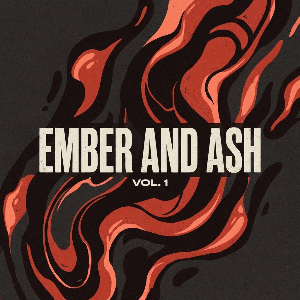
6) ember night
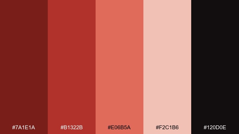
HEX: #7A1E1A #B1322B #E06B5A #F2C1B6 #120D0E
Mood: bold, cinematic, intimate
Best for: music album cover
Smoky and cinematic, these ember tones feel like stage lights cutting through a dark room. They fit album art where drama and intimacy matter more than bright clarity. Use the near-black as the main field, then pull focus with a single hot ember red for the title. Keep gradients subtle so the cover stays moody rather than glossy.
Image example of ember night generated using media.io
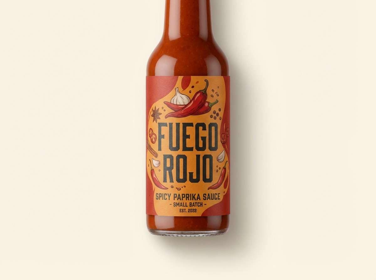
7) paprika pop
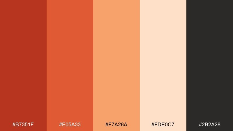
HEX: #B7351F #E05A33 #F7A26A #FDE0C7 #2B2A28
Mood: playful, appetizing, energetic
Best for: food product ad creative
Zesty and bright, these paprika tones evoke roasted peppers, citrus warmth, and a lively kitchen. They are perfect for product ads, menu callouts, and quick promotions that need appetite appeal. Let the pale cream support the layout so the orange-red stays punchy. Use the dark neutral for prices and small print to keep legibility high on busy creatives.
Image example of paprika pop generated using media.io
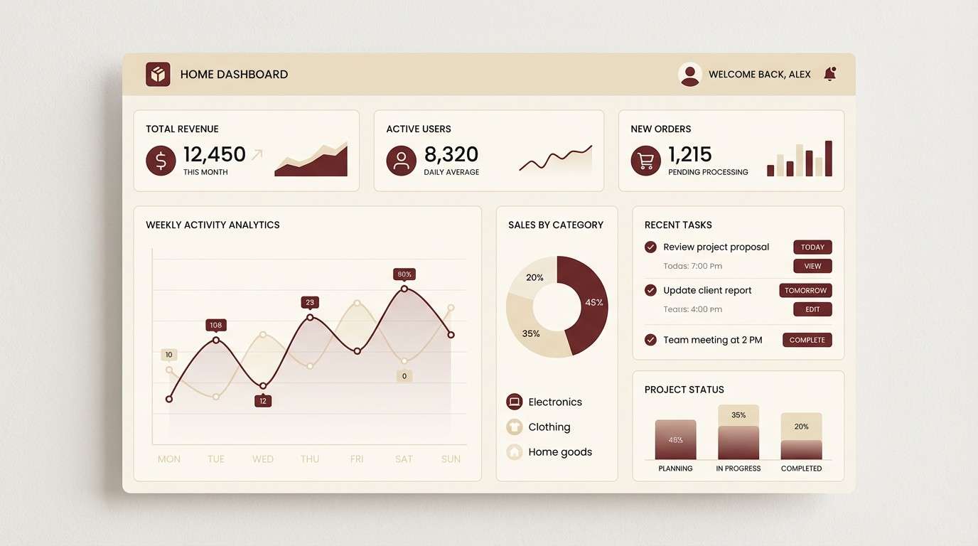
8) mahogany minimal
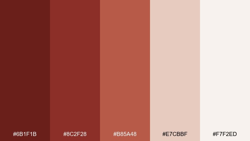
HEX: #6B1F1B #8C2F28 #B85A48 #E7CBBF #F7F2ED
Mood: minimal, premium, confident
Best for: 2d ui dashboard theme
Rich mahogany and soft parchment neutrals create a calm, premium feel like leather and warm paper. This ruddy color scheme works especially well for finance, analytics, and productivity dashboards. Keep surfaces light and reserve the deep reds for active states, charts, and key metrics. One practical tip is to use the mid tone for hover states so contrast changes are noticeable without flashing.
Image example of mahogany minimal generated using media.io
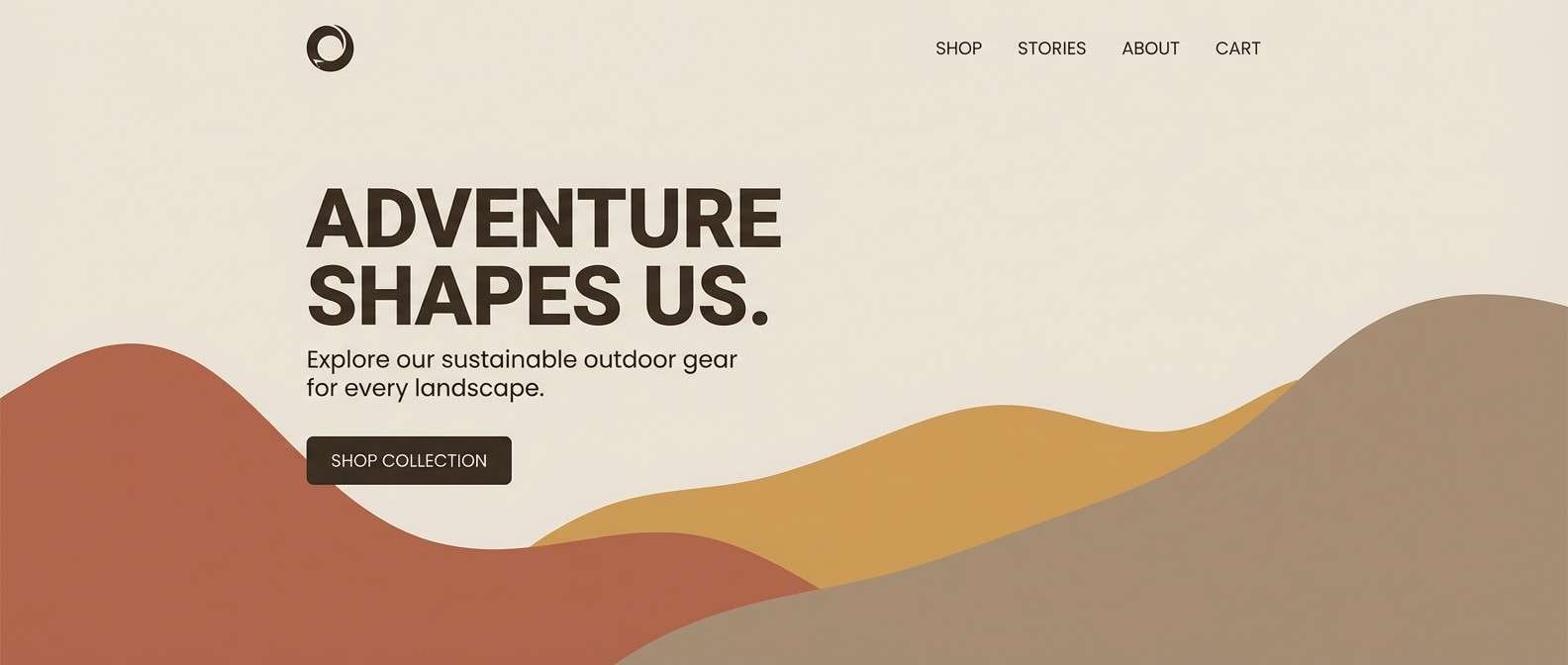
9) dusty canyon
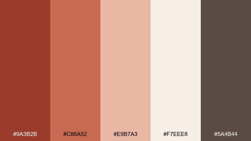
HEX: #9A3B2B #C86A52 #E9B7A3 #F7EEE8 #5A4B44
Mood: outdoorsy, sun-faded, approachable
Best for: outdoor brand website hero
Sun-faded canyon tones feel like trail dust, sandstone, and soft sunrise haze. They suit website heroes where storytelling needs warmth and a touch of ruggedness. Use the pale blush as the main background wash and set headings in the darker rock brown for contrast. A small rust accent on CTA buttons will stand out without feeling overly salesy.
Image example of dusty canyon generated using media.io
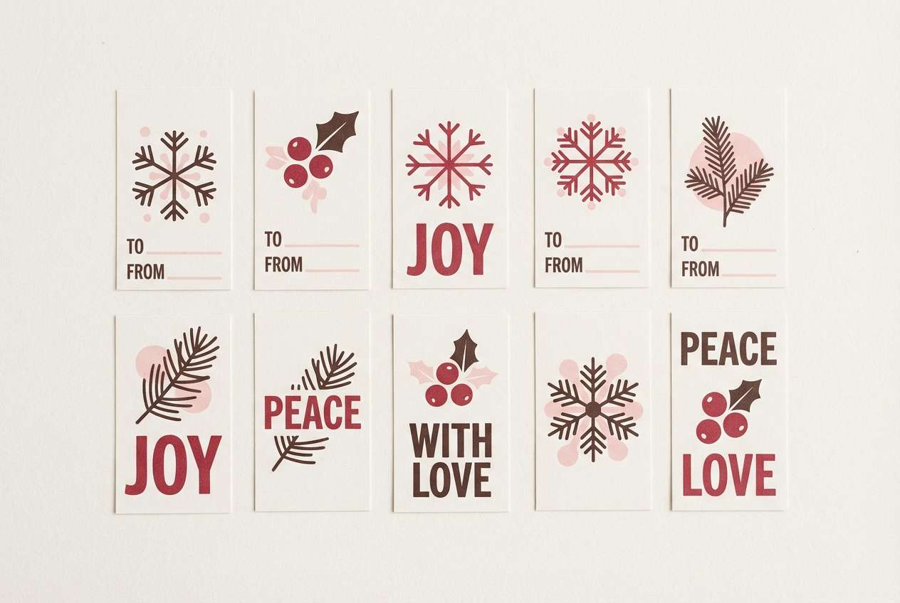
10) cranberry cocoa
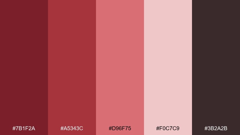
HEX: #7B1F2A #A5343C #D96F75 #F0C7C9 #3B2A2B
Mood: festive, cozy, nostalgic
Best for: holiday gift tag design
Cozy cranberry reds with cocoa depth bring a festive, candlelit vibe without going overly bright. They work nicely on gift tags, small cards, and seasonal promos where you want warmth and readability. Keep the darkest brown for type and outlines, and let the lighter pinks soften the overall feel. Add minimal patterning like dots or stripes using the mid cranberry for a classic finish.
Image example of cranberry cocoa generated using media.io
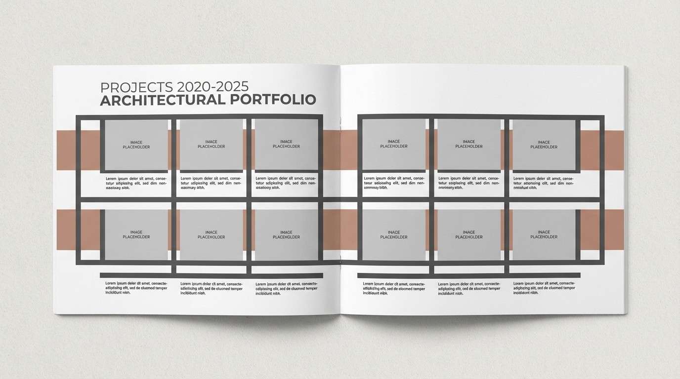
11) clay and charcoal
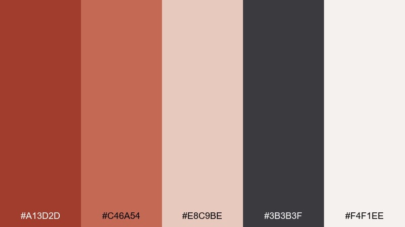
HEX: #A13D2D #C46A54 #E8C9BE #3B3B3F #F4F1EE
Mood: professional, architectural, clean
Best for: architectural portfolio layout
Clean clay warms up sharp charcoal, like brick against graphite sketches. It fits architecture portfolios, case studies, and presentation decks where structure matters. Use charcoal for grids and captions, then bring clay in for section headers or key callouts. A restrained approach works best: pick one accent tone and repeat it consistently across pages.
Image example of clay and charcoal generated using media.io
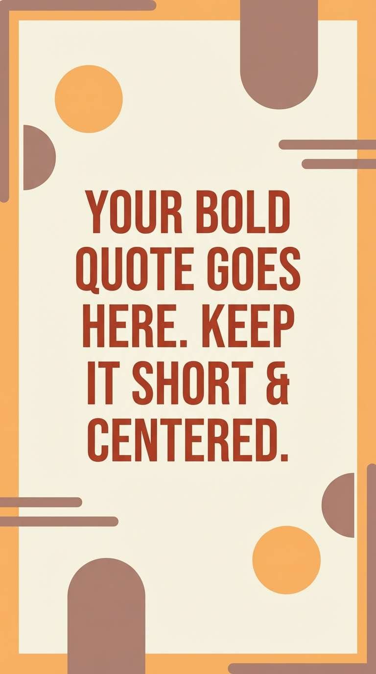
12) apricot brick
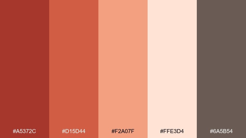
HEX: #A5372C #D15D44 #F2A07F #FFE3D4 #6A5B54
Mood: friendly, bright, modern
Best for: social media quote template
Cheerful apricot and brick tones feel like warm sunlight on a painted wall. These ruddy color combinations are great for quote posts where you need strong contrast and a welcoming vibe. Use the cream as the main card background, then set bold type in the deep brick or the muted brown-gray. Keep the apricot as a highlight for dividers, icons, or a simple underline to guide the eye.
Image example of apricot brick generated using media.io
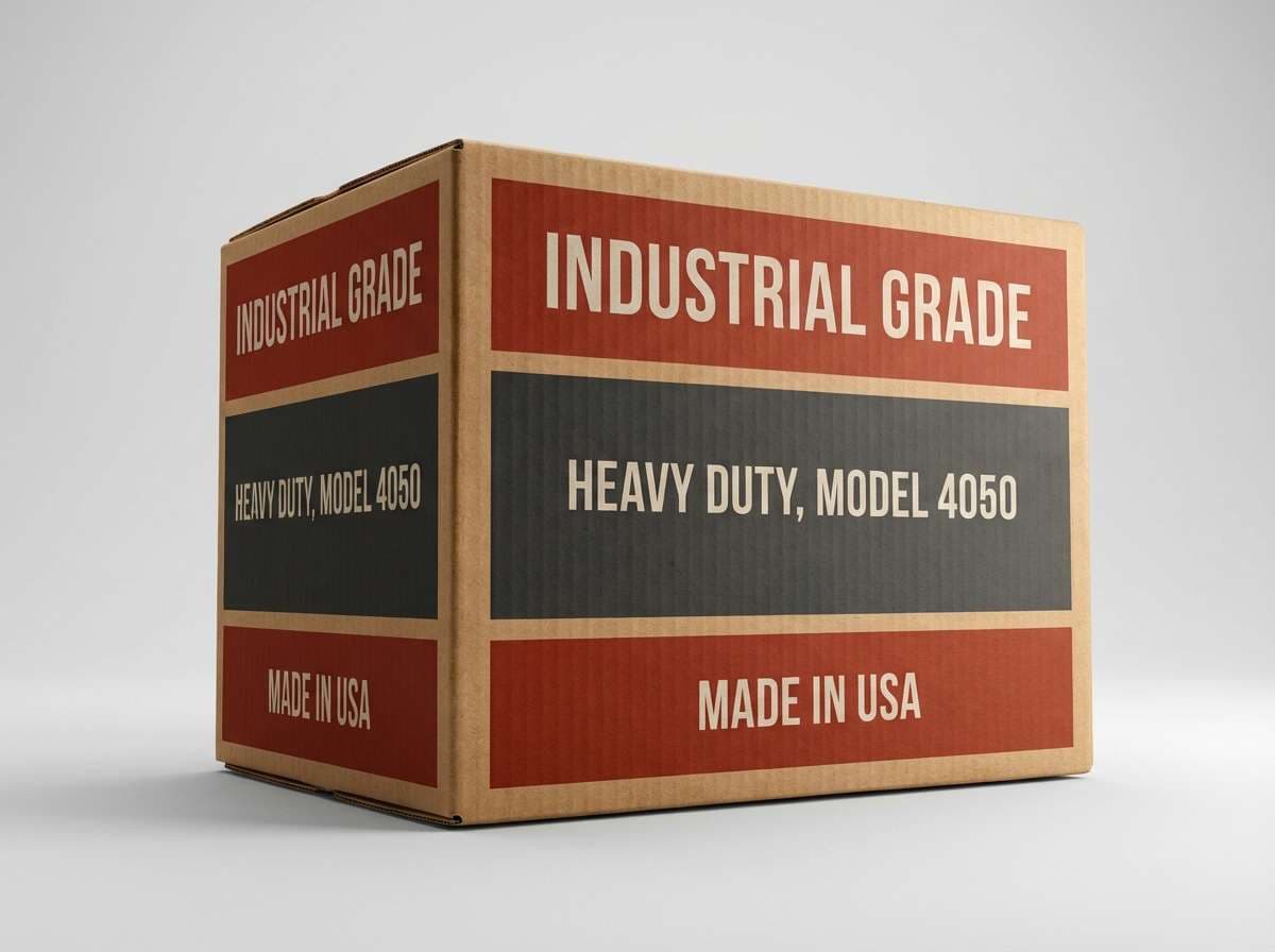
13) iron oxide
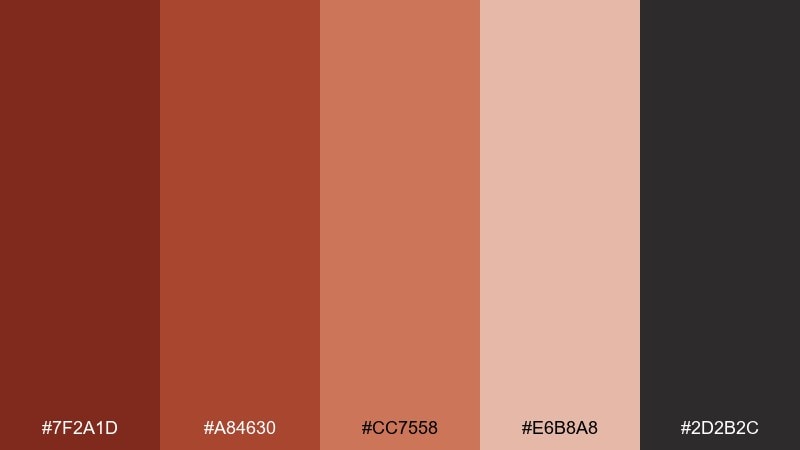
HEX: #7F2A1D #A84630 #CC7558 #E6B8A8 #2D2B2C
Mood: industrial, sturdy, utilitarian
Best for: industrial product packaging
Sturdy iron-oxide reds and metal-dark neutrals feel rugged and work-ready. They suit packaging for tools, hardware, or workshop goods where durability is part of the message. Use the darkest neutral for bold labeling and safety-style icons. Keep the lighter clay tint for secondary panels so information stays organized at a glance.
Image example of iron oxide generated using media.io
14) desert blush
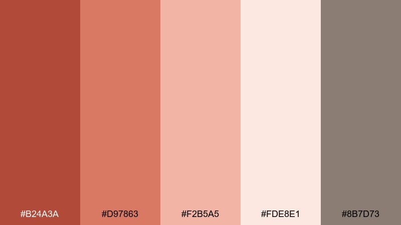
HEX: #B24A3A #D97863 #F2B5A5 #FDE8E1 #8B7D73
Mood: soft, airy, soothing
Best for: spa flyer design
Soft desert blush tones evoke warm sand, calm skin tones, and a quiet, restorative mood. They are ideal for spa flyers, wellness menus, and gentle promotions. Use the lightest tint as a spacious background and keep body text in the taupe for comfortable reading. A single coral accent bar can guide attention to booking details without feeling pushy.
Image example of desert blush generated using media.io

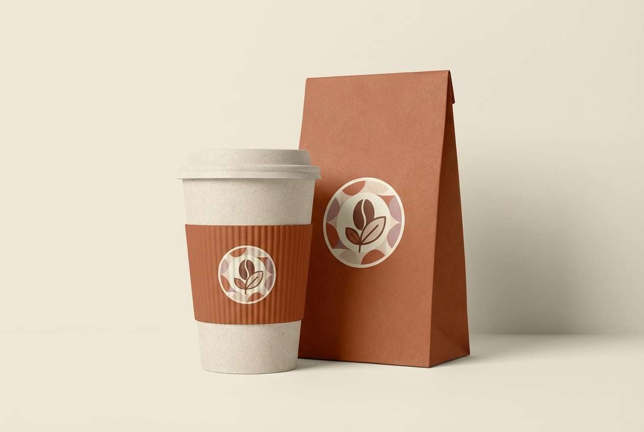
15) warm hearth
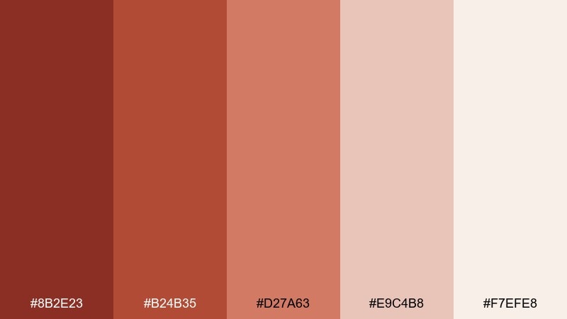
HEX: #8B2E23 #B24B35 #D27A63 #E9C4B8 #F7EFE8
Mood: cozy, welcoming, handcrafted
Best for: cozy cafe branding
Cozy hearth reds and creamy neutrals feel like fresh pastries, warm wood, and a glowing espresso bar. This ruddy color palette fits cafe logos, cup sleeves, and loyalty cards where comfort is the point. Pair it with textured paper, rounded type, and small line icons for a friendly tone. Keep the soft cream dominant and reserve the deeper rust for stamps and signage accents.
Image example of warm hearth generated using media.io
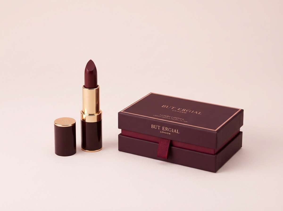
16) garnet velvet
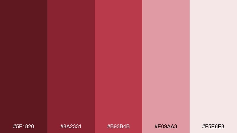
HEX: #5F1820 #8A2331 #B93B4B #E09AA3 #F5E6E8
Mood: luxurious, dramatic, elegant
Best for: luxury cosmetics ad
Deep garnet and soft rose feel like velvet fabric under low, flattering light. They are perfect for beauty ads where the message should be premium and intimate. Use the darkest shade for product names and the light rose as airy negative space. Add subtle gradients or a satin texture effect to make the reds look rich rather than flat.
Image example of garnet velvet generated using media.io
17) tomato basil
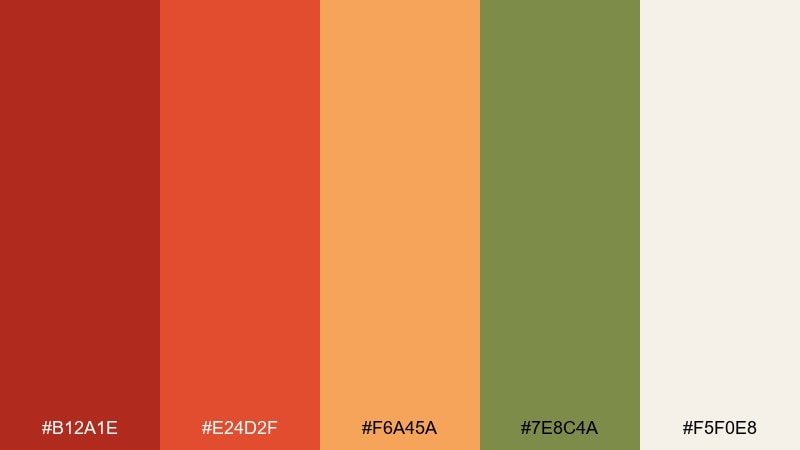
HEX: #B12A1E #E24D2F #F6A45A #7E8C4A #F5F0E8
Mood: fresh, tasty, sunny
Best for: recipe blog header
Fresh tomato reds with a basil green accent bring instant food energy and a home-cooked vibe. They work well for recipe headers, category tags, and call-to-action buttons. Keep the background creamy to prevent the warm tones from feeling too loud. Use green sparingly for badges or highlights so it stays appetizing instead of turning festive.
Image example of tomato basil generated using media.io
18) copper dusk
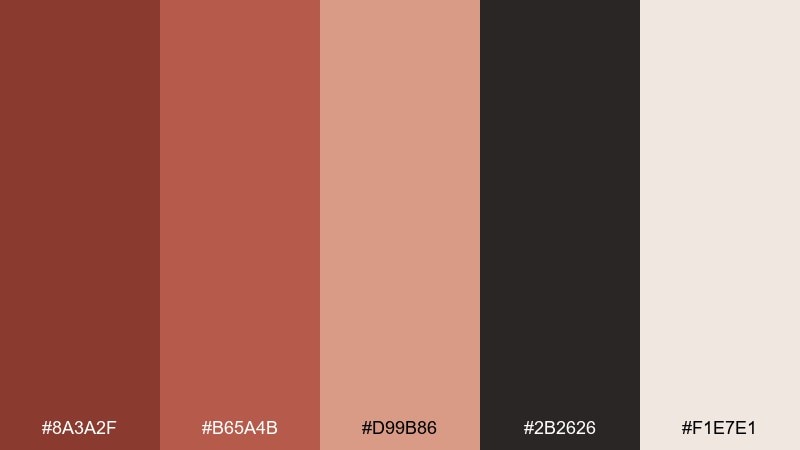
HEX: #8A3A2F #B65A4B #D99B86 #2B2626 #F1E7E1
Mood: moody, refined, urban
Best for: interior paint guide chart
Moody copper and dusk-dark neutrals feel like a city loft at golden hour. They fit paint guides and swatch charts where you want warmth with a sophisticated edge. Use the light neutral as the main canvas and keep the near-black for labels and grid lines. A helpful tip is to group swatches from dark to light so undertones read clearly at a glance.
Image example of copper dusk generated using media.io
19) rosewood neutrals
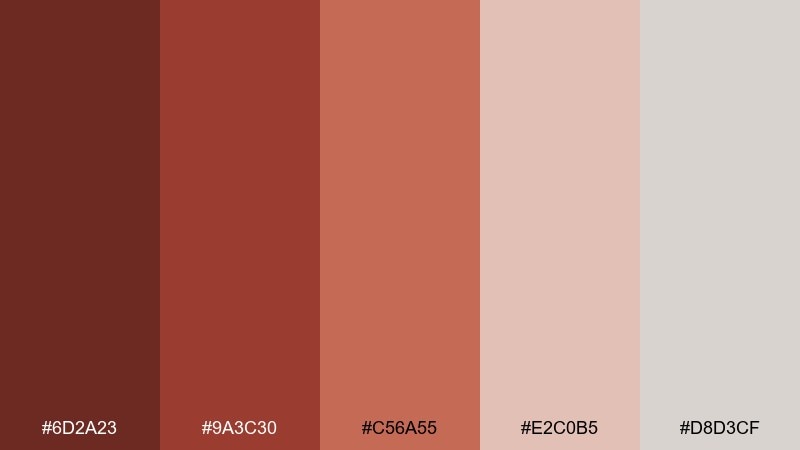
HEX: #6D2A23 #9A3C30 #C56A55 #E2C0B5 #D8D3CF
Mood: minimal, mature, understated
Best for: minimalist portfolio ui
Understated rosewood tones and quiet neutrals create a polished, mature look. They are great for portfolio interfaces where projects need to stay front-and-center. Use the gray-beige for page backgrounds and let the deeper rosewood appear in navigation states and subtle separators. Keep saturation low across components to maintain a calm, gallery-like feel.
Image example of rosewood neutrals generated using media.io
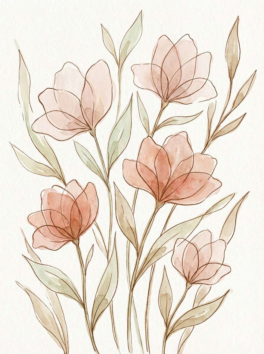
20) burnt coral light
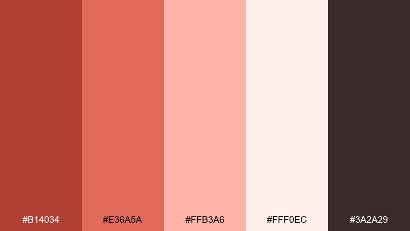
HEX: #B14034 #E36A5A #FFB3A6 #FFF0EC #3A2A29
Mood: springy, gentle, uplifting
Best for: spring botanical illustration
Light burnt coral and soft blush evoke petals, warm breezes, and a bright spring morning. These shades are perfect for botanical illustrations, stationery accents, and seasonal headers. Use the deep brown only for fine linework so the artwork stays airy. For best results, layer watercolor washes from pale blush to coral and save the strongest tone for small focal blooms.
Image example of burnt coral light generated using media.io
What Colors Go Well with Ruddy?
Ruddy pairs effortlessly with warm neutrals like cream, parchment, linen, and taupe—these keep the palette breathable and help the reds feel sophisticated rather than heavy. For typography and UI borders, charcoal and cocoa browns deliver clean contrast without the starkness of pure black.
If you want a modern “earth + fresh” balance, add muted greens like sage, olive, or basil. For a brighter lift, peach and blush tints create gentle highlights that still stay within a warm, cohesive range.
For bolder contrast, try deep near-black fields or cool-leaning grays as a background, then use ruddy as the accent. This approach is especially effective for hero sections, product ads, or cinematic posters.
How to Use a Ruddy Color Palette in Real Designs
In branding, use ruddy as your emotional anchor: apply the darkest red for logos and key headlines, and let creams or light blushes carry most of the whitespace. This keeps the identity warm while still feeling clean and premium.
In UI, reserve ruddy accents for interactive states (primary buttons, active tabs, charts) and keep surfaces light for comfort. If you’re using dark mode, use ember-like reds sparingly so they read as intentional highlights rather than constant alarm.
For print and packaging, ruddy shines on textured stocks and matte finishes because it reads like pigment, not plastic. Pair with a single deep neutral for legibility, and repeat one mid-tone accent across labels to keep consistency.
Create Ruddy Palette Visuals with AI
If you already have HEX codes, you can generate matching mockups by describing the scene (product, layout, lighting) and calling out the palette’s mood—cozy, editorial, cinematic, or airy. The more specific the design format (flyer, album cover, UI dashboard), the closer the result will be.
Try turning any palette above into an on-brand image set for ads, landing pages, packaging concepts, or social templates. Keep prompts simple, then iterate by adjusting one variable at a time (background, texture, typography, or contrast).
Ruddy Color Palette FAQs
-
What is a ruddy color palette?
A ruddy color palette is built around warm, earthy reds—often terracotta, brick, rust, or clay—usually balanced with creams, taupes, browns, or charcoals for contrast and usability. -
Is ruddy closer to red or orange?
Ruddy sits between red and orange, but typically leans red with brown/earth undertones. That’s why it feels warmer and more natural than a pure primary red. -
What neutral colors pair best with ruddy tones?
Cream, parchment, linen, warm gray-beige, cocoa brown, and charcoal are the most reliable neutrals. They soften ruddy and keep text and layouts readable. -
Can I use ruddy colors in UI design without hurting readability?
Yes—keep backgrounds light (cream/off-white) and use ruddy mainly for accents like buttons, badges, and chart highlights. For text, choose charcoal or deep brown instead of bright red. -
What complementary accent works with ruddy?
Muted greens (sage/olive/basil) complement ruddy well because they sit opposite red on the color wheel while staying natural. Use green sparingly for tags, icons, or secondary CTAs. -
Does ruddy work for luxury branding?
It can, especially when you use deeper garnet/mahogany shades with soft blush or parchment highlights. Matte finishes, restrained layouts, and strong contrast help it feel premium. -
How do I keep a ruddy palette from feeling too “autumn”?
Increase the amount of light neutral space, add blush or peach highlights, and reduce heavy browns. A single cool-leaning gray or near-black can also modernize the look.


