

Street art color palettes are built for impact: bold contrasts, neon hits, and gritty neutrals that still feel intentional. They’re ideal when you want designs to look modern, energetic, and “seen from across the street.”
Below are 20 curated street art color combinations with HEX codes, plus practical tips for posters, branding, murals, and social graphics.
In this article
Why Street Art Palettes Work So Well
Street art palettes are designed for fast readability. High contrast (dark bases + bright accents) makes typography, icons, and shapes pop instantly—perfect for posters, thumbnails, and outdoor-style layouts.
They also feel authentic because they mimic real-world materials: asphalt blacks, concrete grays, sun-faded pastels, and saturated paint hits. That mix of “raw” and “graphic” gives your work an editorial, urban edge.
Most street art color schemes rely on a simple hierarchy: one dominant base, one hero color, and one or two small “tag” accents. This keeps loud colors from turning into visual noise.
20+ Street Art Color Palette Ideas (with HEX Codes)
1) Alley Neon
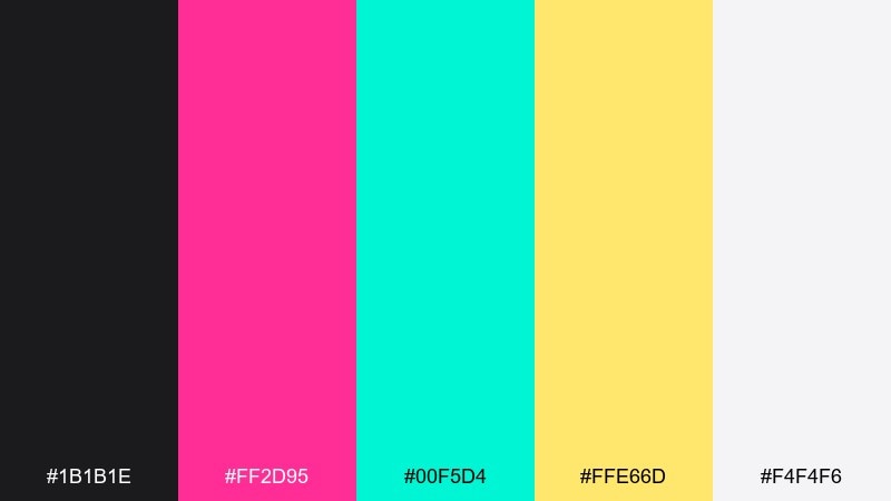
HEX: #1B1B1E #FF2D95 #00F5D4 #FFE66D #F4F4F6
Mood: electric, rebellious, high-contrast
Best for: concert poster design
Electric and rebellious, this mix feels like fresh tags glowing under a streetlight. Use the near-black as the base, then push magenta and teal as competing focal accents. Yellow works best as a highlight for dates, buttons, or sticker-like shapes. Tip: keep the background clean and let one neon lead to avoid visual noise.
Image example of alley neon generated using media.io
Media.io is an online AI studio for creating and editing video, image, and audio in your browser.

2) Spray Can Sunset
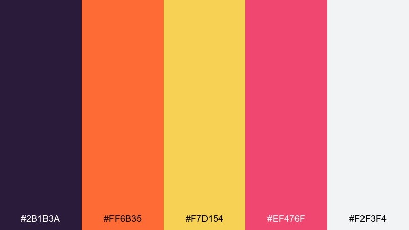
HEX: #2B1B3A #FF6B35 #F7D154 #EF476F #F2F3F4
Mood: warm, energetic, friendly
Best for: summer event flyer
Warm and upbeat, these tones echo a sunset gradient drifting over painted brick. Use orange and pink for headlines and hero shapes, while purple keeps the layout grounded. The soft light gray helps everything breathe without turning sterile. Tip: apply the yellow as a small pop for icons and calls to action.
Image example of spray can sunset generated using media.io
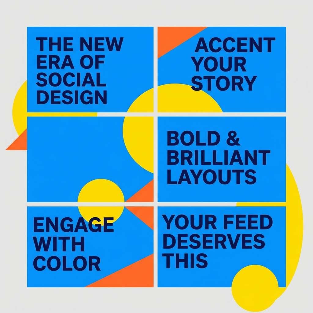
3) Metro Pop
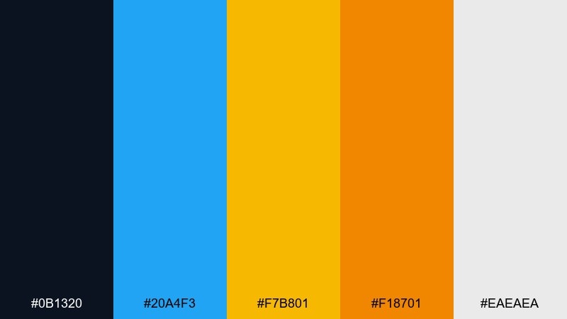
HEX: #0B1320 #20A4F3 #F7B801 #F18701 #EAEAEA
Mood: punchy, modern, urban
Best for: brand social carousel
Punchy and modern, it brings to mind transit signage, ad panels, and quick moving city light. These street art color combination ideas shine when blue carries the layout and the yellow-orange pair becomes the punchy counterweight. Keep navy for type and framing so the bright hues do not overwhelm. Tip: build a simple grid and repeat one accent shape to create momentum across slides.
Image example of metro pop generated using media.io
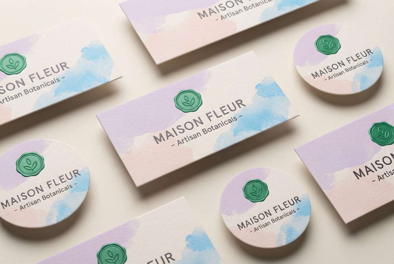
4) Concrete Bloom
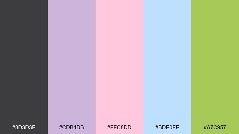
HEX: #3D3D3F #CDB4DB #FFC8DD #BDE0FE #A7C957
Mood: soft, playful, artsy
Best for: boutique packaging labels
Soft and playful, it feels like pastel paste-ups layered over gray concrete. Pair the lavender and blush for friendly brand moments, then use sky blue for airy negative space. The green reads best as a tiny botanical accent or seal mark. Tip: print on uncoated stock so the pastel tones stay chalky and tactile.
Image example of concrete bloom generated using media.io
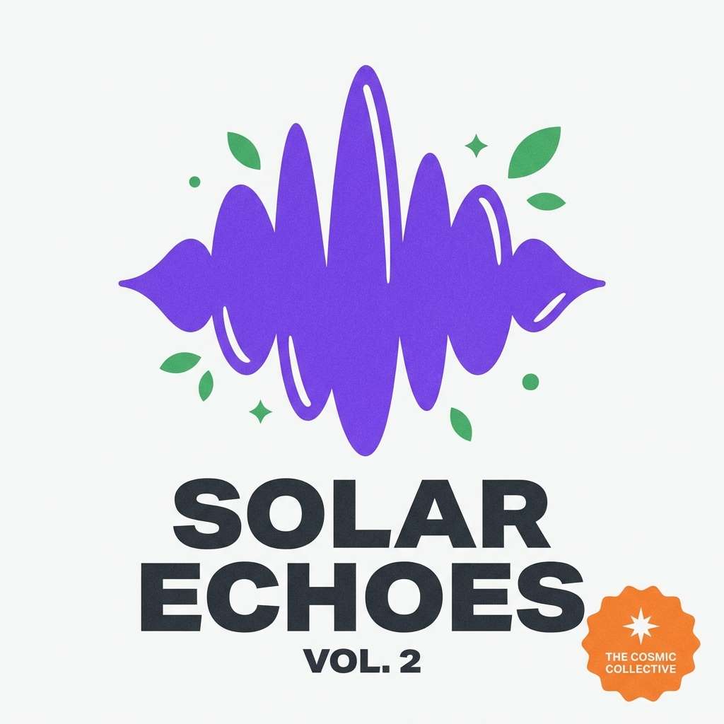
5) Vinyl Tag
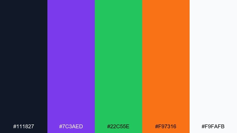
HEX: #111827 #7C3AED #22C55E #F97316 #F9FAFB
Mood: bold, retro, confident
Best for: album cover artwork
Bold and retro, it evokes marker ink on record sleeves and late-night sticker runs. Let violet be the hero tone and use orange for punchy typography or a single iconic symbol. The green works best as a secondary accent for tracklist dividers or small labels. Tip: add a subtle grain overlay to make the colors feel printed, not digital.
Image example of vinyl tag generated using media.io
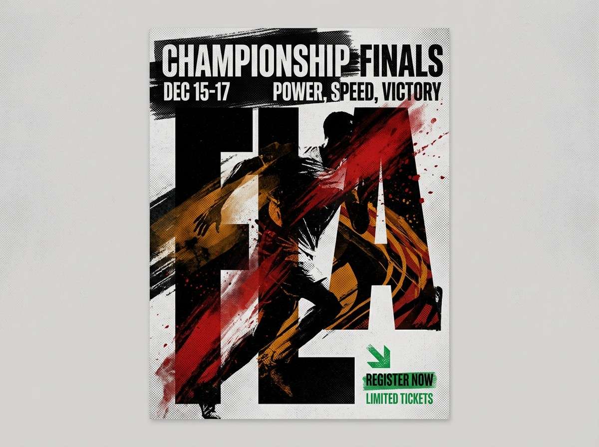
6) Night Wall Rumble
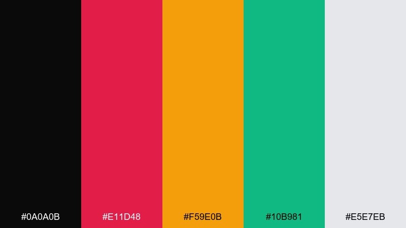
HEX: #0A0A0B #E11D48 #F59E0B #10B981 #E5E7EB
Mood: intense, gritty, dramatic
Best for: sports promo poster
Intense and gritty, it reads like a midnight wall hit by harsh floodlights. This street art color palette works best when black dominates and the red-amber duo becomes the loud emotional hit. Use green sparingly as a contrast cue for stats, badges, or small highlights. Tip: keep shadows deep and edges sharp to preserve the gritty energy.
Image example of night wall rumble generated using media.io
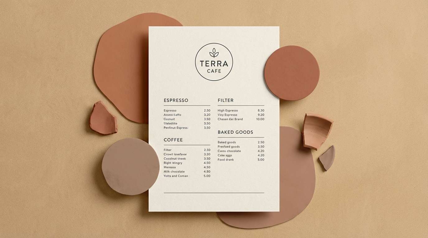
7) Rusted Roller
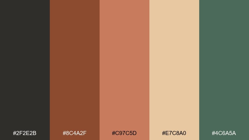
HEX: #2F2E2B #8C4A2F #C97C5D #E7C8A0 #4C6A5A
Mood: earthy, weathered, authentic
Best for: coffee shop branding
Earthy and weathered, these shades feel like rust stains, aged paper, and worn paint rollers. Use the dark olive-gray for logos and menus, then layer terracotta and clay for warmth. The sand tone makes an inviting background that keeps the palette approachable. Tip: pair with a condensed sans serif to enhance the handmade, urban feel.
Image example of rusted roller generated using media.io
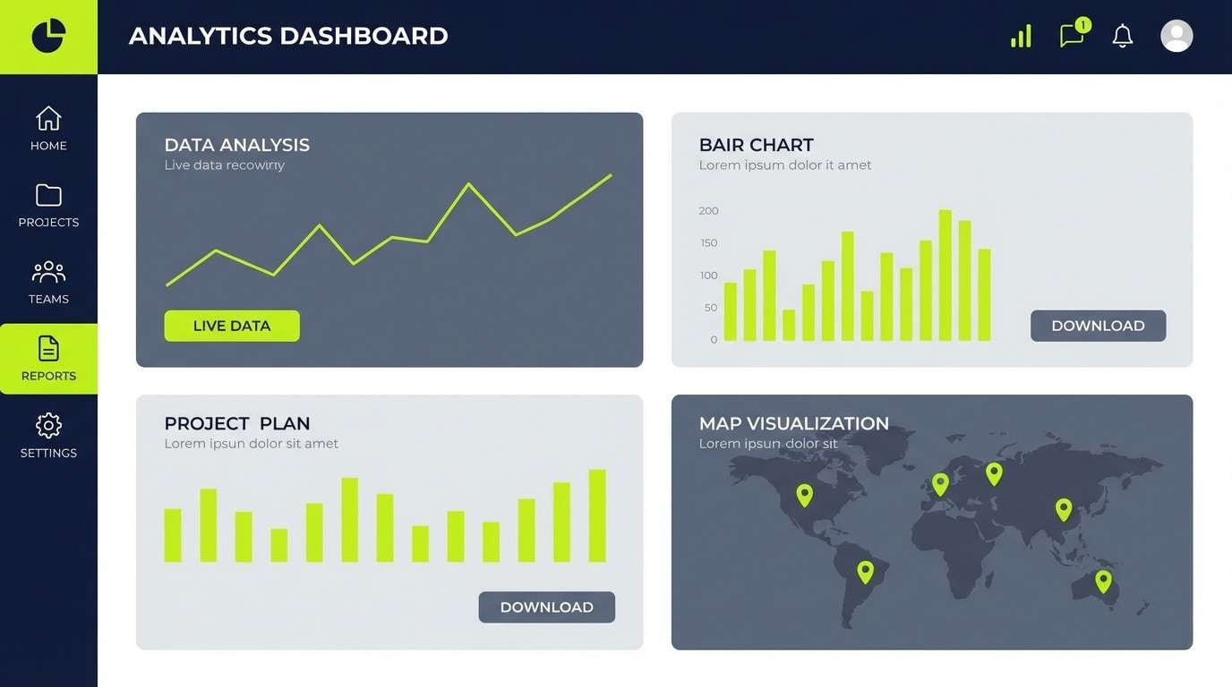
8) Chalk Outline
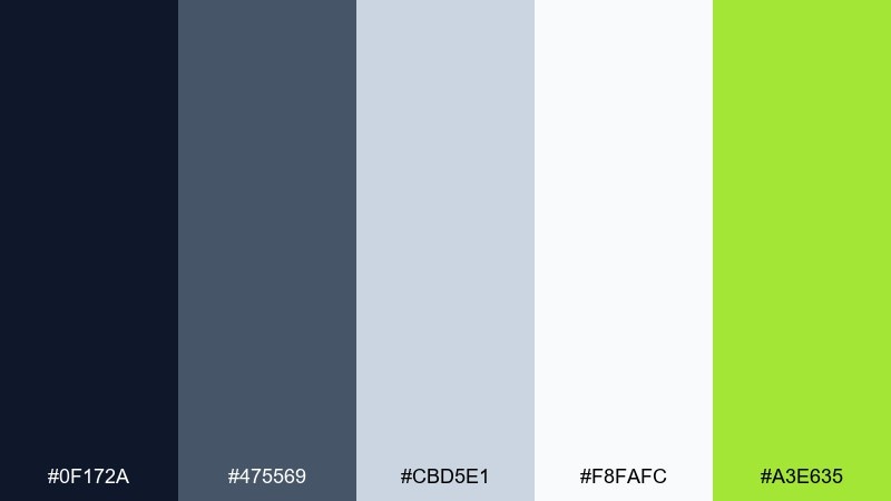
HEX: #0F172A #475569 #CBD5E1 #F8FAFC #A3E635
Mood: clean, graphic, streetwise
Best for: dashboard UI mockup
Clean and streetwise, it suggests chalk lines, taped edges, and sharp outlines against slate. Use the navy for navigation and headers, then step through grays for hierarchy and spacing. Lime works best as the only bright interaction color for toggles, charts, and success states. Tip: keep accent usage under 10 percent so the UI stays focused.
Image example of chalk outline generated using media.io
9) Gallery Cut
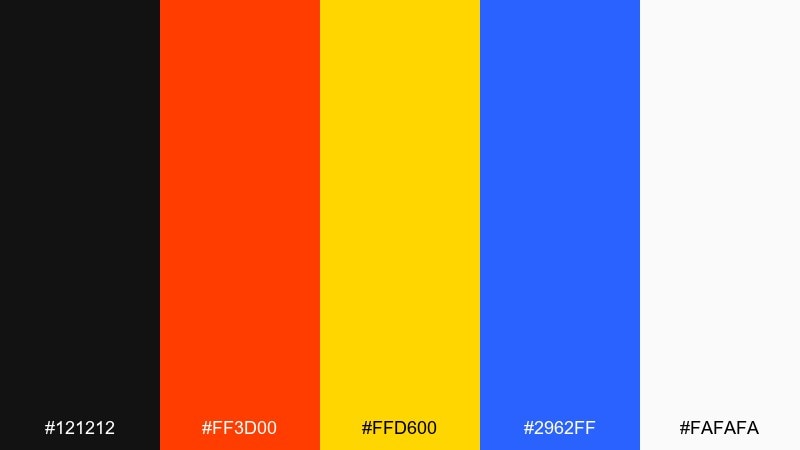
HEX: #121212 #FF3D00 #FFD600 #2962FF #FAFAFA
Mood: bold, curated, editorial
Best for: exhibition poster
Bold yet curated, it feels like a clean gallery wall interrupted by a loud cutout sticker. As a street art color scheme, it works when you anchor type in near-black and let orange or blue carry the main visual block. Yellow is strongest as a directional cue, underline, or small badge. Tip: use generous margins so the bright colors read intentional, not chaotic.
Image example of gallery cut generated using media.io
10) Asphalt Mint
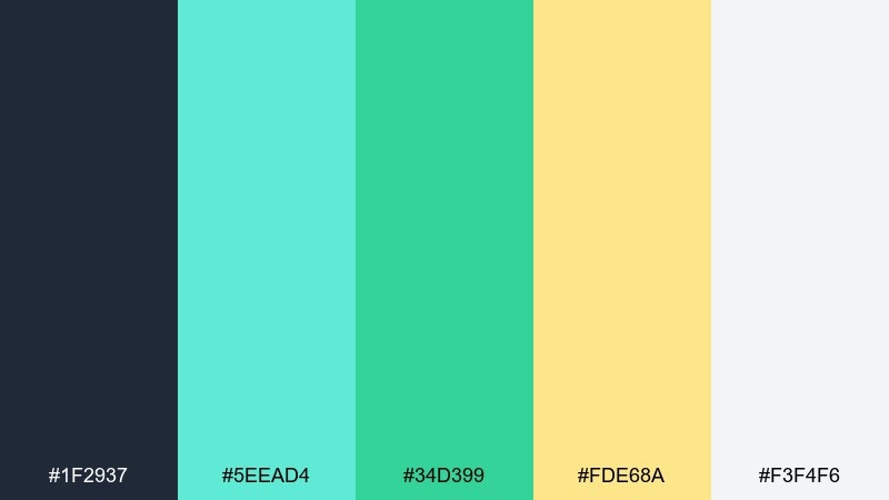
HEX: #1F2937 #5EEAD4 #34D399 #FDE68A #F3F4F6
Mood: fresh, modern, balanced
Best for: startup landing page hero
Fresh and modern, the mint tones feel like new paint cutting through a dark asphalt base. Use charcoal for headings and structure, then layer mint and green for friendly product cues. The soft yellow adds warmth for highlights without turning the page too loud. Tip: keep gradients subtle so the palette stays crisp and tech-forward.
Image example of asphalt mint generated using media.io
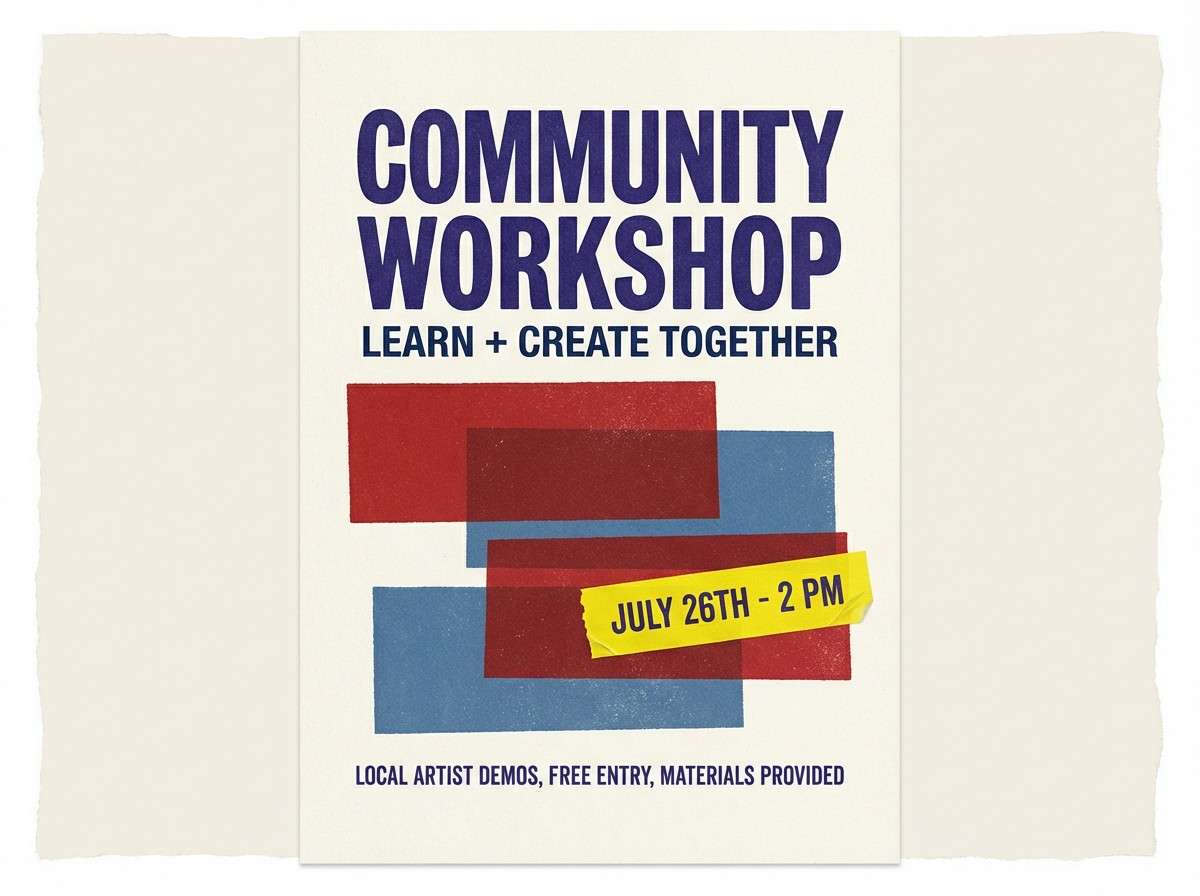
11) Poster Paste
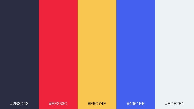
HEX: #2B2D42 #EF233C #F9C74F #4361EE #EDF2F4
Mood: graphic, layered, energetic
Best for: community workshop poster
Graphic and layered, these colors evoke torn posters stacked in quick, messy rhythms. Let the deep indigo handle the main type and borders, then alternate red and blue for blocks and icons. Yellow is best reserved for key details like time, location, or a single sticker element. Tip: add a subtle paper-tear edge to one shape to amplify the paste-up vibe.
Image example of poster paste generated using media.io
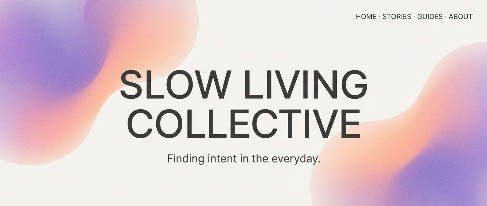
12) Rooftop Haze
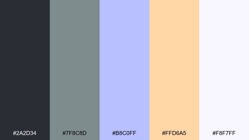
HEX: #2A2D34 #7F8C8D #B8C0FF #FFD6A5 #F8F7FF
Mood: dreamy, calm, atmospheric
Best for: lifestyle blog header
Dreamy and calm, it feels like early morning haze drifting over rooftops and painted skylines. Use the soft violet as a gentle focal color, with peach for warmth and human touch. The charcoal and gray keep copy readable while staying understated. Tip: pair with soft gradients and plenty of whitespace for an airy editorial feel.
Image example of rooftop haze generated using media.io
13) Stencil Citrus
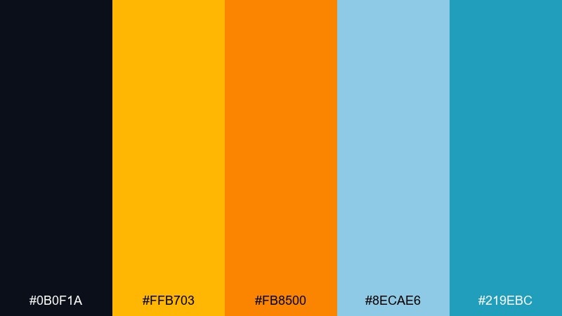
HEX: #0B0F1A #FFB703 #FB8500 #8ECAE6 #219EBC
Mood: sunny, punchy, graphic
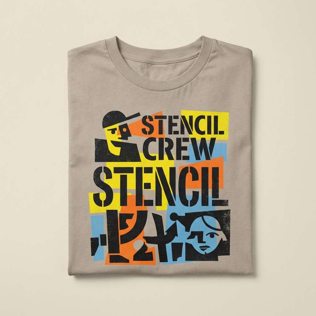
Best for: t-shirt graphic print
Sunny and punchy, it recalls crisp stencil edges and bright citrus paint on dark walls. Use the deep ink tone as the shirt base, then stack the two oranges for maximum impact. The blue pair cools the palette and makes great secondary shapes or small type. Tip: limit the design to two dominant inks to keep the print bold and affordable.
Image example of stencil citrus generated using media.io
14) Tunnel Glow
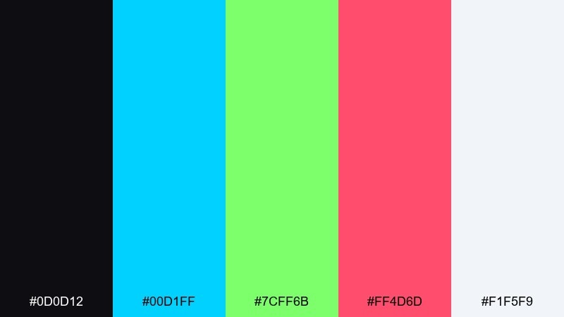
HEX: #0D0D12 #00D1FF #7CFF6B #FF4D6D #F1F5F9
Mood: neon, kinetic, nightlife
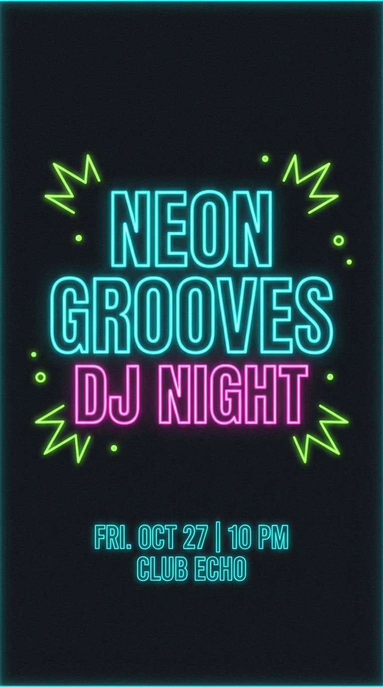
Best for: DJ night promo story
Neon and kinetic, it feels like fluorescent paint catching light in a tunnel. This street art color palette is strongest when cyan and pink trade off as the hero, with black holding the edges and type. Use the green only as a small electric spike for icons or linework. Tip: keep backgrounds dark so the glow reads instantly on mobile.
Image example of tunnel glow generated using media.io
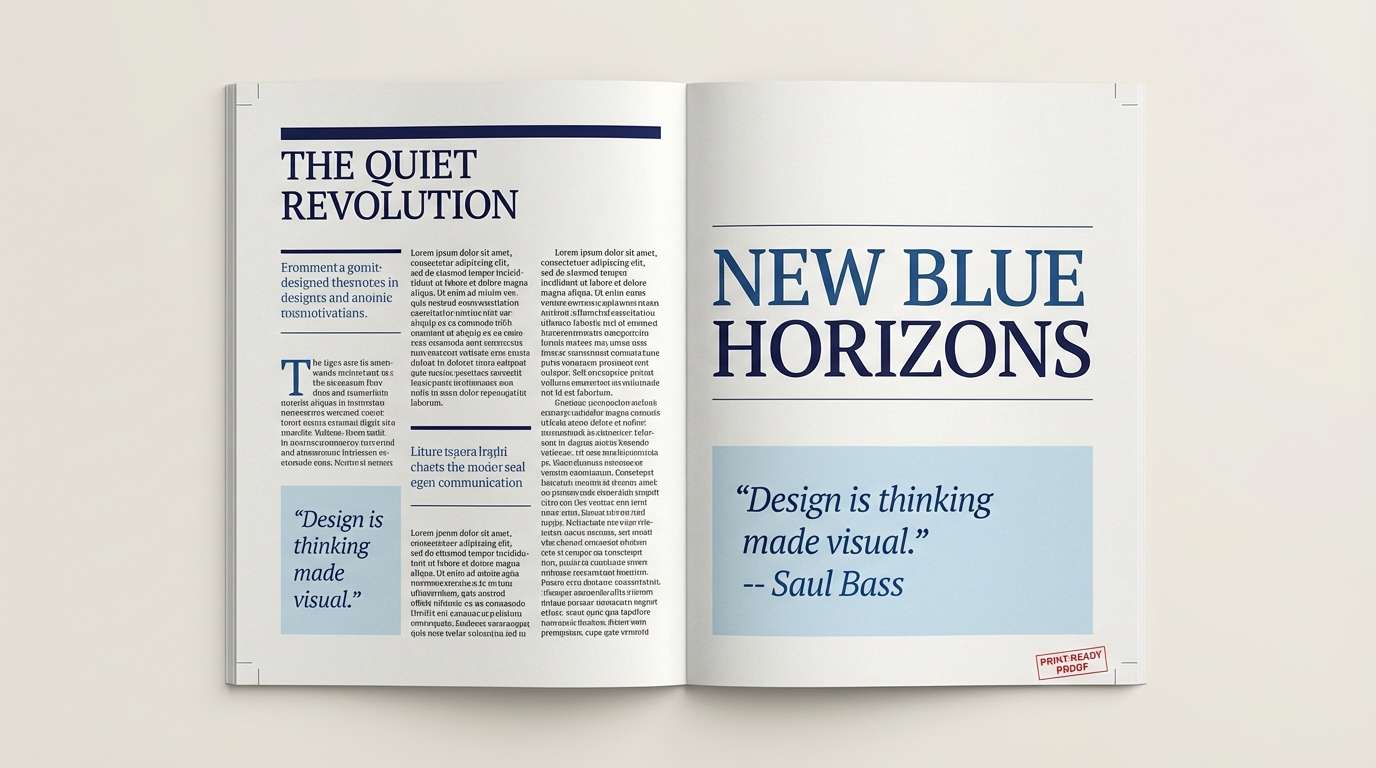
15) Rainy Underpass
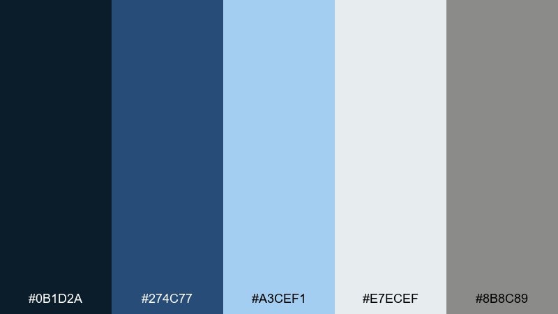
HEX: #0B1D2A #274C77 #A3CEF1 #E7ECEF #8B8C89
Mood: moody, cool, cinematic
Best for: photo essay editorial layout
Moody and cinematic, it suggests wet pavement, fog, and steel beams under an overpass. Use navy and deep blue for headers and dividers, then let pale blue carry pull quotes or captions. The soft gray-white keeps the layout readable without turning clinical. Tip: pair with black-and-white photography for a cohesive, documentary vibe.
Image example of rainy underpass generated using media.io
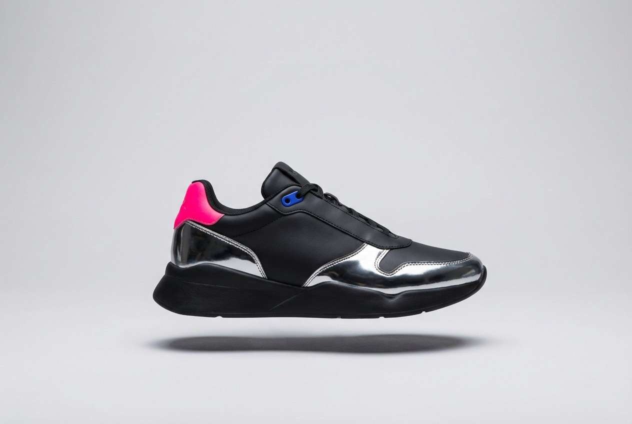
16) Ink and Chrome
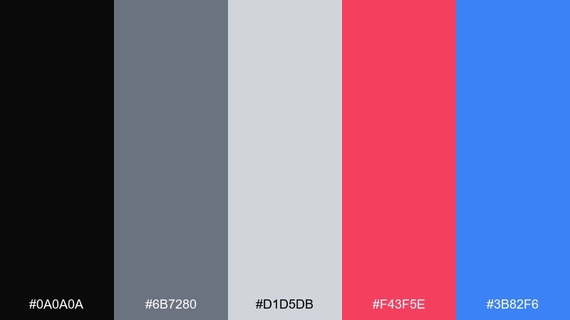
HEX: #0A0A0A #6B7280 #D1D5DB #F43F5E #3B82F6
Mood: sleek, tough, modern
Best for: sneaker product ad
Sleek and tough, it feels like glossy ink, metal caps, and reflective city surfaces. Use black and chrome grays as the stage, then choose either the hot pink or the blue as the hero accent. Keeping both accents small makes the ad feel premium rather than playful. Tip: use hard-edged shadows to enhance the metallic mood.
Image example of ink and chrome generated using media.io
17) Bubble Letter Candy
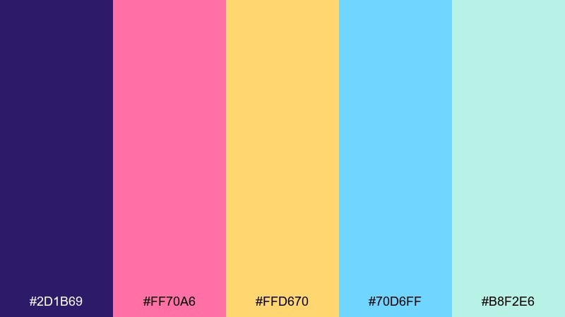
HEX: #2D1B69 #FF70A6 #FFD670 #70D6FF #B8F2E6
Mood: playful, sweet, nostalgic
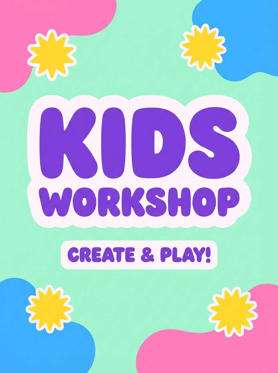
Best for: kids workshop poster
Playful and sweet, it brings bubble letters, candy wrappers, and bright sticker packs to mind. Let purple be the anchor so the pink and blue stay readable in large shapes. Yellow works great for headline highlights, while mint smooths transitions between the loud colors. Tip: round your corners and use thick outlines to match the bouncy feel.
Image example of bubble letter candy generated using media.io
18) Limestone Fade
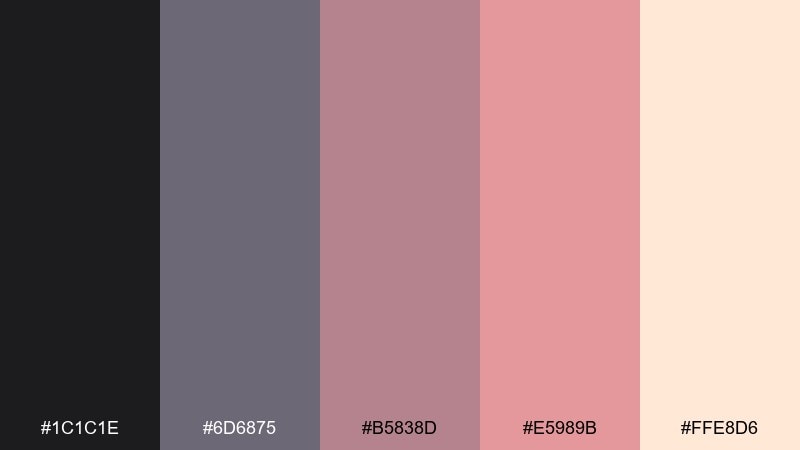
HEX: #1C1C1E #6D6875 #B5838D #E5989B #FFE8D6
Mood: muted, romantic, vintage
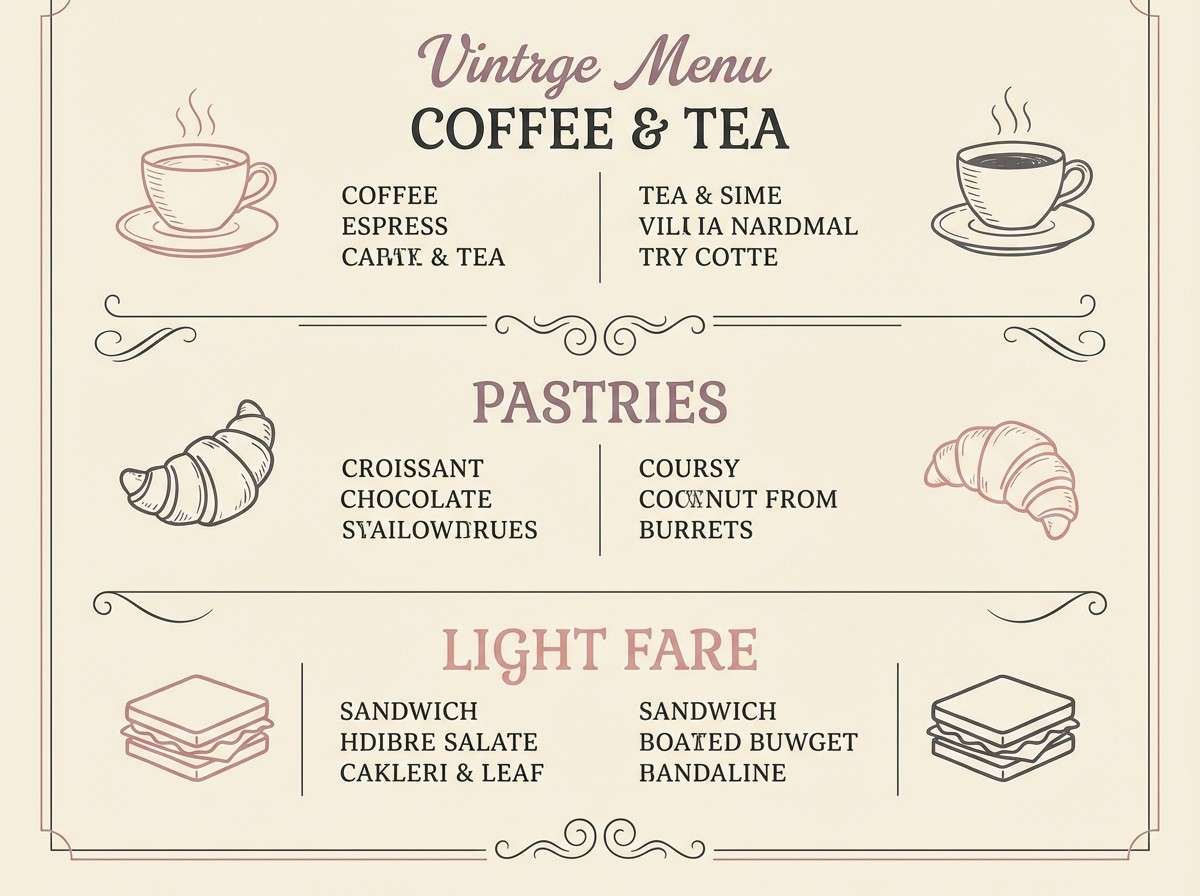
Best for: cafe menu design
Muted and romantic, it feels like sun-faded paint and dusty limestone walls. Use the near-black for menu structure, then bring in mauve and rose for section headers and small illustrations. The warm cream background keeps it cozy and approachable. Tip: print with slightly warm paper stock so the blush tones stay soft.
Image example of limestone fade generated using media.io
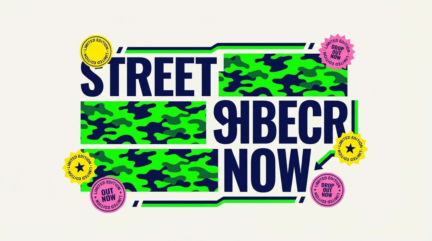
19) Electric Camo
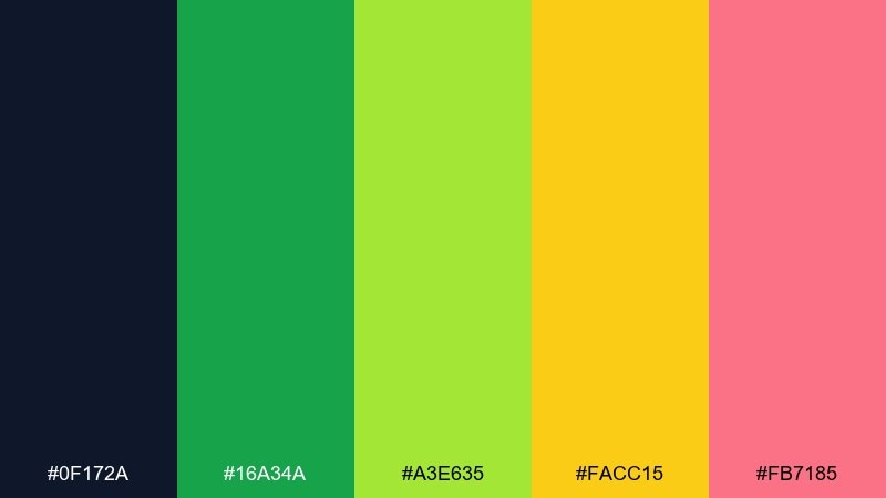
HEX: #0F172A #16A34A #A3E635 #FACC15 #FB7185
Mood: sporty, loud, edgy
Best for: streetwear drop banner
Sporty and loud, it suggests camouflage patterns reworked with neon paint splashes. Use navy to hold the layout together, then let the two greens carry the main graphic pattern. Yellow and pink should be quick hits for badges, prices, or drop dates. Tip: keep type mostly white or navy for legibility over busy camo shapes.
Image example of electric camo generated using media.io
20) Weekend Mural
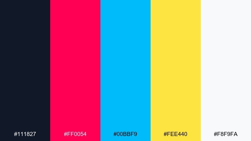
HEX: #111827 #FF0054 #00BBF9 #FEE440 #F8F9FA
Mood: bright, upbeat, creative
Best for: creator highlight reel cover
Bright and upbeat, it feels like a weekend wall session with fresh rollers and loud paint caps. The pink and cyan make a strong duo for the main title, while yellow works as a punchy underline or corner tab. Keep the deep charcoal for type contrast and structure. Tip: stick to big shapes and minimal text so it reads instantly at thumbnail size.
Image example of weekend mural generated using media.io

What Colors Go Well with Street Art?
Street art visuals pair best with a strong dark anchor (near-black, charcoal, deep navy) plus 1–2 saturated “paint” colors like magenta, cyan, orange, or electric green. This combination keeps layouts readable while still feeling loud and expressive.
Muted neutrals—concrete gray, warm cream, sand, and dusty mauves—are also great companions because they mimic real walls and paper. They calm down neon accents and help negative space look intentional.
For a cohesive street art color scheme, choose one “hero” accent and repeat it consistently (headlines, badges, key shapes). Use any extra brights only as small highlights so the design stays punchy, not messy.
How to Use a Street Art Color Palette in Real Designs
Start with hierarchy: pick a base background color (often dark), a hero color for the main focal area, and a single highlight for small cues like dates, prices, or buttons. This simple structure matches how real street pieces use limited paint and bold contrast.
Add texture thoughtfully. A tiny amount of grain, halftone, paper-tear edges, or ink splatter can make flat colors feel printed and tactile—but keep it subtle so text stays sharp.
Test readability at distance and at thumbnail size. Street art-inspired designs should still scan fast, so verify contrast for type and avoid using too many equally loud hues in one area.
Create Street Art Palette Visuals with AI
If you want to see these street art palettes in action, generate quick poster, banner, or social concepts with AI. You can iterate on layout, texture, and lighting while keeping your HEX direction consistent.
In Media.io, paste a prompt, describe the vibe (stencil, paste-up, neon glow, grain), and refine results until the colors feel balanced. It’s a fast way to mock up campaign visuals before committing to final design work.
When prompting, specify a clean background, one dominant accent, and the texture you want (screenprint grain, halftone, torn-paper edge) so the output stays bold and readable.
Street Art Color Palette FAQs
-
What is a street art color palette?
A street art color palette is a set of colors inspired by graffiti, murals, stencils, and paste-ups—typically high-contrast bases (black/gray) with bold accents (neon, primaries) designed for instant visibility. -
What are the best colors for graffiti-style designs?
Near-black or deep navy for structure, then bright accents like magenta, cyan, orange, and electric green. Add an off-white or light gray to create breathing room and improve readability. -
How many colors should I use in an urban color scheme?
For most designs, 3–5 colors is ideal: one base, one hero, one highlight, plus optional neutral support. Keeping accents limited helps the composition feel intentional, not chaotic. -
Do neon colors work in branding?
Yes, especially for youth, nightlife, music, and streetwear brands. Use neon as a controlled accent (buttons, badges, icons) and anchor it with dark neutrals to keep the brand system versatile. -
How do I keep a street art palette readable for text?
Use dark text on light backgrounds or light text on dark backgrounds, and avoid placing small type over multiple bright hues. Reserve the brightest colors for large shapes and short callouts. -
What’s the easiest way to preview these palettes in real layouts?
Generate mockups (posters, social posts, banners) using an AI text-to-image tool, then refine the prompt to control background, texture, and which accent color leads. -
Can I use these HEX codes for UI design?
Yes—just apply restraint. Use neutrals for most surfaces and pick one bright accent for interactive states (buttons, toggles, charts), similar to the “Chalk Outline” approach.
Next: Jasper Color Palette


