

Jasper is a warm clay-red family that instantly adds earthy confidence to a brand, interface, or print layout. It’s bold enough for hero moments, but naturally muted compared to pure red—so it stays tasteful.
Below are 20 jasper color palette ideas with HEX codes, each designed around balanced neutrals, grounded dark anchors, and a few high-impact accents for contrast.
In this article
- Why Jasper Palettes Work So Well
-
- canyon clay
- desert sage
- smoked cedar
- rosewood linen
- terracotta nightfall
- copper botanical
- rustic minimal
- autumn market
- earth and ink
- warm stone studio
- sunbaked citrus
- clay and cream
- vintage ledger
- jasper and teal pop
- mocha berry
- mountain trail
- gallery neutrals
- brick and brass
- wine country
- pastel contrast
- What Colors Go Well with Jasper?
- How to Use a Jasper Color Palette in Real Designs
- Create Jasper Palette Visuals with AI
Why Jasper Palettes Work So Well
Jasper sits in that sweet spot between terracotta and brick red, so it feels energetic without looking overly saturated. It reads as human, handcrafted, and material-driven—perfect for modern brands that still want warmth.
Because jasper has built-in earthiness, it pairs naturally with creamy whites, paper beiges, and charcoal anchors. That makes it easy to keep contrast high for UI or typography while still maintaining a soft, premium feel.
It also adapts across industries: rustic packaging, editorial layouts, wellness UIs, menus, and luxury labels. With the right neutral base, jasper can feel either cozy and approachable or dramatic and cinematic.
20+ Jasper Color Palette Ideas (with HEX Codes)
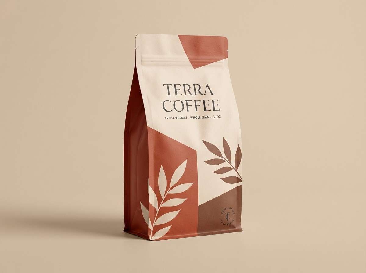
1) Canyon Clay
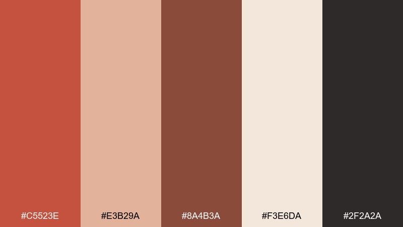
HEX: #C5523E #E3B29A #8A4B3A #F3E6DA #2F2A2A
Mood: sunbaked, grounded, artisanal
Best for: coffee packaging and rustic brand identity
Sunbaked canyon walls and handmade pottery come to mind, warm but never loud. The clay red feels most confident when balanced with creamy paper tones and a dark charcoal anchor. Use it on labels, stamps, and simple icon marks, then let the lighter beige do the heavy lifting for readability. Tip: keep the darkest shade for small type and barcodes to maintain contrast.
Image example of canyon clay generated using media.io
Media.io is an online AI studio for creating and editing video, image, and audio in your browser.

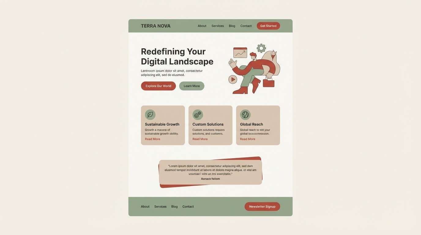
2) Desert Sage
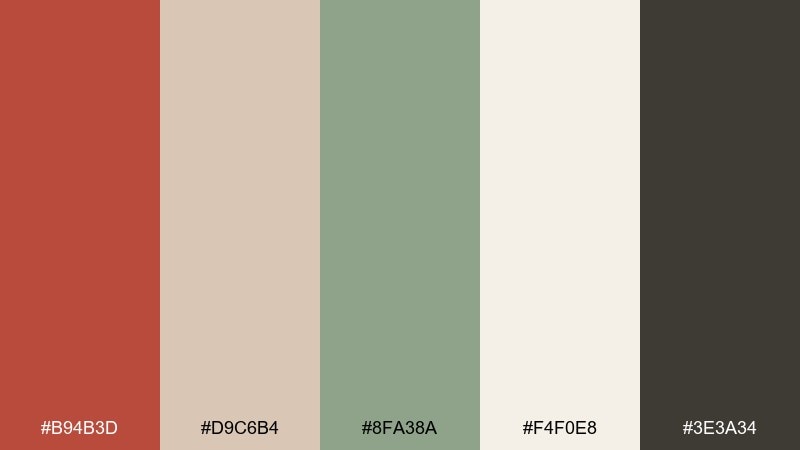
HEX: #B94B3D #D9C6B4 #8FA38A #F4F0E8 #3E3A34
Mood: calm, natural, modern rustic
Best for: wellness website UI and landing pages
Dry desert air, sagebrush, and sun-bleached trails set a calm, restorative tone. The muted green softens the warm red so the interface feels friendly instead of intense. Pair the off-white background with charcoal text, and reserve the red for CTAs and key status states. Tip: use the beige as a card surface to avoid stark white blocks.
Image example of desert sage generated using media.io
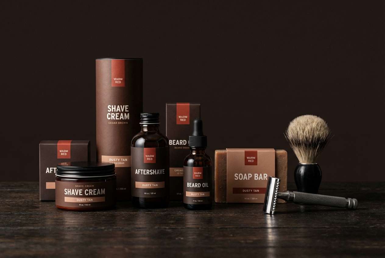
3) Smoked Cedar
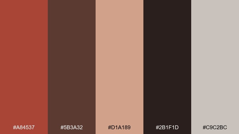
HEX: #A84537 #5B3A32 #D1A189 #2B1F1D #C9C2BC
Mood: moody, woody, premium
Best for: mens grooming product ads
Smoked cedar, leather, and a dim barbershop glow give this mix its confident edge. Deep browns and near-black create instant premium contrast against the dusty tan highlight. Use the red as a controlled accent on seals, headings, or a single hero stripe rather than filling large areas. Tip: add subtle grain textures in the mid-brown to enhance the woody feel without muddying text.
Image example of smoked cedar generated using media.io
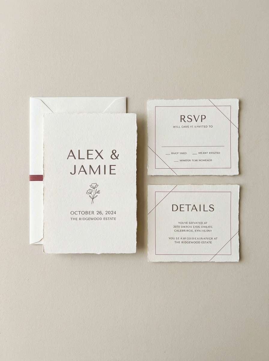
4) Rosewood Linen
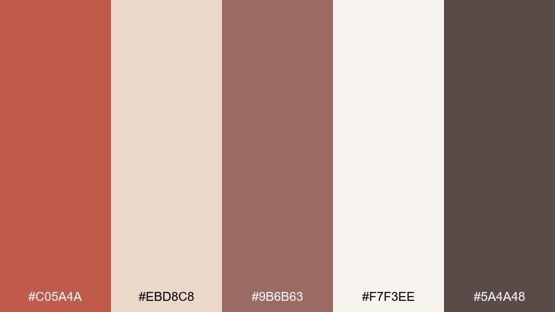
HEX: #C05A4A #EBD8C8 #9B6B63 #F7F3EE #5A4A48
Mood: soft, romantic, refined
Best for: wedding invitation suite
Rosewood warmth on crisp linen feels intimate and timeless, like a letter pressed into textured paper. These tones make a jasper color palette that stays elegant by leaning on the soft ivory and dusty mauve-brown. Pair with simple serif typography and plenty of negative space for a modern look. Tip: foiling works best when you keep the dark taupe for names and the warm red for small motifs.
Image example of rosewood linen generated using media.io
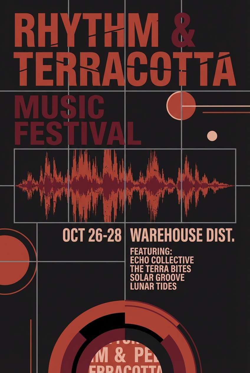
5) Terracotta Nightfall
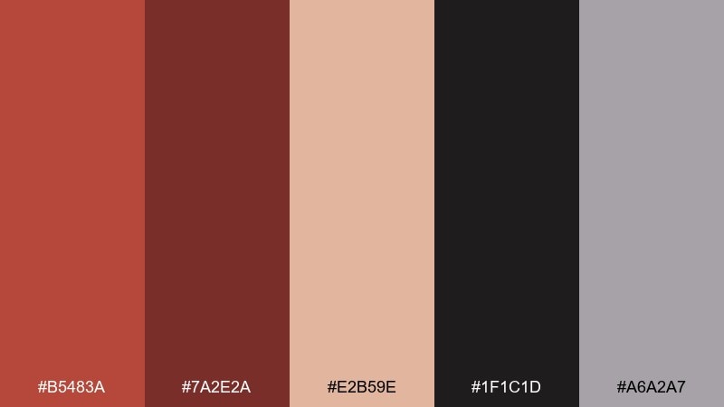
HEX: #B5483A #7A2E2A #E2B59E #1F1C1D #A6A2A7
Mood: dramatic, urban, cinematic
Best for: music event poster
Night streets, neon reflections, and brick heat create a cinematic push and pull. The near-black background makes the terracotta and blush tones pop without turning flashy. Use the gray as a quiet grid color and keep the deep maroon for dates and venue details. Tip: set oversized headings in the warm red, then drop supporting copy to the pale blush for legibility.
Image example of terracotta nightfall generated using media.io
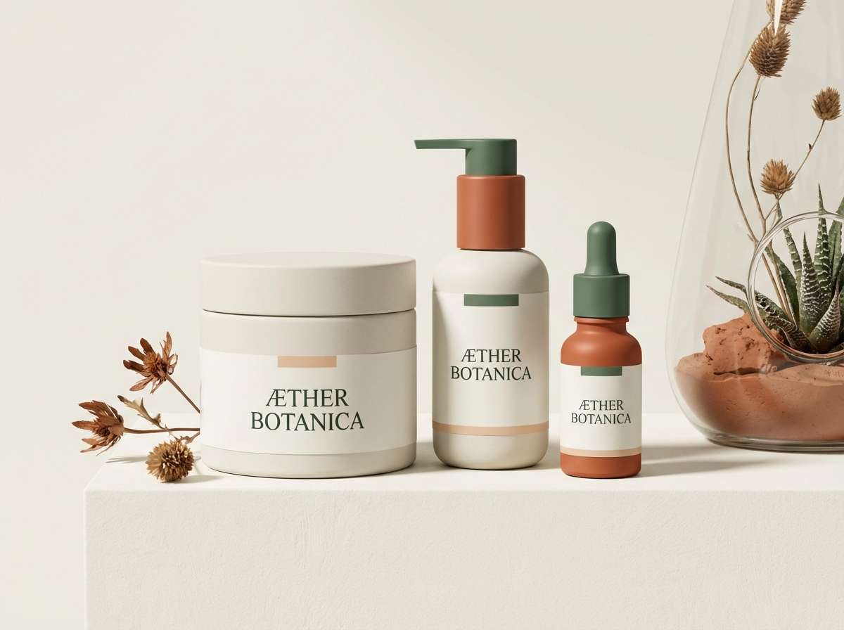
6) Copper Botanical
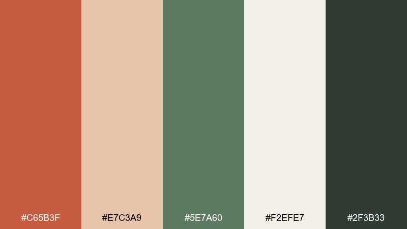
HEX: #C65B3F #E7C3A9 #5E7A60 #F2EFE7 #2F3B33
Mood: earthy, fresh, boutique
Best for: skincare packaging and labels
Copper clay and leafy greens feel like a greenhouse visit after rain, grounded but alive. The green gives the warm red a clean, botanical counterpoint that works beautifully on tubes and boxes. Pair the off-white base with minimal line art and let the dark green handle ingredient lists. Tip: keep the copper tone for brand marks and seals to avoid overwhelming small packaging panels.
Image example of copper botanical generated using media.io
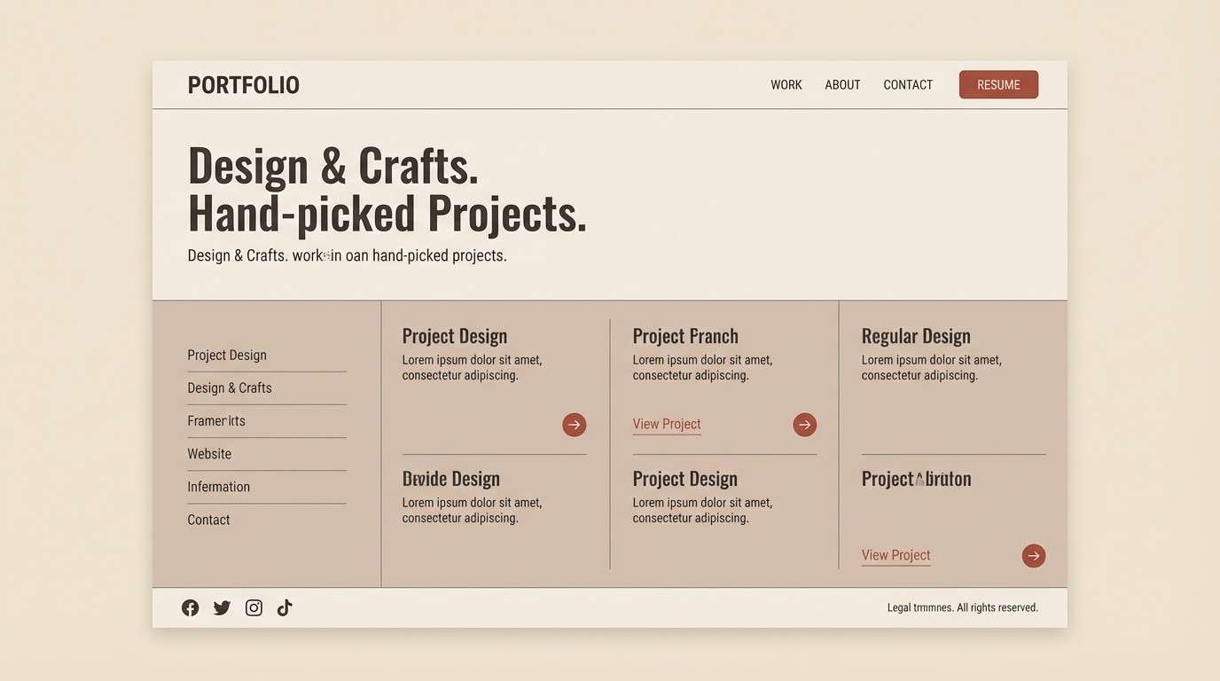
7) Rustic Minimal
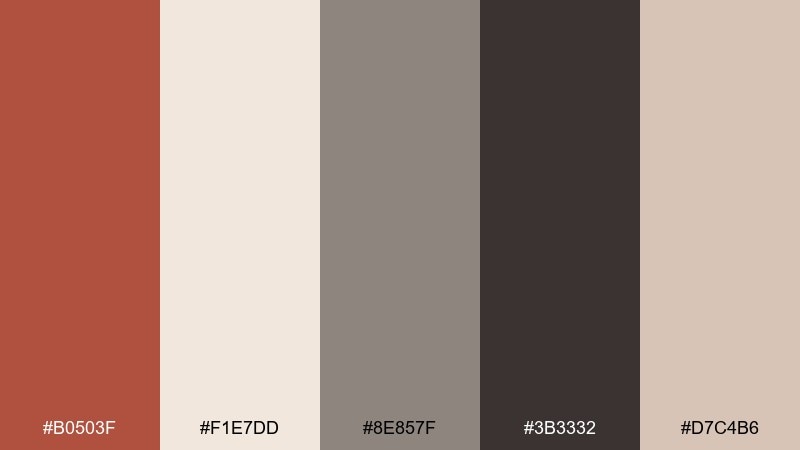
HEX: #B0503F #F1E7DD #8E857F #3B3332 #D7C4B6
Mood: minimal, warm, editorial
Best for: portfolio website UI
Warm plaster walls and a quiet studio desk give this palette its understated confidence. The soft off-white and warm gray create breathing room, while the clay red acts like a subtle signature. Use the charcoal for navigation and body text, and save the red for hover states and selected filters. Tip: keep borders in the pale beige so components feel cohesive without heavy lines.
Image example of rustic minimal generated using media.io
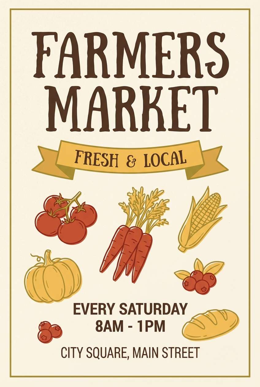
8) Autumn Market
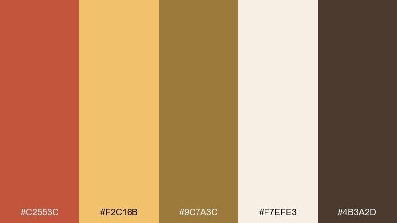
HEX: #C2553C #F2C16B #9C7A3C #F7EFE3 #4B3A2D
Mood: cheerful, cozy, seasonal
Best for: farmers market flyer
Golden harvest light and warm spices make the whole mix feel inviting and handmade. These jasper color combinations shine in bold headers with sunny yellow supporting badges and highlights. Pair with chunky sans-serif type and simple produce illustrations for a friendly, local vibe. Tip: keep body text in the dark cocoa so the yellow stays a joyful accent instead of a readability problem.
Image example of autumn market generated using media.io
9) Earth and Ink
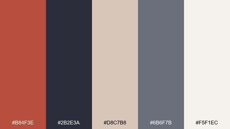
HEX: #B84F3E #2B2E3A #D8C7B8 #6B6F7B #F5F1EC
Mood: professional, balanced, slightly cool
Best for: business presentation slides
Earthy warmth meets inky navy for a smart, boardroom-ready feel. The cool dark tones keep the red grounded, making charts and callouts look confident rather than loud. Use the off-white for slide backgrounds and keep the red for key metrics, icons, and section dividers. Tip: apply the mid-gray-blue to secondary labels so the hierarchy stays clear.
Image example of earth and ink generated using media.io

10) Warm Stone Studio
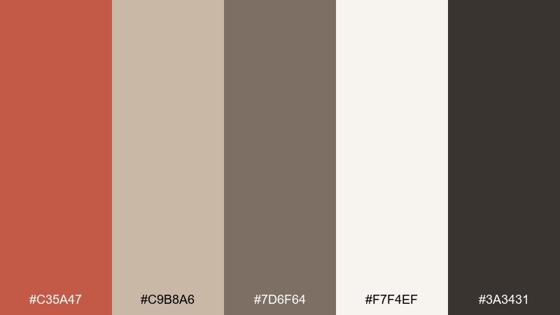
HEX: #C35A47 #C9B8A6 #7D6F64 #F7F4EF #3A3431
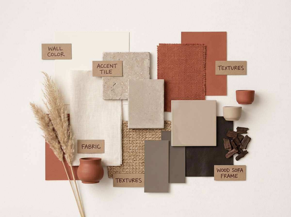
Mood: neutral, architectural, calm
Best for: interior design mood board
Warm stone, clay plaster, and quiet shadows create a refined, architectural atmosphere. The palette reads mature and modern, especially when the red is treated like a material accent instead of a background color. Pair with natural textures like linen, oak, and matte ceramic to keep everything tactile. Tip: use the darkest tone sparingly for captions and swatches to avoid making the board feel heavy.
Image example of warm stone studio generated using media.io
11) Sunbaked Citrus
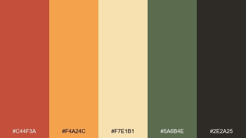
HEX: #C44F3A #F4A24C #F7E1B1 #5A6B4E #2E2A25
Mood: energetic, sunny, outdoorsy
Best for: sports drink product ad
Sunbaked trails and citrus zest give this set a bright, active punch. Orange and buttery yellow lift the warm red into a more energetic, thirst-quenching direction. Pair the greens with ingredient callouts and keep the darkest tone for bold nutrition text. Tip: use large color blocks with a single dominant hue per panel to keep the ad crisp and readable.
Image example of sunbaked citrus generated using media.io
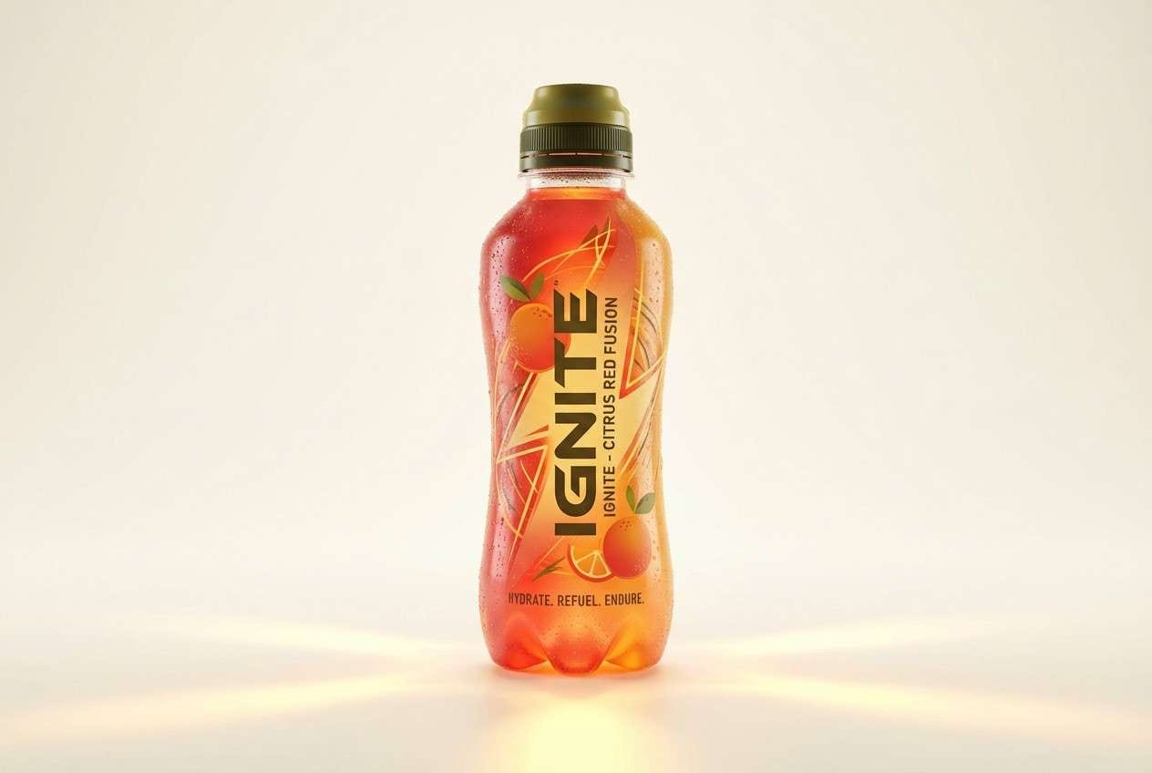
12) Clay and Cream
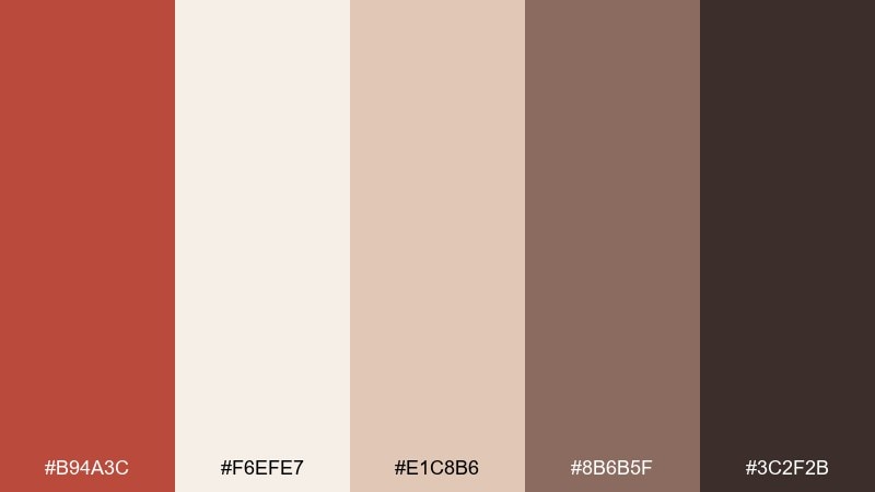
HEX: #B94A3C #F6EFE7 #E1C8B6 #8B6B5F #3C2F2B
Mood: soft, cozy, approachable
Best for: food blog branding
Fresh-baked bread, ceramic bowls, and warm kitchen light make the vibe instantly welcoming. Creamy whites keep the clay red feeling gentle, while the cocoa brown provides dependable contrast for headlines. Pair with hand-drawn icons and warm photography for a homestyle look. Tip: use the mid beige for backgrounds behind recipes so text stays comfortable to read.
Image example of clay and cream generated using media.io
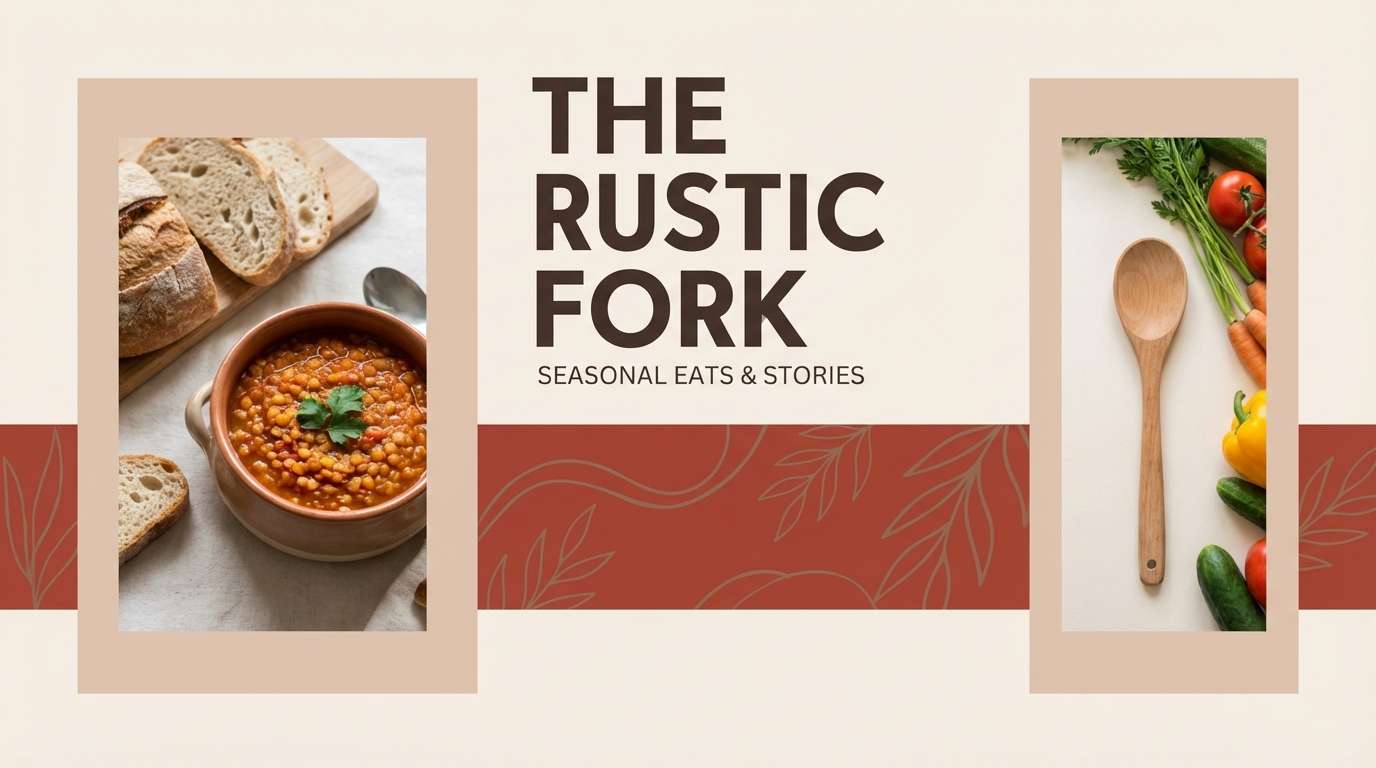
13) Vintage Ledger
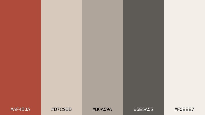
HEX: #AF4B3A #D7C9BB #B0A59A #5E5A55 #F3EEE7
Mood: vintage, academic, trustworthy
Best for: book cover design
Old paper, stamped ink, and library quiet bring a thoughtful, scholarly character. The warm red reads like a classic spine accent against aged neutrals and soft gray. Pair with serif typography and simple line illustrations to keep it timeless. Tip: use the darkest gray for title and author to maintain crisp contrast on the warm background.
Image example of vintage ledger generated using media.io
14) Jasper and Teal Pop
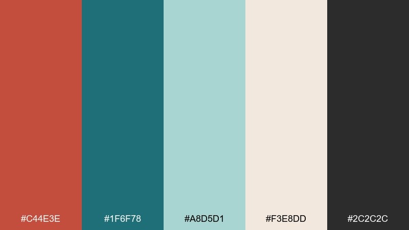
HEX: #C44E3E #1F6F78 #A8D5D1 #F3E8DD #2C2C2C
Mood: fresh, confident, high-contrast
Best for: SaaS marketing hero section
A crisp teal splash against warm clay red feels like modern architecture meeting coastal air. These jasper color combinations work well when teal handles links and micro-interactions, while the red anchors primary buttons. Pair with a light cream background and strong dark text for a clean conversion-focused layout. Tip: keep the pale aqua for subtle gradients or badges so it never competes with CTAs.
Image example of jasper and teal pop generated using media.io

15) Mocha Berry
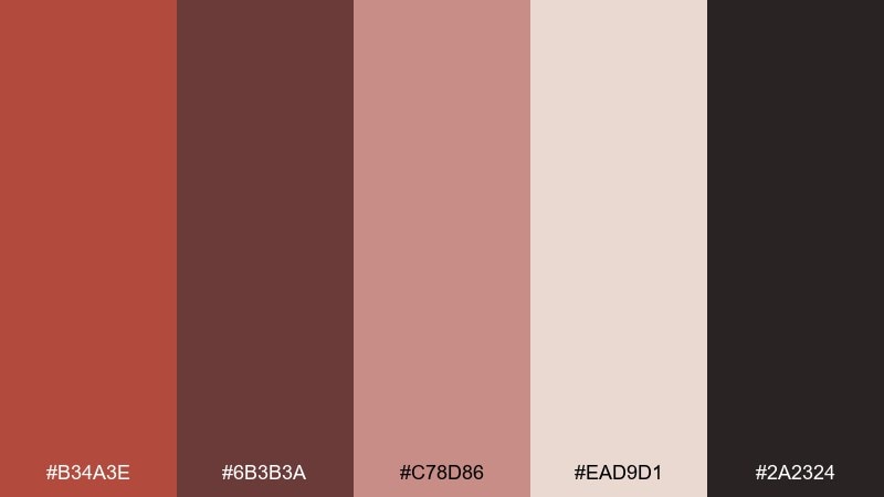
HEX: #B34A3E #6B3B3A #C78D86 #EAD9D1 #2A2324
Mood: rich, cozy, romantic
Best for: valentines social media posts
Mocha and berry notes make the palette feel like a warm dessert table at dusk. The dusty pink keeps the deeper tones from getting too heavy, which is great for type overlays. Pair with minimal heart motifs and generous spacing so it stays modern, not sugary. Tip: use the near-black sparingly for crisp text on the pale blush background.
Image example of mocha berry generated using media.io

16) Mountain Trail
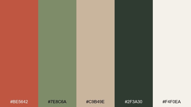
HEX: #BE5642 #7E8C6A #C9B49E #2F3A30 #F4F0EA
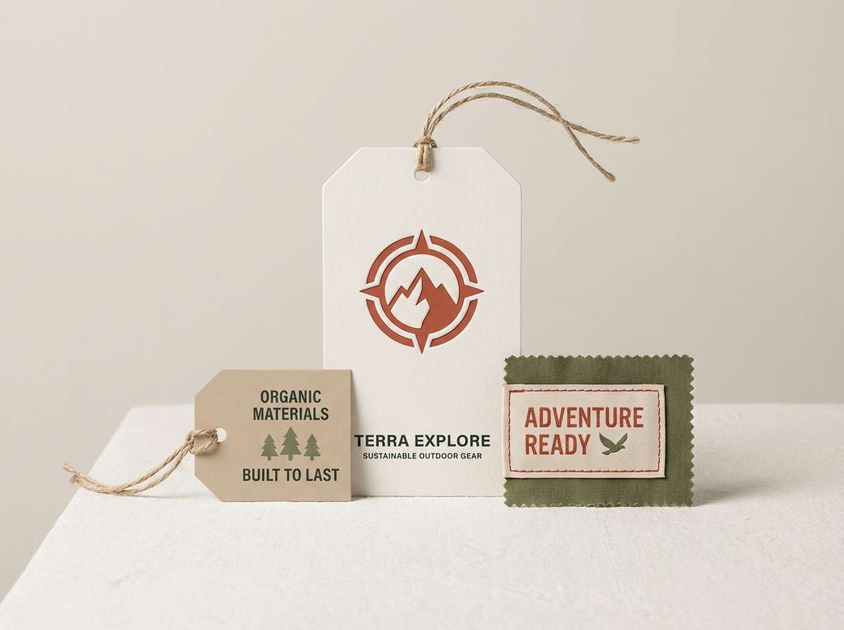
Mood: outdoorsy, sturdy, organic
Best for: outdoor apparel hang tags
Red clay paths and pine shadows give this mix a rugged, trail-ready spirit. The greens feel natural rather than sporty, which keeps branding authentic and grounded. Pair the beige and off-white with kraft textures, and use the deep green for small print and sizing. Tip: reserve the warm red for the logo mark and one highlight stripe to avoid visual clutter.
Image example of mountain trail generated using media.io
17) Gallery Neutrals
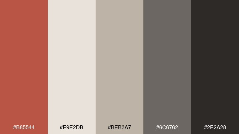
HEX: #B85544 #E9E2DB #BEB3A7 #6C6762 #2E2A28
Mood: quiet, curated, contemporary
Best for: art gallery exhibition brochure
A calm gallery wall with warm spotlights is the mood: subtle, curated, and quietly confident. As a jasper color palette, it works best when the red is a small curatorial accent against layered neutrals. Pair with clean grids, lots of whitespace, and simple photography to keep the focus on the work. Tip: use the mid neutral for captions and the near-black for headings to maintain a crisp hierarchy.
Image example of gallery neutrals generated using media.io
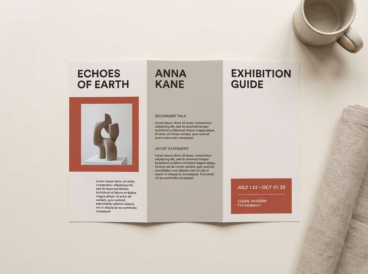
18) Brick and Brass
HEX: #B84D3C #C7A24D #F1E2C8 #4C3E33 #1E1B1A
Mood: heritage, warm, upscale
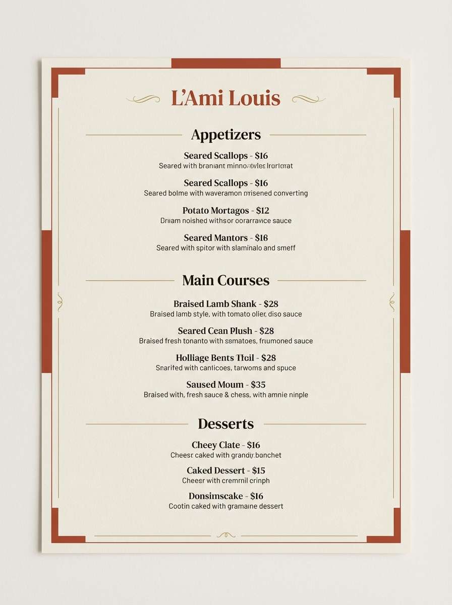
Best for: restaurant menu design
Brick warmth with a brass glow feels classic, like a cozy neighborhood bistro with great lighting. The gold tone adds a premium edge without leaning flashy, especially on cream paper. Pair with dark brown typography and simple dividers to keep menus readable. Tip: use the brass color for section headers and small icons, not full backgrounds.
Image example of brick and brass generated using media.io
19) Wine Country
HEX: #A9433A #6A2C3A #D6A29C #F1E7E6 #2C2326
Mood: luxurious, intimate, sophisticated
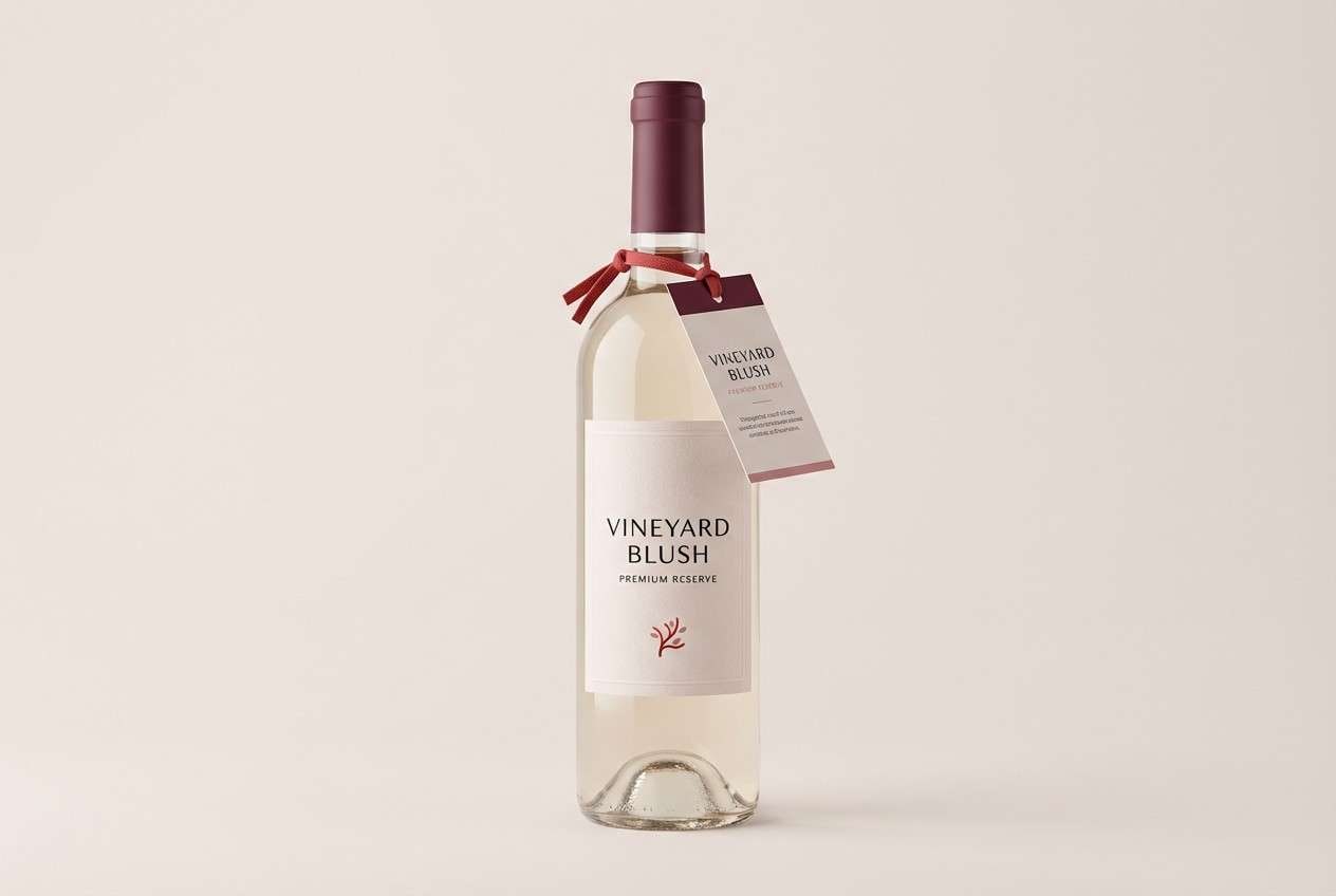
Best for: wine label and bottle neck tag
Deep cellar tones and a soft blush pour create a refined, intimate atmosphere. The burgundy grounds the palette, while the pale pink keeps it modern and light enough for premium labels. Pair with high-contrast serif type and minimal ornament for a contemporary winery feel. Tip: print the blush on uncoated stock to keep the label tactile and warm.
Image example of wine country generated using media.io
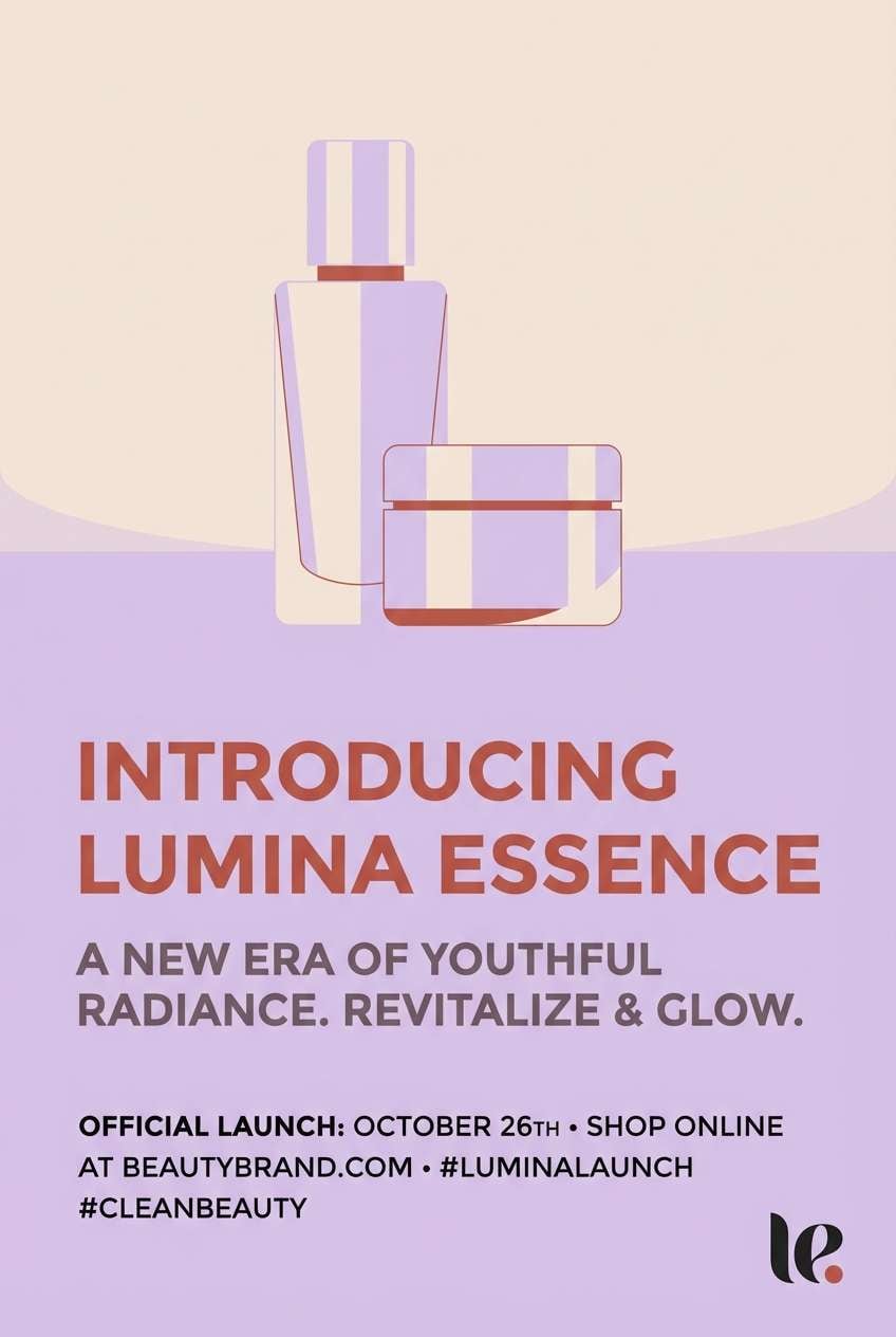
20) Pastel Contrast
HEX: #C25544 #D8C7E8 #F2E6DE #6A5B62 #2C2A2D
Mood: soft, modern, playful contrast
Best for: beauty product launch poster
Soft pastel violet against warm clay red feels contemporary and a little unexpected, like a modern boutique display. The pale cream keeps the contrast gentle, while the mauve-gray ties the warm and cool sides together. Pair with minimalist typography and generous spacing so the colors do the storytelling. Tip: use violet for secondary shapes and the warm red for the product name to guide the eye.
Image example of pastel contrast generated using media.io
What Colors Go Well with Jasper?
Jasper pairs best with warm neutrals—cream, ivory, sand, and parchment—because they keep the red grounded and readable. For typography and structure, charcoal and near-black create crisp contrast without feeling harsh.
To expand the palette, try muted greens (sage, olive, forest) for an organic counterbalance, or deep blues (ink navy) for a more professional, presentation-ready tone. If you want something modern and unexpected, soft pastel violet can add a fresh cool-warm tension.
For metallic-like accents in print, brass/gold tones work beautifully with jasper’s clay warmth. Use those sparingly on icons, rules, or headings so they feel premium, not loud.
How to Use a Jasper Color Palette in Real Designs
In branding, treat jasper as a signature accent: a logo mark, seal, button, or headline stripe. Let your off-white or beige carry most background surfaces so layouts stay calm and spacious.
In UI, reserve jasper for primary CTAs and key states (active, selected, highlight). Pair with charcoal text for accessibility, and use warm grays for borders and dividers to avoid stark contrast.
In print, jasper looks especially good on uncoated paper and matte finishes. Keep body copy in deep browns or near-black, and use the mid-tones (beiges, dusty tans) as panels behind text blocks.
Create Jasper Palette Visuals with AI
If you already have HEX codes, you can turn them into product mockups, poster concepts, and UI hero sections in minutes. The fastest approach is to describe the design type, lighting, and materials, then specify your dominant jasper shade plus one or two supporting neutrals.
To get consistent results, keep prompts clear: define the background color, where the jasper accent appears (CTA, headline, label seal), and which color handles text for readability. Reuse the same prompt format across variations to explore different moods.
When you’re ready, generate multiple layouts and pick the strongest direction before refining typography or imagery.
Jasper Color Palette FAQs
-
What is a jasper color (in design terms)?
In design, jasper usually refers to a warm clay red (similar to terracotta/brick) that feels earthy, slightly muted, and material-driven rather than neon or candy red. -
Is jasper closer to terracotta or brick red?
Jasper typically sits between the two: it has terracotta’s earthy warmth but can carry brick-like depth when paired with browns or charcoal anchors. -
What neutrals work best with jasper?
Cream, ivory, parchment beige, warm gray, and charcoal are the most reliable neutrals for jasper because they preserve warmth while keeping text contrast strong. -
What is a good contrasting accent for jasper?
Muted teal or ink navy creates strong contrast for modern UI, while sage/olive gives a natural complementary feel. Pastel violet can also create a soft, contemporary contrast. -
How do I use jasper in a website UI without overwhelming the page?
Use jasper primarily for CTAs, active states, and small highlights; keep backgrounds off-white or beige, and set most text in charcoal for readability. -
Does jasper print well?
Yes—jasper tones often look premium in matte and uncoated finishes. For clean results, keep small text in dark brown/near-black and avoid making jasper the main background for dense copy. -
Can I generate jasper palette mockups with AI using HEX codes?
Yes. Add the HEX codes into your prompt, specify which color is dominant vs. accent, and describe the design format (packaging, poster, UI) plus lighting/material cues for consistent outputs.


