

A sky color palette is one of the easiest ways to make a design feel calm, open, and instantly readable. From pastel morning blues to deep “blue hour” navies, sky tones naturally guide the eye without adding visual stress.
Below are 20+ sky color palette ideas with HEX codes, plus practical tips for UI, branding, posters, and illustration—so you can pick a sky color scheme that matches your mood and message.
In this article
- Why Sky Palettes Work So Well
-
- cloudline pastels
- clear noon blues
- horizon haze
- glacier air
- coastal mist
- sunrise overlook
- kite daylight
- cirrus minimal
- blue hour ink
- rainwashed street
- arctic window
- poolside glass
- denim skyline
- icy lavender drift
- sandbar breeze
- starlit azure
- paper plane slides
- seaglass morning
- skyline neon pop
- stormbreak contrast
- featherlight gradient
- open air neutrals
- What Colors Go Well with Sky?
- How to Use a Sky Color Palette in Real Designs
- Create Sky Palette Visuals with AI
Why Sky Palettes Work So Well
Sky color palettes feel familiar because we see them every day—so they read as natural, trustworthy, and “easy” on the eyes. That familiarity makes them a strong default for backgrounds, layouts, and brand systems where clarity matters.
Most sky color combinations are built on light values (tints) with one deeper anchor shade, which helps you create hierarchy without harsh contrast. In UI, that typically means calm surfaces plus accessible buttons and links.
Sky tones also play nicely with many accents—from warm coral to sandy neutrals—so you can shift the vibe from clinical to cozy without rebuilding the whole palette.
20+ Sky Color Palette Ideas (with HEX Codes)
1) Cloudline Pastels
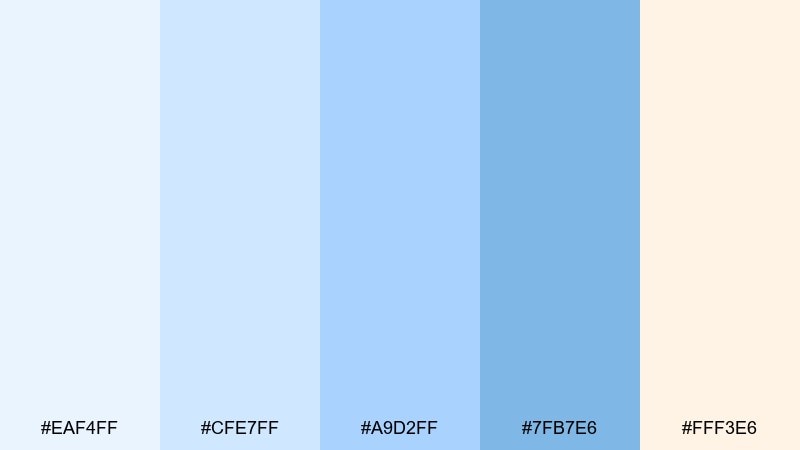
HEX: #EAF4FF #CFE7FF #A9D2FF #7FB7E6 #FFF3E6
Mood: airy, gentle, optimistic
Best for: wellness landing page UI
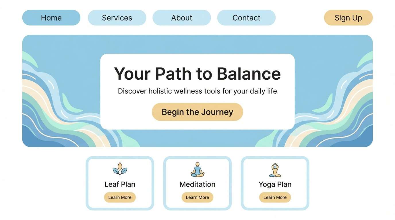
Airy and weightless like a morning full of soft clouds, these tones feel clean without turning sterile. They work beautifully for wellness or skincare pages where calm readability matters. Pair with a warm off-white and minimal line icons to keep the layout light. Usage tip: reserve the deeper blue for buttons and links so the interface stays quiet but navigable.
Image example of cloudline pastels generated using media.io
Media.io is an online AI studio for creating and editing video, image, and audio in your browser.

2) Clear Noon Blues
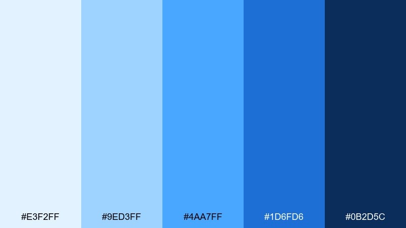
HEX: #E3F2FF #9ED3FF #4AA7FF #1D6FD6 #0B2D5C
Mood: confident, crisp, modern
Best for: tech brand hero banner
Crisp and confident like sunlight at midday, these blues read bold and modern on screens. Use the bright azure for headlines or key shapes, then anchor the design with navy for contrast and accessibility. It pairs well with cool grays and thin geometric type. Usage tip: keep gradients subtle, moving from pale to mid blue to avoid a sporty look.
Image example of clear noon blues generated using media.io

3) Horizon Haze
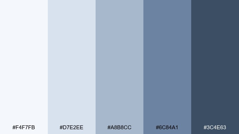
HEX: #F4F7FB #D7E2EE #A8B8CC #6C84A1 #3C4E63
Mood: quiet, misty, refined
Best for: editorial website layout
Quiet and misty like a distant horizon, this mix leans editorial and sophisticated. The gray-blues keep long-form pages feeling polished while still soft on the eyes. Pair with warm paper white backgrounds and a restrained serif for headlines. Usage tip: apply the darkest tone only to navigation and captions to keep the page airy.
Image example of horizon haze generated using media.io
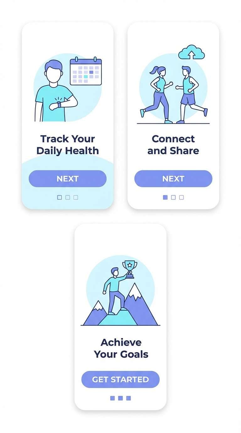
4) Glacier Air
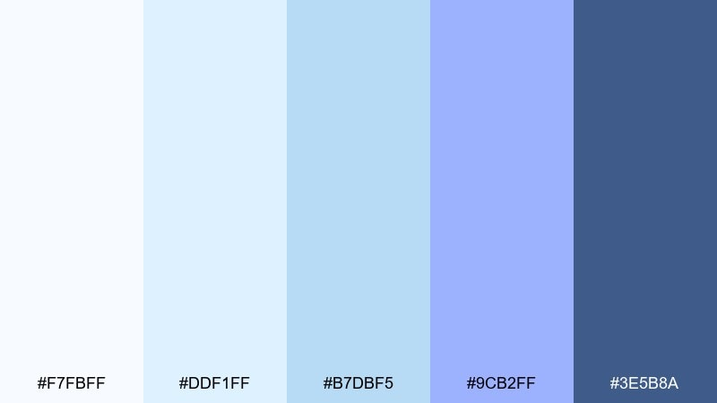
HEX: #F7FBFF #DDF1FF #B7DBF5 #9CB2FF #3E5B8A
Mood: fresh, icy, serene
Best for: health app onboarding screens
Fresh and icy like air over a glacier, the cool blues feel restorative and clear. They suit onboarding flows where you want trust, simplicity, and gentle guidance. Pair with soft rounded shapes and plenty of white space to maintain that breathable feel. Usage tip: limit the lavender-blue to highlights so the palette stays crisp, not sweet.
Image example of glacier air generated using media.io
5) Coastal Mist
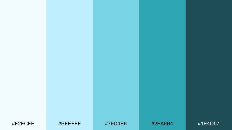
HEX: #F2FCFF #BFEFFF #79D4E6 #2FA6B4 #1E4D57
Mood: breezy, clean, coastal
Best for: travel blog header and cards
Breezy and clean like mist rolling in from the coast, these aqua-leaning tones feel refreshing. They shine on travel blogs, especially for headers, category chips, and info cards. Pair with sandy neutrals and light photography to keep the vibe natural. Usage tip: use the deep teal for text overlays to maintain legibility on pale sections.
Image example of coastal mist generated using media.io
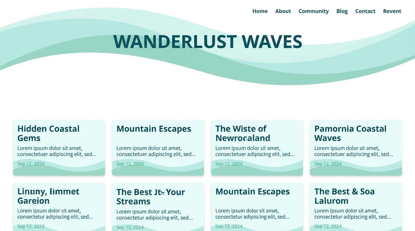
6) Sunrise Overlook
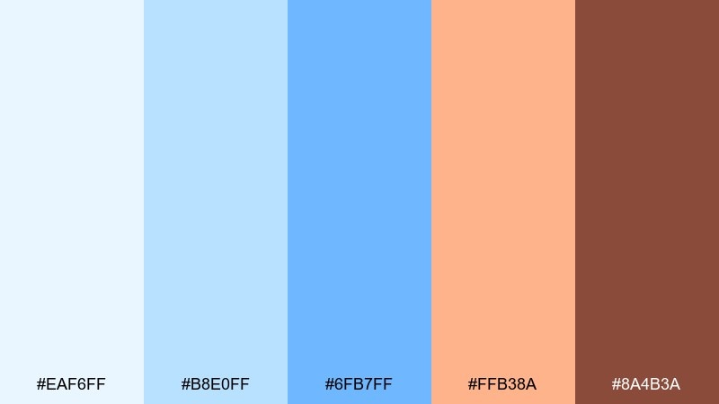
HEX: #EAF6FF #B8E0FF #6FB7FF #FFB38A #8A4B3A
Mood: warm, hopeful, cinematic
Best for: brand campaign social posts
Warm and hopeful like sunrise breaking through blue, this set balances calm with a friendly spark. The coral-peach accent makes the sky color palette feel human and approachable for campaign graphics. Pair it with neutral cream backgrounds and simple silhouettes to avoid visual clutter. Usage tip: use the warm accent only for calls to action and small shapes so the blues stay dominant.
Image example of sunrise overlook generated using media.io
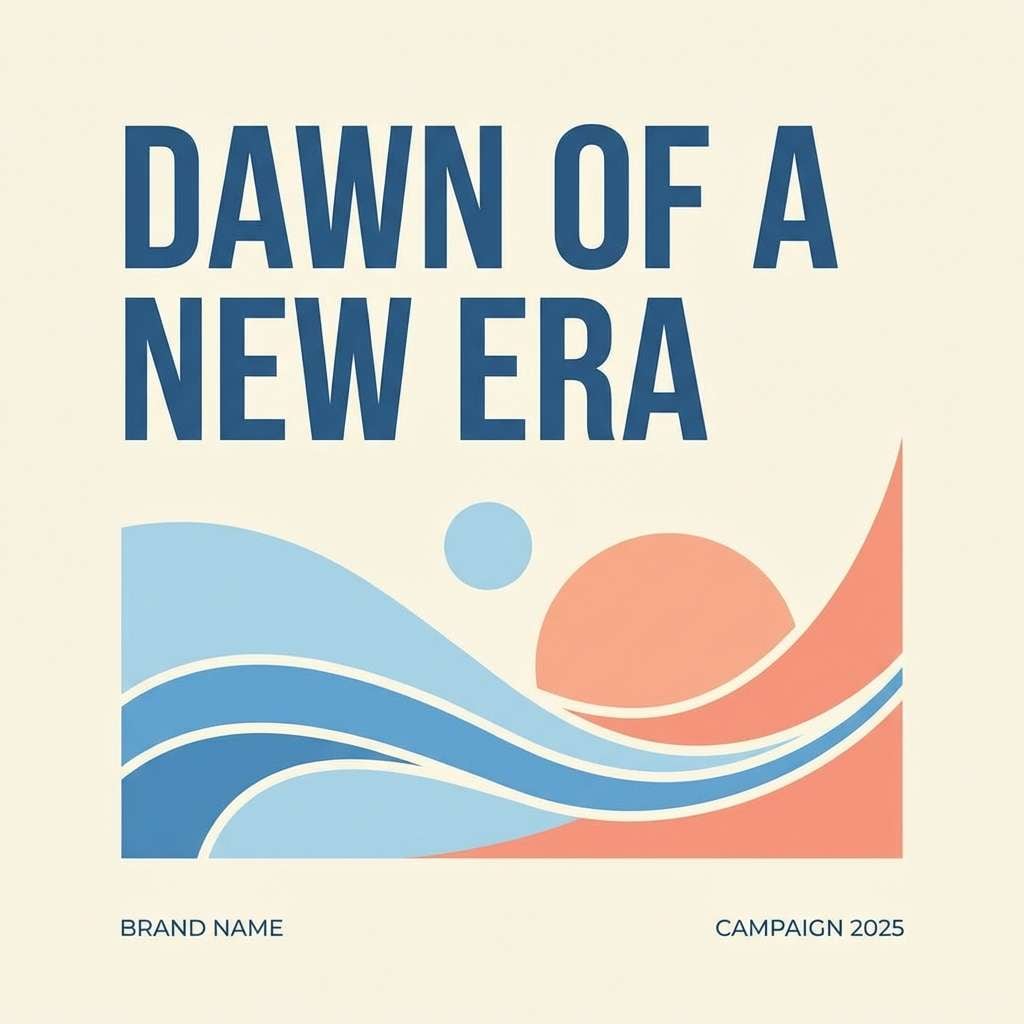
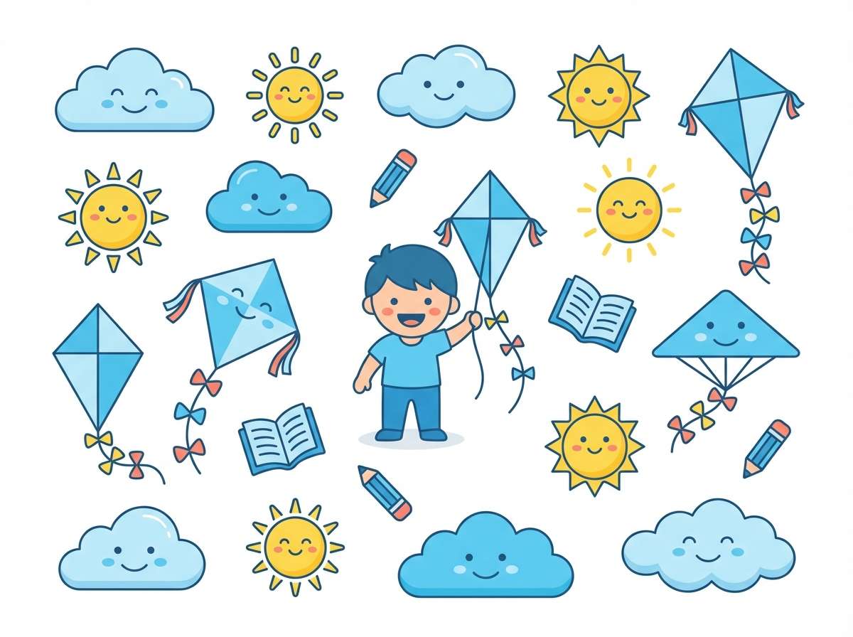
7) Kite Daylight
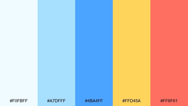
HEX: #F0FBFF #A7DFFF #4BA4FF #FFD45A #FF6F61
Mood: playful, bright, energetic
Best for: kids education app illustrations
Playful and bright like kites against open air, these colors feel energetic without going neon. They work well for friendly learning graphics, badges, and simple character illustrations. Pair with plenty of white and keep outlines soft to maintain a cheerful tone. Usage tip: treat yellow as the main highlight and use coral only for tiny emphasis to avoid visual noise.
Image example of kite daylight generated using media.io
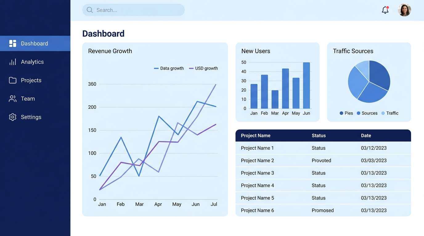
8) Cirrus Minimal
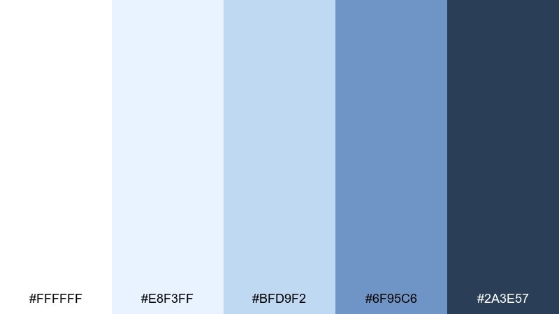
HEX: #FFFFFF #E8F3FF #BFD9F2 #6F95C6 #2A3E57
Mood: minimal, polished, professional
Best for: SaaS dashboard UI
Minimal and polished like thin cirrus clouds, this mix keeps interfaces tidy and professional. The pale blues soften large white areas while navy adds clear hierarchy for data and navigation. Pair with simple charts and thin dividers to avoid heavy blocks. Usage tip: use the mid blue for selected states only, so the dashboard feels calm even with dense content.
Image example of cirrus minimal generated using media.io
9) Blue Hour Ink
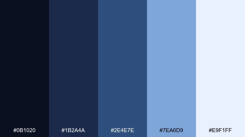
HEX: #0B1020 #1B2A4A #2E4E7E #7EA6D9 #E9F1FF
Mood: moody, elegant, cinematic
Best for: magazine cover layout
Moody and elegant like the last light before night, these inky blues feel cinematic and premium. Use the darkest shade as the base, then layer lighter blues for type blocks and accents. For strong readability, pair with bright off-white and keep body text short. Usage tip: add one soft gradient behind the masthead to create depth without busy textures.
Image example of blue hour ink generated using media.io
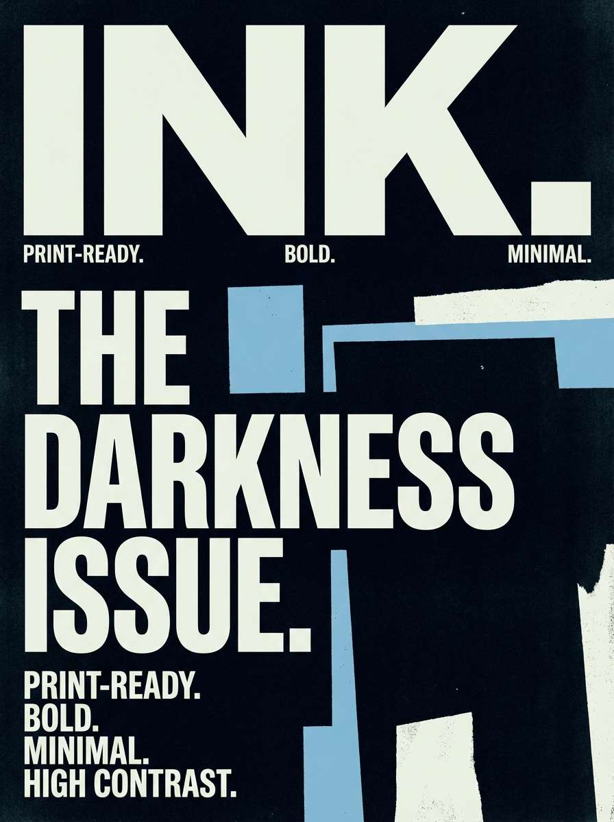
10) Rainwashed Street
HEX: #F6FAFF #D4E2F1 #9BB4CE #5C7B98 #2B3B4A
Mood: cool, grounded, urban
Best for: concert poster graphic
Cool and grounded like pavement after rain, these muted blues feel urban and grown-up. They make a strong base for typography-forward layouts and gritty textures used sparingly. Pair with off-white paper tones and one metallic ink effect for a premium edge. Usage tip: keep the darkest shade for the main headline so the poster reads from distance.
Image example of rainwashed street generated using media.io
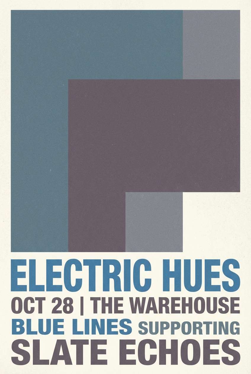
11) Arctic Window
HEX: #FAFDFF #E1F4FF #BDE8FF #5FB3E6 #124B6B
Mood: clean, cool, trustworthy
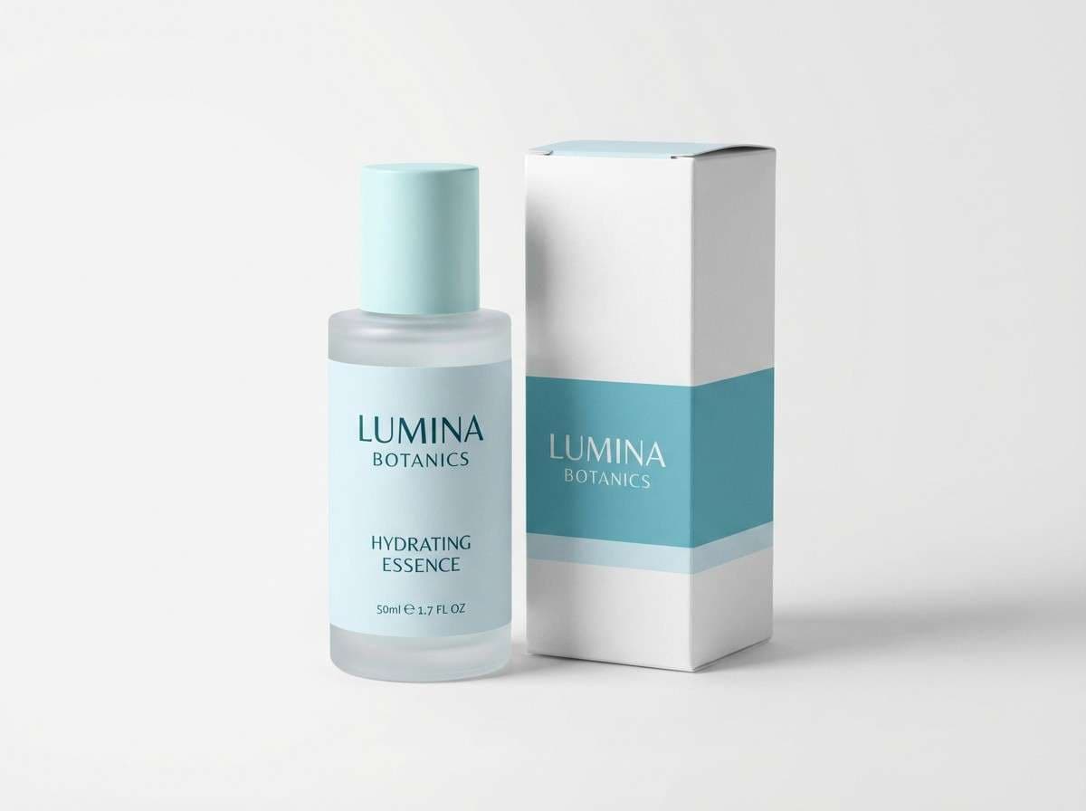
Best for: cosmetic packaging concept
Clean and cool like light through an arctic window, these blues feel trustworthy and clinical in a good way. They fit skincare packaging where you want purity, hydration, and clarity. Pair with matte white materials and minimal sans-serif labels for a modern look. Usage tip: print the darkest tone as small text only, keeping the overall pack bright and fresh.
Image example of arctic window generated using media.io
12) Poolside Glass
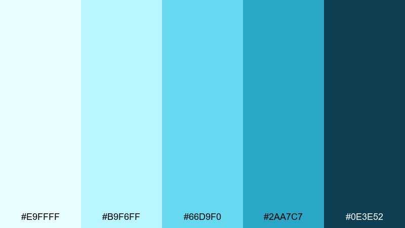
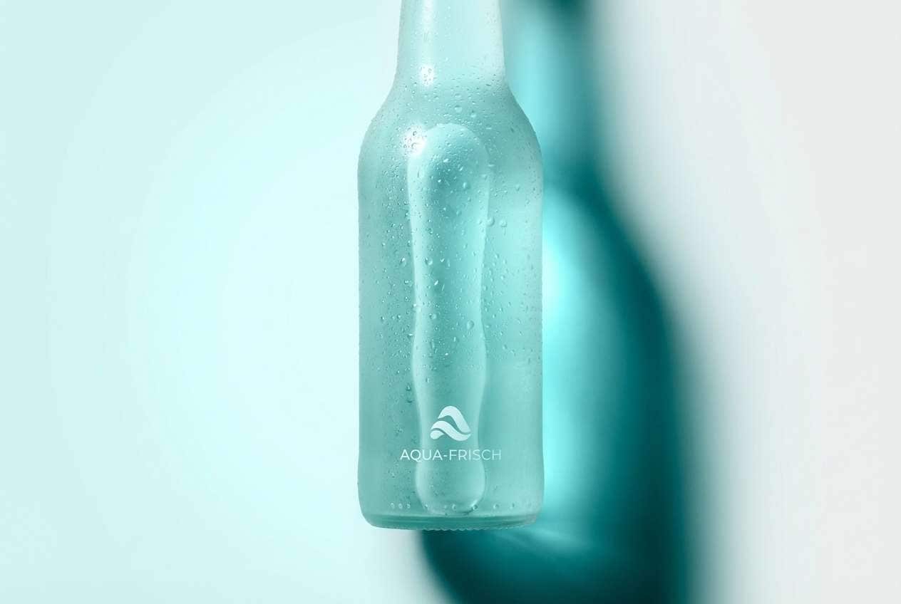
HEX: #E9FFFF #B9F6FF #66D9F0 #2AA7C7 #0E3E52
Mood: fresh, glossy, summery
Best for: beverage product ad
Fresh and glossy like pool reflections, these aqua blues instantly signal summer. They are ideal for beverage ads, especially when you want a chilled, clean feel. For balanced sky color combination, pair the brightest tones with deep teal shadows and lots of negative space. Usage tip: use the lightest tint as a halo behind the product to sell the cold, refreshing mood.
Image example of poolside glass generated using media.io
13) Denim Skyline
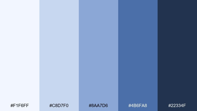
HEX: #F1F6FF #C8D7F0 #8AA7D6 #4B6FA8 #22334F
Mood: steady, classic, dependable
Best for: corporate branding kit
Steady and classic like worn denim under open light, these blues feel dependable and timeless. They work well for corporate brand systems, from stationery to slide decks and social headers. Pair with warm gray neutrals and a single accent color like muted gold if you need extra distinction. Usage tip: set a strict rule for where the navy appears so the system stays consistent across formats.
Image example of denim skyline generated using media.io
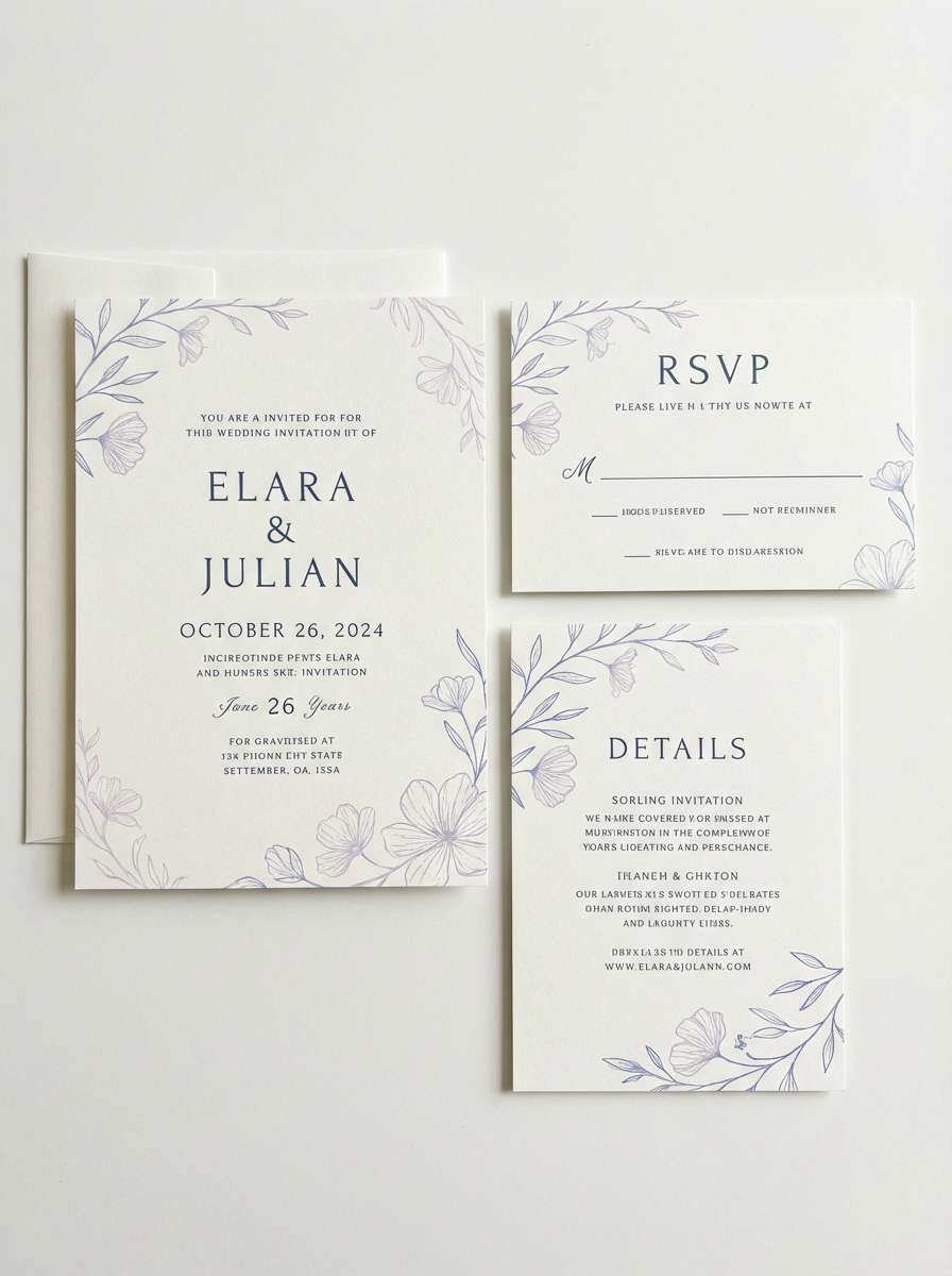
14) Icy Lavender Drift
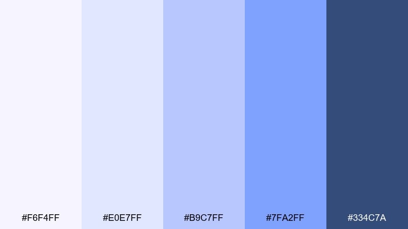
HEX: #F6F4FF #E0E7FF #B9C7FF #7FA2FF #334C7A
Mood: dreamy, soft, modern
Best for: wedding invitation set
Dreamy and soft like lavender haze at twilight, these tones feel romantic without being sugary. The palette reads as a modern sky color scheme when paired with crisp white paper and delicate typography. Add subtle line florals in the deepest blue to keep it elegant. Usage tip: keep the mid periwinkle for borders and small ornaments, not full backgrounds.
Image example of icy lavender drift generated using media.io
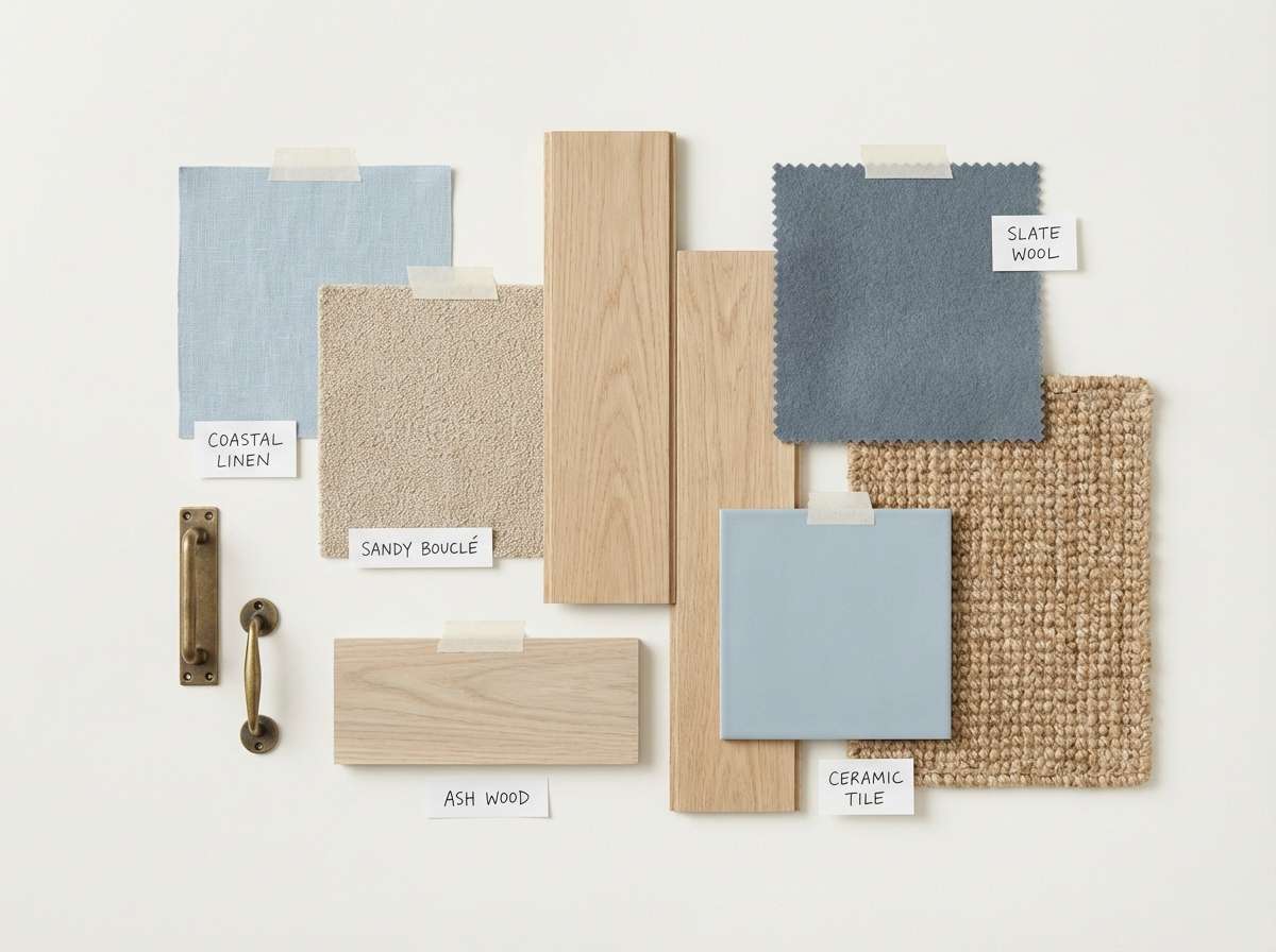
15) Sandbar Breeze
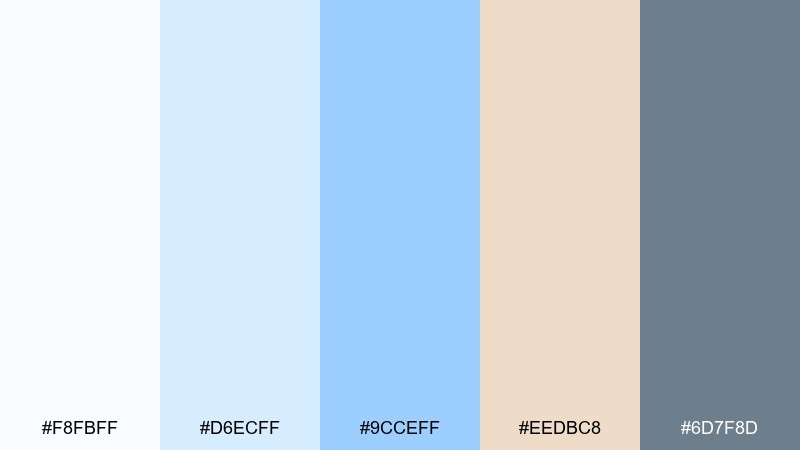
HEX: #F8FBFF #D6ECFF #9CCEFF #EEDBC8 #6D7F8D
Mood: relaxed, coastal, welcoming
Best for: beach house interior moodboard
Relaxed and welcoming like a breeze over pale sand, this mix brings softness to airy interiors. The sandy neutral keeps the blues from feeling cold, making it great for moodboards and decor selections. Pair with light wood textures, linen fabrics, and warm white paint. Usage tip: let the sand tone dominate large surfaces and use blue as an accent in art and textiles.
Image example of sandbar breeze generated using media.io
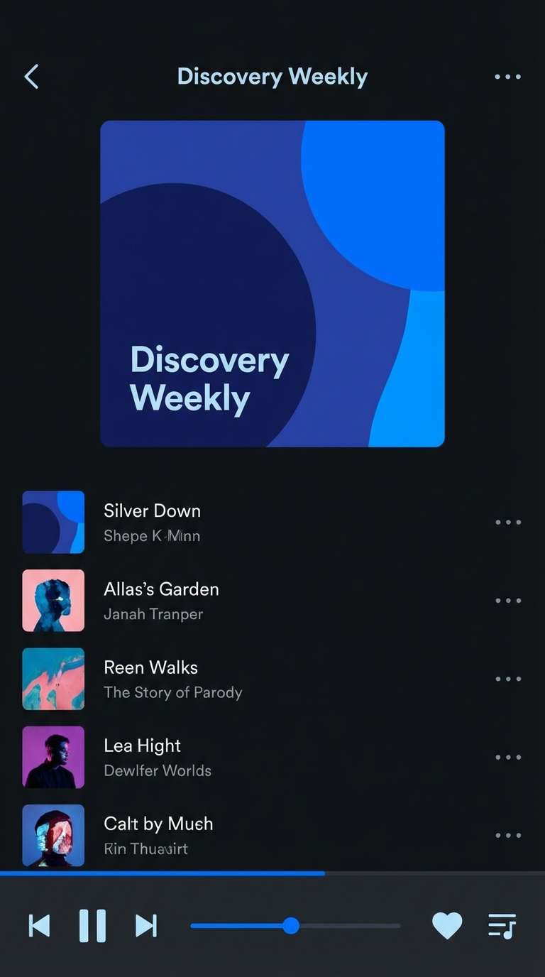
16) Starlit Azure
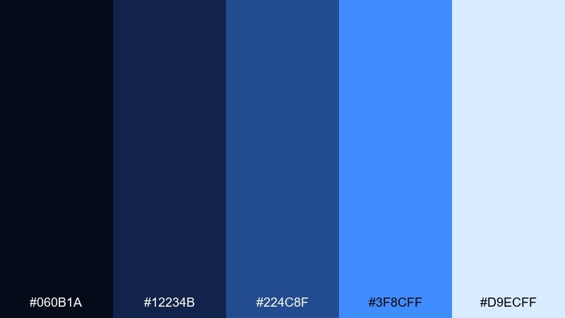
HEX: #060B1A #12234B #224C8F #3F8CFF #D9ECFF
Mood: dramatic, futuristic, focused
Best for: music streaming app UI
Dramatic and focused like bright points against a dark night, these blues feel futuristic and sharp. They are strong for media apps where contrast and clarity matter, especially on dark mode screens. For bold sky color combinations, lean on the electric blue for active states and keep the light tint for artwork frames and highlights. Usage tip: avoid using the brightest blue on large panels, or it can overpower content.
Image example of starlit azure generated using media.io
17) Paper Plane Slides
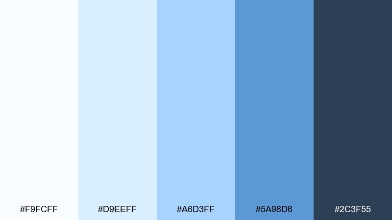
HEX: #F9FCFF #D9EEFF #A6D3FF #5A98D6 #2C3F55
Mood: clear, friendly, organized
Best for: startup pitch deck template
Clear and friendly like paper planes gliding through open air, these blues keep presentations sharp and approachable. They are great for pitch decks that need structure without heavy styling. Pair with a warm gray for supporting text and simple icons for key metrics. Usage tip: use the mid blue as a consistent section header color to unify the full deck.
Image example of paper plane slides generated using media.io
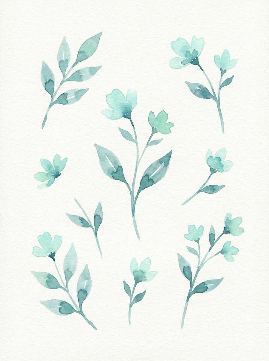
18) Seaglass Morning
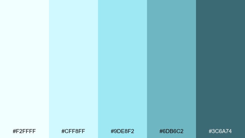
HEX: #F2FFFF #CFF8FF #9DE8F2 #6DB6C2 #3C6A74
Mood: gentle, natural, uplifting
Best for: watercolor botanical illustration
Gentle and natural like seaglass found at low tide, these tones feel uplifting and handmade. They suit watercolor botanicals, light packaging accents, and calming social graphics. Pair with soft cream paper textures and fine pencil outlines to keep the illustration delicate. Usage tip: build depth by layering the two lightest hues rather than jumping straight to the dark teal.
Image example of seaglass morning generated using media.io
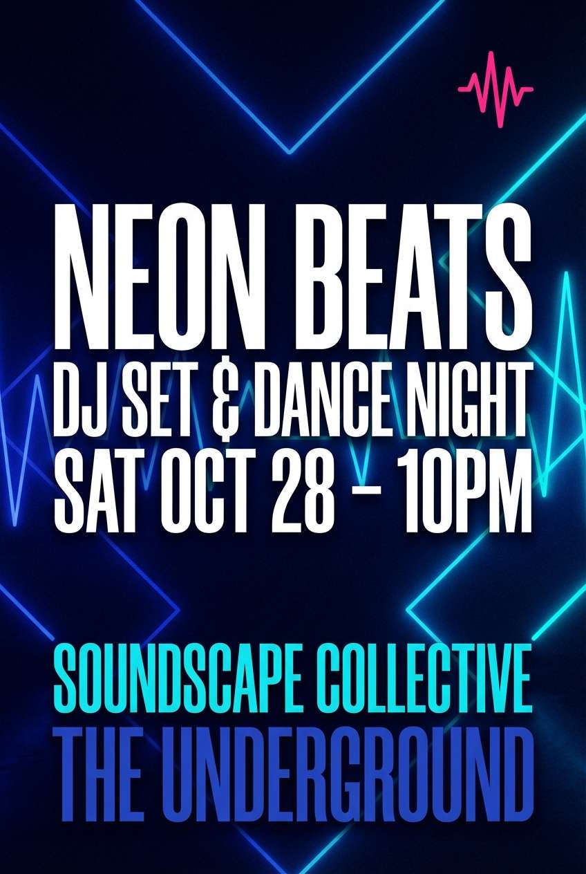
19) Skyline Neon Pop
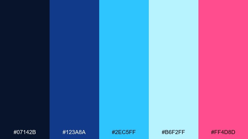
HEX: #07142B #123A8A #2EC5FF #B6F2FF #FF4D8D
Mood: bold, nightlife, high-energy
Best for: club event flyer
Bold and high-energy like city lights cutting through a deep blue night, this set is made for attention. The cyan and pink are punchy accents that still feel cohesive with the darker blues. Pair with heavy typography and lots of breathing room so the bright tones look intentional, not chaotic. Usage tip: keep pink to one focal element, such as the date or a single graphic stripe.
Image example of skyline neon pop generated using media.io
20) Stormbreak Contrast
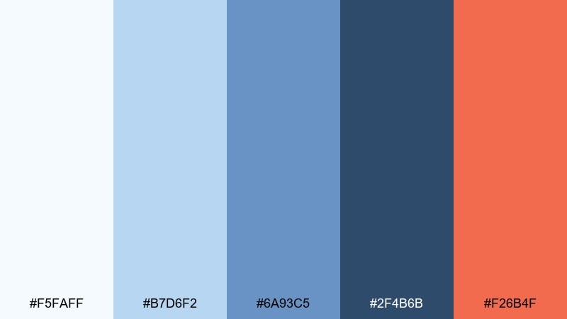
HEX: #F5FAFF #B7D6F2 #6A93C5 #2F4B6B #F26B4F
Mood: dramatic, bold, dynamic
Best for: sports promo poster
Dramatic and dynamic like a storm splitting to reveal light, these tones deliver instant contrast. The warm accent adds urgency against the cooler blues, perfect for promos and countdown-style graphics. Pair with gritty textures sparingly and keep backgrounds mostly pale for readability. Usage tip: use the warm color only for key numbers or CTAs to avoid overpowering the cool base.
Image example of stormbreak contrast generated using media.io
21) Featherlight Gradient
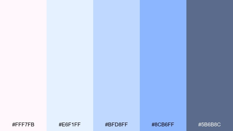
HEX: #FFF7FB #E6F1FF #BFD8FF #8CB6FF #5B6B8C
Mood: soft, dreamy, airy
Best for: beauty brand email header
Soft and dreamy like a featherlight gradient drifting across the horizon, these pastels feel gentle and premium. They suit beauty emails where you want a calm first impression and clean product focus. Pair with minimal serif headlines and lots of white to keep the layout refined. Usage tip: set the header as a very subtle gradient and keep body sections solid for stronger scanning.
Image example of featherlight gradient generated using media.io
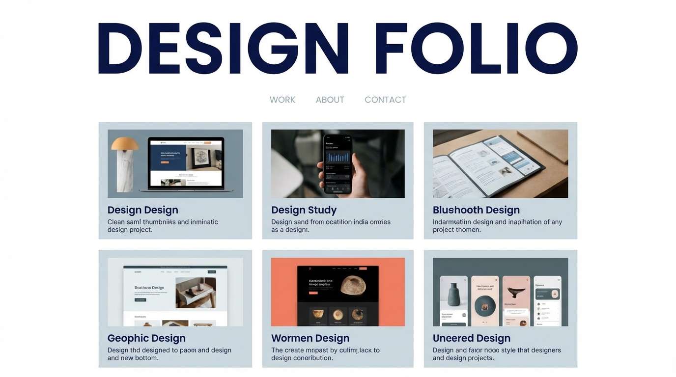
22) Open Air Neutrals
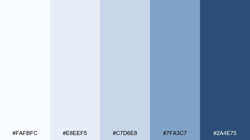
HEX: #FAFBFC #E8EEF5 #C7D6E8 #7FA3C7 #2A4E75
Mood: calm, balanced, versatile
Best for: portfolio website theme
Calm and balanced like open air over a quiet city, these neutrals keep creative work front and center. The soft grays and blues make an easy backdrop for photography, case studies, and long captions. Pair with a single warm accent from your brand to personalize the look. Usage tip: use the mid blue for hover states and links to guide attention without shouting.
Image example of open air neutrals generated using media.io
What Colors Go Well with Sky?
Sky blues pair beautifully with warm accents like coral, peach, and soft orange—these complementary notes add energy while keeping the overall look friendly. If you want a calmer pairing, try sandy beige, warm cream, or paper white for a coastal, sunlit feel.
For modern UI and tech branding, match sky tones with cool grays, charcoal, and deep navy to create structure and accessibility. If you’re aiming for a dreamy mood, lavender and periwinkle are natural partners for sky color combinations.
When adding an accent, keep it limited: one warm highlight color is usually enough to create focus without turning the palette noisy.
How to Use a Sky Color Palette in Real Designs
Start with role-based color assignments: use the lightest sky tints for backgrounds, mid blues for components (cards, chips, sections), and the darkest navy/teal for text, navigation, and contrast. This keeps the “air” in your layout while preserving readability.
In branding, sky palettes work best when you establish one signature blue and one supporting neutral (cream or cool gray). Then use a warm accent (like coral) strictly for CTAs, badges, or key moments so your visuals stay calm but still conversion-friendly.
For illustration and social content, build depth by layering nearby tints instead of jumping straight from pale to dark. Subtle gradients and soft shadows can create a sky-like atmosphere without heavy texture.
Create Sky Palette Visuals with AI
If you want to see your sky color scheme in action, generate fast mockups for UI screens, posters, packaging, and social templates with AI. This makes it easier to validate contrast, mood, and hierarchy before you commit to a full design system.
In Media.io, you can paste a prompt, describe the style (minimal UI, watercolor, poster, packaging), and iterate quickly until the palette feels right. Save the best result as a reference for your brand kit or client presentation.
Sky Color Palette FAQs
-
What is a sky color palette?
A sky color palette is a set of colors inspired by sky lighting—usually soft blues, gray-blues, and a deeper navy anchor, sometimes paired with warm sunrise/sunset accents like peach or coral. -
Which HEX codes are best for a “light sky blue” look?
Look for very high-value tints such as #EAF4FF, #E3F2FF, #F7FBFF, or #FAFDFF, then add one mid blue and one deep navy for structure and readable UI states. -
What colors complement sky blue?
Coral/peach (warm contrast), sandy beige/cream (soft neutral balance), and deep navy/charcoal (strong readability) are the most reliable complements for sky blue palettes. -
How do I keep a sky color scheme from looking “baby blue”?
Introduce a grounded anchor (navy, slate, or deep teal), reduce saturation in mid tones, and add a neutral (paper white or cool gray). Keeping gradients subtle also helps. -
Are sky palettes good for websites and apps?
Yes—sky palettes are popular for UI because they feel calm and spacious. Use the darkest shade for text and primary buttons to maintain accessibility, and keep light tints as surfaces. -
How many colors should a sky palette include?
Five colors is a practical setup: two light background tints, one mid tone for components, one deep anchor for contrast, and one neutral or warm accent for highlights. -
Can I generate sky palette mockups with AI?
Yes. With Media.io’s text-to-image tool, you can generate UI mockups, posters, or packaging concepts using prompts that specify sky blues plus your accent color, then iterate until the mood is right.
Next: Coral Red Color Palette


