

Shocking pink is a high-impact color that instantly signals energy, confidence, and a modern edge. Used well, it can make branding, UI, posters, and product visuals feel more intentional and memorable.
Below are curated shocking pink color palette ideas with HEX codes, mood notes, and practical pairing tips—plus AI-ready prompts you can reuse to generate matching visuals.
In this article
- Why Shocking Pink Palettes Work So Well
-
- electric pop
- neon noir
- bubblegum sunset
- studio chic
- candy contrast
- retro arcade
- rose gold punch
- minimal punch
- festival lights
- orchid velvet
- peachy shock
- tropical sorbet
- urban graffiti
- ballet riot
- berry milk
- cosmic magenta
- citrus punch
- midnight flamingo
- paper collage
- luxe editorial
- soft signal
- chrome pop
- cherry blossom flash
- What Colors Go Well with Shocking Pink?
- How to Use a Shocking Pink Color Palette in Real Designs
- Create Shocking Pink Palette Visuals with AI
Why Shocking Pink Palettes Work So Well
Shocking pink sits in a highly saturated range that the eye notices immediately, which makes it perfect for emphasis—CTAs, highlights, hero elements, or anything that needs instant attention.
It also plays nicely with strong neutrals like near-black, charcoal, and clean white, giving you a reliable readability backbone while the pink delivers personality and brand recall.
When paired with complementary cools (cyan, mint, violet) or warm accents (gold, peach, orange), shocking pink can shift from “neon nightlife” to “premium editorial” without losing its signature punch.
20+ Shocking Pink Color Palette Ideas (with HEX Codes)
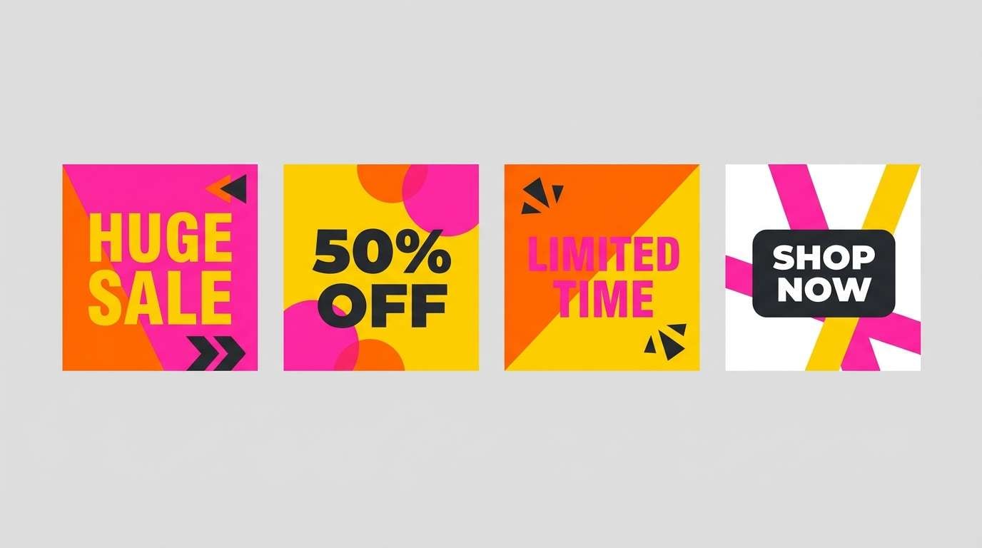
1) Electric Pop
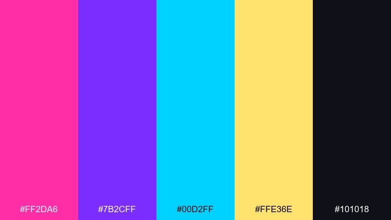
HEX: #ff2da6 #7b2cff #00d2ff #ffe36e #101018
Mood: high-energy, neon, playful
Best for: music event poster design
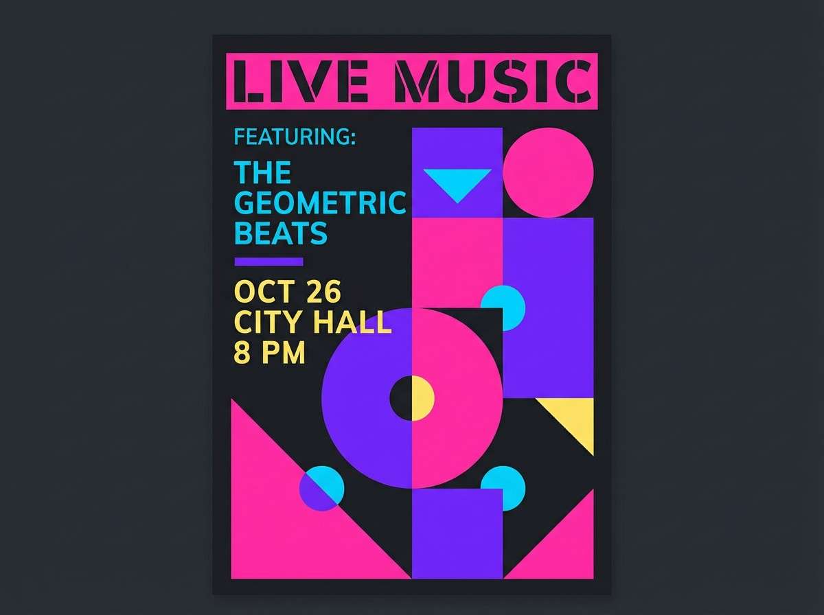
High-energy neon vibes, like a late-night stage glow and laser streaks. The hot pink and violet read loud, while cyan and yellow keep it playful instead of harsh. Use the dark near-black for type and negative space so the brights feel intentional, not chaotic. Tip: reserve yellow for small highlights like dates or callouts to keep hierarchy clean.
Image example of electric pop generated using media.io
Media.io is an online AI studio for creating and editing video, image, and audio in your browser.

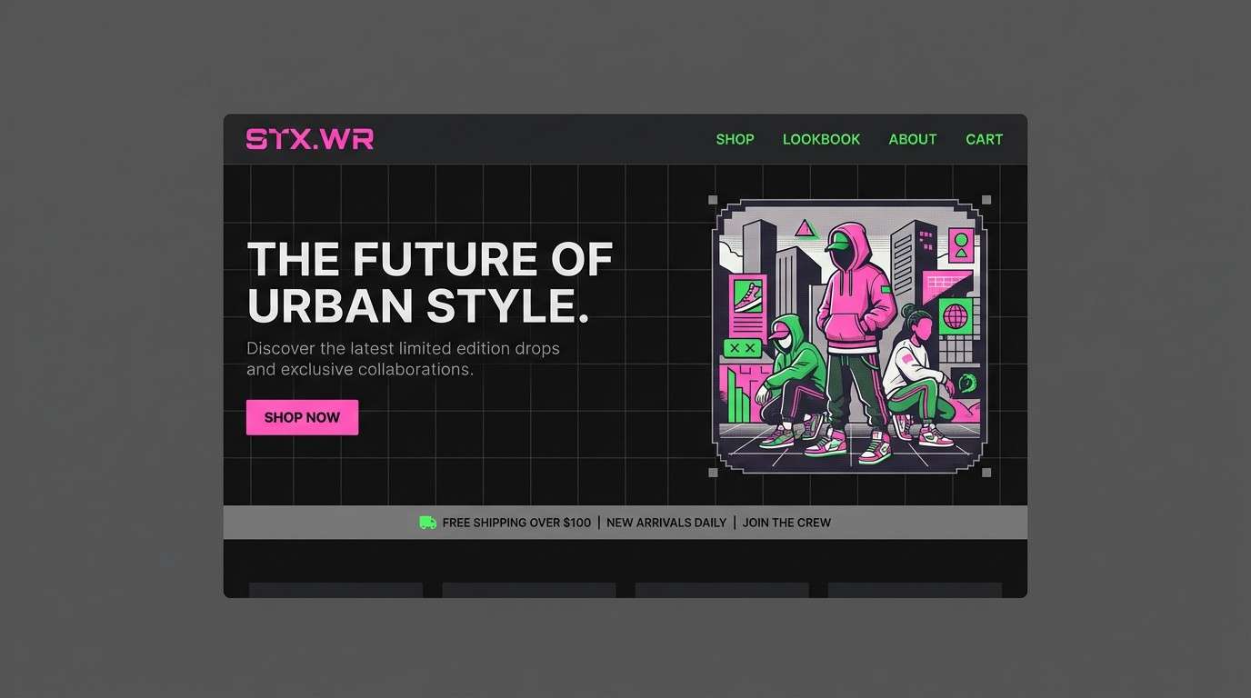
2) Neon Noir
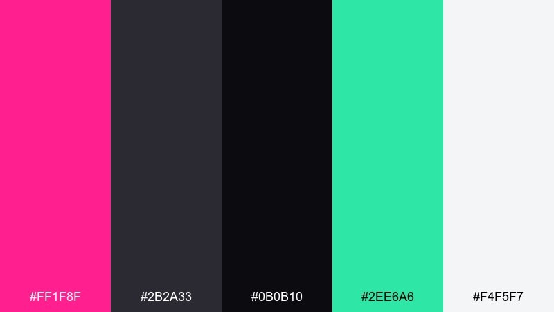
HEX: #ff1f8f #2b2a33 #0b0b10 #2ee6a6 #f4f5f7
Mood: edgy, cinematic, modern
Best for: streetwear brand landing page UI
Edgy and cinematic, like a city alley lit by signage after midnight. These shocking pink color combinations shine best when you treat the charcoal tones as the main canvas and let pink and mint act as sparks. Pair with crisp off-white text for readability and keep gradients subtle. Tip: use the mint only for success states or links so the UI stays focused.
Image example of neon noir generated using media.io
3) Bubblegum Sunset
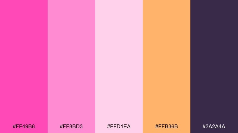
HEX: #ff49b6 #ff8bd3 #ffd1ea #ffb36b #3a2a4a
Mood: sweet, dreamy, warm
Best for: beauty social media carousel
Sweet and dreamy, like cotton candy clouds fading into a warm horizon. The peachy orange brings glow, while the plum anchor keeps the pastels from drifting. Use the light pinks for backgrounds and the deeper plum for headings and icons. Tip: keep text blocks short and let large color fields do the storytelling.
Image example of bubblegum sunset generated using media.io
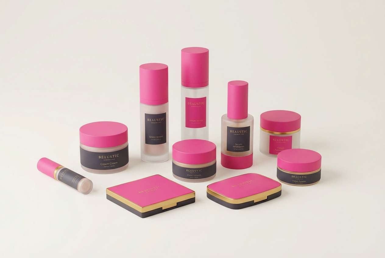
4) Studio Chic
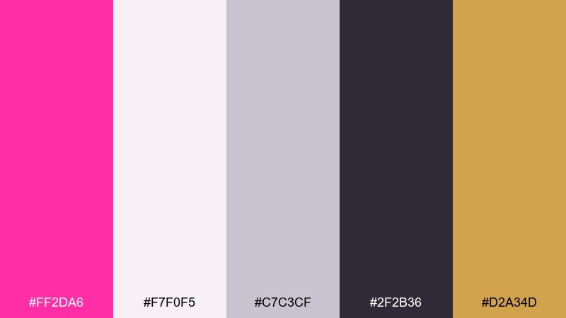
HEX: #ff2da6 #f7f0f5 #c7c3cf #2f2b36 #d2a34d
Mood: polished, fashion-forward, balanced
Best for: cosmetics packaging and product ad
Polished and fashion-forward, like a clean studio set with one bold spotlight color. The soft off-white and cool gray make the pink feel luxe, while the warm gold adds a premium cue. Keep the darkest charcoal for typography and ingredient lines to maintain clarity. Tip: print the pink as a spot color on matte stock for a punchy, modern finish.
Image example of studio chic generated using media.io
5) Candy Contrast
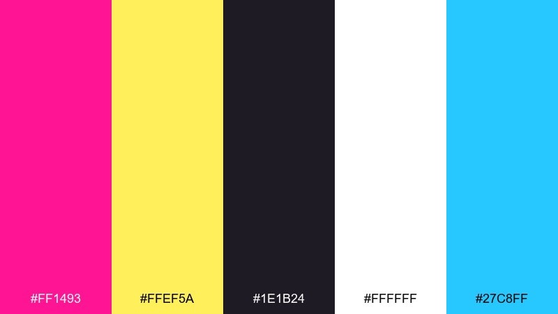
HEX: #ff1493 #ffef5a #1e1b24 #ffffff #27c8ff
Mood: bold, punchy, youthful
Best for: YouTube thumbnail and channel branding
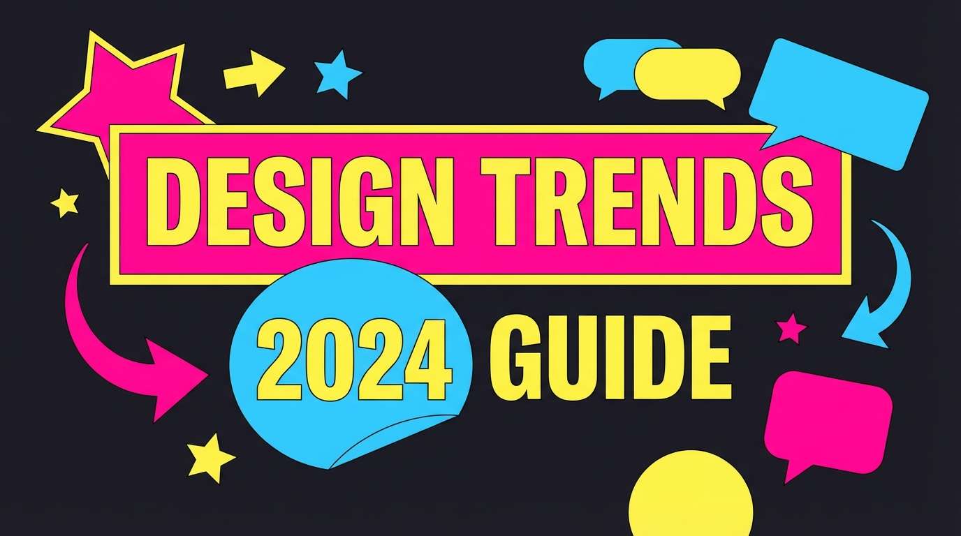
Bold and punchy, like a candy aisle under bright lights. This shocking pink color palette pops hardest when black and white do the heavy lifting for contrast, letting yellow and cyan act as attention magnets. Use thick outlines and large type to match the energy. Tip: keep only one accent shape in cyan so the thumbnail stays readable at small sizes.
Image example of candy contrast generated using media.io
6) Retro Arcade
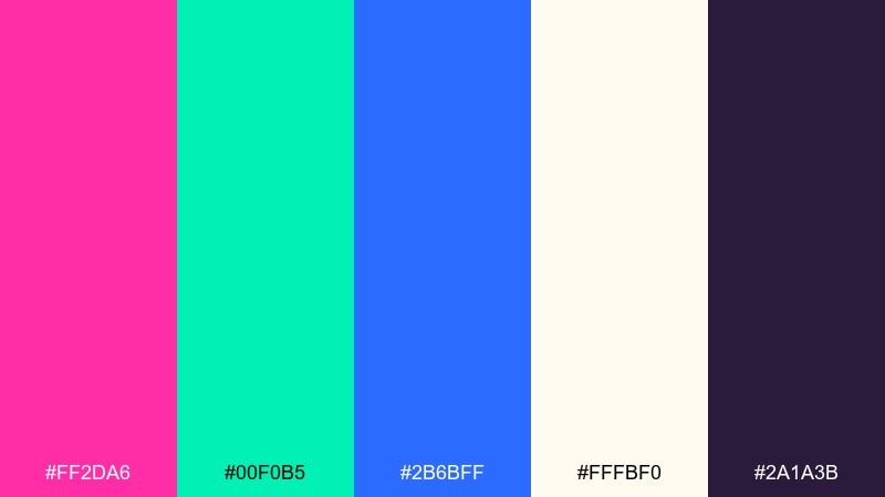
HEX: #ff2da6 #00f0b5 #2b6bff #fffbf0 #2a1a3b
Mood: nostalgic, bright, playful
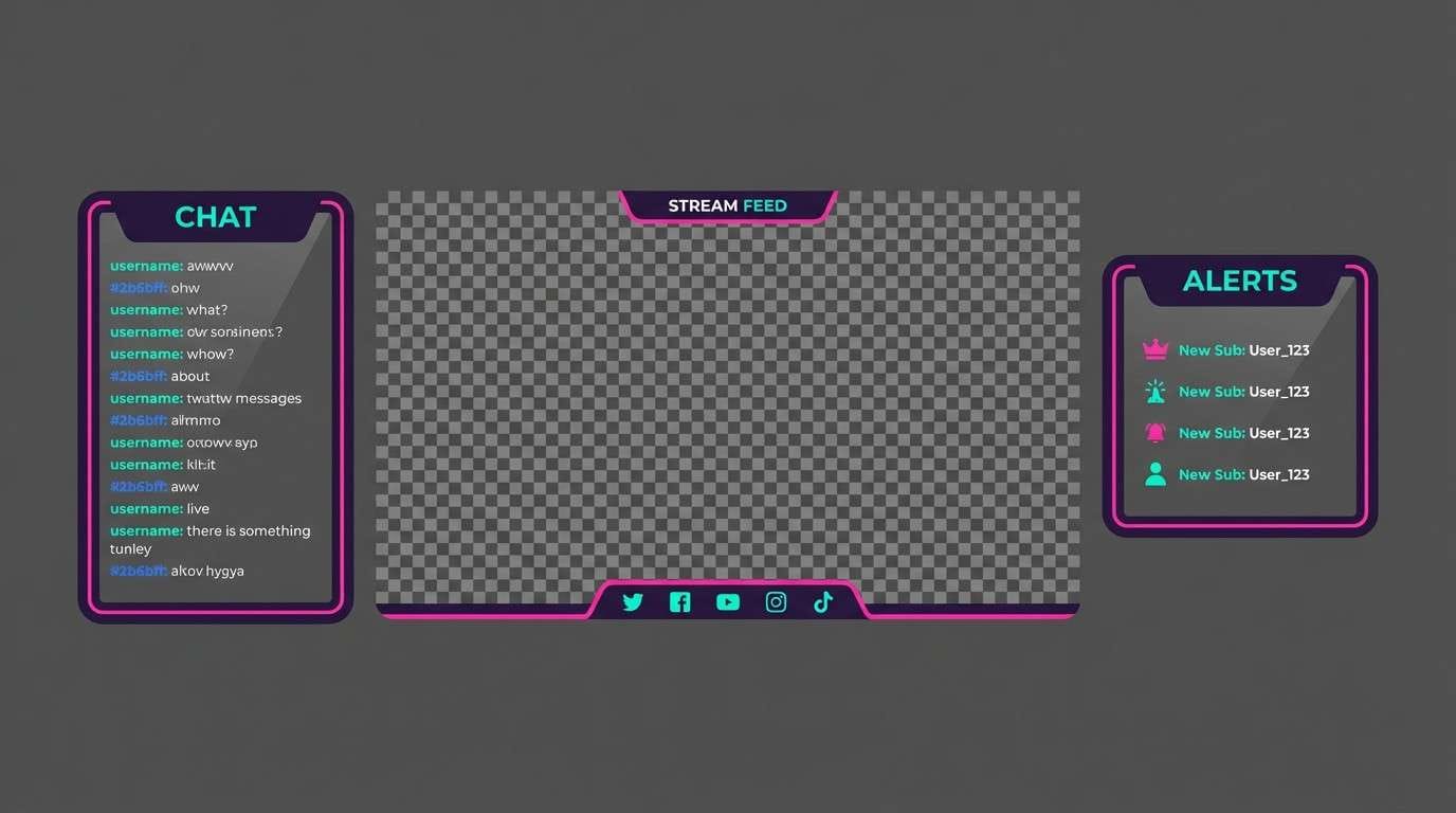
Best for: gaming stream overlay UI
Nostalgic and bright, like an arcade carpet and pixel glow. The teal and blue balance the pink so it feels fun rather than overly sweet, while the deep purple grounds overlays and panels. Use the cream as card backgrounds to keep chat and stats legible. Tip: add thin teal strokes around buttons for a retro interface vibe.
Image example of retro arcade generated using media.io
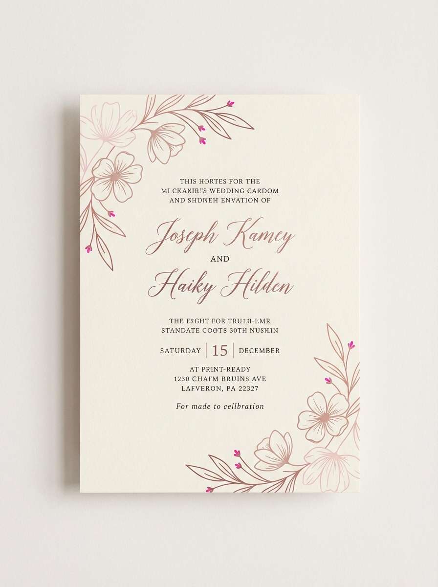
7) Rose Gold Punch
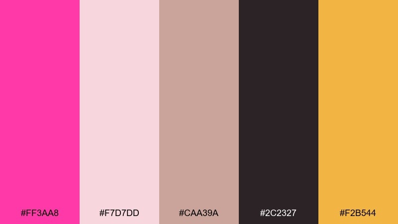
HEX: #ff3aa8 #f7d7dd #caa39a #2c2327 #f2b544
Mood: glam, warm, refined
Best for: wedding invitation suite
Glam and warm, like rose gold jewelry catching candlelight. These shocking pink color combinations feel refined when you lean on blush and taupe for most surfaces and save the vivid pink for monograms or borders. Pair with charcoal ink for crisp readability. Tip: emboss the pink elements for tactile luxury without increasing visual noise.
Image example of rose gold punch generated using media.io
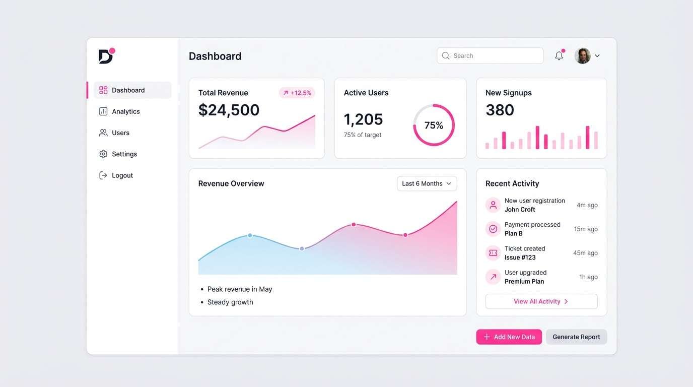
8) Minimal Punch
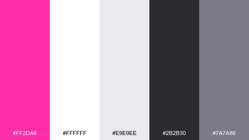
HEX: #ff2da6 #ffffff #e9e9ee #2b2b30 #7a7a86
Mood: clean, confident, modern
Best for: SaaS dashboard UI accent system
Clean and confident, like a gallery-white room with one bold artwork. The grayscale range keeps everything usable for tables and charts, while the pink becomes a clear interaction signal. Use the darkest gray for text and the mid-gray for dividers to avoid visual clutter. Tip: reserve the pink for primary actions only to prevent fatigue in long sessions.
Image example of minimal punch generated using media.io
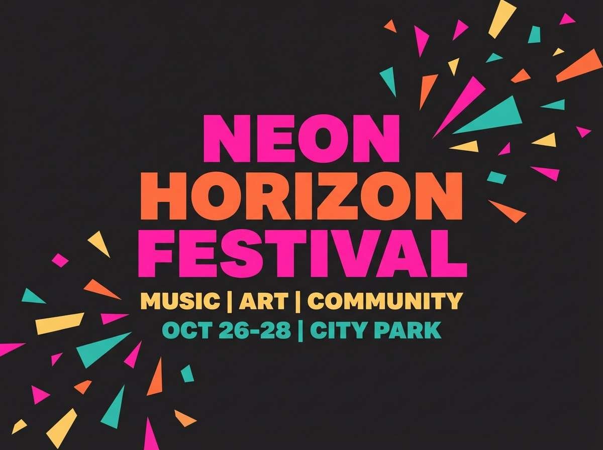
9) Festival Lights
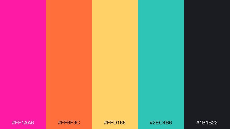
HEX: #ff1aa6 #ff6f3c #ffd166 #2ec4b6 #1b1b22
Mood: celebratory, vibrant, lively
Best for: summer festival flyer
Celebratory and lively, like lanterns and confetti at golden hour. The warm orange and yellow amplify the pink, while teal cools the mix so it stays balanced. Put the dark shade behind key information for instant readability. Tip: use teal for location details and icons to create an easy scanning rhythm.
Image example of festival lights generated using media.io
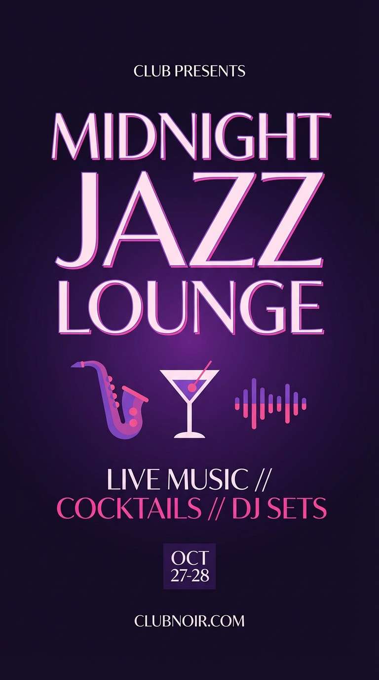
10) Orchid Velvet
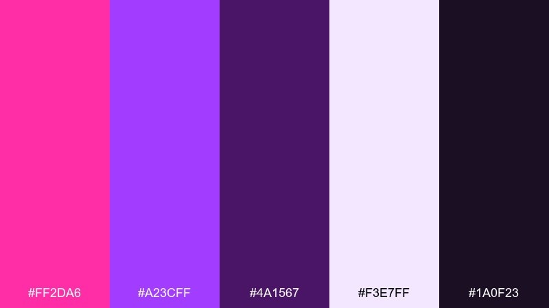
HEX: #ff2da6 #a23cff #4a1567 #f3e7ff #1a0f23
Mood: luxurious, moody, romantic
Best for: nightclub poster and social stories
Luxurious and moody, like velvet curtains under purple spotlights. The deep plum and near-black create drama, while orchid and pale lavender keep the design legible. Use the light lavender for secondary text and spacing so the dark base does not feel heavy. Tip: try a soft radial glow behind the headline to mimic stage lighting.
Image example of orchid velvet generated using media.io
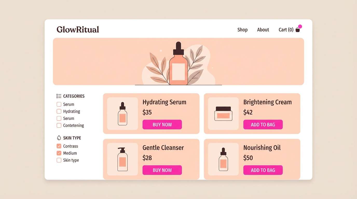
11) Peachy Shock
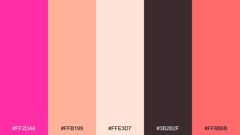
HEX: #ff2da6 #ffb199 #ffe3d7 #3b2b2f #ff6b6b
Mood: friendly, warm, approachable
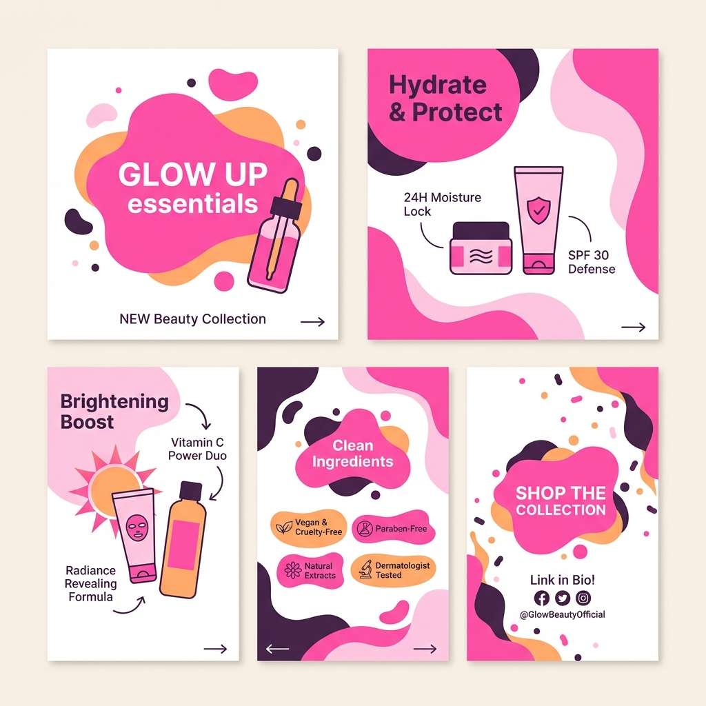
Best for: DTC skincare product page
Friendly and warm, like a peach smoothie with a bright cherry twist. The soft blushes make the layout welcoming, while the deeper cocoa tone gives structure for headings and navigation. Use the coral-red sparingly for badges or limited-time offers to avoid competing with the pink. Tip: keep background areas in the palest tint to make product photography stand out.
Image example of peachy shock generated using media.io
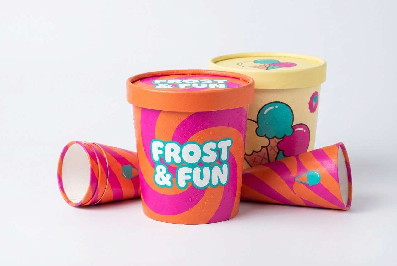
12) Tropical Sorbet
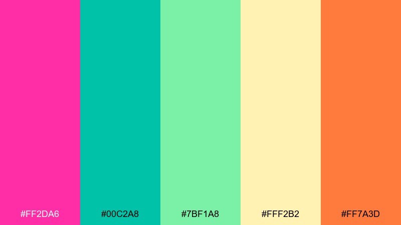
HEX: #ff2da6 #00c2a8 #7bf1a8 #fff2b2 #ff7a3d
Mood: fresh, sunny, tropical
Best for: ice cream packaging concept
Fresh and sunny, like tropical fruit sorbet on a hot day. Pink and orange bring the sweetness, while minty greens add a refreshing counterpoint. Use the pale yellow as a label background so flavor names stay clear. Tip: keep the green to small waves or leaf motifs to prevent the pack from looking too busy.
Image example of tropical sorbet generated using media.io
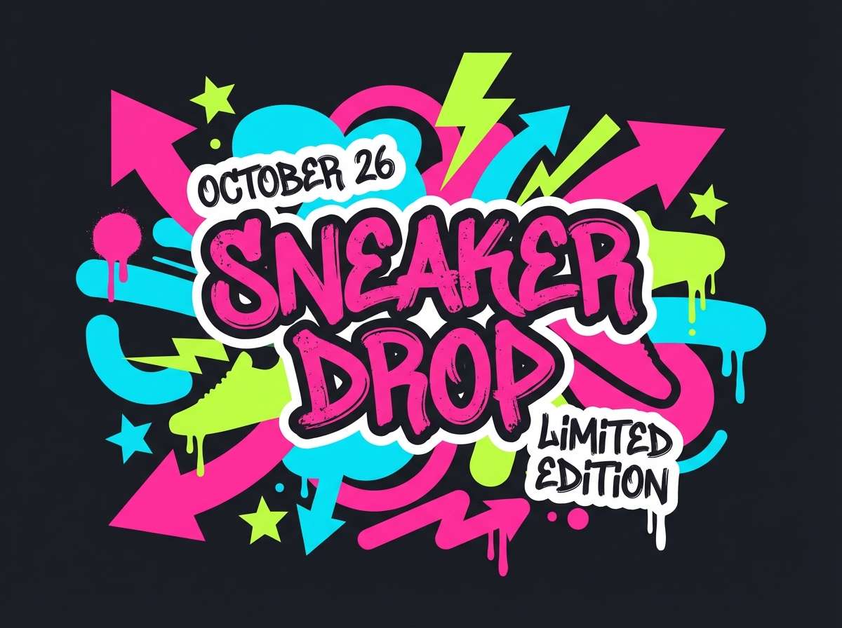
13) Urban Graffiti
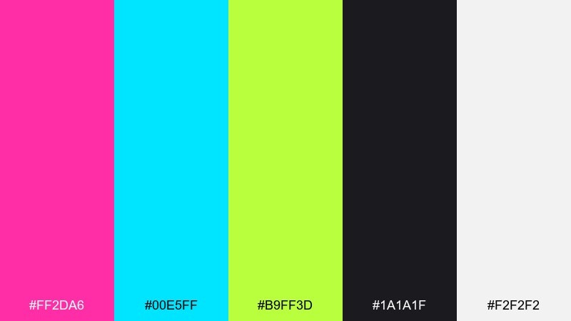
HEX: #ff2da6 #00e5ff #b9ff3d #1a1a1f #f2f2f2
Mood: street, loud, youthful
Best for: sneaker drop poster
Street-loud energy, like fresh paint on a midnight wall. Cyan and acid green add bite to the pink, while black and off-white keep typography crisp. Use black as the main field and stack bright stickers or tags in the corners. Tip: limit green to one or two elements so the drop info stays the hero.
Image example of urban graffiti generated using media.io
14) Ballet Riot
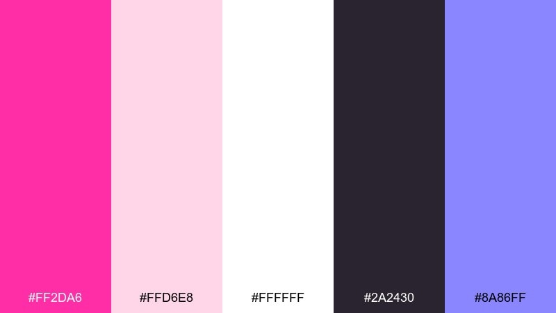
HEX: #ff2da6 #ffd6e8 #ffffff #2a2430 #8a86ff
Mood: soft-meets-bold, artistic, modern
Best for: dance studio rebrand kit
Soft-meets-bold, like satin ribbons with an unexpected neon edge. This shocking pink color palette works beautifully when the blush and white handle most surfaces and the dark plum defines the logotype. Add periwinkle as a secondary accent for schedules and social templates. Tip: keep pink at larger blocks or headers so it feels intentional, not sprinkled.
Image example of ballet riot generated using media.io
15) Berry Milk
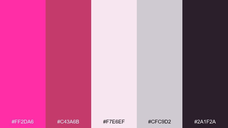
HEX: #ff2da6 #c43a6b #f7e6ef #cfc9d2 #2a1f2a
Mood: cozy, sweet, muted
Best for: cafe menu design
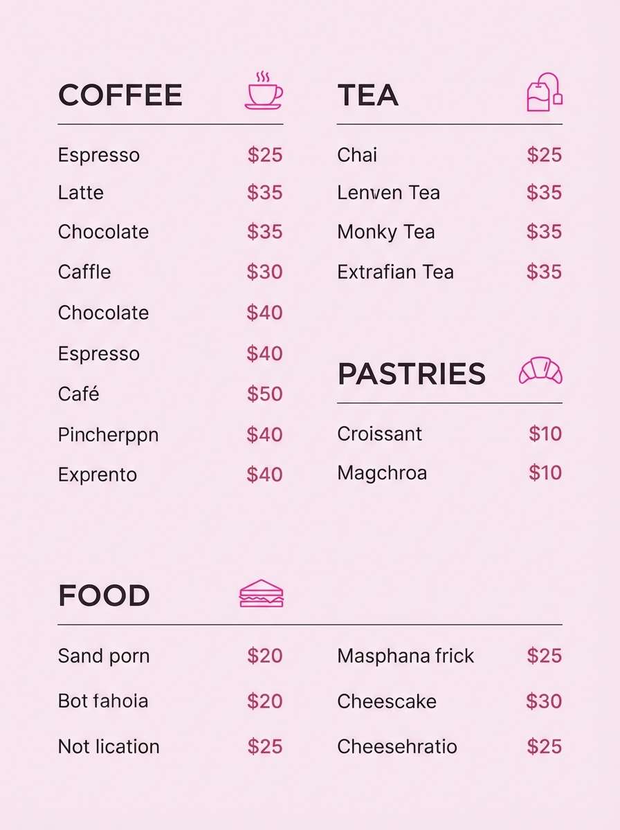
Cozy and sweet, like berry milk in a chilled glass. Muted rose and creamy pinks soften the bright tone, while the deep espresso shade supports readable menus. Use the dusty gray for lines, section labels, and pricing structure. Tip: add small pink highlights to featured items rather than coloring entire sections.
Image example of berry milk generated using media.io
16) Cosmic Magenta
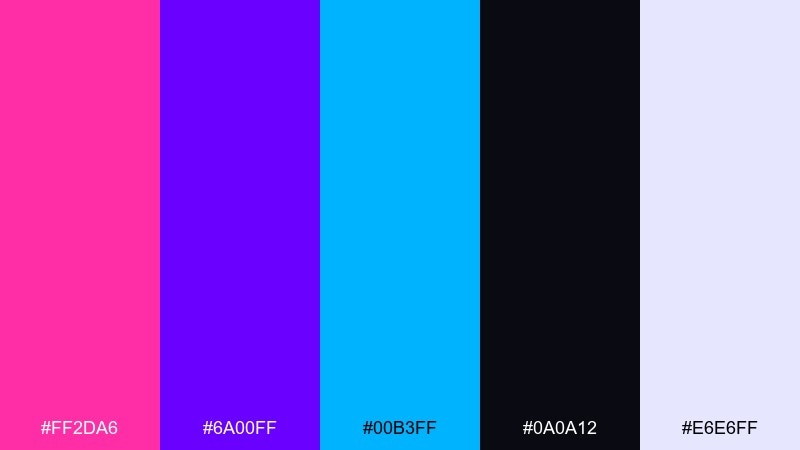
HEX: #ff2da6 #6a00ff #00b3ff #0a0a12 #e6e6ff
Mood: futuristic, spacey, luminous
Best for: tech conference hero banner
Futuristic and luminous, like a nebula streaking across a night sky. Let the inky base dominate, then layer magenta and violet glows for depth with a touch of electric blue. Keep body text in the pale lavender to avoid harsh contrast. Tip: use subtle grain or star speckles only in the darkest areas to maintain polish.
Image example of cosmic magenta generated using media.io

17) Citrus Punch
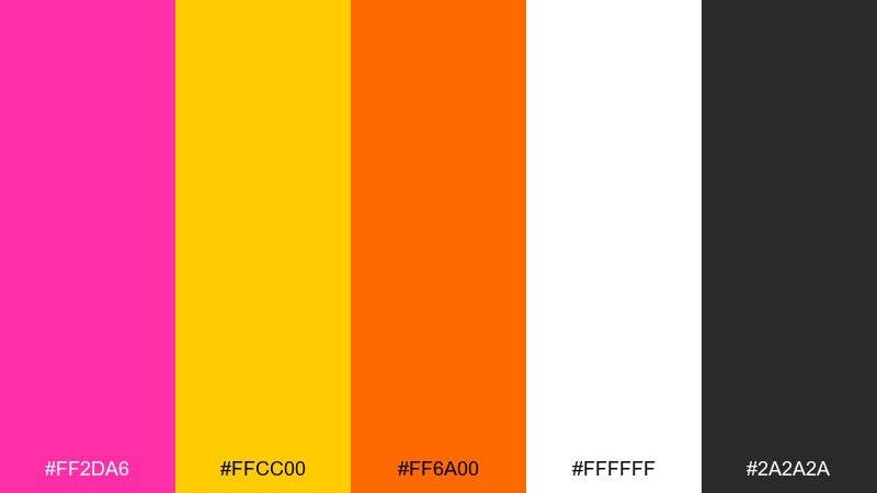
HEX: #ff2da6 #ffcc00 #ff6a00 #ffffff #2a2a2a
Mood: sunny, bold, high-contrast
Best for: limited-time promo banner ads
Sunny and bold, like citrus slices under bright daylight. The yellow and orange push the palette into high-contrast territory, while white keeps it airy and modern. Use charcoal for text and borders so the warm tones do not vibrate. Tip: pick either yellow or orange for the primary call-to-action background and use the other as a small badge.
Image example of citrus punch generated using media.io
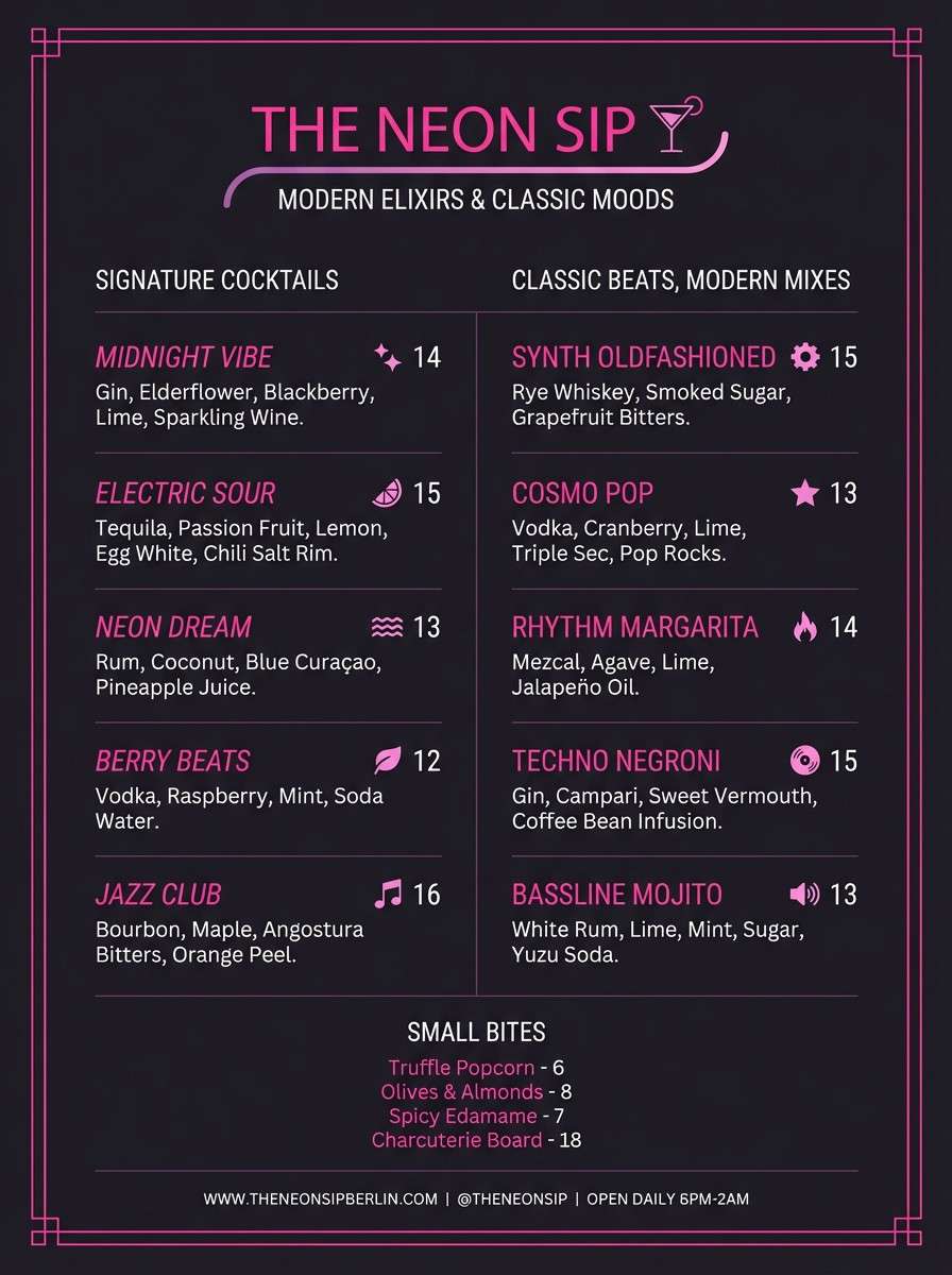
18) Midnight Flamingo
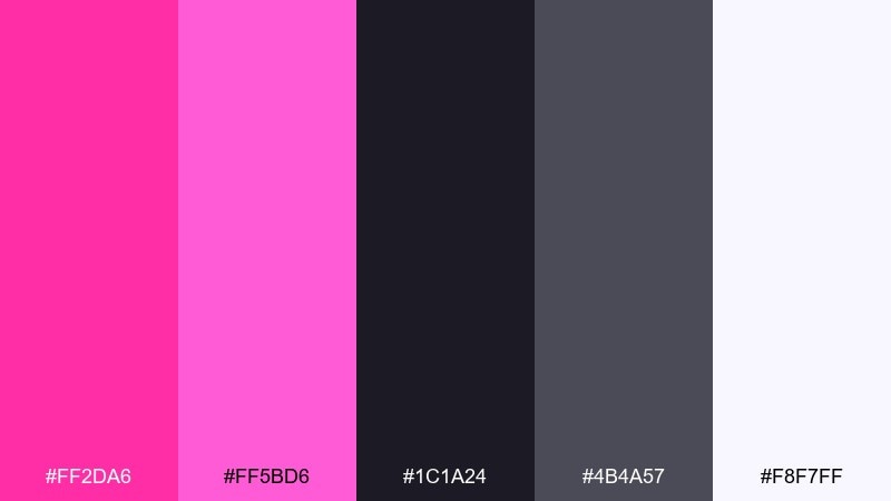
HEX: #ff2da6 #ff5bd6 #1c1a24 #4b4a57 #f8f7ff
Mood: sleek, nightlife, stylish
Best for: cocktail bar menu and signage
Sleek nightlife vibes, like a flamingo neon reflected on polished stone. Two pinks create depth while the charcoal grays keep the look sophisticated and readable. Use the near-black for backgrounds and the off-white for body copy to avoid glare. Tip: set the brighter pink as a thin underline or icon color to add elegance without shouting.
Image example of midnight flamingo generated using media.io
19) Paper Collage
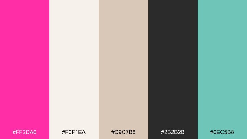
HEX: #ff2da6 #f6f1ea #d9c7b8 #2b2b2b #6ec5b8
Mood: handmade, modern craft, airy
Best for: scrapbook-style blog header
Handmade and airy, like layered paper cutouts with a bright ink stamp. Cream and kraft tones soften the pink so it feels editorial rather than neon. Add the muted teal for small tabs, links, or stickers to create a friendly accent. Tip: keep textures subtle and consistent so the collage look stays clean on screens.
Image example of paper collage generated using media.io
20) Luxe Editorial
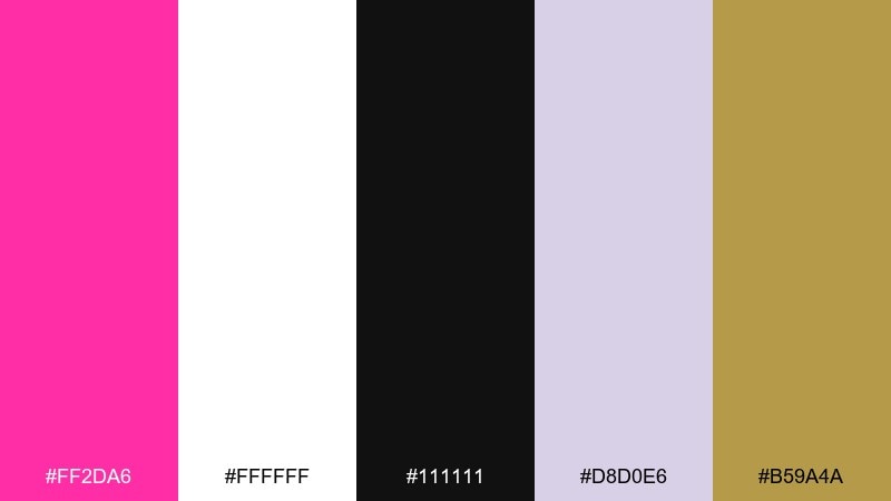
HEX: #ff2da6 #ffffff #111111 #d8d0e6 #b59a4a
Mood: editorial, premium, confident
Best for: magazine cover layout
Editorial and premium, like a high-fashion spread with one daring accent. Use white and black for strong typography, then let lavender and gold create a refined supporting cast. The pink works best as a cover line highlight or a small logo block. Tip: keep margins generous so the bright accent reads intentional and luxurious.
Image example of luxe editorial generated using media.io
21) Soft Signal
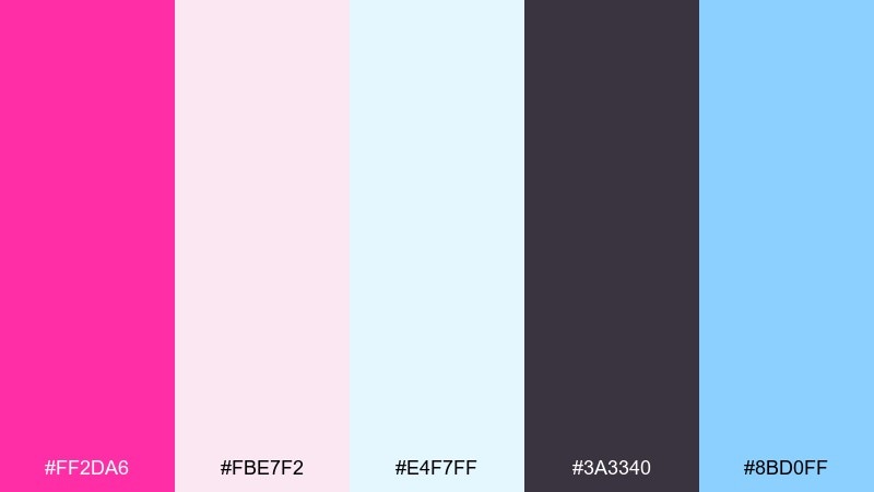
HEX: #ff2da6 #fbe7f2 #e4f7ff #3a3340 #8bd0ff
Mood: gentle, optimistic, clean
Best for: mobile app onboarding screens
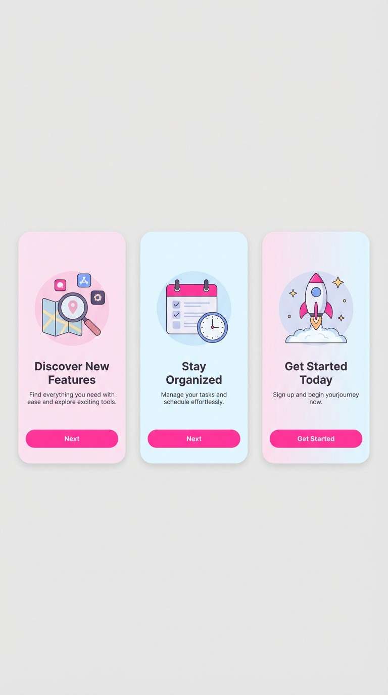
Gentle and optimistic, like a soft glow on frosted glass. The pale pink and airy blue keep screens feeling calm, while the darker plum keeps text readable. Use the bright sky blue for secondary actions so the main CTA can stay pink. Tip: keep illustrations minimal and let large gradients carry the mood.
Image example of soft signal generated using media.io
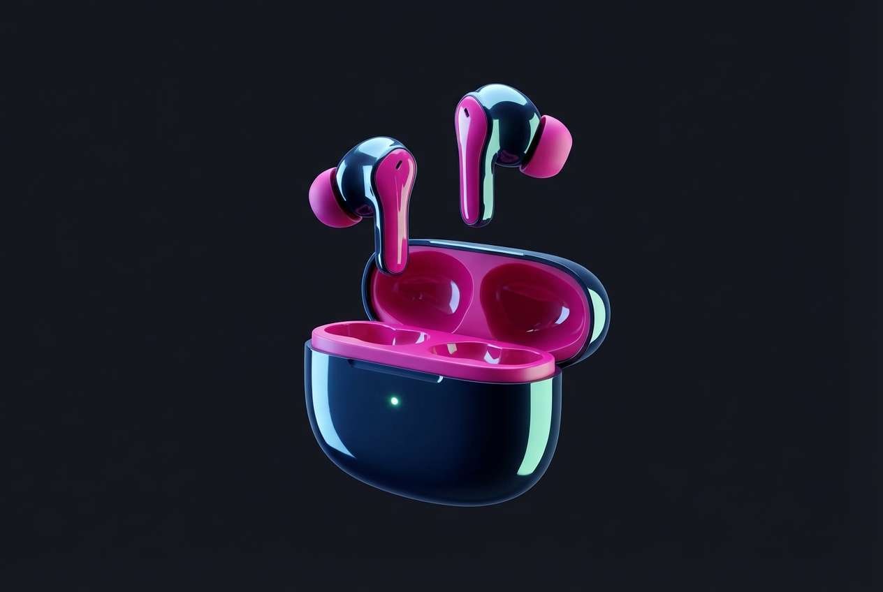
22) Chrome Pop
HEX: #ff2da6 #c7f9ff #b8b8c8 #1a1a22 #6fffd2
Mood: sleek, futuristic, glossy
Best for: product teaser ad for earbuds
Sleek and glossy, like chrome hardware under neon reflections. The icy tints and cool grays make the pink feel techy instead of candy-like. Use the near-black for deep contrast and let mint act as a crisp highlight for specs. Tip: keep reflections subtle so the color story stays clean and premium.
Image example of chrome pop generated using media.io
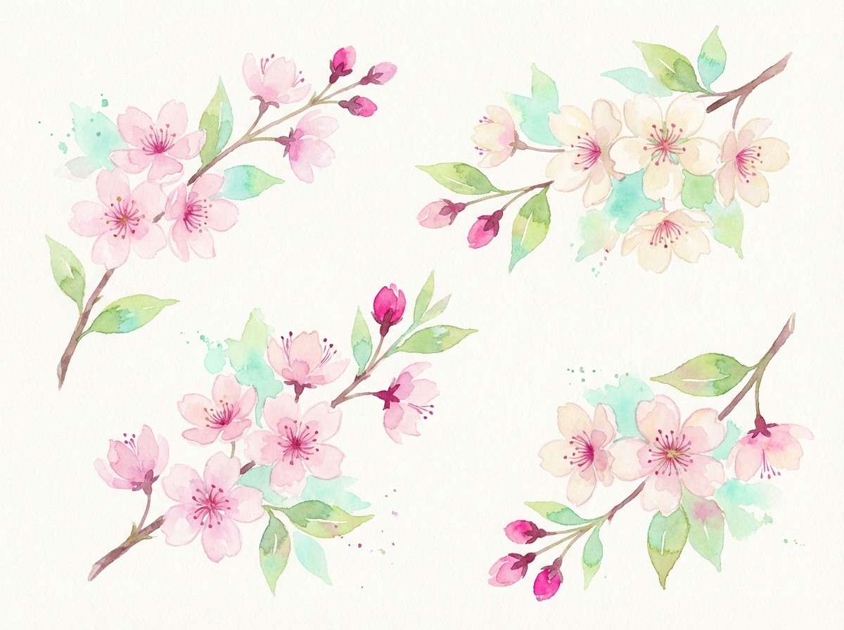
23) Cherry Blossom Flash
HEX: #ff2da6 #ffd9e8 #b5f2e6 #fff7e8 #2d2a32
Mood: springy, light, cheerful
Best for: botanical illustration set
Springy and cheerful, like petals drifting through bright morning air. Blush and cream create softness, while mint adds freshness that keeps the pink from feeling heavy. Use the charcoal for outlines and labels to maintain clarity in delicate artwork. Tip: wash the blush across larger areas and add pink only to focal blossoms for contrast.
Image example of cherry blossom flash generated using media.io
What Colors Go Well with Shocking Pink?
Shocking pink pairs beautifully with deep neutrals (black, charcoal, espresso) because the contrast makes the pink look cleaner and more controlled. This is one of the easiest ways to keep neon tones readable in UI and poster layouts.
For a modern, “electric” feel, combine shocking pink with cool accents like cyan, mint, and violet. The cool tones act like light effects—great for tech, nightlife, and gaming visuals.
To warm it up, add peach, orange, gold, or buttery yellow. These combos feel sunny and playful, but they work best when you let a dark neutral handle typography so the warm colors don’t compete.
How to Use a Shocking Pink Color Palette in Real Designs
Start by assigning roles: pick a neutral for backgrounds, a dark for text, and let shocking pink be the “signal” color for CTAs, highlights, badges, or key shapes. This keeps the palette bold without becoming tiring.
In branding, shocking pink shines when used as a consistent accent (logo mark, underline, label stripe) rather than filling every surface. In UI, reserve it for primary actions and active states to protect hierarchy.
For print and product shots, balance saturation with texture and whitespace. Matte finishes, generous margins, and restrained secondary accents often make shocking pink feel more premium than “loud.”
Create Shocking Pink Palette Visuals with AI
If you have HEX codes and a clear mood, you can generate on-brand visuals fast—posters, UI mockups, packaging concepts, and social templates—without starting from scratch.
Use the prompts included under each palette, swap the subject (flyer, hero banner, product shot), and keep the same color dominance rules to maintain a consistent look across assets.
Media.io makes it easy to turn a shocking pink color palette into design-ready images you can iterate on quickly for campaigns, rebrands, or content batches.
Shocking Pink Color Palette FAQs
-
What is the hex code for shocking pink?
Shocking pink is commonly represented around #FF2DA6 in modern digital palettes, though exact values can vary by brand and display. -
Is shocking pink the same as hot pink or magenta?
They’re related but not identical. Hot pink is often slightly warmer, while magenta leans more purple; “shocking pink” usually sits in a vivid, neon-leaning pink range designed for maximum punch. -
What background color makes shocking pink look best?
Deep neutrals like near-black or charcoal make shocking pink feel cleaner and brighter, while white backgrounds make it feel more editorial and modern—just use enough dark text for readability. -
What colors complement shocking pink?
Cyan/mint and violet are strong modern companions, and warm accents like gold, peach, and orange can add a sunny, playful twist. Pairing with black/white keeps contrast under control. -
How do I keep shocking pink from overpowering a design?
Assign it a clear job (CTA, highlight, label stripe) and let neutrals handle most of the surface area. Limiting shocking pink to a small percentage of the layout usually improves hierarchy. -
Is shocking pink accessible for UI design?
It can be, but contrast depends on the exact shade and the background. Use a contrast checker for text, and consider using shocking pink for buttons and highlights while keeping body text in dark neutrals. -
Can I use shocking pink in professional branding?
Yes—especially for fashion, beauty, entertainment, and modern tech. It reads professional when paired with strong typography, restrained accents, and premium neutrals like black, off-white, and cool gray.
Next: Vermilion Color Palette


