

A shamrock color palette brings that unmistakable lively green energy—fresh, optimistic, and instantly recognizable—without needing loud visuals to make a point.
From modern UI to seasonal campaigns, shamrock greens pair beautifully with neutrals, charcoal contrast, and warm creams. Below are 20+ curated shamrock color combinations with HEX codes and practical ways to use them.
In this article
- Why Shamrock Palettes Work So Well
-
- emerald meadow
- clover cream
- rainwashed fern
- vintage ireland
- neon shamrock pop
- forest and flax
- minted matcha
- shamrock and charcoal
- garden party greens
- celtic gold accent
- deep moss editorial
- sea glass shamrock
- rustic pub interior
- clean saas green
- spring wedding botanicals
- sports team bold
- eco packaging craft
- minimal poster green
- kids learning app
- luxe jewelry emerald
- cottage herb garden
- stadium shamrock lights
- What Colors Go Well with Shamrock?
- How to Use a Shamrock Color Palette in Real Designs
- Create Shamrock Palette Visuals with AI
Why Shamrock Palettes Work So Well
Shamrock greens sit in a sweet spot: bright enough to feel energetic, but natural enough to read as trustworthy. That makes them useful across industries—from wellness and food to fintech and education.
They’re also extremely flexible. Add charcoal or near-black for modern contrast, mix in warm creams for friendliness, or introduce gold accents for festive, premium moments.
Because green carries strong “growth” and “good” signals, shamrock tones are excellent for CTAs, success states, and brand marks—especially when you control saturation with calming tints and grounded neutrals.
20+ Shamrock Color Palette Ideas (with HEX Codes)
1) Emerald Meadow
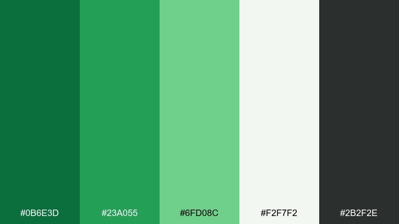
HEX: #0B6E3D #23A055 #6FD08C #F2F7F2 #2B2F2E
Mood: fresh, confident, outdoorsy
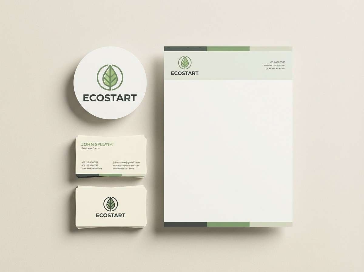
Best for: brand identity for eco startups
Fresh meadow greens and crisp air energy set a confident, outdoorsy tone. Use it for eco brands, farm-to-table logos, and sustainability messaging where trust matters. Pair the deeper green with soft off-white to keep layouts clean and readable. Tip: reserve the near-black for typography so the greens stay vibrant without looking harsh.
Image example of emerald meadow generated using media.io
Media.io is an online AI studio for creating and editing video, image, and audio in your browser.

2) Clover Cream
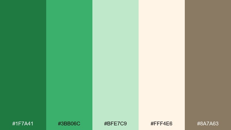
HEX: #1F7A41 #3BB06C #BFE7C9 #FFF4E6 #8A7A63
Mood: soft, friendly, welcoming
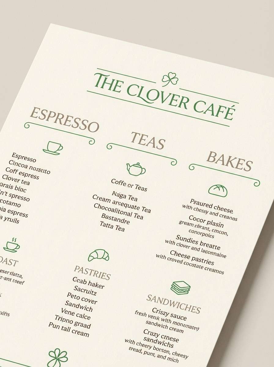
Best for: cafe menu design
Soft greens over warm cream feel like morning light through clover leaves. This shamrock color palette suits cafe menus, bakery signage, and cozy loyalty cards where comfort sells. Pair the cream background with mid-green headings for easy scanning, then use the taupe for prices and small copy. Tip: keep photos slightly desaturated so the greens stay the hero.
Image example of clover cream generated using media.io
3) Rainwashed Fern
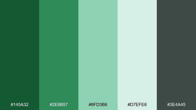
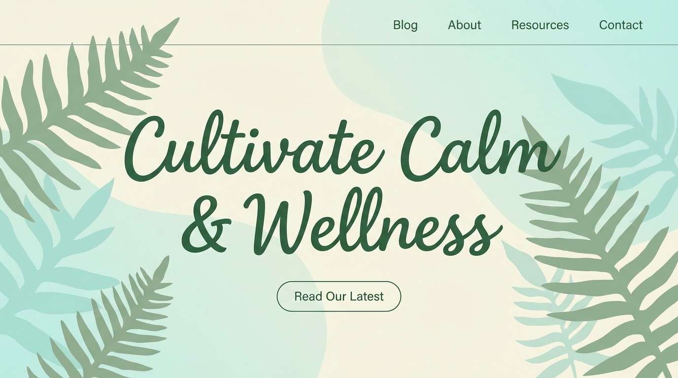
HEX: #145A32 #2E8B57 #8FD3B6 #D7EFE6 #3E4A45
Mood: calm, clean, restorative
Best for: wellness blog header and hero
Cool, rainwashed greens evoke a quiet walk under ferns after a shower. Use it in wellness blog heroes, meditation content, and spa promos where calm clarity is the goal. Balance the darker greens with the pale aqua-tint for breathing room and gentle contrast. Tip: add generous line spacing and thin rules in the gray-green to keep the page feeling airy.
Image example of rainwashed fern generated using media.io
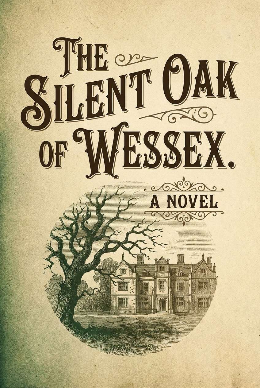
4) Vintage Ireland
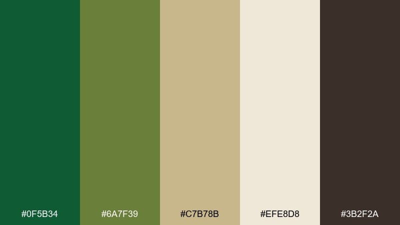
HEX: #0F5B34 #6A7F39 #C7B78B #EFE8D8 #3B2F2A
Mood: heritage, earthy, story-rich
Best for: book cover for historical fiction
Heritage greens and worn parchment tones bring a story-rich, old-world feel. It works beautifully for historical fiction covers, museum brochures, and heritage tour posters. Use the dark brown for title type and the mossy green for ornaments or borders. Tip: add subtle grain texture so the palette feels printed and authentic.
Image example of vintage ireland generated using media.io
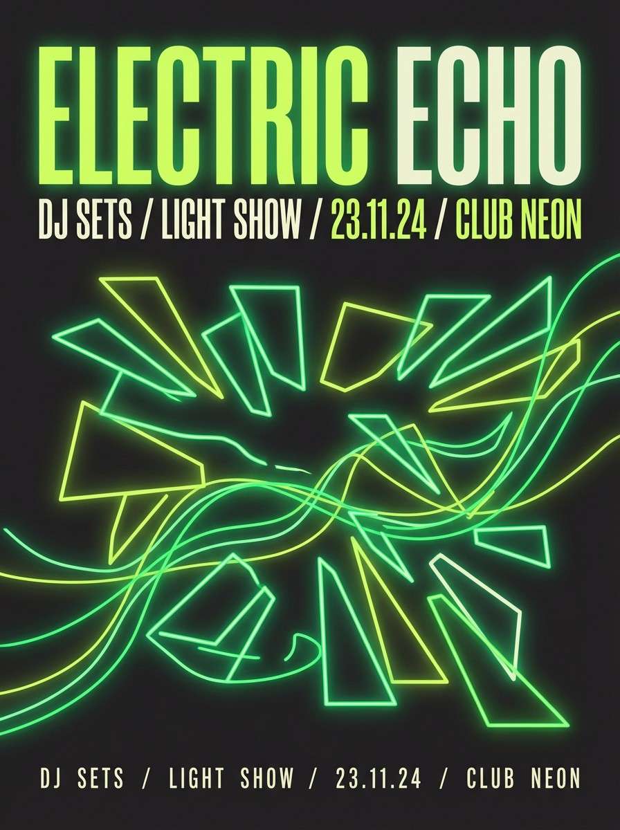
5) Neon Shamrock Pop
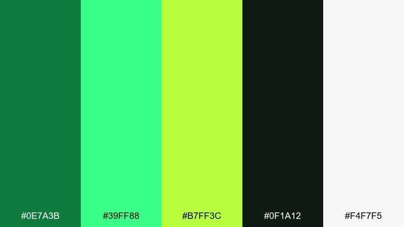
HEX: #0E7A3B #39FF88 #B7FF3C #0F1A12 #F4F7F5
Mood: electric, youthful, high-energy
Best for: event poster for club night
Electric greens against near-black feel like neon signage on a rainy street. These shamrock color combinations are made for club posters, music promos, and punchy social graphics. Let the neon mint and lime take over headlines, then use off-white sparingly for small details. Tip: keep gradients subtle and avoid extra colors so the glow stays clean.
Image example of neon shamrock pop generated using media.io
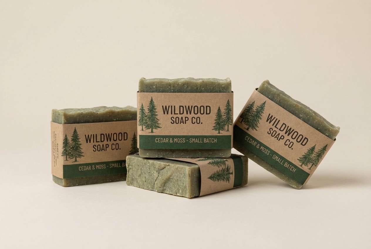
6) Forest and Flax
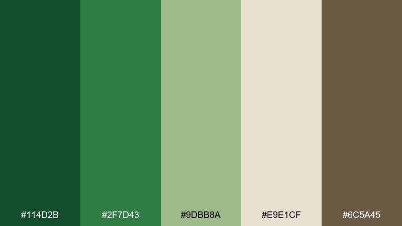
HEX: #114D2B #2F7D43 #9DBB8A #E9E1CF #6C5A45
Mood: grounded, natural, artisan
Best for: craft packaging for handmade soap
Grounded forest tones and flax neutrals feel artisan and tactile. Use it for handmade soap packaging, farmer market labels, and small-batch product tags. The flax background keeps the greens looking organic rather than techy, while the warm brown adds a handcrafted finish. Tip: choose uncoated paper and simple line art to reinforce the natural vibe.
Image example of forest and flax generated using media.io
7) Minted Matcha
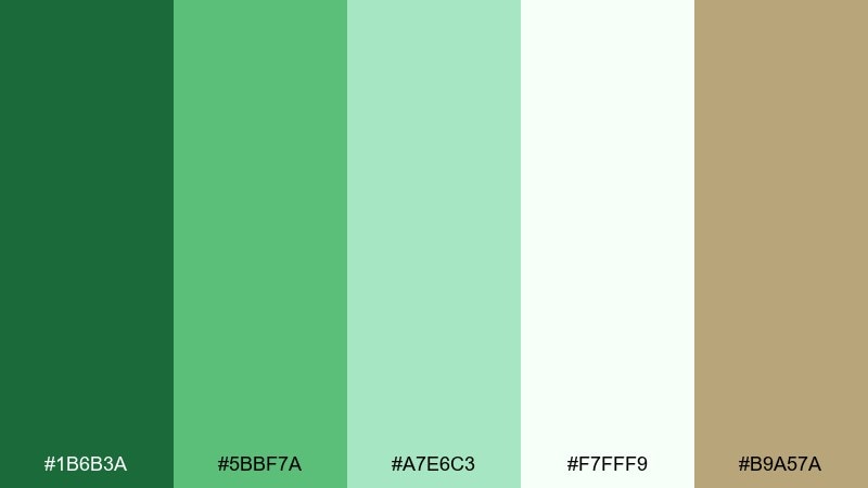
HEX: #1B6B3A #5BBF7A #A7E6C3 #F7FFF9 #B9A57A
Mood: light, clean, uplifting
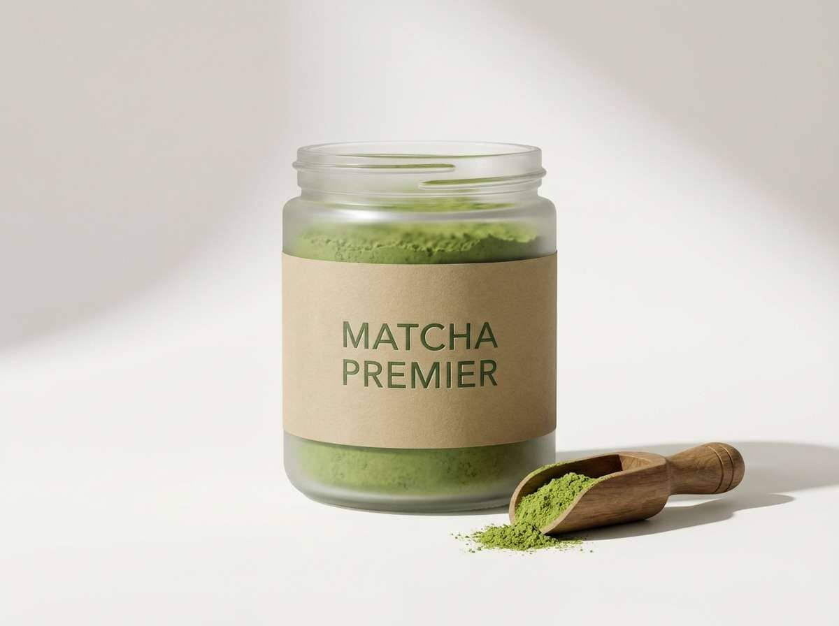
Best for: matcha product ad
Light matcha greens and airy tints feel clean, modern, and quietly premium. Use it for beverage ads, subscription landing pages, or product launches that need freshness without shouting. Keep the background near-white and lean on the mid-green for key buttons and callouts. Tip: use the gold-tan only for small highlights like badges or price tags.
Image example of minted matcha generated using media.io
8) Shamrock and Charcoal
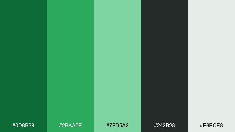
HEX: #0D6B38 #2BAA5E #7FD5A2 #242B28 #E6ECE8
Mood: modern, sharp, high-contrast
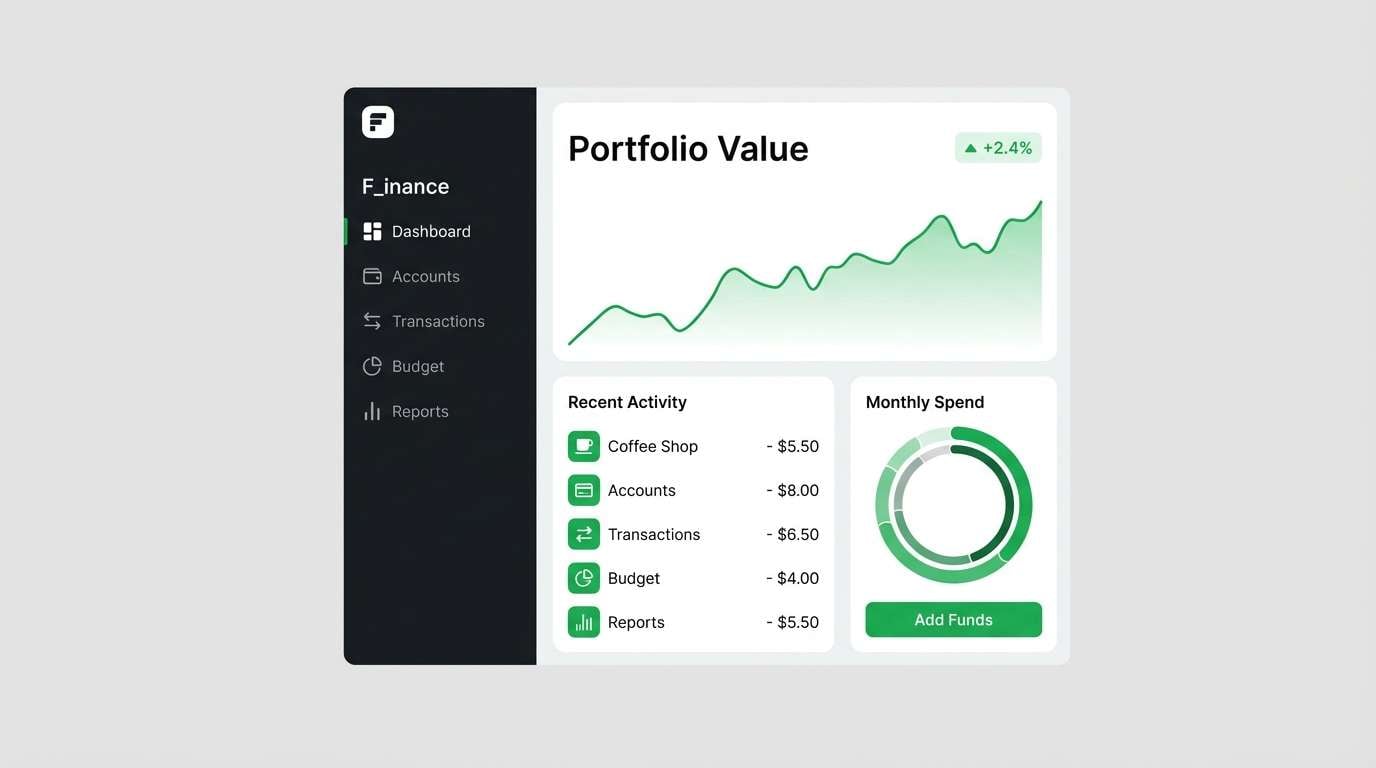
Best for: finance app UI
Sharp greens with charcoal contrast feel modern and decisive, like a clean dashboard at night. Use it for fintech UIs, admin panels, and data-heavy screens where clarity is non-negotiable. Let the charcoal handle navigation and tables, while the brighter green marks success states and key actions. Tip: keep success and confirmation messages to one green tone to avoid visual noise.
Image example of shamrock and charcoal generated using media.io
9) Garden Party Greens
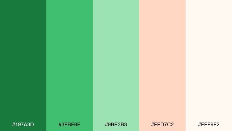
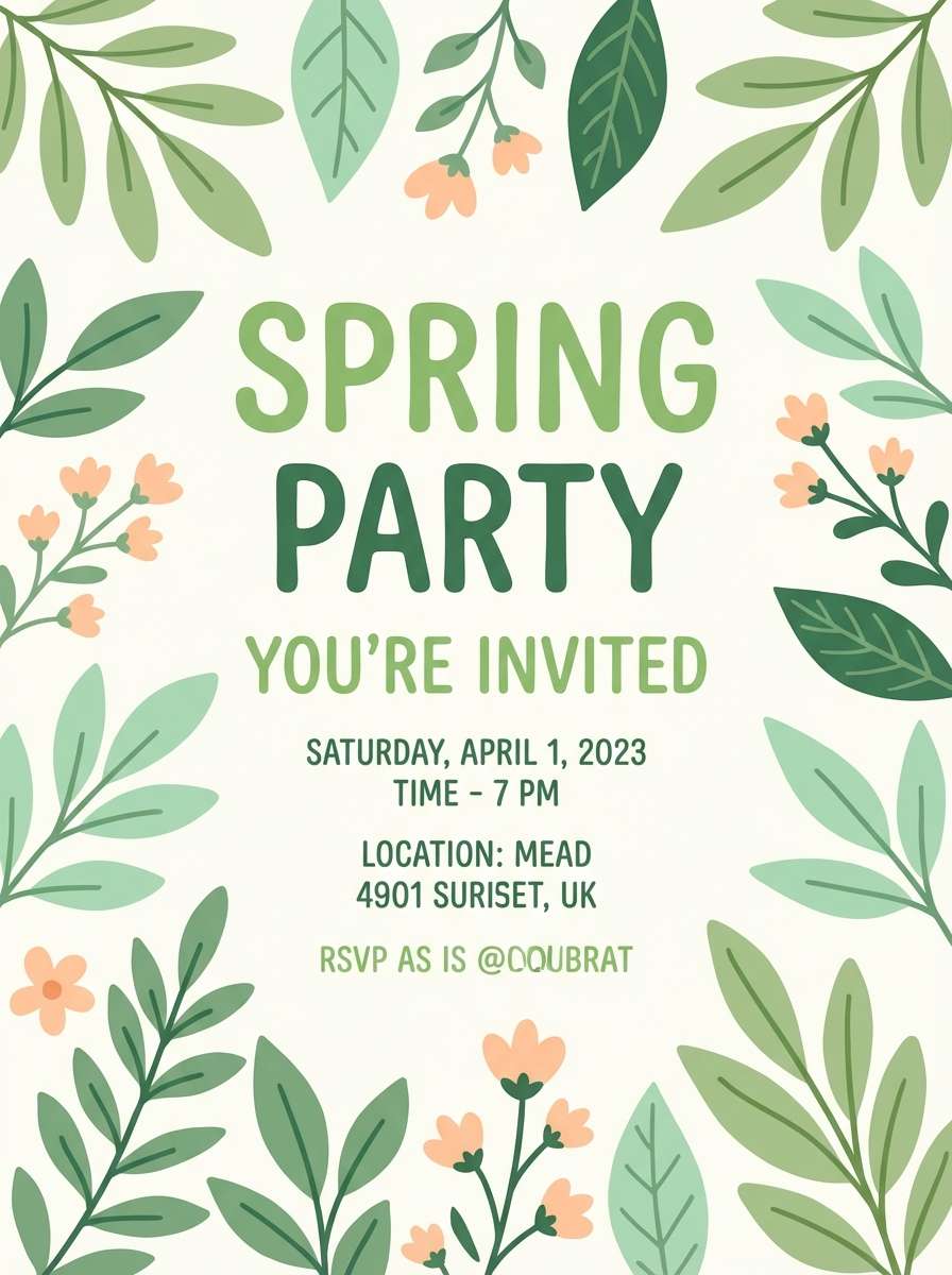
HEX: #197A3D #3FBF6F #9BE3B3 #FFD7C2 #FFF9F2
Mood: playful, bright, springy
Best for: spring party invitation
Bright greens with a blush-peach accent feel like fresh blooms at a backyard garden party. Use it for spring invitations, brunch flyers, or seasonal social posts. Let the greens lead and keep the peach as a small accent for dates, icons, or separators. Tip: choose rounded type and simple floral doodles to keep the look light and celebratory.
Image example of garden party greens generated using media.io
10) Celtic Gold Accent
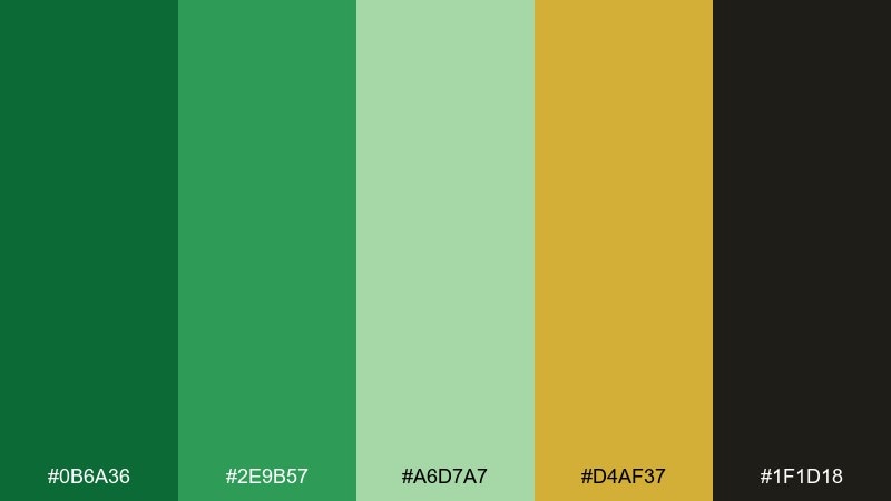
HEX: #0B6A36 #2E9B57 #A6D7A7 #D4AF37 #1F1D18
Mood: regal, festive, statement
Best for: St Patrick day campaign banner
Regal greens with a metallic-gold hit feel festive and ceremonial. This shamrock color palette works for St Patrick day banners, limited-time promos, and celebratory brand moments. Use gold only for a badge or key headline detail, and keep the rest grounded with deep green and near-black. Tip: avoid thin gold text on light backgrounds, and instead use gold as shapes or outlines for better legibility.
Image example of celtic gold accent generated using media.io

11) Deep Moss Editorial
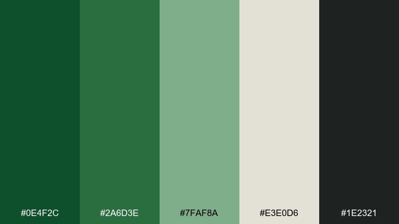
HEX: #0E4F2C #2A6D3E #7FAF8A #E3E0D6 #1E2321
Mood: moody, refined, editorial
Best for: magazine feature layout
Moody moss greens and warm gray-beige feel refined, like an editorial spread in a design magazine. Use it for long-form articles, lookbooks, and premium storytelling layouts. Keep body text in the near-black and use the muted green for pull quotes and section dividers. Tip: choose one strong green for headers and keep the rest subdued to maintain a luxury feel.
Image example of deep moss editorial generated using media.io
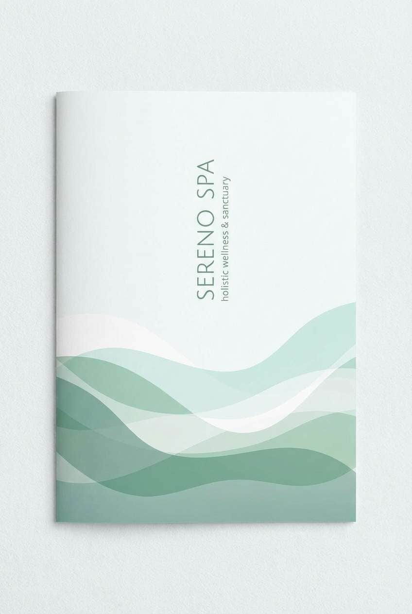
12) Sea Glass Shamrock
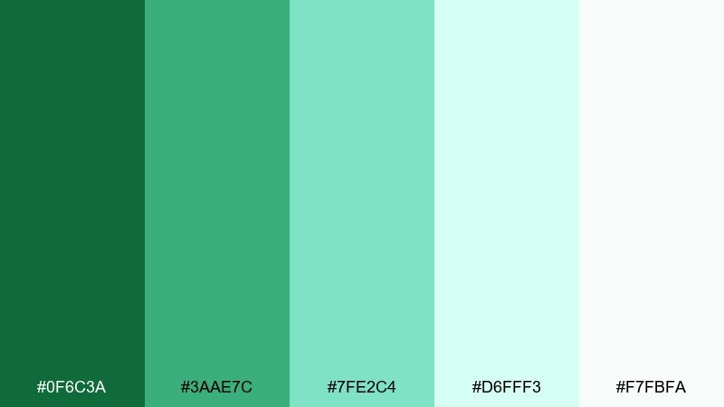
HEX: #0F6C3A #3AAE7C #7FE2C4 #D6FFF3 #F7FBFA
Mood: breezy, coastal, refreshing
Best for: spa brochure cover
Breezy sea-glass greens feel refreshing, like a coastal spa day. Use it for spa brochures, skincare landing pages, and calming service menus. The pale aqua works well as a background, while the deeper green adds structure to headings and icons. Tip: keep imagery bright and minimal so the palette stays light and restorative.
Image example of sea glass shamrock generated using media.io
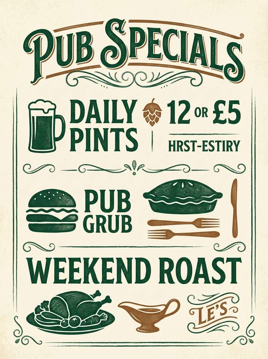
13) Rustic Pub Interior
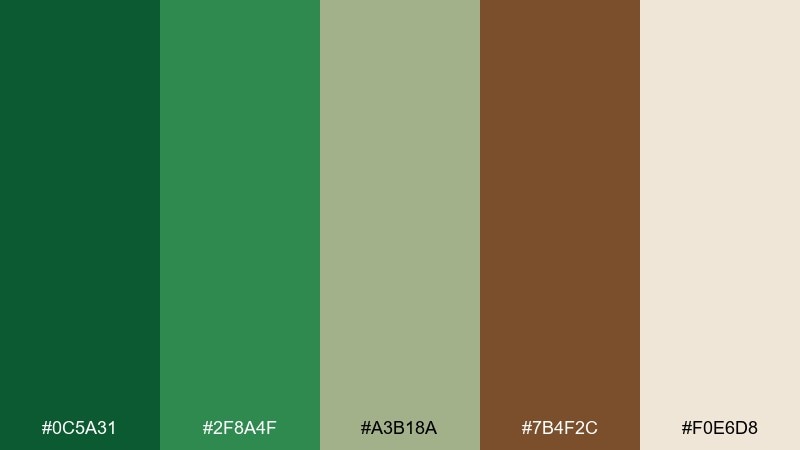
HEX: #0C5A31 #2F8A4F #A3B18A #7B4F2C #F0E6D8
Mood: warm, rustic, social
Best for: pub chalkboard poster
Warm greens with a whiskey-brown accent feel like a lively pub with wood beams and friendly chatter. Use it for chalkboard-style posters, menu specials, and local event promos. Let the cream act as the board, then set the greens for headings and highlights with brown for supporting text. Tip: use hand-drawn separators and keep contrast high for readability from a distance.
Image example of rustic pub interior generated using media.io
14) Clean SaaS Green
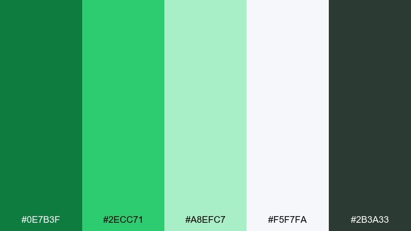
HEX: #0E7B3F #2ECC71 #A8EFC7 #F5F7FA #2B3A33
Mood: crisp, trustworthy, tech-forward
Best for: SaaS landing page UI
Crisp greens on cool neutrals feel trustworthy and tech-forward, like a polished SaaS homepage. This shamrock color scheme fits onboarding screens, pricing pages, and product-led growth layouts. Use the vivid green for primary CTAs and the mint tint for subtle cards and backgrounds. Tip: keep charts to two greens plus gray to prevent data visuals from looking busy.
Image example of clean saas green generated using media.io

15) Spring Wedding Botanicals
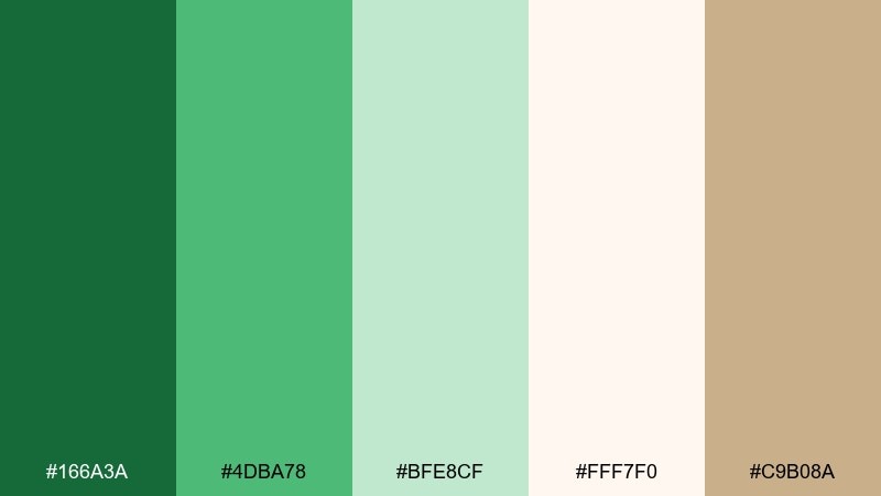
HEX: #166A3A #4DBA78 #BFE8CF #FFF7F0 #C9B08A
Mood: romantic, airy, botanical
Best for: wedding invitation suite
Airy botanicals and soft greens feel romantic, like pressed leaves tucked into a keepsake book. Use it for wedding invitation suites, save-the-dates, and thank-you cards. Keep the background creamy and let the mid-green handle names and key details for gentle contrast. Tip: add thin line florals in the pale green so the design stays elegant, not busy.
Image example of spring wedding botanicals generated using media.io
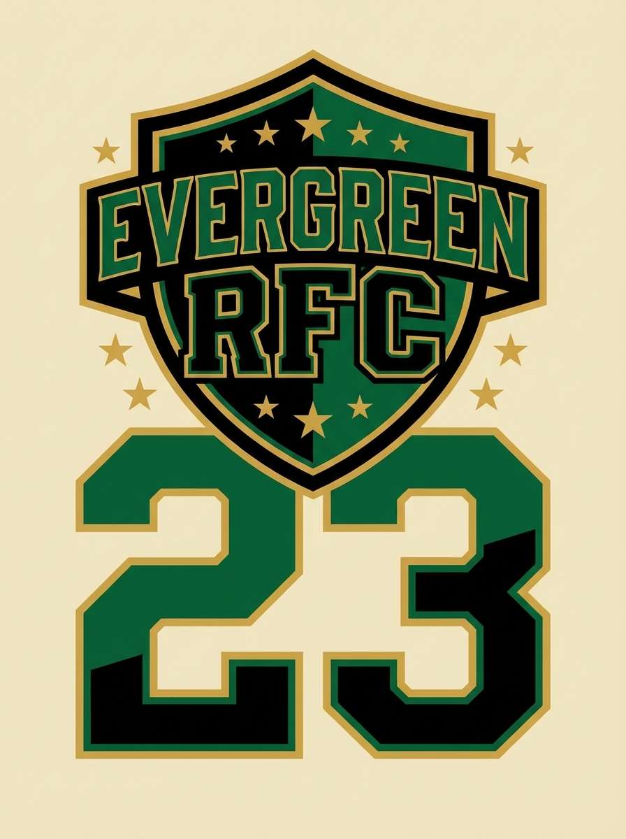
16) Sports Team Bold
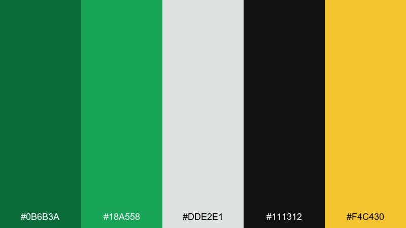
HEX: #0B6B3A #18A558 #DDE2E1 #111312 #F4C430
Mood: competitive, bold, punchy
Best for: team poster and merch graphic
Bold greens with black and a hit of gold feel competitive and stadium-loud. These shamrock color combinations are great for team posters, merch graphics, and energetic social announcements. Use black for strong shapes and typography, then bring in green for the main identity and gold for small highlights like numbers or badges. Tip: keep gradients minimal so prints stay sharp across fabric and paper.
Image example of sports team bold generated using media.io
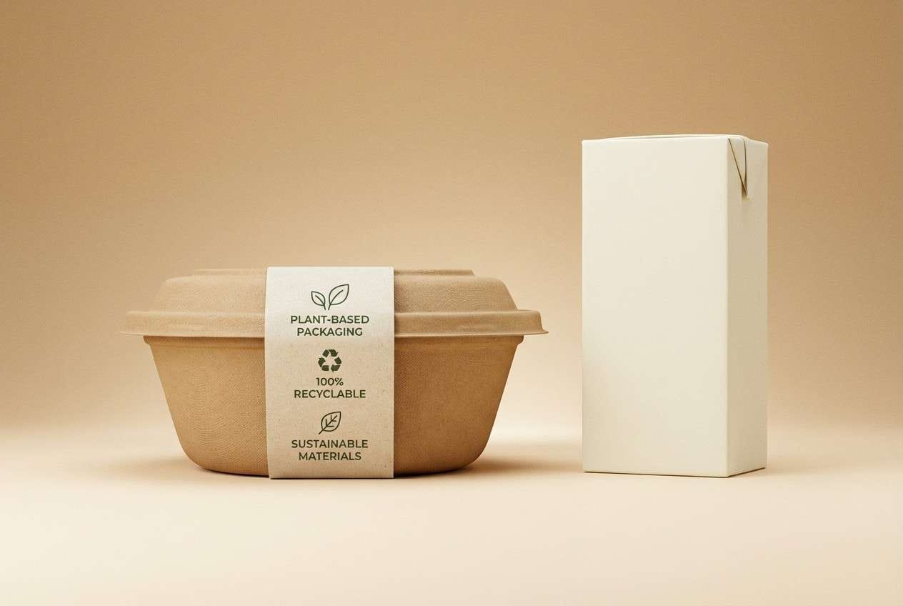
17) Eco Packaging Craft
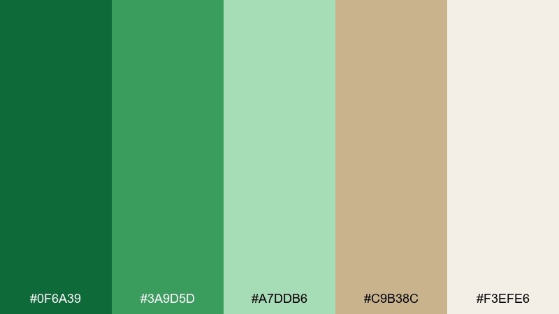
HEX: #0F6A39 #3A9D5D #A7DDB6 #C9B38C #F3EFE6
Mood: ethical, warm, handmade
Best for: recyclable food packaging label
Ethical greens with kraft-like neutrals feel handmade and honest. Use it for recyclable food labels, pantry staples, and farmers market packaging where ingredients should feel real. Let the warm beige carry the background, then use the deeper green for product names and the lighter green for icons. Tip: choose simple stamp-style graphics to reinforce the sustainable message.
Image example of eco packaging craft generated using media.io
18) Minimal Poster Green
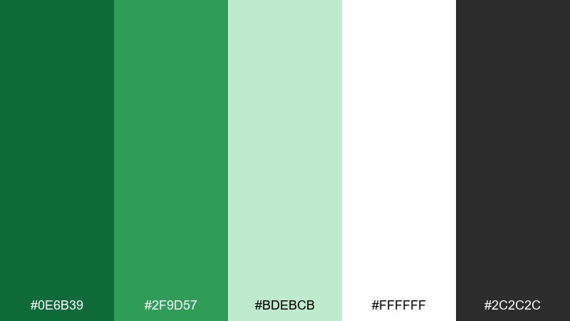
HEX: #0E6B39 #2F9D57 #BDEBCB #FFFFFF #2C2C2C
Mood: minimal, modern, gallery-like
Best for: typographic poster
Minimal greens on white space feel gallery-clean and modern. Use it for typographic posters, brand quotes, and simple announcement graphics. Keep one dominant green for the headline and let the pale mint support blocks and lines. Tip: use a single strong sans serif and generous margins to make the color feel intentional.
Image example of minimal poster green generated using media.io
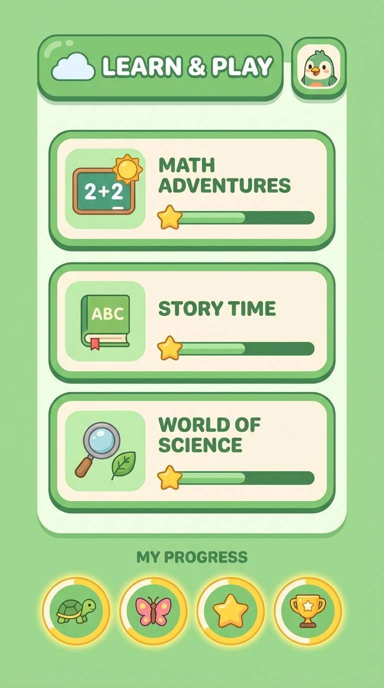
19) Kids Learning App
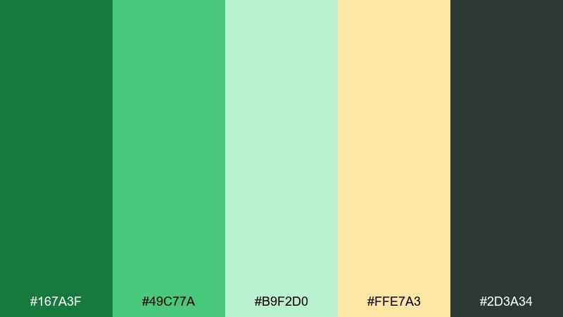
HEX: #167A3F #49C77A #B9F2D0 #FFE7A3 #2D3A34
Mood: cheerful, friendly, approachable
Best for: kids learning app UI
Cheerful greens with a sunny yellow feel friendly and encouraging, like stickers on a workbook. Use it for kids learning app screens, progress badges, and simple onboarding flows. Keep the darkest tone for text and outlines, while the mint and yellow highlight achievements. Tip: limit the yellow to key rewards so it stays special and motivating.
Image example of kids learning app generated using media.io
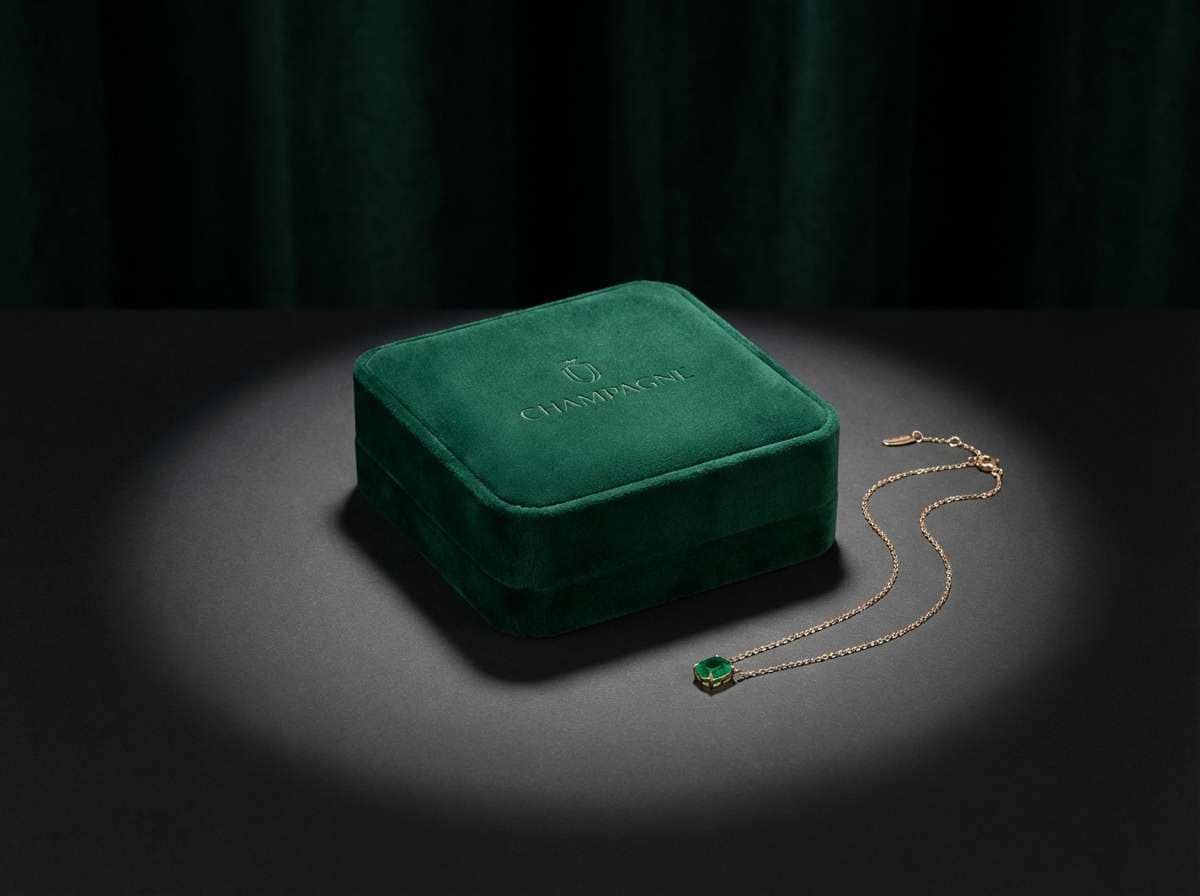
20) Luxe Jewelry Emerald
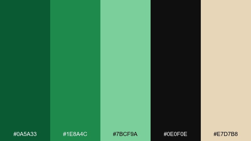
HEX: #0A5A33 #1E8A4C #7BCF9A #0E0F0E #E7D7B8
Mood: luxury, dramatic, elegant
Best for: jewelry product ad
Dramatic emerald greens with near-black and soft champagne feel luxurious and cinematic. Use it for jewelry ads, premium product pages, and high-end branding where contrast signals value. Keep the background dark and introduce champagne as a subtle highlight for logos or price details. Tip: use soft spot lighting and minimal copy so the color reads like velvet, not flat green.
Image example of luxe jewelry emerald generated using media.io
21) Cottage Herb Garden
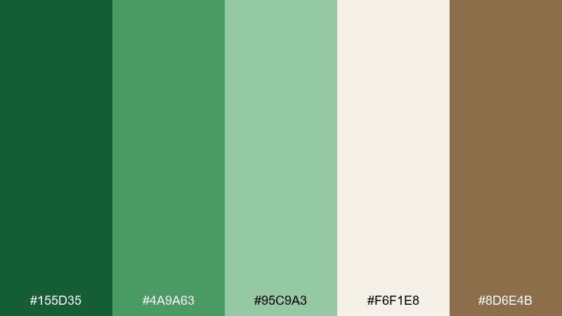
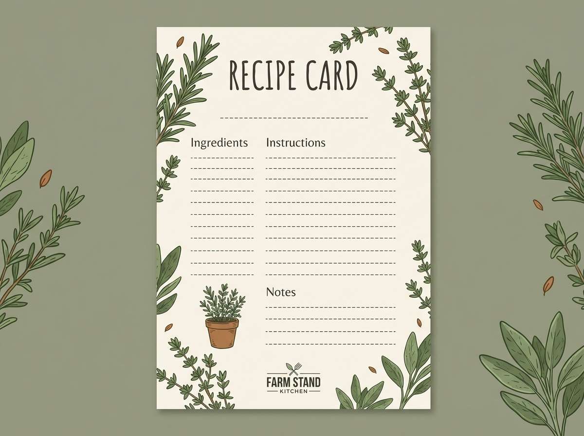
HEX: #155D35 #4A9A63 #95C9A3 #F6F1E8 #8D6E4B
Mood: homey, wholesome, garden-fresh
Best for: recipe blog graphics
Garden-fresh herb tones and warm neutrals feel homey, like a cottage kitchen in spring. Use it for recipe cards, food blog graphics, and cooking newsletters. The creamy background keeps text readable, while the greens support section headers and ingredient icons. Tip: add a single brown accent for dividers to echo wooden utensils and keep the look grounded.
Image example of cottage herb garden generated using media.io
22) Stadium Shamrock Lights
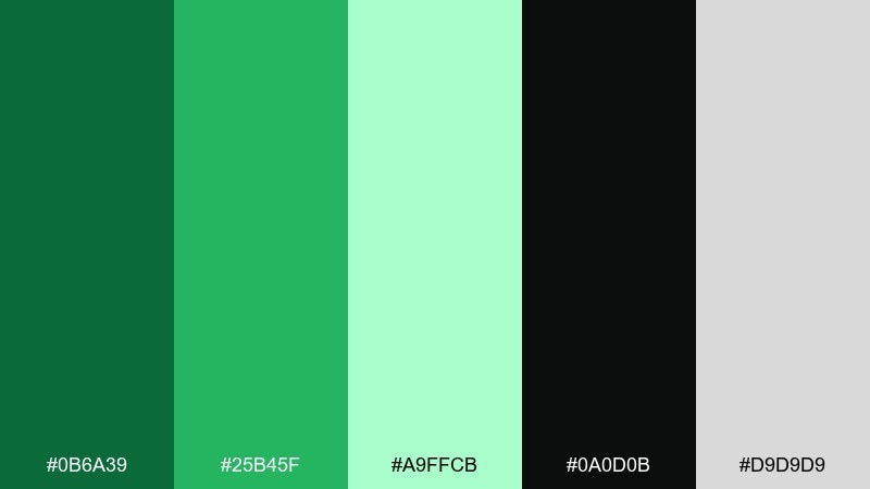
HEX: #0B6A39 #25B45F #A9FFCB #0A0D0B #D9D9D9
Mood: dynamic, night-time, energetic
Best for: social media promo tiles
Night-time greens with bright highlights feel like stadium lights cutting through the dark. Use it for social promo tiles, countdown posts, and bold announcement templates. Keep the black as the canvas and let the brightest mint punch through for key numbers or CTAs. Tip: stick to big type and simple shapes so the glow reads clearly on small screens.
Image example of stadium shamrock lights generated using media.io

What Colors Go Well with Shamrock?
Shamrock green pairs naturally with grounded neutrals like off-white, cream, warm beige, taupe, and kraft tones. These soften the saturation and make the green feel organic and approachable.
For modern contrast, combine shamrock with charcoal, near-black, and cool grays—ideal for UI, dashboards, and bold typography. This also helps green accents read as “action” or “success” without overwhelming the layout.
If you want a celebratory or premium twist, add a controlled accent like gold, champagne, or peach. Keep accents minimal so shamrock remains the hero color.
How to Use a Shamrock Color Palette in Real Designs
Start by assigning roles: pick one primary shamrock green for brand marks and CTAs, a darker green (or charcoal) for text and structure, and a pale tint for backgrounds and cards. This keeps pages consistent across components.
In print, shamrock can shift depending on paper and lighting, so test on the intended stock. Pairing with warm creams or parchment tones often improves legibility and makes the green feel less “digital.”
For campaigns (seasonal, sports, or events), lean on high-contrast pairings and big shapes. Reserve neon or lime-like greens for headlines and highlights to avoid visual fatigue.
Create Shamrock Palette Visuals with AI
If you already have HEX codes, the fastest way to validate a shamrock color scheme is to generate mock visuals—posters, UI screens, packaging, or brand assets—before committing to production.
Use Media.io text-to-image prompts to explore lighting, typography, and layout styles while keeping your green palette consistent. It’s especially helpful when you want multiple directions (minimal, luxe, rustic, neon) from the same core shamrock tones.
Once you find a direction you like, iterate by changing only one variable at a time (background tone, accent color, or contrast level) to keep results cohesive.
Shamrock Color Palette FAQs
-
What is a shamrock color palette?
A shamrock color palette is a set of greens inspired by shamrock/clover tones—typically a vivid mid-green supported by deeper forest greens, lighter mint tints, and neutral companions like cream, gray, or charcoal. -
Is shamrock green the same as emerald green?
They’re close but not identical. Emerald is usually deeper and slightly cooler, while shamrock green often reads brighter and fresher—more “leafy” and energetic in UI and branding. -
What neutral colors work best with shamrock green?
Off-white, warm cream, light gray, charcoal, and kraft beige are top choices. They control saturation and make shamrock accents look clean and intentional. -
What accent colors pair well with shamrock?
Gold/champagne for a premium or festive look, peach for a playful spring vibe, and sunny yellow for cheerful kid-friendly designs. Use accents sparingly to keep the greens dominant. -
How do I make shamrock green work in UI design?
Use shamrock as an accent for CTAs, success states, toggles, and highlights, while keeping surfaces neutral (white/gray) and text in charcoal or near-black for readability and contrast. -
How can I keep shamrock palettes from looking too “St. Patrick’s Day”?
Avoid pairing only bright green with pure white. Instead, add sophisticated neutrals (charcoal, warm gray, parchment) and use muted greens or sea-glass tints to shift the vibe toward modern or premium. -
Can I generate shamrock palette design examples with AI?
Yes. With Media.io text-to-image, you can turn a simple prompt (poster, UI, packaging, invitation) into cohesive visuals and iterate quickly until the shamrock greens feel right for your brand.


