

An apocalyptic color palette is all about ash neutrals, weathered rust, stormy blues, and muted greens that feel gritty but still usable in modern design.
Below are 20 apocalyptic color palette ideas with HEX codes, plus AI image prompts you can reuse for posters, UI, branding, and concept art.
In this article
Why Apocalyptic Palettes Work So Well
Apocalyptic palettes lean on desaturated tones, which naturally feel more realistic and grounded. That restraint makes layouts easier to read and helps typography, spacing, and texture do the heavy lifting.
These colors also tell a story fast: ash and concrete suggest decay, rust implies time and damage, and muted greens hint at nature returning. Even without illustrations, the palette alone can communicate mood.
Because most sets are built around strong dark bases and calm mid-tones, they’re practical for UI, posters, and branding. You can keep the look cinematic while still maintaining a clean hierarchy and accessible contrast.
20+ Apocalyptic Color Palette Ideas (with HEX Codes)
1) Ashen Dawn
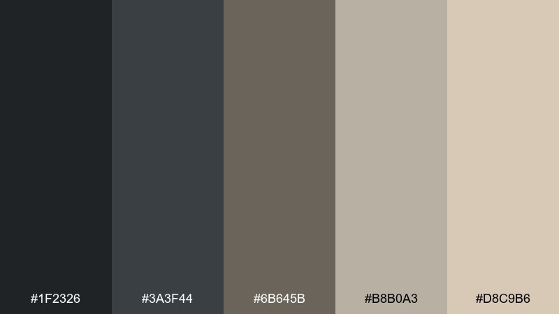
HEX: #1f2326 #3a3f44 #6b645b #b8b0a3 #d8c9b6
Mood: quiet, smoky, resilient
Best for: landing page hero and typography-led web design
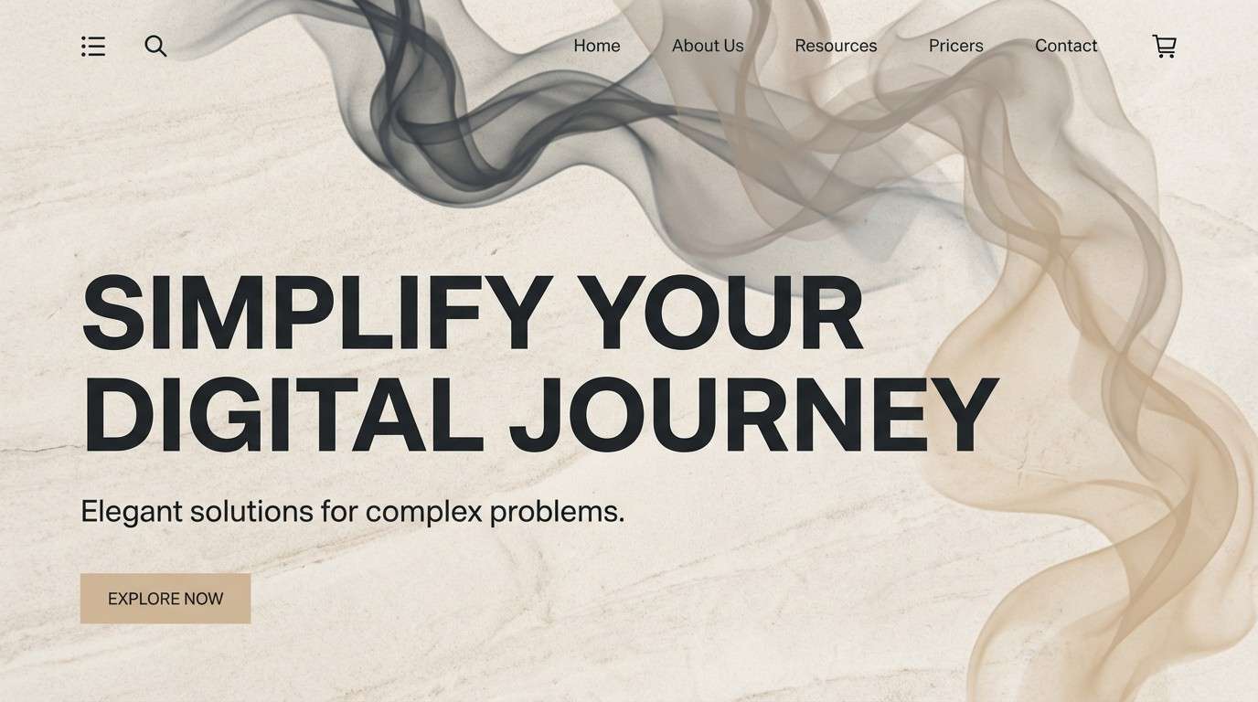
Quiet smoke and morning haze set a grounded, resilient tone that feels calm after the chaos. Use the deep charcoals for headings and navigation, then let the warm stone neutrals carry your background blocks. It shines in web heroes, long-form reads, and minimalist brand systems where contrast matters more than saturation. Pair with crisp white sparingly and keep one mid-tone as your primary UI fill for a clean hierarchy.
Image example of ashen dawn generated using media.io
Media.io is an online AI studio for creating and editing video, image, and audio in your browser.

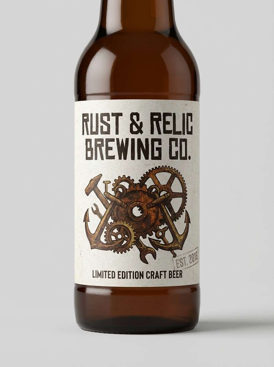
2) Rusted Bunker
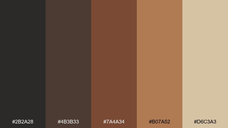
HEX: #2b2a28 #4b3b33 #7a4a34 #b07a52 #d6c3a3
Mood: industrial, heavy, weathered
Best for: craft beer can label and packaging
Industrial heat and weathered metal come through like a bunker door left out in the rain. Build your base with the near-black and deep brown, then let the rust tones handle badges and callouts. It works especially well on cans, boxes, and hang tags where texture and contrast sell the story. Add a light sand panel for legibility and keep the warm mid-rust as your single hero accent.
Image example of rusted bunker generated using media.io
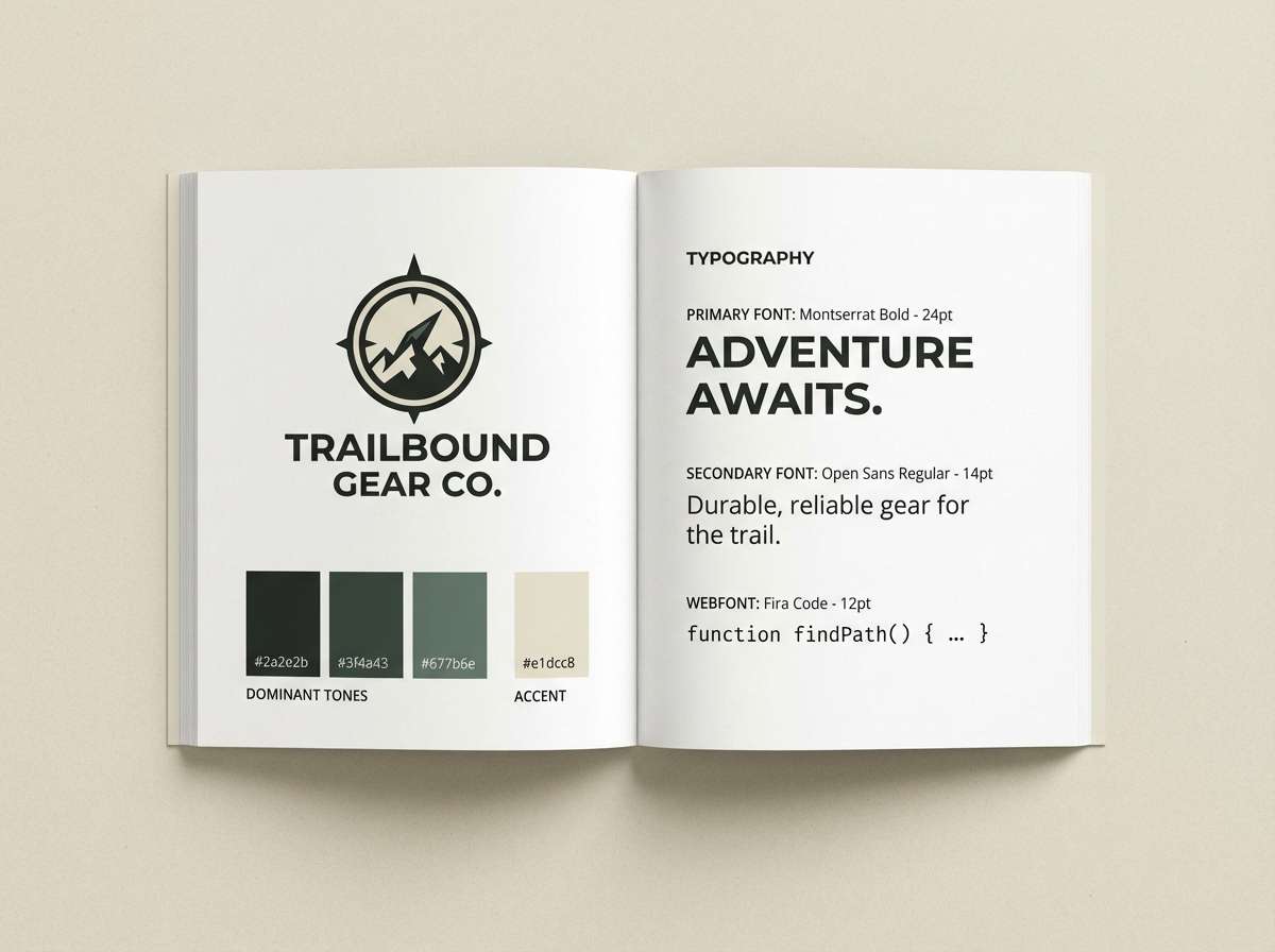
3) Fallout Sage
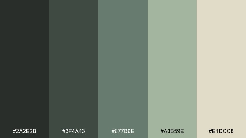
HEX: #2a2e2b #3f4a43 #677b6e #a3b59e #e1dcc8
Mood: muted, tactical, organic
Best for: outdoor gear brand guide and identity accents
Muted sage and graphite feel tactical and natural at the same time, like overgrown concrete. These apocalyptic color combinations are perfect for brands that want rugged credibility without going full neon hazard. Use the dark greens for logos and labels, then reserve the pale olive for background fields and spec tables. A small touch of the warm off-white keeps everything readable in print and on screens.
Image example of fallout sage generated using media.io
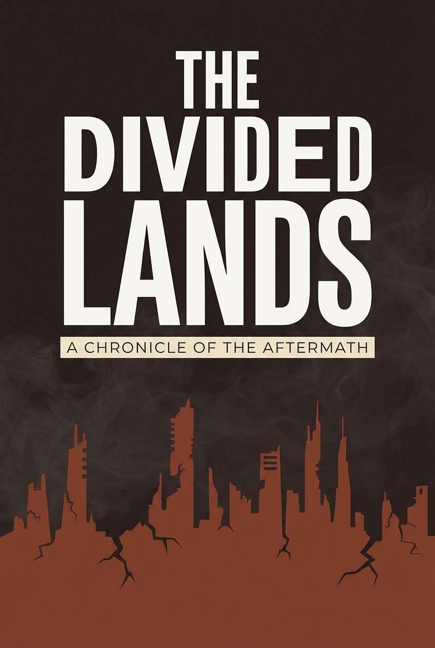
4) Cinder Bloom
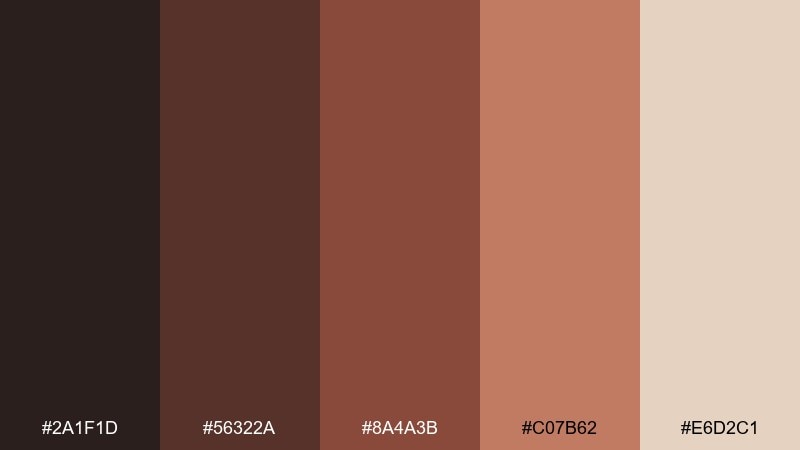
HEX: #2a1f1d #56322a #8a4a3b #c07b62 #e6d2c1
Mood: smoldering, warm, cinematic
Best for: book cover design for dystopian fiction
Smoldering clay and cinder browns evoke scorched earth with a surprising warmth underneath. Use the darkest tone for title type and silhouettes, then pull the terracotta mid-tones into gradients and illustrated highlights. It suits dystopian fiction covers, album art, and cinematic thumbnails that need instant mood. Keep the light cream for a thin border or subtitle strip to avoid muddy contrast.
Image example of cinder bloom generated using media.io
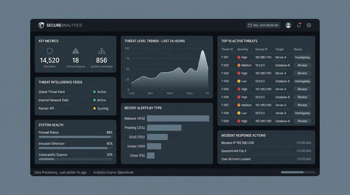
5) Ozone Storm
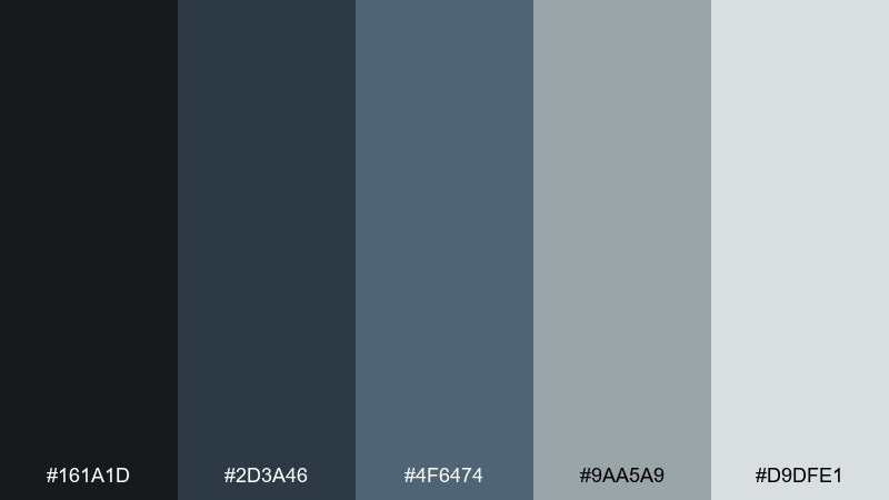
HEX: #161a1d #2d3a46 #4f6474 #9aa5a9 #d9dfe1
Mood: cold, electric, foreboding
Best for: dashboard UI mockup for security analytics
Cold air, static, and stormlight make this set feel sharp and foreboding without being flashy. Use the near-black and slate blue for panels, then reserve the foggy gray for cards and dividers. It is a strong fit for security dashboards and data-heavy products where calm clarity is the priority. Add one bright indicator using the lightest gray and keep charts mostly monochrome for a disciplined look.
Image example of ozone storm generated using media.io
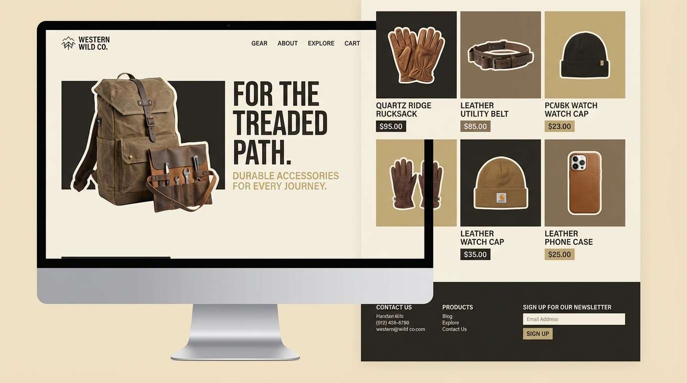
6) Wasteland Sand
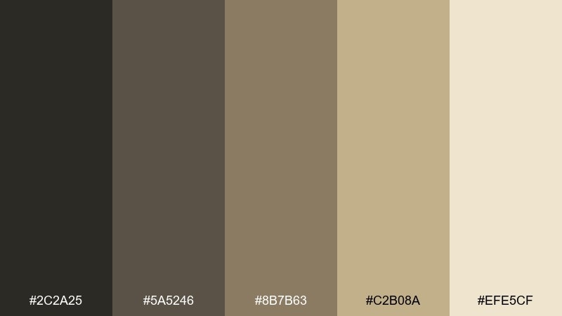
HEX: #2c2a25 #5a5246 #8b7b63 #c2b08a #efe5cf
Mood: dusty, sunbaked, minimal
Best for: product landing page for rugged accessories
Dusty dunes and sunbaked stone give a clean, minimal look with a survival edge. The dark olive-brown anchors headers and buttons, while the sand and oat tones keep layouts airy. It works great for product pages, lookbooks, and lifestyle brands that lean natural rather than glossy. Use the lightest cream as the primary background and introduce texture with subtle grain instead of extra colors.
Image example of wasteland sand generated using media.io
7) Nuclear Ivy
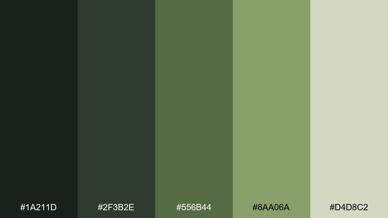
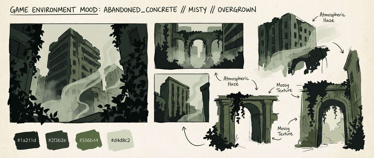
HEX: #1a211d #2f3b2e #556b44 #8aa06a #d4d8c2
Mood: overgrown, tense, hopeful
Best for: game environment concept mood board
Overgrown ivy on abandoned steel gives a tense but hopeful vibe, like nature reclaiming the ruins. An apocalyptic color combination like this reads best when the deep greens stay dominant and the pale lichen tone is used as a soft atmospheric lift. It is ideal for game mood boards, survival titles, and environmental storytelling. Keep accents restrained and let lighting, fog, and texture do the drama.
Image example of nuclear ivy generated using media.io
8) Iron Fog
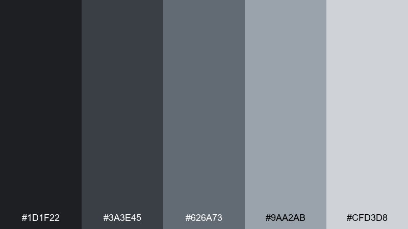
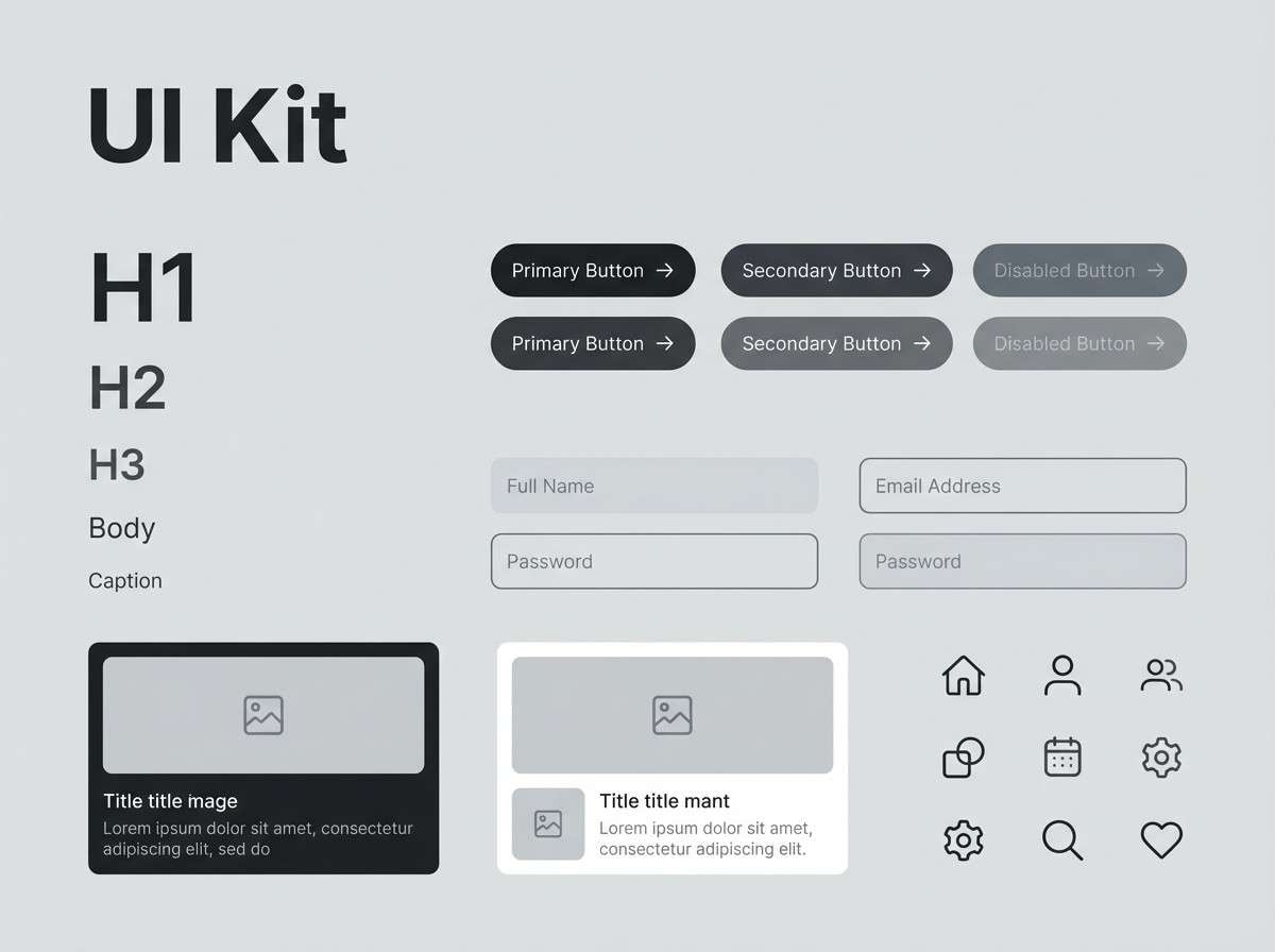
HEX: #1d1f22 #3a3e45 #626a73 #9aa2ab #cfd3d8
Mood: stoic, metallic, modern
Best for: SaaS UI kit and component library
Stoic metal and city fog create a sleek, modern neutral range with plenty of depth. Use the darkest graphite for navigation and modal overlays, and let the mid-grays handle borders and disabled states. It is excellent for UI kits, enterprise products, and documentation sites where consistency wins. Add a single brand accent color later and keep your grayscale ramp intact for accessibility.
Image example of iron fog generated using media.io
9) Ember Siren
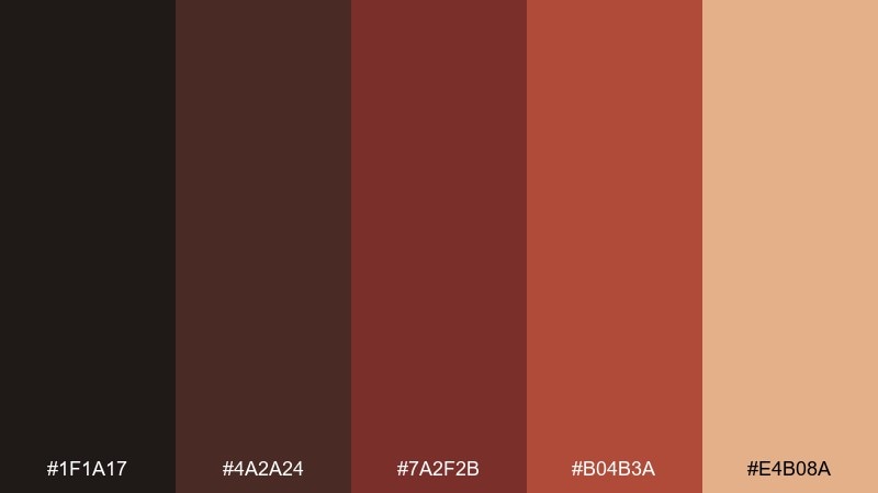
HEX: #1f1a17 #4a2a24 #7a2f2b #b04b3a #e4b08a
Mood: urgent, fiery, dramatic
Best for: event poster for a dark synth concert
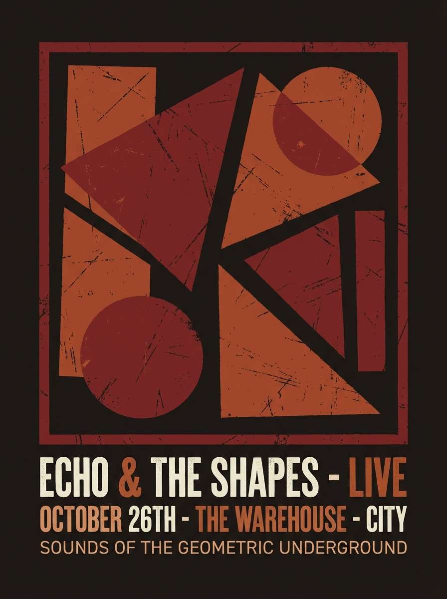
Urgent ember reds and smoky browns feel like warning lights cutting through haze. Use the near-black for big type and negative space, then push the warm coral for focal elements and ticket details. It is ideal for posters, concert flyers, and high-contrast social creatives. Tip: keep gradients subtle and let one flat red-orange block carry the main call to action.
Image example of ember siren generated using media.io
10) Dried Bloodstone
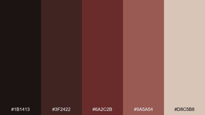
HEX: #1b1413 #3f2422 #6a2c2b #9a5a54 #d8c5b8
Mood: grim, antique, intense
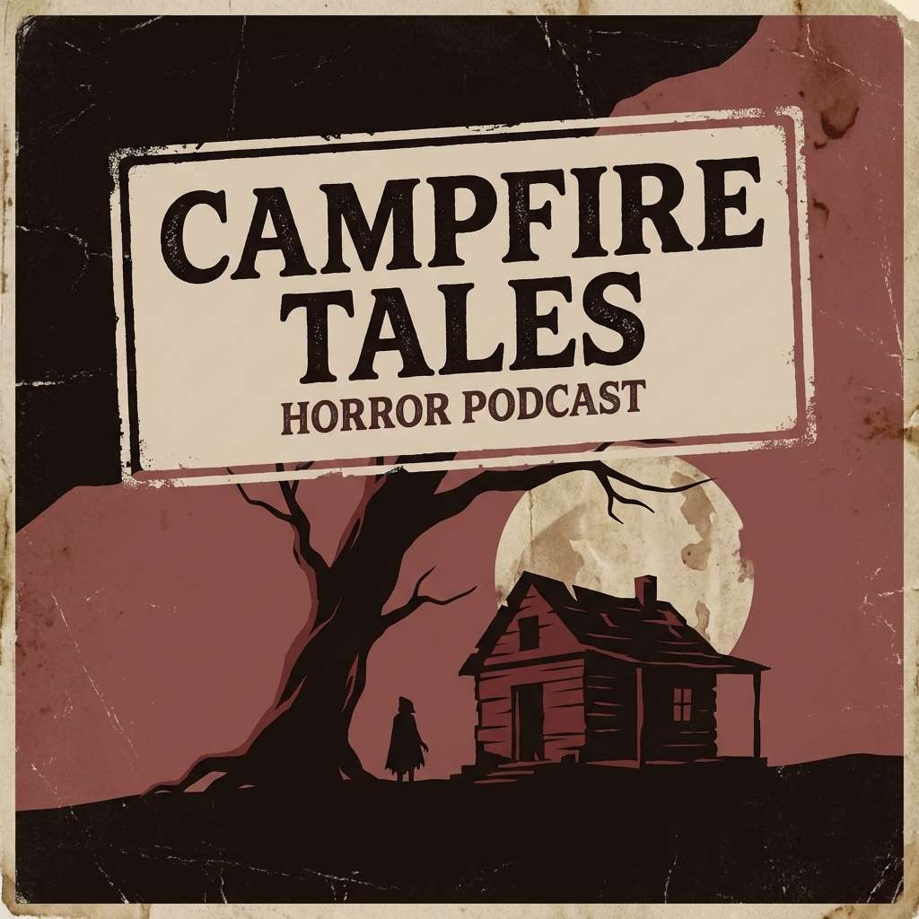
Best for: podcast cover art for horror storytelling
Grim burgundy and dried clay tones read like antique leather and old brick. The palette holds up well at small sizes, making it great for podcast covers and thumbnail-first designs. Pair the darkest shade with bold serif type, then use the pale blush-tan for a clean title plate. Keep contrast high and avoid adding bright primaries that would break the period mood.
Image example of dried bloodstone generated using media.io
11) Acid Rain
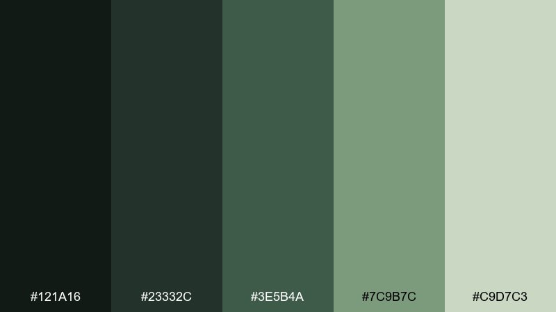
HEX: #121a16 #23332c #3e5b4a #7c9b7c #c9d7c3
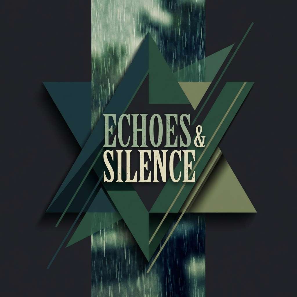
Mood: toxic, rainy, atmospheric
Best for: music album artwork with moody typography
Toxic greens washed in rain create an atmospheric, uneasy calm. Use the deep teal-black for the background and bring in the mossy mid-tones for type and overlays. It fits album artwork, moody posters, and experimental brands that want a hint of danger without neon. Add the pale mint as fog or glow, and keep everything else matte to sell the wet-weather vibe.
Image example of acid rain generated using media.io
12) Concrete Horizon
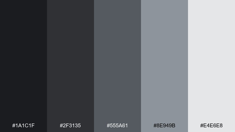
HEX: #1a1c1f #2f3135 #555a61 #8e949b #e4e6e8
Mood: bleak, structured, editorial
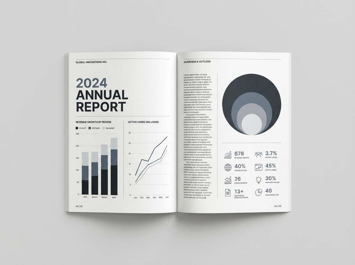
Best for: annual report and data visualization
Bleak concrete and clean structure make everything feel controlled and serious. For an apocalyptic color scheme that still reads professional, lean on the mid-grays for charts and reserve near-black for key takeaways. It works beautifully in annual reports, infographics, and investor decks. Use the lightest gray as breathing room and keep grid lines subtle to avoid visual noise.
Image example of concrete horizon generated using media.io
13) Charred Cedar
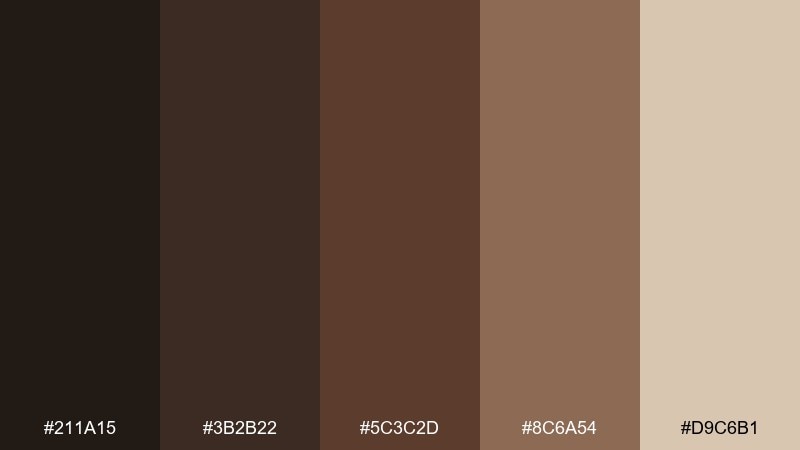
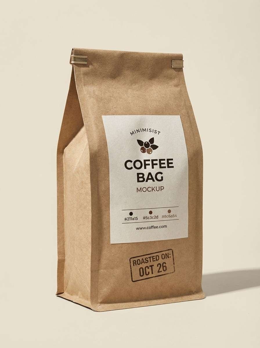
HEX: #211a15 #3b2b22 #5c3c2d #8c6a54 #d9c6b1
Mood: earthy, burnt, handcrafted
Best for: coffee bag packaging and label system
Earthy char and cedarwood browns feel handcrafted, like fire-kissed timber and roasted beans. Use the darkest shade for your logo mark and the warm mid-browns for pattern work and icons. It is a natural fit for coffee packaging, small-batch goods, and rustic branding. Tip: print on uncoated stock and let the light beige act as a quiet negative space panel.
Image example of charred cedar generated using media.io
14) Dusty Relic
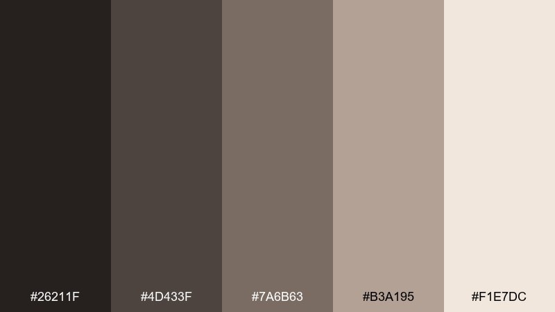
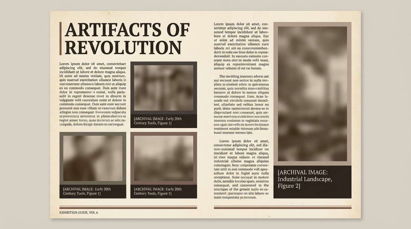
HEX: #26211f #4d433f #7a6b63 #b3a195 #f1e7dc
Mood: vintage, dusty, calm
Best for: museum-style editorial spread
Vintage dust and worn paper create a calm, archival atmosphere. Use the warm gray-browns for body text and captions, then let the pale paper tone dominate the page. It is great for editorial spreads, lookbooks, and documentation designs that need warmth without color noise. Add a single dark header bar for structure and keep imagery slightly desaturated to match.
Image example of dusty relic generated using media.io
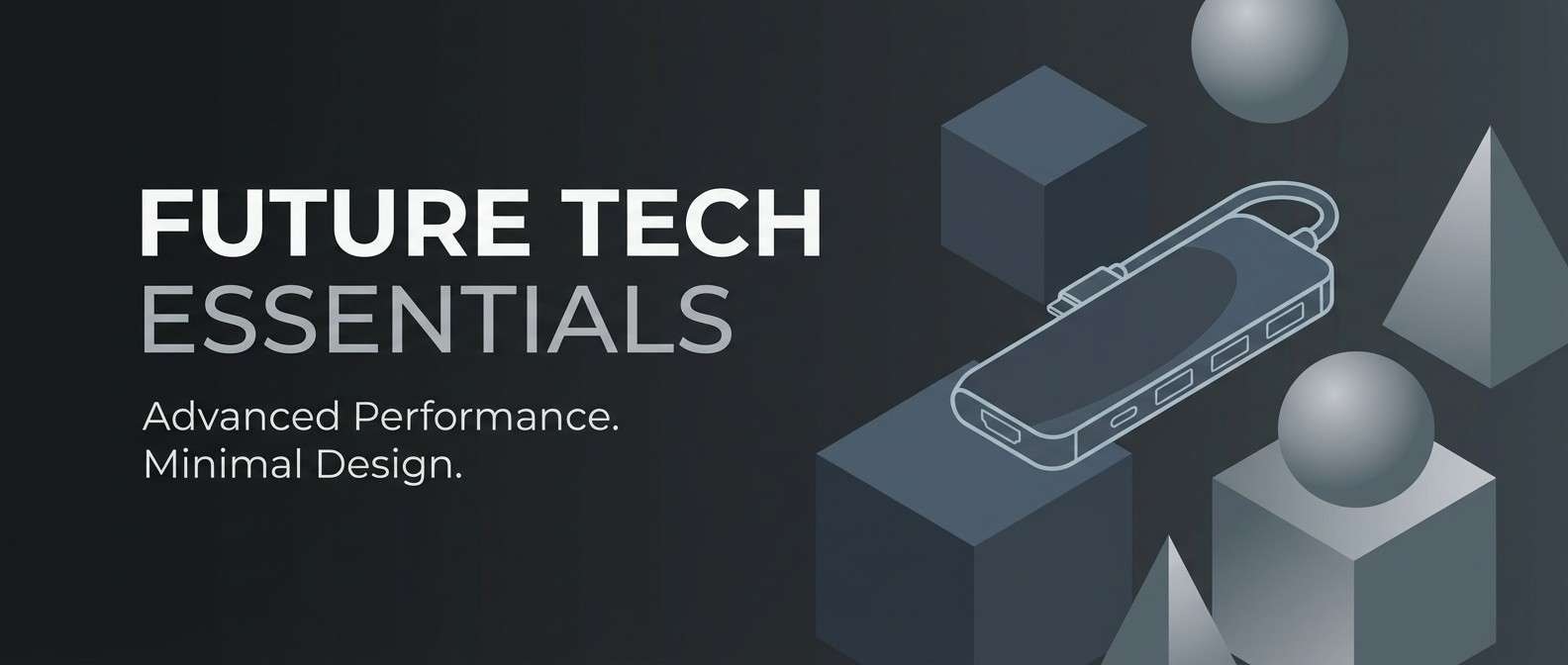
15) Mirage Metal
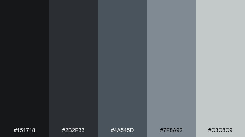
HEX: #151718 #2b2f33 #4a545d #7f8a92 #c3c8c9
Mood: sleek, distant, high-tech
Best for: tech product promo banner
Sleek metal tones with a mirage-like softness feel futuristic and distant. Use the deep blacks for drama, then layer the cool grays to shape depth in minimal graphics. It is ideal for product promo banners, tech decks, and clean motion graphics. Tip: add one subtle diagonal gradient and keep shadows soft to avoid harsh, gamey contrast.
Image example of mirage metal generated using media.io
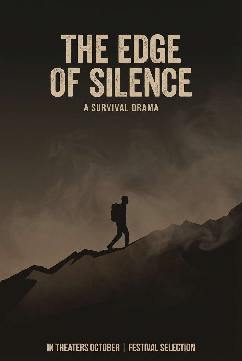
16) Soot Sepia
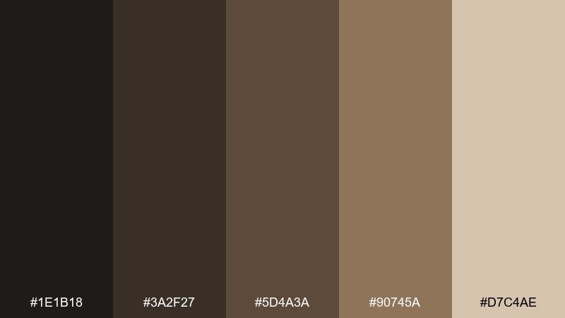
HEX: #1e1b18 #3a2f27 #5d4a3a #90745a #d7c4ae
Mood: nostalgic, smoky, cinematic
Best for: film poster for a survival drama
Nostalgic sepia and soot blacks evoke smoke in late-afternoon light. The darker pair grounds titles and credits, while the warm browns add a human, cinematic warmth. It is perfect for film posters, festival flyers, and dramatic social graphics. Keep the light beige for negative space around key text so the layout stays legible from a distance.
Image example of soot sepia generated using media.io
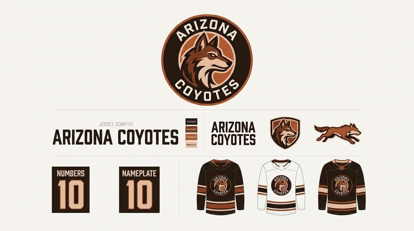
17) Burnt Anthem
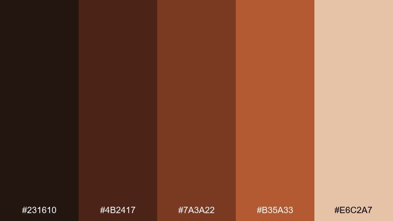
HEX: #231610 #4b2417 #7a3a22 #b35a33 #e6c2a7
Mood: bold, scorched, energetic
Best for: sports team rebrand concept
Bold burnt oranges and deep ember browns feel energetic, like heat shimmering off asphalt. Use the darkest tone for wordmarks and outlines, then push the orange-brown as a confident secondary color. It works for sports rebrand concepts, merch graphics, and punchy headers. Tip: keep the pale peach as a highlight only, so your main marks stay tough and high-contrast.
Image example of burnt anthem generated using media.io
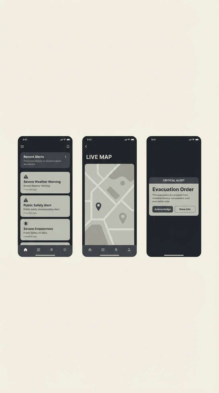
18) Pale Radio
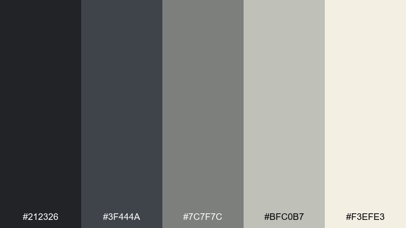
HEX: #212326 #3f444a #7c7f7c #bfc0b7 #f3efe3
Mood: static, faded, minimalist
Best for: minimal UI for a crisis alert app
Faded static and pale signal noise create a minimalist, uneasy calm. This apocalyptic color palette is strong for alert-driven UI because the grayscale range supports clear hierarchy without visual fatigue. Use the darkest charcoal for primary actions, and reserve the off-white for content areas and readable forms. Tip: introduce emphasis with weight and spacing first, then add color badges only where truly needed.
Image example of pale radio generated using media.io
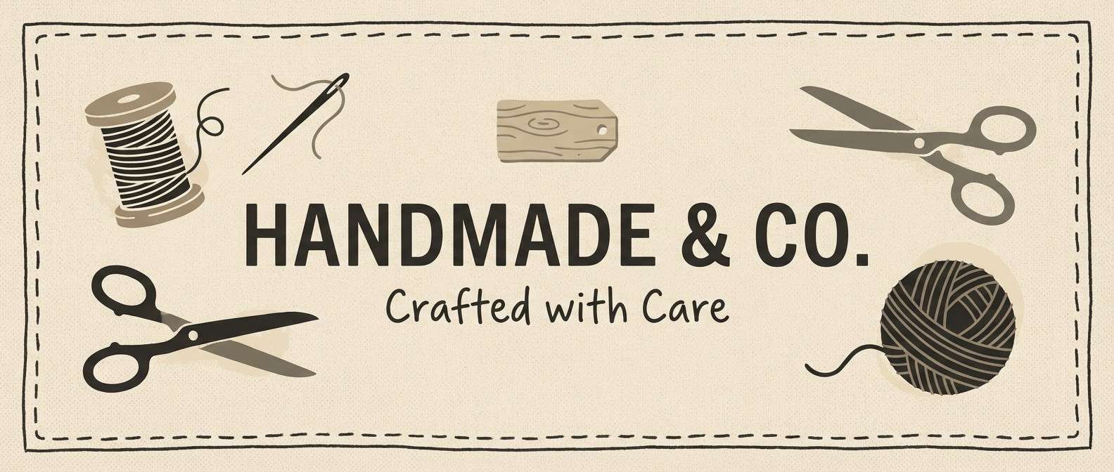
19) Scavenger Canvas
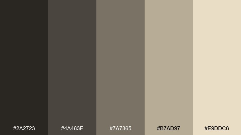
HEX: #2a2723 #4a463f #7a7365 #b7ad97 #e9ddc6
Mood: resourceful, neutral, textured
Best for: handmade goods Etsy shop banner
Resourceful neutrals and canvas-like warmth feel practical, like patched fabric and scavenged tools. Use the darker browns for navigation and badge shapes, then let the lighter tans carry your background and product highlights. It is a great fit for handmade goods, small storefronts, and simple brand banners. Tip: add texture via paper grain and stitching motifs instead of extra colors.
Image example of scavenger canvas generated using media.io
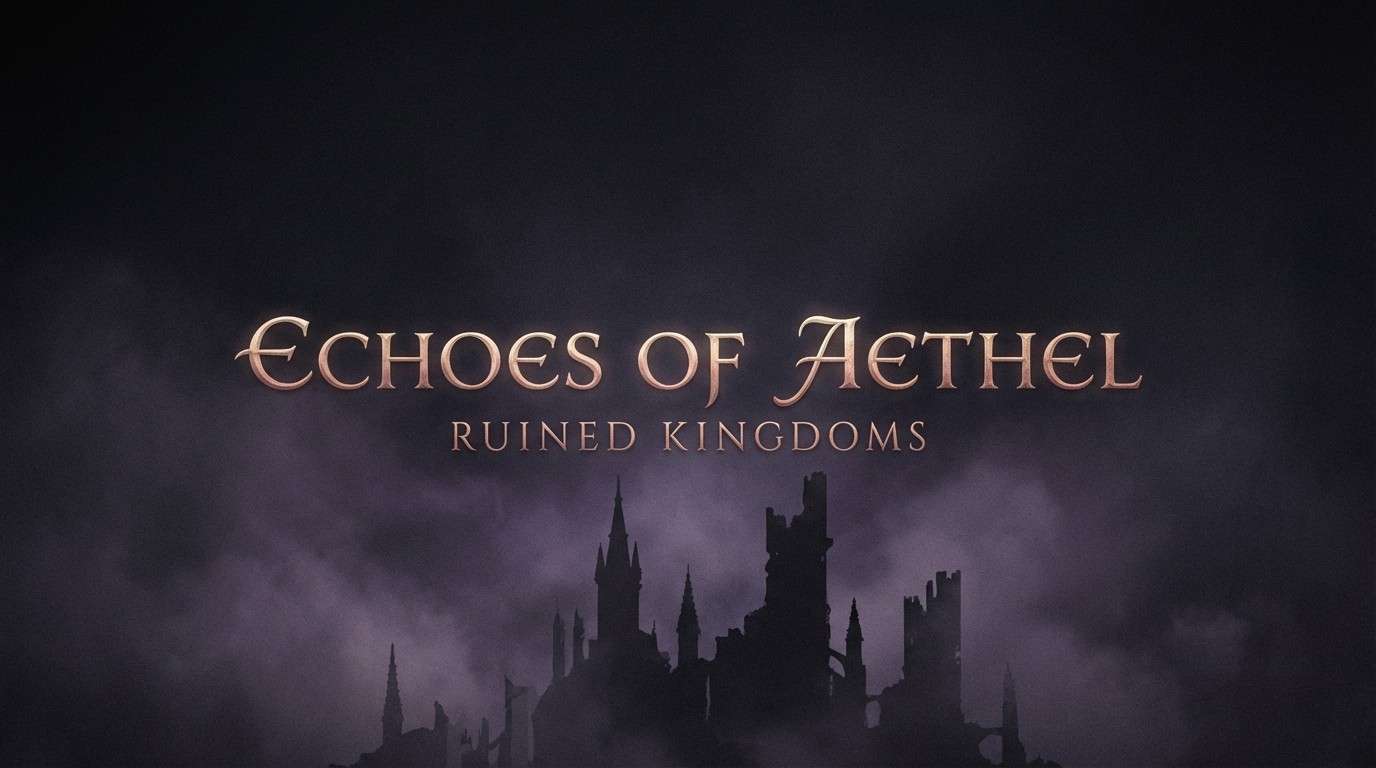
20) Twilight Ruins
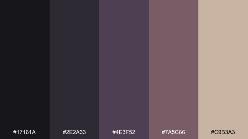
HEX: #17161a #2e2a33 #4e3f52 #7a5c66 #c9b3a3
Mood: mysterious, dusky, poetic
Best for: fantasy game title screen concept
Dusky purples and ruined twilight shadows feel mysterious and poetic, like a city fading into night. These apocalyptic color combinations work best with a strong dark base and one muted mauve highlight for logos or menu focus states. It is ideal for title screens, key art comps, and atmospheric branding. Tip: keep the lightest tone as a soft bloom around text so the scene stays moody, not pastel.
Image example of twilight ruins generated using media.io
What Colors Go Well with Apocalyptic?
Apocalyptic schemes pair best with other desaturated families: warm grays, concrete whites, soot blacks, and dusty browns. These keep the world feeling believable and prevent the design from turning “comic book neon.”
For contrast, use controlled accents like rust orange, ember red, or oxidized green. Even a small amount can create strong focal points for buttons, badges, or poster titles.
If you need a cleaner finish, add one modern neutral (soft off-white or cool light gray) to open up space. That single “breathing room” color can make gritty palettes feel premium and readable.
How to Use a Apocalyptic Color Palette in Real Designs
Start with a dark base and build a clear grayscale ladder for typography, dividers, and surfaces. This keeps hierarchy stable and makes your palette feel intentional instead of muddy.
Lean on texture rather than extra colors: grain, dust overlays, paper fibers, and subtle gradients sell the post-apocalyptic vibe. Use your lightest tone for legibility panels behind text, especially on posters and thumbnails.
Reserve your “hazard” accent (rust, ember, moss) for one job: calls to action, key stats, or the main headline. Consistent accent rules make even gritty designs feel polished.
Create Apocalyptic Palette Visuals with AI
If you want to preview how these apocalyptic colors look in posters, UI mockups, packaging, or concept boards, generate quick visuals first. Seeing the palette applied will help you pick the right contrast and texture level.
Reuse the prompts above as templates: swap the subject (poster, dashboard, book cover) while keeping the same HEX-dominant language. This keeps results consistent across a whole brand system.
With Media.io, you can turn a palette idea into on-brand imagery in minutes, then iterate quickly until the mood is exactly right.
Apocalyptic Color Palette FAQs
-
What is an apocalyptic color palette?
An apocalyptic color palette is a set of mostly desaturated, weathered tones—ash grays, soot blacks, rust browns, dusty tans, and muted greens/blues—used to create a gritty, post-disaster mood. -
Which apocalyptic colors work best for UI design?
Neutral-forward sets like Iron Fog, Ozone Storm, and Pale Radio work well for UI because they provide a strong grayscale ramp for hierarchy, with space to add one controlled accent for alerts or CTAs. -
How do I keep an apocalyptic palette from looking muddy?
Increase value contrast (light vs. dark), dedicate one light tone to “text panels,” and limit accents to one main hue (like rust or ember). Texture should be subtle so it doesn’t reduce readability. -
What accent color pairs well with ash and charcoal?
Rust orange, ember red-orange, and muted olive are classic accents. Use them sparingly for focal points (buttons, tags, poster titles) so the overall look stays controlled. -
Are apocalyptic palettes good for branding?
Yes—especially for outdoor, industrial, gaming, coffee, or editorial brands. The key is pairing the gritty base with clean typography and a consistent accent rule to keep the identity modern. -
How can I generate apocalyptic-themed visuals from these HEX codes?
Use AI prompts that mention dominant HEX tones, plus material cues like concrete, rusted metal, smoke, grain, and fog. This helps the generator prioritize your palette and produce consistent mood. -
What’s the best background color for apocalyptic posters and thumbnails?
Near-black or deep charcoal backgrounds usually deliver the strongest drama and legibility. Add a light beige/gray strip or panel behind small text to keep details readable at a distance.


