

Boho wedding colors are all about warmth, texture, and an effortless balance of earthy neutrals with sunset-inspired accents. The result feels relaxed and romantic—perfect for modern couples who still love natural, grounded styling.
Below are boho wedding color palette ideas with HEX codes, plus practical ways to apply each set to invitations, florals, outfits, signage, and brand-like wedding details.
In this article
- Why Boho Wedding Palettes Work So Well
-
- desert pampas
- terracotta dusk
- sage and sand
- sunbaked clay
- canyon rose
- amber macrame
- olive grove
- copper sunset
- mocha lace
- blush adobe
- golden wheat
- sepia silk
- driftwood neutral
- clay and cream
- rustic orchid
- tawny linen
- burnt honey
- earthy eucalyptus
- vintage spice
- saffron meadow
- ochre nomad
- desert berry smoke
- What Colors Go Well with Boho Wedding?
- How to Use a Boho Wedding Color Palette in Real Designs
- Create Boho Wedding Palette Visuals with AI
Why Boho Wedding Palettes Work So Well
Boho wedding palettes are naturally photogenic because they lean on warm neutrals, sunbaked earth tones, and softened botanicals. These hues flatter skin tones, work across seasons, and feel timeless instead of trendy.
They also pair beautifully with tactile materials—linen, handmade paper, rattan, clay ceramics, macramé, and dried florals—so your decor looks layered and intentional even with minimal styling.
Most importantly, boho wedding colors are easy to scale: you can keep everything airy with creams and sands, or add mood and depth with espresso browns, olive greens, and berry-rose accents.
20+ Boho Wedding Color Palette Ideas (with HEX Codes)
1) Desert Pampas
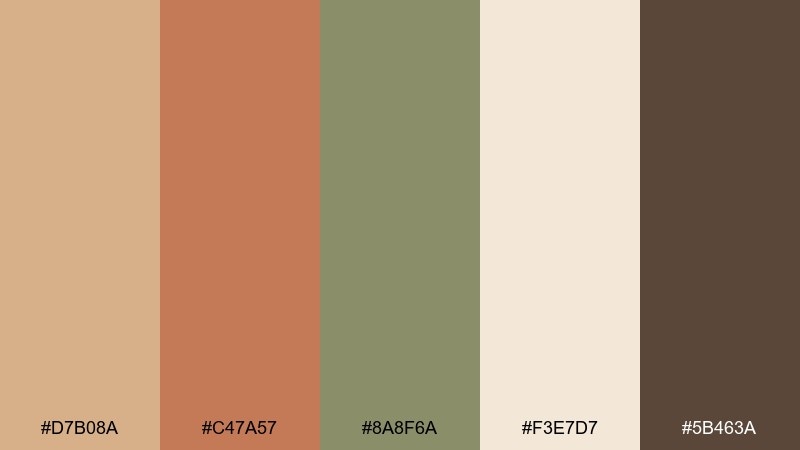
HEX: #D7B08A #C47A57 #8A8F6A #F3E7D7 #5B463A
Mood: sun-warmed, airy, organic
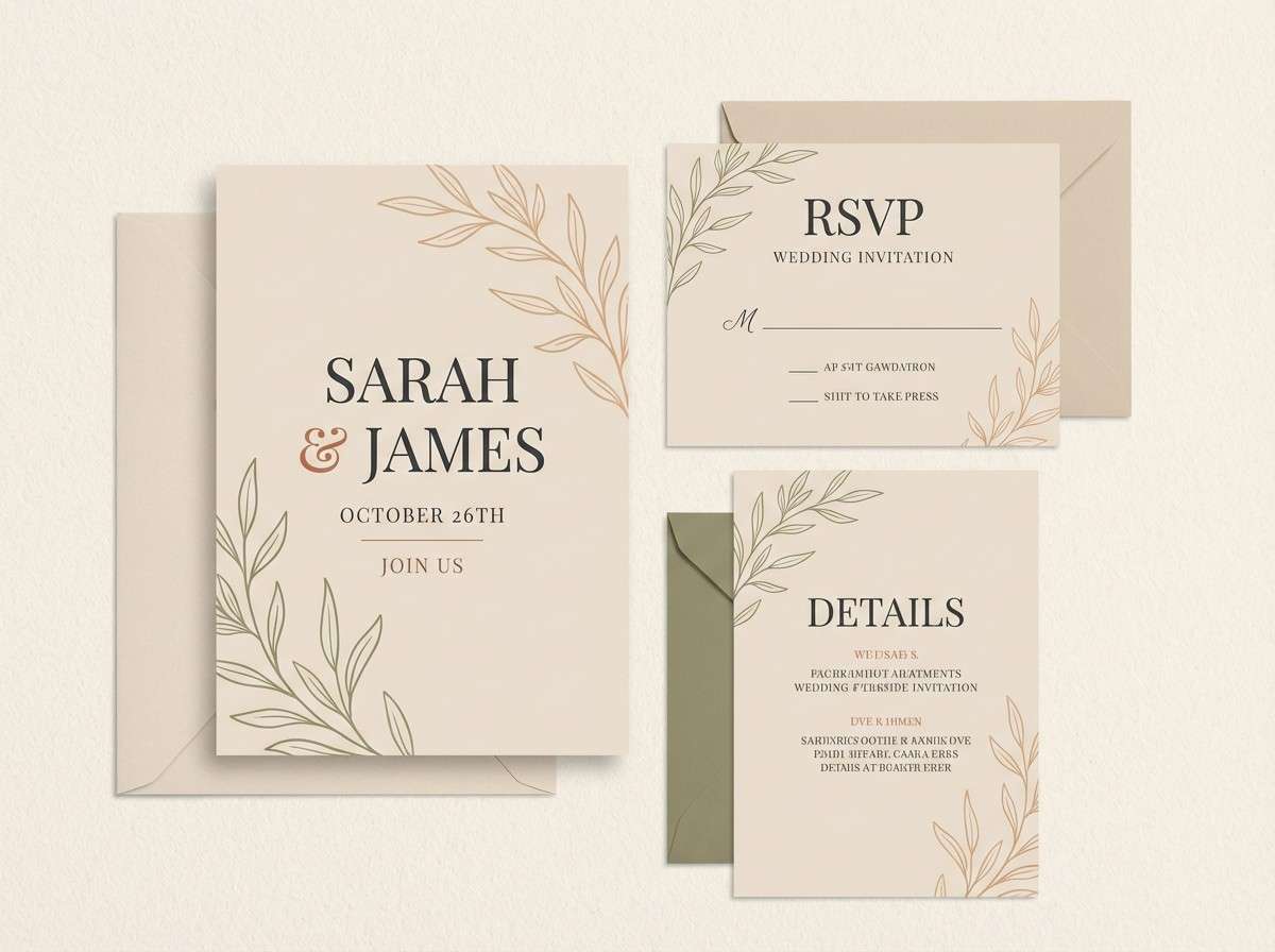
Best for: wedding invitation suite design on a plain background
Sun-warmed and airy, this mix feels like pampas grass swaying at golden hour with a soft desert haze. Use the cream and sand tones as your paper base, then bring in terracotta for headings and seals. Sage works beautifully for delicate line art or monograms, while the deep brown anchors readability. Tip: keep the darkest tone for small type and RSVP details so the whole set stays light but legible.
Image example of desert pampas generated using media.io
Media.io is an online AI studio for creating and editing video, image, and audio in your browser.

2) Terracotta Dusk
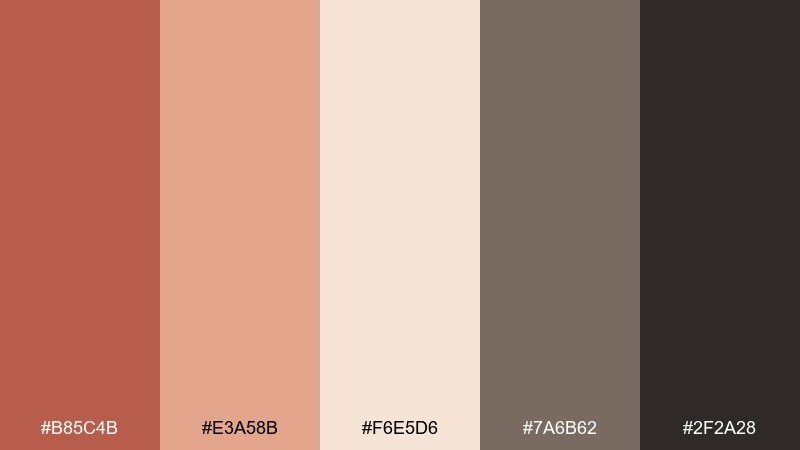
HEX: #B85C4B #E3A58B #F6E5D6 #7A6B62 #2F2A28
Mood: romantic, grounded, candlelit
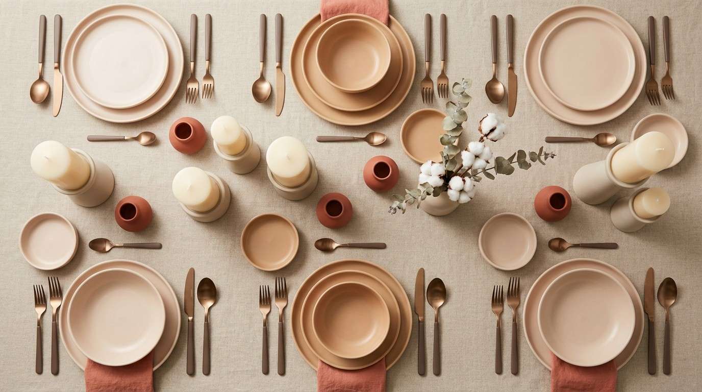
Best for: reception table setting with linens and candles
Romantic and grounded, these tones evoke clay pottery, blush skies, and candlelit warmth. Let the creamy shade lead for linens, menus, and plates, then layer terracotta and peach through napkins and florals. Add the smoky taupe for taper candles or signage, and reserve near-black for place cards to keep contrast crisp. Tip: repeat terracotta in at least three touchpoints so the table looks intentional rather than accidental.
Image example of terracotta dusk generated using media.io
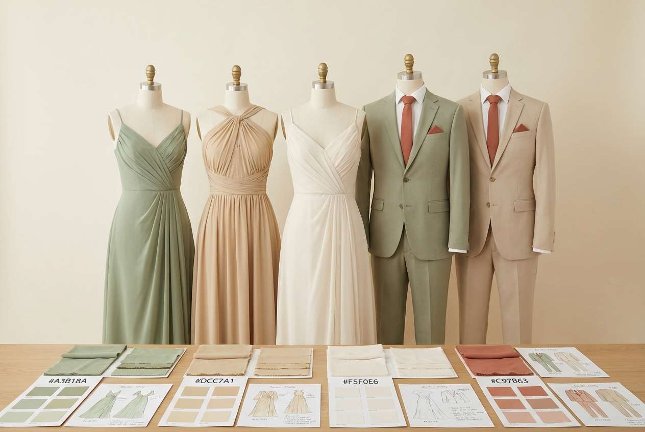
3) Sage and Sand
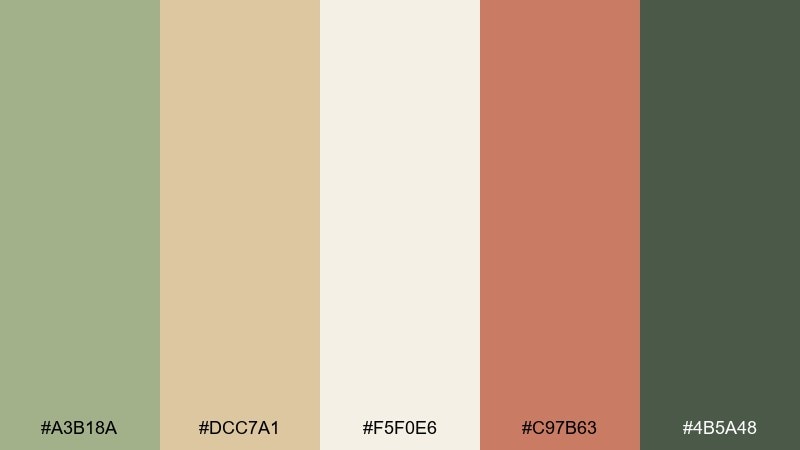
HEX: #A3B18A #DCC7A1 #F5F0E6 #C97B63 #4B5A48
Mood: fresh, calm, botanical
Best for: bridesmaid and groomsmen outfit coordination
Fresh and calm, this pairing brings to mind eucalyptus bundles, sandy pathways, and soft morning light. Put sage at the center for dresses or ties, then keep sand and cream as the grounding neutrals. A touch of muted terracotta adds warmth in boutonnieres, shoes, or hair accessories. Tip: choose one fabric finish (matte linen or crepe) across the party to keep the palette cohesive.
Image example of sage and sand generated using media.io
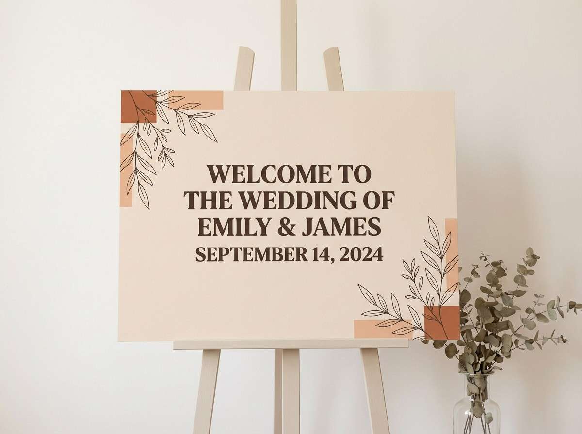
4) Sunbaked Clay
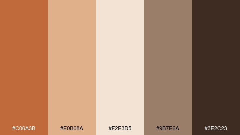
HEX: #C06A3B #E0B08A #F2E3D5 #9B7E6A #3E2C23
Mood: rustic, warm, artisanal
Best for: wedding signage and welcome board
Rustic and artisanal, these hues feel like sunbaked adobe walls and handmade ceramics. Use the pale neutral as the board background, then set type in the deep cocoa for strong distance readability. Bring in clay and tan for border details, icons, or painted brush strokes. Tip: if you are hand-lettering, test the darkest ink against the lightest background to avoid a washed-out look in photos.
Image example of sunbaked clay generated using media.io
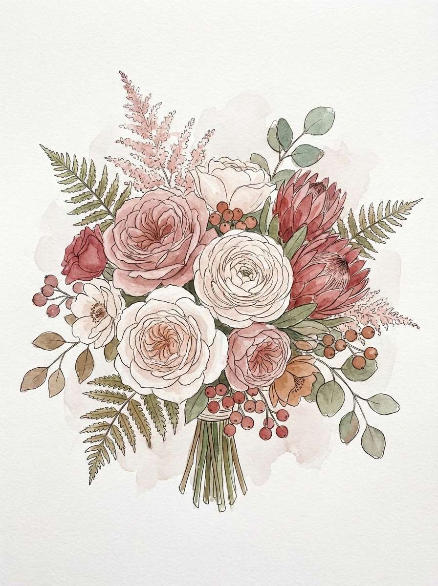
5) Canyon Rose
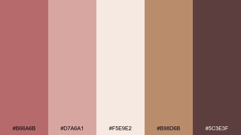
HEX: #B66A6B #D7A6A1 #F5E9E2 #B98D6B #5C3E3F
Mood: soft, vintage, sunset-romantic
Best for: bridal bouquet and floral styling
Soft and vintage, it reads like dusty roses against canyon stone at sunset. Let blush and cream dominate the blooms, then weave in warm tan through dried grasses or ribbon. The deeper rose-brown works best in small bursts, like ranunculus centers or wax seals, so it does not overpower the florals. Tip: add one texture element (pampas, bunny tails, or seed pods) to make the colors feel more bohemian and dimensional.
Image example of canyon rose generated using media.io
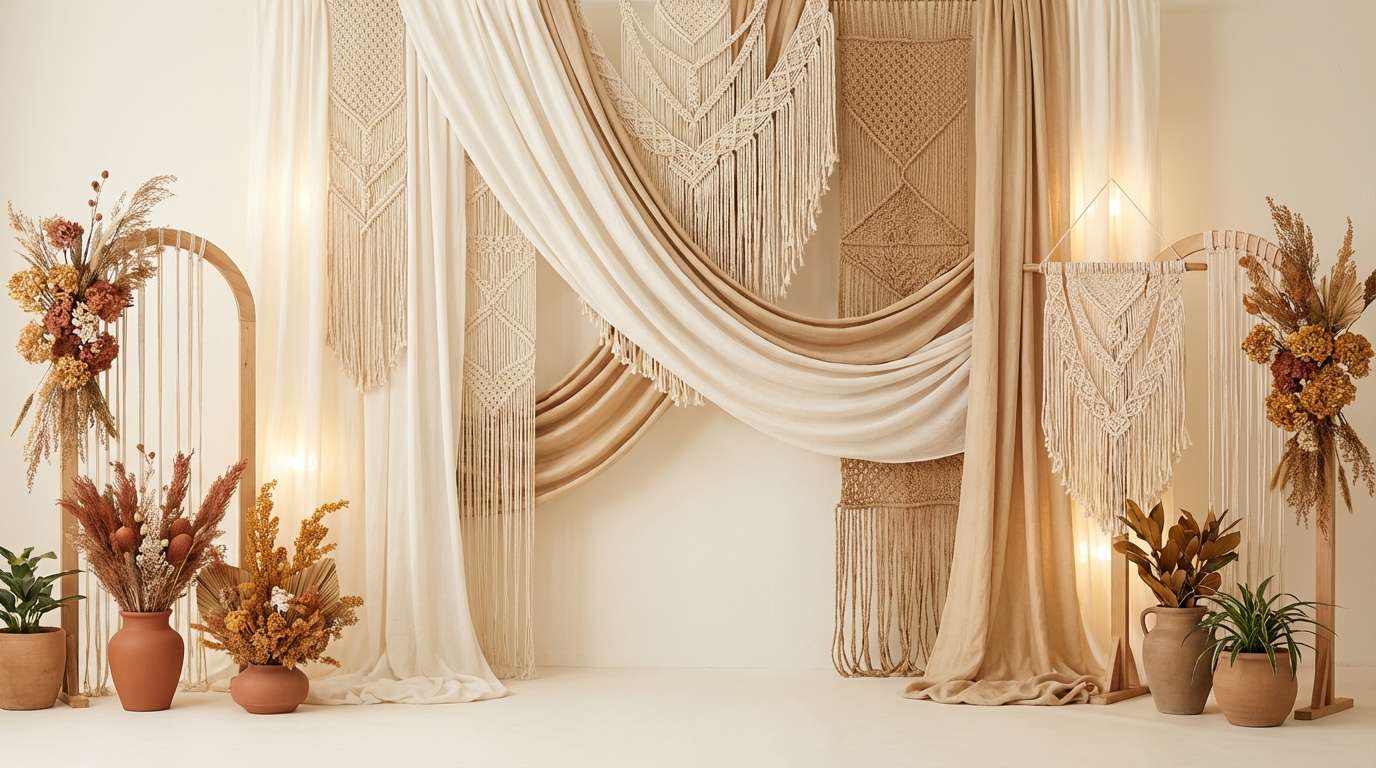
6) Amber Macrame
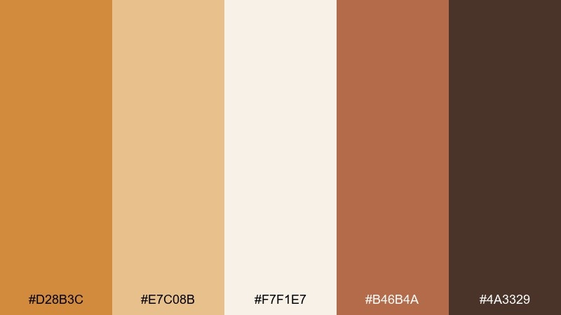
HEX: #D28B3C #E7C08B #F7F1E7 #B46B4A #4A3329
Mood: golden, cozy, handcrafted
Best for: boho ceremony backdrop with textiles
Golden and cozy, it evokes macrame knots, woven baskets, and late-afternoon light. Keep the creamy tone as the textile base, then build warmth with amber and caramel in layered fabrics. Use the deeper brown as a grounding frame color for arches or poles to prevent the look from becoming too pale. Tip: mix two textile patterns at most, and let color do the rest of the styling work.
Image example of amber macrame generated using media.io
7) Olive Grove
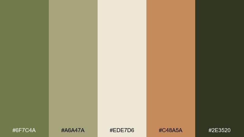
HEX: #6F7C4A #A6A47A #EDE7D6 #C48A5A #2E3520
Mood: earthy, Mediterranean, natural
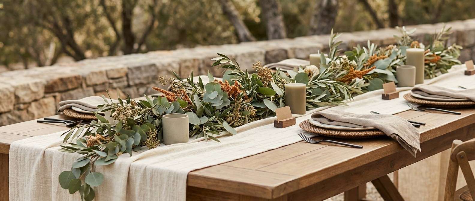
Best for: rustic outdoor reception decor
Earthy and Mediterranean, these tones feel like olive branches, stoneware, and sunlit groves. Use the warm cream as the base across table runners and menus, then layer olives through greenery and glass accents. The caramel note plays well with wood chairs and rattan details, while the deep green-black should be saved for small type and contrast edges. Tip: if your venue is already green-heavy, lean more on cream and caramel so photos do not skew too dark.
Image example of olive grove generated using media.io
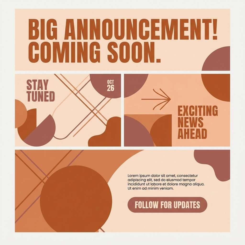
8) Copper Sunset
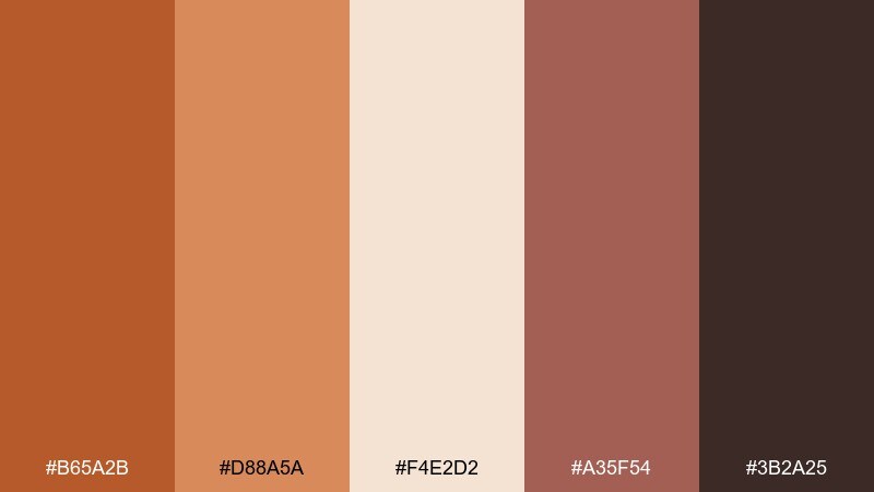
HEX: #B65A2B #D88A5A #F4E2D2 #A35F54 #3B2A25
Mood: dramatic, glowing, desert-sunset
Best for: branded social media announcement template
Dramatic and glowing, it brings copper skies, warm clay, and a hint of smoky rose. Use the pale tone as a breathable background, then build the headline in copper for instant warmth. Add rose-brown sparingly for highlights like dates or callouts, and keep the deepest shade for body text to maintain clarity. Tip: pair this set with a clean serif and a thin sans to balance the intensity of the warm tones.
Image example of copper sunset generated using media.io
9) Mocha Lace
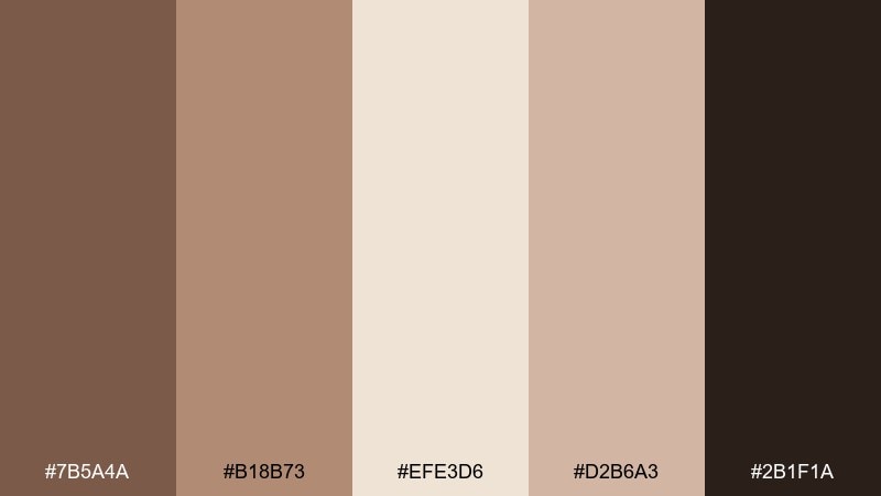
HEX: #7B5A4A #B18B73 #EFE3D6 #D2B6A3 #2B1F1A
Mood: elegant, intimate, vintage-luxe
Best for: menu card and place card typography
Elegant and intimate, these shades feel like lace details, espresso crema, and candle shadows. Use the light beige as paper stock, then set names and menu items in the near-black for crisp contrast. Mocha and warm taupe are perfect for borders, icons, and subtle background patterns without competing with the type. Tip: keep decorative flourishes in the mid-tones so the layout stays readable from across the table.
Image example of mocha lace generated using media.io

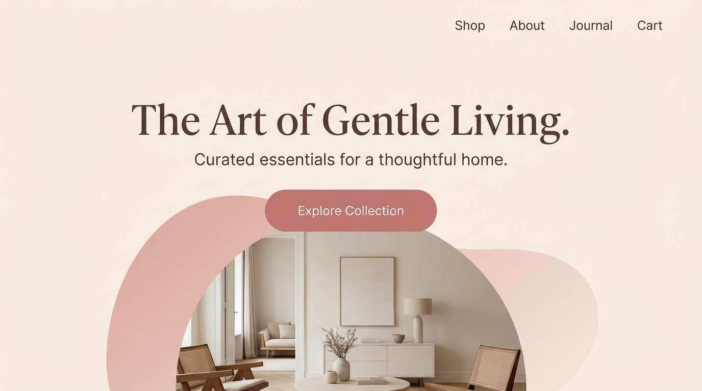
10) Blush Adobe
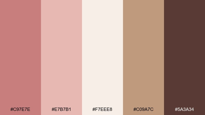
HEX: #C97E7E #E7B7B1 #F7EEE8 #C09A7C #5A3A34
Mood: romantic, sun-faded, softly modern
Best for: wedding website hero section (2D UI mockup)
Romantic and sun-faded, it looks like blush plaster walls with warm sand drifting through open windows. For a clean boho wedding color combination, keep the hero background in the pale blush-cream and use cocoa for headline contrast. Add adobe rose in buttons and links, and use the tan as subtle dividers or icon fills. Tip: make the primary CTA the warm rose so it stands out without feeling loud.
Image example of blush adobe generated using media.io
11) Golden Wheat
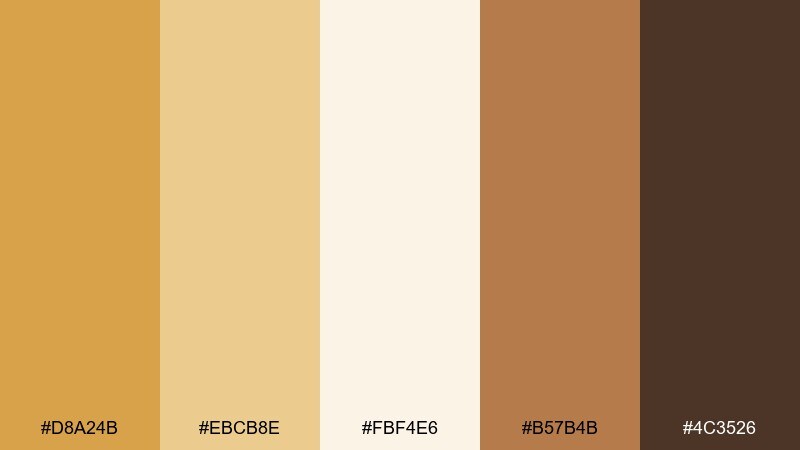
HEX: #D8A24B #EBCB8E #FBF4E6 #B57B4B #4C3526
Mood: cheerful, rustic, sunlit
Best for: dessert table styling and labels
Cheerful and rustic, these tones call up wheat fields, honey drizzle, and sunlit pastries. Use the creamy shade for label backgrounds, then set text in the darkest brown for maximum readability. Golden tones are ideal for dessert accents like ribbons, stands, and small florals, while the caramel helps bridge wood textures. Tip: keep metallics minimal and stick to brushed gold so the warmth stays natural.
Image example of golden wheat generated using media.io
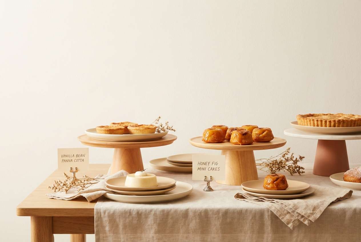
12) Sepia Silk
HEX: #A97758 #D0B19A #F2EAE1 #8C6A5A #2A2321
Mood: timeless, editorial, softly dramatic
Best for: lookbook or magazine-style wedding editorial layout
Timeless and editorial, it feels like sepia film, silk fabric, and softly dramatic shadows. Let the lightest tone carry the page background, then layer tan and warm brown in pull quotes and section dividers. Use the deepest shade for captions and small copy so it reads cleanly in print. Tip: keep imagery warm-toned and avoid cool filters so the palette stays cohesive from cover to spread.
Image example of sepia silk generated using media.io
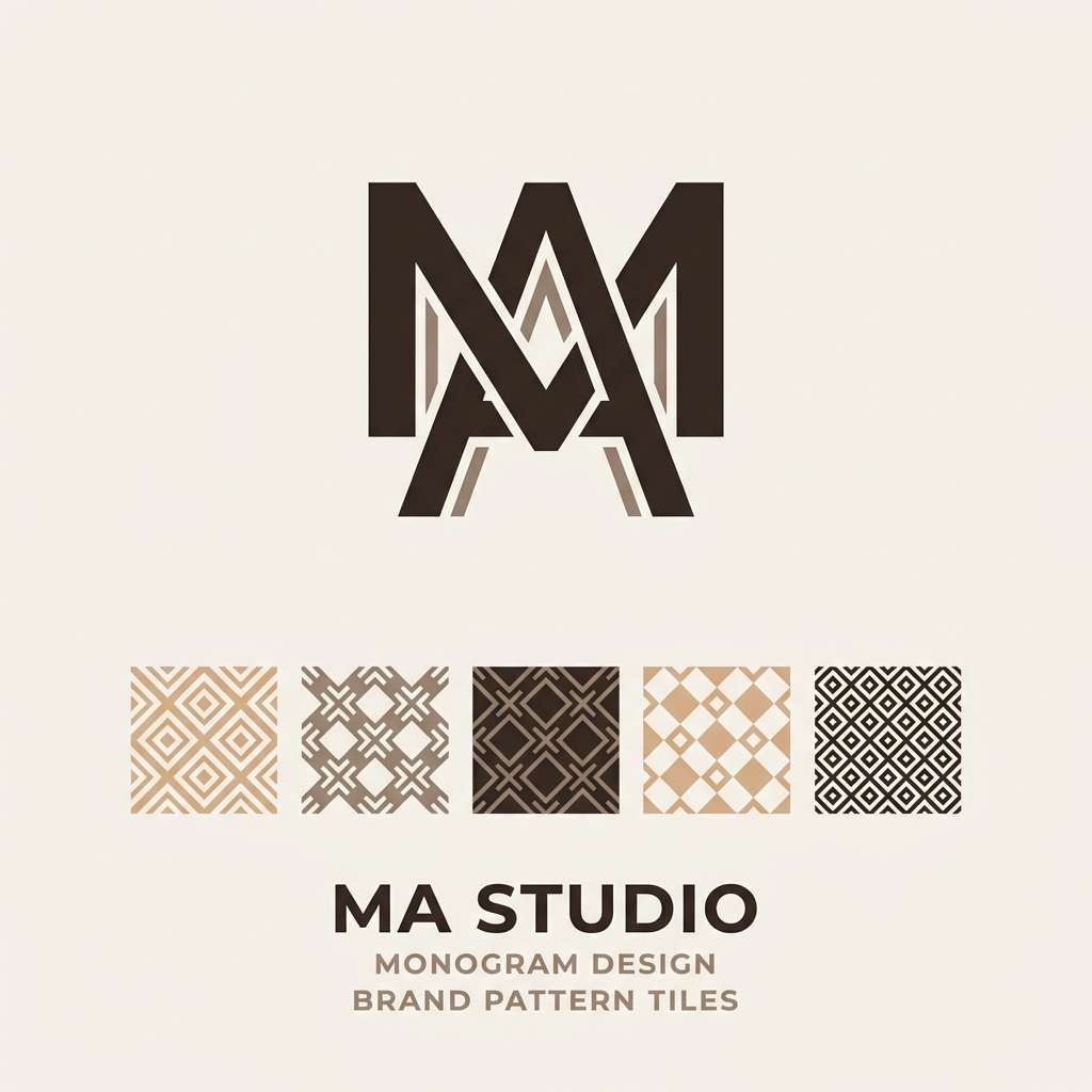
13) Driftwood Neutral
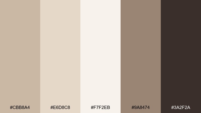
HEX: #CBB8A4 #E6D8C8 #F7F2EB #9A8474 #3A2F2A
Mood: minimal, coastal-earthy, serene
Best for: minimal logo and monogram design
Minimal and serene, these neutrals echo driftwood, sun-bleached shells, and calm morning air. Use the palest shade as negative space, then build the monogram in the deep brown for clean contrast. Mid-tone taupe works well for secondary marks, embossing, or subtle pattern backgrounds. Tip: if printing, test a warm gray ink for the mid-tones so they do not disappear on textured paper.
Image example of driftwood neutral generated using media.io
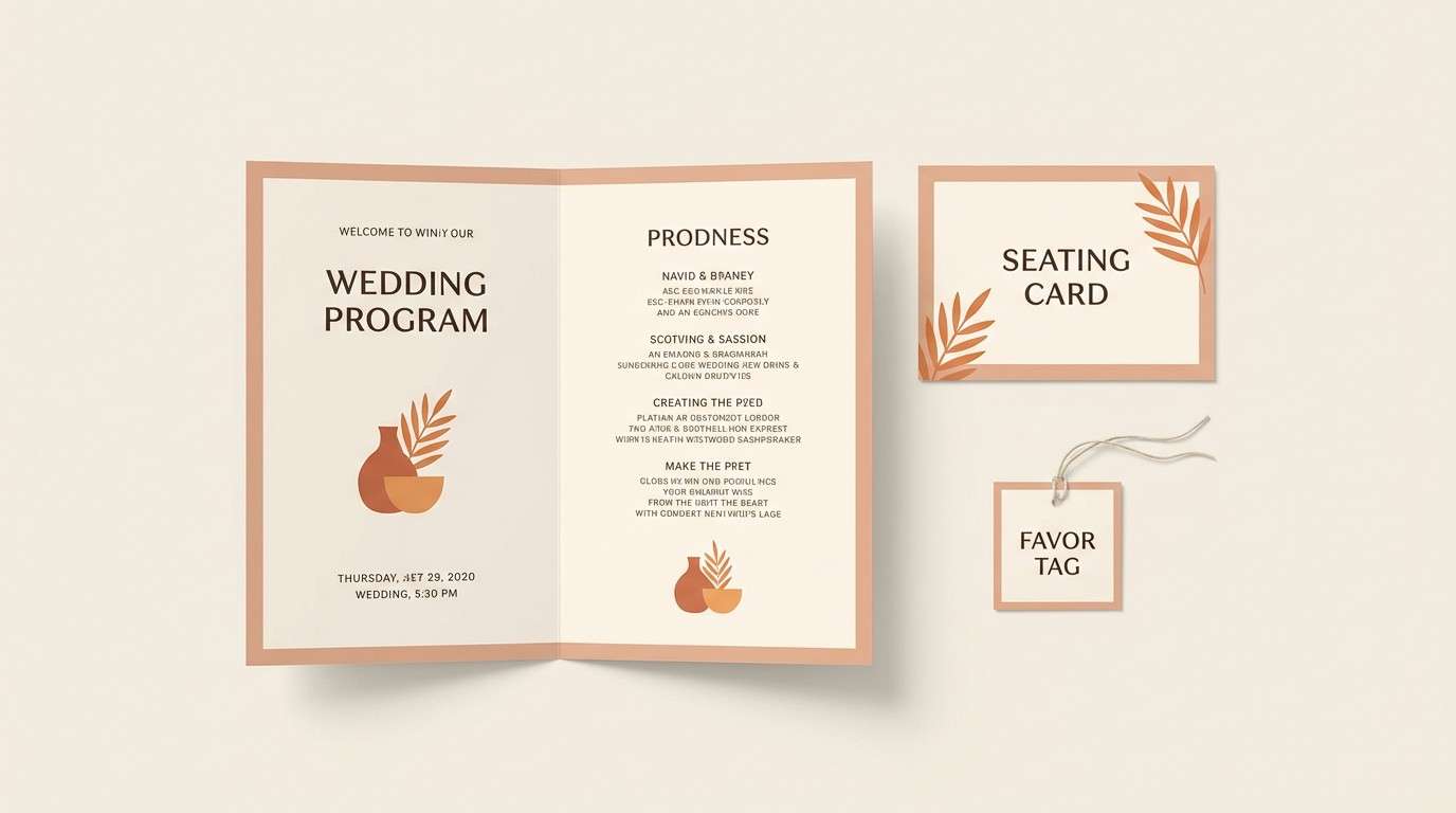
14) Clay and Cream
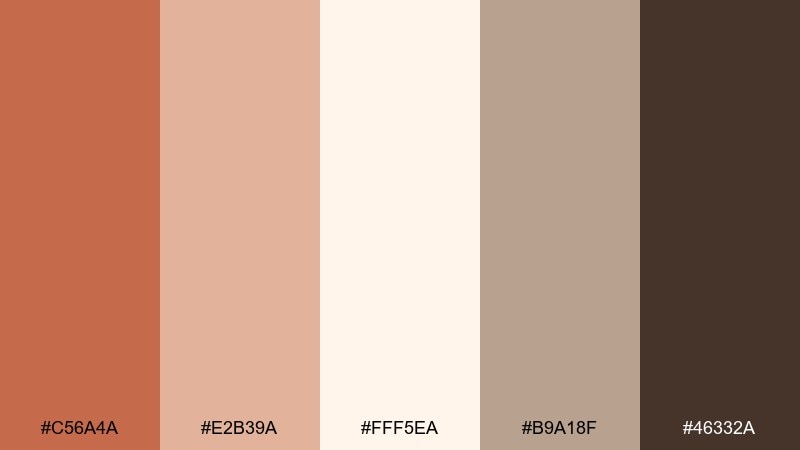
HEX: #C56A4A #E2B39A #FFF5EA #B9A18F #46332A
Mood: soft, welcoming, artisan-modern
Best for: day-of stationery set (programs, seating, tags)
Soft and welcoming, it suggests hand-thrown clay, creamy paper, and a gentle blush of warmth. This boho wedding color palette shines on day-of pieces where you want cohesion across many small formats. Use cream as the primary background, clay for section headers, and the dark brown for names and table numbers. Tip: keep icons and dividers in the light taupe so the set feels refined rather than busy.
Image example of clay and cream generated using media.io
15) Rustic Orchid
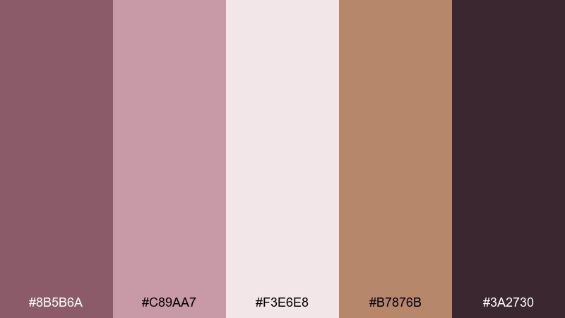
HEX: #8B5B6A #C89AA7 #F3E6E8 #B7876B #3A2730
Mood: moody-floral, romantic, eclectic
Best for: accent florals and ceremony arrangements
Moody-floral and romantic, it feels like dried orchids, antique ribbons, and twilight tones. Use the pale blush as breathing room, then pull the mauve-plum into statement blooms or ribbon tails. The warm tan keeps the palette from turning too cool and pairs nicely with wood and rattan. Tip: repeat the deepest plum in small details, like candle holders or ink, to tie the arrangement together.
Image example of rustic orchid generated using media.io
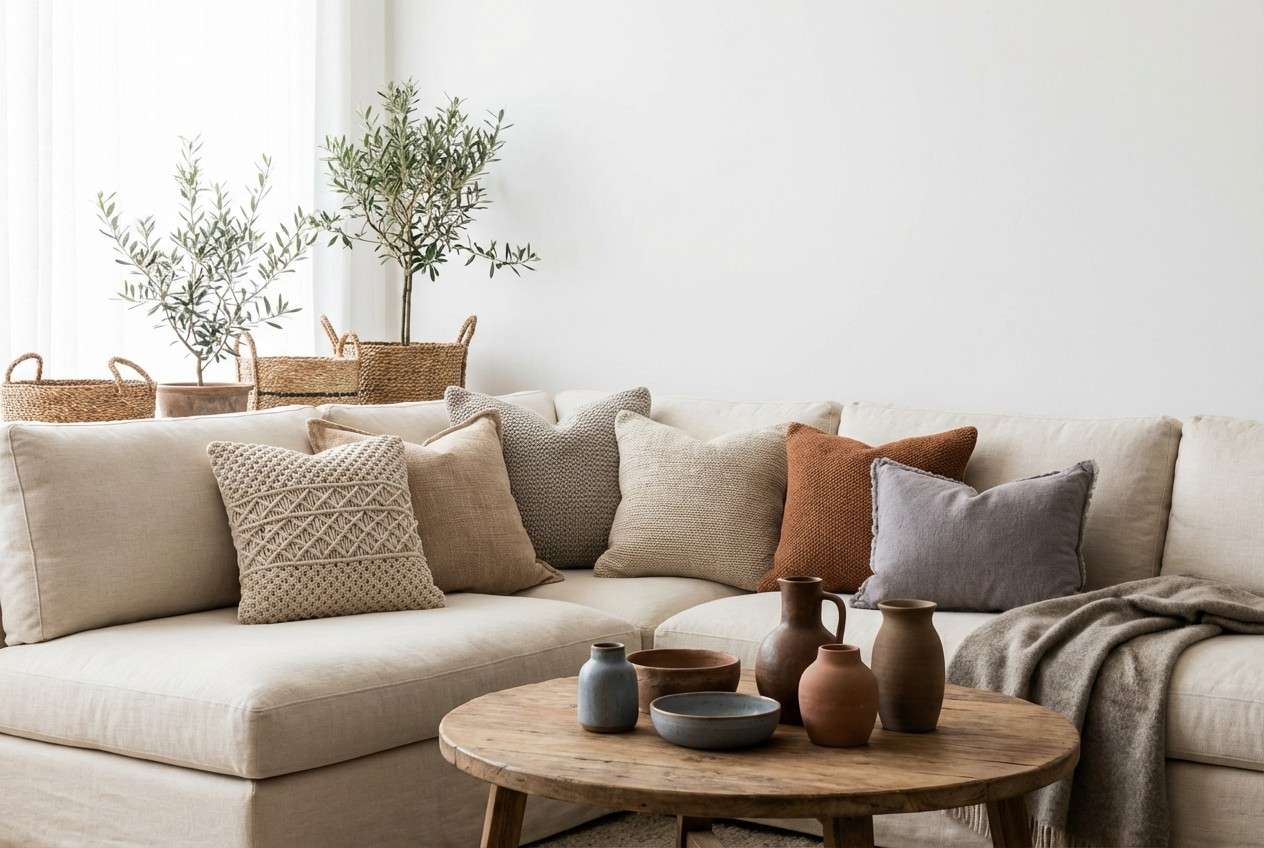
16) Tawny Linen
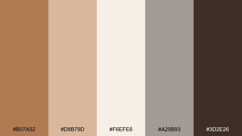
HEX: #B07A52 #D8B79D #F6EFE6 #A29B93 #3D2E26
Mood: natural, relaxed, understated
Best for: linen textures and lounge area decor
Natural and relaxed, these colors look like tawny linen, sun-warmed leather, and soft stone. Let the creamy neutral dominate upholstery and throws, then introduce tawny accents in pillows or poufs. The cool greige is a quiet balancing tone for vases and side tables, while the deep brown frames the space through wood or metal. Tip: use texture contrasts (linen, jute, smooth ceramic) to keep the neutral range interesting in photos.
Image example of tawny linen generated using media.io
17) Burnt Honey
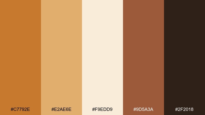
HEX: #C7792E #E2AE6E #F9EDD9 #9D5A3A #2F2018
Mood: spiced, glowing, festive
Best for: candle label or small product tag design
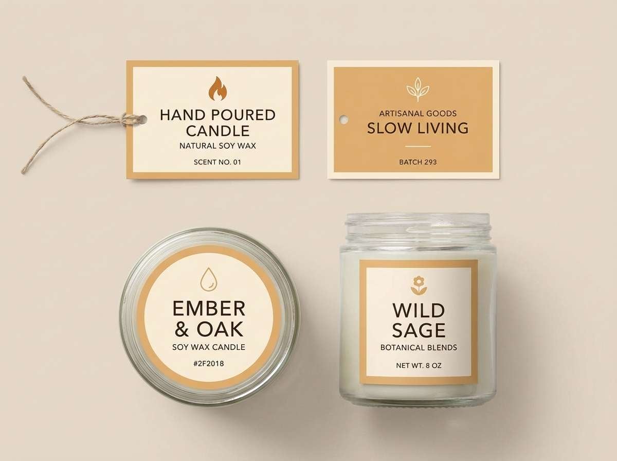
Spiced and glowing, it brings to mind burnt honey, cinnamon, and warm evening light. This set works well for small labels where you need warmth without losing legibility. Use the pale cream as the label base, then print names in the deep espresso and reserve the amber tones for borders or icons. Tip: choose matte paper so the golden shades look rich rather than reflective.
Image example of burnt honey generated using media.io
18) Earthy Eucalyptus
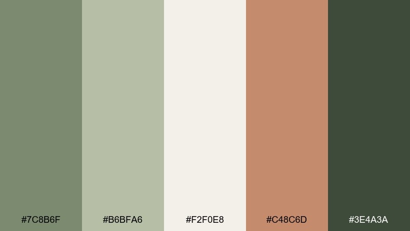
HEX: #7C8B6F #B6BFA6 #F2F0E8 #C48C6D #3E4A3A
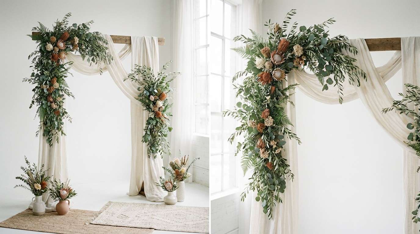
Mood: fresh, grounded, garden-natural
Best for: greenery-heavy wedding arch styling
Fresh yet grounded, these tones feel like eucalyptus leaves, soft fog, and warm clay pots. Keep the pale neutral for fabric drape and floral whites, then let the greens carry the structure of the arch. Add muted terracotta through ribbons or pots to keep the look warm and intentional. Tip: photograph test a small section first, because green-heavy setups can look darker than expected under shade.
Image example of earthy eucalyptus generated using media.io
19) Vintage Spice
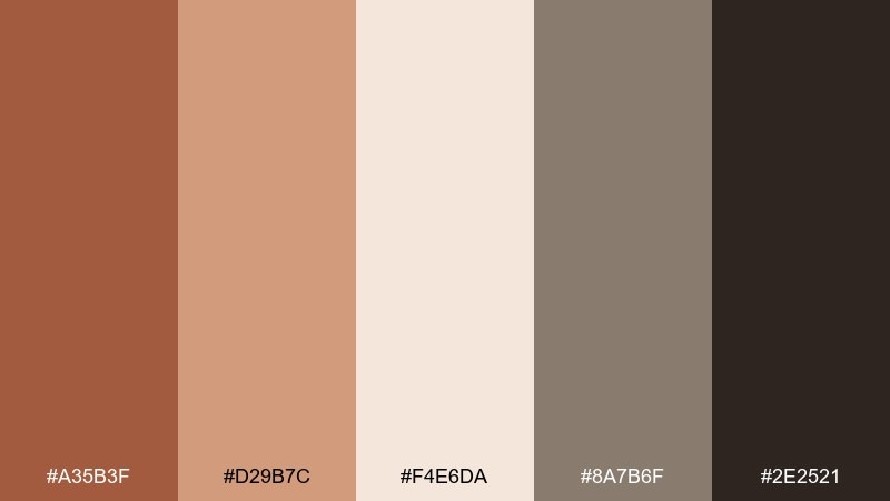
HEX: #A35B3F #D29B7C #F4E6DA #8A7B6F #2E2521
Mood: nostalgic, cozy, heritage-inspired
Best for: thank-you card and envelope styling
Nostalgic and cozy, it recalls vintage spice jars, worn leather, and warm paper. For a refined boho wedding color combination, set the card in creamy stock and print the message in the darkest shade for crisp contrast. Use the cinnamon and tan tones on envelope liners, stamps, or a small illustration to add personality. Tip: keep the greige as a quiet supporting color so the warm accents feel curated rather than heavy.
Image example of vintage spice generated using media.io

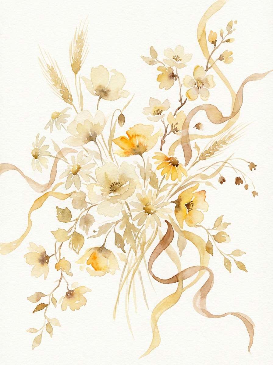
20) Saffron Meadow
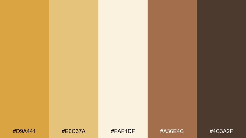
HEX: #D9A441 #E6C37A #FAF1DF #A36E4C #4C3A2F
Mood: bright, joyful, sunlit
Best for: summer wedding floral accents and ribbons
Bright and joyful, it feels like saffron petals scattered across a sunlit meadow. These boho wedding color combinations work best when saffron is used as an accent, not the entire base. Let cream and pale gold lead in the florals, then add saffron through ribbons, small blooms, or table accents for a lively pop. Tip: repeat the darker brown in stationery or signage so the warm yellow reads grounded, not overly sweet.
Image example of saffron meadow generated using media.io
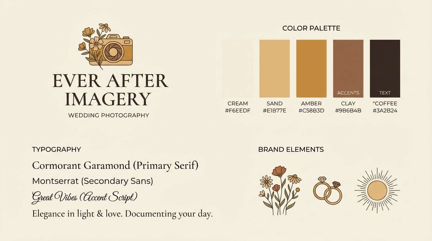
21) Ochre Nomad
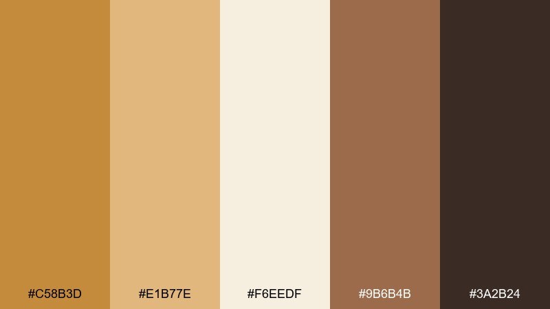
HEX: #C58B3D #E1B77E #F6EEDF #9B6B4B #3A2B24
Mood: nomadic, grounded, sunlit-earth
Best for: brand kit for a wedding photographer (2D layout)
Nomadic and grounded, these tones echo ochre pigments, desert stone, and well-worn leather. Use the light neutral as the canvas, then anchor the brand mark in deep brown for clarity across web and print. Bring ochre into highlights like buttons, badges, and story covers, keeping the mid tan for backgrounds and secondary panels. Tip: limit gradients and lean into solid blocks so the warm tones stay modern.
Image example of ochre nomad generated using media.io
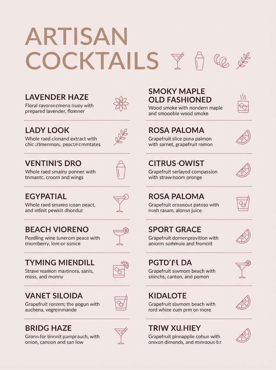
22) Desert Berry Smoke
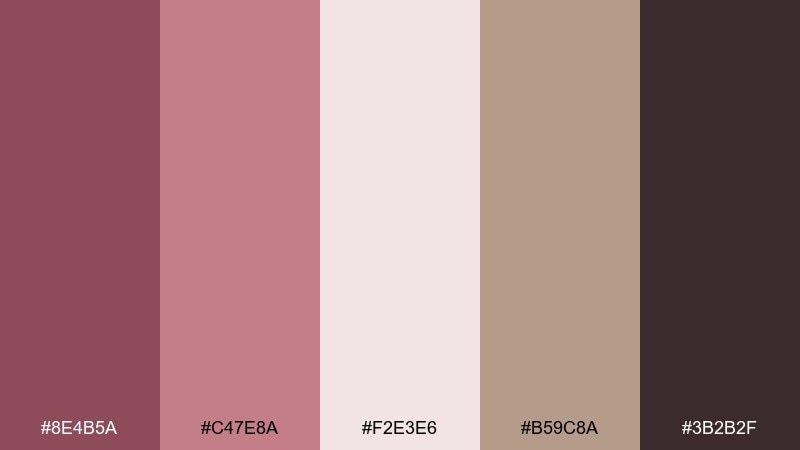
HEX: #8E4B5A #C47E8A #F2E3E6 #B59C8A #3B2B2F
Mood: smoky, romantic, modern-boho
Best for: cocktail menu design on plain background
Smoky and romantic, it blends desert berry tones with a soft veil of muted neutrals. This boho wedding color palette is ideal for cocktail menus where you want color without overwhelming the typography. Use the pale blush as the paper base, then set drink names in the deepest shade for strong contrast. Tip: highlight signature cocktails with the berry-rose tone and keep everything else neutral for an upscale feel.
Image example of desert berry smoke generated using media.io
What Colors Go Well with Boho Wedding?
Boho wedding colors pair best with warm neutrals (cream, sand, beige), earthy reds (terracotta, clay, rust), and nature-based greens (sage, olive, eucalyptus). These combinations keep the look organic while still feeling styled.
To add romance, bring in dusty blush, canyon rose, or muted mauve—then ground everything with a deep brown or near-black for typography, signage, and contrast in photos.
If you want a brighter boho moment, use saffron or golden wheat as an accent rather than the base. A small pop of yellow feels sunlit and joyful when it’s balanced by cocoa, taupe, and cream.
How to Use a Boho Wedding Color Palette in Real Designs
Start by assigning roles: one light base for backgrounds (paper, linen, UI), one dark anchor for text, and 2–3 accents for highlights like wax seals, ribbons, floral pops, and small graphic shapes.
Keep the palette consistent across touchpoints—invites, signage, website, menus, and socials—by repeating your main accent color at least a few times. Repetition is what makes boho styling feel curated instead of random.
Finally, match color with texture. Warm palettes look best with matte finishes (cotton paper, linen, unglazed ceramics) so the hues photograph soft and natural rather than shiny.
Create Boho Wedding Palette Visuals with AI
If you’re building a wedding mood board, invitation mockups, or social announcement templates, AI image generation can help you preview how boho wedding colors will look in real layouts before you print or buy decor.
Use your chosen HEX codes in prompts (background + headline + accent) and generate variations for stationery sets, table styling, bouquets, and website hero sections until everything feels cohesive.
With Media.io, you can turn a simple text description into polished visuals fast—perfect for sharing with planners, florists, and designers.
Boho Wedding Color Palette FAQs
-
What are classic boho wedding colors?
Classic boho wedding colors include terracotta, clay, rust, sand, cream, and muted greens like sage or olive. Many couples add a deep cocoa or near-black for contrast in signage and stationery. -
How do I choose a boho wedding color palette for my venue?
Match your palette to what already exists in the space. For green-heavy outdoor venues, lean on cream and caramel with olive accents so photos don’t skew too dark; for desert or stone venues, add sage or blush to soften the warmth. -
What is the best boho color palette for invitations?
Light bases with strong text contrast work best—try cream/sand backgrounds with terracotta headings and deep brown body text. This keeps the suite airy while staying readable in print. -
Can boho wedding colors work for a formal wedding?
Yes. Choose a neutral-forward palette (cream, taupe, mocha) and use earthy accents sparingly. Elevate the look with refined typography, generous whitespace, and consistent finishes like matte paper and minimal metallics. -
How many colors should a boho wedding palette include?
Five colors is a practical sweet spot: one light base, one dark anchor, and three mid/accent tones for variety. This gives you enough flexibility for decor and design without losing cohesion. -
What greenery and florals match boho wedding palettes?
Eucalyptus, olive branches, pampas grass, bunny tails, and dried grasses pair naturally with boho tones. For blooms, use blush roses, muted ranunculus, and warm neutrals, then add terracotta or berry accents in small bursts. -
How can I preview boho wedding colors before printing or purchasing decor?
Create quick mockups (invites, menus, signage, and table scenes) using your HEX codes in an AI image generator. It’s an easy way to test contrast, warmth, and balance before committing to materials.
Next: Raw Sienna Color Palette


