

Sea tones are a go-to for modern branding because they feel clean, confident, and instantly calming. From deep teals to airy mints, a sea color palette can swing from luxury to playful without losing clarity.
Below are 20 sea-inspired palette combinations with HEX codes, plus real prompt examples you can reuse to generate matching visuals for UI, packaging, posters, and more.
In this article
- Why Sea Palettes Work So Well
-
- deep current
- sea glass morning
- harbor mist
- kelp forest
- tidepool pastels
- nautical classic
- coral sandbar
- stormy breakers
- blue lagoon pop
- driftwood neutrals
- mermaid metallics
- oceanfront minimal
- seafarer retro
- coastal citrus
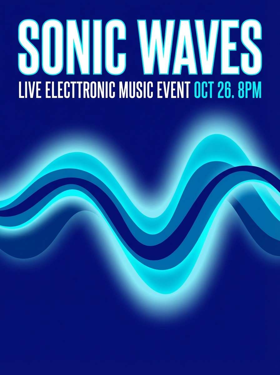
- midnight marina
- pearl and plankton
- saltwater spa
- fisherman knit
- aqua typography
- dusk on the jetty
- What Colors Go Well with Sea?
- How to Use a Sea Color Palette in Real Designs
- Create Sea Palette Visuals with AI
Why Sea Palettes Work So Well
Sea palettes naturally balance cool depth with bright clarity. Dark navies and deep teals add authority, while aqua and seafoam shades keep interfaces and layouts feeling breathable.
They also play well with both minimal and expressive design systems. You can stay monochromatic for a polished, modern look, or add warm accents (sand, coral, citrus) to create contrast and energy.
Most importantly, sea tones tend to be “trust colors” for digital products. They support readability, feel stable across light and dark modes, and look great in gradients, charts, and UI states.
20+ Sea Color Palette Ideas (with HEX Codes)
1) Deep Current
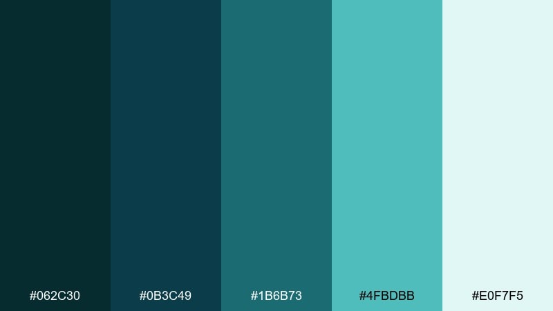
HEX: #062c30 #0b3c49 #1b6b73 #4fbdbb #e0f7f5
Mood: moody, refined, underwater calm
Best for: luxury brand landing page and hero gradients
Moody depth and quiet movement, like moonlight catching a rolling swell. Use the dark teals as backgrounds, then lift key UI elements with the brighter aqua for contrast. Pair it with warm off-whites or subtle texture to avoid a flat look. Usage tip: reserve the lightest tint for whitespace blocks so charts and buttons stay crisp.
Image example of deep current generated using media.io
Media.io is an online AI studio for creating and editing video, image, and audio in your browser.

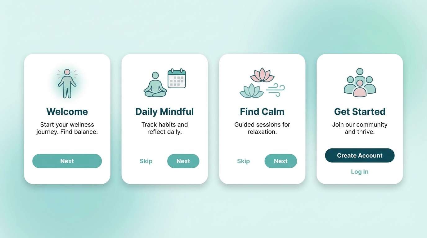
2) Sea Glass Morning
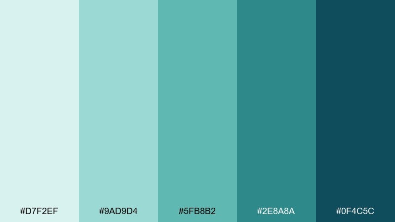
HEX: #d7f2ef #9ad9d4 #5fb8b2 #2e8a8a #0f4c5c
Mood: airy, fresh, uplifting
Best for: wellness app UI and onboarding screens
Airy and optimistic, like pale sunlight through tumbled glass on the shore. This sea color palette works beautifully for wellness and lifestyle designs where clarity matters. Pair the minty tints with charcoal text and a single deep teal CTA for a clean hierarchy. Usage tip: keep gradients subtle between the first three colors to maintain a soft, breathable feel.
Image example of sea glass morning generated using media.io
3) Harbor Mist
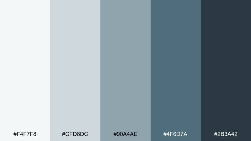
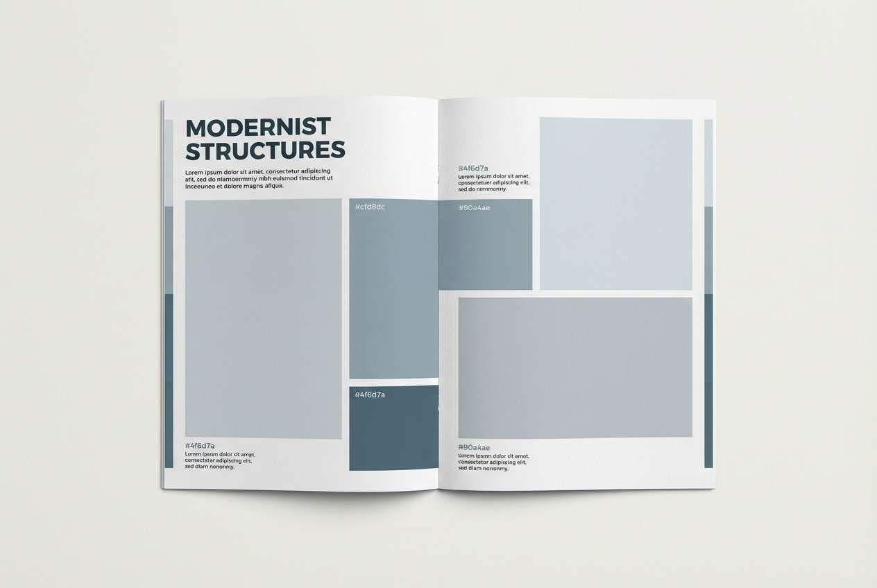
HEX: #f4f7f8 #cfd8dc #90a4ae #4f6d7a #2b3a42
Mood: quiet, coastal, sophisticated
Best for: editorial layouts and product catalogs
Quiet and composed, like fog settling over docks at dawn. The cool grays give typography room to breathe while the slate tones add structure to grids and rules. Pair with natural paper textures or a muted beige to warm it up without losing the calm. Usage tip: use the darkest shade for headings only, keeping body text in the mid-slate to reduce harsh contrast.
Image example of harbor mist generated using media.io
4) Kelp Forest
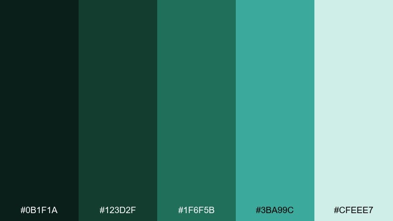
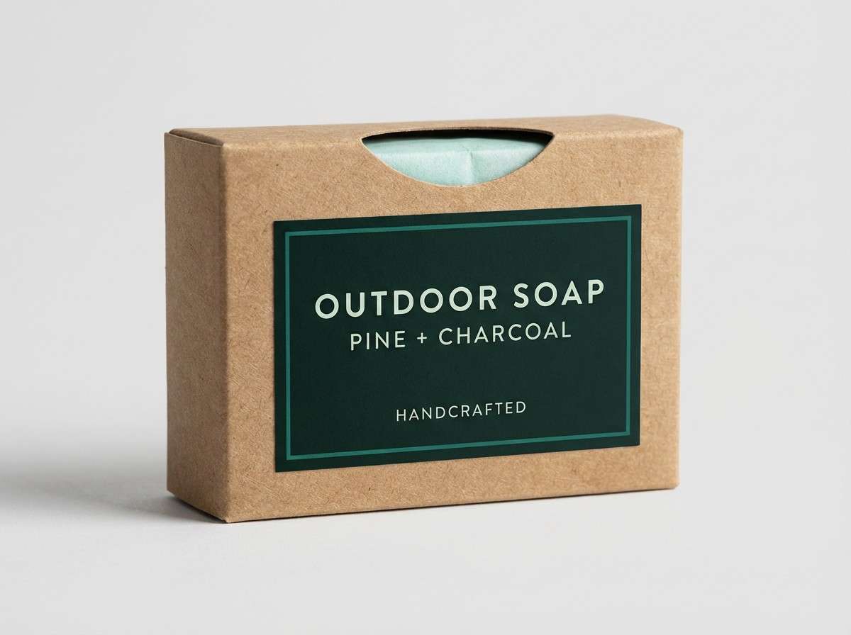
HEX: #0b1f1a #123d2f #1f6f5b #3ba99c #cfeee7
Mood: earthy, lush, adventurous
Best for: outdoor brand identity and packaging
Earthy and lush, like sunlight slicing through a dense underwater canopy. The deep green-blacks ground the design, while the teal brings life to badges, icons, and highlights. Pair it with kraft paper neutrals or matte black finishes for a rugged, premium vibe. Usage tip: print the darker tones in spot ink or rich black mixes to keep them from turning muddy.
Image example of kelp forest generated using media.io
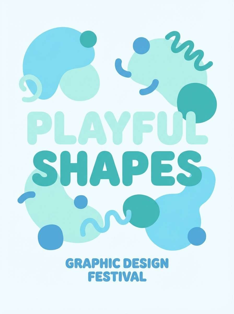
5) Tidepool Pastels
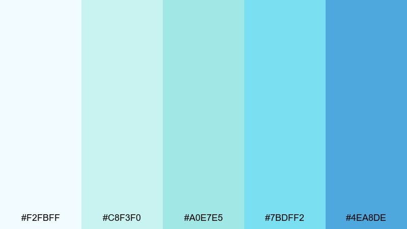
HEX: #f2fbff #c8f3f0 #a0e7e5 #7bdff2 #4ea8de
Mood: playful, light, calming
Best for: kids education graphics and soft posters
Playful and light, like tiny shells and ripples in a sunlit tidepool. These pastel aquas are perfect for friendly illustrations, stickers, and gentle gradients. Pair with warm cream backgrounds and rounded type to keep it approachable. Usage tip: use the deeper blue sparingly for outlines so the overall look stays airy.
Image example of tidepool pastels generated using media.io
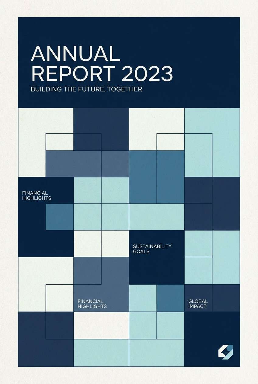
6) Nautical Classic
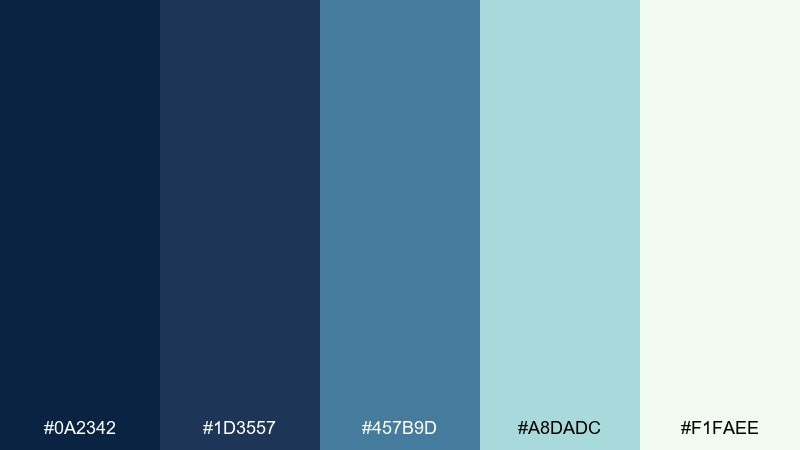
HEX: #0a2342 #1d3557 #457b9d #a8dadc #f1faee
Mood: timeless, crisp, trustworthy
Best for: corporate websites and annual reports
Timeless and crisp, like pressed linen and clean deck lines. The navy anchors navigation and headers, while the lighter blues keep sections readable and modern. Pair with a single warm accent such as brass or tan for charts and highlights. Usage tip: keep backgrounds in the near-white shade to avoid the icy look that pure white can create.
Image example of nautical classic generated using media.io
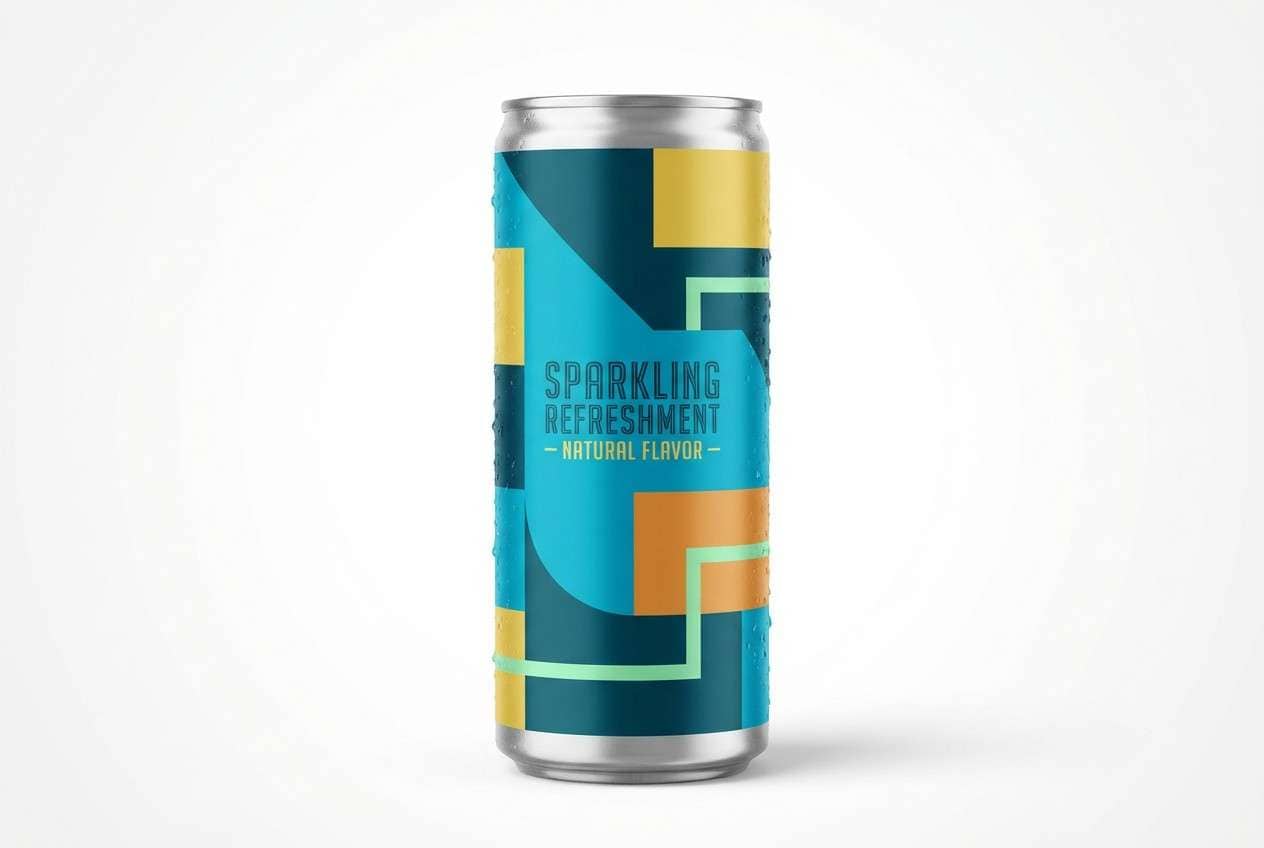
7) Coral Sandbar
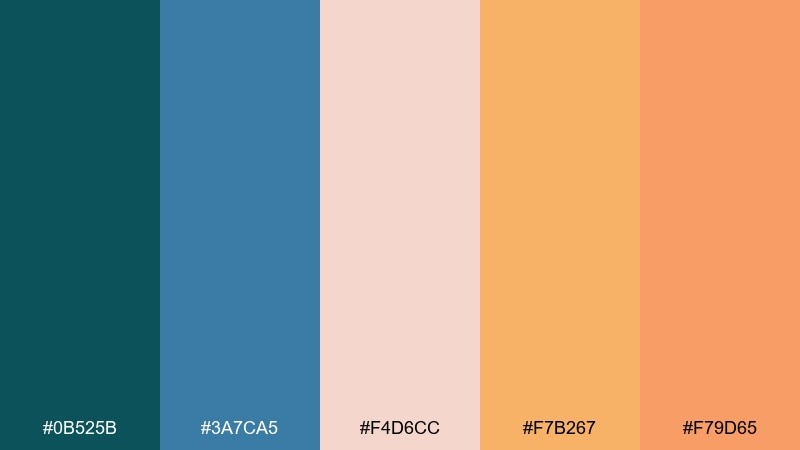
HEX: #0b525b #3a7ca5 #f4d6cc #f7b267 #f79d65
Mood: sun-kissed, social, energetic
Best for: summer event flyer and beach cafe branding
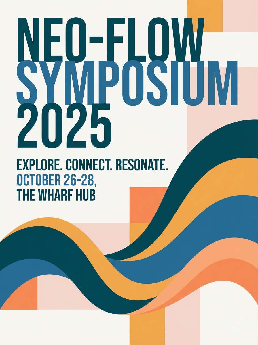
Sun-kissed and lively, like a warm sandbar with coral light bouncing off the water. These sea color combinations shine when you need a friendly teal base with upbeat peachy accents. Pair with creamy paper tones and bold sans-serif type to keep it modern instead of tropical-cliché. Usage tip: use the coral-orange as a small highlight on buttons or dates so it pops without overpowering the blues.
Image example of coral sandbar generated using media.io
8) Stormy Breakers
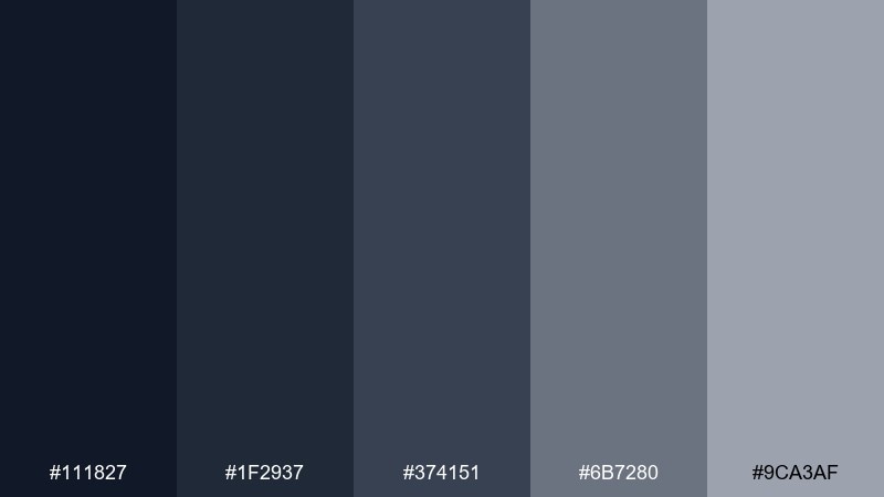
HEX: #111827 #1f2937 #374151 #6b7280 #9ca3af
Mood: dramatic, modern, minimal
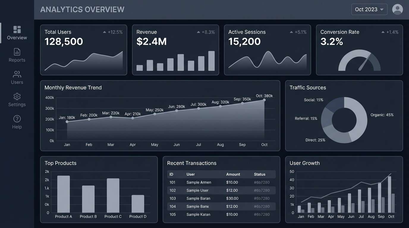
Best for: tech dashboards and dark mode UI
Dramatic and modern, like heavy clouds rolling over choppy water. The near-black base makes data visualizations feel premium, while the mid-grays create clear layers for panels and cards. Pair with a single saturated teal accent for active states and links. Usage tip: bump contrast for small text by using the lightest gray only on primary labels, not secondary metadata.
Image example of stormy breakers generated using media.io
9) Blue Lagoon Pop
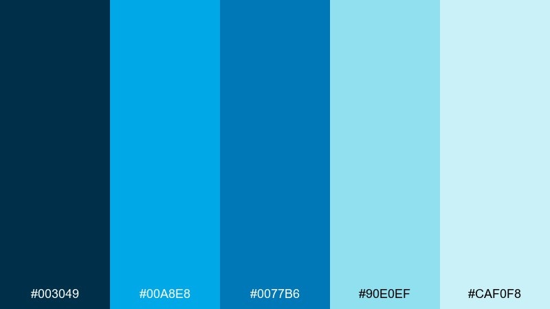
HEX: #003049 #00a8e8 #0077b6 #90e0ef #caf0f8
Mood: bright, sporty, refreshing
Best for: sports ads and social media banners
Bright and refreshing, like a plunge into clear water on a hot day. The saturated blues are built for bold headlines, energetic shapes, and high-contrast CTAs. Pair with clean white space and tight typography for a sharp, athletic finish. Usage tip: use the lightest two shades as backgrounds for text overlays to avoid readability issues on mobile.
Image example of blue lagoon pop generated using media.io

10) Driftwood Neutrals
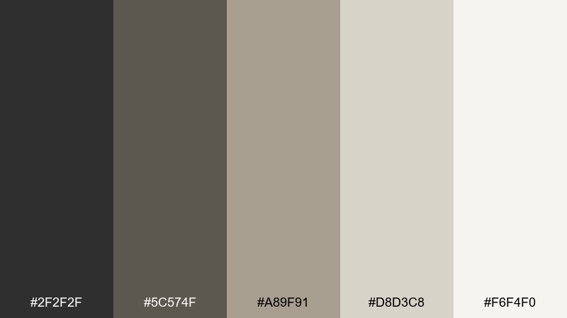
HEX: #2f2f2f #5c574f #a89f91 #d8d3c8 #f6f4f0
Mood: natural, grounded, understated
Best for: interior design moodboards and blogs
Natural and grounded, like weathered wood and sun-bleached rope. These neutrals create a calm foundation for photography-heavy pages and long-form reading. Pair with a muted teal or deep navy accent when you need a nod to coastal influence without going literal. Usage tip: use the mid-taupe for dividers and UI borders so the layout feels structured but soft.
Image example of driftwood neutrals generated using media.io
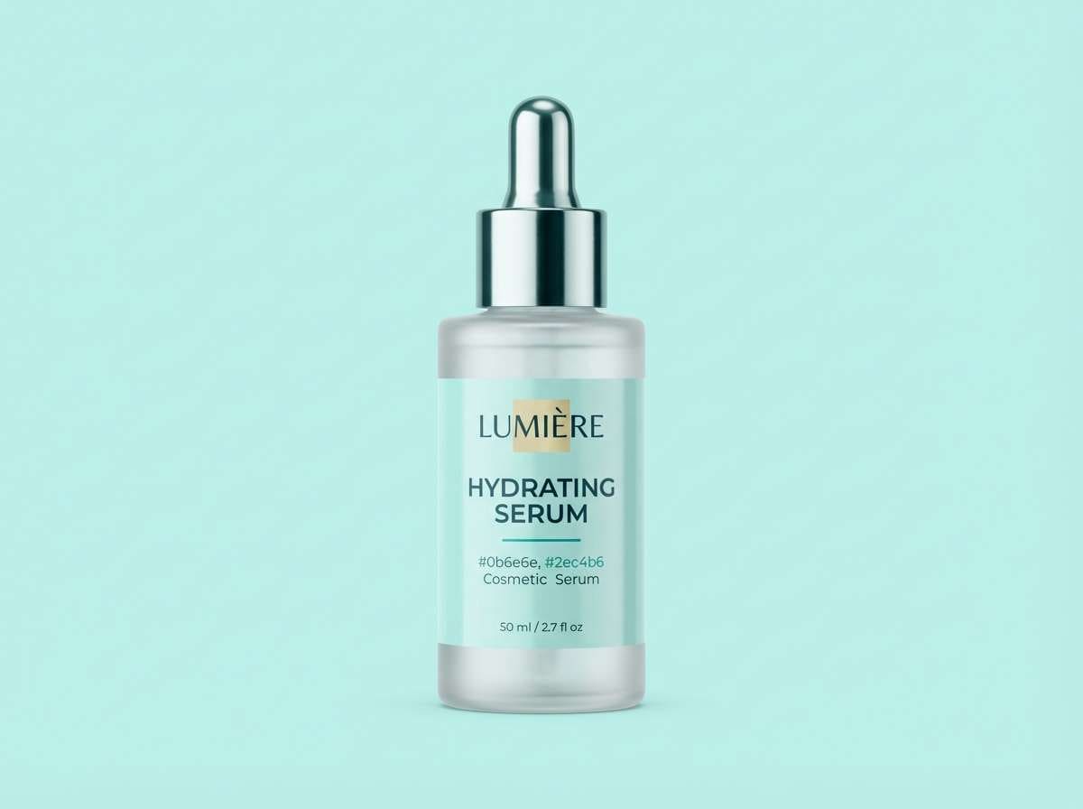
11) Mermaid Metallics
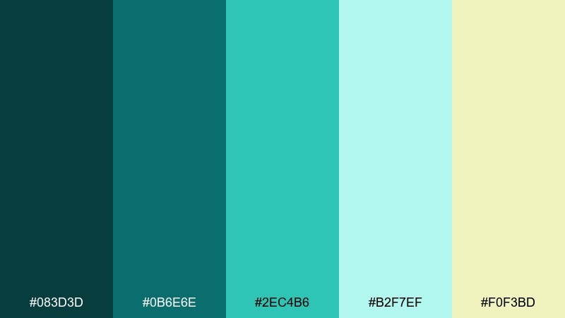
HEX: #083d3d #0b6e6e #2ec4b6 #b2f7ef #f0f3bd
Mood: shimmery, modern, whimsical
Best for: beauty product ads and glossy branding
Shimmery and whimsical, like iridescent light on rippling water. The teal-to-mint range feels fresh, while the pale yellow adds a subtle glow for highlights. Pair with black typography and a touch of foil texture to sell the glossy, premium vibe. Usage tip: keep the yellow for small spark points only, such as price tags or icon fills.
Image example of mermaid metallics generated using media.io
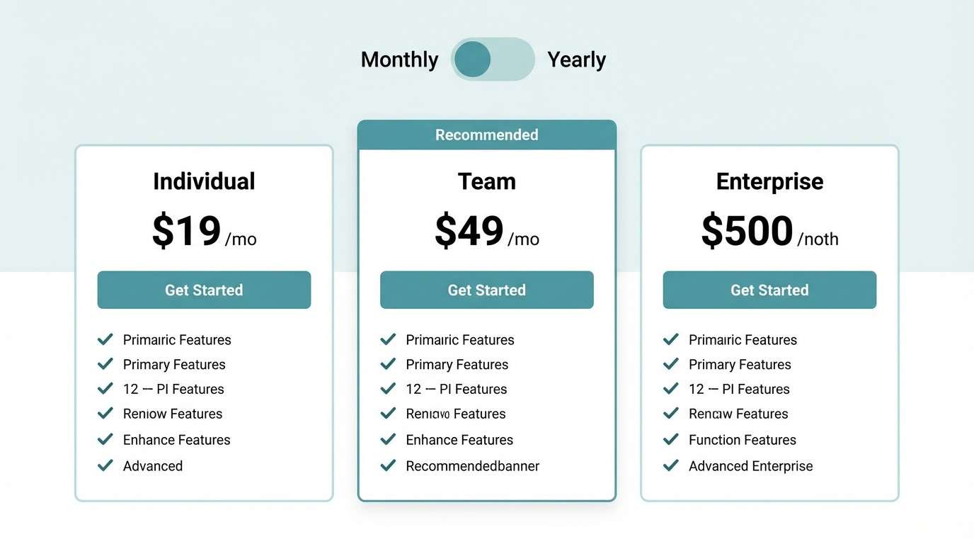
12) Oceanfront Minimal
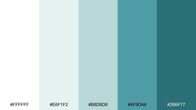
HEX: #ffffff #e6f1f2 #b8d8d8 #4f9da6 #2b6f77
Mood: clean, spacious, contemporary
Best for: SaaS UI, fintech sites, and presentations
Clean and spacious, like modern architecture facing open water. This sea color scheme is ideal for interfaces that need trust and clarity without looking cold. Pair it with a warm gray for secondary text and a restrained icon set in the deeper teal. Usage tip: put the strongest teal only on primary actions so the minimal vibe stays intact.
Image example of oceanfront minimal generated using media.io
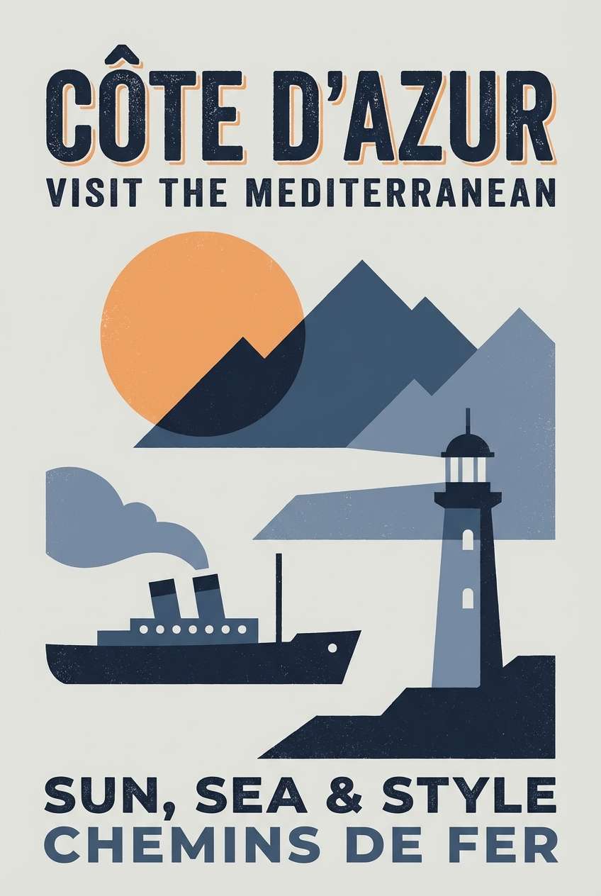
13) Seafarer Retro
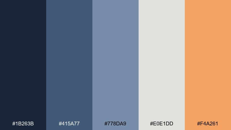
HEX: #1b263b #415a77 #778da9 #e0e1dd #f4a261
Mood: nostalgic, confident, bold
Best for: poster art and vintage-inspired packaging
Nostalgic and confident, like a classic travel poster with sun-faded inks. The layered blues build instant depth, while the warm orange reads as a friendly, retro accent. Pair with off-white paper grain and slab serif type to lean into the vintage feel. Usage tip: use the orange as a small focal point, such as a stamp mark or callout badge.
Image example of seafarer retro generated using media.io
14) Coastal Citrus
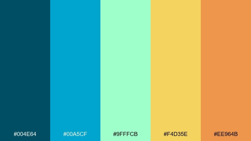
HEX: #004e64 #00a5cf #9fffcb #f4d35e #ee964b
Mood: cheerful, breezy, punchy
Best for: food and beverage branding
Cheerful and breezy, like sparkling water with a citrus twist. The cool blues keep the look clean, while the yellow and orange bring appetite and warmth. Pair with simple line icons and lots of white space for an energetic, modern label. Usage tip: use the mint green as a transition color between blue and yellow areas to avoid harsh edges.
Image example of coastal citrus generated using media.io
15) Midnight Marina
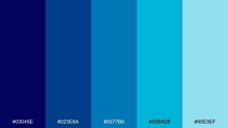
HEX: #03045e #023e8a #0077b6 #00b4d8 #90e0ef
Mood: sleek, nocturnal, high-contrast
Best for: music posters and bold web headers
Sleek and nocturnal, like neon reflections over dark water at the docks. This sea color palette gives you a strong midnight base with electric blues for energy. Pair it with black or deep charcoal type and keep gradients tight for a modern, high-impact look. Usage tip: use the lightest blue only for glow edges and micro-highlights to prevent banding in large areas.
Image example of midnight marina generated using media.io
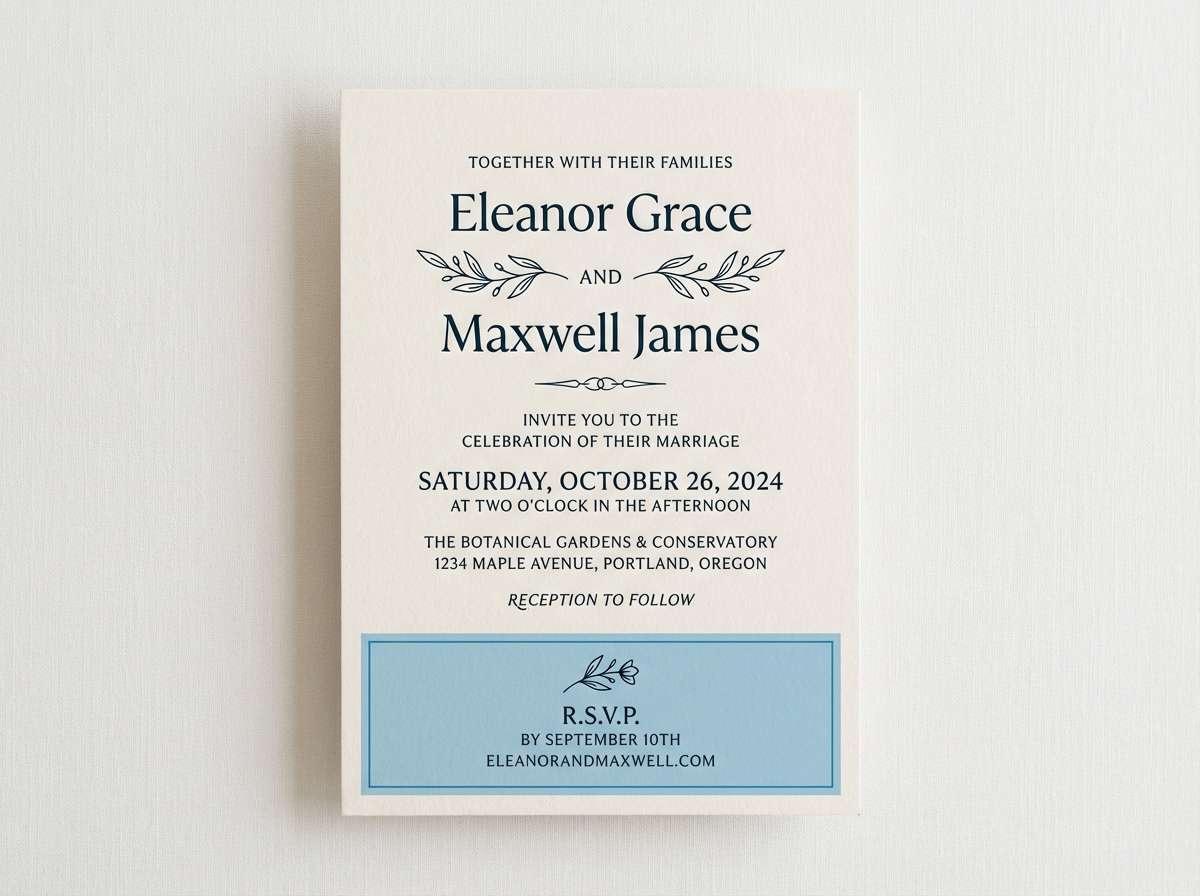
16) Pearl and Plankton
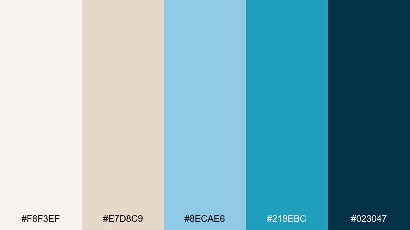
HEX: #f8f3ef #e7d8c9 #8ecae6 #219ebc #023047
Mood: soft, curated, coastal-chic
Best for: wedding stationery and lifestyle branding
Soft and curated, like pearls against a blue horizon. The warm creams keep it romantic, while the clean blues add a modern coastal edge. Pair with elegant serif headings and thin line accents for invitations or brand kits. Usage tip: print the cream tones on uncoated stock so they feel tactile and premium.
Image example of pearl and plankton generated using media.io
17) Saltwater Spa
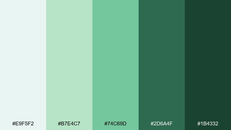
HEX: #e9f5f2 #b7e4c7 #74c69d #2d6a4f #1b4332
Mood: soothing, botanical, restorative
Best for: spa menus and botanical illustrations
Soothing and restorative, like eucalyptus steam and cool mineral water. The gentle greens feel clean for wellness branding, while the deeper forest shades keep headers grounded. Pair with watercolor foliage and ample spacing to reinforce the calm. Usage tip: set the menu background in the palest tint and use the darkest green only for section titles.
Image example of saltwater spa generated using media.io
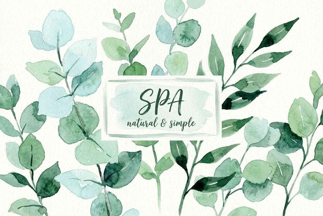
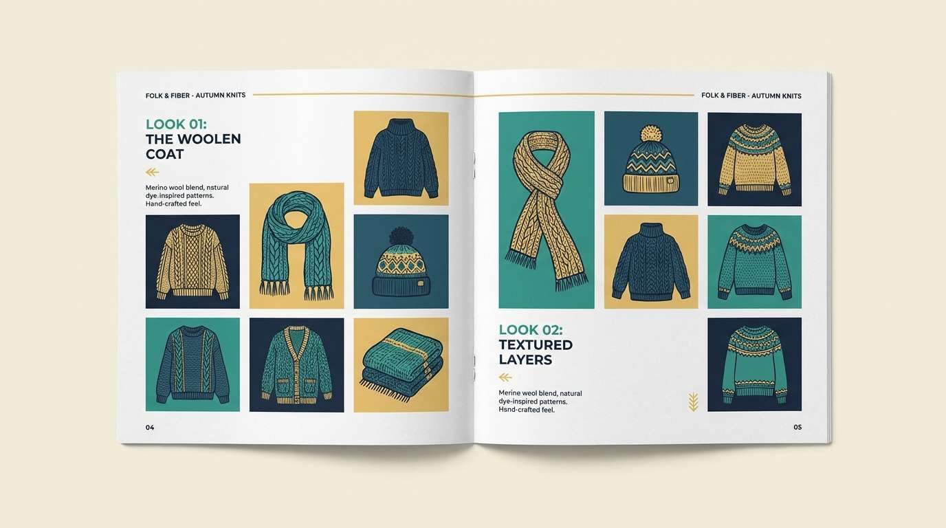
18) Fisherman Knit
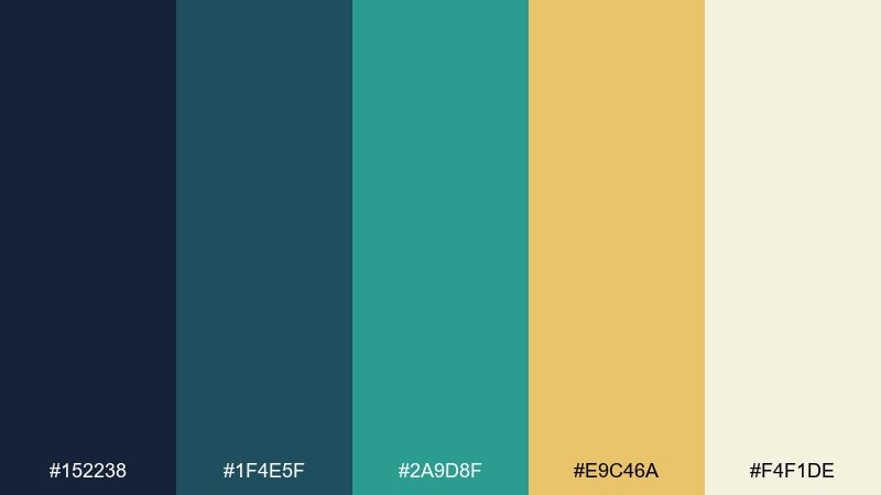
HEX: #152238 #1f4e5f #2a9d8f #e9c46a #f4f1de
Mood: cozy, handcrafted, coastal
Best for: craft store branding and lookbook spreads
Cozy and handcrafted, like a chunky knit sweater on a breezy pier. These sea color combinations balance sturdy blue-greens with a warm golden accent that feels friendly and human. Pair with textured paper, stitched motifs, and simple iconography to highlight the handmade story. Usage tip: keep the gold for badges and small labels so it reads like a warm stitch, not a block of color.
Image example of fisherman knit generated using media.io
19) Aqua Typography
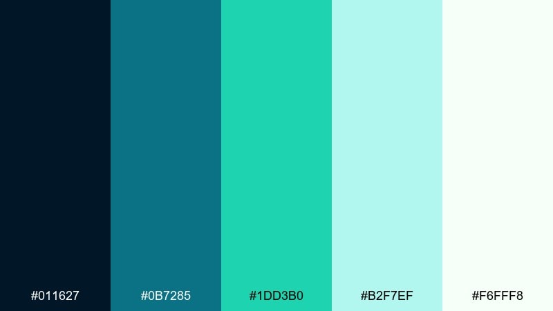
HEX: #011627 #0b7285 #1dd3b0 #b2f7ef #f6fff8
Mood: sharp, modern, high-readability
Best for: typography posters and quote graphics
Sharp and modern, like crisp lettering over clear water. The inky base gives strong contrast, while the aqua tones add punch to headlines and highlights. Pair with a single sans-serif family and generous tracking for a gallery-ready look. Usage tip: use the light mint as a quiet background so the teal headline stays the hero.
Image example of aqua typography generated using media.io
20) Dusk on the Jetty
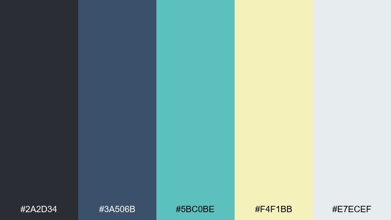
HEX: #2a2d34 #3a506b #5bc0be #f4f1bb #e7ecef
Mood: cinematic, balanced, slightly nostalgic
Best for: travel blog headers and photo overlays
Cinematic and balanced, like the last light fading behind a quiet pier. The dark gray-blue supports photography, while the teal and soft yellow add a memorable color note for highlights. Pair with clean white spacing and subtle grain to keep it editorial. Usage tip: place the yellow behind small text callouts only, so it reads as a warm glow rather than a loud block.
Image example of dusk on the jetty generated using media.io
What Colors Go Well with Sea?
Sea tones pair best with grounded neutrals like sand, driftwood taupe, warm gray, and off-white. These keep your design feeling coastal without making everything look overly blue or “themed.”
For contrast, add warm accents such as coral, peach, citrus yellow, or terracotta. Small warm touches are ideal for CTAs, badges, dates, and highlights because they pop against teal and navy.
If you want a modern, tech-forward feel, pair sea palettes with charcoal, slate, and near-black. This combo works especially well for dashboards, dark mode UIs, and high-contrast typography.
How to Use a Sea Color Palette in Real Designs
Start with role-based color assignment: pick one deep shade for headers/nav, one mid-tone for components, one light tint for backgrounds, and one accent for actions. Sea palettes are naturally gradient-friendly, so you can also blend adjacent tints for hero sections.
Watch contrast carefully, especially with aqua-on-white and mint-on-gray combinations. Keep text in charcoal/navy, reserve bright aqua for icons and interactive states, and test WCAG contrast for small UI labels.
In print and packaging, use texture to prevent flatness: uncoated paper, subtle grain, or foil accents. Deep teals and navies look premium when paired with warm whites and controlled highlight colors.
Create Sea Palette Visuals with AI
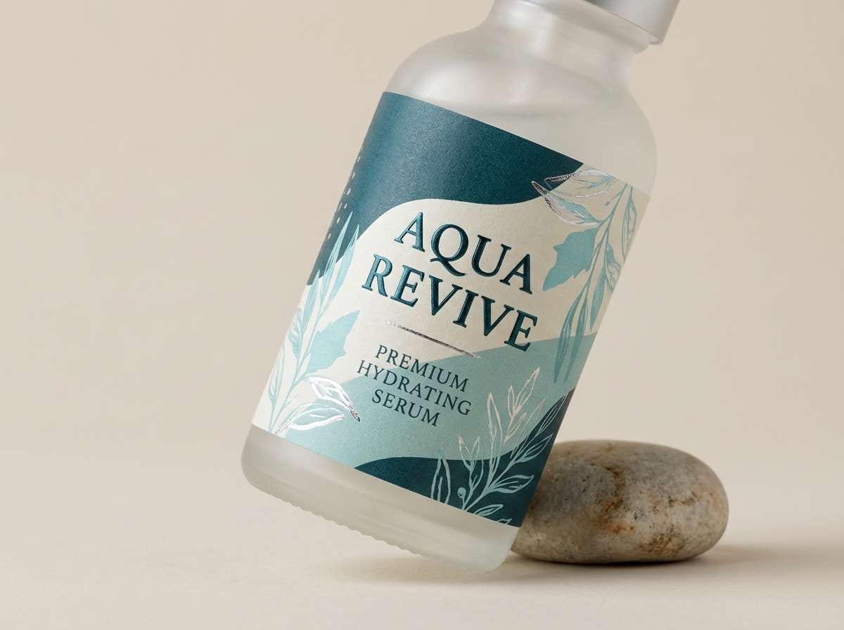
If you already have HEX codes, you can generate on-brand mockups by describing the scene (UI, packaging, poster), then specifying which colors should dominate and which should be accents. This helps keep outputs consistent with your sea color scheme.
Reuse the prompts above as templates: swap the product type, layout style, and ratio, while keeping your chosen sea tones in the “colors dominated by…” line for reliable results.
When you find a look you like, iterate by changing only one variable at a time (lighting, typography style, texture, or contrast). That’s the fastest way to build a cohesive set of visuals.
Sea Color Palette FAQs
-
What is a sea color palette?
A sea color palette is a set of colors inspired by ocean and coastal tones—typically teal, aqua, navy, seafoam, slate, and soft off-whites—used to create a cohesive design look. -
Which sea tones are best for modern UI design?
Mid teals and soft blue-grays work well for surfaces and sections, while a deeper teal or navy is ideal for navigation and headings. Use a single brighter aqua as an accent for active states and primary CTAs. -
How do I keep sea palettes from looking too cold?
Add warmth with off-white (not pure white), sand/taupe neutrals, or small coral/citrus accents. Texture (grain, paper, subtle gradients) also makes cool palettes feel more natural. -
What accent color pops against teal and navy?
Coral, peach, golden yellow, and warm orange pop strongly against teal/navy. Use them sparingly for buttons, badges, chart highlights, and small callouts. -
Are sea palettes good for branding?
Yes—sea tones often communicate trust, calm, cleanliness, and quality. They’re popular in wellness, SaaS, travel, finance, skincare, and outdoor brands. -
How can I generate sea-themed design mockups with AI?
Use a text-to-image tool and include your HEX colors in the prompt (e.g., “colors dominated by #0b3c49 #2ec4b6…”). Specify the design type (UI mockup, label, poster), lighting, and ratio for more predictable results. -
What’s the easiest way to build a sea gradient?
Choose two or three adjacent tones (for example, deep teal → teal → mint) and keep transitions subtle. Reserve the lightest tint for whitespace blocks so text and UI components stay crisp.


