

Sap green sits right between lively botanical greens and grounded olive tones, making it one of the most versatile greens for modern design. It can feel fresh and natural, or muted and premium, depending on what you pair it with.
Below are 20+ sap green color palette ideas with HEX codes—built for branding, UI, print, and social content—plus practical tips to keep contrast clean and layouts readable.
In this article
- Why Sap Green Palettes Work So Well
-
- forest linen
- moss and clay
- herbarium notes
- vintage olive
- rainy canopy
- citrus grove
- sage concrete
- botanical noir
- sunlit fern
- woodland wedding
- organic cafe
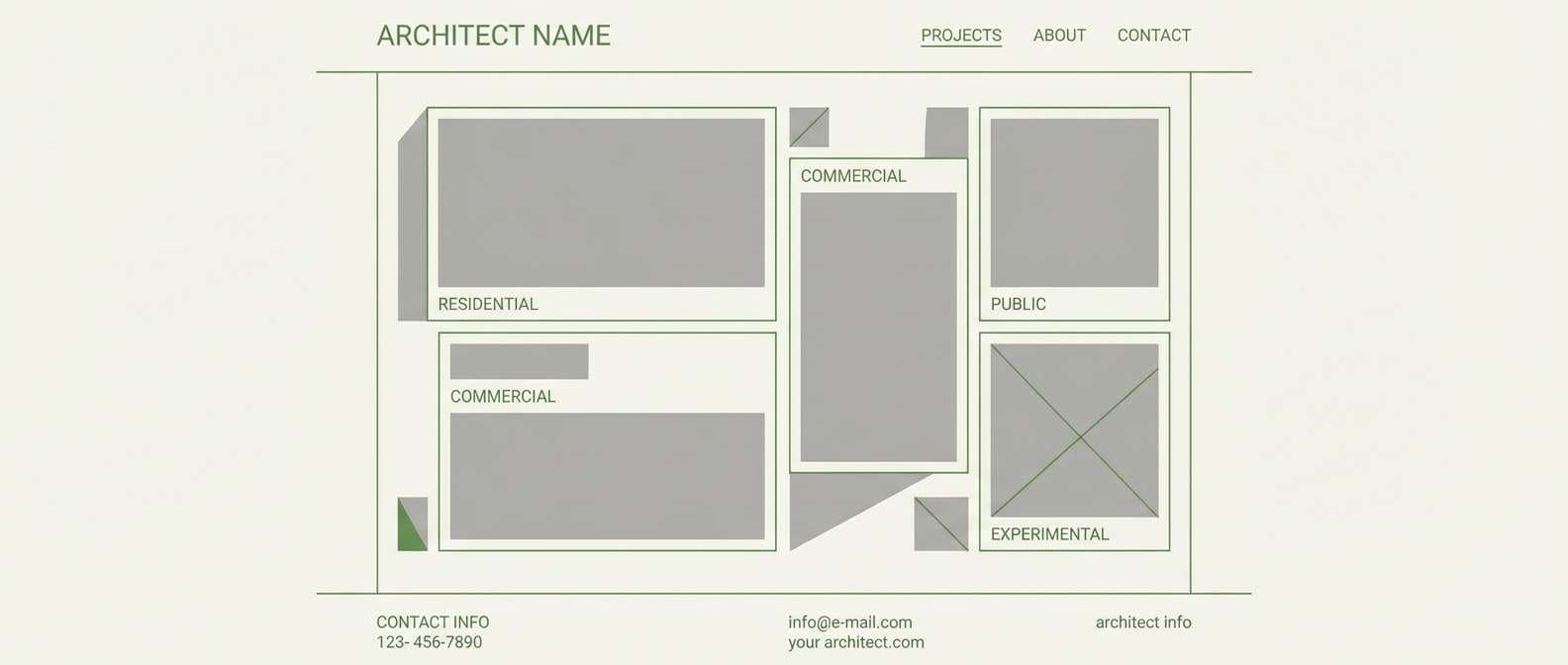
- trail map ui
- eco skincare label
- farmers market poster
- autumn orchard
- alpine cabin
- minimal stationery
- yoga studio calm
- garden party invitation
- editorial nature spread
- seed packet charm
- What Colors Go Well with Sap Green?
- How to Use a Sap Green Color Palette in Real Designs
- Create Sap Green Palette Visuals with AI
Why Sap Green Palettes Work So Well
Sap green is a “bridge” color: it carries the natural, plant-based signal of green, but it’s toned enough to play nicely with neutrals like cream, taupe, and warm gray. That balance makes it easy to use across both digital UI and printed materials.
It also scales well from calm to bold. Pair sap green with soft off-whites for wellness and editorial design, or add amber, terracotta, and near-black for high-contrast campaigns and premium packaging.
Most importantly, sap green supports strong hierarchy. You can keep backgrounds light and breathable, reserve dark charcoals for text, and use sap green as the consistent accent that ties every component together.
20+ Sap Green Color Palette Ideas (with HEX Codes)
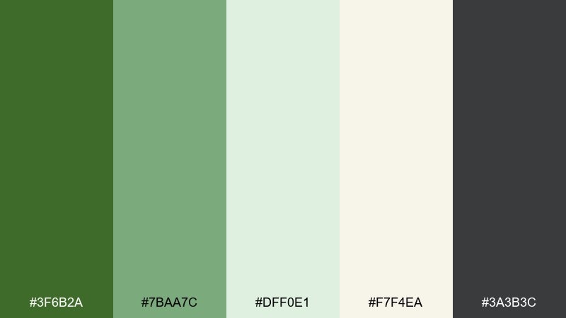
1) Forest Linen
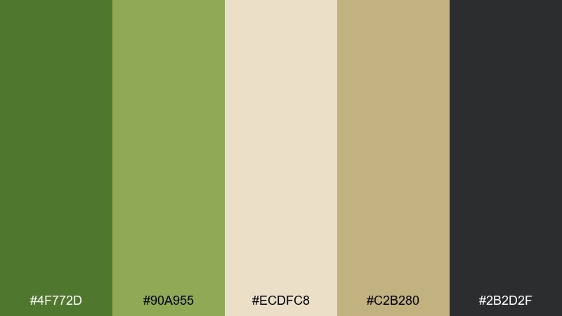
HEX: #4F772D #90A955 #ECDFC8 #C2B280 #2B2D2F
Mood: grounded, natural, calm
Best for: eco brand identity and stationery
Grounded and calm, like a shaded trail with sun-warmed linen. The green reads organic without feeling too rustic, while the cream and sand keep layouts airy. Use the charcoal for type and fine lines to avoid muddy contrast. Tip: reserve the darkest tone for headings and logos, and let the mid green carry accents and icons.
Image example of forest linen generated using media.io
Media.io is an online AI studio for creating and editing video, image, and audio in your browser.

2) Moss and Clay

HEX: #3F6B2A #6E8F3D #C97C5D #E9D8C5 #2A1F1A
Mood: earthy, warm, rustic
Best for: ceramics shop branding and packaging
Earthy and warm, like moss on a terracotta pot after rain. The clay accent brings friendly energy to the greens and keeps the look from turning too cool. Pair it with plenty of cream negative space for labels and ingredient lists. Tip: use terracotta for calls to action and the deep brown only for small text and barcode areas.
Image example of moss and clay generated using media.io
3) Herbarium Notes
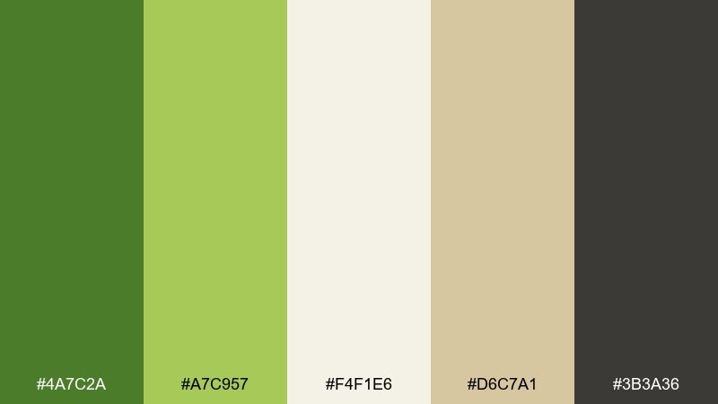
HEX: #4A7C2A #A7C957 #F4F1E6 #D6C7A1 #3B3A36
Mood: botanical, light, studious
Best for: blog headers and editorial graphics
Botanical and light, like pressed leaves on aged paper. The pale cream and parchment tones keep content readable while the greens signal freshness. Use the dark gray for body copy to maintain a softer editorial feel than pure black. Tip: keep charts and icons to two greens max, then rely on neutrals for the rest.
Image example of herbarium notes generated using media.io
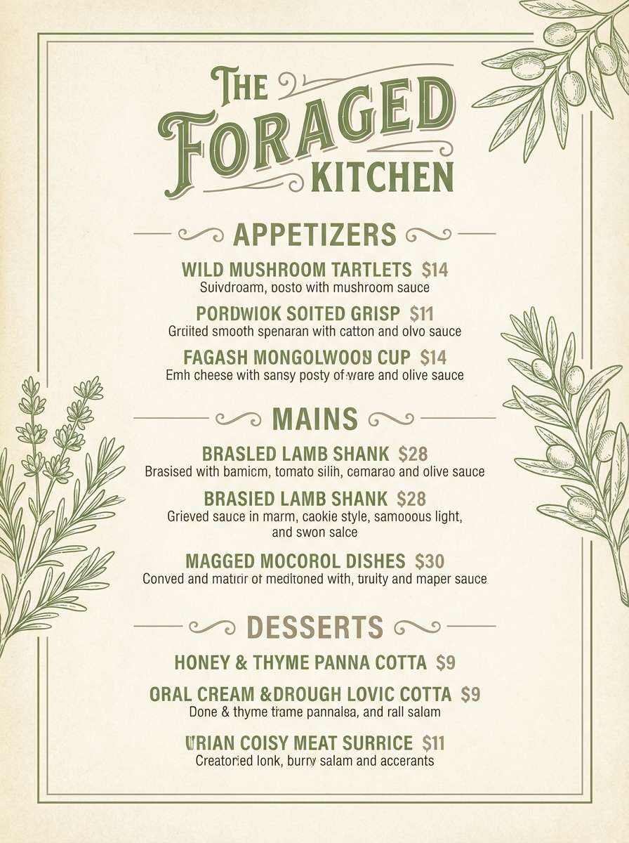
4) Vintage Olive
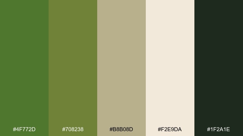
HEX: #4F772D #708238 #B8B08D #F2E9DA #1F2A1E
Mood: classic, muted, heritage
Best for: restaurant menus and labels
Classic and muted, like an old olive grove at dusk. The tan and cream keep the palette approachable, while the deep green adds a heritage feel. For menus, set headings in the darkest green and keep body text in near-black for clarity. Tip: add subtle borders in the warm taupe to structure sections without heavy lines.
Image example of vintage olive generated using media.io
5) Rainy Canopy
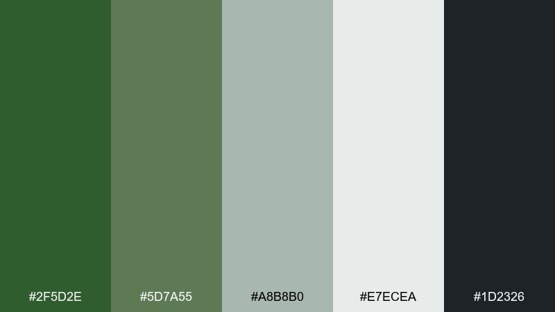
HEX: #2F5D2E #5D7A55 #A8B8B0 #E7ECEA #1D2326
Mood: cool, quiet, modern
Best for: health app UI and dashboards
Cool and quiet, like mist settling under a dense canopy. The gray-green neutrals make screens feel calm and reduce glare for long sessions. Use the darkest tone for navigation and the soft mint-gray for surfaces and cards. Tip: keep primary buttons in the richer green and use the pale background to boost perceived contrast.
Image example of rainy canopy generated using media.io
6) Citrus Grove
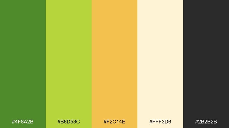
HEX: #4F8A2B #B6D53C #F2C14E #FFF3D6 #2B2B2B
Mood: bright, upbeat, sunny
Best for: social ads and seasonal promos
Bright and upbeat, like a picnic in a citrus grove at noon. The yellow and amber accents add punch without overpowering the green base. Use the cream as a light canvas and keep black for short, high-impact copy. Tip: limit the amber to badges and price tags so the layout stays fresh, not loud.
Image example of citrus grove generated using media.io
7) Sage Concrete
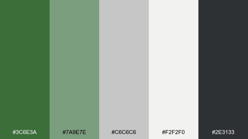
HEX: #3C6E3A #7A9E7E #C6C6C6 #F2F2F0 #2E3133
Mood: urban, clean, understated
Best for: architecture portfolios and websites
Urban and understated, like fresh sage against smooth concrete. The grays give structure while the greens soften the overall tone. Use the darkest gray for text and let the medium green highlight links and section dividers. Tip: in web layouts, keep backgrounds near-white and apply green only to interactive elements for clarity.
Image example of sage concrete generated using media.io
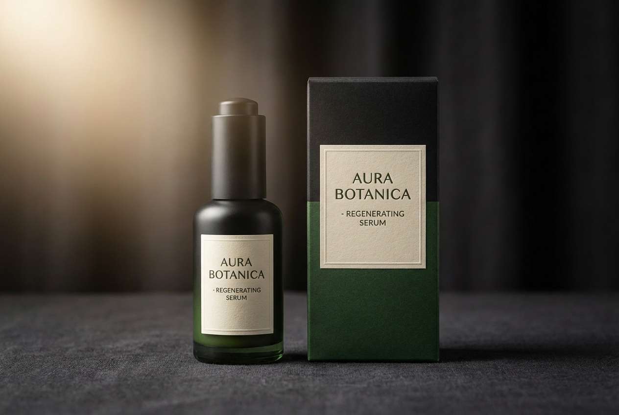
8) Botanical Noir
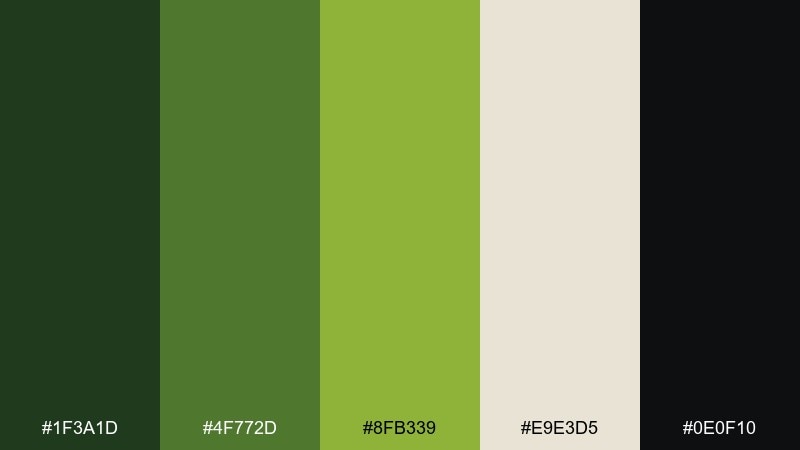
HEX: #1F3A1D #4F772D #8FB339 #E9E3D5 #0E0F10
Mood: dramatic, luxe, moody
Best for: premium skincare packaging
Dramatic and luxe, like glossy leaves lit by a single spotlight. Deep near-black and forest tones give a premium base, while the brighter green adds controlled vibrancy. This is one of those sap green color combinations that looks expensive when you keep the layout minimal. Tip: use the light cream only for small label panels or ingredient blocks to preserve the moody feel.
Image example of botanical noir generated using media.io
9) Sunlit Fern
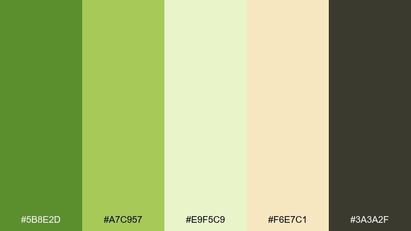
HEX: #5B8E2D #A7C957 #E9F5C9 #F6E7C1 #3A3A2F
Mood: fresh, airy, springlike
Best for: wellness blogs and hero sections
Fresh and airy, like ferns catching warm sunlight. The pale greens feel optimistic, and the soft butter tone keeps it welcoming rather than clinical. Use the dark olive-gray for text to avoid harsh contrast. Tip: for hero sections, place the lightest green as the background and reserve the mid green for buttons and highlights.
Image example of sunlit fern generated using media.io
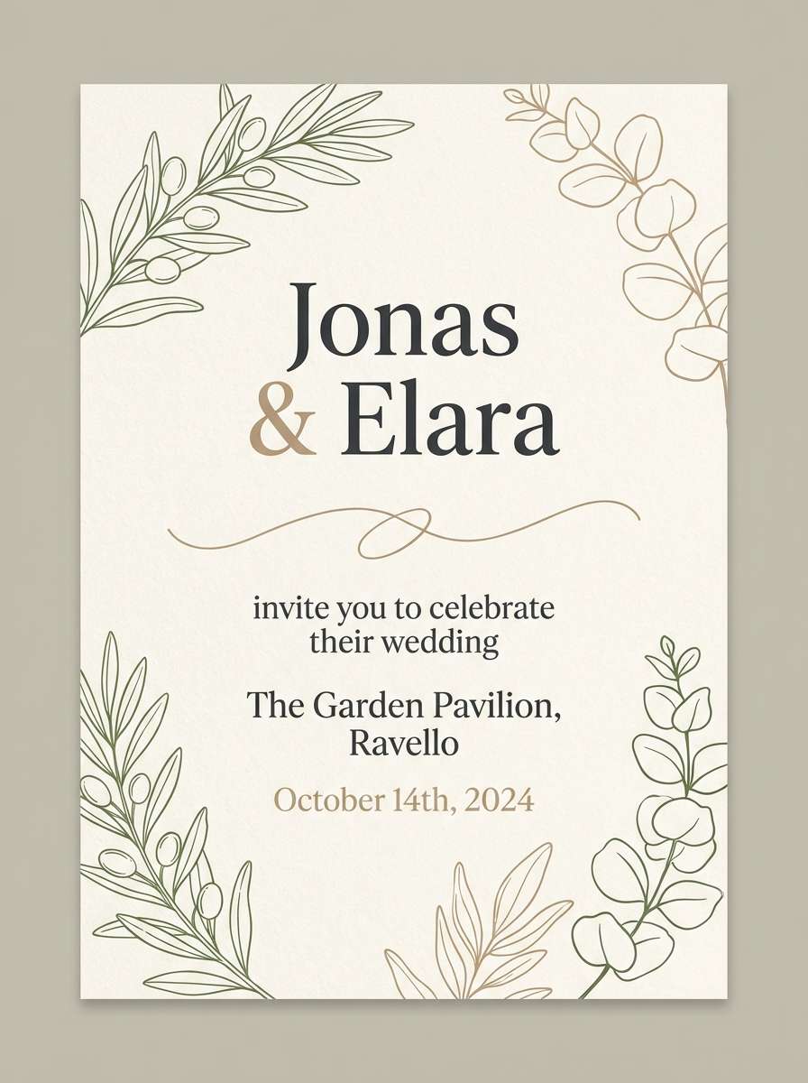
10) Woodland Wedding
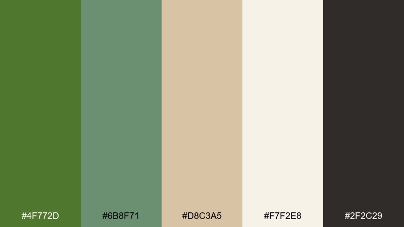
HEX: #4F772D #6B8F71 #D8C3A5 #F7F2E8 #2F2C29
Mood: romantic, natural, elegant
Best for: wedding invitations and day-of signage
Romantic and natural, like vows under tall trees with linen drapery. The warm beige balances the green so the design feels elegant, not overly earthy. Set names in the darkest tone and keep details in a softer gray-green for hierarchy. Tip: use the cream as a full-bleed background to make the green typography feel refined.
Image example of woodland wedding generated using media.io
11) Organic Cafe
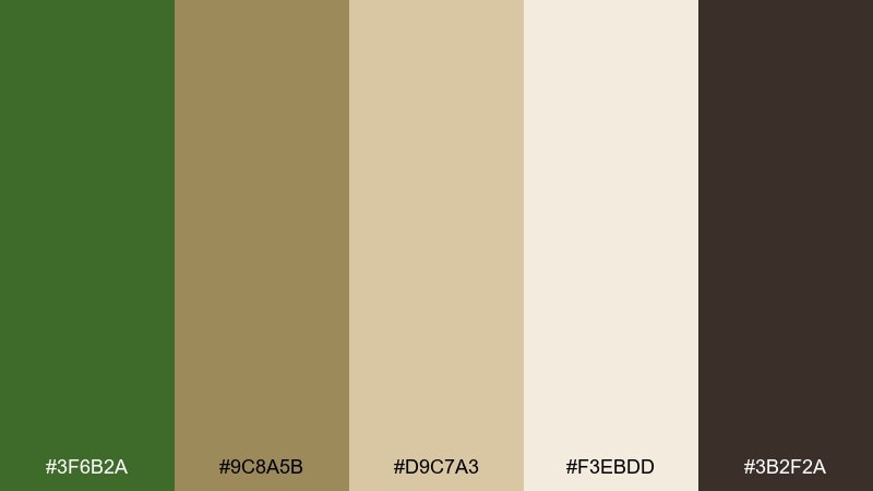
HEX: #3F6B2A #9C8A5B #D9C7A3 #F3EBDD #3B2F2A
Mood: cozy, artisanal, welcoming
Best for: cafe menus and loyalty cards
Cozy and artisanal, like a small cafe with wooden shelves and dried herbs. The warm browns and oat tones soften the green and make it feel food-friendly. Use the deep coffee brown for typography and the mid green for icons or section headers. Tip: keep photos neutral or lightly toned so the printed palette stays consistent.
Image example of organic cafe generated using media.io
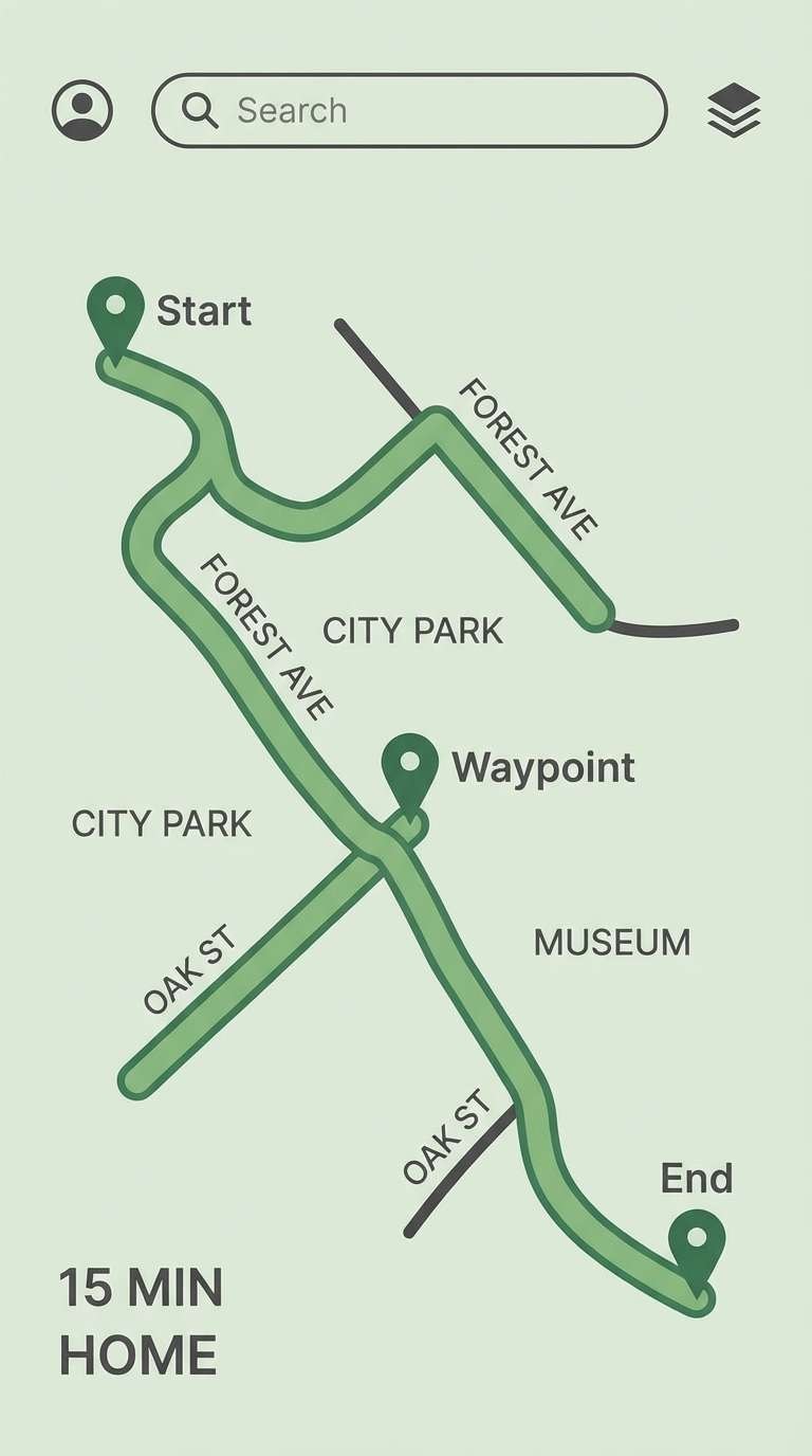
12) Trail Map UI
HEX: #2F5D2E #4F772D #DCE2D6 #B9C7A5 #1E1F22
Mood: practical, outdoorsy, clear
Best for: navigation app UI and maps
Practical and outdoorsy, like a clean trail map printed on matte paper. The pale sage and soft gray-green give plenty of room for labels and routes. Use the near-black for text and map markers to maintain legibility at small sizes. Tip: keep the brighter green for active states only so users instantly recognize selected paths.
Image example of trail map ui generated using media.io
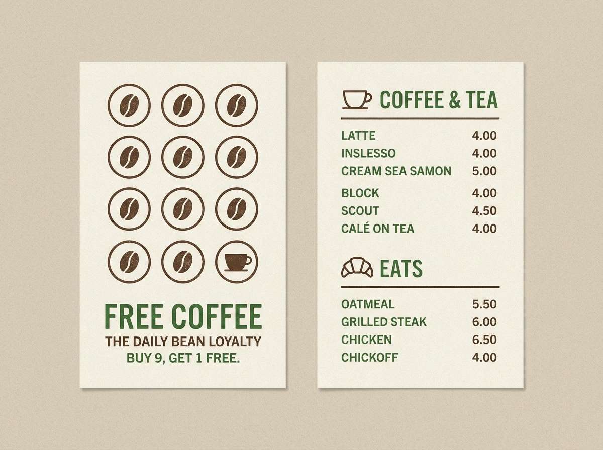
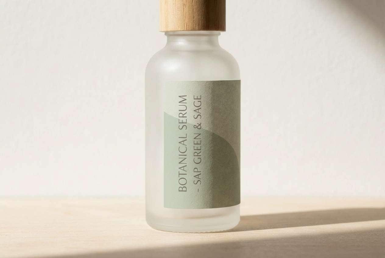
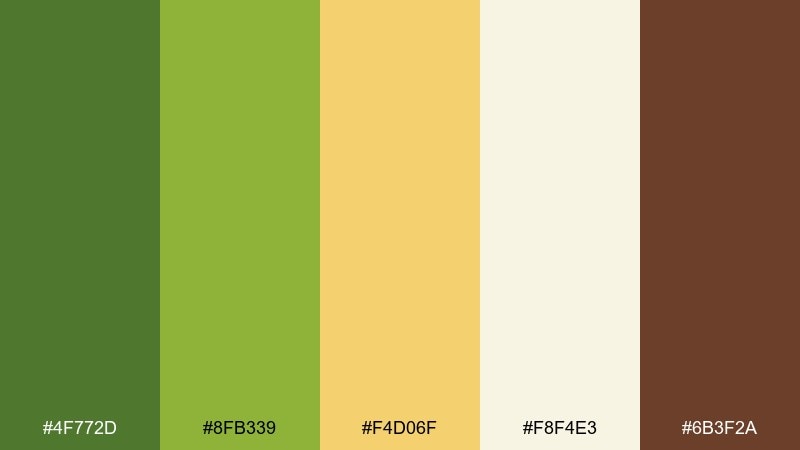
13) Eco Skincare Label
HEX: #4A7C2A #93B86B #F1EFE6 #D9D2C3 #2C2B28
Mood: clean, gentle, trustworthy
Best for: natural cosmetics labels
Clean and gentle, like freshly mixed aloe in a bright studio. The muted greens feel trustworthy, and the warm off-white keeps the label readable. A sap green color palette like this works well when you want natural cues without going full rustic. Tip: use the darkest tone sparingly for ingredients, and keep key claims in mid green for easy scanning.
Image example of eco skincare label generated using media.io
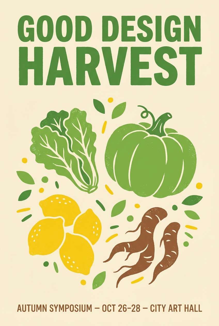
14) Farmers Market Poster
HEX: #4F772D #8FB339 #F4D06F #F8F4E3 #6B3F2A
Mood: cheerful, handmade, local
Best for: event posters and flyers
Cheerful and handmade, like weekend stalls stacked with herbs and citrus. The sunny yellow lifts the greens and adds instant visibility from a distance. Use the brown as a supporting ink color for small details and illustrated textures. Tip: keep the headline in green, then use yellow for dates or location badges to guide the eye.
Image example of farmers market poster generated using media.io
15) Autumn Orchard
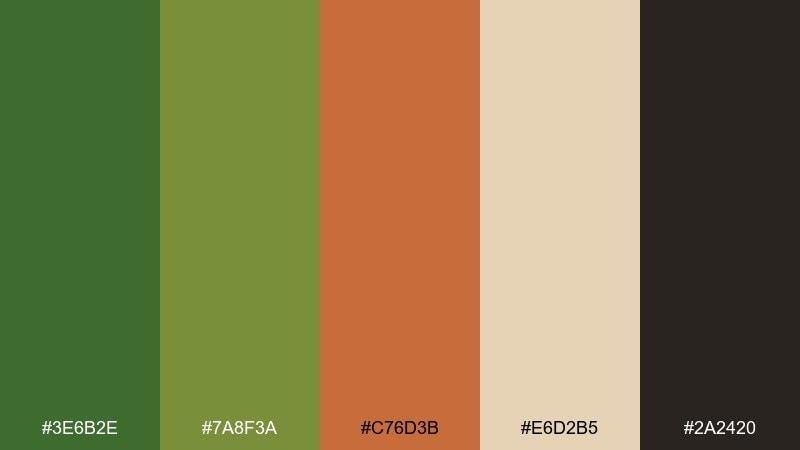
HEX: #3E6B2E #7A8F3A #C76D3B #E6D2B5 #2A2420
Mood: harvest, warm, nostalgic
Best for: seasonal product ads
Warm and nostalgic, like late apples and leaves turning at the edge of the orchard. The orange-brown accent adds a harvest note that complements the greens beautifully. These sap green color combinations are great for fall campaigns where you want freshness and warmth together. Tip: use the orange only as a spotlight color for prices or limited-time tags.
Image example of autumn orchard generated using media.io
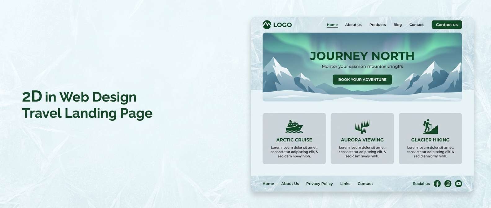
16) Alpine Cabin
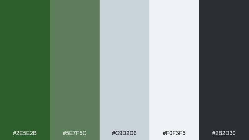
HEX: #2E5E2B #5E7F5C #C9D2D6 #F0F3F5 #2B2D30
Mood: cool, crisp, outdoors
Best for: travel landing pages
Cool and crisp, like morning air outside an alpine cabin. The icy neutrals keep the palette modern, while the greens add a quiet outdoors cue. Use the darkest gray for navigation and the mid green for primary buttons to maintain clarity. Tip: pair with minimal photography and avoid warm filters so the colors stay true.
Image example of alpine cabin generated using media.io
17) Minimal Stationery
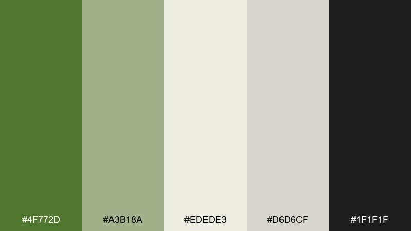
HEX: #4F772D #A3B18A #EDEDE3 #D6D6CF #1F1F1F
Mood: minimal, calm, contemporary
Best for: personal branding and resumes
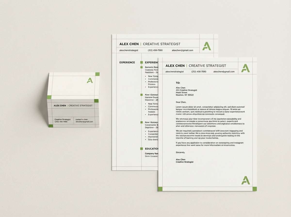
Minimal and calm, like a tidy desk with soft daylight. The warm grays and off-white make the green feel sophisticated rather than loud. Use the near-black for text and keep the greens for dividers, bullets, and small highlights. Tip: on resumes, stick to one green shade for headings so the hierarchy stays professional.
Image example of minimal stationery generated using media.io
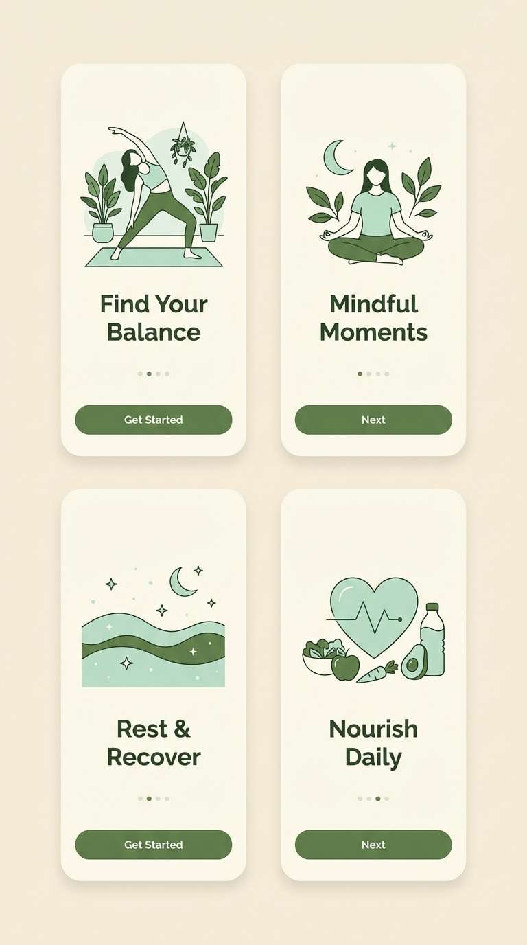
18) Yoga Studio Calm
HEX: #3F6B2A #7BAA7C #DFF0E1 #F7F4EA #3A3B3C
Mood: soothing, balanced, mindful
Best for: wellness app onboarding screens
Soothing and balanced, like slow breathing in a quiet studio. The minty light green feels restorative, while the deeper green adds structure for buttons and progress indicators. Use the cream as the base to keep screens bright and welcoming. Tip: avoid heavy gradients here; flat color blocks will feel more mindful and modern.
Image example of yoga studio calm generated using media.io
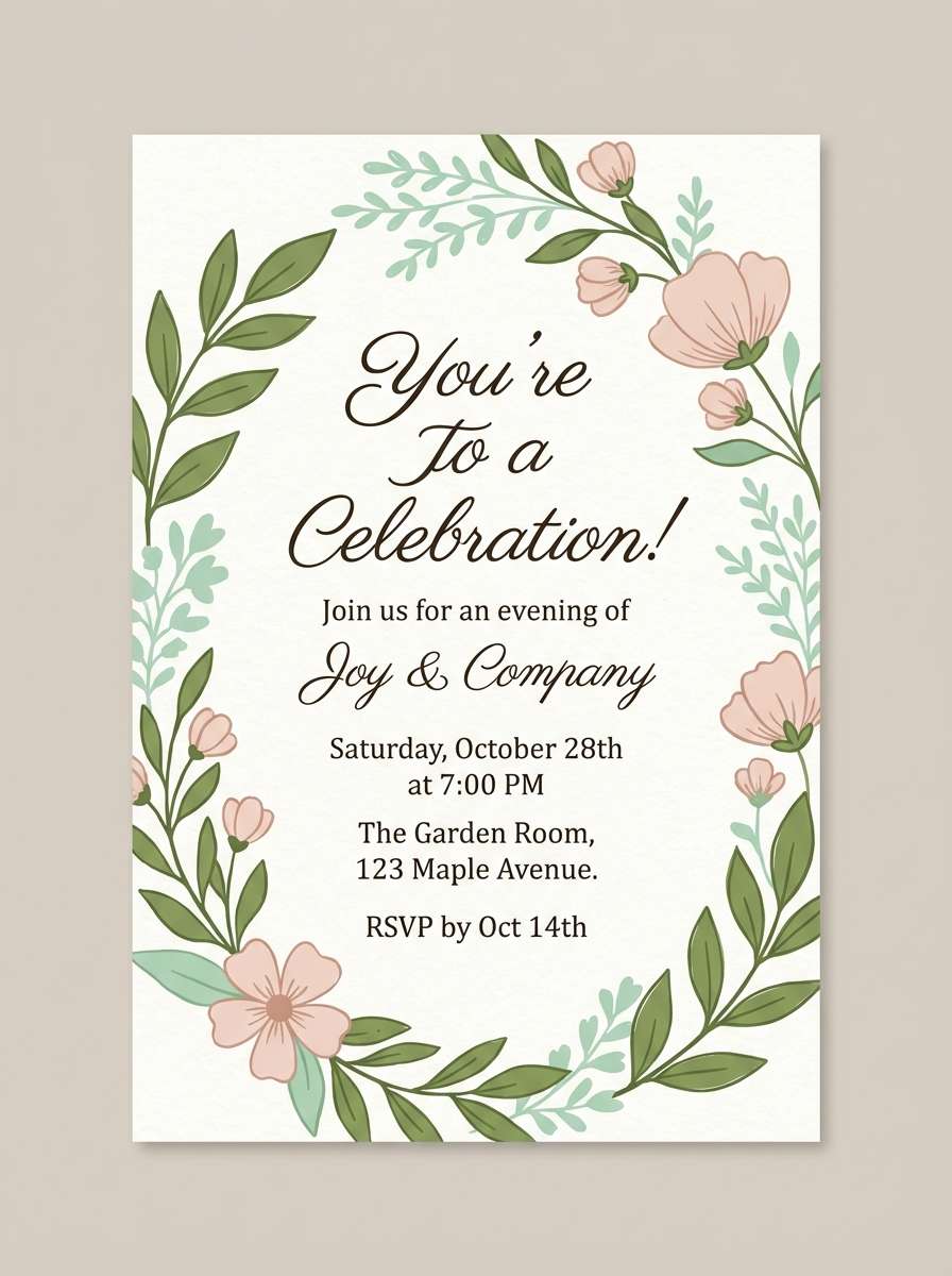
19) Garden Party Invitation
HEX: #4F772D #9ED0A3 #F6D6D6 #FFF6F0 #3B3A36
Mood: playful, soft, celebratory
Best for: party invitations and RSVPs
Playful and soft, like a garden party with pastel blooms and greenery. The blush pink adds a sweet contrast that keeps the greens feeling light and social. If you need a friendly sap green color combination for print, this mix stays readable on warm white stock. Tip: keep the blush for borders or small floral motifs and let green handle the main type.
Image example of garden party invitation generated using media.io
20) Editorial Nature Spread
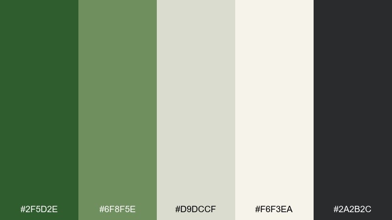
HEX: #2F5D2E #6F8F5E #D9DCCF #F6F3EA #2A2B2C
Mood: refined, calm, story-driven
Best for: magazine spreads and report design
Refined and story-driven, like a long-form nature feature on textured paper. The soft gray-beige neutrals keep the layout elegant while the greens add a subtle theme. Use the darkest tone for headlines and pull quotes, and keep body copy in a softer charcoal. Tip: set charts in one green plus one neutral to maintain a cohesive visual rhythm.
Image example of editorial nature spread generated using media.io
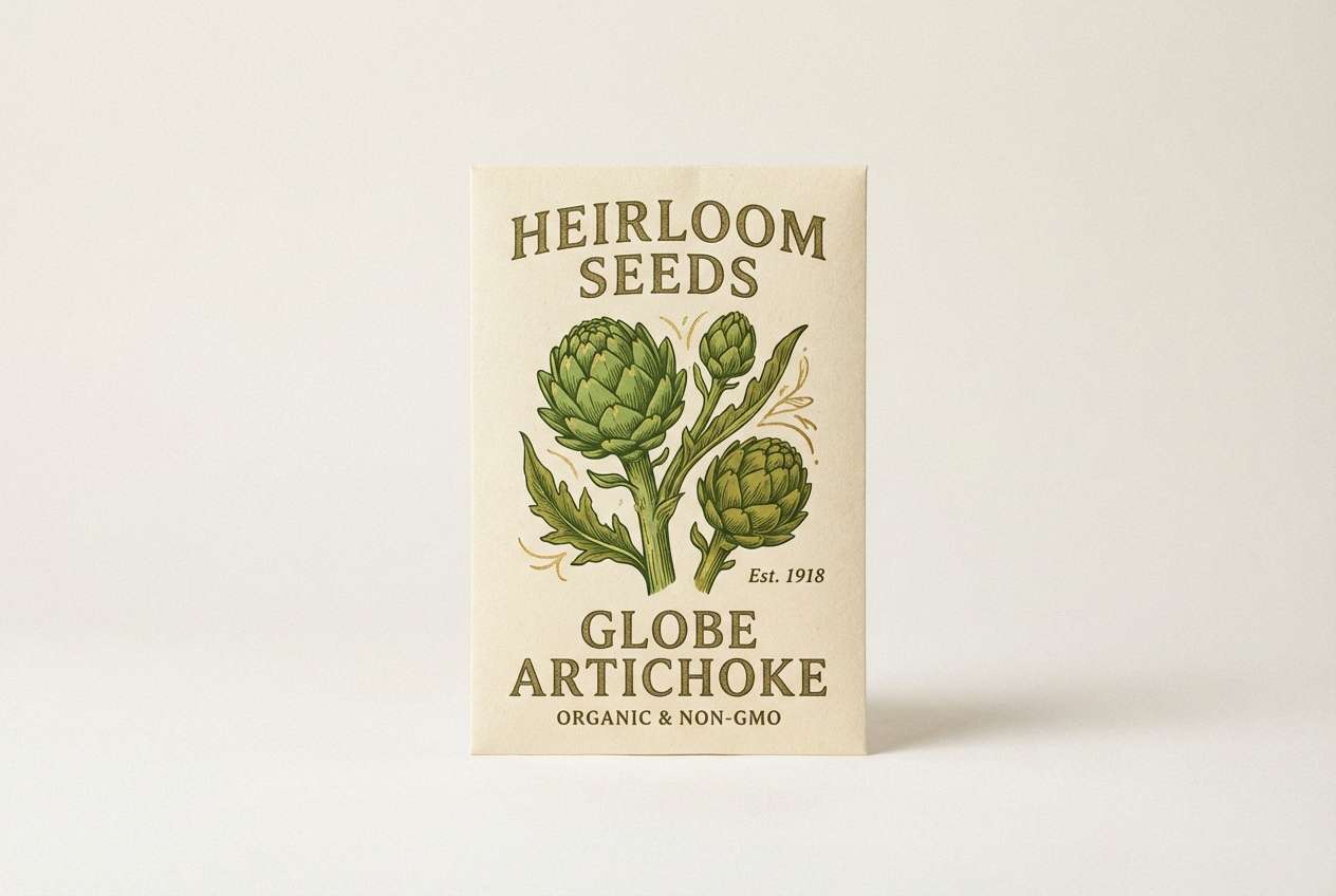
21) Seed Packet Charm
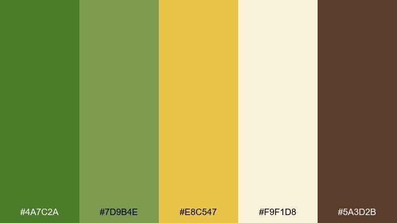
HEX: #4A7C2A #7D9B4E #E8C547 #F9F1D8 #5A3D2B
Mood: cheerful, vintage, crafty
Best for: seed packets and small retail packaging
Cheerful and a bit vintage, like illustrated seed packets in a garden shop. The golden accent adds charm and makes the greens feel sunny rather than serious. Use the warm cream for the main label field and the brown for small details like batch numbers. Tip: keep illustrations in two dominant tones so printing stays clean and consistent.
Image example of seed packet charm generated using media.io
What Colors Go Well with Sap Green?
Soft neutrals are the easiest match: cream, linen, warm beige, and oat tones make sap green feel natural and modern without turning the design too dark. For text, charcoal is usually safer than pure black because it keeps the overall mood organic.
If you want more energy, pair sap green with sunlit accents like citrus yellow, amber, or muted gold. For seasonal warmth, terracotta and burnt orange create a harvest-friendly contrast that still feels grounded.
For premium looks, add near-black, deep forest, and a controlled light panel (off-white) for labels or UI cards. The key is to keep the bright greens as accents so the palette stays refined.
How to Use a Sap Green Color Palette in Real Designs
Start with roles, not just colors: pick one light neutral for backgrounds, one dark neutral for typography, and use sap green as the primary accent for buttons, icons, and headings. This keeps interfaces readable and brand systems consistent.
In print, avoid “muddy” contrast by separating mid greens with plenty of cream space, and use a darker ink (charcoal or deep brown) for small text. For packaging and posters, reserve your warm accent (amber/terracotta) for badges, prices, or calls to action.
If you’re building a full system, create a small ramp: dark green (navigation), sap green (primary action), light green (hover/surface), and neutral background. That gives you hierarchy without needing extra colors.
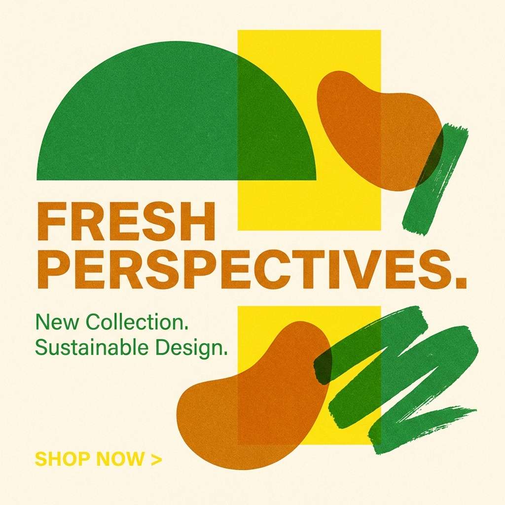
Create Sap Green Palette Visuals with AI
If you have HEX codes but need real mockups, generating visuals is the fastest way to test whether your sap green tones feel calm, premium, or playful. Try creating the same layout in two palettes to compare contrast and “temperature” at a glance.
With Media.io’s text-to-image tool, you can turn a palette idea into packaging, UI screens, posters, and stationery concepts in minutes—then iterate by swapping one accent color at a time.
Use short prompts that describe the design type (menu, label, dashboard), the mood (minimal, rustic, luxe), and your dominant colors (sap green + neutrals), then refine details like lighting and paper texture.
Sap Green Color Palette FAQs
-
What is sap green (and how does it differ from olive or forest green)?
Sap green is a medium, natural-looking green inspired by plant sap—typically brighter and fresher than olive (more brown/yellow) and lighter/less blue than many forest greens. It’s a flexible “middle green” that can read botanical or earthy depending on the neutrals and accents around it. -
Is sap green good for branding?
Yes. Sap green is widely associated with nature, growth, balance, and sustainability, which makes it strong for wellness, eco products, food, outdoors, and lifestyle brands. It also pairs cleanly with modern neutrals, helping brands feel contemporary rather than rustic. -
What background color works best with sap green?
For most designs, warm off-whites (cream, linen, parchment) and soft grays work best because they keep the palette airy and prevent green-on-green from feeling heavy. In dark themes, use near-black/charcoal with small off-white panels for legibility. -
What accent colors make sap green pop?
Citrus yellow, amber/gold, terracotta, and blush pink can make sap green feel more energetic and eye-catching. Use accents sparingly (badges, CTAs, highlights) so the design stays balanced and the green remains the main identity cue. -
What color should text be on sap green?
For readability, use off-white/cream text on darker sap greens, and charcoal/near-black text on light backgrounds. If the sap green is mid-tone, test contrast carefully—often it’s better to use sap green for buttons and headings, and keep body text in charcoal. -
Does sap green work for UI design?
It does, especially when paired with gray-green surfaces and clear dark typography. Use sap green for primary actions and active states, keep backgrounds neutral, and limit the number of greens on one screen to maintain clarity. -
How can I generate sap green palette mockups quickly?
Use an AI text-to-image generator to create quick UI, packaging, or poster concepts from a prompt that includes your sap green palette and the intended style (minimal, rustic, premium). Then iterate by changing one accent color or background neutral at a time.


