

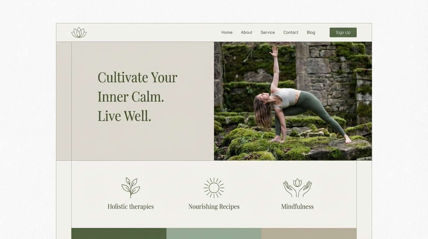
A Japanese garden color palette blends tranquil greens, quiet stone neutrals, and carefully placed accents—perfect for designs that need calm clarity without feeling flat.
Below are 20 Japanese garden color palette ideas with HEX codes, plus real-world use tips and AI prompts you can reuse to generate matching visuals.
In this article
Why Japanese Garden Palettes Work So Well
Japanese garden palettes feel balanced because they’re built around nature’s hierarchy: supportive neutrals (stone, sand, paper) with greens as the main structure and a small accent that draws the eye.
They’re also forgiving in real layouts. Muted tones reduce visual noise, make typography easier to read, and keep interfaces and print designs from looking overly saturated.
Most importantly, these color combinations communicate calm and intention—useful for wellness, editorial, interiors, and any brand that wants a refined, timeless mood.
20+ Japanese Garden Color Palette Ideas (with HEX Codes)
1) Mossy Path
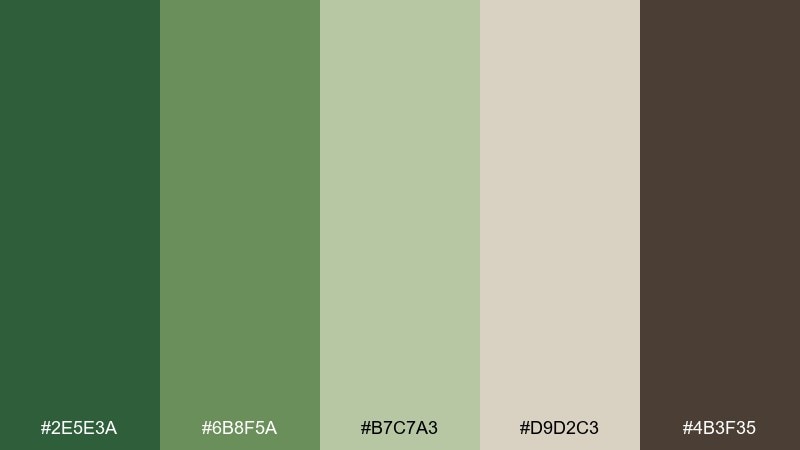
HEX: #2E5E3A #6B8F5A #B7C7A3 #D9D2C3 #4B3F35
Mood: grounded, quiet, restorative
Best for: wellness branding and landing pages
Grounded and restorative, it feels like shaded stepping stones edged with soft moss and damp earth. Use the deep green as your anchor, then let the muted sage and warm stone act as spacious backgrounds. It suits wellness brands, spa sites, and calm product storytelling where legibility matters. Tip: keep text on the light stone tone and reserve the dark brown for subtle dividers and icon strokes.
Image example of mossy path generated using media.io
Media.io is an online AI studio for creating and editing video, image, and audio in your browser.

2) Koi Pond
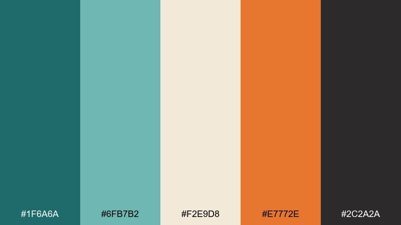
HEX: #1F6A6A #6FB7B2 #F2E9D8 #E7772E #2C2A2A
Mood: lively, balanced, contemporary
Best for: event posters and social graphics
Lively yet balanced, it evokes rippling water, pale sand edges, and a flash of koi in motion. These japanese garden color combinations work best when teal leads, cream supports, and orange becomes a focused accent. Try it on event posters and social templates where you need energy without losing calm. Tip: limit the orange to one focal element per layout to keep the palette feeling refined.
Image example of koi pond generated using media.io

3) Stone Lantern
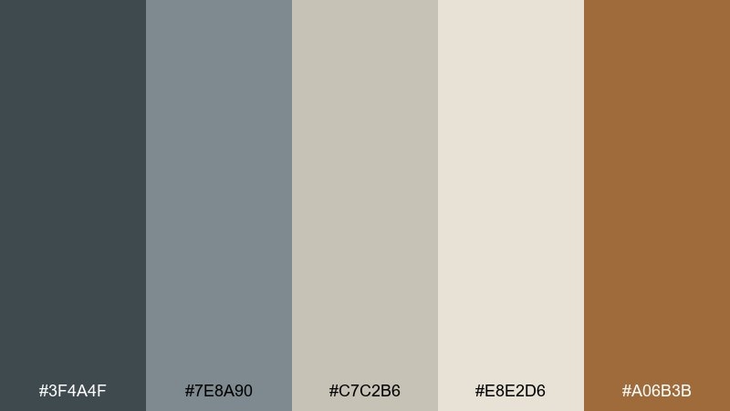
HEX: #3F4A4F #7E8A90 #C7C2B6 #E8E2D6 #A06B3B
Mood: serene, architectural, timeless
Best for: editorial layouts and portfolio sites
Serene and architectural, it recalls weathered granite, soft ash shadows, and warm clay details. As a japanese garden color combination, lean on the mid grays for structure while the off-white gives generous breathing room. It shines in editorial spreads, architecture portfolios, and calm hero sections with lots of negative space. Tip: use the clay tone sparingly for pull quotes, call-to-action buttons, or section headers.
Image example of stone lantern generated using media.io
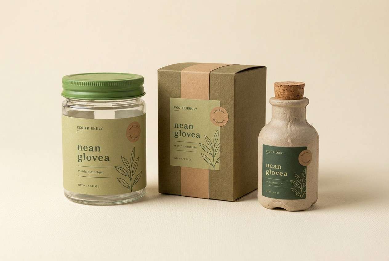
4) Bamboo Shade
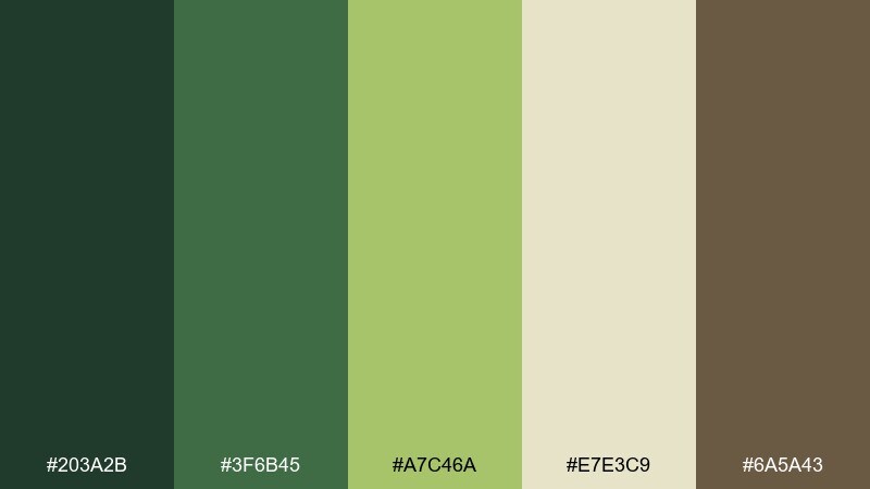
HEX: #203A2B #3F6B45 #A7C46A #E7E3C9 #6A5A43
Mood: fresh, shaded, natural
Best for: eco product packaging
Fresh and shaded, it brings to mind bamboo groves with sunlit leaves and earthy stalks. The light yellow-green works as a friendly brand color, while the cream keeps labels readable and premium. It fits eco packaging, tea products, and sustainable skincare with a natural story. Tip: print the darkest green for typography and use the brown as a thin border to make the label feel crafted.
Image example of bamboo shade generated using media.io
5) Sakura Mist
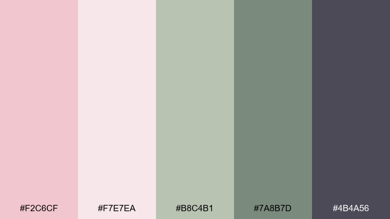
HEX: #F2C6CF #F7E7EA #B8C4B1 #7A8B7D #4B4A56
Mood: airy, romantic, modern
Best for: wedding invitations and stationery
Airy and romantic, it suggests falling petals over quiet greenery and cool dusk shadows. The blush and near-white are ideal for spacious stationery, while the desaturated greens keep it grounded. It works beautifully for wedding invitations, RSVP cards, and tasteful lifestyle branding. Tip: foil or emboss the charcoal tone for names and headings to add a premium finish without overpowering the softness.
Image example of sakura mist generated using media.io
6) Tea House
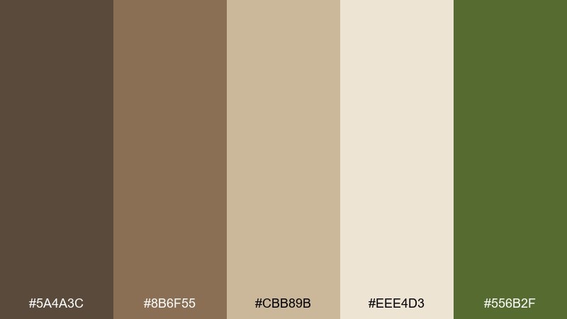
HEX: #5A4A3C #8B6F55 #CBB89B #EEE4D3 #556B2F
Mood: warm, traditional, inviting
Best for: cafe branding and menus
Warm and inviting, it feels like tatami mats, roasted tea aromas, and aged wood in soft light. The caramel and beige tones create instant comfort, while olive green adds a quiet botanical note. Use it for cafe logos, menu systems, and packaging where a handcrafted vibe matters. Tip: keep the darkest brown for headlines and let the cream carry body text for effortless readability.
Image example of tea house generated using media.io
7) Autumn Maple
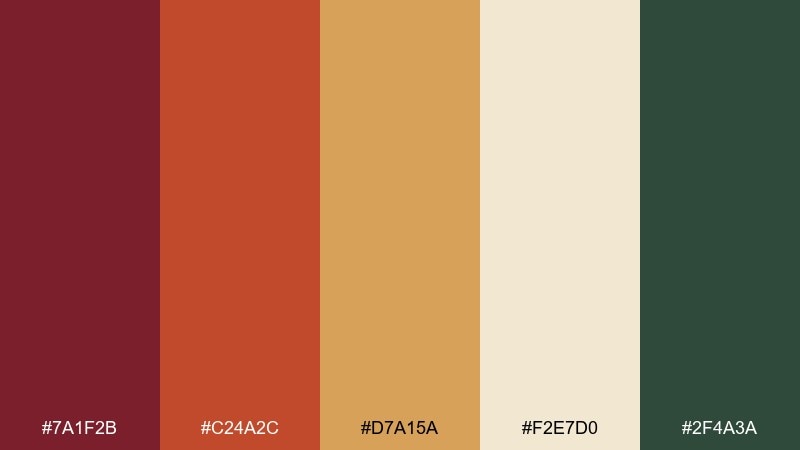
HEX: #7A1F2B #C24A2C #D7A15A #F2E7D0 #2F4A3A
Mood: bold, seasonal, cinematic
Best for: campaign creatives and banners
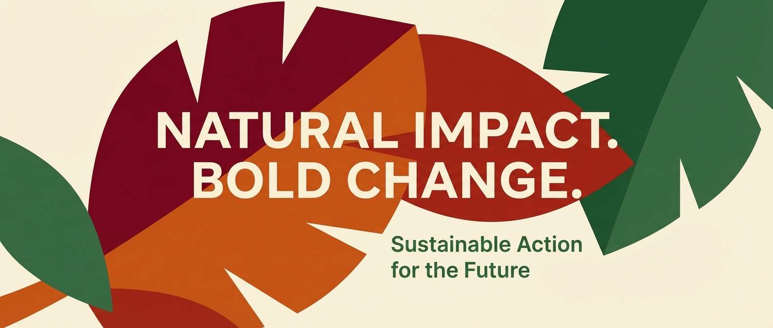
Bold and cinematic, it channels fiery maple leaves against evergreen depth and pale stone paths. Use the reds for focal shapes and calls-to-action, then balance them with cream and forest green to avoid visual heat overload. It suits seasonal campaigns, hero banners, and book covers that need drama with restraint. Tip: pair the darker red with cream for headlines and reserve the orange for highlights and badges.
Image example of autumn maple generated using media.io
8) Rainy Gravel
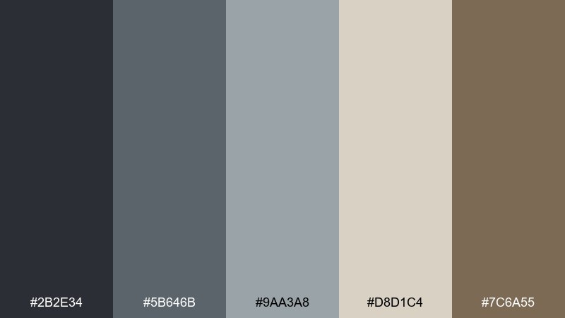
HEX: #2B2E34 #5B646B #9AA3A8 #D8D1C4 #7C6A55
Mood: moody, minimal, sophisticated
Best for: product UI dashboards
Moody and minimal, it resembles wet gravel, soft fog, and worn stone after rain. The gray range gives you strong hierarchy for dashboards, while the warm taupe keeps the look human rather than sterile. It fits analytics UIs, productivity tools, and premium SaaS sites. Tip: use the darkest charcoal for navigation and the light stone as the main canvas to reduce eye strain.
Image example of rainy gravel generated using media.io
9) Iris Brook
HEX: #2E4C7A #5A7FA8 #BFD3DA #EADFD2 #6B6A3A
Mood: cool, reflective, elegant
Best for: editorial headers and blog themes
Cool and reflective, it hints at a shaded brook with iris petals and misty air. The blues create calm authority for headers, while the warm beige prevents the layout from feeling icy. Great for blog themes, long-form articles, and editorial hero sections. Tip: use the olive as a small accent for links or category tags to add an organic twist.
Image example of iris brook generated using media.io
10) Zen Sand
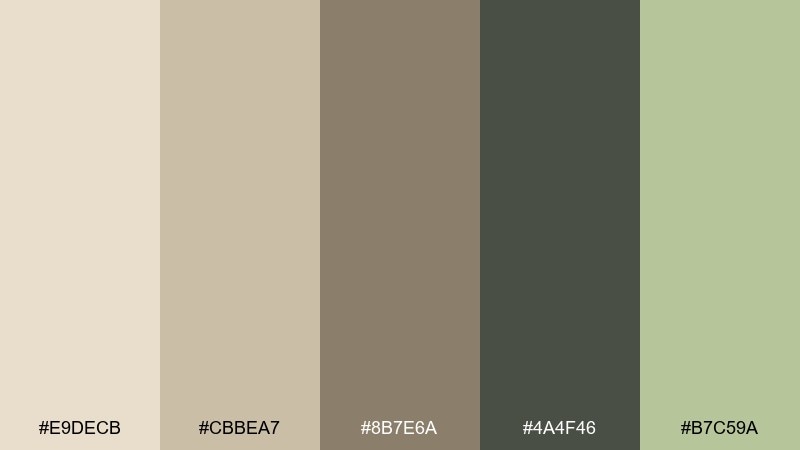
HEX: #E9DECB #CBBEA7 #8B7E6A #4A4F46 #B7C59A
Mood: quiet, airy, meditative
Best for: interior mood boards and presentations
Quiet and meditative, it mirrors raked sand, smooth pebbles, and a hint of soft leaf green. The beige and oat tones make a calm base, with charcoal giving structure for type and diagrams. Use it in interior presentations, pitch decks, and calm portfolio slides. Tip: add the pale green only to a few key callouts so the neutrals stay dominant.
Image example of zen sand generated using media.io
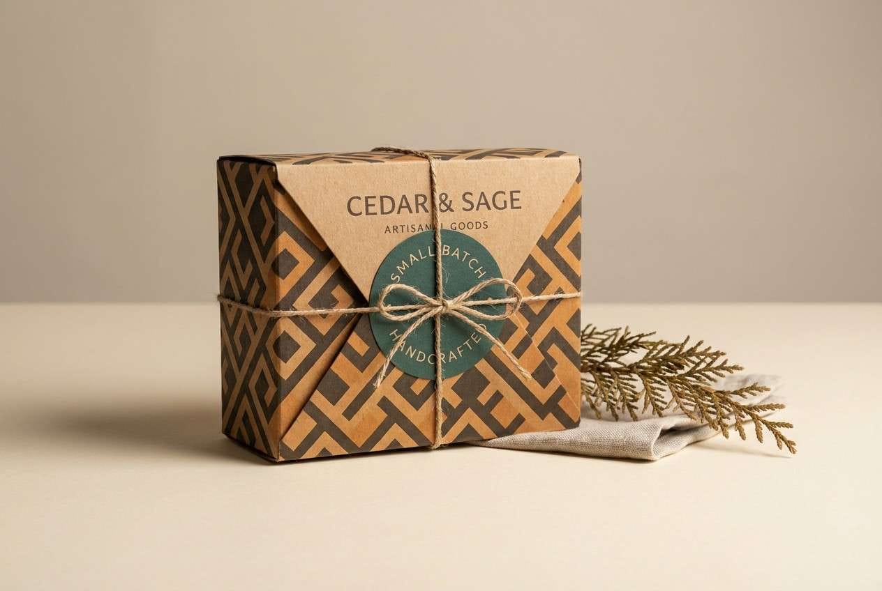
11) Cedar Gate
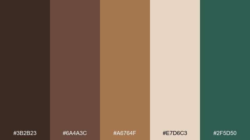
HEX: #3B2B23 #6A4A3C #A6764F #E7D6C3 #2F5D50
Mood: rustic, grounded, confident
Best for: outdoor brand identities
Rustic and confident, it brings the feel of cedar gates, sun-warmed timber, and deep green shadows. The wood tones make logos and badges feel handcrafted, while the creamy highlight keeps everything legible. It suits outdoor brands, heritage packaging, and artisanal goods. Tip: use the teal-green as a secondary brand color for stamps, seals, or small UI highlights.
Image example of cedar gate generated using media.io
12) Wisteria Dusk
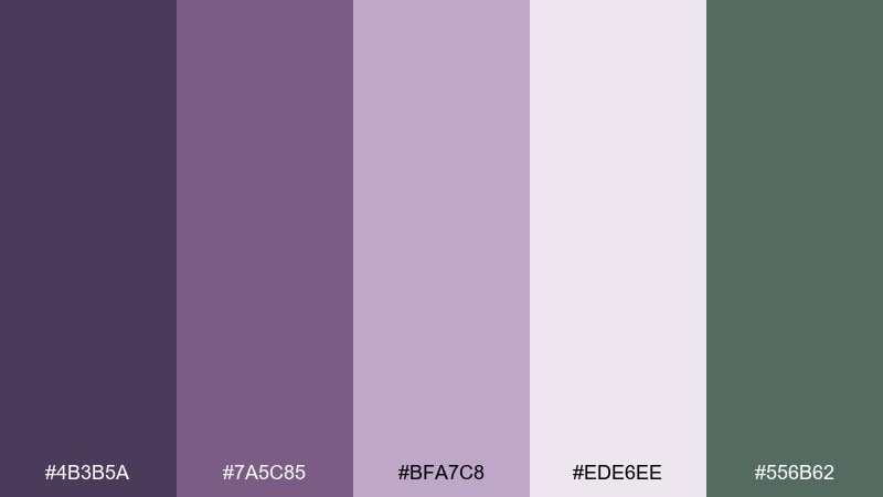
HEX: #4B3B5A #7A5C85 #BFA7C8 #EDE6EE #556B62
Mood: dreamy, refined, slightly mysterious
Best for: beauty branding and lookbooks
Dreamy and refined, it recalls wisteria clusters at dusk with cool green foliage in the background. Lavender and mauve create a soft luxury feel, while the pale lilac keeps layouts airy. Ideal for beauty brands, lookbooks, and boutique social templates. Tip: pair mauve with the near-white for product names, and use the deep plum for small, high-contrast details.
Image example of wisteria dusk generated using media.io
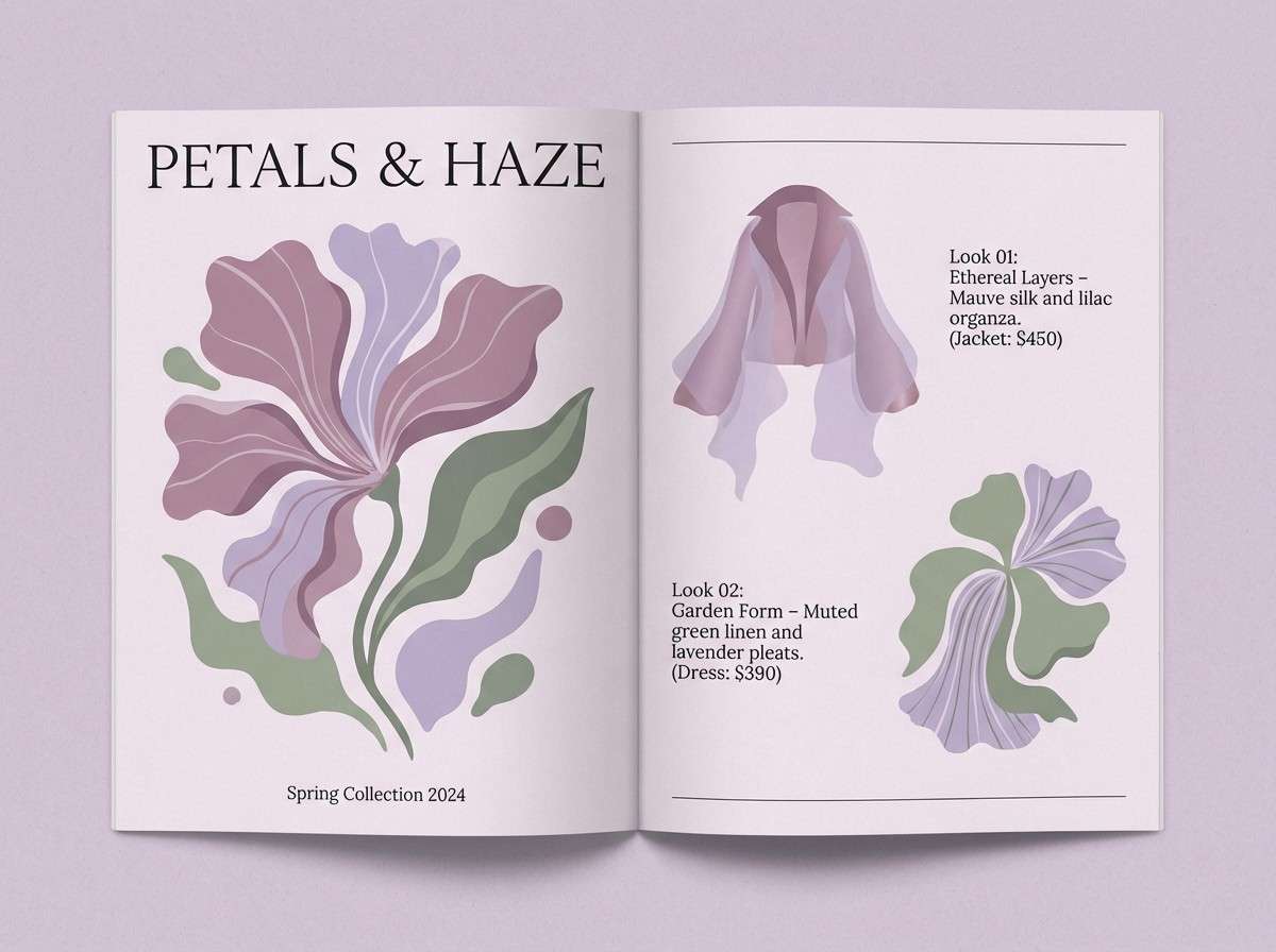
13) Plum Blossom
HEX: #8A1C3E #C35A7C #F2D5DF #DDE3D6 #39423B
Mood: romantic, vibrant, poised
Best for: spring promos and boutique logos
Romantic and poised, it evokes plum blossoms against fresh greenery and deep ink-like shadows. Use the rich plum for a signature mark, then soften with blush for backgrounds and supportive shapes. It works well for spring promotions, boutique logos, and elegant packaging. Tip: keep the dark green as your text color when blush is the background for a calmer contrast than pure black.
Image example of plum blossom generated using media.io
14) Fern Grotto
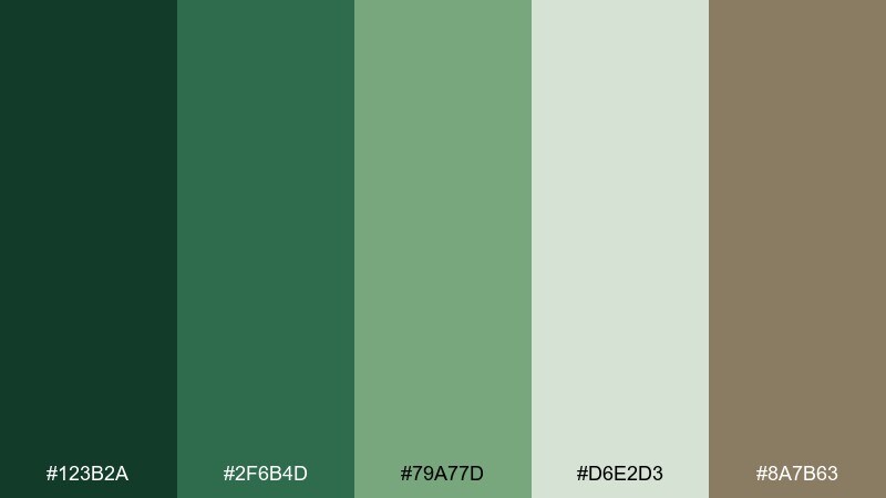
HEX: #123B2A #2F6B4D #79A77D #D6E2D3 #8A7B63
Mood: lush, cool, restorative
Best for: nature blogs and eco newsletters
Lush and restorative, it feels like dense ferns in a shaded grotto with cool air and damp stone nearby. The layered greens build depth for headers and buttons, while the pale minty neutral keeps reading areas light. Great for nature blogs, eco newsletters, and conservation campaigns. Tip: set your primary call-to-action in the mid green and keep secondary actions in the soft neutral for a calm hierarchy.
Image example of fern grotto generated using media.io
15) Pagoda Roof
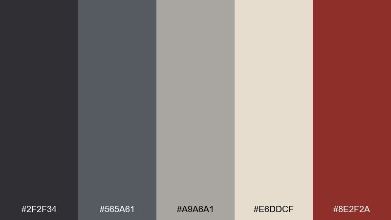
HEX: #2F2F34 #565A61 #A9A6A1 #E6DDCF #8E2F2A
Mood: heritage, dramatic, elegant
Best for: museum posters and cultural events
Dramatic and heritage-rich, it suggests tiled roofs, deep shadows, and a refined red seal stamp. The grays build a dignified base, while the warm off-white keeps the design open and modern. Use it for museum posters, cultural events, and minimalist merchandise. Tip: treat the deep red as a stamp-like accent for dates or key details rather than a full background.
Image example of pagoda roof generated using media.io

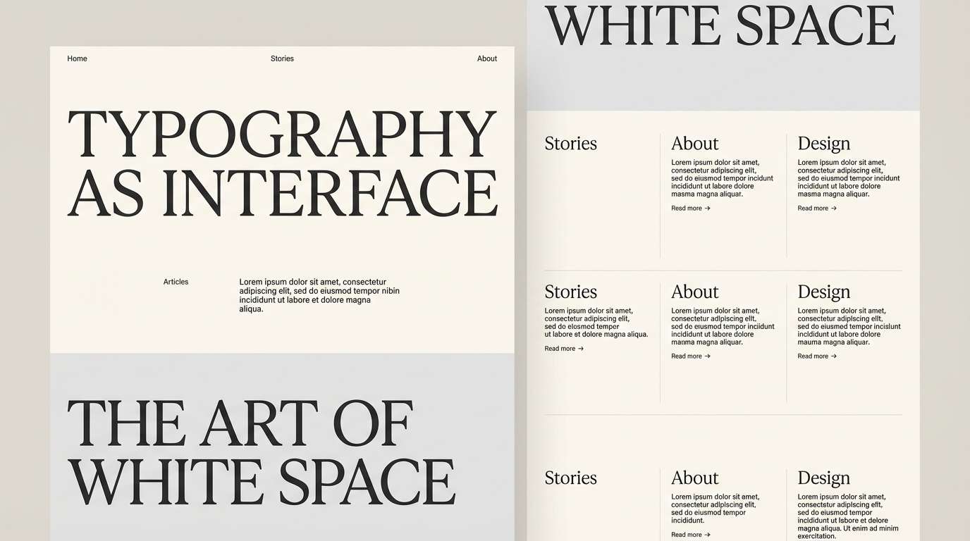
16) Shoji Paper
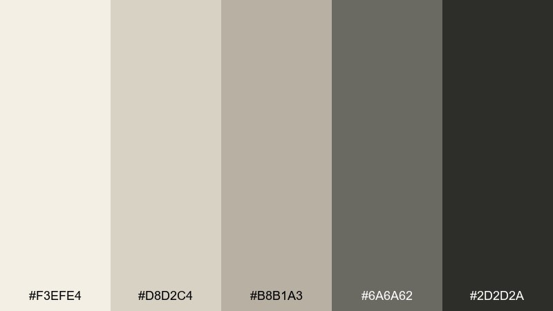
HEX: #F3EFE4 #D8D2C4 #B8B1A3 #6A6A62 #2D2D2A
Mood: minimal, airy, refined
Best for: typography-focused websites
Minimal and refined, it captures the glow of shoji screens and soft, layered neutrals. The creamy whites make an ideal canvas for typography, while the grays provide consistent UI structure. Perfect for writing portfolios, editorial sites, and product pages that rely on clean hierarchy. Tip: use the near-black only for headings and key icons, keeping most text in the mid gray for a gentler look.
Image example of shoji paper generated using media.io
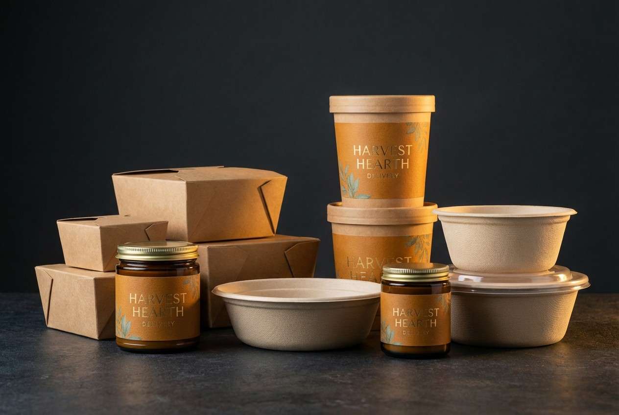
17) Lantern Glow
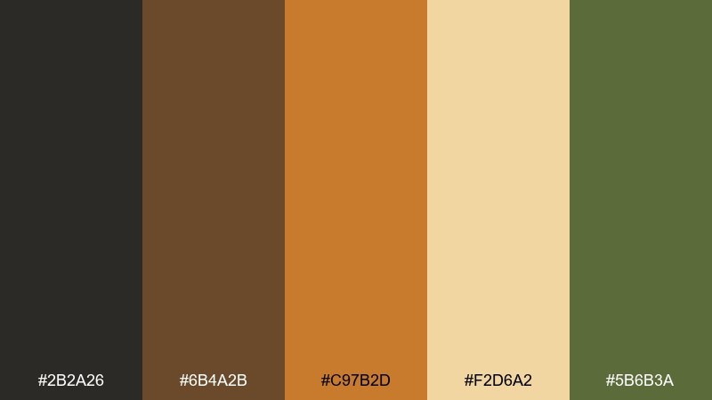
HEX: #2B2A26 #6B4A2B #C97B2D #F2D6A2 #5B6B3A
Mood: cozy, warm, cinematic
Best for: restaurant promos and packaging
Cozy and cinematic, it feels like lantern light reflecting on wood with a muted garden green nearby. The amber and gold are strong for appetite appeal, while the near-black keeps typography sharp. Use it for restaurant promos, seasonal packaging, and warm hero banners. Tip: let gold sit on dark backgrounds for maximum glow, and keep green as a supporting garnish color.
Image example of lantern glow generated using media.io
18) Pine Needle
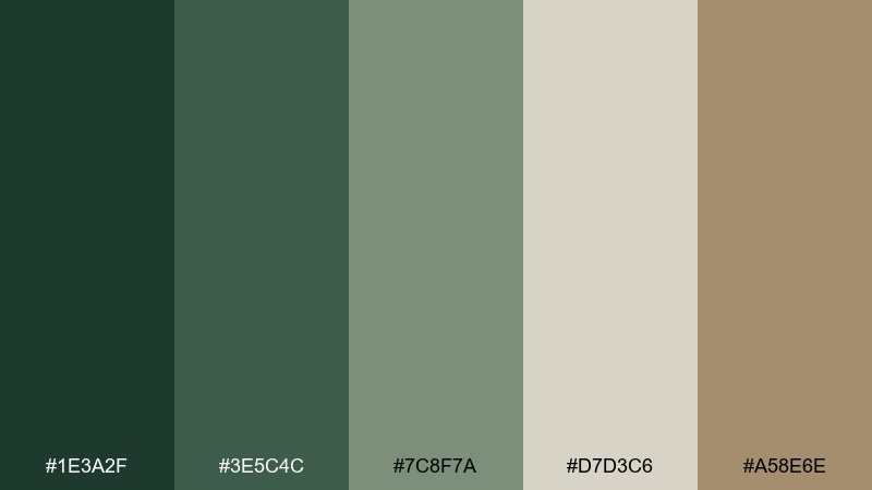
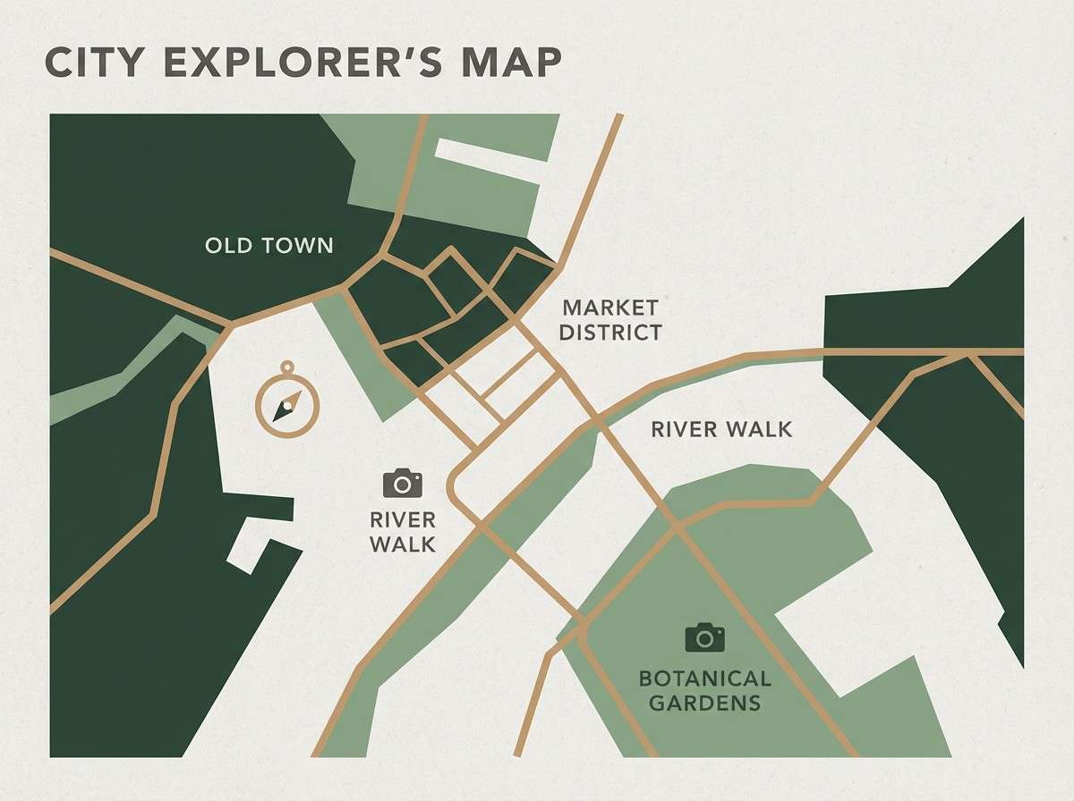
HEX: #1E3A2F #3E5C4C #7C8F7A #D7D3C6 #A58E6E
Mood: crisp, calm, outdoorsy
Best for: travel guides and map designs
Crisp and calm, it calls up pine needles, cool shade, and sandy trails. The greens work well for map elements and navigation, while the light neutral supports readable labels. Great for travel guides, location pages, and outdoorsy print materials. Tip: use the tan as a route highlight color to stand out without resorting to neon accents.
Image example of pine needle generated using media.io
19) River Rock
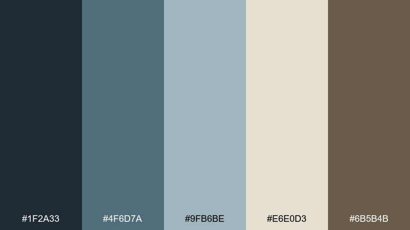
HEX: #1F2A33 #4F6D7A #9FB6BE #E6E0D3 #6B5B4B
Mood: cool, steady, professional
Best for: corporate reports and slide decks
Cool and steady, it feels like smooth river rocks under shallow water with a warm shoreline note. The blue-grays bring a professional tone, and the creamy neutral keeps slides from looking heavy. Use it for corporate reports, pitch decks, and data storytelling with a softer edge. Tip: set charts in the mid blue-gray and reserve the darkest tone for axes and labels to keep visuals clean.
Image example of river rock generated using media.io

20) Morning Dew
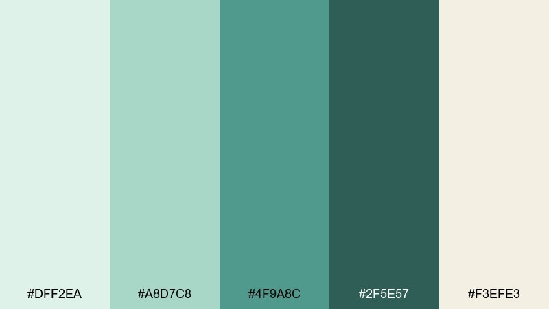
HEX: #DFF2EA #A8D7C8 #4F9A8C #2F5E57 #F3EFE3
Mood: fresh, clean, optimistic
Best for: skincare ads and product pages
Fresh and optimistic, it looks like morning dew on leaves with soft light washing over pale stone. The mint and teal tones feel hygienic and modern, while the warm off-white keeps the page welcoming. Ideal for skincare ads, product pages, and clean lifestyle content. Tip: use the darkest teal for trust signals like badges and guarantees, and keep backgrounds mostly in the airy mint.
Image example of morning dew generated using media.io
What Colors Go Well with Japanese Garden?
Japanese garden palettes pair best with layered greens (matcha, moss, bamboo) and soft neutrals like stone gray, sand beige, and warm off-white. These create a quiet base that stays readable across web and print.
For accents, choose one intentional “focus” color: koi orange, seal red, plum, or sakura pink. A single accent used sparingly feels authentic to the style and keeps layouts from turning busy.
If you need more contrast, add a near-black ink tone or charcoal instead of pure black. It preserves the calm mood while still giving strong hierarchy for headlines and UI elements.
How to Use a Japanese Garden Color Palette in Real Designs
Start with a neutral canvas (cream, warm gray, sand) for backgrounds, then place greens into navigation, headers, or large shapes. This mirrors the “ground + foliage” logic that makes nature palettes feel coherent.
Reserve the accent for one job per layout: a primary button, a date badge, a product highlight, or a key illustration element. Limiting accents is the fastest way to keep a Japanese garden color scheme refined.
For typography and accessibility, use the darkest tone for headings and UI outlines, and keep body text on the lightest neutral. This maintains calm while ensuring clear contrast and comfortable reading.
Create Japanese Garden Palette Visuals with AI
If you want your palette to look consistent across posters, landing pages, packaging, or invitations, generate matching concept visuals first. It helps you test balance (dominant neutrals, supporting greens, and one accent) before design production.
With Media.io, you can reuse the prompts above, swap in your brand keywords, and quickly iterate on layout styles and aspect ratios—without needing a full photo shoot or mockup kit.
Try generating a few variations: one minimal shoji-paper layout, one koi-accent poster, and one moody rainy-gravel UI. You’ll quickly see which direction fits your project.
Japanese Garden Color Palette FAQs
-
What is a Japanese garden color palette?
A Japanese garden color palette is typically built from natural greens (moss, bamboo, pine), quiet neutrals (stone, sand, paper), and one restrained accent (koi orange, seal red, sakura pink) to guide focus. -
Which greens feel most “Japanese garden” in design?
Muted, slightly desaturated greens work best—think matcha, moss, pine, and deep forest tones. They feel organic and calm compared to bright neon greens. -
What neutral colors should I pair with zen greens?
Warm off-whites, sand beige, oat, and stone gray pair well with zen green. These neutrals keep layouts airy and make typography easier to read. -
What accent color works best with Japanese garden palettes?
Koi orange, deep seal red, plum, or soft sakura pink are classic accents. Use the accent sparingly—usually as a button, badge, or small highlight—to keep the overall mood refined. -
Are Japanese garden color combinations good for branding?
Yes. They communicate calm, trust, and craft—great for wellness, skincare, tea/cafes, eco brands, editorial sites, and interiors. The muted range also reproduces well across digital and print. -
How do I keep a Japanese garden palette from looking dull?
Add depth with multiple values (dark, mid, light) and introduce one high-focus accent color. Also use texture—paper-like off-whites or stone-like grays—to keep the design visually rich without increasing saturation. -
Can I generate Japanese garden palette images with AI?
Yes. Use a clear prompt that describes the design type (poster/UI/packaging), set your dominant tones and a single accent, and keep the background minimal. Media.io makes it easy to iterate and match your HEX palette direction.
Next: Fireworks Color Palette


