

Rococo color palettes blend powdered pastels, creamy neutrals, and gilded accents into a look that feels romantic, ornate, and surprisingly modern.
Whether you’re building branding, wedding stationery, UI screens, or packaging, these rococo colors help you communicate softness with structure—never flat, never harsh.
In this article
- Why Rococo Palettes Work So Well
-
- powdered court
- salon porcelain
- gilded pastel
- rosewater fresco
- mint marzipan
- lilac lace
- apricot cherub
- pearl cameo
- antique ribbon
- blue rocaille
- velvet parlor
- sugarplum opera
- champagne stucco
- spring tuileries
- silk fan
- honeyed frame
- dawn chiffon
- iris pavilion
- lace and limestone
- charcoal rococo
- pastel gallery night
- What Colors Go Well with Rococo?
- How to Use a Rococo Color Palette in Real Designs
- Create Rococo Palette Visuals with AI
Why Rococo Palettes Work So Well
A rococo color palette is built for elegance: blush pinks, porcelain blues, creams, and soft golds create instant refinement without needing loud saturation.
Because most rococo colors live in a light-to-mid value range, designs feel airy and premium—great for layouts that need “breathing room” like packaging, invites, and editorial spreads.
Add one grounding shade (taupe, charcoal, burgundy, or slate) and the look becomes modern and readable, giving those French pastel tones a crisp, professional finish.
20+ Rococo Color Palette Ideas (with HEX Codes)
1) Powdered Court
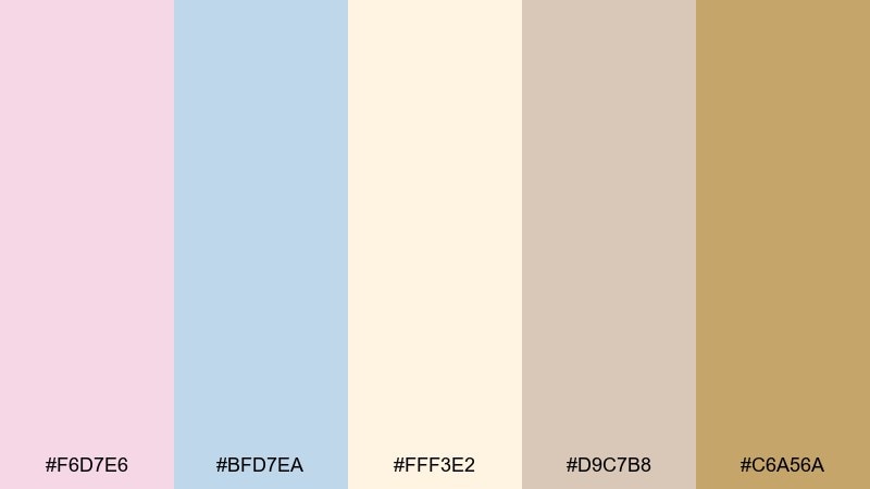
HEX: #F6D7E6 #BFD7EA #FFF3E2 #D9C7B8 #C6A56A
Mood: airy, romantic, refined
Best for: luxury skincare branding and labels
Airy blush, porcelain blue, and warm cream feel like powder and silk in a candlelit salon. The mix reads elegant without turning sugary, especially with the antique gold accent. Use it for premium beauty packaging, seals, and label systems that need softness plus authority. Tip: keep typography in a deep taupe or near-black to prevent the pastels from washing out, and use the gold only for small highlights.
Image example of powdered court generated using media.io
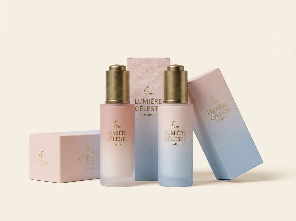
Media.io is an online AI studio for creating and editing video, image, and audio in your browser.

2) Salon Porcelain
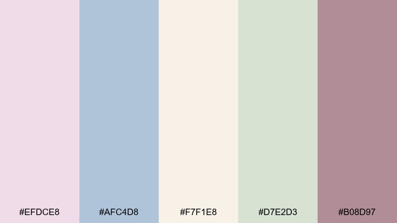
HEX: #EFDCE8 #AFC4D8 #F7F1E8 #D7E2D3 #B08D97
Mood: calm, polished, vintage
Best for: editorial layouts and lookbooks
Muted mauve and misty blue evoke painted porcelain and quiet museum light. The creamy base keeps pages bright while the sage tint adds an understated, contemporary edge. It works beautifully for magazine spreads, fashion lookbooks, and refined blog visuals where photos need breathing room. Tip: set headings in the deeper mauve for hierarchy, then use the blue for rules, pull quotes, and small navigation elements.
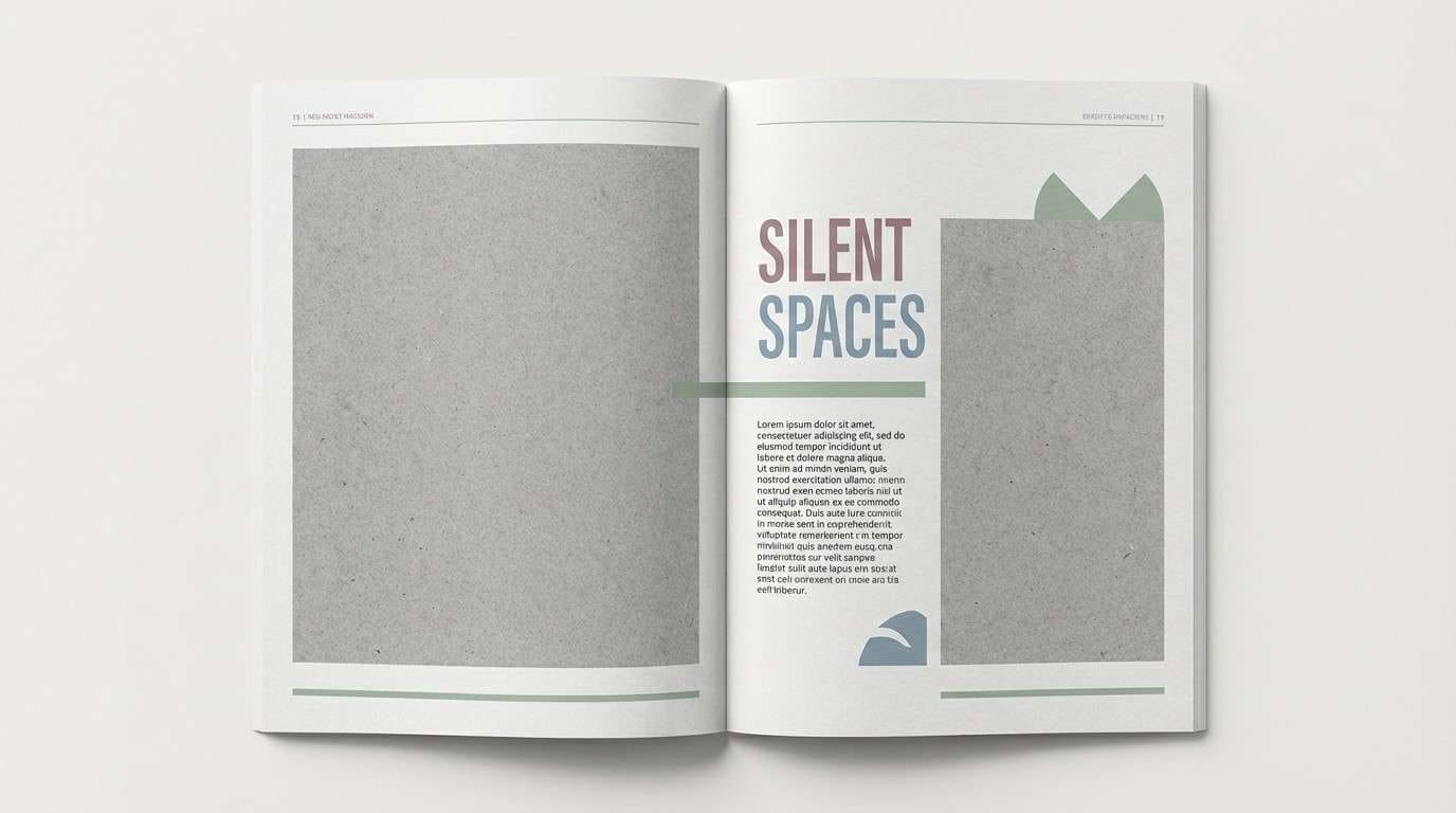
Image example of salon porcelain generated using media.io
3) Gilded Pastel
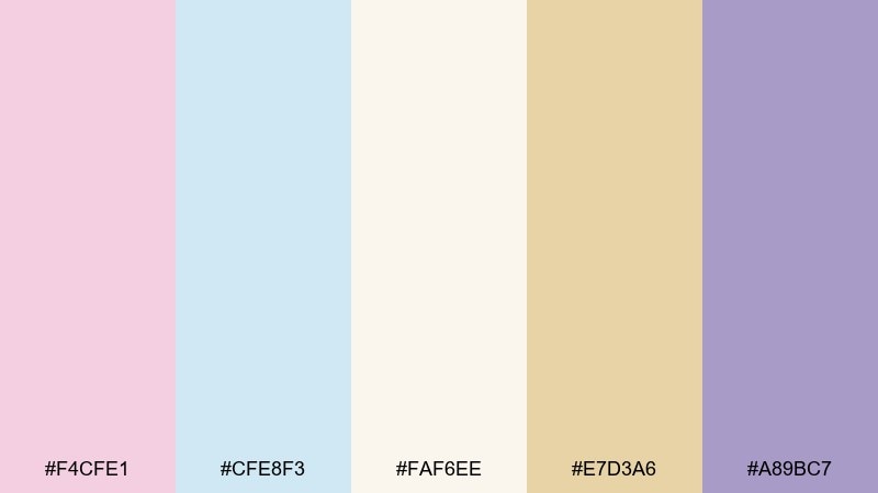
HEX: #F4CFE1 #CFE8F3 #FAF6EE #E7D3A6 #A89BC7
Mood: dreamy, ornate, luminous
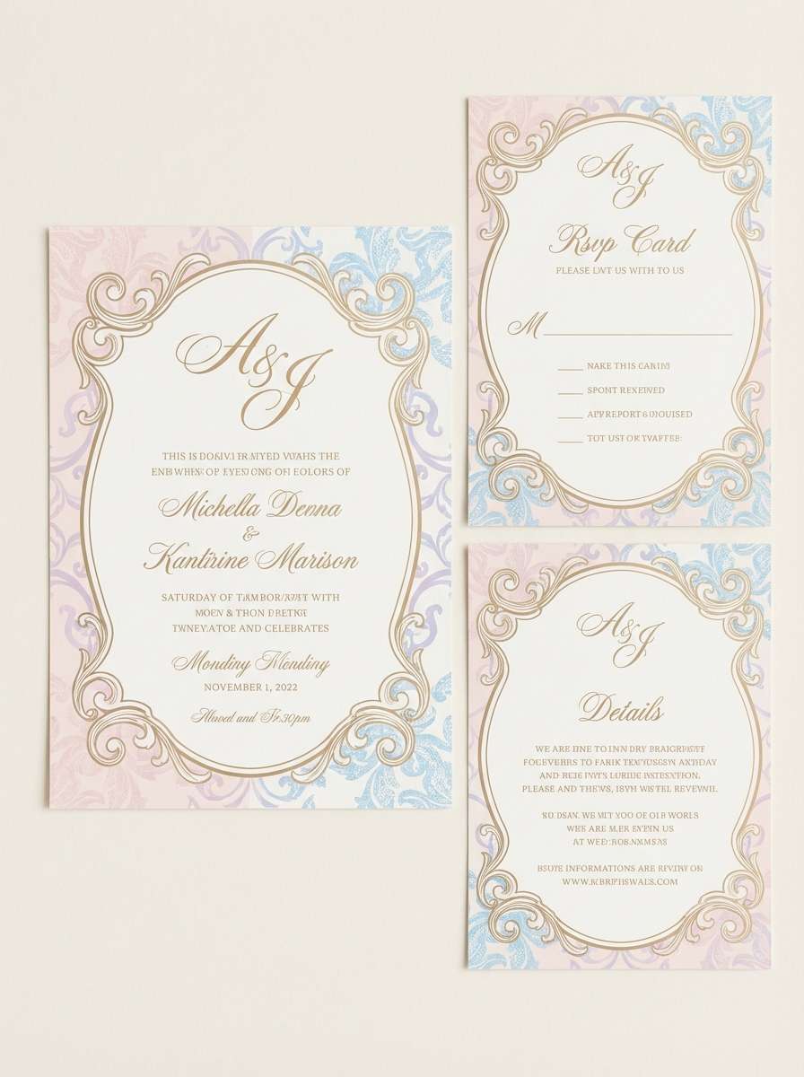
Best for: wedding invitations and stationery suites
Dreamy pink, airy blue, and champagne gold feel like frescoed ceilings and gilded frames. The lilac note adds depth so the pastels stay sophisticated. As a rococo color palette, it suits invitation suites, menus, and day-of signage that want romance with a museum-grade finish. Tip: print the gold as foil or a warm metallic ink, and keep the background in the soft ivory for legibility.
Image example of gilded pastel generated using media.io
4) Rosewater Fresco

HEX: #F7C9D4 #F2E9E1 #C9DCEB #DCE8D6 #8E7C72
Mood: fresh, graceful, airy
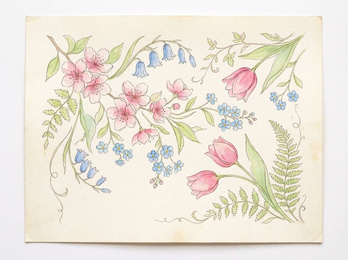
Best for: spring botanical illustrations
Rosewater pink and soft sky blue feel like watercolor washes over plaster walls. Gentle green keeps it botanical, while the warm stone tone grounds the whole set. Use it for floral prints, seasonal social posts, and gentle product inserts where you want a light touch. Tip: let the stone tone outline stems and labels so the pastels stay crisp instead of blending together.
Image example of rosewater fresco generated using media.io
5) Mint Marzipan
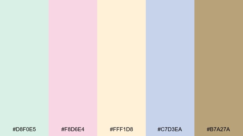
HEX: #D8F0E5 #F8D6E4 #FFF1D8 #C7D3EA #B7A27A
Mood: playful, sweet, polished
Best for: bakery packaging and menu design
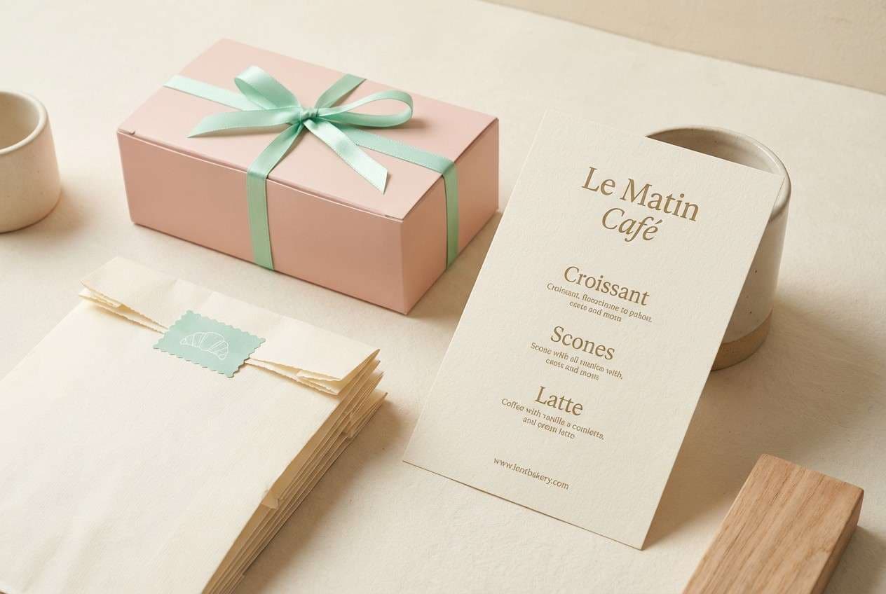
Minty freshness with blush and vanilla cream suggests macarons in a glass case. The periwinkle note makes the palette feel less dessert-only and more design-forward. It shines on pastry boxes, cafe menus, and loyalty cards where you need softness that still reads clean. Tip: use the gold-brown as the primary text color and reserve mint for backgrounds or panels to avoid low contrast.
Image example of mint marzipan generated using media.io
6) Lilac Lace
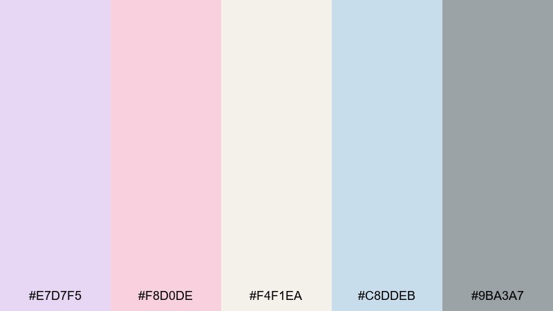
HEX: #E7D7F5 #F8D0DE #F4F1EA #C8DDEB #9BA3A7
Mood: soft, airy, modern-vintage
Best for: beauty UI and onboarding screens
Lilac and blush feel like lace shadows on a sunlit vanity. The cool gray keeps the pastels from becoming overly precious, making it friendly for digital layouts. Use it for onboarding flows, feature cards, and gentle gradients in beauty or wellness apps. Tip: keep buttons in the gray or blue for clarity, and use lilac only as a background tint or large card surface.
Image example of lilac lace generated using media.io

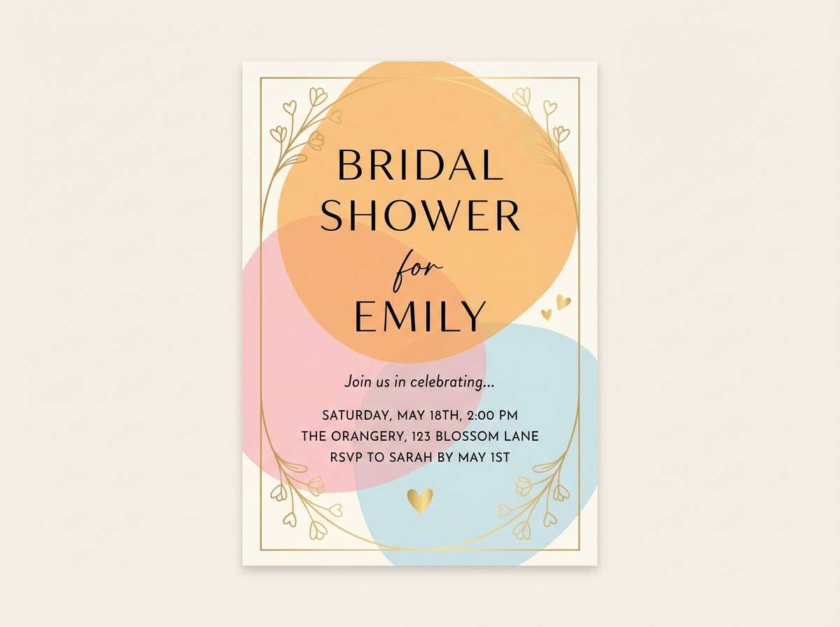
7) Apricot Cherub
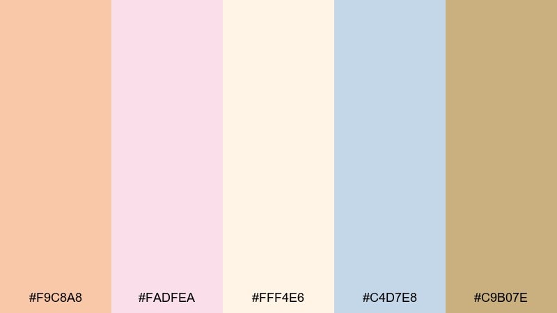
HEX: #F9C8A8 #FADFEA #FFF4E6 #C4D7E8 #C9B07E
Mood: sunlit, cheerful, romantic
Best for: bridal shower flyers and party posters
Apricot warmth and petal pink evoke cherubs, ribbons, and late-afternoon glow. The pale blue adds freshness, while the soft gold keeps it celebratory. These rococo color combinations work well for party posters, shower invites, and cute event signage without looking childish. Tip: use apricot for large shapes and headers, then save gold for borders and tiny icons to keep the design light.
Image example of apricot cherub generated using media.io
8) Pearl Cameo

HEX: #F6F2EE #E9D2D8 #C9D7E5 #D9E3D2 #7F7A74
Mood: quiet, elegant, understated
Best for: minimal branding and packaging systems
Pearl neutrals with blush and powder blue feel like a cameo set into matte stone. The gentle green keeps it calm and fresh, while the gray-brown adds seriousness for typography. Use it for minimalist packaging, boutique identity systems, and premium inserts where subtlety is the point. Tip: lean on the pearl and gray for most surfaces, and apply blush only in small brand marks or inside-lid moments.
Image example of pearl cameo generated using media.io
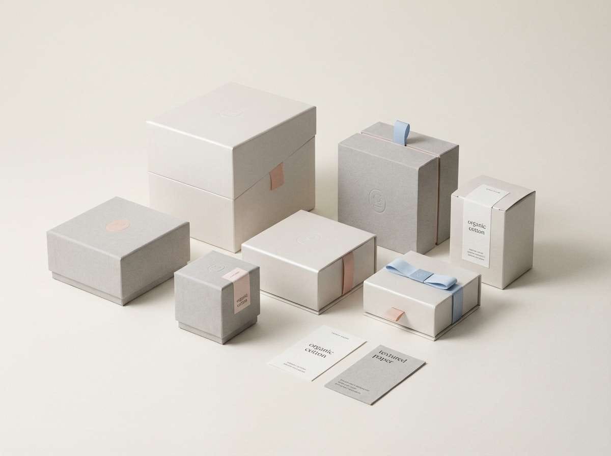
9) Antique Ribbon
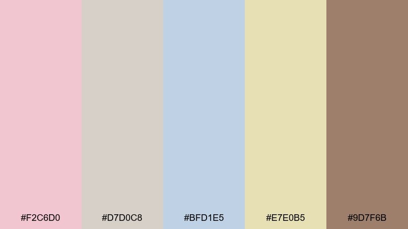
HEX: #F2C6D0 #D7D0C8 #BFD1E5 #E7E0B5 #9D7F6B
Mood: nostalgic, warm, collected
Best for: scrapbook aesthetics and social templates
Dusty rose and linen tones recall antique ribbons tucked into a keepsake box. The soft blue cools the warmth, and the faded gold adds that thrifted, timeworn charm. It fits scrapbooking layouts, story templates, and lifestyle collages that want gentle cohesion. Tip: use the brown as a consistent text and outline color so the lighter tones can layer without losing definition.
Image example of antique ribbon generated using media.io
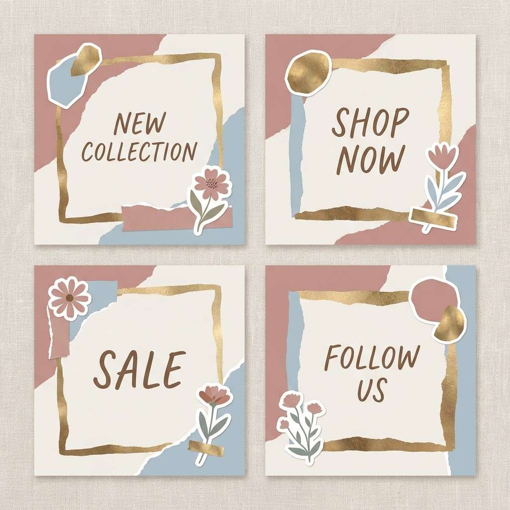
10) Blue Rocaille
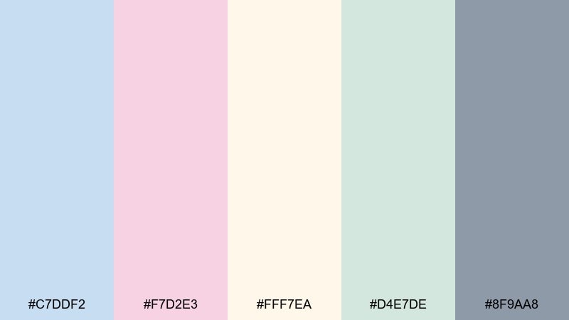
HEX: #C7DDF2 #F7D2E3 #FFF7EA #D4E7DE #8F9AA8
Mood: fresh, ornate, breezy
Best for: home decor mood boards
Breezy blue and blush sit like rocaille carvings against creamy plaster. The minty tint keeps it light and livable, while the steel gray gives structure. Use it for interior mood boards, curtain and upholstery pairings, or airy presentation decks. Tip: choose one dominant pastel for large surfaces, then use the gray for lines, captions, and measurements to keep everything readable.
Image example of blue rocaille generated using media.io

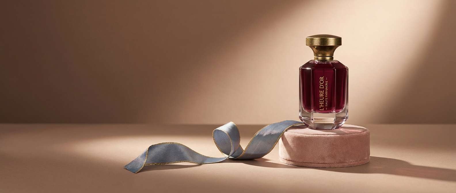
11) Velvet Parlor
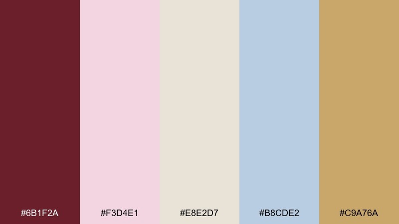
HEX: #6B1F2A #F3D4E1 #E8E2D7 #B8CDE2 #C9A76A
Mood: dramatic, romantic, luxe
Best for: premium fragrance ads and hero visuals
Deep burgundy velvet against blush and antique gold brings candlelit drama with a modern edge. The cool blue keeps the richness from feeling heavy, while the warm neutral smooths transitions. As a rococo color palette, it works for fragrance campaigns, premium landing pages, and gift sets that need instant opulence. Tip: use burgundy sparingly as a focal block or headline color, and let blush carry the larger backgrounds for balance.
Image example of velvet parlor generated using media.io
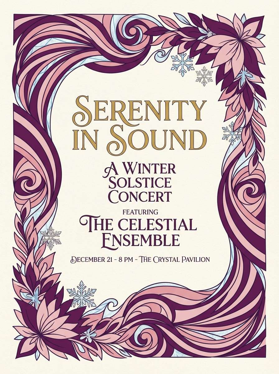
12) Sugarplum Opera
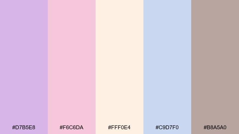
HEX: #D7B5E8 #F6C6DA #FFF0E4 #C9D7F0 #B8A5A0
Mood: whimsical, theatrical, soft
Best for: event tickets and concert posters
Sugarplum purple and ballet pink feel like velvet curtains and stage lights softened by haze. Creamy peach keeps it welcoming, and the icy blue adds a crisp modern layer. Use it for concert posters, ticket graphics, and cultural event branding where you want charm without clutter. Tip: keep the background pale and place the strongest purple only on key titles so the layout stays readable from a distance.
Image example of sugarplum opera generated using media.io
13) Champagne Stucco

HEX: #F7E7D2 #F3C9D8 #D0E0EF #E4E9DD #A68B6B
Mood: warm, classic, inviting
Best for: lifestyle blog headers and thumbnails
Champagne beige and blush feel like sun on textured stucco, calm and a little nostalgic. Powder blue and soft sage keep the warmth fresh for modern screens. It fits blog headers, Pinterest thumbnails, and gentle content templates that need a cohesive look across seasons. Tip: set a consistent neutral background and rotate only one accent color per post to maintain a recognizable visual system.
Image example of champagne stucco generated using media.io

14) Spring Tuileries

HEX: #D7F1D8 #F7CCD9 #FFF2DF #C9DDF0 #B1B8A3
Mood: garden-fresh, light, optimistic
Best for: eco-friendly brand identities
Fresh green, petal pink, and airy cream evoke trimmed gardens and morning air. The sky blue adds clarity, while the muted olive-gray keeps the palette grounded and grown-up. These tones are great for eco brands, refill packaging, and sustainable product pages that want softness without looking juvenile. Tip: use green as the hero color, then keep pink as a secondary highlight for badges and callouts.
Image example of spring tuileries generated using media.io
15) Silk Fan
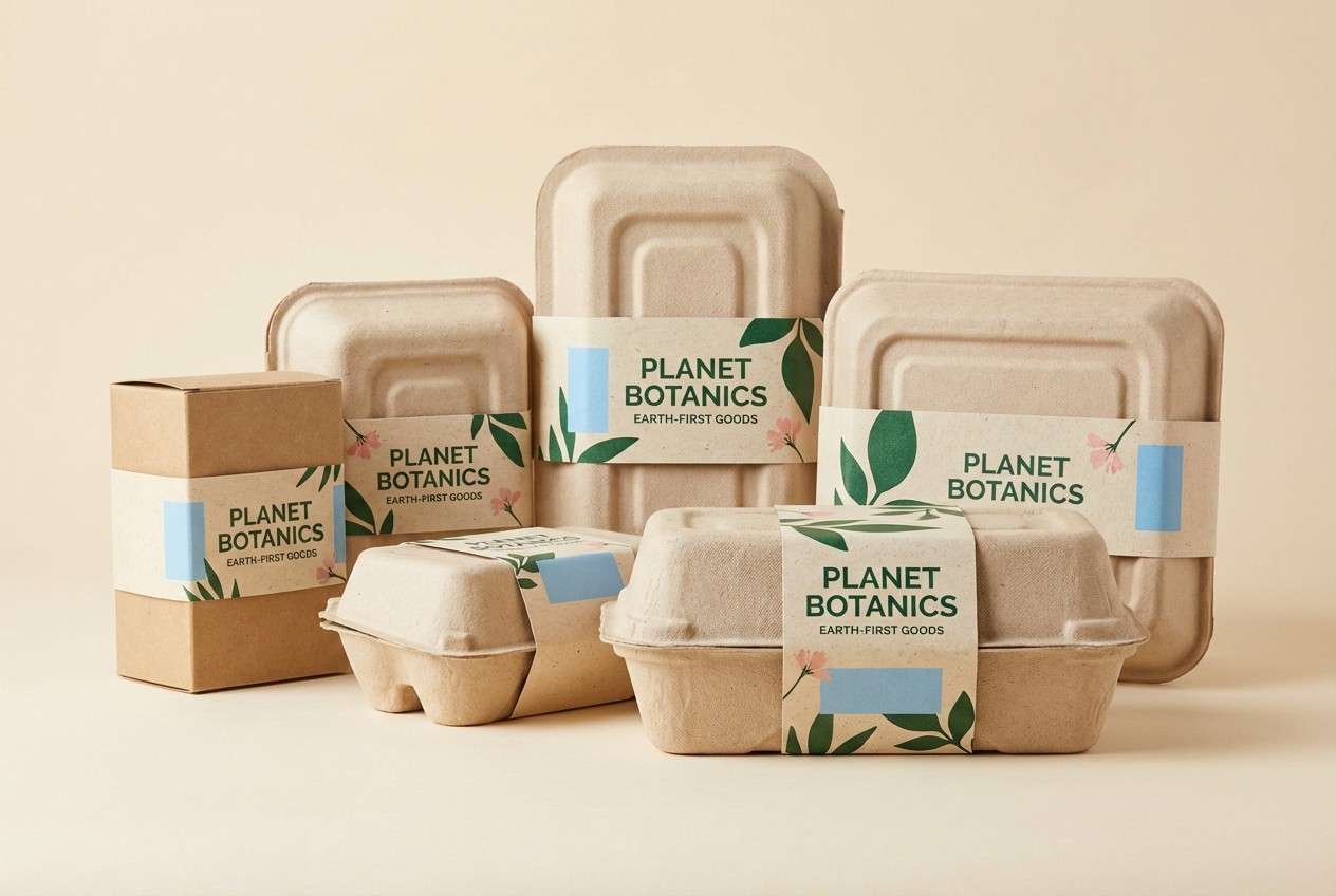
HEX: #F2D0C9 #E9E6DF #C6D8EA #E6D9F2 #8C7D73
Mood: delicate, calm, cultivated
Best for: portfolio websites and case studies
Soft blush, cool blue, and a whisper of lilac feel like folds of a silk fan. The warm gray-brown adds authority, making the pastel mix feel professional on screens. These rococo color combinations fit portfolio sites, case-study pages, and presentation decks that need polish without harsh contrast. Tip: keep body text in the brown, and use blush or lilac for section dividers and hover states.
Image example of silk fan generated using media.io
16) Honeyed Frame

HEX: #EBD3A6 #F7D4E4 #F5F0E6 #C7D7E8 #A7B7A2
Mood: cozy, luminous, artisanal
Best for: handmade product packaging
Honeyed gold and blush feel like a warm frame around delicate craftwork. The creamy base keeps it clean, while the muted blue and green add a natural, handmade honesty. Use it for soap wraps, candle labels, and maker-market signage where you want charm without clutter. Tip: keep the label background cream and use the honey tone for borders so the pink can stay a soft accent.
Image example of honeyed frame generated using media.io

17) Dawn Chiffon

HEX: #F9E3EA #F7F3E9 #CFE1F2 #DCE9D9 #BCA7B3
Mood: gentle, clean, soothing
Best for: wellness apps and meditation UI
Pale dawn pink and soft blue feel like quiet breathing in a bright room. Cream and misty green support a calm interface, and the mauve-gray gives you a readable text tone. It works for wellness dashboards, meditation timers, and onboarding screens where comfort matters. Tip: use the blue for primary actions and reserve pink for progress states or supportive highlights.
Image example of dawn chiffon generated using media.io

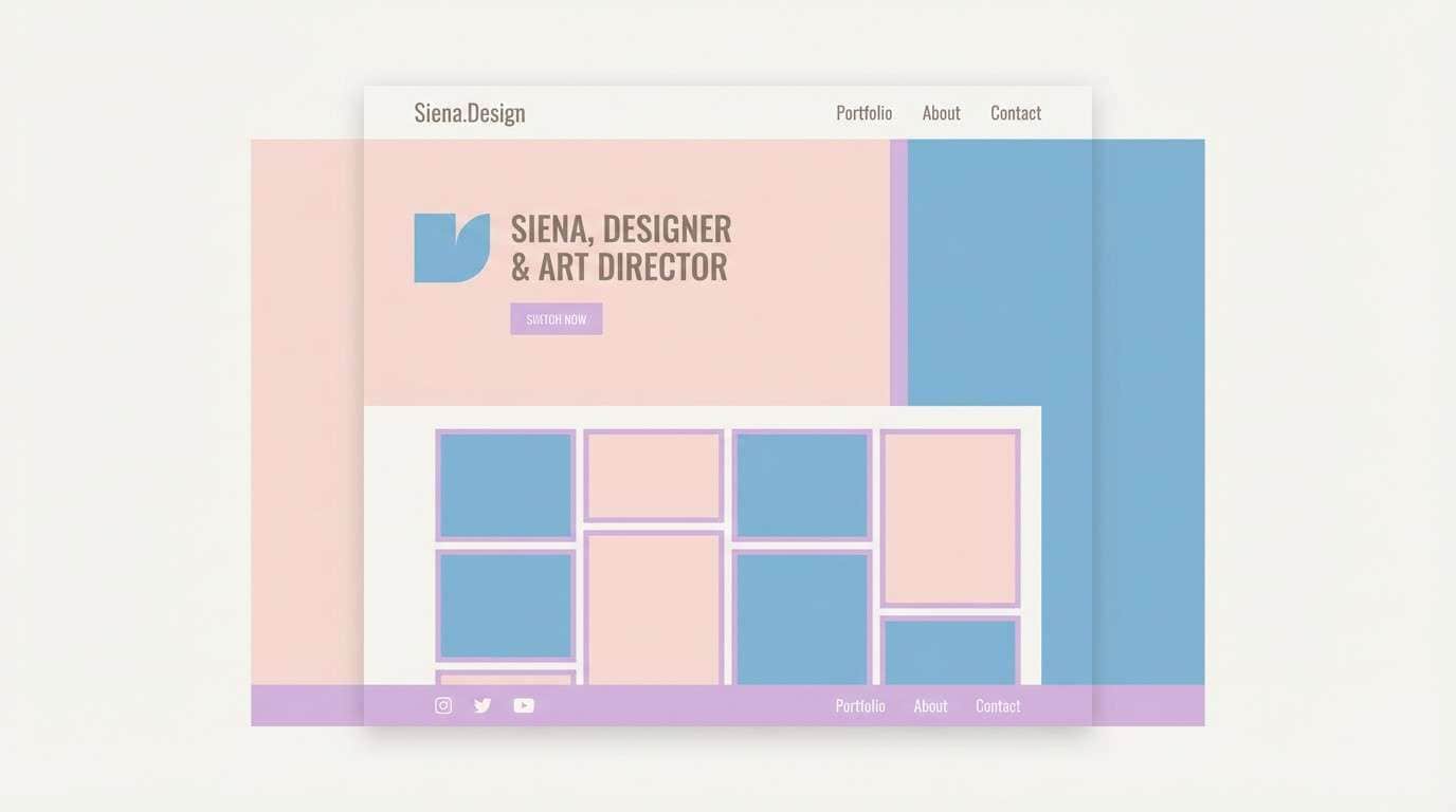
18) Iris Pavilion
HEX: #CBBEF0 #BFD8EE #F8D1E1 #FFF4E2 #7E8A97
Mood: bright, airy, artistic
Best for: creative workshop posters
Iris purple and powder blue feel like painted columns under a pale sky. Blush and cream bring warmth, while the slate blue-gray helps typography hold its shape. Use it for workshop posters, class schedules, and creative community flyers that should feel welcoming and elevated. Tip: set the background in cream and build bold color blocks with iris and blue so the design reads from across the room.
Image example of iris pavilion generated using media.io

19) Lace and Limestone
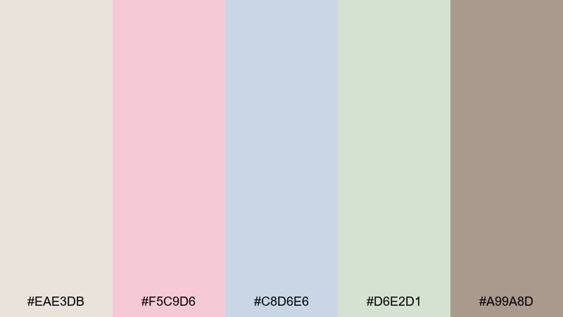
HEX: #EAE3DB #F5C9D6 #C8D6E6 #D6E2D1 #A99A8D
Mood: neutral, soft, architectural
Best for: interior paint and material guides
Limestone beige with lace pink and pale blue feels like a renovated historic apartment. The soft green adds a natural note, and the taupe keeps swatches looking grounded and realistic. Use it for paint guides, material spec sheets, and client presentations where you want gentle color without losing professionalism. Tip: keep most pages neutral and use pink or blue only for section tabs and key callouts.
Image example of lace and limestone generated using media.io

20) Charcoal Rococo
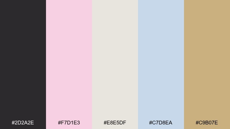
HEX: #2D2A2E #F7D1E3 #E8E5DF #C7D8EA #C9B07E
Mood: modern, romantic, high-contrast
Best for: boutique branding and logo systems
Charcoal brings a modern edge to blush, powder blue, and warm gold, like ornate detailing framed by a black lacquer mirror. The result feels chic and editorial, not overly sweet. A restrained rococo color combination like this works well for boutique logos, hang tags, and sleek web headers. Tip: keep charcoal for type and marks, then use blush as the dominant background to preserve the romantic tone.
Image example of charcoal rococo generated using media.io

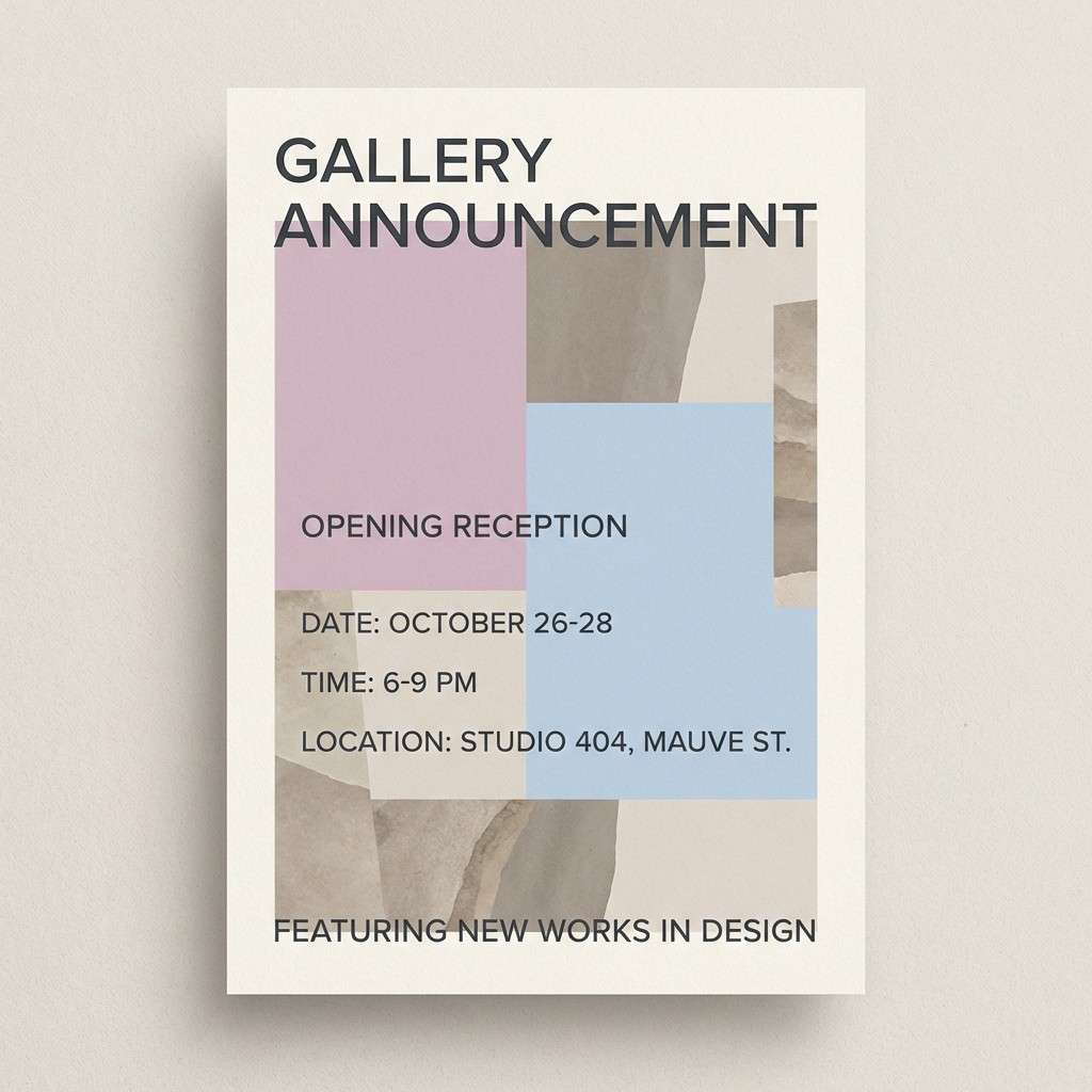
21) Pastel Gallery Night

HEX: #F2CFE3 #C2D7F0 #F6F0E6 #DAD3C7 #6F6A63
Mood: artful, composed, slightly moody
Best for: gallery announcements and opening invites
Soft mauve and powder blue feel like gallery walls under evening light. Cream and stone neutrals keep the look curated, while the deep gray anchors text and details. It works for opening-night invitations, artist talks, and minimalist posters where typography is the hero. Tip: use the deep gray for all copy and let mauve appear only in blocks or small gradients to avoid a cloudy look.
Image example of pastel gallery night generated using media.io
What Colors Go Well with Rococo?
Rococo palettes pair best with light neutrals (ivory, pearl, warm cream) and soft, powdery pastels like blush pink, porcelain blue, lilac, and misty sage.
To keep a rococo color scheme from feeling too sweet, add one grounding shade—taupe, charcoal, slate gray, or a deep wine tone—to sharpen typography and create hierarchy.
For a more ornate finish, metallic accents (antique gold, champagne, soft brass) work beautifully as small highlights on borders, icons, foil details, or premium packaging trims.
How to Use a Rococo Color Palette in Real Designs
Start with a dominant light base (cream/ivory) so your pastel color palette stays clean and readable. Then choose one “hero pastel” (blush or powder blue) for larger surfaces and backgrounds.
Use your deepest shade for text, outlines, and UI components where contrast matters. In print, reserve gold for sparing embellishments—frames, monograms, seals—so it feels intentional, not noisy.
If you’re designing for web or mobile, test contrast early: pastels can wash out on bright screens. Slightly deepen your text color or add subtle panels behind copy to preserve clarity.
Create Rococo Palette Visuals with AI
If you have HEX codes but need realistic mockups (labels, invites, posters, or UI screens), AI image generation helps you preview the vibe before you commit to production.
With Media.io, you can turn a short prompt into rococo-style visuals—then iterate quickly by swapping props, lighting, materials, and accent colors like antique gold or wine burgundy.
Use your palette’s key terms (e.g., “porcelain blue,” “blush,” “champagne gold foil”) directly in the prompt to keep results consistent across a full brand set.
Rococo Color Palette FAQs
-
What is a rococo color palette?
A rococo color palette is typically made of soft pastels (blush pink, powder/porcelain blue, lilac, mint), light neutrals (ivory, cream, pearl), and occasional metallic accents like antique gold for an ornate, romantic look. -
Are rococo colors good for modern branding?
Yes. Rococo colors feel premium and editorial when you balance them with a strong neutral (taupe, charcoal, slate) for typography and keep metallic accents minimal. -
What’s the best text color on rococo pastels?
Deep taupe, charcoal, slate gray, or burgundy usually reads best. Pure black can feel too harsh, while mid-gray may not provide enough contrast on light pastel backgrounds. -
How do I keep a rococo palette from looking childish?
Use fewer “candy” brights, lean into dusty/muted pastels, add warm neutrals, and introduce one darker anchor color. Also limit pink to accents if your layout starts to feel overly sweet. -
Can I use rococo palettes for UI design?
Absolutely—rococo palettes work well for beauty, wellness, and editorial-style apps. The key is contrast: keep buttons and text in darker neutrals and use pastels as panels, cards, and background tints. -
What print finishes work best with rococo color schemes?
Gold foil, champagne metallic ink, soft-touch paper, and subtle embossing pair beautifully with rococo palettes because they mimic the “gilded frame” feel without needing heavy ornament. -
How can I generate rococo palette mockups quickly?
Use Media.io’s text-to-image generator: describe the scene (e.g., invitation suite, skincare labels, interior mood board) and include your rococo colors (blush, porcelain blue, cream, antique gold) to produce consistent visuals fast.


