

Salmon teal is a modern, high-contrast pairing that balances warmth (salmon) with cool clarity (teal). It’s easy to make it feel playful, premium, coastal, or tech-forward depending on the neutrals and dark anchors you add.
Below are 20 salmon teal color palette ideas with ready-to-use HEX codes, plus design prompts you can use to generate matching visuals for branding, UI, print, and product design.
In this article
- Why Salmon Teal Palettes Work So Well
-
- coastal coral drift
- seafoam sunset
- retro soda shop
- nordic spa calm
- tropical punch
- blush and brass
- modern gallery wall
- minted wedding paper
- desert oasis
- techy tide ui
- coral reef poster
- soft nursery splash
- bistro menu chic
- skincare studio clean
- editorial weekend
- beach resort brochure
- ceramic studio glaze
- fitness app pop
- holiday knit warmth
- data viz freshness
- What Colors Go Well with Salmon Teal?
- How to Use a Salmon Teal Color Palette in Real Designs
- Create Salmon Teal Palette Visuals with AI
Why Salmon Teal Palettes Work So Well
Salmon and teal sit on opposite sides of the warm–cool spectrum, so the combo naturally creates visual energy. Salmon brings approachability and human warmth, while teal adds freshness, trust, and structure.
This contrast also helps with hierarchy: salmon is excellent for attention (headlines, highlights, badges), and teal is strong for functional UI elements (buttons, navigation, charts). When you add off-whites and deep charcoals, the palette becomes versatile across print and screens.
Because both colors have a “modern classic” feel, salmon teal can shift style quickly—coastal with sandy neutrals, editorial with crisp off-white and near-black, or premium with brass/gold accents.
20+ Salmon Teal Color Palette Ideas (with HEX Codes)
1) Coastal Coral Drift
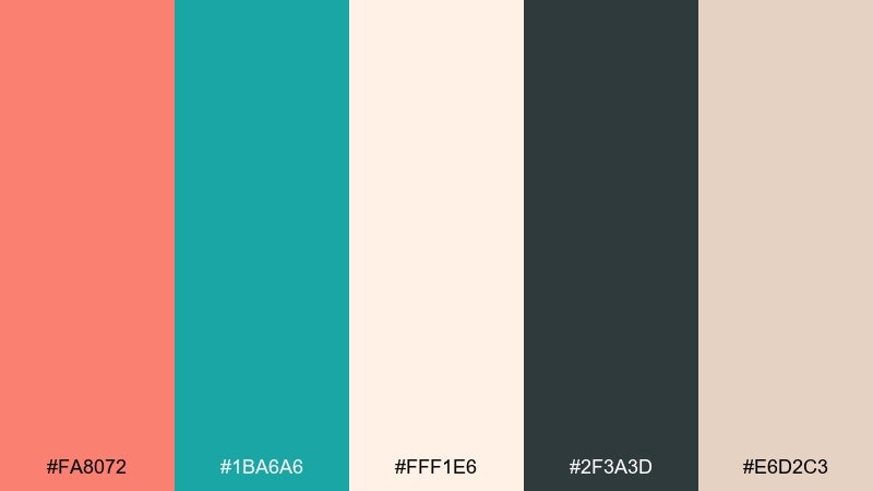
HEX: #FA8072 #1BA6A6 #FFF1E6 #2F3A3D #E6D2C3
Mood: airy, coastal, relaxed
Best for: beach resort brochure cover
Airy, coastal, and relaxed, it feels like warm sand beside clear water. Use salmon as the friendly headline color and teal for calls to action and section bars. Pair with cream backgrounds and a charcoal type color to keep layouts crisp. Tip: keep teal in larger blocks so the coral accents look intentional, not busy.
Image example of coastal coral drift generated using media.io
Media.io is an online AI studio for creating and editing video, image, and audio in your browser.

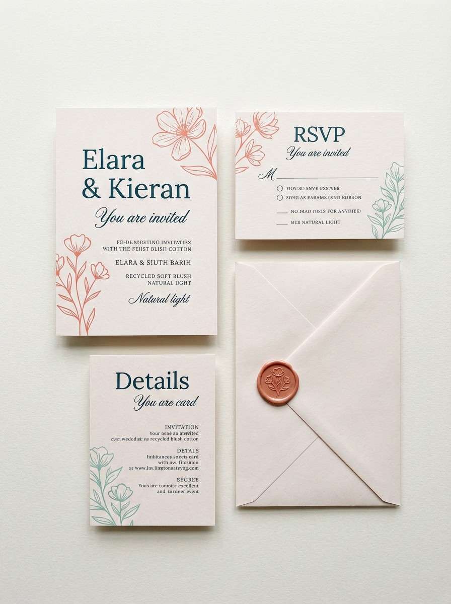
2) Seafoam Sunset
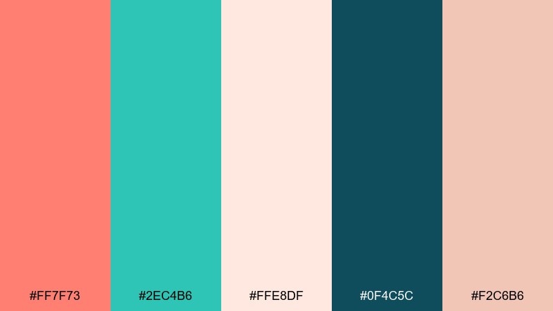
HEX: #FF7F73 #2EC4B6 #FFE8DF #0F4C5C #F2C6B6
Mood: romantic, breezy, optimistic
Best for: summer wedding invitation suite
Romantic and breezy, it evokes a sunset glow fading into seafoam water. This salmon teal color palette shines on invitations when you keep the paper tone light and let teal carry the details. Add deep blue-green for type and thin borders to anchor the softness. Tip: use salmon for names and teal for the schedule so the hierarchy reads instantly.
Image example of seafoam sunset generated using media.io
3) Retro Soda Shop
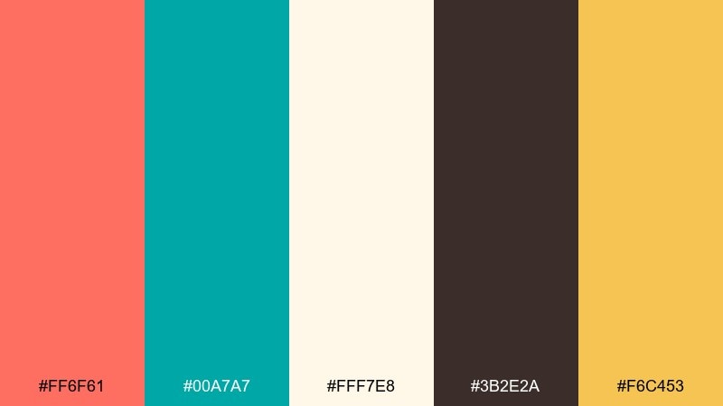
HEX: #FF6F61 #00A7A7 #FFF7E8 #3B2E2A #F6C453
Mood: playful, retro, high-energy
Best for: vintage style poster
Playful and retro, it feels like neon signage and fizzy drinks at a classic counter. Put the salmon on big display type and use teal for outlines, badges, and starbursts. Cream keeps the composition readable while brown adds that nostalgic ink vibe. Tip: reserve the golden yellow for only one callout to make it pop.
Image example of retro soda shop generated using media.io

4) Nordic Spa Calm
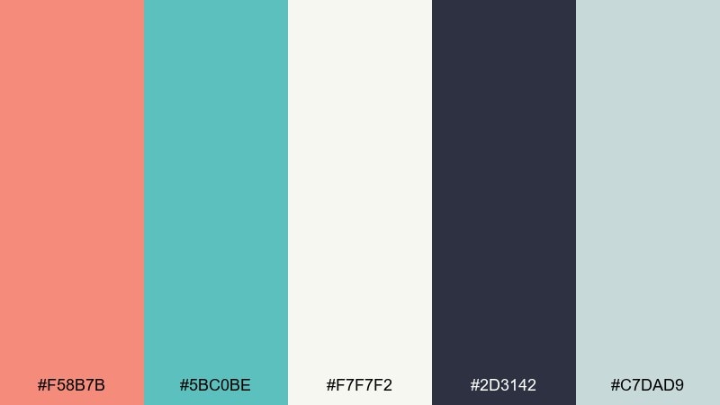
HEX: #F58B7B #5BC0BE #F7F7F2 #2D3142 #C7DAD9
Mood: calm, clean, restorative
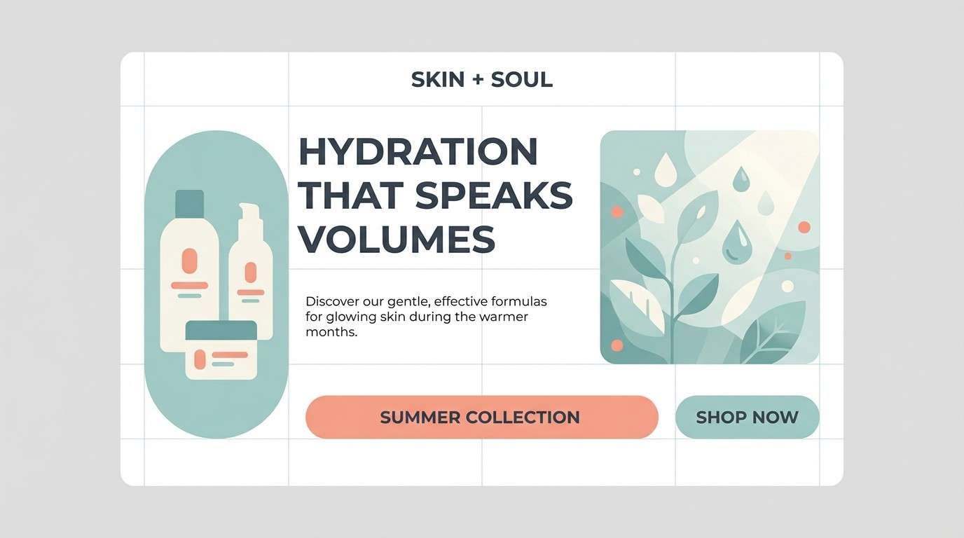
Best for: skincare landing page hero
Calm and restorative, it suggests steamed towels, clean tile, and quiet mornings. Let the near-white background do most of the work while teal carries the trust signals like buttons and icons. Use salmon sparingly for highlights such as promotions or key benefits. Tip: keep shadows cool and subtle so the palette stays spa-like, not sugary.
Image example of nordic spa calm generated using media.io
5) Tropical Punch
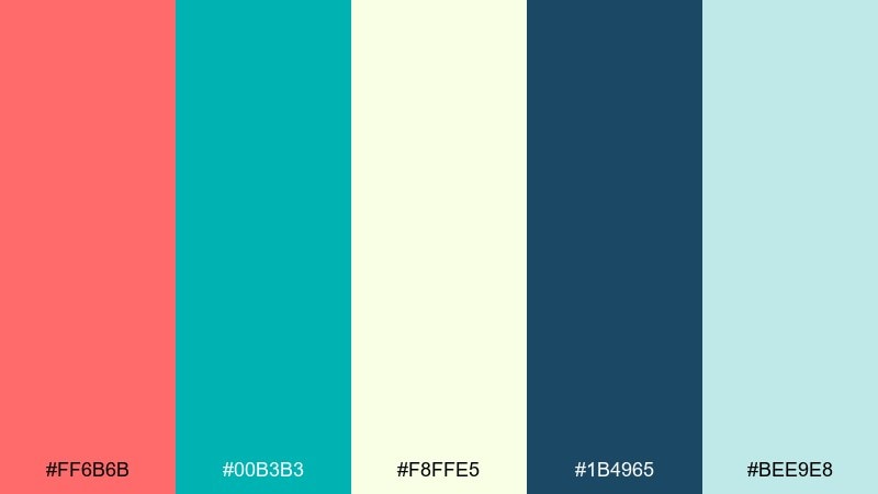
HEX: #FF6B6B #00B3B3 #F8FFE5 #1B4965 #BEE9E8
Mood: tropical, bright, refreshing
Best for: summer social media ad
Tropical and bright, it reads like fruit punch against a cool pool. Use salmon for the main offer text and teal for the frame, buttons, or swipe cues. Keep the background pale so the message stays legible on mobile. Tip: limit the dark navy to small text and logos to avoid weighing down the freshness.
Image example of tropical punch generated using media.io

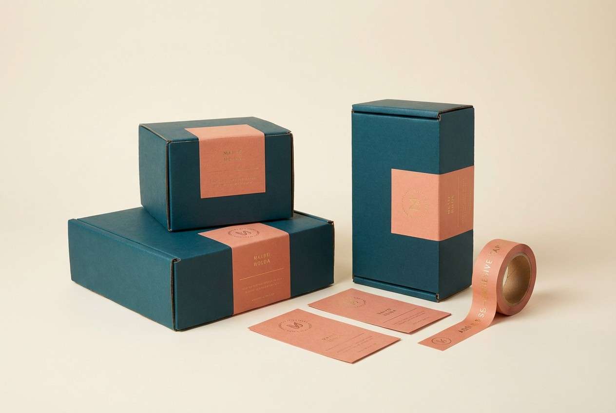
6) Blush and Brass
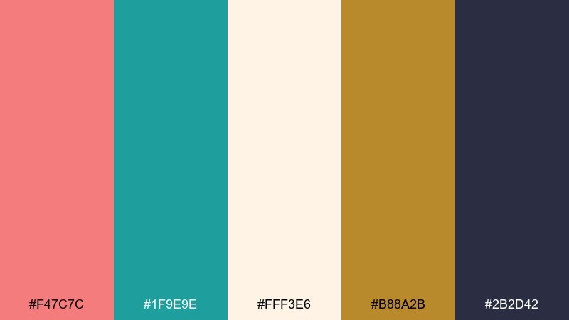
HEX: #F47C7C #1F9E9E #FFF3E6 #B88A2B #2B2D42
Mood: polished, warm, upscale
Best for: boutique product packaging
Polished and warm, it feels like satin blush paired with a gleam of brass. These salmon teal color combinations work beautifully on premium packaging when teal stays structured and salmon stays soft. Add brass for foiled details and keep the background creamy to feel boutique. Tip: use one large teal panel and place salmon labels on top for instant contrast.
Image example of blush and brass generated using media.io
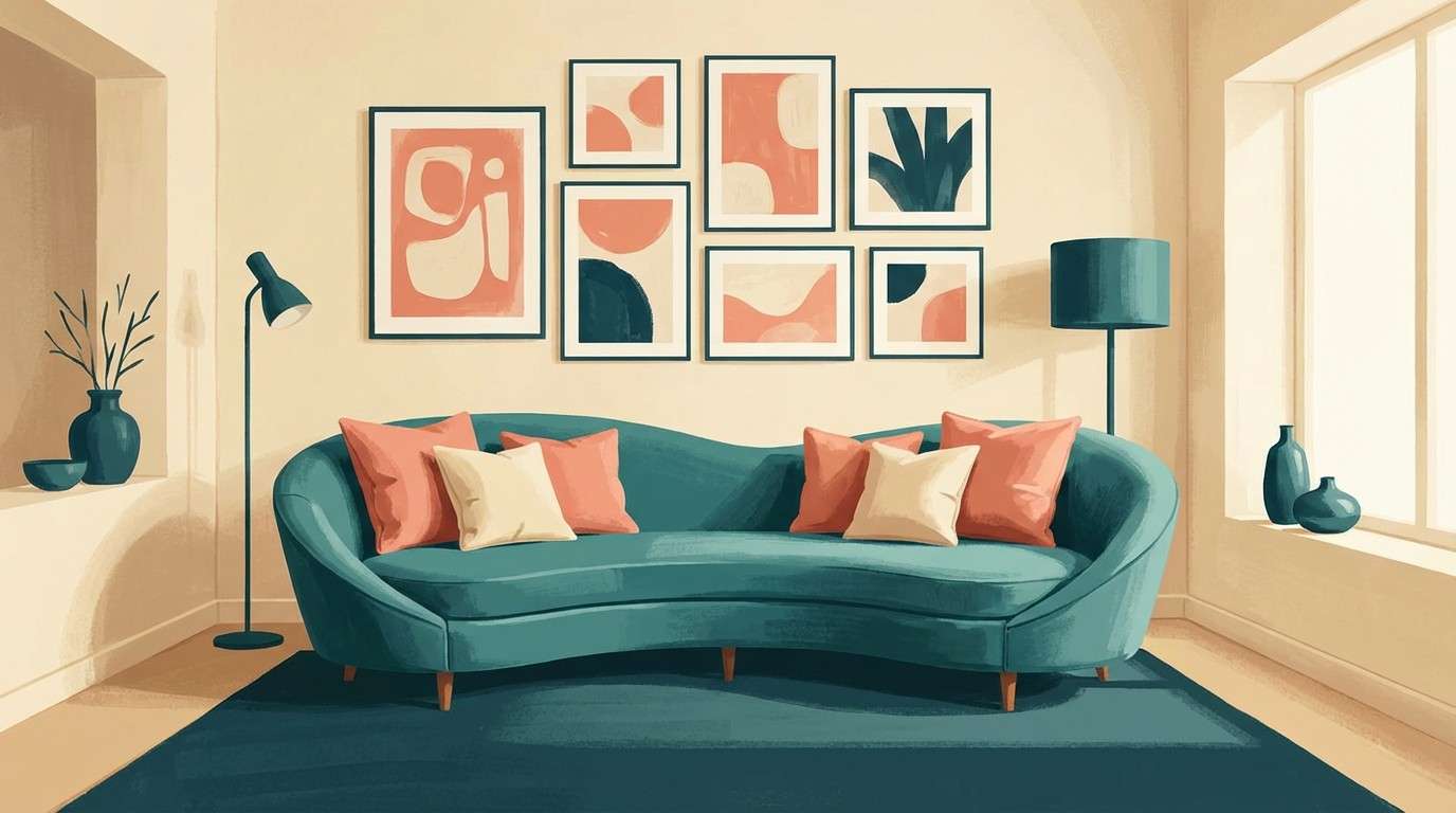
7) Modern Gallery Wall
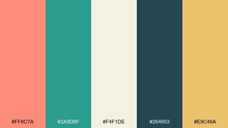
HEX: #FF8C7A #2A9D8F #F4F1DE #264653 #E9C46A
Mood: modern, curated, artistic
Best for: living room interior accents
Modern and curated, it suggests a gallery wall with warm prints and cool ceramic pieces. Use teal on larger anchor items like a rug or sofa, then add salmon through art, pillows, or a throw. Cream and deep blue-green make the room feel intentional rather than themed. Tip: repeat the golden tone in two small objects to tie the palette together.
Image example of modern gallery wall generated using media.io
8) Minted Wedding Paper
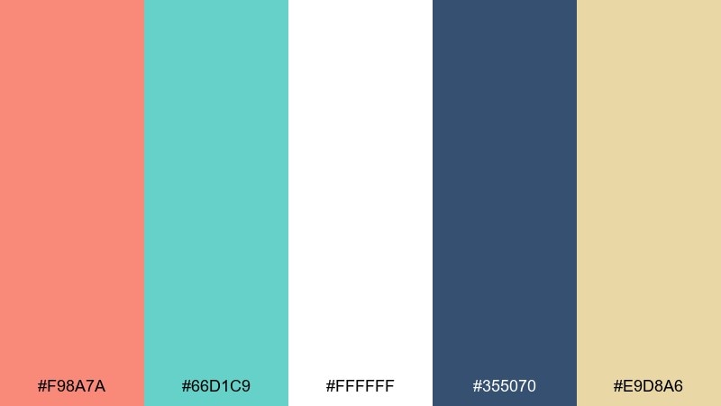
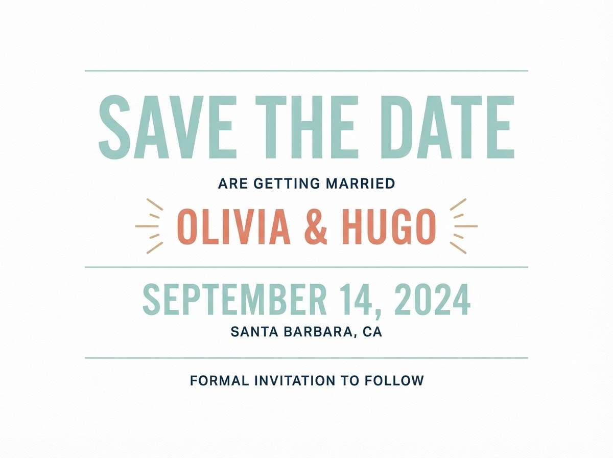
HEX: #F98A7A #66D1C9 #FFFFFF #355070 #E9D8A6
Mood: elegant, light, celebratory
Best for: minimal wedding save the date
Elegant and celebratory, it feels like crisp paper with a hint of confetti. Keep the layout minimal: white space plus teal for dates and dividers, salmon for names and monograms. Navy text ensures readability for small print details. Tip: print teal slightly lighter than on screen so the suite stays airy.
Image example of minted wedding paper generated using media.io
9) Desert Oasis
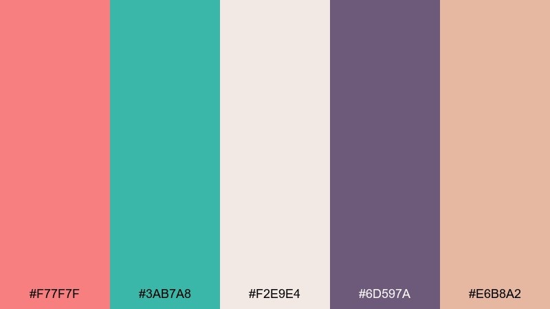
HEX: #F77F7F #3AB7A8 #F2E9E4 #6D597A #E6B8A2
Mood: earthy, serene, sun-warmed
Best for: travel blog header
Earthy and sun-warmed, it looks like canyon rock meeting a cool spring. Use salmon as the primary highlight for titles and teal for navigation and links. The dusty neutrals help photos and maps sit comfortably in the layout. Tip: introduce the muted purple only in small accents to avoid competing with the teal.
Image example of desert oasis generated using media.io

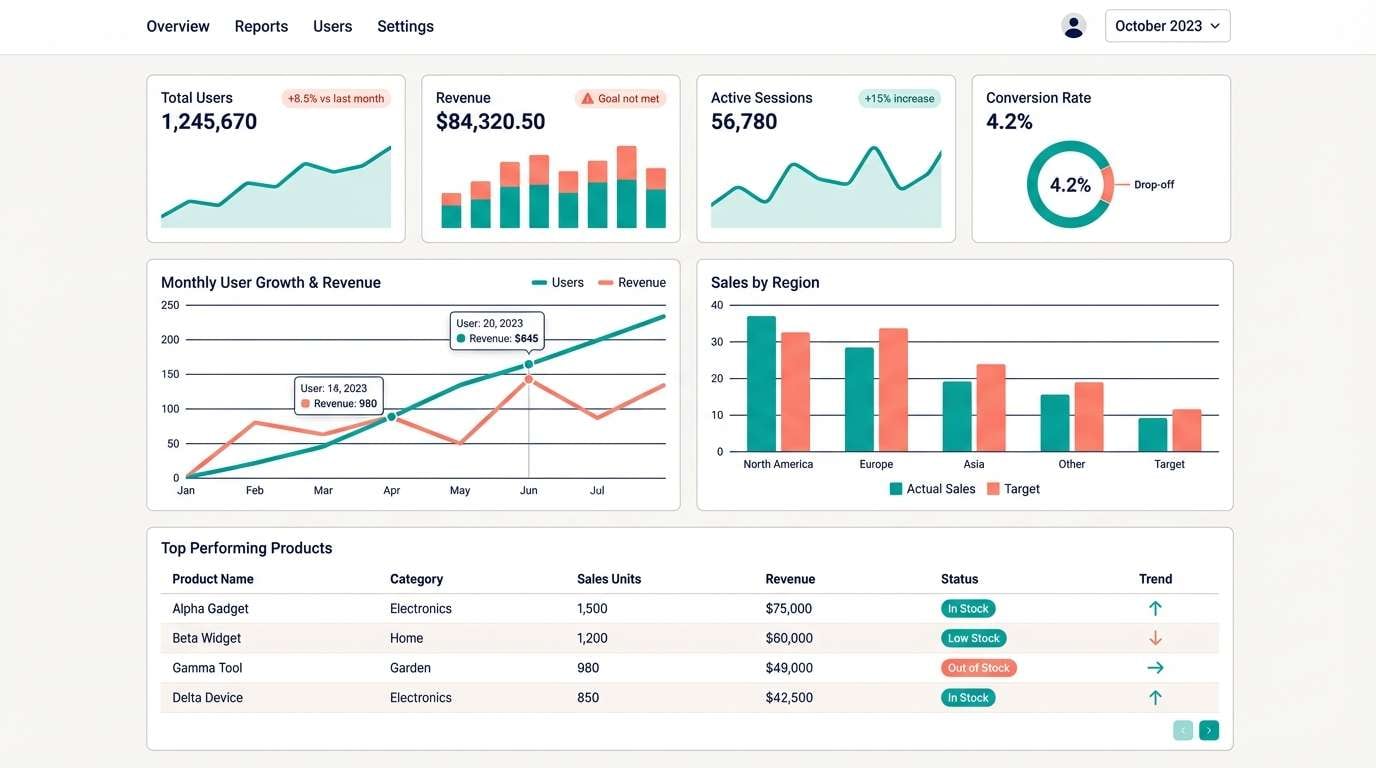
10) Techy Tide UI
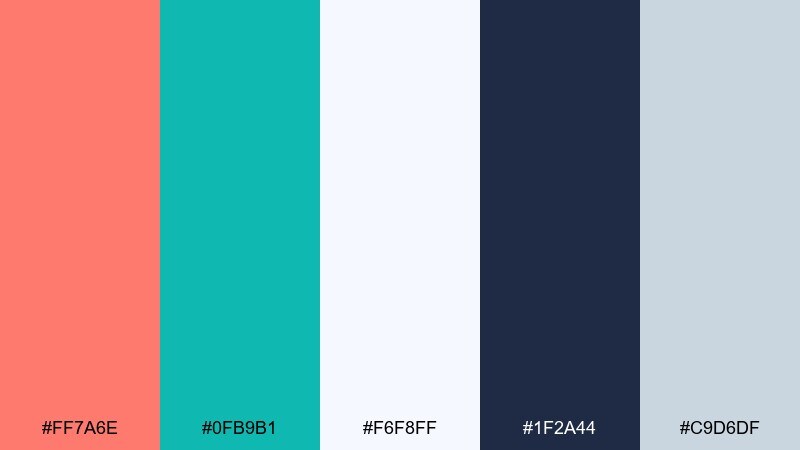
HEX: #FF7A6E #0FB9B1 #F6F8FF #1F2A44 #C9D6DF
Mood: clean, modern, confident
Best for: analytics dashboard UI
Clean and confident, it feels like crisp data cards with a friendly punch of color. This salmon teal color scheme works best when teal is the primary for charts and states, and salmon is reserved for alerts or key metrics. Keep surfaces near-white and use the deep navy for text contrast. Tip: apply salmon only to one chart series per view to reduce visual noise.
Image example of techy tide ui generated using media.io
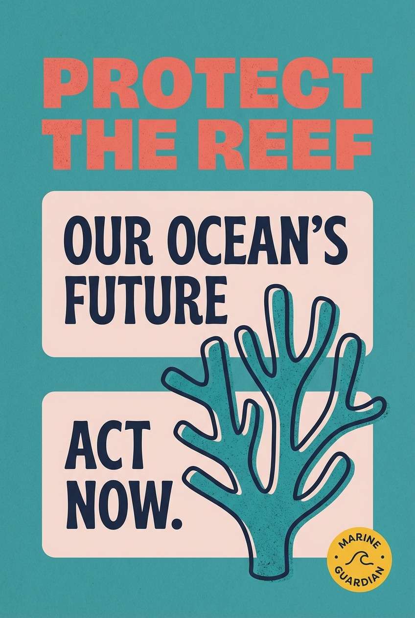
11) Coral Reef Poster
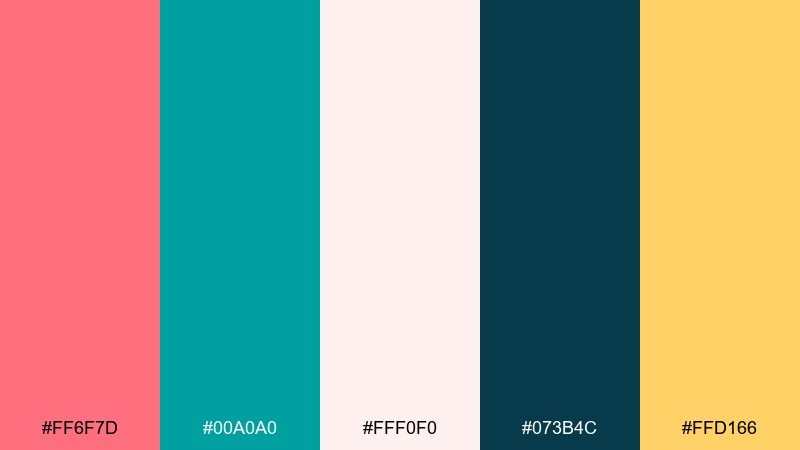
HEX: #FF6F7D #00A0A0 #FFF0F0 #073B4C #FFD166
Mood: bold, aquatic, adventurous
Best for: marine conservation poster
Bold and aquatic, it evokes coral branches cutting through deep water. Use teal as the big background field and salmon for the headline to achieve instant impact from a distance. Keep supporting copy dark and tight for legibility. Tip: use the sunny yellow only for a single statistic badge or donation callout.
Image example of coral reef poster generated using media.io
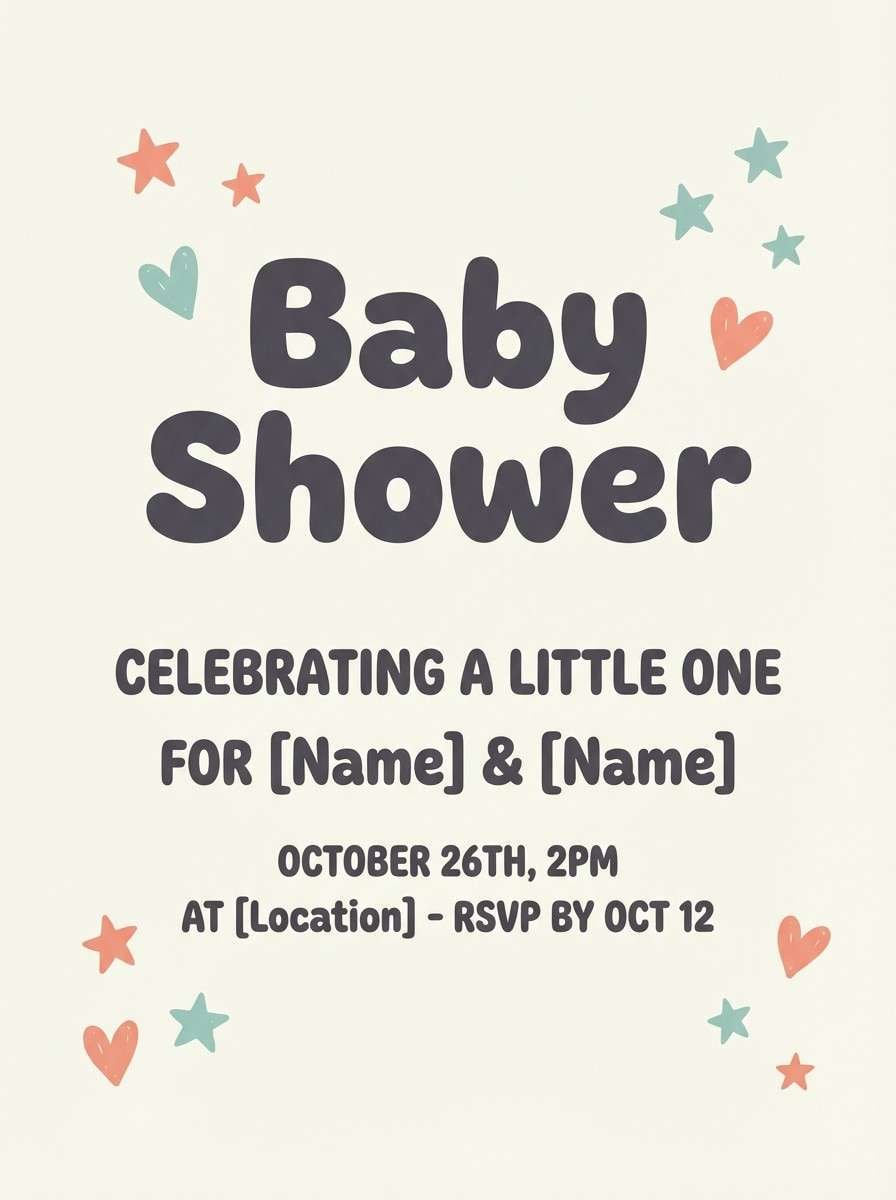
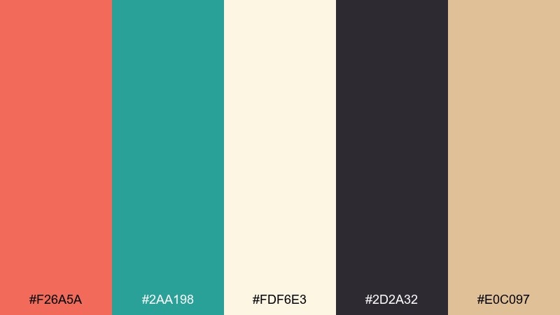
12) Soft Nursery Splash
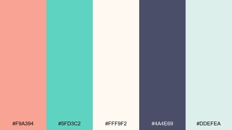
HEX: #F9A394 #5FD3C2 #FFF9F2 #4A4E69 #DDEFEA
Mood: gentle, comforting, playful
Best for: baby shower invitation
Gentle and comforting, it feels like watercolor dots on soft cotton. Let the background stay creamy, then add teal for borders and small icons like stars or hearts. Salmon works best as a warm focal point for the name or event title. Tip: choose rounded type and keep contrast medium so everything stays sweet, not loud.
Image example of soft nursery splash generated using media.io
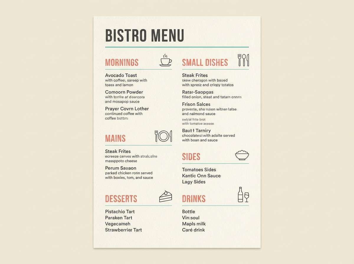
13) Bistro Menu Chic
HEX: #F26A5A #2AA198 #FDF6E3 #2D2A32 #E0C097
Mood: cozy, chic, appetizing
Best for: restaurant menu design
Cozy and chic, it brings to mind a bustling bistro with warm lighting and cool tile. Use salmon for section headers and teal for subtle separators, icons, and price highlights. Cream keeps the menu readable under dim light, while charcoal supports fine print. Tip: keep teal lines thin so the menu stays elegant rather than sporty.
Image example of bistro menu chic generated using media.io
14) Skincare Studio Clean
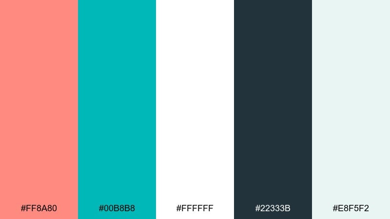
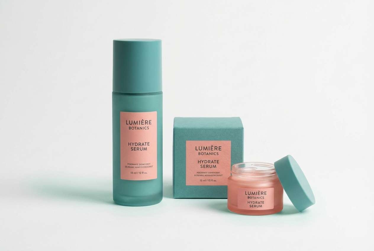
HEX: #FF8A80 #00B8B8 #FFFFFF #22333B #E8F5F2
Mood: fresh, clinical, trustworthy
Best for: product ad still life
Fresh and trustworthy, it feels like a bright studio with glossy bottles and clean labels. Make teal the brand anchor on packaging and use salmon for one standout claim or ingredient callout. White and pale mint keep everything feeling hygienic and premium. Tip: use matte materials for the salmon elements so they do not overpower the teal.
Image example of skincare studio clean generated using media.io
15) Editorial Weekend
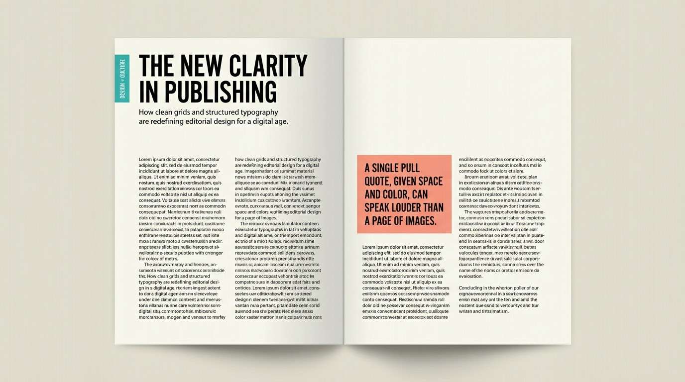
HEX: #F97C6D #3DB7B0 #FAF9F6 #111827 #D1D5DB
Mood: stylish, minimal, editorial
Best for: magazine feature spread
Stylish and minimal, it reads like a weekend magazine with clean grids and confident headings. Use salmon for pull quotes and teal for section tabs or issue labels. Keep body text near-black and let the off-white page tone soften the contrast. Tip: limit color use to the top third of the spread so the layout feels premium.
Image example of editorial weekend generated using media.io
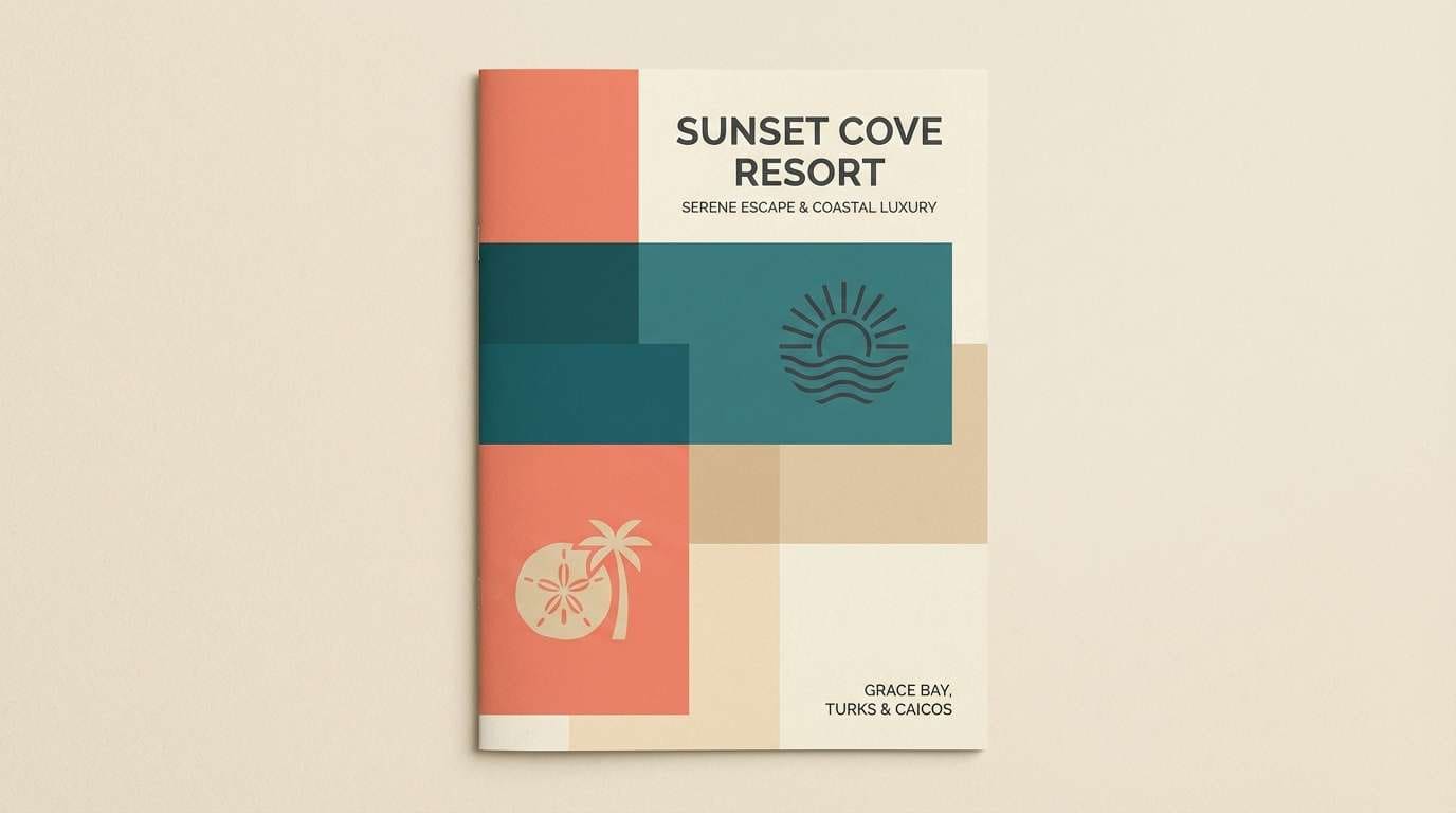
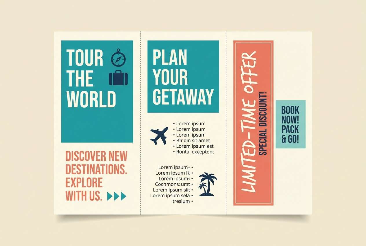
16) Beach Resort Brochure
HEX: #FF7E67 #14A098 #F6F1E9 #0B1320 #C7EAE4
Mood: inviting, breezy, polished
Best for: tri-fold brochure design
Inviting and breezy, it feels like linen textures and sea glass. Use teal for large panels and navigation cues, then place salmon on the key offer and booking details. A warm off-white background keeps the look friendly while near-black supports small text. Tip: repeat a pale teal tint in icons so the brochure feels cohesive across folds.
Image example of beach resort brochure generated using media.io
17) Ceramic Studio Glaze
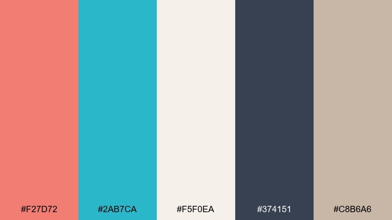
HEX: #F27D72 #2AB7CA #F5F0EA #374151 #C8B6A6
Mood: handmade, modern, tactile
Best for: ceramic product label set
Handmade and tactile, it suggests glossy glaze against warm clay. Use salmon for label titles and teal for ingredient lists, batch numbers, or tiny stamps. The warm neutrals make it feel artisanal while slate keeps type clean. Tip: print on textured stock so the soft tones look intentional and elevated.
Image example of ceramic studio glaze generated using media.io
18) Fitness App Pop
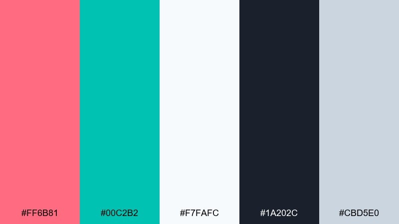
HEX: #FF6B81 #00C2B2 #F7FAFC #1A202C #CBD5E0
Mood: energetic, modern, motivating
Best for: fitness app onboarding UI
Energetic and motivating, it feels like a fresh start with clear goals and upbeat momentum. Use teal for primary buttons and progress rings, and bring salmon in for streaks, achievements, and micro-celebrations. Keep the background light so the UI stays breathable. Tip: these salmon teal color combinations read best when salmon is used as a reward color, not a default accent.
Image example of fitness app pop generated using media.io
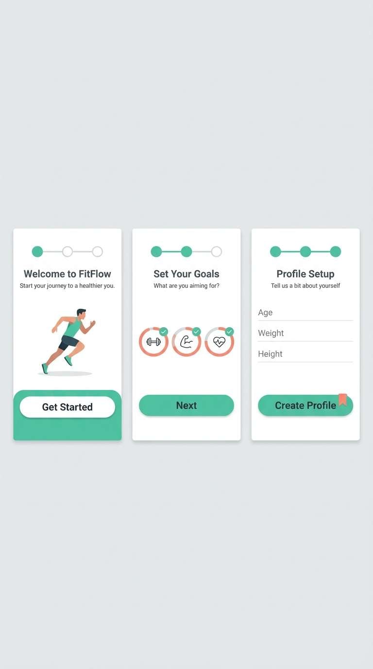
19) Holiday Knit Warmth
HEX: #F47B72 #1AA6A0 #FFF7F0 #2B2D42 #CDE7E3
Mood: cozy, festive, friendly
Best for: holiday greeting card
Cozy and festive, it recalls knitted patterns with a modern twist. Use salmon for the greeting and teal for simple ornament shapes or a border. Keep the background creamy and let the dark shade handle small text like signatures. Tip: add subtle patterning using the pale teal tint so the card feels textured without getting busy.
Image example of holiday knit warmth generated using media.io

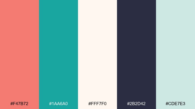
20) Data Viz Freshness
HEX: #FF7D6E #22B8B1 #F9FBFF #0B1220 #DDE3EA
Mood: clear, friendly, professional
Best for: infographic layout
Clear and friendly, it feels like well-labeled charts and calm structure. Put teal on the main series and use salmon only for one emphasis series or key takeaway badges. A near-white background keeps labels readable, while the deep ink color improves accessibility. Tip: stick to consistent line weights so the colors, not the styling, do the talking.
Image example of data viz freshness generated using media.io

What Colors Go Well with Salmon Teal?
Salmon teal pairs smoothly with soft neutrals like cream, ivory, warm sand, and light gray—these keep the palette breathable and prevent the warm/cool contrast from feeling loud. For typography and structure, deep charcoal, ink, and navy create clean readability.
If you want extra personality, add a single accent: brass/gold for premium packaging, sunny yellow for poster-style callouts, or muted lavender/purple for a desert-sunset twist. The key is to keep accents limited so teal and salmon remain the main story.
For accessibility in UI, let the darkest shade handle body text and small labels, then use teal and salmon for states, highlights, or limited chart series.
How to Use a Salmon Teal Color Palette in Real Designs
Start by assigning roles: use teal as the primary system color (buttons, links, navigation, chart baselines) and salmon as the emphasis color (headlines, badges, limited alerts). This keeps hierarchy consistent across pages and components.
Control the ratio to avoid clutter—many designs look best with neutrals taking most of the canvas, teal forming the “frame,” and salmon appearing as the warm spotlight. If you’re printing, test swatches on the target stock because salmon can shift warmer and teal can darken.
For branding, repeat one tint (like pale mint or warm cream) across backgrounds, icons, or packaging materials to unify the look without adding more hues.
Create Salmon Teal Palette Visuals with AI
If you already have HEX codes, you can quickly generate matching mockups (posters, UI screens, invitations, packaging) by describing the layout and specifying salmon and teal as dominant tones. This helps you validate contrast, mood, and composition before committing to production.
Use the prompts above as a starting point, then swap the format (square ad, brochure, dashboard, card) while keeping the same color roles. It’s an efficient way to explore multiple directions with one salmon teal color palette.
When you find a direction you like, keep the same prompt and only change a single variable at a time (type style, layout density, accent color) to iterate faster and stay consistent.
Salmon Teal Color Palette FAQs
-
What does the salmon and teal color combination communicate?
It usually communicates friendly warmth (salmon) paired with fresh trust and clarity (teal). Together they feel modern, upbeat, and balanced—great for brands that want to be approachable but still polished. -
Is salmon teal good for website and app UI design?
Yes—use teal for primary actions, navigation, and data series, and reserve salmon for highlights like key metrics, badges, or limited alerts. Keep neutrals (white/off-white/light gray) as the main surface for clean readability. -
What neutral colors work best with salmon teal?
Cream, ivory, warm sand, light gray, and off-white work especially well. For text and contrast, pair with charcoal, deep navy, or ink-black rather than pure black for a softer, premium feel. -
Can I use salmon teal for print designs like invitations or brochures?
Definitely. Use a light paper tone (white/cream) to keep the palette airy, and anchor small text with a deep navy/charcoal. Always print a proof because salmon can appear more orange on some stocks and teals can shift cooler. -
How do I keep salmon teal palettes from feeling too “summery”?
Add darker anchors (navy, slate, charcoal) and reduce saturation by choosing dusty salmon and muted teal. Premium accents like brass/gold also push the look toward boutique and editorial rather than beachy. -
What’s a good accent color to add to salmon teal?
Use one accent at a time: brass/gold for luxury, sunny yellow for energetic posters and callouts, or muted lavender for a desert-sunset vibe. Keep it minimal so it doesn’t compete with salmon and teal. -
How can I quickly visualize salmon teal palette ideas before designing?
Generate mockups with AI by describing the design type (UI, poster, packaging) and stating salmon and teal as dominant colors, plus your preferred neutrals and typography tone. This helps you compare multiple directions fast without building full comps.


