

A monochromatic color palette uses one hue and stretches it across tints, tones, and shades. The result is a clean, cohesive look that feels intentional in UI, branding, and interiors.
Below are 20 tone-on-tone monochromatic color combinations with HEX codes, plus practical tips and AI prompt examples you can reuse in your own projects.
In this article
Why Monochromatic Palettes Work So Well
Monochromatic color schemes reduce visual noise, because everything is built from a single base hue. That makes layouts feel organized and “designed,” even with minimal elements.
They also create natural hierarchy through value changes: light tints for backgrounds, mid tones for surfaces, and deep shades for emphasis. You can guide attention without introducing extra colors.
Finally, monotone palettes are flexible across mediums. The same set of shades and tints can translate from UI to print to interiors while staying consistent and modern.
20+ Monochromatic Color Palette Ideas (with HEX Codes)
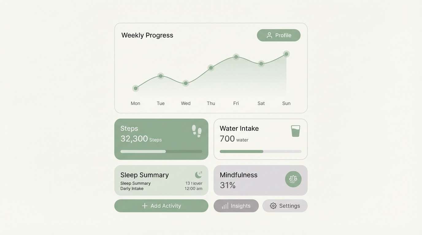
1) Misty Sage
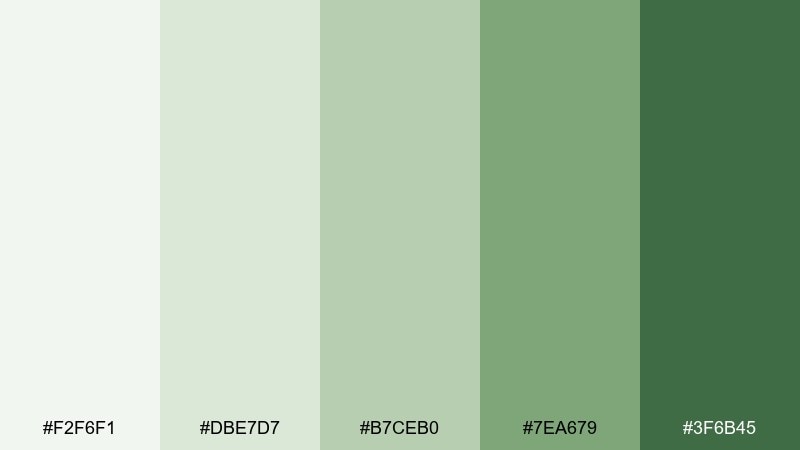
HEX: #f2f6f1 #dbe7d7 #b7ceb0 #7ea679 #3f6b45
Mood: fresh, calm, restorative
Best for: wellness app dashboard UI
Fresh and airy like morning fog over herb gardens, these sage tones feel instantly calming. Use the lightest tint for backgrounds, mid tones for cards and controls, and the deep green for primary CTAs. Pair with warm off-white and subtle grain textures to keep it organic instead of clinical. Tip: reserve the darkest shade for one action per screen to maintain a gentle, spa-like hierarchy.
Image example of misty sage generated using media.io
Media.io is an online AI studio for creating and editing video, image, and audio in your browser.

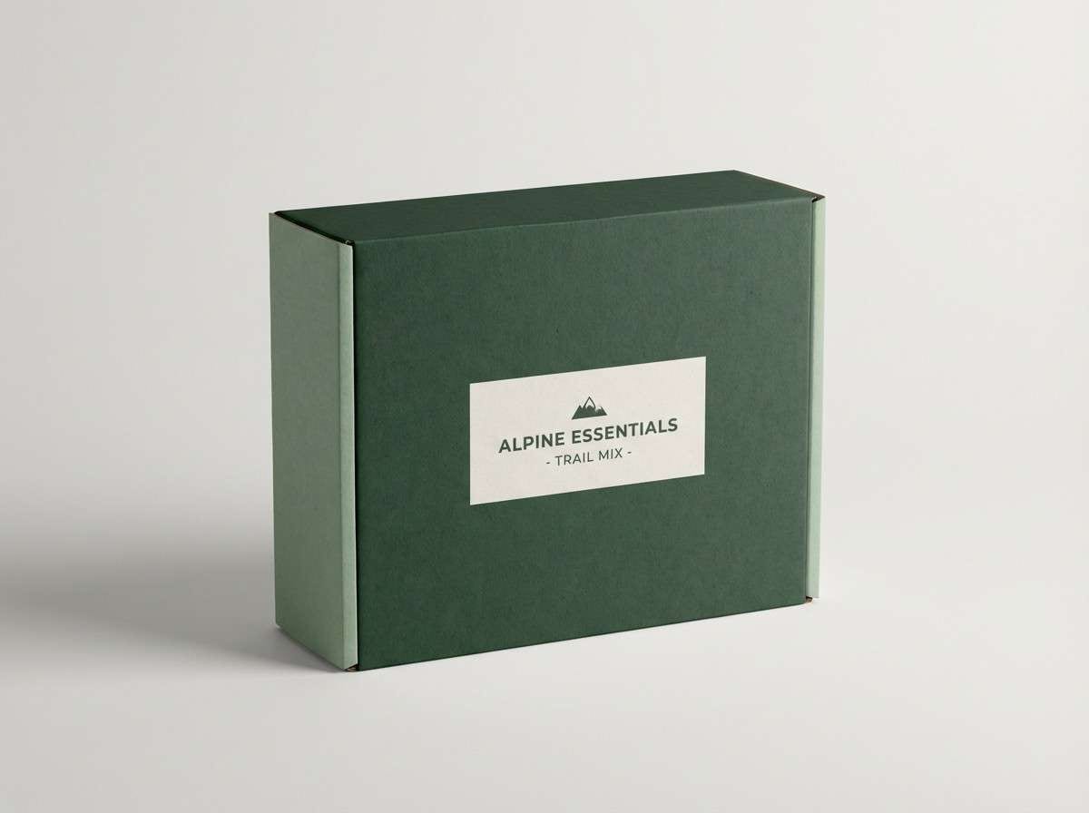
2) Deep Forest
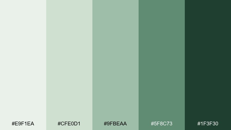
HEX: #e9f1ea #cfe0d1 #9fbeaa #5f8c73 #1f3f30
Mood: grounded, rugged, premium
Best for: outdoor brand packaging and label design
Grounded and rugged like pine needles and shaded trails, this range reads premium without shouting. Put the darkest green on logotypes and key label text, then let mid greens carry blocks, badges, and patterns. Pair with kraft paper, matte finishes, and a small touch of black for extra definition. Tip: use the palest tint as negative space around product claims so the label stays readable at a glance.
Image example of deep forest generated using media.io
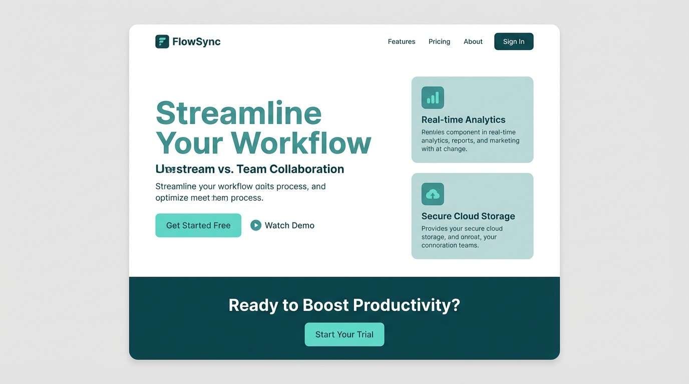
3) Ocean Teal
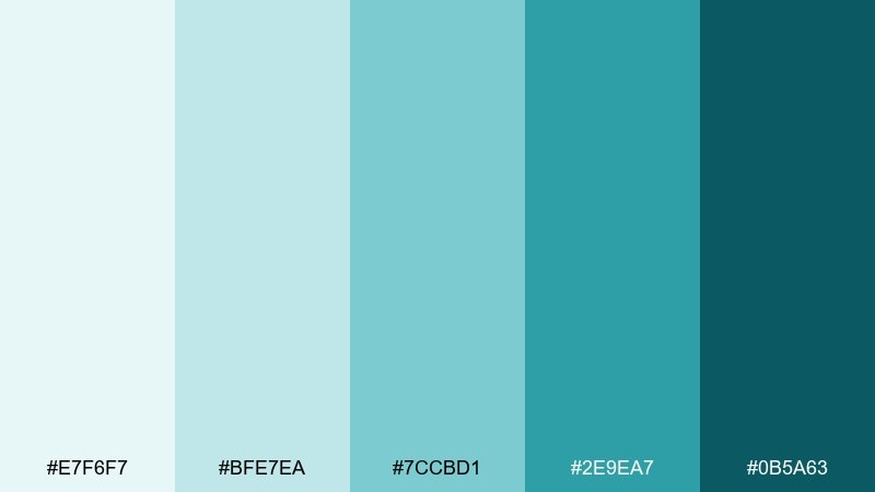
HEX: #e7f6f7 #bfe7ea #7ccbd1 #2e9ea7 #0b5a63
Mood: clean, coastal, confident
Best for: SaaS landing page UI
Clean and coastal like sunlit water, these teals feel modern and confident. Use pale aqua for sections, mid teal for UI accents, and the deep shade for headings and hero buttons. Pair with crisp white and light gray dividers to keep the layout sharp. Tip: add subtle teal gradients only in large areas, and keep smaller components flat for clarity.
Image example of ocean teal generated using media.io
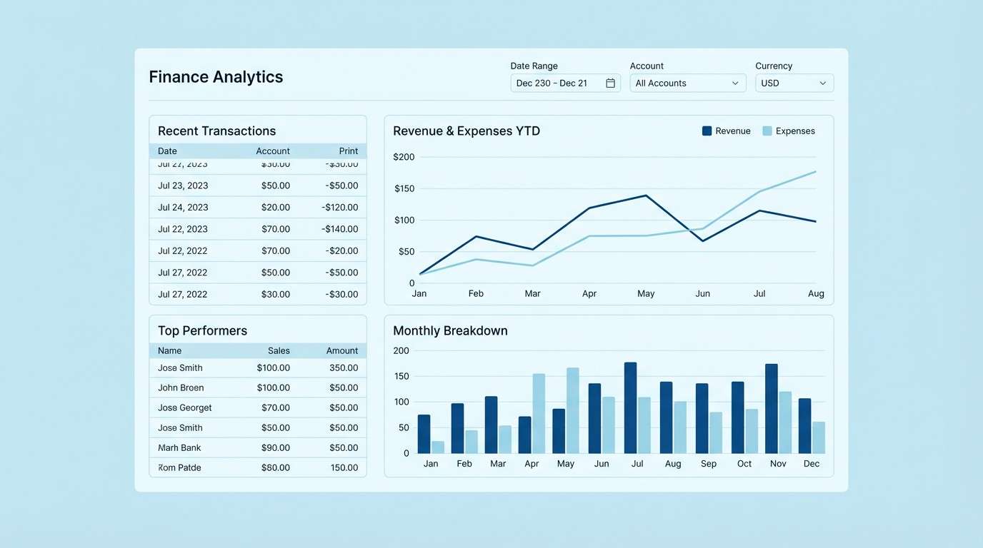
4) Icy Blue
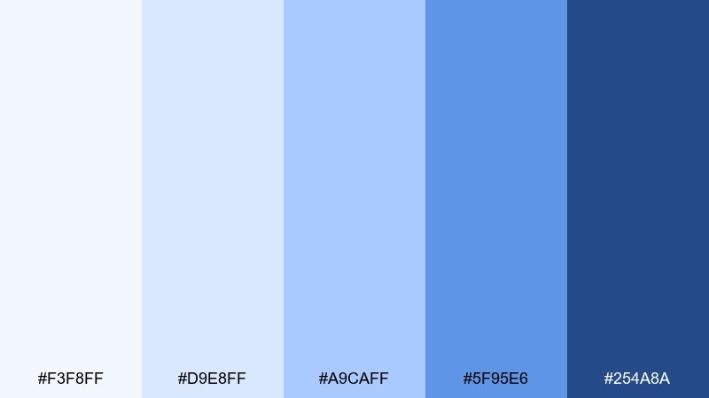
HEX: #f3f8ff #d9e8ff #a9caff #5f95e6 #254a8a
Mood: crisp, precise, trustworthy
Best for: finance analytics dashboard UI
Crisp and precise like winter light, these blues communicate trust and clarity. Let the near-white tint handle large canvases, then use mid blues for chart series and interactive states. Pair with neutral grays and thin line icons to keep the data feeling tidy. Tip: limit the darkest navy to totals and alerts so the eye lands on the most important numbers first.
Image example of icy blue generated using media.io
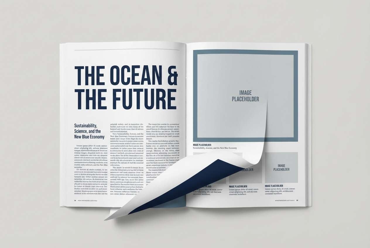
5) Stormy Navy
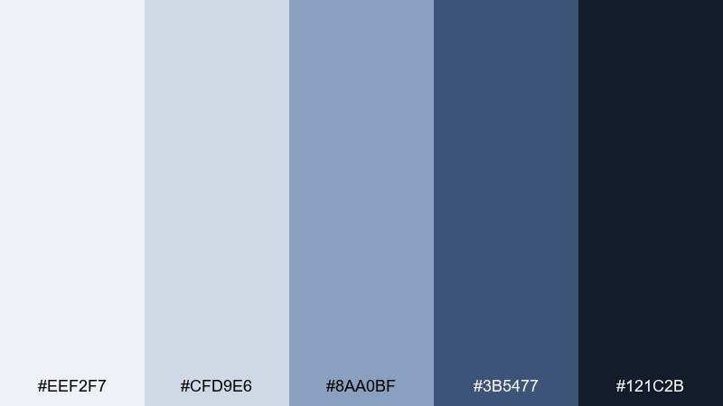
HEX: #eef2f7 #cfd9e6 #8aa0bf #3b5477 #121c2b
Mood: moody, editorial, elegant
Best for: magazine editorial layout
Moody and elegant like a storm over open water, these navies add instant editorial weight. Use pale blue-gray for margins and columns, then bring in the darkest tone for headlines and pull quotes. Pair with warm cream paper textures or a muted metallic accent to soften the seriousness. Tip: keep body text in the mid range for readability, reserving the darkest shade for emphasis only.
Image example of stormy navy generated using media.io
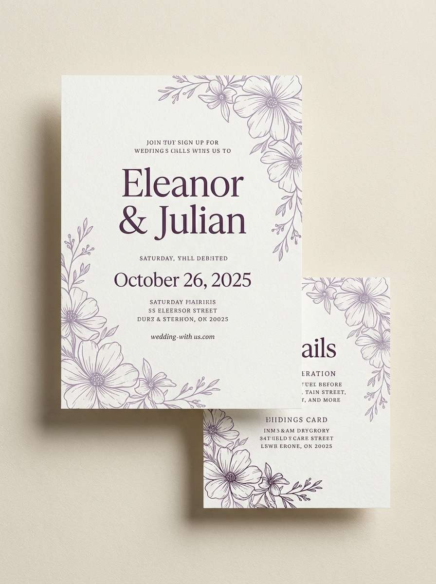
6) Dusty Lavender
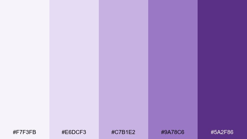
HEX: #f7f3fb #e6dcf3 #c7b1e2 #9a78c6 #5a2f86
Mood: romantic, soft, dreamy
Best for: wedding invitation suite
Romantic and dreamy like twilight petals, these lavender tones feel gentle and elevated. A monochromatic color palette like this works beautifully for invitations when you use the lightest tint for the paper field and the deepest purple for names and key details. Pair with delicate line florals, vellum overlays, or a touch of warm gold foil for contrast. Tip: increase letter spacing slightly on the darkest shade to keep small text from looking heavy.
Image example of dusty lavender generated using media.io
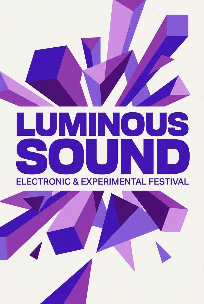
7) Royal Purple
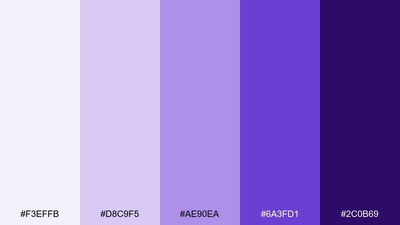
HEX: #f3effb #d8c9f5 #ae90ea #6a3fd1 #2c0b69
Mood: bold, electric, theatrical
Best for: music poster design
Bold and theatrical like stage lights in haze, these purples deliver instant drama. Use the brightest mid tone for big shapes and overlays, then anchor typography with the deep violet. Pair with black or off-white type and a subtle noise texture to make the gradients feel intentional. Tip: keep only one high-saturation layer per focal area so the poster stays punchy instead of muddy.
Image example of royal purple generated using media.io
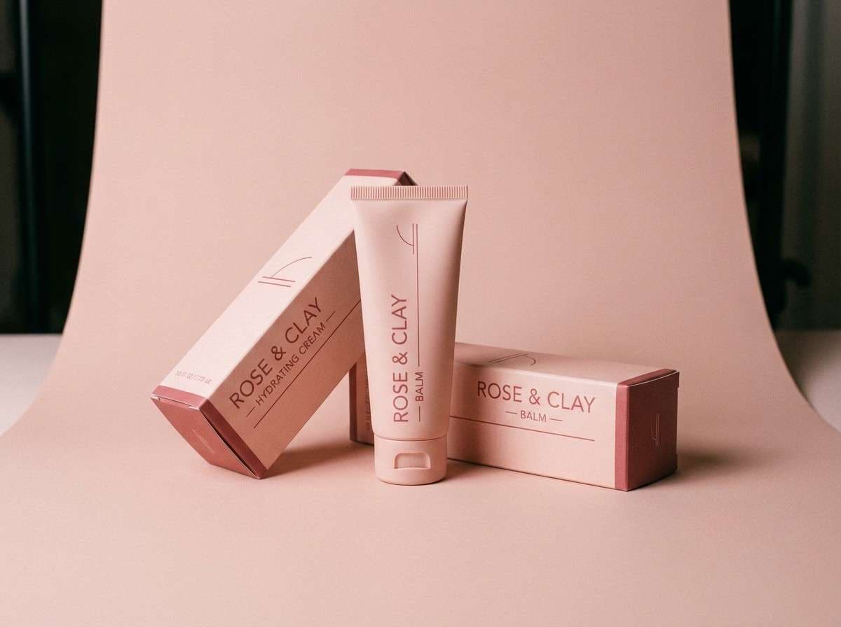
8) Blush Rose
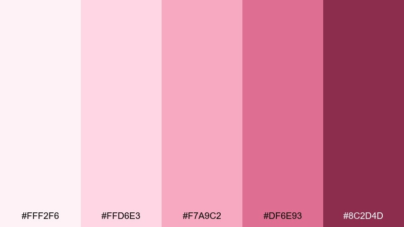
HEX: #fff2f6 #ffd6e3 #f7a9c2 #df6e93 #8c2d4d
Mood: tender, polished, beauty-forward
Best for: skincare product packaging
Tender and polished like a soft satin ribbon, these blush shades feel made for beauty brands. Use the palest pink for the carton base, mid tones for panels or patterns, and the wine shade for product names. Pair with clean sans serif type and a small warm metallic accent for a premium finish. Tip: print the darkest tone as spot elements only to avoid overpowering the delicate vibe.
Image example of blush rose generated using media.io
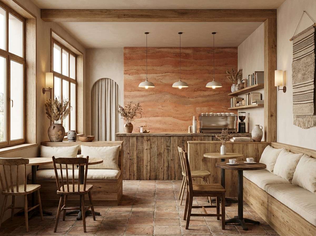
9) Brick Terracotta
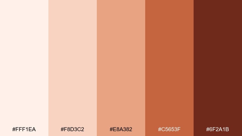
HEX: #fff1ea #f8d3c2 #e8a382 #c5653f #6f2a1b
Mood: warm, earthy, inviting
Best for: cafe interior accent wall and decor plan
Warm and earthy like sun-baked clay, these terracotta tones create an inviting, lived-in feel. Use the lighter tints on walls or large textiles, then bring in brick shades through ceramics, signage, or upholstery. Pair with natural woods, woven textures, and creamy whites to keep it airy. Tip: repeat the mid tone at least three times across the space to make the look feel intentional and cohesive.
Image example of brick terracotta generated using media.io
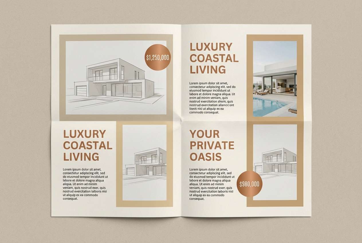
10) Warm Sand
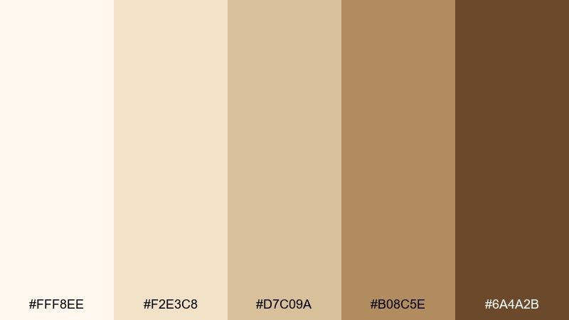
HEX: #fff8ee #f2e3c8 #d7c09a #b08c5e #6a4a2b
Mood: sunlit, neutral, timeless
Best for: real estate brochure layout
Sunlit and timeless like dunes at golden hour, these sand tones feel calm and upscale. Use the lightest cream for page backgrounds and plenty of white space, then step up into deeper tans for section headers and callouts. Pair with clean photography and charcoal typography for sharp legibility. Tip: keep gradients subtle and rely on texture, like paper grain, to add depth without clutter.
Image example of warm sand generated using media.io
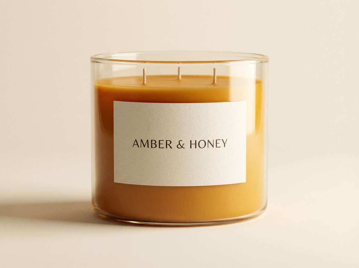
11) Honey Amber
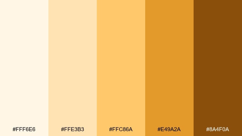
HEX: #fff6e6 #ffe3b3 #ffc86a #e49a2a #8a4f0a
Mood: cozy, luminous, appetizing
Best for: e-commerce candle product ad
Cozy and luminous like warm honey in glass, these ambers feel inviting and appetizing. Use the pale tint as a clean background, then push the mid amber into labels, badges, and soft shadows. Pair with warm neutrals and natural materials like linen to keep the scene premium. Tip: avoid pure black text here and choose deep brown instead for a smoother, warmer contrast.
Image example of honey amber generated using media.io
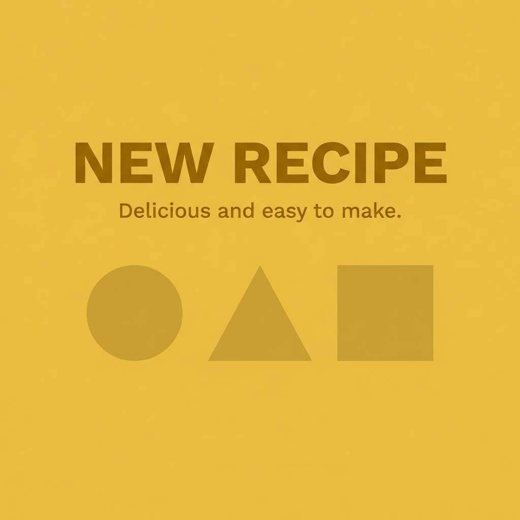
12) Sunny Mustard
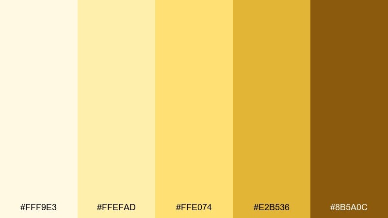
HEX: #fff9e3 #ffefad #ffe074 #e2b536 #8b5a0c
Mood: cheerful, energetic, friendly
Best for: social media post template for brands
Cheerful and bright like late-summer sun, these mustards add energy without going neon. Monochromatic color combinations work well in social templates when you keep text in the darkest shade and let lighter tints hold the background shapes. Pair with simple icons and plenty of padding so the warmth does not feel cramped. Tip: use the mid tone for buttons or stickers, and keep the strongest yellow away from long paragraphs.
Image example of sunny mustard generated using media.io
13) Olive Grove
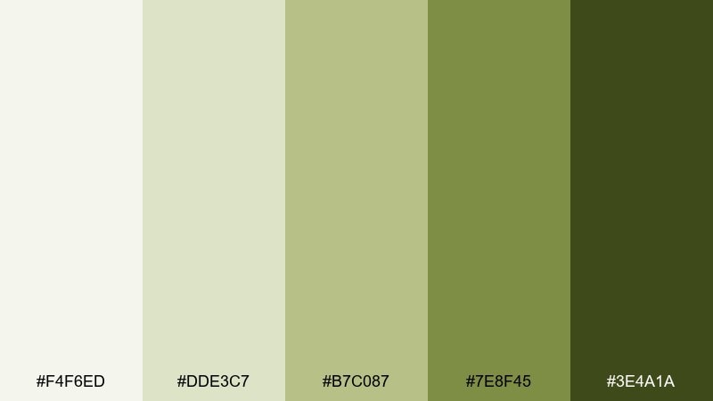
HEX: #f4f6ed #dde3c7 #b7c087 #7e8f45 #3e4a1a
Mood: natural, savory, sustainable
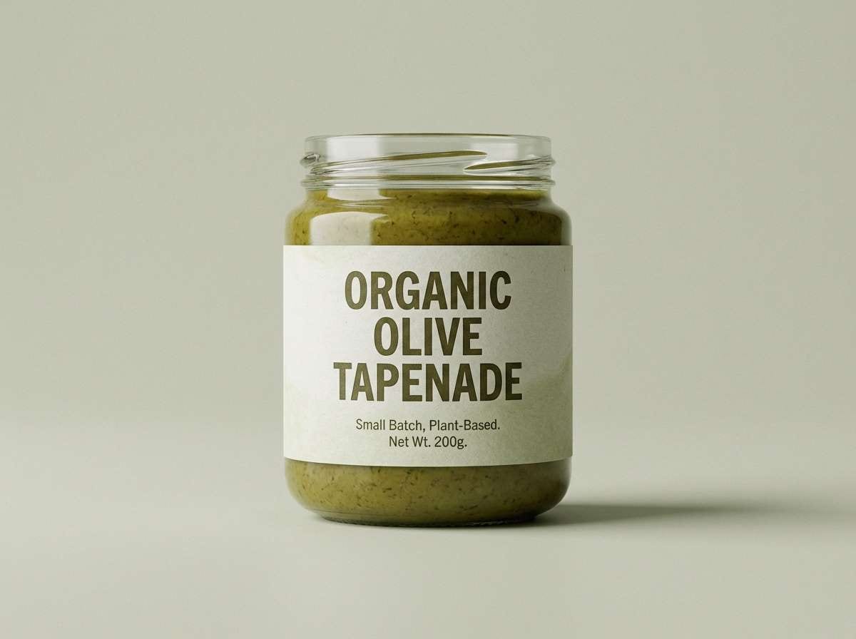
Best for: organic food label design
Natural and savory like crushed olives and fresh leaves, this olive range signals sustainability at first glance. Use pale green for label fields, mid tones for brand patterns, and the deepest shade for ingredients and certifications. Pair with uncoated stock and simple stamp-like icons for an honest, pantry-ready feel. Tip: keep contrast high on nutrition text by placing it on the lightest tint only.
Image example of olive grove generated using media.io
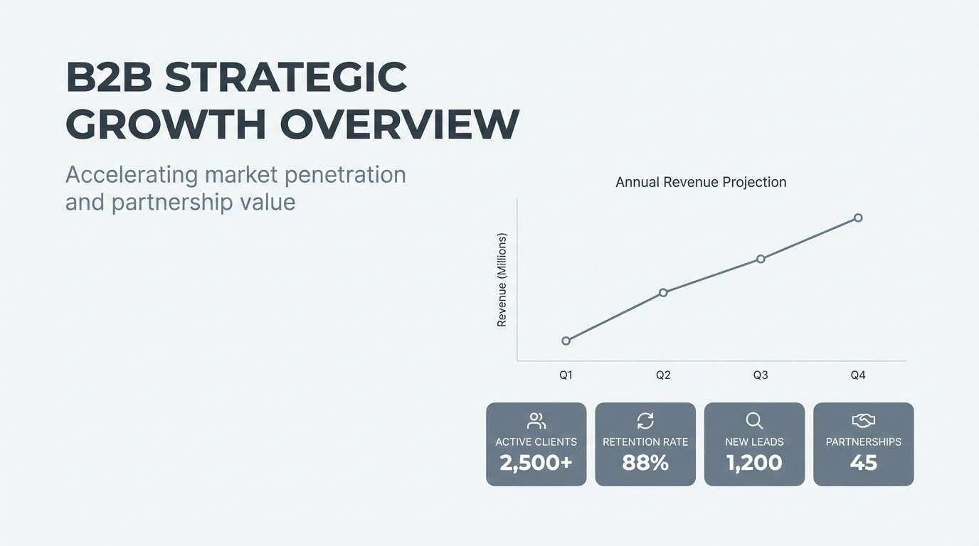
14) Slate Gray
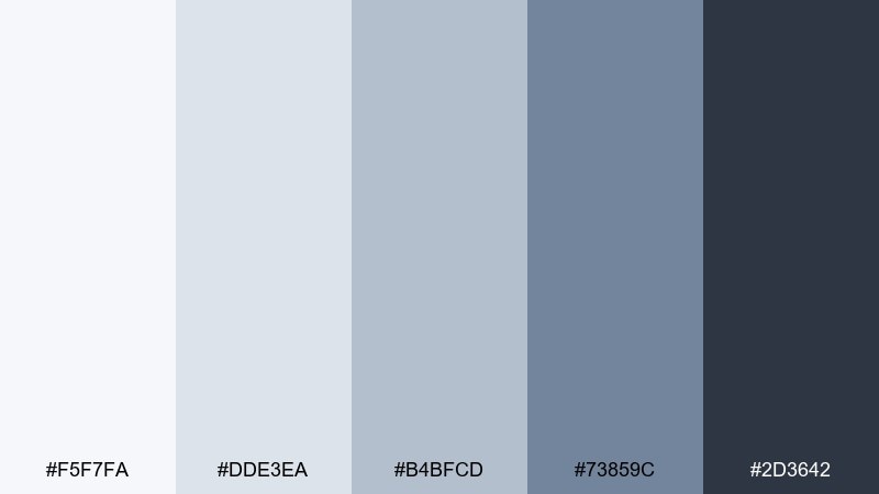
HEX: #f5f7fa #dde3ea #b4bfcd #73859c #2d3642
Mood: professional, structured, calm
Best for: B2B pitch deck template
Professional and structured like polished stone, these slates keep attention on the message. A monochromatic color scheme like this shines in decks: use the lightest gray for slides, mid grays for charts and dividers, and the darkest tone for titles. Pair with one small accent color only if you need category cues, otherwise let typography do the work. Tip: set data labels in the darkest shade and reduce gridline contrast to keep charts crisp.
Image example of slate gray generated using media.io
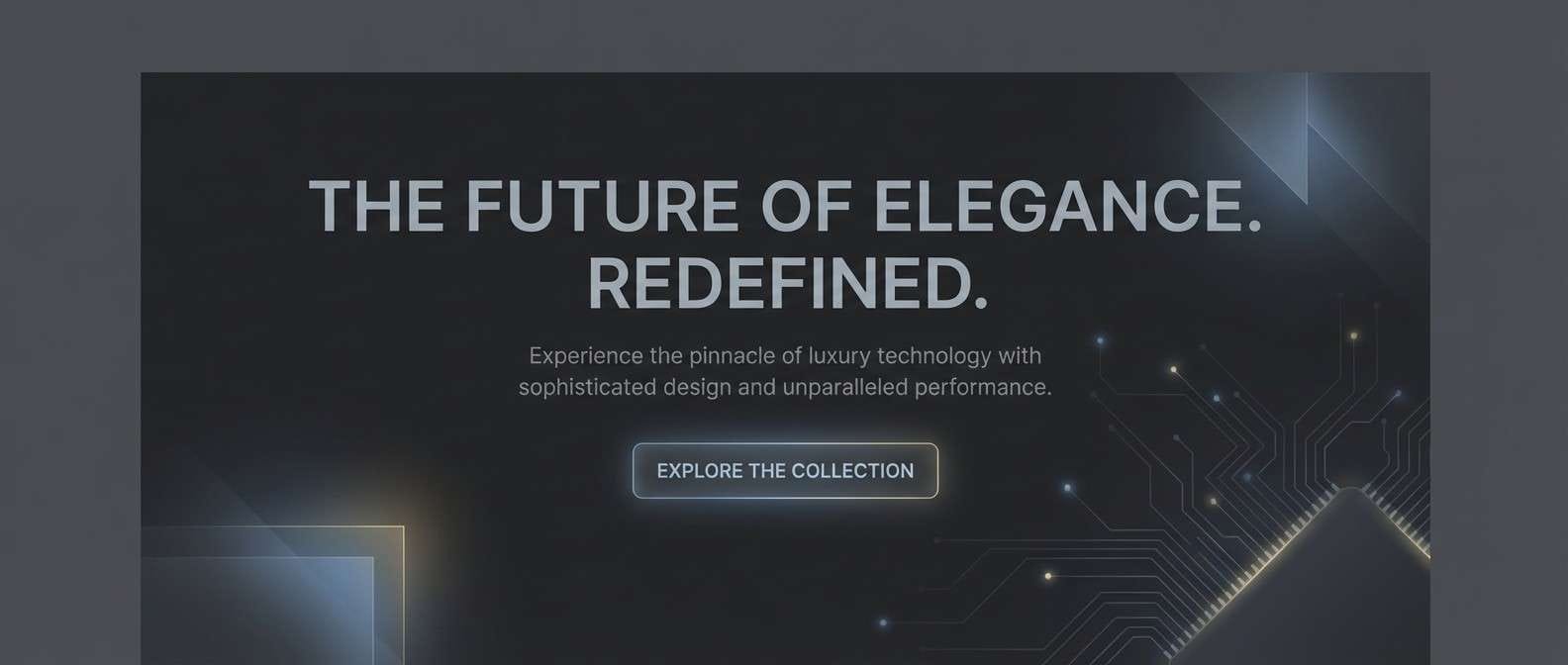
15) Charcoal Night
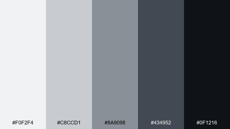
HEX: #f0f2f4 #c8ccd1 #8a9098 #434952 #0f1216
Mood: sleek, high-contrast, luxe
Best for: luxury tech website hero banner
Sleek and luxe like a city skyline at night, these charcoals feel high-end and controlled. Use the darkest shade for the hero background, then lift key UI elements with mid grays and sharp white space. Pair with subtle reflections, thin strokes, and condensed type for a premium tech vibe. Tip: introduce the lightest gray as a soft glow behind the headline to improve readability without breaking the mood.
Image example of charcoal night generated using media.io
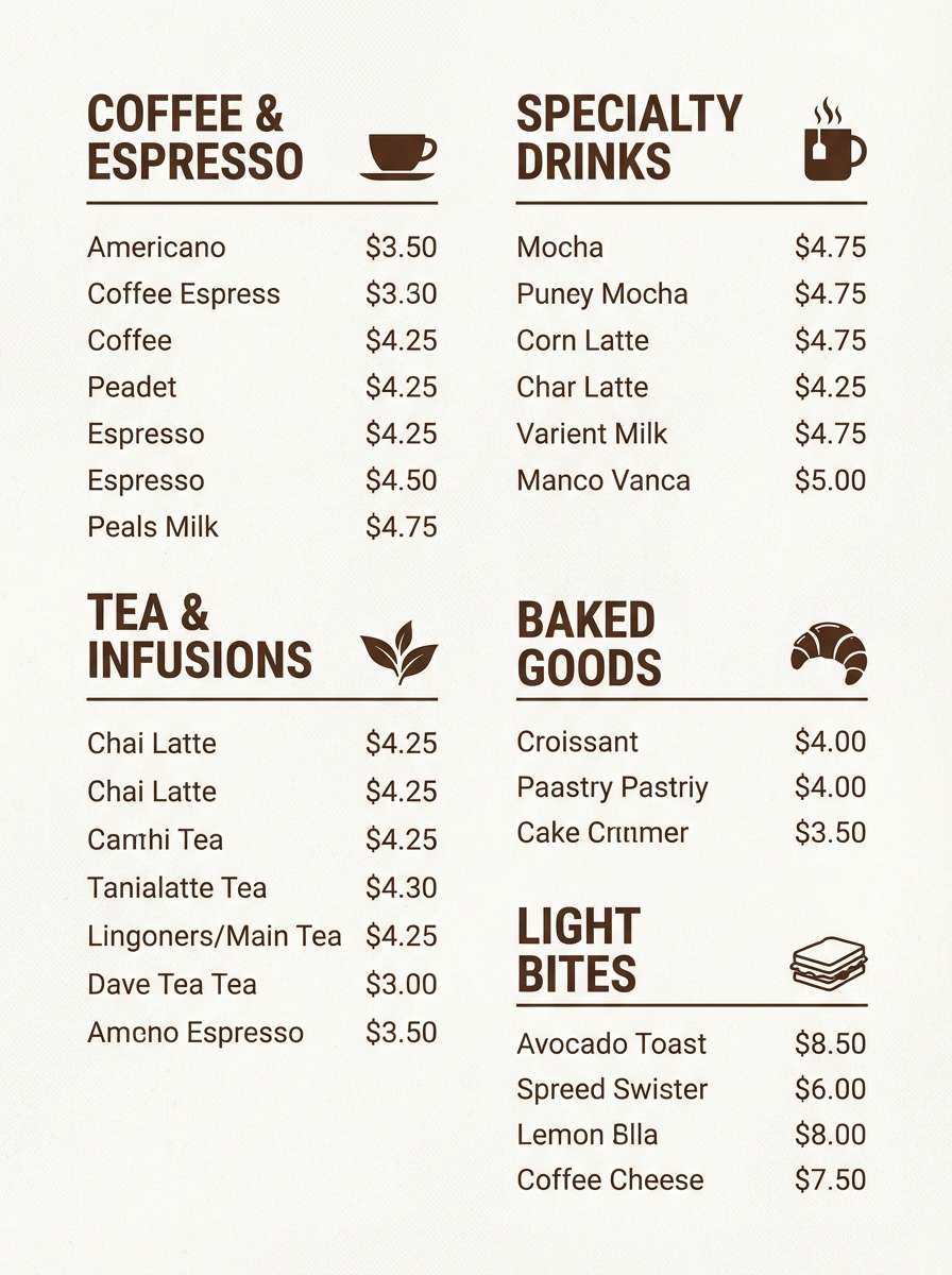
16) Cocoa Brown
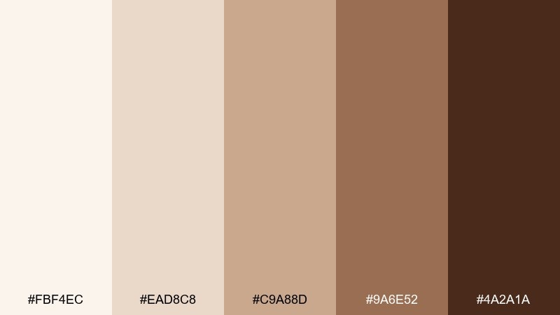
HEX: #fbf4ec #ead8c8 #c9a88d #9a6e52 #4a2a1a
Mood: cozy, artisanal, comforting
Best for: coffee shop menu board design
Cozy and artisanal like cacao and steamed milk, these browns make menus feel comforting and crafted. Use the lightest cream for the board base, mid browns for sections, and the darkest espresso tone for item names and prices. Pair with hand-drawn icons or subtle paper texture to reinforce the handmade mood. Tip: keep one consistent shade for all prices so scanning stays effortless.
Image example of cocoa brown generated using media.io
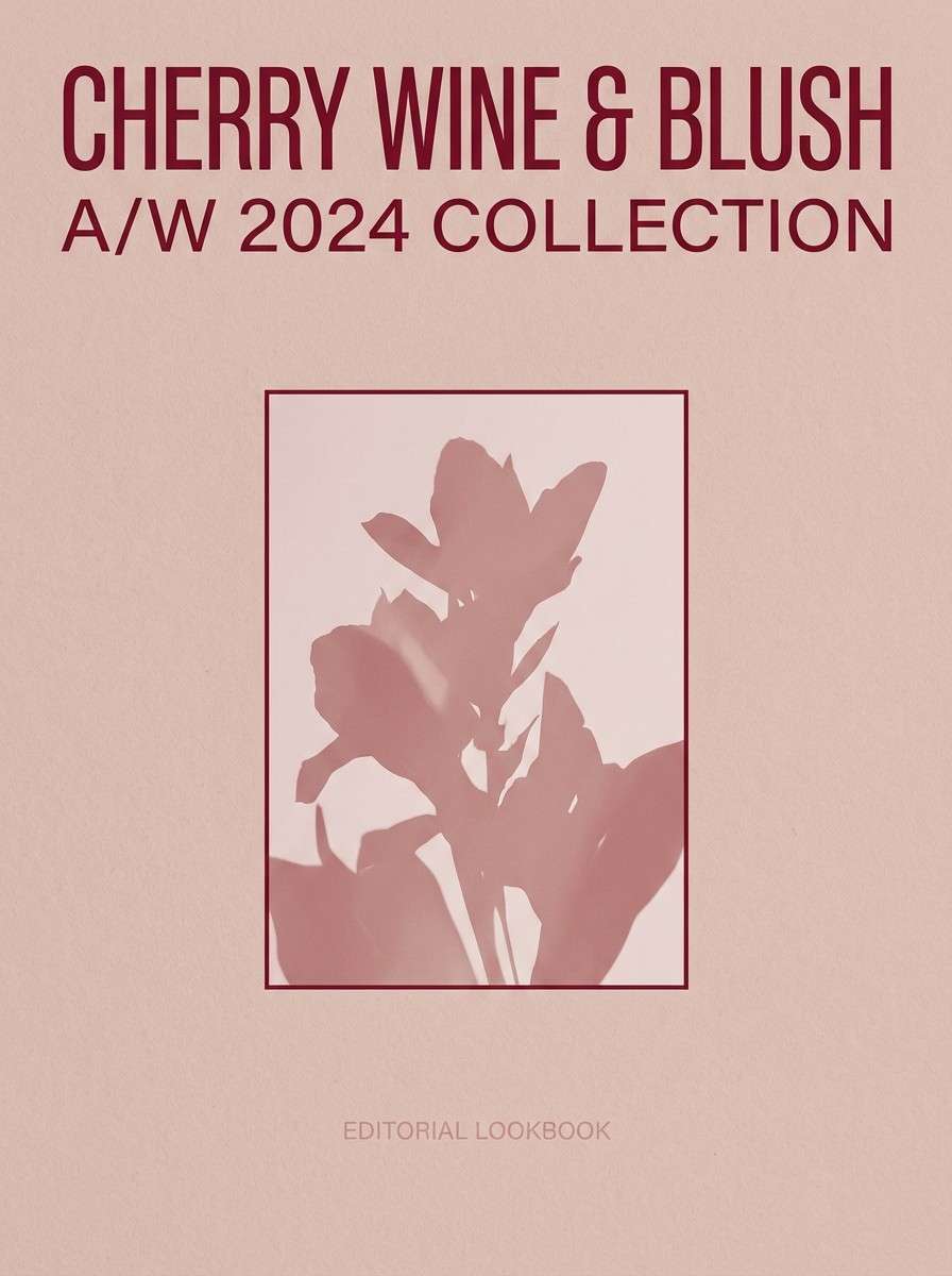
17) Cherry Wine
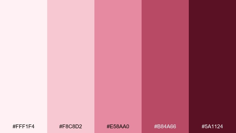
HEX: #fff1f4 #f8c8d2 #e58aa0 #b84a66 #5a1124
Mood: romantic, dramatic, fashion-forward
Best for: fashion lookbook cover
Romantic and dramatic like red velvet in low light, these wine tones feel fashion-forward and confident. Use pale blush as negative space, then bring in deeper cherry for the masthead and key typography. Pair with monochrome photography or soft shadows so the color stays the star. Tip: limit mid pinks to small accents like lines or page numbers to keep the cover sophisticated.
Image example of cherry wine generated using media.io
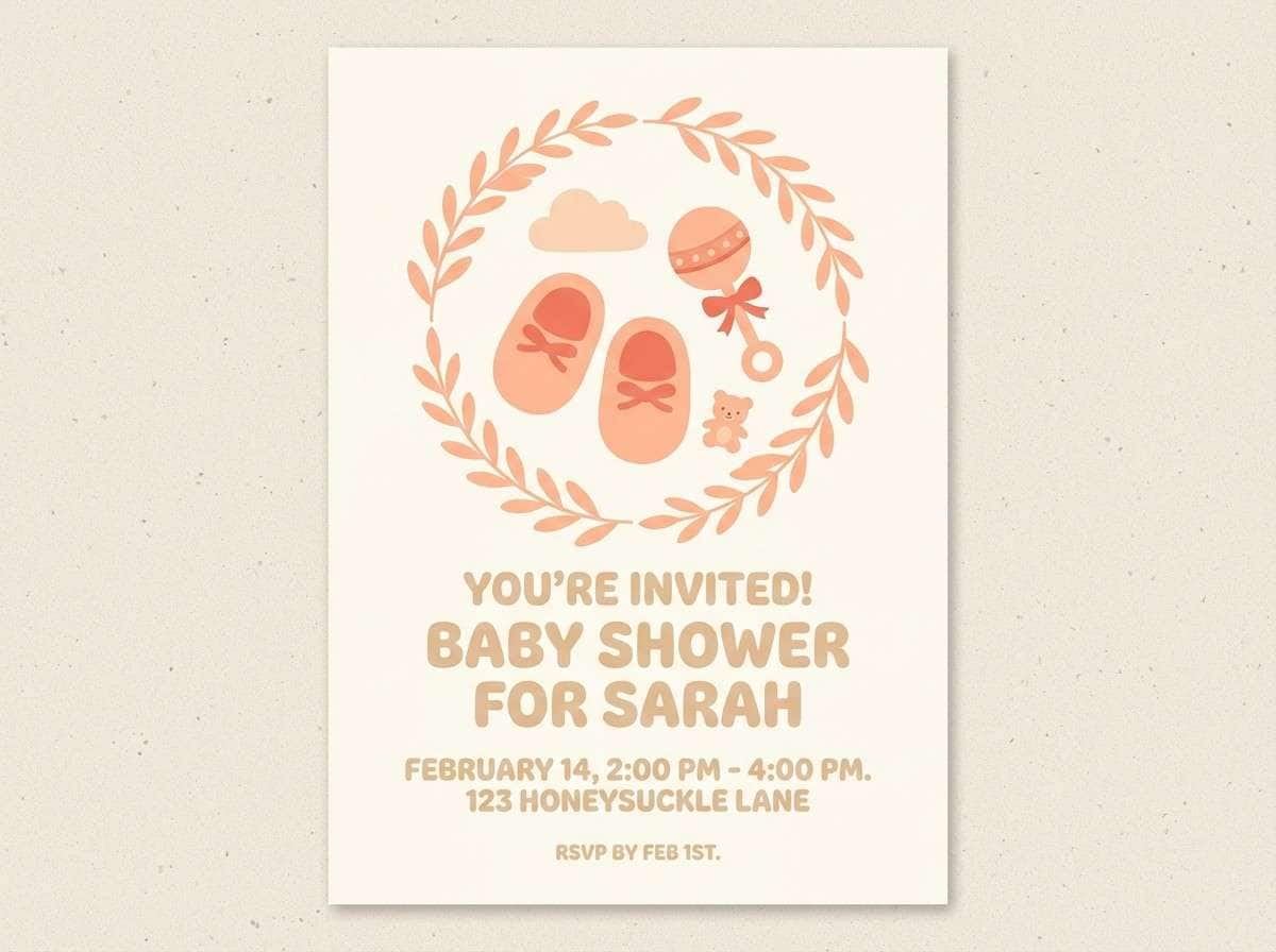
18) Peach Cream
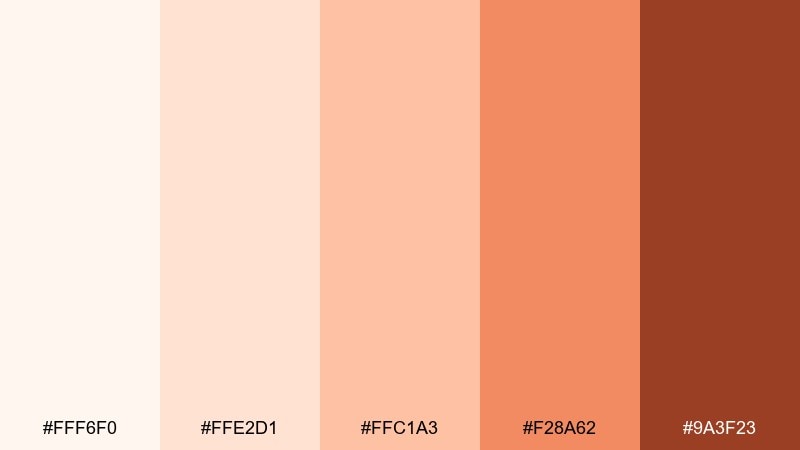
HEX: #fff6f0 #ffe2d1 #ffc1a3 #f28a62 #9a3f23
Mood: sweet, soft, welcoming
Best for: baby shower flyer design
Sweet and welcoming like whipped cream and ripe peaches, these tones feel gentle and celebratory. Use the lightest peach for the background, mid shades for balloons or borders, and the deeper coral for the event details. Pair with rounded type and simple illustrations to keep it playful. Tip: keep body copy on the palest tint so the flyer stays readable when printed.
Image example of peach cream generated using media.io
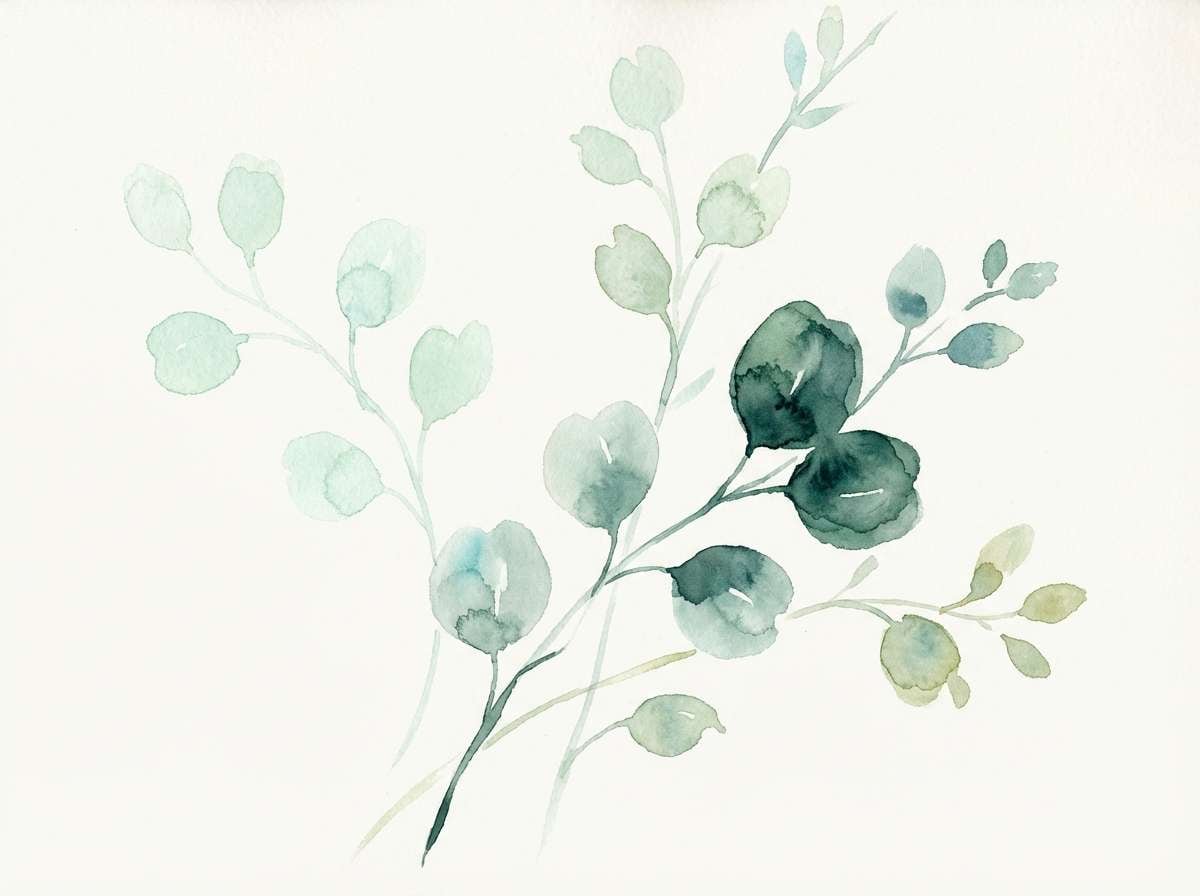
19) Mint Gelato
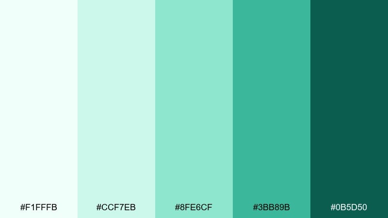
HEX: #f1fffb #ccf7eb #8fe6cf #3bb89b #0b5d50
Mood: fresh, playful, clean
Best for: watercolor botanical illustration
Fresh and playful like mint gelato on a warm day, these greens feel clean and uplifting. Use the pale tint for paper wash, mid mint for leaves, and the deep teal-green for shadowed stems and detail lines. Pair with plenty of white space so the illustration stays light. Tip: keep the darkest shade to fine edges only, letting the watercolor blooms create most of the depth.
Image example of mint gelato generated using media.io
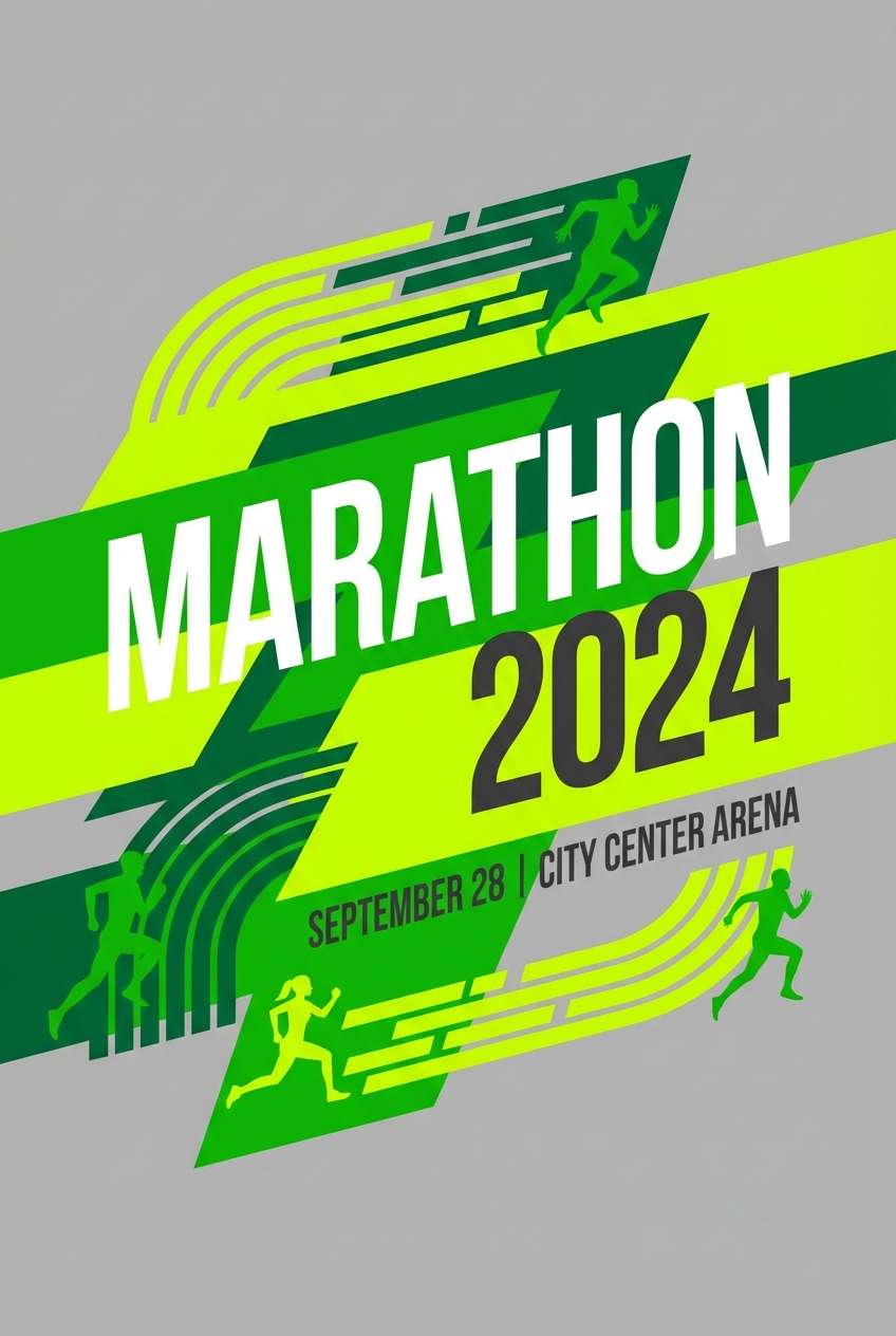
20) Electric Lime
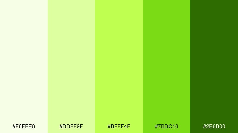
HEX: #f6ffe6 #ddff9f #bfff4f #7bdc16 #2e6b00
Mood: high-energy, sporty, bold
Best for: sports event poster
High-energy and bold like fresh-cut grass under stadium lights, these lime tones feel fast and sporty. Use the brightest lime for large shapes and highlights, then ground the layout with dark green for type and rules. Pair with black or white as support neutrals to keep contrast sharp at a distance. Tip: keep the neon-like shade away from long text blocks and reserve it for titles and directional elements.
Image example of electric lime generated using media.io
What Colors Go Well with Monochromatic?
Monochromatic palettes pair well with neutrals because they protect the “one-hue” concept while improving readability. Think warm off-white, soft gray, charcoal, or deep brown depending on the base hue.
If you want more pop, add a tiny accent from outside the hue family (like a complementary color) but keep it limited to micro-elements: badges, links, or a single highlight state.
Texture is another strong partner—paper grain, matte finishes, subtle noise, or natural materials can add depth without introducing new colors.
How to Use a Monochromatic Color Palette in Real Designs
Start by assigning roles by value: the lightest tint for backgrounds, mid tones for surfaces (cards, panels, shapes), and the darkest shade for primary actions and key type. This keeps hierarchy consistent.
For UI, avoid using the darkest shade everywhere—reserve it for one main CTA and top-priority labels. For print and branding, rely on contrast in scale and spacing so the design stays readable.
When in doubt, test accessibility early. A monochromatic color scheme can look elegant, but your text and icons still need enough contrast to work across screens and lighting conditions.
Create Monochromatic Palette Visuals with AI
Want to see your monochromatic color combinations applied to real layouts? Generate quick mockups—dashboards, posters, packaging, or interiors—using a single consistent hue family and controlled contrast.
With Media.io’s Text to Image tool, you can paste a prompt, specify the look (minimal, editorial, realistic), and iterate until the tone-on-tone balance feels right.
Use the prompts above as templates, then swap the subject (UI, label, flyer) and keep your palette’s mood keywords to get more consistent results.
Monochromatic Color Palette FAQs
-
What is a monochromatic color palette?
A monochromatic color palette is built from one base hue, then expanded using its tints (added white), shades (added black), and tones (added gray) to create a cohesive set of colors. -
Are monochromatic color schemes good for web and UI design?
Yes—monochromatic color schemes can make interfaces feel clean and consistent. The key is assigning clear roles (background, surfaces, text, CTAs) and checking contrast for accessibility. -
How do I add contrast in a monotone palette?
Use value contrast first (light vs dark), then add contrast through typography weight, spacing, borders, and subtle texture. If needed, add a tiny neutral (white/charcoal) or one small accent color. -
What’s the difference between tints, shades, and tones?
Tints are a hue mixed with white, shades are a hue mixed with black, and tones are a hue mixed with gray. Together, they create the range that makes monochromatic color combinations work. -
Can I use monochromatic palettes for branding?
Yes. Monochromatic brand colors are memorable and easy to keep consistent across print and digital. Typically, you’ll choose one hero shade, a lighter system for backgrounds, and a deep shade for logos and headlines. -
Do monochromatic palettes work for interiors?
They work especially well in interiors because texture and material changes add depth. Use lighter tints for large areas (walls), mid tones for upholstery, and darker shades for accents like frames and fixtures. -
How can I generate monochromatic palette mockups quickly?
Use an AI generator like Media.io Text to Image. Describe the design (e.g., “SaaS landing page,” “packaging label,” “poster”), specify the hue family, and iterate with lighting and texture cues for realistic results.


