

A rose garden color palette blends soft florals, leafy greens, and warm neutrals to create designs that feel romantic, fresh, and easy to trust.
Whether you’re building a brand, designing UI, or styling invitations, these rose garden colors give you a flexible foundation plus enough contrast for readable type.
In this article
- Why Rose Garden Palettes Work So Well
-
- morning dew roses
- petal & sage modern ui
- tea rose neutrals
- garden party branding
- antique rose velvet
- rosehip sunset poster
- rose quartz kitchen
- bloom & linen minimal
- cottage rosewater
- stem and thorn contrast
- champagne peony mix
- dusty mauve workspace
- wild rose pathway
- herb garden accents
- crimson bud statement
- soft coral bouquet
- rose garden at dusk
- greenhouse morning
- blush marble mix
- porcelain pink classic
- What Colors Go Well with Rose Garden?
- How to Use a Rose Garden Color Palette in Real Designs
- Create Rose Garden Palette Visuals with AI
Why Rose Garden Palettes Work So Well
Rose garden palettes balance emotional warmth (pinks, blush, coral) with natural stability (sage, olive, forest green). That mix feels welcoming without becoming overly sweet, which is why it works across modern and classic styles.
They also tend to include soft, paper-like neutrals that make layouts breathe. Those light bases keep designs looking premium and give you space to add typography, patterns, and photography without visual noise.
Finally, deeper greens, charcoals, or wine tones provide reliable contrast for accessibility. You can keep the overall look delicate while still getting crisp headers, readable body text, and strong CTAs.
20+ Rose Garden Color Palette Ideas (with HEX Codes)
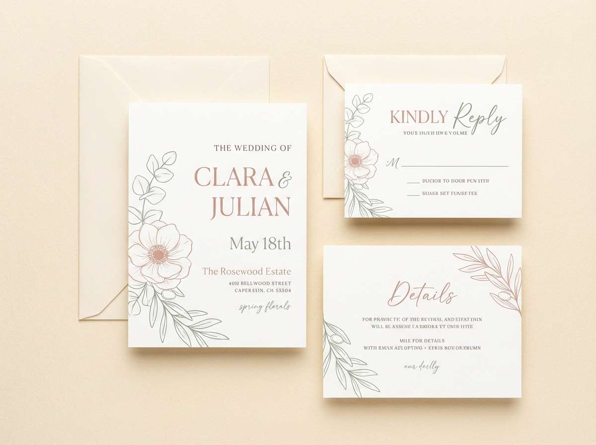
1) Morning Dew Roses
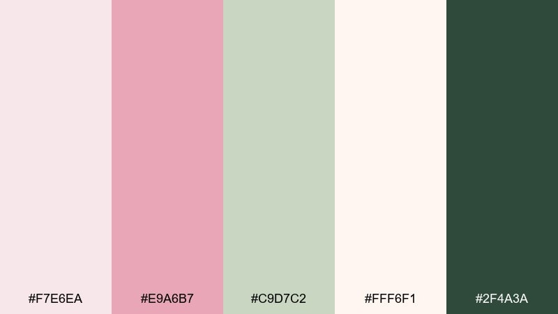
HEX: #F7E6EA #E9A6B7 #C9D7C2 #FFF6F1 #2F4A3A
Mood: fresh, romantic, airy
Best for: spring wedding invitation suite
Fresh and airy like petals with early-morning mist, these tones feel romantic without going overly sweet. Use the blush and cream as your base, then add sage for botanical balance and deep green for crisp type. It works beautifully on invitations, place cards, and monograms where you want soft charm with legible contrast. Tip: keep metallics subtle, and let the dark green handle small text for clean readability.
Image example of morning dew roses generated using media.io
Media.io is an online AI studio for creating and editing video, image, and audio in your browser.

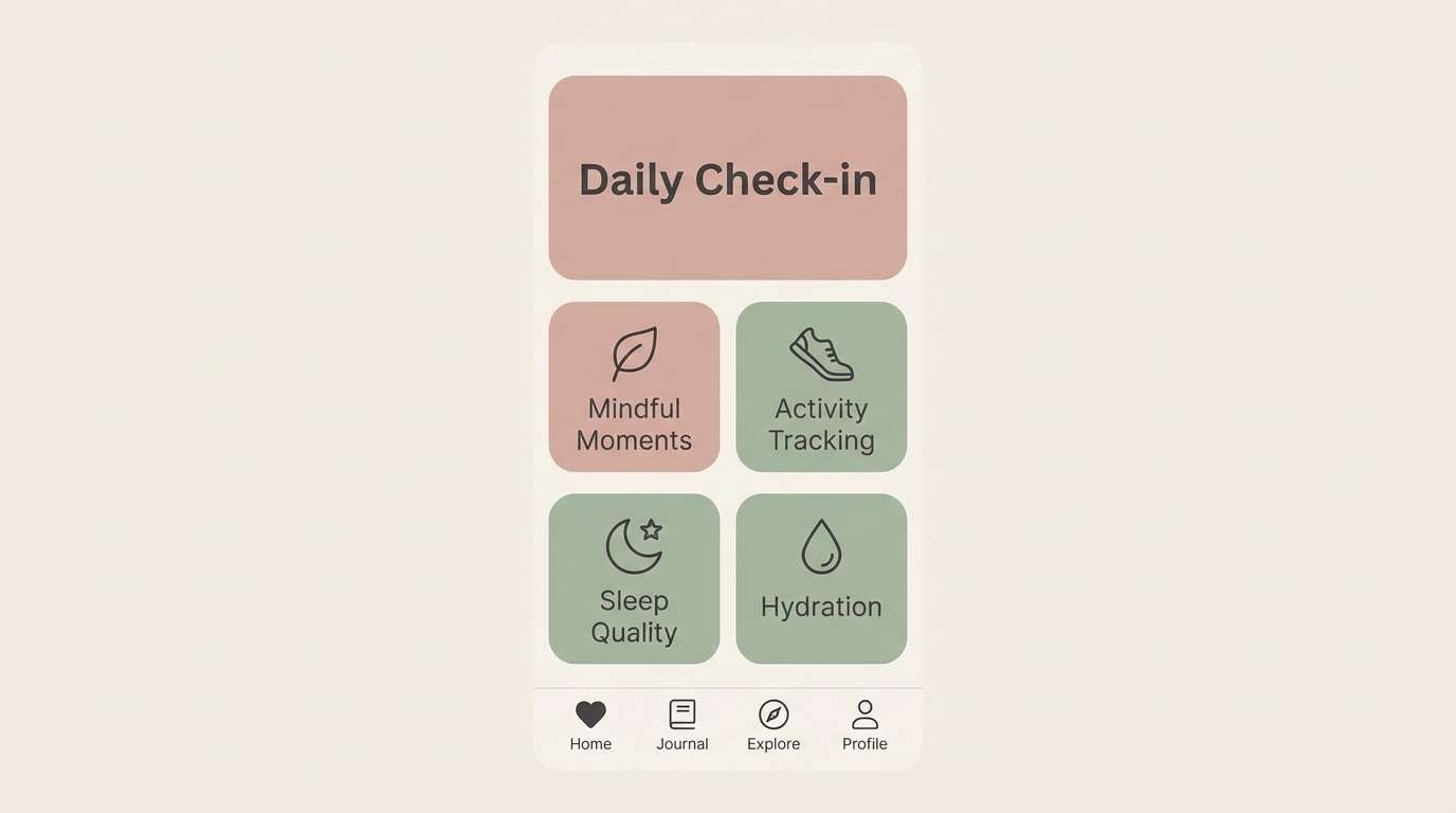
2) Petal & Sage Modern UI
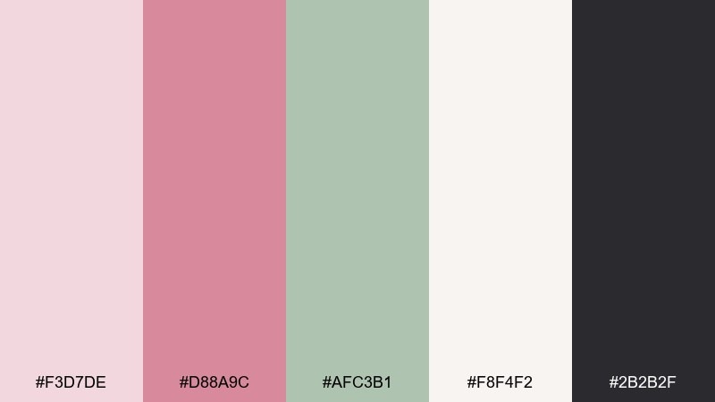
HEX: #F3D7DE #D88A9C #AFC3B1 #F8F4F2 #2B2B2F
Mood: calm, modern, approachable
Best for: wellness app UI screens
Calm and modern, this mix reads like soft petals against tidy greenhouse greens. Let the off-white and blush handle surfaces, then use the charcoal for navigation and accessibility-friendly text. The sage works best as a secondary accent for toggles, tags, and success states. Tip: keep the bright pink limited to one primary action to maintain a soothing interface.
Image example of petal & sage modern ui generated using media.io
3) Tea Rose Neutrals
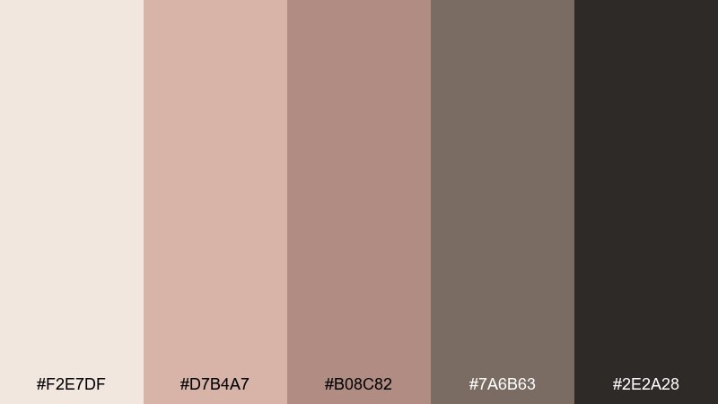
HEX: #F2E7DF #D7B4A7 #B08C82 #7A6B63 #2E2A28
Mood: warm, editorial, refined
Best for: magazine layout and lookbooks
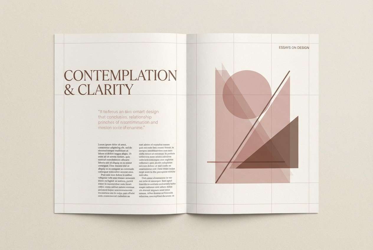
Warm and editorial, these tea-stained neutrals feel like pressed roses in a vintage journal. Use the light cream for generous margins, then layer dusty rose and cocoa for headings and pull quotes. The deep near-black anchors photography captions and fine lines without looking harsh. Tip: pair with textured paper or subtle grain to enhance the print-like mood.
Image example of tea rose neutrals generated using media.io
4) Garden Party Branding
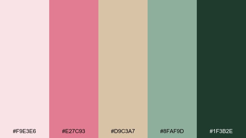
HEX: #F9E3E6 #E27C93 #D9C3A7 #8FAF9D #1F3B2E
Mood: cheerful, social, polished
Best for: boutique brand identity board
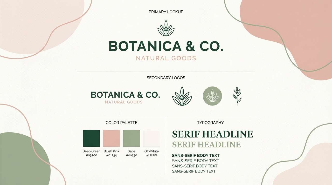
Cheerful and polished, it evokes clinking glasses beside blooming borders and leafy hedges. For a boutique identity, build the base with blush and warm beige, then use sage as your steady secondary tone. The deep evergreen makes logos and wordmarks feel premium, especially on light backgrounds. Tip: this rose garden color palette shines when you keep the bright pink to highlights like seals, stickers, and social buttons.
Image example of garden party branding generated using media.io
5) Antique Rose Velvet

HEX: #EED3D9 #C76C7B #8E3D4D #CBB7AE #3A2A2D
Mood: luxurious, moody, romantic
Best for: beauty product packaging
Luxurious and moody, these shades feel like velvet petals under soft lamplight. Use the pale blush for outer cartons and the deep wine for typography that looks instantly high-end. The warm greige keeps the look grounded and pairs well with matte finishes and embossing. Tip: add spot gloss only on the darkest shade to create contrast without clutter.
Image example of antique rose velvet generated using media.io
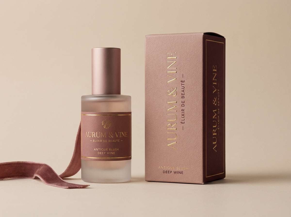
6) Rosehip Sunset Poster
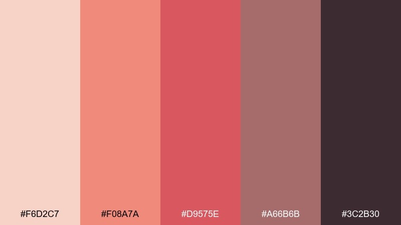
HEX: #F6D2C7 #F08A7A #D9575E #A66B6B #3C2B30
Mood: vibrant, inviting, energetic
Best for: event poster and promo graphics
Vibrant and inviting, it feels like late sunlight catching rosehips and warm stone paths. Use coral and raspberry for headline impact, while the muted mauve keeps subtext and details from looking loud. The deep plum-brown works well for borders, QR codes, and small typography. Tip: these rose garden color combinations look best when you reserve the brightest tone for one focal element, like the date or call to action.
Image example of rosehip sunset poster generated using media.io

7) Rose Quartz Kitchen
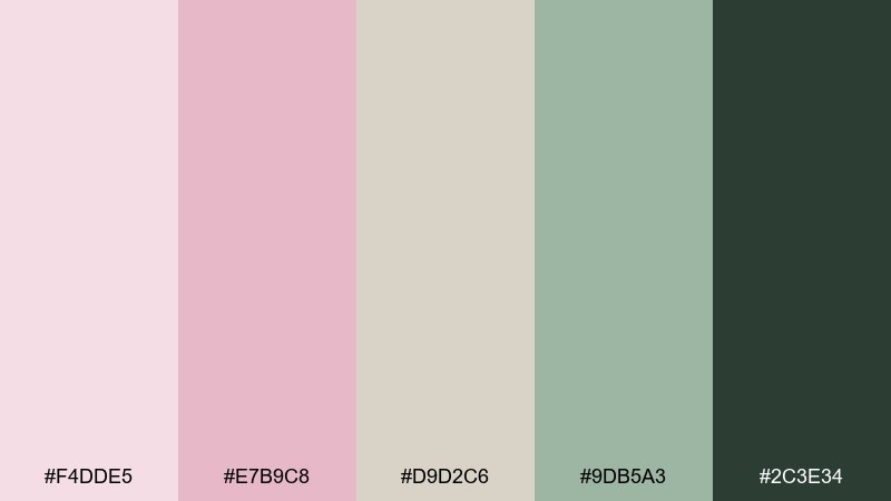
HEX: #F4DDE5 #E7B9C8 #D9D2C6 #9DB5A3 #2C3E34
Mood: soft, clean, homey
Best for: interior design mood board
Soft and clean, this set evokes rose quartz counters, linen towels, and herbs by the window. Use the warm neutral as your main field color and bring in blush for textiles or small decor moments. Sage and deep green make great companions for plants, cabinetry accents, and hardware. Tip: keep contrast high on labels and notes by using the darkest green for text.
Image example of rose quartz kitchen generated using media.io
8) Bloom & Linen Minimal

HEX: #FFF4F2 #F0CBD2 #D7A8B2 #C6D2C4 #5C6A60
Mood: minimal, gentle, contemporary
Best for: ecommerce landing page UI
Minimal and gentle, it feels like fresh blooms on clean linen with a hint of greenery. Keep the cream and pale blush as your layout foundation and reserve the dusty rose for buttons or price highlights. The soft green and muted gray-green are ideal for tags, icons, and secondary states. Tip: avoid pure black and use the gray-green for body text to keep the look airy.
Image example of bloom & linen minimal generated using media.io
9) Cottage Rosewater
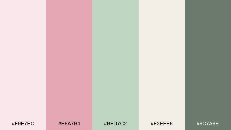
HEX: #F9E7EC #E6A7B4 #BFD7C2 #F3EFE6 #6C7A6E
Mood: charming, soft, pastoral
Best for: watercolor botanical illustration
Charming and pastoral, it brings to mind cottage gardens, rosewater spritz, and sun-faded curtains. Use the pale pink wash for petals, then layer the stronger blush for depth and shadow. The leafy greens keep the illustration lively, while the warm off-white makes a perfect paper tone. Tip: limit hard outlines and let the mid-pink create form through soft gradients.
Image example of cottage rosewater generated using media.io
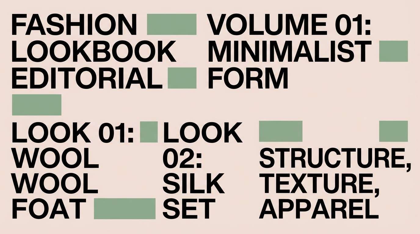
10) Stem and Thorn Contrast
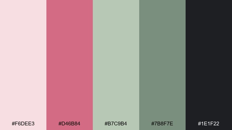
HEX: #F6DEE3 #D46B84 #B7C9B4 #7B8F7E #1E1F22
Mood: bold, clean, confident
Best for: fashion lookbook layout
Bold and clean, it feels like smooth petals against crisp stems and a dark studio backdrop. Use the near-black for structure, grids, and typography, then add pink for punchy section dividers or cover lines. The greens act as a grounded counterpoint that keeps the overall look modern. Tip: keep pink accents consistent in size so the pages feel intentional, not scattered.
Image example of stem and thorn contrast generated using media.io
11) Champagne Peony Mix
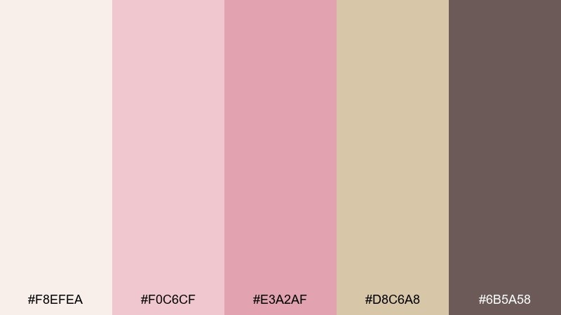
HEX: #F8EFEA #F0C6CF #E3A2AF #D8C6A8 #6B5A58
Mood: celebratory, soft, elegant
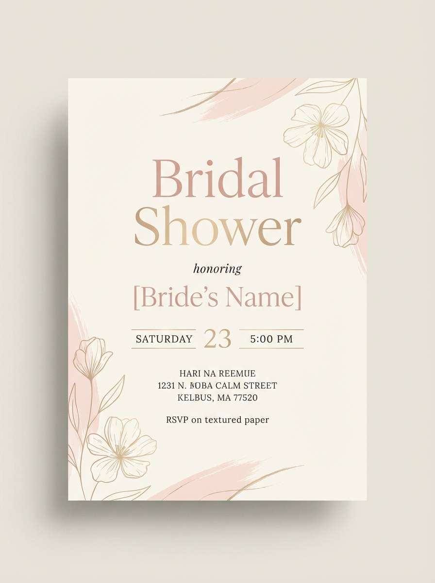
Best for: bridal shower flyer
Celebratory and soft, it recalls champagne bubbles, peony petals, and warm candlelight. Use the creamy tone as your background, then layer blush and dusty pink for headers and decorative rules. The champagne-beige supports photos or illustrated elements without competing. Tip: choose one script font and keep body text in the muted brown for a tidy, upscale flyer.
Image example of champagne peony mix generated using media.io
12) Dusty Mauve Workspace
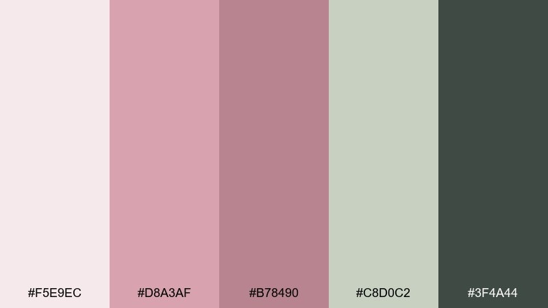
HEX: #F5E9EC #D8A3AF #B78490 #C8D0C2 #3F4A44
Mood: focused, soothing, professional
Best for: presentation slide template
Focused and soothing, these muted tones feel like a quiet desk near an open garden window. Use the pale background for slides, then bring in mauve for section headers and callouts. The soft green supports charts and status labels, while the deep gray-green keeps text crisp. Tip: stick to two accent colors per slide to keep the deck looking polished.
Image example of dusty mauve workspace generated using media.io
13) Wild Rose Pathway
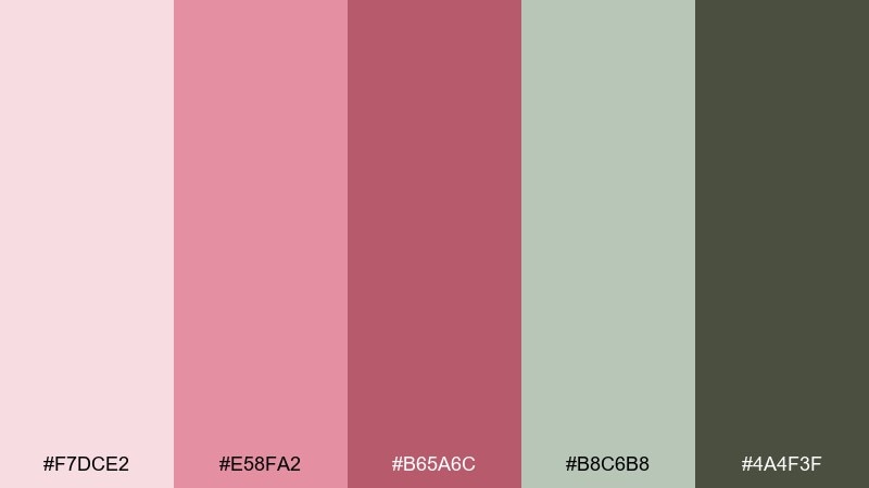
HEX: #F7DCE2 #E58FA2 #B65A6C #B8C6B8 #4A4F3F
Mood: storybook, earthy, romantic
Best for: book cover design
Storybook and earthy, it evokes wild roses climbing fences along a shaded path. Use the pale pink as your background, then bring in the mid-rose for the title to keep it warm and inviting. The muted greens add an organic frame and work well for subtle illustration details. Tip: add a simple vignette in the darkest olive to guide the eye toward the title.
Image example of wild rose pathway generated using media.io
14) Herb Garden Accents
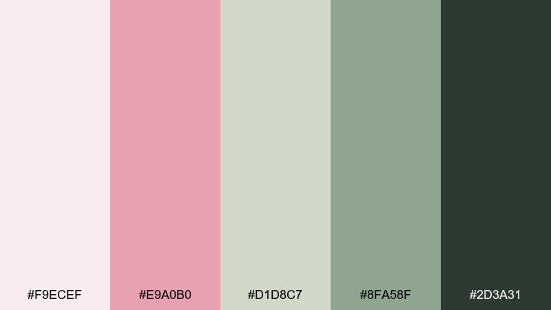
HEX: #F9ECEF #E9A0B0 #D1D8C7 #8FA58F #2D3A31
Mood: fresh, natural, inviting
Best for: restaurant menu design
Fresh and natural, it feels like rose petals scattered beside cut herbs and ceramic plates. Use the pale pink as a soft menu background, then lean on the deep green for readable sections and prices. The two greens make tasteful dividers and icon accents without feeling themed. Tip: keep photos warm-toned and minimal so the greens and blush stay in charge.
Image example of herb garden accents generated using media.io
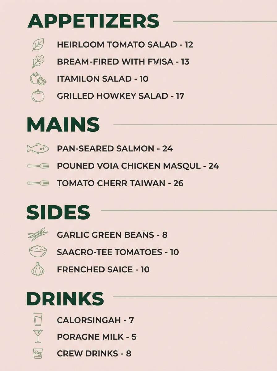
15) Crimson Bud Statement
HEX: #F7E2E6 #E15B7B #B01E45 #D2C9BF #2A2326
Mood: dramatic, confident, bold
Best for: social media campaign ad
Dramatic and confident, it captures a crimson bud against soft petals and dark shadows. Use the bright berry for key hooks like discount text or sign-up buttons, while the deep red adds depth in backgrounds and banners. The warm greige keeps the layout from feeling too heavy, especially in carousel designs. Tip: these rose garden color combinations work best when you give the darkest tone plenty of breathing room around typography.
Image example of crimson bud statement generated using media.io
16) Soft Coral Bouquet
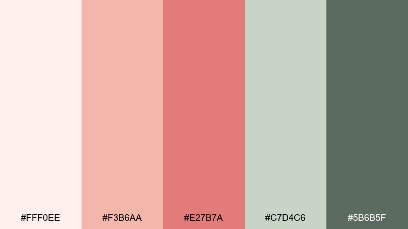
HEX: #FFF0EE #F3B6AA #E27B7A #C7D4C6 #5B6B5F
Mood: uplifting, friendly, clean
Best for: skincare product ad
Uplifting and friendly, it feels like a coral bouquet with fresh green stems on a bright counter. Use the pale peach as your background, then let coral handle product highlights and benefit badges. The greens support trust-building elements like ingredient lists and seals. Tip: keep shadows soft and choose rounded typography to match the gentle color temperature.
Image example of soft coral bouquet generated using media.io
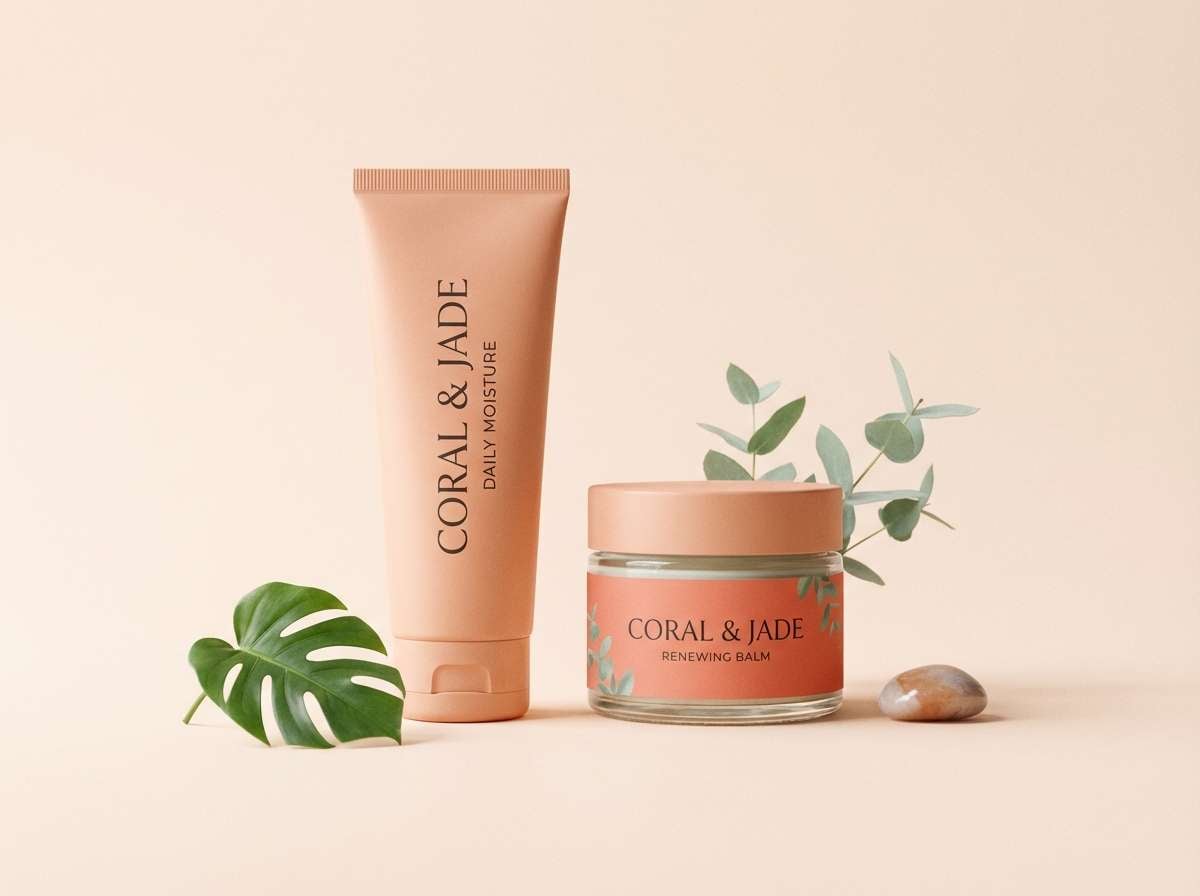
17) Rose Garden at Dusk
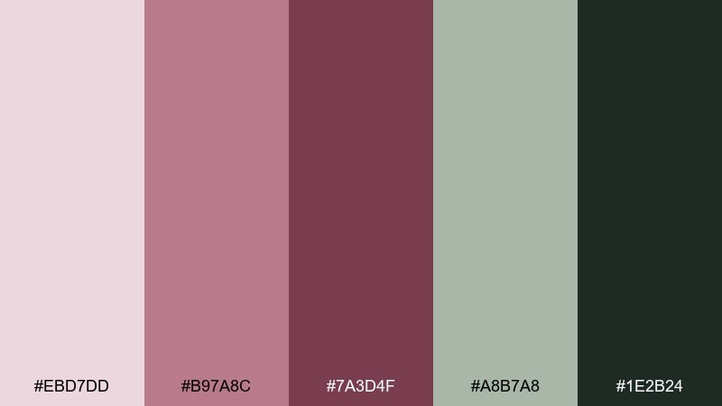
HEX: #EBD7DD #B97A8C #7A3D4F #A8B7A8 #1E2B24
Mood: quiet, intimate, cinematic
Best for: scented candle packaging
Quiet and intimate, it suggests twilight blooms with cool leaves and a hint of smoke. Use the dusty mauve for the label base, then set type in deep forest for a grounded, cinematic feel. The plum-wine works beautifully for small seals and scent notes. Tip: matte paper plus a single foil detail on the darkest green elevates the mood instantly.
Image example of rose garden at dusk generated using media.io
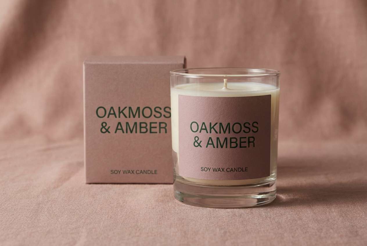
18) Greenhouse Morning
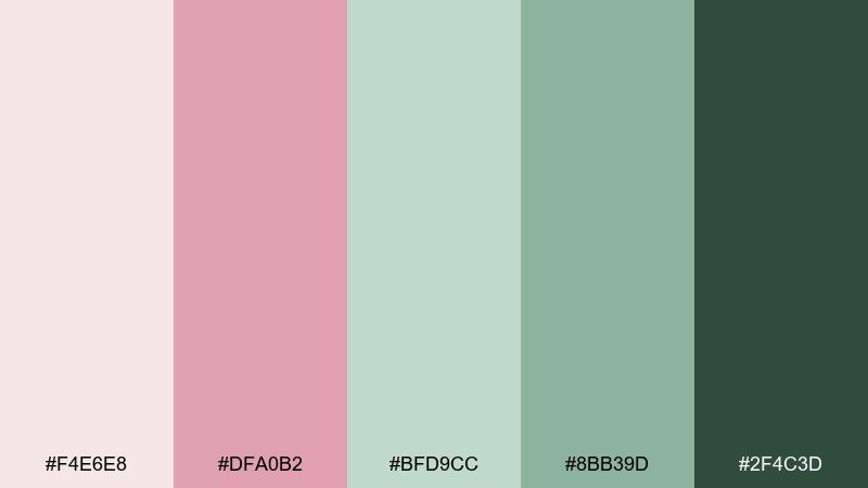
HEX: #F4E6E8 #DFA0B2 #BFD9CC #8BB39D #2F4C3D
Mood: fresh, optimistic, botanical
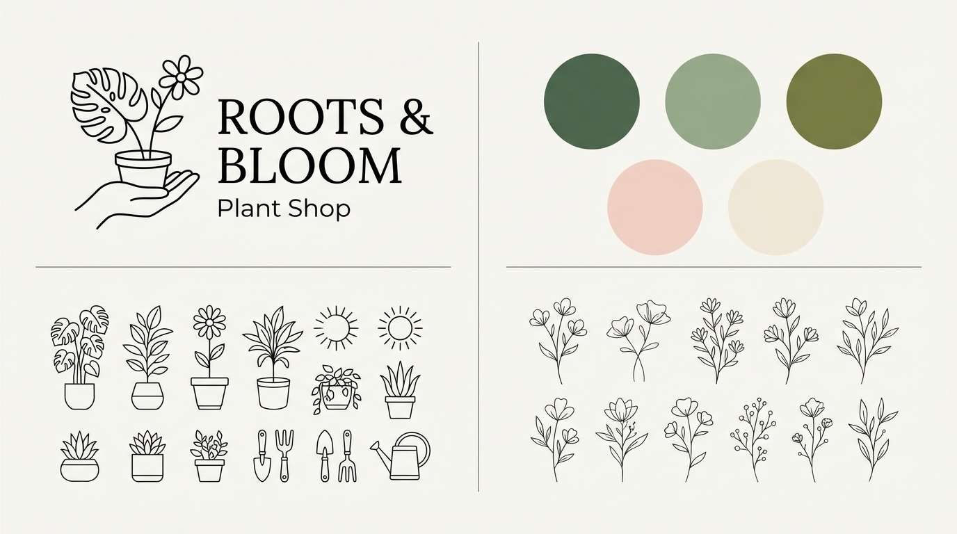
Best for: plant shop brand kit
Fresh and optimistic, it feels like warm light filtering through greenhouse glass onto new blooms. Use the soft pink sparingly for friendly highlights, while the greens do most of the work for trust and nature-forward messaging. This rose garden color palette pairs nicely with natural textures, kraft paper, and simple line icons. Tip: choose one green for primary CTAs and keep the others for supporting labels and backgrounds.
Image example of greenhouse morning generated using media.io
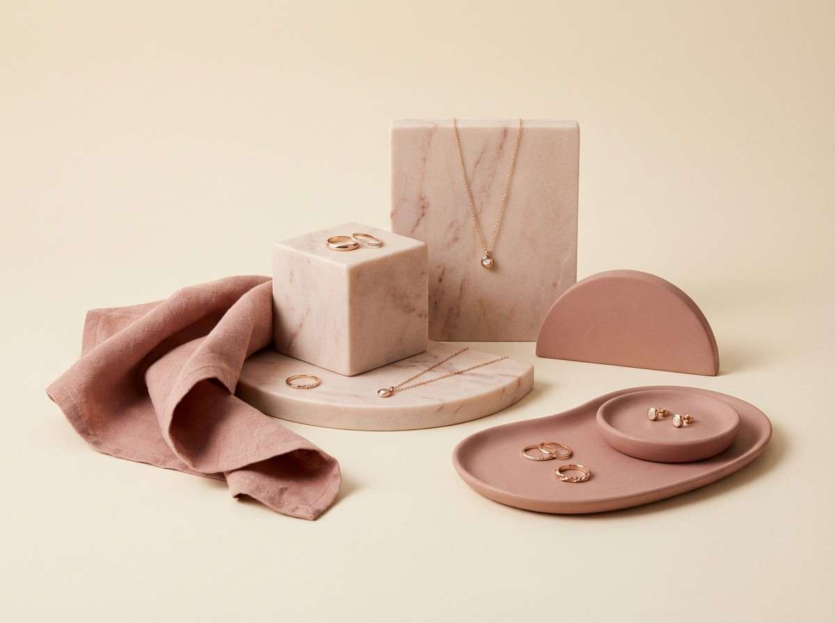
19) Blush Marble Mix
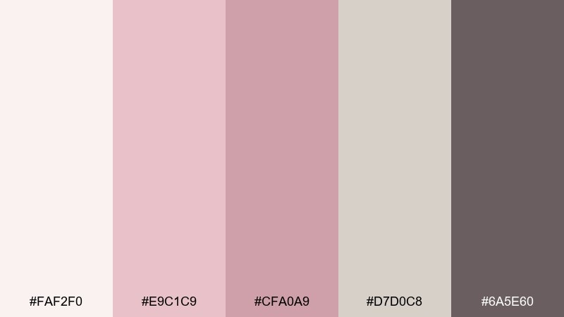
HEX: #FAF2F0 #E9C1C9 #CFA0A9 #D7D0C8 #6A5E60
Mood: elegant, soft, upscale
Best for: jewelry product photography
Elegant and soft, it evokes blush marble, satin ribbons, and quiet boutique lighting. Use the pale cream as a clean studio background, then bring in blush and dusty rose through props or label details. The warm gray and deep taupe keep the scene grounded and premium. Tip: keep reflections subtle and let one rosy tone dominate so metal finishes stay believable.
Image example of blush marble mix generated using media.io
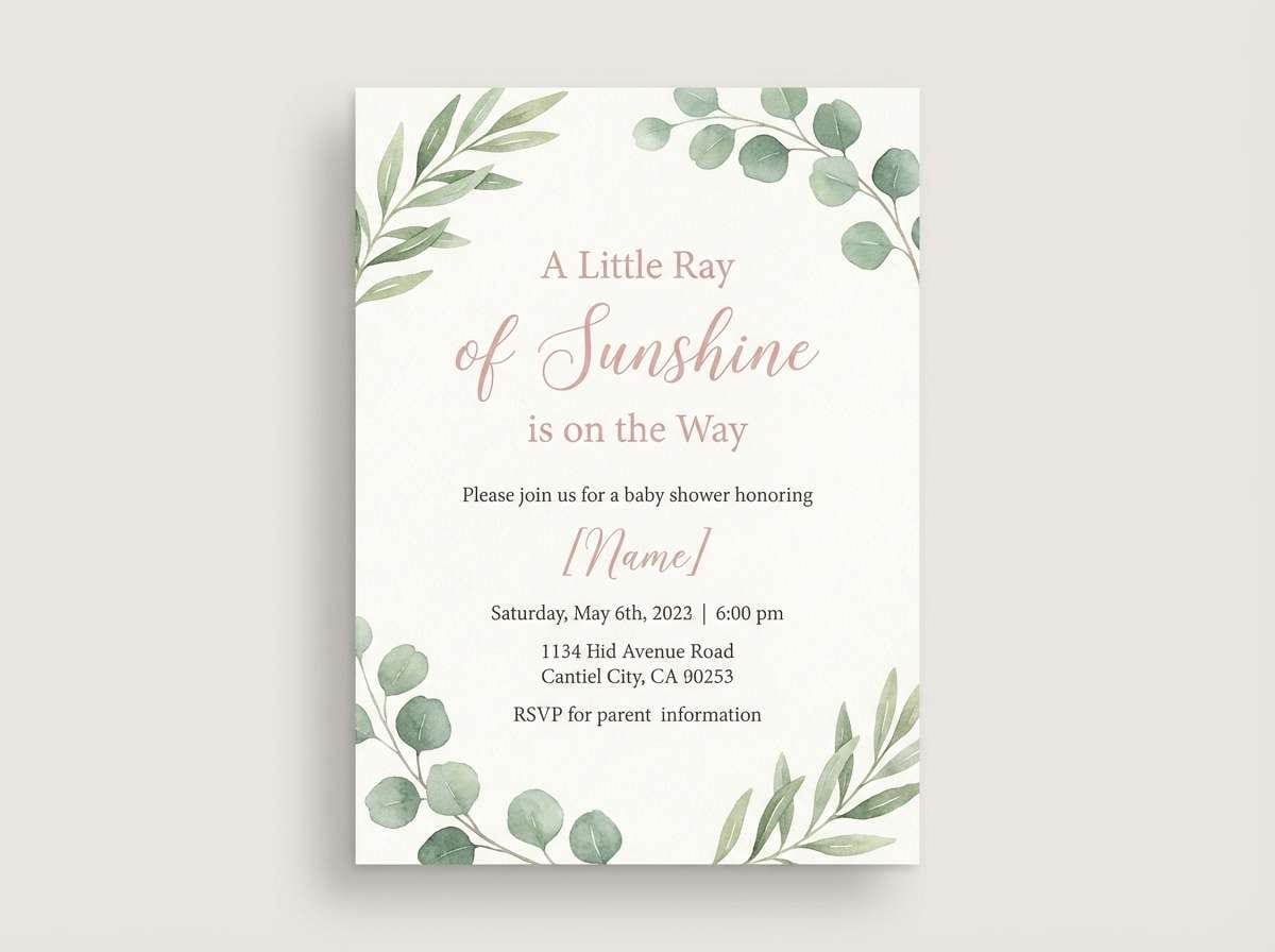
20) Porcelain Pink Classic
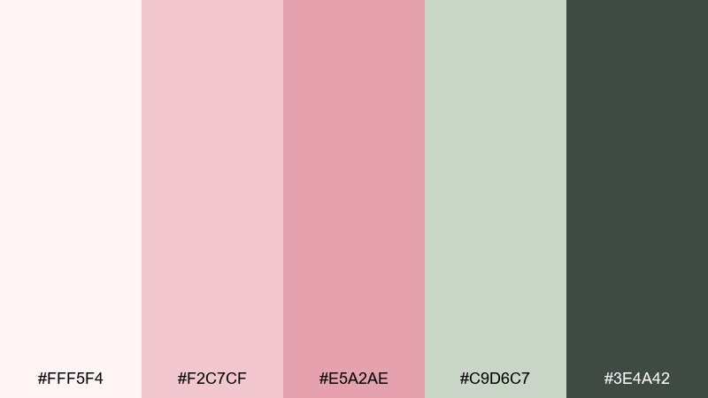
HEX: #FFF5F4 #F2C7CF #E5A2AE #C9D6C7 #3E4A42
Mood: sweet, classic, gentle
Best for: baby shower invitation
Sweet and classic, it feels like porcelain pink with a whisper of garden greenery. Use the creamy white as your main canvas, then add soft pink for borders, icons, and friendly headings. The green tones keep the design from becoming overly sugary and pair well with simple floral illustrations. Tip: for a cohesive rose garden color combination, repeat one pink in both typography and a small motif like a bow or sprig.
Image example of porcelain pink classic generated using media.io
What Colors Go Well with Rose Garden?
Rose garden colors pair naturally with greens: sage, eucalyptus, olive, and deep forest. These shades echo stems and leaves, and they also help anchor blush tones so they look modern and balanced.
Warm neutrals like cream, linen, champagne, and greige keep the palette soft and premium. They’re ideal as backgrounds for packaging, invitations, and editorial layouts where you want gentle contrast.
For stronger structure, add a dark neutral such as charcoal, espresso, or near-black. A deeper base improves readability in UI and makes rosy accents feel intentional rather than washed out.
How to Use a Rose Garden Color Palette in Real Designs
Start with a light neutral as your main canvas, then choose one rose tone as the “hero” accent. This approach keeps the design airy while still giving you a clear focal point for buttons, headings, or highlights.
Use greens as supporting accents for secondary UI states, dividers, icons, or botanical motifs. If you’re working on branding, reserve the deepest green for logos and small text to maintain crisp legibility.
When adding photography or textures, keep them warm and natural (paper grain, matte finishes, subtle marble). That consistency helps blush and sage feel cohesive across print, web, and social.
Create Rose Garden Palette Visuals with AI
If you already have HEX codes, the next step is seeing them in context: mock invitations, packaging, brand boards, or UI screens. Visuals make it easier to test contrast, hierarchy, and overall vibe before you commit.
With Media.io’s Text to Image, you can generate rose garden-inspired examples quickly using prompts like “blush and sage branding board” or “rose quartz interior mood board,” then iterate until it matches your style.
Try generating multiple versions with different ratios for social posts, web headers, or print layouts, while keeping your palette consistent across every output.
Rose Garden Color Palette FAQs
-
What is a rose garden color palette?
A rose garden color palette is a set of blush and rosy pinks balanced with leafy greens and soft neutrals (like cream or greige) to create a romantic, botanical look. -
Which green works best with blush pink?
Sage and eucalyptus greens are the easiest matches for blush because they’re muted and natural. For stronger contrast in text or logos, use deep forest green or charcoal. -
Is a rose garden palette good for modern UI design?
Yes. Use off-white and blush for surfaces, keep a dark neutral (charcoal) for typography, and limit bright pink to a single primary action to maintain a calm, accessible interface. -
How do I keep rose garden colors from looking too “sweet”?
Add structure with darker tones (charcoal, deep green, wine) and rely on warm neutrals for most of the background. Keeping rosy tones as accents rather than full fills also helps. -
What are good neutral pairings for rose garden palettes?
Cream, linen, champagne-beige, and warm greige pair well because they mimic paper and natural materials. They also make pinks look softer and more premium. -
Which rose garden palette works best for packaging?
For luxury packaging, choose moody blush-and-wine combinations with matte textures and minimal foil. For clean skincare, use pale peach or blush backgrounds with soft green trust cues. -
Can I generate rose garden palette mockups with AI?
Yes. Use Media.io Text to Image to generate brand boards, invitations, UI mockups, or product scenes, and include your palette mood words (blush, sage, cream, deep green) in the prompt.


