

Rose blush sits in that sweet spot between soft pink and muted mauve, so it feels romantic without looking overly cute. It’s easy to style across branding, weddings, packaging, and UI because it naturally reads warm, human, and premium.
Below are 20+ rose blush color palette ideas with HEX codes, plus practical tips for contrast, balance, and real-world use. You can also generate matching visuals with Media.io to test how each scheme looks in context.
In this article
Why Rose Blush Palettes Work So Well
Rose blush works because it’s flattering and flexible: it can read airy and minimal at light tints, or mature and dramatic when you bring in deeper mauves and plum-browns. That range makes it easy to build hierarchy in layouts without switching color families.
It also pairs naturally with neutrals like cream, taupe, and soft gray, which keeps designs calm and editorial. Those neutrals give you breathing room, while blush tones provide warmth and a human, approachable vibe.
Finally, rose blush adapts across mediums—print, web, packaging, and social—because it can be tuned warmer (more romantic) or cooler (more modern). With the right darkest shade for contrast, it stays readable and polished.
20+ Rose Blush Color Palette Ideas (with HEX Codes)
1) Petal Latte
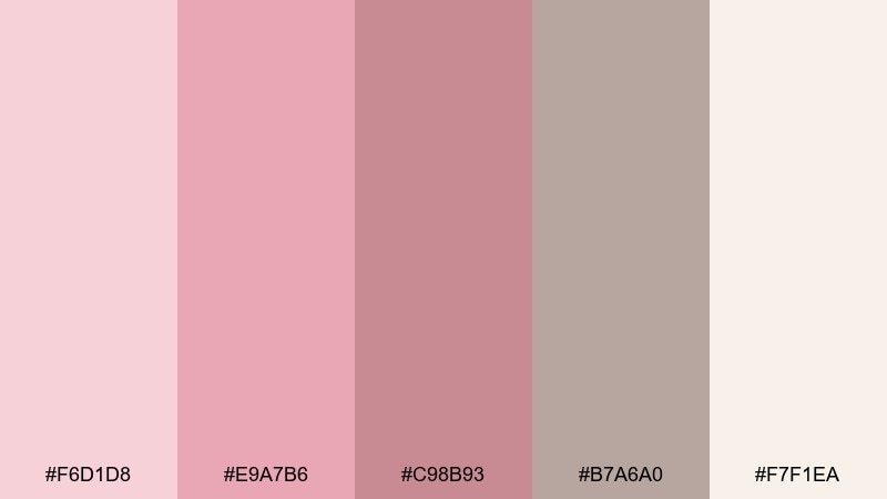
HEX: #F6D1D8 #E9A7B6 #C98B93 #B7A6A0 #F7F1EA
Mood: warm, airy, comforting
Best for: coffee shop branding and menu design
Warm and airy like steamed milk with a blush swirl, these tones feel friendly and handcrafted. Use the deeper dusty rose for headlines, then let the creamy off-white carry space and readability. It shines on menus, loyalty cards, and small signage paired with charcoal type and subtle paper textures. Tip: keep the mid-pink to one hero area per layout to avoid visual sweetness overload.
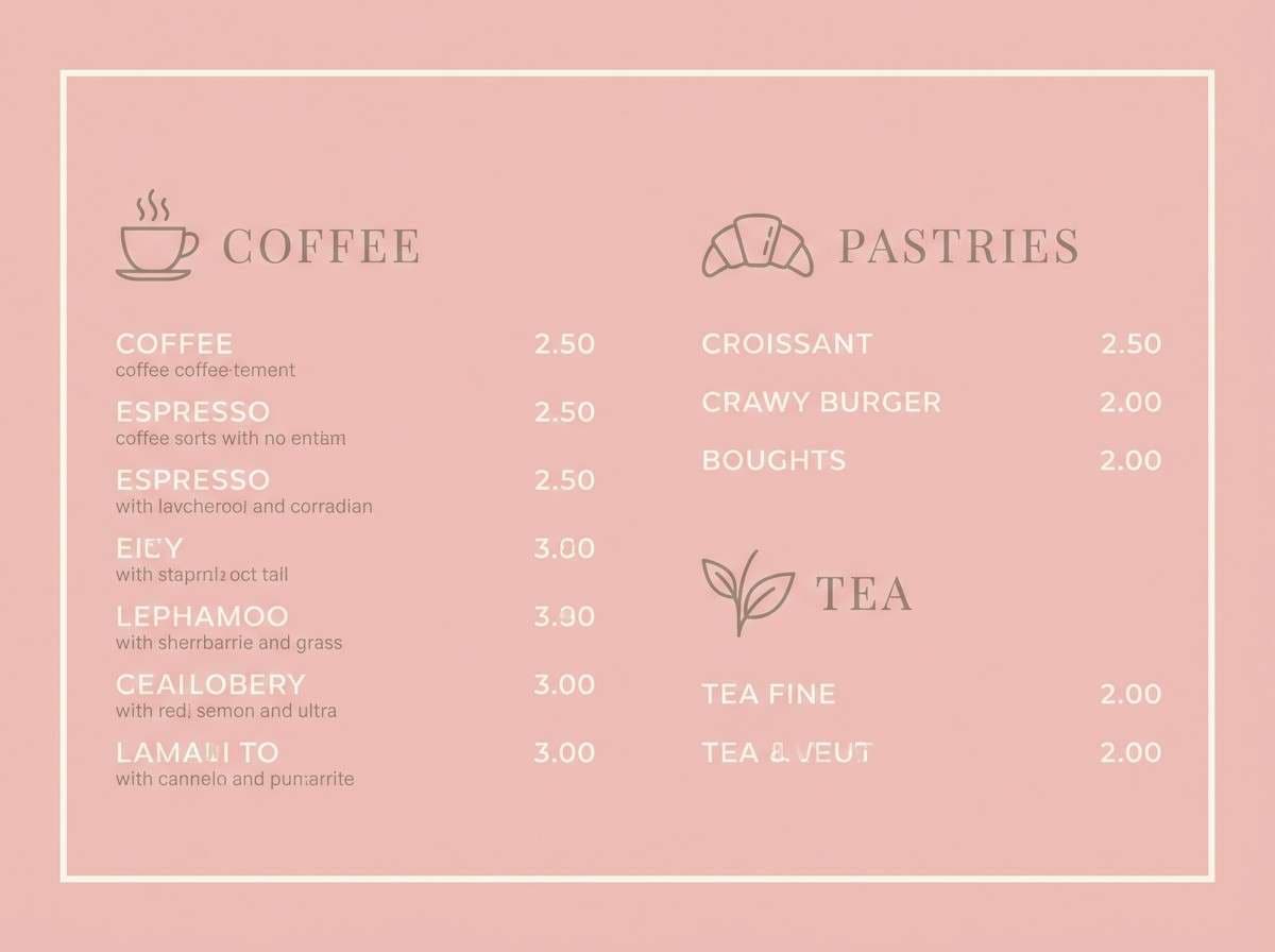
Image example of petal latte generated using media.io
Media.io is an online AI studio for creating and editing video, image, and audio in your browser.

2) Dusty Peony
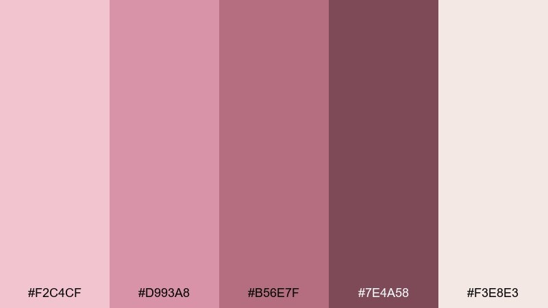
HEX: #F2C4CF #D993A8 #B56E7F #7E4A58 #F3E8E3
Mood: romantic, vintage, lush
Best for: wedding invitations and save the date cards
Romantic and vintage like pressed peony petals tucked into a book, this mix leans soft but still reads clearly. Let the wine-rose shade anchor names and dates, and reserve the pale blush for large blocks of negative space. It pairs beautifully with ivory stock, foil details, and delicate line florals. Tip: print a small swatch test first, since dusty pinks can shift warmer on uncoated paper.
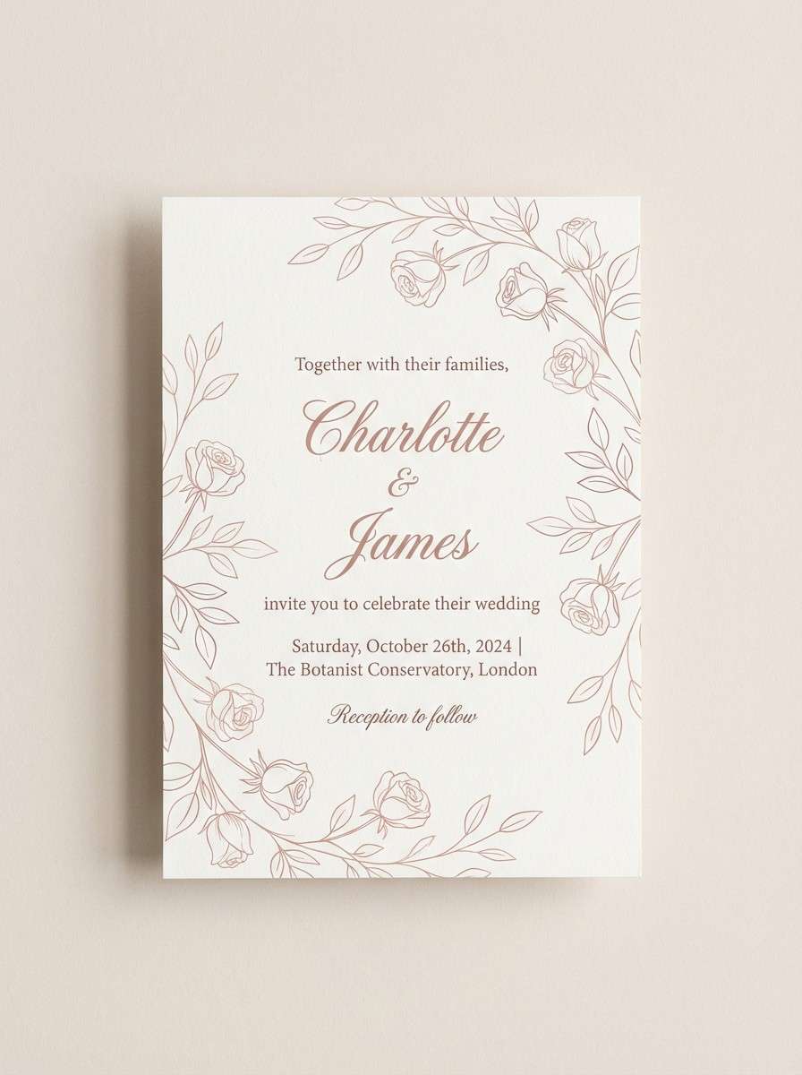
Image example of dusty peony generated using media.io
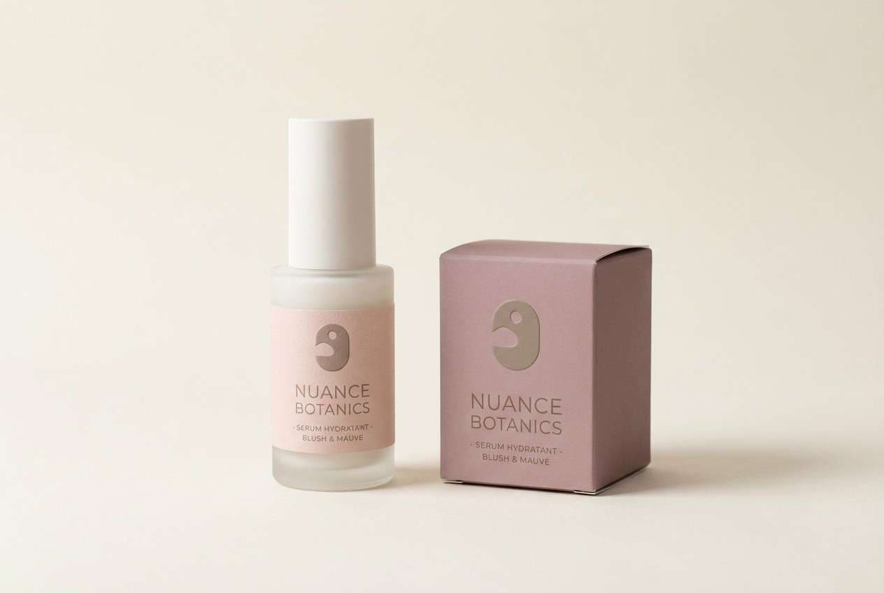
3) Rosé Quartz
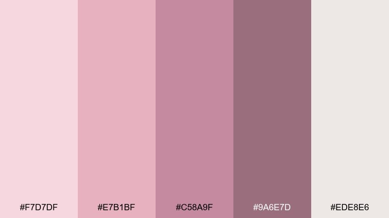
HEX: #F7D7DF #E7B1BF #C58A9F #9A6E7D #EDE8E6
Mood: polished, serene, modern
Best for: skincare packaging and product labels
Polished and serene like a rosé quartz stone catching soft light, these hues feel clean and premium. The muted mauve works well for ingredient callouts while the pale blush keeps the label airy. For a cohesive shelf look, pair with matte cream packaging and minimal sans-serif type. Tip: use spot gloss only on the darkest shade to create a quiet luxury contrast in a rose blush color palette.
Image example of rosé quartz generated using media.io
4) Blush Linen
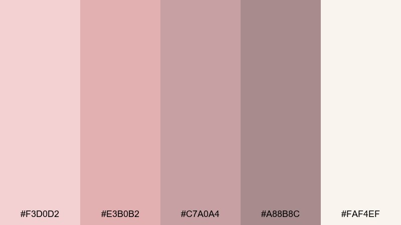
HEX: #F3D0D2 #E3B0B2 #C7A0A4 #A88B8C #FAF4EF
Mood: soft, neutral, calming
Best for: minimal lifestyle blog headers
Soft and neutral like linen curtains at golden hour, this set reads gentle without feeling sugary. Use the warm cream as the base, then layer blush and muted clay for section dividers and buttons. It pairs nicely with light editorial photography and clean grid layouts. Tip: keep contrast accessible by using the deepest taupe for body text, not the mid pink.
Image example of blush linen generated using media.io
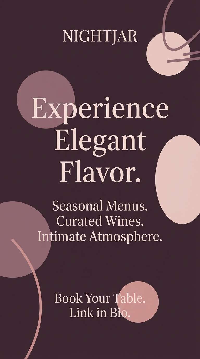
5) Candlelit Mauve
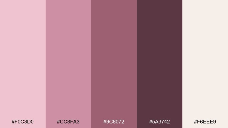
HEX: #F0C3D0 #CC8FA3 #9C6072 #5A3742 #F6EEE9
Mood: moody, intimate, elegant
Best for: restaurant social ads and story graphics
Moody and intimate like candlelight bouncing off velvet, this palette brings drama without going dark. Lean on the deep plum-brown for type and frames, then add blush as a soft glow around key offers. It works best with minimal food silhouettes and subtle grain textures. Tip: keep your brightest cream limited to one highlight element to preserve the night-time feel.
Image example of candlelit mauve generated using media.io
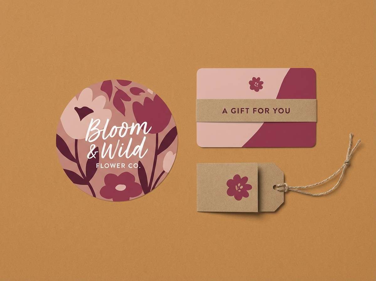
6) Vintage Bouquet
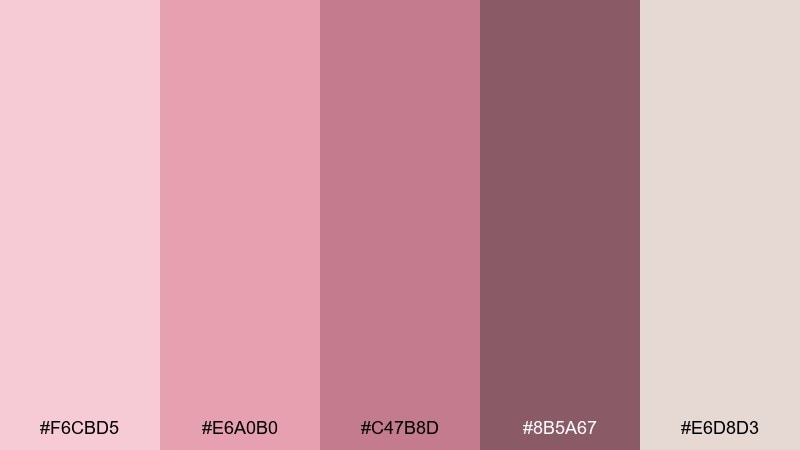
HEX: #F6CBD5 #E6A0B0 #C47B8D #8B5A67 #E6D8D3
Mood: nostalgic, floral, cozy
Best for: floral shop branding and gift cards
Nostalgic and floral like a bouquet wrapped in kraft paper, these tones feel sweet and familiar. Use the dusty berry for logo marks and stamps, then let the lighter blushes soften price tags and captions. Pair with warm neutrals, hand-drawn botanicals, and textured backgrounds for a handmade vibe. Tip: add one consistent border color across assets to keep the look cohesive in busy arrangements.
Image example of vintage bouquet generated using media.io
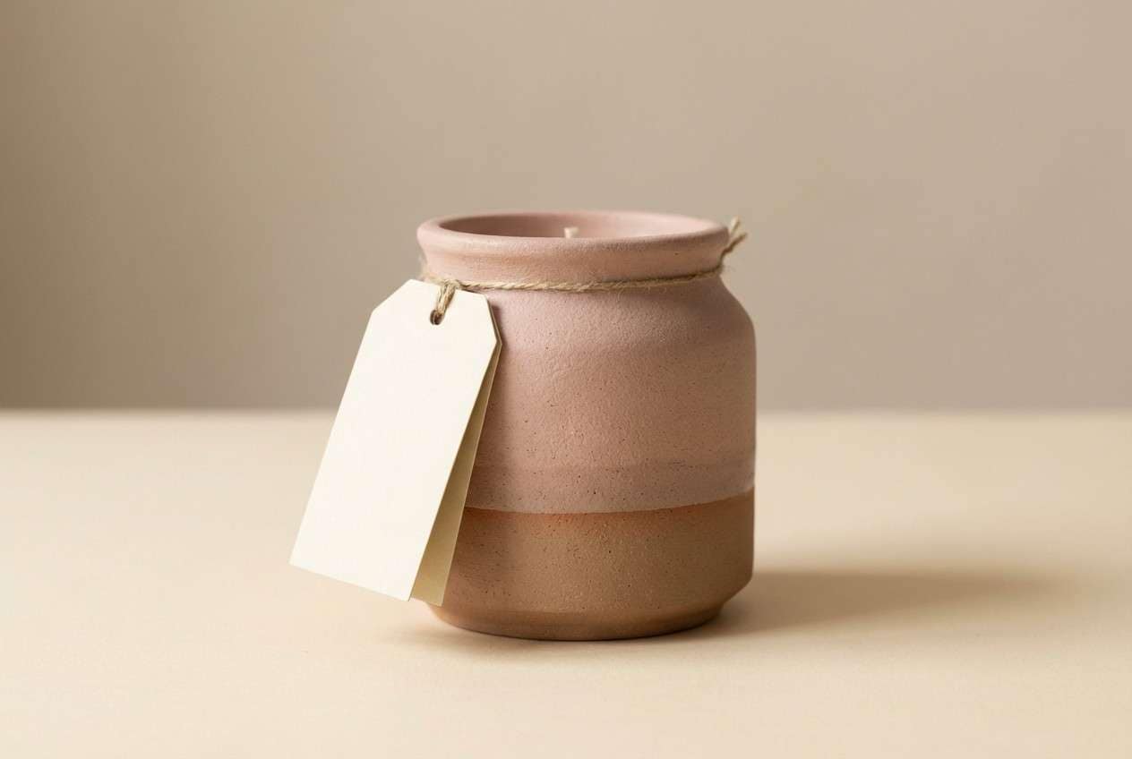
7) Rosewater Clay
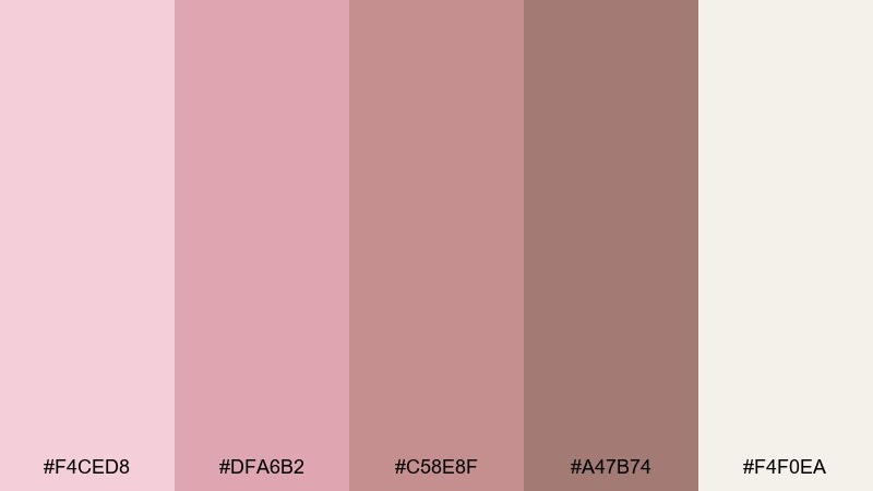
HEX: #F4CED8 #DFA6B2 #C58E8F #A47B74 #F4F0EA
Mood: earthy, grounded, gentle
Best for: ceramic product labels and hang tags
Earthy and grounded like rosewater mixed into clay, this set feels artisan and tactile. Keep the clay-brown for key copy and barcodes, and use blush tones for brand blocks and small icons. It pairs well with recycled paper, debossed details, and simple geometric marks. Tip: choose one blush shade for all callouts so the label stays calm and premium.
Image example of rosewater clay generated using media.io
8) Satin Nude
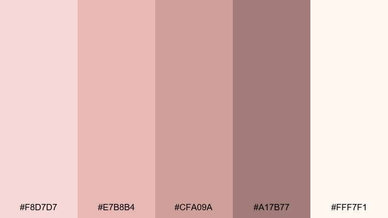
HEX: #F8D7D7 #E7B8B4 #CFA09A #A17B77 #FFF7F1
Mood: clean, delicate, understated
Best for: makeup ecommerce product pages
Clean and delicate like satin fabric in soft daylight, these nudes stay modern and wearable. Use the deeper warm taupe for text and pricing, with pale blush as background panels and filters. It pairs nicely with high-resolution lip and skin swatches, plus minimalist UI components. Tip: add subtle shadow only in the taupe range so cards look dimensional without turning gray.
Image example of satin nude generated using media.io
9) Garden Party
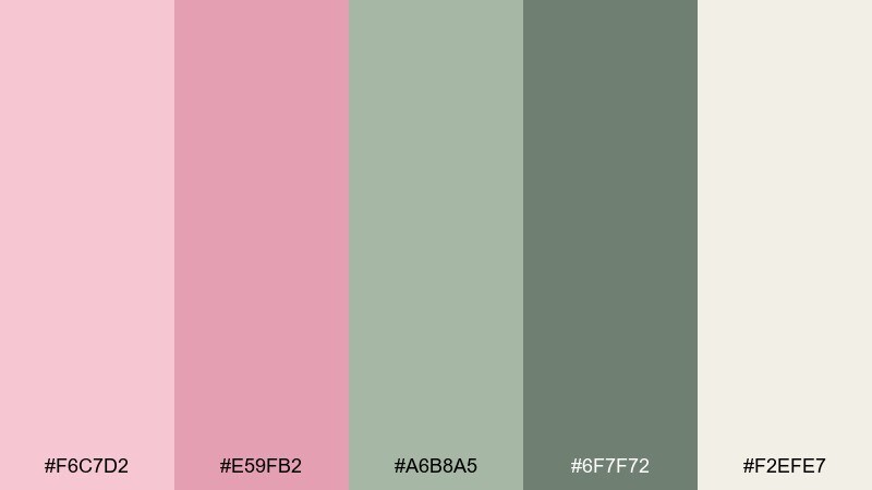
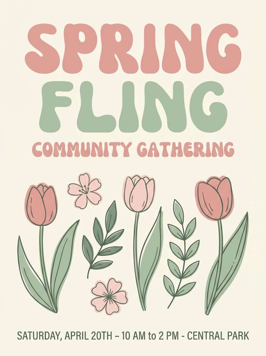
HEX: #F6C7D2 #E59FB2 #A6B8A5 #6F7F72 #F2EFE7
Mood: fresh, playful, springy
Best for: spring event posters and flyers
Fresh and playful like a garden party under soft clouds, blush meets gentle greens for an easy spring lift. Use the sage tones for supporting shapes and schedules, and let the pinks carry the headline energy. Pair with simple illustrated florals and plenty of cream space to keep it breezy. Tip: keep green saturation low so the pink stays the star.
Image example of garden party generated using media.io
10) Ballet Studio
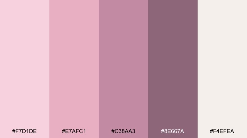
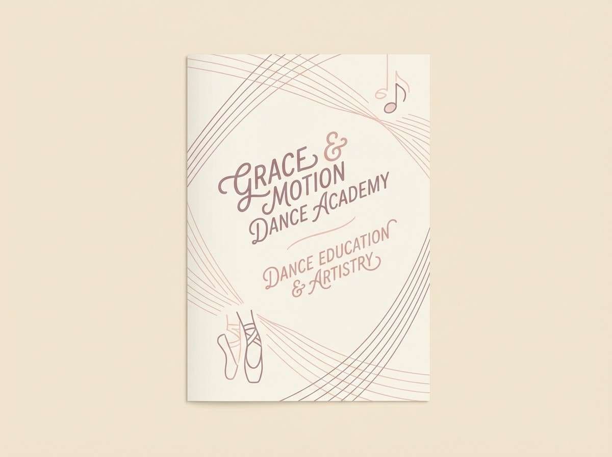
HEX: #F7D1DE #E7AFC1 #C38AA3 #8E667A #F4EFEA
Mood: graceful, light, refined
Best for: dance school brochures and schedules
Graceful and light like tulle and warm studio mirrors, these hues feel refined without feeling formal. Use the muted mauve for headers and timetable lines, then keep blush as the main field color for approachability. It pairs well with black-and-white photography and thin geometric rules. Tip: limit the darkest shade to navigation and section labels for a clean hierarchy.
Image example of ballet studio generated using media.io
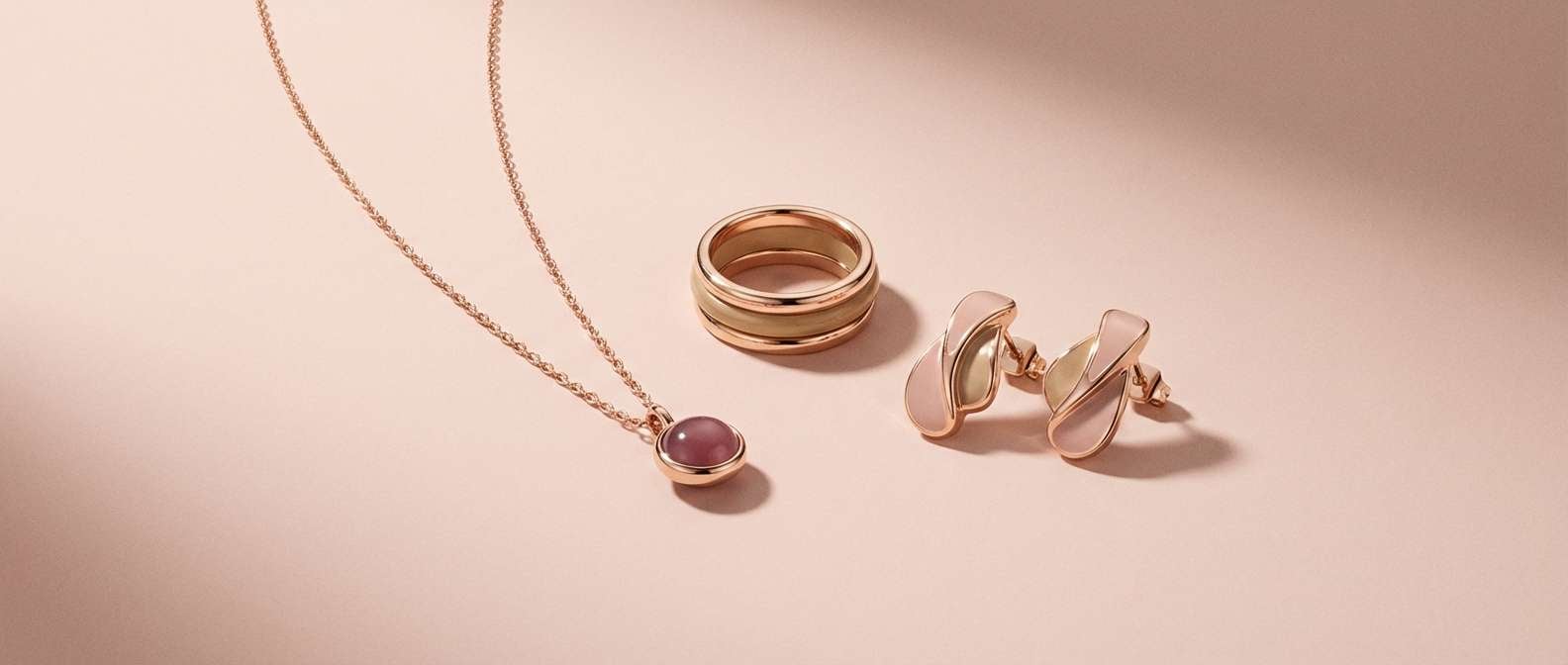
11) Rose Gold Dusk
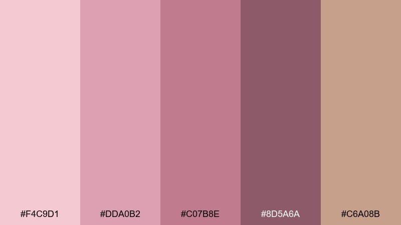
HEX: #F4C9D1 #DDA0B2 #C07B8E #8D5A6A #C6A08B
Mood: glam, warm, evening
Best for: jewelry product ads and banners
Glam and warm like rose gold at dusk, this set balances blush with a subtle metallic-tan vibe. Let the tan act as the supporting neutral while the deeper berry handles headlines and pricing. It pairs nicely with reflective product shots and minimalist typography. Tip: keep backgrounds light blush so metal pieces stand out without heavy contrast.
Image example of rose gold dusk generated using media.io
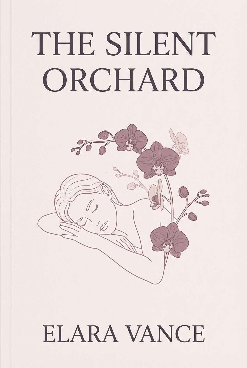
12) Quiet Romance
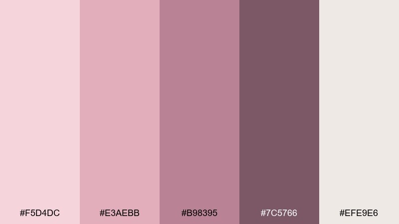
HEX: #F5D4DC #E3AEBB #B98395 #7C5766 #EFE9E6
Mood: calm, intimate, poetic
Best for: book covers and author branding
Calm and intimate like a handwritten note tucked into a novel, these tones feel poetic and grown-up. Use the charcoal-mauve for the title, then let the pale blush create a soft field behind typography. It pairs well with serif fonts, fine line illustrations, and subtle paper grain. Tip: keep imagery monochrome or duotone so the color story stays quiet.
Image example of quiet romance generated using media.io
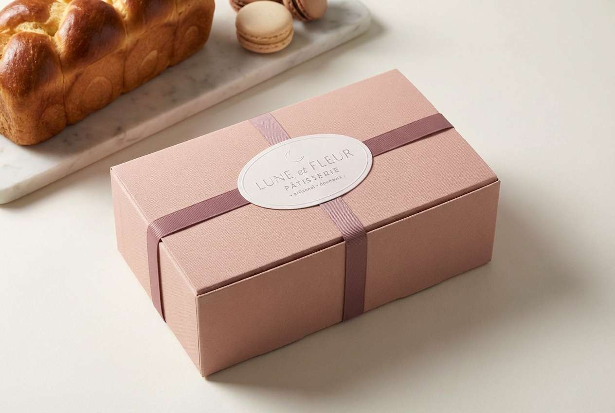
13) Mauve Macaron
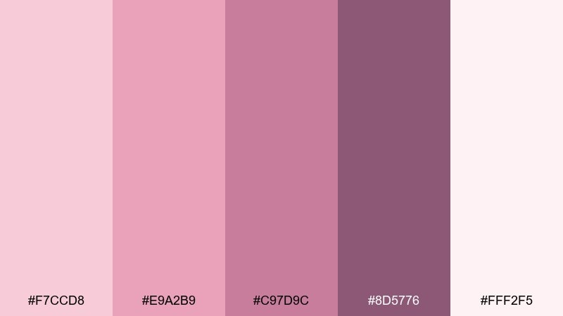
HEX: #F7CCD8 #E9A2B9 #C97D9C #8D5776 #FFF2F5
Mood: sweet, chic, playful
Best for: bakery packaging and pastry labels
Sweet and chic like a macaron box tied with ribbon, these pink-to-mauve tones feel boutique and fun. Use the brighter pink for flavor badges, and keep the pale tint for the main box color to avoid overwhelming the product. For modern rose blush color combinations, pair with crisp white space and thin black type for contrast. Tip: repeat one small pattern element in the darkest mauve to make the set feel branded.
Image example of mauve macaron generated using media.io
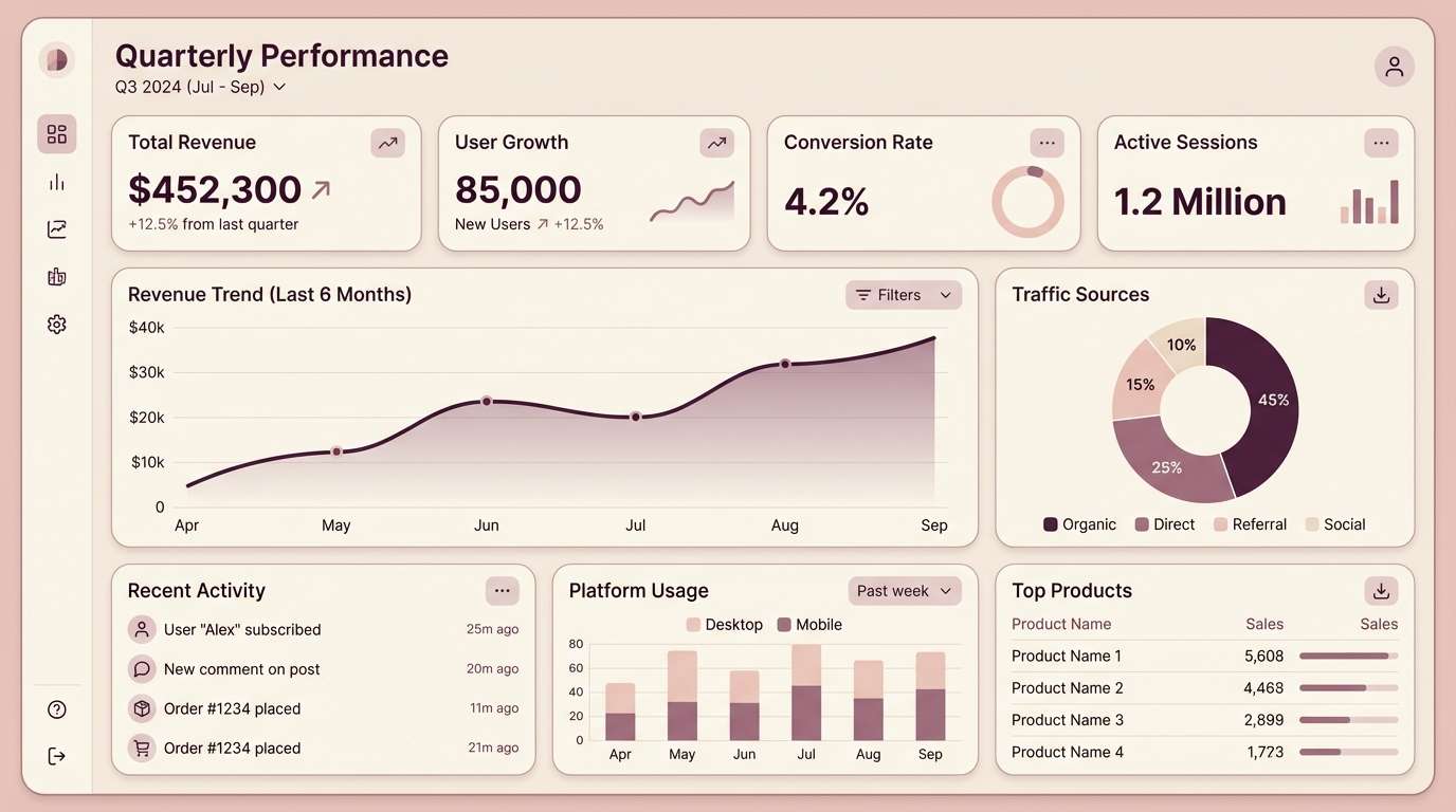
14) Minimal Blush UI
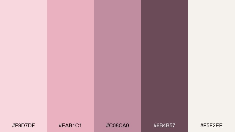
HEX: #F9D7DF #EAB1C1 #C08CA0 #6B4B57 #F5F2EE
Mood: modern, clean, trustworthy
Best for: dashboard UI and analytics widgets
Modern and clean like a calm workspace, these tones give dashboards a softer edge without losing clarity. Use the deep plum for charts and key numbers, with cream panels to keep density readable. The mid blush works best as a hover state or progress fill rather than a full background. Tip: keep alert colors neutral and rely on value contrast inside the palette for emphasis.
Image example of minimal blush ui generated using media.io
15) Terracotta Rose
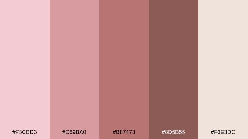
HEX: #F3CBD3 #D89BA0 #B87473 #8D5B55 #F0E3DC
Mood: sun-warmed, rustic, inviting
Best for: home decor lookbooks and catalogs
Sun-warmed and rustic like terracotta tiles with a blush glaze, this mix feels inviting and grounded. Use the clay-brown for section titles and page numbers, while the dusty pinks soften product callouts. It pairs beautifully with natural materials photography, linen textures, and warm lighting. Tip: keep spreads airy with wide margins so the deeper tones do not feel heavy.
Image example of terracotta rose generated using media.io
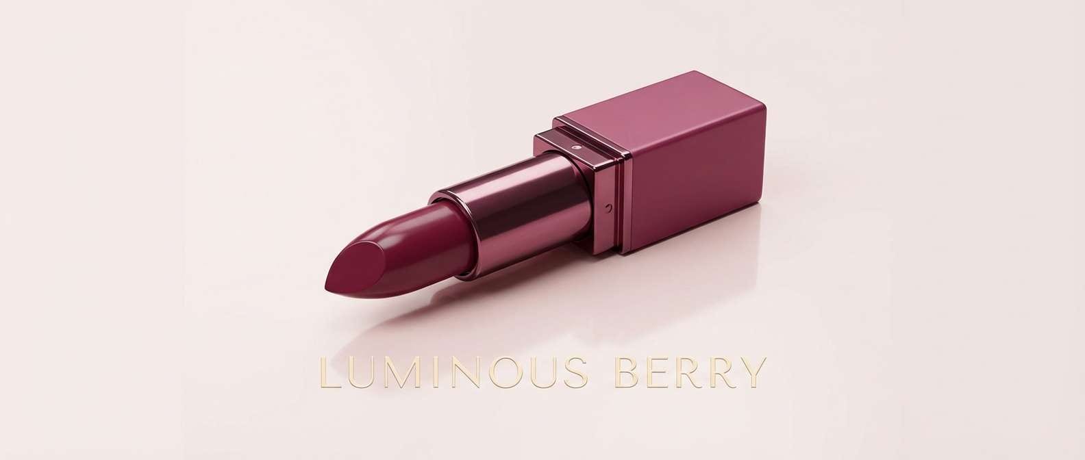
16) Berry Velvet
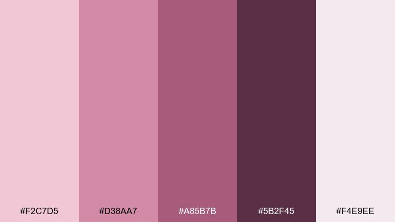
HEX: #F2C7D5 #D38AA7 #A85B7B #5B2F45 #F4E9EE
Mood: bold, luxe, dramatic
Best for: lipstick ads and beauty campaign banners
Bold and luxe like berry velvet under spotlight, these shades make beauty visuals feel high-impact. Let the deep berry do the heavy lifting for headlines and product names, while pale blush keeps the background elegant. It pairs well with glossy textures and tight typography tracking. Tip: use the mid magenta sparingly as a single accent stripe for a clean, editorial look.
Image example of berry velvet generated using media.io
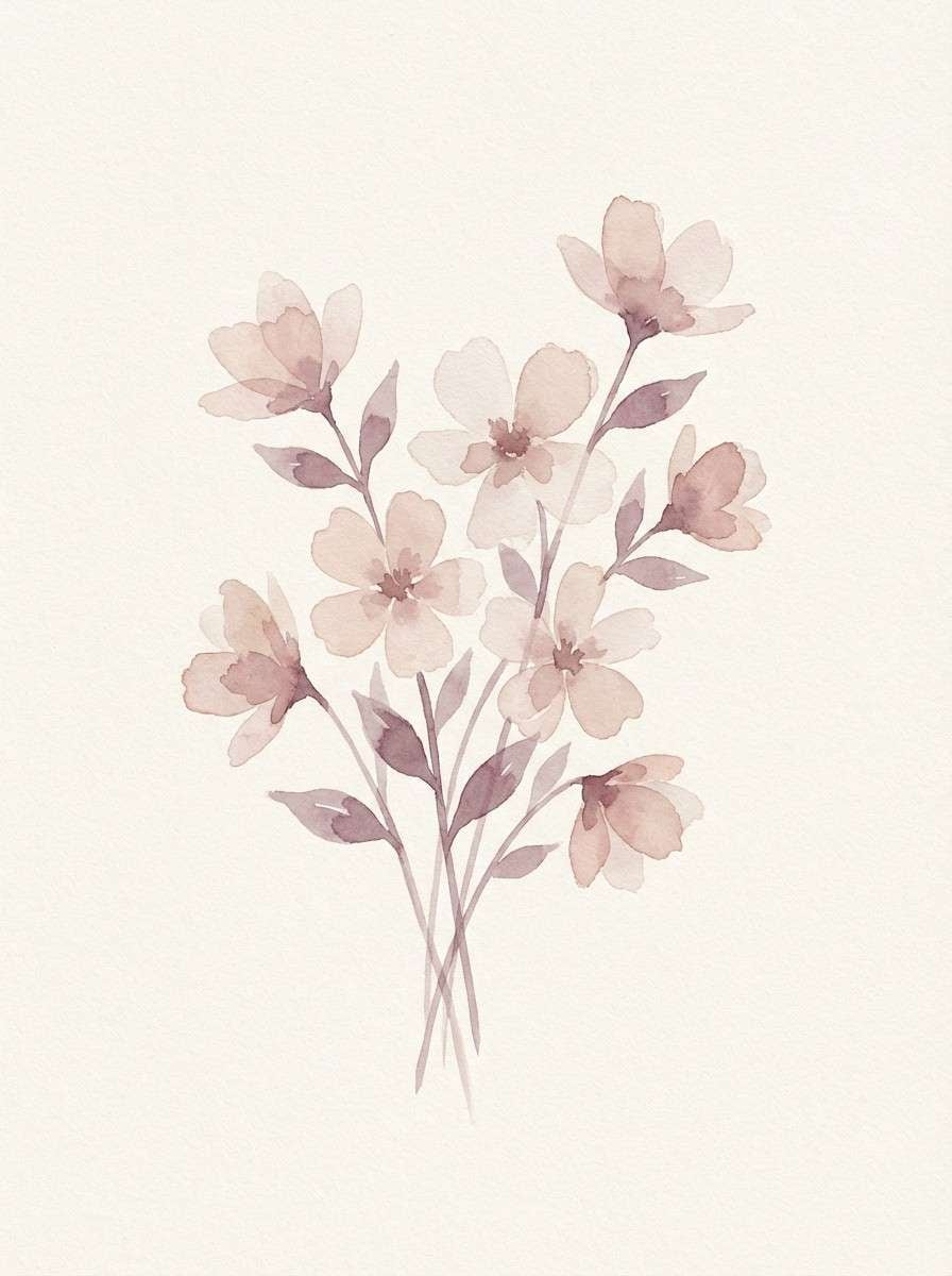
17) Pressed Blossom
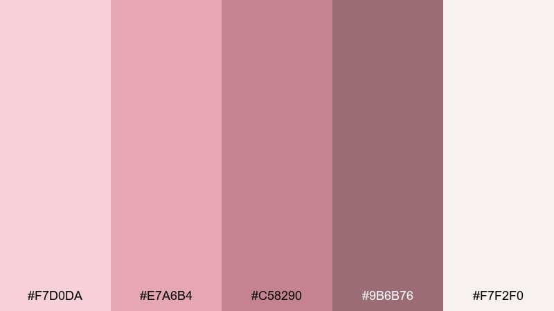
HEX: #F7D0DA #E7A6B4 #C58290 #9B6B76 #F7F2F0
Mood: delicate, artistic, airy
Best for: watercolor botanical illustrations
Delicate and artistic like pressed blossoms on handmade paper, these tones lend themselves to gentle gradients and washes. Use the palest shade as the paper base, then build petals with the mid pink and soft mauve. It pairs well with light sepia ink lines and minimal captions. Tip: keep saturation low in large areas and add contrast only at focal points.
Image example of pressed blossom generated using media.io
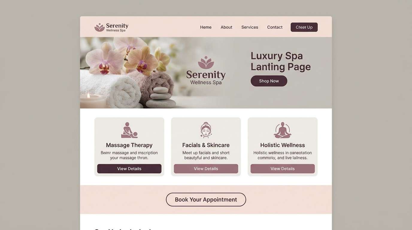
18) Smoky Rosewood
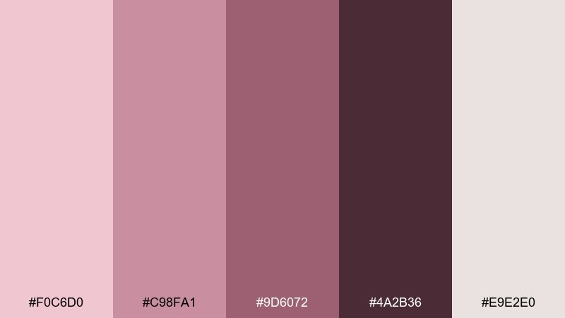
HEX: #F0C6D0 #C98FA1 #9D6072 #4A2B36 #E9E2E0
Mood: smoky, mature, sophisticated
Best for: luxury spa website and landing pages
Smoky and mature like rosewood with a soft haze, this set feels sophisticated and restorative. Use the deep brown-plum for navigation and CTA text, with pale blush sections to keep the page calm. It pairs well with grayscale photography and thin dividers in muted mauve. Tip: give CTAs extra padding so the dark tone feels intentional, not heavy.
Image example of smoky rosewood generated using media.io
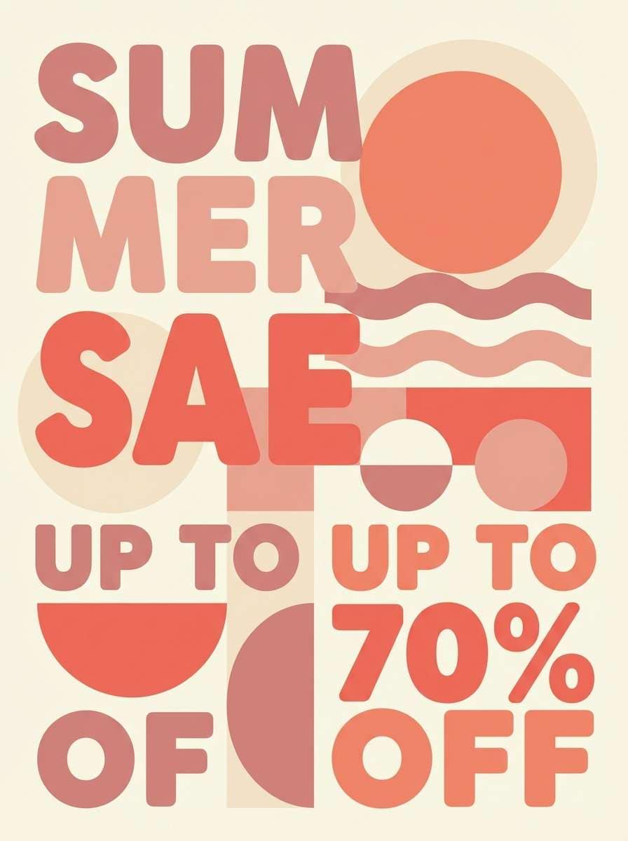
19) Apricot Blush
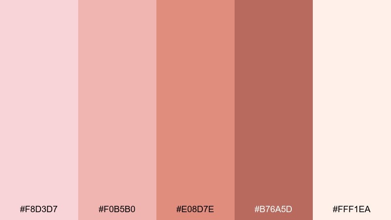
HEX: #F8D3D7 #F0B5B0 #E08D7E #B76A5D #FFF1EA
Mood: sunny, upbeat, friendly
Best for: summer sale posters and promo graphics
Sunny and upbeat like apricot sorbet with a rosy swirl, these warm tones feel friendly and attention-grabbing. Use the coral-leaning shades for discount badges and hero shapes, and keep the creamy tint for breathing room. For punchy rose blush color combinations, pair with bold black type and simple geometric patterns. Tip: avoid adding extra oranges outside this set so the warmth stays controlled.
Image example of apricot blush generated using media.io
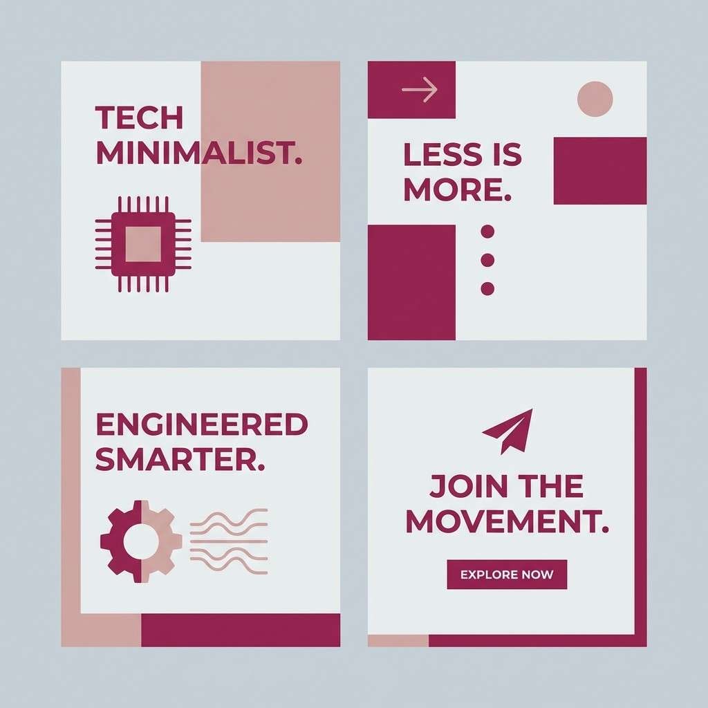
20) Cloudy Cherry
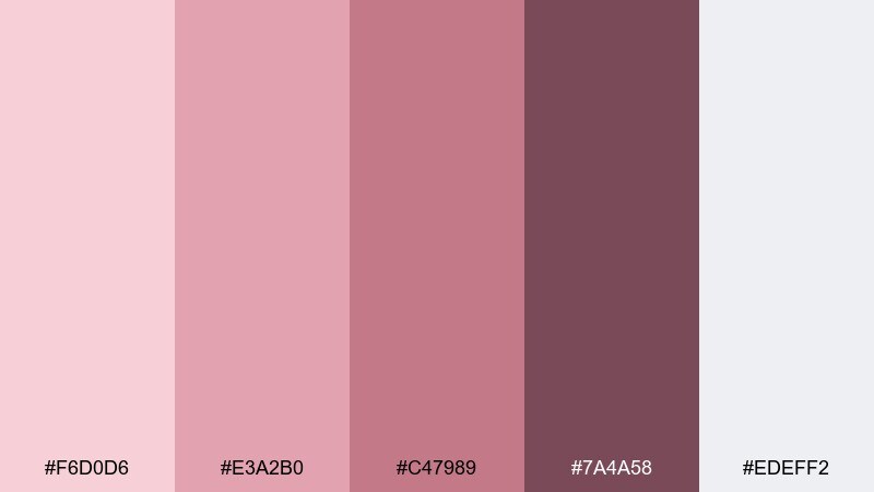
HEX: #F6D0D6 #E3A2B0 #C47989 #7A4A58 #EDEFF2
Mood: soft, cool, contemporary
Best for: tech brand social templates
Soft and cool like cherry blossoms under an overcast sky, these tones feel contemporary and slightly muted. The cool gray keeps layouts crisp, while the berry and mauve add personality to headlines and icons. It works great for carousel templates, announcement tiles, and simple motion graphics. Tip: use the gray as the primary background so the pink accents stay sharp.
Image example of cloudy cherry generated using media.io
21) Plum Petals
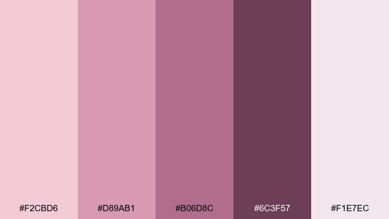
HEX: #F2CBD6 #D89AB1 #B06D8C #6C3F57 #F1E7EC
Mood: creative, expressive, confident
Best for: music poster designs and cover art
Creative and expressive like plum petals in stage light, this mix leans bold but stays elegant. Use the deepest plum for typography and silhouettes, then layer dusty pink for gradients and motion-like shapes. These rose blush color combinations look especially sharp with high-contrast layouts and minimal line art. Tip: keep one solid background color and add texture through overlays rather than extra hues.
Image example of plum petals generated using media.io

What Colors Go Well with Rose Blush?
Rose blush pairs beautifully with soft neutrals like cream, ivory, and warm taupe, which keep the palette breathable and modern. These neutrals also help blush feel less “sweet” and more editorial.
For contrast, reach for deep plum, wine, charcoal, or espresso-brown—these darker anchors make blush typography and UI elements readable. If you want a fresh twist, muted greens (sage, olive-gray) add a springy balance without fighting the pink.
Cool accents like light gray can push rose blush into a more contemporary, tech-friendly direction. The key is controlling saturation so the blush stays the hero while supporting colors do the structural work.
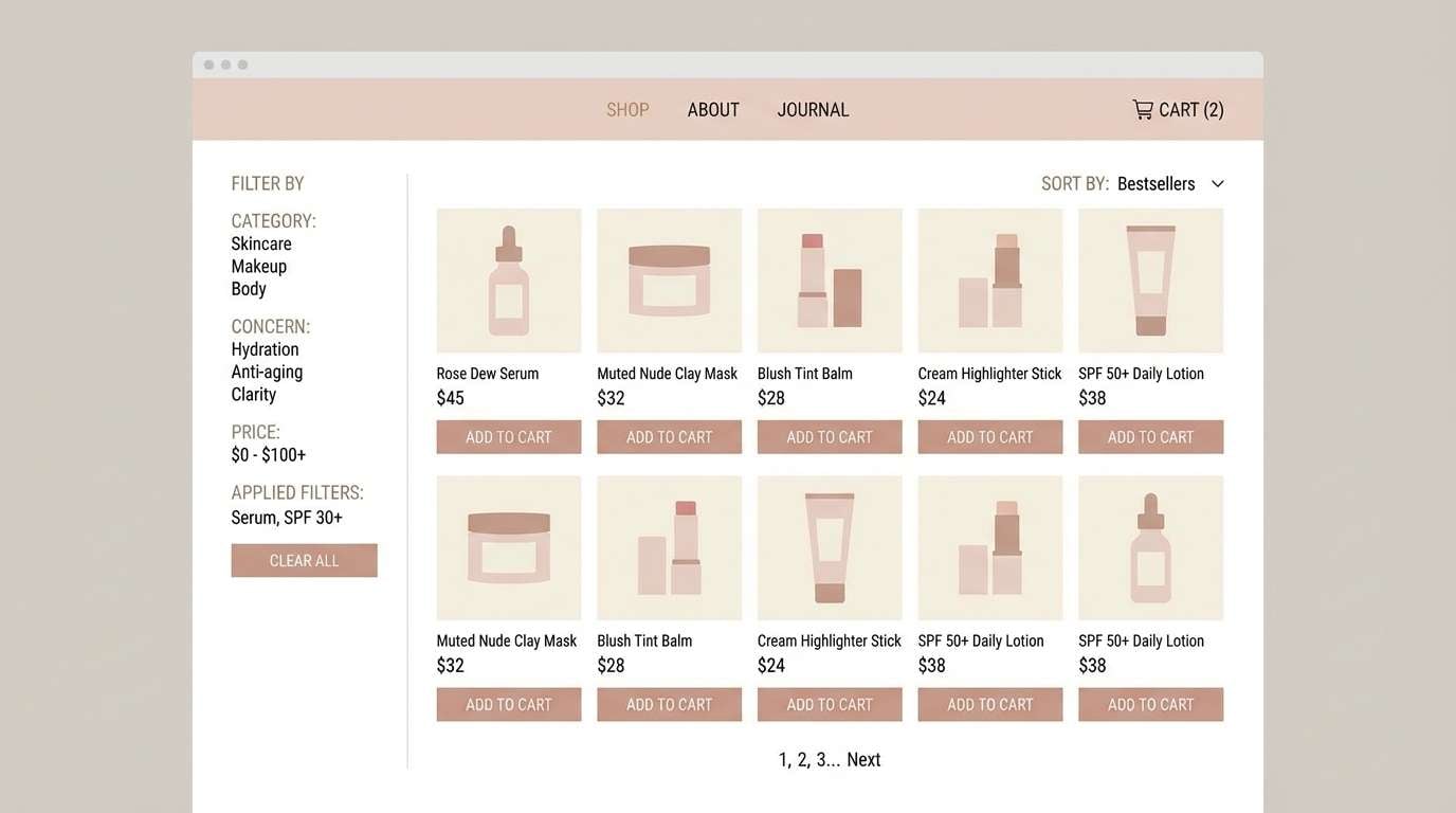
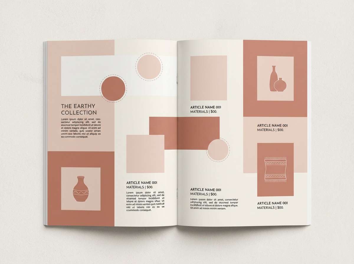
How to Use a Rose Blush Color Palette in Real Designs
Start with a neutral base (cream or soft gray), then assign roles: one blush tint for backgrounds, a mid blush/mauve for UI fills or secondary shapes, and the darkest plum-brown for text and CTAs. This keeps hierarchy clear and prevents the layout from turning into a single pink wash.
In print, always test swatches—dusty pinks can shift warmer on uncoated paper and cooler on coated stock. In digital, check contrast for body text and small UI labels; often the deepest shade is the only safe option for long-form readability.
To keep the look premium, repeat one accent consistently (like a single mauve used for dividers, icons, or stamps). Consistency makes rose blush feel intentional rather than decorative.
Create Rose Blush Palette Visuals with AI
If you already have HEX codes but can’t picture the final vibe, generate quick mockups—posters, packaging, UI cards, or invitations—to see how the blush tones behave under different lighting and textures. This is especially helpful when choosing between warm blush vs. cooler mauve-leaning options.
With Media.io Text-to-Image, you can paste a prompt, describe your design type, and iterate fast until the palette looks balanced. Try changing only one variable at a time (background tone, contrast level, or texture) to keep results consistent.
Once you like the direction, reuse the same prompt format across assets to maintain a cohesive brand look.
Rose Blush Color Palette FAQs
-
What is a rose blush color palette?
A rose blush color palette is a set of soft pink-to-mauve tones (often paired with cream, taupe, or gray) designed to feel warm, romantic, and modern while still being versatile for branding, print, and UI. -
Is rose blush warm or cool?
Rose blush can be either, depending on the undertone. Peachy blush reads warmer, while mauve-leaning blush reads cooler. Adding cream/taupe emphasizes warmth; adding gray or plum-mauve emphasizes cool sophistication. -
What are the best neutral pairings with rose blush?
Top neutrals include ivory/cream, beige, warm taupe, and soft gray. These keep layouts clean and give blush room to breathe, especially in minimal branding and UI designs. -
What color provides strong contrast with rose blush for text?
Deep plum, charcoal-mauve, espresso brown, or near-black gives the most reliable contrast. For accessible design, avoid using mid-pink shades for body text and reserve them for accents or larger headings. -
Does rose blush work well for modern brands?
Yes—when balanced with clean neutrals and a dark anchor shade, rose blush feels premium and contemporary. It’s especially popular in beauty, wellness, lifestyle, and boutique ecommerce. -
How do I keep a rose blush palette from feeling too “cute”?
Use blush as a background or highlight, then rely on taupe/gray and a deep plum-brown for structure. Add restraint: fewer pink blocks, more whitespace, and consistent typography choices. -
Can I generate rose blush design mockups with AI?
Yes. With Media.io Text-to-Image, you can generate invitations, packaging, social templates, and UI mockups using rose blush prompts, then iterate quickly to refine contrast, lighting, and overall mood.
Next: Atlantis Color Palette


