

An Atlantis color palette blends deep ocean teals, clear aquas, and soft sands to create designs that feel calm, premium, and refreshingly modern. It’s a flexible look that works across branding, UI, and print when you balance depth with enough light space.
Below are 20 curated Atlantis palette ideas with HEX codes, plus real-world use tips and AI prompts you can reuse to generate matching visuals quickly.
In this article
Why Atlantis Palettes Work So Well
Atlantis-inspired palettes sit in the sweet spot between trust and freshness: deep teals feel stable and professional, while aqua highlights add clarity and modern energy. That contrast makes them ideal for digital products and brand systems that need to look clean but not cold.
They also pair naturally with warm neutrals like pearl, sand, and parchment. Those softer tones create breathing room, improve readability, and keep teal-heavy designs from feeling too dark or overly saturated.
Finally, Atlantis palettes scale well across mediums. The same five colors can cover UI states (base, surface, accent, highlight) and print needs (headline ink, background stock, callout blocks) without losing cohesion.
20+ Atlantis Color Palette Ideas (with HEX Codes)
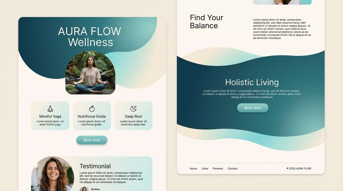
1) Sunken Lagoon
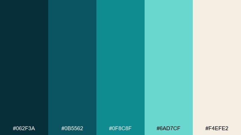
HEX: #062f3a #0b5562 #0f8c8f #6ad7cf #f4efe2
Mood: calm, submerged, luminous
Best for: wellness branding and landing pages
Calm, submerged tones that feel like light rippling over a quiet lagoon. The deep teal anchors headlines while the bright aqua adds a clean, modern lift. Use the warm pearl shade for generous whitespace so the cool tones do not feel heavy. For an atlantis color palette that stays readable, keep body text dark and reserve the mint for buttons and highlights.
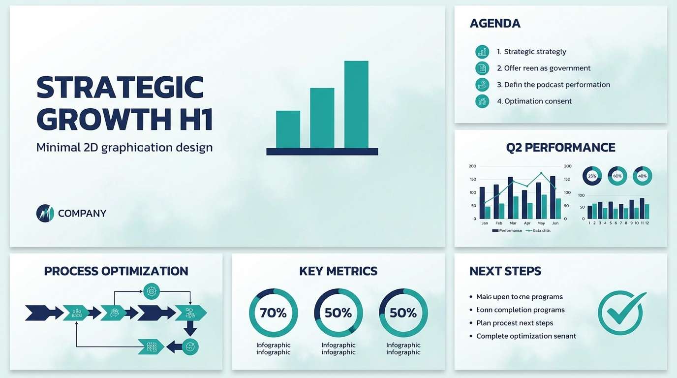
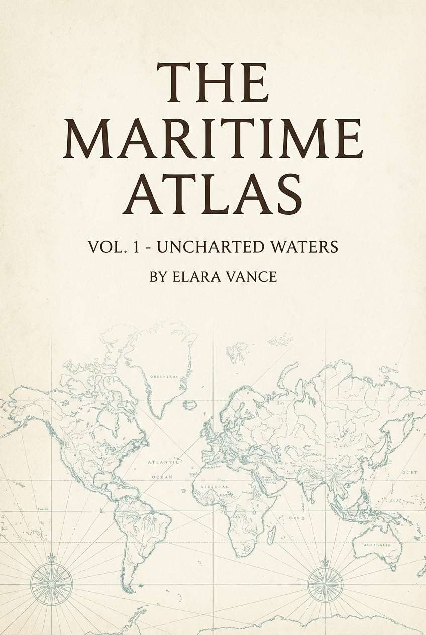
Image example of sunken lagoon generated using media.io
Media.io is an online AI studio for creating and editing video, image, and audio in your browser.

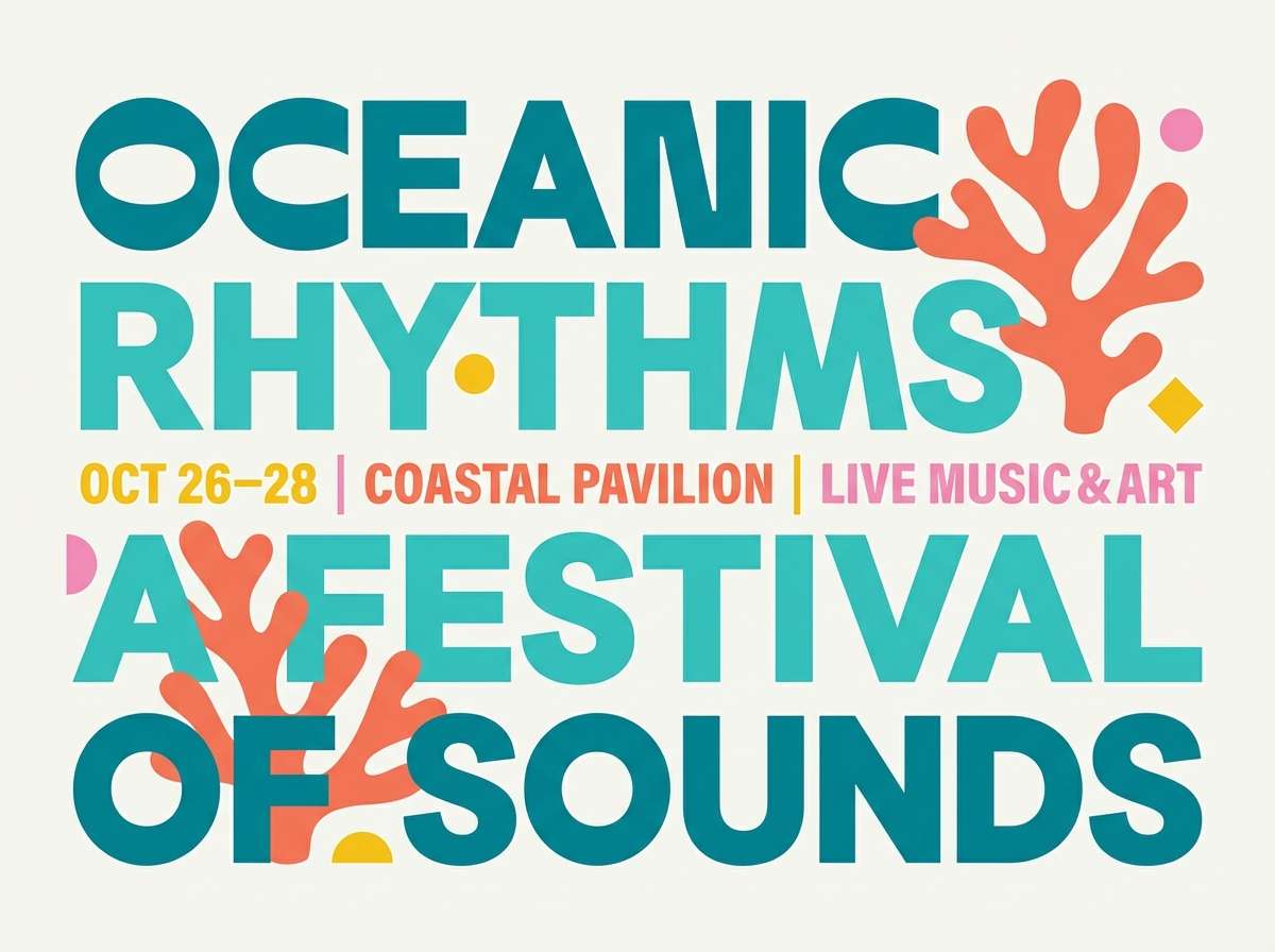
2) Reef Glow
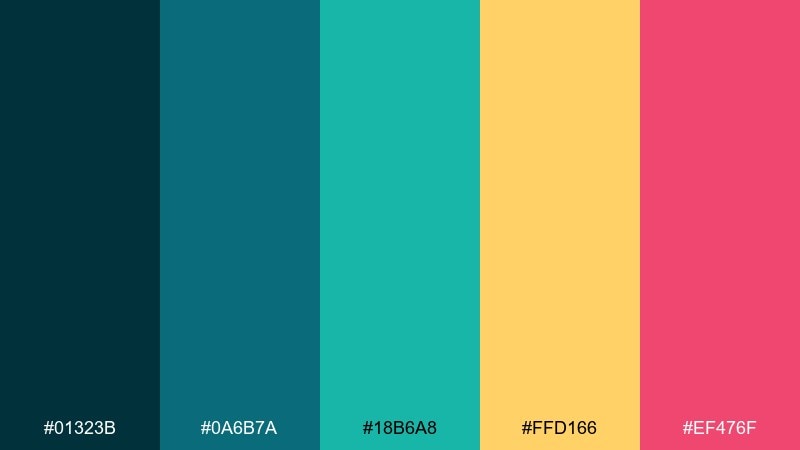
HEX: #01323b #0a6b7a #18b6a8 #ffd166 #ef476f
Mood: energetic, tropical, bold
Best for: event posters and social ads
Energetic reef colors that pop like coral under sunlit water. The teal trio keeps the base cohesive, while golden yellow and punchy pink act as high-impact accents. It works especially well for headlines, callouts, and sticker-style shapes on clean backgrounds. Tip: use the yellow for primary CTAs and keep pink to small bursts so the design stays crisp.
Image example of reef glow generated using media.io
3) Sea Glass Minimal
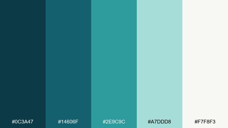
HEX: #0c3a47 #14606f #2e9c9c #a7ddd8 #f7f8f3
Mood: clean, airy, modern
Best for: SaaS UI dashboards
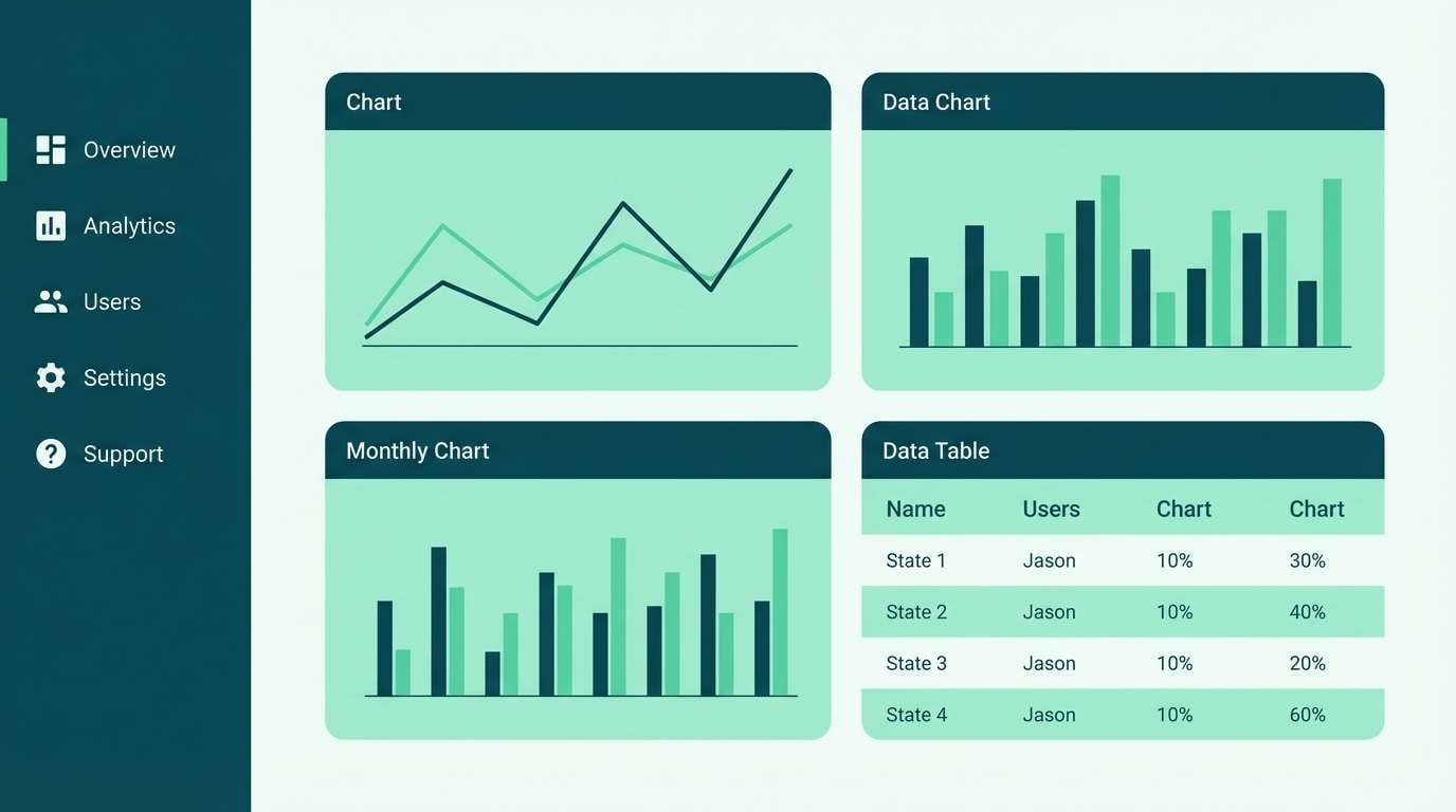
Clean sea-glass tones that feel polished and quietly modern. The darker blue-greens make excellent navigation and chart colors, while the pale mint reads as a soft surface layer. Pair it with simple iconography and thin dividers for a lightweight interface. Usage tip: limit the brightest teal to active states so the hierarchy stays obvious.
Image example of sea glass minimal generated using media.io
4) Tidepool Neutrals
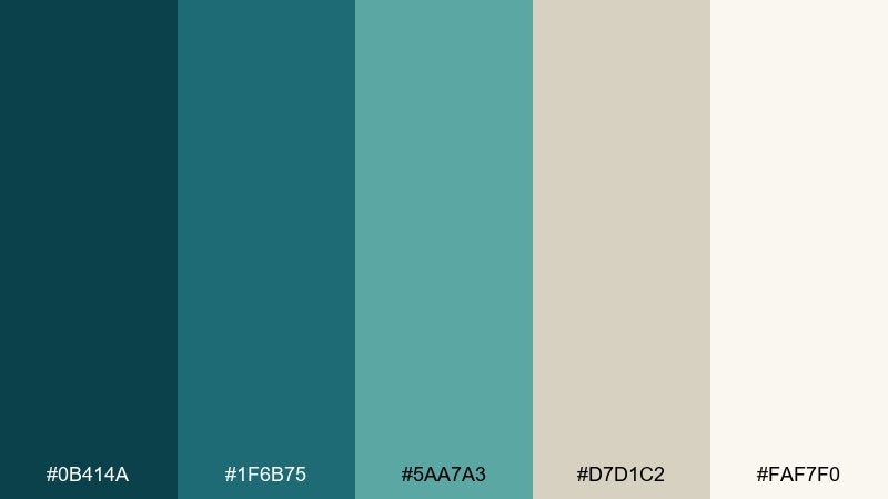
HEX: #0b414a #1f6b75 #5aa7a3 #d7d1c2 #faf7f0
Mood: grounded, coastal, balanced
Best for: interior design mood boards
Grounded coastal tones that recall tidepools, stone, and sun-bleached sand. The warm neutrals soften the cool aquas so the palette feels livable rather than icy. Use it for room plans, material boards, or calm editorial spreads with plenty of texture. One practical tip: choose the sand shade as the main background to keep teal accents elegant.
Image example of tidepool neutrals generated using media.io
5) Nautical Depths
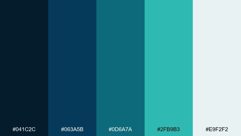
HEX: #041c2c #063a5b #0d6a7a #2fb9b3 #e9f2f2
Mood: confident, marine, professional
Best for: corporate reports and presentations
Confident marine shades that feel like deep water and polished metal. The inky navy works for titles and charts, while the brighter aqua keeps pages from looking too formal. Pair with lots of white space and simple grid layouts for a modern business look. Tip: use the light mist tone for tables and callout boxes to improve readability.
Image example of nautical depths generated using media.io
6) Coral Compass
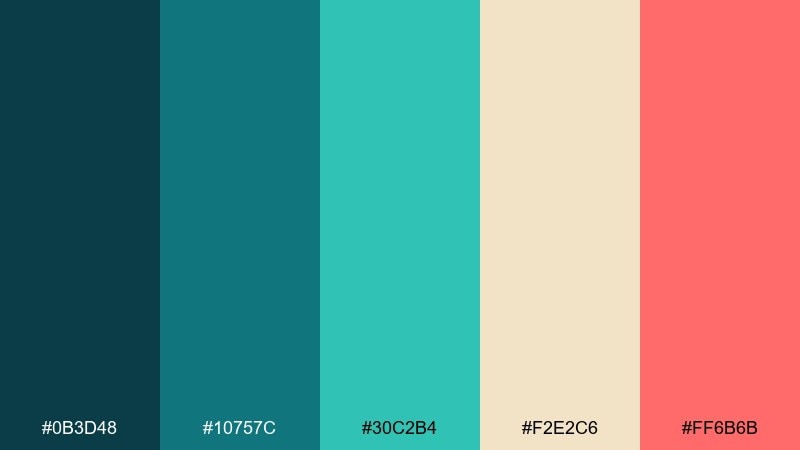
HEX: #0b3d48 #10757c #30c2b4 #f2e2c6 #ff6b6b
Mood: adventurous, sunlit, playful
Best for: travel branding and postcards
Adventurous sunlit hues that suggest a compass pointing toward warm shores. The teal base feels oceanic and reliable, and the coral accent adds instant personality. These atlantis color combinations shine on postcards, luggage tags, and playful brand marks when paired with simple sans-serif type. Usage tip: keep coral to stamps, icons, or a single headline to avoid overpowering the calm aquas.
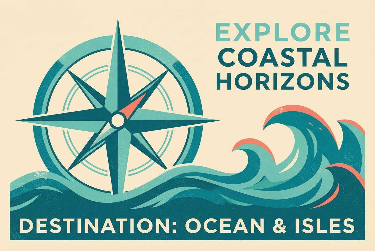
Image example of coral compass generated using media.io
7) Misty Marina
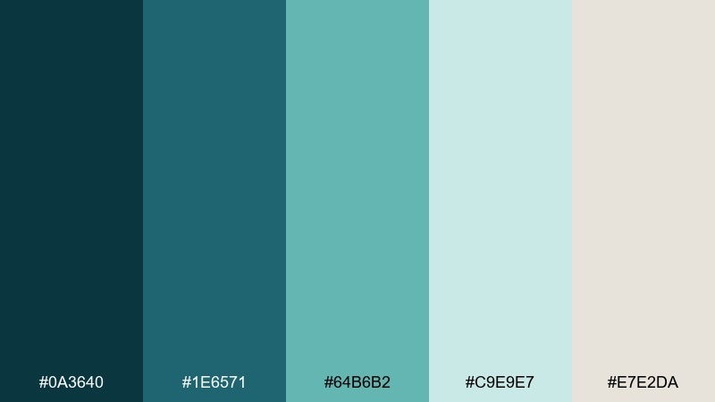
HEX: #0a3640 #1e6571 #64b6b2 #c9e9e7 #e7e2da
Mood: soft, foggy, relaxed
Best for: lifestyle blog headers
Soft foggy tones that feel like morning air at a quiet marina. The muted teals give you contrast without harshness, and the pale mint reads as gentle atmosphere. Pair with warm beige neutrals and a touch of grain to keep it cozy. Tip: set headers in the darkest shade and use the mint for subtle highlights and lines.
Image example of misty marina generated using media.io
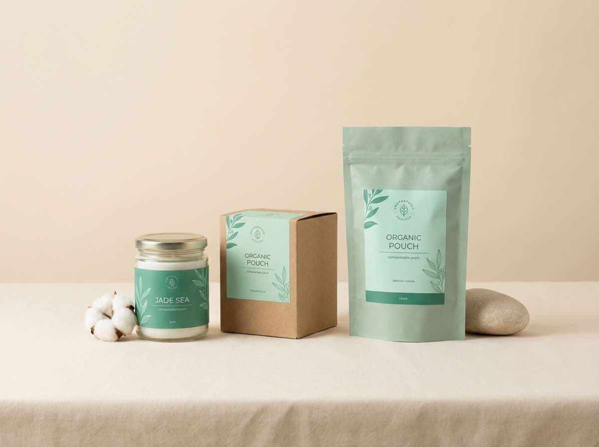
8) Jade Current
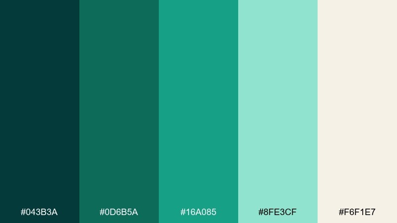
HEX: #043b3a #0d6b5a #16a085 #8fe3cf #f6f1e7
Mood: fresh, botanical, restorative
Best for: eco product packaging
Fresh jade-and-mint tones that feel restorative and nature-forward. The deeper greens support premium type and labels, while the pale mint brings a clean, sustainable vibe. It works beautifully on matte packaging with minimal graphics and plenty of negative space. Usage tip: print the darkest shade for text to keep small ingredients readable.
Image example of jade current generated using media.io
9) Pearl Diver
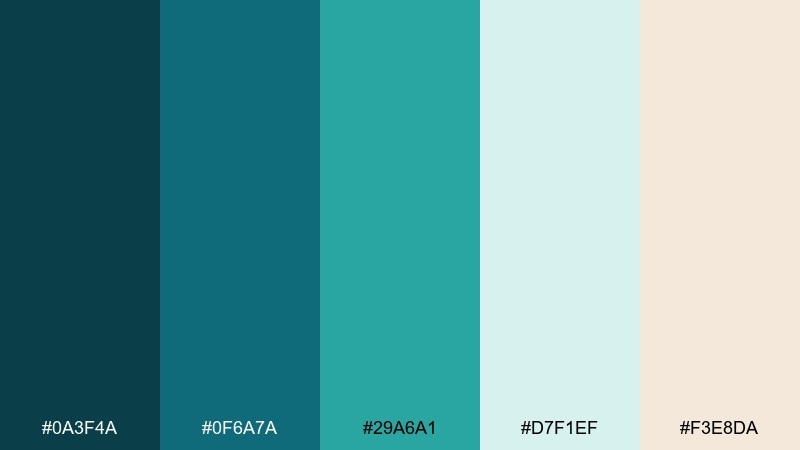
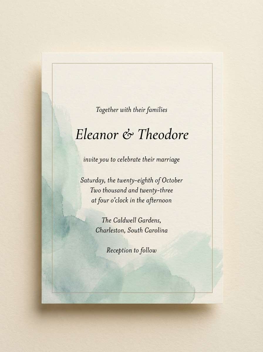
HEX: #0a3f4a #0f6a7a #29a6a1 #d7f1ef #f3e8da
Mood: elegant, airy, refined
Best for: wedding invitations
Elegant watery hues with a pearl-like softness, perfect for romantic stationery. The teal shades give structure for names and dates, while the pale tones keep everything light and formal. Pair with delicate serif typography and fine line art for a timeless feel. Tip: use the warm cream as the paper color and add teal foil or ink for contrast.
Image example of pearl diver generated using media.io
10) Siren Night
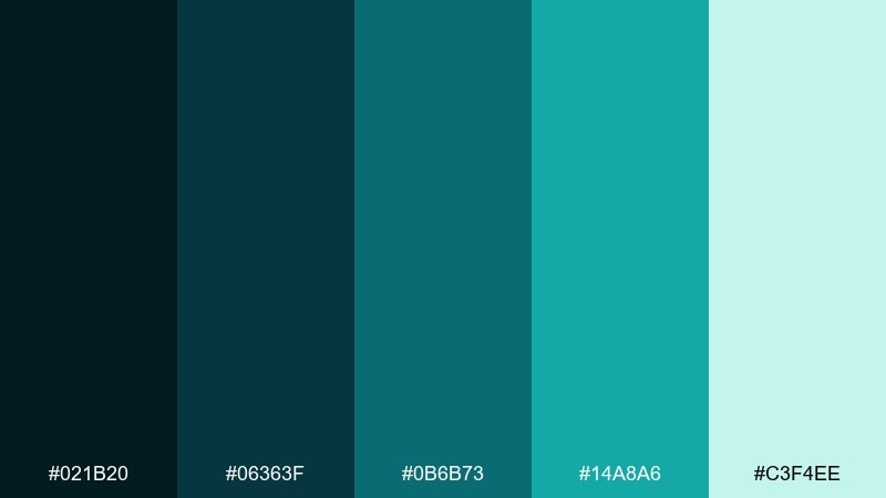
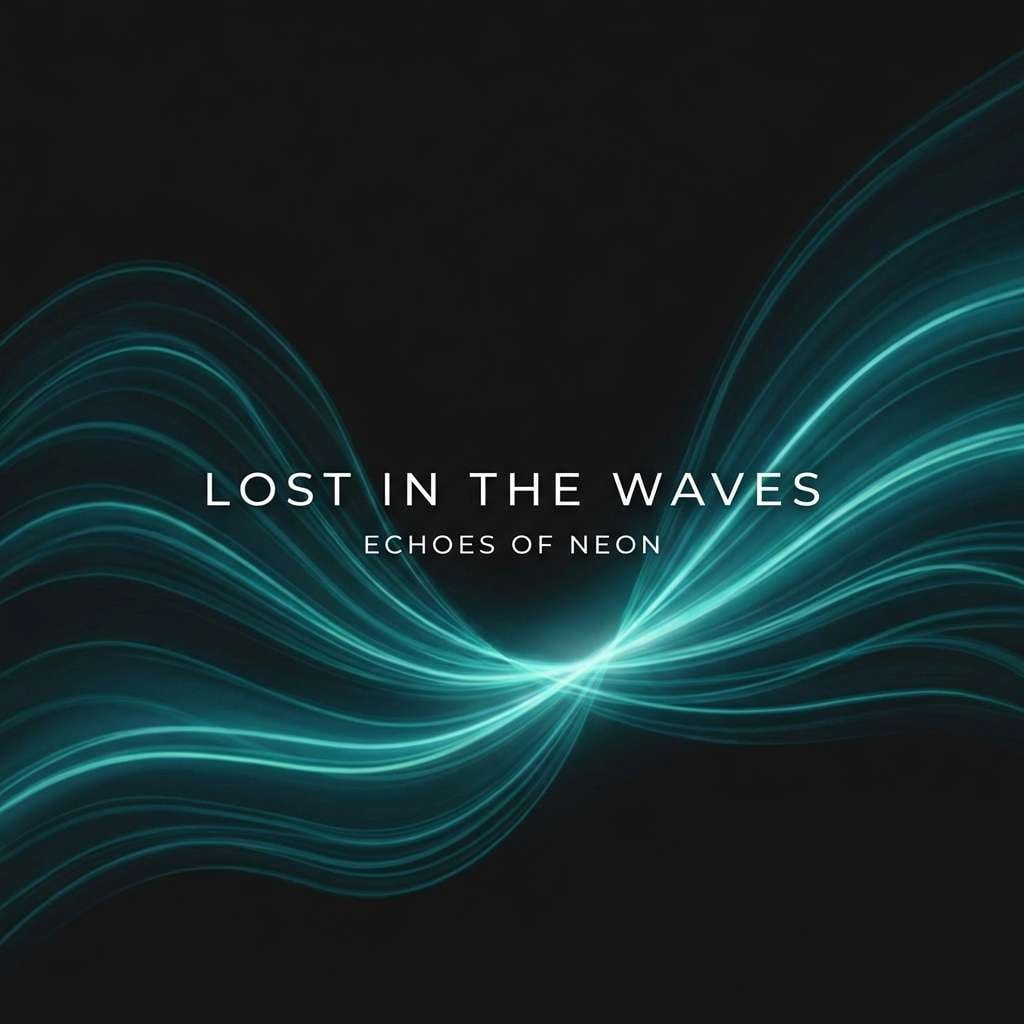
HEX: #021b20 #06363f #0b6b73 #14a8a6 #c3f4ee
Mood: mysterious, nocturnal, sleek
Best for: music cover art and promos
Mysterious nocturnal tones that feel like neon reflections on dark water. The near-black and deep teal create drama, while the bright aqua reads like a spotlight. Use it for album covers, club flyers, or digital promos where contrast needs to hit fast. Tip: keep text in the pale mint and reserve the brightest aqua for one focal element.
Image example of siren night generated using media.io
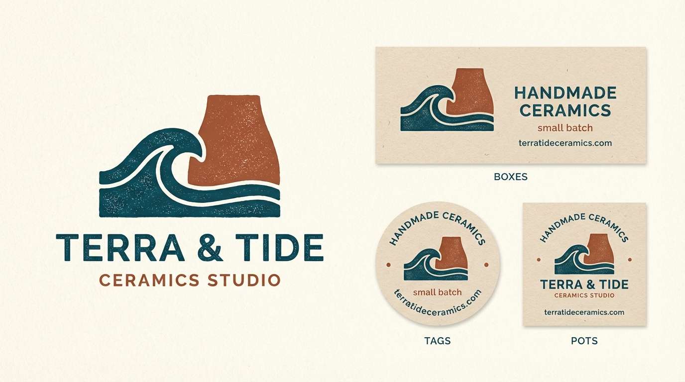
11) Coastal Clay
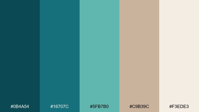
HEX: #0b4a54 #16707c #5fb7b0 #c9b39c #f3ede3
Mood: warm, artisan, coastal
Best for: ceramics shop branding
Warm artisan tones that blend sea air with handmade clay. Teal shades add freshness to logos and labels, while the clay and cream colors bring a grounded, tactile feel. Pair with textured paper, stamped marks, and simple product photography for a studio-made look. Tip: use the clay shade in backgrounds so teal elements feel like glazed details.
Image example of coastal clay generated using media.io
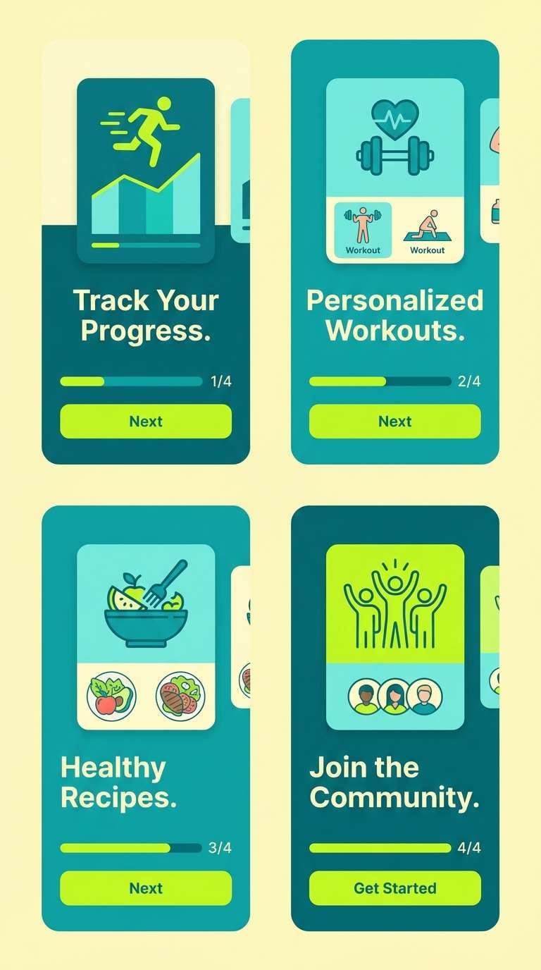
12) Aqua Citrus
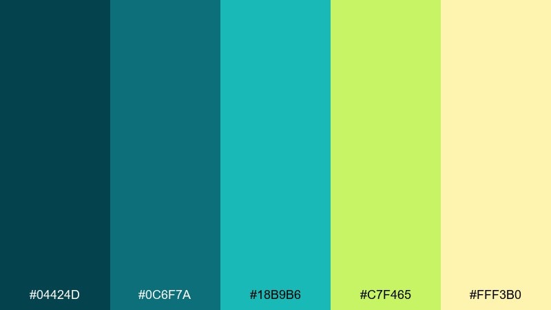
HEX: #04424d #0c6f7a #18b9b6 #c7f465 #fff3b0
Mood: bright, zesty, upbeat
Best for: fitness app onboarding screens
Bright zesty tones that feel like sparkling water with a citrus twist. The teal foundation keeps it sporty and modern, and the lime highlight adds instant energy. Use the pale yellow for friendly backgrounds and let lime guide the eye to key steps. Tip: keep the lime to progress indicators and icons so it stays punchy, not loud.
Image example of aqua citrus generated using media.io
13) Vintage Map
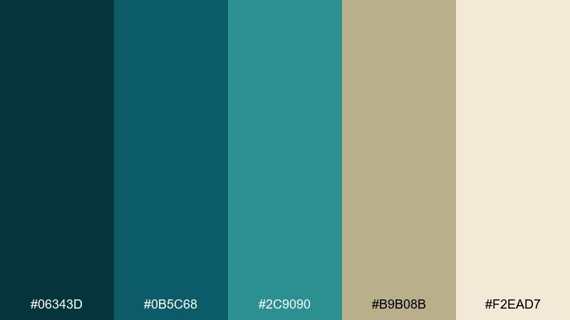
HEX: #06343d #0b5c68 #2c9090 #b9b08b #f2ead7
Mood: heritage, exploratory, classic
Best for: book covers and editorial features
Heritage tones that resemble aged maps and inked coastlines. The muted teal reads sophisticated rather than trendy, and the parchment neutrals keep it literary. Pair with serif fonts, fine rules, and subtle paper grain for a classic editorial finish. Tip: use the parchment as the cover base and set titles in the deepest teal for strong legibility.
Image example of vintage map generated using media.io
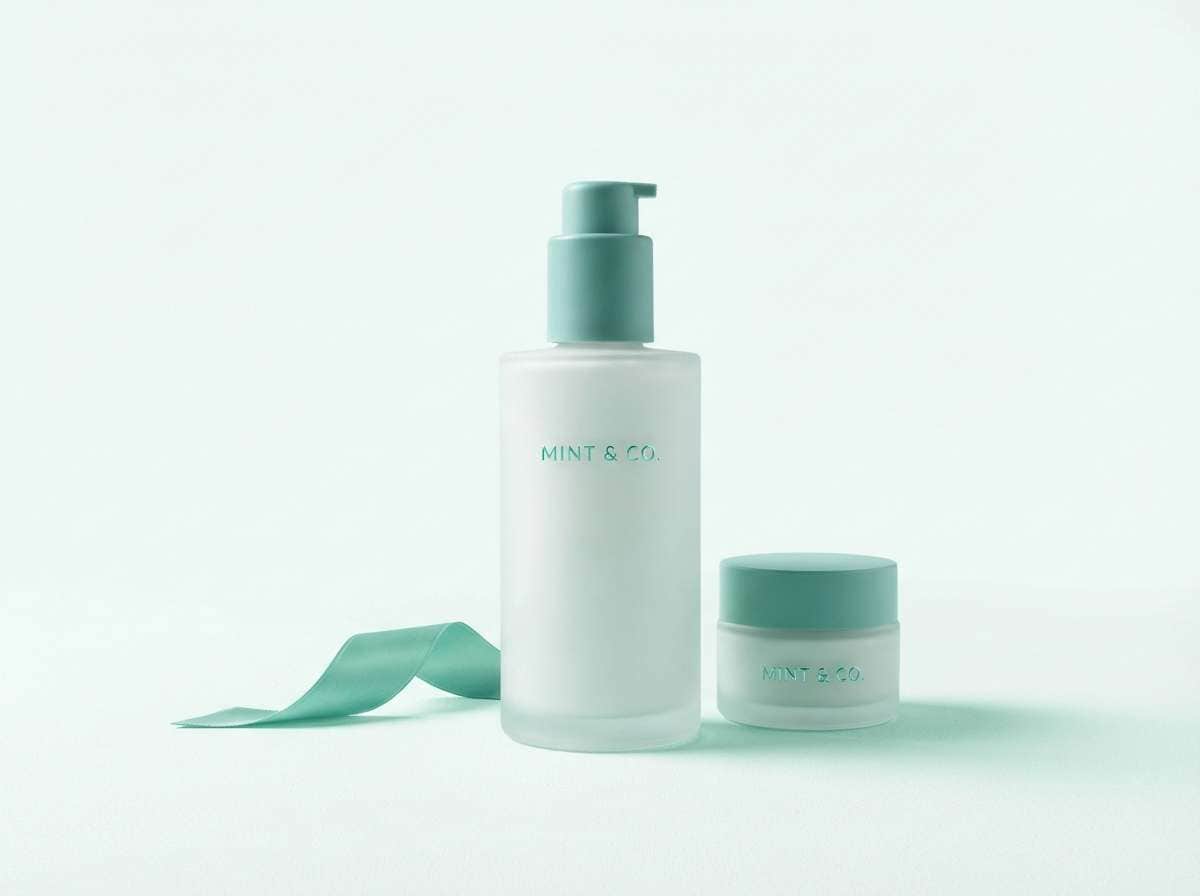
14) Spa Serenity
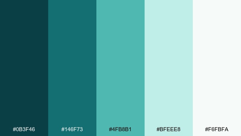
HEX: #0b3f46 #146f73 #4fb8b1 #bfeee8 #f6fbfa
Mood: soothing, clean, spa-like
Best for: skincare product ads
Soothing spa tones that read clean, hydrated, and quietly luxurious. The mid teals give structure for product names, while the pale mint and near-white create an airy glow. Pair with soft shadows and minimal props to keep the ad feeling premium. Tip: choose one teal as the hero color and use the others as subtle gradients.
Image example of spa serenity generated using media.io
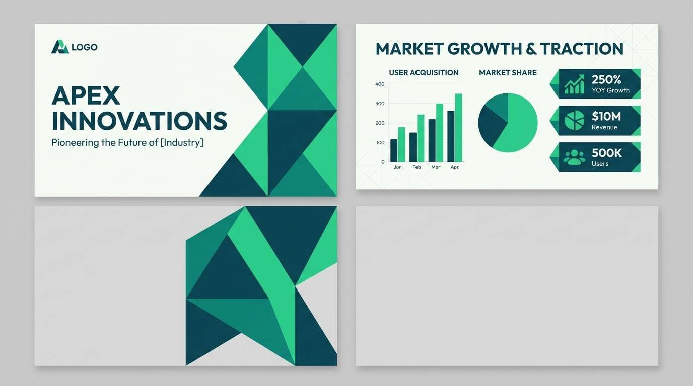
15) Electric Kelp
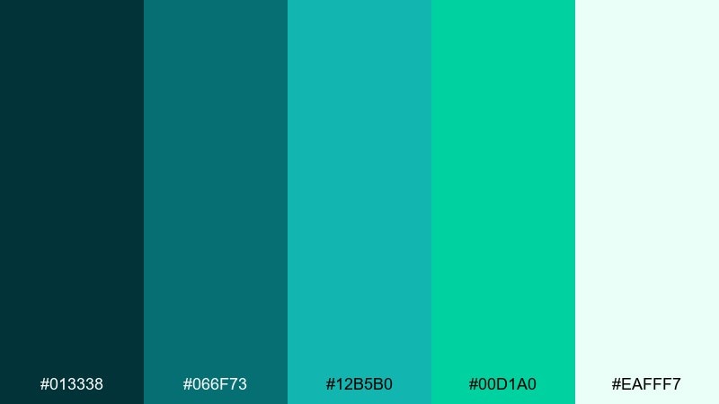
HEX: #013338 #066f73 #12b5b0 #00d1a0 #eafff7
Mood: vivid, techy, futuristic
Best for: startup pitch decks
Vivid kelp-like greens with a futuristic, tech-forward edge. The bright green-teal accents bring motion and confidence, especially on dark sections. These atlantis color combinations work best with plenty of breathing room and crisp geometric shapes. Tip: use the near-white for most slides, then switch to the darkest teal for one dramatic section break.
Image example of electric kelp generated using media.io
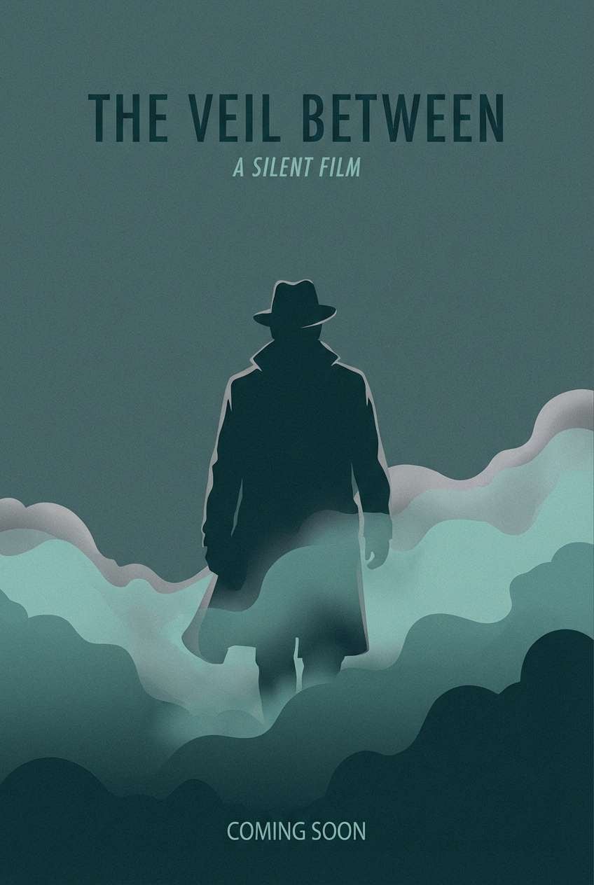
16) Monsoon Harbor
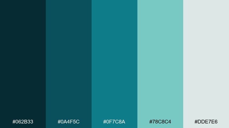
HEX: #062b33 #0a4f5c #0f7c8a #78c8c4 #dde7e6
Mood: moody, rainy, cinematic
Best for: film posters and key art
Moody rainy hues that feel cinematic, like harbor lights in a storm. The darker tones make a strong base for dramatic type, while the soft gray-green keeps it atmospheric. Pair with high-contrast silhouettes and restrained texture for a modern thriller feel. Tip: set the title in the pale tone and use the mid teal for credits and details.
Image example of monsoon harbor generated using media.io
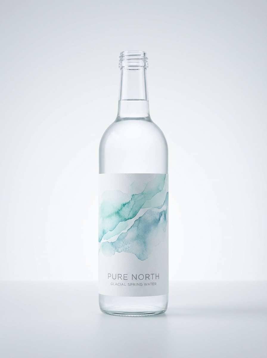
17) Glacier Bay
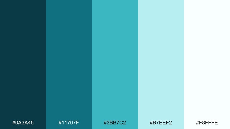
HEX: #0a3a45 #11707f #3bb7c2 #b7eef2 #f8fffe
Mood: icy, crisp, refreshing
Best for: water brand labels
Icy crisp aquas that feel like glacial water and fresh air. The bright cyan-teal gives instant clarity, while the near-white keeps the whole look ultra-clean. Pair with thin sans-serif type and minimal wave motifs for a modern label. Tip: keep the darkest teal only for legal text so the design stays bright and premium.
Image example of glacier bay generated using media.io
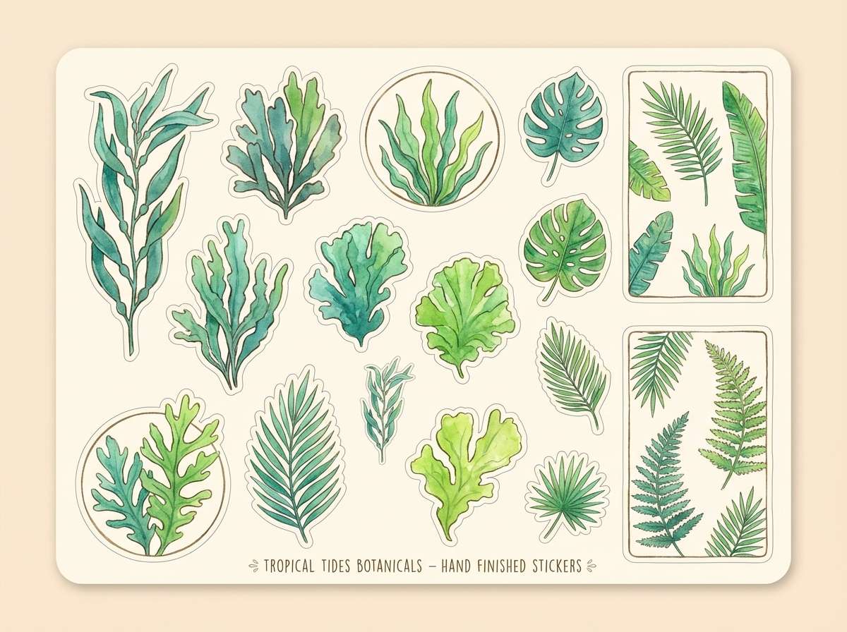
18) Tropical Algae
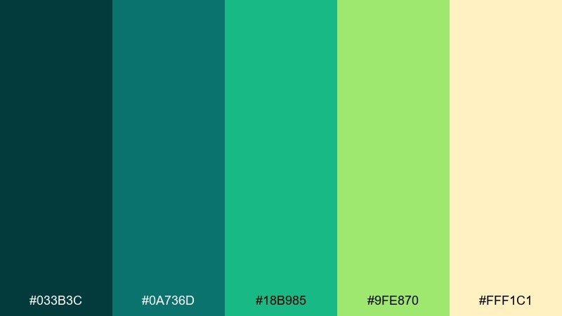
HEX: #033b3c #0a736d #18b985 #9fe870 #fff1c1
Mood: lush, playful, tropical
Best for: botanical illustrations and stickers
Lush tropical greens that look like algae drifting in sunlit shallows. The vivid lime adds playful contrast, especially against the warm buttery highlight. Use it for illustrated sticker packs, plant motifs, and cheerful merchandise. Tip: choose two greens as the main fills and save lime for small spark points and outlines.
Image example of tropical algae generated using media.io
19) Opal Surf
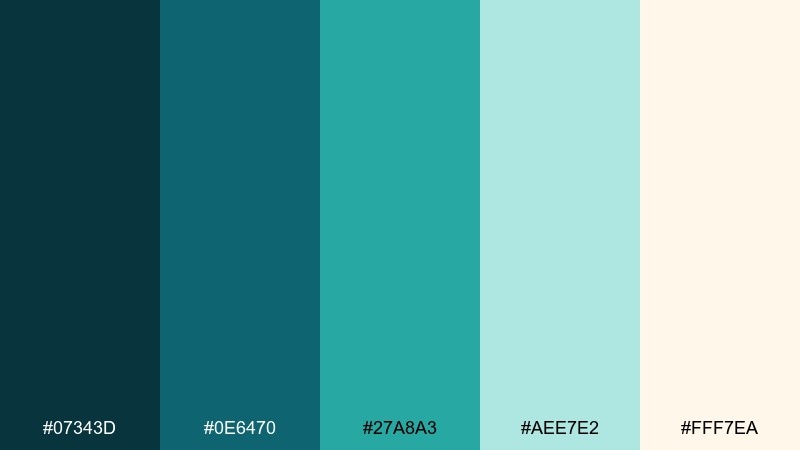
HEX: #07343d #0e6470 #27a8a3 #aee7e2 #fff7ea
Mood: friendly, breezy, optimistic
Best for: restaurant menus and signage
Breezy opal tones that feel like surf foam and sun-warmed air. The mid teal is great for headings and section dividers, while the creamy background keeps menus inviting. Pair with simple illustrations and plenty of spacing to avoid visual clutter. Tip: use the minty opal shade for highlight boxes like specials and seasonal items.
Image example of opal surf generated using media.io
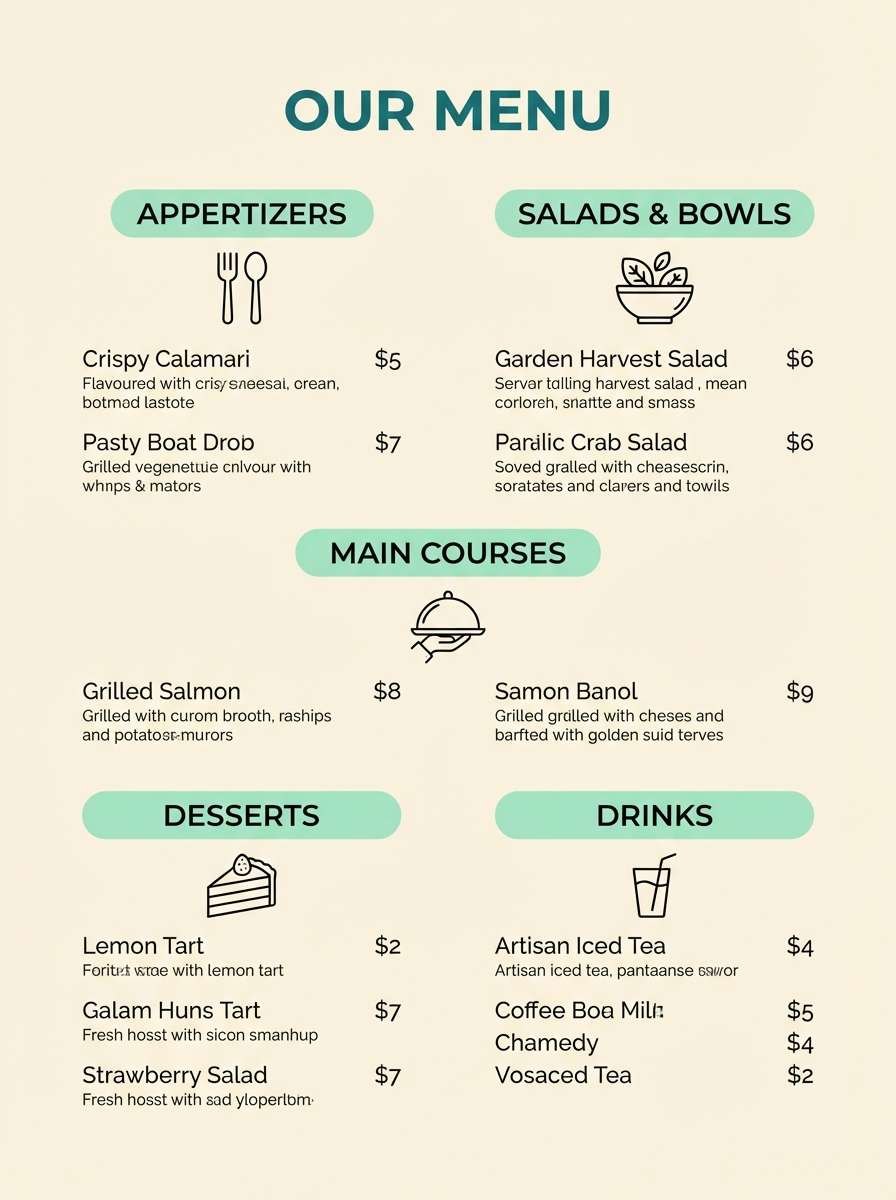
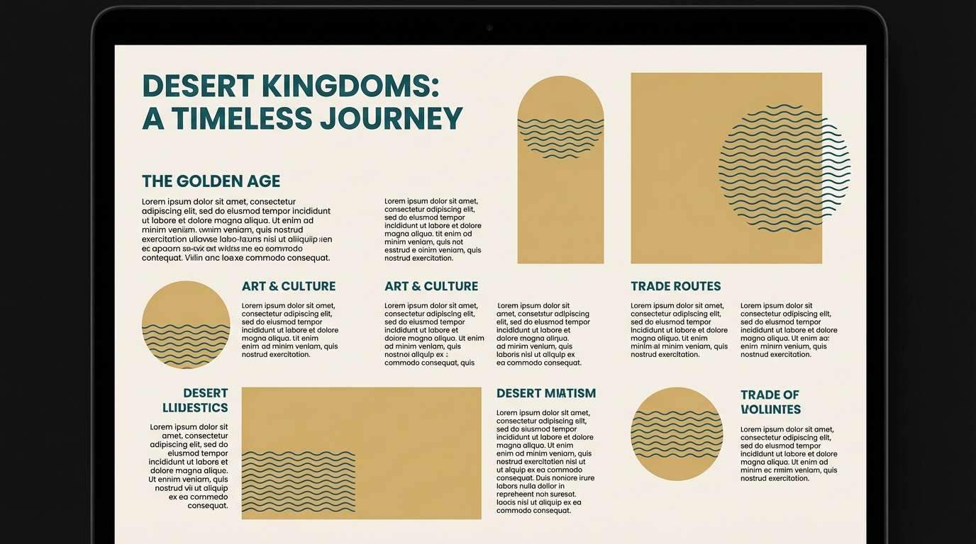
20) Temple Ruins
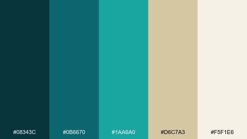
HEX: #08343c #0b6670 #1aa6a0 #d6c7a3 #f5f1e6
Mood: ancient, sunlit, storied
Best for: museum exhibits and brochures
Ancient sunlit tones that hint at stone ruins beside clear water. The teal shades add modern clarity, while the sandy gold brings a historical, tactile warmth. Use it for exhibit signage, brochures, and wayfinding where contrast must be calm but unmistakable. Tip: keep the sand color for panels and let teal guide navigation arrows and section labels.
Image example of temple ruins generated using media.io
What Colors Go Well with Atlantis?
Atlantis tones (teal, aqua, deep blue-green) pair beautifully with warm neutrals like pearl, cream, sand, clay, and parchment. These soften the coolness and create a premium, coastal balance that reads well on screens and in print.
For bolder contrast, add coral, watermelon pink, sunny yellow, or lime as a controlled accent. Keep the bright color to small UI states (CTAs, badges, highlights) so the palette stays “oceanic” rather than chaotic.
If you want a darker, cinematic direction, combine near-black teal with misty gray-green or pale mint for typography. This creates strong hierarchy while preserving the underwater mood.
How to Use a Atlantis Color Palette in Real Designs
Start with a role-based system: choose one darkest teal for text and headers, one mid teal for brand blocks and navigation, one bright aqua for interactive states, and one light neutral for background. This keeps contrast predictable and your UI accessible.
In print, treat the warm neutral as the “paper” color and layer teals as ink. You’ll get an elegant, editorial feel—especially if you use subtle textures, thin rules, and generous margins.
For branding, keep logos simple and let the palette carry the theme. A restrained accent (coral or lime) works best as a signature detail on icons, stamps, or packaging seals.
Create Atlantis Palette Visuals with AI
If you already have HEX codes, the next step is turning them into on-brand visuals: landing pages, posters, packaging, menus, or UI screens that match the palette’s mood. The fastest workflow is to reuse a prompt style and swap in your preferred palette name and design context.
With Media.io’s AI image generator, you can iterate quickly—try multiple compositions, aspect ratios, and levels of minimalism—then keep the strongest concept for your final design direction.
Once you like a result, generate variations (lighter background, darker hero section, stronger accent) to build a consistent set of assets for campaigns and product pages.
Atlantis Color Palette FAQs
-
What is an Atlantis color palette?
An Atlantis color palette is typically built around oceanic teals and aquas, supported by deep blue-greens for contrast and light neutrals (pearl, mist, sand) for whitespace and readability. -
Which Atlantis palette is best for UI design?
For UI, pick a clean set with strong hierarchy and soft surfaces, such as Sea Glass Minimal or Nautical Depths. Use the darkest shade for text, mid tones for navigation, and the brightest teal only for active states. -
How do I keep teal-heavy designs readable?
Anchor body text in a very dark teal (or near-black), keep large background areas light (pearl/mist/cream), and reserve bright aqua for buttons, links, and highlights rather than long text blocks. -
What accent colors work with Atlantis tones?
Coral and warm pinks add playful contrast, while sunny yellow or lime creates energetic “tropical” pops. Use accents sparingly—think badges, icons, or a single CTA—to avoid overwhelming the calm base. -
Are Atlantis palettes good for print materials?
Yes. Atlantis palettes look especially polished on invitations, brochures, menus, and packaging when you use a warm neutral as the base and print teal as the primary ink for type and rules. -
How can I generate Atlantis-themed visuals that match my HEX codes?
Use a consistent prompt style (layout type + mood + dominant colors + “2d graphic design” or “studio shot”), then iterate on aspect ratio and accent intensity. Media.io’s text-to-image makes it easy to create multiple on-brand options fast. -
What’s a safe 60-30-10 split for Atlantis palettes?
A common split is 60% light neutral background, 30% mid/dark teal structure (nav, headers, blocks), and 10% bright aqua or warm accent for CTAs, highlights, and key data points.
Next: Botanical Color Palette


