

Renaissance art colors are built for impact: warm grounds, mineral blues, and gilded highlights that feel both human and elevated. They translate beautifully to modern branding because the contrast is value-based (light vs. dark) rather than neon saturation.
Below are museum-inspired palette combos with HEX codes you can copy into design tools, plus AI prompts to generate matching visuals for posters, packaging, UI, and moodboards.
In this article
- Why Renaissance Art Palettes Work So Well
-
- florentine fresco
- lapis chapel
- venetian velvet
- siena earthwork
- gilded manuscript
- marble halo
- crimson madonna
- olive grove umbra
- studio chiaroscuro
- pastel cartouche
- candlelit gallery
- celadon drapery
- courtly tapestry
- alabaster and ash
- copper patina
- roseate fresco
- ink and parchment
- sunlit piazza
- night procession
- sacred azure and ocher
- pilgrim ochre
- fresco garden
- What Colors Go Well with Renaissance Art?
- How to Use a Renaissance Art Color Palette in Real Designs
- Create Renaissance Art Palette Visuals with AI
Why Renaissance Art Palettes Work So Well
Renaissance palettes were engineered around real pigments and materials—plaster, linen, wood, gold leaf—so the colors naturally feel believable and “touchable” in modern design.
They also balance warmth and depth: creamy grounds and earth reds carry the composition, while lapis or slate blues add structure and hierarchy without becoming harsh.
Most importantly, these schemes age well. Even when used in contemporary layouts, the muted saturation and strong value contrast keep designs premium, readable, and timeless.
20+ Renaissance Art Color Palette Ideas (with HEX Codes)
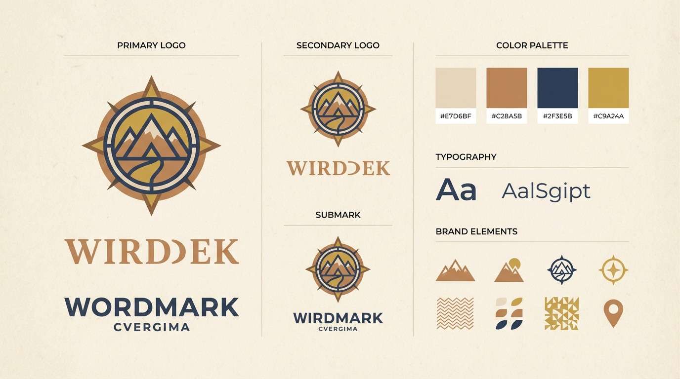
1) Florentine Fresco
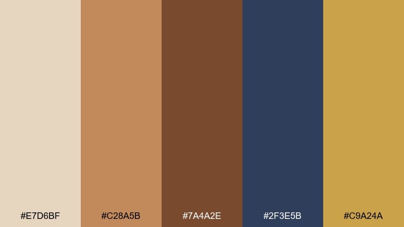
HEX: #E7D6BF #C28A5B #7A4A2E #2F3E5B #C9A24A
Mood: warm, historic, grounded
Best for: heritage brand identity and logo system
Sun-baked plaster, worn terracotta, and a glint of gilt evoke quiet chapels and city palazzi. Use this renaissance art color palette for heritage brands, artisan goods, and editorial headers that need weight without feeling heavy. Pair the deep slate blue with antique gold for premium accents, and let the umber anchor typography. Tip: keep the parchment tone as the dominant background so the warmer reds and browns feel intentional, not muddy.
Image example of florentine fresco generated using media.io
Media.io is an online AI studio for creating and editing video, image, and audio in your browser.

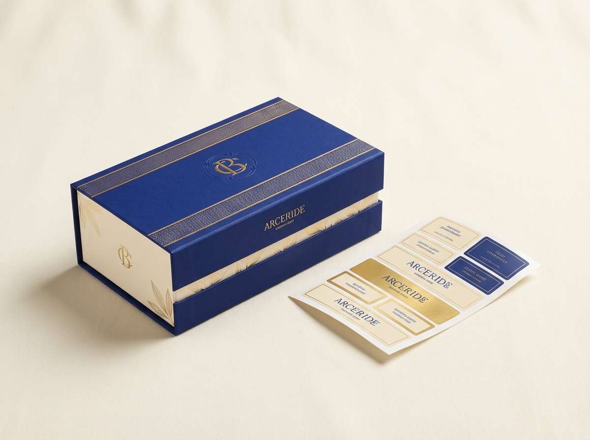
2) Lapis Chapel
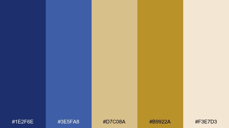
HEX: #1E2F6E #3E5FA8 #D7C08A #B9922A #F3E7D3
Mood: regal, luminous, devotional
Best for: luxury packaging and foil-stamp labels
Deep lapis tones with soft gold feel like vaulted ceilings painted under candlelight. The contrast is ideal for premium packaging, especially when you can add metallic finishes that echo the warm golds. Keep the pale cream as breathing room and use the darker blue for hierarchy and product names. Tip: reserve the richest blue for small areas so it reads like a jewel rather than a block.
Image example of lapis chapel generated using media.io
3) Venetian Velvet
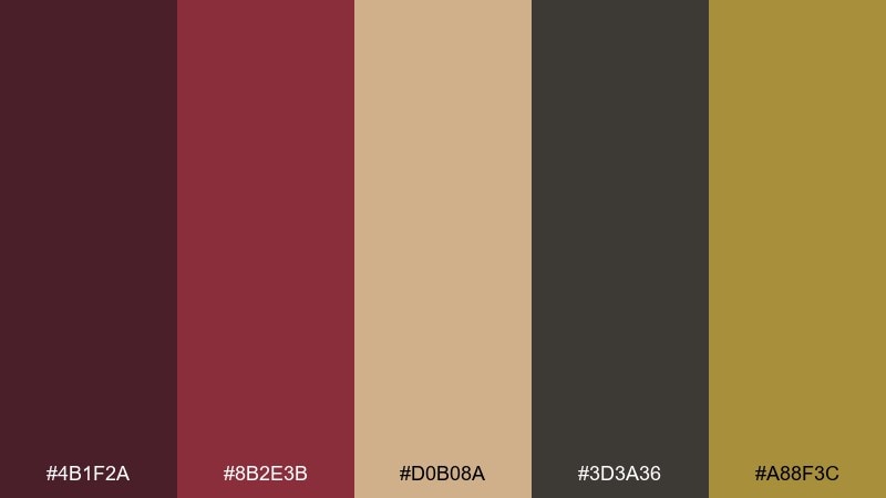
HEX: #4B1F2A #8B2E3B #D0B08A #3D3A36 #A88F3C
Mood: opulent, dramatic, intimate
Best for: event posters and theater playbills
Plum wine reds and velvet browns create a sumptuous, stage-ready atmosphere. This mix works beautifully for posters that need drama without going neon, especially when paired with condensed serif type. Use the sand beige for negative space and let the gold act as a thin border or icon color. Tip: avoid equal saturation across the reds and browns; keep one dominant so the layout stays clear.
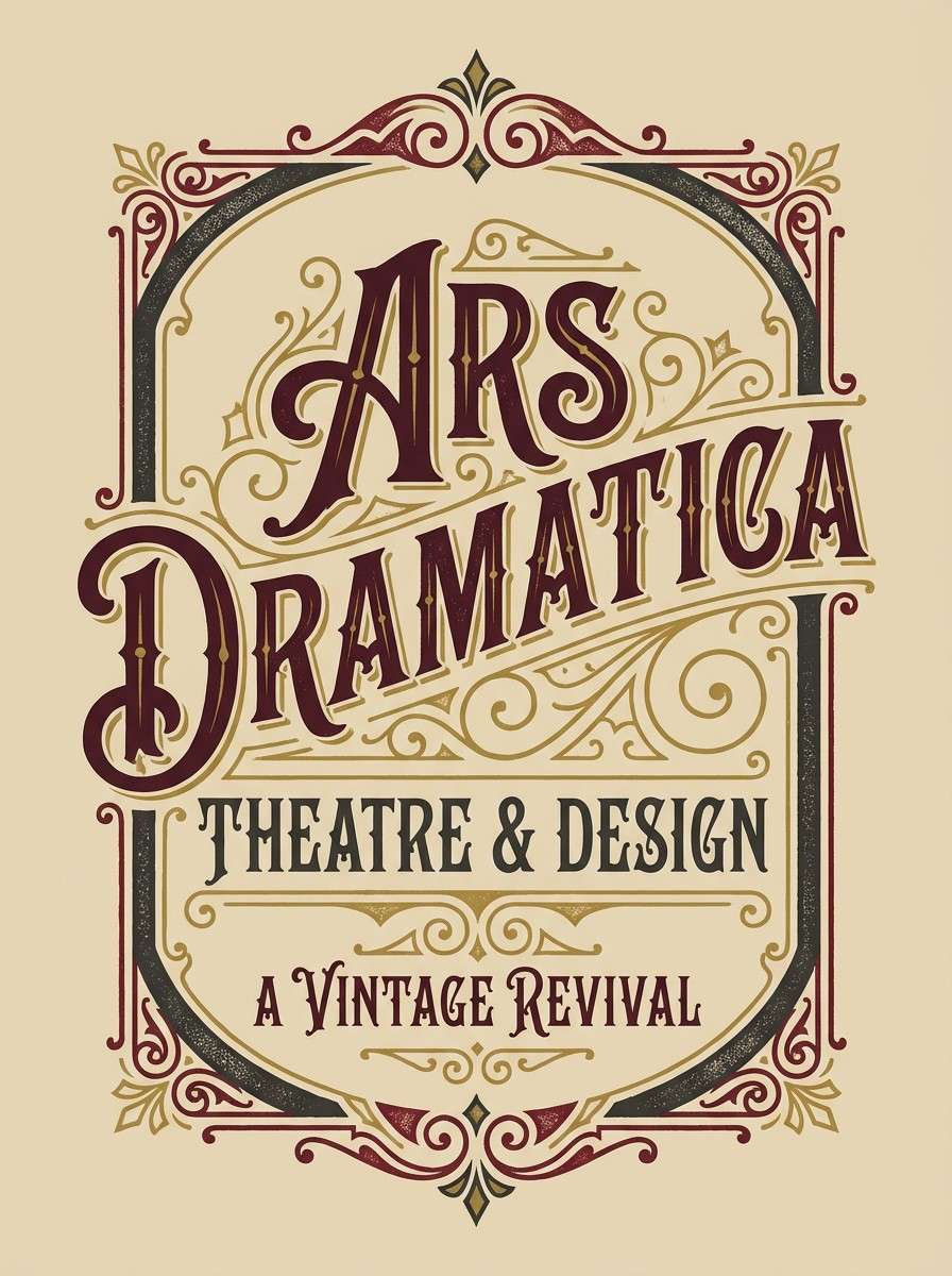
Image example of venetian velvet generated using media.io
4) Siena Earthwork
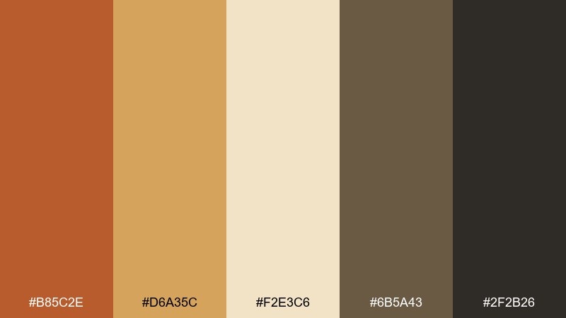
HEX: #B85C2E #D6A35C #F2E3C6 #6B5A43 #2F2B26
Mood: earthy, rustic, sunlit
Best for: restaurant menus and food branding
Burnt sienna and wheat tones recall courtyard light, clay pots, and hand-ground pigments. These hues are friendly and appetizing for menus, café marks, and farm-to-table packaging. Pair the darker brown with simple line icons, and use the cream as the base for easy readability. Tip: add a subtle paper texture behind the cream to push the handcrafted feel.
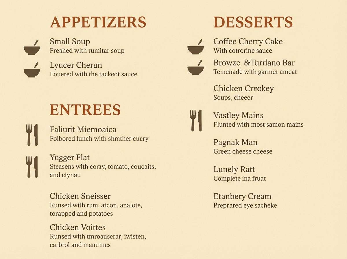
Image example of siena earthwork generated using media.io
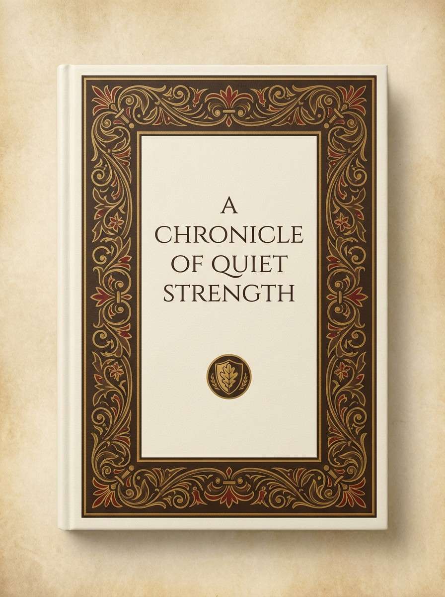
5) Gilded Manuscript
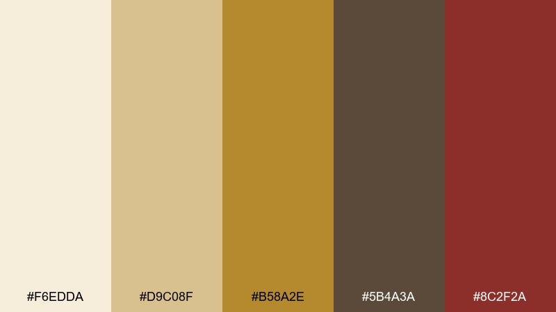
HEX: #F6EDDA #D9C08F #B58A2E #5B4A3A #8C2F2A
Mood: scholarly, ornate, refined
Best for: book covers and academic editorial design
Cream parchment and aged gold read like illuminated margins and careful penwork. These renaissance art color combinations shine on book jackets, chapter openers, and museum catalogs where detail matters. Pair the wine red with gold for small ornaments, then keep body text grounded in the cocoa brown. Tip: use gold sparingly as a rule line or emblem so it stays special.
Image example of gilded manuscript generated using media.io
6) Marble Halo
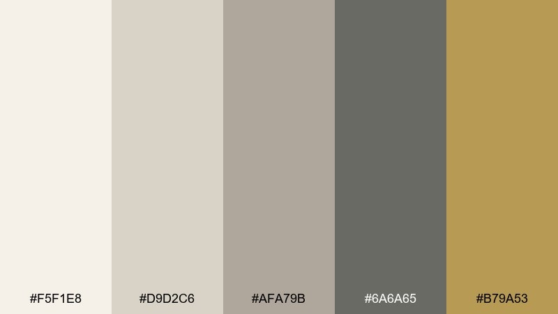
HEX: #F5F1E8 #D9D2C6 #AFA79B #6A6A65 #B79A53
Mood: calm, airy, sculptural
Best for: minimal UI themes and dashboard design
Soft stone neutrals feel like polished marble and quiet gallery walls. Use this set for calm interfaces where contrast comes from value shifts instead of loud color. The muted gold works best as a highlight for toggles, badges, or key metrics while the grays handle structure. Tip: test accessibility by darkening the charcoal slightly for primary text on the lightest background.
Image example of marble halo generated using media.io

7) Crimson Madonna
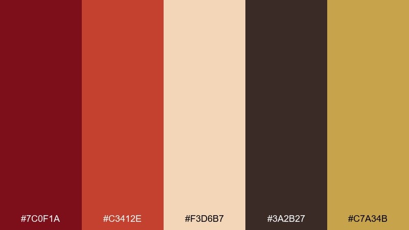
HEX: #7C0F1A #C3412E #F3D6B7 #3A2B27 #C7A34B
Mood: bold, reverent, iconic
Best for: beauty campaign ads and bold social posts
Vermilion and deep crimson create an iconic focal point that feels painted, not printed. Use the warm skin-toned peach as a soft field and let the dark brown define type and product silhouettes. Gold is best as a thin accent line that signals luxury without overpowering the reds. Tip: keep imagery simple and high-contrast so the red stays the hero.
Image example of crimson madonna generated using media.io
8) Olive Grove Umbra
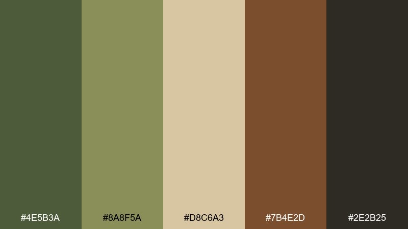
HEX: #4E5B3A #8A8F5A #D8C6A3 #7B4E2D #2E2B25
Mood: natural, grounded, pastoral
Best for: botanical stationery and eco brands
Olive greens and umber browns evoke shaded groves and hand-mixed pigments. The palette suits sustainable branding, olive oil labels, and stationery that wants a calm, organic feel. Pair the light tan with plenty of whitespace, then use the darkest tone for stamps or monograms. Tip: print tests matter here, since greens can shift warmer or cooler depending on paper stock.
Image example of olive grove umbra generated using media.io
9) Studio Chiaroscuro
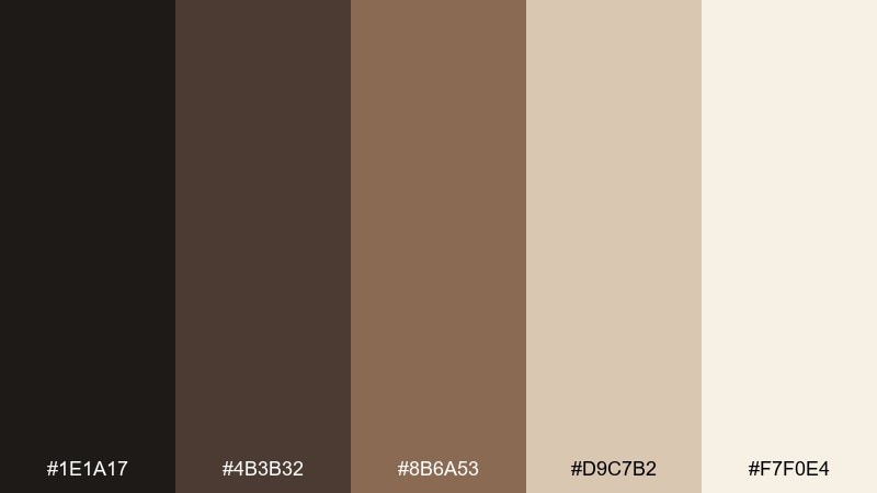
HEX: #1E1A17 #4B3B32 #8B6A53 #D9C7B2 #F7F0E4
Mood: moody, cinematic, classic
Best for: photography portfolios and gallery websites
Dark-to-light browns mimic chiaroscuro shading and studio backdrops. Use the near-black for headers and navigation, then layer warm neutrals for panels and captions. This works especially well with monochrome photography, letting images breathe without looking sterile. Tip: add a slightly warm off-white for content blocks to avoid harsh contrast against pure white.
Image example of studio chiaroscuro generated using media.io
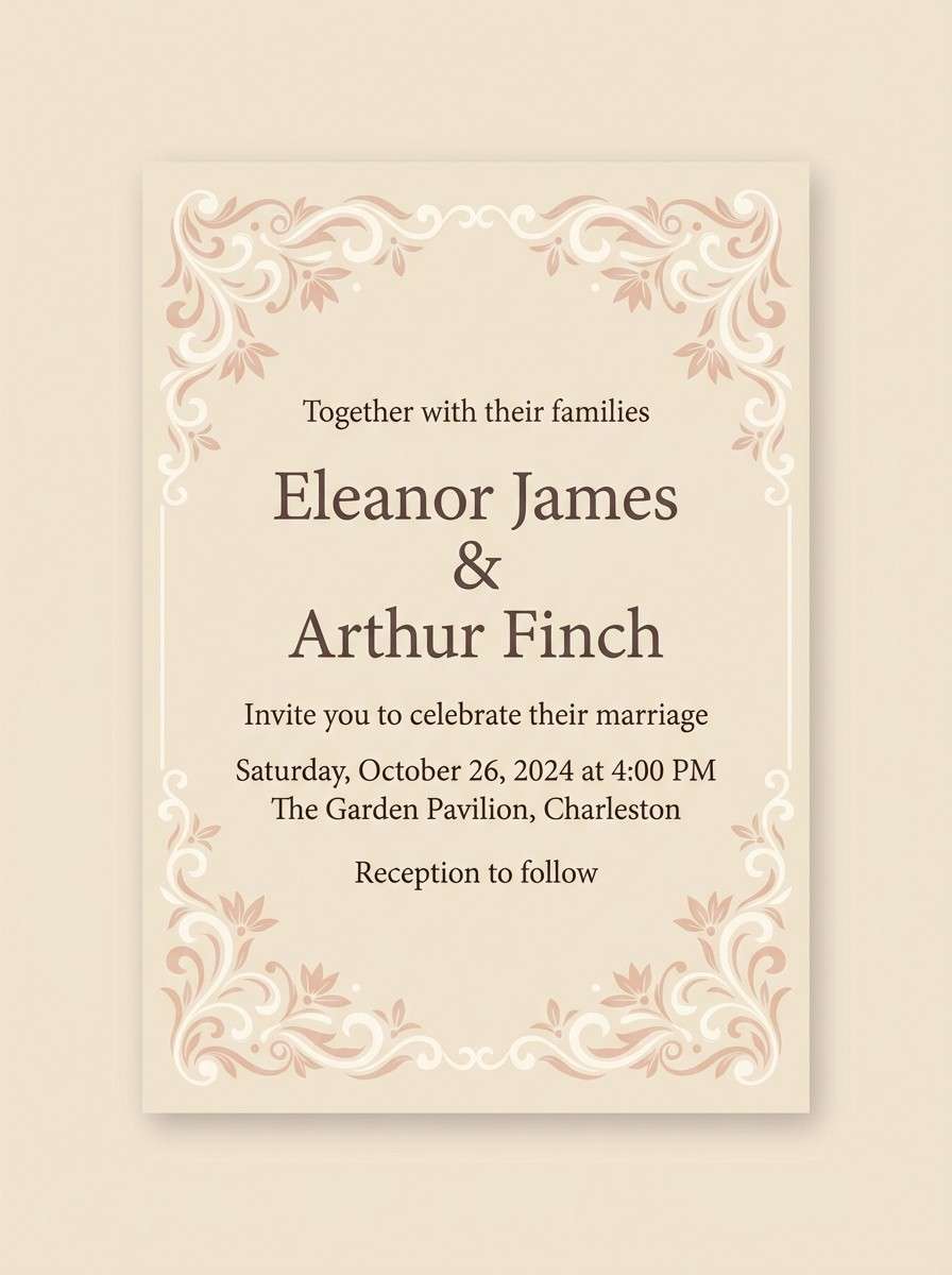
10) Pastel Cartouche
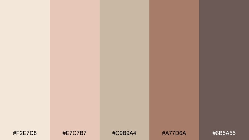
HEX: #F2E7D8 #E7C7B7 #C9B9A4 #A77D6A #6B5A55
Mood: soft, antique, romantic
Best for: wedding invitations and elegant flyers
Powdery blush and antique taupe feel like faded fresco borders. Use the palest cream for background, then bring in the rose-brown for names, monograms, or subtle ornaments. The deeper neutral is perfect for RSVP details and small print without breaking the softness. Tip: keep embellishments thin and restrained so the palette stays airy.
Image example of pastel cartouche generated using media.io
11) Candlelit Gallery
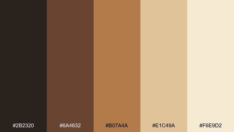
HEX: #2B2320 #6A4632 #B07A4A #E1C49A #F6E9D2
Mood: cozy, amber, intimate
Best for: coffee packaging and warm product ads
Amber browns and honeyed cream feel like lamplight on varnished wood. This mix is perfect for coffee bags, chocolate wrappers, and cozy campaigns that need warmth without heavy reds. Use the darkest brown for labels and flavor names, with the pale cream as a clean field. Tip: add a subtle gradient from honey to cream to mimic real candle glow in hero images.
Image example of candlelit gallery generated using media.io
12) Celadon Drapery
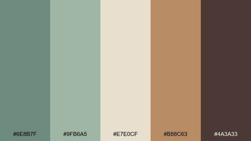
HEX: #6E8B7F #9FB6A5 #E7E0CF #B88C63 #4A3A33
Mood: fresh, refined, quietly modern
Best for: home decor lookbooks and lifestyle branding
Muted celadon greens read like draped fabric in a sunlit studio. Use the green range for calm spreads and product pages, then bring in the warm tan as a counterpoint that feels handcrafted. The deep espresso tone grounds headings and keeps the layout from floating away. Tip: pair with natural textures like linen, clay, or matte paper to enhance the softness.
Image example of celadon drapery generated using media.io
13) Courtly Tapestry
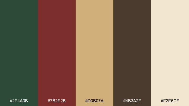
HEX: #2E4A3B #7B2E2B #D0B07A #4B3A2E #F2E6CF
Mood: rich, woven, ceremonial
Best for: museum posters and cultural festival branding
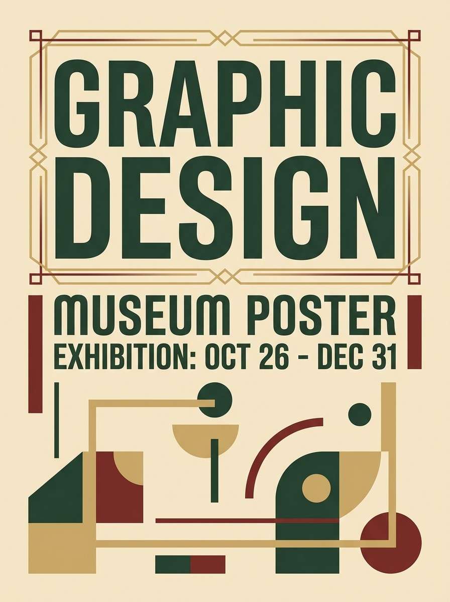
Deep green and wine red feel like woven threads against aged gold. Use this renaissance art color palette for museum posters, festival marks, and signage where tradition meets contemporary typography. Pair the cream with generous margins, then use the gold as a unifying line color across icons and dividers. Tip: try a subtle textile pattern in the green to echo tapestry depth without cluttering.
Image example of courtly tapestry generated using media.io
14) Alabaster and Ash
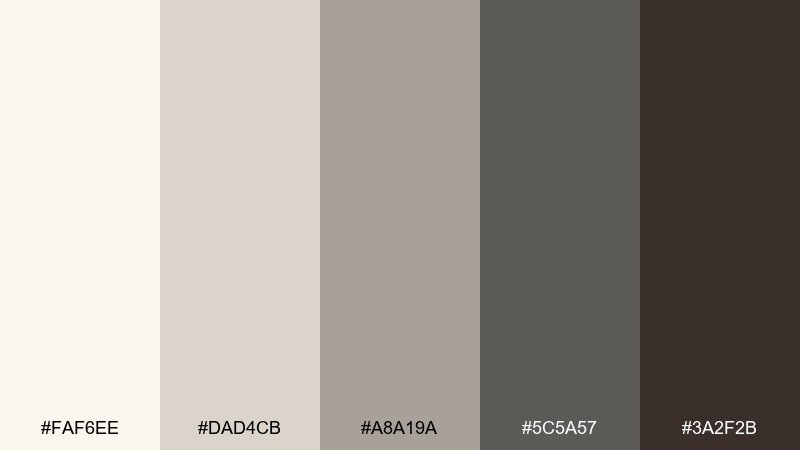
HEX: #FAF6EE #DAD4CB #A8A19A #5C5A57 #3A2F2B
Mood: quiet, elegant, architectural
Best for: portfolio sites and minimalist brand systems
Pale alabaster and smoky grays evoke carved stone and studio dust. This is a strong choice for minimal portfolios, architecture presentations, and clean brand systems. Keep the deepest brown-gray for type and use mid-grays for lines, grids, and subtle UI states. Tip: add warmth through photography or paper textures, since the neutrals are intentionally restrained.
Image example of alabaster and ash generated using media.io
15) Copper Patina
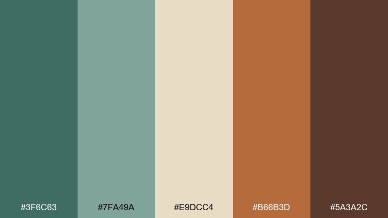
HEX: #3F6C63 #7FA49A #E9DCC4 #B66B3D #5A3A2C
Mood: artisanal, aged, curated
Best for: craft product packaging and maker shops
Oxidized teal and copper orange feel like aged metalwork in a workshop. Use the teal family as the main field color, then let copper highlight seals, icons, or key calls to action. The cream keeps everything readable and lends a natural paper feel. Tip: for packaging, print the teal slightly darker than on screen to avoid a washed-out look.
Image example of copper patina generated using media.io
16) Roseate Fresco
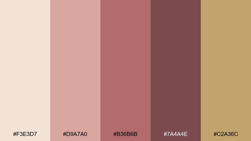
HEX: #F3E3D7 #D9A7A0 #B36B6B #7A4A4E #C2A36C
Mood: tender, romantic, antique
Best for: skincare branding and soft social templates
Dusty rose and warm gold feel like restored plaster with a gentle blush. Use the pale rose as a background for skincare posts, then build depth with muted berry for headings and buttons. The antique gold is best as a small highlight, especially for icons or thin separators. Tip: keep shadows soft and avoid pure black text; a deep plum-brown reads more refined.
Image example of roseate fresco generated using media.io
17) Ink and Parchment
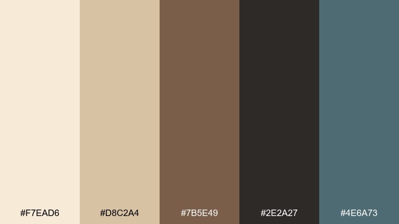
HEX: #F7EAD6 #D8C2A4 #7B5E49 #2E2A27 #4E6A73
Mood: scholarly, calm, quietly bold
Best for: blogs, longform reading, and documentation UI
Parchment creams with inky charcoal evoke margin notes and careful drafts. Use this set for reading-heavy pages, documentation hubs, or newsletters where comfort matters. The muted steel blue makes a great link color that stays understated, while the dark charcoal keeps text crisp. Tip: set your primary background to parchment instead of white to reduce glare and add character.
Image example of ink and parchment generated using media.io
18) Sunlit Piazza
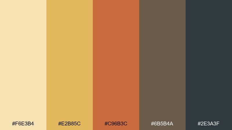
HEX: #F6E3B4 #E2B85C #C96B3C #6B5B4A #2E3A3F
Mood: bright, lively, Mediterranean
Best for: travel posters and tourism campaigns
Golden sunlight and warm stone hues bring the energy of open squares and late-afternoon walks. Use the bright gold and apricot-orange as the main shapes for travel posters, then balance with cool slate for typography. The earthy brown is perfect for small details like stamps, icons, or route lines. Tip: keep the slate limited to text and frames so the warmth stays dominant.
Image example of sunlit piazza generated using media.io
19) Night Procession
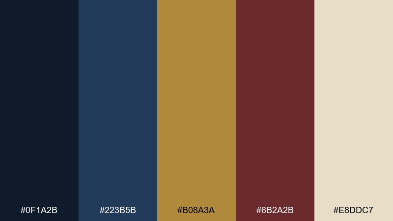
HEX: #0F1A2B #223B5B #B08A3A #6B2A2B #E8DDC7
Mood: mysterious, ceremonial, high-contrast
Best for: album covers and dramatic campaign creatives
Midnight blue and dark wine feel like torchlight moving through a narrow street. These renaissance art color combinations are excellent for dramatic covers, hero banners, and campaigns that need depth and tension. Use the cream for titles and negative space, then let gold act as a thin highlight around key elements. Tip: avoid overusing the wine red; a few controlled accents go further than large blocks.
Image example of night procession generated using media.io

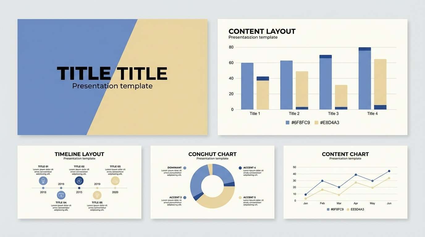
20) Sacred Azure and Ocher

HEX: #274C9A #6F8FC9 #E8D4A3 #C07A2B #5A3E2B
Mood: uplifting, classic, radiant
Best for: presentation templates and keynote slides
Clear azure paired with ocher feels like sky meeting sunlit architecture. Use the lighter blue for large panels, the deep blue for titles, and ocher as a confident highlight for charts and callouts. The warm brown keeps body text grounded when you need more contrast than navy alone. Tip: on slides, use the pale gold as the default background for charts so the blues pop cleanly.
Image example of sacred azure and ocher generated using media.io
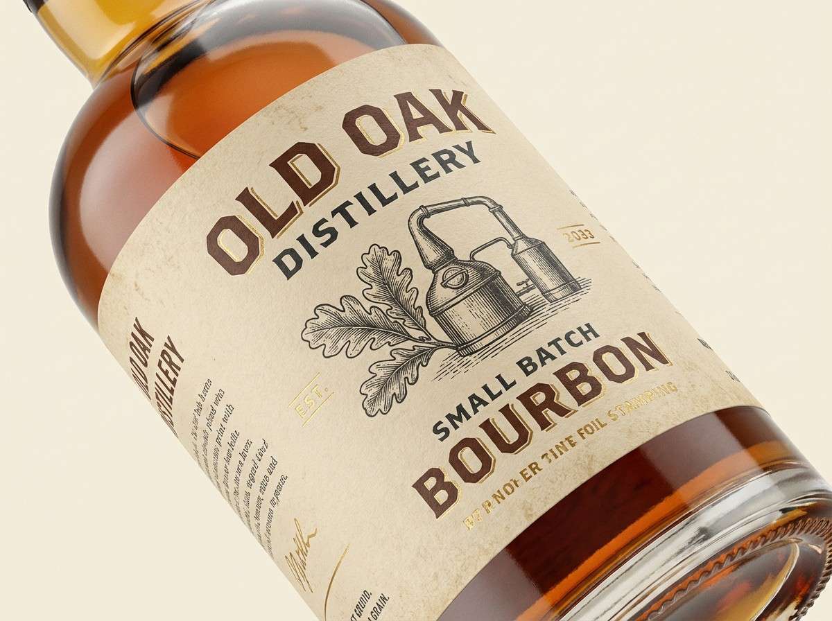
21) Pilgrim Ochre
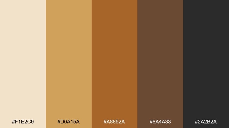
HEX: #F1E2C9 #D0A15A #A8652A #6A4A33 #2A2B2A
Mood: humble, weathered, timeless
Best for: craft spirits labels and vintage signage
Ochre and toasted browns suggest sun-worn roads, leather bindings, and pigment dust. Use the cream as your base, then layer amber and brown for label bands, badges, and type hierarchy. The near-black is best for fine detail and legibility on small packaging. Tip: try a slightly distressed print finish to match the palette's lived-in character.
Image example of pilgrim ochre generated using media.io
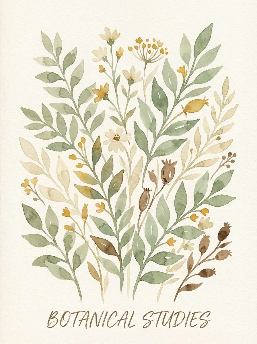
22) Fresco Garden
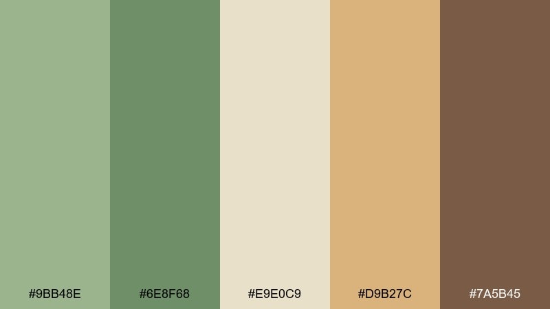
HEX: #9BB48E #6E8F68 #E9E0C9 #D9B27C #7A5B45
Mood: fresh, pastoral, gentle
Best for: spring botanical prints and wall art
Herbal greens and sandy neutrals feel like a garden study painted on old plaster. Use this set for botanical wall prints, journal covers, and seasonal marketing where softness matters. Pair the light cream with airy linework, then let the deeper green carry focal leaves and stems. Tip: keep the tan as a warm highlight rather than a large fill to preserve the springlike freshness.
Image example of fresco garden generated using media.io
What Colors Go Well with Renaissance Art?
Renaissance art palettes pair especially well with parchment whites, warm creams, and stone grays because those neutrals mimic canvas, plaster, and gallery light. They also help richer pigments (lapis, crimson, umber) stay crisp instead of heavy.
For accents, antique gold and muted brass are natural companions—use them as thin rules, icons, or foil-like highlights. If you need a modern counterbalance, add a restrained slate or steel blue rather than a bright cyan.
To keep the look contemporary, rely on value contrast: one deep anchor (near-black, espresso, navy), one mid-tone earth, and one light ground. That structure is what makes “old master” color feel premium in today’s layouts.
How to Use a Renaissance Art Color Palette in Real Designs
Start with a dominant “ground” color (parchment, cream, stone) and reserve saturated hues like lapis or crimson for focal points—product names, hero titles, or key shapes. This prevents the palette from turning muddy.
In branding, choose one dark anchor for typography and system elements, then introduce gold as a micro-accent for separators, badges, and premium cues. In posters, let warm earth tones fill large areas while a cool blue handles hierarchy and readability.
For digital UI, test contrast early: many renaissance-inspired mid-tones look gorgeous but may need a slightly darker text color to meet accessibility. Subtle texture (paper grain, print noise) can add authenticity without overpowering content.
Create Renaissance Art Palette Visuals with AI
If you want more than swatches—like packaging mockups, poster concepts, or UI screens—generate palette-matched images using AI prompts. This makes it easy to explore multiple styles while keeping a consistent renaissance art color scheme.
In Media.io, paste a prompt (like the examples above), specify your aspect ratio, then iterate by adjusting lighting (candlelit vs. daylight), texture (paper vs. velvet), and composition (minimal vs. ornate). You can quickly build a cohesive moodboard for clients or campaigns.
Once you find a direction, reuse the same palette and prompt structure across assets to keep color harmony consistent from social posts to landing pages.
Renaissance Art Color Palette FAQs
-
What are typical Renaissance art colors?
Common Renaissance art colors include warm ochres and siennas, umber browns, parchment-like creams, lapis lazuli blues, muted greens, and antique gold accents that echo gilding and aged varnish. -
How do I keep a Renaissance palette from looking “too vintage”?
Use a clean layout with generous whitespace, limit ornament, and lean on value contrast (light ground + dark type). Keep gold and rich reds as small accents instead of large fills. -
Which Renaissance colors work best for modern branding?
Start with a parchment/cream base, pair it with a deep navy or espresso for typography, then add one signature accent like lapis blue, terracotta, or antique gold for recognizable brand cues. -
What’s a good substitute for metallic gold in digital design?
Use a muted gold HEX (like #C9A24A or #B9922A) and simulate “metal” through gradients, subtle highlights, or sparing use on icons and dividers rather than trying to make large flat gold panels. -
Do Renaissance palettes work for UI and dashboards?
Yes—stone neutrals and warm off-whites reduce glare and feel premium. Just verify contrast for text and controls, and reserve saturated hues for states like highlights, badges, or key metrics. -
How many colors should I use from a Renaissance palette?
A practical approach is 3–5: one light background, one dark text/anchor, one mid-tone earth for surfaces, and one accent (blue, red, or gold) for emphasis. Using all five is fine if you assign clear roles. -
Can I generate Renaissance-style palette images from text prompts?
Yes. With Media.io Text to Image, you can describe the design (poster, packaging, UI), specify dominant HEX colors, and iterate quickly until the visuals match the renaissance tone you want.
Next: Bubbles Color Palette


