

Bubbles color palettes capture that clean, airy feeling you get from soap film and soft reflections—perfect when you want designs to feel light, modern, and friendly.
Below are 20+ bubbles color palette ideas with HEX codes for UI, branding, posters, and packaging, plus AI image prompts you can reuse to visualize each look fast.
In this article
- Why Bubbles Palettes Work So Well
-
- soapfilm pastels
- aquatic whisper
- cotton candy foam
- minty effervescence
- pearl lilac mist
- skyglass shine
- citrus fizz
- rosewater bubbles
- seaglass pop
- icy opal
- lagoon spritz
- sherbet cloud
- prismatic neutral
- clean spa glow
- playroom pop
- aurora suds
- frosted lemonade
- bubblegum neon
- velvet seafoam
- morning rinse
- crystal pop
- What Colors Go Well with Bubbles?
- How to Use a Bubbles Color Palette in Real Designs
- Create Bubbles Palette Visuals with AI
Why Bubbles Palettes Work So Well
Bubbles palettes feel “clean by default” because they lean on high-value tints (light pastels, near-whites, and cool highlights) that read as fresh on screens and in print.
They also mimic real iridescence: gentle hue shifts between blue, lilac, mint, and blush create depth without heavy contrast, making layouts feel spacious and modern.
Most importantly, bubbles tones play nicely with strong typography. Add one deep neutral for text and you get a soft UI or brand system that stays crisp and accessible.
20+ Bubbles Color Palette Ideas (with HEX Codes)
1) Soapfilm Pastels
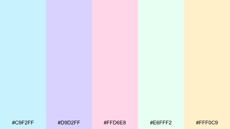
HEX: #c9f2ff #d9d2ff #ffd6e8 #e6fff2 #fff0c9
Mood: airy, iridescent, soothing
Best for: skincare brand landing page UI
Airy and iridescent, these pastels feel like sunlight catching a thin film of foam. This bubbles color palette shines in skincare UI where you want softness without losing clarity. Pair it with lots of white space and a single dark slate for type to keep contrast accessible. Usage tip: use #c9f2ff as the main background and reserve #ffd6e8 for small call-to-action highlights.
Image example of soapfilm pastels generated using media.io
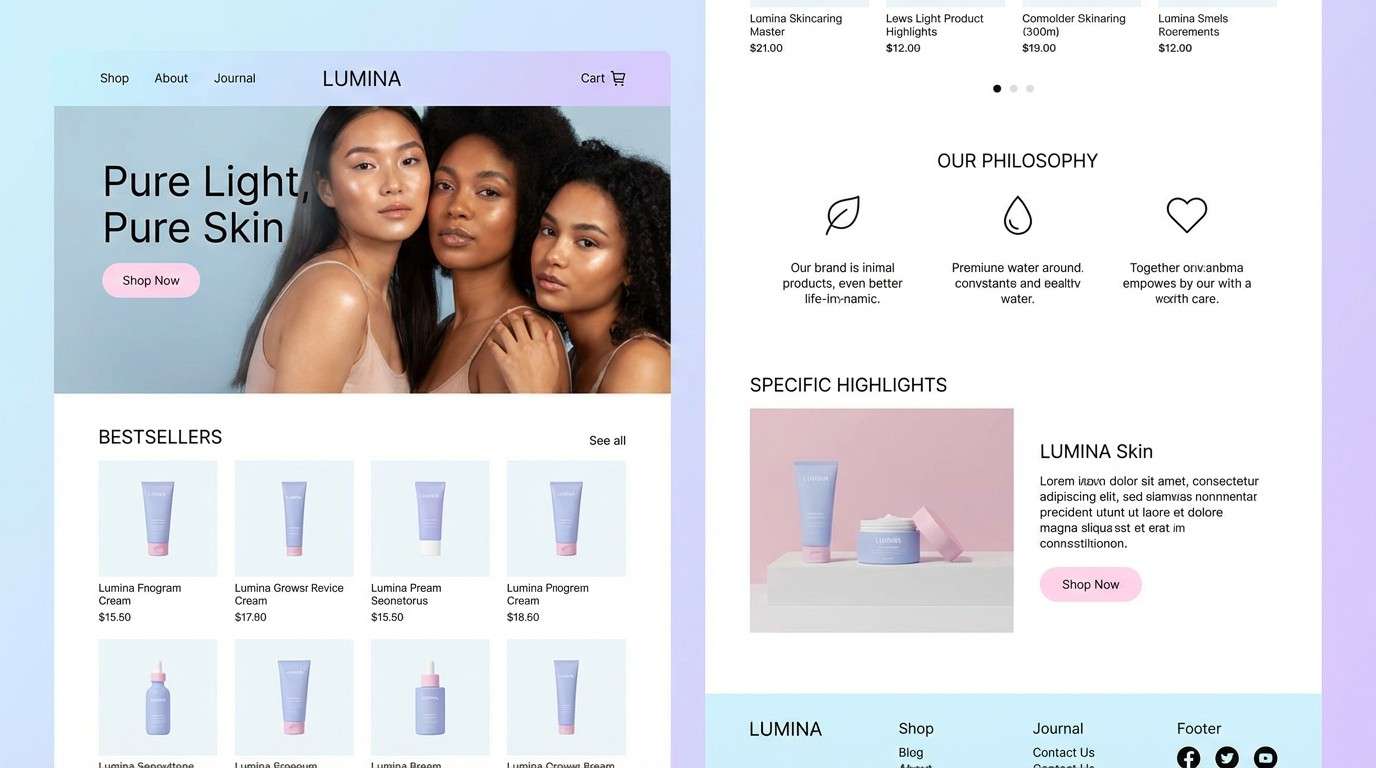
Media.io is an online AI studio for creating and editing video, image, and audio in your browser.

2) Aquatic Whisper
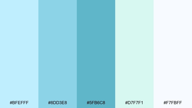
HEX: #bfefff #8dd3e8 #5fb6c8 #d7f7f1 #f7fbff
Mood: fresh, clean, coastal
Best for: wellness app dashboard UI
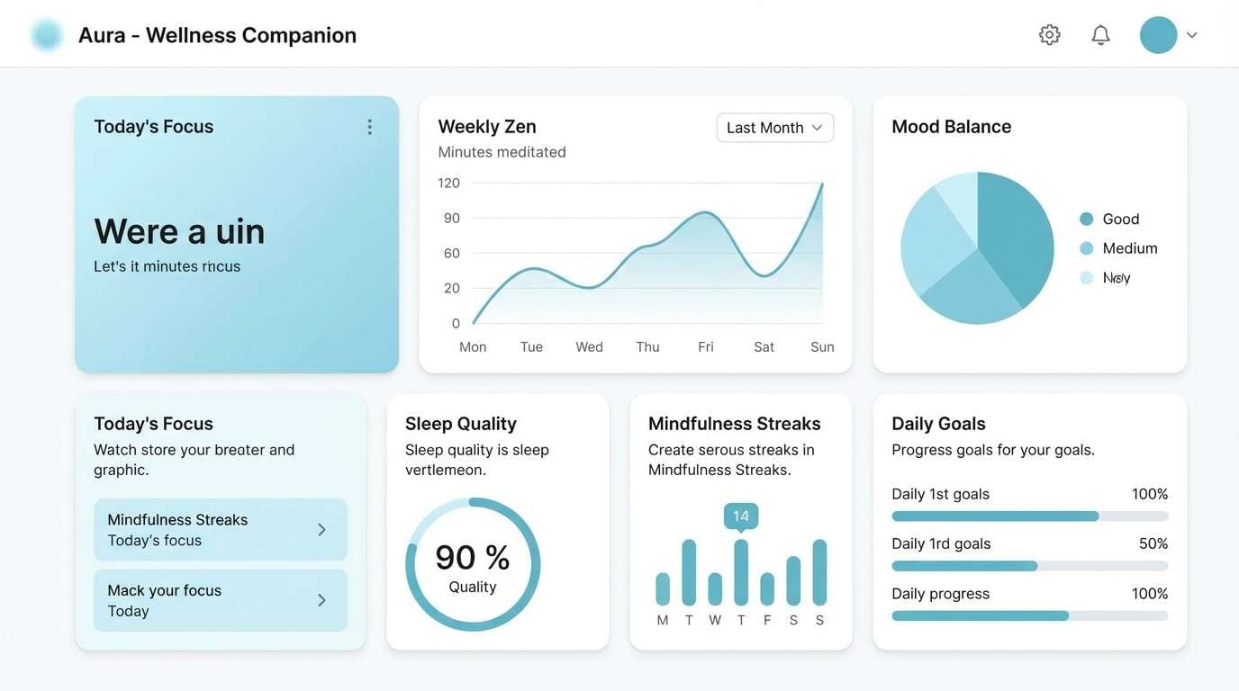
Fresh and coastal, these tones evoke a quiet pool surface and cool morning air. They work beautifully for wellness dashboards where calm readability matters. Balance the watery hues with crisp white panels and a deep teal for headings. Usage tip: keep charts mostly #8dd3e8 and #5fb6c8, and use #d7f7f1 as a subtle fill to reduce visual noise.
Image example of aquatic whisper generated using media.io
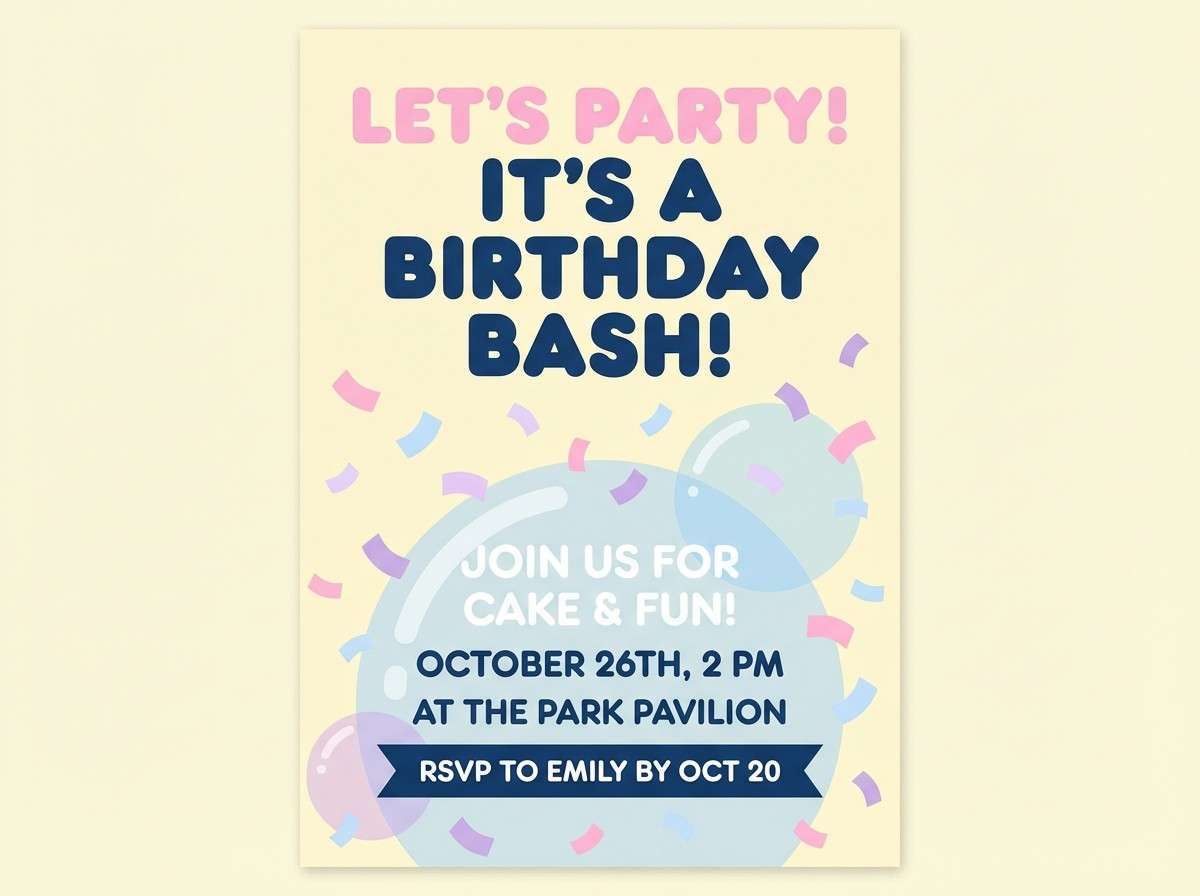
3) Cotton Candy Foam
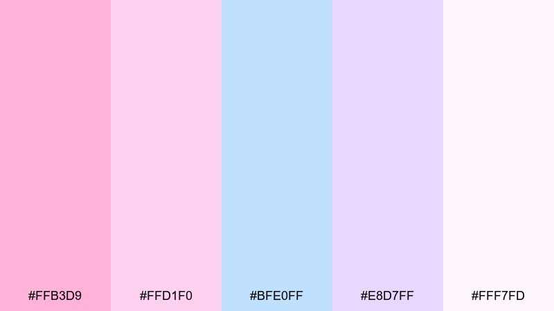
HEX: #ffb3d9 #ffd1f0 #bfe0ff #e8d7ff #fff7fd
Mood: playful, sweet, dreamy
Best for: birthday invitation flyer
Playful and dreamy, these pinks and light blues feel like spun sugar drifting through foam. They are a natural fit for birthday invitations, kids events, and cheerful social posts. Pair with a warm navy or charcoal text to keep the sweetness from getting washed out. Usage tip: choose one dominant pastel for the background and keep the other hues for confetti shapes and headlines.
Image example of cotton candy foam generated using media.io
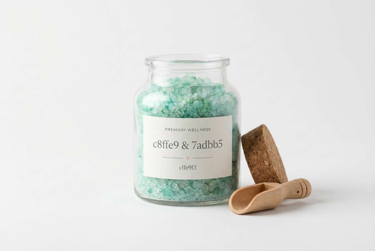
4) Minty Effervescence
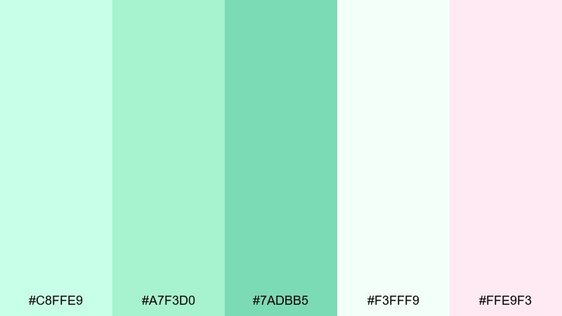
HEX: #c8ffe9 #a7f3d0 #7adbb5 #f3fff9 #ffe9f3
Mood: uplifting, spa-like, light
Best for: product packaging for bath salts
Uplifting and spa-like, these mints and soft blush notes suggest a clean fizz in a glass. They suit bath-salt packaging and personal care labels where freshness is the promise. Pair with matte white containers and minimalist black typography for a modern apothecary look. Usage tip: print #7adbb5 as the hero band color and use #c8ffe9 for secondary panels to keep the label airy.
Image example of minty effervescence generated using media.io
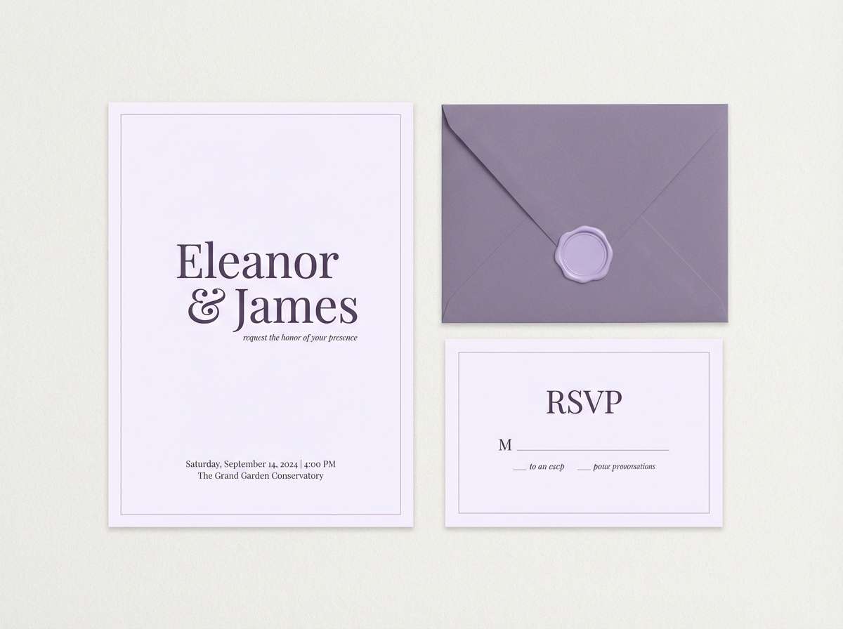
5) Pearl Lilac Mist
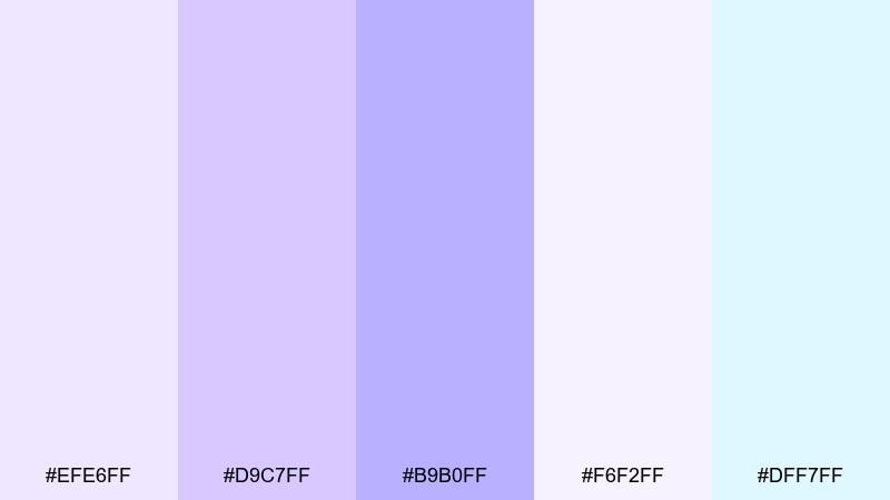
HEX: #efe6ff #d9c7ff #b9b0ff #f6f2ff #dff7ff
Mood: romantic, soft, luminous
Best for: wedding stationery set
Romantic and luminous, lilac mist and pearl whites create a gentle, floating mood. These hues feel refined on wedding stationery, menus, and vow cards. Pair with warm gray ink and small metallic details to elevate the softness. Usage tip: use #f6f2ff for paper-like backgrounds and reserve #b9b0ff for monograms or section dividers.
Image example of pearl lilac mist generated using media.io
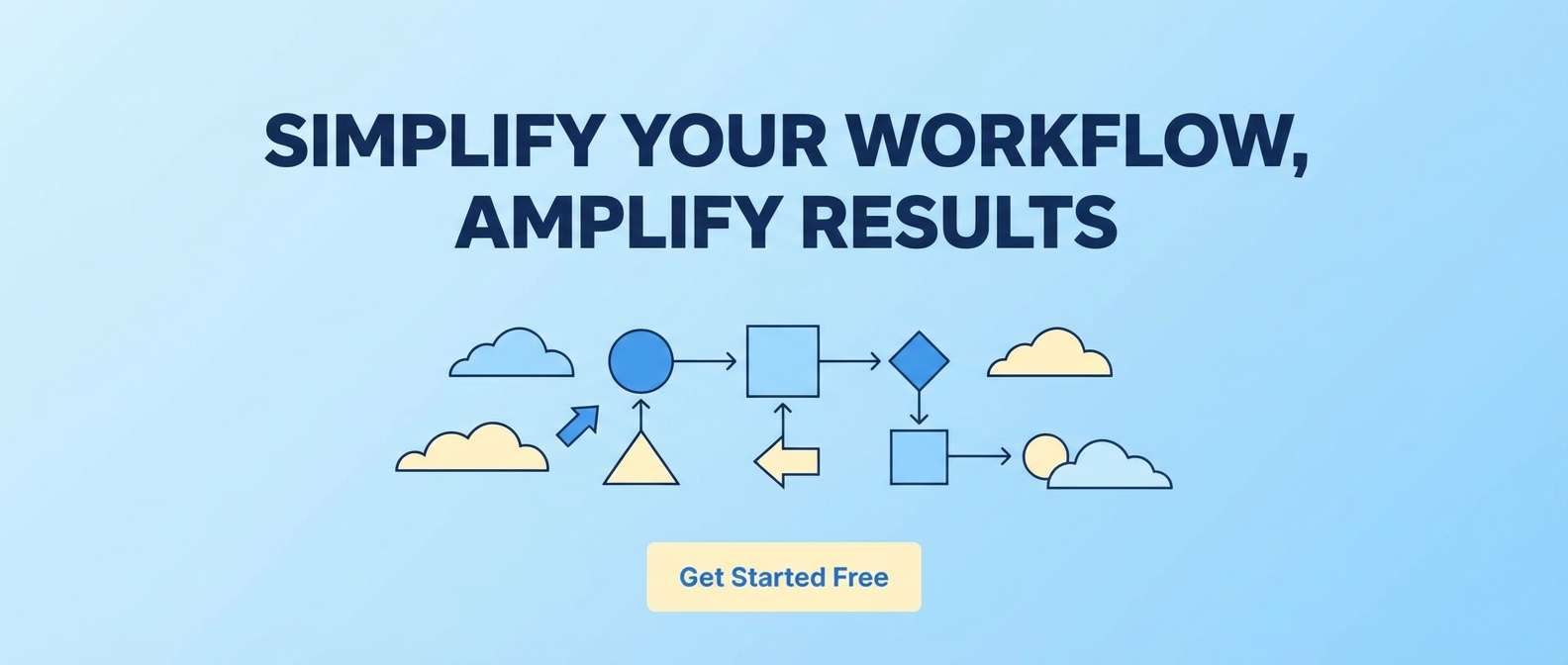
6) Skyglass Shine
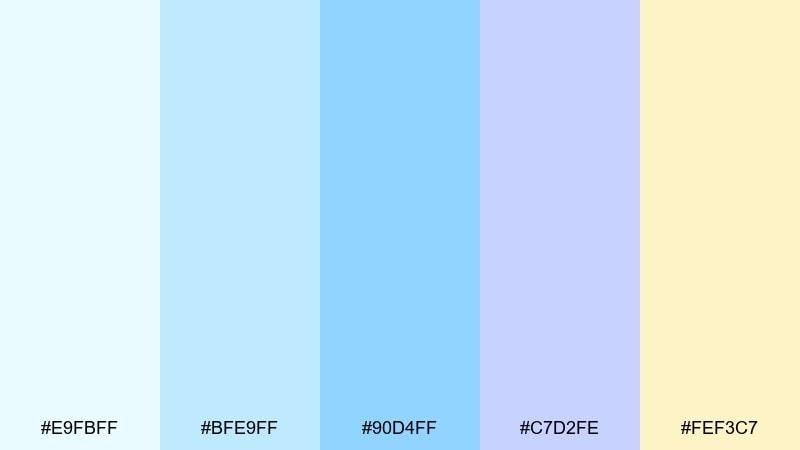
HEX: #e9fbff #bfe9ff #90d4ff #c7d2fe #fef3c7
Mood: bright, modern, optimistic
Best for: SaaS hero banner and CTA
Bright and optimistic, these sky-tinted tones feel like glossy glass and open space. The bubbles color combinations here are great for SaaS hero banners where you want a friendly, modern lift. Pair with deep navy text and a single high-contrast button color to guide the eye. Usage tip: keep gradients subtle by blending #bfe9ff into #e9fbff, then use #fef3c7 as a warm CTA halo.
Image example of skyglass shine generated using media.io
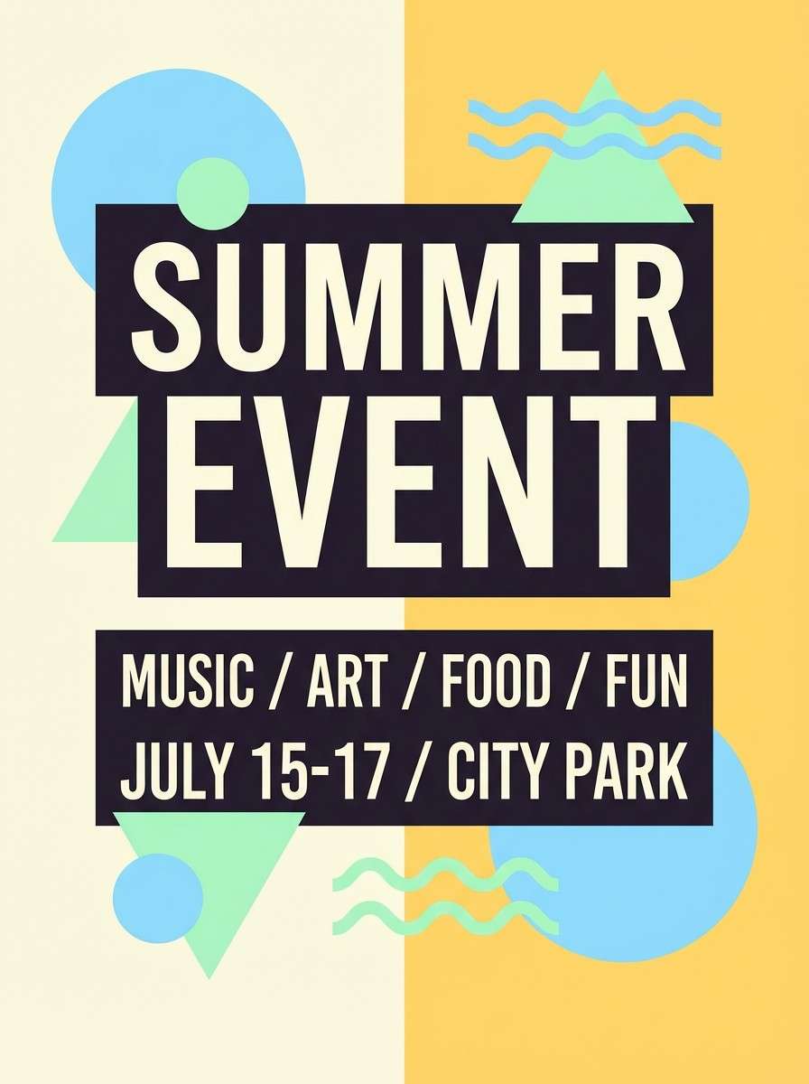
7) Citrus Fizz
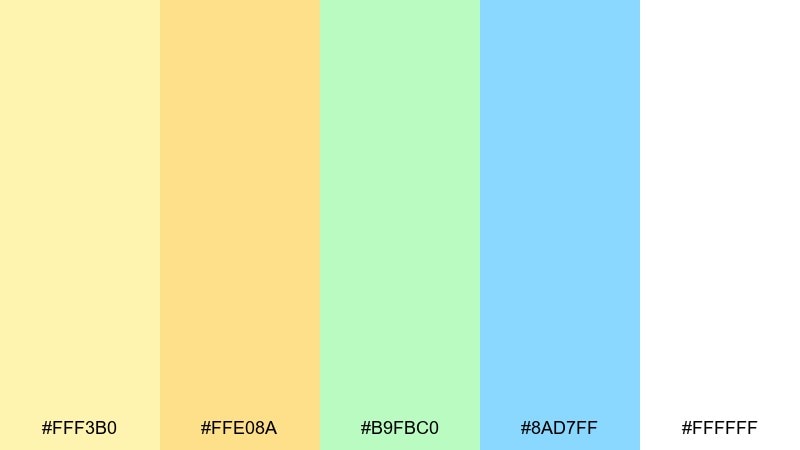
HEX: #fff3b0 #ffe08a #b9fbc0 #8ad7ff #ffffff
Mood: zesty, energetic, clean
Best for: summer event poster
Zesty and sunlit, this mix feels like a sparkling lemonade with a cool splash. It works for summer posters and upbeat announcements that need instant cheer. Pair with bold black type and simple shapes to keep the palette crisp rather than sugary. Usage tip: let #fff3b0 dominate the background and use #8ad7ff for punchy graphic circles or wave accents.
Image example of citrus fizz generated using media.io
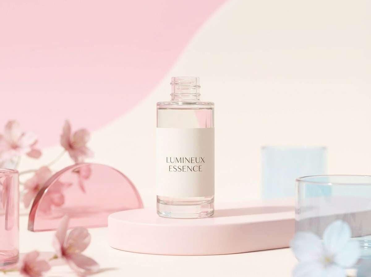
8) Rosewater Bubbles
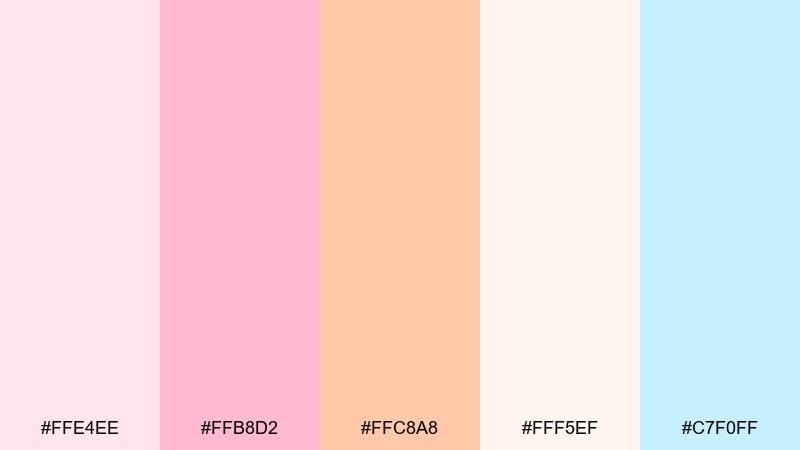
HEX: #ffe4ee #ffb8d2 #ffc8a8 #fff5ef #c7f0ff
Mood: tender, romantic, fresh
Best for: beauty product ad creative
Tender rosewater tones with a cool blue lift evoke dewy petals and airy foam. They are ideal for beauty ad creatives where softness should still feel clean and premium. Pair with a light serif headline and minimal line art to add sophistication. Usage tip: keep the product area neutral with #fff5ef and use #ffb8d2 for the main attention cue.
Image example of rosewater bubbles generated using media.io
9) Seaglass Pop
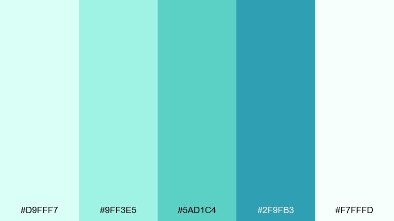
HEX: #d9fff7 #9ff3e5 #5ad1c4 #2f9fb3 #f7fffd
Mood: refreshing, breezy, coastal
Best for: eco brand logo and identity
Refreshing seaglass greens and ocean teals create a breezy, coastal mood. This set fits eco identities that want to feel optimistic rather than earthy and heavy. Pair with off-white stationery and a simple geometric mark for a clean, modern system. Usage tip: choose #2f9fb3 as the anchor brand color and keep #d9fff7 for background fields and patterns.
Image example of seaglass pop generated using media.io
10) Icy Opal
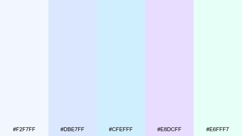
HEX: #f2f7ff #dbe7ff #cfefff #e8dcff #e6fff7
Mood: cool, delicate, modern
Best for: tech keynote slide deck
Cool and delicate, these opal tints feel like frosted glass and gentle light refraction. They read well on keynote slides where you want a modern, airy stage for content. Pair with charcoal text and thin-line icons to keep everything sharp. Usage tip: use #f2f7ff for most slide backgrounds and apply #e8dcff only for section breaks or pull quotes.
Image example of icy opal generated using media.io
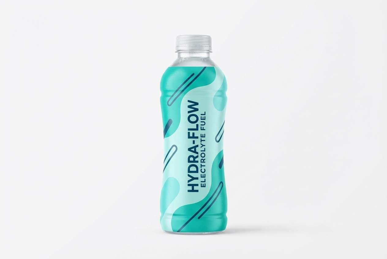
11) Lagoon Spritz
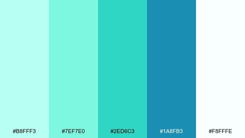
HEX: #b8fff3 #7ef7e0 #2ed6c3 #1a8fb3 #f8fffe
Mood: lively, aquatic, confident
Best for: sports drink packaging concept
Lively lagoon tones with a deeper blue anchor bring a confident, aquatic energy. They are great for sports drink packaging that needs to feel refreshing and active. Pair with bold condensed type and plenty of negative space so the bright greens stay clean. Usage tip: make #2ed6c3 the hero label color and use #1a8fb3 sparingly for contrast bands and nutrition callouts.
Image example of lagoon spritz generated using media.io
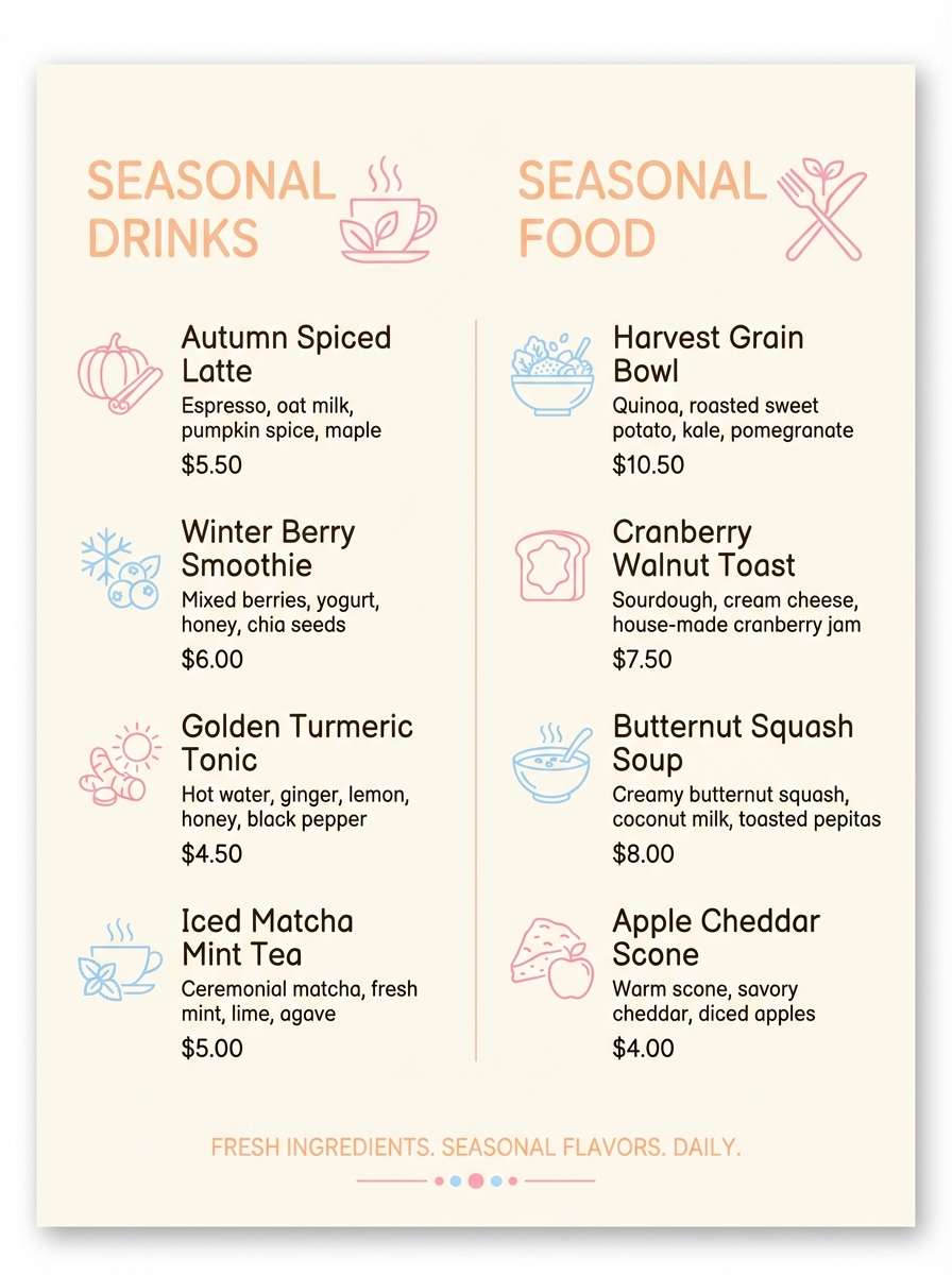
12) Sherbet Cloud
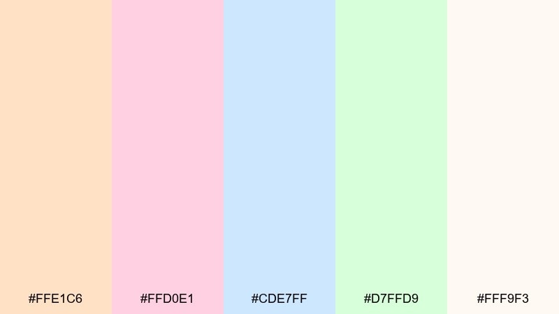
HEX: #ffe1c6 #ffd0e1 #cde7ff #d7ffd9 #fff9f3
Mood: soft, cozy, cheerful
Best for: cafe seasonal menu design
Soft sherbet hues create a cozy, cheerful cloud of color that feels welcoming and light. This set is lovely for cafe menus, bakery promos, and seasonal specials. Pair with warm brown typography and simple food icons for a friendly, handcrafted vibe. Usage tip: keep #fff9f3 as the main canvas and use #ffe1c6 for section headers to guide scanning.
Image example of sherbet cloud generated using media.io
13) Prismatic Neutral
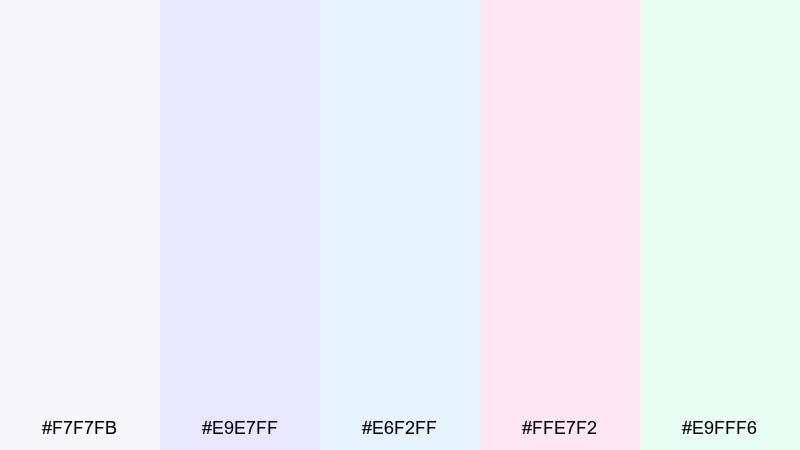
HEX: #f7f7fb #e9e7ff #e6f2ff #ffe7f2 #e9fff6
Mood: minimal, polished, airy
Best for: editorial magazine layout
Minimal and polished, these near-neutrals carry a prismatic hint like bubbles on a bright countertop. This bubbles color palette is perfect for editorial layouts that need calm pages with subtle personality. Pair with black body text and a single accent rule line to keep the spread crisp. Usage tip: print #f7f7fb as your page base and use #ffe7f2 only for pull-quote boxes or captions.
Image example of prismatic neutral generated using media.io
14) Clean Spa Glow
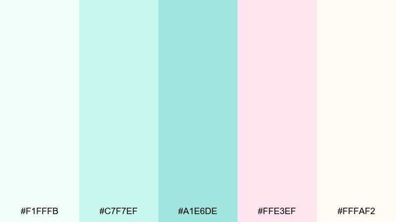
HEX: #f1fffb #c7f7ef #a1e6de #ffe3ef #fffaf2
Mood: calm, hygienic, comforting
Best for: clinic brochure design
Calm and hygienic, these spa-like greens with a blush touch feel reassuring and well cared for. They work for clinic brochures and service one-pagers where trust and clarity come first. Pair with a straightforward sans serif and clear iconography to support readability. Usage tip: keep #fffaf2 for large background areas and use #a1e6de for section tabs and bullet markers.
Image example of clean spa glow generated using media.io
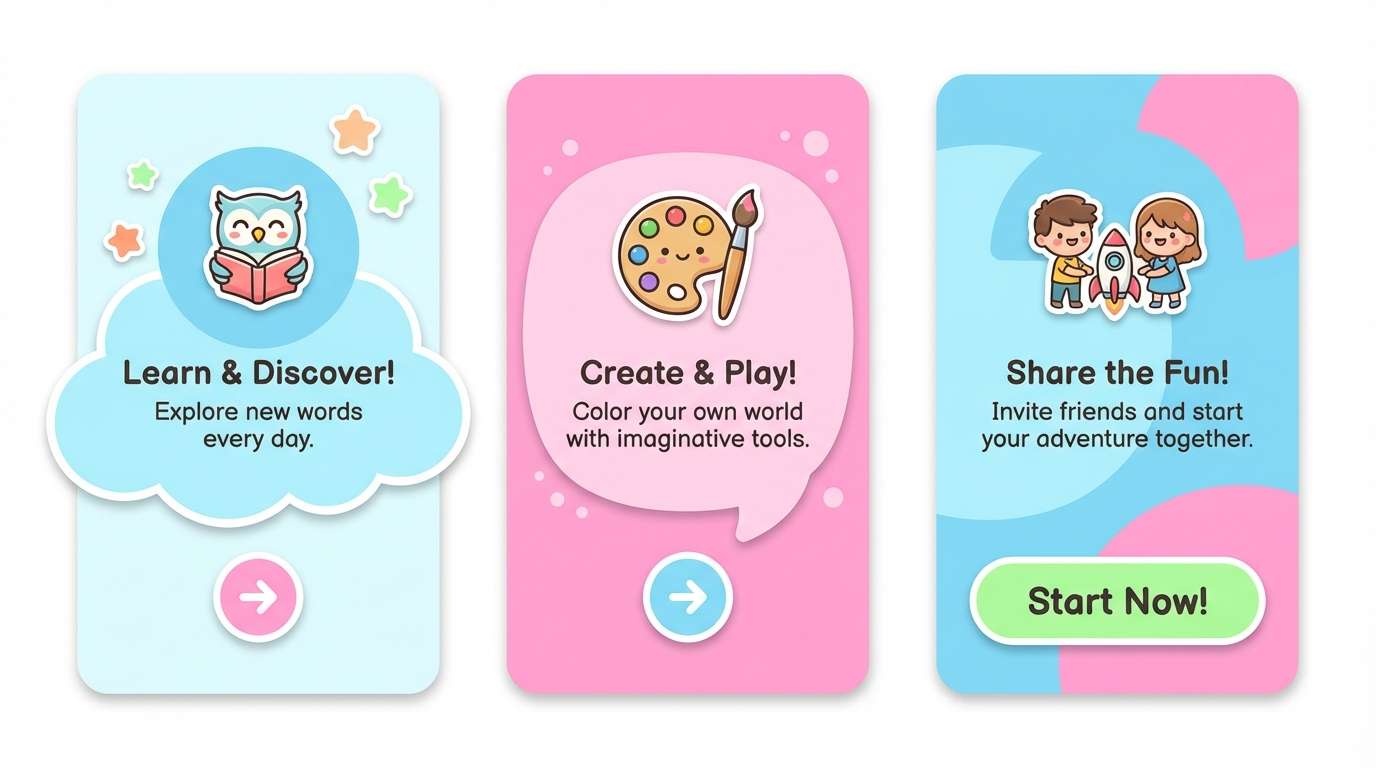
15) Playroom Pop
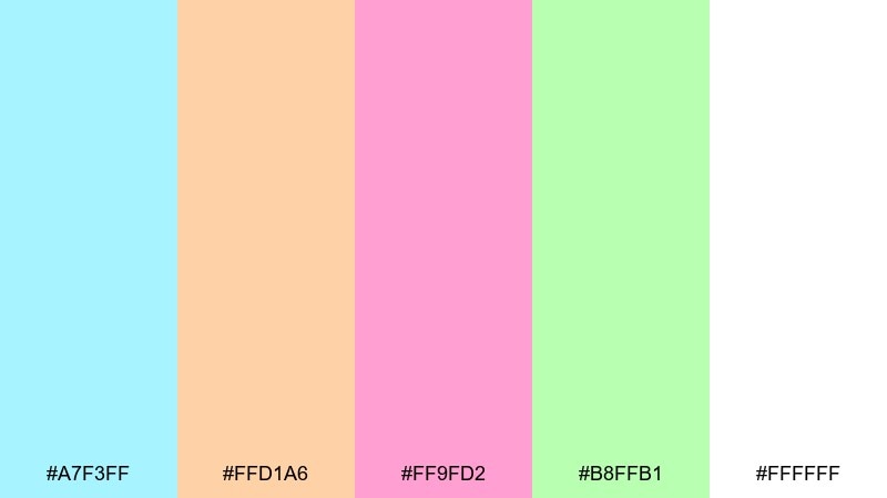
HEX: #a7f3ff #ffd1a6 #ff9fd2 #b8ffb1 #ffffff
Mood: fun, bold, friendly
Best for: kids app onboarding screens
Fun and friendly, these bright pops feel like toy blocks floating in sudsy water. They are a strong choice for kids onboarding screens where color helps guide attention. Pair with rounded shapes and generous spacing so the high-saturation accents do not overwhelm. Usage tip: pick one dominant color per screen and keep the other hues for progress dots and playful illustrations.
Image example of playroom pop generated using media.io
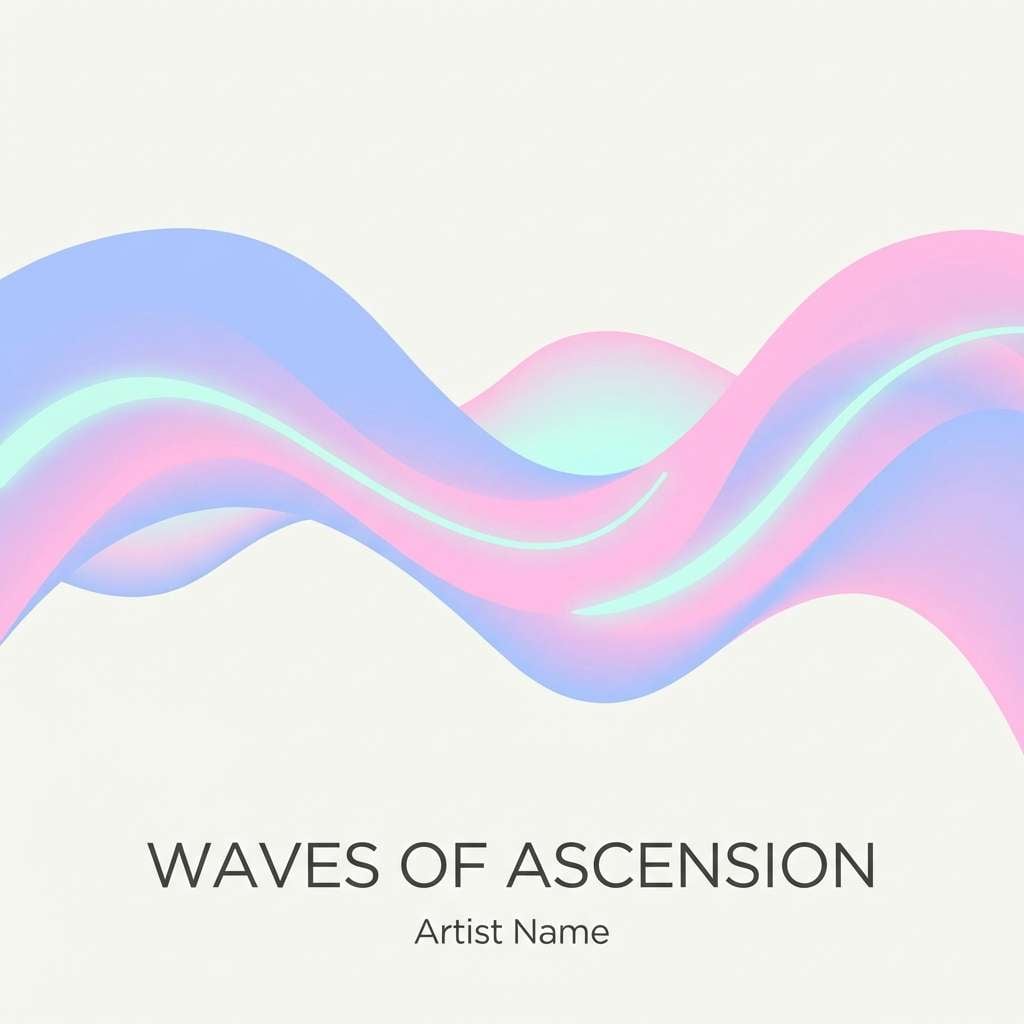
16) Aurora Suds
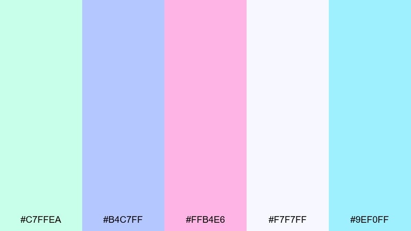
HEX: #c7ffea #b4c7ff #ffb4e6 #f7f7ff #9ef0ff
Mood: dreamy, futuristic, light
Best for: music playlist cover art
Dreamy and futuristic, these aurora tones feel like soft light waves moving through foam. They work well for playlist covers and digital art where you want a gentle neon without harsh contrast. Pair with simple typography and one strong focal shape for the cleanest look. Usage tip: set #f7f7ff as the base and layer translucent gradients between #b4c7ff and #ffb4e6.
Image example of aurora suds generated using media.io
17) Frosted Lemonade
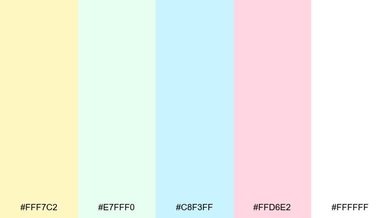
HEX: #fff7c2 #e7fff0 #c8f3ff #ffd6e2 #ffffff
Mood: light, upbeat, refreshing
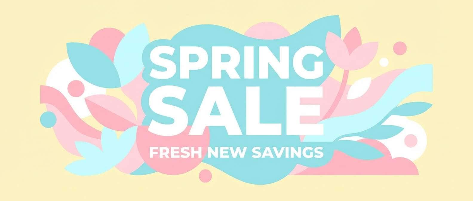
Best for: spring sale email header
Light and upbeat, these tones evoke a frosted lemonade with a pastel sparkle. They fit spring sale headers and promotional banners that need to feel friendly and clean. Pair with dark gray text and simple product cutouts to avoid a washed-out look. Usage tip: use #fff7c2 as the main glow color and keep #c8f3ff for supporting shapes behind key pricing.
Image example of frosted lemonade generated using media.io
18) Bubblegum Neon
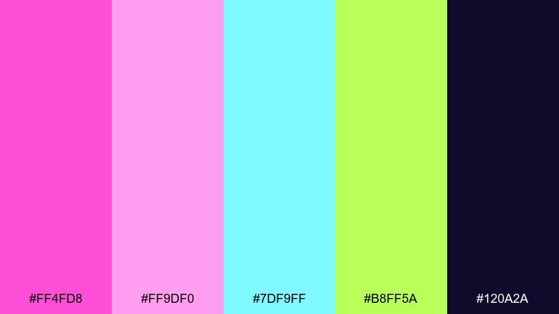
HEX: #ff4fd8 #ff9df0 #7df9ff #b8ff5a #120a2a
Mood: bold, electric, nightlife
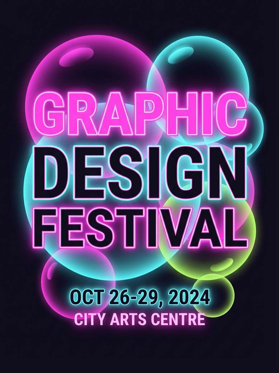
Best for: festival poster design
Bold and electric, this set looks like neon reflections bouncing off glossy bubbles at night. It is made for festival posters, club flyers, and high-energy announcements. Pair with a deep background like #120a2a to keep the neons controlled and readable. Usage tip: limit neon use to headlines and key details, then let negative space carry the rest of the layout.
Image example of bubblegum neon generated using media.io
19) Velvet Seafoam
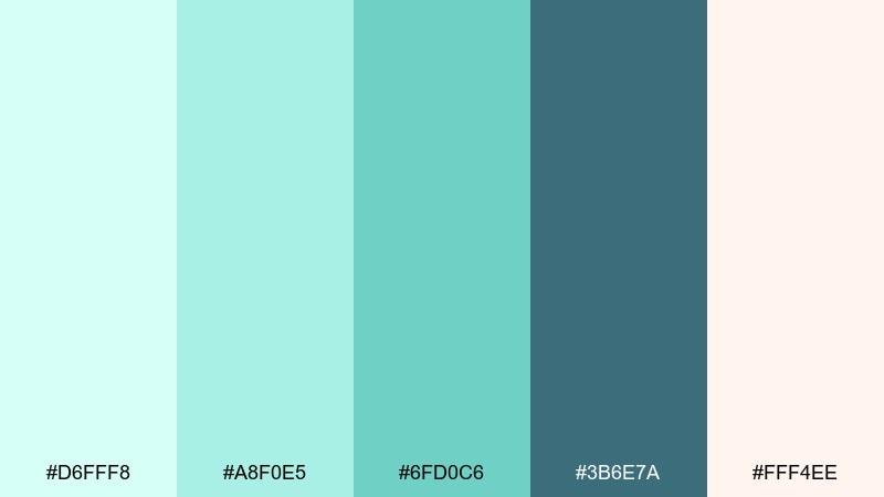
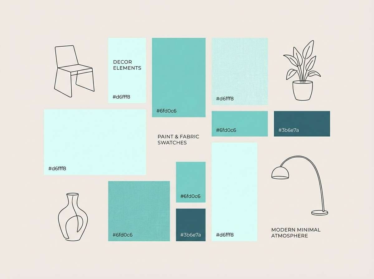
HEX: #d6fff8 #a8f0e5 #6fd0c6 #3b6e7a #fff4ee
Mood: relaxed, mature, coastal
Best for: interior design moodboard
Relaxed and mature, seafoam greens with a velvety blue-gray feel like a calm seaside room. This mix works for interior moodboards, hospitality branding, and lifestyle visuals. Pair with natural textures and warm off-white to keep the palette grounded. Usage tip: use #3b6e7a as the anchor for titles and outlines, and let #d6fff8 carry large airy areas.
Image example of velvet seafoam generated using media.io
20) Morning Rinse
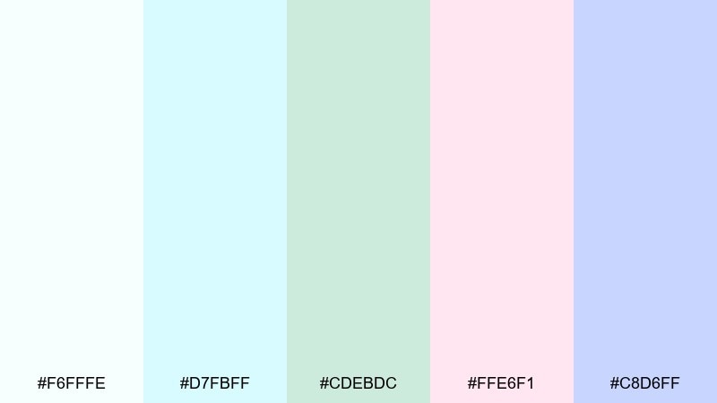
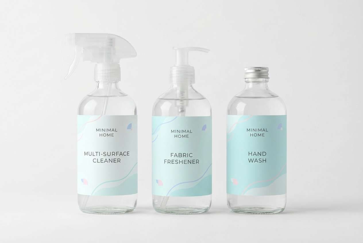
HEX: #f6fffe #d7fbff #cdebdc #ffe6f1 #c8d6ff
Mood: gentle, everyday, tidy
Best for: household product label set
Gentle and tidy, these tones feel like a bright bathroom and a quiet morning routine. They suit household label sets where cleanliness should look friendly, not clinical. Pair with simple icons and consistent spacing across variants to build recognition on shelves. Usage tip: assign one accent per scent or formula and keep #f6fffe as the shared base for a cohesive line.
Image example of morning rinse generated using media.io
21) Crystal Pop
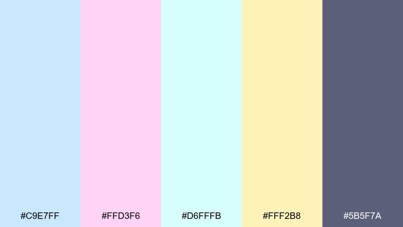
HEX: #c9e7ff #ffd3f6 #d6fffb #fff2b8 #5b5f7a
Mood: sparkly, upbeat, polished
Best for: social media carousel templates
Sparkly and upbeat, these crystal tints feel like bubbles catching confetti light. The bubbles color combinations here help carousel templates stay playful while still looking polished. Pair with a steady neutral like #5b5f7a for text so every slide stays readable. Usage tip: keep backgrounds very light and use #fff2b8 as the recurring highlight color for buttons and labels.
Image example of crystal pop generated using media.io
What Colors Go Well with Bubbles?
Bubbles tones pair best with deep neutrals for contrast—think charcoal, ink navy, or slate—so pastel backgrounds stay readable and buttons feel intentional.
For a more “iridescent” vibe, add one warmer tint (butter yellow or peach) to balance the cool blues, lilacs, and mints.
If you want a premium look, keep the palette mostly near-white and use one accent color sparingly (for CTAs, badges, or dividers).
How to Use a Bubbles Color Palette in Real Designs
In UI, treat bubbles colors as atmosphere: large soft backgrounds, subtle gradients, and lightly tinted cards. Then choose one anchor color for headings and key actions.
In print (packaging, stationery, brochures), keep inks light but structure strong—consistent margins, simple icons, and a clean type system prevent the palette from feeling washed out.
For posters and social templates, let one bright accent (neon pink, aqua, or lemon) handle hierarchy while the rest stays airy and supportive.
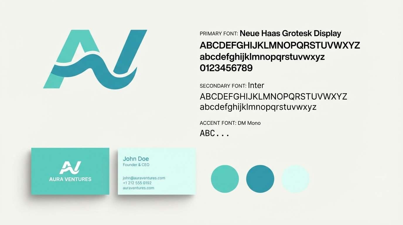
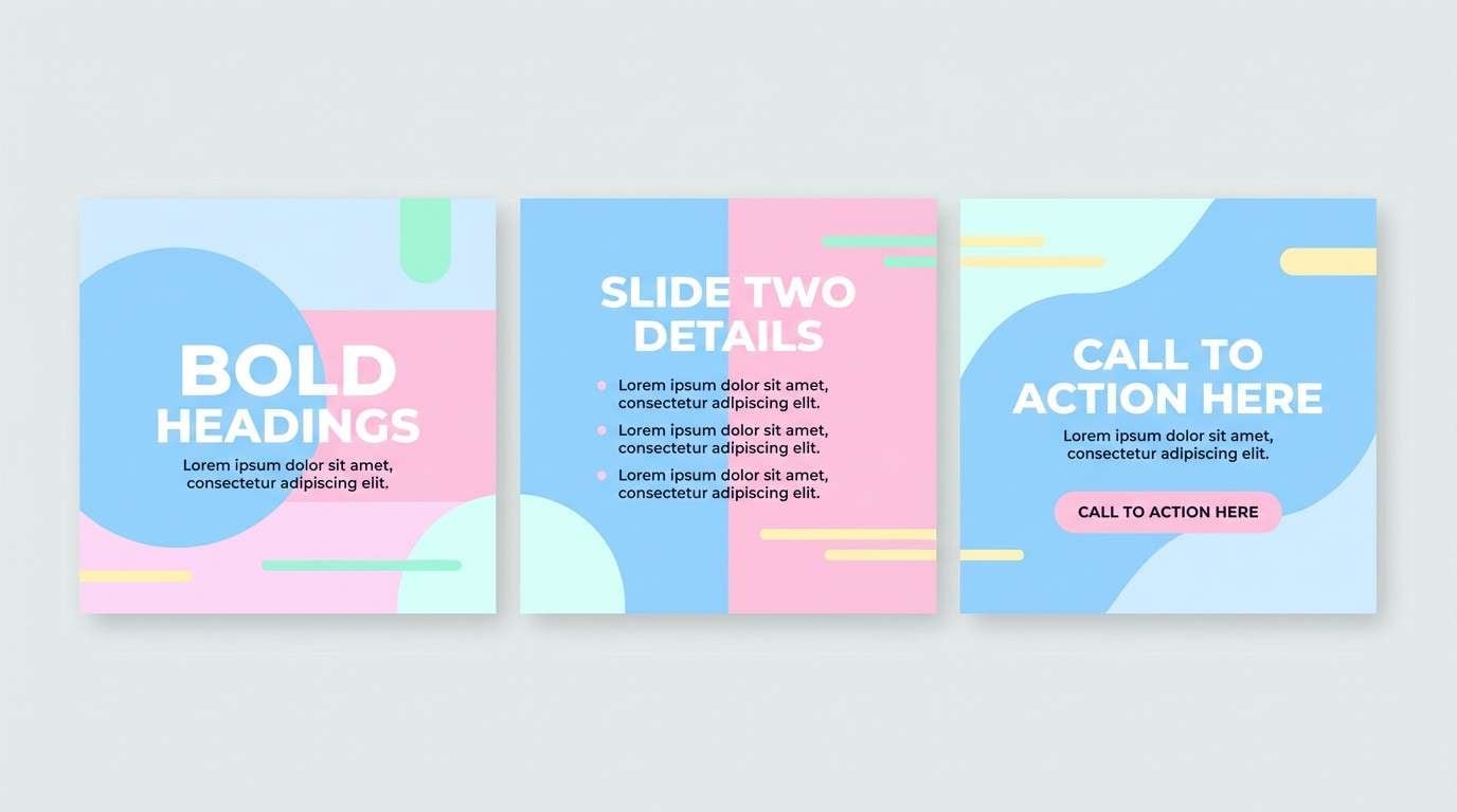
Create Bubbles Palette Visuals with AI
If you want to see how a bubbles color palette behaves in real layouts, generate quick mockups first—hero banners, packaging, menus, or cover art—before committing to production files.
Start with one palette, paste the included prompt, and tweak the subject (brand type, layout, lighting) while keeping the HEX colors consistent for a cohesive look.
With Media.io, you can iterate fast and export visuals for moodboards, client previews, and design direction.
Bubbles Color Palette FAQs
-
What is a bubbles color palette?
A bubbles color palette is a set of light, airy hues inspired by soap foam and iridescent reflections—often pastel blues, lilacs, mints, blush pinks, and near-whites for a clean, floating feel. -
Are bubbles palettes good for UI design?
Yes. Bubbles tones work well for UI because they create calm surfaces and subtle depth. Just add a dark neutral (navy/charcoal) for text and ensure buttons meet contrast needs. -
How do I keep pastel bubbles colors from looking washed out?
Use a clear hierarchy: large light backgrounds, crisp white panels, and one darker anchor color for typography. Reserve the most saturated accent for CTAs and key labels only. -
What fonts pair well with bubbles color schemes?
Clean sans serifs (for modern UI) and light, elegant serifs (for beauty or wedding stationery) both work. The key is strong weight contrast so type stays readable over pale tints. -
Do bubbles palettes print well on packaging?
They can, especially on matte whites and soft-touch finishes. Use a proof to confirm pastel accuracy, and consider slightly increasing saturation for small elements that must stand out on shelf. -
What’s the best “dark anchor” color for bubbles palettes?
Deep navy, slate, or blue-gray are the most natural anchors because they keep the look fresh (not heavy) while providing reliable contrast for headings, outlines, and icons. -
Can I generate bubbles-themed visuals with AI using these HEX codes?
Yes. Use the prompts provided under each palette as a starting point, keep the listed HEX colors in your prompt, and iterate on subject and layout until the mood fits your brand.


