

Red violet sits right between passion and mystery—warm enough to feel human, deep enough to feel premium. It’s a standout choice for branding, UI, and print when you want bold color without the harshness of pure red or neon purple.
Below are red violet color palette ideas with HEX codes, plus real-world use tips and AI prompts you can copy to generate matching visuals in Media.io.
In this article
- Why Red Violet Palettes Work So Well
-
- velvet orchid
- garnet dusk
- rosewood mauve
- neon petal
- plum wine
- berry sorbet
- aubergine noir
- lavender smoke
- cranberry cream
- festival fuchsia
- dusty amaranth
- royal iris
- mulberry slate
- copper violet
- sakura twilight
- indie magenta
- vintage bougainvillea
- midnight dahlia
- clay rose violet
- haze of heliotrope
- amaranth skyline
- violet ember
- What Colors Go Well with Red Violet?
- How to Use a Red Violet Color Palette in Real Designs
- Create Red Violet Palette Visuals with AI
Why Red Violet Palettes Work So Well
Red violet is naturally expressive: it carries the emotional heat of red while keeping the sophistication and depth of purple. That makes it ideal for designs that need both energy and elegance.
It also scales across mediums. In UI, muted red violets feel modern and calm; in print, deeper wine tones look rich on textured paper and premium finishes.
Most importantly, red violet supports strong hierarchy. Dark plum anchors backgrounds and typography, mid magentas draw attention to CTAs, and pale blush/lilac tints keep layouts breathable.
20+ Red Violet Color Palette Ideas (with HEX Codes)
1) Velvet Orchid
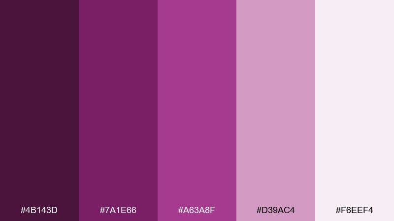
HEX: #4B143D #7A1E66 #A63A8F #D39AC4 #F6EEF4
Mood: lush, romantic, dramatic
Best for: beauty branding and premium packaging
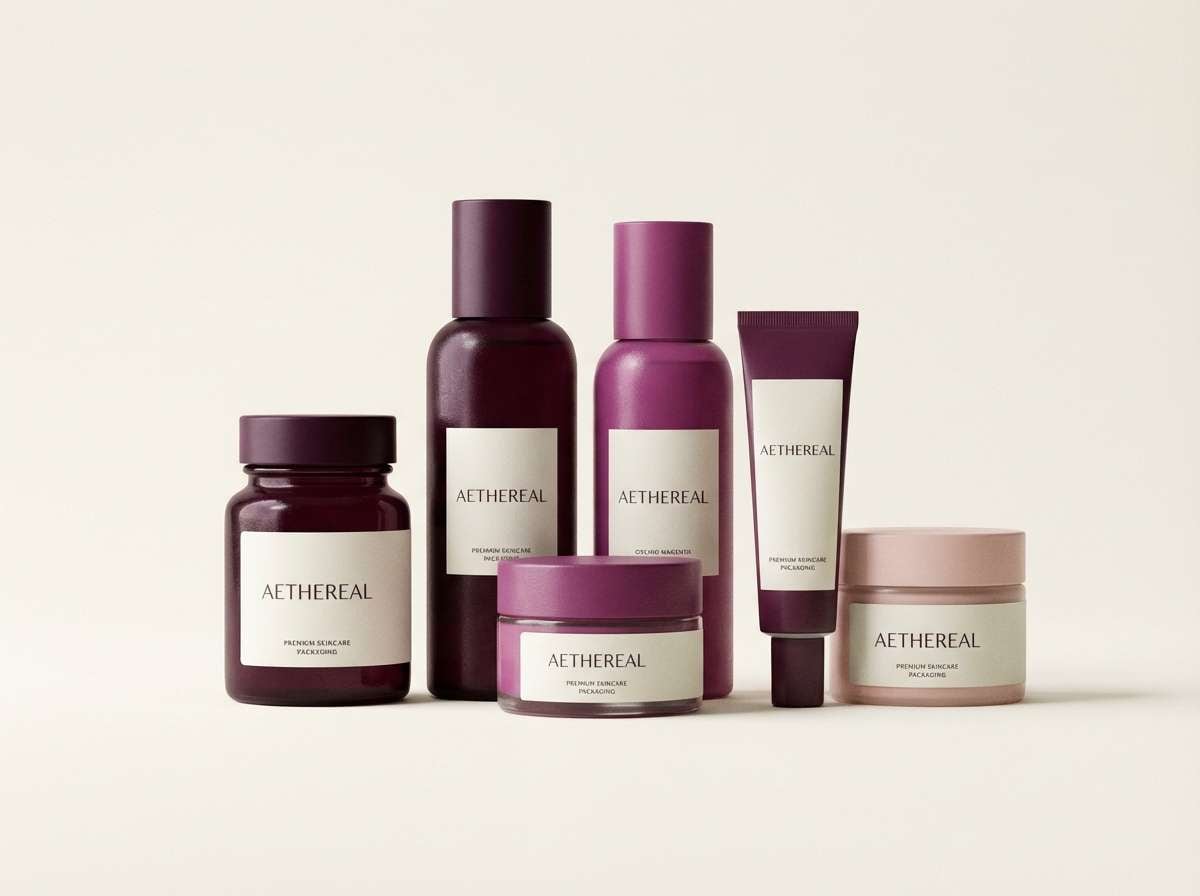
Lush and romantic like velvet petals under low light, these tones feel intimate and high-end. Use the deep wine shades for logos and headers, then let the dusty orchid and blush carry backgrounds and labels. Pair with warm ivory and restrained metallics like soft gold for a boutique look. Tip: keep typography simple and give the darkest shade plenty of breathing room to avoid looking heavy.
Image example of velvet orchid generated using media.io
Media.io is an online AI studio for creating and editing video, image, and audio in your browser.

2) Garnet Dusk
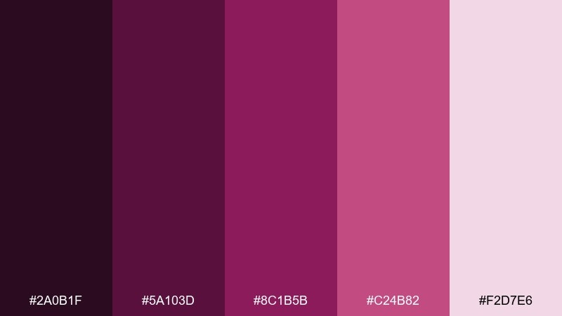
HEX: #2A0B1F #5A103D #8C1B5B #C24B82 #F2D7E6
Mood: moody, nocturnal, bold
Best for: music posters and nightlife event flyers
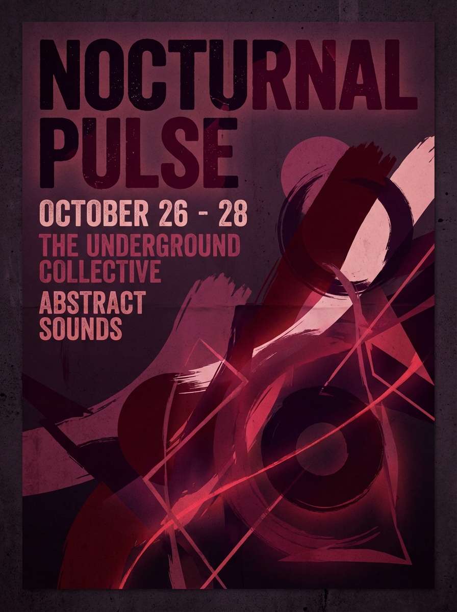
Moody dusk energy comes through with inky shadows and garnet highlights, like city lights after midnight. Let the near-black plum anchor the background, then bring in the garnet and hot berry for titles and key details. A pale rose tint keeps small text readable without breaking the night vibe. Tip: reserve the brightest pink for one focal element so the layout feels intentional, not chaotic.
Image example of garnet dusk generated using media.io
3) Rosewood Mauve
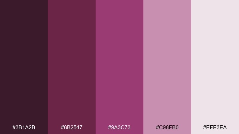
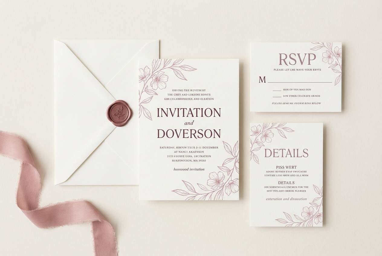
HEX: #3B1A2B #6B2547 #9A3C73 #C98FB0 #EFE3EA
Mood: soft, vintage, elegant
Best for: wedding invitations and stationery suites
Soft and vintage like pressed florals in an old book, these mauves feel elegant without being sweet. This red violet color palette shines on textured paper, using rosewood for headings and the dusty mauve for ornaments and borders. Pair it with cream stock, subtle embossing, and minimal line art to keep everything refined. Tip: keep contrast high for dates and addresses by using the darkest shade for body text.
Image example of rosewood mauve generated using media.io
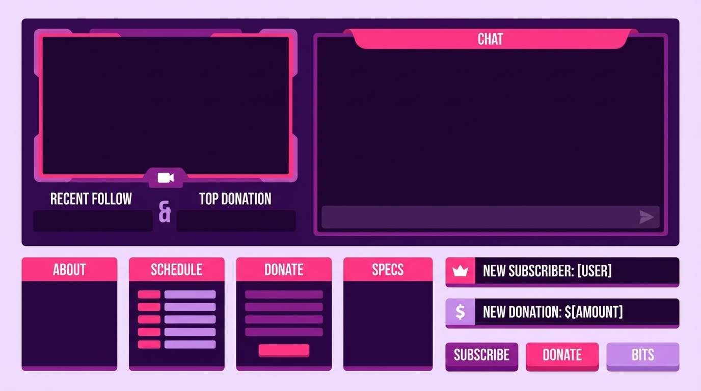
4) Neon Petal
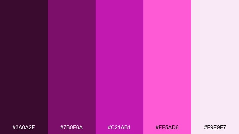
HEX: #3A0A2F #7B0F6A #C21AB1 #FF5AD6 #F9E9F7
Mood: electric, playful, high-energy
Best for: stream overlays and creator channel graphics
Electric and playful like neon signage reflected on glass, this mix is made for attention. Use the saturated magenta and hot pink for alerts, buttons, and highlights, while the deep purple stabilizes the layout. A pale lilac-white keeps panels clean and readable. Tip: limit gradients to one area so the overlay stays sharp on video.
Image example of neon petal generated using media.io
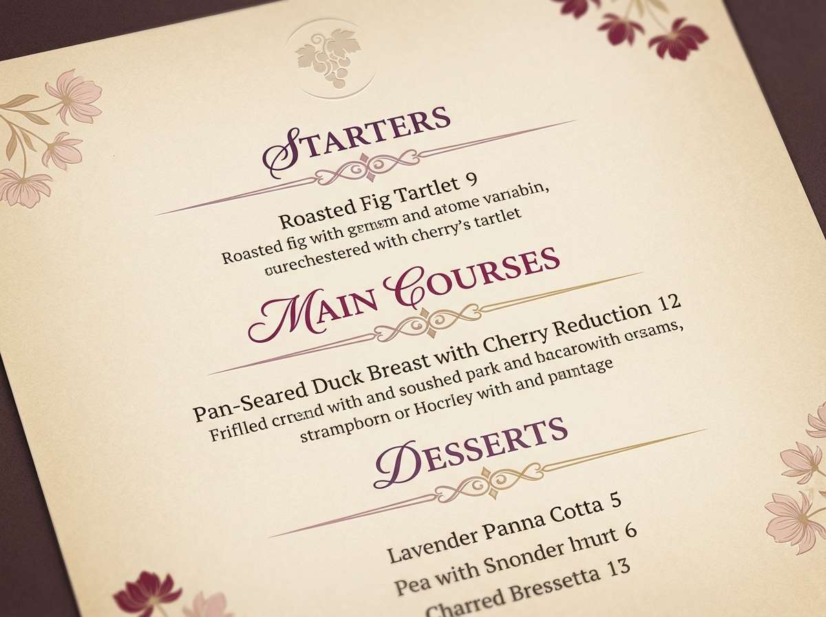
5) Plum Wine
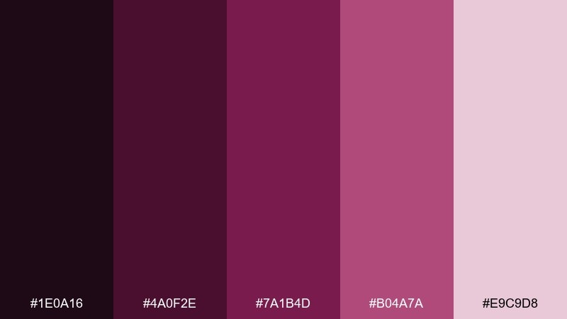
HEX: #1E0A16 #4A0F2E #7A1B4D #B04A7A #E9C9D8
Mood: rich, intimate, classic
Best for: fine dining menus and wine bar branding
Rich and intimate like a candlelit tasting room, these plums read classic and confident. Build the menu base in pale blush, then use the wine tones for section dividers and featured items. Works beautifully with matte paper and subtle texture, especially alongside warm neutrals. Tip: avoid pure black and use the deepest plum instead for a softer, more premium finish.
Image example of plum wine generated using media.io
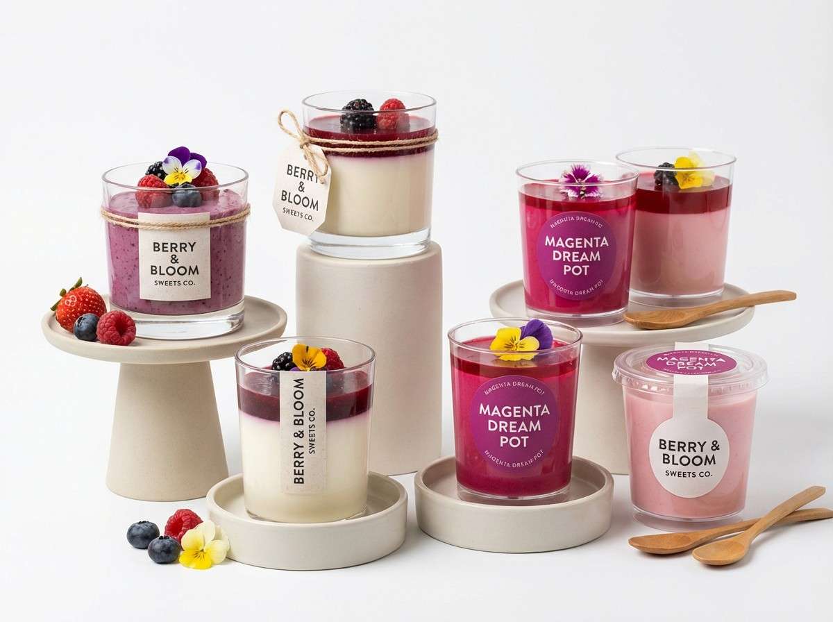
6) Berry Sorbet
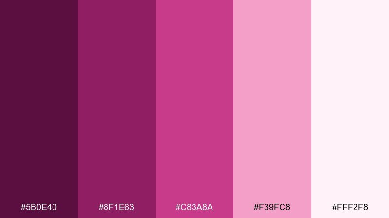
HEX: #5B0E40 #8F1E63 #C83A8A #F39FC8 #FFF2F8
Mood: sweet, bright, friendly
Best for: dessert shop branding and social posts
Sweet and bright like berry sorbet on a summer day, this set feels friendly and modern. These red violet color combinations are great for food brands that want warmth without leaning orange. Pair the mid berry and cotton-candy pink with lots of clean white space and simple icons for a fresh look. Tip: use the darkest shade for pricing and small text so posts stay readable on mobile.
Image example of berry sorbet generated using media.io
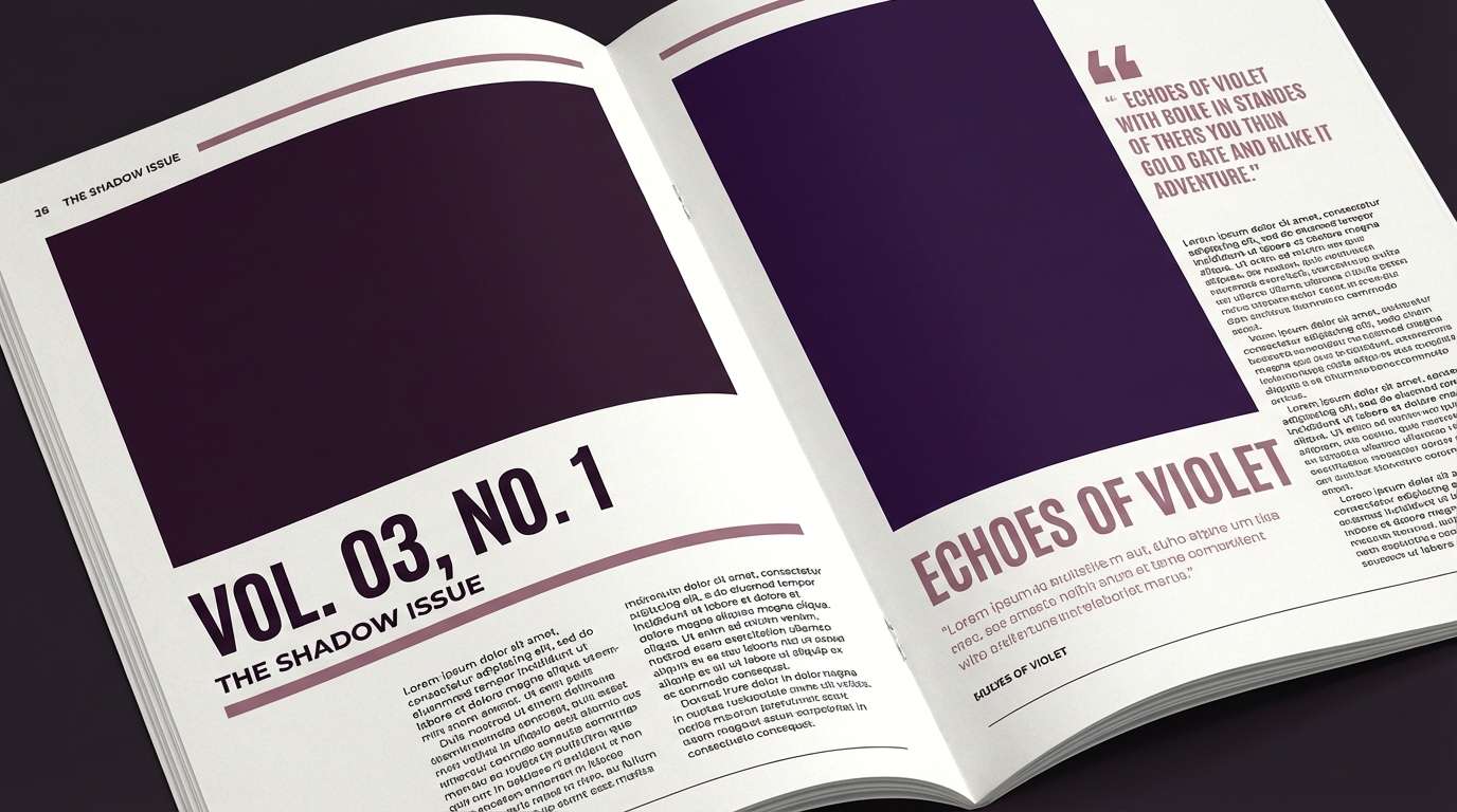
7) Aubergine Noir
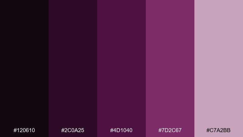
HEX: #120610 #2C0A25 #4D1040 #7D2C67 #C7A2BB
Mood: mysterious, luxe, editorial
Best for: fashion editorials and lookbooks
Mysterious and luxe like aubergine silk, the dark base creates instant drama. Use the near-black and deep purple for photography frames and type, then bring in muted violet for pull quotes and section labels. It pairs well with off-white paper and minimal grids for a high-fashion feel. Tip: keep accent color usage under 15 percent so the noir mood stays dominant.
Image example of aubergine noir generated using media.io
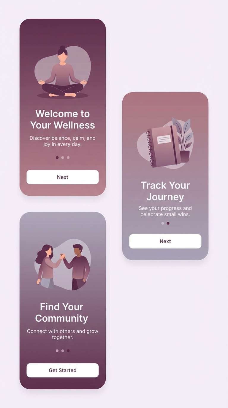
8) Lavender Smoke
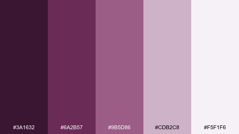
HEX: #3A1632 #6A2B57 #9B5D86 #CDB2C8 #F5F1F6
Mood: calm, airy, modern
Best for: wellness app UI and onboarding screens
Calm and airy like lavender smoke drifting through a quiet room, these tones reduce visual stress. This red violet color scheme works best with soft gradients and rounded components, letting the pale lilac act as a gentle canvas. Pair with warm gray and plenty of spacing to keep screens breathable. Tip: use the mid mauve for primary buttons and reserve the darkest plum for navigation only.
Image example of lavender smoke generated using media.io
9) Cranberry Cream
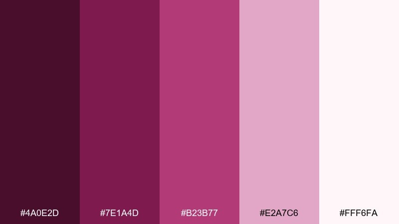
HEX: #4A0E2D #7E1A4D #B23B77 #E2A7C6 #FFF6FA
Mood: cozy, inviting, polished
Best for: holiday email headers and seasonal promos
Cozy and inviting like cranberry sauce on a cream tablecloth, this mix feels polished and warm. Keep backgrounds creamy and use cranberry tones for banners, badges, and callouts. It pairs well with minimal photography and simple shapes, especially for holiday sales. Tip: add subtle grain or paper texture to avoid a flat, overly digital look.
Image example of cranberry cream generated using media.io
10) Festival Fuchsia
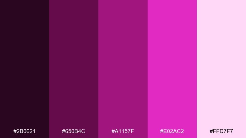
HEX: #2B0621 #650B4C #A1157F #E02AC2 #FFD7F7
Mood: bold, youthful, expressive
Best for: album cover art and merch graphics
Bold and expressive like stage lights hitting satin, these fuchsia notes feel unapologetic. Let the dark purple create a strong frame, then push the bright fuchsia for the artist name or a single graphic motif. Soft pink keeps secondary info readable without dulling the energy. Tip: use large type and simple shapes so the colors do the heavy lifting.
Image example of festival fuchsia generated using media.io
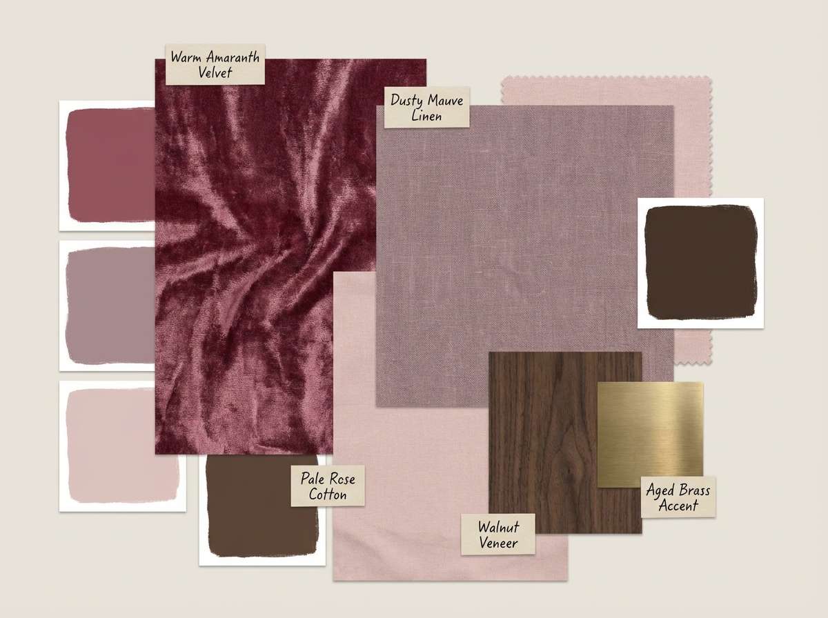
11) Dusty Amaranth
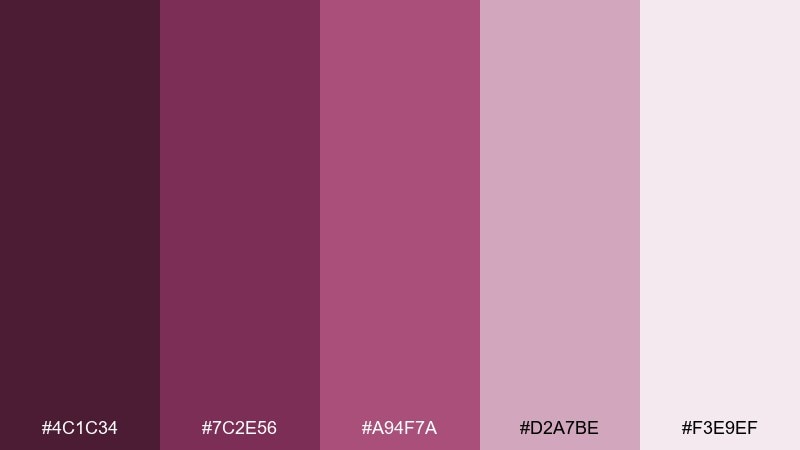
HEX: #4C1C34 #7C2E56 #A94F7A #D2A7BE #F3E9EF
Mood: grounded, warm, understated
Best for: boutique hotel interiors and mood boards
Grounded and warm like dried amaranth bouquets, this palette is quietly sophisticated. Use the dusty midtones for textiles and wall accents, while the pale rose lifts the room and keeps it airy. It pairs naturally with walnut wood, brass fixtures, and creamy linens. Tip: repeat the darkest shade in small details like trim or signage to unify the space.
Image example of dusty amaranth generated using media.io
12) Royal Iris
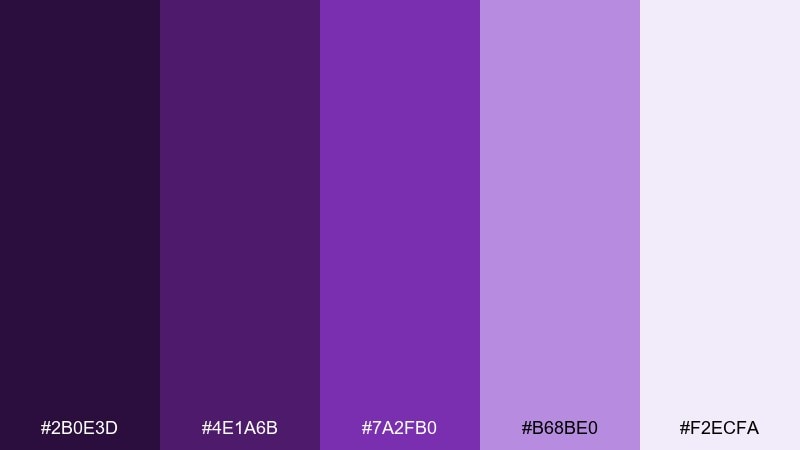
HEX: #2B0E3D #4E1A6B #7A2FB0 #B68BE0 #F2ECFA
Mood: regal, creative, refined
Best for: tech keynote slides and conference branding
Regal and creative like an iris in spotlight, these purples feel refined and smart. Use the darkest violet for slide titles and section breaks, and let the bright purple lead charts and highlights. A soft lilac background keeps screens from feeling too intense in large rooms. Tip: keep data visuals to two main hues for clarity at distance.
Image example of royal iris generated using media.io

13) Mulberry Slate
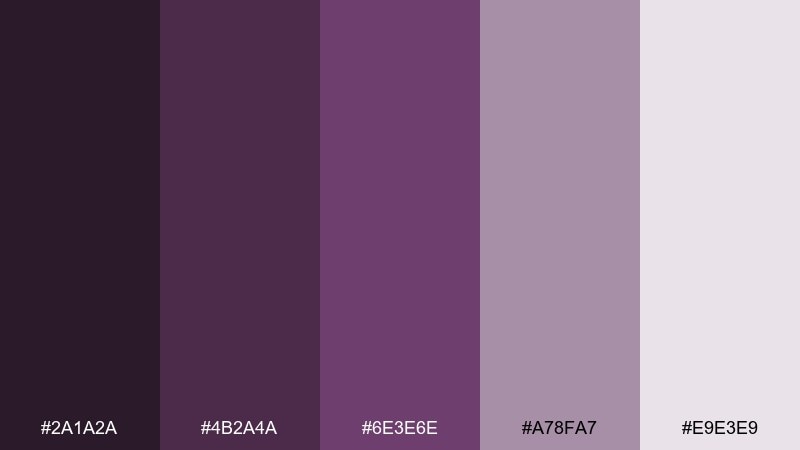
HEX: #2A1A2A #4B2A4A #6E3E6E #A78FA7 #E9E3E9
Mood: muted, modern, balanced
Best for: SaaS dashboards and data-heavy UI
Muted and modern like mulberry ink on slate paper, these tones feel balanced and professional. Use the darker pair for nav and chart axes, while the softened violet-gray keeps panels calm. It pairs well with cool grays and plenty of whitespace for long sessions. Tip: add a single brighter accent only for alerts to avoid fatigue in data-heavy screens.
Image example of mulberry slate generated using media.io
14) Copper Violet
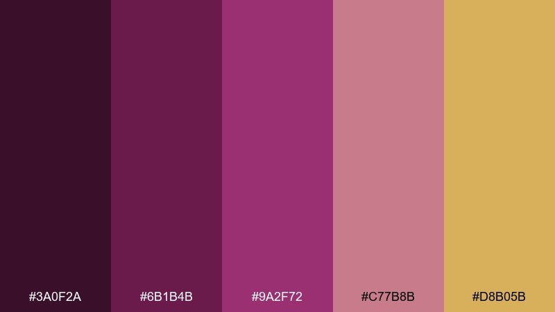
HEX: #3A0F2A #6B1B4B #9A2F72 #C77B8B #D8B05B
Mood: opulent, warm, artisanal
Best for: candle labels and artisan product branding
Opulent and warm like copper foil on violet wax, this mix feels artisanal and giftable. The copper-gold accent plays best in small doses on borders, seals, or icons, while the violets carry the main brand. This red violet color palette pairs nicely with kraft paper, matte finishes, and botanical line drawings. Tip: keep the gold as a single accent tone so it reads premium instead of flashy.
Image example of copper violet generated using media.io
15) Sakura Twilight
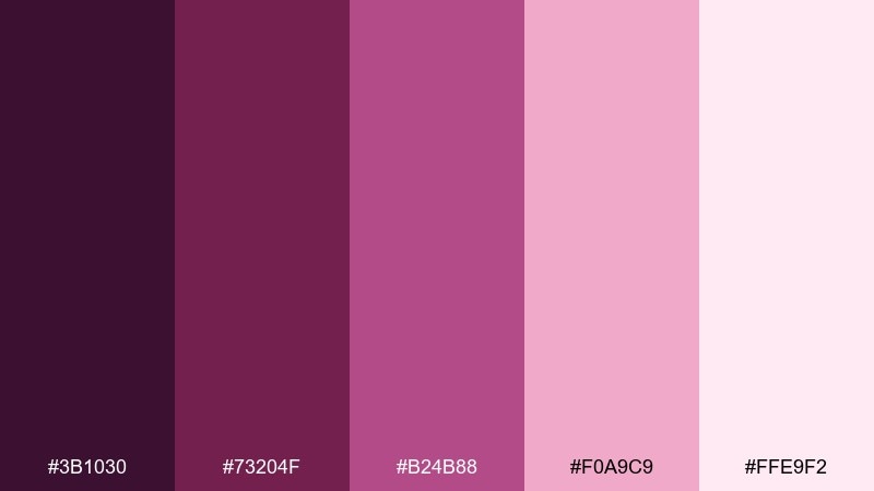
HEX: #3B1030 #73204F #B24B88 #F0A9C9 #FFE9F2
Mood: dreamy, delicate, romantic
Best for: spring sale graphics and floral campaigns
Dreamy twilight vibes meet delicate sakura tones, like petals floating at sunset. Use the pale pinks for airy backgrounds and the richer violet-rose for headlines and stamps. It pairs beautifully with watercolor florals and soft shadowing. Tip: add subtle gradient washes behind text blocks to improve contrast without losing the gentle mood.
Image example of sakura twilight generated using media.io
16) Indie Magenta
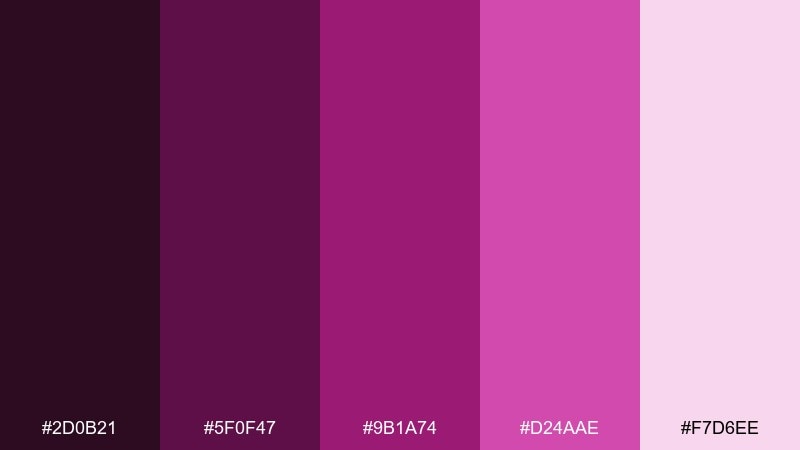
HEX: #2D0B21 #5F0F47 #9B1A74 #D24AAE #F7D6EE
Mood: artsy, confident, punchy
Best for: podcast cover art and thumbnails
Artsy and confident like ink-stamped magenta on textured paper, these tones feel punchy without going neon. Use the darkest shade for the background, then stack magenta and pink for type hierarchy and graphic shapes. It works well with grain textures and bold sans-serif fonts. Tip: keep the cover to two dominant colors so it reads clearly at small thumbnail sizes.
Image example of indie magenta generated using media.io

17) Vintage Bougainvillea
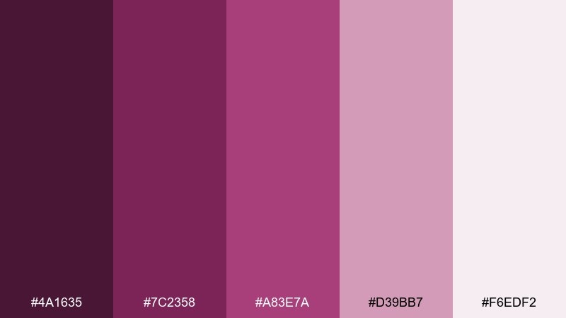
HEX: #4A1635 #7C2358 #A83E7A #D39BB7 #F6EDF2
Mood: nostalgic, floral, charming
Best for: boutique shop logos and label systems
Nostalgic and floral like bougainvillea climbing an old wall, this set feels charming and approachable. These red violet color combinations are ideal for boutique labels where you want warmth and personality without loud saturation. Pair with cream backgrounds, hand-drawn icons, and a muted green accent if you need contrast. Tip: keep the logo in the two darkest tones for consistent reproduction across materials.
Image example of vintage bougainvillea generated using media.io
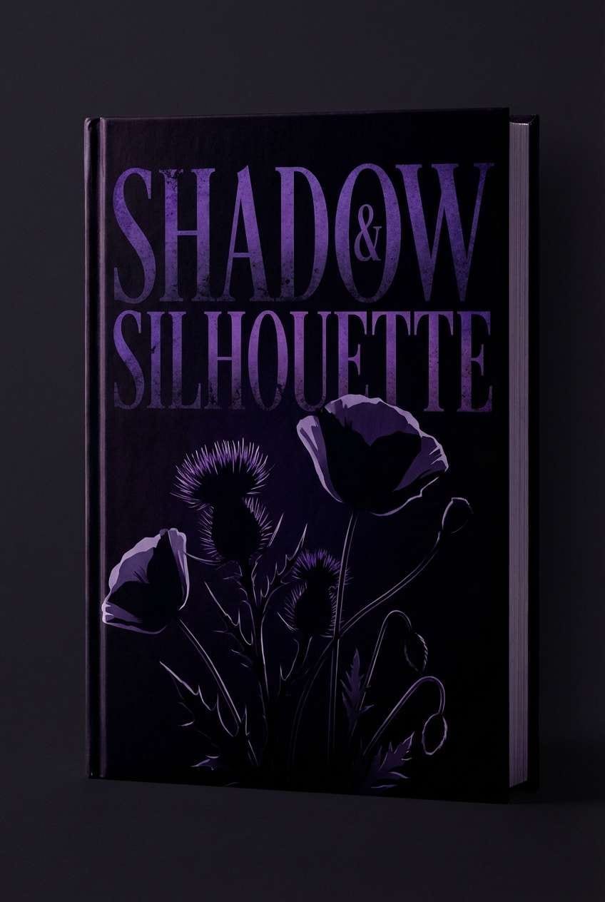
18) Midnight Dahlia
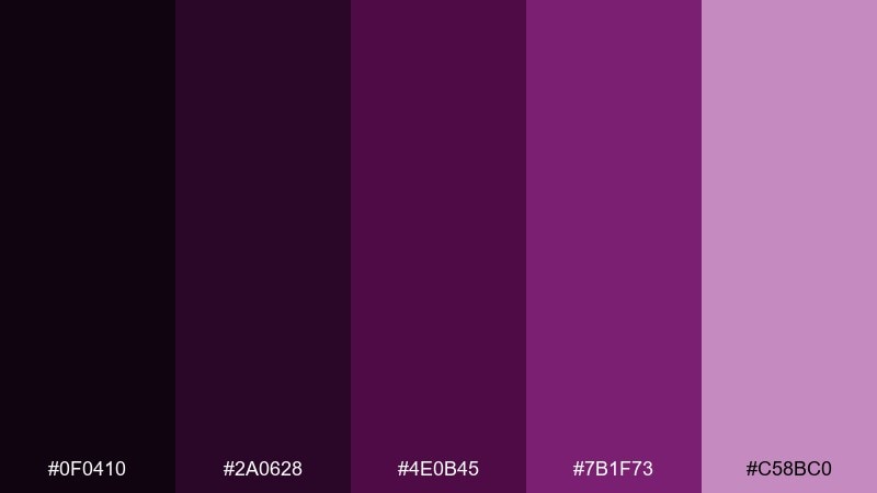
HEX: #0F0410 #2A0628 #4E0B45 #7B1F73 #C58BC0
Mood: dramatic, gothic, cinematic
Best for: book covers and mystery promos
Dramatic and cinematic like a dahlia blooming at midnight, this palette leans gothic without feeling dated. Use the near-black for the background and the vivid violet for title contrast, then soften supporting elements with the muted lavender. It pairs well with serif typography and minimal illustration. Tip: add a faint vignette using the darkest shade to pull focus into the center.
Image example of midnight dahlia generated using media.io
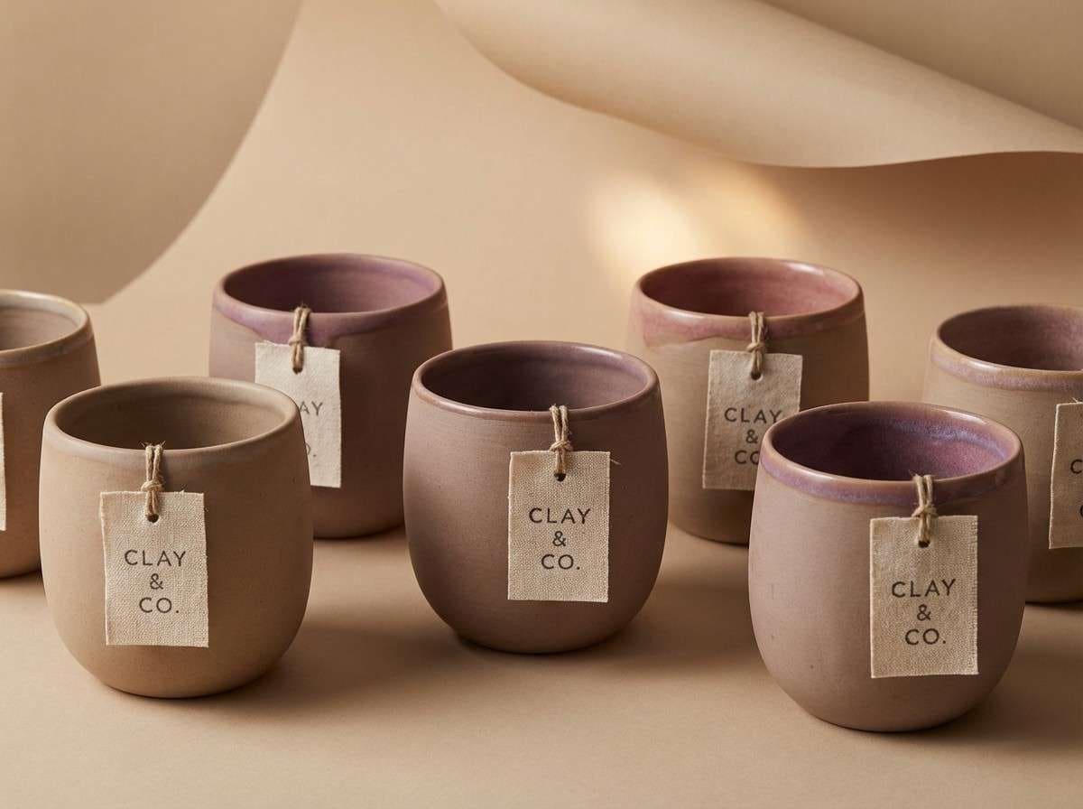
19) Clay Rose Violet
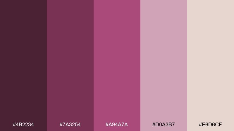
HEX: #4B2234 #7A3254 #A94A7A #D0A3B7 #E6D6CF
Mood: earthy, cozy, contemporary
Best for: ceramics shops and handcrafted product ads
Earthy and cozy like rose-tinted clay, these violets feel contemporary and grounded. The warmer neutrals make the mauves more wearable for lifestyle brands and product photography overlays. It pairs beautifully with beige backdrops, linen textures, and soft shadows. Tip: use the clay neutral as the background so the violet accents feel intentional and calm.
Image example of clay rose violet generated using media.io
20) Haze of Heliotrope
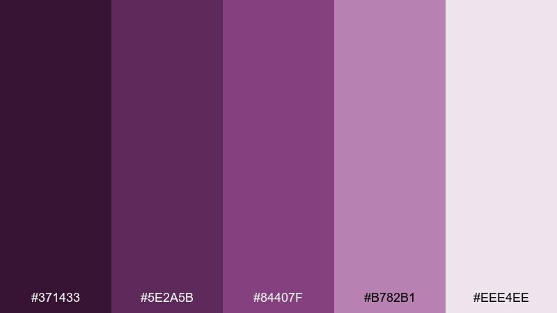
HEX: #371433 #5E2A5B #84407F #B782B1 #EEE4EE
Mood: gentle, poetic, serene
Best for: meditation branding and soft landing pages
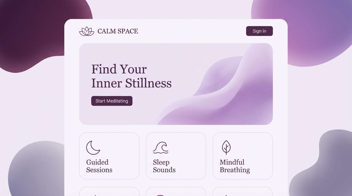
Gentle and poetic like a heliotrope haze at sunrise, these purples feel serene and safe. Build landing pages with the light lilac as your base, then use the mid heliotrope for cards, highlights, and subtle gradients. It pairs well with thin typography and minimalist icons to keep the calm mood intact. Tip: keep contrast accessible by using the deepest plum for body text over the light background.
Image example of haze of heliotrope generated using media.io
21) Amaranth Skyline
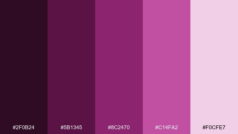
HEX: #2F0B24 #5B1345 #8C2470 #C14FA2 #F0CFE7
Mood: modern, confident, energetic
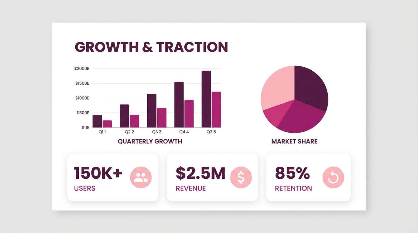
Best for: startup branding and pitch deck visuals
Modern and confident like a skyline glow at golden hour, these tones feel energetic and credible. A red violet color combination like this works well when you need a signature accent that still plays nicely with neutrals. Use the deep plum for headings, the bright magenta for key metrics, and the pale tint for backgrounds. Tip: keep charts consistent by mapping one hue to one data category across the whole deck.
Image example of amaranth skyline generated using media.io
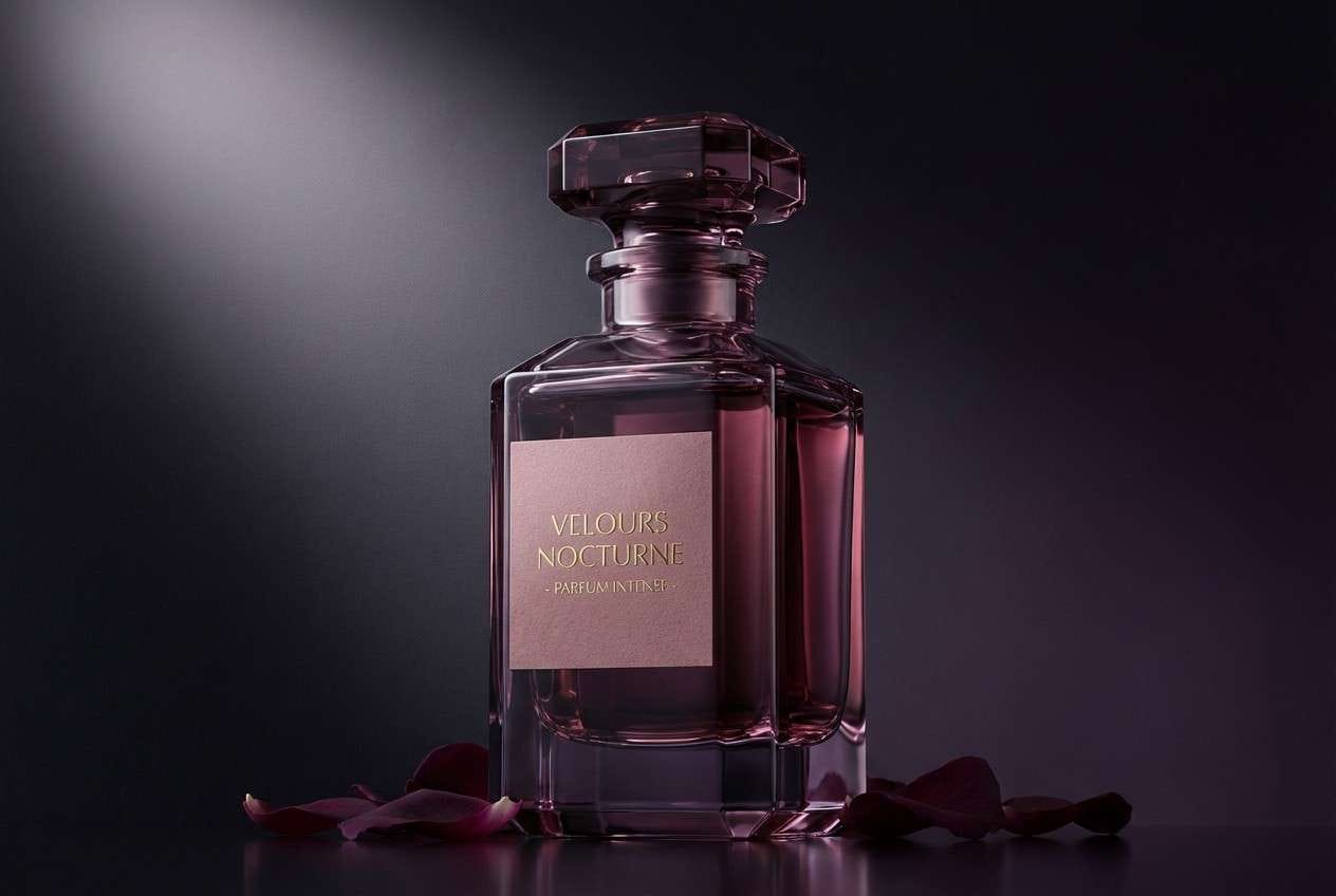
22) Violet Ember
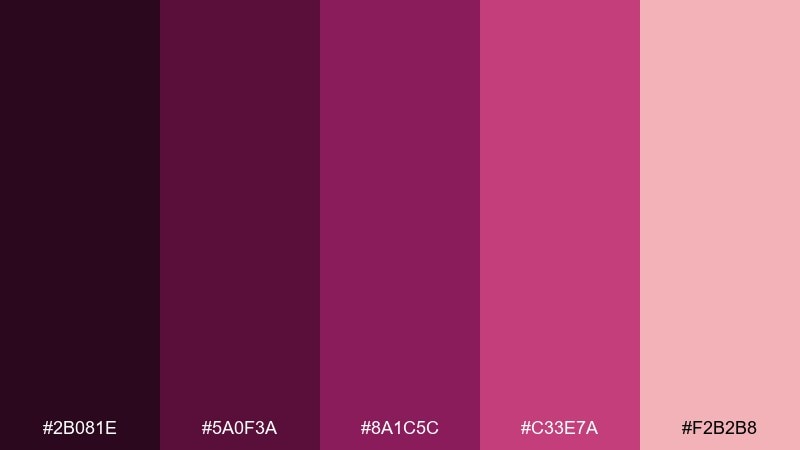
HEX: #2B081E #5A0F3A #8A1C5C #C33E7A #F2B2B8
Mood: warm, dramatic, sensual
Best for: fragrance ads and hero banners
Warm and dramatic like embers under violet glass, these tones feel sensual and premium. The deeper shades are perfect for moody hero banners, while the rosy pink can highlight notes or limited-edition tags. This red violet color palette pairs well with soft spotlighting and high-contrast product photography. Tip: use a single bright highlight for the call to action and keep everything else subdued.
Image example of violet ember generated using media.io
What Colors Go Well with Red Violet?
Red violet pairs beautifully with soft, warm neutrals like ivory, cream, beige, and blush—these help it feel expensive and approachable instead of overly intense. For a more modern look, add cool grays or off-white to bring structure and clarity.
If you want contrast, try restrained accents: copper/gold for an artisanal premium feel, or muted sage/olive for a botanical balance. For high-energy designs, hot pink and bright magenta can work, but they’re best used sparingly as a single focal highlight.
For typography, avoid pure black on deep red violet backgrounds; near-black plum or very dark charcoal often looks smoother and more cohesive while keeping readability strong.
How to Use a Red Violet Color Palette in Real Designs
Start by assigning roles: pick one darkest shade for headers/nav, one mid-tone for primary UI or key shapes, one brighter accent for CTA or emphasis, and one pale tint for backgrounds. This keeps the palette consistent across layouts and prevents “purple overload.”
In print, red violet looks best with texture—matte paper, subtle grain, emboss, or foil accents. In digital design, it benefits from generous spacing and simple type so the color carries the personality without making the interface feel heavy.
For accessibility, check contrast on body text and small UI labels. Often the quickest fix is using the deepest plum for text and reserving the brighter magenta/pink for badges, buttons, or icons.
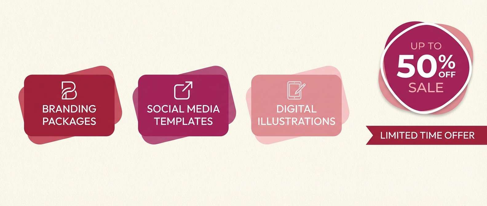
Create Red Violet Palette Visuals with AI
If you already have HEX codes, you can turn them into on-brand mockups fast by describing the product, layout, and lighting—then specifying the dominant colors as “deep plum,” “orchid magenta,” “dusty mauve,” and “soft blush.”
To stay consistent across a campaign, reuse one prompt structure and only swap the scene (packaging, UI, poster, menu). This helps AI outputs look like a unified brand system rather than random one-offs.
Media.io makes it easy to generate red violet visuals for branding, UI screens, ads, and social creatives directly in your browser.
Red Violet Color Palette FAQs
-
What is a red violet color?
Red violet is a purple hue with a noticeable red/magenta bias. It feels warmer than classic violet and often reads as wine, plum, orchid, or magenta-violet depending on saturation and lighting. -
Is red violet the same as magenta?
Not exactly. Magenta is typically brighter and more saturated, while red violet is slightly deeper and more “purple-leaning.” Many palettes use both: red violet for the base and magenta as an accent. -
What neutral colors match red violet best?
Ivory, cream, warm beige, light blush, and soft greige are the easiest neutrals to pair with red violet. They keep the palette elegant and help red violet feel premium rather than overly loud. -
What colors create strong contrast with red violet?
Soft mint/sage, muted olive, and cool light gray provide clean contrast. For dramatic contrast, use very pale lilac-white backgrounds with deep plum typography. -
How do I keep a red violet palette from looking too dark?
Use a pale tint (blush, lilac, or off-white) as the primary background, reserve the darkest plum for small areas (nav, headers, frames), and keep bright accents limited to one focal element. -
Does red violet work well for UI design?
Yes—especially when you use muted mauves for surfaces and a deeper plum for navigation and text. Keep one brighter pink/magenta only for primary actions or alerts to maintain clarity. -
How can I generate red violet palette images with consistent style?
Reuse a single prompt template (scene + composition + lighting + “dominant colors …”) and keep the same few color descriptors across outputs. Media.io’s text-to-image tool makes it easy to iterate while staying on palette.


