

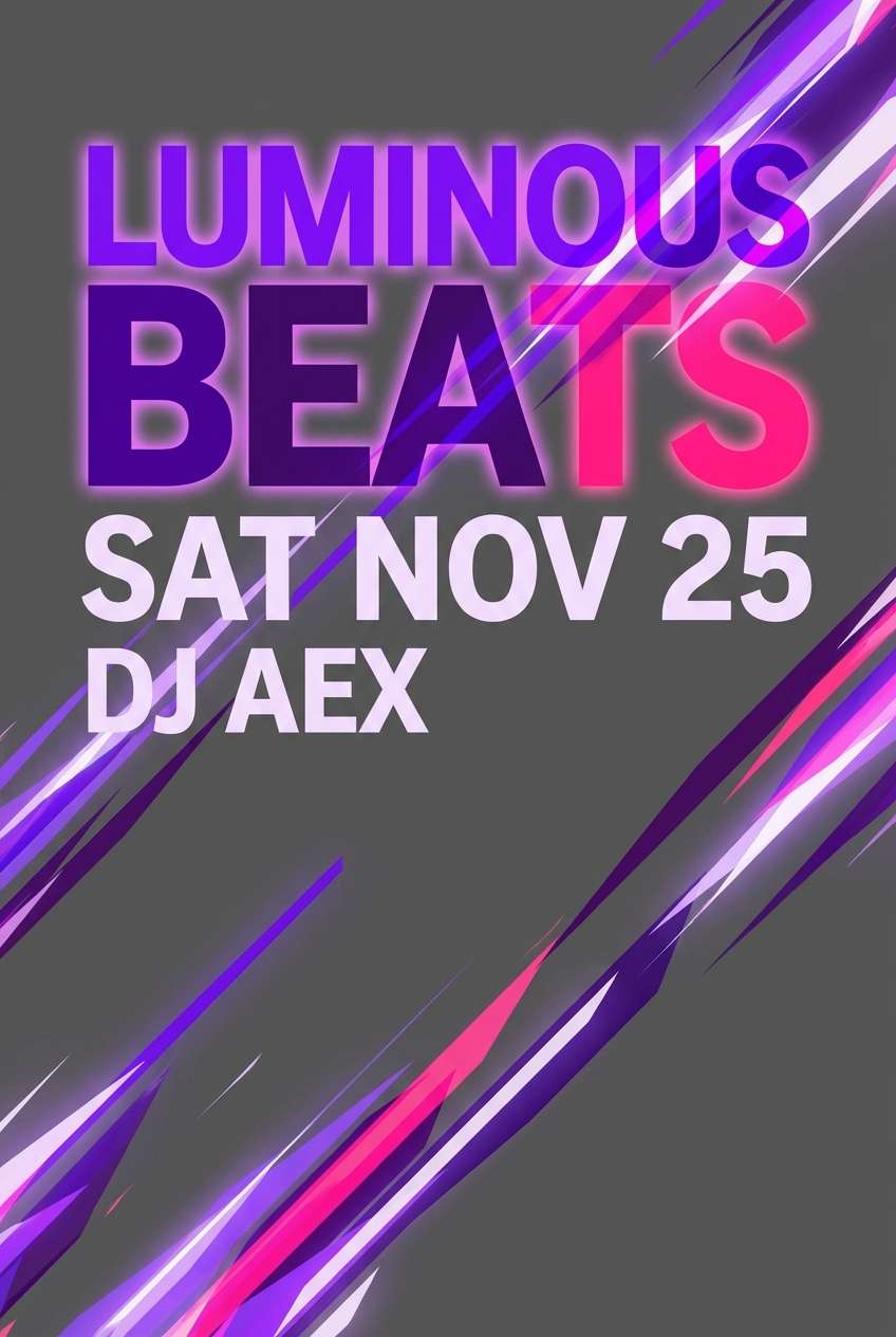
Electric purple is a high-voltage hue that instantly reads as modern, expressive, and a little futuristic. It’s perfect when you want a design to feel energetic without relying on complex layouts.
Below are electric purple color palette ideas (with HEX codes) you can use for branding, posters, UI accents, nightlife visuals, and more—plus quick tips for making the contrast work.
In this article
- Why Electric Purple Palettes Work So Well
-
- neon orchid night
- vaporwave glow
- royal grape and gold
- lavender storm
- cyber plum ui
- amethyst noir
- electric iris mint
- purple sunset coral
- galaxy arcade
- lilac linen
- ultra violet citrus
- purple teal contrast
- velvet berry wedding
- cosmic hologram
- ink purple editorial
- grape soda pop
- plum clay interior
- midnight club lights
- frosted violet tech
- purple bloom botanical
- What Colors Go Well with Electric Purple?
- How to Use a Electric Purple Color Palette in Real Designs
- Create Electric Purple Palette Visuals with AI
Why Electric Purple Palettes Work So Well
Electric purple sits in a sweet spot between “creative” and “premium,” so it can feel both playful and high-end depending on what you pair it with. That flexibility makes it a reliable anchor color for brands, campaigns, and UI accents.
It also performs extremely well on screens: the saturation creates strong separation from dark backgrounds, and it stays readable when balanced with off-whites and soft grays. In motion graphics and nightlife visuals, it naturally suggests glow, energy, and speed.
Most importantly, electric purple creates instant hierarchy. Use it for primary actions, hero elements, or focal typography, and let neutrals or deep tones do the heavy lifting in the background.
20+ Electric Purple Color Palette Ideas (with HEX Codes)
1) Neon Orchid Night
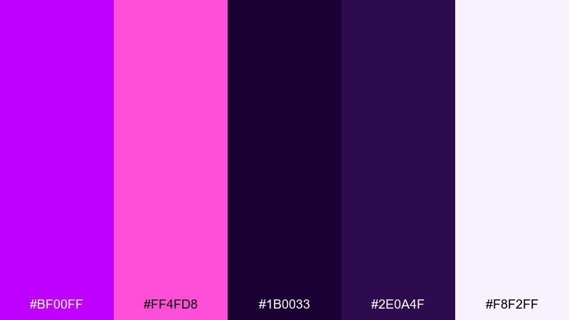
HEX: #BF00FF #FF4FD8 #1B0033 #2E0A4F #F8F2FF
Mood: neon, moody, nightlife
Best for: nightclub event poster
Neon orchid vibes meet midnight shadows, like city lights reflecting on wet pavement. This electric purple color palette pops hardest against near-black and looks crisp with a milky white highlight. Use it for event posters, music promos, and punchy social ads where you need instant energy. Tip: keep text mostly in off-white and reserve the hot pink for calls to action.
Image example of neon orchid night generated using media.io
Media.io is an online AI studio for creating and editing video, image, and audio in your browser.

2) Vaporwave Glow
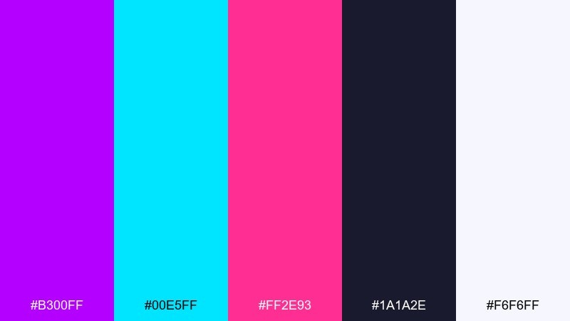
HEX: #B300FF #00E5FF #FF2E93 #1A1A2E #F6F6FF
Mood: retro, glossy, playful
Best for: music livestream thumbnail
Glossy retro energy and arcade glow make this mix feel loud in the best way. Cyan and magenta accents sharpen the purple and help key elements stand out. It works well for livestream graphics, DJ covers, and bold thumbnails where contrast matters. Tip: use the dark navy as the base so the brights read like neon.
Image example of vaporwave glow generated using media.io
3) Royal Grape and Gold
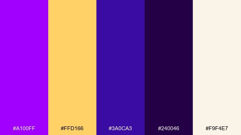
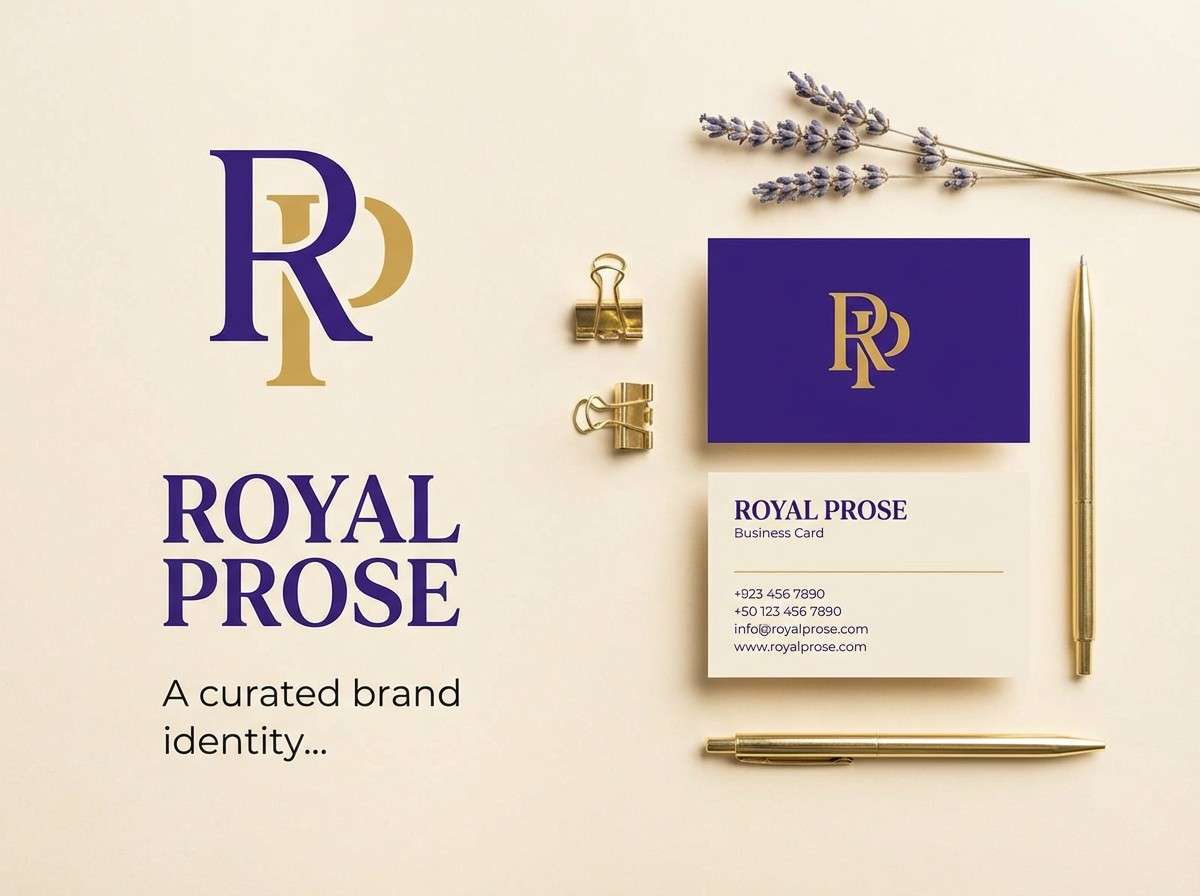
HEX: #A100FF #FFD166 #3A0CA3 #240046 #F9F4E7
Mood: luxury, regal, warm
Best for: premium brand identity
Rich grape tones with a golden accent feel ceremonial and expensive. The deep purples add depth while the warm gold provides instant hierarchy for logos and headings. Use it for premium branding, beauty labels, and boutique packaging where you want a polished finish. Tip: apply gold sparingly for icons and dividers to avoid overpowering the purple base.
Image example of royal grape and gold generated using media.io
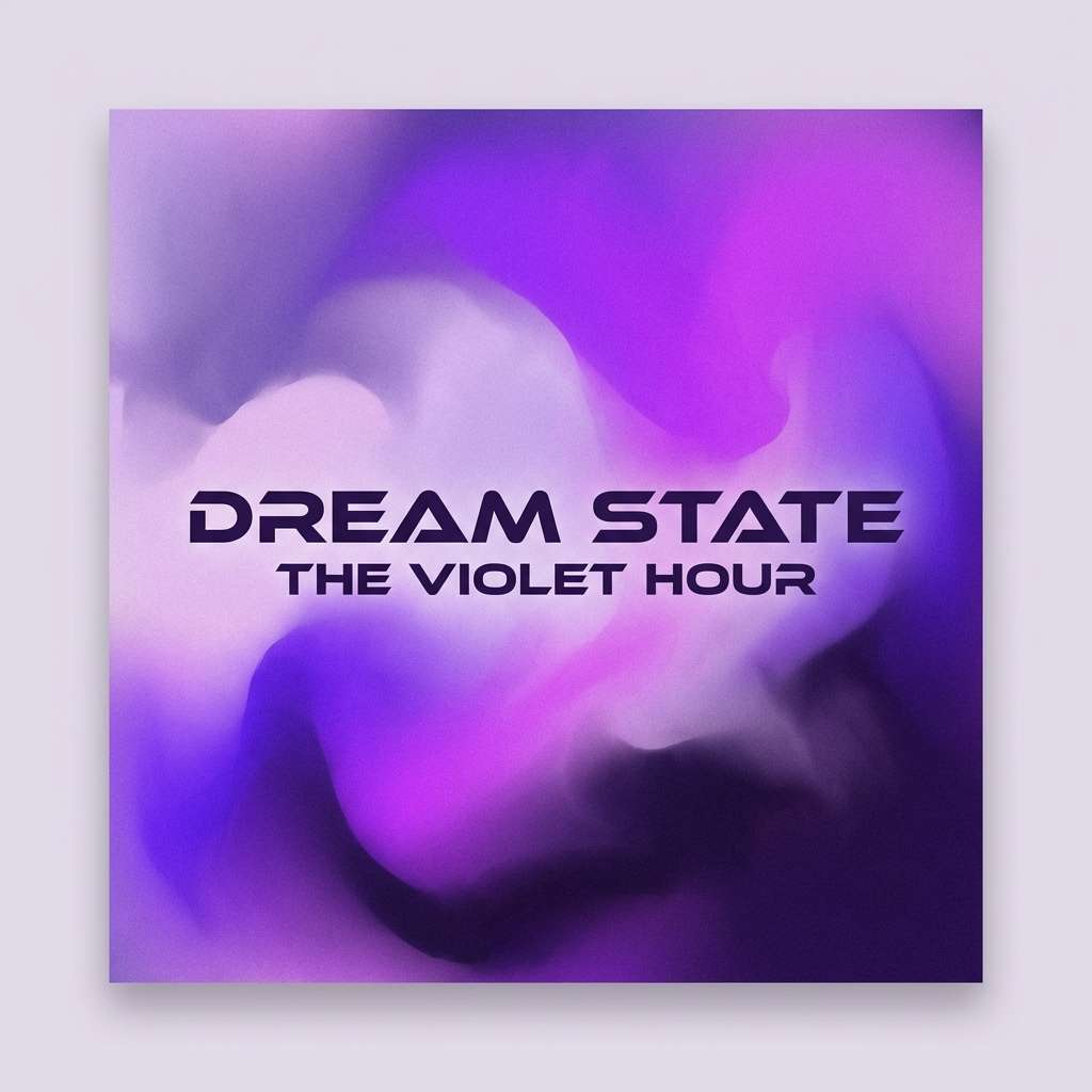
4) Lavender Storm
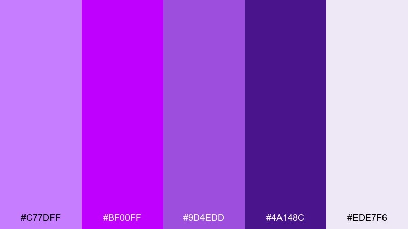
HEX: #C77DFF #BF00FF #9D4EDD #4A148C #EDE7F6
Mood: dramatic, dreamy, atmospheric
Best for: album cover artwork
Like thunderclouds tinted violet, these purples move from soft lavender to deep stormy plum. The gentle gray-lilac keeps the palette airy while the darker purple anchors titles and focal points. It fits album covers, editorial graphics, and moody hero banners. Tip: add subtle grain to gradients so the transitions feel cinematic rather than flat.
Image example of lavender storm generated using media.io
5) Cyber Plum UI
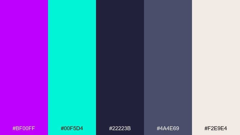
HEX: #BF00FF #00F5D4 #22223B #4A4E69 #F2E9E4
Mood: techy, crisp, modern
Best for: saas dashboard ui
Clean tech contrast makes the purple feel sharp instead of sugary. Teal provides a clear secondary accent for active states, charts, and success messages. Use these tones for dashboards, analytics views, and login screens that need clarity and punch. Tip: keep cards in warm off-white and reserve electric purple for primary buttons and key metrics.
Image example of cyber plum ui generated using media.io
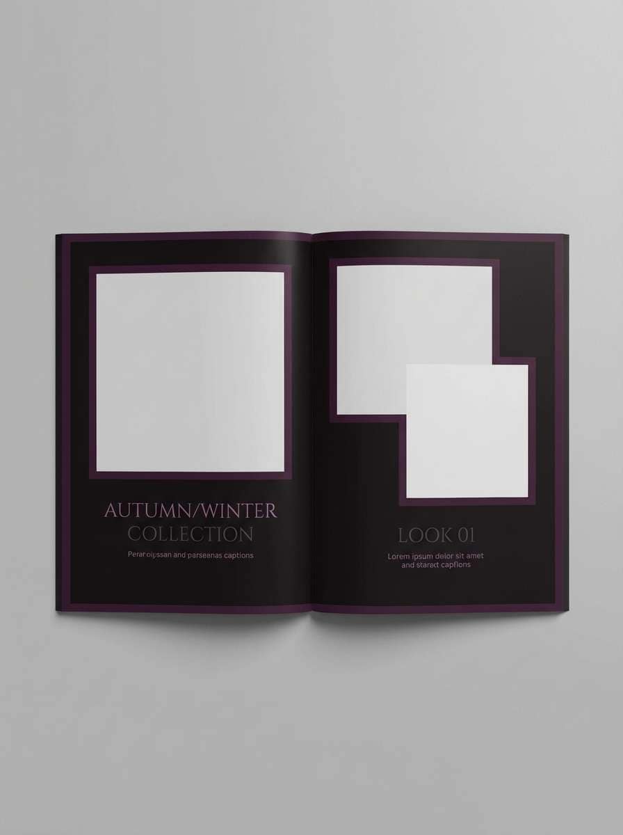
6) Amethyst Noir
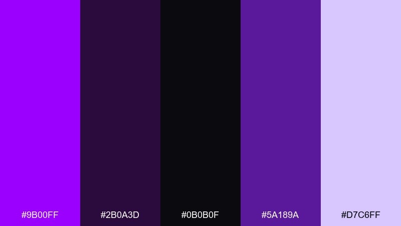
HEX: #9B00FF #2B0A3D #0B0B0F #5A189A #D7C6FF
Mood: mysterious, elegant, high-contrast
Best for: fashion lookbook layout
Dark noir shadows with a cool amethyst glow create a sleek, editorial feel. The pale violet works beautifully for captions and fine rules while the near-black keeps layouts sharp. Use it for fashion lookbooks, high-end landing pages, and dramatic photography overlays. Tip: set body text in the light violet, not pure white, for a softer premium read.
Image example of amethyst noir generated using media.io
7) Electric Iris Mint
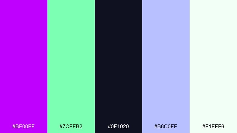
HEX: #BF00FF #7CFFB2 #0F1020 #B8C0FF #F1FFF6
Mood: fresh, energetic, futuristic
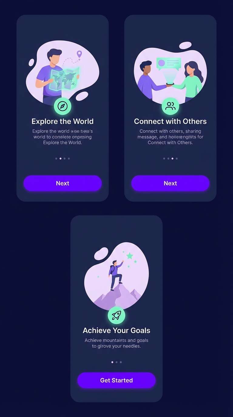
Best for: app onboarding screens
Fresh mint air with a bright iris pop feels like a new feature launch. This electric purple color scheme stays readable because the dark base grounds the high-chroma accents. It works well for onboarding, feature callouts, and playful micro-interactions. Tip: use mint for success states and keep purple for primary actions to avoid mixed signals.
Image example of electric iris mint generated using media.io
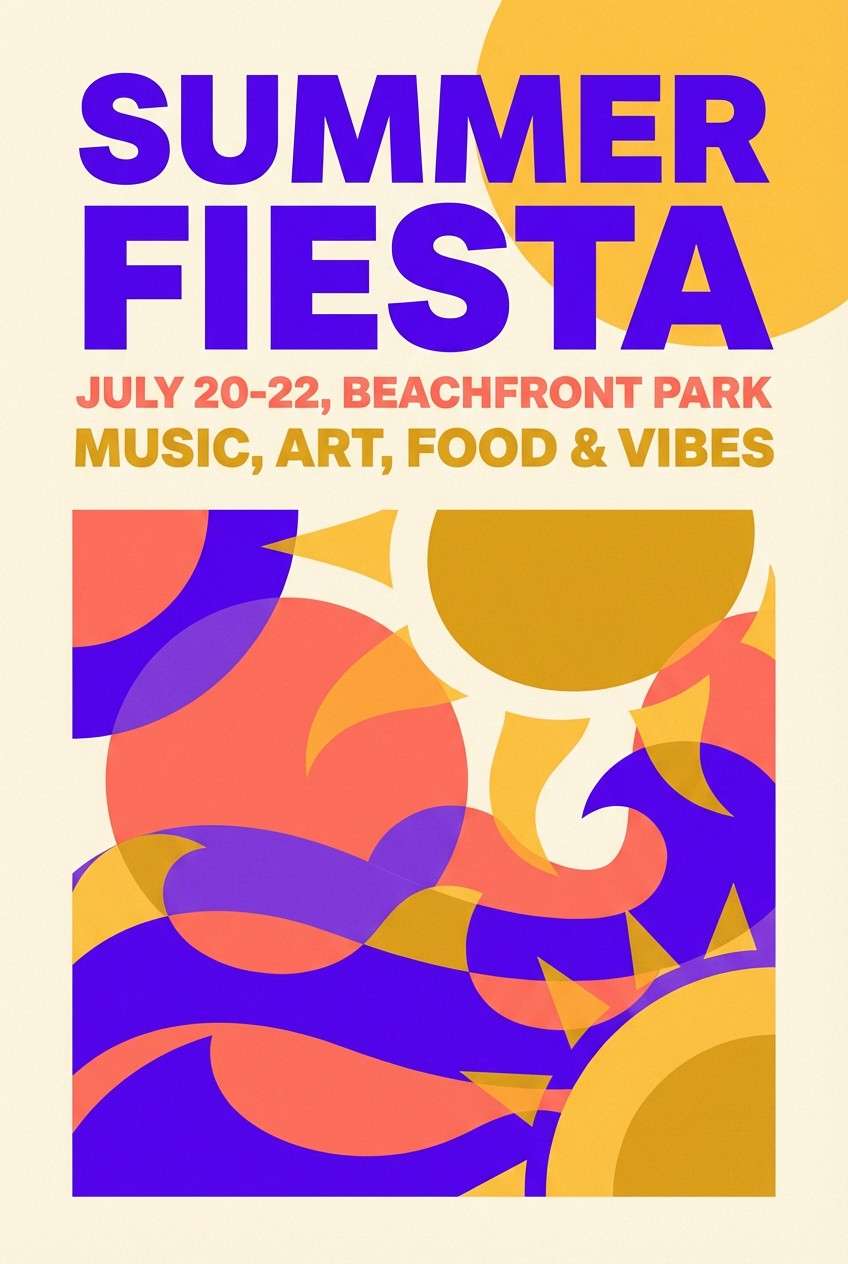
8) Purple Sunset Coral
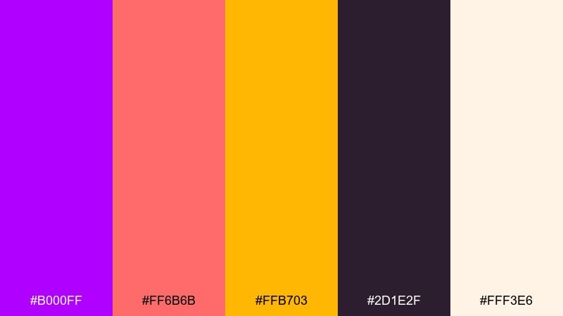
HEX: #B000FF #FF6B6B #FFB703 #2D1E2F #FFF3E6
Mood: warm, bold, upbeat
Best for: summer flyer design
A sunset punch of coral and golden light makes the purple feel warmer and more social. The deep brown-purple base keeps bright elements from looking childish. Use it for summer flyers, pop-up promotions, and food or beverage campaigns that need cheer. Tip: place headlines in the dark tone and let coral and gold carry the fun accents.
Image example of purple sunset coral generated using media.io
9) Galaxy Arcade
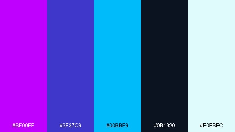
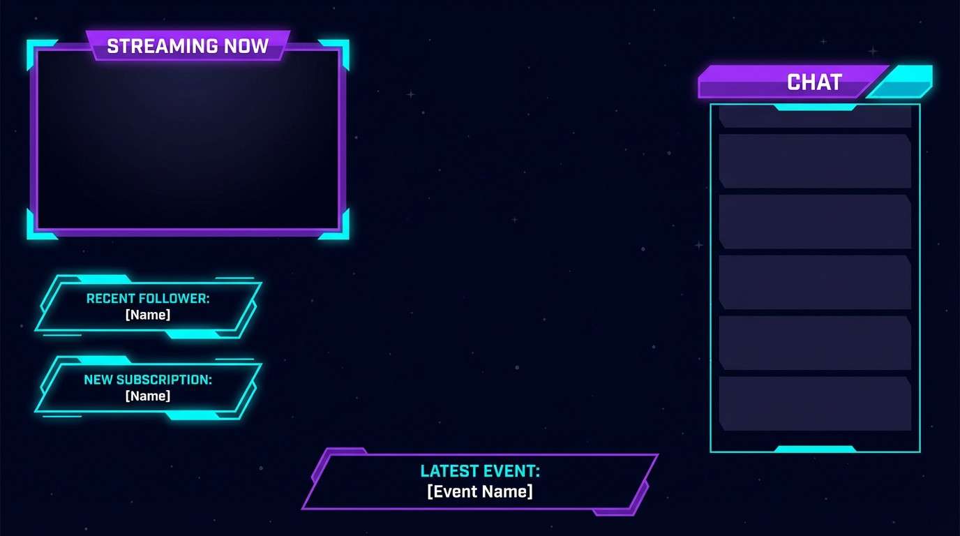
HEX: #BF00FF #3F37C9 #00BBF9 #0B1320 #E0FBFC
Mood: spacey, electric, adventurous
Best for: gaming stream overlay
Cosmic blues and neon violet feel like a spaceship dashboard glowing in the dark. The palette reads clean on screens, especially for layered panels and alerts. Use it for gaming overlays, esports banners, and sci-fi themed graphics. Tip: keep cyan limited to notifications so it stays attention-grabbing.
Image example of galaxy arcade generated using media.io
10) Lilac Linen
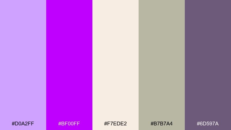
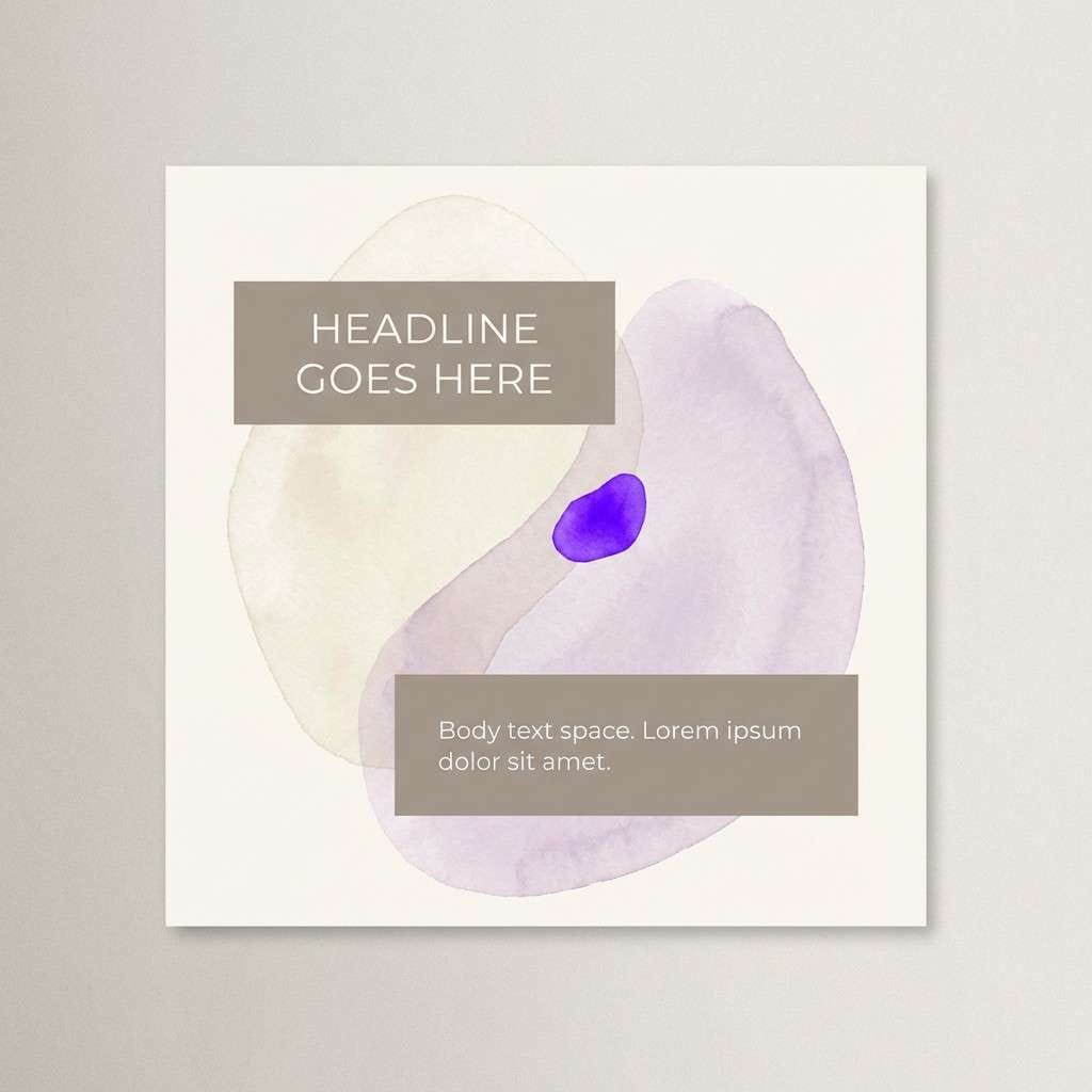
HEX: #D0A2FF #BF00FF #F7EDE2 #B7B7A4 #6D597A
Mood: soft, cozy, modern-neutral
Best for: wellness brand social posts
Soft lilac on linen-like neutrals feels calm, tidy, and a little romantic. The muted taupe and gray-green tones reduce the intensity while keeping the purple recognizable. It works nicely for wellness posts, journaling templates, and gentle product storytelling. Tip: use the bright purple only for small tags or highlights to maintain the soothing vibe.
Image example of lilac linen generated using media.io
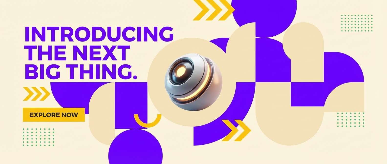
11) Ultra Violet Citrus
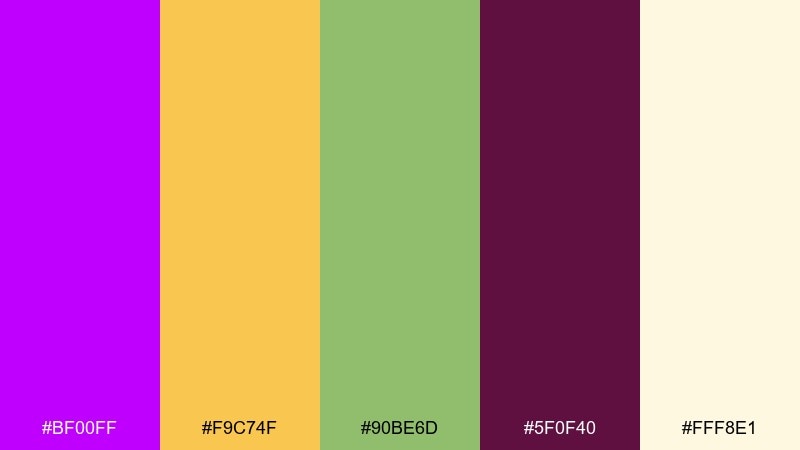
HEX: #BF00FF #F9C74F #90BE6D #5F0F40 #FFF8E1
Mood: bright, optimistic, quirky
Best for: product launch banner
Zesty citrus tones make the violet feel playful and surprising, like a modern candy shop. The warm cream background keeps it friendly, while the deep berry adds sophistication for headings. Use it for launch banners, promo sections, and energetic campaign graphics. Tip: let yellow carry the spotlight moments and keep purple for brand anchors and buttons.
Image example of ultra violet citrus generated using media.io
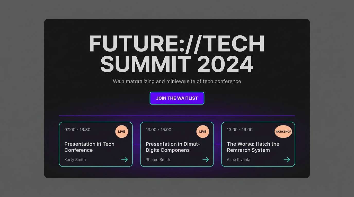
12) Purple Teal Contrast
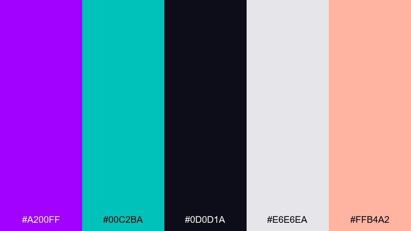
HEX: #A200FF #00C2BA #0D0D1A #E6E6EA #FFB4A2
Mood: confident, modern, high-contrast
Best for: tech conference landing page
Confident contrast with teal and peach gives the layout a sharp, contemporary edge. An electric purple color combination like this works well for sections, badges, and speaker highlights without losing readability. Use it on conference pages, sign-up flows, and schedule grids where hierarchy matters. Tip: keep the background near-black and use the light gray for body text to reduce glare.
Image example of purple teal contrast generated using media.io
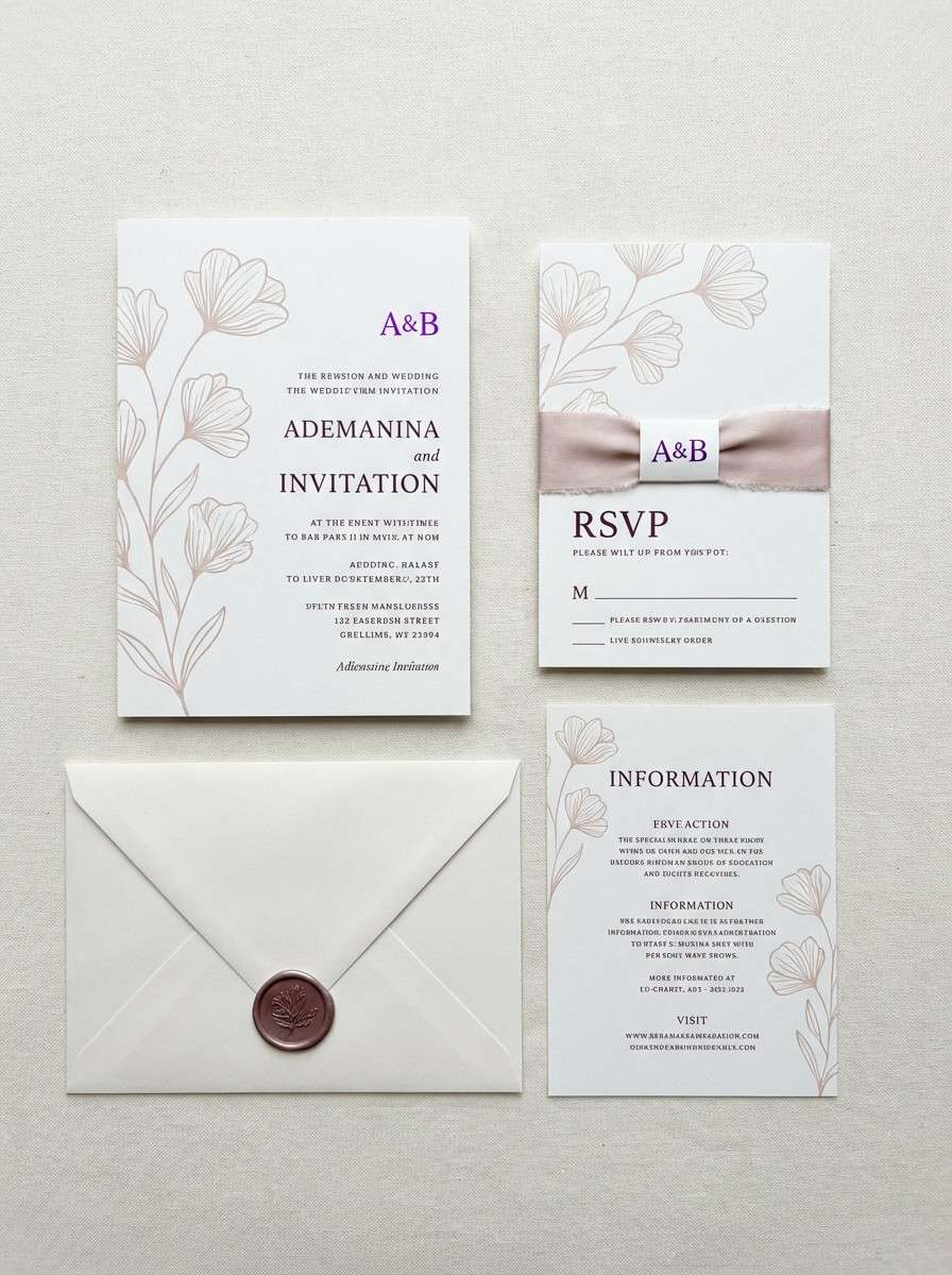
13) Velvet Berry Wedding
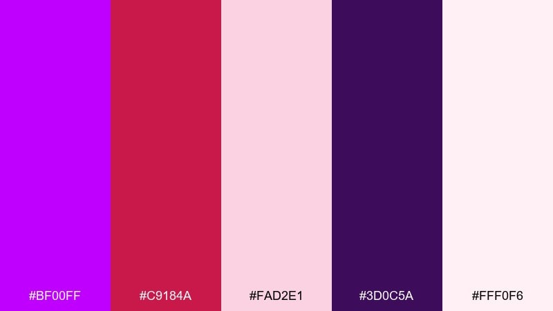
HEX: #BF00FF #C9184A #FAD2E1 #3D0C5A #FFF0F6
Mood: romantic, lush, elegant
Best for: wedding invitation suite
Velvet berry and soft blush create a romantic glow with a modern edge. Deep purple keeps the look grounded, while the pale pinks give plenty of airy space for names and details. Use it for invitation suites, bridal event signage, and monograms. Tip: print the darkest tone for typography and use the bright purple as a small crest or wax-seal accent.
Image example of velvet berry wedding generated using media.io
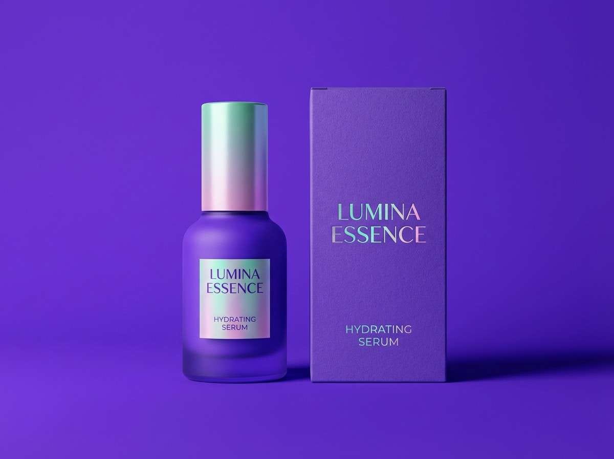
14) Cosmic Hologram
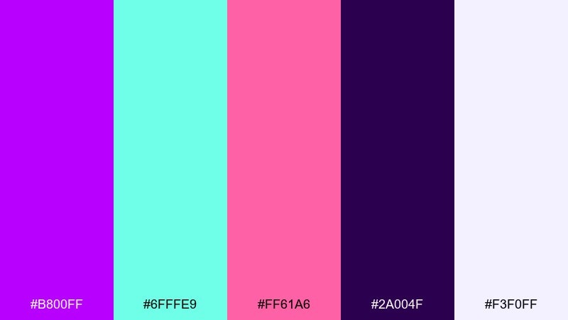
HEX: #B800FF #6FFFE9 #FF61A6 #2A004F #F3F0FF
Mood: iridescent, trendy, bold
Best for: beauty product packaging
Iridescent candy tones feel futuristic, like holographic foil catching light. The deep violet gives structure while mint and pink bring that glossy, trend-forward punch. Use it for beauty packaging, limited-edition drops, and playful product ads. Tip: keep the label background pale and use the dark tone for fine text to preserve legibility.
Image example of cosmic hologram generated using media.io
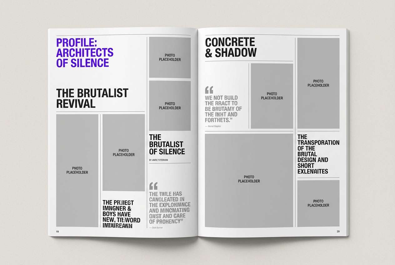
15) Ink Purple Editorial
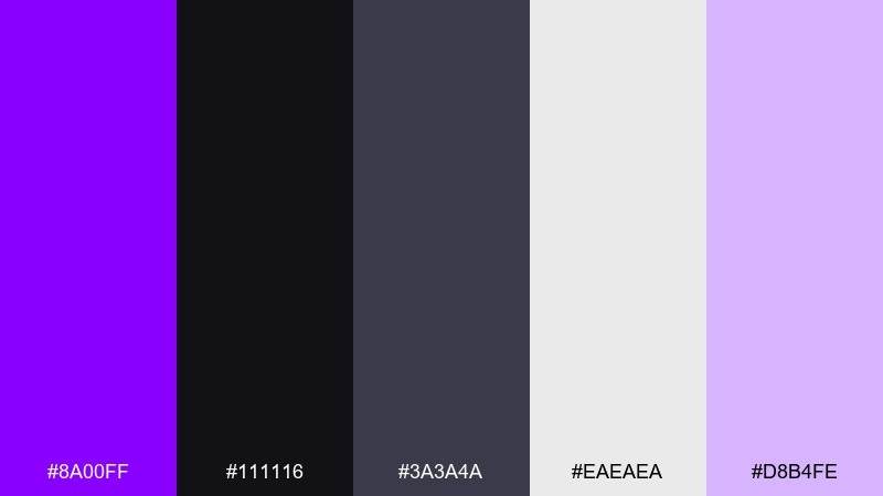
HEX: #8A00FF #111116 #3A3A4A #EAEAEA #D8B4FE
Mood: clean, editorial, sophisticated
Best for: magazine feature layout
Inky blacks with a soft violet highlight feel like fresh print and modern design theory. The grayscale range gives you strong typographic control, with purple used as a smart signal for pull quotes and section markers. Use it for magazine features, reports, and minimalist portfolios. Tip: limit purple to one element per spread to keep the editorial restraint.
Image example of ink purple editorial generated using media.io
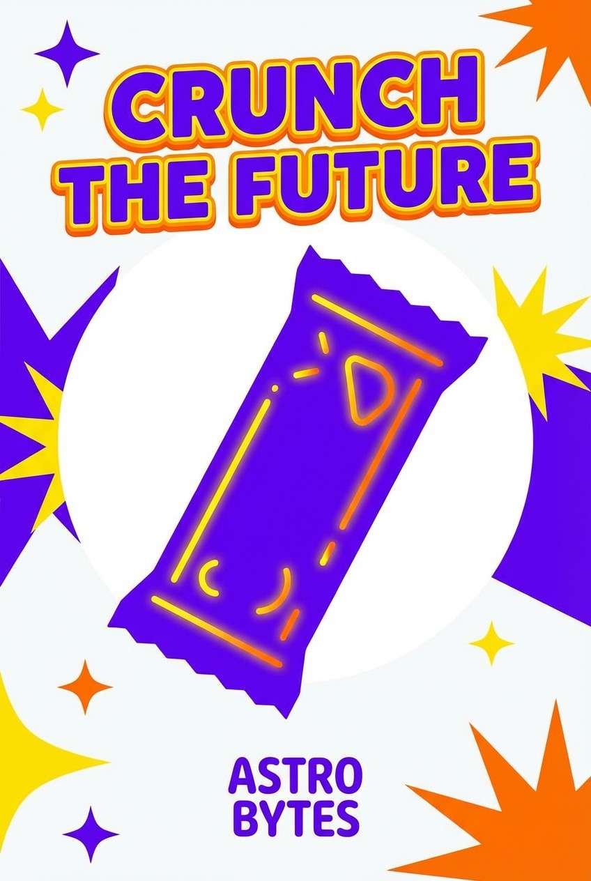
16) Grape Soda Pop
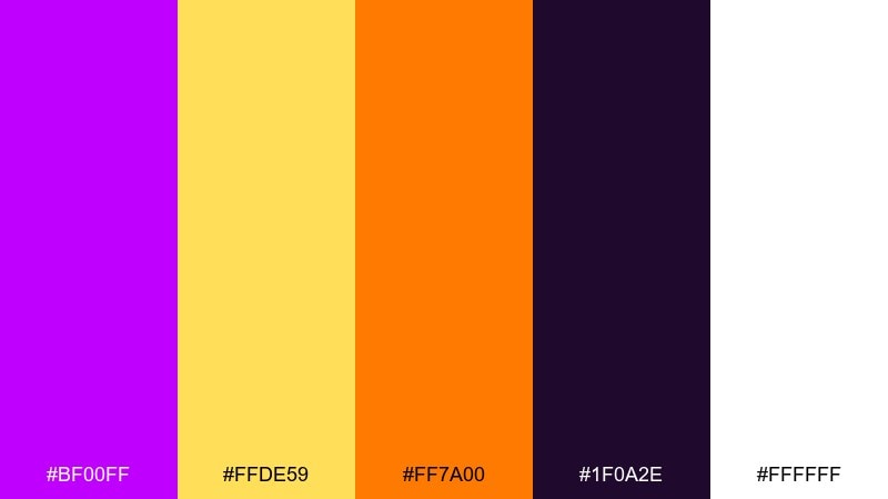
HEX: #BF00FF #FFDE59 #FF7A00 #1F0A2E #FFFFFF
Mood: fun, punchy, youthful
Best for: snack brand poster ad
Sugary, fizzy color energy makes this set feel like a bold vending-machine moment. Bright yellow and orange bring instant appetite appeal while the deep purple keeps everything from becoming too loud. Use it for snack posters, playful ads, and packaging variations aimed at younger audiences. Tip: build big blocks of white space so the brights read cleanly from a distance.
Image example of grape soda pop generated using media.io
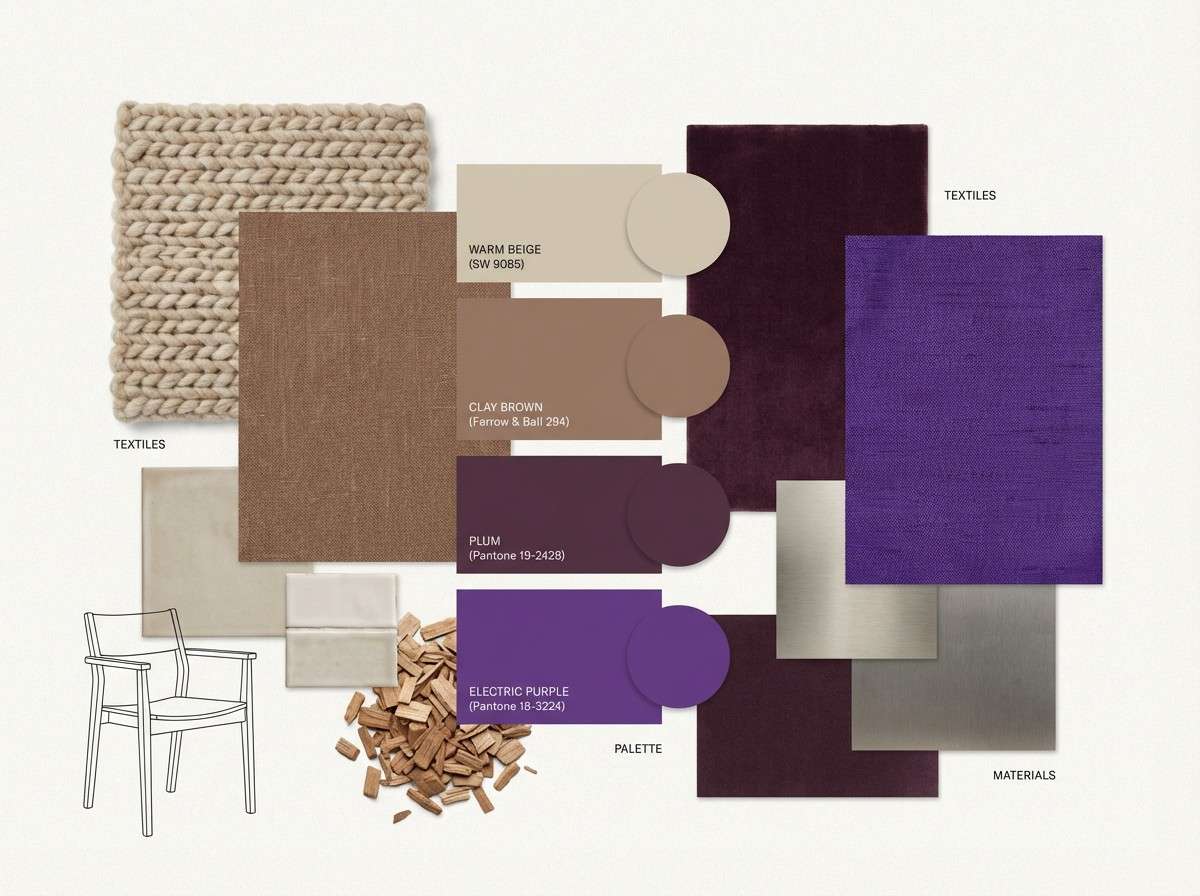
17) Plum Clay Interior
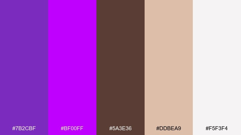
HEX: #7B2CBF #BF00FF #5A3E36 #DDBEA9 #F5F3F4
Mood: warm, grounded, artsy
Best for: interior mood board
Earthy clay and warm neutrals soften the purple into something livable and tactile. The mix feels like velvet pillows against natural plaster walls, with a bright accent for modern flair. Use it for interior mood boards, boutique cafes, or lifestyle branding that wants warmth plus a statement color. Tip: apply electric purple in small decor moments like throws, artwork, or a single feature wall.
Image example of plum clay interior generated using media.io
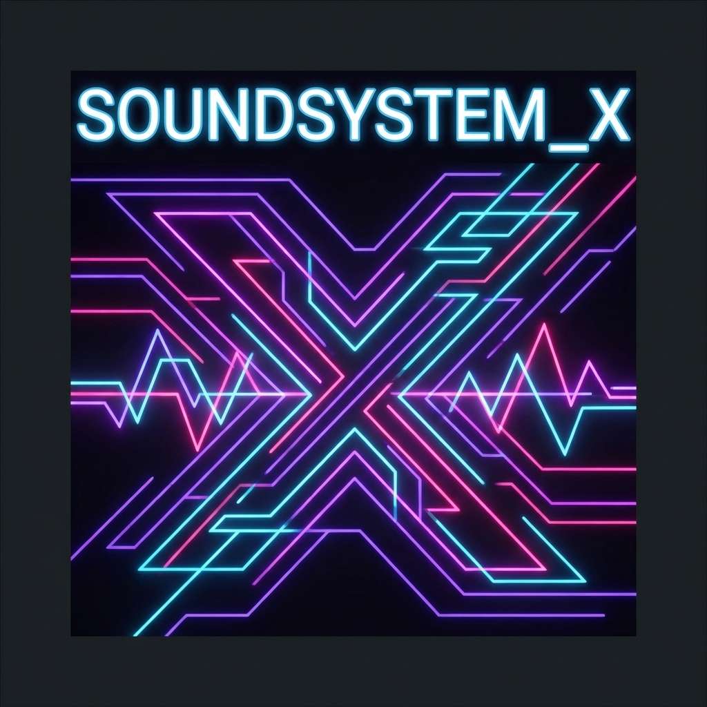
18) Midnight Club Lights
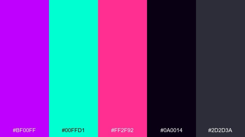
HEX: #BF00FF #00FFD1 #FF2F92 #0A0014 #2D2D3A
Mood: intense, glossy, high-energy
Best for: dance music cover art
Midnight darkness with laser-bright accents feels like a packed dance floor at peak drop. The neon teal and hot pink intensify the purple and create instant focal points for titles and logos. For maximum impact, this electric purple color palette pairs best with heavy sans typography and simple geometric shapes. Tip: keep gradients subtle and let hard edges do the work for a sharper club look.
Image example of midnight club lights generated using media.io
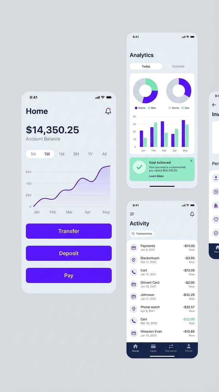
19) Frosted Violet Tech
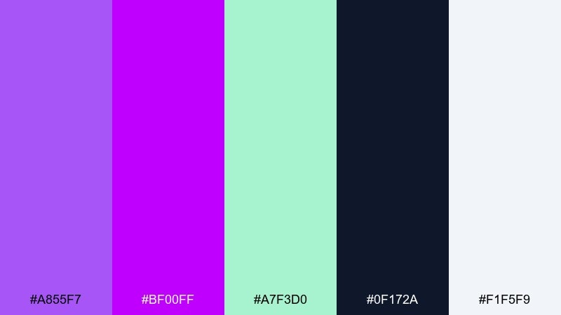
HEX: #A855F7 #BF00FF #A7F3D0 #0F172A #F1F5F9
Mood: cool, clean, trustworthy
Best for: fintech app ui
Frosted violet with icy neutrals feels clean, stable, and very screen-friendly. The minty accent brings clarity for positive states, while the deep navy supports readable navigation and charts. Use it in fintech UI, settings screens, and data-heavy views that need a modern edge without looking noisy. Tip: keep surfaces light and use purple primarily for selected states and primary actions.
Image example of frosted violet tech generated using media.io
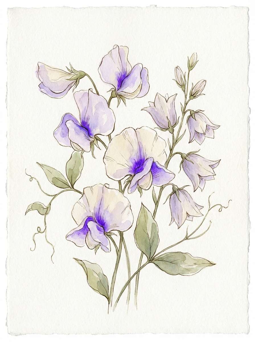
20) Purple Bloom Botanical
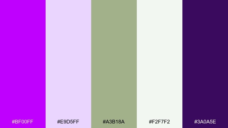
HEX: #BF00FF #E9D5FF #A3B18A #F2F7F2 #3A0A5E
Mood: botanical, airy, calming
Best for: spring floral illustration
Soft violet petals against fresh greens feel like a spring garden after rain. The pale lavender and gentle off-white keep the palette light, while the deep purple adds definition for outlines and shadows. Use it for botanical illustrations, stationery, or skincare storytelling that wants a clean natural mood. Tip: let green take more area than purple so the accent feels intentional, not overpowering.
Image example of purple bloom botanical generated using media.io
What Colors Go Well with Electric Purple?
Electric purple pairs best with deep, grounding tones (near-black, navy, charcoal) when you want a neon, nightlife, or tech feel. These darker bases make purple look brighter and help UI elements and typography stay legible.
For a softer, more premium look, combine it with off-whites, warm creams, and light grays. This reduces glare and lets electric purple act as an accent for buttons, badges, and key headlines.
If you want maximum pop, add high-contrast brights like teal/cyan, hot pink, citrus yellow, or coral. Use those brights sparingly—electric purple already draws attention, so too many “lead colors” can compete.
How to Use a Electric Purple Color Palette in Real Designs
Start with a base and a role system: choose one dark (background), one light (surface/text), and keep electric purple as your primary accent. This keeps layouts clean while still delivering the bold purple personality.
In branding, use electric purple for distinctive marks, highlight stripes, or campaign headlines, then rely on neutrals for long-form readability. For print, consider slightly muted purple variants for large areas and keep the brightest purple for small premium details.
In UI, reserve electric purple for interactive states (primary buttons, selected tabs, key metrics). Pair it with a secondary accent (mint/teal or peach) for status messaging so purple doesn’t have to communicate every meaning.
Create Electric Purple Palette Visuals with AI
Want to preview how an electric purple color palette looks on a poster, landing page, packaging, or UI mockup? Generate fast concept visuals from a text prompt, then iterate by swapping accents (teal, gold, coral) to match your brand vibe.
With Media.io, you can create on-style images for campaigns and then refine them for real use—perfect for testing contrast, typography mood, and background choices before production.
Use the palette HEX codes above in your prompt, or describe the mood (neon nightclub, editorial noir, frosted fintech) to guide the output.
Electric Purple Color Palette FAQs
-
What is the HEX code for electric purple?
A common electric purple used in many modern palettes is #BF00FF, which reads as a vivid, neon-leaning purple on screens. -
Is electric purple the same as neon purple or violet?
They’re close, but not identical. “Neon purple” often pushes brighter and more fluorescent, while “violet” can be cooler or more muted; electric purple typically sits in a high-saturation middle ground that still feels clean and modern. -
What background colors make electric purple pop?
Near-black, deep navy, and charcoal make electric purple look brighter and more “glowing.” For softer contrast, warm cream or off-white keeps it vibrant without the harshness of pure white. -
What accent colors pair well with electric purple?
Teal/cyan, hot pink, coral, and citrus yellow are strong accent partners. If you want a premium look, try gold or champagne tones used sparingly. -
How do I keep electric purple designs readable?
Use electric purple for accents and actions, not for long paragraphs. Set body text in off-white or light gray on dark backgrounds, and ensure buttons meet contrast guidelines by pairing purple with a very light text color. -
What industries commonly use electric purple palettes?
Electric purple is popular in nightlife and music, gaming and streaming, beauty launches, and tech/SaaS branding—anywhere you want a bold, energetic, trend-forward tone. -
Can I use electric purple in minimal or editorial design?
Yes—limit purple to one or two elements (section labels, pull quotes, small rules) and lean on grayscale for the rest. This keeps the layout restrained while still feeling distinctive.


