

Red and turquoise is a modern, high-contrast pairing that feels both energetic and refreshing. It blends warmth (red) with cool clarity (turquoise), making layouts pop without relying on heavy gradients or effects.
Below are 20 ready-to-use red turquoise color palette ideas with HEX codes, plus AI image prompts you can reuse for branding, UI, posters, packaging, and print.
In this article
- Why Red Turquoise Palettes Work So Well
-
- coral reef market
- cactus fiesta
- seaside salsa
- vintage motel sign
- terracotta lagoon
- poppy aqua poster
- cranberry surf
- artisan tilework
- botanical riviera
- retro beach umbrella
- minimal dashboard pop
- gallery wall contrast
- kids science fair
- coastal wedding suite
- street food truck
- luxury spa accent
- winter berry lagoon
- sunbaked harbor
- modern folk pattern
- museum exhibit labels
- What Colors Go Well with Red Turquoise?
- How to Use a Red Turquoise Color Palette in Real Designs
- Create Red Turquoise Palette Visuals with AI
Why Red Turquoise Palettes Work So Well
Red turquoise tones succeed because they naturally create strong visual separation: red advances (feels closer and louder), while turquoise recedes (feels cooler and calmer). That push-pull contrast makes headlines, buttons, tags, and hero areas instantly scannable.
This pairing is also flexible across styles. With bright reds and clean aquas, it reads youthful and playful; with muted terracotta and deep teal, it becomes earthy, curated, and premium.
Finally, red and turquoise can stay readable when supported by the right neutrals. Creams and off-whites soften the intensity for large backgrounds, while charcoal or navy keeps typography crisp.
20+ Red Turquoise Color Palette Ideas (with HEX Codes)
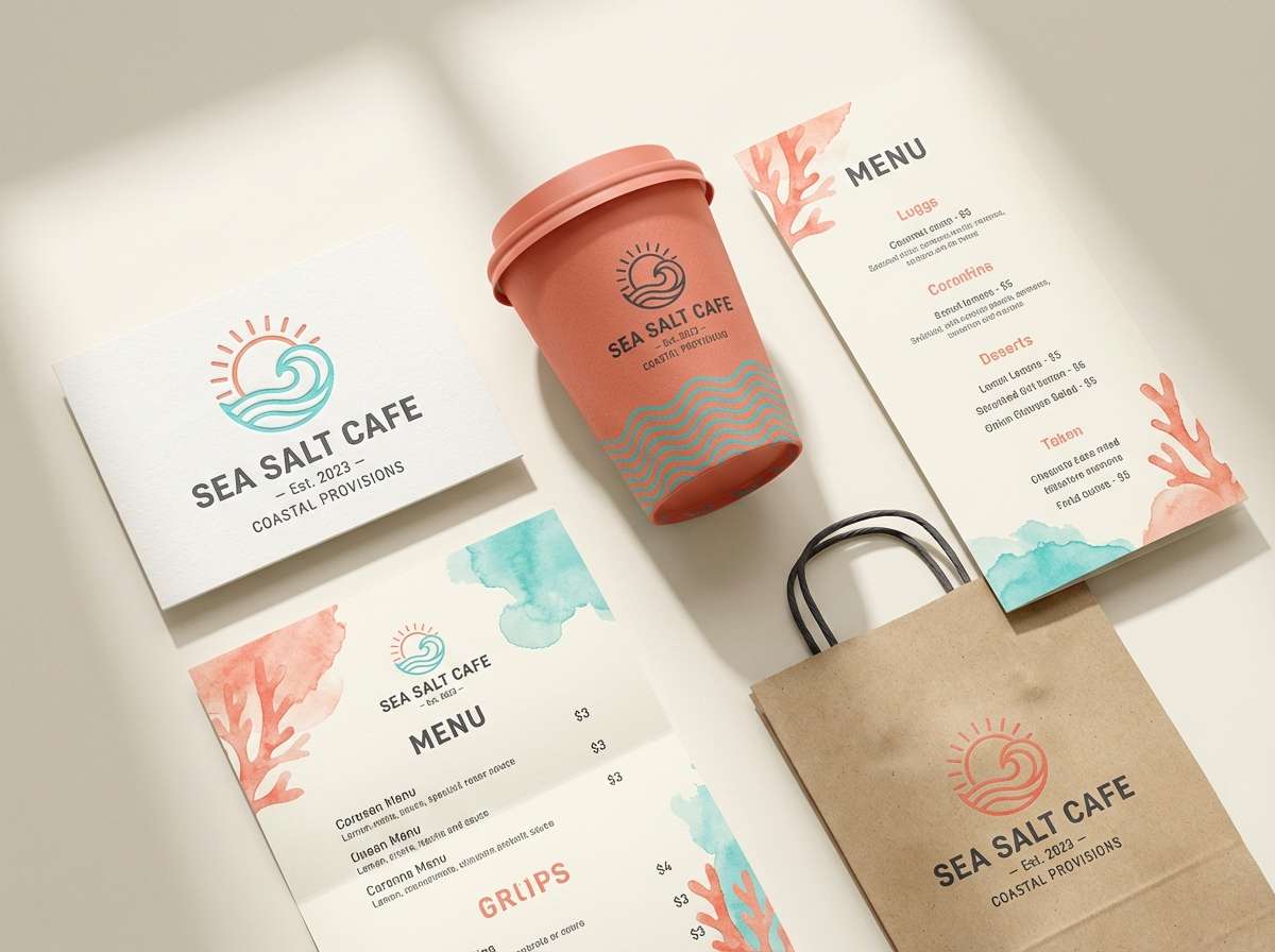
1) Coral Reef Market
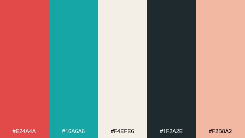
HEX: #E24A4A #16A6A6 #F4EFE6 #1F2A2E #F2B8A2
Mood: bright, coastal, welcoming
Best for: brand identity for a seaside cafe
Bright and coastal, it feels like coral stalls and sea-glass trinkets under morning sun. Use the turquoise as the primary brand color and let the red punch through in buttons, badges, or a logo mark. The warm cream keeps menus and signage readable, while the deep charcoal anchors typography. Tip: keep the coral tint (#F2B8A2) for backgrounds to avoid oversaturating large areas.
Image example of coral reef market generated using media.io
Media.io is an online AI studio for creating and editing video, image, and audio in your browser.

2) Cactus Fiesta
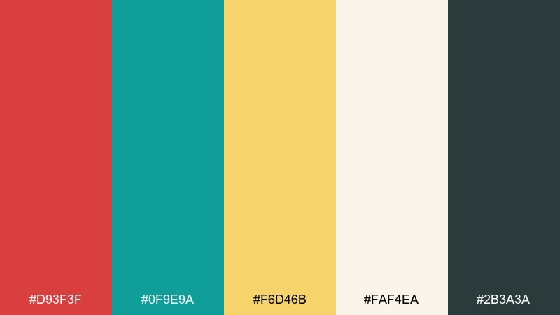
HEX: #D93F3F #0F9E9A #F6D46B #FAF4EA #2B3A3A
Mood: playful, sunny, energetic
Best for: summer event flyer design
Playful and sunny, it evokes desert paper lanterns and cool agua fresca. Let the golden yellow take the spotlight for headlines, then use turquoise for shapes and section dividers to keep the layout crisp. The strong red works best in small bursts like icons or a date block. Tip: keep body text in the dark slate to preserve contrast on the light background.
Image example of cactus fiesta generated using media.io

3) Seaside Salsa
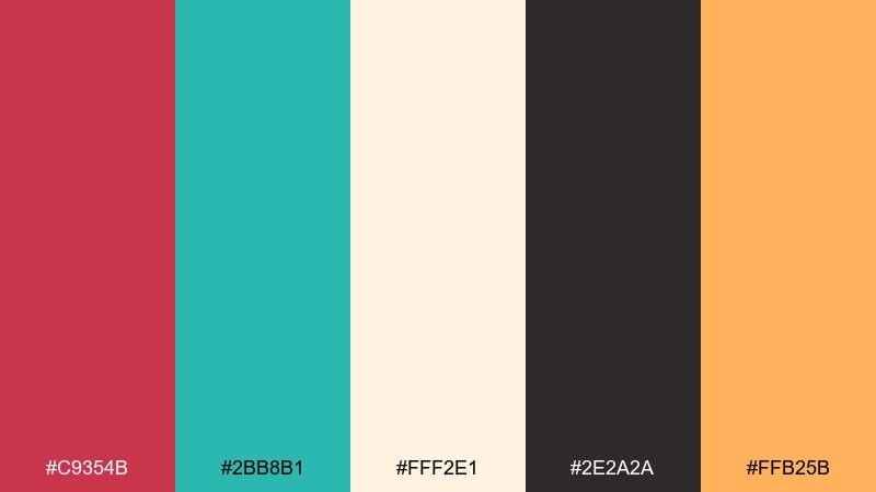
HEX: #C9354B #2BB8B1 #FFF2E1 #2E2A2A #FFB25B
Mood: fresh, flavorful, upbeat
Best for: recipe blog hero banner
Fresh and flavorful, it suggests citrus wedges, spicy salsa, and a breeze off the pier. The turquoise makes a clean banner base, while the raspberry red adds appetite appeal in callouts and category tags. Pair the soft cream with dark text for readable ingredient lists. Tip: reserve the orange for a single focal element like a subscribe button or rating badge.
Image example of seaside salsa generated using media.io
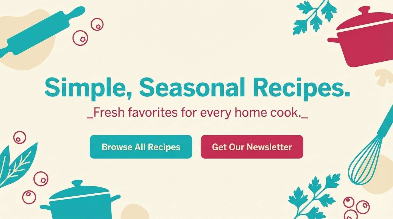
4) Vintage Motel Sign
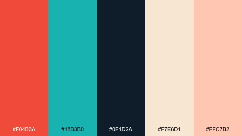
HEX: #F04B3A #18B3B0 #0F1D2A #F7E6D1 #FFC7B2
Mood: retro, bold, cinematic
Best for: album cover artwork
Retro and cinematic, it brings to mind neon glass, late-night highways, and weathered paint. Use the navy as the stage color, then layer turquoise and tomato red as the glowing highlights. The warm creams help soften harsh contrasts and can be used for type outlines or subtle texture. Tip: add grain or halftone effects so the bright hues feel more vintage than digital.
Image example of vintage motel sign generated using media.io
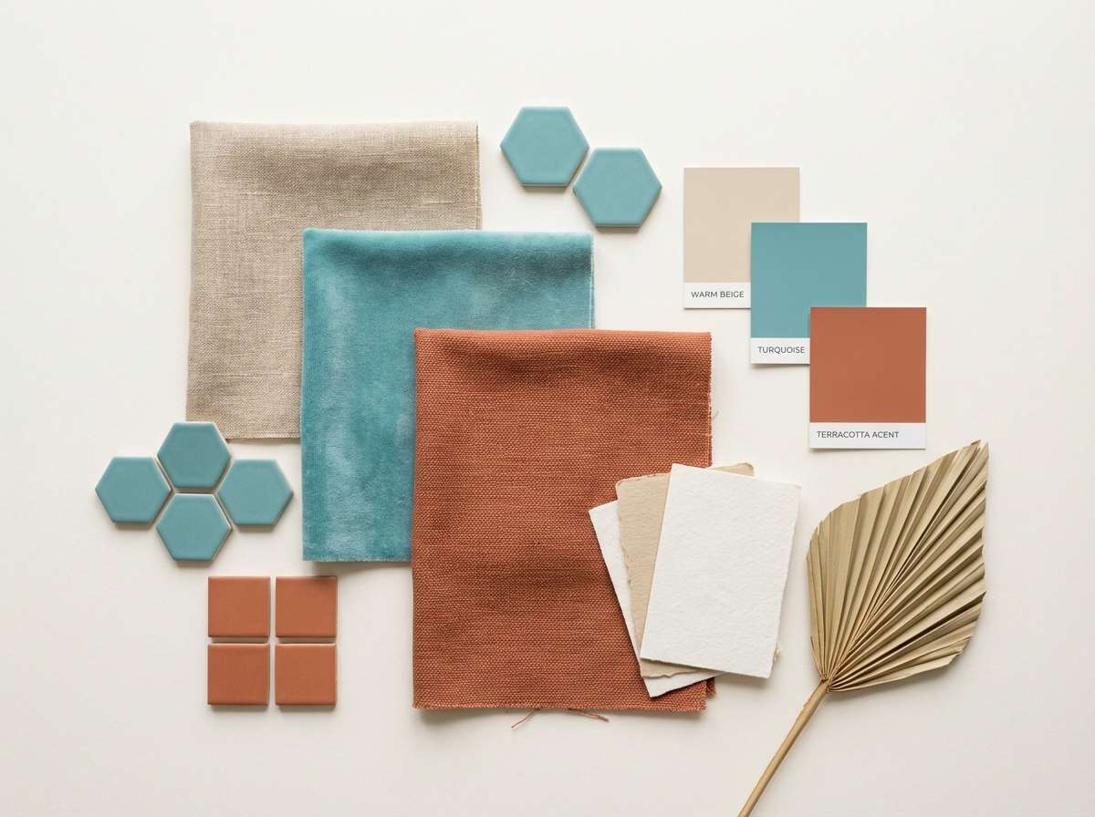
5) Terracotta Lagoon
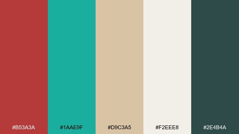
HEX: #B53A3A #1AAE9F #D9C3A5 #F2EEE8 #2E4B4A
Mood: earthy, calm, curated
Best for: interior design mood board
Earthy and calm, it feels like clay pottery beside a still lagoon. Keep the sandy beige and soft off-white as the base layers, then bring in turquoise through textiles or tile accents. The muted red reads best as a terracotta statement piece rather than a full wall color. Tip: balance with matte textures to maintain the grounded, natural vibe.
Image example of terracotta lagoon generated using media.io
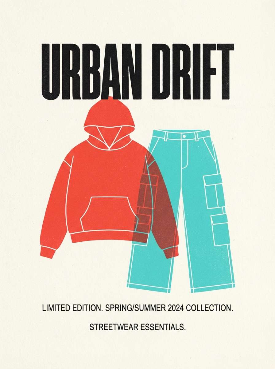
6) Poppy Aqua Poster
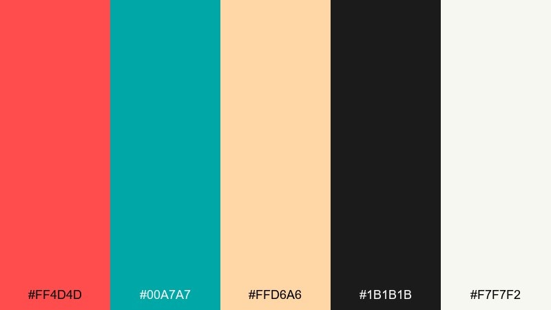
HEX: #FF4D4D #00A7A7 #FFD6A6 #1B1B1B #F7F7F2
Mood: punchy, youthful, attention-grabbing
Best for: streetwear product poster
Punchy and youthful, it looks like poppies against a clear pool with sharp black ink lines. This red turquoise color palette works best with bold typography and plenty of negative space so the colors feel intentional, not noisy. Use the off-white as your primary canvas, then drop in turquoise blocks behind product info and red for the hero headline. Tip: keep black strictly for type and outlines to preserve that graphic, screen-print feel.
Image example of poppy aqua poster generated using media.io
7) Cranberry Surf
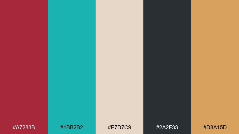
HEX: #A7283B #1BB2B2 #E7D7C9 #2A2F33 #D8A15D
Mood: moody, coastal, refined
Best for: hotel website landing page
Moody and coastal, it suggests cranberry cocktails at dusk and dark water beyond the pier. Use turquoise for interactive states like links and hover fills, while cranberry becomes your signature accent on key CTAs. The warm sand tone keeps sections from feeling too cold next to the slate text color. Tip: apply the caramel hue sparingly as an icon or rating highlight to elevate the luxury feel.
Image example of cranberry surf generated using media.io
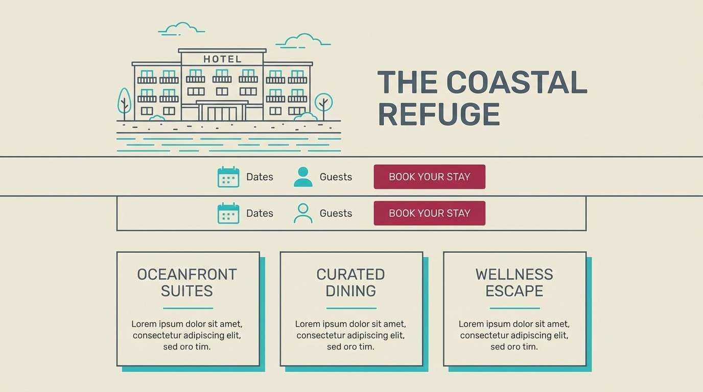
8) Artisan Tilework
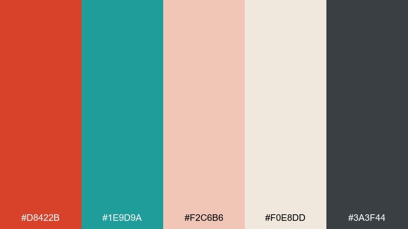
HEX: #D8422B #1E9D9A #F2C6B6 #F0E8DD #3A3F44
Mood: handmade, warm, textured
Best for: ceramics shop packaging
Handmade and warm, it feels like painted tiles, kiln heat, and dusty studio shelves. Let the creams carry the packaging surface, then add turquoise patterns for a crafted, Mediterranean touch. The brick red works beautifully as a stamp mark or small brand seal. Tip: keep pattern density low so the palette reads artisanal, not busy.
Image example of artisan tilework generated using media.io
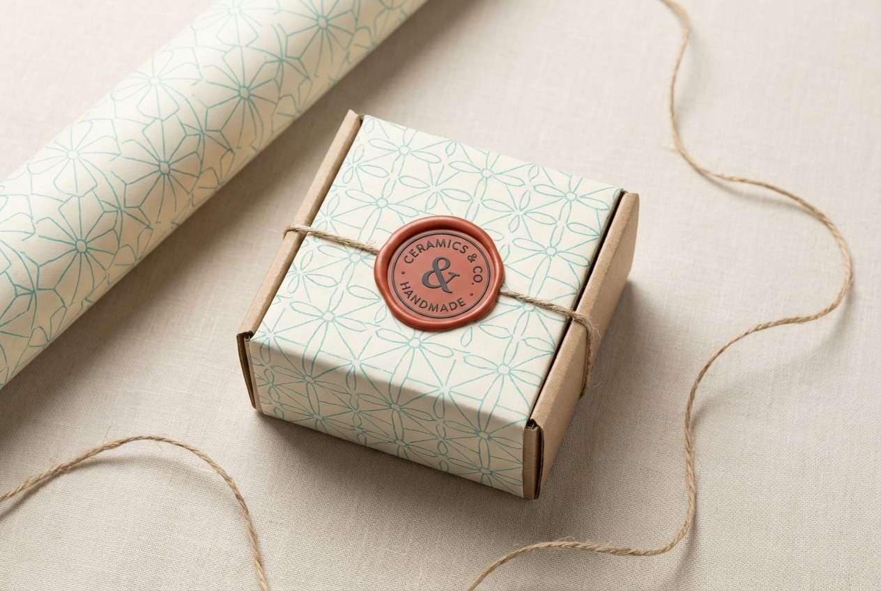
9) Botanical Riviera
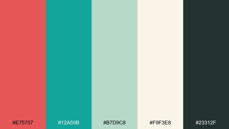
HEX: #E75757 #12A59B #B7D9C8 #F9F3E8 #23312F
Mood: fresh, botanical, airy
Best for: watercolor botanical illustration
Fresh and airy, it evokes garden leaves washed by sea mist with a blush of blossoms. Use the minty green as a gentle mid-tone wash and keep turquoise for deeper leaf shadows. The soft red is perfect for petals or small fruit accents that need to pop without shouting. Tip: leave plenty of paper-white space so the greens stay luminous.
Image example of botanical riviera generated using media.io
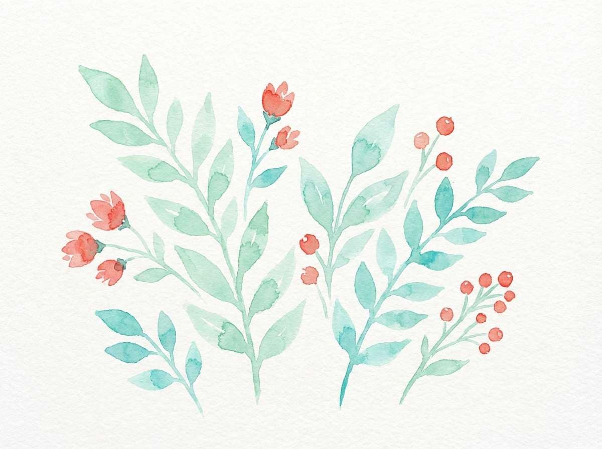
10) Retro Beach Umbrella
HEX: #FF5A4F #2AC4BF #FFE7C6 #1A3B5D #F0A66C
Mood: summery, nostalgic, bold
Best for: travel social media ad
Summery and nostalgic, it recalls striped umbrellas, postcard skies, and warm sand underfoot. The navy gives your ad copy structure, while turquoise and red carry the main visual energy. Use the pale sand as a background so text and icons remain clear in small formats. Tip: pick one warm accent, either peach or red, for the headline to keep the layout cohesive.
Image example of retro beach umbrella generated using media.io

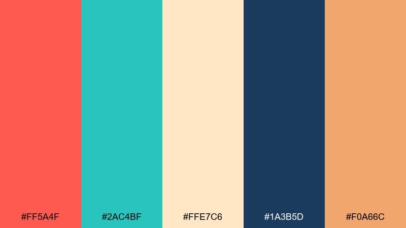
11) Minimal Dashboard Pop
HEX: #E03A3A #19B4B4 #EDE7DD #2D2D2D #9BB2B1
Mood: clean, modern, high-contrast
Best for: SaaS analytics dashboard UI
Clean and modern, it feels like calm surfaces with sharp data highlights. These red turquoise color combinations are ideal for status chips and alert states, while the neutrals keep charts readable. Use turquoise for primary actions and reserve red for errors, thresholds, or critical KPIs only. Tip: apply the muted gray-green to secondary chart lines so the interface stays focused on the main metrics.
Image example of minimal dashboard pop generated using media.io

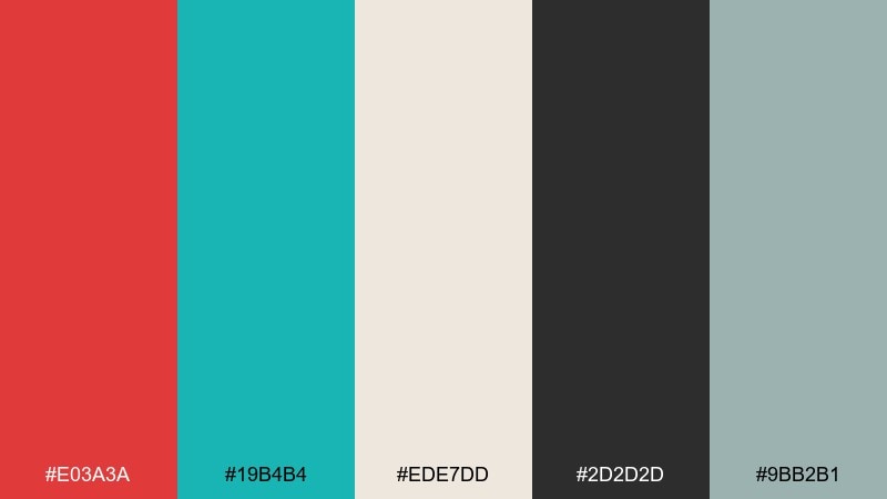
12) Gallery Wall Contrast
HEX: #C83A3A #0FAAA6 #F3EFE7 #6B5B4B #1C1C1C
Mood: artsy, grounded, sophisticated
Best for: museum poster layout
Artsy and grounded, it brings a gallery hush with bold color blocks on textured paper. Use the near-black for type hierarchy, then add turquoise as the modern counterpoint in rules or panel fills. The red works best in one intentional area like the exhibition title or a date stamp. Tip: keep margins generous so the palette reads curated and premium.
Image example of gallery wall contrast generated using media.io
13) Kids Science Fair
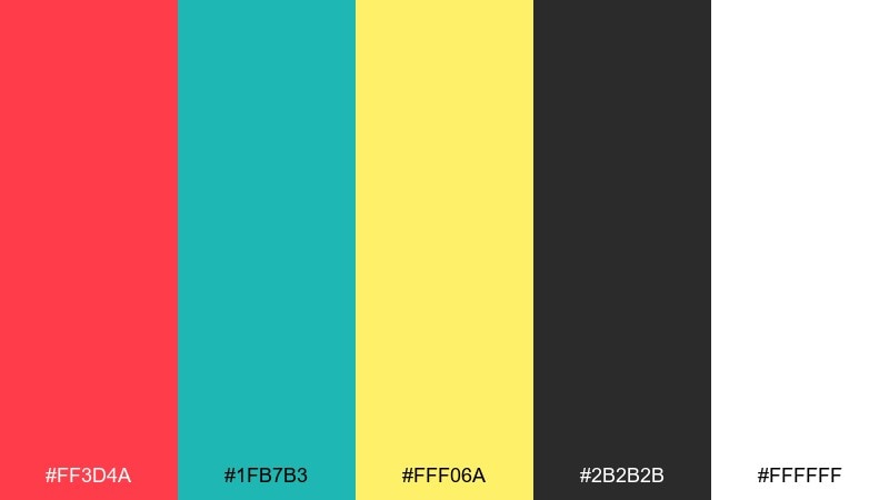
HEX: #FF3D4A #1FB7B3 #FFF06A #2B2B2B #FFFFFF
Mood: fun, curious, high-energy
Best for: school science fair invitation
Fun and curious, it feels like bright lab stickers, beakers, and doodled rockets. Let yellow carry the cheerful background shapes, then use turquoise for section headers and navigation cues. The vivid red is perfect for date and time emphasis so parents can scan quickly. Tip: use plenty of white breathing room to keep the design kid-friendly, not chaotic.
Image example of kids science fair generated using media.io

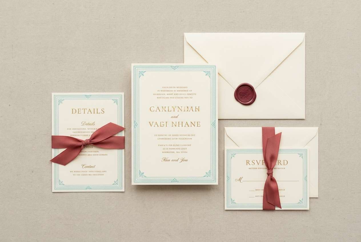
14) Coastal Wedding Suite
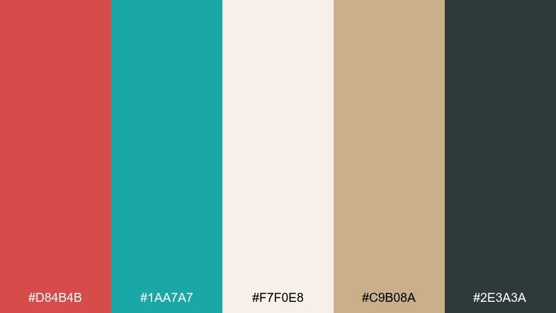
HEX: #D84B4B #1AA7A7 #F7F0E8 #C9B08A #2E3A3A
Mood: romantic, soft, coastal
Best for: wedding invitation set
Romantic and soft, it evokes linen stationery, seaside vows, and rose petals on sand. This red turquoise color palette shines when turquoise is used as a thin border or monogram ink, with the warm red reserved for a single accent line or wax-seal motif. The cream and champagne tones keep everything elegant and print-friendly. Tip: pick one script font for names and keep the rest in a clean serif to avoid visual clutter.
Image example of coastal wedding suite generated using media.io
15) Street Food Truck
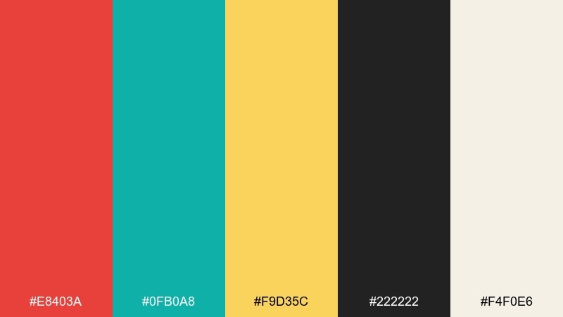
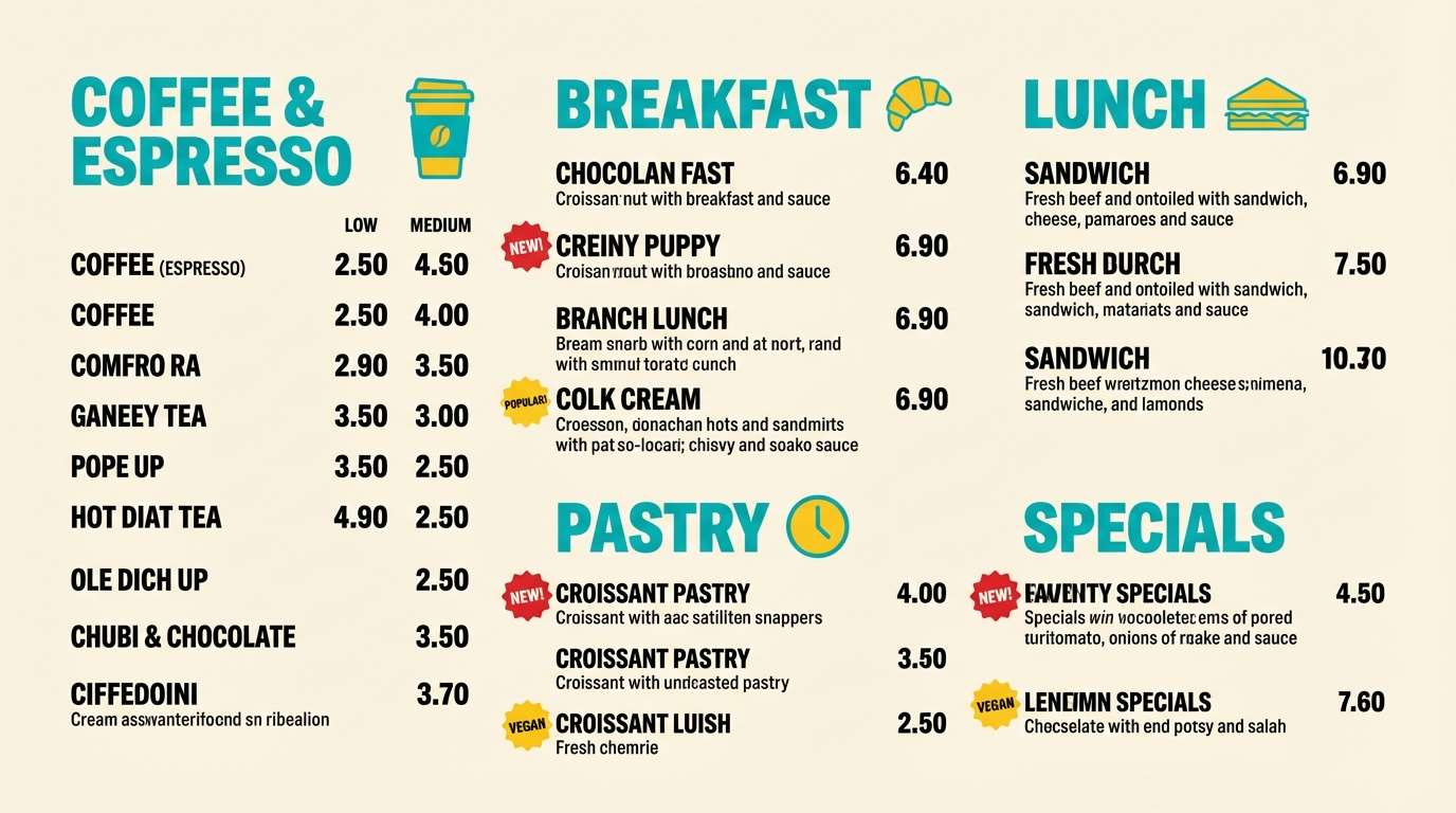
HEX: #E8403A #0FB0A8 #F9D35C #222222 #F4F0E6
Mood: bold, hungry, upbeat
Best for: food truck menu board
Bold and hungry, it feels like sizzling griddles and hand-painted signage on a busy corner. Use turquoise for section headers and dividers so the menu stays organized at a glance. The red and yellow can tag best-sellers and spicy levels without overwhelming the board. Tip: keep the background in warm off-white to reduce glare and improve readability outdoors.
Image example of street food truck generated using media.io
16) Luxury Spa Accent
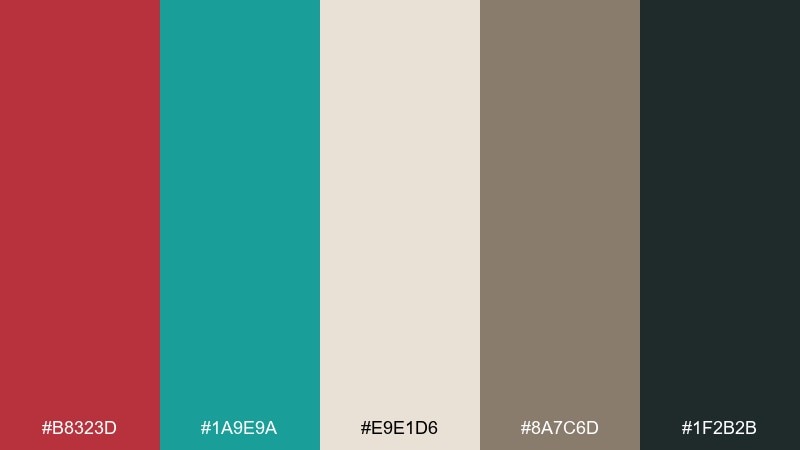
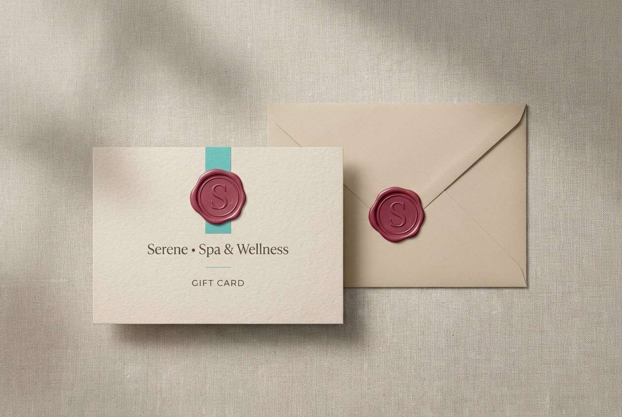
HEX: #B8323D #1A9E9A #E9E1D6 #8A7C6D #1F2B2B
Mood: calm, upscale, restorative
Best for: spa gift card design
Calm and upscale, it suggests warm stone, herbal steam, and quiet candlelight. Let the beige and taupe set a restful base, then add turquoise as a refined accent stripe or logo detail. The deep berry red works best as a minimal stamp mark or a small corner seal. Tip: use lots of whitespace and a single thin rule line to keep the look premium.
Image example of luxury spa accent generated using media.io
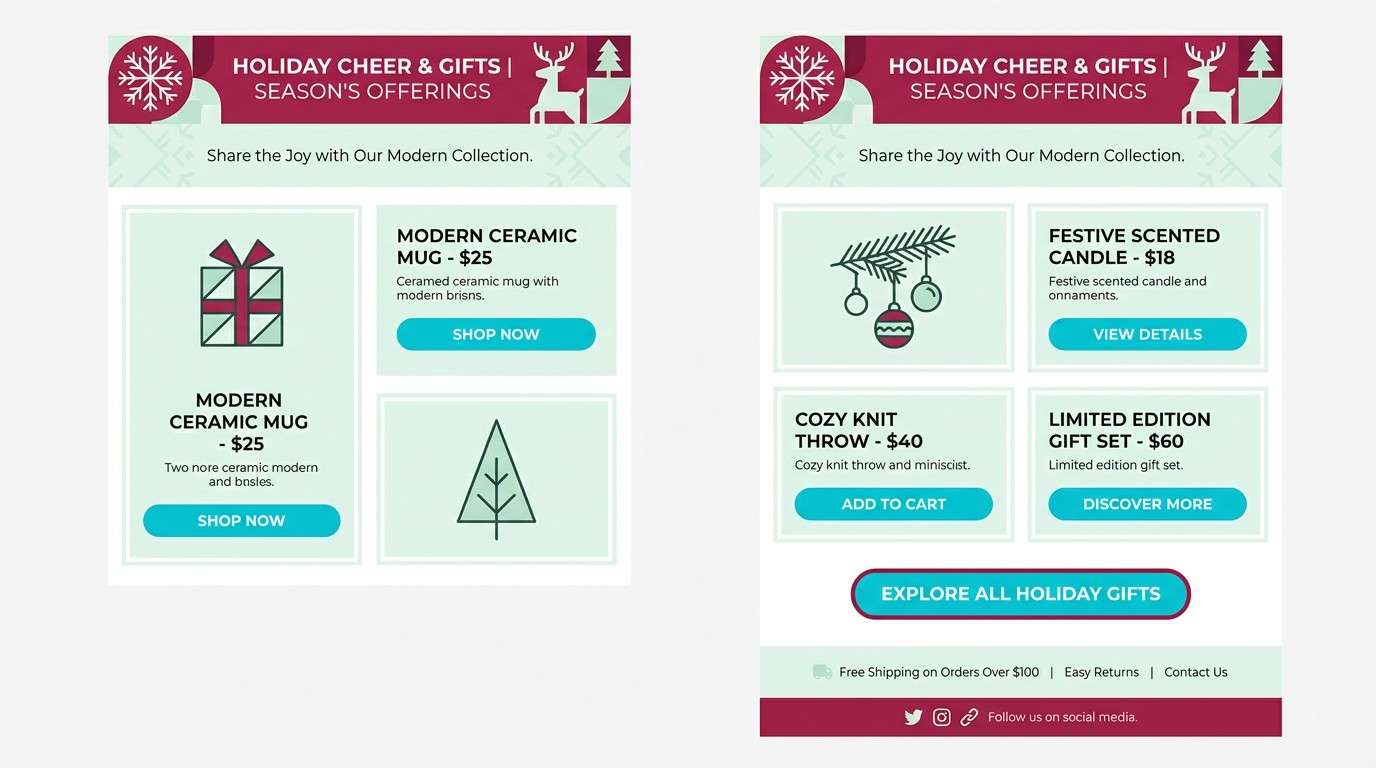
17) Winter Berry Lagoon
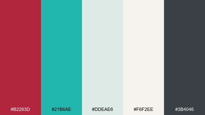
HEX: #B2263D #21B6AE #DDEAE6 #F6F2EE #3B4046
Mood: cool, crisp, modern
Best for: holiday email newsletter
Cool and crisp, it brings to mind frosted glass, berry sprigs, and clean winter air. Use the pale mint and warm off-white to keep the email light, then place turquoise in buttons for strong visibility. The berry tone is perfect for seasonal banners without leaning too traditional. Tip: avoid heavy blocks of dark gray and use it mainly for text to maintain an airy rhythm.
Image example of winter berry lagoon generated using media.io
18) Sunbaked Harbor
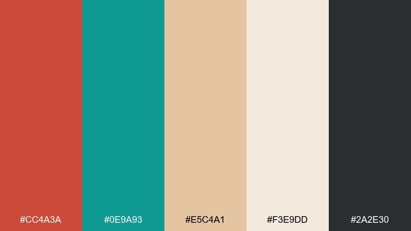
HEX: #CC4A3A #0E9A93 #E5C4A1 #F3E9DD #2A2E30
Mood: warm, rugged, nautical
Best for: outdoor gear product ad
Warm and rugged, it feels like weathered docks, rope fibers, and sunbaked paint. Use the dark slate for bold product copy, then bring turquoise into technical callouts and feature icons. The brick red adds energy in a single badge like new or limited. Tip: keep the tan and cream tones as the backdrop so the gear details remain the focus.
Image example of sunbaked harbor generated using media.io

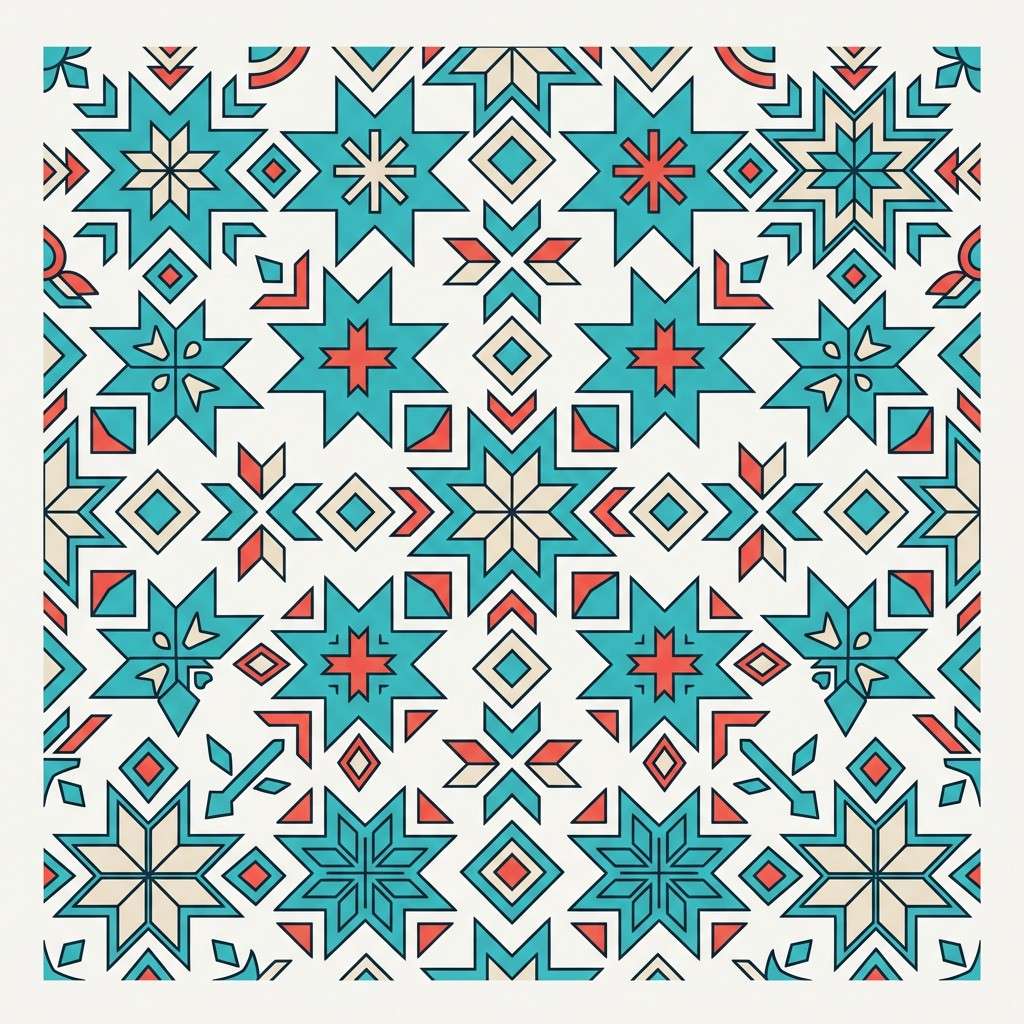
19) Modern Folk Pattern
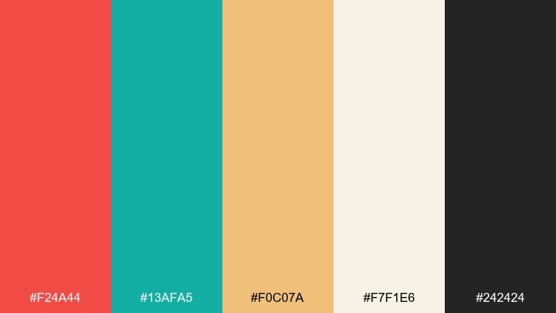
HEX: #F24A44 #13AFA5 #F0C07A #F7F1E6 #242424
Mood: festive, handcrafted, contemporary
Best for: textile pattern design
Festive and handcrafted, it looks like modern folk motifs printed on soft cotton. These red turquoise color combinations work especially well in repeating shapes, where turquoise forms the base pattern and red becomes the rhythm. Use the golden tone for small highlights so the repeat stays lively but balanced. Tip: test the pattern at both tiny and large scales to ensure the dark outline stays clean.
Image example of modern folk pattern generated using media.io
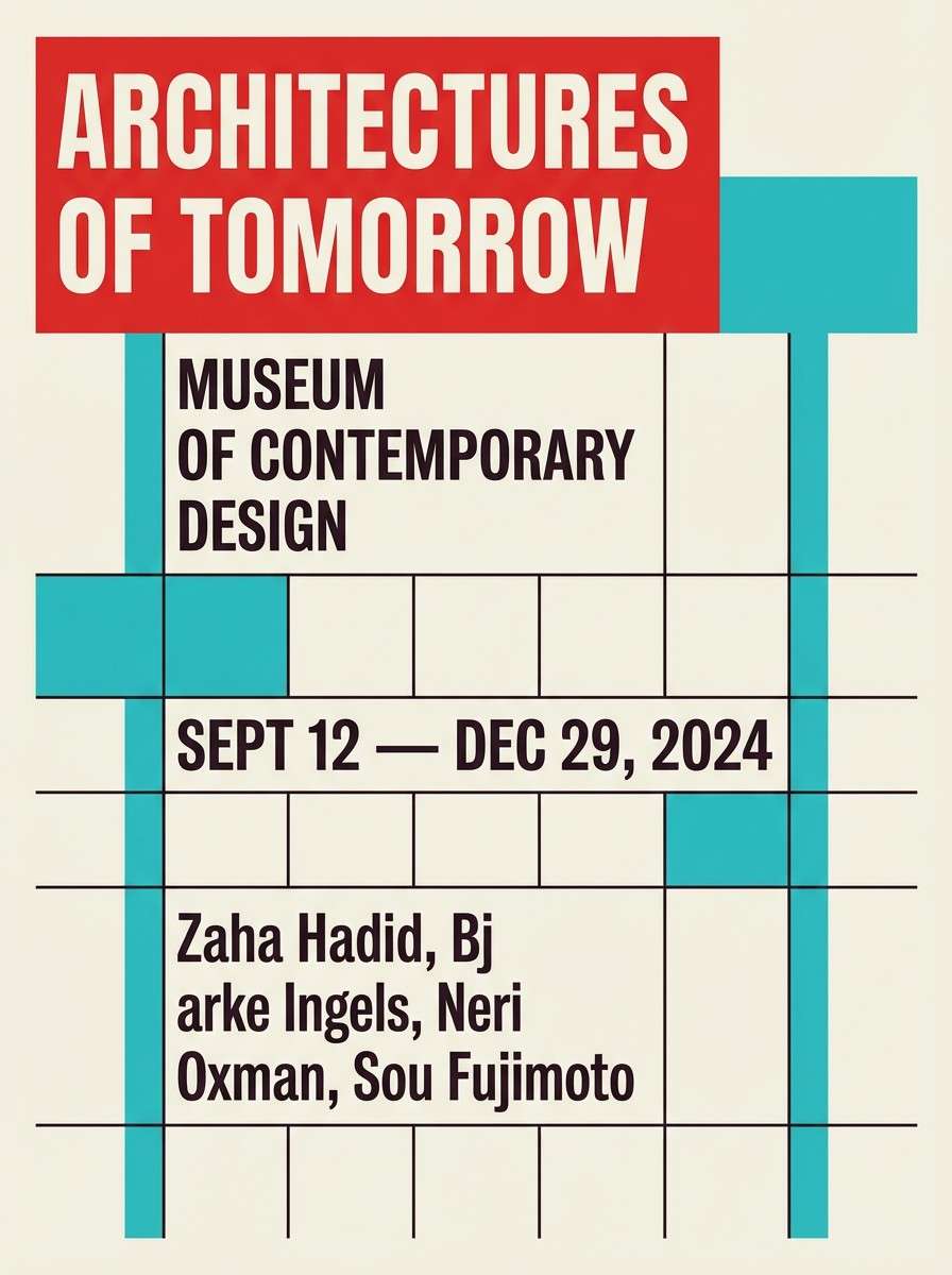
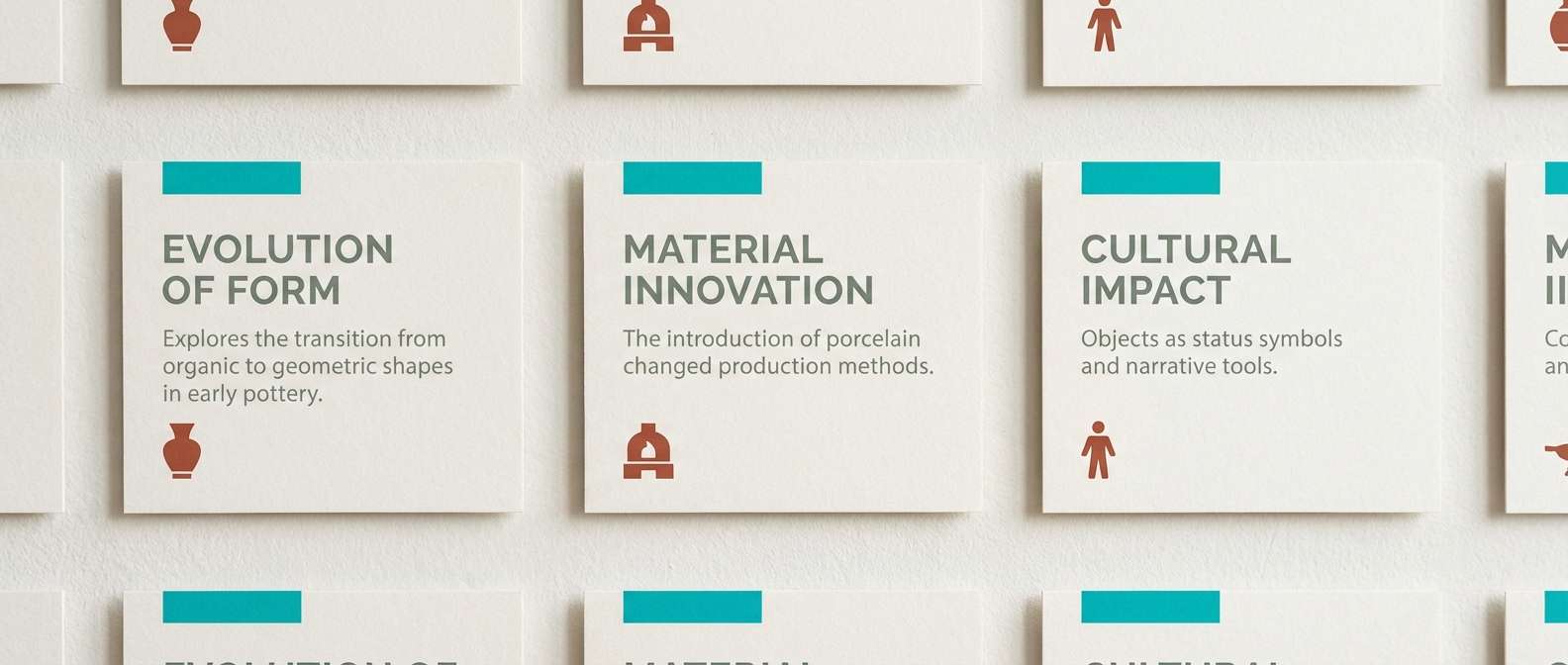
20) Museum Exhibit Labels
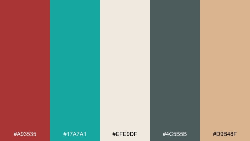
HEX: #A93535 #17A7A1 #EFE9DF #4C5B5B #D9B48F
Mood: quiet, academic, refined
Best for: exhibition label system design
Quiet and academic, it evokes letterpress cards and softly lit display cases. Use the warm off-white for label stock, then rely on deep gray-green for body text and hierarchy. Turquoise is ideal for section coding, while the brick red can mark special notes or interactive prompts. Tip: keep accent colors to thin rules and small icons so the system feels timeless.
Image example of museum exhibit labels generated using media.io
What Colors Go Well with Red Turquoise?
Neutrals are the easiest match: warm off-white, cream, sand, and light beige make red turquoise tones feel breathable and print-friendly. For typography and UI structure, charcoal, near-black, and deep slate keep contrast consistent.
For extra warmth, add muted gold, caramel, or peach as a third accent—great for badges, highlights, and supporting icons. If you want a cooler, more modern feel, try navy or a gray-green to stabilize the palette without competing with turquoise.
When in doubt, choose one dominant (turquoise or red), one supporting neutral (cream/off-white), one text anchor (charcoal/navy), and keep any extra accent color under 10% usage.
How to Use a Red Turquoise Color Palette in Real Designs
For branding, let turquoise act as the primary identity color (backgrounds, panels, packaging patterns), then use red as a signature punch in logos, seals, or CTA moments. This keeps the brand energetic while still feeling clean and modern.
For UI, use turquoise for primary actions and interactive states, and reserve red for alerts, errors, or “critical” KPI callouts. Back everything with warm neutrals so charts, tables, and long-form text remain readable.
For print (posters, menus, invitations), avoid large areas of fully saturated red—use it in titles, stamps, and key highlights. A cream base plus dark text will make the turquoise and red look intentional rather than overwhelming.
Create Red Turquoise Palette Visuals with AI
If you want to preview how a red and turquoise palette looks on real design assets, generate quick mockups with AI first. It’s a fast way to test contrast, mood, and color balance before you commit to a full layout.
Reuse the prompts above as templates: swap the subject (menu, website hero, packaging, invite), keep the palette’s dominant colors, and adjust the aspect ratio to match your platform.
With Media.io, you can create a consistent set of palette visuals for presentations, mood boards, and client approvals—right in your browser.
Red Turquoise Color Palette FAQs
-
What does a red and turquoise color palette communicate?
It usually signals energetic freshness: red brings urgency and warmth, while turquoise adds clarity and a modern, coastal coolness. Together, they create strong visual contrast that feels lively and current. -
Is red turquoise a good palette for branding?
Yes—especially for brands that want to look bold but approachable (food, travel, lifestyle, events, and modern retail). Use turquoise as the main brand field and keep red as an accent so the identity stays balanced. -
How do I keep red and turquoise from looking too loud?
Add warm neutrals like cream, off-white, or sand as the dominant background, and use charcoal or navy for text. Limit saturated red to small areas (buttons, badges, key headlines) instead of large blocks. -
What are the best neutrals to pair with red turquoise tones?
Warm off-whites (#F7F0E8 style tones), soft beige, and light tan work beautifully for backgrounds. For structure and type, deep charcoal, slate, and navy help keep contrast readable. -
Can I use red and turquoise in UI design?
Definitely. Make turquoise your primary action color (links, primary buttons), and reserve red for error states and critical alerts only. This keeps the interface intuitive and avoids “always-on” warning vibes. -
What accent colors work well with a red turquoise palette?
Muted gold, caramel, peach, and soft coral can add warmth without fighting the main pairing. If you want a cooler, more restrained system, try gray-green or deep navy as a secondary support color. -
How can I quickly visualize a red turquoise palette on real assets?
Generate mockups with AI using consistent prompts (poster, packaging, landing page, invitation) and your HEX codes as references. This makes it easy to compare variations and pick the most usable balance.


