

Copper rust is a warm, earthy tone that blends the glow of metal with the grounded feel of clay. It’s bold enough to lead a design, yet natural enough to pair smoothly with neutrals and dark anchors.
Below are 20 copper rust color palette ideas (with HEX codes), plus practical guidance for branding, interiors, and web/UI—so you can build warmth without turning overly orange.
In this article
- Why Copper Rust Palettes Work So Well
-
- forge glow
- canyon clay
- patina and pepper
- autumn market
- smoked terracotta
- copper orchard
- industrial ember
- desert sunset tiles
- vintage leatherbound
- hearth and linen
- oxide bloom
- spiced cider
- burnished minimal
- rustic workshop
- terra botanica
- claystone modern
- copper nightfall
- sienna coast
- amber alloy
- warm artifact
- What Colors Go Well with Copper Rust?
- How to Use a Copper Rust Color Palette in Real Designs
- Create Copper Rust Palette Visuals with AI
Why Copper Rust Palettes Work So Well
Copper rust sits in a “sweet spot” between orange and brown, which makes it feel energetic but still mature. It reads as handcrafted, autumnal, and tactile—often associated with pottery, leather, brick, and oxidized metal.
Because it’s naturally warm, copper rust creates instant contrast against cool shadows (slate, blue-gray, charcoal) and stays readable when paired with creamy off-whites. That balance makes it reliable for both print and digital layouts.
It also scales well: use brighter copper notes for highlights and CTAs, then lean on deeper rusts and browns for structure. The result is a palette that feels premium, not loud.
20+ Copper Rust Color Palette Ideas (with HEX Codes)
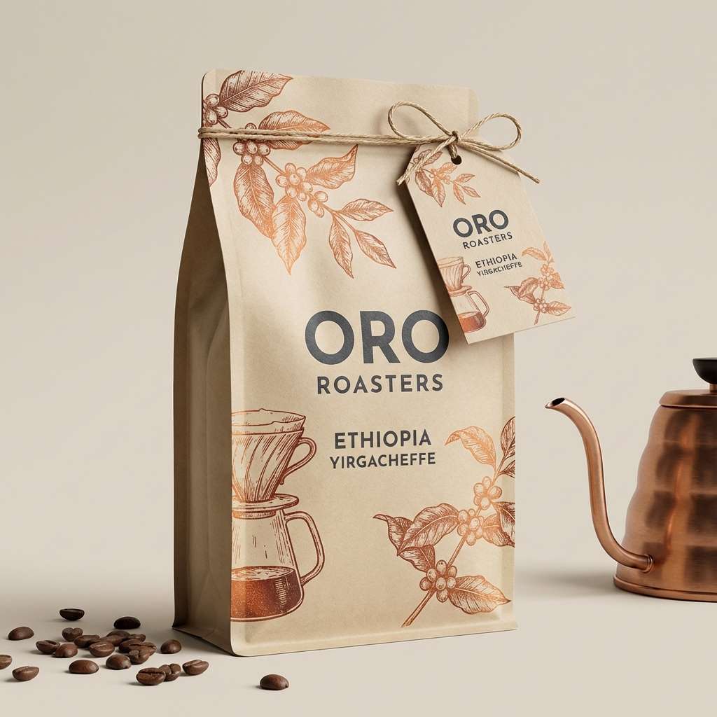
1) Forge Glow
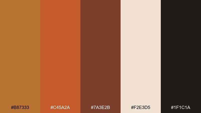
HEX: #b87333 #c45a2a #7a3e2b #f2e3d5 #1f1c1a
Mood: bold, handcrafted, premium
Best for: artisan coffee branding and bag packaging
Bold, kiln-warm tones evoke hammered metal, espresso crema, and a workshop glow. This copper rust color palette shines on craft brands, especially when the cream is used for whitespace and the near-black anchors type. Pair it with uncoated paper textures or subtle grain to keep it tactile. Usage tip: reserve the brightest copper for seals, icons, and small highlights so it feels premium, not loud.
Image example of forge glow generated using media.io
Media.io is an online AI studio for creating and editing video, image, and audio in your browser.

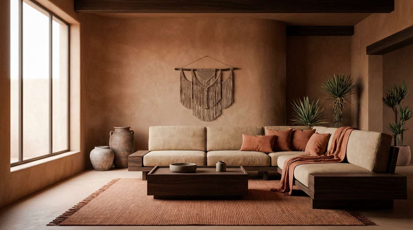
2) Canyon Clay
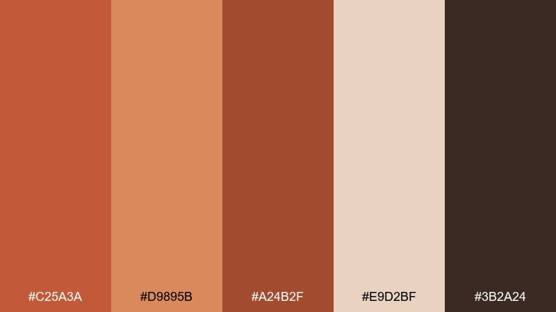
HEX: #c25a3a #d9895b #a24b2f #e9d2bf #3b2a24
Mood: sunbaked, grounded, welcoming
Best for: southwest living room interior styling
Sunbaked clay and canyon walls come to mind, with soft sand lightening the whole mix. It works beautifully for interiors where you want warmth without going overly orange. Balance the palette with natural wood, woven textiles, and dark accents in small doses. Usage tip: paint one statement wall in the mid rust and keep trims in the pale beige for an airy, modern look.
Image example of canyon clay generated using media.io
3) Patina and Pepper
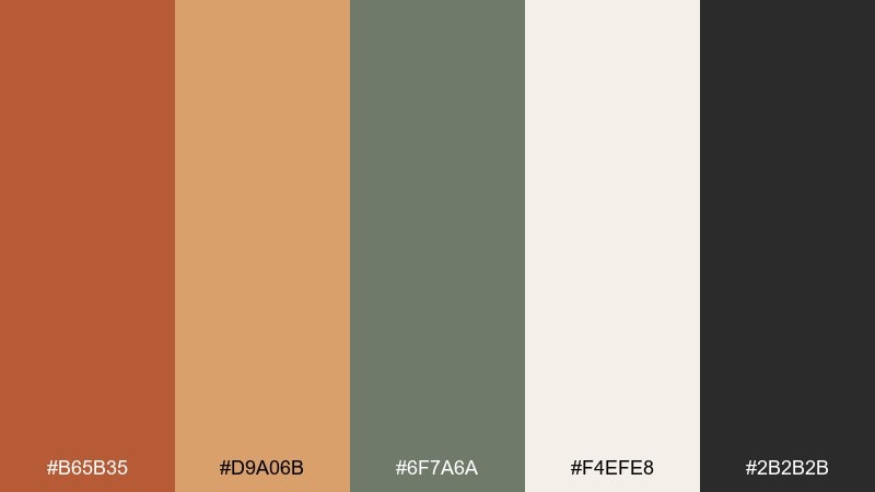
HEX: #b65b35 #d9a06b #6f7a6a #f4efe8 #2b2b2b
Mood: vintage, savory, balanced
Best for: modern bistro menu design
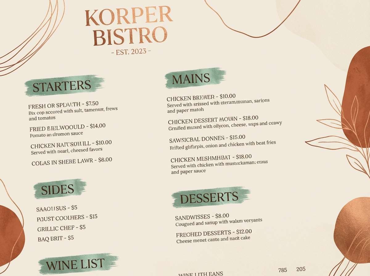
Aged copper warmth meets herb-patina green and cracked pepper black for a savory, old-world vibe. These tones feel right for menus, labels, and culinary brands that want rustic character with clean readability. Keep the cream as the main paper tone and use the green as a subtle divider or section header. Usage tip: set body text in pepper black and reserve the copper for prices and callouts.
Image example of patina and pepper generated using media.io
4) Autumn Market
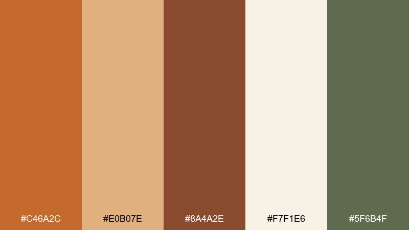
HEX: #c46a2c #e0b07e #8a4a2e #f7f1e6 #5f6b4f
Mood: cheerful, seasonal, cozy
Best for: fall farmers market social post
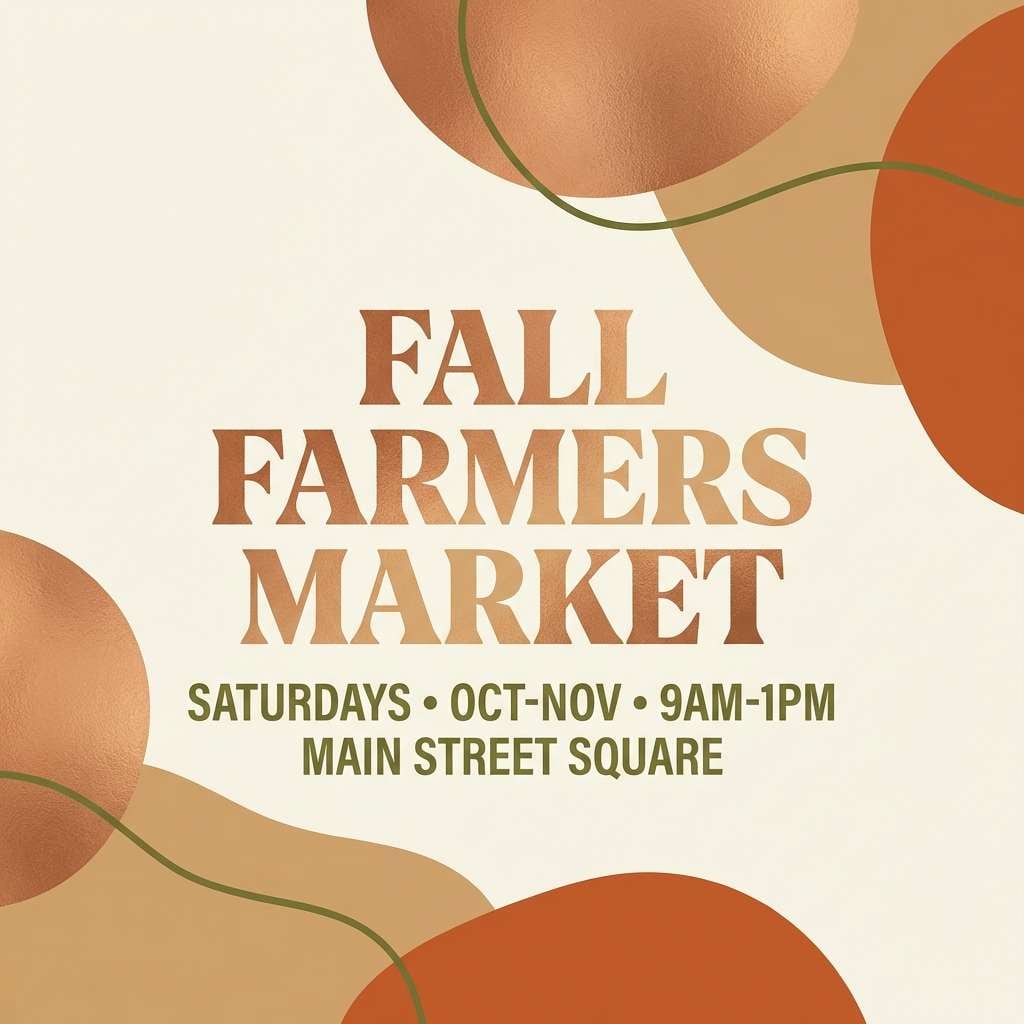
Cozy stalls, dried leaves, and spiced treats are the images this mix brings up. It suits seasonal promotions and community events because it feels friendly and easy to read. Pair the warm oranges with plenty of creamy background and a grounded olive accent for contrast. Usage tip: use the olive for buttons or dates so the warm hues stay dominant.
Image example of autumn market generated using media.io
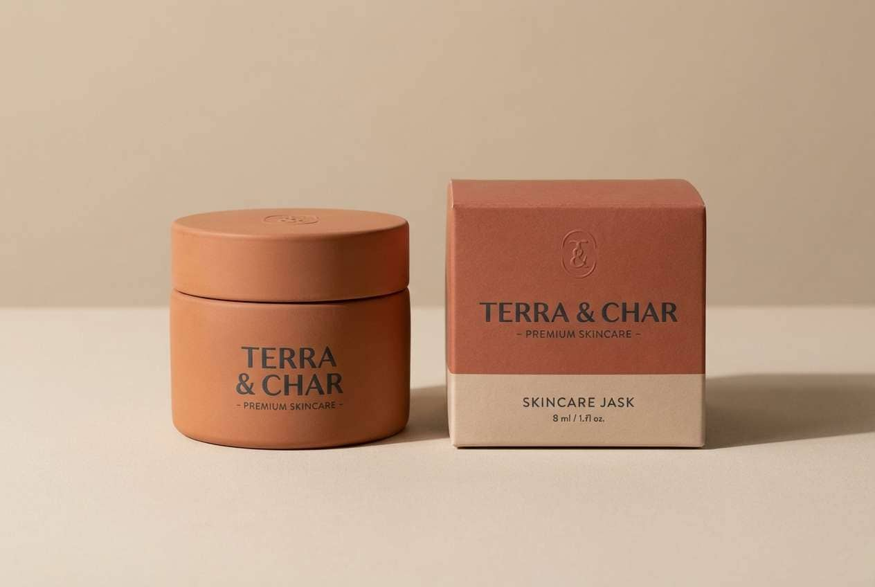
5) Smoked Terracotta
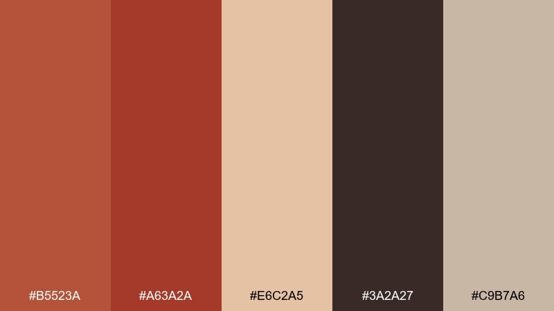
HEX: #b5523a #a63a2a #e6c2a5 #3a2a27 #c9b7a6
Mood: moody, refined, sensual
Best for: premium skincare packaging
Smoked terracotta and deep ember reds feel like candlelight on ceramic jars. The palette is ideal for beauty packaging that aims for warmth, richness, and a slightly mysterious edge. Pair it with matte finishes, minimal serif type, and soft beige backgrounds to keep it upscale. Usage tip: foil-stamp the darkest tone and keep the brighter rust for small brand marks.
Image example of smoked terracotta generated using media.io
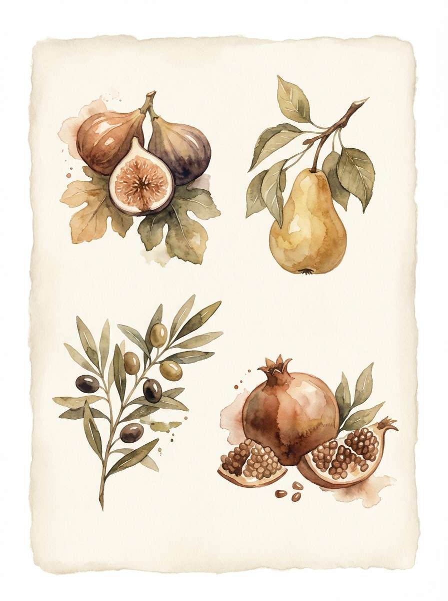
6) Copper Orchard
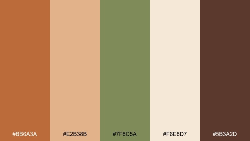
HEX: #bb6a3a #e2b38b #7f8c5a #f6e8d7 #5b3a2d
Mood: fresh, rustic, pastoral
Best for: watercolor botanical illustration set
Ripe orchard fruit and late-summer leaves come through in the warm copper, soft tan, and gentle green. It fits botanical art, food blogs, and natural product storytelling where you want warmth plus a hint of freshness. Keep the pale cream as the paper wash and layer the darker brown for stems and outlines. Usage tip: let the green appear sparingly so the copper stays the hero.
Image example of copper orchard generated using media.io
7) Industrial Ember
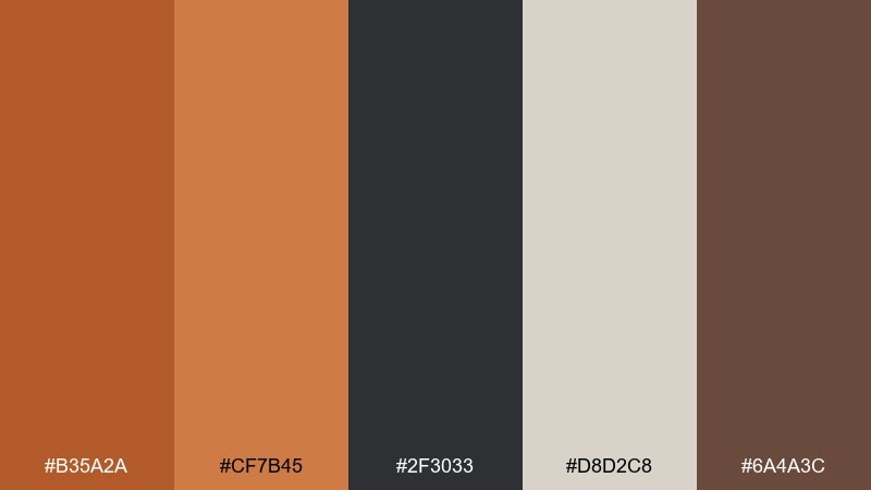
HEX: #b35a2a #cf7b45 #2f3033 #d8d2c8 #6a4a3c
Mood: modern, confident, utilitarian
Best for: analytics dashboard UI theme
Hot metal against graphite and stone neutrals creates a sharp, industrial feel. As a copper rust color scheme, it works well for dashboards where you need strong hierarchy and clear status colors without going neon. Use the light neutral for panels, charcoal for text, and copper as the primary action color. Usage tip: keep alerts to one accent shade and rely on tint variations for charts.
Image example of industrial ember generated using media.io

8) Desert Sunset Tiles
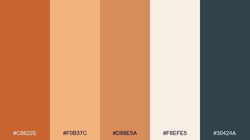
HEX: #c8622e #f0b37c #d88e5a #f8efe5 #30424a
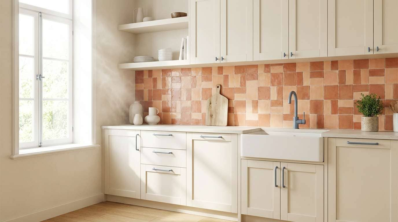
Mood: sunset, airy, contemporary
Best for: kitchen backsplash and decor mockup
A desert sunset gradient shows up in the layered oranges and soft peach, cooled by a blue-gray shadow tone. It is a great fit for modern kitchens, tile concepts, or interior mood boards that need warmth plus a crisp edge. Pair with brushed steel fixtures and pale oak so the palette reads fresh. Usage tip: use the blue-gray only in grout lines, hardware, or thin outlines to avoid shifting the warmth.
Image example of desert sunset tiles generated using media.io
9) Vintage Leatherbound
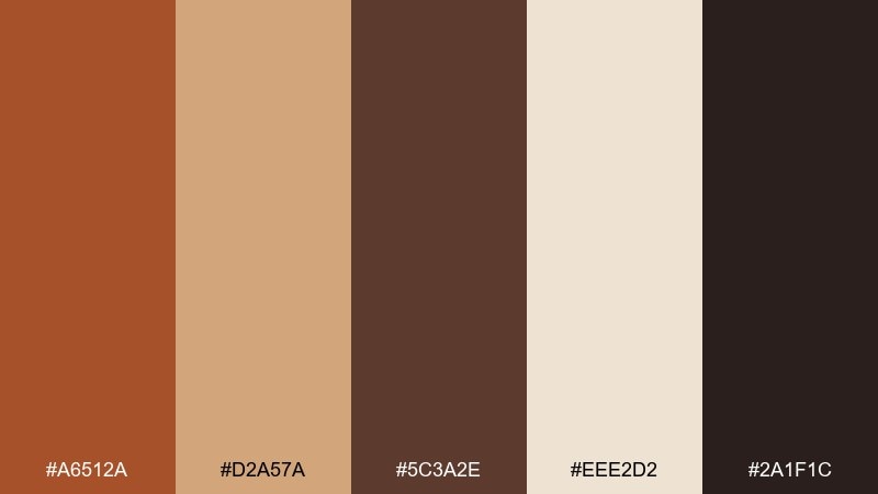
HEX: #a6512a #d2a57a #5c3a2e #eee2d2 #2a1f1c
Mood: classic, scholarly, intimate
Best for: historical novel book cover
Worn leather, tobacco paper, and ink-dark shadows give this palette a library-at-dusk vibe. It suits book covers, stationery, and heritage branding where texture and tradition matter. Pair the lighter tan with subtle embossing and keep the deepest brown for titles and borders. Usage tip: add a thin copper rule line to frame the layout and elevate the vintage feel.
Image example of vintage leatherbound generated using media.io
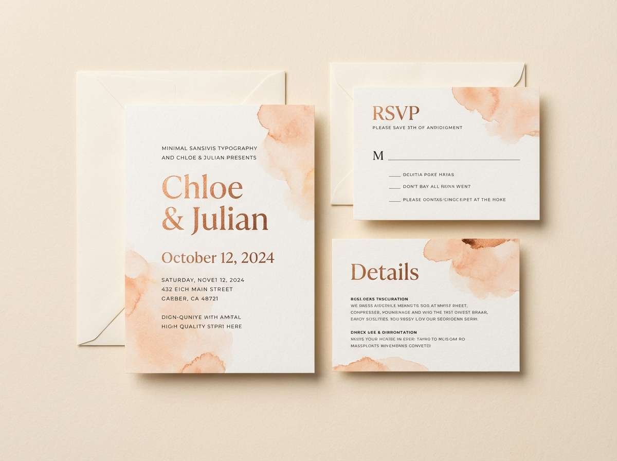
10) Hearth and Linen
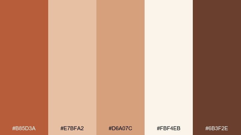
HEX: #b85d3a #e7bfa2 #d6a07c #fbf4eb #6b3f2e
Mood: soft, romantic, homey
Best for: rustic wedding invitation suite
Hearth warmth and linen softness make this mix feel intimate and welcoming. It is ideal for invitations where you want romance without heavy florals or overly bright hues. Pair with deckle-edge paper, warm-gray envelopes, and a simple script for names. Usage tip: print the darkest brown for text and use the lighter peach tones as subtle watercolor shapes behind headings.
Image example of hearth and linen generated using media.io
11) Oxide Bloom
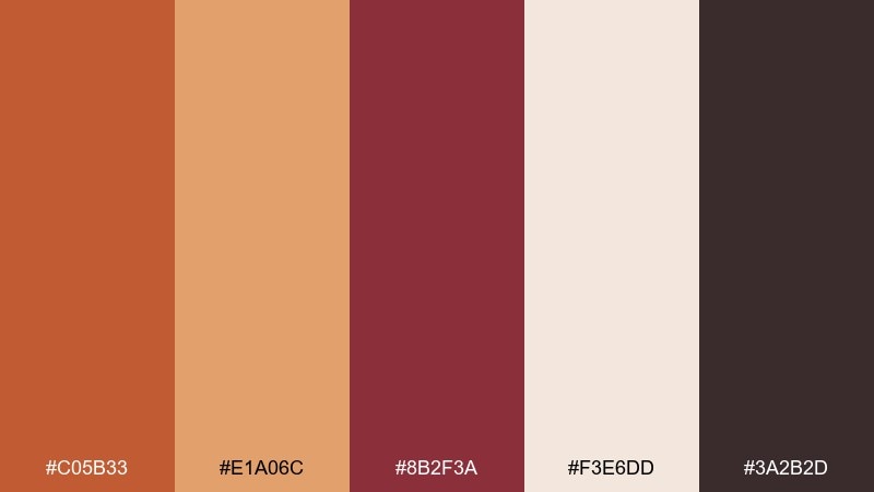
HEX: #c05b33 #e1a06c #8b2f3a #f3e6dd #3a2b2d
Mood: dramatic, editorial, artistic
Best for: fashion magazine spread layout
Oxide reds and dusty rose-browns feel like pigment, lipstick, and studio backdrops. The palette plays well in editorial design where contrast and mood do the storytelling. Pair it with lots of off-white space and crisp black-ish text for a modern, gallery-like finish. Usage tip: keep the burgundy tone for pull quotes or section openers so it lands with impact.
Image example of oxide bloom generated using media.io
12) Spiced Cider
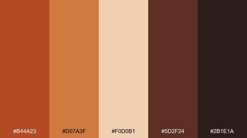
HEX: #b44a23 #d07a3f #f0d0b1 #5d2f24 #2b1e1a
Mood: festive, warm, inviting
Best for: seasonal cafe poster
Spiced cider warmth, toasted sugar, and dark syrup notes make this feel instantly seasonal. These copper rust color combinations are perfect for cafe posters and limited-time offers where you want appetite appeal and clear readability. Pair with bold sans-serif type and simple spice-inspired icons in the lighter peach. Usage tip: set the headline in the brightest rust and keep body copy in the deep brown for contrast.
Image example of spiced cider generated using media.io
13) Burnished Minimal
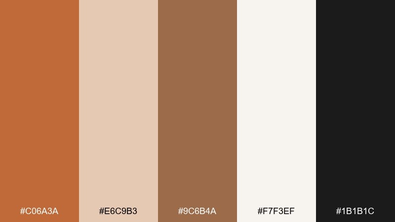
HEX: #c06a3a #e6c9b3 #9c6b4a #f7f3ef #1b1b1c
Mood: minimal, warm, tech-forward
Best for: app onboarding UI screens
Burnished copper against soft creams and near-black feels clean, modern, and quietly confident. It works especially well for onboarding flows where you want warmth but still need crisp accessibility. Pair the darkest tone with generous line-height and use the tan as a card background. Usage tip: keep buttons consistent in one copper shade and use the lighter tones for progress indicators.
Image example of burnished minimal generated using media.io
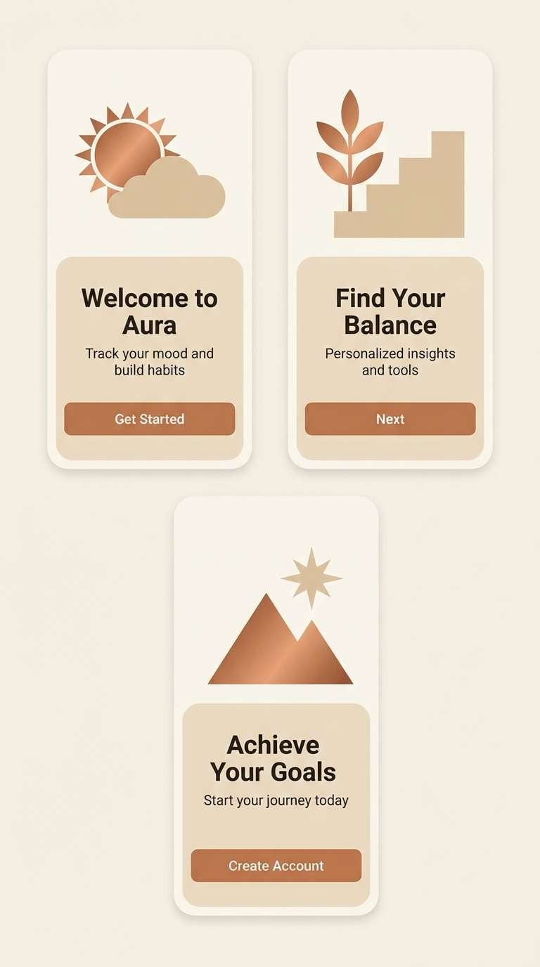
14) Rustic Workshop
HEX: #a94f2a #c97a4b #7b563e #e8dbc9 #1e2326
Mood: rugged, practical, dependable
Best for: tool brand banner ad
Rugged rust, worn wood, and steel-dark accents evoke a working garage or maker studio. It is a strong choice for hardware brands that want a reliable, no-nonsense tone. Pair with condensed typography and simple iconography to keep the message punchy. Usage tip: place the light beige behind product specs so they stay readable at a glance.
Image example of rustic workshop generated using media.io
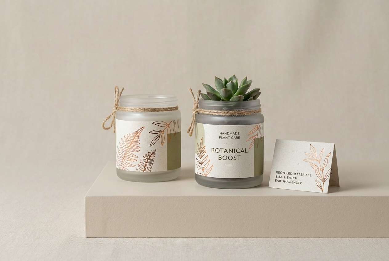
15) Terra Botanica
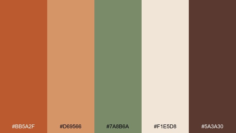
HEX: #bb5a2f #d69566 #7a8b6a #f1e5d8 #5a3a30
Mood: natural, earthy, calm
Best for: plant label and jar packaging
Earthy terracotta and leaf-muted green feel like a greenhouse shelf in late afternoon. The palette fits botanical packaging, seed packets, and eco-minded brands that want warmth without looking overly rustic. Pair with recycled paper textures and simple line drawings for a clean, natural finish. Usage tip: keep the green for secondary information and let the copper tones carry the brand name.
Image example of terra botanica generated using media.io
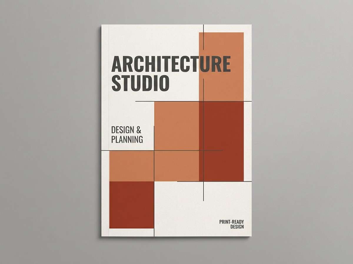
16) Claystone Modern
HEX: #c0663b #b24a35 #cfc5ba #f5f1eb #2c2d2f
Mood: architectural, clean, sophisticated
Best for: architecture studio brochure
Clean clay tones with concrete neutrals suggest modern facades and sunlit courtyards. It is ideal for brochures and portfolios where you want warmth but still need a professional, minimalist structure. Pair with plenty of white space and restrained photography so the colors feel intentional. Usage tip: use the gray-beige for section backgrounds and keep the rust tones for headings and key stats.
Image example of claystone modern generated using media.io
17) Copper Nightfall
HEX: #b35a35 #d28c5f #4a2d2f #1b1a1d #f0e1d2
Mood: cinematic, intimate, luxe
Best for: indie music album cover
Nightfall blacks and deep wine-browns make the copper highlights glow like stage lights. This mix is great for album art, event posters, or any design that needs drama without neon. Pair with grainy textures and high-contrast typography for a cinematic edge. Usage tip: keep the light cream for a single focal element so the dark tones stay immersive.
Image example of copper nightfall generated using media.io
18) Sienna Coast
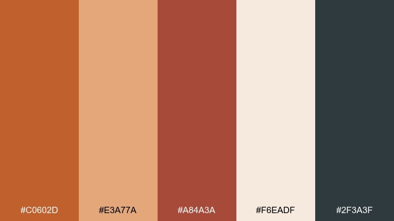
HEX: #c0602d #e3a77a #a84a3a #f6eadf #2f3a3f
Mood: adventurous, sunlit, refined
Best for: travel flyer for coastal towns
Sienna cliffs, sunlit stone, and a slate sea-breeze accent give this palette a relaxed travel feel. Used as a copper rust color combination, it supports bold headlines while still feeling upscale and editorial. Pair with clean maps, thin line icons, and lots of pale background to keep it airy. Usage tip: let the slate tone handle small details like rules and captions so the warm hues stay dominant.
Image example of sienna coast generated using media.io

19) Amber Alloy
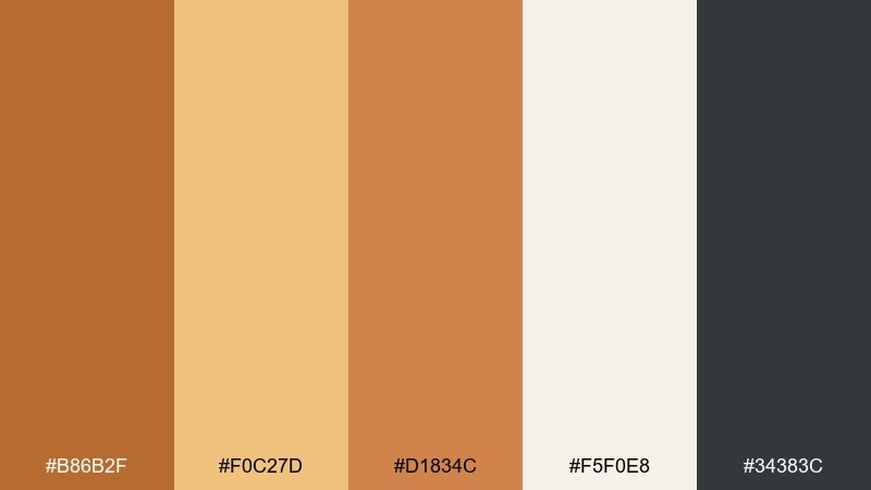
HEX: #b86b2f #f0c27d #d1834c #f5f0e8 #34383c
Mood: optimistic, polished, commercial
Best for: ecommerce hero banner for home goods
Amber warmth and alloy-dark contrast create a bright, trustworthy storefront vibe. It is a strong fit for ecommerce banners where you want warmth, clarity, and product-first layouts. Pair with simple shadows, crisp sans-serif type, and a pale background to keep the page feeling fast and modern. Usage tip: use the light amber for hover states and keep the darker copper for primary buttons.
Image example of amber alloy generated using media.io
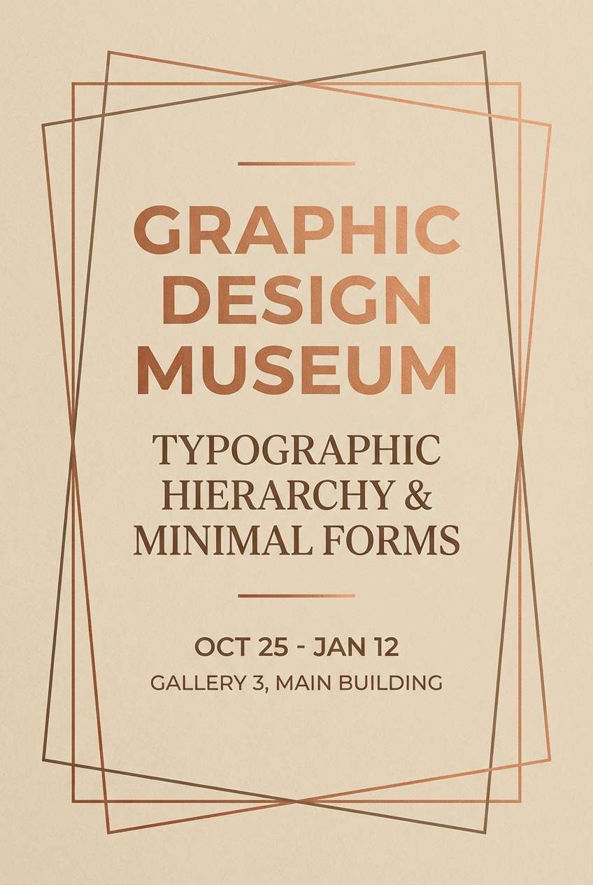
20) Warm Artifact
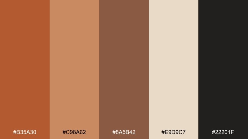
HEX: #b35a30 #c98a62 #8a5b42 #e9d9c7 #22201f
Mood: heritage, curated, timeless
Best for: museum exhibit poster design
Curated artifact tones feel like ceramics, patinated metals, and aged display cards. The palette is perfect for museum posters and cultural events where warmth and authority need to coexist. Pair with classic typography, generous margins, and a single strong image or silhouette. Usage tip: set the headline in the darkest tone and use the mid copper for dates and directional info.
Image example of warm artifact generated using media.io
What Colors Go Well with Copper Rust?
Copper rust pairs naturally with creamy whites, sand, and warm grays—these lighten the palette and keep it breathable in layouts. For depth, add espresso browns, near-black charcoals, or ink tones that anchor typography.
If you want contrast that still feels sophisticated, try muted greens (olive, sage, patina) or blue-grays/slates. Those cooler notes sharpen copper rust without making it look neon or overly saturated.
For a richer, more dramatic direction, bring in wine tones like burgundy or deep maroon. This adds a luxe, editorial feeling while keeping everything in a warm, earthy family.
How to Use a Copper Rust Color Palette in Real Designs
Start by assigning roles: pick one copper rust as your hero accent, a light neutral for background, and a dark tone for text. This prevents the design from becoming “all warm” and losing hierarchy.
In branding and packaging, copper rust shines with tactile choices—uncoated paper, subtle grain, matte finishes, or foil in small areas. In interiors, use it as a statement wall or textile color, then keep trims and large surfaces light.
For UI and web, treat copper rust like a controlled highlight: buttons, icons, progress, and key data points. Use tints of the same rust for charts and states to stay consistent and accessible.
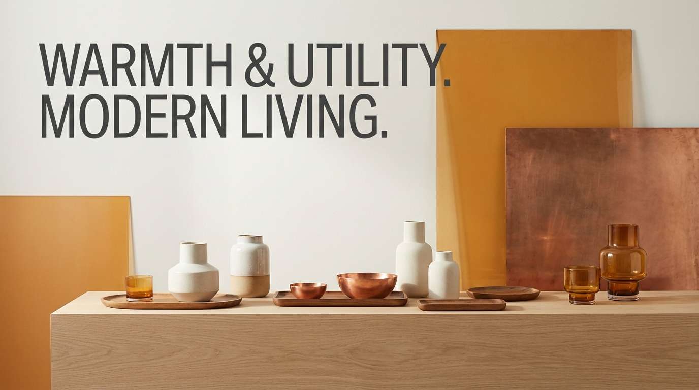
Create Copper Rust Palette Visuals with AI
If you’re building a mood board, brand concept, or social template, generating quick visuals helps you validate the palette before production. You can test lighting, materials, and layout styles while keeping the same copper rust tones.
With Media.io’s text-to-image tool, you can turn a palette idea into packaging mockups, UI screens, posters, or interior scenes—then refine prompts until the look matches your brand.
Copper Rust Color Palette FAQs
-
What is the best neutral to pair with copper rust?
Warm off-white or cream (like #F7F3EF or #F2E3D5) is the easiest match because it keeps copper rust looking premium and prevents the palette from feeling too heavy. -
Does copper rust work for modern websites and apps?
Yes—use copper rust mainly as an accent (buttons, highlights, charts) with charcoal text and light neutral surfaces. This keeps the UI clean while still feeling warm and distinctive. -
What dark color matches copper rust for strong contrast?
Near-black charcoal and deep espresso browns work best (for example #1F1C1A, #2B2B2B, or #2B1E1A). They make copper rust pop and improve readability for headings and body text. -
What cool colors complement copper rust without clashing?
Muted blue-grays and slates (like #30424A or #2F3A3F) add crisp contrast, while staying understated enough to keep copper rust as the hero. -
Can copper rust pair with green?
Absolutely—olive, sage, and patina greens are classic complements because they feel natural (clay + foliage). Use green sparingly for secondary labels, dividers, or small UI states. -
Is copper rust more suitable for autumn-only themes?
Not necessarily. It reads “autumnal” when combined with golden tans and browns, but it can look modern year-round when paired with clean off-whites, charcoal, and minimal layouts. -
How do I keep a copper rust palette from looking too orange?
Choose slightly browner rust tones, increase creamy whitespace, and add a grounding dark (charcoal/espresso). Avoid using multiple bright oranges at once—keep the brightest copper for small highlights.


