

A bright color palette is built for instant impact: high saturation, punchy contrast, and playful energy that makes designs feel modern and alive.
Below are 20+ bright color combinations with HEX codes, plus quick tips to pair bright hues with neutrals so your layouts stay readable.
In this article
- Why Bright Color Combinations Work So Well
-
- citrus pop
- electric carnival
- tropical soda
- neon coral mint
- sunny market
- candy gradient
- poolside punch
- pop art primary
- glowing sunset
- lime berry splash
- arcade glow
- confetti pastel
- flamingo citrus
- aqua tangerine
- radiant orchard
- bubblegum sky
- prism party
- sunrise sorbet
- fresh fiesta
- vivid studio
- botanical burst
- editorial pop
- What Colors Go Well with Bright?
- How to Use a Bright Color Palette in Real Designs
- Create Bright Palette Visuals with AI
Why Bright Color Combinations Work So Well
Bright color schemes grab attention fast because they push saturation and contrast—two things the human eye notices immediately. That makes them ideal for posters, promos, and UI moments where you need quick clarity.
They also communicate emotion without extra elements: neon feels electric, citrus feels playful, and bold primaries feel graphic and confident. With the right hierarchy, bright palettes can feel both fun and professional.
The key is control. When you anchor brights with neutrals (white, off-white, charcoal) and limit how many hues dominate, your designs stay readable while still feeling high-energy.
20+ Bright Color Palette Ideas (with HEX Codes)
1) Citrus Pop
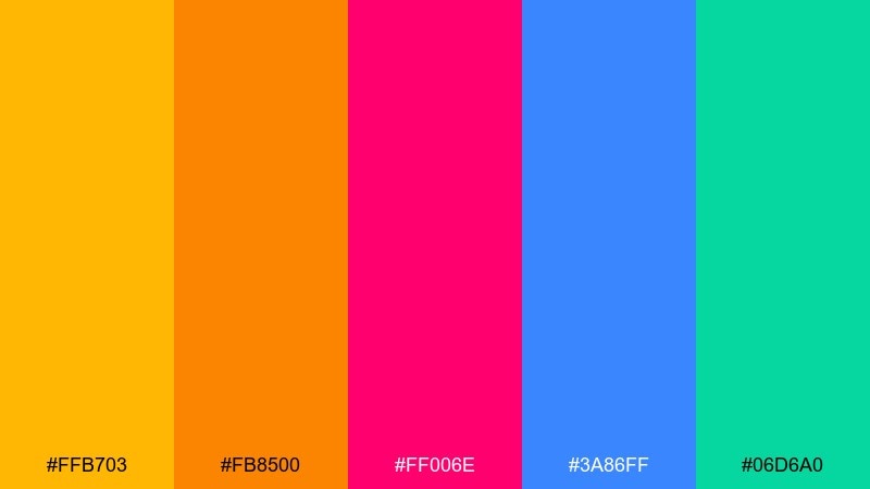
HEX: #ffb703 #fb8500 #ff006e #3a86ff #06d6a0
Mood: zesty, upbeat, youthful
Best for: summer campaign poster
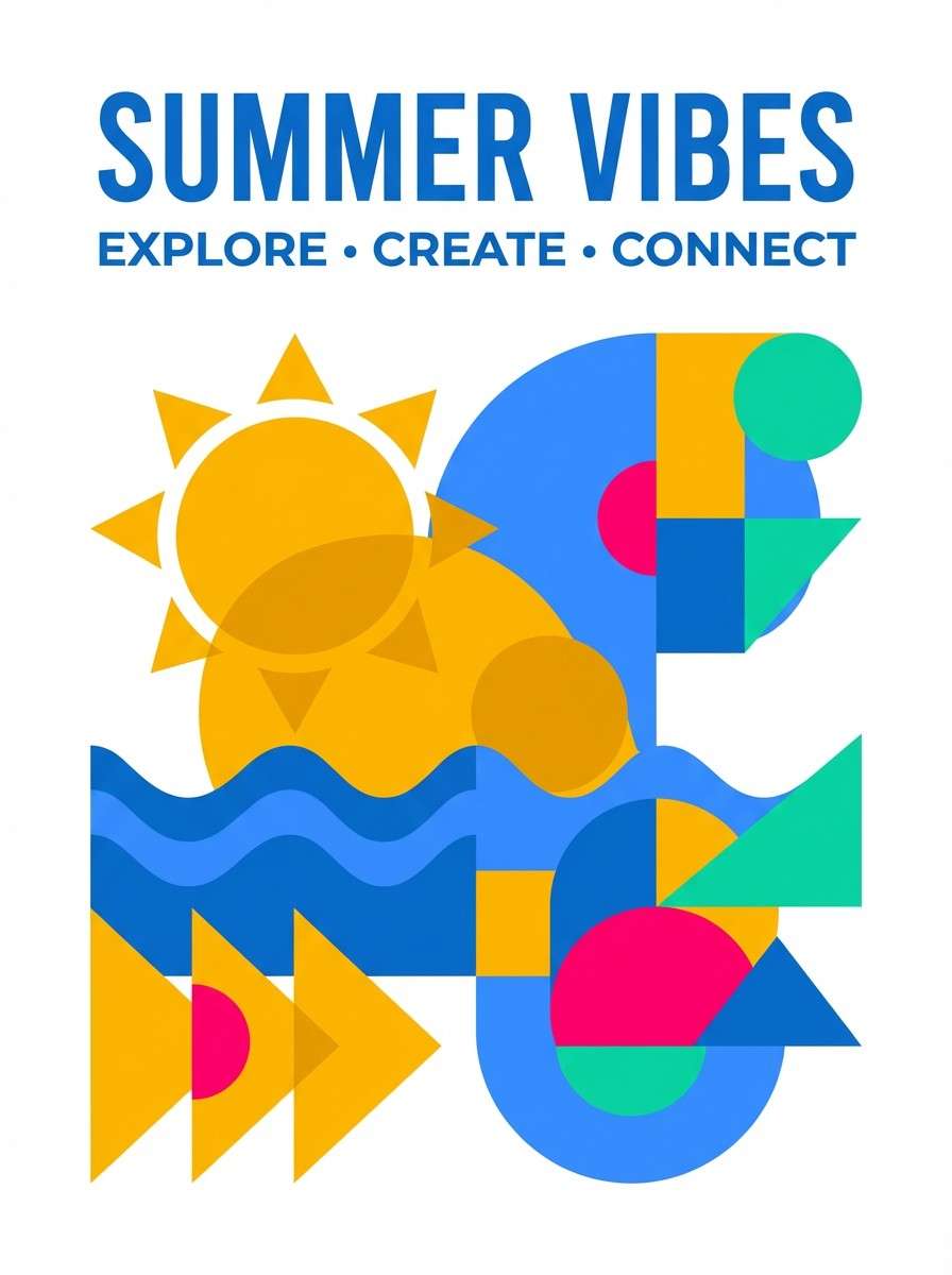
Zesty and upbeat, it feels like citrus slices, cold soda, and sunlit afternoons. Use it for summer posters, event promos, and social graphics where you want instant energy. Pair it with plenty of white space or a soft off-white to keep the saturation readable. Tip: let the blue carry headlines, and use the pink as a small accent for calls to action.
Image example of citrus pop generated using media.io
Media.io is an online AI studio for creating and editing video, image, and audio in your browser.

2) Electric Carnival
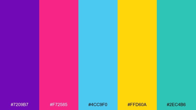
HEX: #7209b7 #f72585 #4cc9f0 #ffd60a #2ec4b6
Mood: electric, bold, nightlife
Best for: music festival flyer
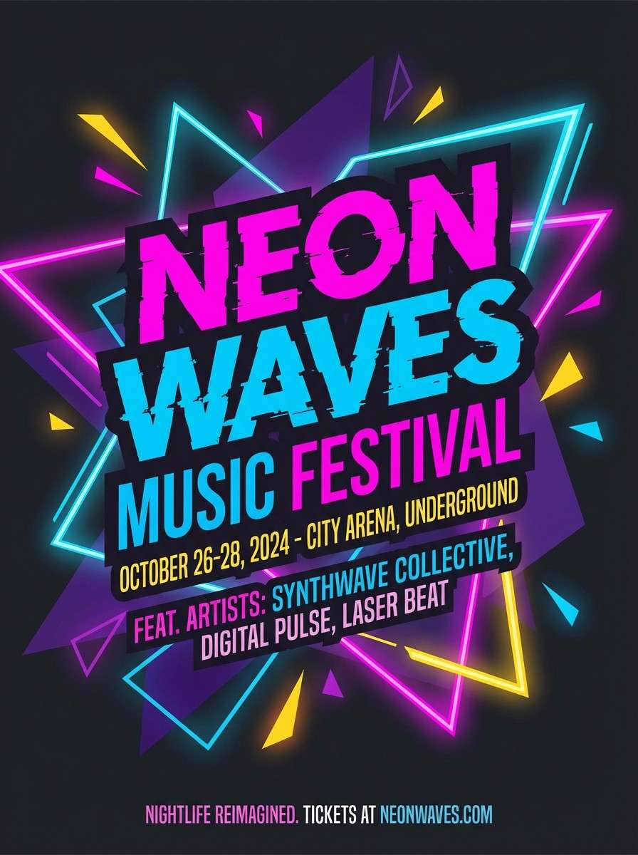
Electric and bold, it evokes neon lights, stage lasers, and late-night crowds. This bright color scheme works best on flyers, concert promos, and punchy social ads that need instant contrast. Balance the intensity with black or deep charcoal type and generous margins. Tip: reserve the yellow for the top priority info like date and venue so it pops without clutter.
Image example of electric carnival generated using media.io
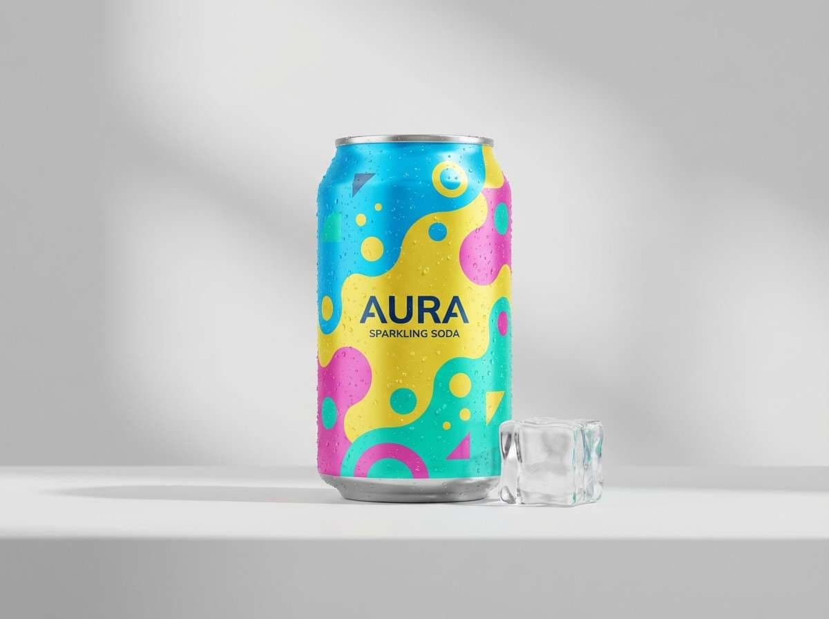
3) Tropical Soda
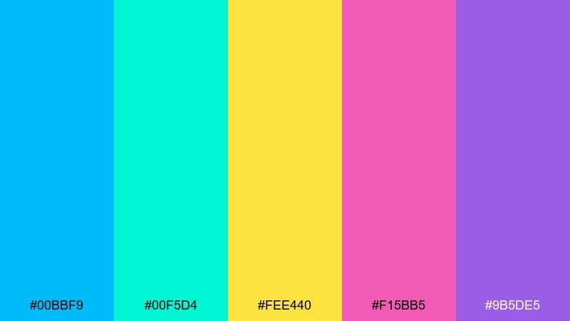
HEX: #00bbf9 #00f5d4 #fee440 #f15bb5 #9b5de5
Mood: playful, tropical, fizzy
Best for: drink brand social ads
Playful and fizzy, these bright colors feel like tropical fruit soda with bubbles and bright sunlight. Use them for beverage ads, snack launches, and energetic social posts that need a fun mood. Pair with clean sans-serif typography and a simple grid so the colors do the talking. Tip: use the yellow as a highlight stripe behind key words to boost readability.
Image example of tropical soda generated using media.io
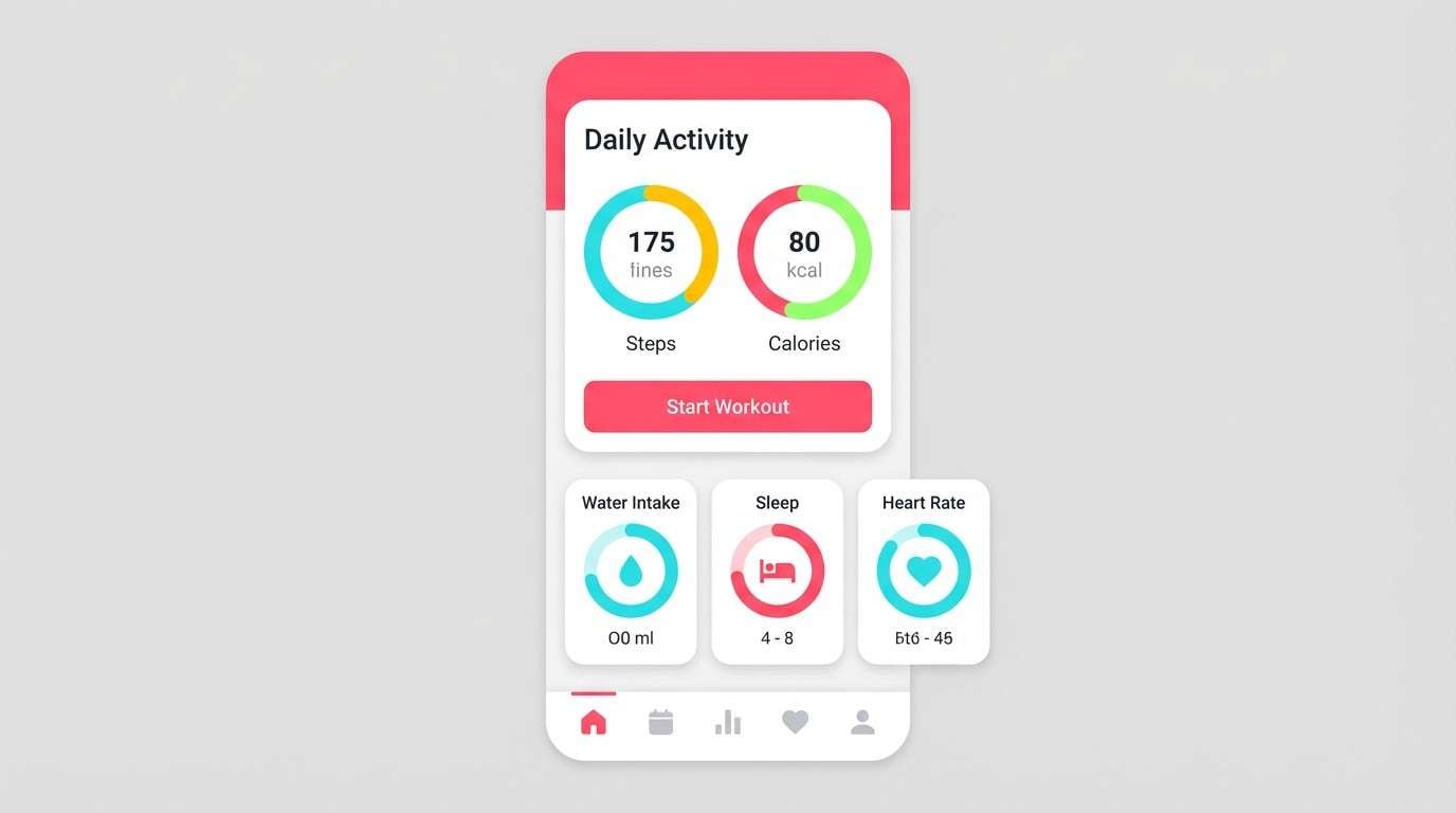
4) Neon Coral Mint
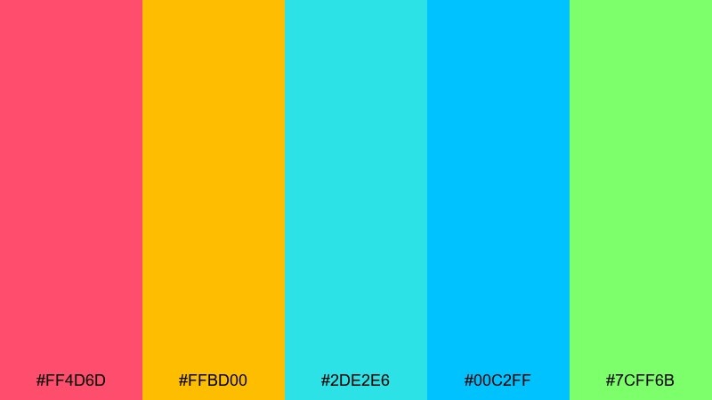
HEX: #ff4d6d #ffbd00 #2de2e6 #00c2ff #7cff6b
Mood: fresh, energetic, sporty
Best for: fitness app UI mockup
Fresh and energetic, this bright color palette suggests workout endorphins, cool mint, and high-tempo playlists. It shines in fitness UI, habit trackers, and dashboards that need clear visual cues. Pair with light gray surfaces and use coral for the primary action button to guide attention. Tip: keep charts to two dominant colors and use the rest for status badges only.
Image example of neon coral mint generated using media.io
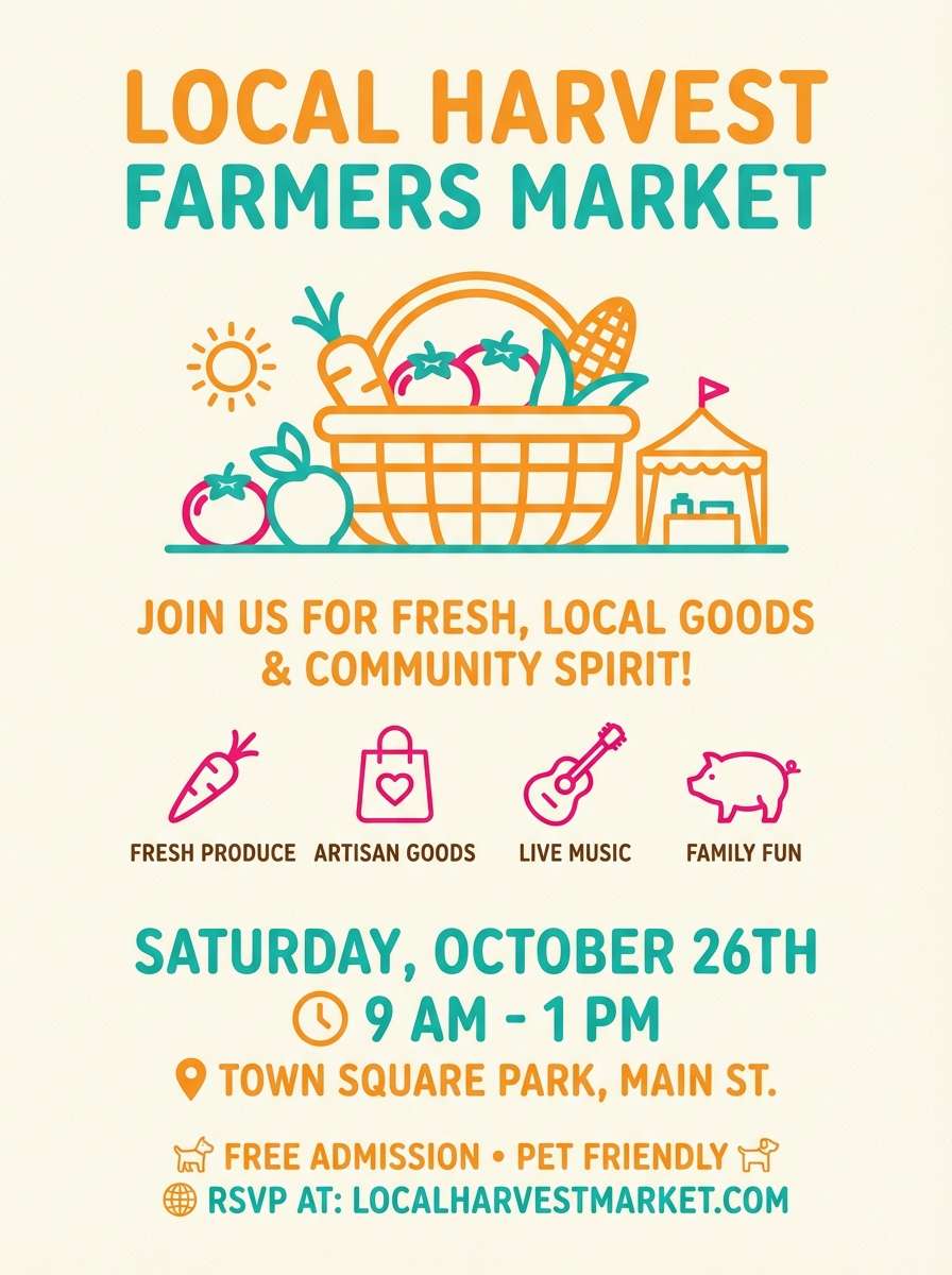
5) Sunny Market
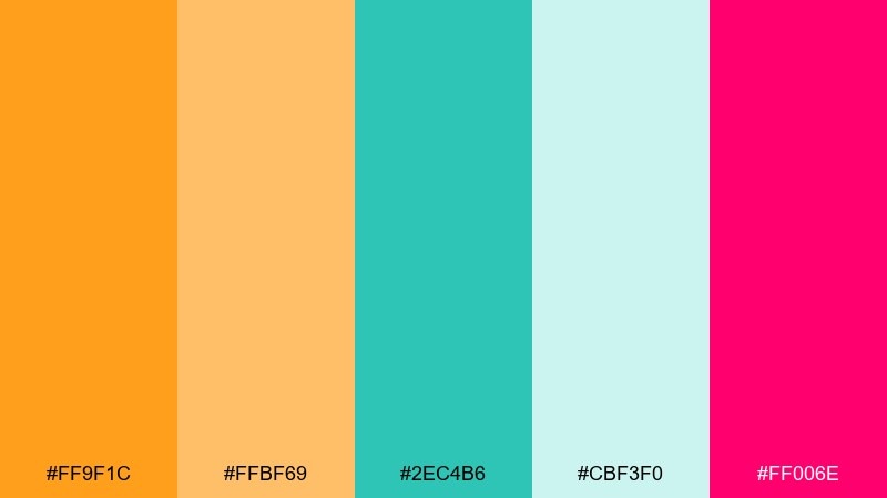
HEX: #ff9f1c #ffbf69 #2ec4b6 #cbf3f0 #ff006e
Mood: friendly, local, inviting
Best for: farmers market invitation
Friendly and inviting, it brings to mind fresh produce stalls and warm weekend mornings. Use it for invitations, neighborhood flyers, and small-business promos where you want approachable color. Pair with a cream background and a hand-drawn icon style for extra charm. Tip: keep pink as a small stamp or badge so the warmer oranges stay in control.
Image example of sunny market generated using media.io
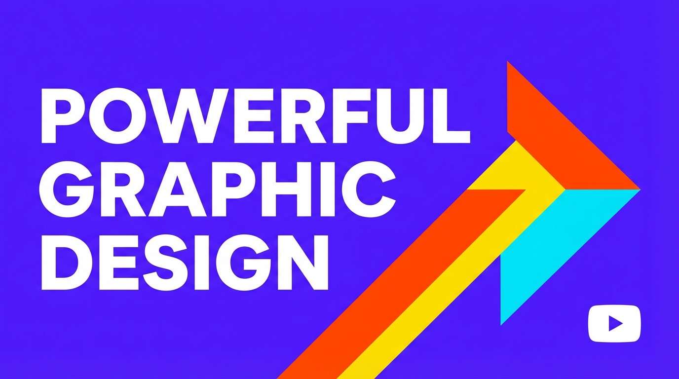
6) Candy Gradient
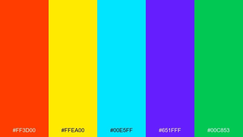
HEX: #ff3d00 #ffea00 #00e5ff #651fff #00c853
Mood: candy-coated, high-contrast, fun
Best for: YouTube thumbnail design
Candy-coated and high-contrast, it feels like arcade prizes and glossy wrappers. It is ideal for thumbnails, banners, and promo tiles that must stand out in a crowded feed. Pair with bold outlines and heavy type to prevent the colors from vibrating. Tip: choose one dominant hue per tile, then use the yellow only for a single highlight.
Image example of candy gradient generated using media.io
7) Poolside Punch
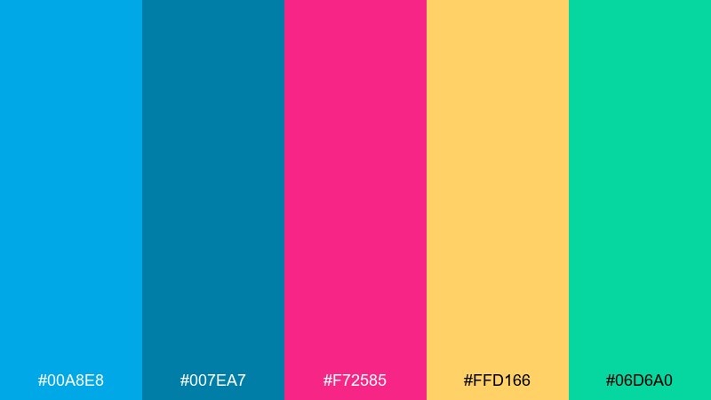
HEX: #00a8e8 #007ea7 #f72585 #ffd166 #06d6a0
Mood: summery, refreshing, confident
Best for: travel landing page hero
Summery and refreshing, this bright color scheme calls up clear pool water, fruity drinks, and vacation photos. Use it on travel hero sections, promo banners, and email headers where contrast helps your message land fast. Pair with white or very pale gray body text areas so content stays easy to scan. Tip: build a two-tone blue background and let pink handle the primary button.
Image example of poolside punch generated using media.io

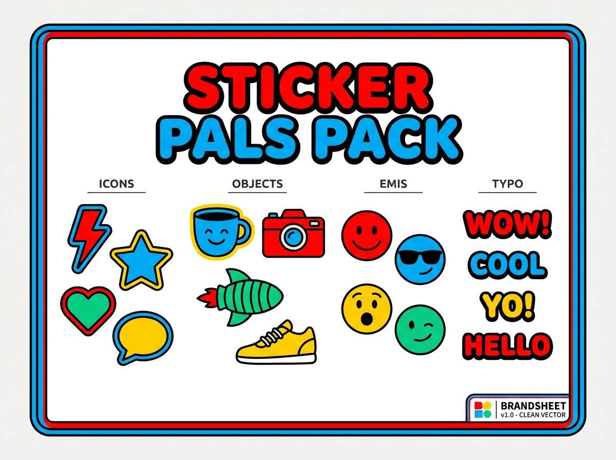
8) Pop Art Primary
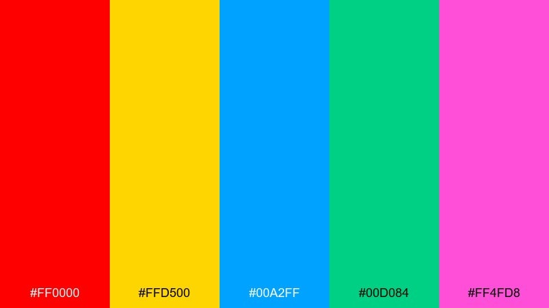
HEX: #ff0000 #ffd500 #00a2ff #00d084 #ff4fd8
Mood: comic-book, bold, graphic
Best for: sticker pack branding
Comic-book boldness with punchy contrasts makes it feel like posters on city walls. It is great for sticker packs, creator merch, and playful brand marks with thick outlines. These bright color combinations are easiest to control when you anchor designs with black linework and a white base. Tip: limit any single sticker to three colors, then rotate the set for variety.
Image example of pop art primary generated using media.io
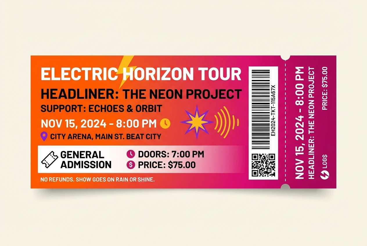
9) Glowing Sunset
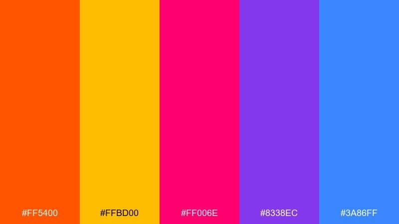
HEX: #ff5400 #ffbd00 #ff006e #8338ec #3a86ff
Mood: dramatic, warm, optimistic
Best for: concert ticket design
Dramatic warmth, like a horizon that shifts from gold to magenta in minutes. The bright color palette works beautifully for ticket designs, nightlife promos, and bold gradients that feel modern. Pair with deep navy or black typography to keep contrast crisp. Tip: use a smooth orange-to-pink gradient for the background and keep the purple for small detail elements.
Image example of glowing sunset generated using media.io
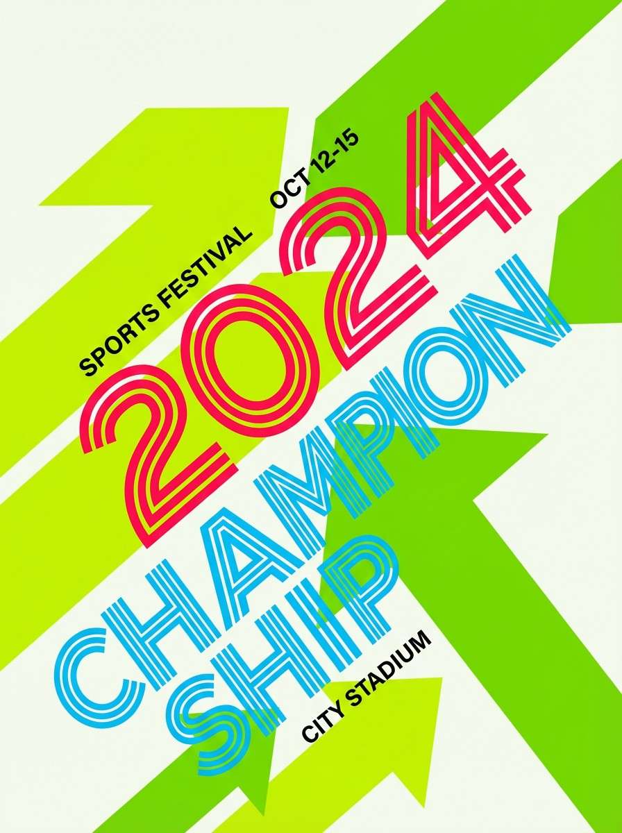
10) Lime Berry Splash
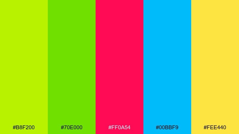
HEX: #b8f200 #70e000 #ff0a54 #00bbf9 #fee440
Mood: sporty, juicy, attention-grabbing
Best for: sports event poster
Sporty and juicy, it feels like lime zest with a berry kick. Use it for sports posters, team announcements, and energetic countdown graphics. Pair with dark charcoal text blocks so the greens stay vivid without becoming hard to read. Tip: reserve the hot pink for numbers and scores to create a clear focal point.
Image example of lime berry splash generated using media.io
11) Arcade Glow
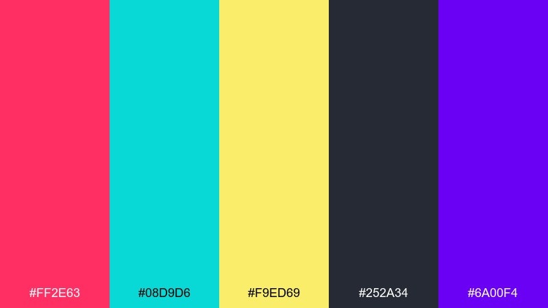
HEX: #ff2e63 #08d9d6 #f9ed69 #252a34 #6a00f4
Mood: retro, neon, techy
Best for: game streaming overlay
Retro neon and techy contrast evoke arcade cabinets and pixelated glow. It is strong for streaming overlays, gaming banners, and highlight cards where motion graphics shine. Pair with the deep charcoal as a base to avoid eye fatigue. Tip: keep teal for interface frames and use pink only for alerts and wins.
Image example of arcade glow generated using media.io
12) Confetti Pastel
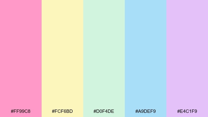
HEX: #ff99c8 #fcf6bd #d0f4de #a9def9 #e4c1f9
Mood: soft, cheerful, celebratory
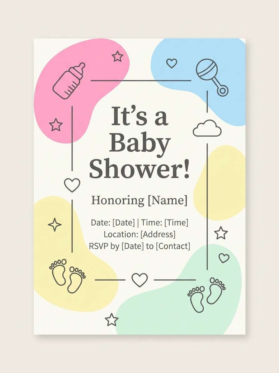
Best for: baby shower invitation
Soft and celebratory, it feels like confetti drifting through warm light. Use it for baby shower invites, friendly newsletters, and lighthearted packaging where the tone should stay gentle. Pair with a warm gray text color rather than pure black to keep the look airy. Tip: add a single stronger accent (like a deeper pink) only for names or dates.
Image example of confetti pastel generated using media.io
13) Flamingo Citrus
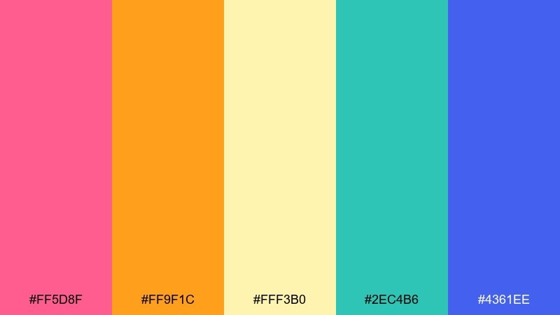
HEX: #ff5d8f #ff9f1c #fff3b0 #2ec4b6 #4361ee
Mood: playful, beachy, modern
Best for: boutique brand identity
Playful and beachy, it brings flamingo feathers and citrus stalls into a modern storefront. It fits boutique identities, lifestyle packaging, and Instagram brand kits that lean fun but polished. Pair with a sandy cream background and thin serif headlines for contrast. Tip: keep teal for supporting blocks and let pink carry the logo mark.
Image example of flamingo citrus generated using media.io
14) Aqua Tangerine
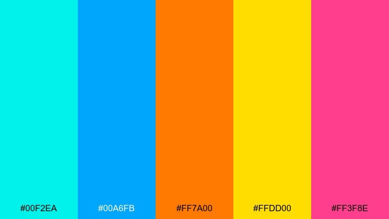
HEX: #00f2ea #00a6fb #ff7a00 #ffdd00 #ff3f8e
Mood: fresh, sunny, playful
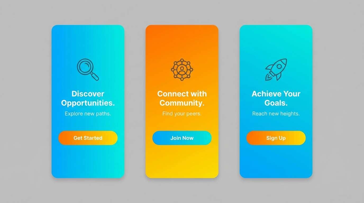
Best for: mobile onboarding screens UI mockup
Fresh and sunny, it feels like turquoise water with a burst of tangerine. It is perfect for onboarding screens, app walkthroughs, and feature callouts where friendly color cues help users progress. Pair with lots of white and simple icons to avoid visual overload. Tip: assign one accent per screen so the flow stays coherent from step to step.
Image example of aqua tangerine generated using media.io
15) Radiant Orchard
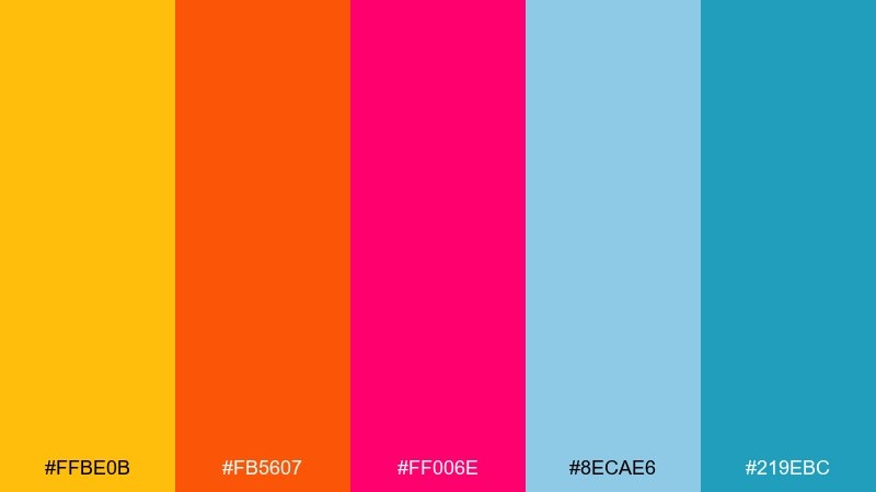
HEX: #ffbe0b #fb5607 #ff006e #8ecae6 #219ebc
Mood: warm, lively, market-fresh
Best for: food truck menu board
Warm and lively, these bright color combinations suggest ripe fruit, handwritten specials, and a busy lunch line. Use them for food truck menus, cafe boards, and pricing cards that must be readable at a glance. Pair with a light background and keep the teal-blue for section headers. Tip: use orange for prices and limit pink to one or two highlight items.
Image example of radiant orchard generated using media.io
16) Bubblegum Sky
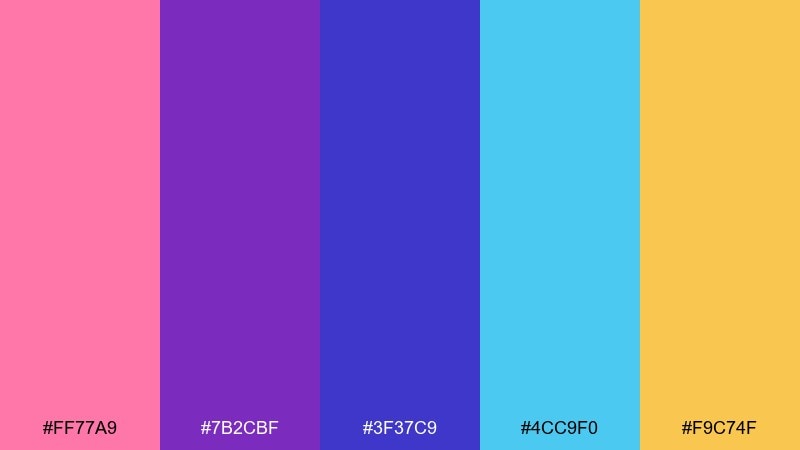
HEX: #ff77a9 #7b2cbf #3f37c9 #4cc9f0 #f9c74f
Mood: dreamy, pop, youthful
Best for: album cover artwork
Dreamy pop energy, like bubblegum clouds against a saturated sky. It works well for album covers, creator merch, and punchy digital art with a glossy vibe. Pair with simple type and one strong focal shape to keep it from feeling busy. Tip: use the yellow sparingly as a spotlight, not a full background.
Image example of bubblegum sky generated using media.io
17) Prism Party
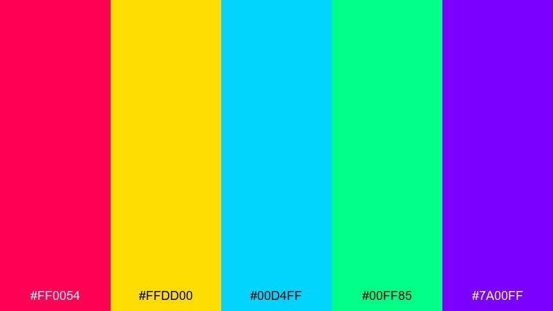
HEX: #ff0054 #ffdd00 #00d4ff #00ff85 #7a00ff
Mood: festive, high-energy, modern
Best for: startup launch banner
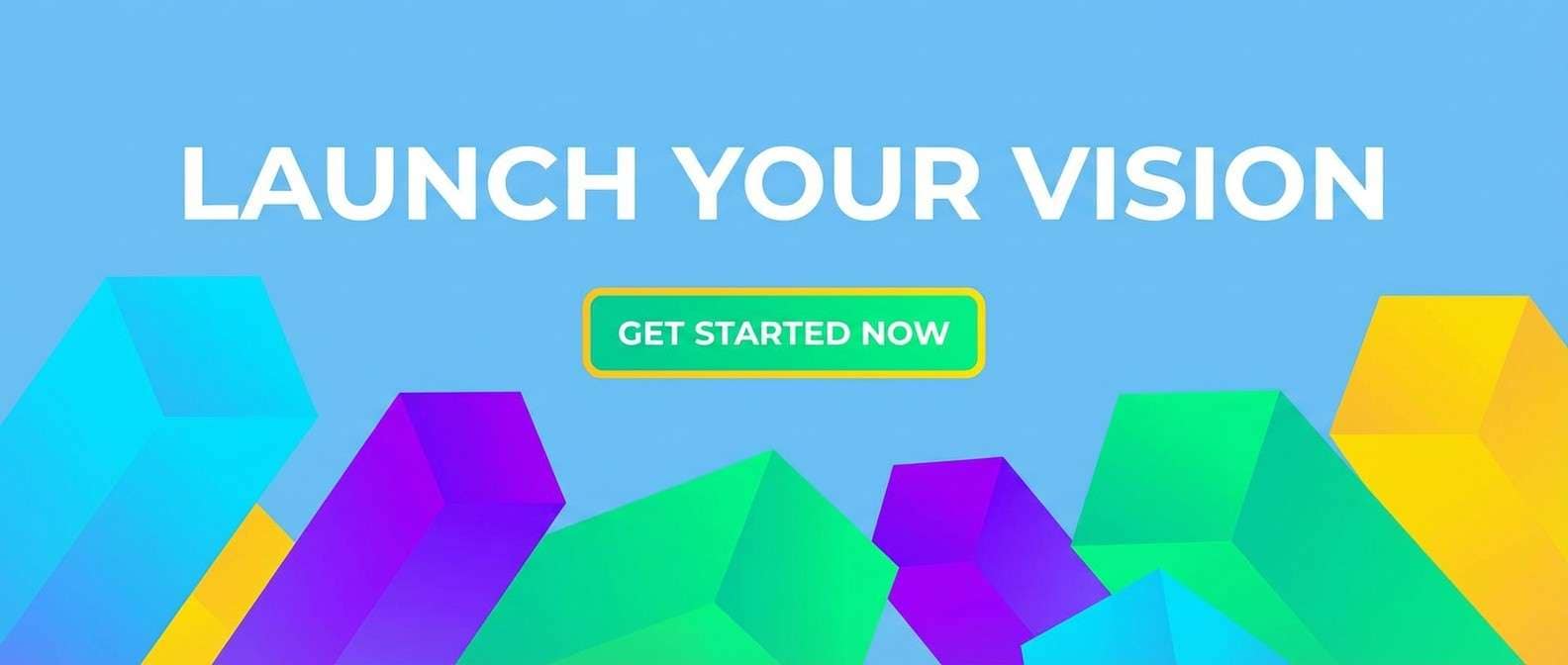
Festive and high-energy, these bright tones feel like light refracting through a prism at a party. Use them for launch banners, announcement graphics, and bold hero areas where you want a confident first impression. Pair with dark navy text and simple blocks to keep hierarchy clear. Tip: choose two dominant colors for the background, and reserve the rest for icons and micro-highlights.
Image example of prism party generated using media.io
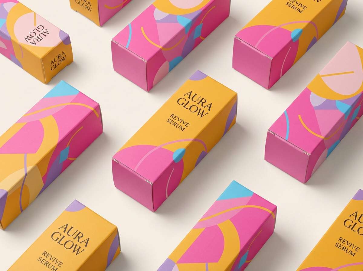
18) Sunrise Sorbet
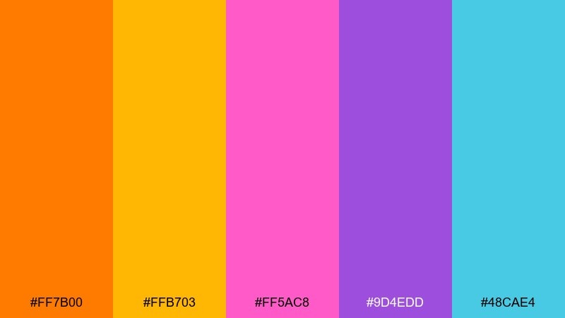
HEX: #ff7b00 #ffb703 #ff5ac8 #9d4edd #48cae4
Mood: sweet, optimistic, glowing
Best for: beauty product packaging
Sweet and optimistic, these bright color combinations evoke sorbet swirls at sunrise with a soft glow. They are a great fit for beauty packaging, limited editions, and gift sets that need playful confidence. Pair with minimalist labeling and a matte finish so the colors feel premium. Tip: make pink the hero on the box, and use teal only for small seals or side details.
Image example of sunrise sorbet generated using media.io
19) Fresh Fiesta
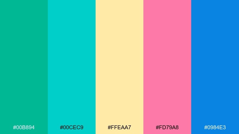
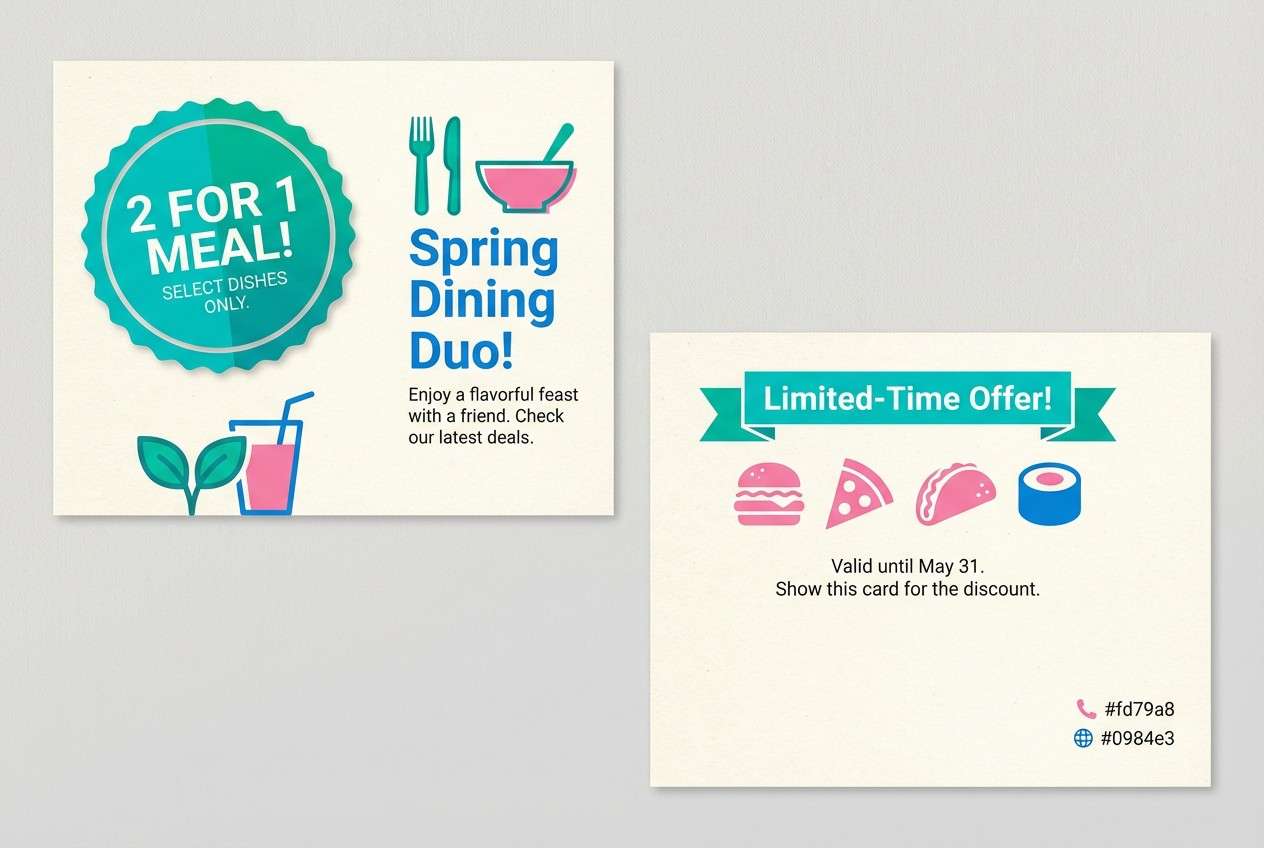
HEX: #00b894 #00cec9 #ffeaa7 #fd79a8 #0984e3
Mood: cheerful, friendly, social
Best for: restaurant promo postcard
Cheerful and social, it feels like a shared table with sparkling drinks and fresh garnish. Use it for restaurant postcards, special-night promos, and loyalty offers that need a welcoming punch. Pair with clean photography-free layouts and a cream base for readability. Tip: keep teal dominant and use pink only for the offer badge so the message stays clear.
Image example of fresh fiesta generated using media.io
20) Vivid Studio
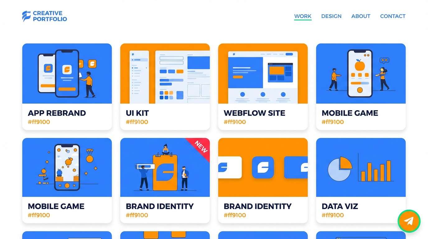
HEX: #ff1744 #ff9100 #00e676 #2979ff #d500f9
Mood: creative, sharp, confident
Best for: design portfolio website UI
Creative and sharp, it feels like a studio wall covered in bold sketches and color tests. It suits portfolio sites, agency landing pages, and project thumbnails where personality matters. Pair with a clean neutral background and consistent spacing so the accents do not compete. Tip: pick one signature accent for links and keep the others for category tags.
Image example of vivid studio generated using media.io
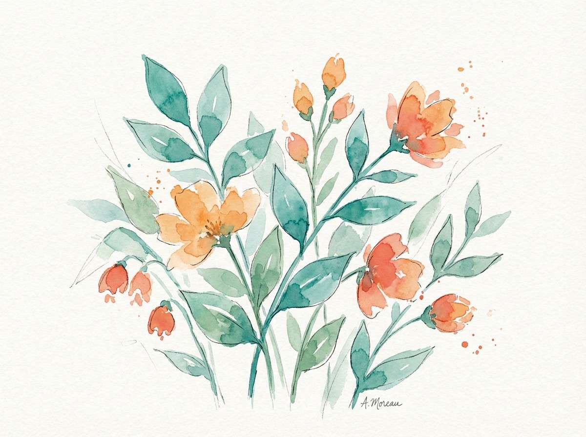
21) Botanical Burst
HEX: #2a9d8f #52b788 #f4a261 #e76f51 #3a86ff
Mood: garden-fresh, sunny, outdoorsy
Best for: spring botanical illustration
Garden-fresh and sunny, This bright color palette evokes new leaves, terracotta pots, and clear sky. Use it for spring illustrations, wellness graphics, and seasonal email headers. Pair with warm paper textures or off-white backgrounds to keep the greens looking natural. Tip: let teal and green fill most foliage, then use orange only for blossoms and focal petals.
Image example of botanical burst generated using media.io
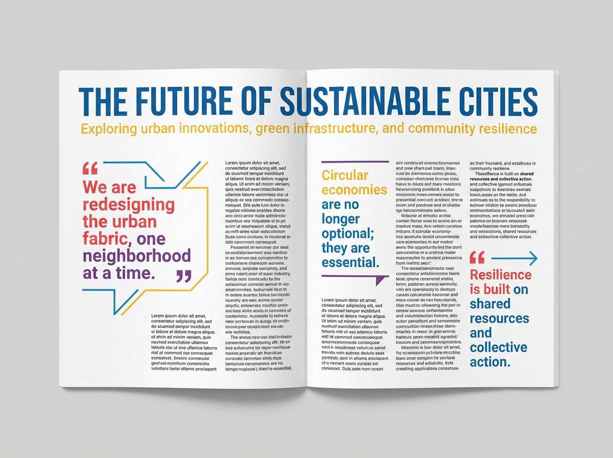
22) Editorial Pop
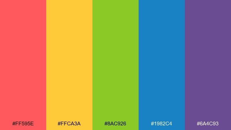
HEX: #ff595e #ffca3a #8ac926 #1982c4 #6a4c93
Mood: modern, punchy, magazine-like
Best for: magazine feature layout
Modern and punchy, it feels like a magazine spread with confident headlines and colorful sidebars. Use it for editorial layouts, lookbooks, and feature pages where sections need clear visual separation. Pair with black body text and plenty of leading for a polished read. Tip: keep yellow to small blocks and pull quotes so it does not overpower the page.
Image example of editorial pop generated using media.io
What Colors Go Well with Bright?
Bright palettes pair best with strong neutrals that can “hold” the saturation: white, off-white, light gray, charcoal, and true black. These bases give your bright accents room to breathe and help typography stay crisp.
If you want a modern look, try using one bright as the hero and one as a secondary accent, then keep everything else neutral. For warmer, friendlier designs, swap pure white for cream and use dark navy instead of black.
For gradients, choose adjacent bright hues (like orange → pink or blue → purple) and keep text on a solid neutral layer. This prevents readability issues while keeping the energy.
How to Use a Bright Color Palette in Real Designs
Start with hierarchy: pick one dominant color for large areas, one supporting color for key components, and one accent for CTAs or highlights. Bright color combinations feel intentional when each hue has a job.
Use contrast thoughtfully. On-screen, bright-on-bright can vibrate; add borders, shadows, or neutral containers to separate elements and reduce eye strain.
In branding systems, define rules for states (success, warning, error) so brights don’t become random. Consistent spacing, grid, and typography will make even the loudest palette feel polished.
Create Bright Palette Visuals with AI
Want to preview how a bright palette looks on a poster, UI mockup, or product ad? Generate quick concept images using your chosen HEX colors and a clear prompt.
With Media.io, you can iterate fast: test different dominant colors, swap backgrounds from white to charcoal, and refine layouts without starting over each time.
Try creating one image per use case (poster, social tile, landing hero) so you can compare readability and contrast before you commit to a final design.
Bright Color Palette FAQs
-
What is a bright color palette?
A bright color palette uses highly saturated hues (often with strong contrast) to create energetic, attention-grabbing designs for branding, posters, and UI. -
How many bright colors should I use in one design?
Usually 1 dominant bright + 1 supporting bright + 1 small accent is enough. Use neutrals for backgrounds and text to avoid visual overload. -
What background works best with bright colors?
White, off-white, light gray, charcoal, and black are the easiest backgrounds to pair with brights because they stabilize contrast and improve readability. -
How do I make bright color combinations easier to read?
Keep text on neutral blocks, increase spacing, and avoid placing saturated colors directly behind small type. Reserve the brightest hue for highlights or CTA buttons. -
Are bright palettes good for UI design?
Yes—when used with restraint. Use brights for interactive elements (buttons, badges, charts) and keep surfaces neutral so screens stay calm and accessible. -
Can I use a bright color scheme for a professional brand?
Yes. Choose one signature bright and pair it with sophisticated neutrals (navy, charcoal, warm gray). Consistent typography and layout will keep it polished. -
How can I generate bright palette mockups quickly?
Use an AI image generator like Media.io: include your HEX colors in the prompt, specify the design type (poster, packaging, UI), and iterate variations to test contrast and hierarchy.


