

An island color palette blends beachy pastels with deep sea accents to create designs that feel fresh, relaxed, and instantly inviting. It’s a versatile direction for branding, UI, packaging, and prints that need both calm and clarity.
Below are 20+ island palette ideas with HEX codes, plus practical tips for pairing and using these coastal colors in real layouts.
In this article
Why Island Palettes Work So Well
Island palettes balance two things designers often need at the same time: airy, sunlit backgrounds and deep ocean shades that provide structure. This contrast helps layouts feel open without sacrificing readability.
Because island color schemes are rooted in nature (water, sand, foliage, coral), they tend to look harmonious even when mixing warm and cool hues. That makes them reliable for branding systems with multiple use-cases.
They also support emotion-driven design: calm wellness interfaces, cheerful summer promos, premium coastal packaging, or cinematic night-sky posters—without changing the underlying “island” story.
20+ Island Color Palette Ideas (with HEX Codes)
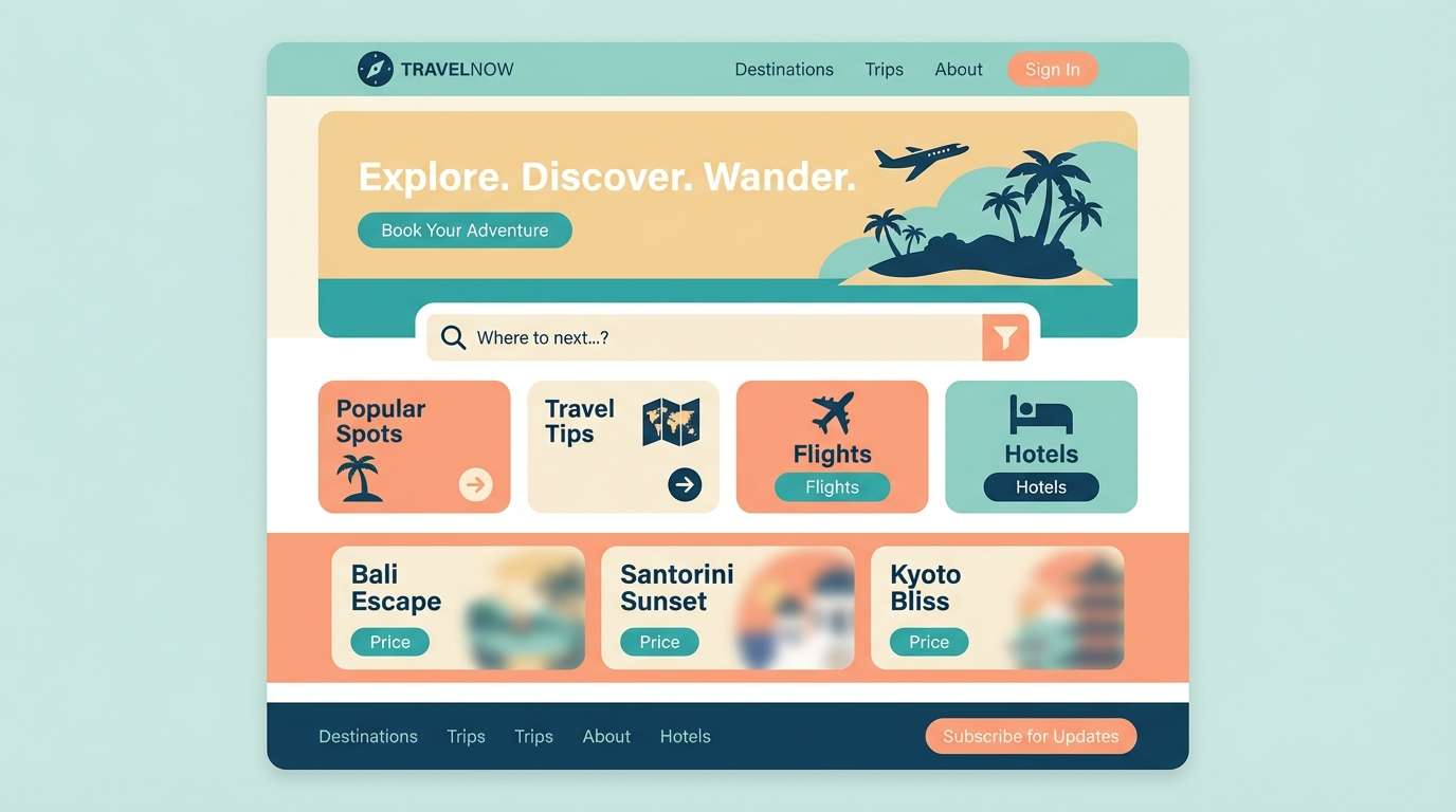
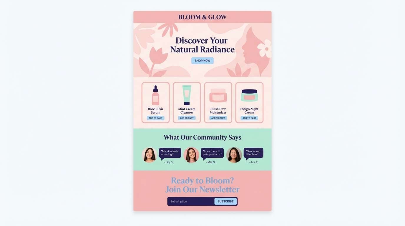
1) Lagoon Breeze
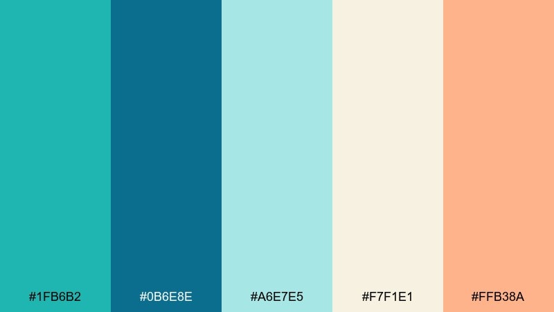
HEX: #1FB6B2 #0B6E8E #A6E7E5 #F7F1E1 #FFB38A
Mood: fresh, airy, coastal
Best for: 2D travel landing page UI mockup
Fresh, airy coastal tones that feel like clear water over white sand. Use the teal and deep ocean blue for structure, then soften sections with seafoam and warm cream. The peach accent is ideal for buttons, badges, or limited highlights. Keep text mostly in the navy-leaning blue for contrast and readability.
Image example of lagoon breeze generated using media.io
Media.io is an online AI studio for creating and editing video, image, and audio in your browser.

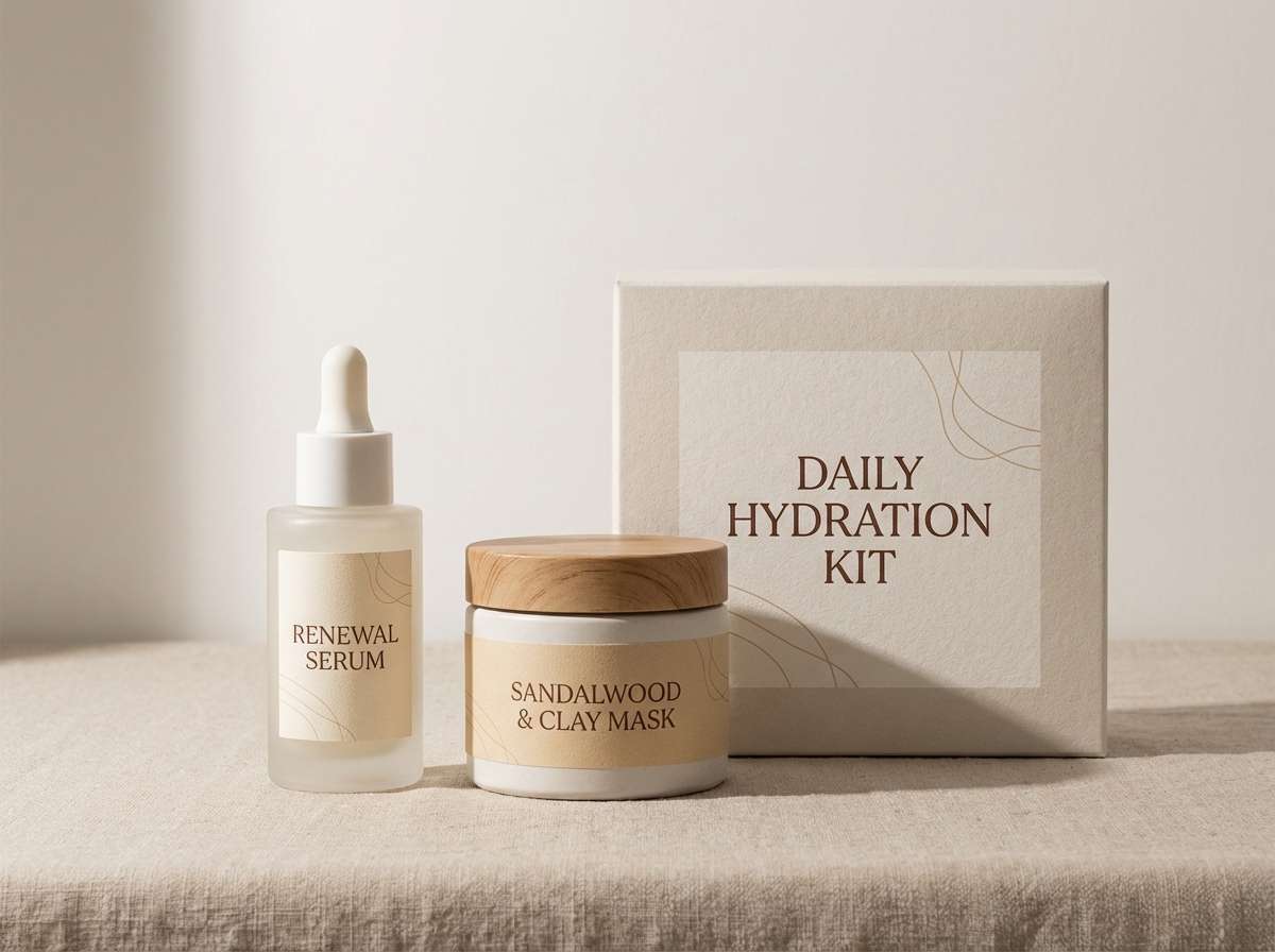
2) Coconut Sand
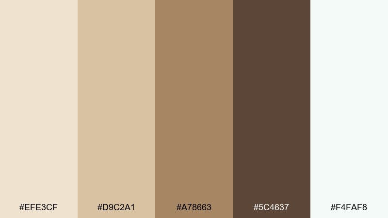
HEX: #EFE3CF #D9C2A1 #A78663 #5C4637 #F4FAF8
Mood: warm, calm, natural
Best for: skincare product packaging and label set
Warm, calm neutrals that evoke sun-baked dunes and toasted coconut husk. Let the cream and off-white carry most of the space, then anchor type with the cocoa brown. The mid tan works well for borders, icons, and ingredient panels without feeling heavy. Add a matte finish and plenty of breathing room for a premium look.
Image example of coconut sand generated using media.io
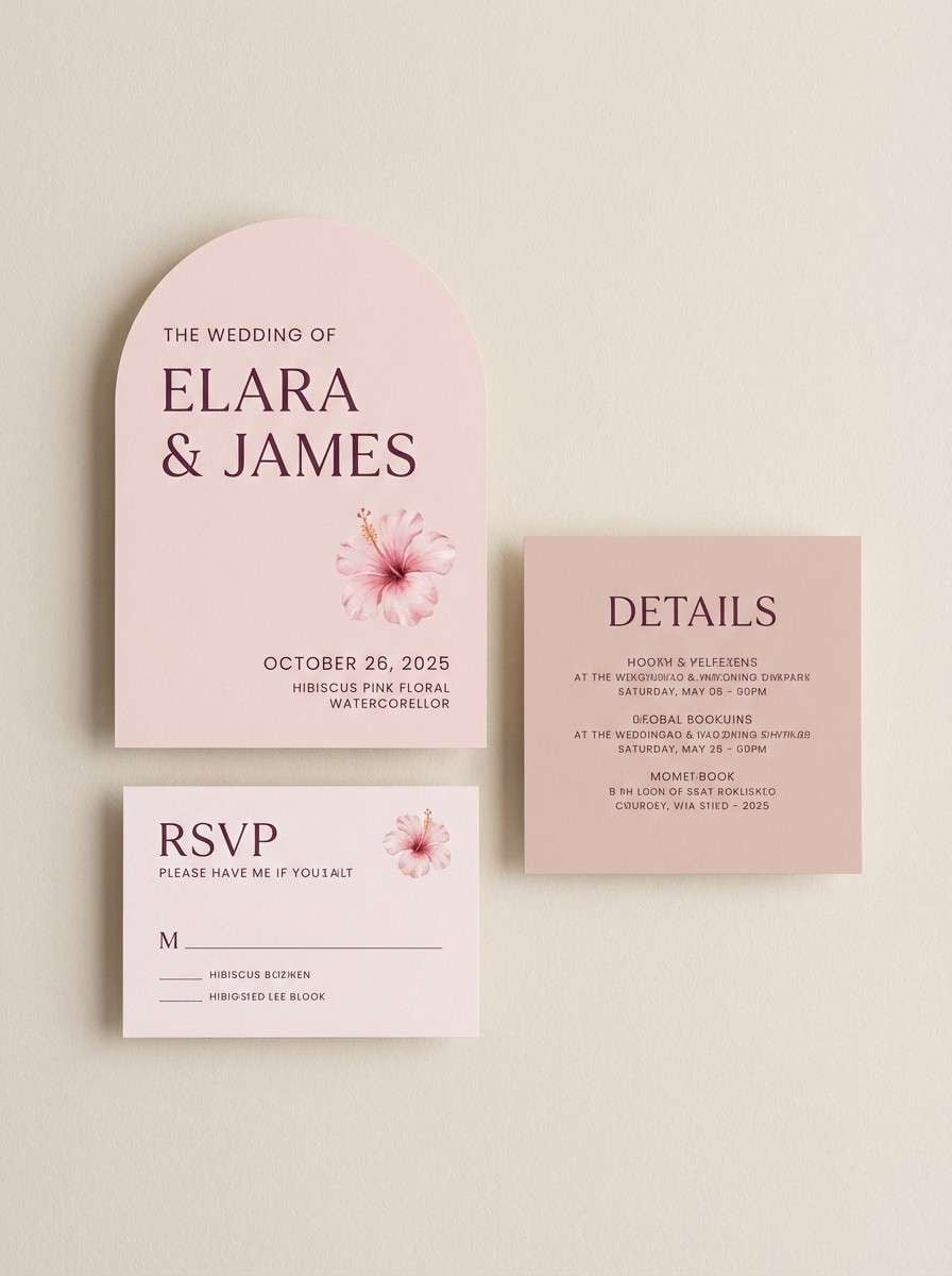
3) Hibiscus Dusk
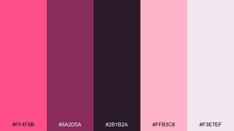
HEX: #FF4F8B #8A2D5A #2B1B2A #FFB3C8 #F3E7EF
Mood: romantic, moody, sunset
Best for: wedding invitation suite design
Romantic dusk tones that feel like hibiscus petals against a fading sky. Use the deep plum for headings and fine lines, letting blush and pale pink handle the main background. The bright hibiscus works best in small doses for monograms, seals, or RSVP highlights. This island color combination stays elegant when paired with ample whitespace and restrained florals.
Image example of hibiscus dusk generated using media.io
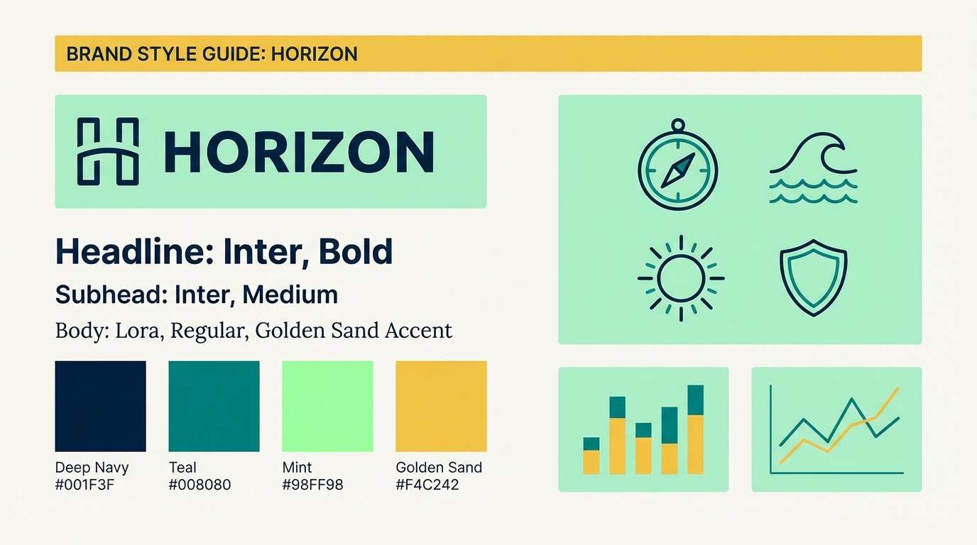
4) Reef Shadow
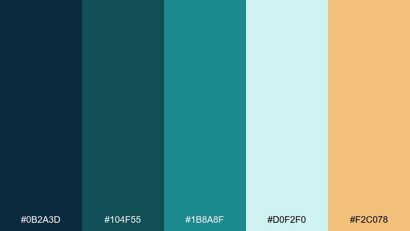
HEX: #0B2A3D #104F55 #1B8A8F #D0F2F0 #F2C078
Mood: deep, sleek, oceanic
Best for: tech brand style guide one-page layout
Deep, sleek oceanic tones with a sunlit pop that feels like coral edges in shade. Build your grid with navy and teal, then use the mint as a clean background for charts and callouts. The golden sand accent makes key metrics and links stand out without screaming. This mix works especially well with geometric icons and condensed headings.
Image example of reef shadow generated using media.io
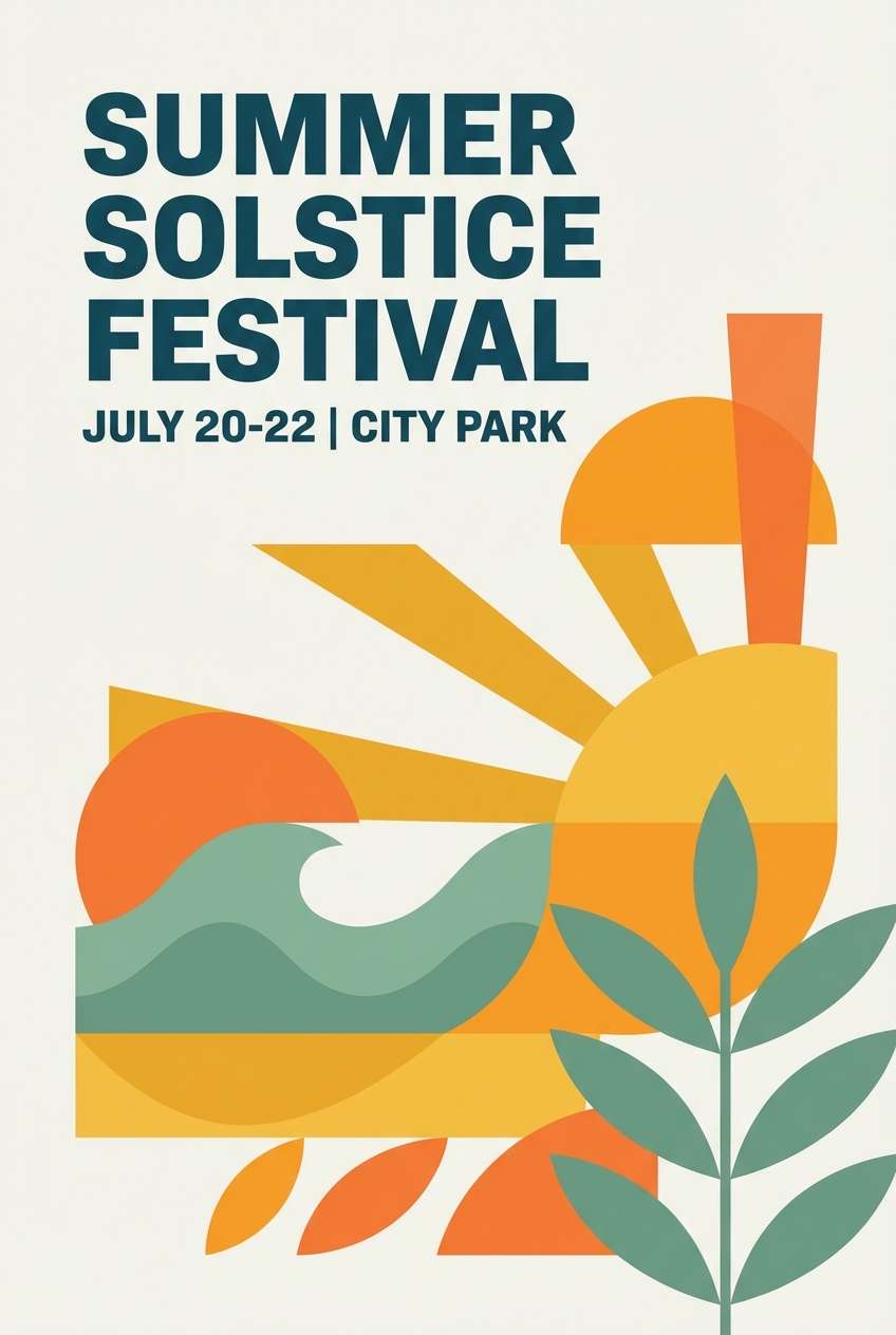
5) Mango Sunrise
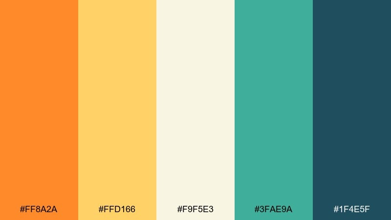
HEX: #FF8A2A #FFD166 #F9F5E3 #3FAE9A #1F4E5F
Mood: bright, optimistic, tropical
Best for: summer event poster design
Bright, optimistic hues that read like mango slices and early sun on the water. Let the orange and golden yellow dominate headlines and shapes, then cool it down with sea green for balance. The deep blue-green is your best choice for text and strong contrast. Keep gradients subtle so the design stays punchy and modern.
Image example of mango sunrise generated using media.io
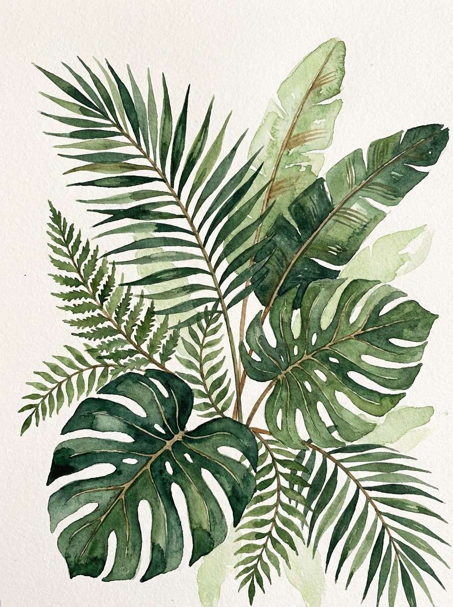
6) Palm Canopy
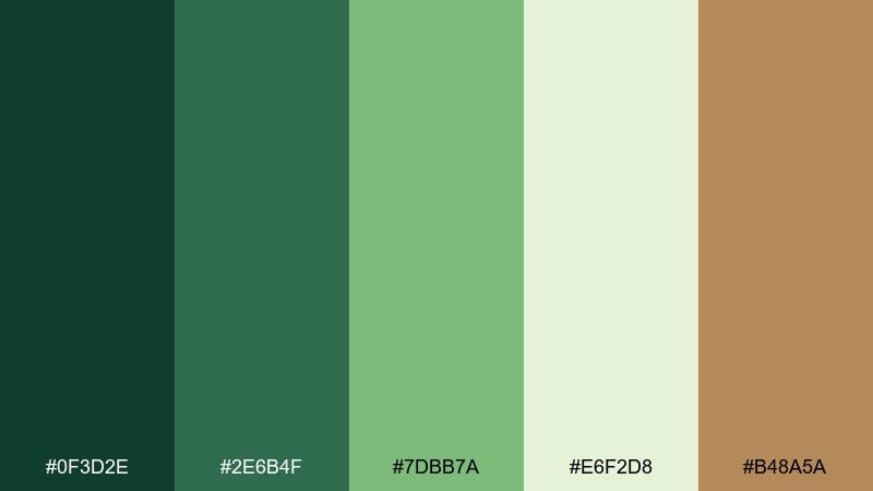
HEX: #0F3D2E #2E6B4F #7DBB7A #E6F2D8 #B48A5A
Mood: lush, grounded, botanical
Best for: watercolor botanical art print
Lush, grounded greens that evoke palm fronds and shaded jungle paths. Use the darkest green for stems and shadows, then layer mid greens for depth and texture. The pale leaf tone keeps negative space airy, while the warm brown adds a natural trunk-like balance. Consider a slightly textured paper background to enhance the organic feel.
Image example of palm canopy generated using media.io
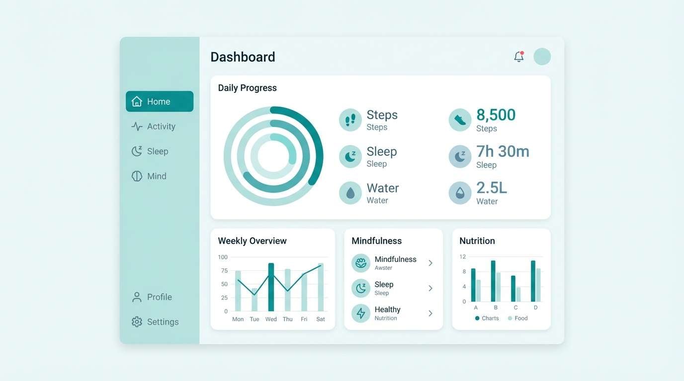
7) Seaglass Mist
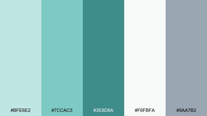
HEX: #BFE6E2 #7CCAC3 #3E8D8A #F6FBFA #9AA7B2
Mood: soft, clean, spa-like
Best for: wellness app dashboard UI mockup
Soft, clean tones that feel like seaglass washed smooth by gentle tide. Keep most panels in near-white and misty aqua, reserving the darker teal for active states and key data. The cool gray-blue is perfect for secondary text and icons. For a calm interface, avoid heavy borders and rely on spacing and subtle shadows instead.
Image example of seaglass mist generated using media.io
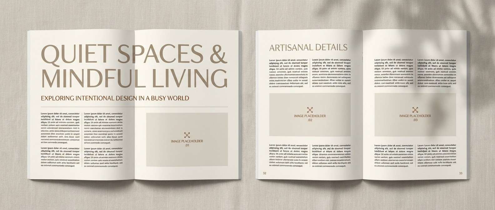
8) Driftwood Linen
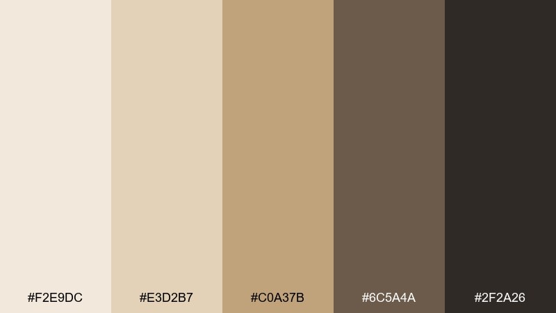
HEX: #F2E9DC #E3D2B7 #C0A37B #6C5A4A #2F2A26
Mood: minimal, rustic, refined
Best for: editorial magazine spread layout
Minimal rustic neutrals that evoke driftwood, linen, and quiet beach mornings. Use the light creams as your page base, then bring hierarchy with warm taupe and brown. The near-black is ideal for body copy, keeping the layout sharp and readable. Add a single textured element, like a grainy photo frame, to prevent the spread from feeling flat.
Image example of driftwood linen generated using media.io
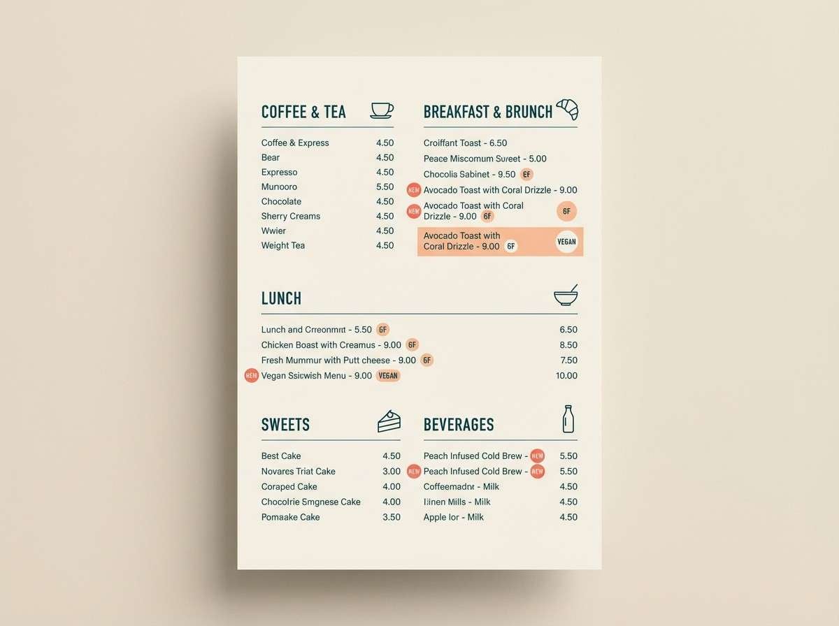
9) Coral Cove
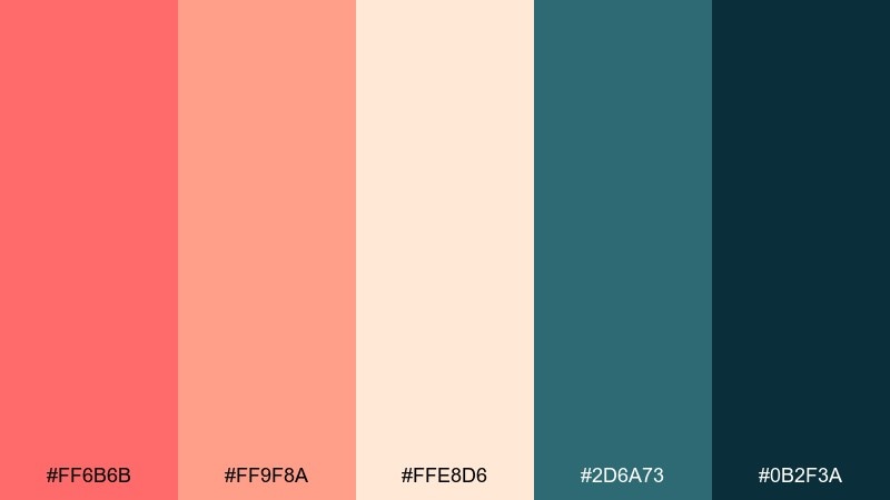
HEX: #FF6B6B #FF9F8A #FFE8D6 #2D6A73 #0B2F3A
Mood: playful, warm, seaside
Best for: restaurant menu design
Playful seaside warmth that feels like coral reefs and sunset cocktails. Use the deep teal for headings and separators, then let coral and peach carry highlights like specials and callouts. The creamy base keeps everything approachable and easy to scan. This island color palette works best with bold sans typography and simple iconography for categories.
Image example of coral cove generated using media.io
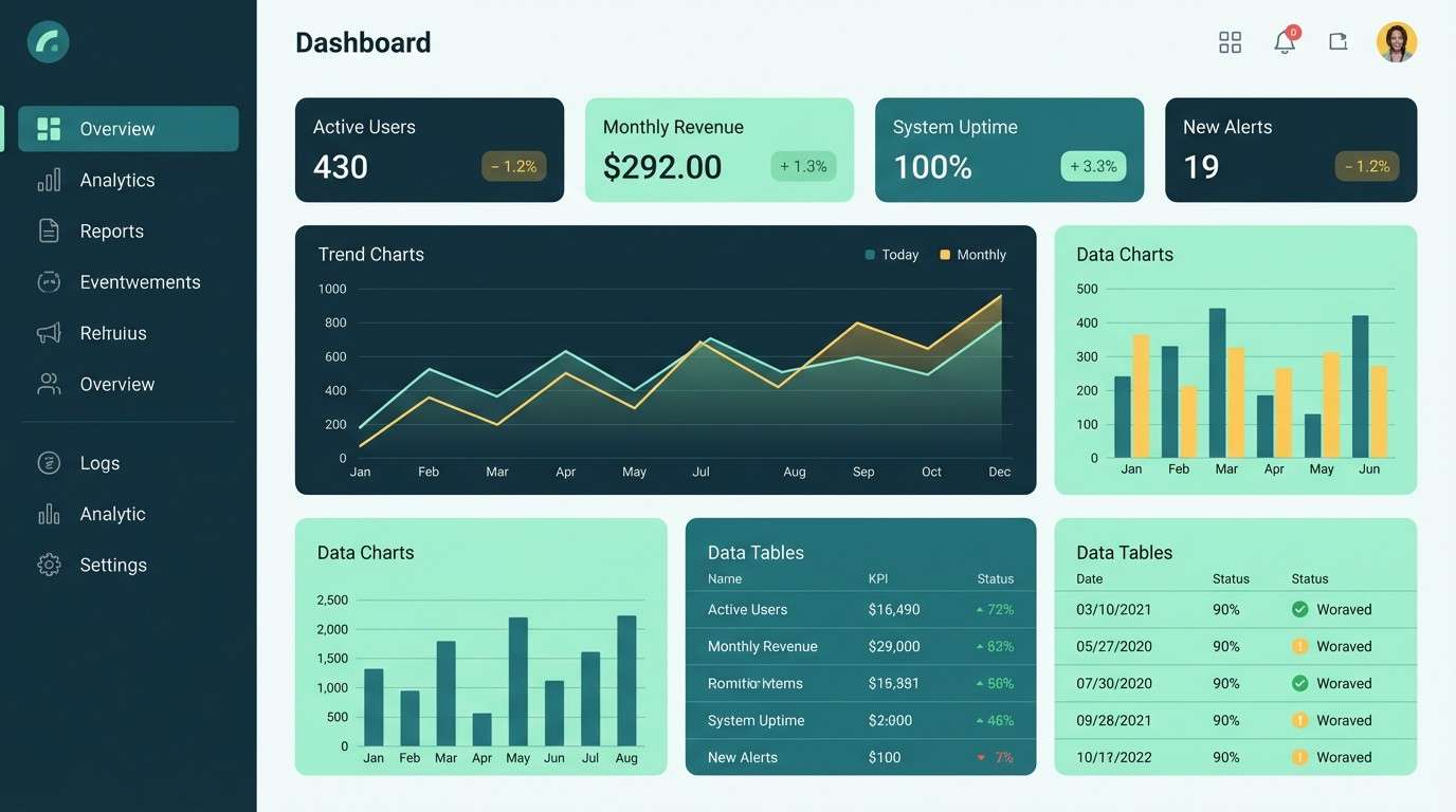
10) Tidal Pool
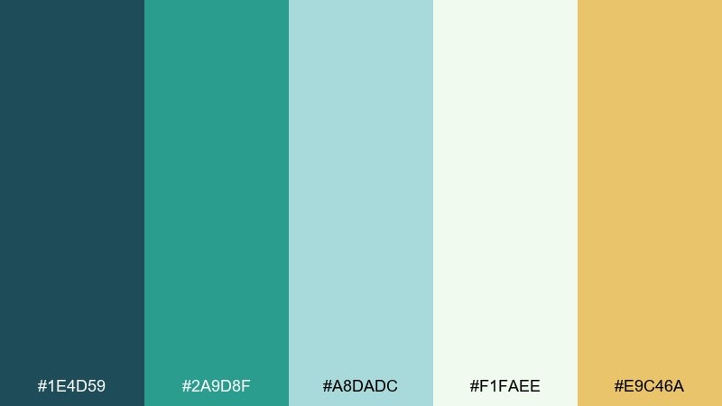
HEX: #1E4D59 #2A9D8F #A8DADC #F1FAEE #E9C46A
Mood: balanced, breezy, modern
Best for: data dashboard UI mockup
Balanced breezy tones that mirror a tidal pool shifting between shadow and sparkle. The dark blue-green should carry navigation and charts, while the teal handles active states and key indicators. Keep surfaces in soft mint and near-white so dense data still feels light. For a polished finish, use the warm yellow sparingly as a single highlight color for alerts or totals.
Image example of tidal pool generated using media.io
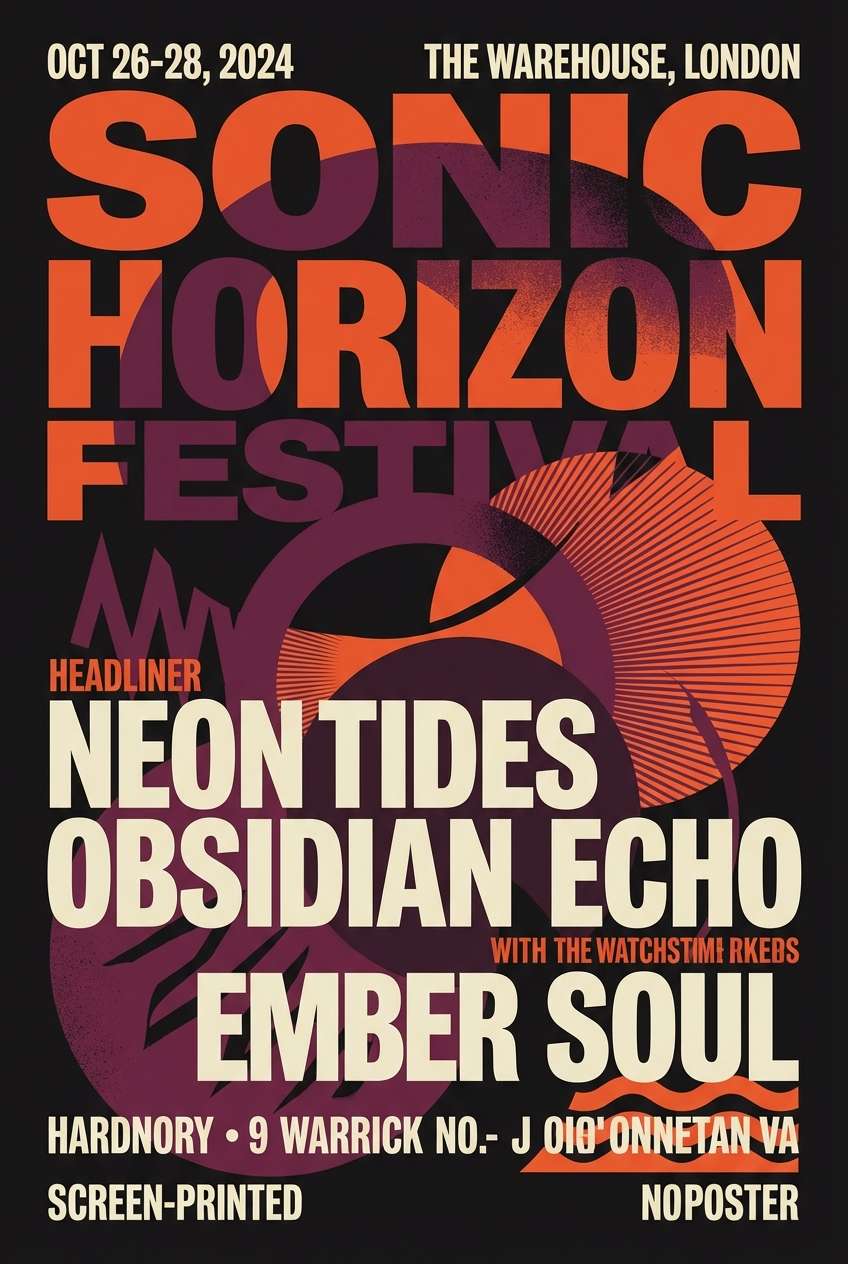
11) Volcano Night
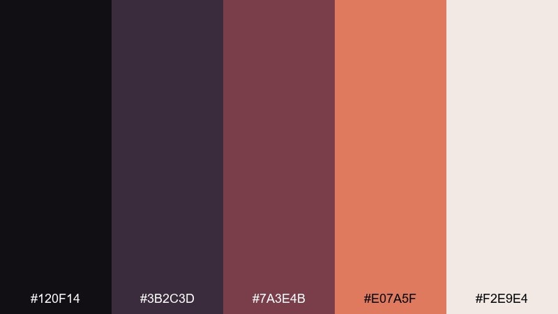
HEX: #120F14 #3B2C3D #7A3E4B #E07A5F #F2E9E4
Mood: dramatic, cinematic, bold
Best for: music festival flyer design
Dramatic, cinematic tones that feel like lava glow under a starless sky. Use the near-black as the main ground, then layer plum and maroon for depth in shapes and typography. The ember orange is perfect for lineup highlights and ticket info. Keep the cream for small type and logos so the flyer stays readable at a distance.
Image example of volcano night generated using media.io
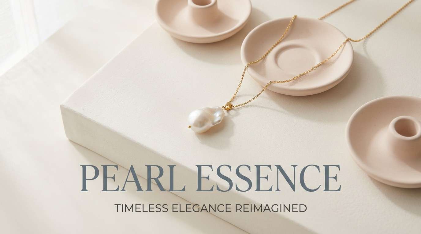
12) Pearl Shore
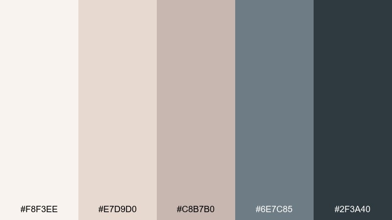
HEX: #F8F3EE #E7D9D0 #C8B7B0 #6E7C85 #2F3A40
Mood: soft, elegant, coastal neutral
Best for: jewelry product ad banner
Soft, elegant neutrals that evoke pearl luster and weathered seaside stone. Use the off-white and blush-beige as the backdrop for product shine, then rely on slate for supporting copy. The deep charcoal anchors logos and pricing without overpowering. Pair with thin line dividers and generous margins to keep the ad feeling luxury.
Image example of pearl shore generated using media.io
13) Sunlit Cabana
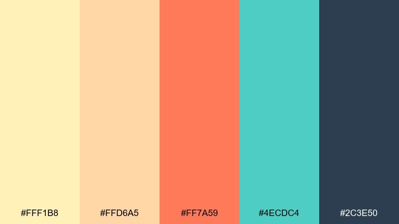
HEX: #FFF1B8 #FFD6A5 #FF7A59 #4ECDC4 #2C3E50
Mood: cheerful, summery, upbeat
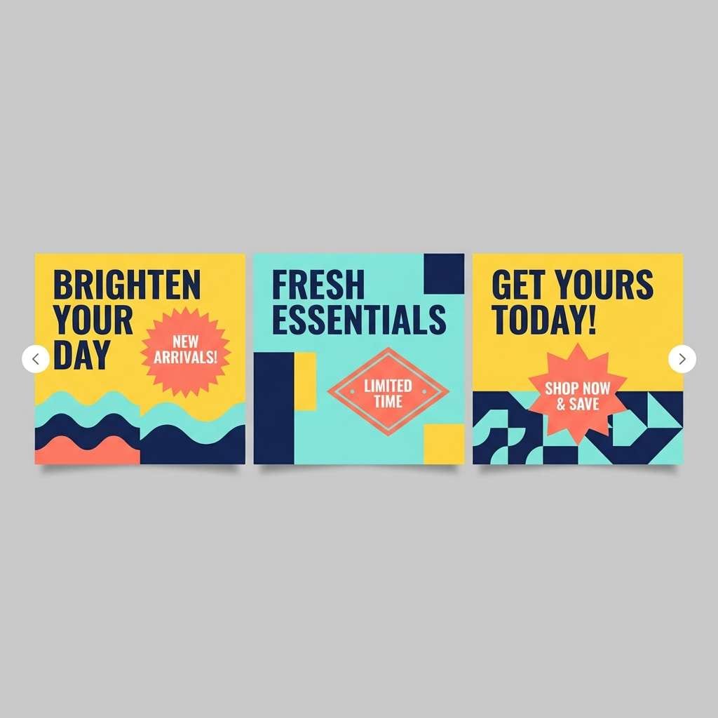
Best for: social media promo carousel design
Cheerful cabana tones that feel like striped towels and sparkling pool water. Make sunny yellow the dominant background on a few slides, then alternate with aqua for variety. Coral works best for promos and stickers, while the navy keeps text crisp and accessible. For cohesion, repeat one shape motif across all cards and only swap the main background color.
Image example of sunlit cabana generated using media.io
14) Island Market
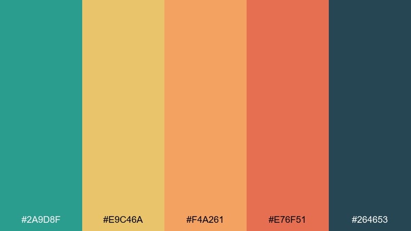
HEX: #2A9D8F #E9C46A #F4A261 #E76F51 #264653
Mood: vibrant, friendly, handmade
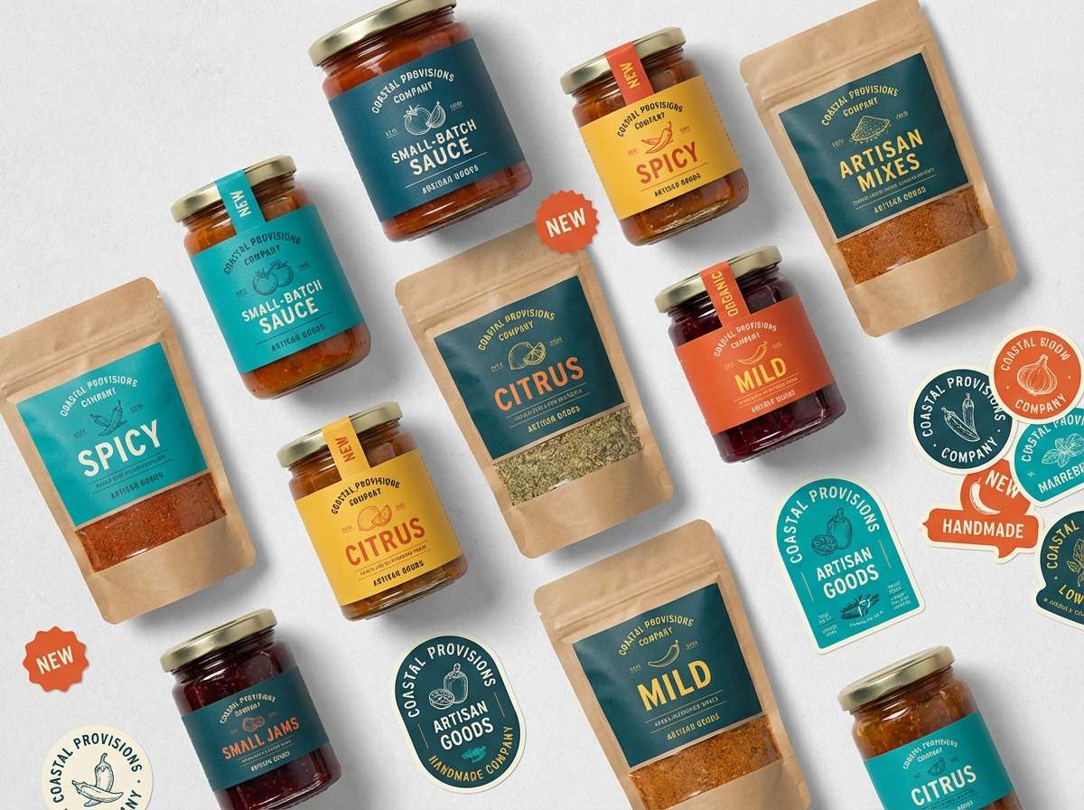
Best for: artisan food label and sticker set
Vibrant, friendly tones that bring to mind fruit stalls and hand-painted signs. Use teal and deep blue-green for brand anchors, then rotate the warm yellows and oranges across product variants. The red-orange makes a great limited accent for heat levels or best seller tags. These island color combinations stay cohesive when you keep type in the deep blue-green and vary only the accent blocks.
Image example of island market generated using media.io
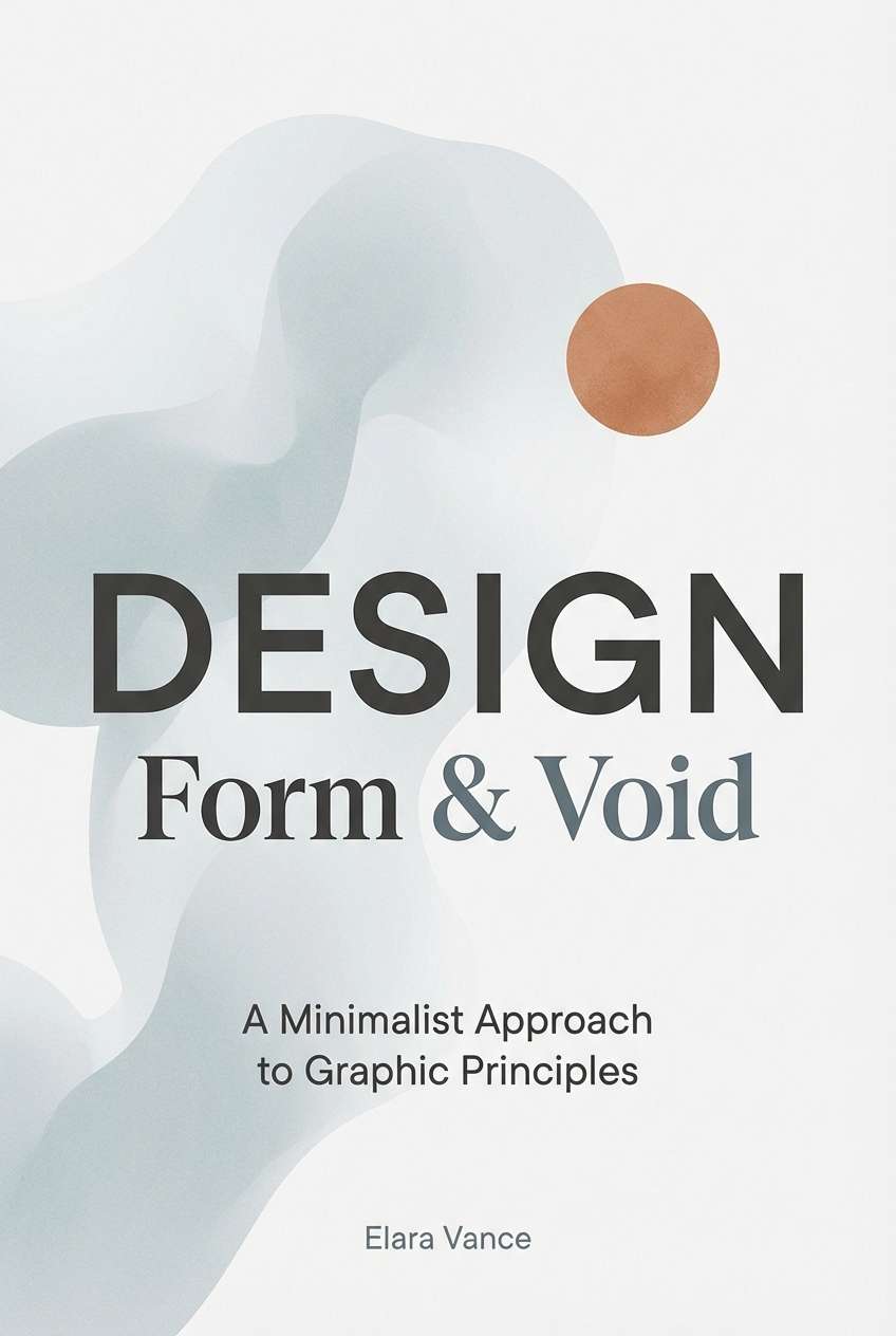
15) Rainy Pier
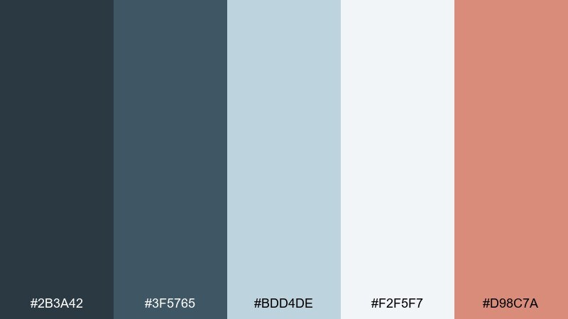
HEX: #2B3A42 #3F5765 #BDD4DE #F2F5F7 #D98C7A
Mood: quiet, misty, reflective
Best for: book cover design
Quiet, misty blues that feel like a rainy pier and soft fog rolling in. Use charcoal and slate for the title and author name, then let pale blue-gray handle large background shapes. The warm clay accent adds a human touch for a small badge or underline. Keep contrast high for thumbnail readability and avoid overly thin fonts.
Image example of rainy pier generated using media.io
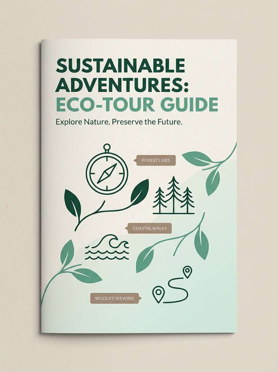
16) Turtle Bay
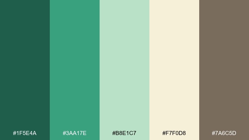
HEX: #1F5E4A #3AA17E #B8E1C7 #F7F0D8 #7A6C5D
Mood: eco, relaxed, outdoorsy
Best for: eco-tour brochure cover
Relaxed eco greens that suggest mangroves, sea grass, and quiet coves. Use the deep green for headlines and navigation blocks, then keep most of the surface in pale mint and warm sand. The muted brown helps ground icons, maps, and small labels. For a friendly finish, pair with rounded sans type and simple line illustrations.
Image example of turtle bay generated using media.io
17) Surf Wax
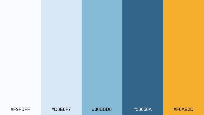
HEX: #F9FBFF #D8E8F7 #86BBD8 #33658A #F6AE2D
Mood: clean, sporty, energetic
Best for: sports brand web header design
Clean sporty blues with a sunny pop that feels like fresh wax and bright midday swell. Use navy for bold headings and the main call to action, while light blues keep the header airy. The golden accent is ideal for one key button or a limited promo tag. If you need extra punch, increase contrast by placing the accent on navy rather than on the pale background.
Image example of surf wax generated using media.io

18) Tropical Postcard
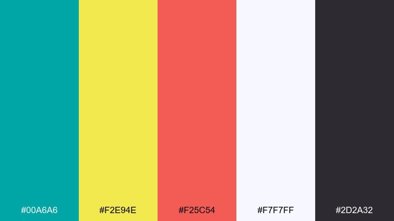
HEX: #00A6A6 #F2E94E #F25C54 #F7F7FF #2D2A32
Mood: retro, fun, punchy
Best for: retro postcard illustration
Retro punchy tones that evoke sun-faded postcards and playful souvenir shops. Let teal and warm yellow take the lead in big shapes, then use coral red for stamps, titles, and small bursts. The soft white keeps the layout crisp, while charcoal is best reserved for outlines and short text. This island color combination looks great with halftone textures and rounded letterforms.
Image example of tropical postcard generated using media.io
19) Shell Pink Horizon
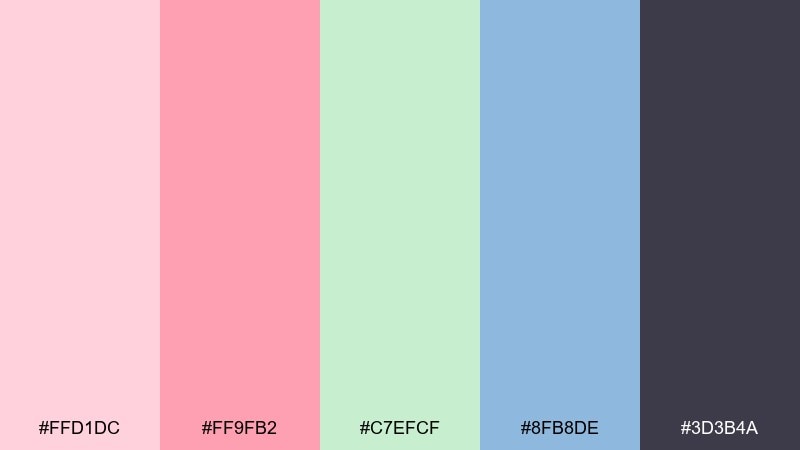
HEX: #FFD1DC #FF9FB2 #C7EFCF #8FB8DE #3D3B4A
Mood: soft, dreamy, modern pastel
Best for: beauty brand homepage UI mockup
Soft dreamy pastels that feel like shells at sunrise and a hazy horizon line. Use the deep indigo for headings and navigation so the lighter tones remain delicate, not washed out. Pink and blush can alternate as section backgrounds, while mint adds a fresh counterbalance. For a cohesive island color palette, keep imagery airy and limit gradients to subtle fades.
Image example of shell pink horizon generated using media.io
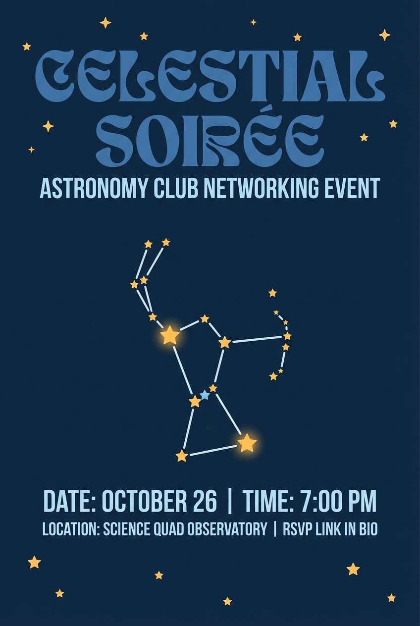
20) Stargazer Beach
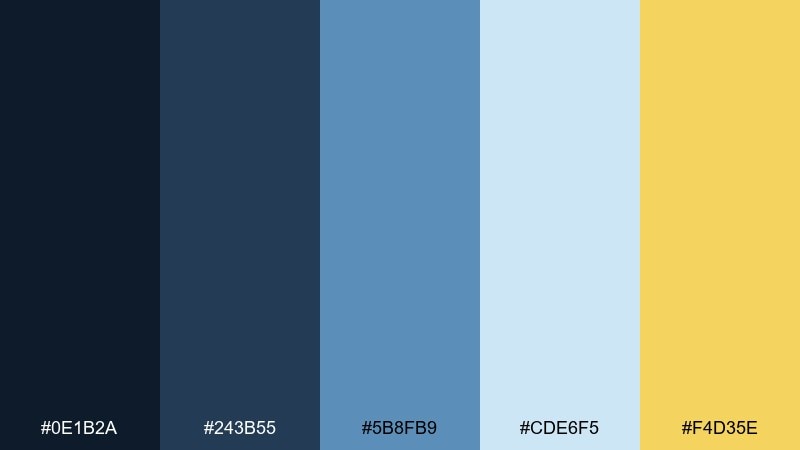
HEX: #0E1B2A #243B55 #5B8FB9 #CDE6F5 #F4D35E
Mood: serene, night-sky, adventurous
Best for: astronomy club event flyer
Serene night-sky blues that evoke stargazing above a quiet shoreline. Use the deepest navy for the background and bold headings, then layer mid blues for constellation lines and subtle shapes. The pale sky blue keeps details readable, while the warm yellow makes a perfect star highlight. These island color combinations feel cohesive when you repeat the yellow sparingly across icons and dates.
Image example of stargazer beach generated using media.io
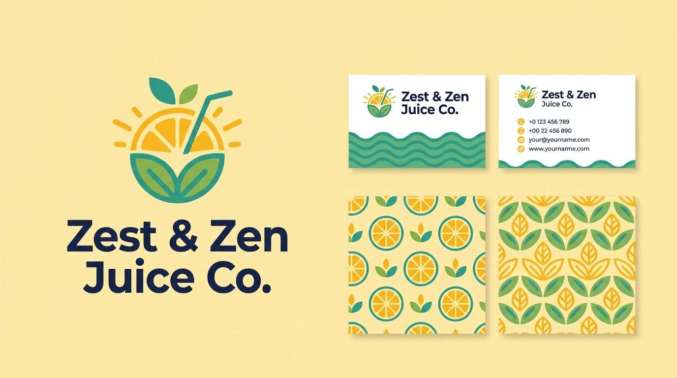
21) Citrus Lagoon
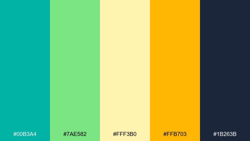
HEX: #00B3A4 #7AE582 #FFF3B0 #FFB703 #1B263B
Mood: zesty, bright, tropical-fresh
Best for: juice bar logo and brand kit
Zesty tropical-fresh hues that feel like lime zest over cold lagoon water. Teal and leaf green work as your main brand colors, while soft yellow can fill backgrounds and patterns. Use the bright citrus gold for one hero element, like a logo mark or price highlight, and keep type in deep navy for clarity. For a cohesive system, stick to flat color blocks and avoid overly complex gradients.
Image example of citrus lagoon generated using media.io
What Colors Go Well with Island?
Island palettes pair best with grounded neutrals (warm cream, sand, driftwood taupe) because they give bright tropical tones room to breathe. These neutrals also help UI and print layouts stay readable and premium.
For contrast and hierarchy, use deep ocean shades like navy, blue-green, charcoal, or plum—especially for typography and navigation. A single warm accent (coral, mango, citrus gold) can then do the “attention” work for CTAs and badges.
If you want a softer coastal look, lean into seafoam, misty aqua, and pale sky blue, then anchor with one dark ink-like color. This keeps the design airy while still meeting accessibility needs.
How to Use a Island Color Palette in Real Designs
Start with role-based color assignment: pick one dark shade for text and UI structure, one mid-tone for interactive states, and one light tone for backgrounds. Save the most saturated “tropical” color for small, repeatable highlights like buttons, tags, and icons.
In branding, keep your logo and type system consistent (often in navy/charcoal), then rotate secondary accents by campaign or product flavor. This approach preserves recognition while still feeling seasonal and fun.
For print and packaging, consider finishes: matte creams and sands feel natural, while glossy teals and corals feel fresh and modern. Test swatches under real lighting to ensure the palette holds up across materials.
Create Island Palette Visuals with AI
If you want to see your island color scheme in action, generate quick mockups for landing pages, packaging, posters, and brand kits. Visual testing helps you validate contrast, accent intensity, and overall mood before production.
With Media.io text-to-image, you can paste a prompt, describe the layout you need, and iterate fast—ideal for exploring multiple island palette ideas without starting from scratch.
Island Color Palette FAQs
-
What is an island color palette?
An island color palette is a coastal-inspired mix of ocean blues/teals, sandy neutrals, and warm tropical accents (like coral, mango, or sunshine yellow) used to create a relaxed, beachy mood in designs. -
Which island colors are best for website UI?
Use a deep navy or blue-green for text and navigation, pale mint/cream for backgrounds, and a single bright accent (coral or citrus gold) for CTAs. This keeps the interface airy while maintaining strong contrast. -
How do I keep tropical tones from looking too loud?
Limit saturated hues to small areas (buttons, badges, highlights) and expand your neutrals. Keeping typography mostly in a dark ocean tone also helps the palette feel modern and controlled. -
What neutral works best with lagoon teal and coral?
Warm cream, sand, and off-white neutrals pair especially well with lagoon teal and coral because they soften the saturation and make the accent colors feel sunlit instead of harsh. -
Are island color palettes good for branding?
Yes—these palettes are memorable and flexible. You can anchor the brand with a deep sea tone, then rotate tropical accents across campaigns, product variants, or seasonal launches. -
How do I choose a text color for an island color scheme?
Pick the darkest shade in the palette (navy, charcoal, deep teal, or plum) for body text. For light backgrounds, this improves readability and helps meet contrast expectations. -
Can I generate island palette mockups with AI?
Yes. Use Media.io’s text-to-image tool to generate UI, posters, packaging, or brand kit visuals from prompts, then refine your palette choices based on what looks best in context.


