

Raw sienna sits in that sweet spot between earthy orange and warm brown, making it easy to build palettes that feel grounded yet modern.
Below are 20 raw sienna color palette ideas with HEX codes, plus practical notes on pairing, contrast, and real design use.
In this article
Why Raw Sienna Palettes Work So Well
Raw sienna feels natural and trustworthy because it echoes materials we see every day: clay, leather, wood, and sunbaked stone. That familiarity makes it a strong base color for brands that want warmth without looking loud.
It also plays nicely with both light neutrals (cream, oat, sand) and deep anchors (espresso, charcoal). This range gives designers plenty of room for hierarchy, contrast, and readable typography.
Finally, raw sienna is flexible across mediums. It prints beautifully on textured stocks for packaging, and it translates well to UI when paired with off-whites and a controlled accent color.
20+ Raw Sienna Color Palette Ideas (with HEX Codes)
1) Desert Studio
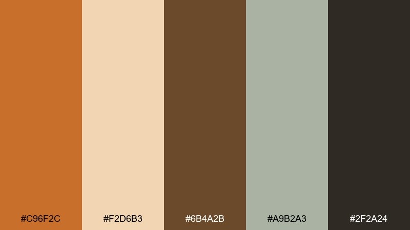
HEX: #c96f2c #f2d6b3 #6b4a2b #a9b2a3 #2f2a24
Mood: grounded, sun-warmed, modern rustic
Best for: branding for artisan goods
Grounded and sun-warmed, this set feels like clay walls, linen textiles, and a quiet studio at golden hour. Use it for logos, labels, and small-batch packaging where an earthy look builds trust. Pair the sienna with the linen cream for headlines, then lean on the deep brown for type and contrast. Tip: keep the sage gray as a subtle background to prevent the warm tones from feeling too heavy.
Image example of desert studio generated using media.io
Media.io is an online AI studio for creating and editing video, image, and audio in your browser.

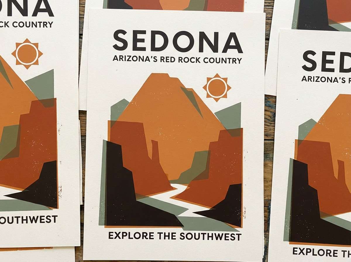
2) Canyon Clay
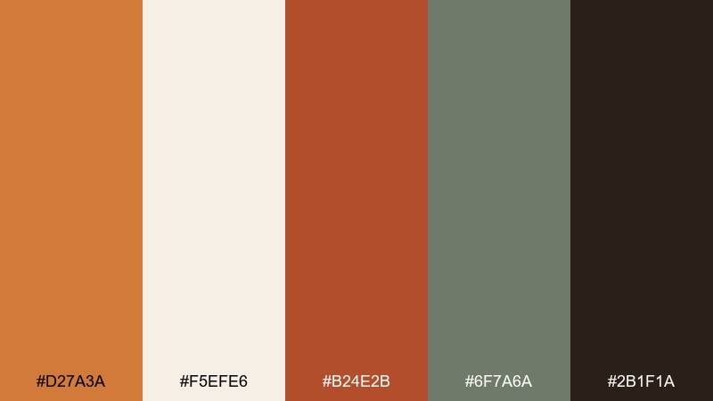
HEX: #d27a3a #f5efe6 #b24e2b #6f7a6a #2b1f1a
Mood: bold, rugged, outdoorsy
Best for: travel poster design
Bold and rugged, these tones echo canyon cliffs and dusty trails after a long hike. They work beautifully in poster layouts where you want energy without neon brightness. Balance the clay reds with the off-white for readable typography, and use the muted green as a natural accent. Tip: reserve the near-black for small text and icons to keep the palette feeling open and airy.
Image example of canyon clay generated using media.io
3) Sunbaked Linen
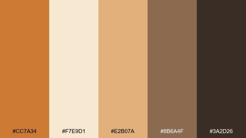
HEX: #cc7a34 #f7e9d1 #e2b07a #8b6a4f #3a2d26
Mood: soft, breathable, welcoming
Best for: lifestyle blog headers
Soft and breathable, it reads like sunbaked linen, oat milk coffee, and worn wood. These raw sienna color combinations shine in wide header images and minimal blog layouts that need warmth without clutter. Use the cream as the canvas, then bring in the sienna and apricot for highlight bars or buttons. Tip: keep the dark brown for navigation text so links stay crisp on light backgrounds.
Image example of sunbaked linen generated using media.io
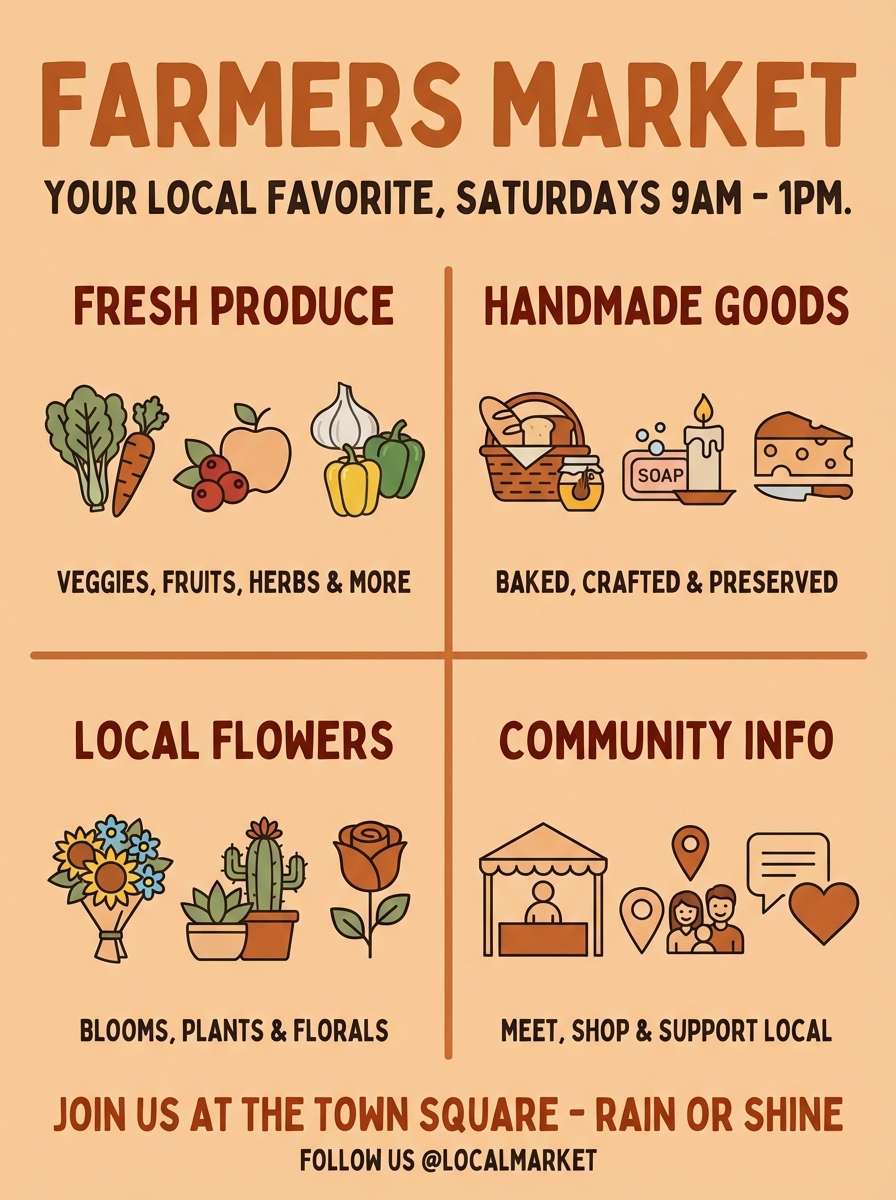
4) Rustic Harvest
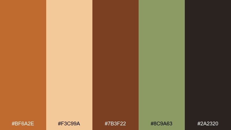
HEX: #bf6a2e #f3c99a #7b3f22 #8c9a63 #2a2320
Mood: cozy, seasonal, farmhouse
Best for: farmers market flyer
Cozy and seasonal, this mix evokes baskets of squash, dried herbs, and wooden crates. It fits flyers and community posters where you want a handmade vibe that still looks polished. Pair the pumpkin tint with the herb green for friendly callouts, then anchor everything with the deep espresso. Tip: use the pale peach as generous negative space to keep the design readable from a distance.
Image example of rustic harvest generated using media.io
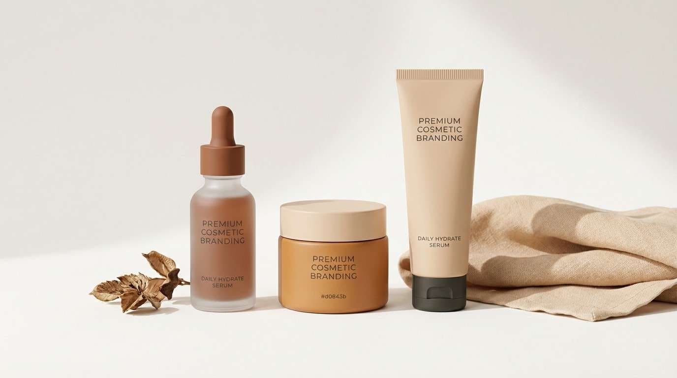
5) Terracotta Whisper
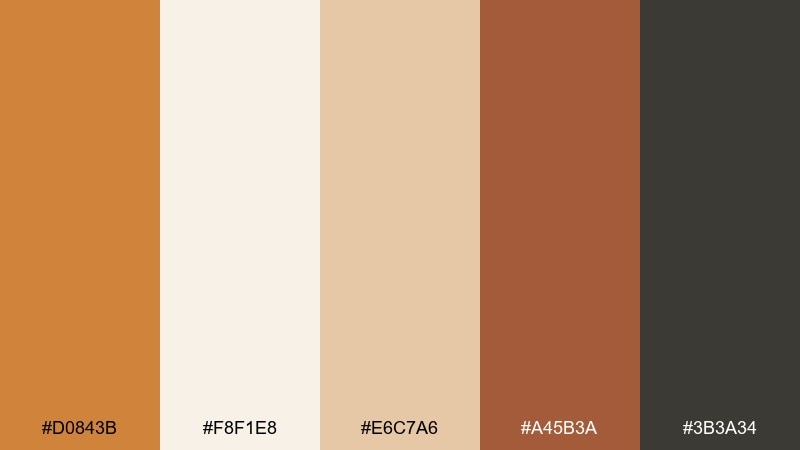
HEX: #d0843b #f8f1e8 #e6c7a6 #a45b3a #3b3a34
Mood: calm, refined, boutique
Best for: skincare packaging
Calm and refined, these hues feel like matte terracotta, soft paper, and a quiet boutique shelf. They suit skincare packaging where warmth suggests comfort and care. Use the creamy off-white for label space, then add sienna and cocoa for hierarchy and brand marks. Tip: print the darker accent sparingly to keep the overall look light and premium.
Image example of terracotta whisper generated using media.io
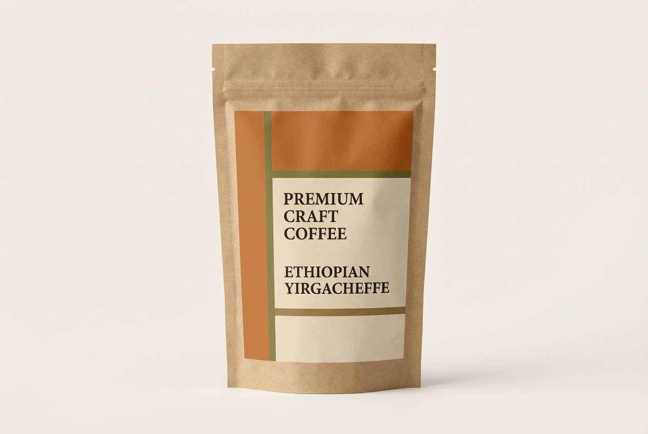
6) Olive Kiln
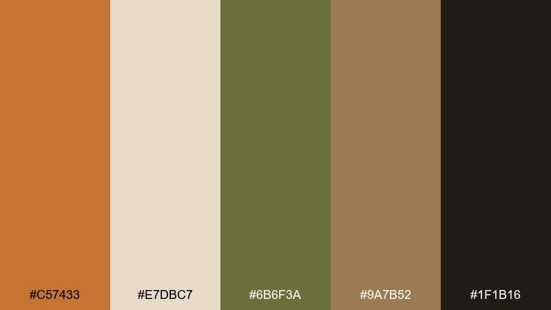
HEX: #c57433 #e7dbc7 #6b6f3a #9a7b52 #1f1b16
Mood: earthy, crafted, heritage
Best for: coffee bag design
Earthy and crafted, it calls to mind fired clay, olive leaves, and vintage apothecary labels. The tones work well on coffee bags, especially when you want a heritage feel with modern clarity. Pair the olive with the warm clay for stamps and icons, and keep the cream for tasting notes and small text. Tip: add texture through subtle paper grain, not extra colors, to preserve the palette integrity.
Image example of olive kiln generated using media.io
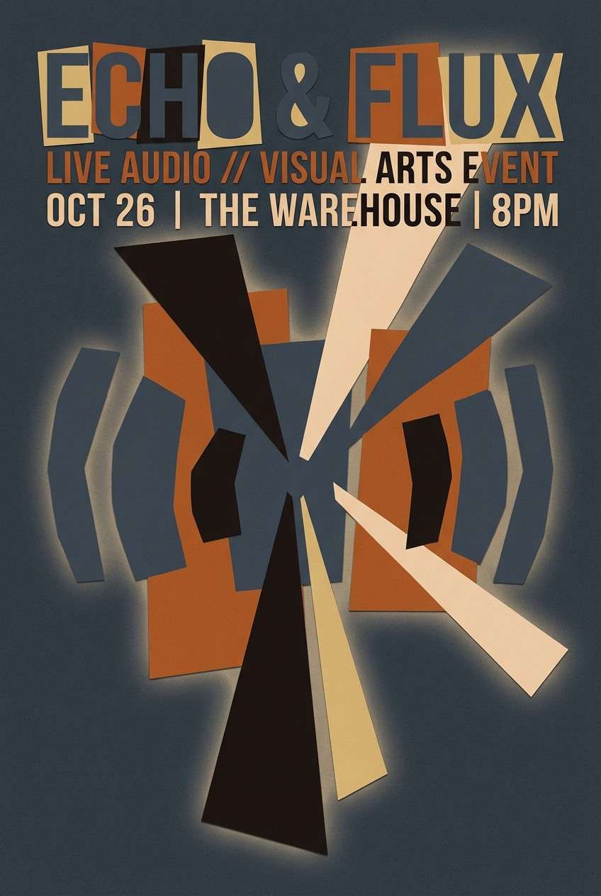
7) Copper Dusk
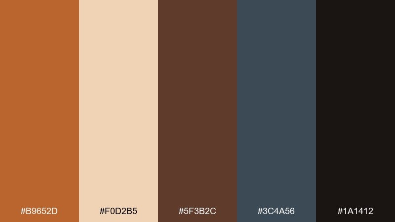
HEX: #b9652d #f0d2b5 #5f3b2c #3c4a56 #1a1412
Mood: moody, urban, cinematic
Best for: music event poster
Moody and cinematic, this palette feels like copper streetlights against a cool evening sky. It is ideal for posters and event graphics that need drama without harsh contrast. Use the slate blue-gray as a strong field color, then bring in copper for titles and highlights. Tip: keep the light sand as a small accent so the overall design stays dusk-like and atmospheric.
Image example of copper dusk generated using media.io
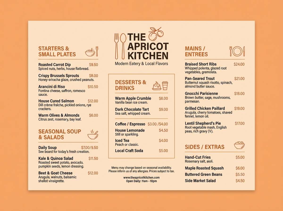
8) Apricot Adobe
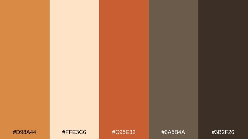
HEX: #d98a44 #ffe3c6 #c95e32 #6a5b4a #3b2f26
Mood: bright, friendly, sunlit
Best for: restaurant menu design
Bright and friendly, these shades suggest apricot glaze, adobe walls, and toasted spices. They are strong for menus where appetite cues matter and the typography must stay legible. Set most text on the pale apricot, then use the deeper rust for section headers and callouts. Tip: keep the warm taupe for dividers and icon lines so the layout feels structured, not busy.
Image example of apricot adobe generated using media.io
9) Sienna and Sage
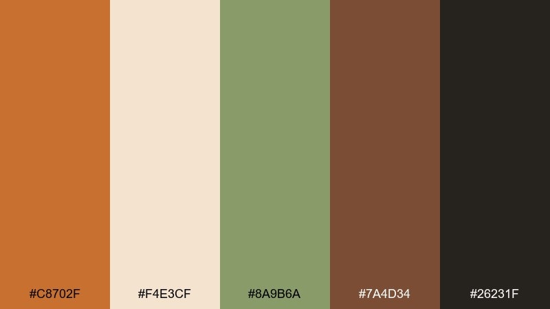
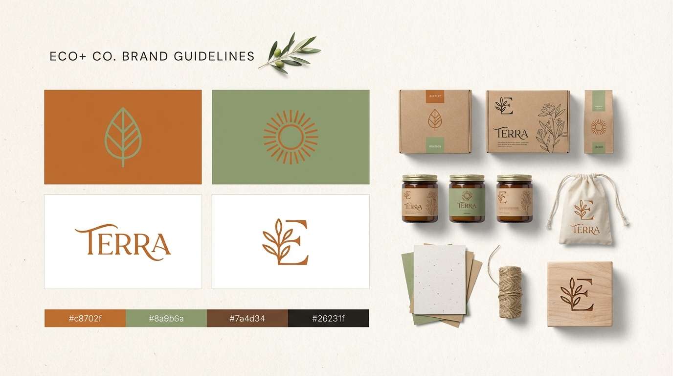
HEX: #c8702f #f4e3cf #8a9b6a #7a4d34 #26231f
Mood: balanced, natural, calming
Best for: eco brand identity
Balanced and calming, it evokes dried sage bundles, clay pots, and recycled paper. The warm and cool notes make it easy to build a brand system that feels natural rather than trendy. Pair the sage green with the cream for backgrounds, then use sienna for key actions and badges. Tip: test contrast for accessibility by placing the dark charcoal behind the cream for small text.
Image example of sienna and sage generated using media.io
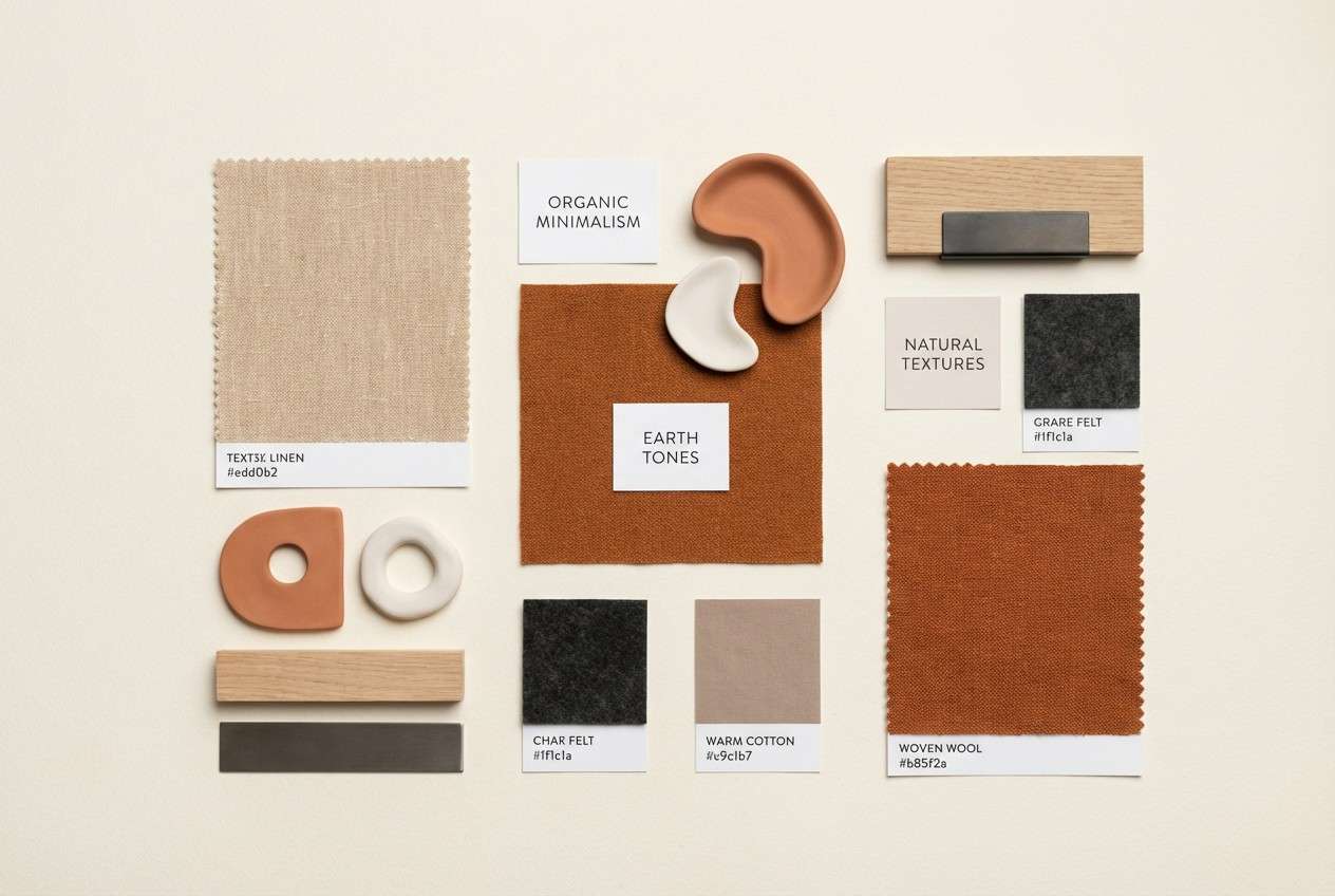
10) Campfire Neutrals
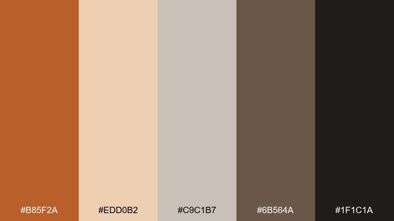
HEX: #b85f2a #edd0b2 #c9c1b7 #6b564a #1f1c1a
Mood: cozy, minimal, grounded
Best for: interior moodboard
Cozy and grounded, these neutrals feel like a campfire glow on wool blankets and stone. They fit interior moodboards and client presentations where you want warmth without loud color. Pair the soft gray with the cream for large surfaces, then use the ember tone for small decor accents. Tip: keep the darkest shade for titles and measurement notes so the board stays readable.
Image example of campfire neutrals generated using media.io
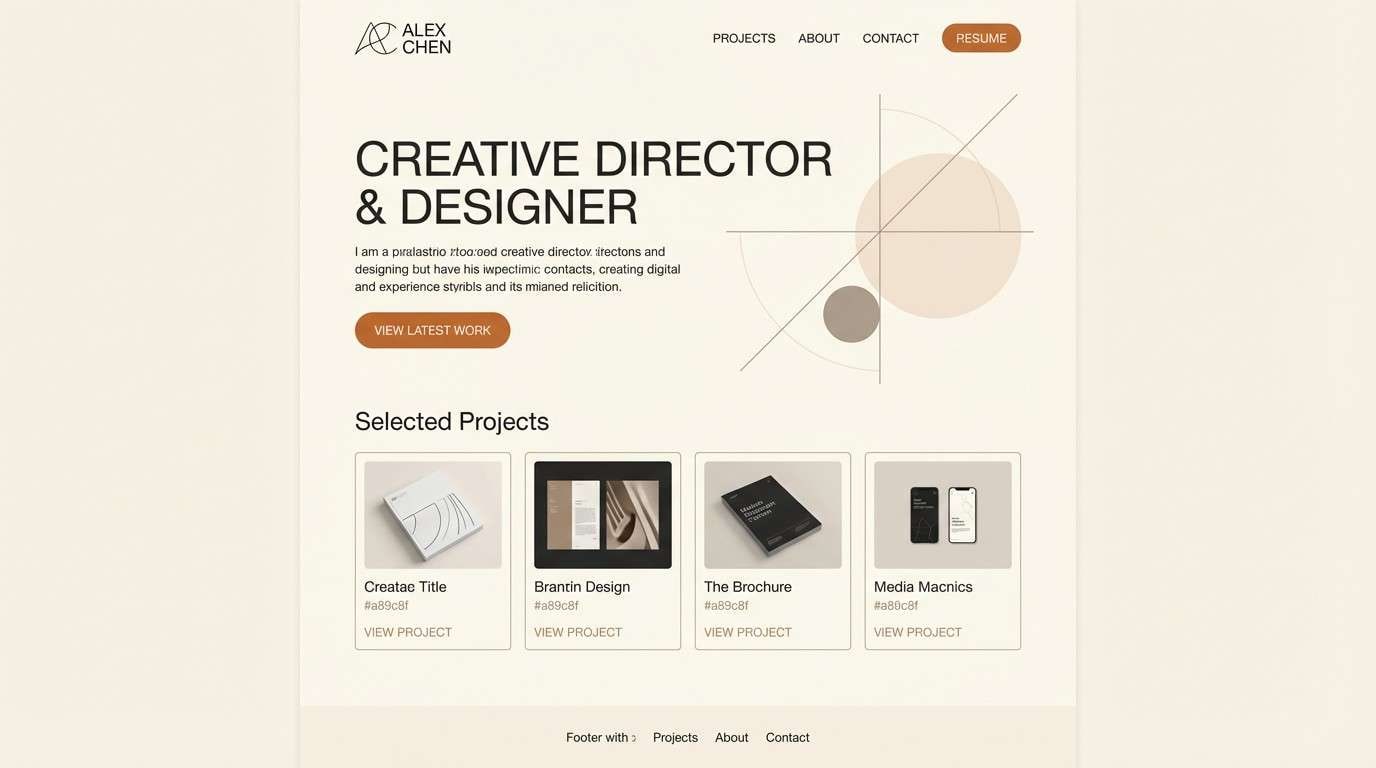
11) Clay and Charcoal
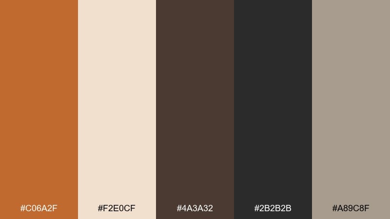
HEX: #c06a2f #f2e0cf #4a3a32 #2b2b2b #a89c8f
Mood: serious, architectural, modern
Best for: portfolio website UI
Serious and architectural, it brings to mind brick dust, concrete, and clean shadow lines. Use it in a portfolio UI where structure and legibility matter more than decoration. The light cream and warm gray create comfortable reading surfaces, while charcoal anchors navigation and footers. Tip: highlight only one primary button in clay so the interface stays calm and intentional.
Image example of clay and charcoal generated using media.io
12) Golden Workshop
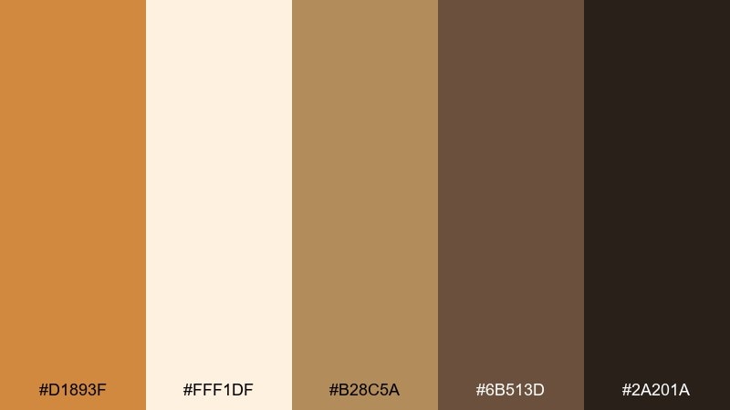
HEX: #d1893f #fff1df #b28c5a #6b513d #2a201a
Mood: warm, industrious, optimistic
Best for: DIY tutorial thumbnails
Warm and industrious, these colors resemble sawdust, honeyed varnish, and well-used tools. They are great for tutorial thumbnails where you need high contrast without a harsh look. Use the pale cream as the base, then set big title blocks in golden sienna for instant recognition. Tip: keep the darkest brown for only the key words so the thumbnail stays punchy at small sizes.
Image example of golden workshop generated using media.io

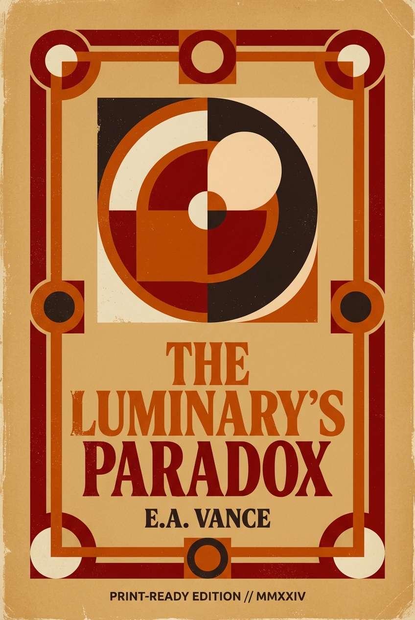
13) Autumn Brick
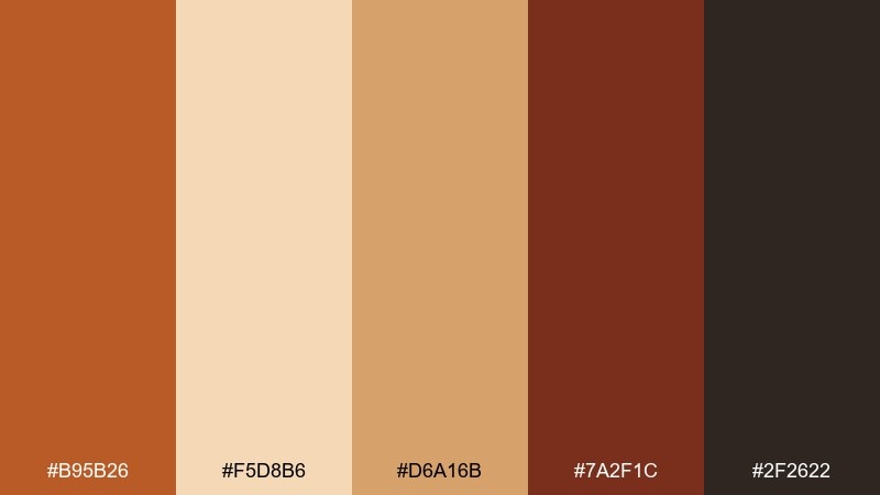
HEX: #b95b26 #f5d8b6 #d6a16b #7a2f1c #2f2622
Mood: rich, nostalgic, bold
Best for: book cover design
Rich and nostalgic, this mix feels like old brick lanes and turning leaves. It works on book covers where you want depth, warmth, and a hint of drama. Pair the pale tan with the brick red for a strong title area, and use the deep maroon for author name and rules. Tip: keep gradients subtle so the palette retains its printed, classic feel.
Image example of autumn brick generated using media.io
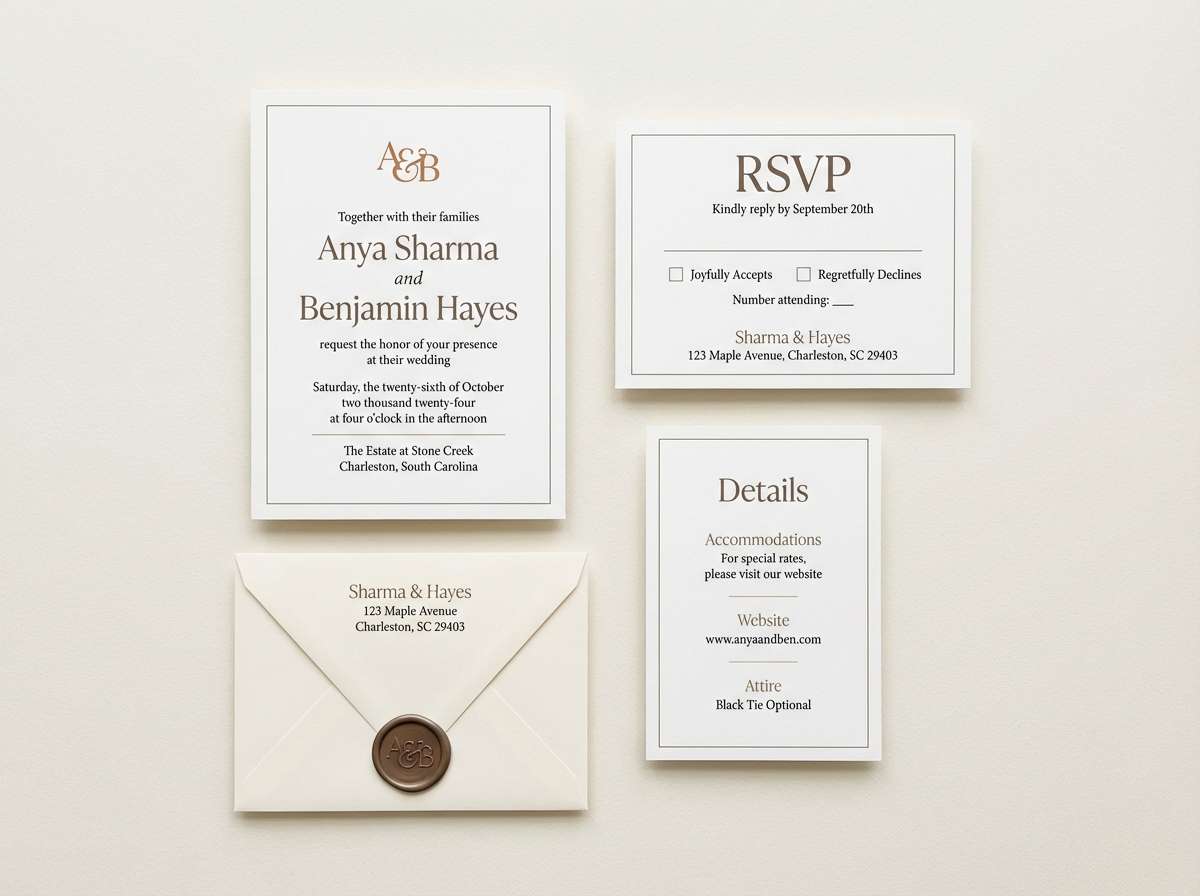
14) Soft Sepia
HEX: #c67a3a #fbf6ee #d9c3aa #8a6f5a #4a3d35
Mood: gentle, timeless, editorial
Best for: wedding invitation suite
Gentle and timeless, it reads like sepia film, vellum paper, and dried florals. These tones are ideal for invitation suites that aim for understated elegance over sparkle. Use the cream as the main stock color, then print names in the deeper cocoa for clarity. Tip: add the warm tan only for small monograms or borders to keep the suite airy.
Image example of soft sepia generated using media.io
15) Museum Earthtones
HEX: #b5672f #e8ddcf #7b6a57 #5a6a6a #1e1916
Mood: curated, calm, sophisticated
Best for: gallery exhibition brochure
Curated and calm, this palette suggests museum walls, aged wood frames, and quiet lighting. It suits brochures and exhibition materials where the design should support the content, not compete with it. Use the warm beige for margins and captions, then bring in the teal-gray as a refined accent for section tabs. Tip: keep the darkest ink tone for body text to maintain a premium print feel.
Image example of museum earthtones generated using media.io
16) Spiced Mocha
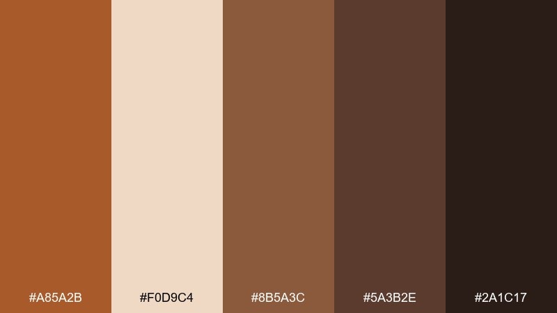
HEX: #a85a2b #f0d9c4 #8b5a3c #5a3b2e #2a1c17
Mood: cozy, rich, coffeehouse
Best for: cafe loyalty card
Cozy and rich, it feels like spiced mocha, cinnamon, and dark chocolate. The mid-to-deep browns help small printed pieces look sturdy and intentional. Pair the creamy latte tone with the darkest espresso for readable details, and reserve the warm spice for the logo mark. Tip: use thicker line weights in print so the darker inks do not fill in on textured paper.
Image example of spiced mocha generated using media.io
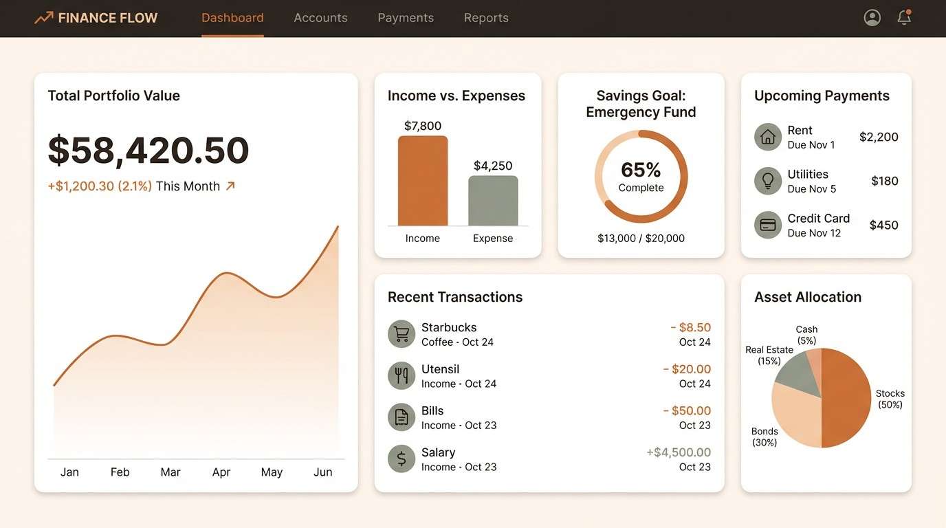
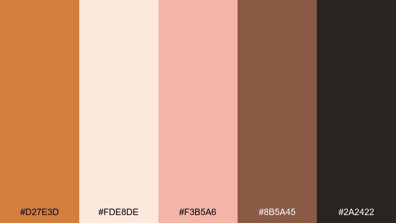
17) Warm Minimal UI
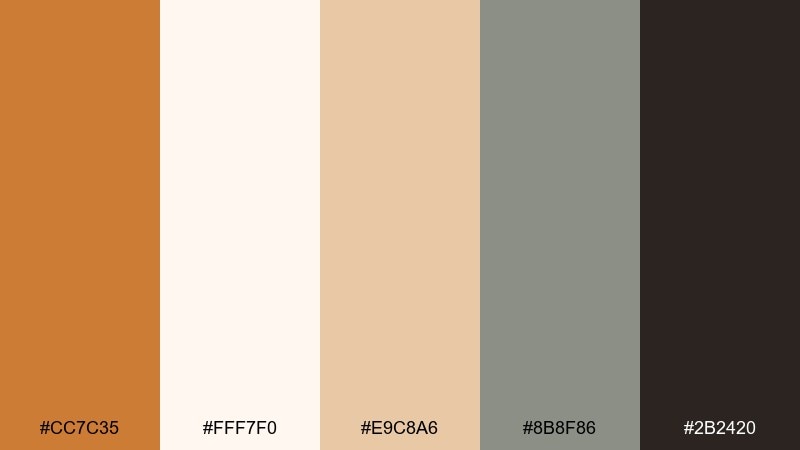
HEX: #cc7c35 #fff7f0 #e9c8a6 #8b8f86 #2b2420
Mood: clean, warm, modern
Best for: finance dashboard UI
Clean and warm, it brings a friendly glow to interfaces that can otherwise feel cold. This raw sienna color palette is a strong fit for dashboards, where clarity and hierarchy matter more than decoration. Use the off-white for panels, the charcoal for text, and keep the sienna for primary actions or key metrics. Tip: limit the accent to one button style and one chart highlight for a controlled, trustworthy UI.
Image example of warm minimal ui generated using media.io
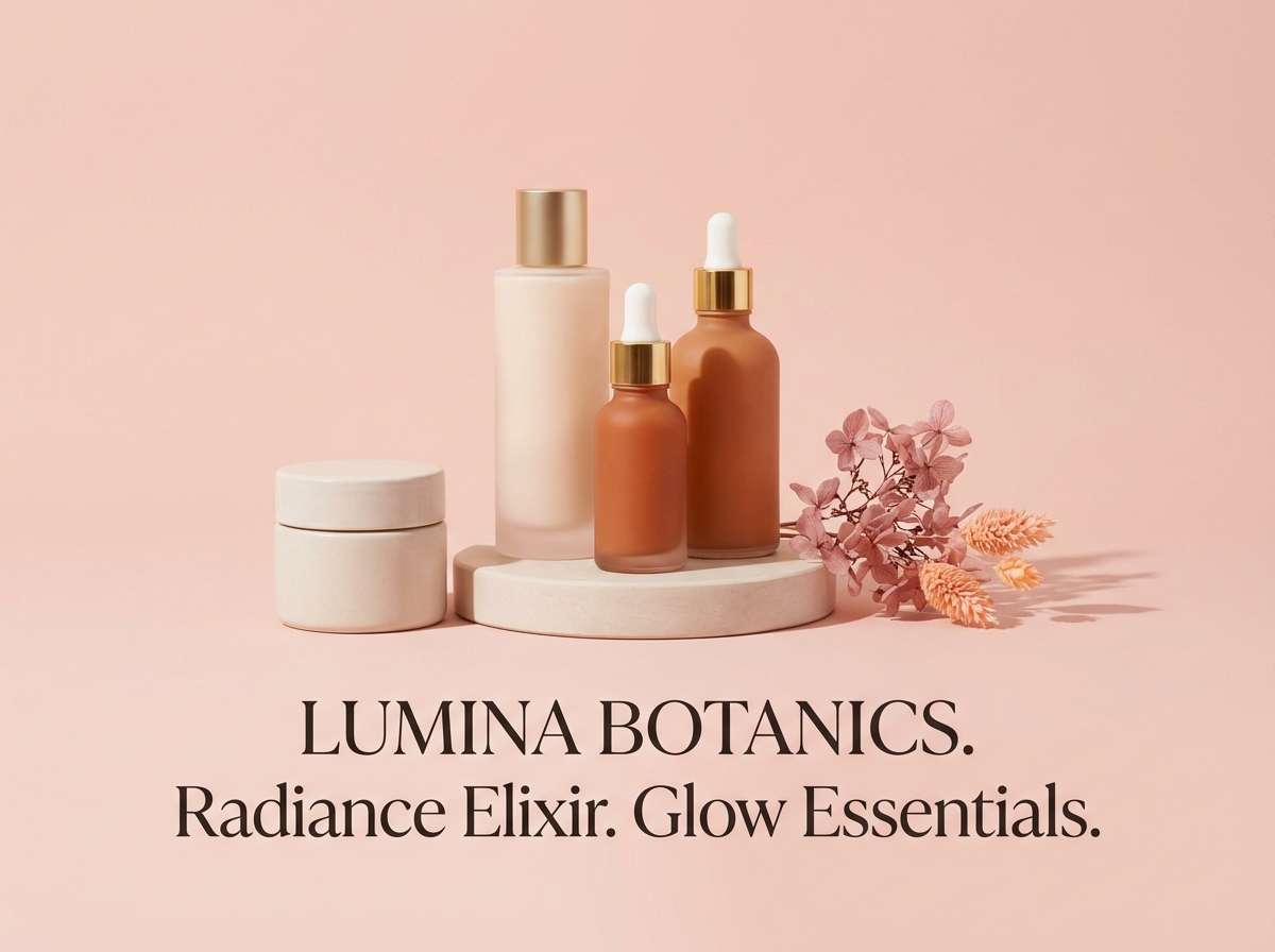
18) Clay Blossom
HEX: #d27e3d #fde8de #f3b5a6 #8b5a45 #2a2422
Mood: romantic, warm, softly playful
Best for: beauty product ad
Romantic and softly playful, these hues feel like clay pots beside blush petals. They are great for beauty ads that need warmth, softness, and clear contrast for copy. Pair the pale pink with the sienna for headlines, then use the cocoa tone for fine print and ingredient notes. Tip: keep backgrounds mostly light so the accent pink reads as intentional, not sugary.
Image example of clay blossom generated using media.io
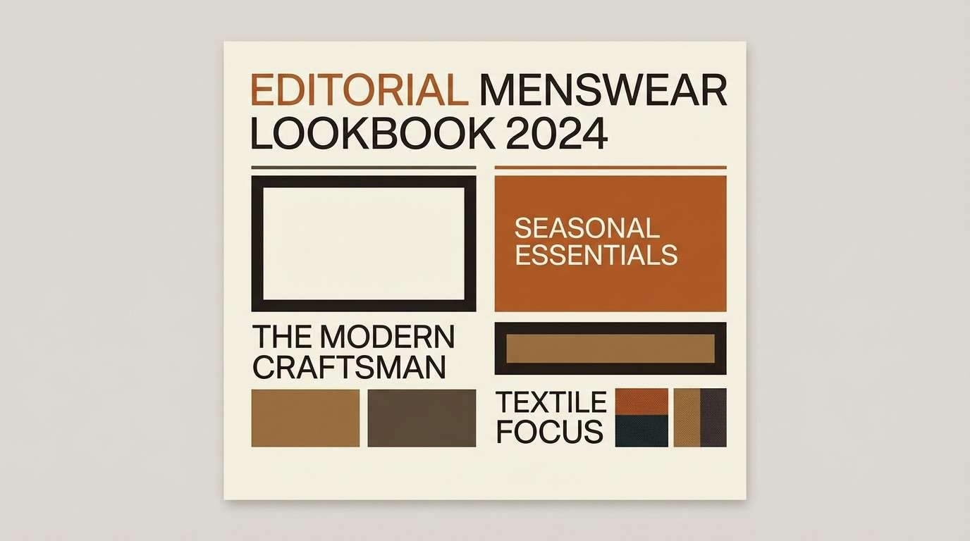
19) Saddle Leather
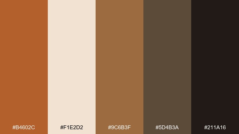
HEX: #b4602c #f1e2d2 #9c6b3f #5d4b3a #211a16
Mood: heritage, rugged, premium
Best for: menswear lookbook
Heritage and rugged, this set evokes saddle leather, brass hardware, and well-made denim. It works in lookbooks where you want a premium feel without glossy flash. Use the cream for generous margins, then build typographic hierarchy with the leather browns. Tip: keep photos warm-toned so the design and imagery do not fight each other.
Image example of saddle leather generated using media.io
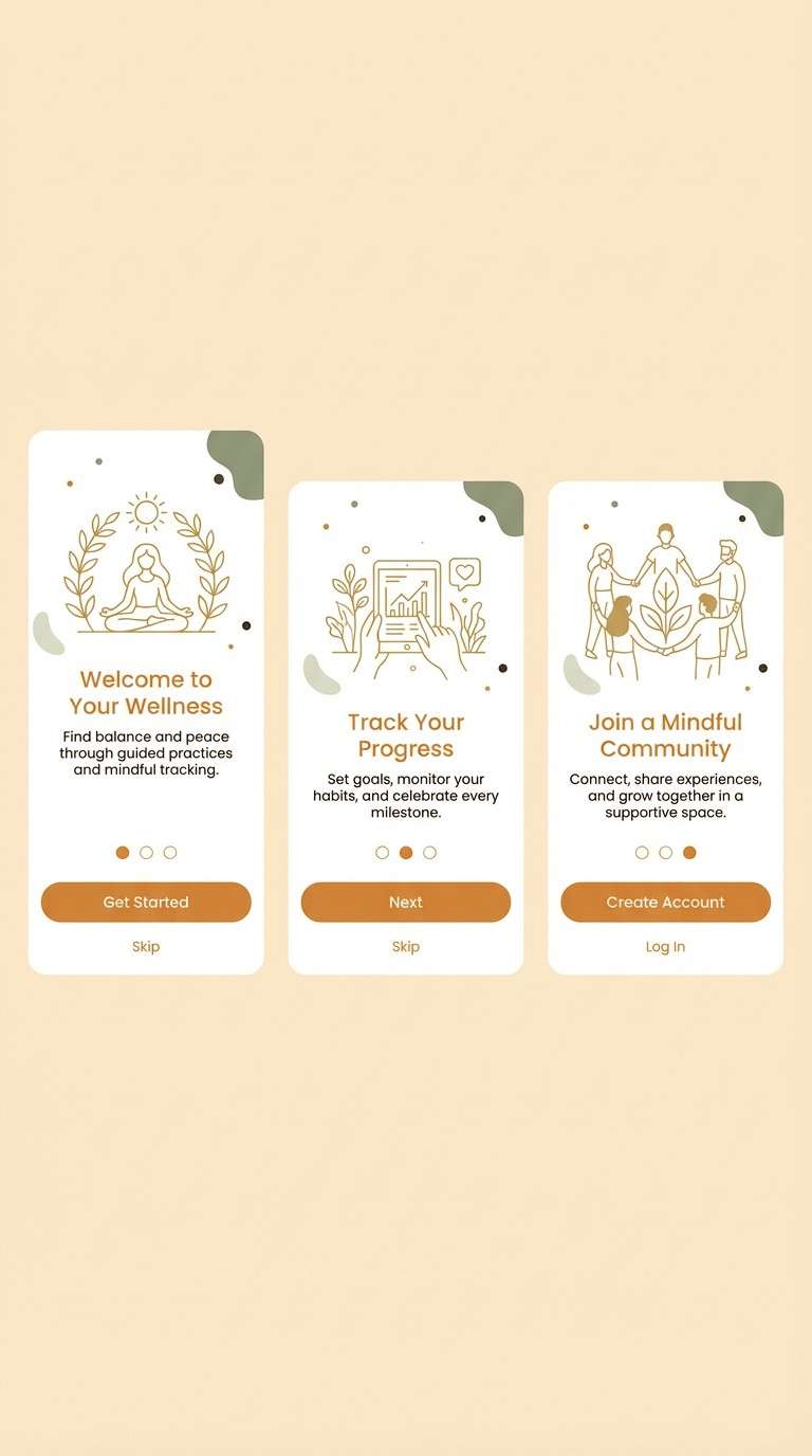
20) Sunlit Path
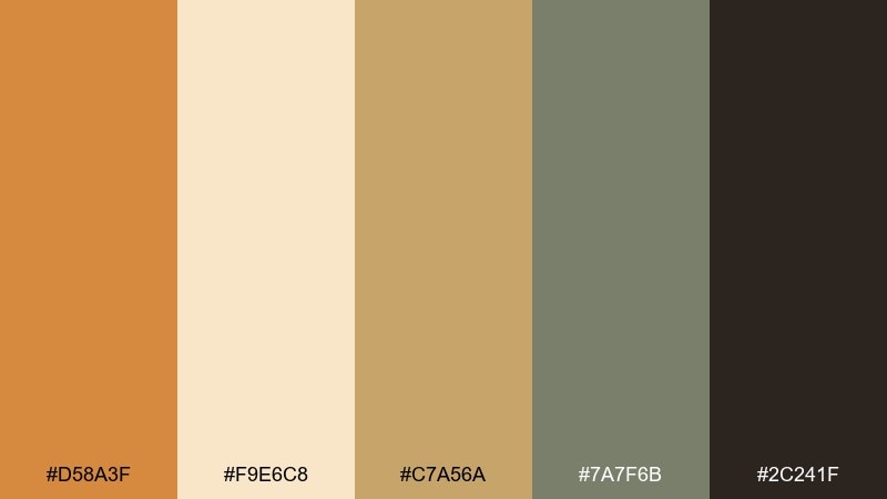
HEX: #d58a3f #f9e6c8 #c7a56a #7a7f6b #2c241f
Mood: optimistic, natural, outdoorsy
Best for: wellness app onboarding
Optimistic and natural, it feels like a sunlit path through dry grass and soft stone. These raw sienna color combinations are ideal for onboarding screens that should feel encouraging and calm. Use the cream as your main background, add sienna for progress highlights, and keep the muted green for secondary actions. Tip: repeat the golden tan in small illustrations to unify screens without relying on heavy gradients.
Image example of sunlit path generated using media.io
What Colors Go Well with Raw Sienna?
Raw sienna pairs best with creamy whites, sand, and oat neutrals when you want a clean, premium base. These light tones keep layouts breathable and make the sienna feel intentional rather than heavy.
For contrast, reach for espresso browns, charcoal, or near-black inks—especially for typography and UI navigation. If you want a nature accent, muted greens (sage, olive) and blue-grays add balance without clashing.
For a softer, modern twist, raw sienna also works with blush and dusty pinks. Keep pink as a controlled accent so the palette stays warm and refined.
How to Use a Raw Sienna Color Palette in Real Designs
In branding and packaging, use raw sienna as the signature brand color (logo mark, seal, or label block) and let creams or warm beiges do most of the background work. Add one dark ink for legibility and a muted accent (like sage) for system flexibility.
In UI, treat raw sienna as a “call-to-action” color, not a background color. Keep surfaces off-white, set text in charcoal, and apply sienna to primary buttons, active states, or key chart highlights.
In editorial layouts, raw sienna is great for pull quotes, rules, and section headers. Pair it with warm grays to create hierarchy without relying on lots of extra colors.
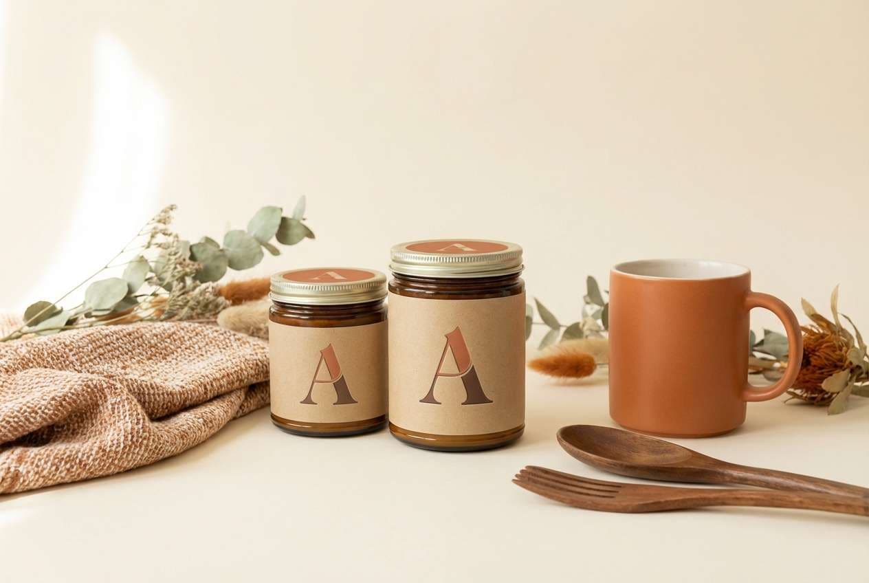
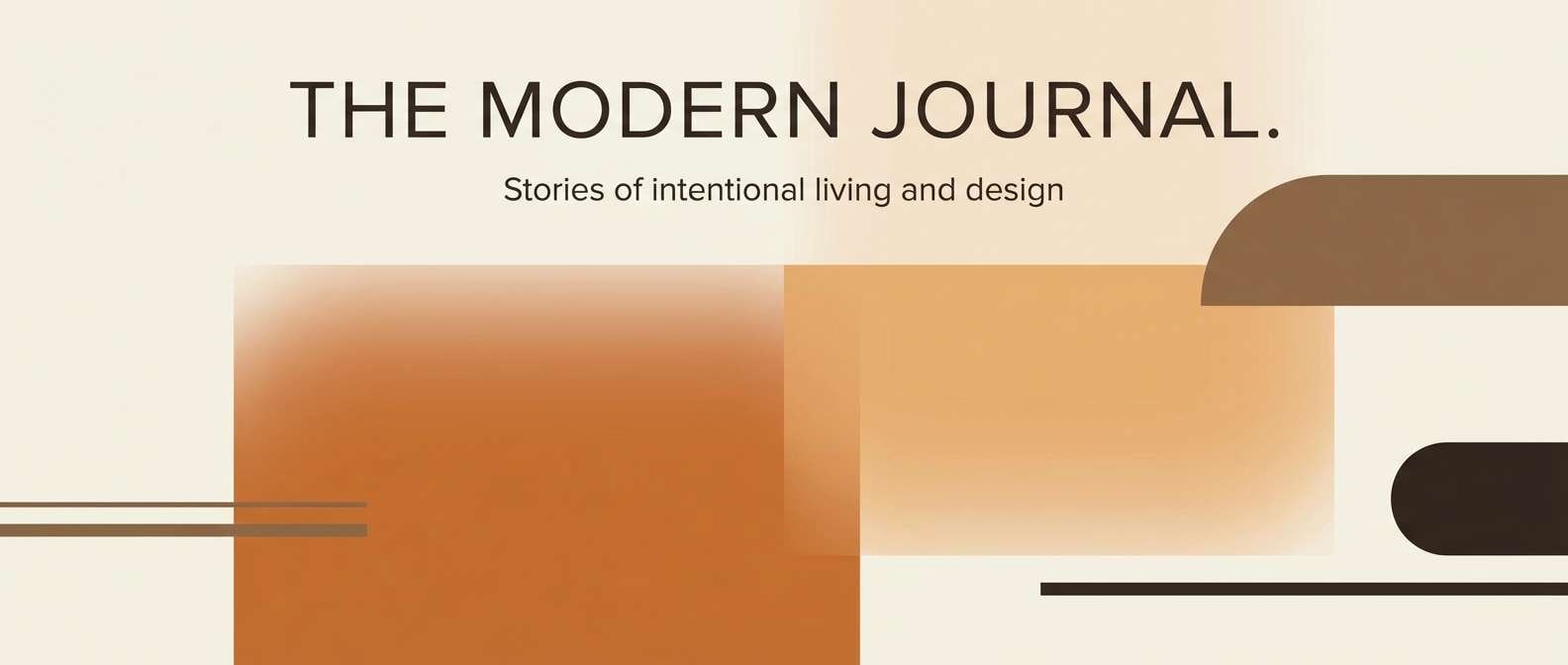
Create Raw Sienna Palette Visuals with AI
If you already have HEX codes, the fastest way to validate a raw sienna color scheme is to see it on real-ish mockups—labels, posters, UI screens, or lookbook layouts. Visual context reveals contrast issues and whether the palette feels too warm, too dull, or perfectly balanced.
With Media.io, you can generate palette-based image examples from text prompts, then iterate quickly by adjusting lighting, textures, and accent emphasis. This makes it easy to explore multiple “brand worlds” without rebuilding designs from scratch.
Start with one palette above, copy its prompt, and swap only the use case (menu, brochure, skincare, UI) to keep comparisons consistent.
Raw Sienna Color Palette FAQs
-
What is the HEX code for raw sienna?
Raw sienna doesn’t have one universal HEX because it varies by palette and material, but common raw sienna-style HEX values sit around warm clay/orange-brown tones (for example #c96f2c or #cc7a34 in the palettes above). -
Is raw sienna warm or cool?
Raw sienna is a warm color. It leans orange-brown and often feels sunbaked, earthy, and natural—especially next to creams, tans, and wood tones. -
What colors complement raw sienna?
Muted greens (sage, olive), blue-grays (slate), and deep neutrals (espresso, charcoal) complement raw sienna well. These pairings add balance and keep the warmth from feeling overpowering. -
Can I use raw sienna in a modern UI design?
Yes. Use raw sienna as an accent for primary buttons, highlights, and active states, and keep backgrounds off-white with charcoal text for clear contrast and a modern, trustworthy look. -
Does raw sienna print well on packaging?
It typically prints very well, especially on uncoated or textured papers where earthy tones look natural. For best results, pair it with a light neutral for label space and a dark ink for small text. -
What’s the difference between sienna, burnt sienna, and raw sienna?
Raw sienna is lighter and more yellow/orange-leaning, while burnt sienna is deeper and redder (as if “heated”). In design terms, raw sienna reads airy and sun-warmed; burnt sienna reads richer and more dramatic. -
How do I keep a raw sienna palette from looking too orange?
Add calming counterweights: creams for negative space, charcoal for structure, and a muted green or slate accent. Also limit raw sienna to key elements instead of large background areas.
Next: Blush Color Palette


