

Blush sits in that sweet spot between pink and neutral—soft enough for calm layouts, but warm enough to feel human. It works across everything from romantic invites to modern UI when you balance it with readable anchors.
Below are 20+ blush color palette ideas with HEX codes, plus practical tips and AI prompts you can reuse for branding, packaging, posters, and screens.
In this article
- Why Blush Palettes Work So Well
-
- rose milk and cream
- peach blush sunrise
- dusty rose and sage
- blush noir luxe
- ballet slipper soft
- blush latte neutrals
- vintage valentine paper
- rose quartz ui
- lilac blush beauty
- sandstone blush calm
- copper blush glow
- cool blush mist
- berry blush pop
- blush garden watercolor
- blush denim contrast
- minimal blush neutrals
- seafoam blush spa
- smoky blush evening
- blush clay terracotta
- blush frost winter
- blush citrus lift
- muted blush and ink
- What Colors Go Well with Blush?
- How to Use a Blush Color Palette in Real Designs
- Create Blush Palette Visuals with AI
Why Blush Palettes Work So Well
Blush tones feel approachable and premium at the same time. They soften sharp layouts, flatter product photography, and add a “care” signal that’s useful for lifestyle brands, wellness, beauty, and events.
Because blush sits close to skin tones and warm neutrals, it pairs naturally with creams, taupes, browns, and charcoals—making type and UI elements easier to balance than with brighter pinks.
Blush also adapts across seasons: airy for spring, cozy with latte neutrals in fall, and elegant with cool grays in winter. With the right contrast, it can read minimal, editorial, or bold.
20+ Blush Color Palette Ideas (with HEX Codes)
1) Rose Milk and Cream
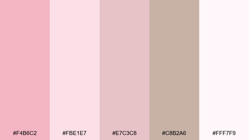
HEX: #F4B6C2 #FBE1E7 #E7C3C8 #C8B2A6 #FFF7F9
Mood: romantic, airy, delicate
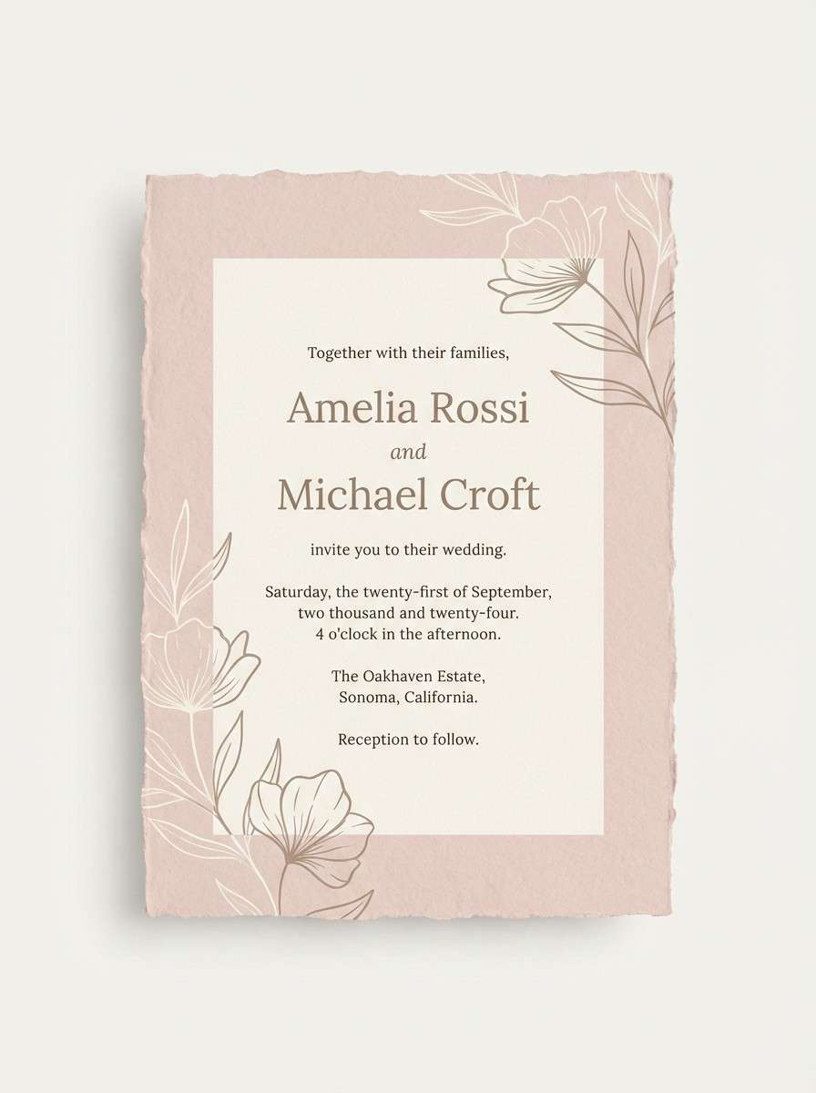
Best for: wedding invitations
Romantic and airy, these tones feel like rose milk, soft tulle, and candlelight at golden hour. Use the pale pinks for backgrounds and keep the deeper dusty rose for headings and monograms. Warm taupe helps type stay readable without turning harsh. Tip: add subtle emboss or foil effects in the taupe shade to keep the look refined.
Image example of rose milk and cream generated using media.io
Media.io is an online AI studio for creating and editing video, image, and audio in your browser.

2) Peach Blush Sunrise
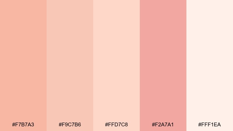
HEX: #F7B7A3 #F9C7B6 #FFD7C8 #F2A7A1 #FFF1EA
Mood: optimistic, warm, welcoming
Best for: social media promo graphics
Optimistic and warm, this mix reads like sunrise through sheer curtains with a peachy glow. Use the lightest tint for spacious backgrounds and reserve the coral-leaning shades for CTAs and stickers. Pair it with clean white space and minimal icons to keep posts crisp. Tip: keep contrast high by setting body text in a near-black or deep brown overlay.
Image example of peach blush sunrise generated using media.io

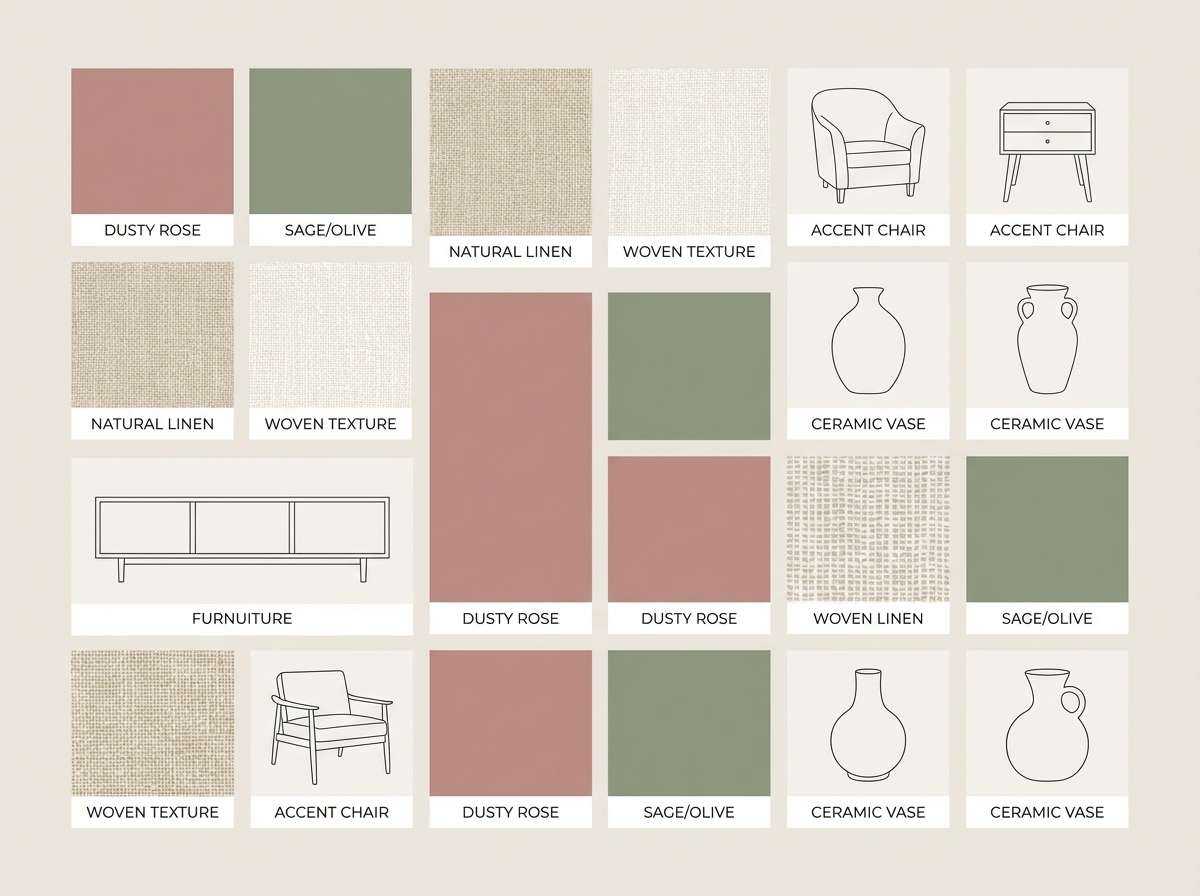
3) Dusty Rose and Sage
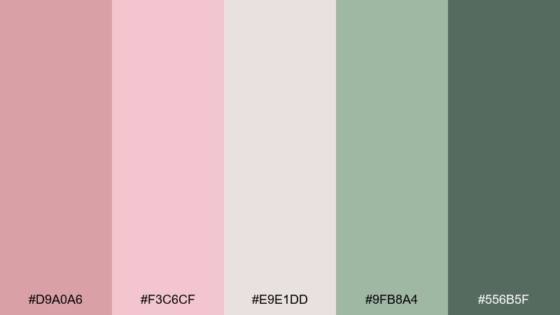
HEX: #D9A0A6 #F3C6CF #E9E1DD #9FB8A4 #556B5F
Mood: calm, organic, grounded
Best for: home decor mood boards
Calm and organic, these shades evoke dried roses, linen, and fresh herbs on a kitchen counter. The dusty pinks soften large surfaces, while sage and deep green add structure and contrast. For blush color combinations that feel grown-up, use green as the anchor and keep pink as an accent. Tip: repeat the sage tone in small details like borders, captions, or fabric swatches to unify the board.
Image example of dusty rose and sage generated using media.io
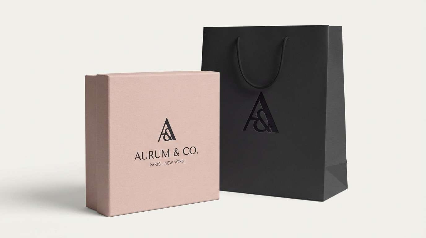
4) Blush Noir Luxe
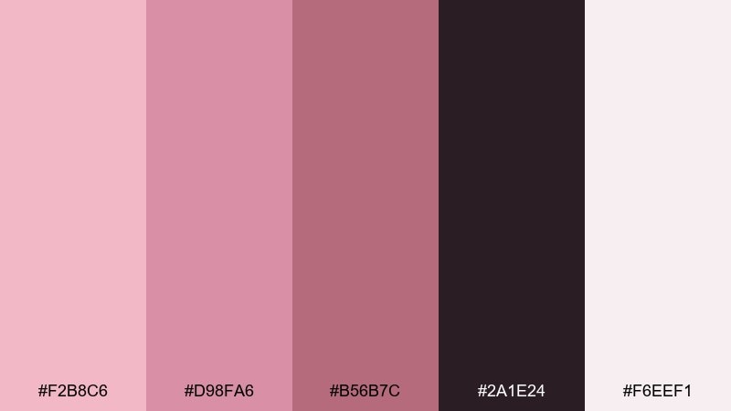
HEX: #F2B8C6 #D98FA6 #B56B7C #2A1E24 #F6EEF1
Mood: dramatic, upscale, modern
Best for: luxury branding
Dramatic and upscale, this set feels like satin blush lipstick against a black silk dress. Use the near-black for logos and wordmarks, then bring in blush as a spotlight color for buttons, seals, or highlights. The mid-rose tones work well for gradients on packaging or web hero sections. Tip: keep metallic effects subtle and let the contrast do the heavy lifting.
Image example of blush noir luxe generated using media.io
5) Ballet Slipper Soft
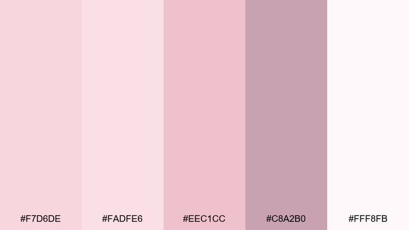
HEX: #F7D6DE #FADFE6 #EEC1CC #C8A2B0 #FFF8FB
Mood: sweet, gentle, comforting
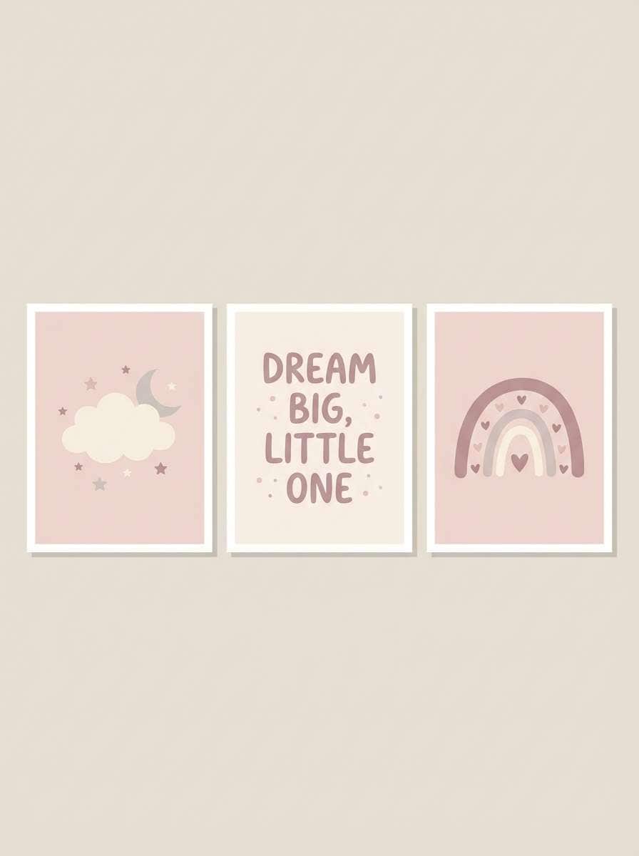
Best for: nursery wall art
Sweet and gentle, these tints look like ballet slippers, baby blankets, and soft morning light. Use the palest shade as the paper base and layer the mid pinks in simple shapes or characters. A muted mauve helps outlines and captions stay readable without feeling stark. Tip: keep illustrations low-detail and let the soft contrast create the calm vibe.
Image example of ballet slipper soft generated using media.io
6) Blush Latte Neutrals
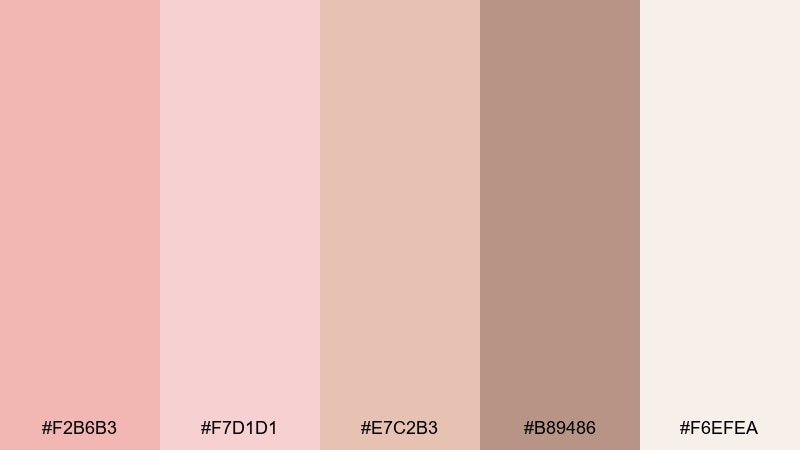
HEX: #F2B6B3 #F7D1D1 #E7C2B3 #B89486 #F6EFEA
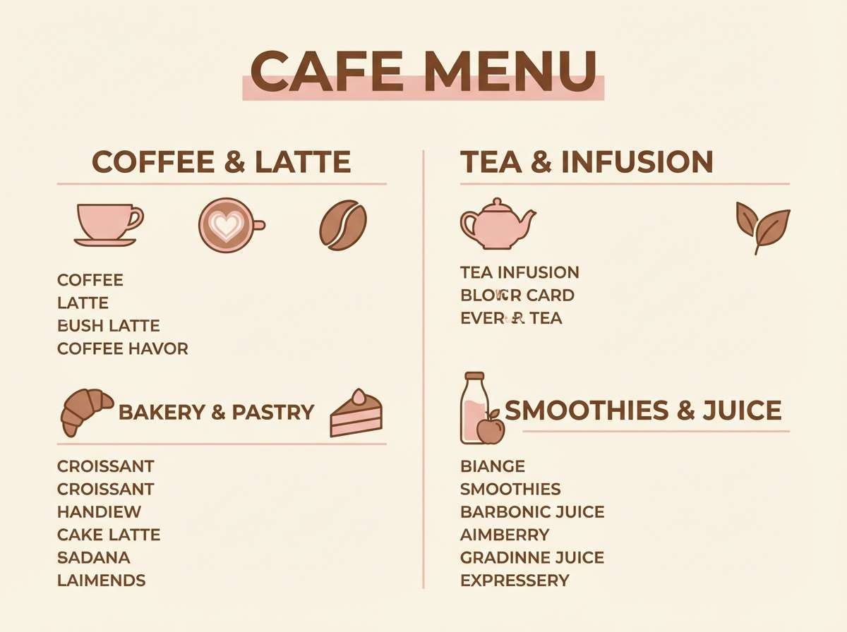
Mood: cozy, inviting, understated
Best for: cafe menus
Cozy and inviting, this range feels like steamed milk, cinnamon dust, and warm ceramic mugs. Use the creamy beige as the menu background and set section headers in the deeper coffee tone. Keep accent pinks for prices, icons, or small dividers so the layout stays easy to scan. Tip: pair with a classic serif for headings and a clean sans for item descriptions.
Image example of blush latte neutrals generated using media.io
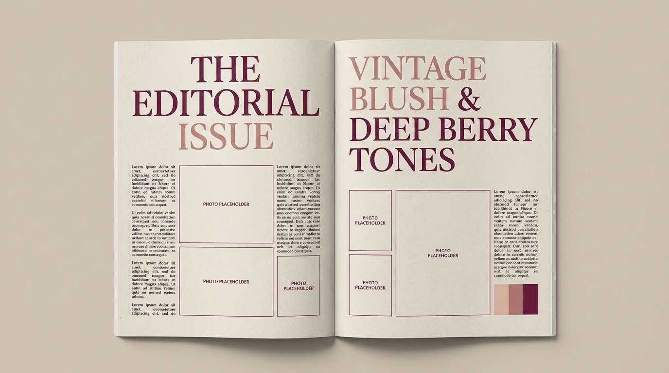
7) Vintage Valentine Paper
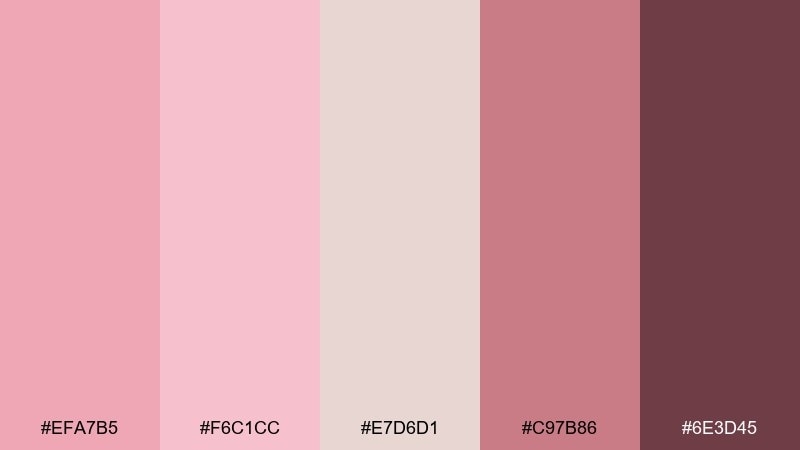
HEX: #EFA7B5 #F6C1CC #E7D6D1 #C97B86 #6E3D45
Mood: nostalgic, warm, editorial
Best for: magazine-style editorials
Nostalgic and warm, these colors bring to mind vintage postcards, pressed flowers, and soft grainy print. Use the paper-like neutral as the base and let the deeper berry shade carry titles and pull quotes. The mid pinks work beautifully for highlight boxes, rules, and page numbers. Tip: add a touch of texture or film grain to make the palette feel authentically retro.
Image example of vintage valentine paper generated using media.io
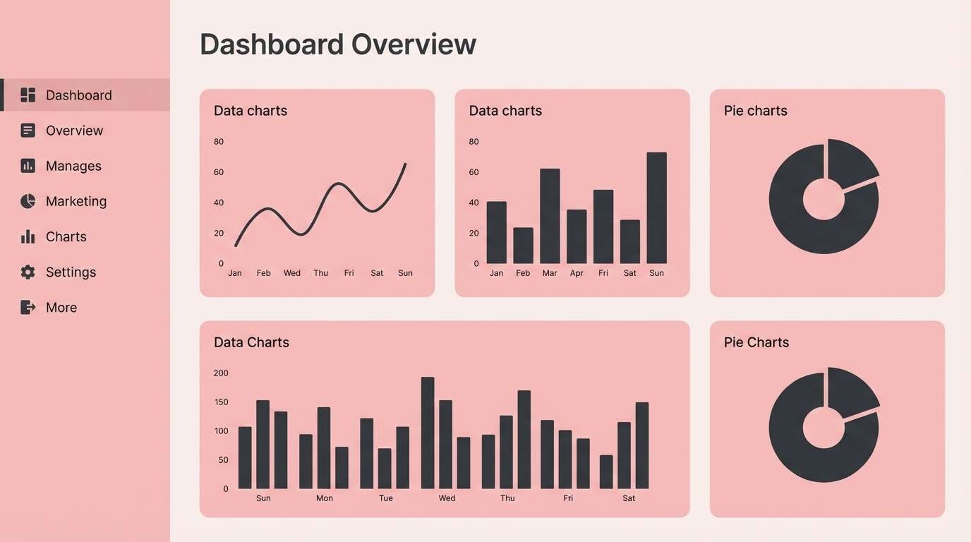
8) Rose Quartz UI
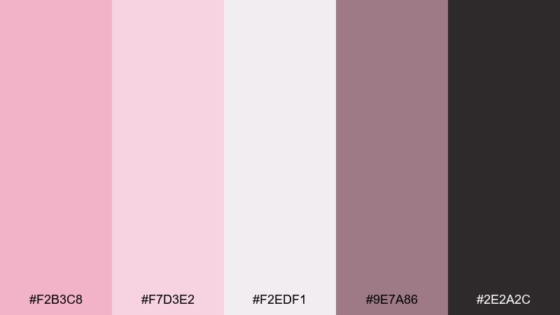
HEX: #F2B3C8 #F7D3E2 #F2EDF1 #9E7A86 #2E2A2C
Mood: polished, friendly, modern
Best for: saas dashboard UI
Polished and friendly, these tones feel like rose quartz glass and soft-focus lighting in a modern workspace. Use the near-white blush for app backgrounds, then set cards and panels in the lighter pink tint for subtle depth. The mauve and charcoal are ideal for text, icons, and chart strokes so data stays clear. Tip: reserve the strongest pink for primary actions to keep the interface calm.
Image example of rose quartz ui generated using media.io
9) Lilac Blush Beauty
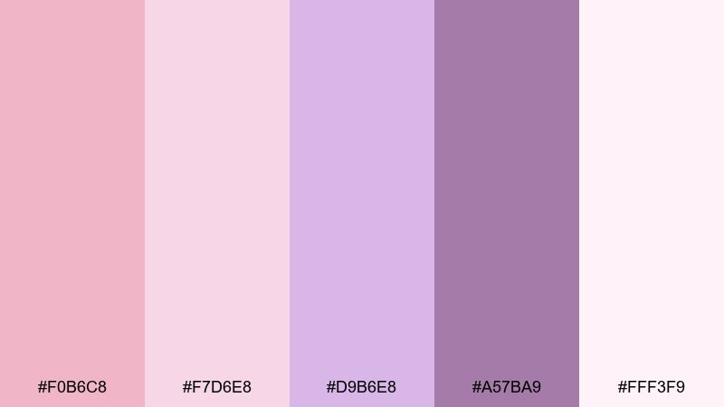
HEX: #F0B6C8 #F7D6E8 #D9B6E8 #A57BA9 #FFF3F9
Mood: dreamy, feminine, playful
Best for: cosmetics packaging
Dreamy and feminine, this pairing suggests soft perfume clouds and pastel makeup compacts. Let the pale blush act as the label base, then bring lilac forward for product names and variant markers. The deeper purple keeps typography legible and adds a premium edge. Tip: use spot gloss on the blush areas to create dimension without adding extra colors.
Image example of lilac blush beauty generated using media.io
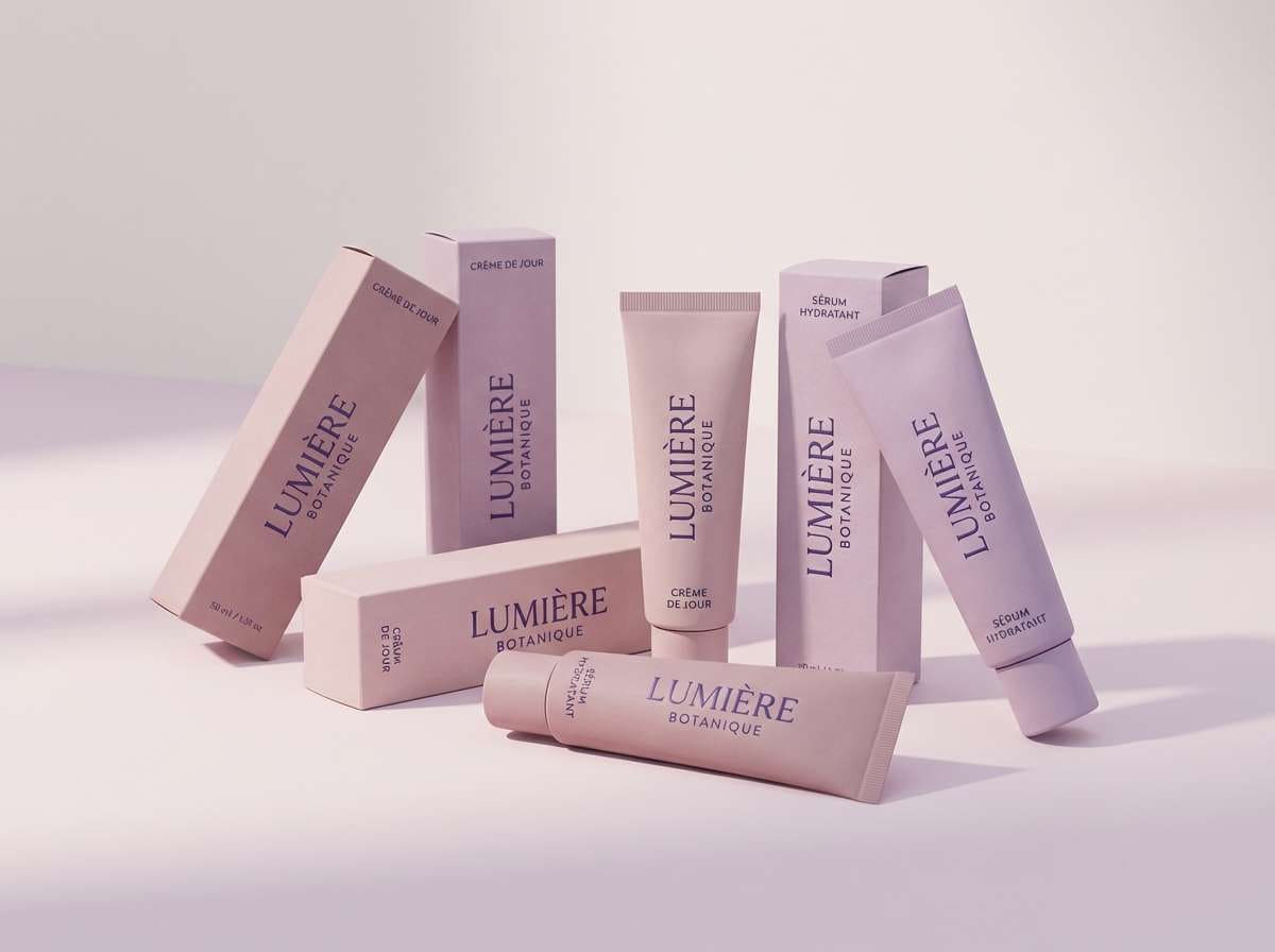
10) Sandstone Blush Calm
HEX: #F1B7B0 #F6D2CB #EAD7D2 #C4A69A #7E635C
Mood: serene, earthy, balanced
Best for: interior design presentations
Serene and earthy, these tones echo sandstone, clay plaster, and dusty petals on a quiet afternoon. Use the pale neutrals for slide backgrounds and the deeper brown for titles and key metrics. The mid blush works well for callout boxes and section dividers without overwhelming the content. Tip: keep imagery warm-toned so photos blend naturally with the palette.
Image example of sandstone blush calm generated using media.io

11) Copper Blush Glow
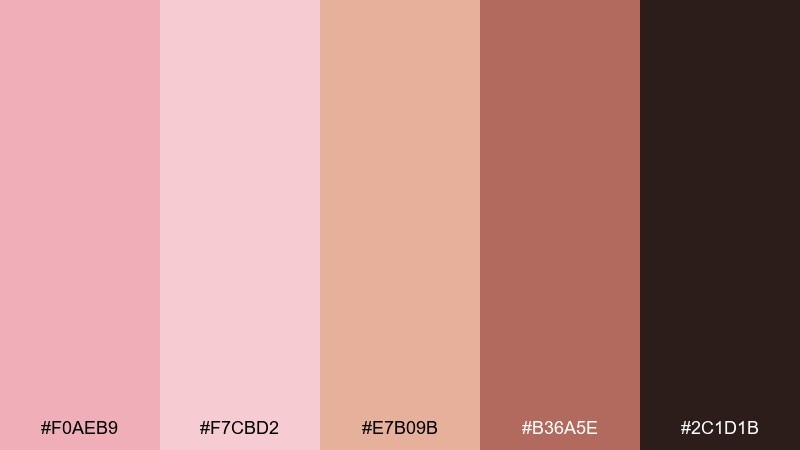
HEX: #F0AEB9 #F7CBD2 #E7B09B #B36A5E #2C1D1B
Mood: glamorous, warm, high-contrast
Best for: jewelry product ads
Glamorous and warm, these shades feel like copper light reflecting off rosy skin. For blush color combinations that sell, keep the background soft and push contrast with the rich copper-brown for headlines and price tags. The peachy tone supports metallic highlights without drifting too orange. Tip: use one hero gemstone or metal piece and let the typography stay minimal.
Image example of copper blush glow generated using media.io
12) Cool Blush Mist
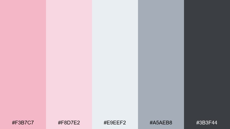
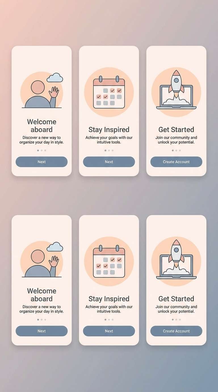
HEX: #F3B7C7 #F8D7E2 #E9EEF2 #A5AEB8 #3B3F44
Mood: clean, airy, tech-forward
Best for: mobile app onboarding screens
Clean and airy, this mix reads like cool morning mist with a soft rosy tint. Use the blue-gray as a quiet support tone for icons and progress indicators, while blush carries the friendly highlights. The charcoal shade keeps copy sharp and accessible on light screens. Tip: limit gradients to one subtle background wash so onboarding feels fast and modern.
Image example of cool blush mist generated using media.io
13) Berry Blush Pop
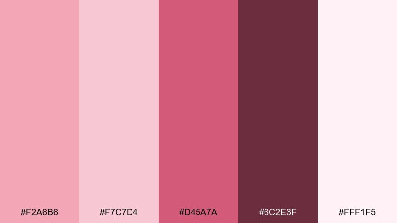
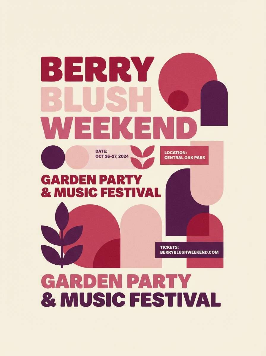
HEX: #F2A6B6 #F7C7D4 #D45A7A #6C2E3F #FFF1F5
Mood: bold, energetic, fun
Best for: event posters
Bold and energetic, these colors evoke berry soda, glossy lips, and neon signs softened by pink haze. Use the deep berry for the main headline and keep the background in the palest tint for punchy contrast. The hot rose shade is perfect for date badges and callouts. Tip: limit yourself to two font weights so the poster stays loud but not messy.
Image example of berry blush pop generated using media.io
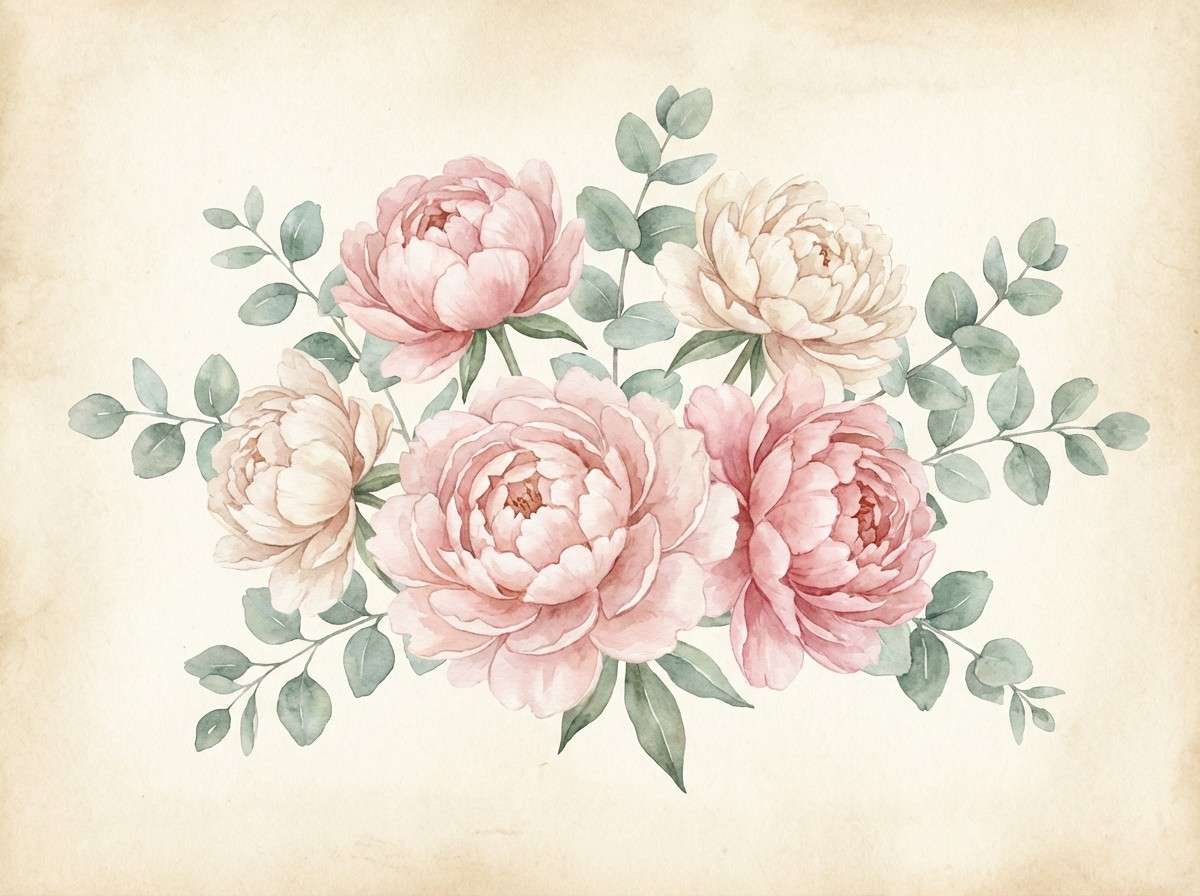
14) Blush Garden Watercolor
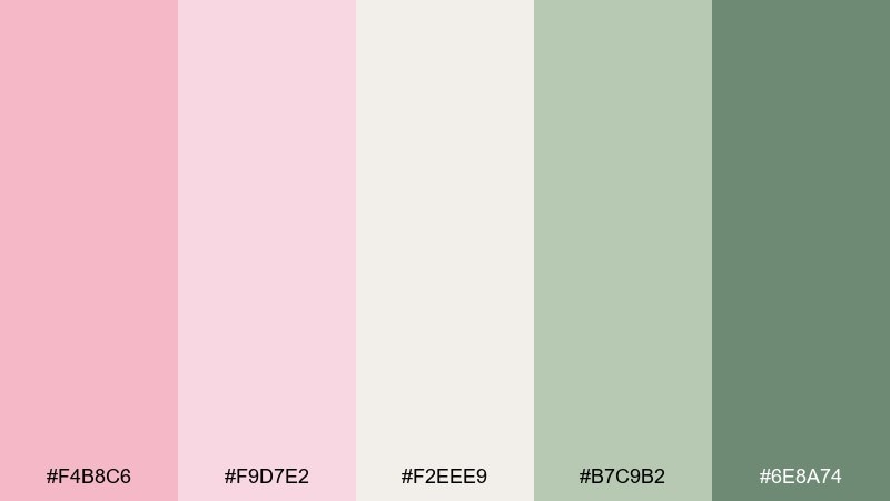
HEX: #F4B8C6 #F9D7E2 #F2EEE9 #B7C9B2 #6E8A74
Mood: fresh, botanical, light
Best for: spring botanical illustrations
Fresh and botanical, this palette feels like peonies, eucalyptus, and watercolor bleeding into textured paper. Let the blush wash form petals and backgrounds, then use the greens for leaves and stems to balance sweetness. The creamy neutral keeps negative space elegant and avoids over-saturation. Tip: paint with transparent layers so the colors mingle naturally at the edges.
Image example of blush garden watercolor generated using media.io
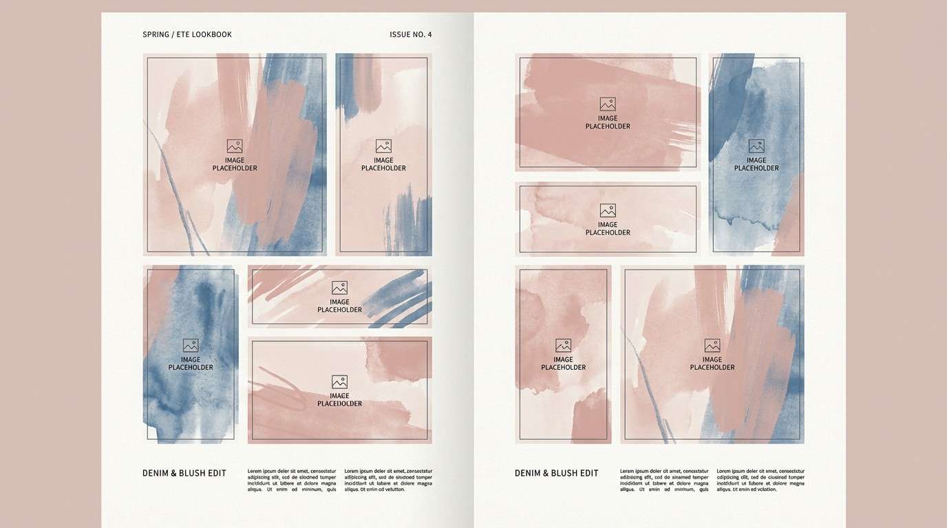
15) Blush Denim Contrast
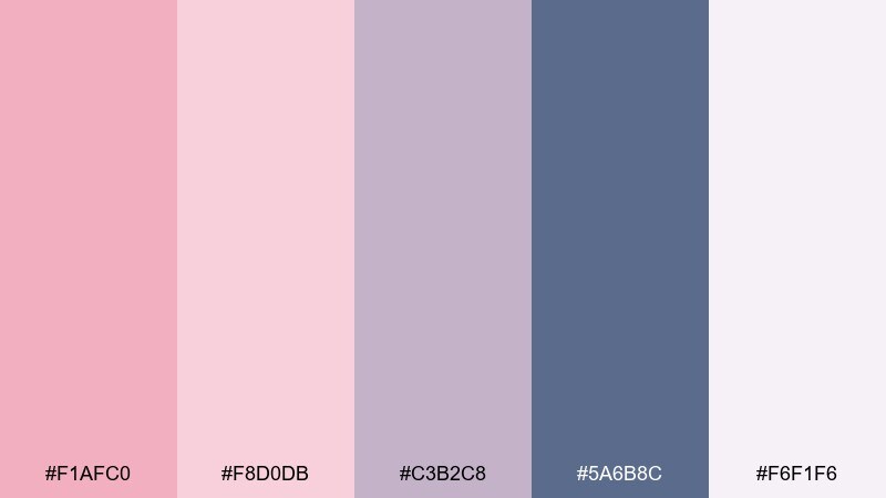
HEX: #F1AFC0 #F8D0DB #C3B2C8 #5A6B8C #F6F1F6
Mood: cool, stylish, contemporary
Best for: fashion lookbooks
Cool and stylish, these shades suggest blush satin paired with deep denim and soft lavender haze. Use the navy-leaning blue for section titles and page numbers, then keep blush as the accent that lifts product shots. The muted violet bridges the two and works well for captions and rules. Tip: keep backgrounds pale so clothing photography stays the hero.
Image example of blush denim contrast generated using media.io
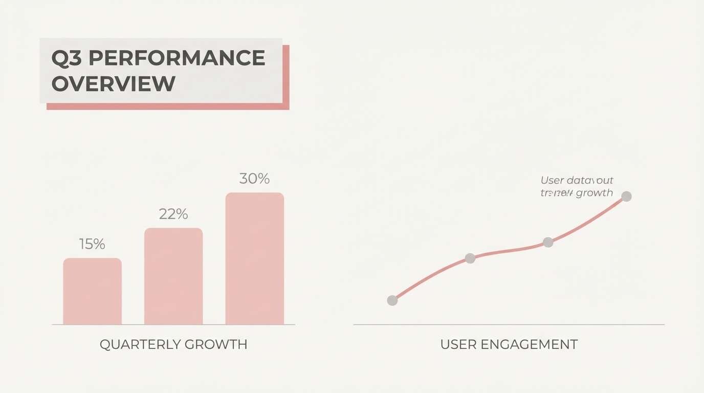
16) Minimal Blush Neutrals
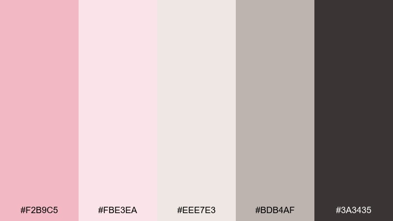
HEX: #F2B9C5 #FBE3EA #EEE7E3 #BDB4AF #3A3435
Mood: minimal, professional, calm
Best for: corporate slide decks
Minimal and professional, these tones feel like clean stationery with a soft pink edge. Use the light neutrals to keep slides readable, then apply blush sparingly to emphasize key numbers and section breaks. The charcoal shade anchors charts and body text so the deck still feels serious. Tip: keep shapes simple and let whitespace do the work for a modern blush color palette look.
Image example of minimal blush neutrals generated using media.io
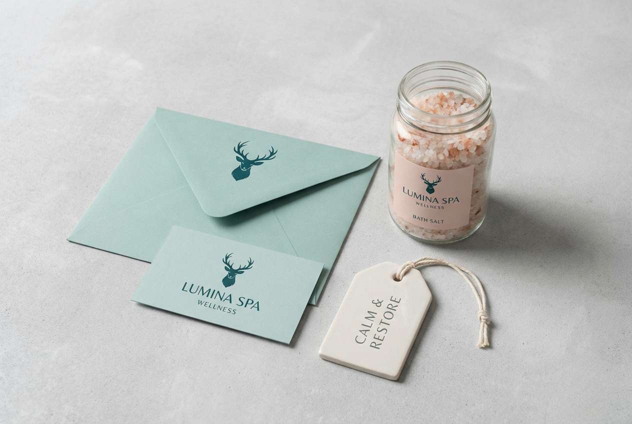
17) Seafoam Blush Spa
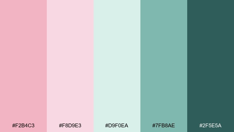
HEX: #F2B4C3 #F8D9E3 #D9F0EA #7FB8AE #2F5E5A
Mood: refreshing, soothing, clean
Best for: spa branding
Refreshing and soothing, this mix evokes seafoam, warm towels, and a rosy glow after a facial. Use blush for friendly highlights and pair it with seafoam for backgrounds, tags, and secondary panels. The deeper teal adds trust and clarity for logos and navigation. Tip: keep patterns subtle and use lots of breathing room to maintain the spa calm.
Image example of seafoam blush spa generated using media.io
18) Smoky Blush Evening
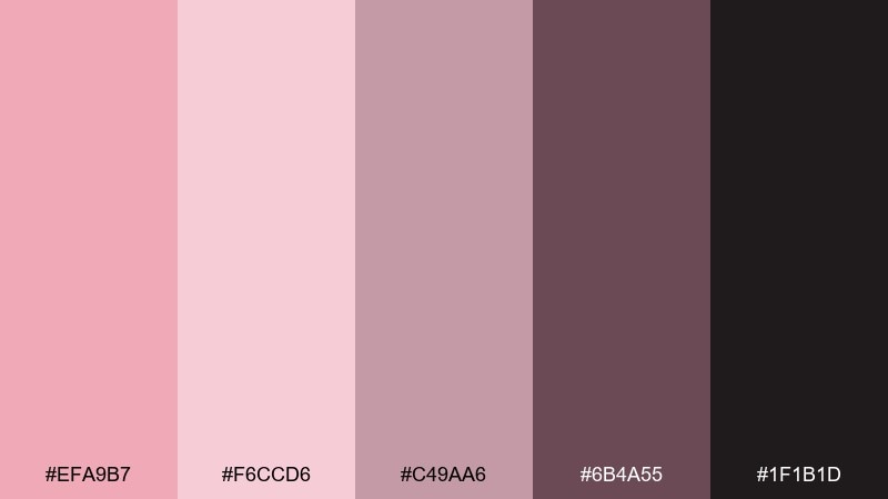
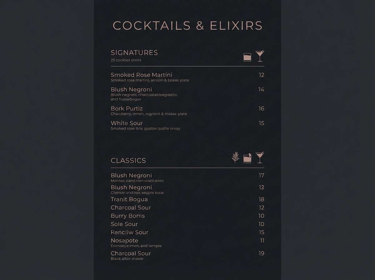
HEX: #EFA9B7 #F6CCD6 #C49AA6 #6B4A55 #1F1B1D
Mood: moody, intimate, refined
Best for: cocktail menus
Moody and intimate, these hues feel like dim bar lighting, smoked glass, and rose-toned cocktails. Use the near-black for the base and bring in blush for section headers and signature drink highlights. The smoky mauve shades support icons and dividers without stealing attention. Tip: print on uncoated paper for a soft, tactile finish that matches the palette.
Image example of smoky blush evening generated using media.io
19) Blush Clay Terracotta
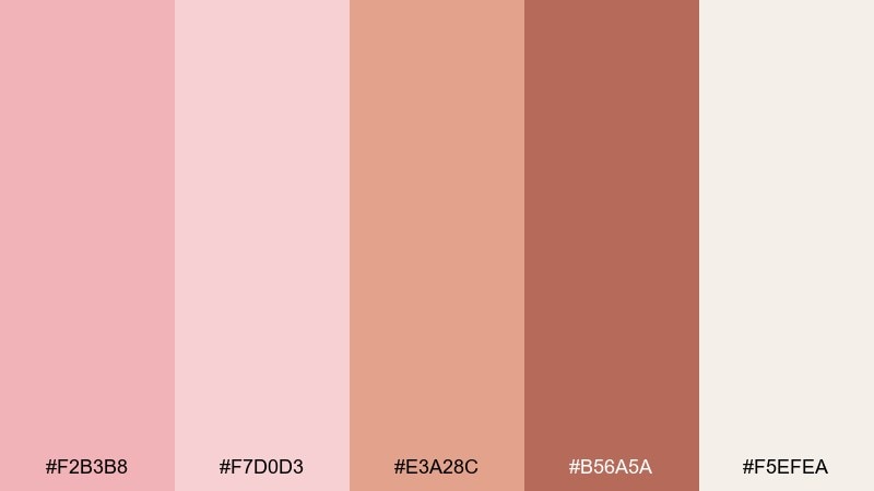
HEX: #F2B3B8 #F7D0D3 #E3A28C #B56A5A #F5EFEA
Mood: artisanal, warm, earthy
Best for: ceramics shop posters
Artisanal and warm, these colors resemble clay dust, kiln heat, and soft pink glaze. Use the cream tone as negative space and push terracotta for big headlines and product pricing. Blush works best as a gentle accent in shapes, stamps, or background bands. Tip: pair with a hand-drawn serif or imperfect stamp font to enhance the crafted feel.
Image example of blush clay terracotta generated using media.io

20) Blush Frost Winter
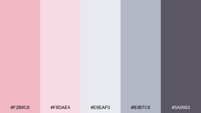
HEX: #F2B8C6 #F8DAE4 #E9EAF0 #B3B7C6 #5A5663
Mood: soft, wintry, elegant
Best for: holiday cards
Soft and wintry, these tones feel like frosted windows with a hint of rosy warmth. Use the pale gray-lilac for the card base and add blush as the festive highlight in ornaments or type accents. The slate shade keeps messages readable and pairs nicely with minimalist line art. Tip: add a light speckle texture to suggest snow without introducing new colors.
Image example of blush frost winter generated using media.io

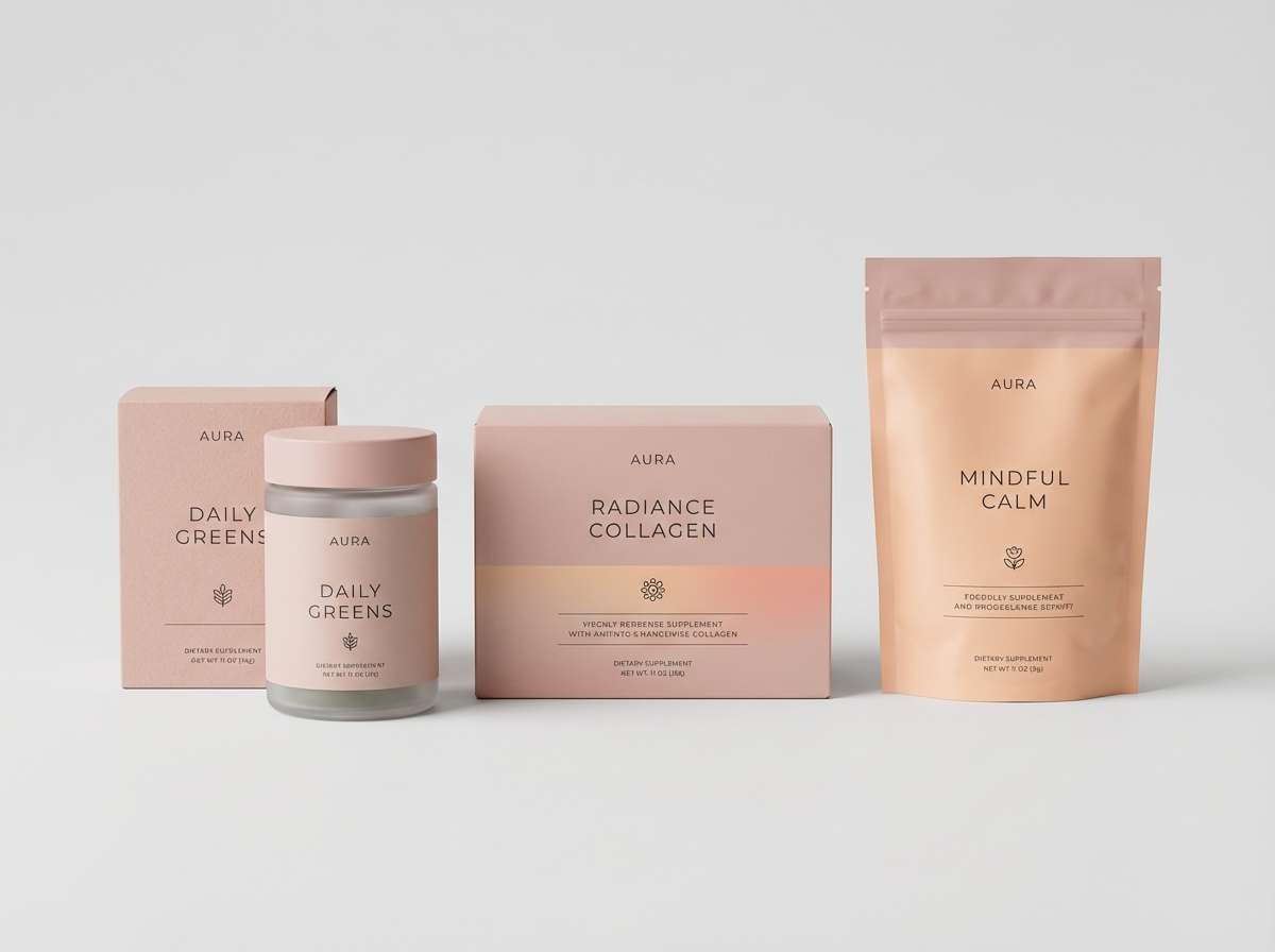
21) Blush Citrus Lift
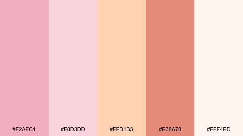
HEX: #F2AFC1 #F8D3DD #FFD1B3 #E38A78 #FFF4ED
Mood: bright, upbeat, youthful
Best for: wellness product packaging
Bright and upbeat, this mix suggests grapefruit spritz, rosy cheeks, and sunshine in a clean kitchen. Keep blush as the primary field color and use the citrus tint for flavor cues and callouts. The deeper coral supports strong type and small icons without feeling heavy. Tip: separate variants by swapping the citrus shade while keeping the blush base consistent.
Image example of blush citrus lift generated using media.io
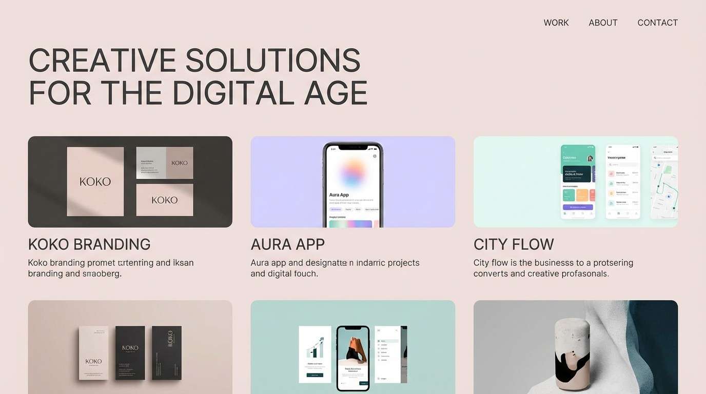
22) Muted Blush and Ink
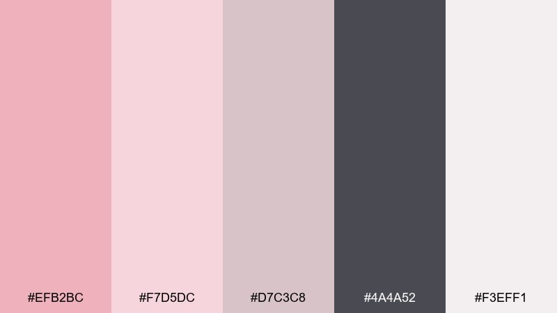
HEX: #EFB2BC #F7D5DC #D7C3C8 #4A4A52 #F3EFF1
Mood: thoughtful, mature, modern
Best for: portfolio websites
Thoughtful and mature, these tones look like soft pink paper with inky editorial type. Use the palest tint for page backgrounds and keep ink-gray for navigation and body copy. The muted mauve helps define cards and project tags without shouting. Tip: limit accent use to hover states and key links for a clean, confident blush color combination.
Image example of muted blush and ink generated using media.io
What Colors Go Well with Blush?
Blush pairs beautifully with warm neutrals like cream, beige, camel, and taupe—especially when you want a soft, elevated look that still keeps typography readable. Add a charcoal or near-black to create structure and maintain contrast.
For a fresher, modern feel, combine blush with greens (sage, eucalyptus, deep forest) or watery teals. These complementary, nature-leaning hues make blush look more grounded and less sugary.
If you want something trend-forward, try blush with cool gray, slate blue, or lilac. This shifts the palette toward airy tech and editorial aesthetics without losing warmth.
How to Use a Blush Color Palette in Real Designs
Start by assigning roles: pick one blush tint for backgrounds, one mid blush for accents, and one dark anchor (charcoal, deep green, or espresso) for text and key UI. This avoids the “all-pink” effect and keeps hierarchy clear.
Use blush strategically where you want friendliness—buttons, badges, highlights, packaging seals, or small brand patterns. In print, blush works especially well with subtle textures (uncoated paper, grain, emboss) that amplify the softness.
Always check contrast for accessibility: blush-on-blush looks pretty but can reduce legibility. When in doubt, set body copy in deep gray/near-black and reserve blush for emphasis.
Create Blush Palette Visuals with AI
If you already have HEX codes, you can turn them into mood boards, UI mockups, posters, and packaging concepts fast by generating image examples from text prompts. This helps you validate the vibe before you commit to final design production.
Use the prompts above as templates: keep the subject and layout consistent, then swap in palette descriptors (like “dusty rose,” “sage,” “near-black”) to explore multiple directions quickly.
When you find a direction you like, generate a few variations (lighting, texture, typography weight) to refine the look while staying inside the same blush color scheme.
Blush Color Palette FAQs
-
What HEX code is a classic blush pink?
A popular blush reference is #F4B6C2. It’s soft, warm, and versatile for backgrounds, branding accents, and romantic print designs. -
Is blush a warm or cool color?
Most blush tones lean warm (a pink with peach/rose undertones), but blush can also lean cool when mixed with lilac or blue-gray. Pairing colors like slate, cool gray, or lavender will make blush feel cooler overall. -
What’s the best text color on a blush background?
Use a deep charcoal, ink gray, espresso brown, or near-black for readability. Blush-on-blush text usually fails contrast for body copy, so keep blush for accents and use dark anchors for type. -
What colors go with blush for modern branding?
Great modern pairings include blush + charcoal, blush + sage/forest green, blush + warm taupe, and blush + cool gray. These combinations keep blush sophisticated and not overly sweet. -
How do I make a blush palette look less “girly”?
Add structure with darker tones (near-black, deep green, navy) and rely on neutrals (stone, sand, taupe). Using blush as an accent rather than the dominant field also shifts it toward a more mature, editorial look. -
Can I use blush in UI design without it feeling distracting?
Yes—treat blush like a soft surface color: use near-white blush for backgrounds, slightly deeper blush for cards, and reserve the strongest pink for primary actions. Keep charts, icons, and body text in charcoal/ink tones. -
How can I generate blush palette mockups quickly?
Use an AI text-to-image tool to create invitations, packaging, posters, or UI screens from prompts, then iterate by changing one variable at a time (material, lighting, layout) while keeping the palette consistent.


