

Purple pink palettes sit right at the sweet spot between dreamy and daring—soft enough for romance, bold enough for modern UI and branding. They’re especially strong when you want a sense of personality without relying on heavy illustration or photography.
Below are curated purple-and-pink tones with practical use tips and AI prompt examples, so you can turn a color scheme into real layouts faster.
In this article
- Why Purple Pink Palettes Work So Well
-
- orchid blush
- berry macaron
- neon fuchsia night
- lavender rosewater
- plum velvet
- mauve latte
- amethyst peony
- grape soda pop
- dusty lilac studio
- raspberry sorbet
- sunset violet
- cranberry orchid
- cotton candy glow
- rose quartz plum
- magenta iris minimal
- vintage violet bouquet
- royal lilac pop
- soft berry clay
- iris pop ui
- berry jam branding
- lilac satin poster
- gradient duo
- What Colors Go Well with Purple Pink?
- How to Use a Purple Pink Color Palette in Real Designs
- Create Purple Pink Palette Visuals with AI
Why Purple Pink Palettes Work So Well
Purple brings depth, creativity, and a premium edge, while pink adds warmth and approachability. Together, they create a range that can swing from soft and elegant to neon and energetic.
They also solve a common design problem: you can get strong contrast without going harsh. Deep plums and eggplants handle text and hierarchy, while pinks act as high-attention accents for buttons, badges, or highlights.
In print and digital, purple pink color combinations translate well into gradients, overlays, and brand systems—especially when you anchor them with a near-white tint for breathing room.
20+ Purple Pink Color Palette Ideas (with HEX Codes)
1) Orchid Blush
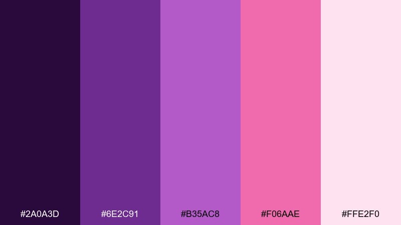
HEX: #2A0A3D #6E2C91 #B35AC8 #F06AAE #FFE2F0
Mood: romantic and luminous
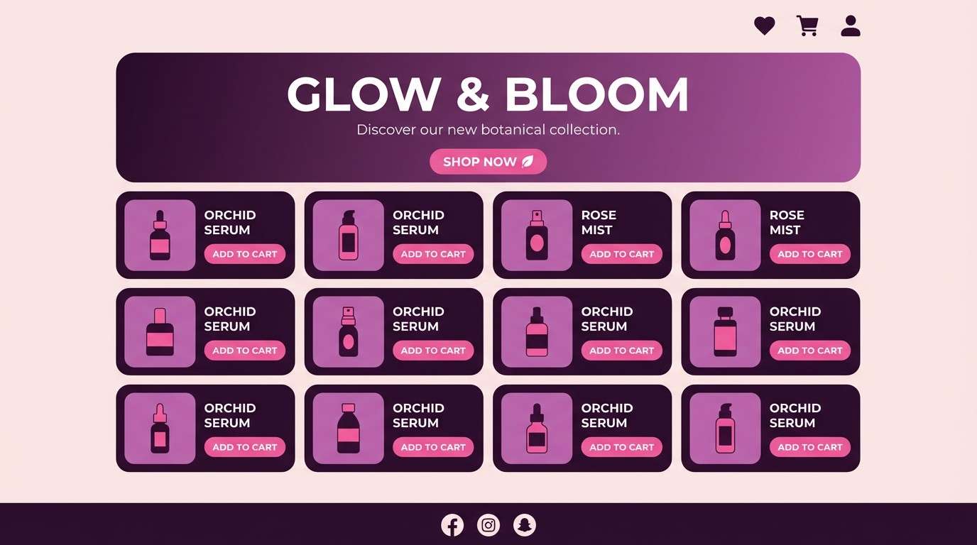
Best for: beauty brand landing page UI
Romantic and luminous, these orchid-to-blush tones feel like satin highlights under soft studio lights. Use the deep eggplant as your text and hero contrast, then let orchid and hot pink carry buttons and key accents. Pair with lots of white space or a pale pink background to keep it modern instead of sugary. Usage tip: reserve the brightest pink for one primary action to maintain clarity.
Image example of orchid blush generated using media.io
Media.io is an online AI studio for creating and editing video, image, and audio in your browser.

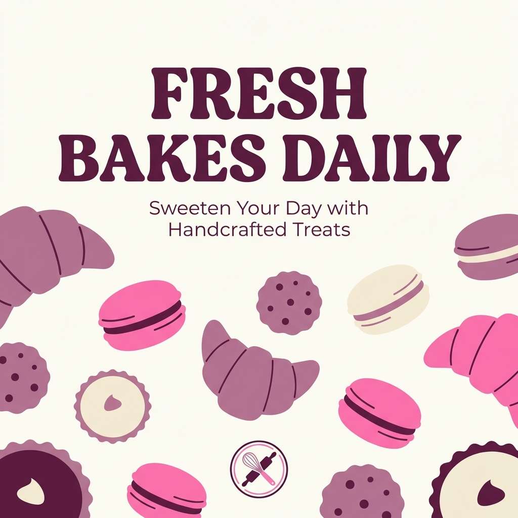
2) Berry Macaron
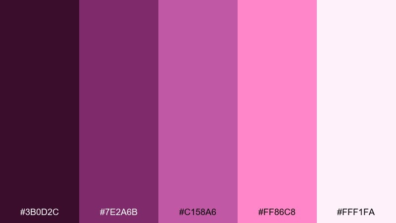
HEX: #3B0D2C #7E2A6B #C158A6 #FF86C8 #FFF1FA
Mood: playful and sweet
Best for: bakery social media post
Playful and sweet, it brings to mind berry fillings, whipped cream, and pastel packaging. These purple pink color combinations work best when you lead with the creamy off-white, then layer in raspberry and mauve for type and stickers. Add the wine-plum tone for legible headlines and to keep the vibe from turning too candy-like. Usage tip: use a single bold pink block behind key text for instant scroll-stopping contrast.
Image example of berry macaron generated using media.io
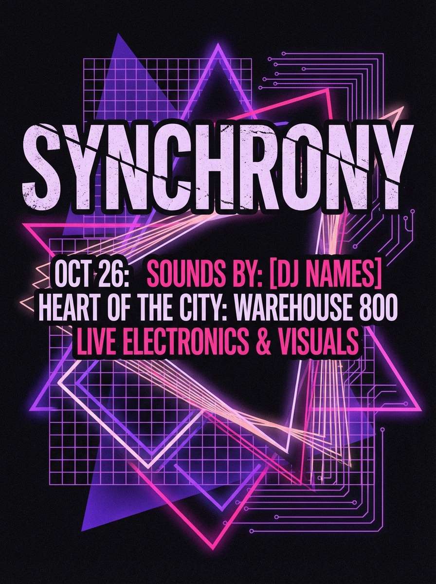
3) Neon Fuchsia Night
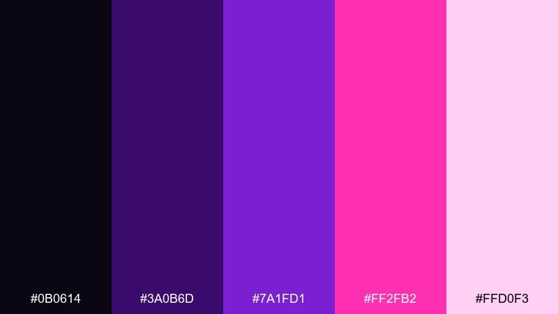
HEX: #0B0614 #3A0B6D #7A1FD1 #FF2FB2 #FFD0F3
Mood: bold and electric
Best for: music event poster
Bold and electric, it feels like club lights cutting through a midnight haze. Keep the near-black background dominant, then let neon fuchsia and vivid violet drive the typography and key shapes. A pale pink tint can soften gradients and prevent banding in large fields. Usage tip: add subtle glow effects only on one or two elements so the poster stays readable.
Image example of neon fuchsia night generated using media.io
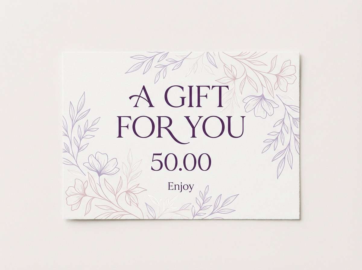
4) Lavender Rosewater
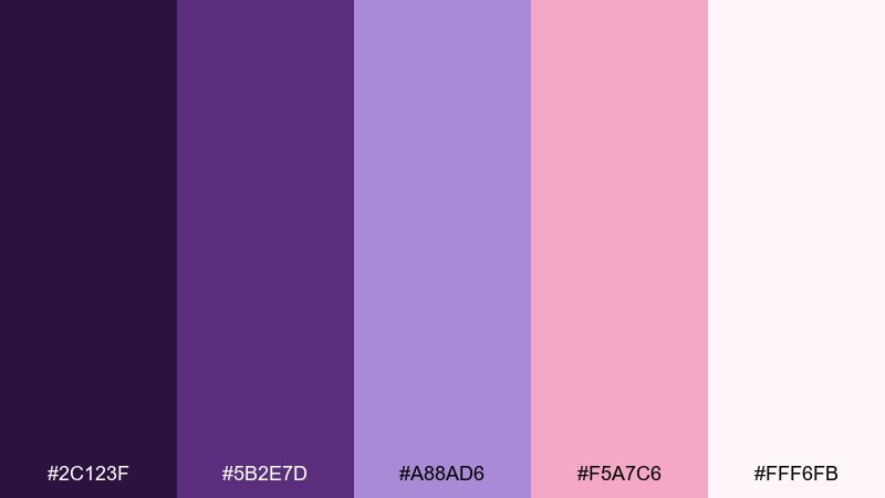
HEX: #2C123F #5B2E7D #A88AD6 #F5A7C6 #FFF6FB
Mood: airy and calming
Best for: spa gift card design
Airy and calming, these shades evoke lavender sachets and rosewater steam in a quiet treatment room. Use the soft lavender for large backgrounds and the blush pink for gentle highlights, keeping the darkest purple for small text. It pairs beautifully with warm grays, textured paper stock, or subtle botanical line art. Usage tip: keep contrast high on fine print by placing it on the near-white tone.
Image example of lavender rosewater generated using media.io
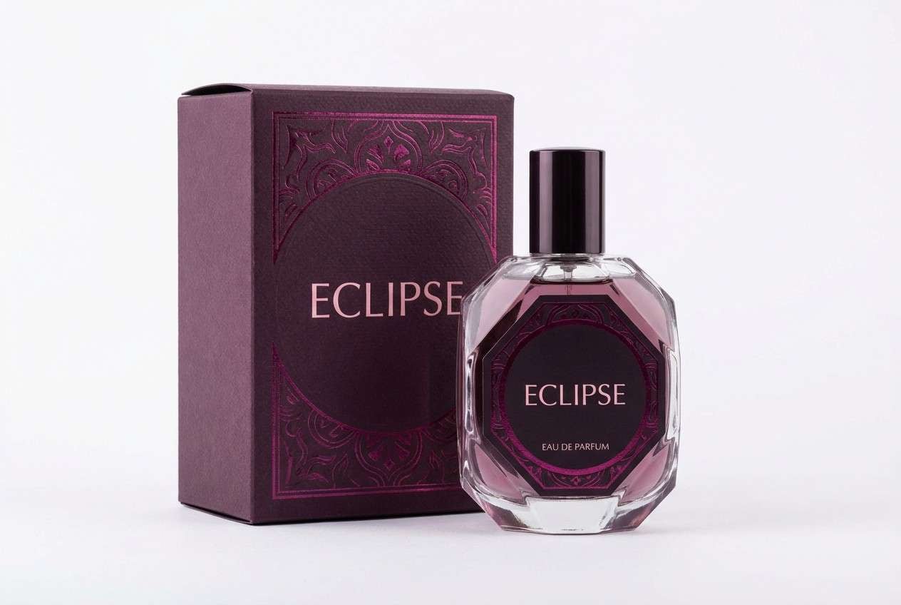
5) Plum Velvet
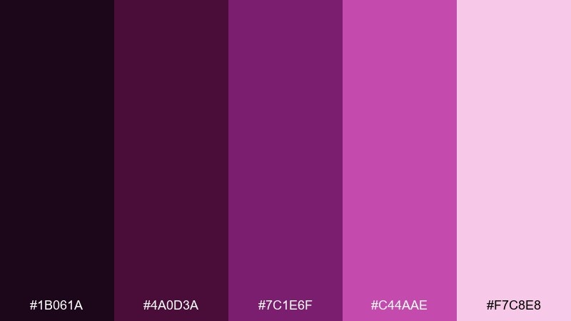
HEX: #1B061A #4A0D3A #7C1E6F #C44AAE #F7C8E8
Mood: luxurious and moody
Best for: perfume bottle packaging
Luxurious and moody, it suggests velvet curtains, dark berries, and a glossy boutique counter. Let the near-black plum dominate the box or label, then use magenta as a premium foil-like accent. The pale pink works as a soft highlight for ingredients or notes without losing the upscale feel. Usage tip: keep finishes consistent, such as matte deep plum with one glossy magenta detail.
Image example of plum velvet generated using media.io
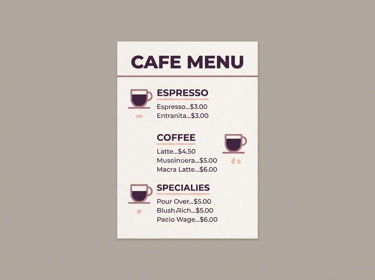
6) Mauve Latte
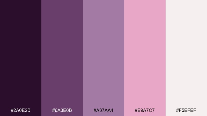
HEX: #2A0E2B #6A3E6B #A37AA4 #E9A7C7 #F5EFEF
Mood: cozy and understated
Best for: cafe menu design
Cozy and understated, it feels like warm foam art and a mauve knit scarf on a rainy afternoon. Use the off-white as the menu base, then set headings in deep purple for readability and structure. The dusty mauves are perfect for dividers, icons, and gentle callouts without shouting. Usage tip: limit pink to one signature item badge so the layout stays calm.
Image example of mauve latte generated using media.io
7) Amethyst Peony
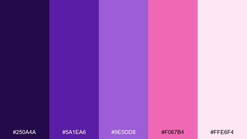
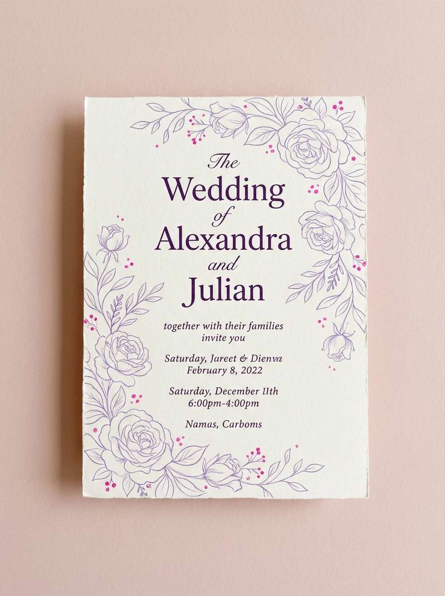
HEX: #250A4A #5A1EA6 #9E5DD8 #F067B4 #FFE6F4
Mood: floral and vibrant
Best for: spring wedding invitation
Floral and vibrant, it captures peony petals against sparkling amethyst shadows. This purple pink color palette shines on invitations when you keep the background light and use purple for names and date lines. Add the brighter pink only for small motifs, monograms, or RSVP accents so it feels elegant rather than loud. Usage tip: print-test the mid-purple to ensure thin strokes stay crisp on textured paper.
Image example of amethyst peony generated using media.io
8) Grape Soda Pop
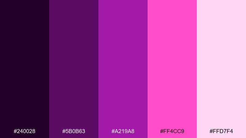
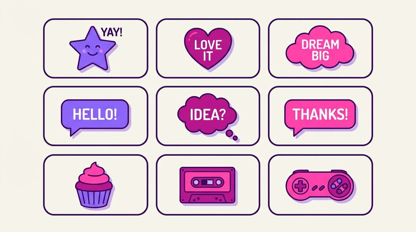
HEX: #240028 #5B0B63 #A219A8 #FF4CC9 #FFD7F4
Mood: fun and punchy
Best for: teen app sticker pack UI
Fun and punchy, these hues feel like fizzy grape soda with a bright pink splash. Use the saturated violet and magenta for sticker shapes and micro-animations, while keeping the background very light for contrast. The deep purple helps outlines and small text stay legible on vibrant elements. Usage tip: add consistent stroke widths so the stickers look cohesive across the set.
Image example of grape soda pop generated using media.io
9) Dusty Lilac Studio
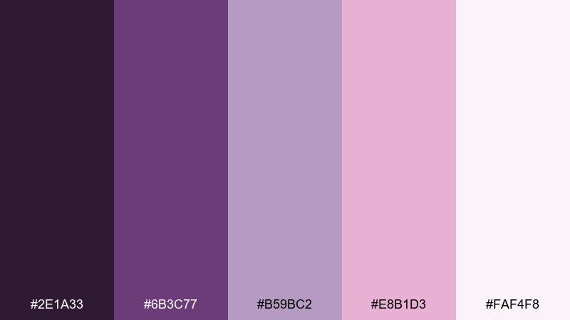
HEX: #2E1A33 #6B3C77 #B59BC2 #E8B1D3 #FAF4F8
Mood: soft and editorial
Best for: magazine feature layout
Soft and editorial, it reads like a fashion spread shot through a lilac filter. Use the near-white as your page base, then set body text in the charcoal-plum tone for comfortable reading. The dusty lilac and blush are ideal for pull quotes, sidebars, and section tabs. Usage tip: keep pink tints under 20 percent for large areas to avoid muddy printing.
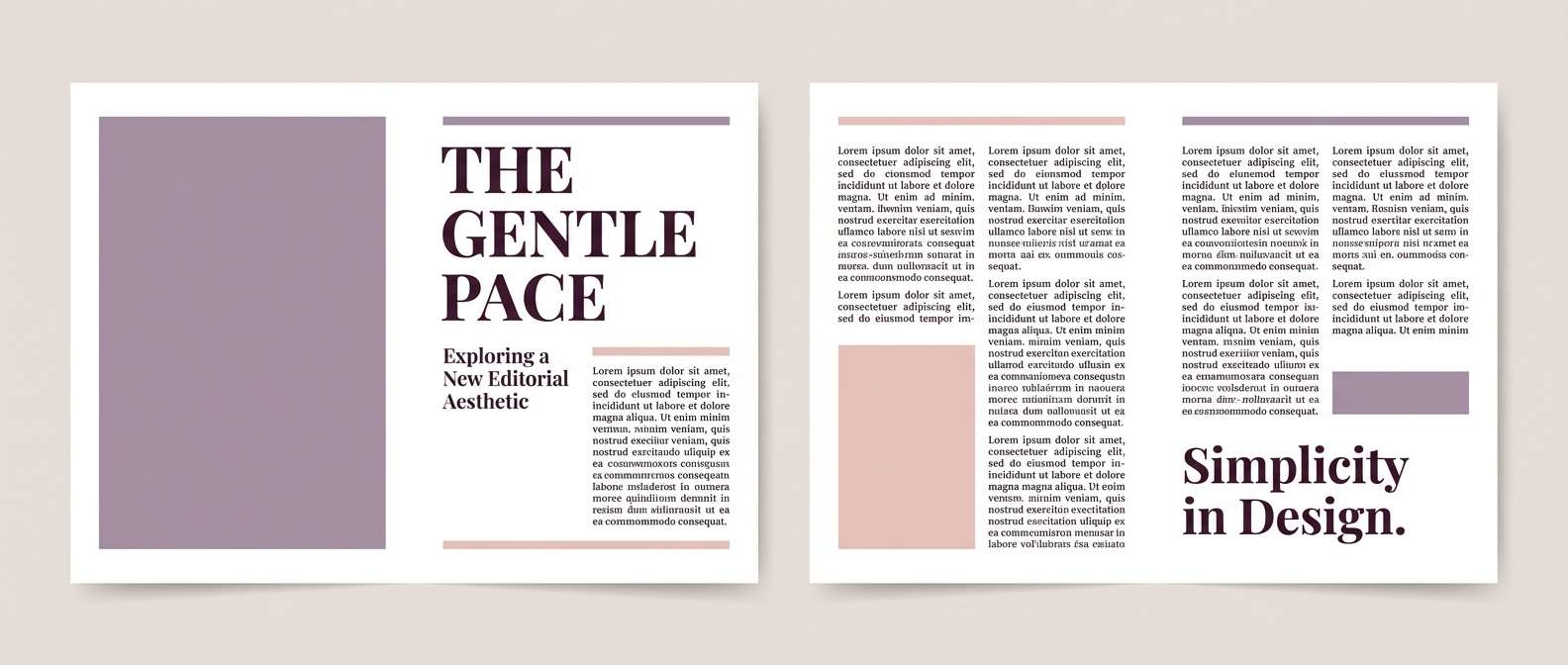
Image example of dusty lilac studio generated using media.io
10) Raspberry Sorbet
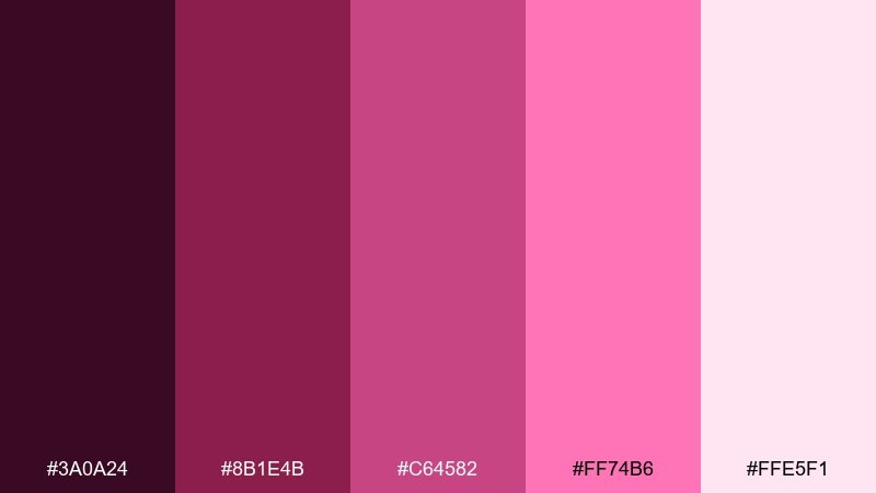
HEX: #3A0A24 #8B1E4B #C64582 #FF74B6 #FFE5F1
Mood: sweet and energetic
Best for: cosmetics promo banner
Sweet and energetic, it evokes raspberry sorbet melting into a glossy swirl. Make the pale pink your canvas, then push the raspberry and hot pink into the product callouts and discount badges. The darkest berry tone anchors text and creates premium contrast around packaging shots. Usage tip: keep gradients subtle so the bright pink stays true on different screens.
Image example of raspberry sorbet generated using media.io

11) Sunset Violet
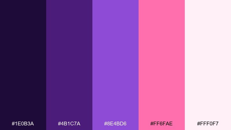
HEX: #1E0B3A #4B1C7A #8E4BD6 #FF6FAE #FFF0F7
Mood: dreamy and uplifting
Best for: podcast cover art
Dreamy and uplifting, it feels like violet skies at sunset with a soft pink horizon. Use the deep indigo-violet for the title backdrop, and let the brighter pink punch through as a highlight stripe or icon. The pale blush keeps negative space airy and prevents the cover from looking too dark in small sizes. Usage tip: test readability at thumbnail size and increase letter spacing if needed.
Image example of sunset violet generated using media.io

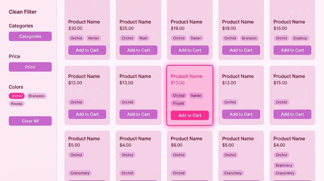
12) Cranberry Orchid
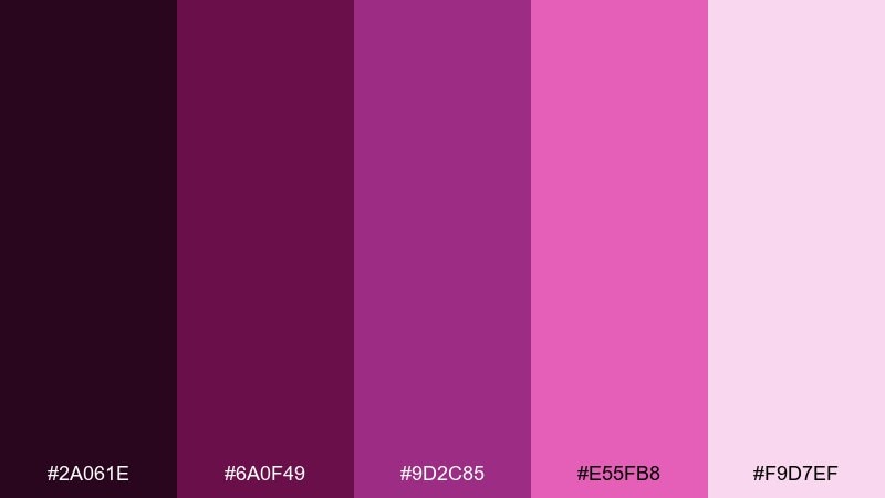
HEX: #2A061E #6A0F49 #9D2C85 #E55FB8 #F9D7EF
Mood: rich and confident
Best for: boutique e-commerce product grid UI
Rich and confident, it brings the vibe of cranberry lipstick with orchid shimmer. As a purple pink color scheme, it works best when the interface stays mostly light and the darker tones are reserved for headers, prices, and hover states. Use the mid-magenta for category chips and subtle borders to keep the grid feeling polished. Usage tip: set focus outlines in bright pink for accessibility without overwhelming the design.
Image example of cranberry orchid generated using media.io
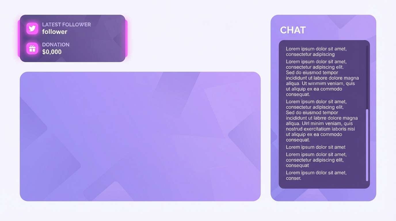
13) Cotton Candy Glow
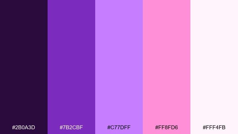
HEX: #2B0A3D #7B2CBF #C77DFF #FF8FD6 #FFF4FB
Mood: lighthearted and glossy
Best for: streaming channel overlay
Lighthearted and glossy, it looks like cotton candy under LED lights with a clean, modern sheen. Use violet for panels and borders, then bring in pink for alerts, labels, and interactive states. The near-white tone keeps text blocks readable and helps the overlay feel less busy. Usage tip: keep alerts to one accent color so notifications are instantly recognizable.
Image example of cotton candy glow generated using media.io
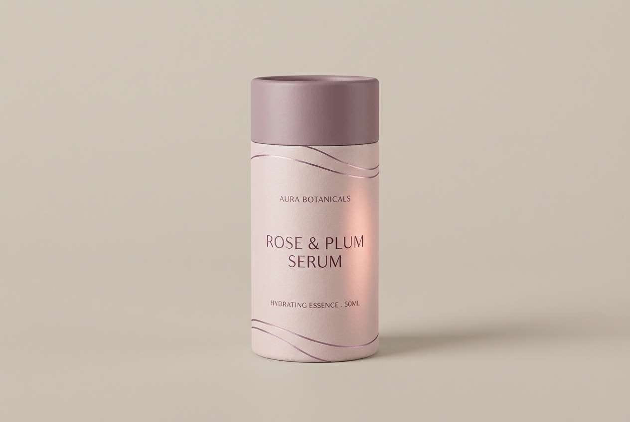
14) Rose Quartz Plum
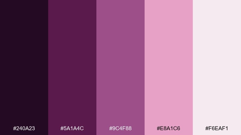
HEX: #240A23 #5A1A4C #9C4F88 #E8A1C6 #F6EAF1
Mood: elegant and gentle
Best for: skincare label design
Elegant and gentle, it feels like rose quartz polished smooth beside a deep plum shadow. Keep labels mostly pale and airy, then use plum for ingredient hierarchy and brand lockups. The mauve midtone is ideal for thin rules, icons, and secondary badges that should stay subtle. Usage tip: choose a slightly heavier font weight so the mid-mauve text does not fade in print.
Image example of rose quartz plum generated using media.io
15) Magenta Iris Minimal
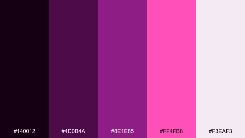
HEX: #140012 #4D0B4A #8E1E85 #FF4FB8 #F3EAF3
Mood: sleek and modern
Best for: startup pitch deck slides
Sleek and modern, it suggests polished gradients and sharp magenta highlights on dark ink. These purple pink color combinations are strongest when you keep most slides light and use the near-black for high-contrast headings. Add magenta for charts, key metrics, and callouts, while the orchid midtone supports secondary data. Usage tip: limit chart colors to two series so the deck stays consistent from slide to slide.
Image example of magenta iris minimal generated using media.io

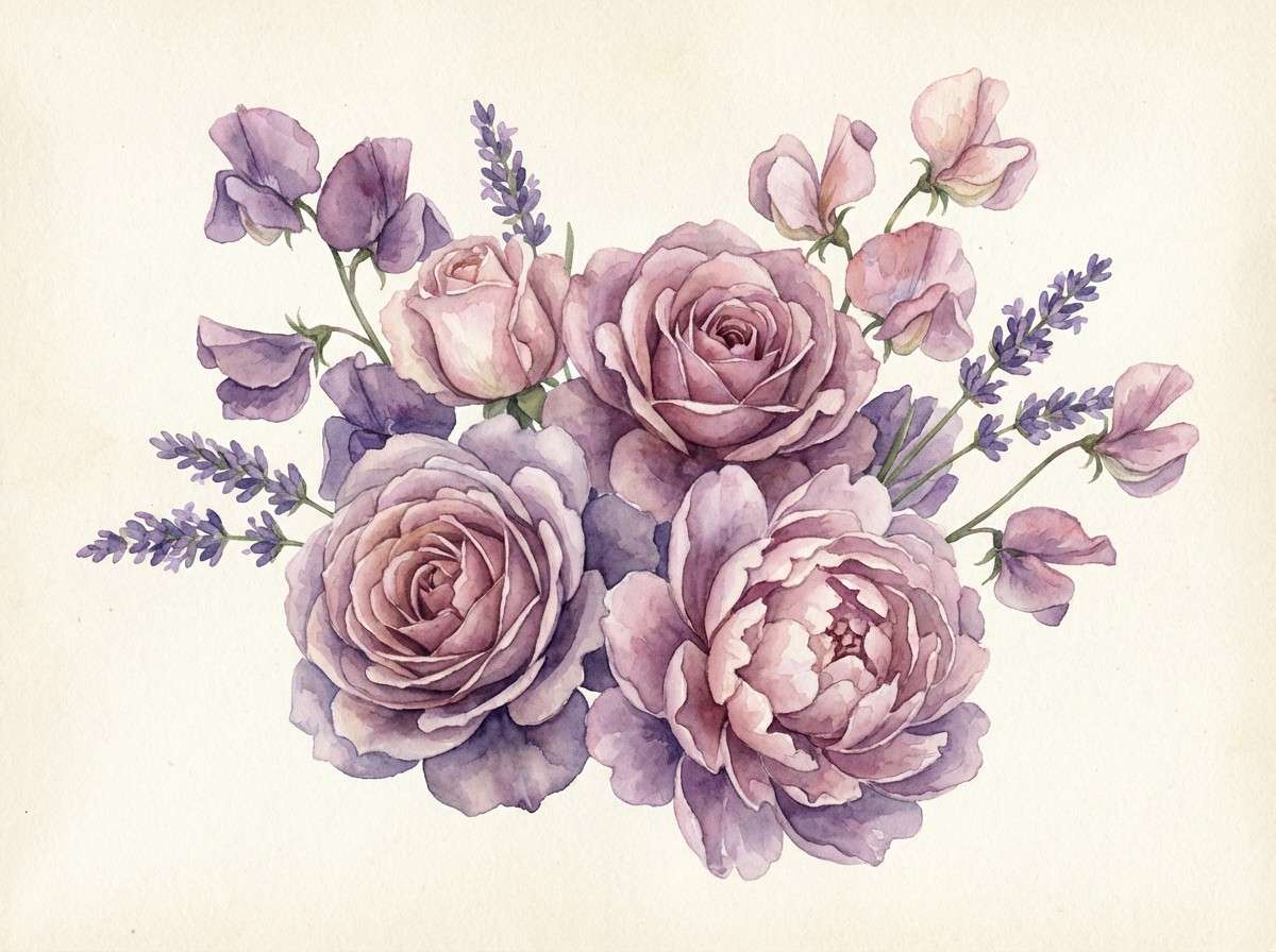
16) Vintage Violet Bouquet
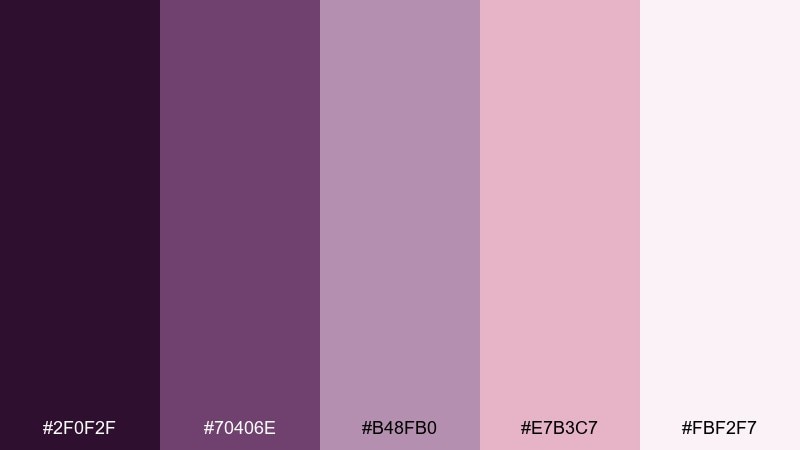
HEX: #2F0F2F #70406E #B48FB0 #E7B3C7 #FBF2F7
Mood: nostalgic and soft
Best for: watercolor floral illustration
Nostalgic and soft, it recalls pressed flowers in an old book and a powdery vanity palette. Let the dusty violet lead your shadows and outlines, with blush washes for petals and background blooms. It pairs well with warm cream paper textures and muted typography in deep plum. Usage tip: use wet-on-wet gradients for the pale pink areas to keep edges delicate.
Image example of vintage violet bouquet generated using media.io
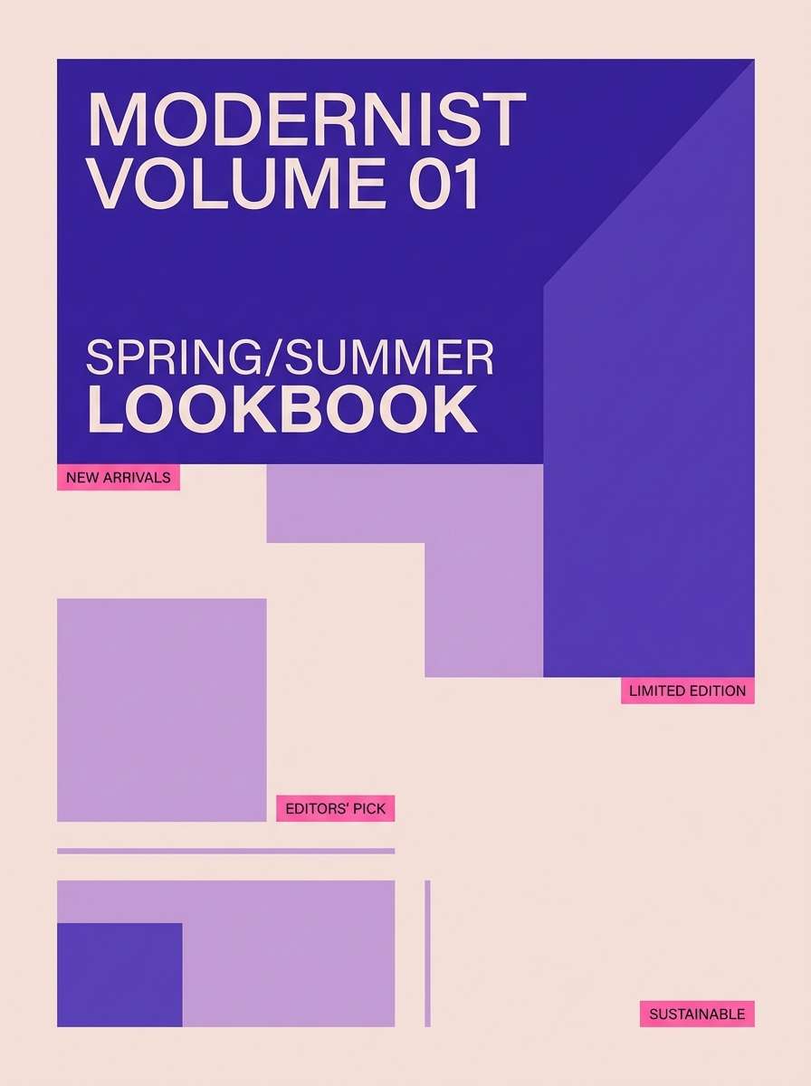
17) Royal Lilac Pop
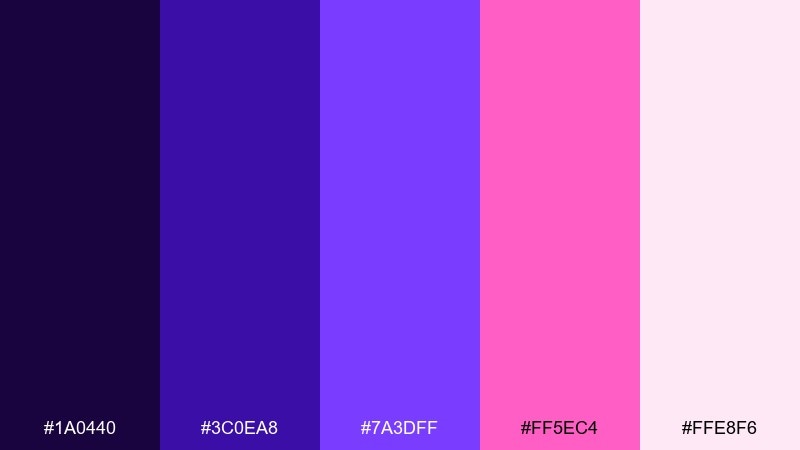
HEX: #1A0440 #3C0EA8 #7A3DFF #FF5EC4 #FFE8F6
Mood: confident and trendy
Best for: fashion lookbook cover
Confident and trendy, it reads like runway lighting with a lilac flash and bold pink styling. Use royal purple for the title block, then pop hot pink in small tags and issue numbers for a modern editorial feel. The pale blush keeps whitespace soft and prevents the cover from feeling too aggressive. Usage tip: keep one strong diagonal element to guide the eye without cluttering the layout.
Image example of royal lilac pop generated using media.io
18) Soft Berry Clay
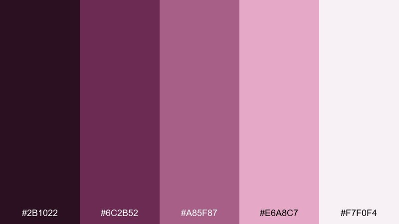
HEX: #2B1022 #6C2B52 #A85F87 #E6A8C7 #F7F0F4
Mood: warm and grounded
Best for: handmade candle label
Warm and grounded, it feels like berry glaze mixed with clay and linen. Keep labels mostly light, then use the deeper berry tone for the brand name and scent notes for a handcrafted look. The mid mauve works well for small icons and batch numbers without stealing attention. Usage tip: print on uncoated stock to make the palette feel more natural and tactile.
Image example of soft berry clay generated using media.io
19) Iris Pop UI
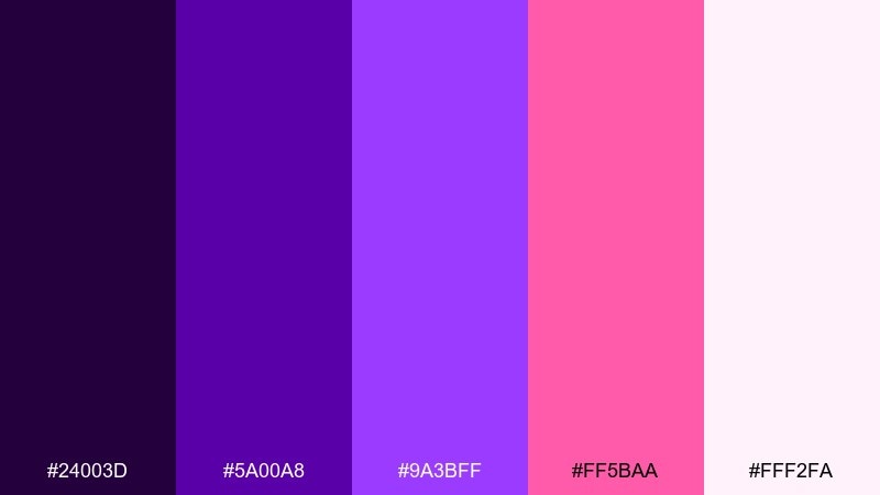
HEX: #24003D #5A00A8 #9A3BFF #FF5BAA #FFF2FA
Mood: bright and techy
Best for: mobile app onboarding screens
Bright and techy, it feels like crisp gradients and energetic micro-interactions. Keep onboarding backgrounds mostly near-white, then use violet blocks for illustrations and section headers. Hot pink works best as the progress indicator and one primary CTA to guide users forward. Usage tip: avoid using pink for body text and reserve it for interactive states only.
Image example of iris pop ui generated using media.io
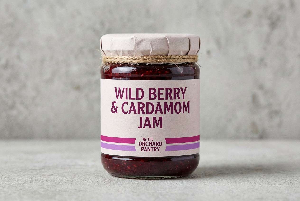
20) Berry Jam Branding
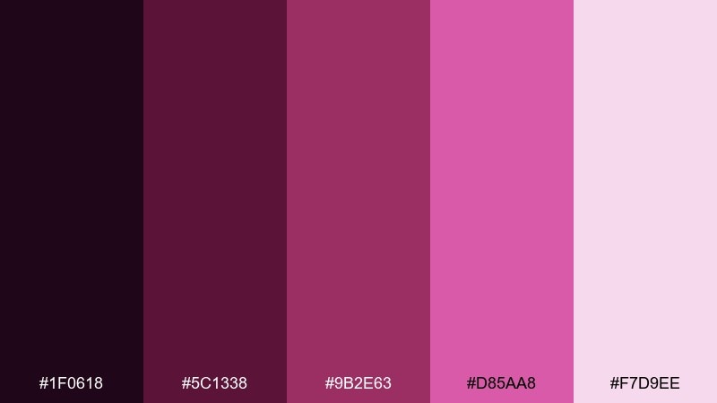
HEX: #1F0618 #5C1338 #9B2E63 #D85AA8 #F7D9EE
Mood: bold and artisanal
Best for: artisan jam jar label and logo
Bold and artisanal, it evokes thick berry jam, handwritten tags, and small-batch craft. Use the darkest tone for the logo mark and type, then build supporting shapes in magenta and orchid for flavor variants. The pale tint works as a label base that still feels warm and food-friendly. Usage tip: add a simple stamp texture in the mid berry tone to make the branding feel handcrafted.
Image example of berry jam branding generated using media.io
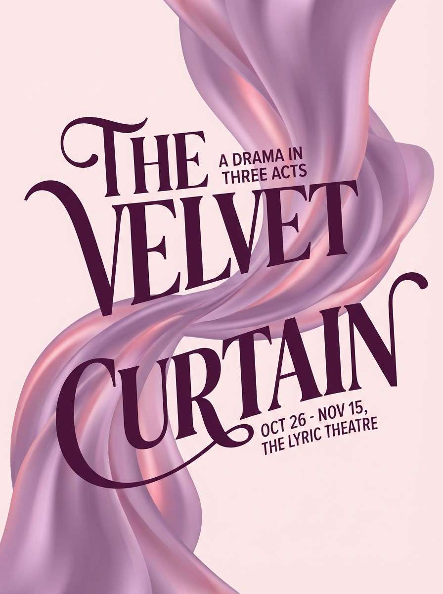
21) Lilac Satin Poster
HEX: #2A0B33 #642D74 #A86BB4 #F07BB2 #FDE8F3
Mood: glam and smooth
Best for: theater show poster
Glam and smooth, it looks like lilac satin catching stage light with a rosy spotlight. This purple pink color palette is ideal for show posters where you need drama without going full neon. Use the deep plum for titles and credits, then layer lilac and rose as background shapes and highlight bars. Usage tip: keep the lightest pink behind small text blocks so everything stays readable from a distance.
Image example of lilac satin poster generated using media.io
22) Gradient Duo
HEX: #2A064F #5C1FA6 #9D4EDD #FF5DA2 #FFF0F8
Mood: smooth and futuristic
Best for: website hero gradient background
Smooth and futuristic, it feels like a clean gradient drifting from violet into warm pink light. Use the mid violet and pink as your dominant blend, then anchor navigation and headings with the darkest purple. The pale tint keeps sections airy and gives cards a gentle lift. Usage tip: add a subtle noise layer to gradients to reduce banding on large screens.
Image example of gradient duo generated using media.io

What Colors Go Well with Purple Pink?
Neutrals are the easiest win: warm white, cream, and soft gray keep purple pink from feeling too saturated, while charcoal or near-black adds structure for typography and UI contrast.
For a fresher, trend-forward look, pair purple pink with mint, sage, or teal—cool greens balance magenta-heavy palettes and make accents feel sharper. For a warmer vibe, gold, sand, and beige give it a premium, cosmetic-friendly finish.
If you want more energy, try small hits of citrus (like yellow) or icy cyan, but keep them as accents so the palette doesn’t turn chaotic.
How to Use a Purple Pink Color Palette in Real Designs
Start with roles, not just colors: pick one deep purple for text/headers, one mid purple for secondary UI, one bright pink for primary actions, and a pale tint for backgrounds. This keeps your hierarchy consistent across screens and templates.
In print, test the midtones—dusty mauves can look muted on uncoated stock, while neon pinks may shift depending on the printer profile. Using a light base (near-white blush) usually improves clarity and reduces ink-heavy blocks.
For gradients, blend between mid violet and warm pink, then add a subtle noise texture to prevent banding—especially on large hero sections and posters.
Create Purple Pink Palette Visuals with AI
If you already have HEX codes, you can quickly generate matching mockups—like landing pages, posters, invitations, and labels—by describing layout, typography, and where the purple/pink accents should land.
Use your darkest purple for “structure” (titles, nav, outlines), and reserve the brightest pink for one standout element (CTA, badge, or highlight). That single choice usually makes the whole design feel intentional.
With Media.io’s text-to-image, you can iterate on the same palette across multiple formats (1:1, 16:9, 3:4) while keeping the visual style consistent.
Purple Pink Color Palette FAQs
-
What does a purple pink color scheme communicate in branding?
Purple often signals creativity, luxury, and imagination, while pink adds warmth, romance, and approachability. Together, they can feel premium-yet-friendly—popular for beauty, fashion, apps, and entertainment. -
How do I keep purple and pink from looking too “sweet”?
Anchor the palette with a deep plum/eggplant for typography and structure, then use pink as a controlled accent. Adding neutral space (white, blush-white, warm gray) also keeps the look modern. -
Which purple pink combo is best for UI readability?
Choose a near-white background, a dark purple for text, and reserve bright pink for interactive states (CTA buttons, focus rings, badges). This maintains contrast and avoids pink body text. -
What are good complementary colors for purple pink palettes?
Mint/sage/teal balance the warmth of pink and the richness of purple. Cream, beige, and gold create a softer premium feel, while charcoal or near-black improves hierarchy and legibility. -
Do purple pink palettes print well?
They can print beautifully, but mid mauves may appear dull on uncoated paper and neon pinks can shift. Always run a small print test and consider slightly deeper midtones for thin lines and small text. -
How many colors should I use from a 5-color palette?
In most designs, 3–4 is enough: one base (light tint), one dark (text), one mid (support), and one accent (bright pink). Keep the fifth color as an optional highlight for special states. -
Can I generate consistent purple pink visuals with AI?
Yes—reuse a prompt structure (layout + subject + “dominant colors” list) and keep one or two signature colors for key elements like CTAs. This helps outputs stay cohesive across banners, posters, and UI screens.


