

Puce is a muted, rosy-brown tone that sits comfortably between mauve and dusty pink—soft enough for modern minimal layouts, yet rich enough for premium branding.
Below are puce color palette ideas with HEX codes you can copy for UI, packaging, interiors, and social graphics, plus AI prompts you can use to generate matching visuals.
In this article
- Why Puce Palettes Work So Well
-
- velvet rosewood
- dusty mauve neutrals
- antique bouquet
- clay and cocoa
- berry latte
- soft focus ui
- sunset blush
- botanical plum wash
- vintage stationery ink
- luxe cosmetic editorial
- autumn wine bar
- spa stone blush
- rose gold event flyer
- editorial blush and slate
- minimal clay ui
- playroom pastel mauve
- nightfall puce noir
- kitchen ceramic blush
- garnet holiday wrap
- art poster mauve modern
- creamy gradient stories
- What Colors Go Well with Puce?
- How to Use a Puce Color Palette in Real Designs
- Create Puce Palette Visuals with AI
Why Puce Palettes Work So Well
Puce is flattering because it’s muted: it carries warmth like pink, but the brown/grey undertone makes it feel more grounded and “grown-up” in branding and interiors.
It also plays nicely with both warm and cool neighbors. Pair it with creamy whites and taupes for softness, or add slate/charcoal to sharpen contrast for editorial and UI layouts.
Most importantly, puce scales well. It can be a gentle background tint, a confident primary brand color, or a punchy accent on dark themes—without looking overly sweet.
20+ Puce Color Palette Ideas (with HEX Codes)
1) Velvet Rosewood
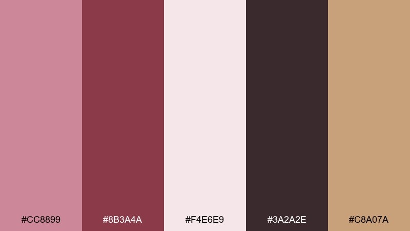
HEX: #CC8899 #8B3A4A #F4E6E9 #3A2A2E #C8A07A
Mood: luxe, romantic, grounded
Best for: beauty product packaging
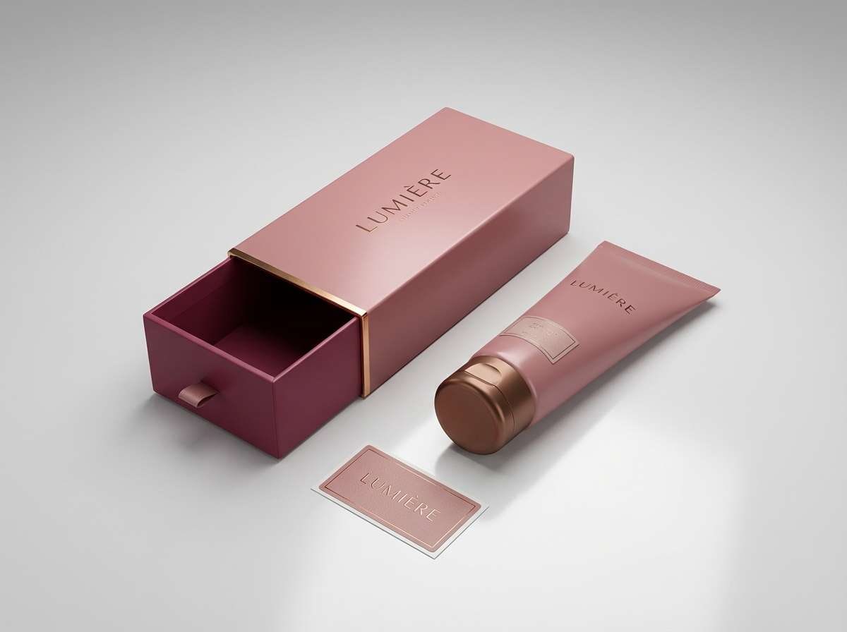
Luxe and romantic, like velvet petals against polished wood. The deep rosewood and near-black anchor the softness of puce while creamy blush keeps it airy. Use it for cosmetics boxes, labels, and premium unboxing cards where you want warmth without looking sugary. Tip: foil-stamp the gold tone on the darkest swatch for instant shelf impact.
Image example of velvet rosewood generated using media.io
Media.io is an online AI studio for creating and editing video, image, and audio in your browser.

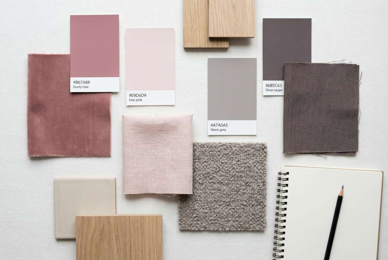
2) Dusty Mauve Neutrals
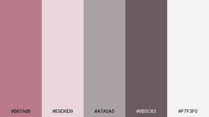
HEX: #B67A88 #E9D6D9 #A7A0A5 #6B5C63 #F7F3F0
Mood: calm, modern, minimal
Best for: interior paint mood boards
Calm and airy, like linen drapes in late-afternoon light. Dusty mauve reads sophisticated when it sits next to warm whites and soft greys. It works beautifully for paint decks, upholstery planning, and mood boards where you want quiet color without losing depth. Tip: keep the darkest grey for trim or typography so the space still feels open.
Image example of dusty mauve neutrals generated using media.io
3) Antique Bouquet
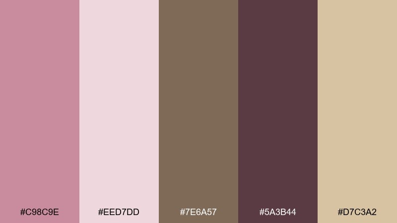
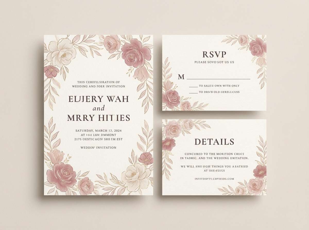
HEX: #C98C9E #EED7DD #7E6A57 #5A3B44 #D7C3A2
Mood: nostalgic, floral, soft
Best for: wedding invitation suite
Nostalgic and floral, like dried roses tucked into an old book. The warm taupe and cocoa tones keep the pinkish hues from feeling too sweet. Use it for invitations, RSVP cards, and envelope liners where you want vintage romance with readable contrast. Tip: print the darkest shade for text and reserve the lightest blush for background paper texture.
Image example of antique bouquet generated using media.io
4) Clay and Cocoa
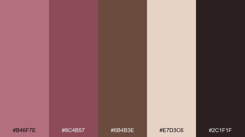
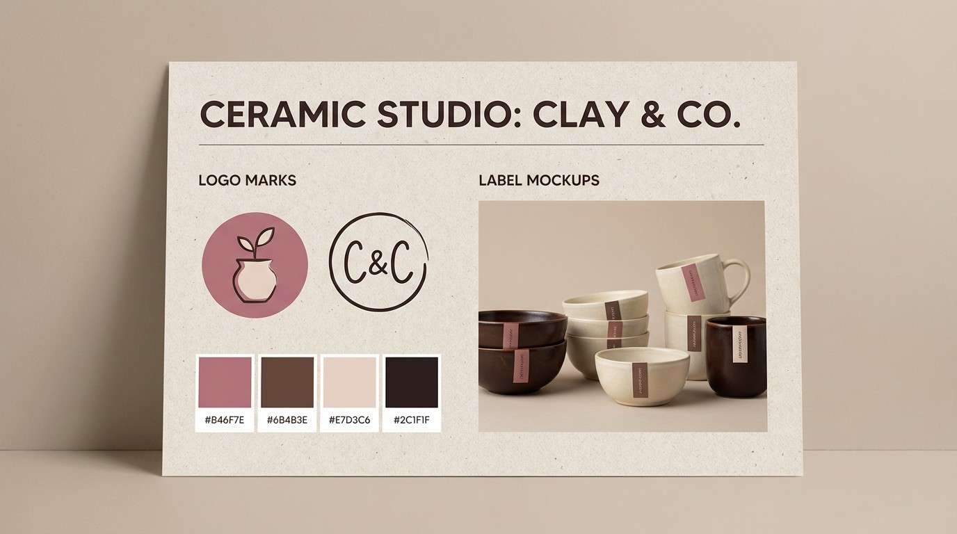
HEX: #B46F7E #8C4B57 #6B4B3E #E7D3C6 #2C1F1F
Mood: earthy, warm, artisanal
Best for: ceramic brand identity
Earthy and warm, like kiln-fired clay with a cocoa glaze. The palette leans handmade thanks to the brown base, while puce brings a gentle rosy cast. It suits craft branding, pottery labels, and maker markets where authenticity matters. Tip: pair matte paper with a single high-contrast stamp in the near-black for a tactile finish.
Image example of clay and cocoa generated using media.io
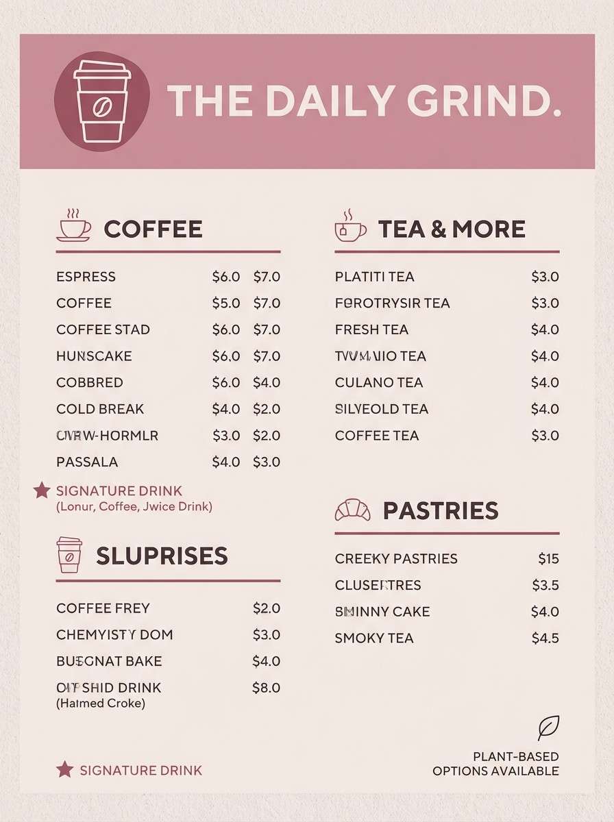
5) Berry Latte
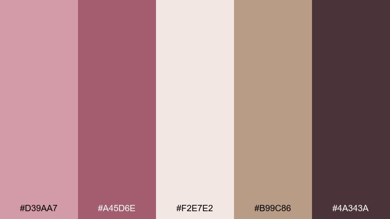
HEX: #D39AA7 #A45D6E #F2E7E2 #B99C86 #4A343A
Mood: cozy, sweet, café-chic
Best for: coffee shop menu design
Cozy and inviting, like a berry latte topped with foam. The creamy off-white and soft tan act as the milk-and-biscuit base, while the deeper berry shade adds appetite and contrast. Use it for menus, loyalty cards, and seasonal drink promos that need warmth without loud color. Tip: keep backgrounds light and use the darkest tone only for prices and headings to maintain readability.
Image example of berry latte generated using media.io
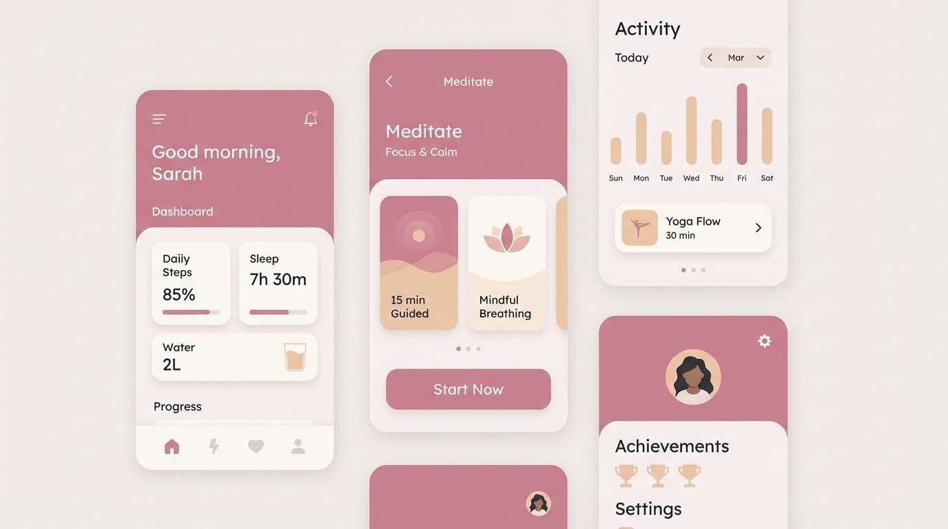
6) Soft Focus UI
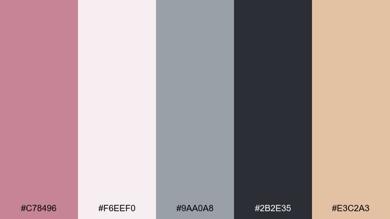
HEX: #C78496 #F6EEF0 #9AA0A8 #2B2E35 #E3C2A3
Mood: polished, gentle, tech-forward
Best for: wellness app UI kit
Polished and gentle, like a soft-focus film still with crisp edges. This puce color palette pairs a blush-tinted primary with cool greys so screens feel calm, not candy-like. It fits wellness onboarding, habit trackers, and settings screens where contrast must stay accessible. Tip: reserve the warm beige for micro-highlights like toggles and badges, not large blocks.
Image example of soft focus ui generated using media.io
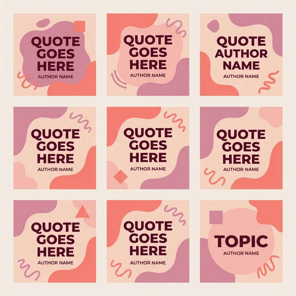
7) Sunset Blush
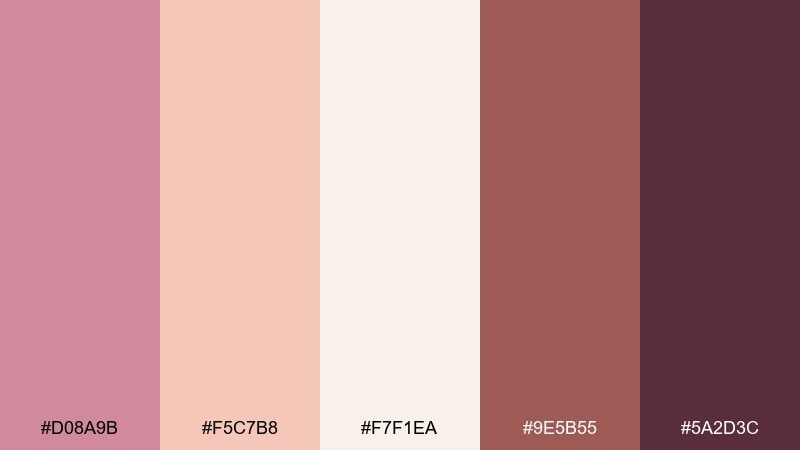
HEX: #D08A9B #F5C7B8 #F7F1EA #9E5B55 #5A2D3C
Mood: warm, optimistic, romantic
Best for: social media quote templates
Warm and optimistic, like sunset light washing over a pastel wall. The peachy highlight brightens the puce base, while the deep plum keeps text grounded and legible. Use it for quote cards, carousel tips, and creator branding where you want approachable elegance. Tip: set large headlines in the darkest shade and keep body text on the cream to avoid eye strain.
Image example of sunset blush generated using media.io
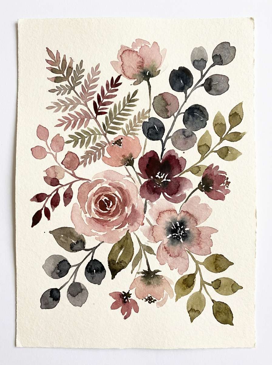
8) Botanical Plum Wash
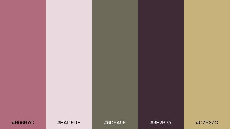
HEX: #B06B7C #EAD9DE #6D6A59 #3F2B35 #C7B27C
Mood: natural, moody, refined
Best for: watercolor botanical prints
Natural and a little moody, like pressed leaves beside plum-colored blooms. The olive-grey adds an earthy counterweight, keeping the rosy tones grounded and editorial. It shines in botanical illustrations, stationery sets, and art prints that need quiet sophistication. Tip: let the light blush act as paper and glaze the puce over it for watercolor depth.
Image example of botanical plum wash generated using media.io
9) Vintage Stationery Ink
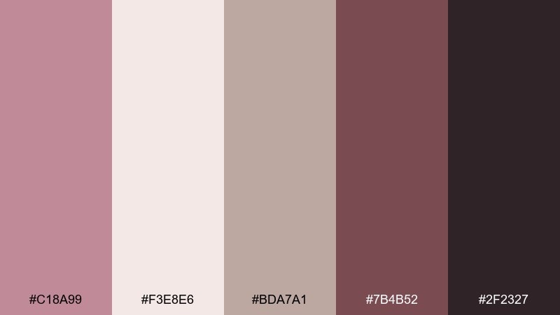
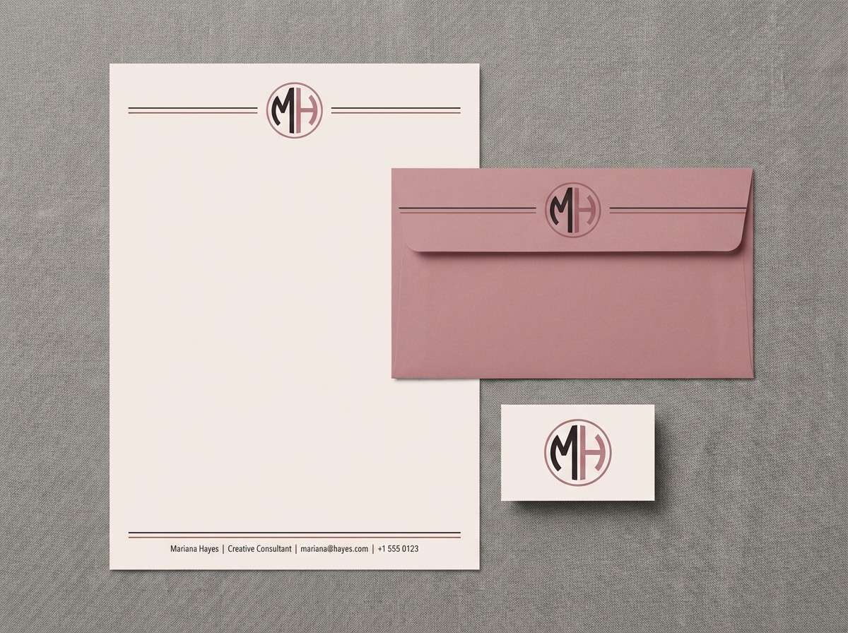
HEX: #C18A99 #F3E8E6 #BDA7A1 #7B4B52 #2F2327
Mood: classic, bookish, intimate
Best for: personal letterhead set
Classic and bookish, like fountain-pen ink on soft cotton paper. The muted rose and warm greige feel timeless, while the near-black makes details crisp. Use it for letterhead, envelopes, and monograms where subtle color signals personality. Tip: print on uncoated stock and keep the palette mostly light, using the darkest shade only for initials and rules.
Image example of vintage stationery ink generated using media.io
10) Luxe Cosmetic Editorial
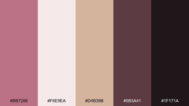
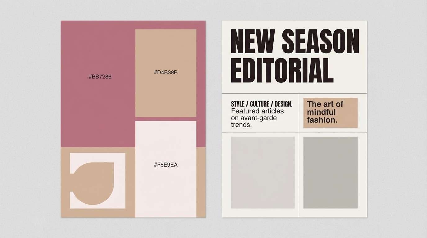
HEX: #BB7286 #F6E9EA #D4B39B #5B3A41 #1F171A
Mood: editorial, glamorous, high contrast
Best for: fashion magazine layout
Editorial and glamorous, like a backstage look lit by soft flash. The warm metallic beige lifts the rosy tones, while deep espresso and black create confident contrast. As a puce color scheme, it works best for fashion spreads, lookbooks, and premium campaign decks. Tip: keep body copy on the pale background and use the darkest shade for pull quotes and section titles.
Image example of luxe cosmetic editorial generated using media.io
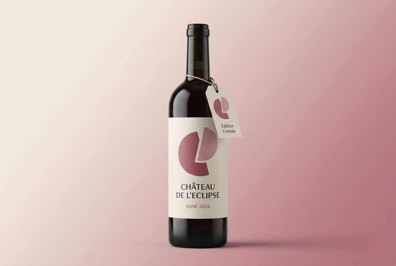
11) Autumn Wine Bar
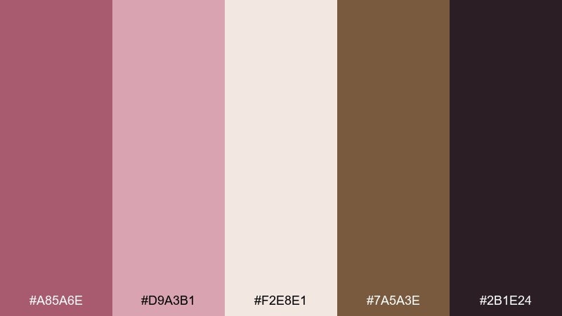
HEX: #A85A6E #D9A3B1 #F2E8E1 #7A5A3E #2B1E24
Mood: rich, seasonal, inviting
Best for: wine label and neck tag
Rich and seasonal, like mulled wine and candlelit wood. The tan-brown note adds a harvest feel that keeps the rosy hues from reading springy. Use it on wine labels, neck tags, and tasting event collateral where warmth sells the story. Tip: use the cream as negative space and let the puce shades carry the brand mark.
Image example of autumn wine bar generated using media.io
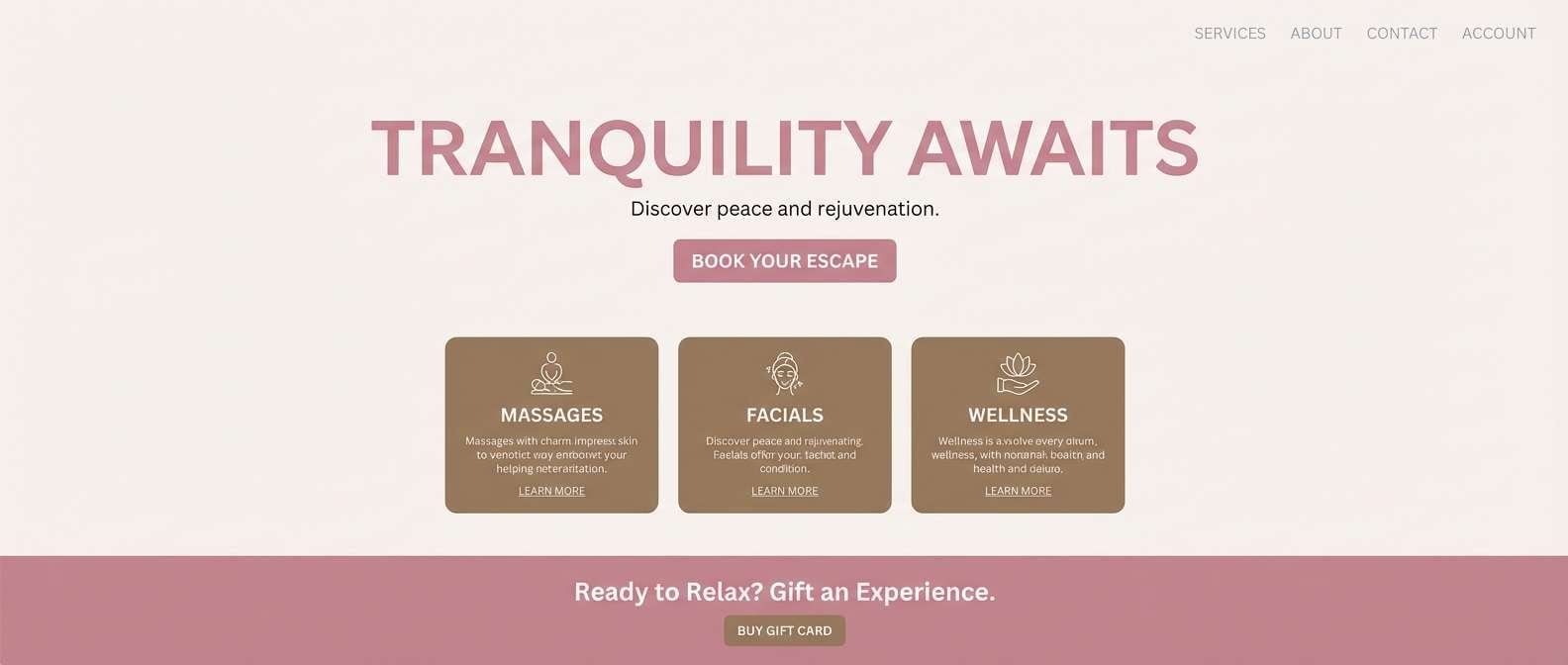
12) Spa Stone Blush
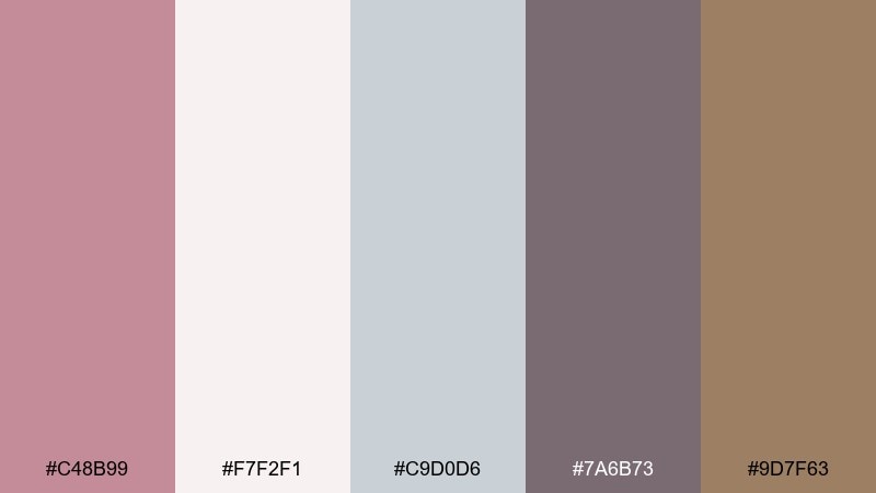
HEX: #C48B99 #F7F2F1 #C9D0D6 #7A6B73 #9D7F63
Mood: serene, clean, restorative
Best for: spa website landing page
Serene and clean, like warm towels and smooth stone. The cool grey-blue keeps the blush notes balanced, creating a calm, trustworthy feel for wellness brands. Use it for hero sections, service cards, and booking CTAs where you want soft color with clear hierarchy. Tip: make buttons the warm taupe so they stand out without shouting.
Image example of spa stone blush generated using media.io
13) Rose Gold Event Flyer
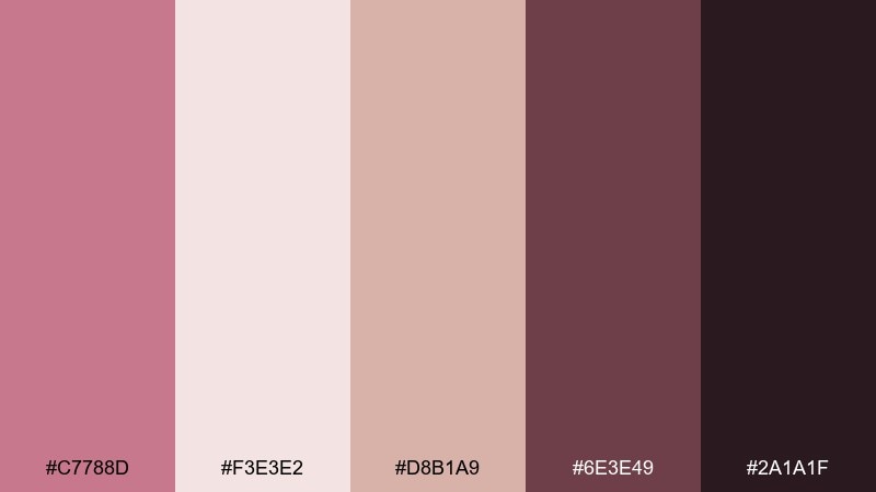
HEX: #C7788D #F3E3E2 #D8B1A9 #6E3E49 #2A1A1F
Mood: celebratory, chic, night-out
Best for: event flyer poster
Chic and celebratory, like rose-gold lights in a dim lounge. The soft blush background keeps things upscale, while the deep berry tone delivers readable type and a sense of nightlife. Use it for party flyers, gallery openings, and ticket promos that need elegance more than loud color. Tip: set the headline in the darkest shade and keep supporting details in the muted mauve for hierarchy.
Image example of rose gold event flyer generated using media.io

14) Editorial Blush and Slate
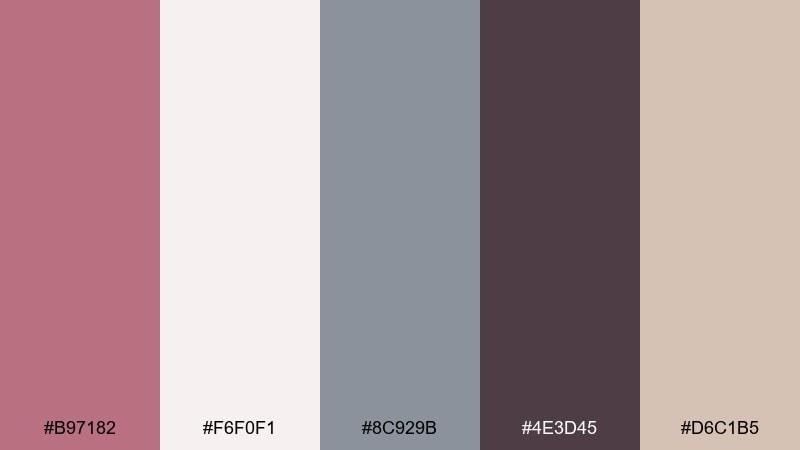
HEX: #B97182 #F6F0F1 #8C929B #4E3D45 #D6C1B5
Mood: smart, balanced, contemporary
Best for: newsletter template
Smart and balanced, like a modern magazine with soft color blocking. Slate grey brings structure to the rosy tones, making long-form content feel easy to scan. Use it in newsletters and blog layouts where headings, links, and dividers need consistent contrast. Tip: keep the blush as section backgrounds and use slate for navigation and rules.
Image example of editorial blush and slate generated using media.io
15) Minimal Clay UI
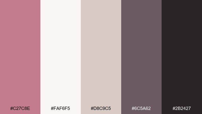
HEX: #C27C8E #FAF6F5 #D8C9C5 #6C5A62 #2B2427
Mood: minimal, warm, elegant
Best for: finance dashboard UI
Minimal and warm, like clay pigments brushed onto clean paper. The gentle neutrals keep the interface professional, while the darker tones bring clarity to charts and labels. Use it for dashboards where you want approachable color without losing seriousness. Tip: use puce only for key states like active tabs and highlights, and keep the rest neutral.
Image example of minimal clay ui generated using media.io
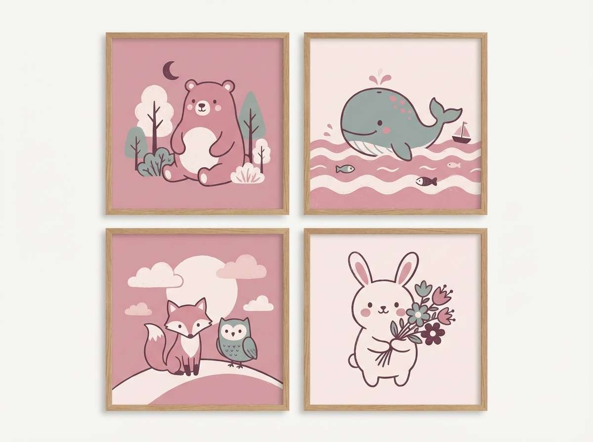
16) Playroom Pastel Mauve
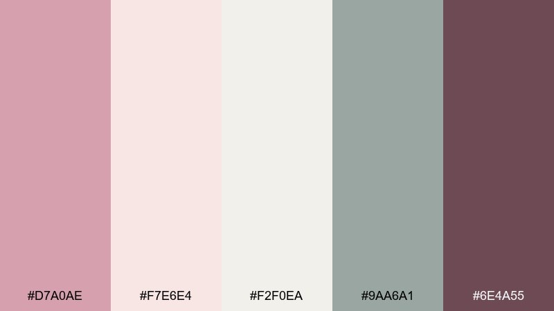
HEX: #D7A0AE #F7E6E4 #F2F0EA #9AA6A1 #6E4A55
Mood: gentle, playful, family-friendly
Best for: nursery wall art prints
Gentle and playful, like pastel blocks in a sunlit playroom. The minty grey-green keeps the pink tones modern, not overly sweet. These puce color combinations work well for nursery prints, kids room decor, and soft educational posters. Tip: choose the cream as the main canvas color and use puce for characters and headings.
Image example of playroom pastel mauve generated using media.io
17) Nightfall Puce Noir
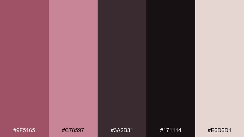
HEX: #9F5165 #C78597 #3A2B31 #171114 #E6D6D1
Mood: dramatic, modern, sleek
Best for: tech startup branding
Dramatic and sleek, like city lights reflected on dark glass. The near-black base makes the rosy accents feel sharp and contemporary rather than delicate. Use it for startup branding, pitch decks, and landing pages that want a bold identity with a human edge. Tip: keep backgrounds dark and use the pale neutral for spacious margins so the design does not feel heavy.
Image example of nightfall puce noir generated using media.io

18) Kitchen Ceramic Blush
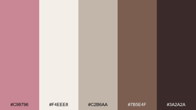
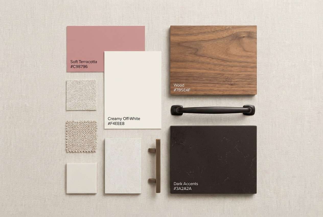
HEX: #C98796 #F4EEE8 #C2B6AA #7B5E4F #3A2A2A
Mood: homey, clean, timeless
Best for: kitchen remodel palette board
Homey and timeless, like ceramic tiles next to warm wood. The cream and greige make the rosy tone feel subtle, perfect for spaces that need longevity. Use it for remodel boards, cabinet paint planning, and countertop pairings where you want a hint of color. Tip: bring puce in through textiles or small appliances so it is easy to refresh later.
Image example of kitchen ceramic blush generated using media.io
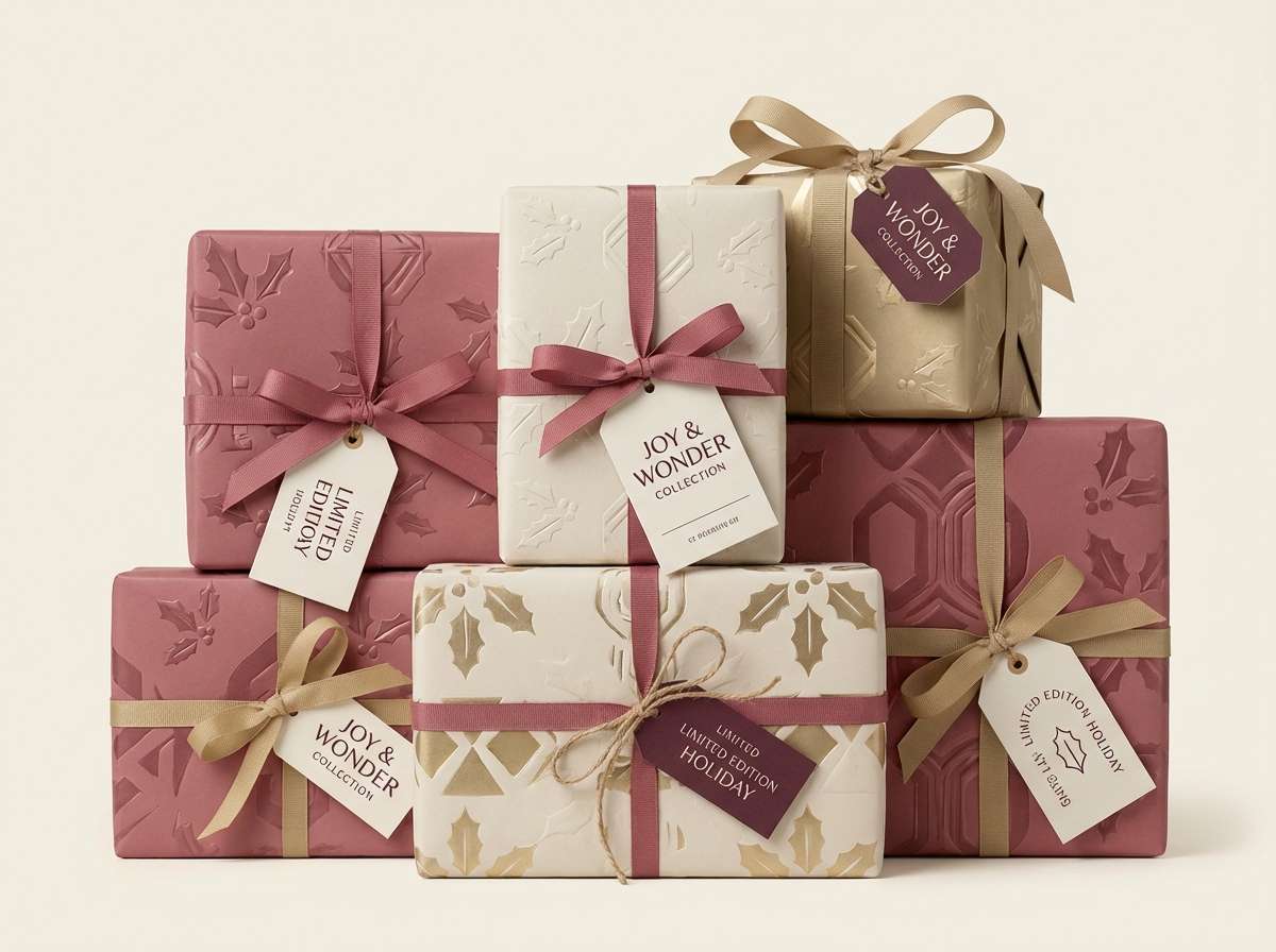
19) Garnet Holiday Wrap
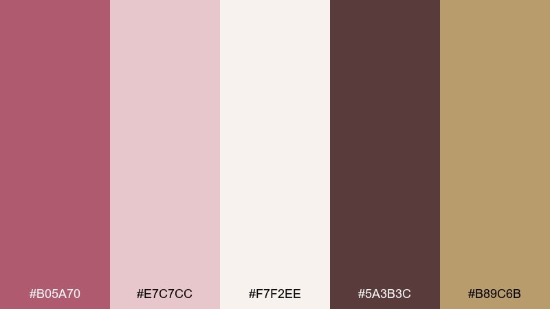
HEX: #B05A70 #E7C7CC #F7F2EE #5A3B3C #B89C6B
Mood: festive, warm, elegant
Best for: gift wrap and tags
Festive and warm, like garnet ribbon on cream paper. The muted blush keeps it sophisticated, while the gold note adds celebration without going glittery. This puce color palette is ideal for holiday wrapping sets, gift tags, and seasonal brand inserts. Tip: use the deep cocoa for tag typography and keep patterns simple so the colors feel premium.
Image example of garnet holiday wrap generated using media.io
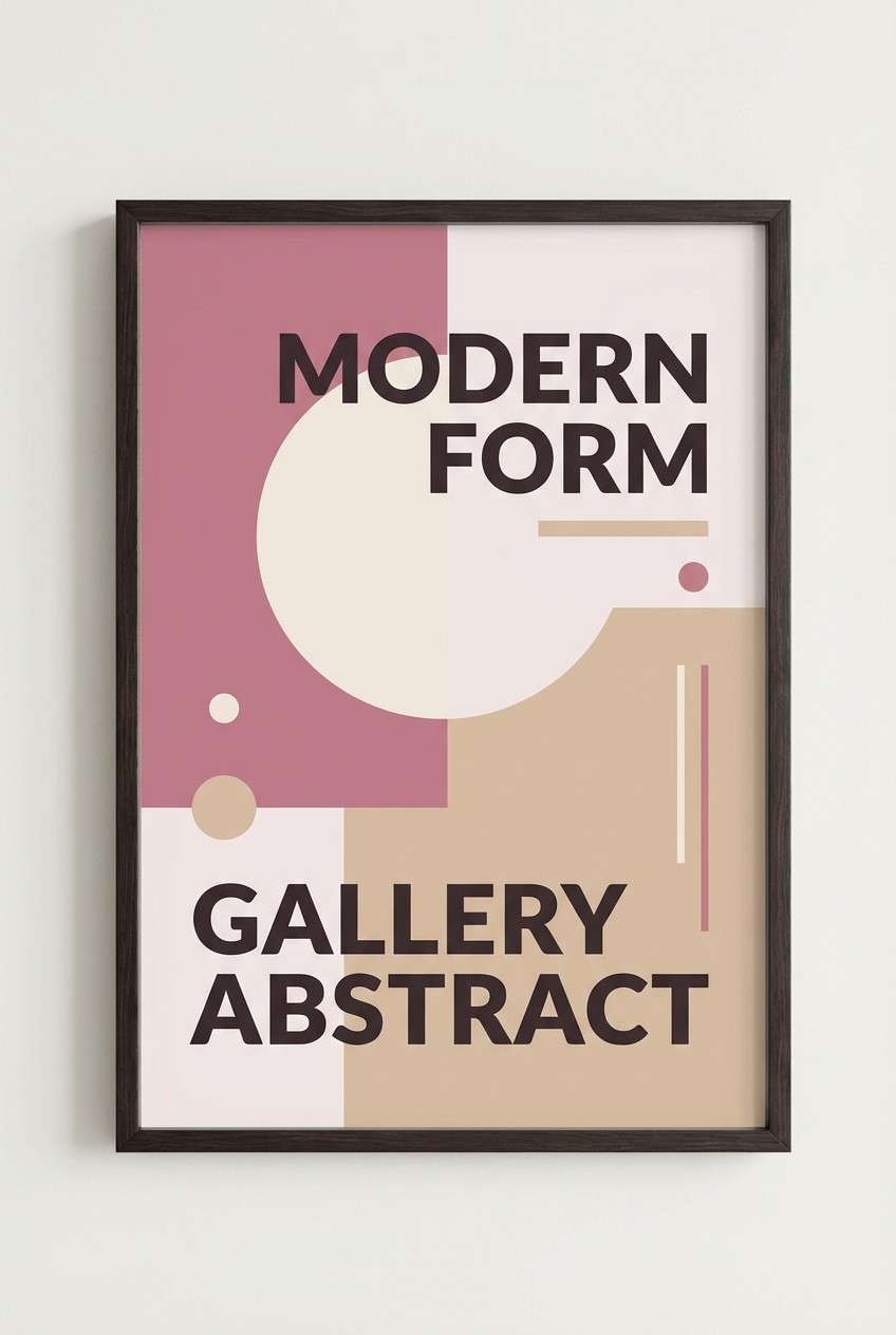
20) Art Poster Mauve Modern
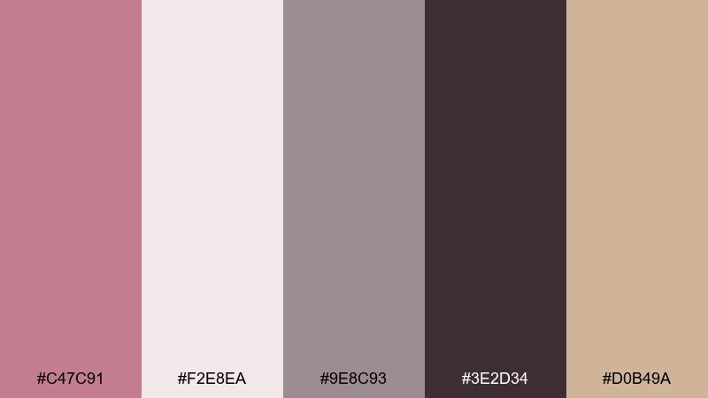
HEX: #C47C91 #F2E8EA #9E8C93 #3E2D34 #D0B49A
Mood: artful, modern, gallery-ready
Best for: abstract poster design
Artful and modern, like an abstract print in a quiet gallery. The mid-tone mauve carries large shapes well, and the charcoal shade keeps typography sharp. Use it for posters, album art, and limited-run prints that need a refined, muted statement. Tip: work with big negative space and use the warm beige only as a small highlight to guide the eye.
Image example of art poster mauve modern generated using media.io
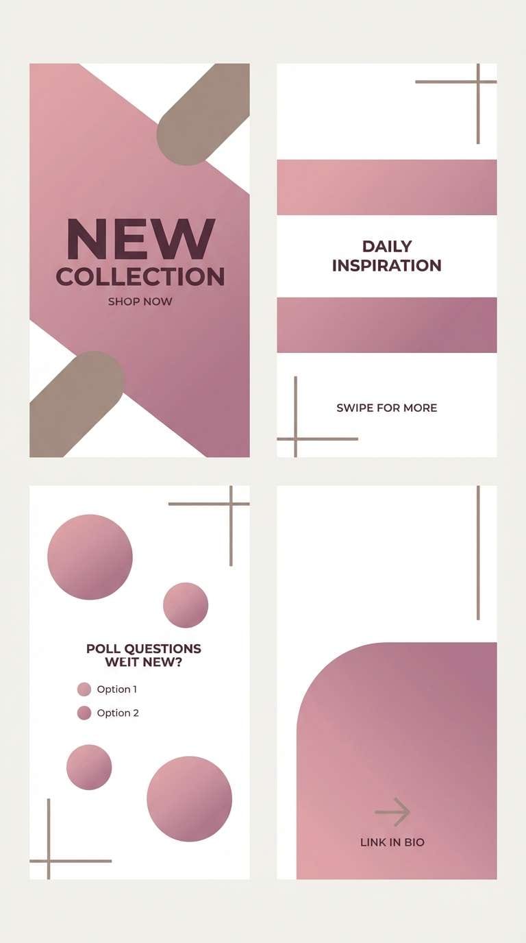
21) Creamy Gradient Stories
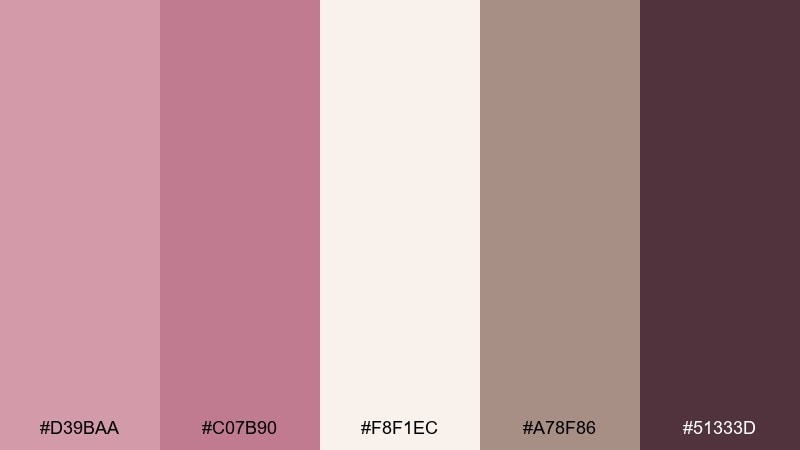
HEX: #D39BAA #C07B90 #F8F1EC #A78F86 #51333D
Mood: soft, trendy, creator-friendly
Best for: instagram story templates
Soft and trendy, like a creamy gradient fading into warm shadow. The two mauve tones blend beautifully for backgrounds, while the dark plum handles text with clarity. Use it for story frames, promo slides, and creator kits that need consistent brand color across posts. Tip: build a two-stop gradient from the two mauves and keep icons in the warm greige for a cohesive look.
Image example of creamy gradient stories generated using media.io
What Colors Go Well with Puce?
Puce pairs best with warm neutrals like cream, ivory, oatmeal, greige, and soft taupe—these keep it sophisticated and prevent the palette from leaning too “pink.”
For contrast, add charcoal, espresso, or near-black to make typography crisp and layouts feel premium. This is especially effective in editorial designs, landing pages, and packaging.
If you want a fresh twist, try cool counterbalances like slate grey, blue-grey, or an olive-leaning neutral. They bring structure and a modern edge to puce tones.
How to Use a Puce Color Palette in Real Designs
In branding, use puce as the signature color (logos, labels, highlight shapes) and lean on cream/greige for backgrounds. Add one dark tone for text so the identity stays readable across formats.
In UI, treat puce like an accent rather than a full background: active states, badges, and key illustrations look great, while cool greys handle navigation and long text areas.
In interiors, puce works well as a soft wall color or textile accent. Pair it with warm whites and natural wood, then bring depth with cocoa/charcoal in hardware, trim, or decor.
Create Puce Palette Visuals with AI
Want to preview how a puce color scheme will look on a menu, flyer, packaging, or UI kit? Generate fast mock visuals from a text prompt, then iterate until the mood feels right.
With Media.io, you can turn any of the prompts above into image examples for mood boards, client decks, or social templates—without needing a full photoshoot or design system upfront.
Start with your chosen HEX set, mention the design type (poster, landing page, packaging), and keep the prompt clean so the colors stay consistent.
Puce Color Palette FAQs
-
What color is puce, exactly?
Puce is a muted pinkish-brown (often described as dusty mauve or rosy-brown). It sits between pink and brown with a greyed, sophisticated undertone. -
Is puce warm or cool?
Puce is usually warm-leaning because of its brown base, but it can read more neutral or slightly cool depending on the surrounding greys and lighting. -
What are the best neutral colors to pair with puce?
Cream, ivory, warm white, greige, taupe, and soft beige pair extremely well with puce because they keep the overall look calm and modern. -
What dark colors work well with puce for contrast?
Charcoal, espresso brown, deep plum, and near-black create clean contrast for headings, logos, and UI text while keeping the palette elegant. -
Can I use puce in a modern UI color scheme?
Yes. Use puce for accents (active states, highlights, badges) and rely on light neutrals plus cool greys for backgrounds and structure to maintain a polished, accessible interface. -
Does puce work for wedding or event designs?
Puce is a strong choice for invitations and event collateral because it feels romantic without being overly sweet, especially when paired with blush paper tones and cocoa/charcoal typography. -
How do I keep a puce palette from looking “too pink”?
Add grounding neutrals (taupe, greige, cocoa) and at least one dark anchor (charcoal or near-black). Limiting bright accents also helps keep the look sophisticated.
Next: Tarot Card Color Palette


