

A prehistoric color palette is built from the hues humans first used to mark, build, and tell stories: charcoal blacks, clay reds, ochres, weathered browns, and bone-like neutrals.
These earthy color combinations feel timeless in modern branding, UI, and print because they’re grounded, readable, and naturally harmonious.
In this article
Why Prehistoric Palettes Work So Well
Prehistoric palettes feel instantly believable because they mimic natural pigments: soot-like charcoals, iron-rich ochres, clay reds, and sun-faded sands. That material logic makes designs feel grounded, even when the layout is modern.
They also tend to be high-utility colors for real projects: darks that read well for typography, mid-tones that build structure, and pale bone neutrals that keep negative space clean.
Most importantly, these earthy color palette choices age well. They’re trend-resistant, so brand systems and UI themes stay consistent across seasons, campaigns, and print runs.
20+ Prehistoric Color Palette Ideas (with HEX Codes)
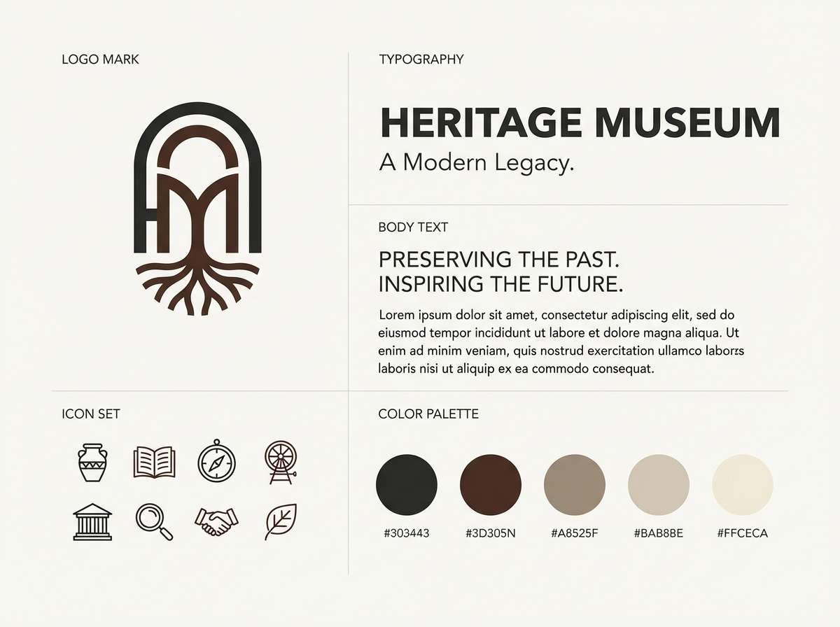
1) Basalt Bone
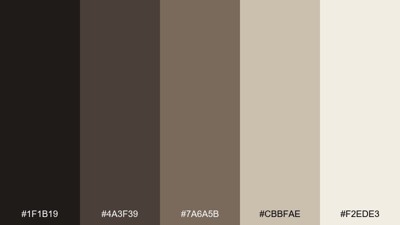
HEX: #1f1b19 #4a3f39 #7a6a5b #cbbfae #f2ede3
Mood: grounded, mineral, quiet
Best for: minimal brand identity for a heritage museum
Grounded and mineral like basalt rock beside weathered bone. Use the near-black and deep brown for typography and logos, then let the bone and off-white open up the negative space. Pair it with uncoated paper textures and subtle grain for authenticity. Tip: keep contrast high by reserving the lightest tone for backgrounds and captions.
Image example of basalt bone generated using media.io
Media.io is an online AI studio for creating and editing video, image, and audio in your browser.

2) Cave Ochre
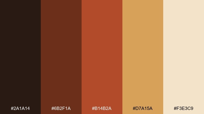
HEX: #2a1a14 #6b2f1a #b14b2a #d7a15a #f3e3c9
Mood: warm, primal, energetic
Best for: event poster for an archaeology exhibit
Warm and primal like ochre handprints on cave walls lit by firelight. These prehistoric color combinations shine on posters, where the rust and terracotta can carry big headlines while sand tones soften the layout. Pair with bold slab serifs or condensed sans fonts for a museum-forward feel. Tip: use the darkest brown as a framing border to keep the warm reds from feeling too loud.
Image example of cave ochre generated using media.io

3) Fossil Sand
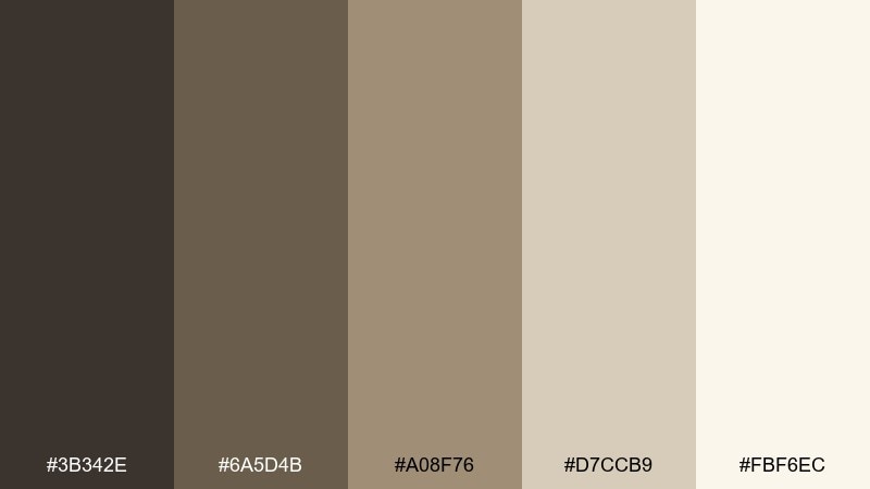
HEX: #3b342e #6a5d4b #a08f76 #d7ccb9 #fbf6ec
Mood: soft, airy, timeworn
Best for: editorial layout for a nature magazine
Soft and timeworn like wind-smoothed dunes over buried fossils. The mid-taupes make steady body text colors, while the pale sand tones keep spreads bright and breathable. Pair with black-and-white photography and thin rules for a quiet, premium look. Tip: let the darkest shade appear only in headings to preserve the airy feel.
Image example of fossil sand generated using media.io
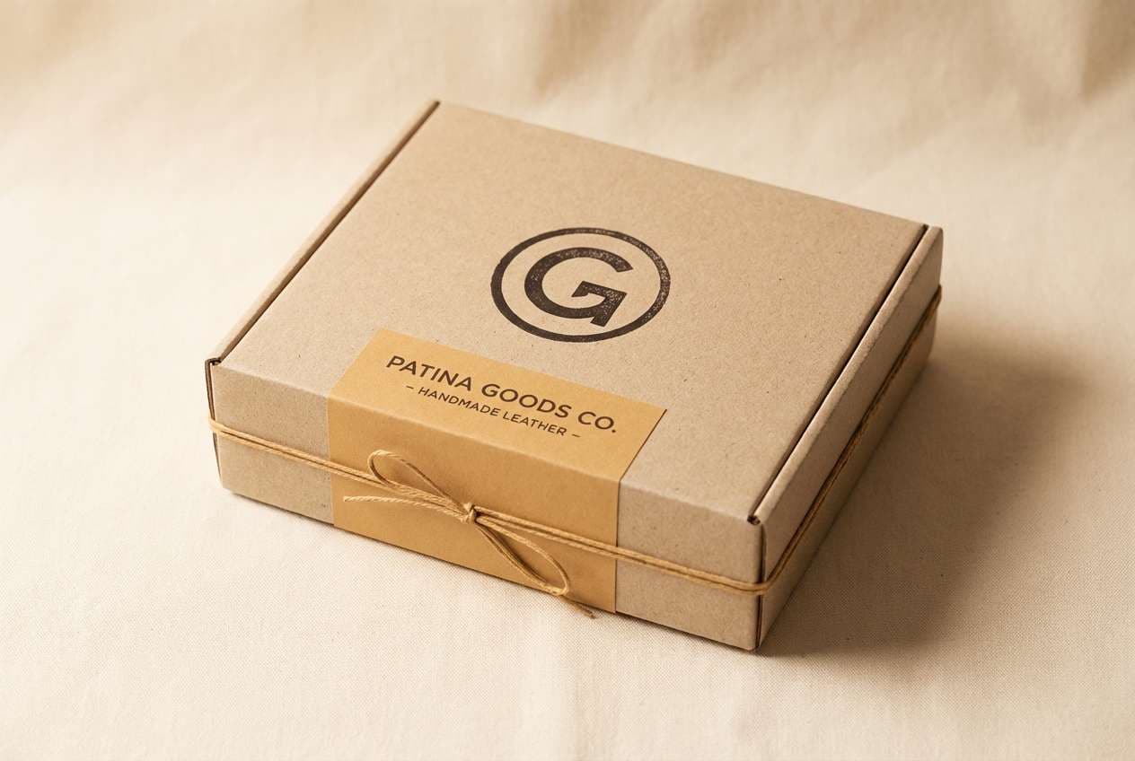
4) Mammoth Hide
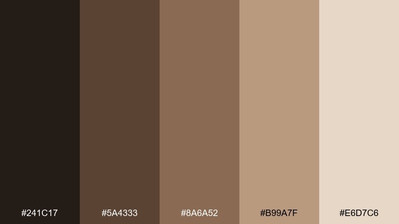
HEX: #241c17 #5a4333 #8a6a52 #b99a7f #e6d7c6
Mood: rugged, tactile, cozy
Best for: packaging for handmade leather goods
Rugged and cozy like worn hide and stitched seams by a campfire. Use the deep espresso for stamps and labels, then layer tan and camel tones for a handcrafted look. Pair with kraft stock, debossing, and simple monograms. Tip: keep the lightest beige for breathing room around the logo so the browns feel intentional, not heavy.
Image example of mammoth hide generated using media.io
5) Flint and Fern
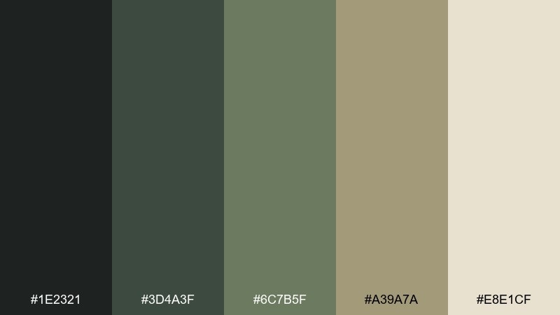
HEX: #1e2321 #3d4a3f #6c7b5f #a39a7a #e8e1cf
Mood: earthy, fresh, resilient
Best for: outdoor brand social ad set
Earthy and resilient like flint stone tucked into fern shade. The greens read natural without turning bright, making them great for lifestyle graphics and product callouts. Pair with clean sans typography and lots of cream space to keep it modern. Tip: use the muted tan as a bridge tone between green blocks and neutral backgrounds.
Image example of flint and fern generated using media.io
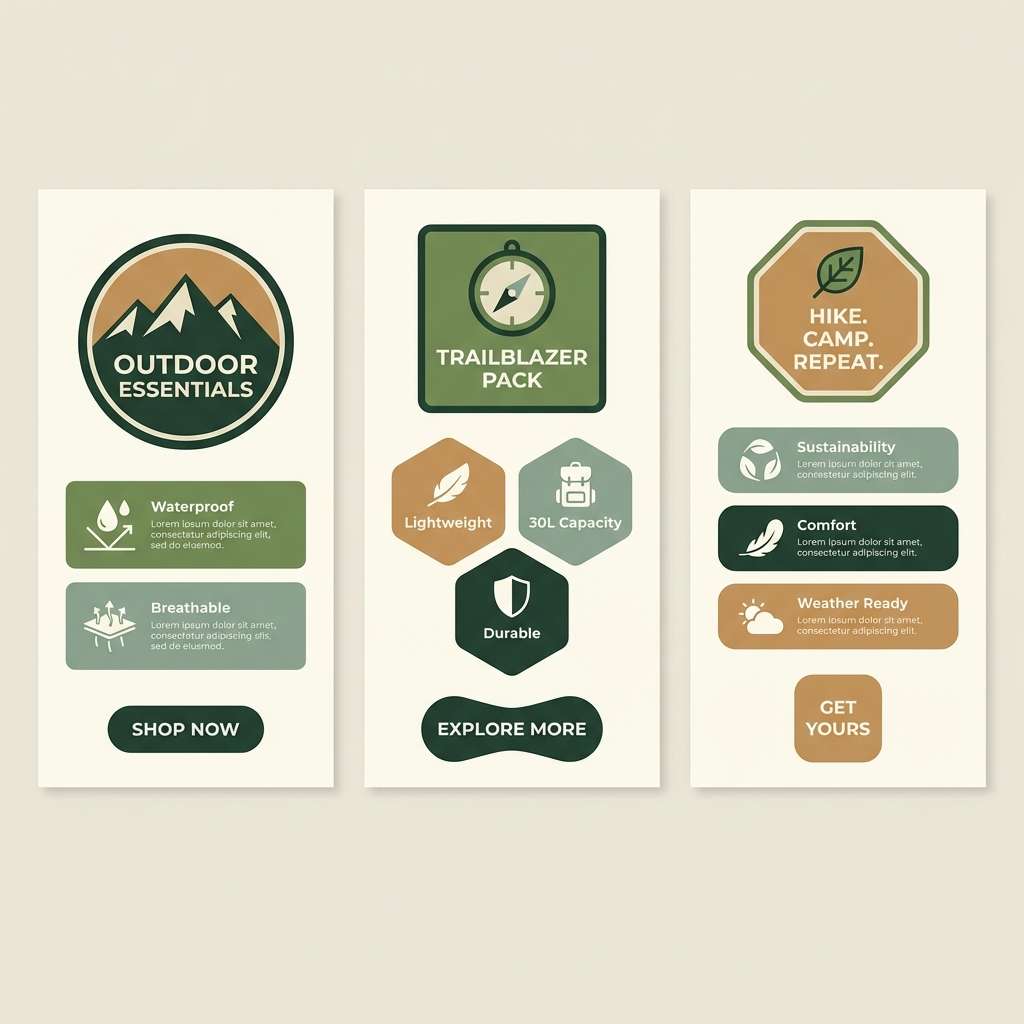
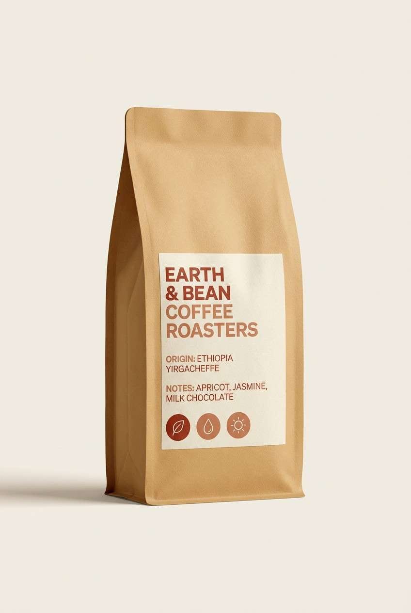
6) Ember Clay
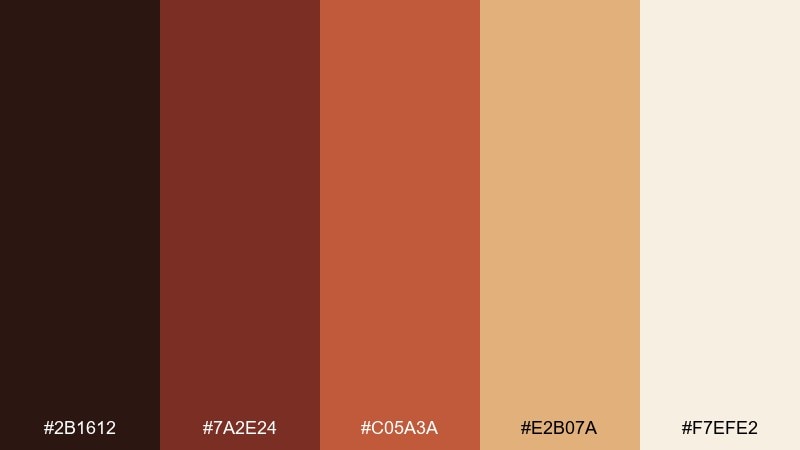
HEX: #2b1612 #7a2e24 #c05a3a #e2b07a #f7efe2
Mood: smoky, bold, artisanal
Best for: coffee label and bag design
Smoky and artisanal like ember glow on wet clay. This prehistoric color palette feels especially strong on packaging, where the burnt reds can carry badges and roast notes. Pair with cream paper, copper foil accents, and simple line illustrations. Tip: keep the darkest tone for small type to prevent the reds from overpowering the label.
Image example of ember clay generated using media.io
7) River Silt
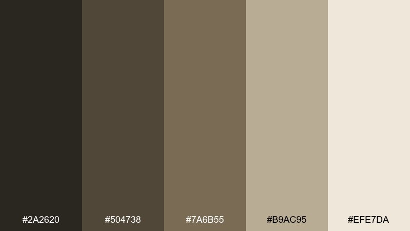
HEX: #2a2620 #504738 #7a6b55 #b9ac95 #efe7da
Mood: muddy, calm, dependable
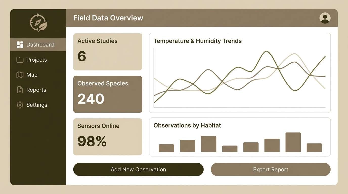
Best for: dashboard UI for a field research app
Calm and dependable like silt settling in slow river water. Use the dark olive-brown for navigation and headers, then layer taupes for cards and dividers. Pair with simple icons and subtle shadows so the interface stays readable in bright outdoor light. Tip: reserve the lightest tone for input fields to guide the eye.
Image example of river silt generated using media.io
8) Paleolithic Pigment
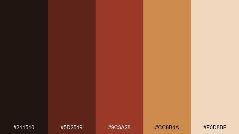
HEX: #211510 #5d2519 #9c3a28 #cc8b4a #f0d8bf
Mood: dramatic, historic, expressive
Best for: album cover for folk music
Dramatic and expressive like ground pigments mixed on stone. The deep wine-browns and brick reds create strong focal points for titles and artwork, while the apricot and pale clay soften the mood. Pair with woodcut-style illustration or hand-drawn type to lean into the story. Tip: keep the mid red as the main accent and let the darker tones do the framing.
Image example of paleolithic pigment generated using media.io
9) Stone Lichen
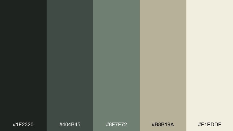
HEX: #1f2320 #404b45 #6f7f72 #b8b19a #f1eddf
Mood: cool, mossy, balanced
Best for: wellness website landing page
Cool and mossy like lichen spreading across shaded stone. The gray-green range is soothing for wellness branding and makes buttons feel calm rather than shouty. Pair with warm neutrals and generous spacing to avoid a gloomy cast. Tip: set headings in the darkest green-gray and use the cream tone for section backgrounds.
Image example of stone lichen generated using media.io
10) Charcoal Tallow
HEX: #141210 #3a2f27 #6a5a4c #b8a996 #f4efe7
Mood: smoky, minimal, understated
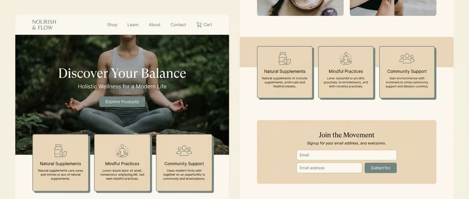
Best for: luxury candle product ad
Smoky and understated like charcoal smudges against warm tallow. These tones feel premium in product advertising, especially when you keep the layout sparse and typography crisp. Pair with matte finishes and a single accent highlight for restraint. Tip: let the off-white be the main canvas so the charcoal reads intentional, not heavy.
Image example of charcoal tallow generated using media.io
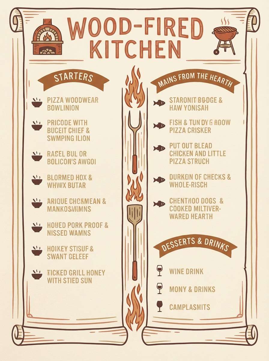
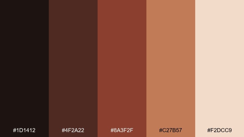
11) Sunbaked Terracotta
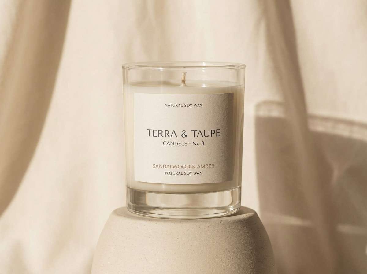
HEX: #2b1711 #6f2f20 #b04f33 #d39a6a #f6e8d7
Mood: sunlit, rustic, inviting
Best for: restaurant menu for a wood-fired kitchen
Sunlit and inviting like terracotta tiles warmed all afternoon. Use the spice browns for section headers, then balance with creamy backgrounds for easy reading. Pair with simple food illustrations and plenty of spacing so the warm reds do not crowd the page. Tip: keep accent rules and icons in the sand tone to soften contrast.
Image example of sunbaked terracotta generated using media.io
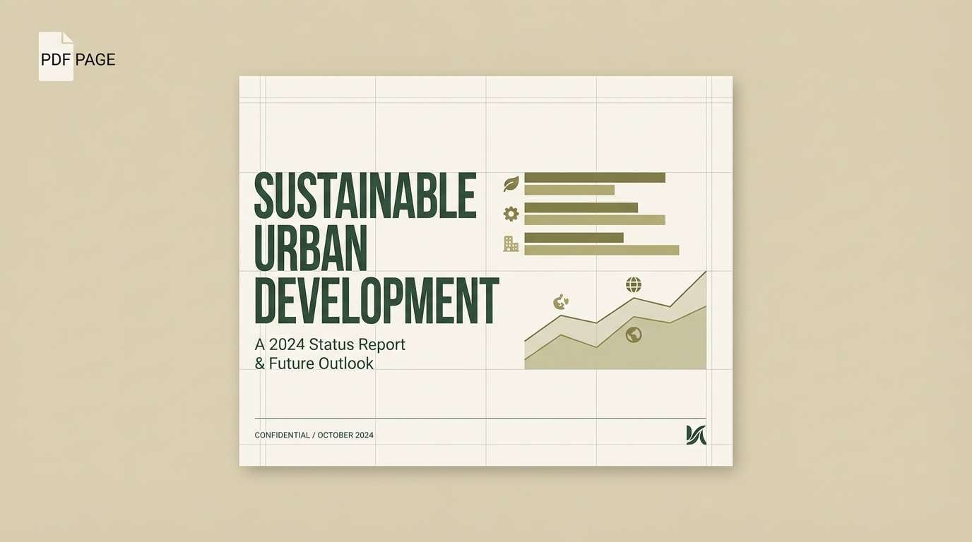
12) Ancient Marsh
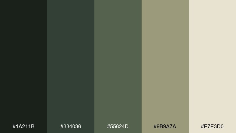
HEX: #1a211b #334036 #55624d #9b9a7a #e7e3d0
Mood: moody, natural, grounded
Best for: eco report PDF layout
Moody and grounded like marsh grass under a low sky. The dark greens make charts and section dividers feel serious, while the warm neutral keeps long pages readable. Pair with simple data visualizations and grayscale photos for a research-forward tone. Tip: use the khaki tone as a consistent highlight for key metrics and callouts.
Image example of ancient marsh generated using media.io
13) Obsidian Dawn
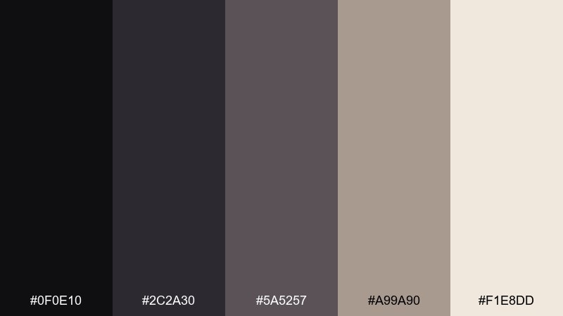
HEX: #0f0e10 #2c2a30 #5a5257 #a99a90 #f1e8dd
Mood: sleek, shadowy, modern
Best for: portfolio website UI for a photographer
Sleek and shadowy like obsidian catching the first pale light. The near-black and graphite tones give galleries a cinematic frame, while the blush-tan neutral keeps it human. Pair with large imagery blocks and minimal UI chrome. Tip: keep buttons in the warm beige so they stand out without breaking the mood.
Image example of obsidian dawn generated using media.io
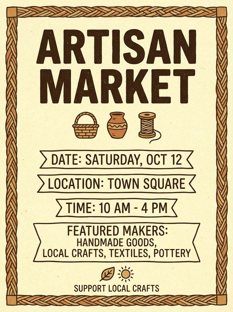
14) Reed Basket
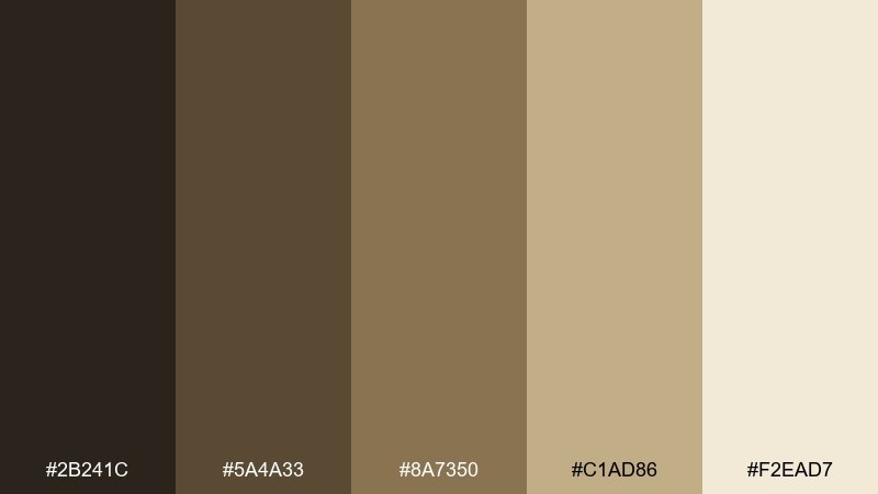
HEX: #2b241c #5a4a33 #8a7350 #c1ad86 #f2ead7
Mood: handmade, warm, wholesome
Best for: artisan market flyer
Handmade and wholesome like woven reeds drying in the sun. The honeyed browns work beautifully for headline type and illustrated borders, while the pale straw tone keeps the flyer friendly. Pair with simple stamp graphics and a rough paper texture. Tip: use the mid tan for icon fills so small details stay legible.
Image example of reed basket generated using media.io
15) Petroglyph Ink
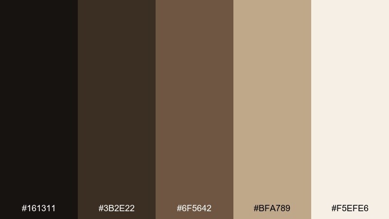
HEX: #161311 #3b2e22 #6f5642 #bfa789 #f5efe6
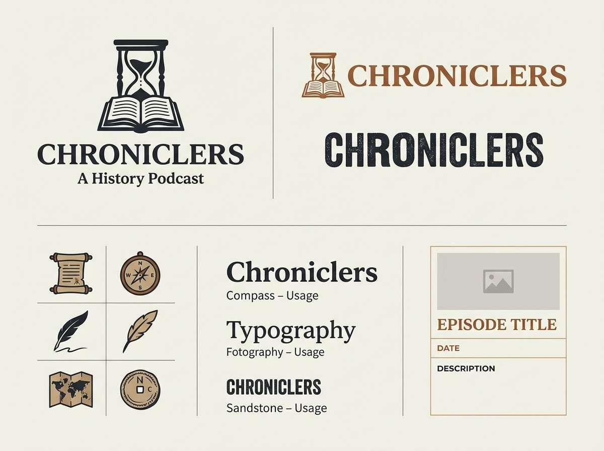
Mood: ancient, graphic, refined
Best for: logo and icon system for a history podcast
Ancient and graphic like petroglyph lines etched into stone. Use the darkest ink tone for the primary mark and the warm brown for secondary icons and dividers. Pair with a serif display face for episode titles and a clean sans for UI labels. Tip: keep the palette mostly neutral and let one brown accent carry emphasis across screens.
Image example of petroglyph ink generated using media.io
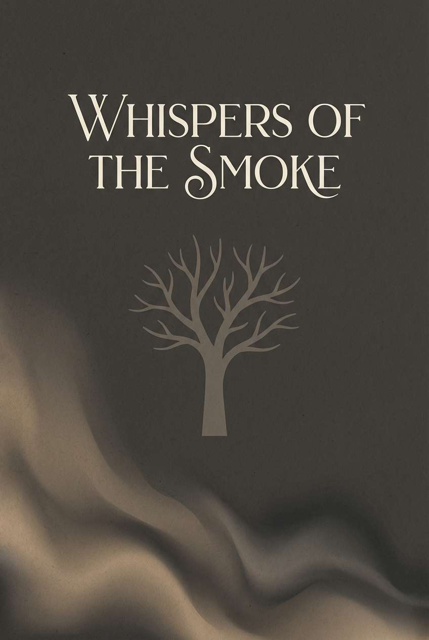
16) Hearth Smoke
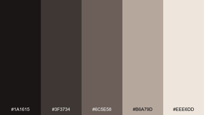
HEX: #1a1615 #3f3734 #6c5e58 #b6a79d #eee6dd
Mood: smoky, intimate, mellow
Best for: book cover for historical fiction
Smoky and intimate like a hearth plume curling into dusk. The warm grays are perfect for mood-driven covers where typography needs to feel classic but not ornate. Pair with a single illustration silhouette and restrained ornament. Tip: set the title in the lightest tone against the darkest background for strong shelf readability.
Image example of hearth smoke generated using media.io
17) Tundra Moss
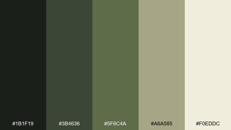
HEX: #1b1f19 #3b4636 #5f6c4a #a6a585 #f0eddc
Mood: cool, rugged, outdoorsy
Best for: product page for hiking gear
Cool and rugged like moss on tundra rock. The olive greens make CTA elements feel outdoorsy without turning neon, while the pale neutral keeps product specs readable. Pair with crisp product photography and simple comparison tables. Tip: use the khaki tone for badges like waterproof or limited edition to avoid color clutter.
Image example of tundra moss generated using media.io
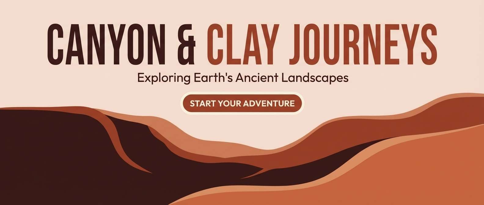
18) Canyon Dusk
HEX: #1d1412 #4f2a22 #8a3f2f #c27b57 #f2dcc9
Mood: cinematic, warm, adventurous
Best for: travel blog header and story graphics
Cinematic and adventurous like canyon walls fading into dusk. These prehistoric color combinations work well for blog headers, highlight blocks, and pull quotes, especially when you want warmth without bright saturation. Pair with wide panoramic imagery and understated UI controls. Tip: keep the terracotta for highlights only and let the pale clay carry the background.
Image example of canyon dusk generated using media.io
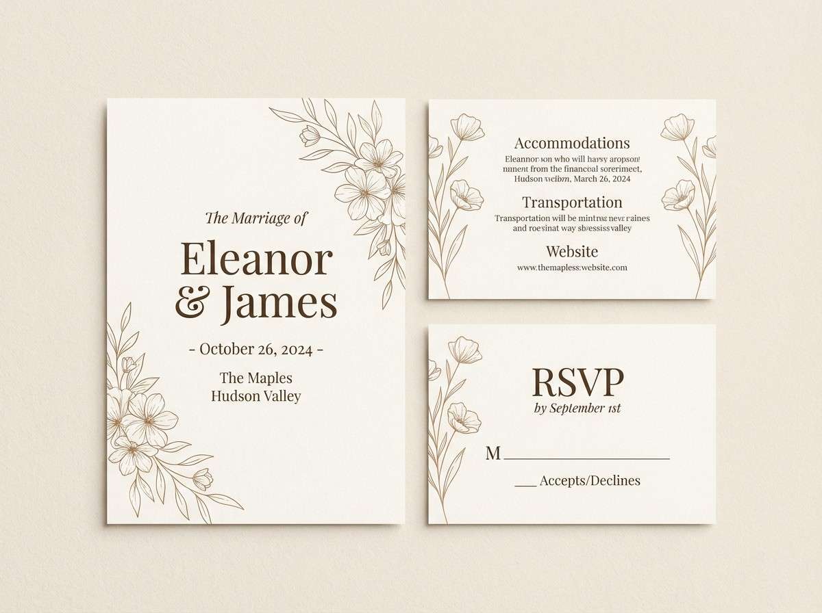
19) Bone Needle
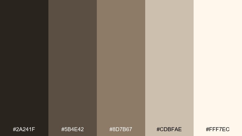
HEX: #2a241f #5b4e42 #8d7b67 #cdbfae #fff7ec
Mood: delicate, antique, calm
Best for: wedding invitation set with vintage styling
Delicate and antique like carved bone tools laid on linen. The soft neutrals give invitations an heirloom feel while staying clean and modern on bright paper. Pair with fine line florals and a classic serif, and keep embellishments minimal. Tip: print the darkest brown in small doses for names and dates, then let the cream tone do the work.
Image example of bone needle generated using media.io
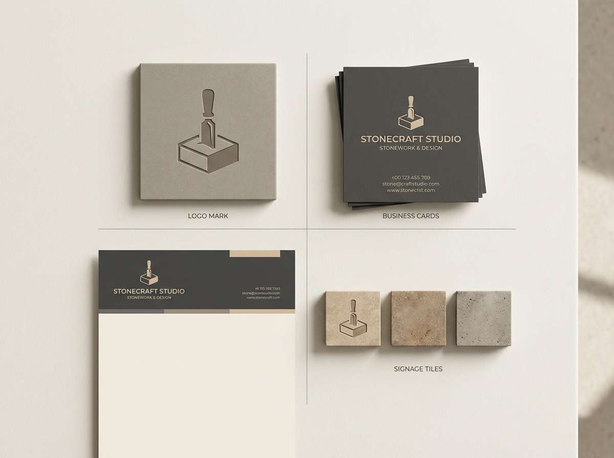
20) Megalith Mist
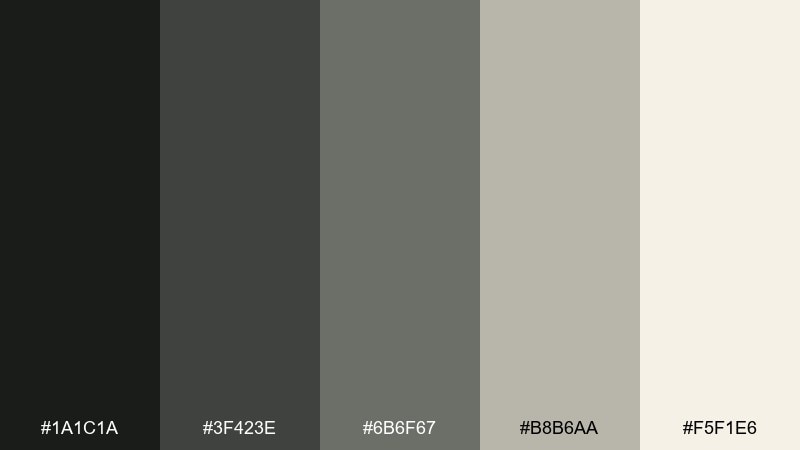
HEX: #1a1c1a #3f423e #6b6f67 #b8b6aa #f5f1e6
Mood: foggy, restrained, timeless
Best for: rebrand concept for a stonework studio
Foggy and timeless like megaliths disappearing into morning mist. This prehistoric color palette suits stone and craft brands that want a quiet, confident presence rather than flashy color. Pair with geometric marks, wide tracking, and textured photography in grayscale. Tip: use the misty light tone for stationery and the darkest charcoal for signage to keep everything cohesive.
Image example of megalith mist generated using media.io
What Colors Go Well with Prehistoric?
Prehistoric palettes pair best with other “material” colors: warm off-whites, parchment creams, stone grays, weathered browns, and charcoal blacks. These keep the scheme believable and easy to balance.
For accent choices, muted greens (sage, moss, lichen) and iron-oxide reds (ochre, rust, terracotta) work especially well because they feel pigment-based rather than synthetic.
If you need a modern counterpoint, add a controlled cool neutral (graphite or deep slate) and keep saturation low so the palette stays grounded.
How to Use a Prehistoric Color Palette in Real Designs
Start with a light bone or cream as your main background, then choose one dark “charcoal” for text and navigation. This simple structure gives you instant readability across web, mobile, and print.
Use mid-tones (taupe, silt, sand) for cards, panels, and dividers, then reserve the warm pigment color (ochre/terracotta/brick) for emphasis like CTA buttons, callouts, or chart highlights.
For print, uncoated stocks and subtle grain help these colors look authentic. For UI, keep contrast intentional by limiting how often the darkest tone appears.
Create Prehistoric Palette Visuals with AI
If you’re presenting a prehistoric color scheme to a client or team, mockups and concept boards make the palette easier to approve. Turning HEX codes into posters, UI sections, labels, and brand boards is often the fastest way to validate “feel.”
With Media.io’s text-to-image generator, you can paste a prompt, specify layout and aspect ratio, and produce consistent visuals that match your earthy color palette direction.
Try generating multiple variants (minimal, editorial, packaging, UI) using the same five colors to see where contrast and hierarchy need adjusting.
Prehistoric Color Palette FAQs
-
What is a prehistoric color palette?
A prehistoric color palette is a set of earthy, pigment-like colors inspired by natural materials—charcoal, clay, ochre, stone, sand, and bone neutrals—often used to create a grounded, timeless look. -
Are prehistoric color combinations good for modern branding?
Yes. Prehistoric color combinations are typically low-saturation and high-utility, so they work well for logos, packaging, and brand systems where you need reliability, warmth, and long-term consistency. -
Which prehistoric colors are best for readable UI?
Use a bone/cream background, a near-black or charcoal for text, and a mid taupe/sand for surfaces. Reserve terracotta/ochre as an accent so buttons and highlights stand out without overpowering the interface. -
How do I keep an earthy palette from looking dull?
Increase contrast (dark text on light backgrounds), add one warmer accent (rust/ochre), and use spacing and typography hierarchy. Texture can help too, but keep it subtle. -
What neutrals match prehistoric tones?
Stone grays, warm taupes, parchment creams, and bone whites match best. They preserve the mineral feel and make the palette easy to apply across print and digital layouts. -
Can I use prehistoric palettes for luxury design?
Absolutely. Charcoal + warm beige + soft cream with restrained accents can feel premium, especially with minimal layouts, matte finishes, and crisp typography. -
How can I visualize these palettes quickly?
Generate brand boards, posters, or UI sections with an AI image tool. With Media.io, you can reuse the same prompt structure and iterate fast until the colors and balance feel right.


