

Grandmillennial style blends heirloom charm with modern polish—think classic patterns, tailored navy, and soft florals that still feel fresh. A grandmillennial color palette makes that balance easy, combining cozy pastels with grounded, traditional darks.
Below are 20+ grandmillennial color combinations with HEX codes you can copy for branding, interiors, packaging, posts, and UI—plus AI prompts you can use to generate matching visuals.
In this article
- Why Grandmillennial Palettes Work So Well
-
- chintz tea party
- navy needlepoint
- sage toile morning
- blush damask
- bamboo rattan
- porcelain blue rose
- lemon curd gingham
- coral cameo
- peacock library
- hydrangea harbor
- antique brass bouquet
- cottage quilt
- palm court preppy
- heirloom ribbon
- vintage vanity
- garden club green
- seaside stripe
- plum parlor
- ivory lace
- tapestry dusk
- rosewater china
- wisteria walk
- What Colors Go Well with Grandmillennial?
- How to Use a Grandmillennial Color Palette in Real Designs
- Create Grandmillennial Palette Visuals with AI
Why Grandmillennial Palettes Work So Well
Grandmillennial palettes feel instantly “lived-in” because they borrow from classic decor—chintz, toile, needlepoint, and vintage ceramics—then sharpen the look with crisp contrast and clean negative space.
They’re also incredibly practical for design: a soft base (ivory, blush, cream) keeps layouts bright, while one or two heritage darks (navy, espresso, charcoal green) make type readable and hierarchy obvious.
Most importantly, these colors communicate warmth and trust. Whether you’re building a brand or a room, grandmillennial tones signal care, tradition, and thoughtful detail without feeling stuck in the past.
20+ Grandmillennial Color Palette Ideas (with HEX Codes)
1) Chintz Tea Party
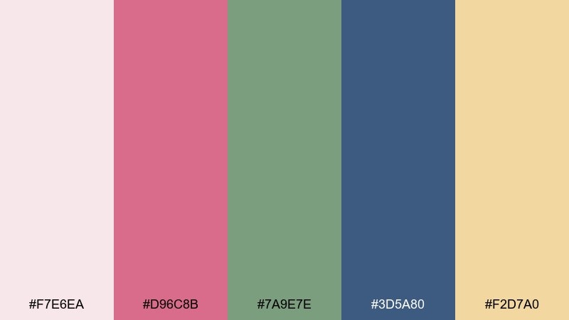
HEX: #F7E6EA #D96C8B #7A9E7E #3D5A80 #F2D7A0
Mood: romantic, cheerful, vintage
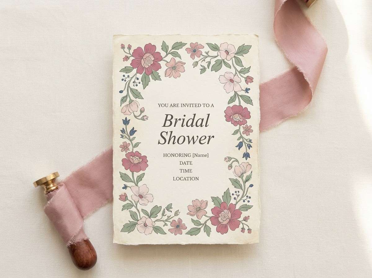
Best for: bridal shower invitation design
Romantic blush and buttery cream feel like printed chintz and fresh-cut peonies on a sunlit table. Pair the rose and sage with navy for crisp type and borders that keep it from going too sweet. Use the cream as the paper base, then reserve the pink for headings and floral motifs. A thin navy rule line makes everything look intentional and heirloom-worthy.
Image example of chintz tea party generated using media.io
Media.io is an online AI studio for creating and editing video, image, and audio in your browser.

2) Navy Needlepoint
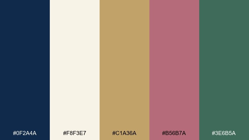
HEX: #0F2A4A #F8F3E7 #C1A36A #B56B7A #3E6B5A
Mood: preppy, polished, timeless
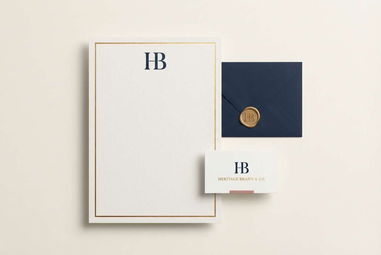
Best for: heritage brand logo and stationery
Deep navy with warm ivory evokes needlepoint pillows, brass frames, and a well-kept foyer. These grandmillennial color combinations work best when navy leads and the gold acts like a subtle metallic highlight. Bring in the dusty rose for seals, icons, or monograms, then ground it with a muted green for supporting accents. Keep plenty of ivory space to make the typography feel upscale.
Image example of navy needlepoint generated using media.io
3) Sage Toile Morning
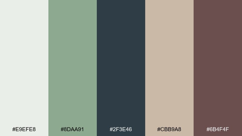
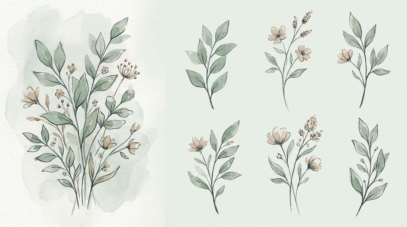
HEX: #E9EFE8 #8DAA91 #2F3E46 #CBB9A8 #6B4F4F
Mood: calm, pastoral, refined
Best for: watercolor botanical print series
Soft sage and misty gray-green feel like toile scenes and quiet garden paths after rain. Let the pale green be the paper tone, then paint foliage in sage with deep charcoal-green for stems and fine lines. The taupe and cocoa notes warm the set so it reads collected, not clinical. For a cohesive series, repeat the dark ink color across every print.
Image example of sage toile morning generated using media.io
4) Blush Damask
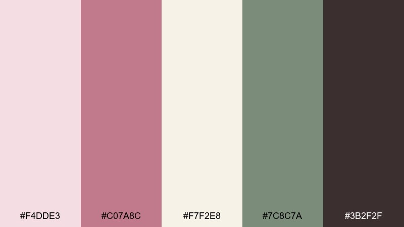
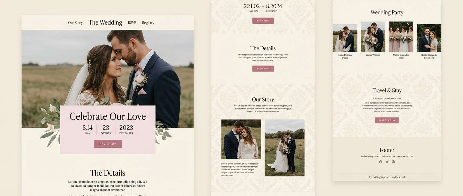
HEX: #F4DDE3 #C07A8C #F7F2E8 #7C8C7A #3B2F2F
Mood: soft, elegant, traditional
Best for: romantic wedding website UI
Powdery blush and warm cream feel like damask wallpaper and silk ribbons. Use the cream for main panels, blush for section breaks, and the deeper rose for buttons and key links. The muted olive keeps the look grounded and pairs beautifully with serif headlines. Limit the dark brown to small text and icons so the page stays airy.
Image example of blush damask generated using media.io
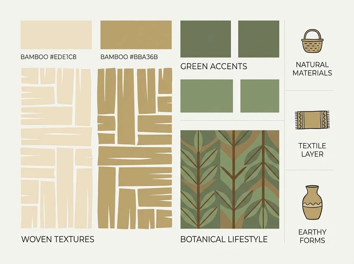
5) Bamboo Rattan
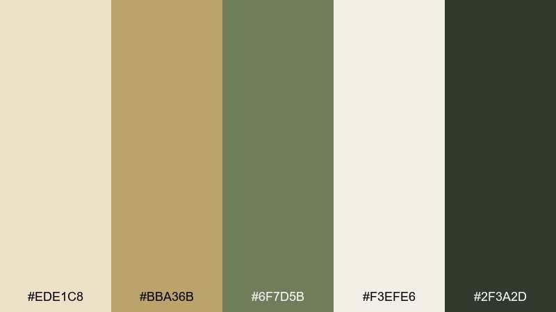
HEX: #EDE1C8 #BBA36B #6F7D5B #F3EFE6 #2F3A2D
Mood: sunny, natural, collected
Best for: home decor moodboard graphic
Warm cane and soft khaki bring to mind rattan chairs, woven shades, and linen napkins. Make the pale oat tone your background, then layer bamboo gold and leafy green for swatches and labels. The dark olive reads like stained wood and adds contrast for small headings. A simple grid layout keeps the textures feeling curated rather than busy.
Image example of bamboo rattan generated using media.io
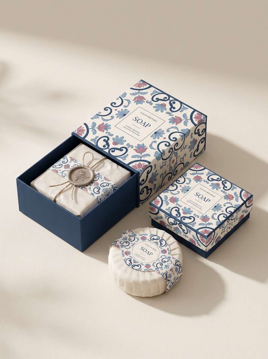
6) Porcelain Blue Rose
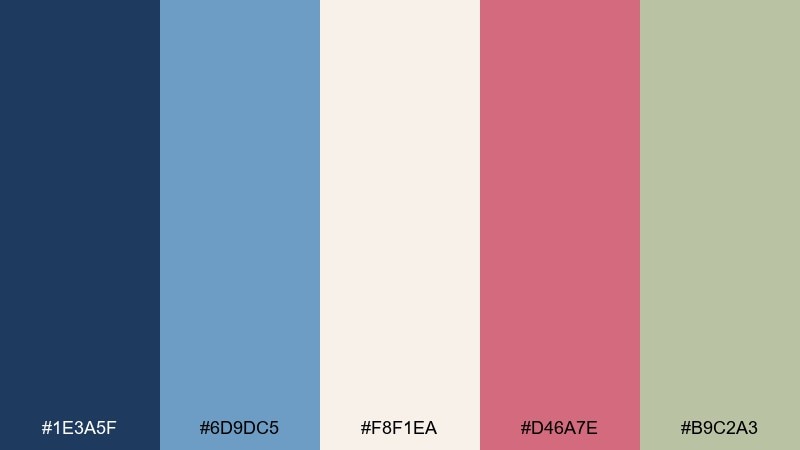
HEX: #1E3A5F #6D9DC5 #F8F1EA #D46A7E #B9C2A3
Mood: fresh, classic, charming
Best for: boutique soap packaging
Cobalt and sky blue feel like porcelain plates stacked beside a vase of roses. This grandmillennial color palette looks best with the cream as the label base and the dark blue reserved for brand marks and ingredient hierarchy. Add the rosy pink as a small floral motif, then soften edges with the muted sage. Print tip: keep the light blue to larger blocks so it does not look washed out.
Image example of porcelain blue rose generated using media.io
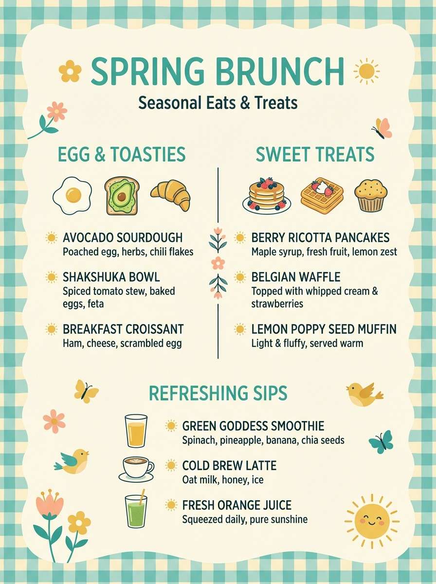
7) Lemon Curd Gingham
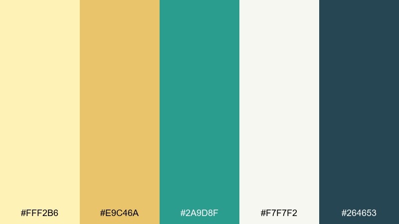
HEX: #FFF2B6 #E9C46A #2A9D8F #F7F7F2 #264653
Mood: bright, playful, tidy
Best for: spring cafe menu design
Buttery yellow with teal feels like gingham tablecloths and lemon curd tarts at brunch. Use off-white for the menu field, then set sections in sunny yellow with teal highlights for prices and callouts. The deep blue-green makes headers readable and keeps the palette from turning childish. A small gingham pattern works best as a border, not a full background.
Image example of lemon curd gingham generated using media.io
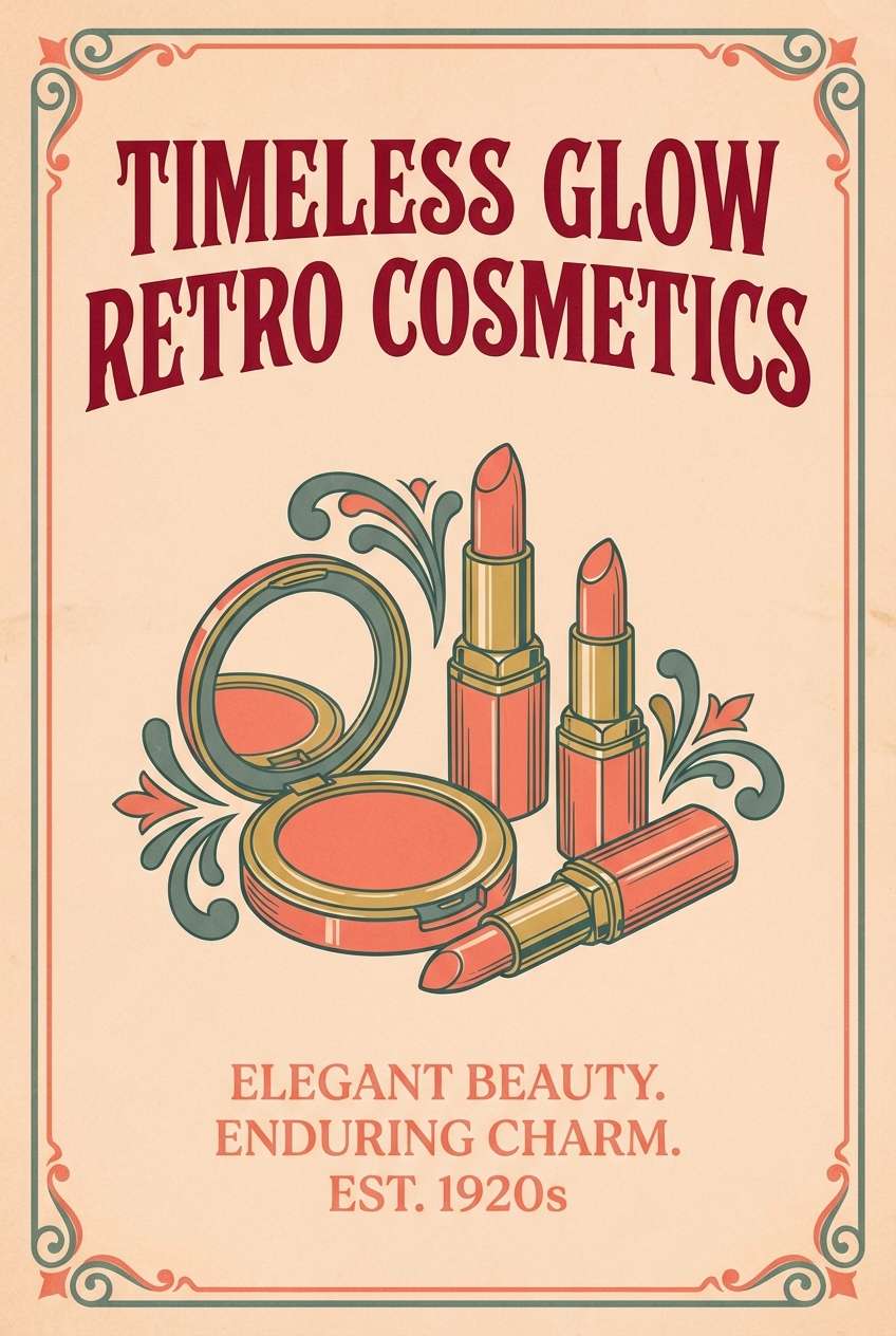
8) Coral Cameo
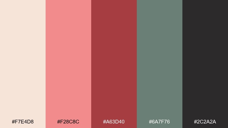
HEX: #F7E4D8 #F28C8C #A63D40 #6A7F76 #2C2A2A
Mood: warm, nostalgic, confident
Best for: beauty product ad poster
Coral blush and oxblood red evoke vintage cameos, lipstick tubes, and softly lit vanity mirrors. Let the pale peach act as negative space, then use coral for the hero product and the deeper red for the headline. The muted green-gray is a smart counterbalance for small captions and fine print. Keep the darkest tone for a single focal element, like a logo stamp.
Image example of coral cameo generated using media.io
9) Peacock Library
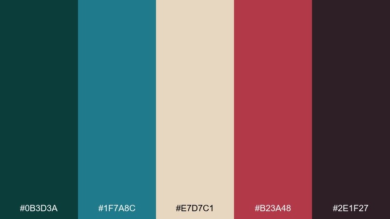
HEX: #0B3D3A #1F7A8C #E7D7C1 #B23A48 #2E1F27
Mood: moody, scholarly, luxe
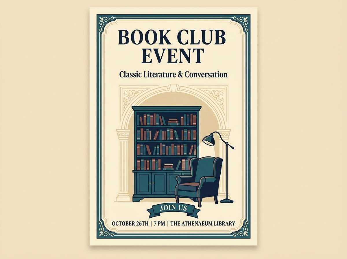
Best for: book club event flyer
Inky teal and wine feel like a paneled library, velvet chairs, and an old hardcover with a ribbon marker. Grandmillennial color combinations shine here when the cream paper tone leads and the dark teal frames the layout. Use peacock blue for section headers, then drop in wine red for dates and RSVP calls to action. A subtle border pattern keeps the flyer traditional without looking dated.
Image example of peacock library generated using media.io
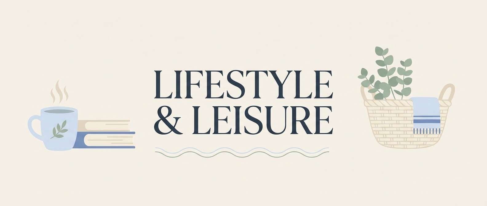
10) Hydrangea Harbor
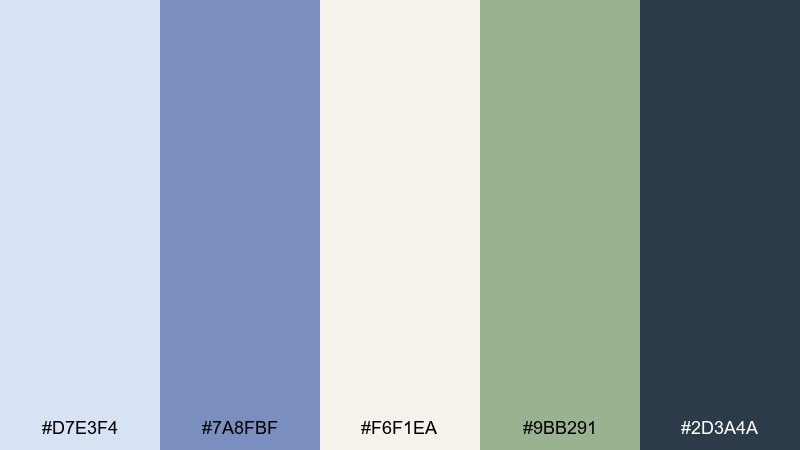
HEX: #D7E3F4 #7A8FBF #F6F1EA #9BB291 #2D3A4A
Mood: breezy, coastal, serene
Best for: lifestyle blog header graphics
Hydrangea blue and airy cream recall seaside cottages, crisp bedding, and salt-bright mornings. Use the pale blue as a banner wash, then set navigation and icons in the deep slate for contrast. The sage-green accent works nicely for category labels and subtle highlights. Tip: keep type mostly slate or navy so the pastel stays clean and legible.
Image example of hydrangea harbor generated using media.io
11) Antique Brass Bouquet
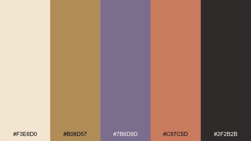
HEX: #F3E6D0 #B08D57 #7B6D8D #C97C5D #2F2B2B
Mood: rich, collected, cozy
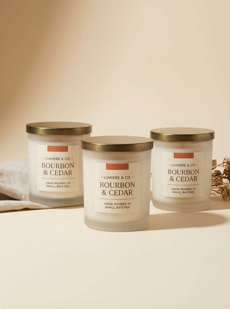
Best for: handmade candle label set
Brassy gold and spiced terracotta feel like antique vases filled with late-summer blooms. Use the creamy tone for labels, then bring in brass for borders and small icons that suggest craft and heritage. The dusty purple adds unexpected depth and pairs beautifully with matte black type. A restrained two-ink look (cream plus brass) can still feel luxurious if the paper texture is right.
Image example of antique brass bouquet generated using media.io
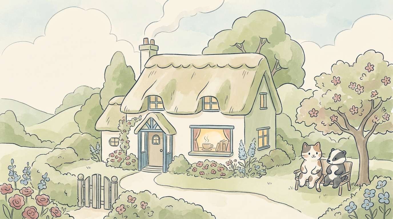
12) Cottage Quilt
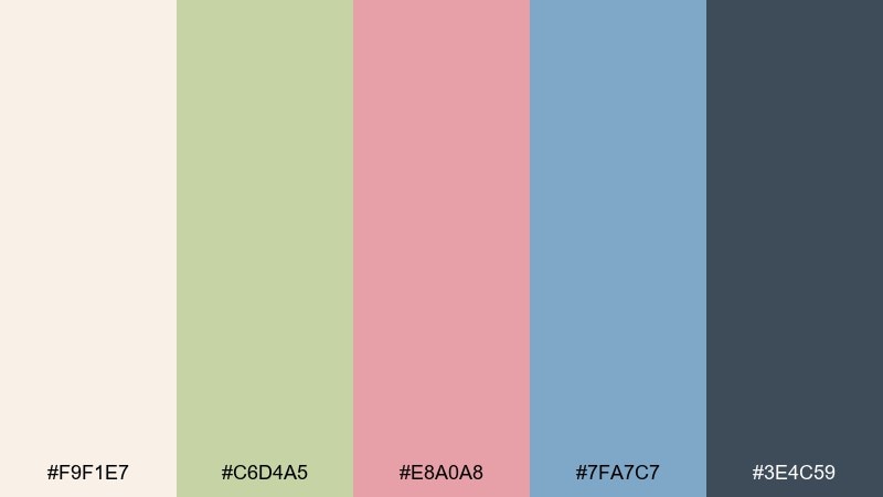
HEX: #F9F1E7 #C6D4A5 #E8A0A8 #7FA7C7 #3E4C59
Mood: wholesome, nostalgic, light
Best for: children's storybook illustration
Pastel pink, leafy green, and gentle blue feel like a patchwork quilt folded at the end of a bed. Build scenes with the cream as the page base, then alternate the soft colors in large shapes to keep it readable. The slate tone is ideal for outlines and small details like buttons or window frames. Use repeating patterns sparingly so the spreads stay calm.
Image example of cottage quilt generated using media.io
13) Palm Court Preppy
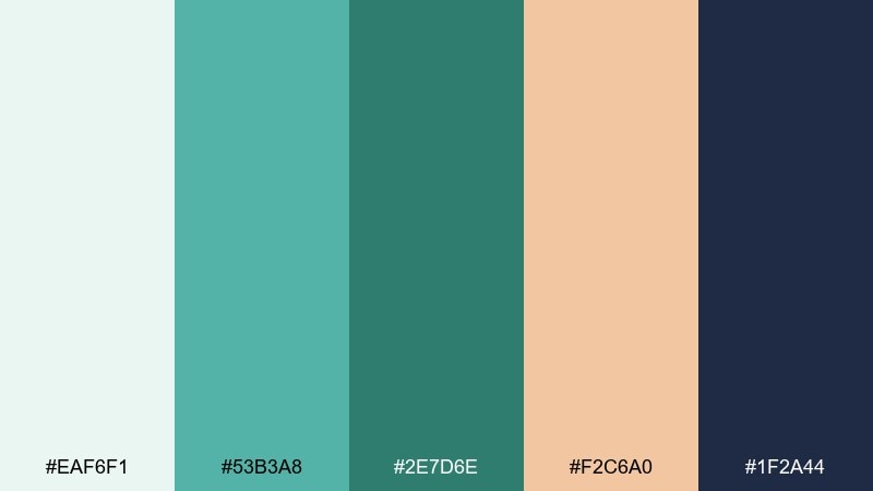
HEX: #EAF6F1 #53B3A8 #2E7D6E #F2C6A0 #1F2A44
Mood: fresh, resort, upbeat
Best for: summer event social media post
Minty aqua and navy evoke a palm-lined courtyard, striped umbrellas, and iced tea in cut glass. Use the pale mint as the canvas, then set the main headline in navy for a punchy, preppy contrast. Peach works best as a small pop for dates, stickers, or a RSVP button. Keep decorative elements geometric to match the sporty vibe.
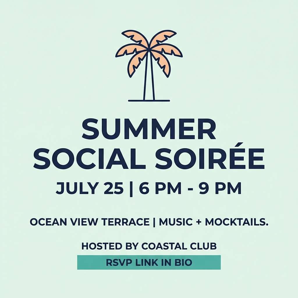
Image example of palm court preppy generated using media.io
14) Heirloom Ribbon
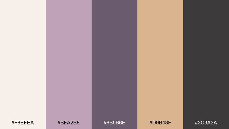
HEX: #F6EFEA #BFA2B8 #6B5B6E #D9B48F #3C3A3A
Mood: graceful, vintage, feminine
Best for: fine jewelry ecommerce UI
Dusty lilac and warm champagne feel like heirloom ribbons tucked in a keepsake box. This grandmillennial color scheme works well when the cream stays dominant and the deeper plum is saved for CTAs and price emphasis. Use the champagne tone for subtle dividers and hover states that suggest metal without turning brassy. Tip: keep product photos neutral so the lavender reads like a soft brand halo.
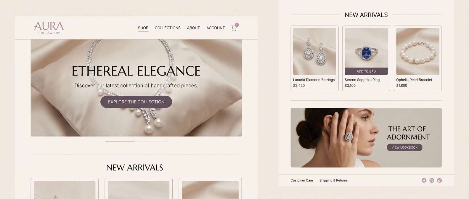
Image example of heirloom ribbon generated using media.io
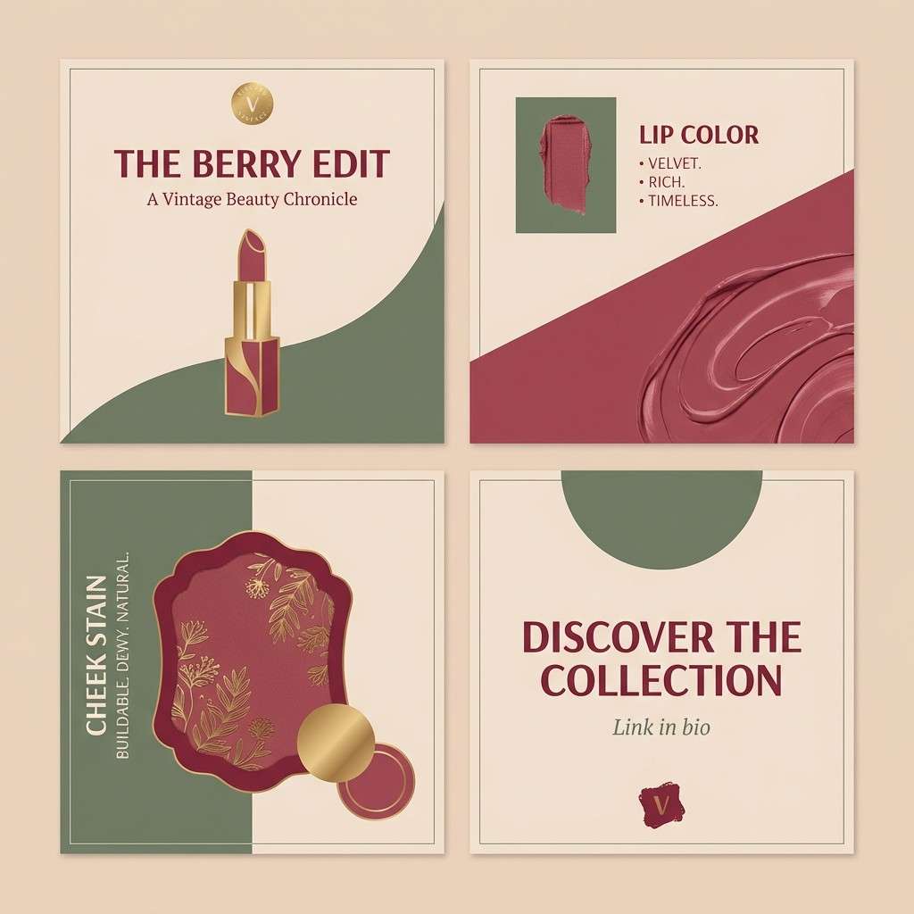
15) Vintage Vanity
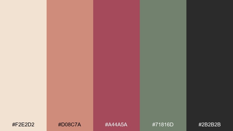
HEX: #F2E2D2 #D08C7A #A44A5A #71816D #2B2B2B
Mood: glam, intimate, nostalgic
Best for: makeup brand Instagram carousel
Warm blush, berry, and soft olive evoke a vintage vanity lit by a shaded lamp. A grandmillennial color palette like this looks strongest with the creamy nude as the base and the berry reserved for the hero shade name and swatches. Use the olive as an unexpected backdrop panel to make the warm tones pop. Keep black limited to microcopy so the carousel stays soft and editorial.
Image example of vintage vanity generated using media.io
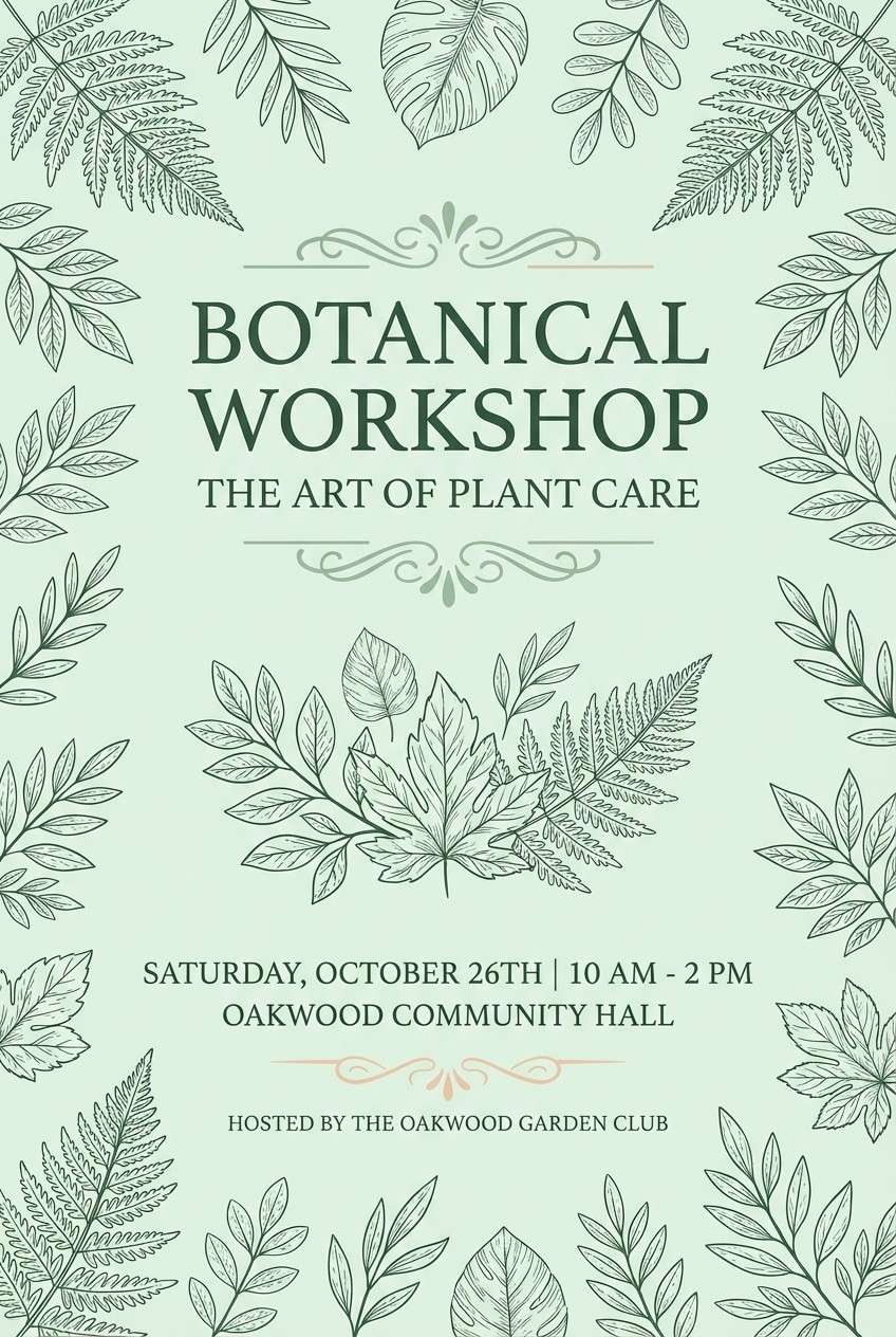
16) Garden Club Green
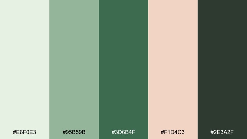
HEX: #E6F0E3 #95B59B #3D6B4F #F1D4C3 #2E3A2F
Mood: fresh, outdoorsy, classic
Best for: botanical workshop poster
Crisp greens with a peachy blush feel like a garden club meeting and a stack of seed packets. Use the pale mint as the poster field, then set the title in deep green for instant readability. The soft peach is perfect for callouts like date, location, or a small badge. Add a simple line-drawn leaf motif to keep the design timeless.
Image example of garden club green generated using media.io
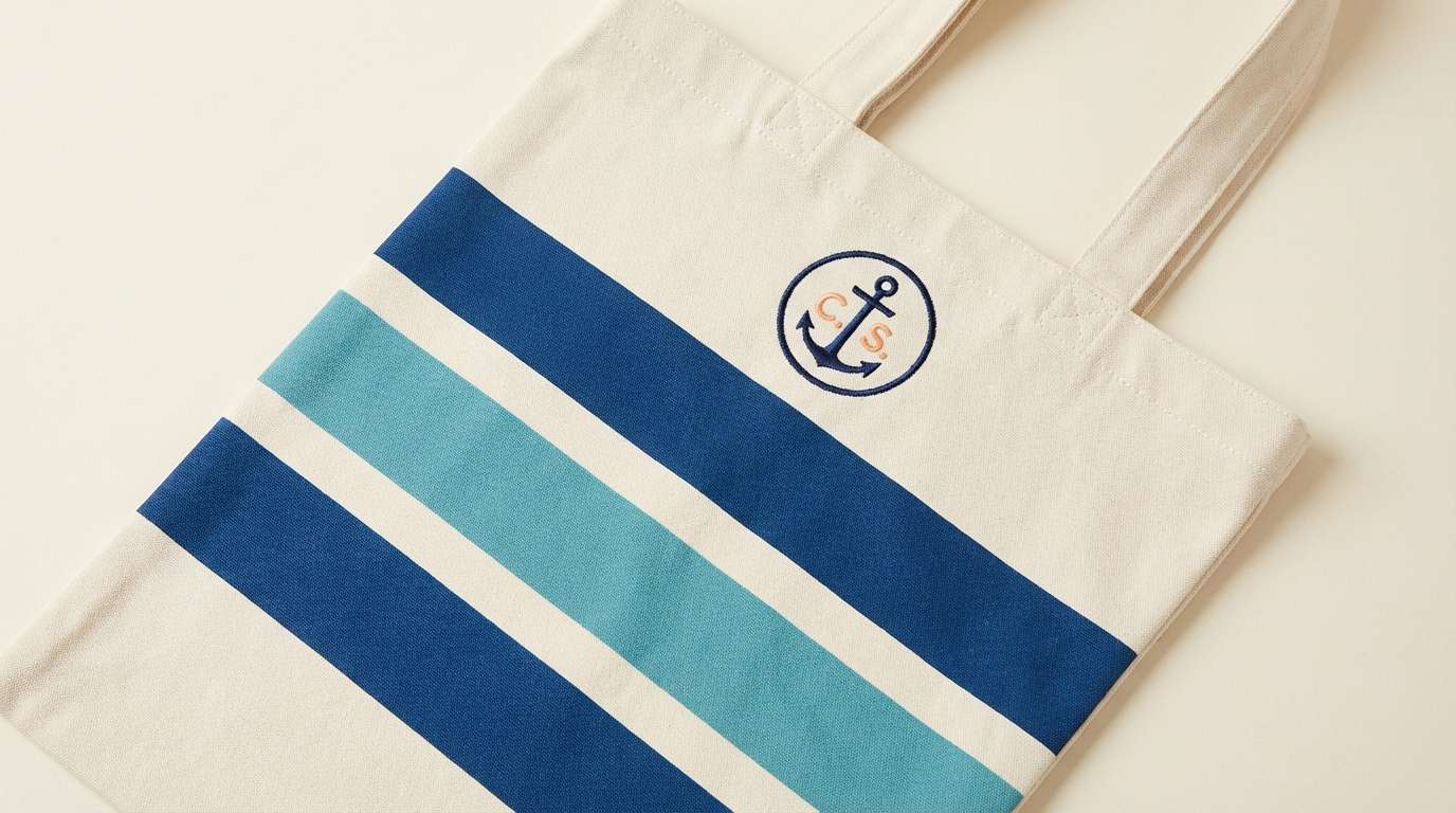
17) Seaside Stripe
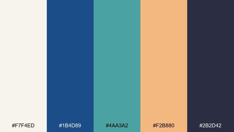
HEX: #F7F4ED #1B4D89 #4AA3A2 #F2B880 #2B2D42
Mood: crisp, coastal, upbeat
Best for: resort tote bag print design
Nautical navy and sea-glass teal feel like striped cabana towels and sun-warmed boardwalks. Use the cream for the base fabric color, then build bold stripes in navy and teal for a classic resort look. The apricot accent is ideal for a small monogram or tag line. Tip: keep stripe widths consistent so the design reads clean from a distance.
Image example of seaside stripe generated using media.io
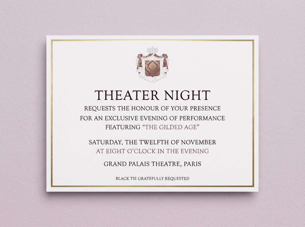
18) Plum Parlor
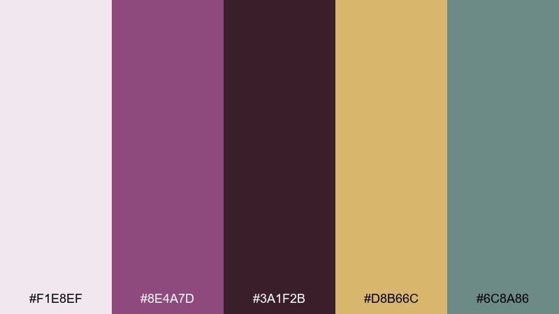
HEX: #F1E8EF #8E4A7D #3A1F2B #D8B66C #6C8A86
Mood: dramatic, velvety, refined
Best for: theater night event invitation
Plum and espresso feel like velvet curtains, gilded frames, and a candlelit parlor before the show. Use the pale lilac as the invitation base, then set the main type in the dark brown for a formal look. Gold works best for borders or small flourishes, while the muted teal-gray can support secondary details. A simple crest motif ties the drama together without becoming ornate.
Image example of plum parlor generated using media.io
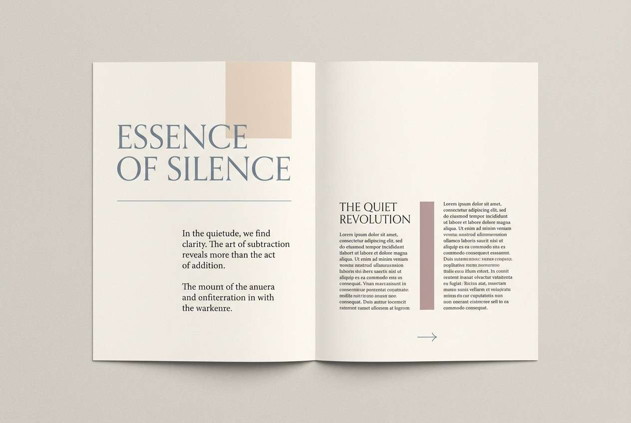
19) Ivory Lace
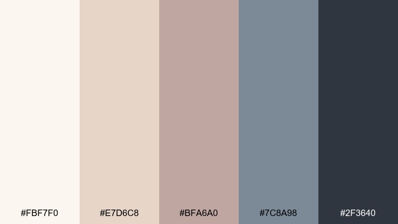
HEX: #FBF7F0 #E7D6C8 #BFA6A0 #7C8A98 #2F3640
Mood: airy, delicate, understated
Best for: minimal editorial magazine spread
Ivory and blush-beige feel like lace curtains and a quiet morning light. Use the soft ivory as the page, then build hierarchy with the slate blue for pull quotes and section labels. The taupe and beige are ideal for subtle blocks behind captions or product notes. Keep the darkest tone to body text to maintain that clean, collected calm.
Image example of ivory lace generated using media.io
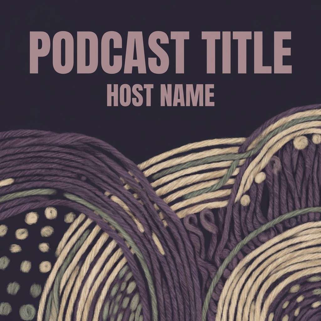
20) Tapestry Dusk
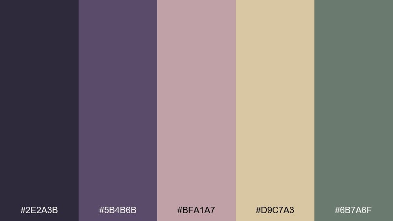
HEX: #2E2A3B #5B4B6B #BFA1A7 #D9C7A3 #6B7A6F
Mood: cozy, artsy, moody
Best for: podcast cover art design
Deep violet and dusty mauve evoke woven tapestry, dim lamps, and thoughtful conversation at dusk. Use the darkest tone as the background so the mauve title lettering stands out without shouting. The wheat and sage tones make great supporting shapes for badges or episode numbers. Tip: keep the typography bold and simple to avoid clutter in small thumbnails.
Image example of tapestry dusk generated using media.io
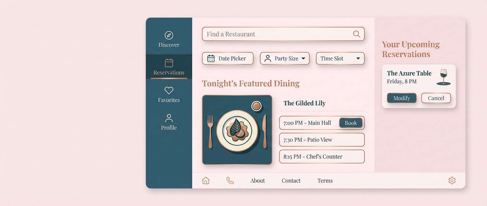
21) Rosewater China
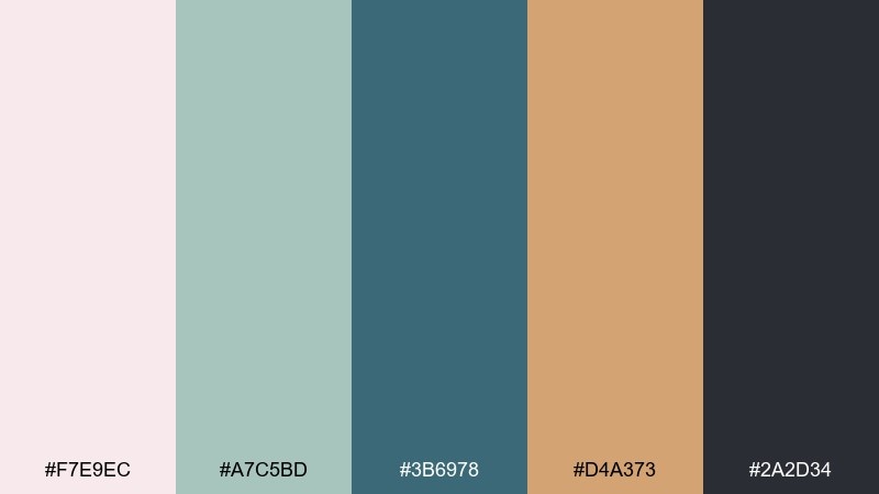
HEX: #F7E9EC #A7C5BD #3B6978 #D4A373 #2A2D34
Mood: clean, graceful, slightly coastal
Best for: restaurant reservation app UI
Rosewater pink with sea-glass green feels like fine china in a bright dining room. Use the pale blush for screen backgrounds, then set navigation in the deep teal for clarity. The warm caramel accent is ideal for highlights like selected dates, ratings, or special offers. Keep the darkest tone for text to preserve that polished, calm look.
Image example of rosewater china generated using media.io
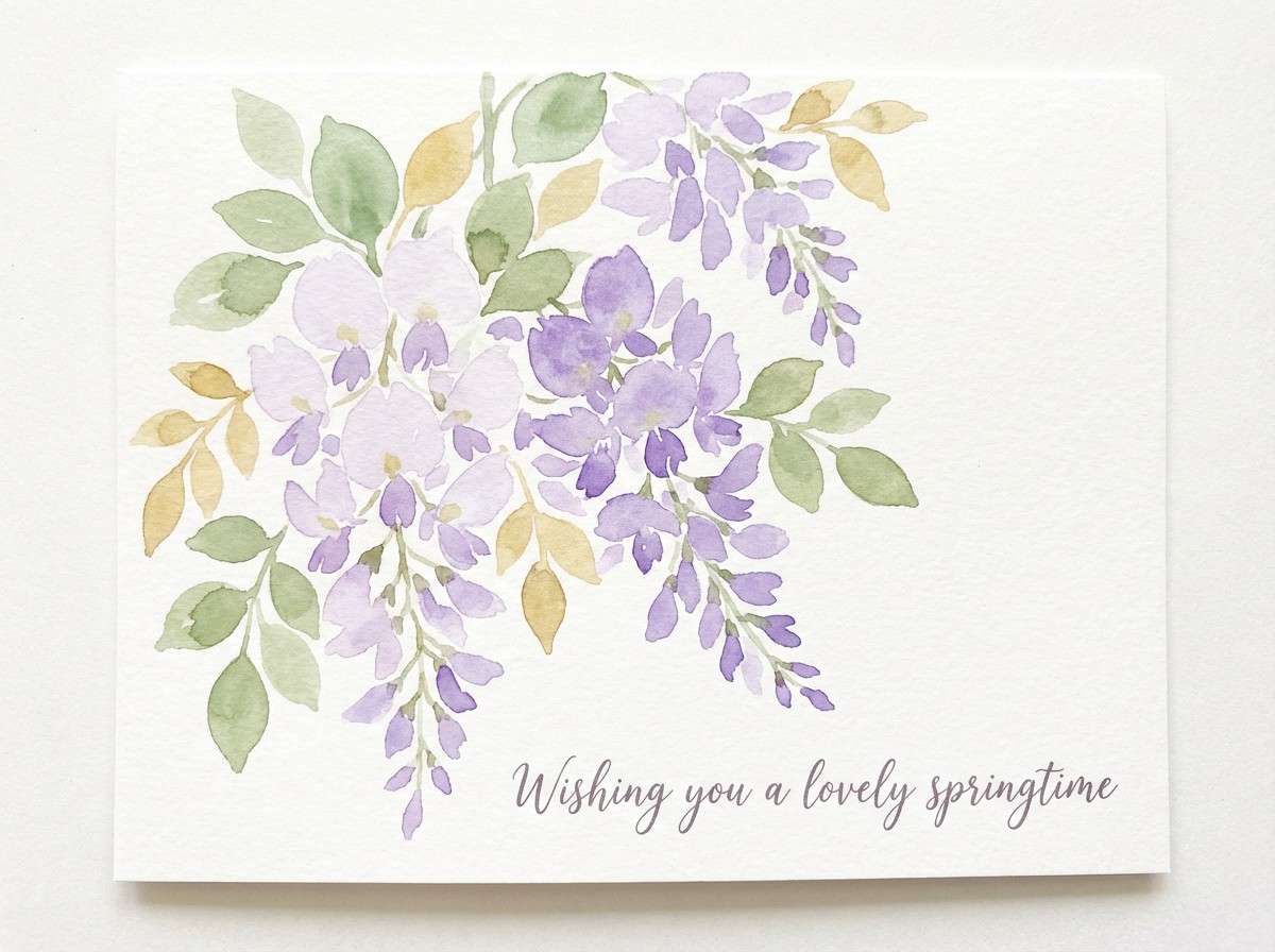
22) Wisteria Walk
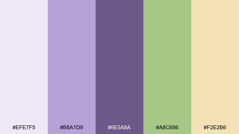
HEX: #EFE7F5 #B8A1D9 #6E5A8A #A8C686 #F2E2B6
Mood: dreamy, springtime, gentle
Best for: watercolor floral greeting card
Lavender and buttercream feel like wisteria vines drifting over a garden gate. Paint the background in the pale lilac wash, then layer blossoms in the mid purple and deepen shadows with the muted violet. The soft green brings the stems to life, while the buttery yellow adds warmth to petals and highlights. Tip: keep the linework minimal so the colors stay the star.
Image example of wisteria walk generated using media.io
What Colors Go Well with Grandmillennial?
Grandmillennial style pairs best with classic anchors like navy, deep teal, espresso brown, and charcoal green—these give vintage-inspired pastels the structure they need to feel tailored instead of overly sweet.
For light, cozy balance, reach for warm neutrals such as ivory, cream, oatmeal, blush-beige, and soft champagne. These tones mimic paper, linen, and painted trim, which is why they look so “at home” in grandmillennial schemes.
To keep the look fresh, add one unexpected accent—apricot, brass-gold, sea-glass teal, or dusty plum—then repeat it in small doses across borders, icons, or pattern details.
How to Use a Grandmillennial Color Palette in Real Designs
Start with a light base color for breathing room (cream, ivory, pale blush), then choose one dark heritage tone for typography and contrast. This single decision makes grandmillennial palettes work beautifully for web UI, invitations, and print.
Next, assign your mid-tones to roles: one “friendly” pastel for large blocks, and one muted green/blue for supporting labels, dividers, or secondary buttons. Keeping roles consistent across assets makes the style feel collected and intentional.
Finally, use pattern thoughtfully. A tiny gingham border, toile line art, or damask-inspired motif reads grandmillennial fast—but it looks most modern when it’s used as an accent, not a full background.
Create Grandmillennial Palette Visuals with AI
If you already have HEX codes, you can turn them into matching visuals by describing a classic subject (stationery, packaging, wallpaper, UI) and specifying which colors should dominate vs. accent.
For best results, mention materials and style cues—“cream paper,” “elegant serif typography,” “porcelain-inspired pattern,” “needlepoint vibe,” or “toile illustration”—to push the image toward that cozy-chic, heritage look.
Generate a few variations, then keep the strongest composition and reuse the prompt as a template for a full set (flyer, post, banner, label) that feels consistent.
Grandmillennial Color Palette FAQs
-
What is a grandmillennial color palette?
A grandmillennial color palette is a cozy-traditional set of hues inspired by heirloom decor (toile, chintz, needlepoint, porcelain) and updated with cleaner contrast—often pairing warm creams and pastels with navy, deep green, plum, or espresso. -
Are grandmillennial colors the same as preppy pastels?
They overlap, but grandmillennial tones usually add more vintage warmth and collected neutrals (ivory, beige, brass, cocoa) plus classic patterns. Preppy pastels tend to feel brighter and sportier, with crisper contrasts. -
What’s the best dark color to anchor a grandmillennial scheme?
Navy is the most versatile anchor because it looks timeless in print and digital and pairs easily with blush, sage, butter yellow, and cream. Deep teal and espresso are great alternatives when you want a moodier, more library-like feel. -
How do I keep grandmillennial palettes from looking dated?
Use plenty of negative space, limit patterns to small accents (borders or icons), and keep typography modern and readable. A single strong dark text color with restrained pastels will feel fresh and intentional. -
Do grandmillennial palettes work for modern brands?
Yes—especially for boutique retail, weddings, hospitality, lifestyle blogs, skincare, candles, and home goods. The style signals trust, craftsmanship, and warmth while still looking polished when applied with clear hierarchy. -
What finishes and materials match grandmillennial colors in print?
Uncoated or lightly textured paper, soft-touch lamination, foil in antique gold/brass, and subtle embossing all complement grandmillennial palettes. Keep metallics as highlights so they feel refined rather than flashy. -
Can I generate grandmillennial-style images with AI using HEX codes?
Yes. Include the HEX colors in your prompt, specify which should be dominant vs. accents, and add cues like “elegant serif typography,” “chintz floral,” “toile illustration,” or “porcelain pattern” to push the aesthetic.
Next: Magnolia Color Palette


