A strong portfolio color palette does more than look “nice”—it quietly sets expectations about your taste, your craft, and how polished your work feels. The right mix of neutrals and accents can make case studies easier to scan and your CTAs easier to trust.
Below are 20+ portfolio color scheme ideas (with HEX color codes) you can copy, tweak, and visualize for websites, resumes, decks, and personal branding.
In this article
- Why Portfolio Palettes Work So Well
-
- midnight linen
- studio concrete
- gallery sage
- ink and coral
- terracotta proof
- soft peach grid
- sea glass resume
- bronze blueprint
- plum notebook
- forest paper
- cobalt accent
- sandstone mono
- cherry on slate
- aurora mint
- mocha canvas
- sunset type
- icy lavender
- vintage cyanotype
- olive ledger
- rose quartz code
- clay and cloud
- What Colors Go Well with Portfolio?
- How to Use a Portfolio Color Palette in Real Designs
- Create Portfolio Palette Visuals with AI
Why Portfolio Palettes Work So Well
Portfolio design colors do a lot of heavy lifting: they create hierarchy, guide attention, and help visitors understand what matters first (role, outcomes, and key visuals). When your palette is consistent, your work looks more cohesive even across different projects.
Most great portfolio color combinations lean neutral for the base (so content stays readable) and use one intentional accent for actions and highlights. This approach keeps the UI calm while still feeling branded.
Finally, a reliable color scheme reduces friction: clean contrast improves accessibility, while repeated accent usage trains the eye to recognize links, buttons, and interactive states instantly.
20+ Portfolio Color Palette Ideas (with HEX Codes)
1) Midnight Linen
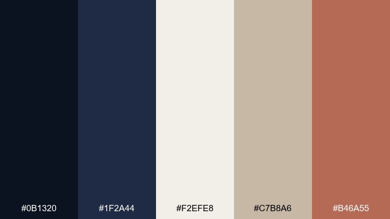
HEX: #0b1320 #1f2a44 #f2efe8 #c7b8a6 #b46a55
Mood: refined, calm, editorial
Best for: 2d ui portfolio homepage mockup
Refined and calm like linen under late-night studio light, these tones balance deep ink blues with warm, tactile neutrals. Use the dark shades for headers and navigation, then let the linen and sand carry body sections and whitespace. Terracotta works best as a restrained accent for buttons, tags, or key links. Tip: keep contrast high by pairing #0b1320 text over #f2efe8 for a crisp, print-like feel.
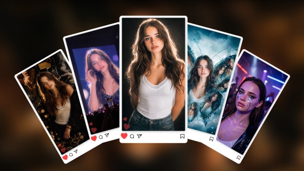
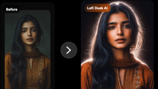
Image example of midnight linen generated using media.io
Media.io is an online AI studio for creating and editing video, image, and audio in your browser.

2) Studio Concrete
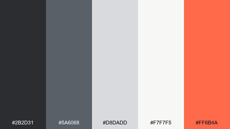
HEX: #2b2d31 #5a6068 #d8dadd #f7f7f5 #ff6b4a
Mood: industrial, modern, energetic
Best for: graphic design poster on plain background
Industrial and modern, this set feels like concrete walls, soft daylight, and a punchy neon marker. Build layouts with the grays for type hierarchy and structure, then let the warm off-white open up the negative space. The orange-red is strongest as a focal element for calls to action or a single headline line. Tip: limit the accent to one or two shapes so the palette stays sophisticated, not sporty.
Image example of studio concrete generated using media.io
3) Gallery Sage
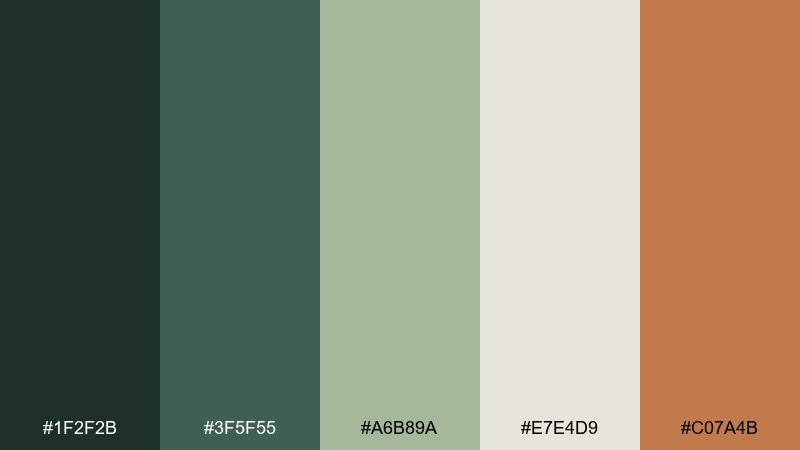
HEX: #1f2f2b #3f5f55 #a6b89a #e7e4d9 #c07a4b
Mood: earthy, curated, calm
Best for: brand identity kit layout on plain background
Earthy and curated, these greens and warm neutrals evoke a quiet gallery with natural wood frames. Use the deep green-black for logos and titles, and let sage and oatmeal fill backgrounds and panels. The copper tone is perfect for seals, icons, or a single highlight line in a brand kit. Tip: pair the copper with plenty of #e7e4d9 space to keep the look premium.
Image example of gallery sage generated using media.io
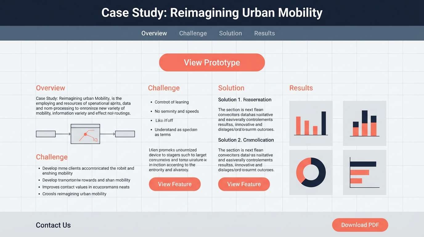
4) Ink and Coral
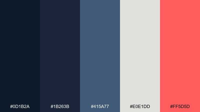
HEX: #0d1b2a #1b263b #415a77 #e0e1dd #ff5d5d
Mood: confident, clean, high-contrast
Best for: 2d ui case study page mockup
Confident and clean, the inky blues feel like a crisp blazer, while coral adds a modern creative spark. Use the darkest shade for primary text and nav, and reserve the pale gray for generous section backgrounds. Coral works best for one action color across the UI, such as links and progress states. Tip: soften large dark blocks with #415a77 to avoid a heavy top-of-page feel.
Image example of ink and coral generated using media.io
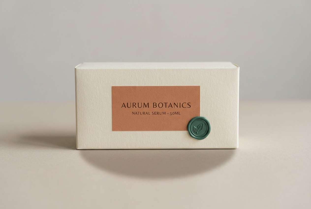
5) Terracotta Proof
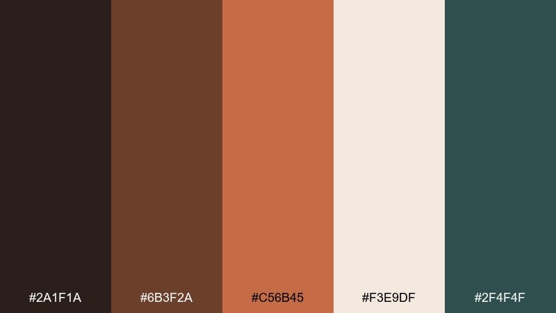
HEX: #2a1f1a #6b3f2a #c56b45 #f3e9df #2f4f4f
Mood: craft, warm, grounded
Best for: realistic packaging mockup in studio
Warm and grounded like clay, espresso, and weathered paper, this mix suits craft-forward brands. Use the cream as the packaging base, then layer terracotta tones for labels and illustration details. The deep teal-green is a smart contrast for ingredient lists or small badges. Tip: keep typography in #2a1f1a for readability and a handmade, premium finish.
Image example of terracotta proof generated using media.io
6) Soft Peach Grid
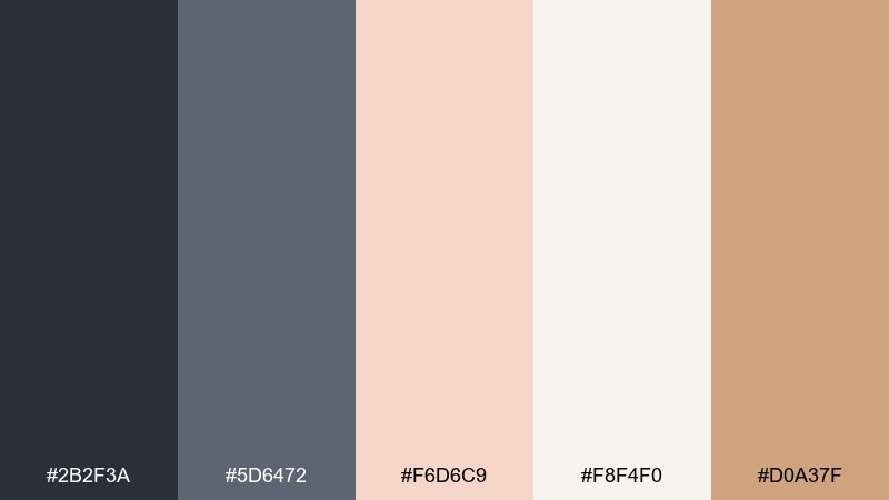
HEX: #2b2f3a #5d6472 #f6d6c9 #f8f4f0 #d0a37f
Mood: friendly, airy, understated
Best for: event flyer design on plain background
Friendly and airy, these tones feel like blush paper, graphite pencil, and soft studio lighting. Let the near-white carry most of the canvas, then build structure with the slate grays for type and grid lines. Peach and warm tan add approachability for dates, callouts, or small icons. Tip: use peach behind key text blocks to guide the eye without shouting.
Image example of soft peach grid generated using media.io

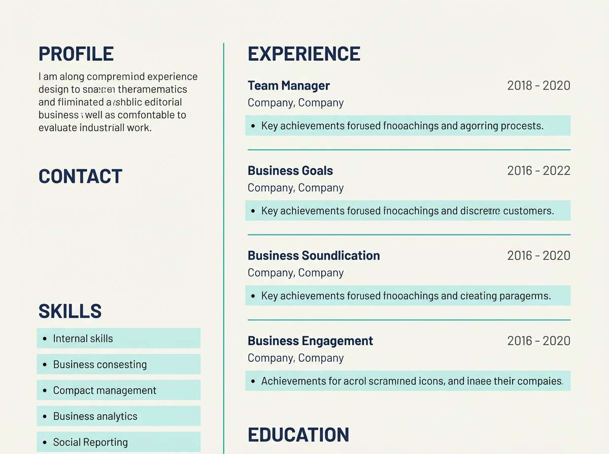
7) Sea Glass Resume
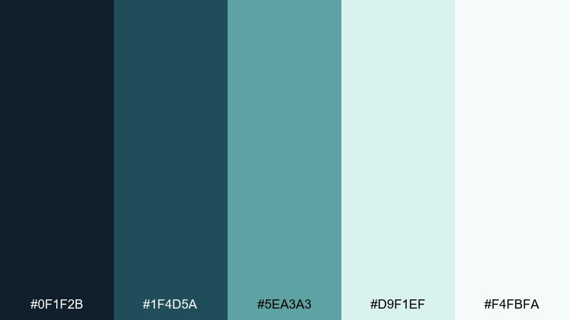
HEX: #0f1f2b #1f4d5a #5ea3a3 #d9f1ef #f4fbfa
Mood: fresh, trustworthy, serene
Best for: editorial resume page layout
Fresh and serene, these sea-glass blues evoke coastal light and clear water. Use the deep navy for headings and body text, then bring in teal for section dividers and small icons. The pale aqua and near-white keep the page open and readable for long-form content. Tip: reserve #5ea3a3 for skill bars or timelines so the layout stays calm and professional.
Image example of sea glass resume generated using media.io
8) Bronze Blueprint
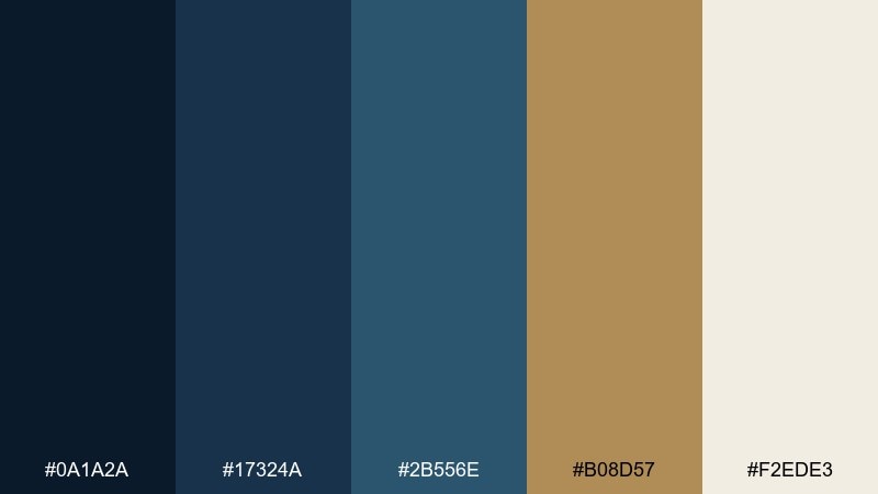
HEX: #0a1a2a #17324a #2b556e #b08d57 #f2ede3
Mood: premium, technical, composed
Best for: 2d ui dashboard mockup
Premium and composed, this set reads like a blueprint drawn in ink with a bronze ruler on ivory paper. The layered blues create clear hierarchy for panels, charts, and sidebars without turning loud. Bronze makes a sharp highlight for active states, key metrics, or small badges in a portfolio color scheme built for credibility. Tip: keep bronze on dark backgrounds for maximum pop and a polished look.
Image example of bronze blueprint generated using media.io
9) Plum Notebook
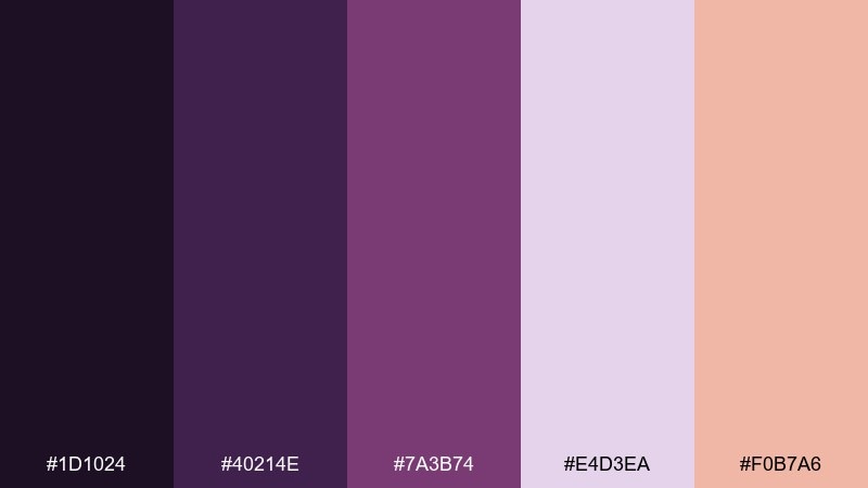
HEX: #1d1024 #40214e #7a3b74 #e4d3ea #f0b7a6
Mood: creative, moody, playful
Best for: social media carousel graphic on plain background
Moody and playful, these plum tones feel like a sketchbook margin filled with ink and pastel highlighter. Use the darkest purple for bold headlines and let lavender soften secondary panels and captions. The peach accent is ideal for one repeating element, like slide numbers or a simple icon set. Tip: avoid placing long paragraphs on the darkest purple; keep it for short, punchy text.
Image example of plum notebook generated using media.io
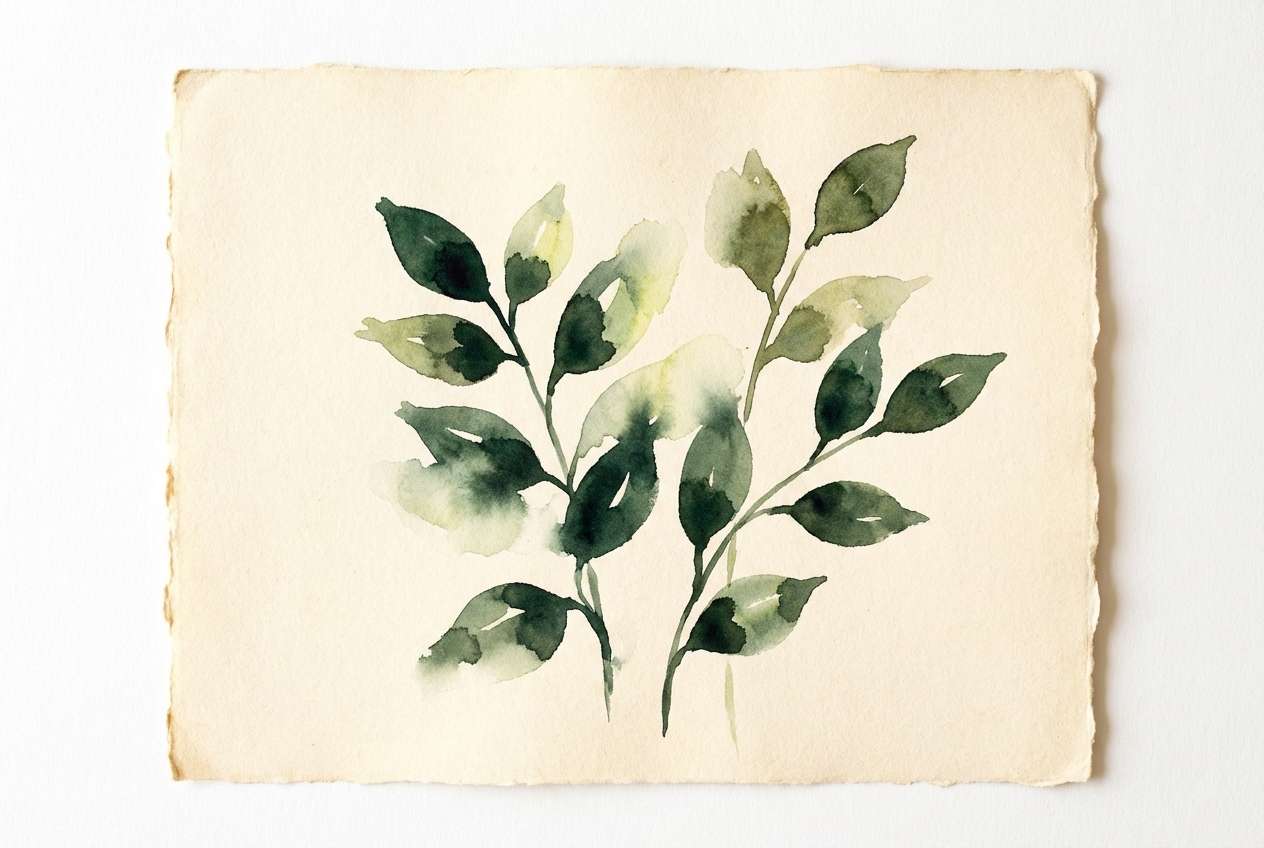
10) Forest Paper
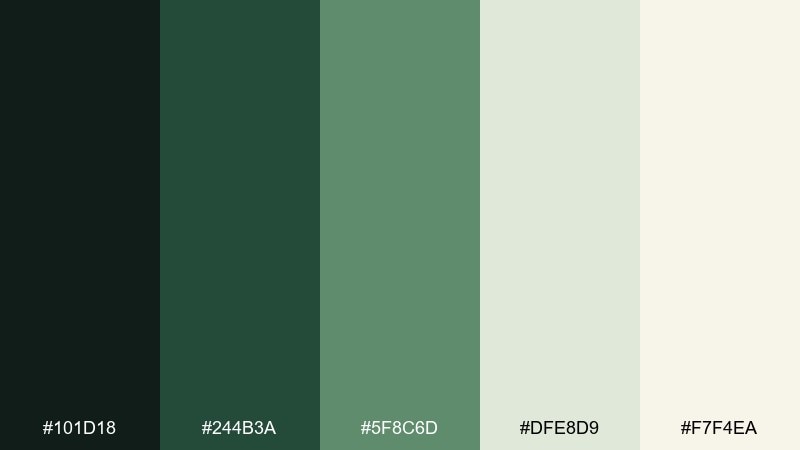
HEX: #101d18 #244b3a #5f8c6d #dfe8d9 #f7f4ea
Mood: natural, steady, restorative
Best for: watercolor botanical illustration
Natural and restorative, these greens look like shaded leaves against handmade paper. Use the deep forest for outlines and titles, then build mid-tone foliage with #244b3a and #5f8c6d. The pale greens and warm cream create gentle backgrounds for cards, slides, or illustration margins. Tip: keep the darkest green in small areas to preserve the airy, botanical mood.
Image example of forest paper generated using media.io
11) Cobalt Accent
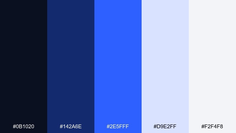
HEX: #0b1020 #142a6e #2e5fff #d9e2ff #f2f4f8
Mood: sharp, digital, high-energy
Best for: 2d ui hero section mockup
Sharp and digital, this palette feels like night mode with a laser-blue cursor glow. Keep most surfaces in the soft grays and pale periwinkle for an uncluttered interface. Use cobalt for primary actions, selected tabs, and links, while the darker navy anchors headings. Tip: try gradients from #142a6e to #2e5fff for a modern hero banner without adding extra colors.
Image example of cobalt accent generated using media.io

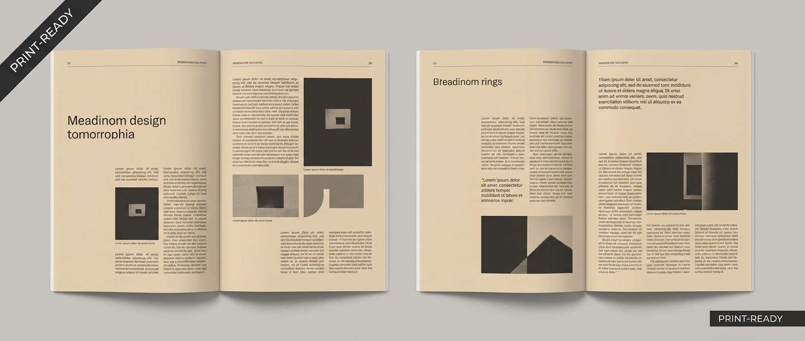
12) Sandstone Mono
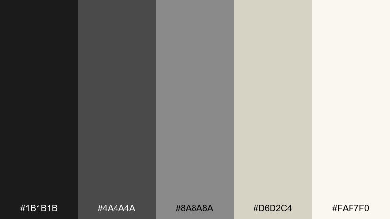
HEX: #1b1b1b #4a4a4a #8a8a8a #d6d2c4 #faf7f0
Mood: minimal, timeless, gallery-like
Best for: magazine layout spread
Minimal and gallery-like, these grays and sand tones evoke stone, pencil lead, and archival paper. Use black and charcoal for typography, and rely on the warm light neutrals for margins and background blocks. The mid-gray works well for captions, footnotes, and subtle rules that guide the reader. Tip: introduce texture through paper grain or light noise instead of adding more color.
Image example of sandstone mono generated using media.io
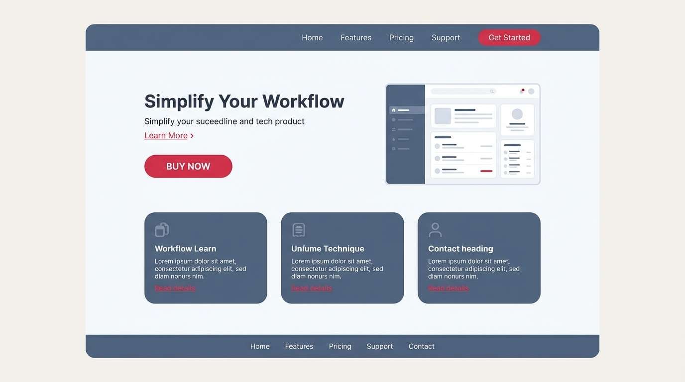
13) Cherry on Slate
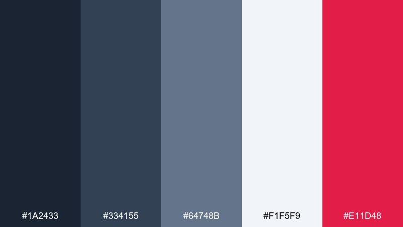
HEX: #1a2433 #334155 #64748b #f1f5f9 #e11d48
Mood: modern, confident, crisp
Best for: 2d ui product landing page mockup
Modern and crisp, slate blues set a steady rhythm while cherry red adds a confident punch. Use the light background for breathing room and keep slate shades for navigation, cards, and subtle borders. For portfolio color combination ideas that still feel professional, the cherry works best as a single action color across buttons and links. Tip: keep red away from long text blocks and reserve it for micro-interactions and highlights.
Image example of cherry on slate generated using media.io
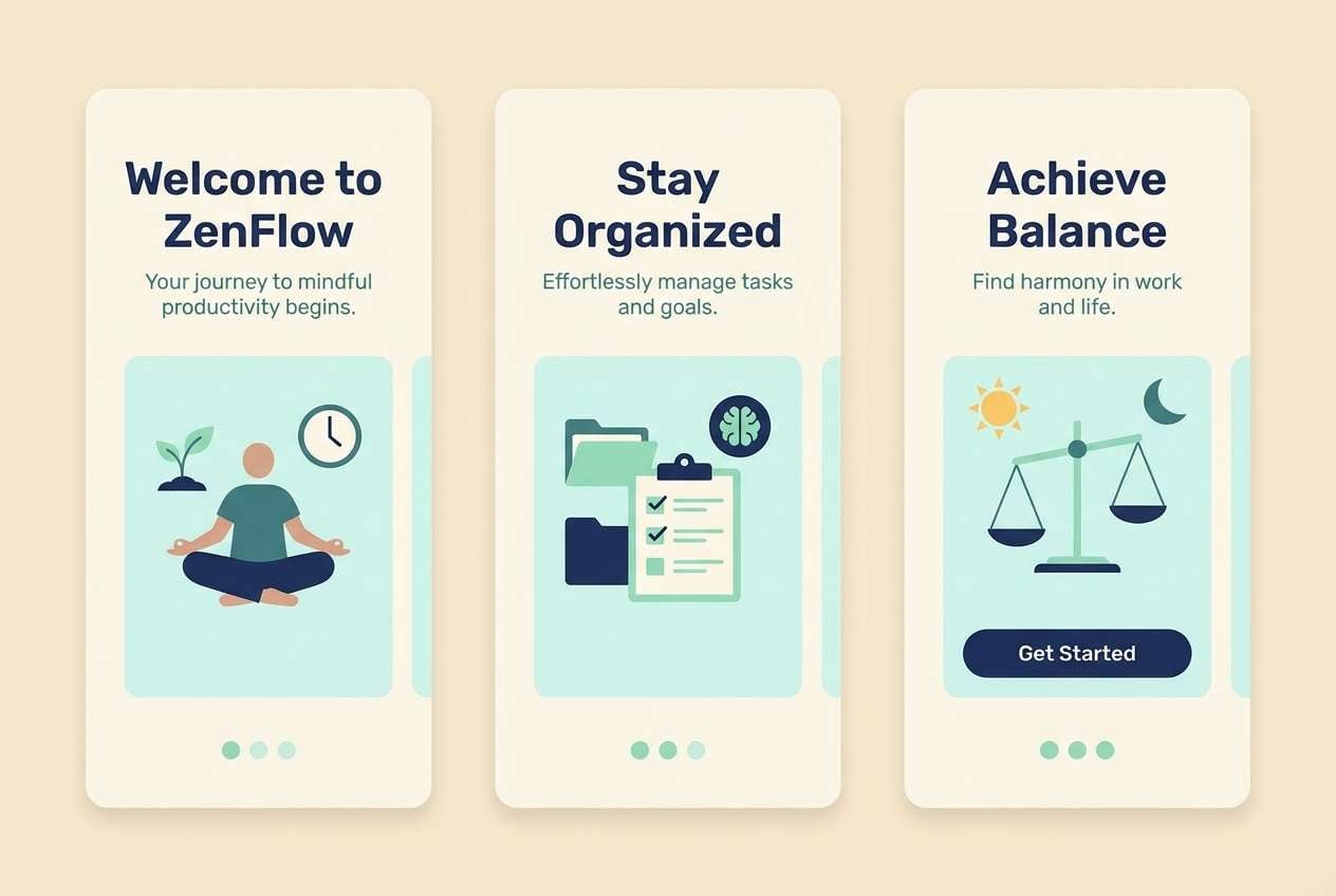
14) Aurora Mint
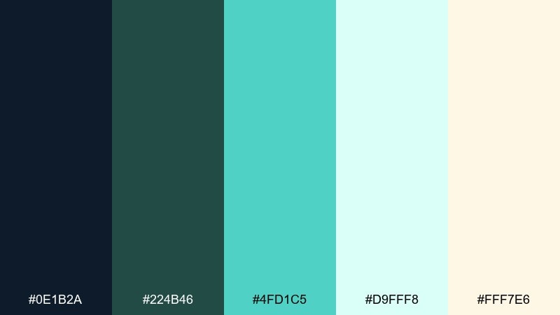
HEX: #0e1b2a #224b46 #4fd1c5 #d9fff8 #fff7e6
Mood: fresh, optimistic, luminous
Best for: 2d ui onboarding screens
Fresh and luminous, mint and deep teal feel like light passing through glass. Use the navy as a grounding text color, then let mint and pale aqua carry panels, cards, and friendly illustration shapes. The warm cream is a subtle counterbalance that keeps the interface from going too cold. Tip: keep the brightest mint for progress indicators and success states to make onboarding feel rewarding.
Image example of aurora mint generated using media.io
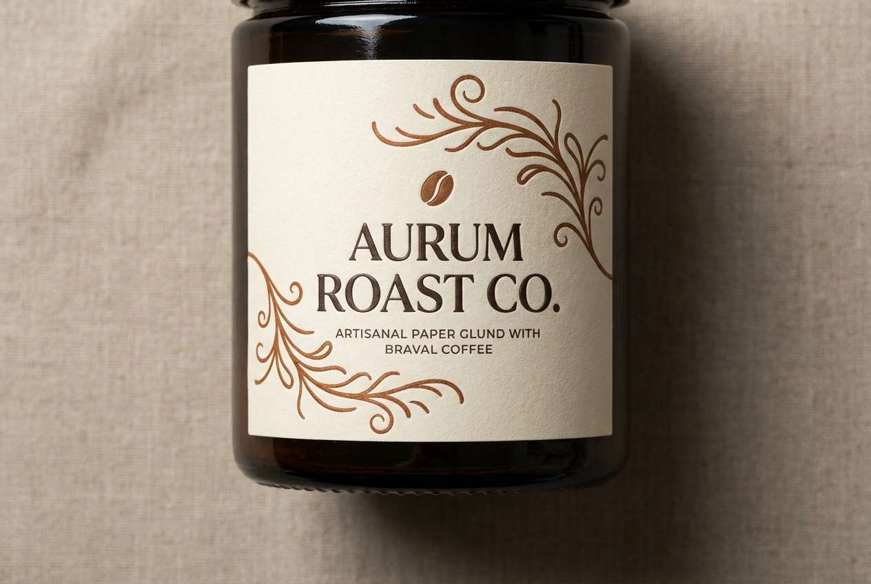
15) Mocha Canvas
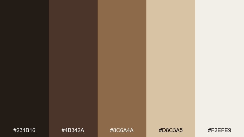
HEX: #231b16 #4b342a #8c6a4a #d8c3a5 #f2efe9
Mood: cozy, artisanal, premium
Best for: realistic studio shot of product label design
Cozy and artisanal, these browns and creams feel like roasted coffee, leather journals, and unbleached canvas. Use the darkest tones for type and logo marks, then build warmth with the mid-browns across labels and patterns. The pale neutrals keep the composition clean and upscale for packaging or lookbooks. Tip: add subtle embossing or foil effects in the mid-brown range for depth without introducing new hues.
Image example of mocha canvas generated using media.io
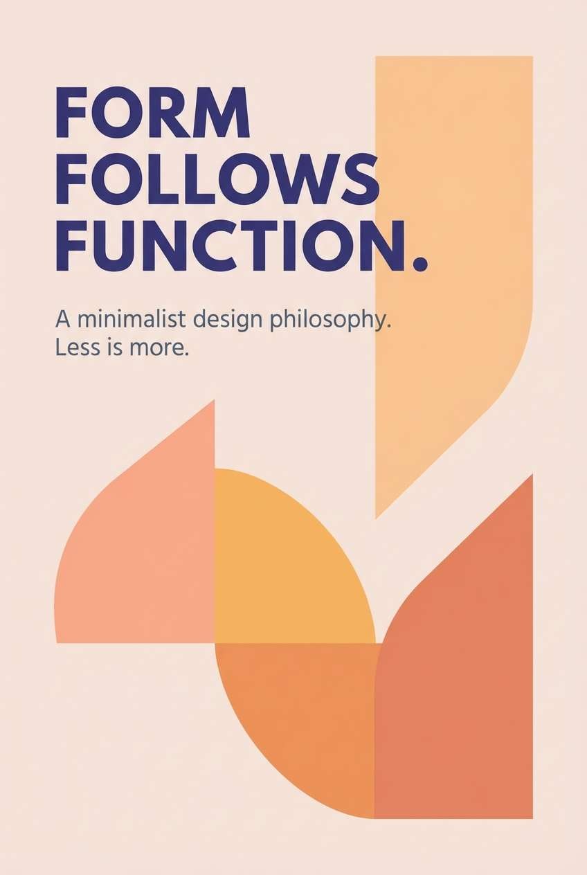
16) Sunset Type
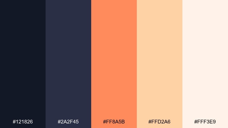
HEX: #121826 #2a2f45 #ff8a5b #ffd2a6 #fff3e9
Mood: warm, modern, inviting
Best for: typography poster on plain background
Warm and inviting, these tones look like sunset light hitting a dark studio wall. Use the deep indigo pair for bold type and strong alignment, then layer peach and apricot for highlights and supporting shapes. The pale blush keeps the background soft and readable, especially for large posters or cover slides. Tip: try apricot (#ffd2a6) behind headlines to create instant hierarchy without extra graphics.
Image example of sunset type generated using media.io
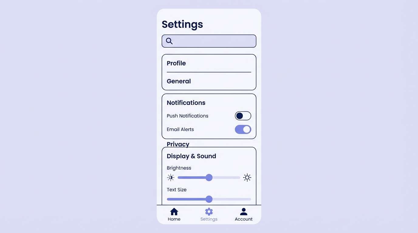
17) Icy Lavender
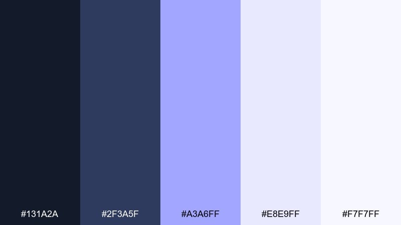
HEX: #131a2a #2f3a5f #a3a6ff #e8e9ff #f7f7ff
Mood: cool, polished, futuristic
Best for: 2d ui settings page mockup
Cool and polished, this lavender-leaning mix feels like frosted glass and crisp winter air. Use the darkest navy for titles and toggles, then let the soft lilac fill backgrounds and cards. The brighter periwinkle is ideal for selected states and sliders without feeling neon. Tip: keep borders subtle by using #e8e9ff so the UI stays airy and modern.
Image example of icy lavender generated using media.io
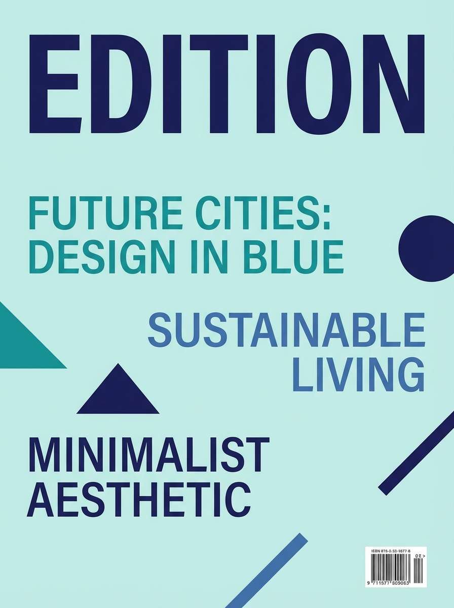
18) Vintage Cyanotype
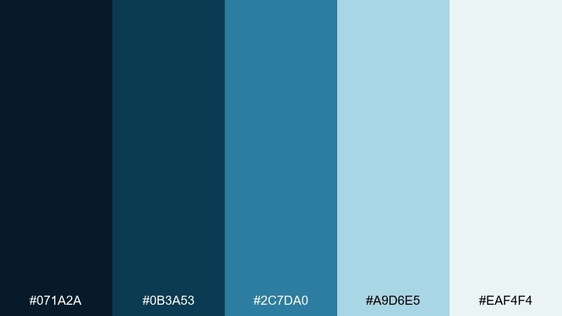
HEX: #071a2a #0b3a53 #2c7da0 #a9d6e5 #eaf4f4
Mood: nostalgic, academic, oceanic
Best for: editorial magazine cover layout
Nostalgic and oceanic, these blues echo cyanotype prints and old atlases. Use the deep navy for mastheads and strong type blocks, and keep mid-blue for subheads and callouts. The pale aqua shades create clean negative space that still feels colored, not stark white. Tip: add thin rules and small icons in #2c7da0 for an academic, crafted finish.
Image example of vintage cyanotype generated using media.io
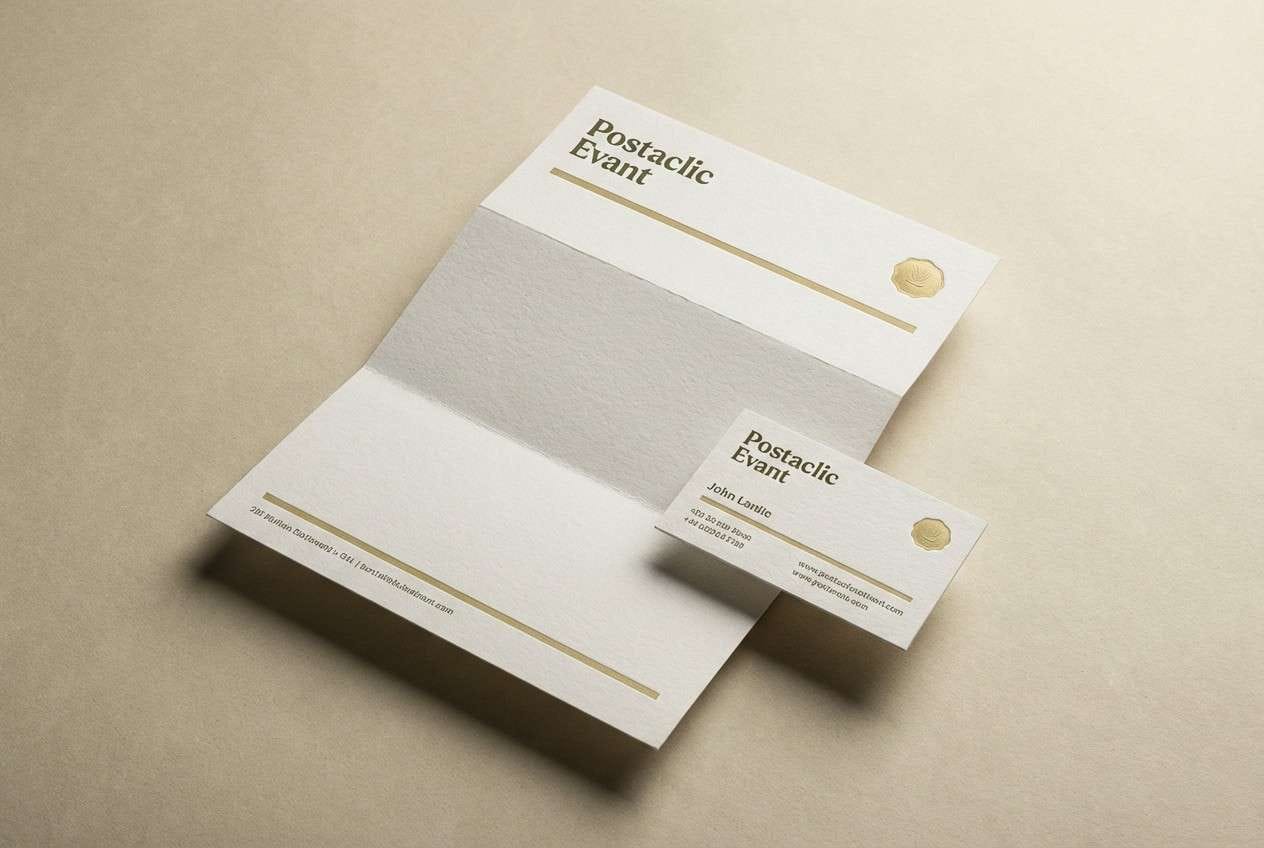
19) Olive Ledger
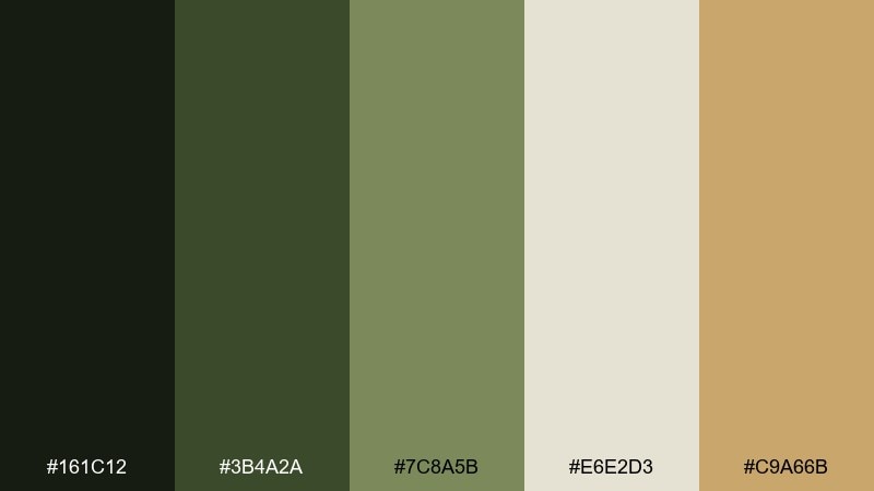
HEX: #161c12 #3b4a2a #7c8a5b #e6e2d3 #c9a66b
Mood: heritage, earthy, dependable
Best for: stationery set mockup in studio
Heritage and dependable, olive and khaki tones recall old ledgers, wax seals, and well-worn bookcloth. Use the deep olive for logos and headings, then lean on the pale parchment for backgrounds and paper stock. For portfolio color combinations that skew classic, the muted gold makes an elegant accent on rules, icons, or seals. Tip: keep the gold small and consistent, like one highlight per section, to maintain that archival feel.
Image example of olive ledger generated using media.io
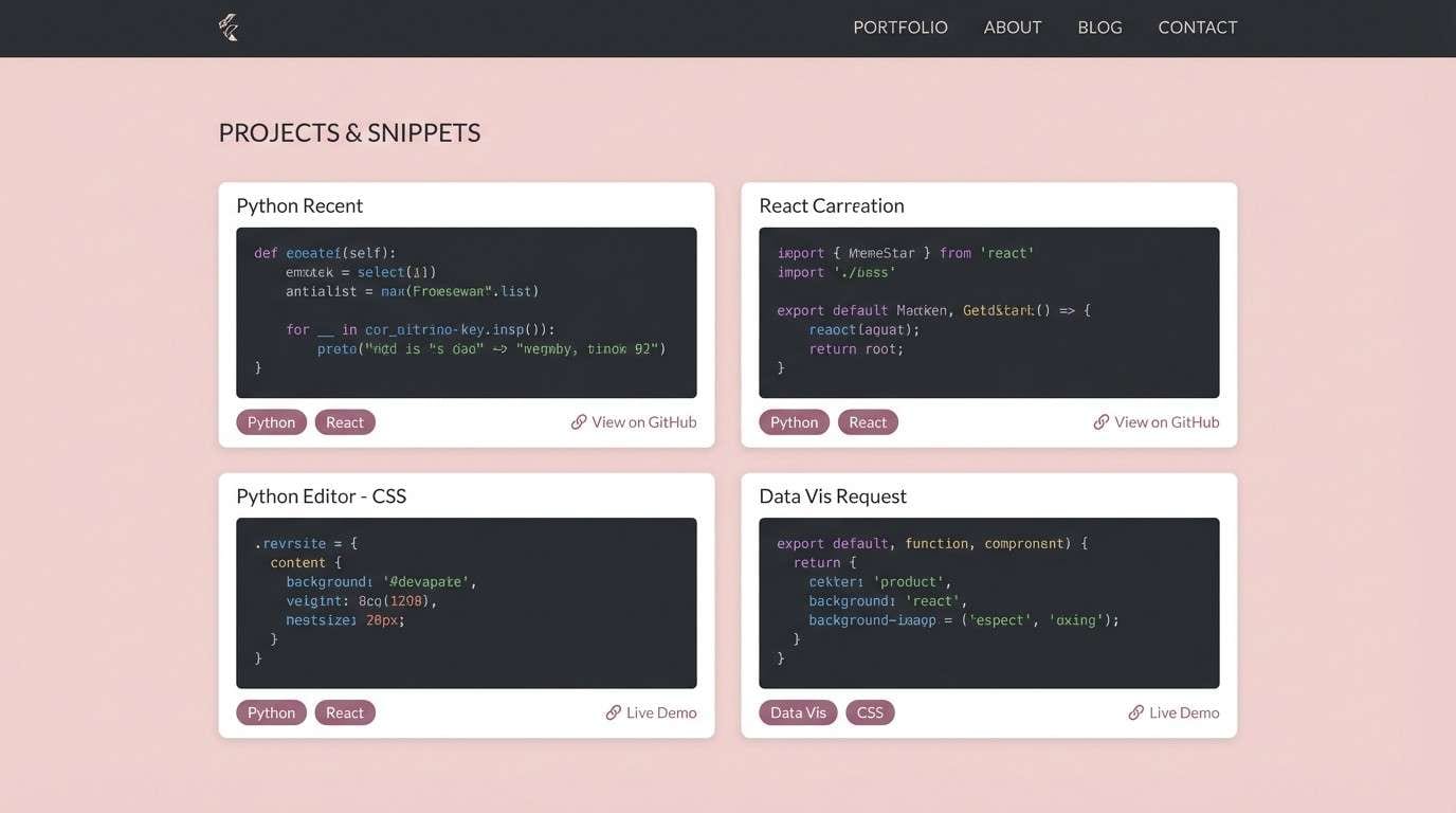
20) Rose Quartz Code
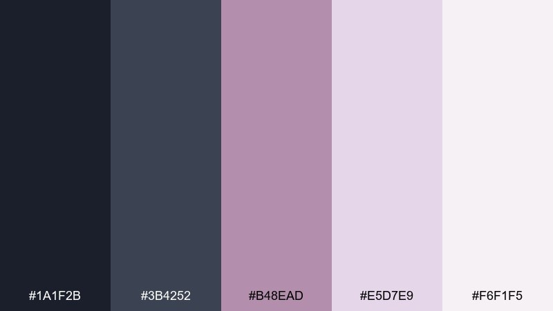
HEX: #1a1f2b #3b4252 #b48ead #e5d7e9 #f6f1f5
Mood: soft, smart, contemporary
Best for: 2d ui developer portfolio section mockup
Soft and smart, these tones feel like dusk-gray code editors warmed up with rose quartz light. Use the charcoal pair for code blocks, nav, and headings, and let the blush neutrals carry the page background. The mauve shade is perfect for tags, link states, and subtle data highlights without looking childish. Tip: for a portfolio color palette that stays readable, set body text in #1a1f2b over #f6f1f5 and keep accents to a single mauve weight.
Image example of rose quartz code generated using media.io
21) Clay and Cloud
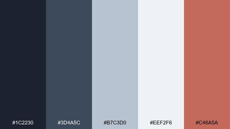
HEX: #1c2230 #3d4a5c #b7c3d0 #eef2f6 #c46a5a
Mood: balanced, professional, approachable
Best for: 2d ui about page mockup
Balanced and approachable, this mix reads like stormy denim with sun-baked clay. Use the deep blue-grays for structure and typography, then let the cloud tones lighten large sections and cards. Clay makes a friendly accent for CTAs, timeline markers, or small illustrations. Tip: keep shadows subtle and rely on #b7c3d0 for borders so the layout stays airy.
Image example of clay and cloud generated using media.io

What Colors Go Well with Portfolio?
Neutrals are the backbone of most portfolio palettes because they let your work samples stay in control. Think ink/navy, charcoal, warm off-white, and soft gray for layouts where readability and hierarchy matter.
Then add one accent color that signals interactivity and emphasis—buttons, links, chips, and key metrics. Coral, cobalt, mint, bronze, or muted gold all work well when used consistently.
If your projects are visually diverse, keep your portfolio color scheme restrained and let imagery provide variety. A stable background + a single accent usually feels more premium than many competing hues.
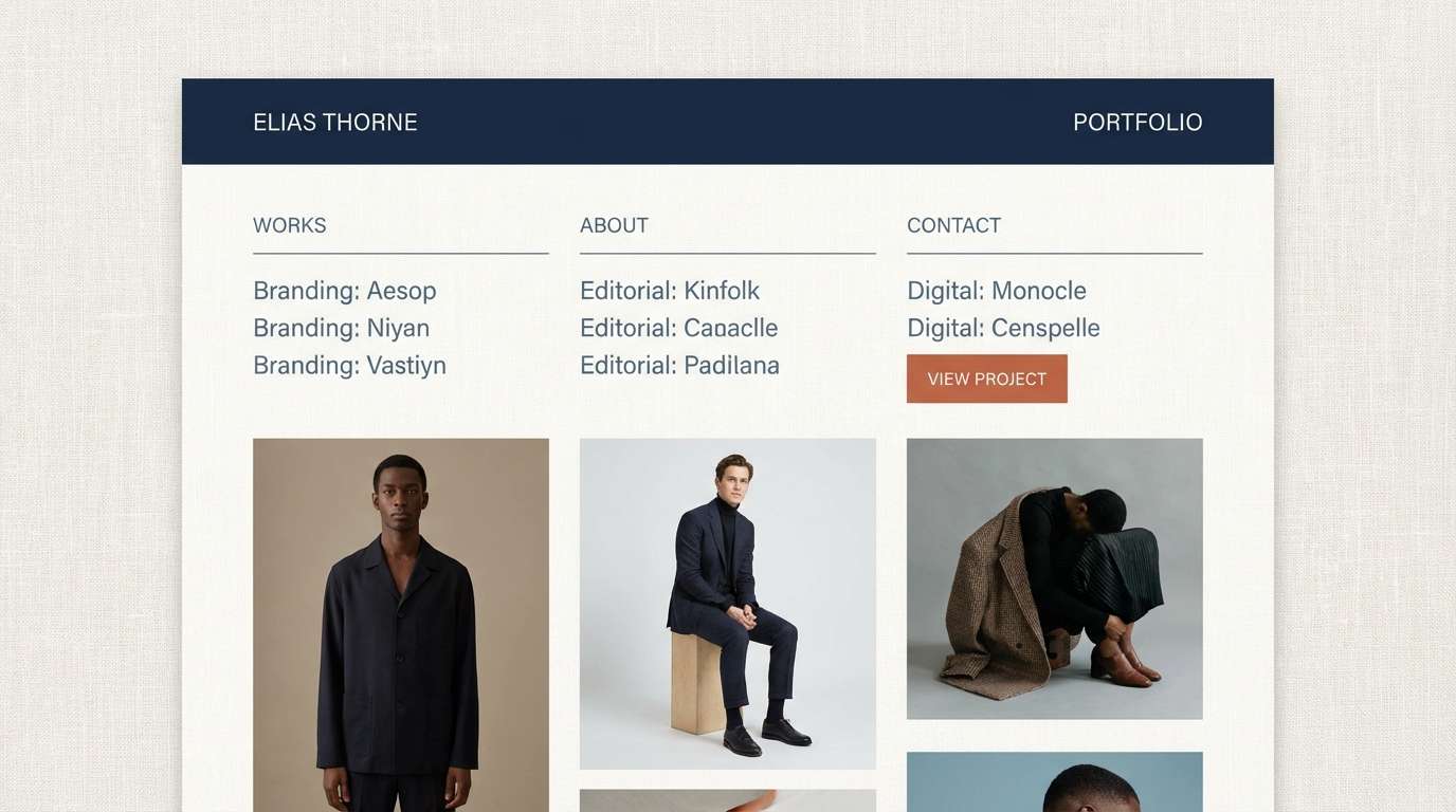
How to Use a Portfolio Color Palette in Real Designs
Start by assigning roles, not just picking colors: one for primary text, one for secondary text, one for surfaces (cards/sections), one for borders/dividers, and one for accent actions. This makes your portfolio color combinations repeatable across pages.
Use contrast intentionally for accessibility: dark text on light surfaces is still the easiest win for case studies and resumes. Save saturated colors for small UI moments like active tabs, hover states, and highlights.
Finally, keep consistency across components—buttons, tags, icons, charts, and callouts should share the same accent logic so the whole site feels designed, not decorated.
Create Portfolio Palette Visuals with AI
If you’re pitching a new look for your personal site (or building a brand kit), generating quick mockups helps you validate a palette before committing to a full redesign. A simple hero, case study page, or resume layout is often enough to test the vibe.
With Media.io, you can turn palette ideas into visuals fast—then iterate on prompts, composition, and lighting until the colors feel right for your niche and audience.
Try creating one “light mode” and one “dark mode” concept using the same accent color to keep your branding consistent across devices.
Portfolio Color Palette FAQs
-
What’s the best portfolio color palette for readability?
Use a light neutral background (off-white or very pale gray) with near-black or deep navy text, then reserve one accent color for links and buttons. This keeps long case studies easy to scan and prevents visual fatigue. -
How many colors should a portfolio color scheme have?
For most portfolios, 4–6 colors is ideal: 2 neutrals for text hierarchy, 1–2 surface/background tones, 1 border/divider tone, and 1 accent. More colors can work, but they’re harder to keep consistent across components. -
Should I use bright colors in a professional portfolio?
Yes, but keep them controlled. Bright hues (like coral, cherry, or cobalt) are strongest as an accent used for CTAs, active states, and small highlights—not as large background sections. -
What’s a safe “modern neutral” portfolio palette?
Charcoal + slate + warm off-white + soft gray, with a single accent (terracotta, mint, or bronze). Palettes like Studio Concrete, Sandstone Mono, and Clay and Cloud are good starting points. -
How do I match my portfolio colors to my work samples?
Make your site colors quieter than your projects. If your work is colorful, use neutral UI colors and let thumbnails shine; if your work is minimal, you can afford a slightly bolder accent to add personality. -
Can I use a dark mode portfolio palette?
Absolutely—just protect contrast. Use a deep navy/charcoal surface, slightly lighter panels for sections, and a clear accent for buttons/links. Avoid large pure-black areas and use mid-tones to keep the layout from feeling heavy. -
How can I preview a portfolio palette before redesigning my site?
Generate a few quick mockups (hero, case study page, and resume/about layout) using the same five HEX codes. Seeing the palette applied to real UI blocks is the fastest way to spot contrast issues and overuse of accents.
