

Oxford blue is a deep, scholarly navy that instantly signals trust, tradition, and quiet confidence. It’s dark enough to feel premium, yet flexible enough to pair with both crisp cool tones and warm, tactile neutrals.
Below are 20 refined oxford blue palette ideas with HEX codes, plus practical tips for branding, UI, print, and interiors so you can pick accents fast and keep your design cohesive.
In this article
- Why Oxford Blue Palettes Work So Well
-
- midnight brass
- seaside tweed
- library leather
- arctic minimal
- terracotta studio
- citrus ink
- botanical navy
- rose quartz night
- concrete & cyan
- vintage ivy
- moonlit lavender
- sandstone harbor
- cherry noir
- sunlit ochre
- steel blossom
- espresso cream
- frosted mint
- neon nightshift
- classic maritime
- quiet monochrome
- What Colors Go Well with Oxford Blue?
- How to Use a Oxford Blue Color Palette in Real Designs
- Create Oxford Blue Palette Visuals with AI
Why Oxford Blue Palettes Work So Well
Oxford blue sits in the “authority” zone of color: it feels stable, intelligent, and composed. That makes it a reliable anchor for layouts where you need instant credibility (think navigation bars, hero headers, or editorial titles).
Because it’s so dark, oxford blue creates strong contrast with off-whites and light tints—great for legibility and hierarchy. You can keep designs minimal and still make them look premium by using negative space and careful accent placement.
It also pairs beautifully with warm materials (brass, leather browns, terracotta) and modern cool accents (cyan, lavender, icy blues). That versatility is why an oxford blue color palette works across branding, UI, print, and interiors.
20+ Oxford Blue Color Palette Ideas (with HEX Codes)
1) Midnight Brass
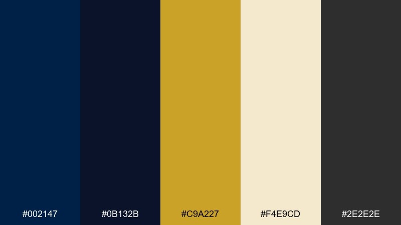
HEX: #002147 #0B132B #C9A227 #F4E9CD #2E2E2E
Mood: luxury, nocturnal, confident
Best for: brand identity and premium packaging
Luxurious and night-sky deep, this mix feels like brass hardware on a navy velvet case. These oxford blue color combinations shine for premium packaging, boutique labels, and polished brand marks. Pair the brass with plenty of warm ivory space so the dark blues do not feel heavy. Usage tip: reserve the gold for logos, borders, and small highlights to keep the look expensive, not loud.
Image example of midnight brass generated using media.io
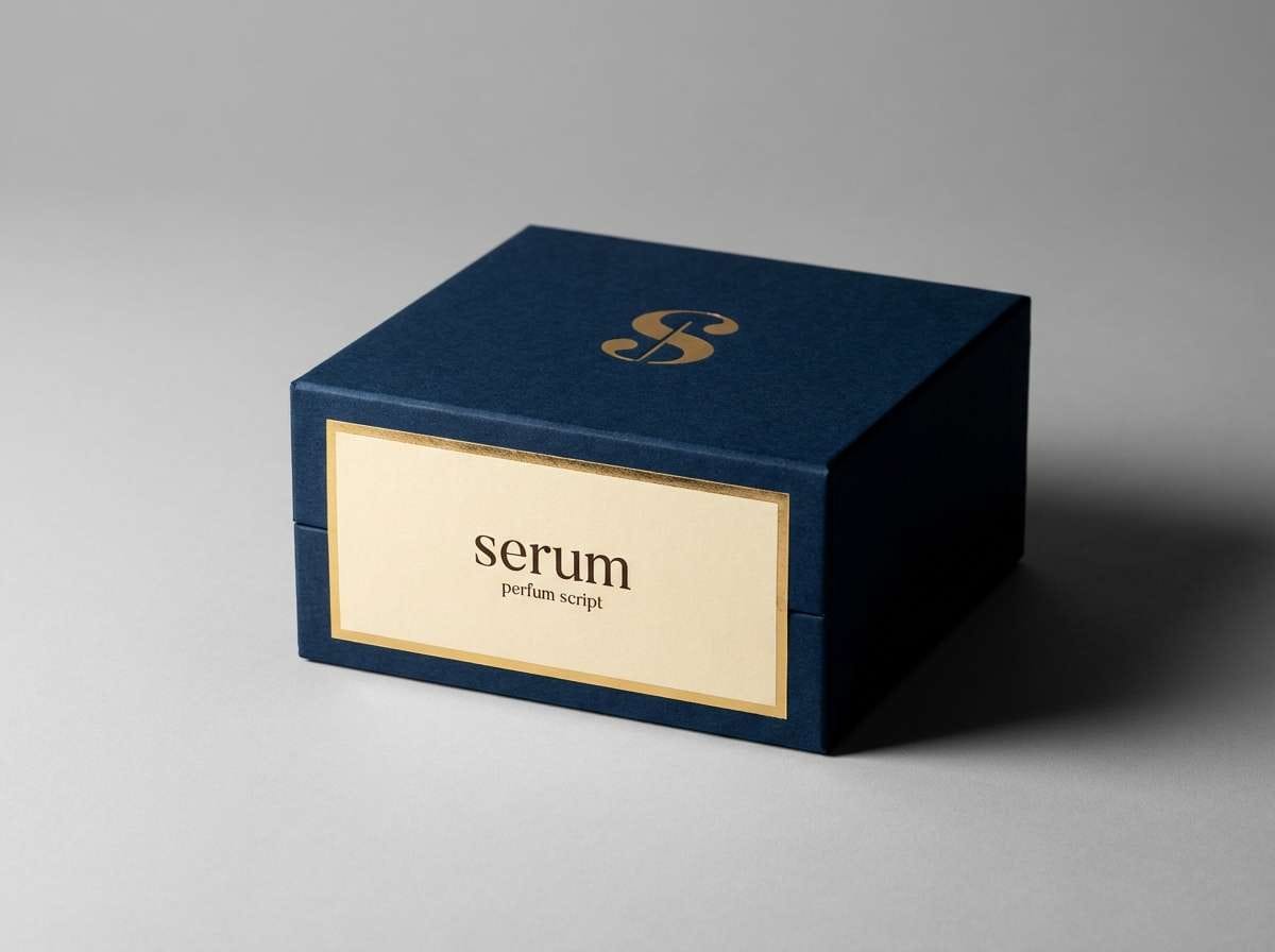
Media.io is an online AI studio for creating and editing video, image, and audio in your browser.

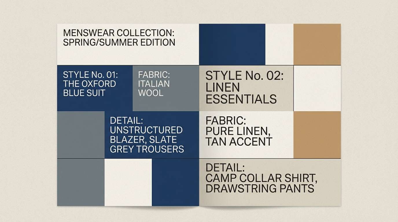
2) Seaside Tweed
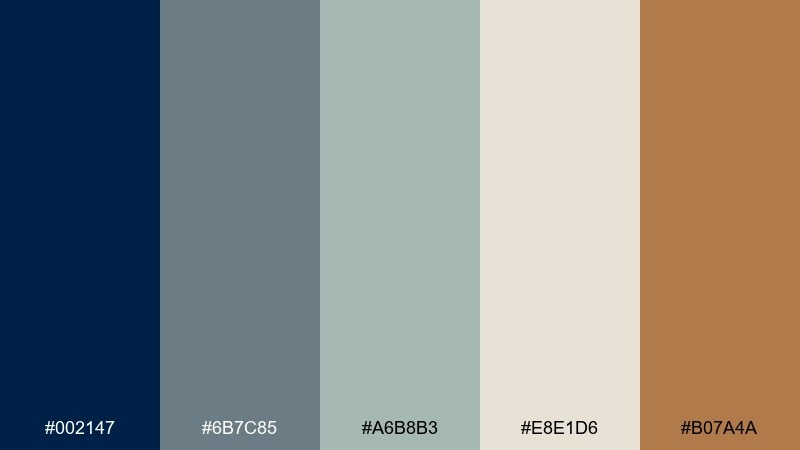
HEX: #002147 #6B7C85 #A6B8B3 #E8E1D6 #B07A4A
Mood: coastal, textured, relaxed
Best for: menswear lookbooks and lifestyle blogs
Calm and tactile, these tones evoke salt air, woven tweed, and weathered docks. The navy anchor adds structure while slate and linen keep the page airy and editorial. Use the tan as a small accent for buttons, pull quotes, or section dividers. Tip: keep typography in the darker blues for readability and let the lighter neutrals do the breathing room.
Image example of seaside tweed generated using media.io
3) Library Leather
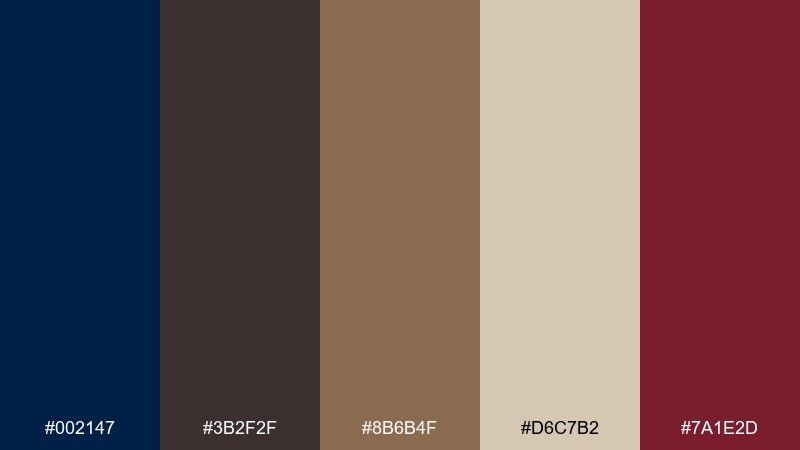
HEX: #002147 #3B2F2F #8B6B4F #D6C7B2 #7A1E2D
Mood: scholarly, warm, classic
Best for: book covers and academic event posters
Scholarly and warm, it recalls leather-bound volumes, old paper, and quiet reading lamps. The deep blue and brown create instant authority, while parchment softens the contrast for longer text blocks. Burgundy works best as a restrained spotlight for dates, badges, or a single graphic element. Usage tip: choose a serif headline in the darkest tone, then keep body text on parchment for comfortable scanning.
Image example of library leather generated using media.io

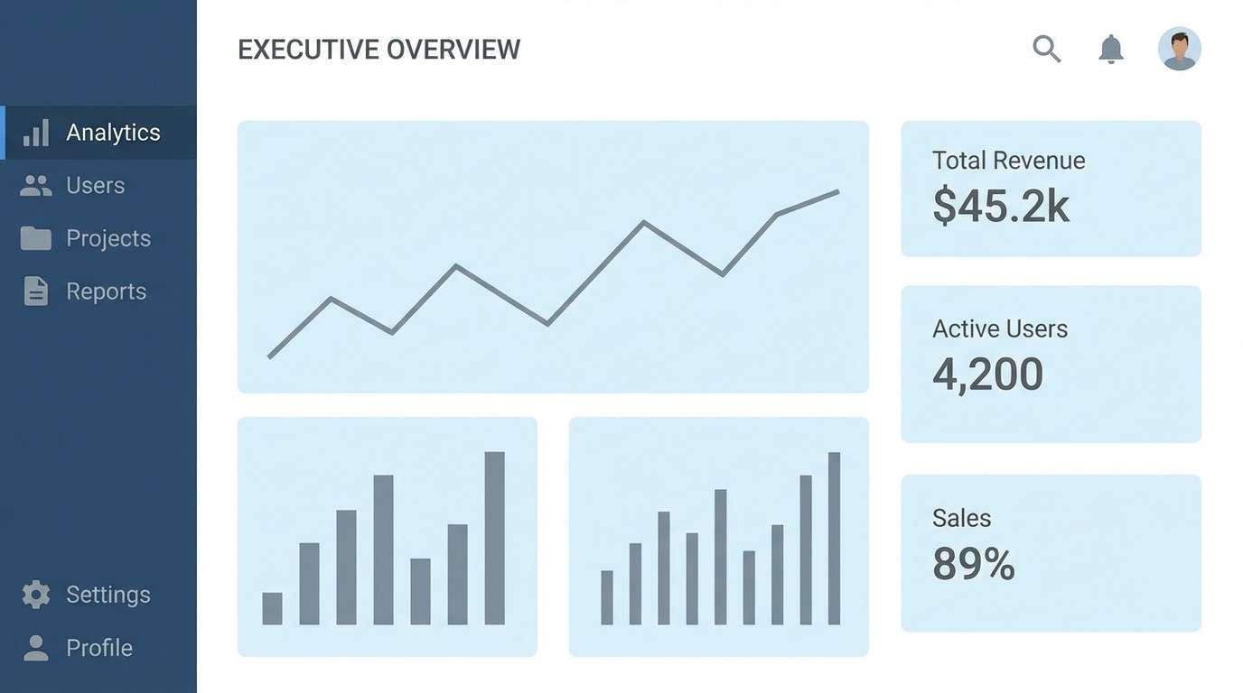
4) Arctic Minimal
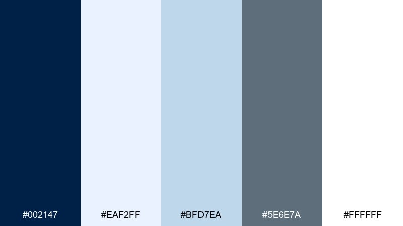
HEX: #002147 #EAF2FF #BFD7EA #5E6E7A #FFFFFF
Mood: clean, crisp, modern
Best for: SaaS dashboard UI
Crisp and wintery, this set feels like glass, snow, and sharp morning light. The deep blue makes a dependable nav or header, while icy tints keep panels and cards lightweight. Steel gray is ideal for icons, dividers, and secondary labels. Tip: use the palest blue for hover states so interactions feel subtle but still visible.
Image example of arctic minimal generated using media.io
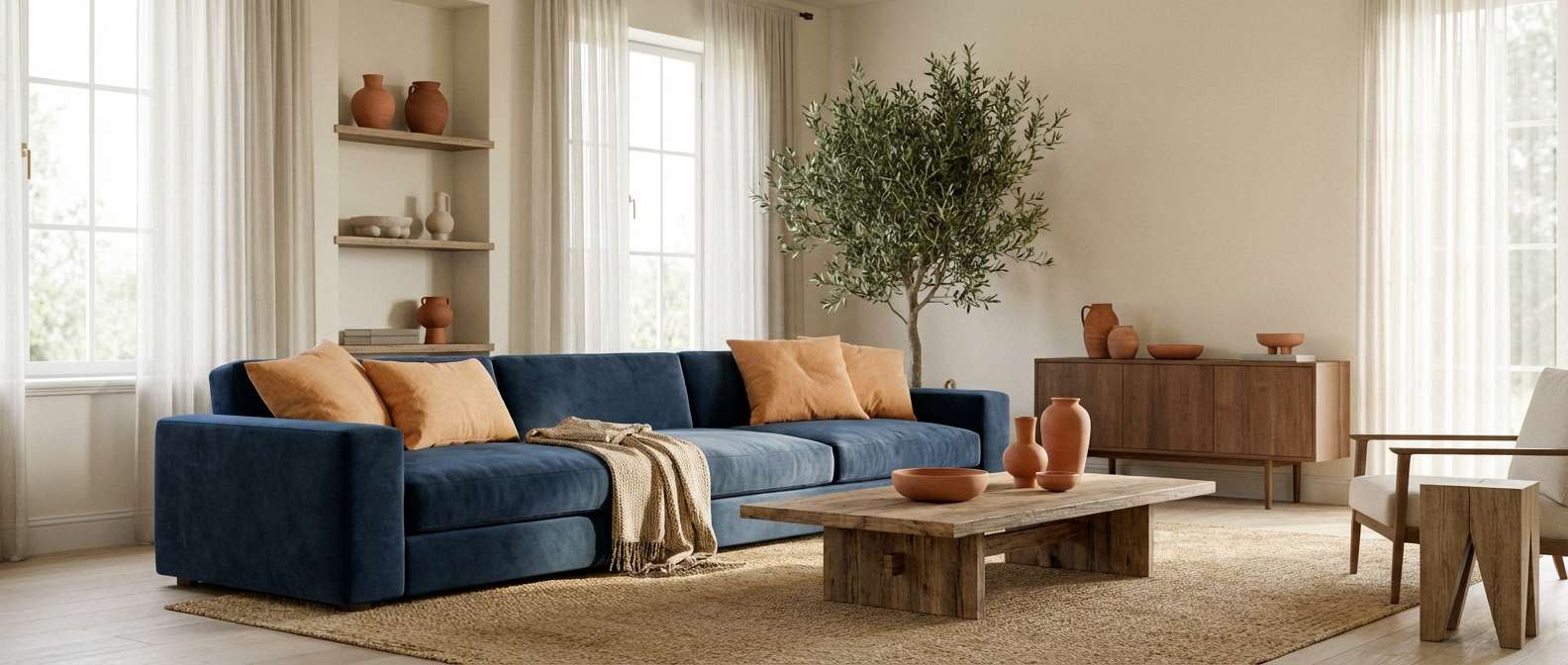
5) Terracotta Studio
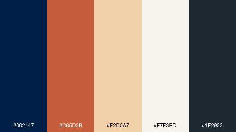
HEX: #002147 #C65D3B #F2D0A7 #F7F3ED #1F2933
Mood: creative, warm, grounded
Best for: modern living room interiors
Warm and creative, it brings to mind sun-baked clay, canvas, and deep evening shadows. The oxford blue color palette works beautifully in modern interiors when you want contrast without going stark black. Let terracotta appear in textiles and art, and keep cream on walls or large surfaces for balance. Usage tip: repeat the navy in two places (like a rug and a chair) to make the room feel intentional, not accidental.
Image example of terracotta studio generated using media.io
6) Citrus Ink

HEX: #002147 #FFB703 #FB8500 #8E9AAF #F6F7FB
Mood: energetic, bold, contemporary
Best for: social media promo banners
Punchy and modern, it feels like bright citrus stamped onto dark ink. The oranges pop hardest when they are used as short bursts: prices, CTA buttons, or a single geometric shape. Cool gray keeps the layout from feeling too hot and helps type stay clean. Tip: limit orange to one primary and one secondary shade so the banner stays readable at small sizes.
Image example of citrus ink generated using media.io

7) Botanical Navy
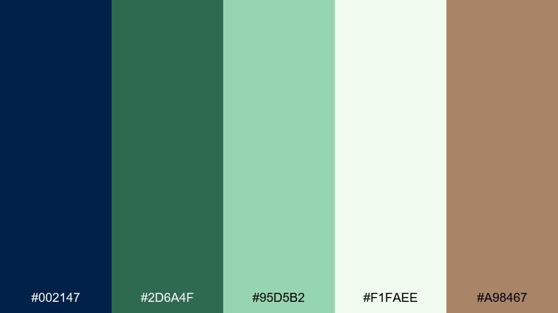
HEX: #002147 #2D6A4F #95D5B2 #F1FAEE #A98467
Mood: fresh, natural, refined
Best for: watercolor botanical prints
Fresh and botanical, it evokes shaded gardens, eucalyptus leaves, and a dark blue twilight sky. The greens feel alive against the navy, while soft white keeps the illustration from turning murky. Use the warm bark tone for stems, borders, or a small signature mark. Usage tip: let the mint be the most visible leaf wash and keep the deep blue for background shadows and text.
Image example of botanical navy generated using media.io
8) Rose Quartz Night
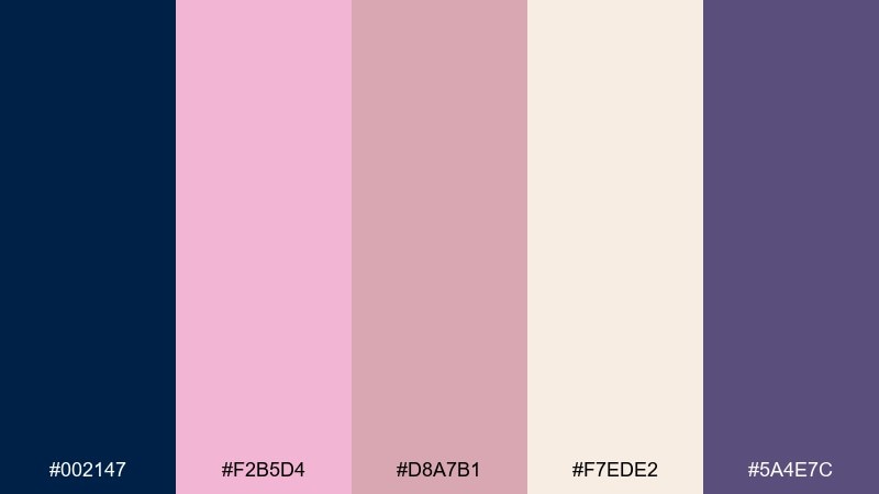
HEX: #002147 #F2B5D4 #D8A7B1 #F7EDE2 #5A4E7C
Mood: romantic, soft, elegant
Best for: wedding invitations
Romantic and soft, it feels like blush petals against a night-sky ribbon. Oxford blue gives the invitation structure for typography, while rose and cream keep the mood gentle and celebratory. Use mauve violet sparingly for monograms or small flourishes to avoid muddy shadows. Tip: keep body copy on the cream tone and reserve the navy for names and key details for crisp legibility.
Image example of rose quartz night generated using media.io

9) Concrete & Cyan

HEX: #002147 #00B4D8 #90E0EF #495057 #F8F9FA
Mood: urban, techy, sharp
Best for: tech startup landing pages
Urban and sharp, it reads like city concrete with electric reflections. Cyan brings instant tech energy, while the deep blue stabilizes headers and navigation. Keep the light cyan for charts, badges, and hover states so the interface feels responsive. Usage tip: pair the cyan with plenty of near-white space and use the concrete gray for long-form text to reduce glare.
Image example of concrete & cyan generated using media.io
10) Vintage Ivy

HEX: #002147 #1B4332 #A3B18A #E9EDC9 #B08968
Mood: heritage, earthy, inviting
Best for: restaurant menus
Heritage and earthy, it suggests ivy-covered brick, aged paper, and warm brass fixtures. As an oxford blue color scheme, it gives menus a refined frame while the greens keep everything welcoming and organic. Bronze works nicely for separators, icons, or a subtle stamp-style logo. Tip: print-friendly layouts look best when the pale paper tone is dominant and the darker hues are reserved for headings and prices.
Image example of vintage ivy generated using media.io
11) Moonlit Lavender
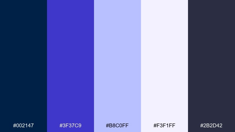
HEX: #002147 #3F37C9 #B8C0FF #F3F1FF #2B2D42
Mood: dreamy, modern, nighttime
Best for: music event posters
Dreamy and nighttime-cool, it feels like stage lights cutting through a deep blue room. Indigo and lavender create a sleek gradient direction without turning sugary. Use the mist tone as your main background to keep text readable and the poster print-friendly. Usage tip: set one bold typographic element in oxford blue and let lavender carry secondary details to build hierarchy fast.
Image example of moonlit lavender generated using media.io
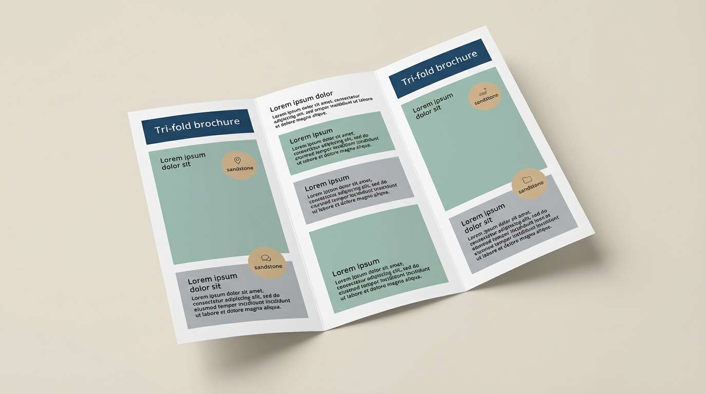
12) Sandstone Harbor
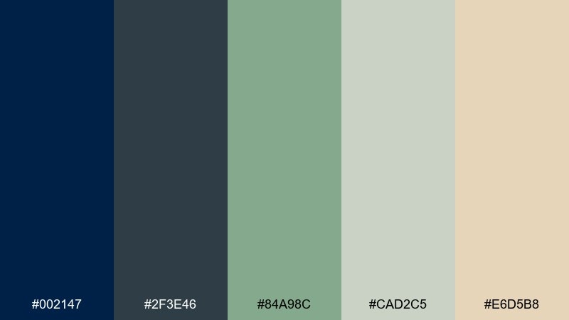
HEX: #002147 #2F3E46 #84A98C #CAD2C5 #E6D5B8
Mood: outdoorsy, calm, dependable
Best for: outdoor brand brochures
Calm and dependable, it recalls coastal cliffs, sea grass, and weathered stone. The deep blues make strong section bars, while seafoam and stone tones keep spreads airy and readable. Sandstone is ideal for callout boxes, maps, or product highlights that should feel natural, not flashy. Tip: keep photography cool-toned if you include it, so the palette stays cohesive across pages.
Image example of sandstone harbor generated using media.io
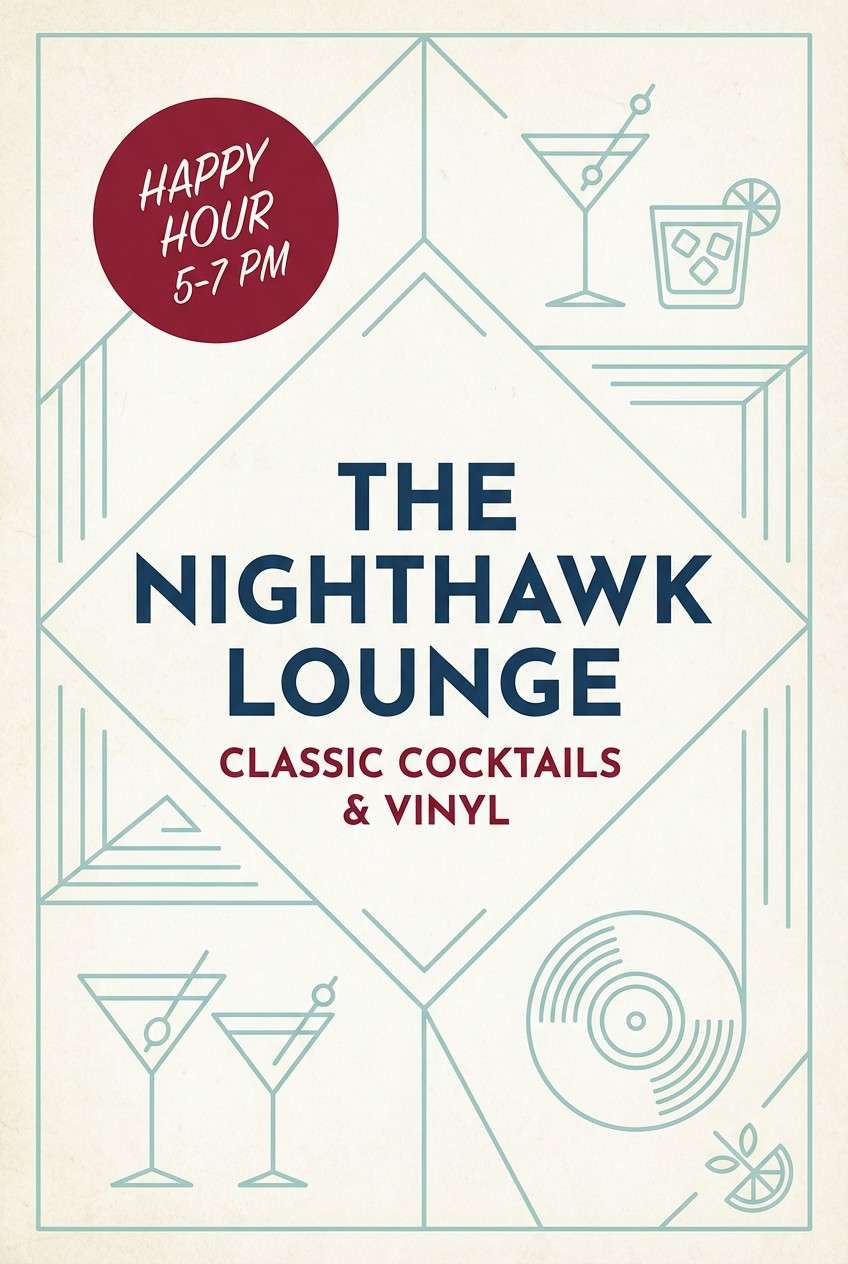
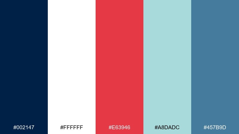
13) Cherry Noir
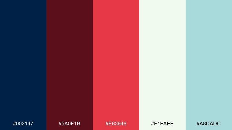
HEX: #002147 #5A0F1B #E63946 #F1FAEE #A8DADC
Mood: moody, festive, high-contrast
Best for: cocktail bar posters
Moody and festive, it feels like a dim lounge with a bright cherry garnish. Deep wine and oxford blue create a dramatic base, while red adds a confident punch for titles or specials. Soft white keeps typography crisp, and pale teal can cool the design with small secondary details. Usage tip: use red for one focal area only, then let the darker tones carry the atmosphere.
Image example of cherry noir generated using media.io
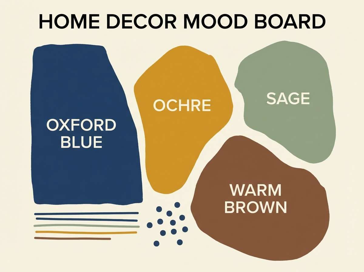
14) Sunlit Ochre

HEX: #002147 #D4A373 #FAEDCD #CCD5AE #6C584C
Mood: sunny, organic, curated
Best for: home decor mood boards
Sunlit and organic, it brings to mind clay pots, dried grasses, and a crisp navy trim. These oxford blue color combinations feel especially good for curated home decor boards where warmth needs a grounded edge. Keep ochre and cream dominant, then use the deep blue to frame swatches and anchor captions. Tip: repeat the sage in multiple small elements so the board reads cohesive instead of patchwork.
Image example of sunlit ochre generated using media.io
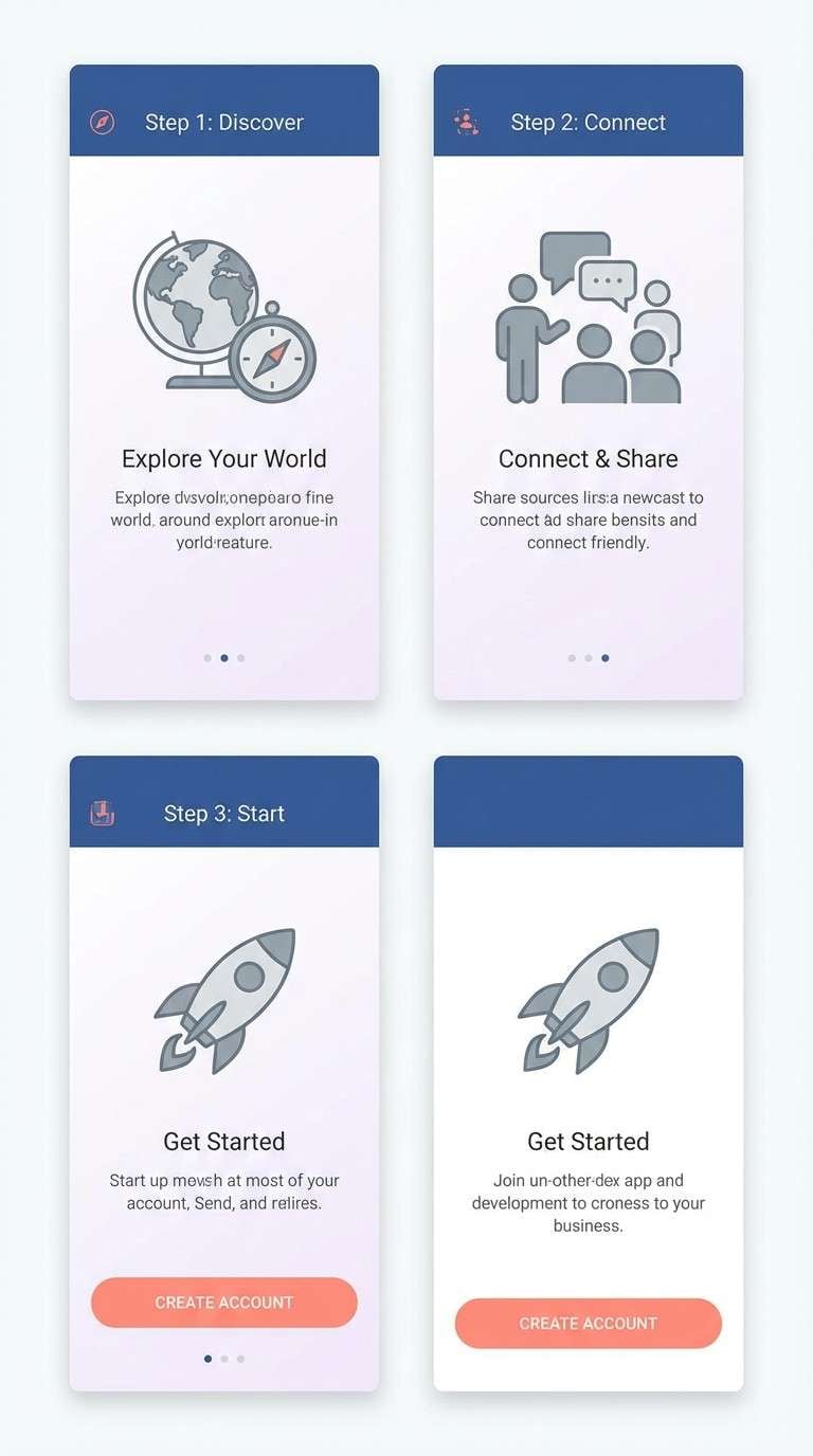
15) Steel Blossom

HEX: #002147 #6C757D #ADB5BD #F8F0FB #E5989B
Mood: soft, balanced, modern
Best for: mobile app onboarding screens
Soft and balanced, it feels like brushed metal with a blush tint. The navy is perfect for a strong header or progress indicator, while lilac-white keeps screens light and friendly. Coral works best as the single action color for next buttons and key icons. Usage tip: keep text on the gray range for accessibility and let the pastel background do the mood-setting.
Image example of steel blossom generated using media.io
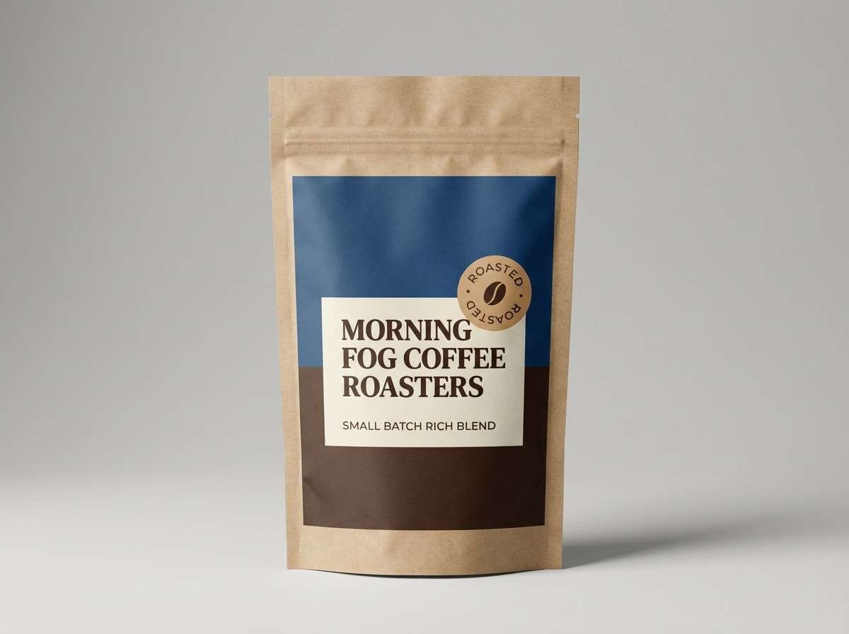
16) Espresso Cream
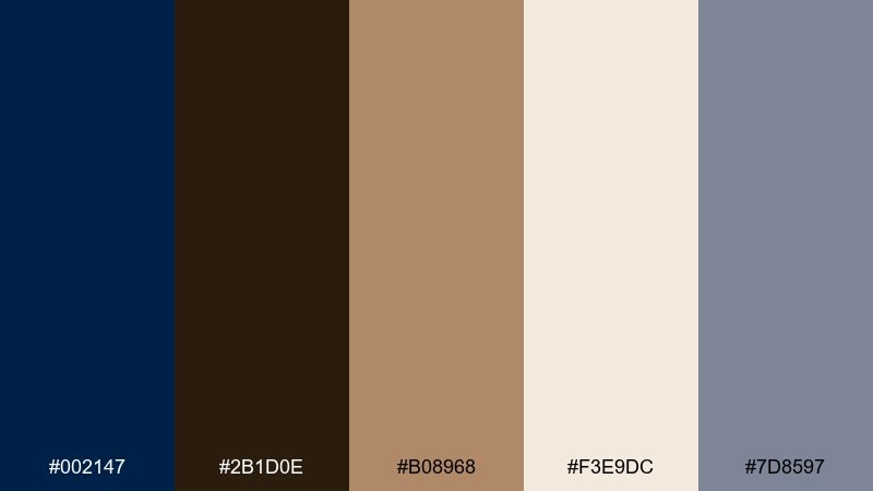
HEX: #002147 #2B1D0E #B08968 #F3E9DC #7D8597
Mood: cozy, artisanal, premium
Best for: coffee packaging labels
Cozy and artisanal, it evokes espresso crema, kraft paper, and a midnight café sign. Deep blue and espresso brown create a premium base, while cream keeps label text readable and inviting. Latte tan works well for small illustrations, origin stamps, or roast-level markers. Tip: use the blue-gray as a quiet secondary ink so the design gains depth without adding extra colors.
Image example of espresso cream generated using media.io
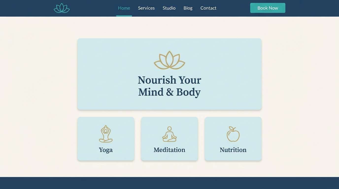
17) Frosted Mint
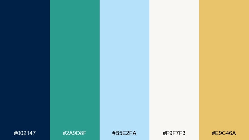
HEX: #002147 #2A9D8F #B5E2FA #F9F7F3 #E9C46A
Mood: fresh, airy, optimistic
Best for: wellness brand website
Fresh and airy, it feels like mint water in a glass beside a deep blue shadow. Teal and ice blue create a calming rhythm for sections, while the soft porcelain tone keeps the layout open. The muted gold is best as a gentle highlight for ratings, badges, or small icons. Usage tip: keep the hero area mostly light, then introduce the navy in the footer and navigation to ground the page.
Image example of frosted mint generated using media.io
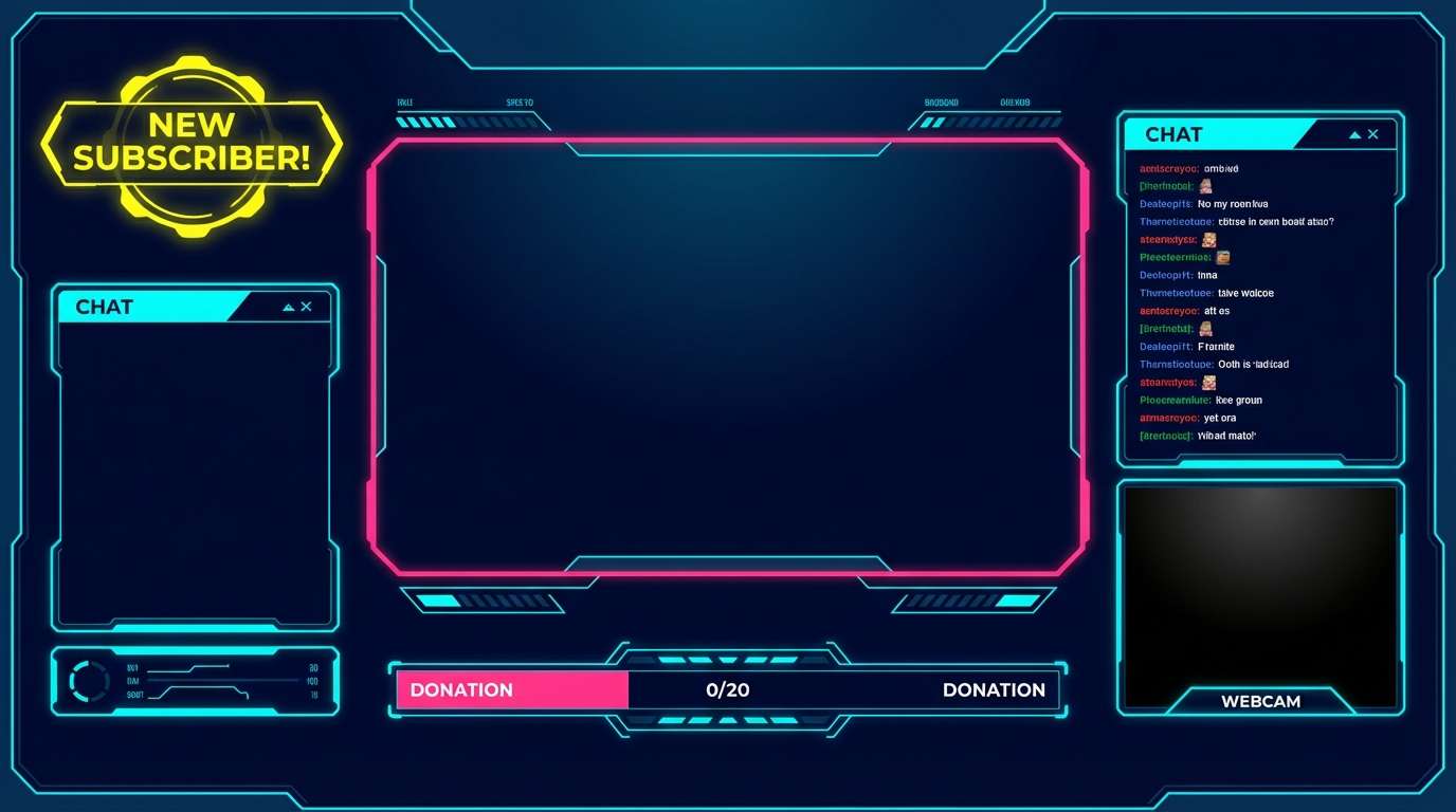
18) Neon Nightshift
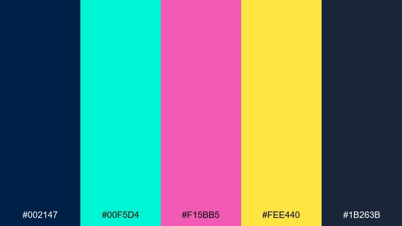
HEX: #002147 #00F5D4 #F15BB5 #FEE440 #1B263B
Mood: electric, playful, futuristic
Best for: gaming stream overlay UI
Electric and futuristic, it evokes arcade glow against a dark control room. These oxford blue color combinations are perfect for stream overlays where you want neon energy without losing readability. Use aqua and yellow for notifications and status elements, then keep pink for one signature accent so the screen does not get chaotic. Tip: put most text on the darkest blues and reserve neon fills for icons, borders, and small chips.
Image example of neon nightshift generated using media.io
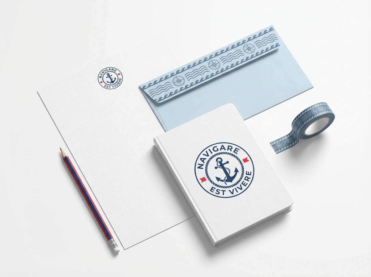
19) Classic Maritime
HEX: #002147 #FFFFFF #E63946 #A8DADC #457B9D
Mood: nautical, crisp, timeless
Best for: nautical logo and stationery
Nautical and crisp, it feels like a clean deck stripe with a bright signal flag. Oxford blue and white create timeless contrast for logos, while red is the perfect micro-accent for seals or punctuation marks. The lighter blues add dimension for backgrounds, envelopes, or secondary patterns. Usage tip: keep the logo primarily two-tone, then use the extra blues only in supporting stationery elements to stay classic.
Image example of classic maritime generated using media.io
20) Quiet Monochrome
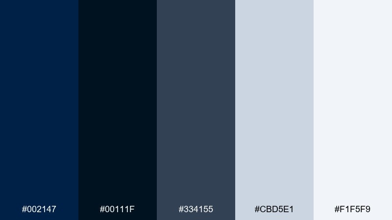
HEX: #002147 #00111F #334155 #CBD5E1 #F1F5F9
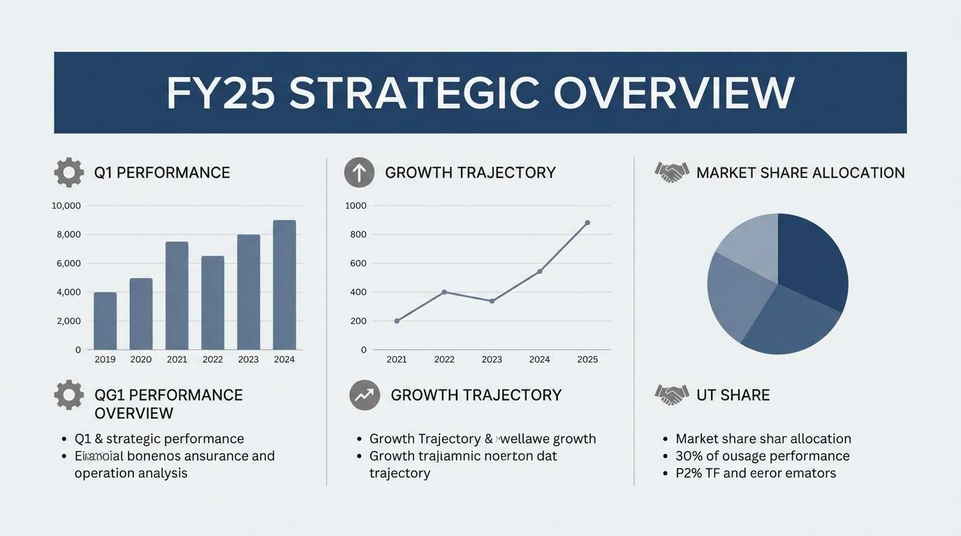
Mood: corporate, calm, polished
Best for: corporate slide decks
Calm and polished, it reads like a late-night boardroom with cool daylight on paper. This oxford blue color scheme is ideal for slide decks that need authority without harsh contrast. Use the light grays for backgrounds and the darker blues for titles, charts, and key numbers. Tip: keep one consistent accent (the medium slate) for highlights across every slide to make the deck feel unified.
Image example of quiet monochrome generated using media.io
What Colors Go Well with Oxford Blue?
Oxford blue pairs naturally with soft neutrals like ivory, parchment, and light gray because they lift the darkness and keep layouts readable. If you want a more tactile, heritage look, add warm browns, tan, and brass-gold accents.
For modern digital design, try oxford blue with icy blues, cyan, or mint-teal for clean “tech” energy. For a romantic or creative direction, blush pinks and muted lavender add softness while the navy keeps everything grounded.
When in doubt, pick one accent and keep it small: oxford blue is heavy, so a disciplined highlight color (gold, coral, or signal red) often looks more premium than using many brights at once.
How to Use a Oxford Blue Color Palette in Real Designs
Use oxford blue as the anchor: navigation, headers, footers, or a strong title block. Then place your lightest tone on the largest surfaces (backgrounds, cards, walls) so the overall feel stays open instead of dense.
Reserve high-chroma accents (orange, cyan, cherry red, neon) for CTAs, badges, or key data points. This creates clear hierarchy and helps users immediately see what matters.
For print, consider ink coverage and readability—dark blues look best with warm off-whites rather than pure white. For UI, keep body text in a deep gray or navy-tinted slate to reduce glare and improve accessibility.
Create Oxford Blue Palette Visuals with AI
If you already have HEX codes, the fastest way to validate a palette is to see it in context—on a poster, packaging label, landing page, or room mockup. Visual tests quickly reveal whether your accent is too loud or your background is too cold.
With Media.io, you can turn a short prompt (plus your palette direction) into clean concept images for branding, UI, social banners, or mood boards—right in the browser.
Create a few variations (swap one accent at a time) and compare them side-by-side to pick the most confident oxford blue color scheme for your project.
Oxford Blue Color Palette FAQs
-
What is the HEX code for Oxford blue?
A common Oxford blue HEX used in modern palettes is #002147. It’s a deep navy that works well as an anchor color for branding and UI. -
Is Oxford blue the same as navy?
Oxford blue is a type of navy, but it’s typically darker and more academic/heritage in feel. Many “navy” colors are brighter or more saturated than Oxford blue. -
What accent color looks best with Oxford blue?
For a premium look, brass/gold and warm ivory are top choices. For modern digital designs, cyan or mint-teal adds energy while keeping the palette crisp. -
Can I use Oxford blue in UI without making it feel too dark?
Yes—use Oxford blue for navigation and key headings, then rely on near-white, icy tints, and light grays for main backgrounds. Keep bright accents limited to CTAs and hover states. -
Does Oxford blue work for interiors?
It works especially well when balanced with warm whites, creams, and natural textures (wood, leather, brass). Use it as an accent wall, cabinetry, or textiles to avoid overpowering a room. -
What colors should I avoid pairing with Oxford blue?
Avoid using too many highly saturated accents at once (multiple neons or loud primaries), which can look chaotic against such a heavy base. If you want bold contrast, pick one bright and support it with neutrals. -
How do I test an Oxford blue color scheme quickly?
Generate a few mockups (banner, landing page, packaging, or poster) and swap only one accent color per version. This makes it easy to see which pairing stays readable and feels on-brand.


