

Peridot is a lively yellow-green that reads fresh, optimistic, and modern across digital and print. It can energize a layout like neon lime, or soften into sage and olive for calm, natural branding.
Below are peridot color palette ideas with HEX codes—built for UI, packaging, decor, posters, and seasonal graphics—plus AI prompts you can reuse to generate matching visuals.
In this article
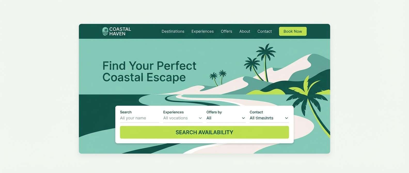
Why Peridot Palettes Work So Well
Peridot sits between lime and chartreuse, so it naturally grabs attention without feeling as aggressive as pure neon green. That makes it ideal for highlights, buttons, badges, and “fresh” brand moments.
It also plays well with neutrals: warm creams and soft grays keep it readable and premium, while deep forest tones create contrast for typography and structure. This flexibility lets peridot swing from playful to refined with just one supporting color shift.
Because peridot is associated with growth, nature, and energy, it’s a strong choice for wellness, eco products, food, outdoor brands, and seasonal spring/summer graphics—especially when paired with grounded olives or airy off-whites.
20+ Peridot Color Palette Ideas (with HEX Codes)
1) Citrus Meadow
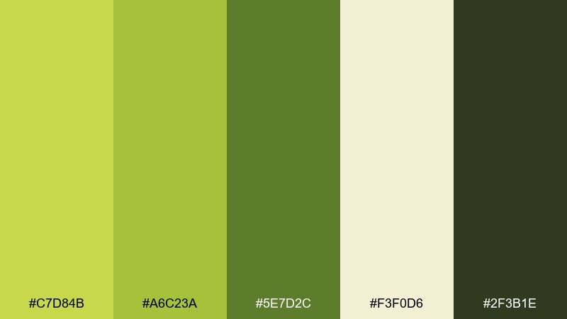
HEX: #C7D84B #A6C23A #5E7D2C #F3F0D6 #2F3B1E
Mood: bright, outdoorsy, uplifting
Best for: organic grocery branding and shelf labels
Bright and outdoorsy, it feels like morning sun across spring grass and citrus leaves. This peridot color palette works well for eco-forward brands, farmers markets, and clean packaging. Pair the lime tones with the warm cream for readable text and let the deep green ground logos. Tip: use the darkest shade for type and outlines to keep the label crisp.
Image example of citrus meadow generated using media.io
Media.io is an online AI studio for creating and editing video, image, and audio in your browser.

2) Polished Jade
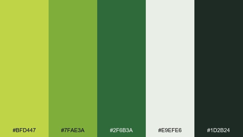
HEX: #BFD447 #7FAE3A #2F6B3A #E9EFE6 #1D2B24
Mood: sleek, confident, modern
Best for: fintech landing page UI
Sleek and confident, these tones evoke polished stone, clean glass, and a calm sense of control. The mid greens make strong buttons, while the near-black green anchors headers and nav. Pair with generous whitespace and soft dividers to avoid visual noise. Tip: reserve the darkest tone for primary CTAs only, so the interface feels premium.
Image example of polished jade generated using media.io
3) Linen and Lime
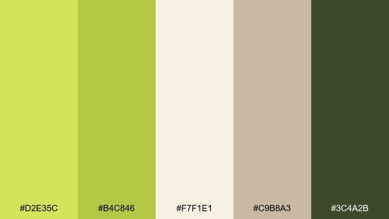
HEX: #D2E35C #B4C846 #F7F1E1 #C9B8A3 #3C4A2B
Mood: soft, natural, airy
Best for: minimal kitchen and dining decor
Soft and natural, it brings to mind sun-warmed linen, fresh herbs, and light wood. The creamy neutrals keep the greens from feeling too loud, making it easy for walls, textiles, and menus. Pair with matte black hardware or dark wood for contrast that still feels calm. Tip: repeat the lime tone in small accents like napkins or ceramics for cohesion.
Image example of linen and lime generated using media.io
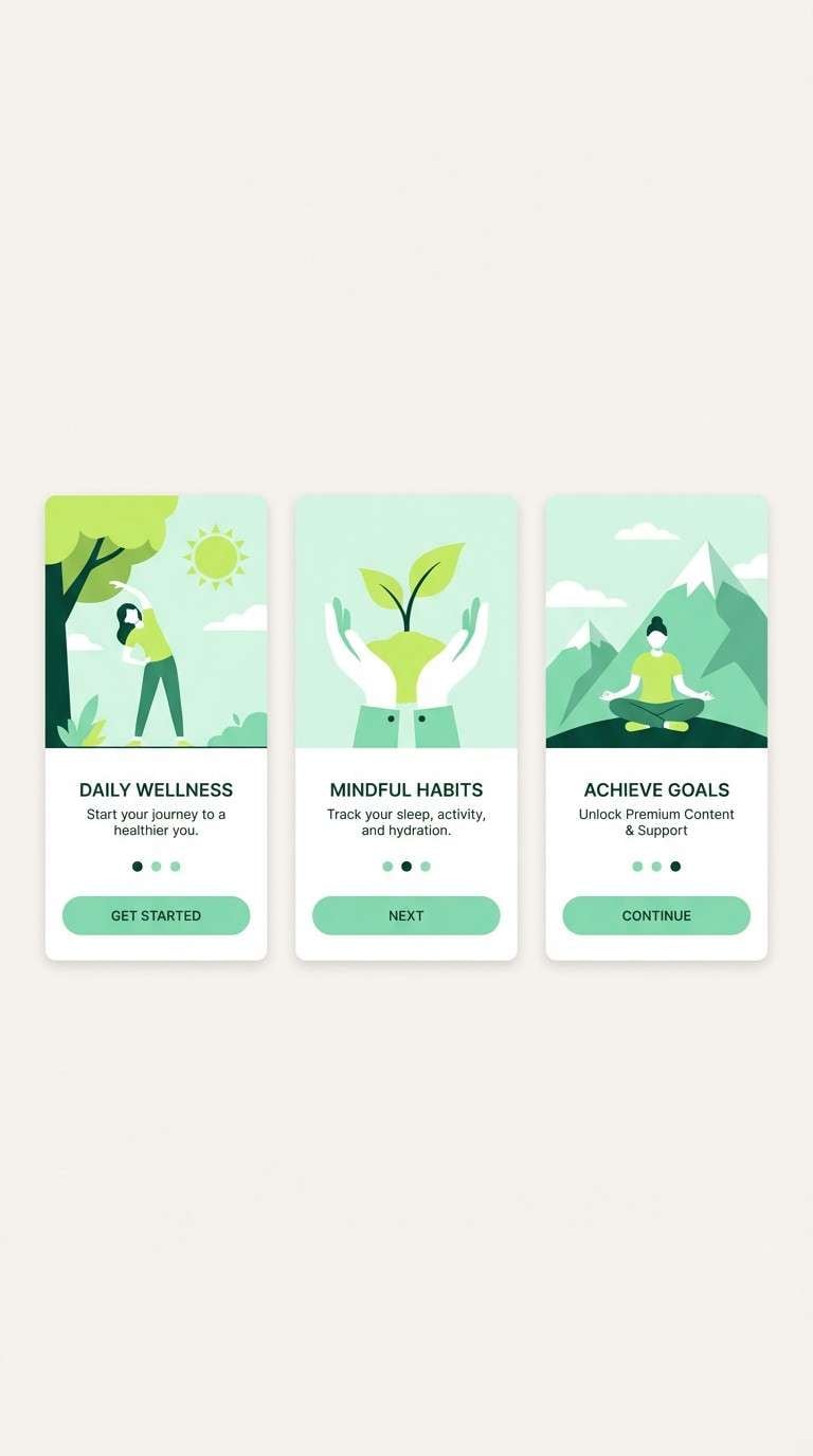
4) Garden Mint
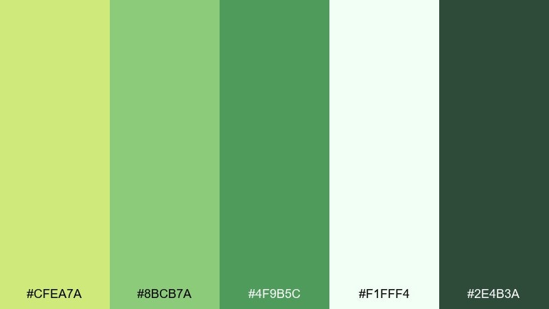
HEX: #CFEA7A #8BCB7A #4F9B5C #F1FFF4 #2E4B3A
Mood: fresh, friendly, rejuvenating
Best for: wellness app onboarding screens
Fresh and friendly, it feels like mint leaves, new sprouts, and a cool breeze after rain. This peridot color scheme is ideal for wellness products where reassurance matters more than flash. Pair the minty greens with soft white space, then use the deep green for progress states and icons. Tip: keep gradients subtle so the screens stay calming.
Image example of garden mint generated using media.io
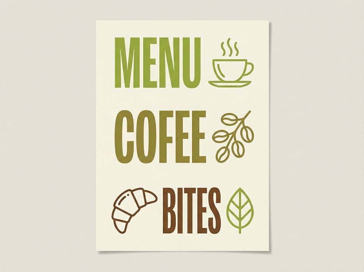
5) Retro Avocado
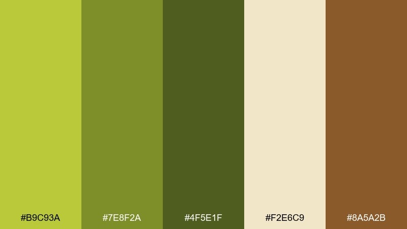
HEX: #B9C93A #7E8F2A #4F5E1F #F2E6C9 #8A5A2B
Mood: retro, earthy, cozy
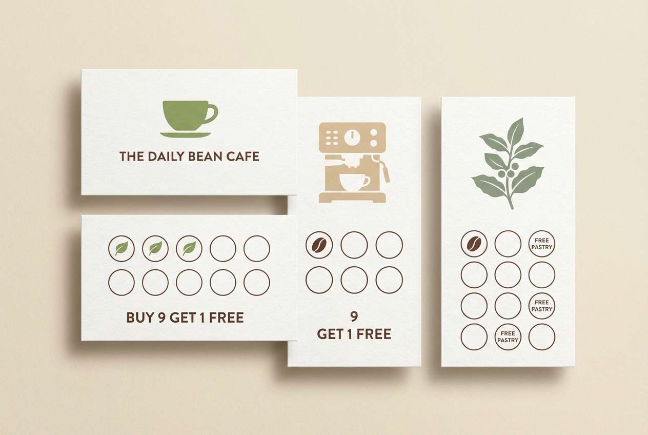
Best for: coffee shop menu and signage
Retro and earthy, it channels vintage kitchens, avocado toast, and warm café lighting. The brown adds a roasted, grounded note that keeps the greens from skewing too sharp. Pair with cream paper textures and chunky typography for an inviting feel. Tip: use the light cream as the main canvas to maintain readability on menus.
Image example of retro avocado generated using media.io
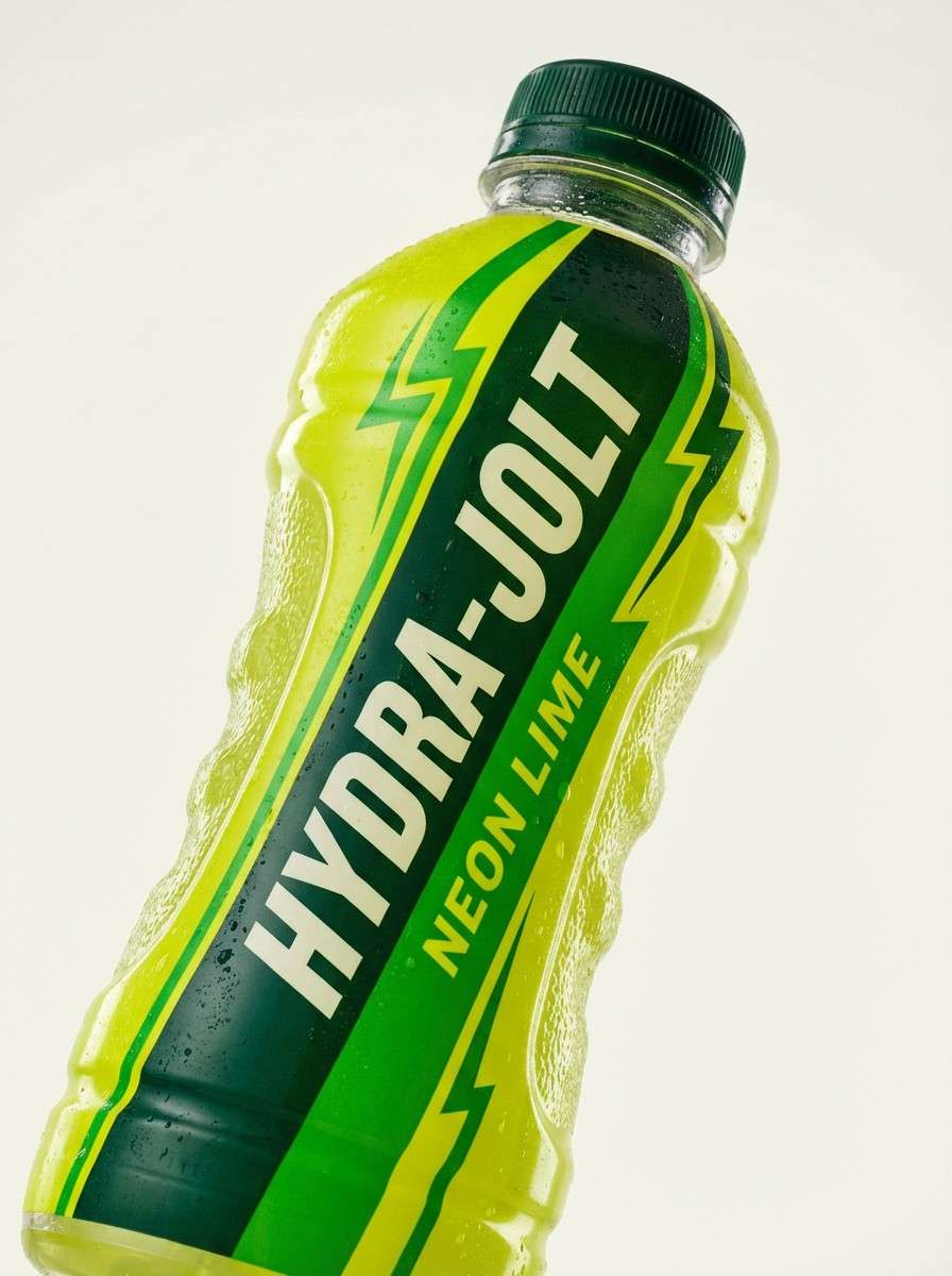
6) Neon Pear Pop
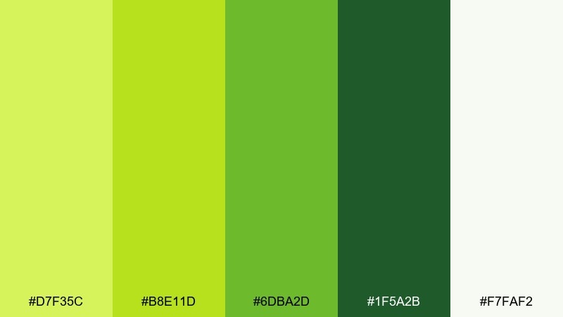
HEX: #D7F35C #B8E11D #6DBA2D #1F5A2B #F7FAF2
Mood: punchy, energetic, playful
Best for: sports drink product ad
Punchy and energetic, it looks like pear candy, stadium lights, and fast motion. These peridot color combinations shine in bold ads, snack branding, and high-contrast banners. Pair the brightest lime with plenty of off-white space, then add the deep green for sharp shadows and type. Tip: limit the neon to one or two focal elements so it feels modern, not messy.
Image example of neon pear pop generated using media.io
7) Soft Sage Studio
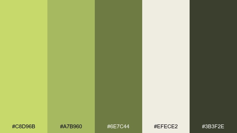
HEX: #C8D96B #A7B960 #6E7C44 #EFECE2 #3B3F2E
Mood: calm, understated, refined
Best for: architect portfolio website
Calm and understated, it suggests quiet studios, sketch paper, and leafy shadows. The muted greens read professional without feeling cold, especially beside the warm off-white. Pair with grayscale photography and thin line icons to keep the layout elegant. Tip: choose the mid sage for links and hover states for subtle motion.
Image example of soft sage studio generated using media.io

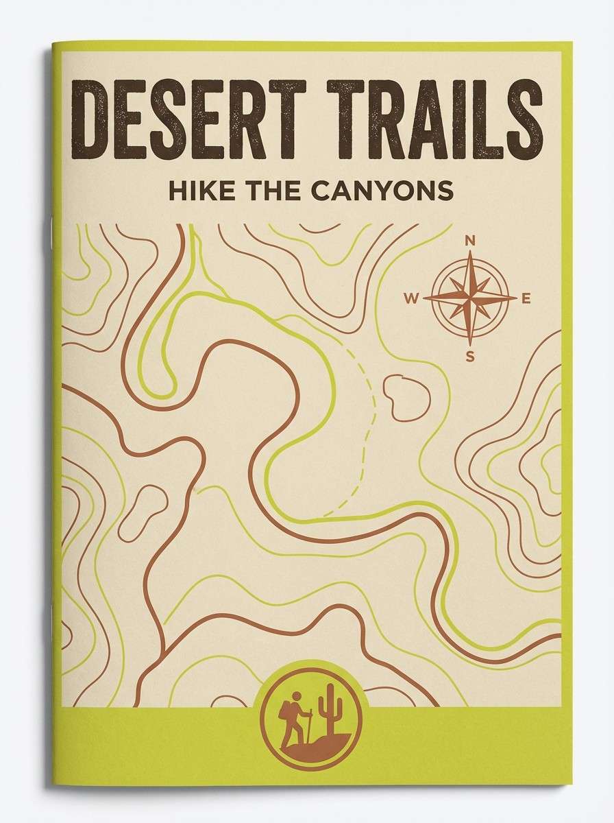
8) Desert Citron
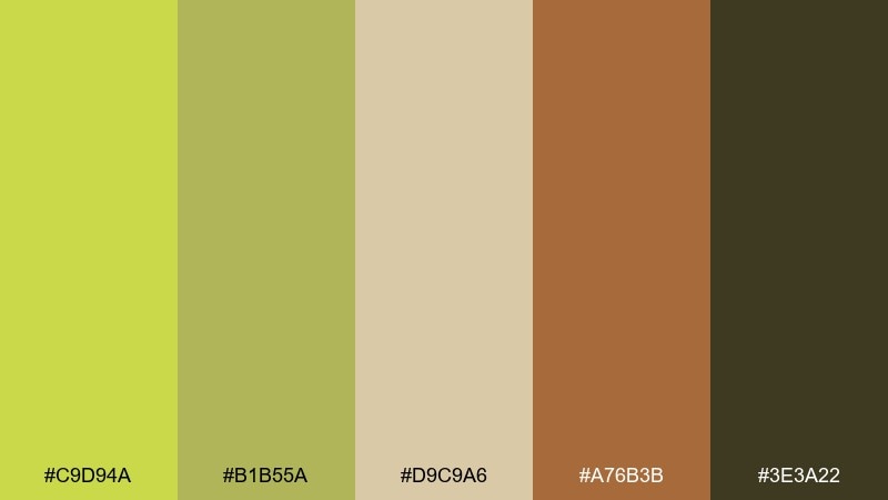
HEX: #C9D94A #B1B55A #D9C9A6 #A76B3B #3E3A22
Mood: sunbaked, rustic, adventurous
Best for: travel brochure for desert hikes
Sunbaked and rustic, it brings to mind citron shrubs, sandstone trails, and golden dust. The sandy beige and clay brown make the greens feel grounded and outdoors-ready. Pair with textured paper backgrounds and simple map icons for an authentic look. Tip: keep the darkest brown for headers to frame the content like a trail sign.
Image example of desert citron generated using media.io
9) Emerald Accent
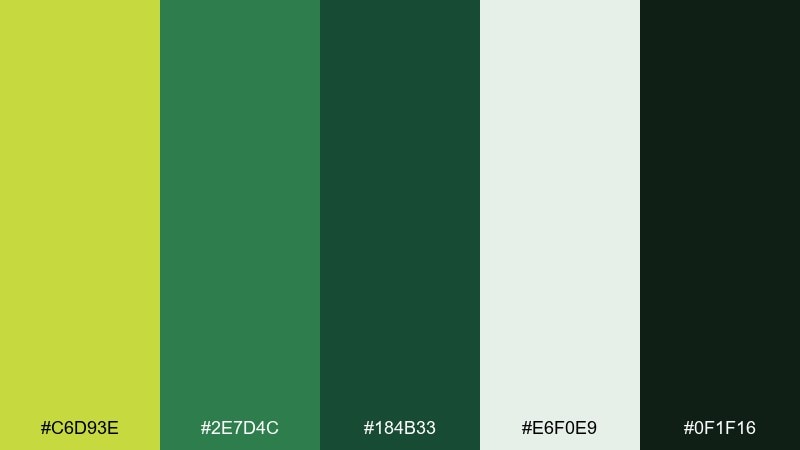
HEX: #C6D93E #2E7D4C #184B33 #E6F0E9 #0F1F16
Mood: sharp, luxe, high-contrast
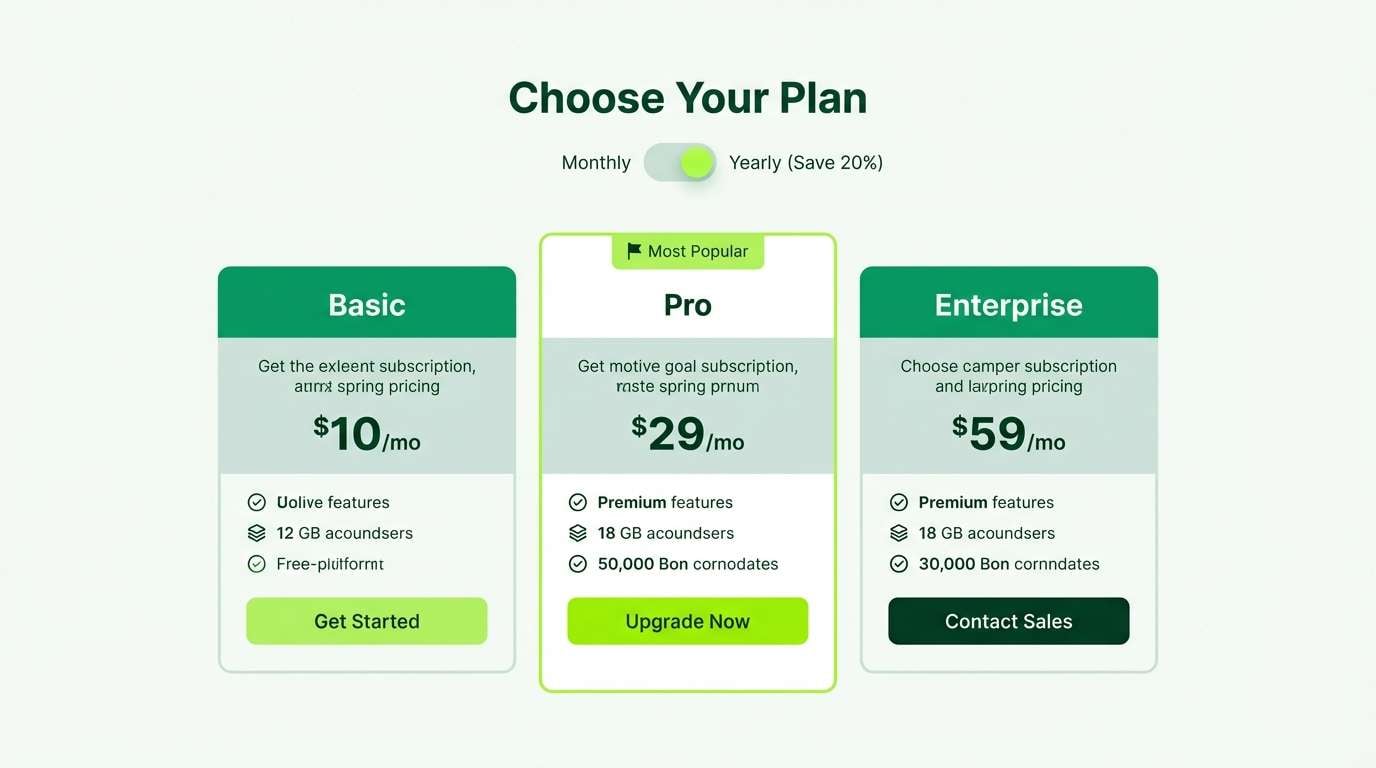
Best for: premium subscription pricing page
Sharp and luxe, it feels like a bright gem set against deep velvet. Use the light lime as an accent for highlights, badges, and key numbers, then let the dark greens create a premium frame. Pair with clean sans-serif type and lots of breathing room to keep it elevated. Tip: avoid filling large areas with the lime; it is strongest in small hits.
Image example of emerald accent generated using media.io
10) Spring Clay
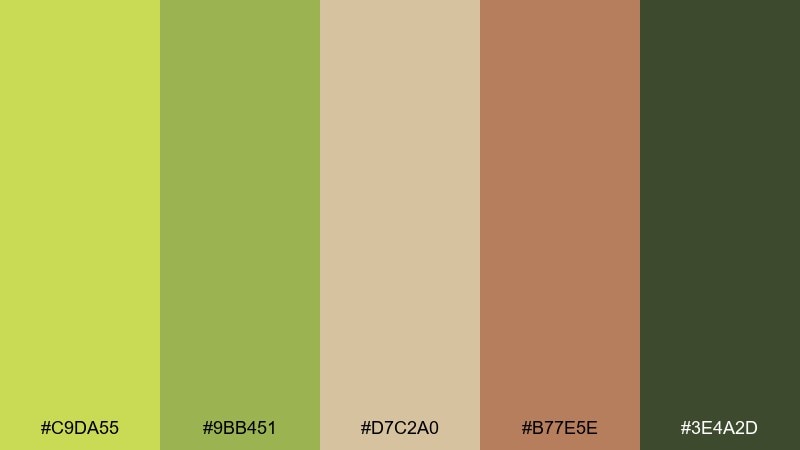
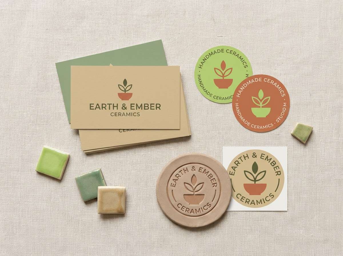
HEX: #C9DA55 #9BB451 #D7C2A0 #B77E5E #3E4A2D
Mood: warm, handmade, approachable
Best for: ceramics studio brand kit
Warm and handmade, it evokes fresh shoots beside sunlit terracotta. The clay and sand notes soften the green so it feels artisanal rather than sporty. Pair with organic shapes, stamped textures, and serif headlines for a crafted look. Tip: use the terracotta as a secondary accent to keep the green from dominating every touchpoint.
Image example of spring clay generated using media.io
11) Matcha Latte
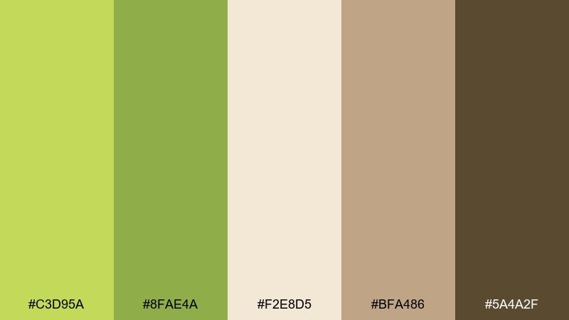
HEX: #C3D95A #8FAE4A #F2E8D5 #BFA486 #5A4A2F
Mood: cozy, mellow, comforting
Best for: cafe loyalty card design
Cozy and mellow, it suggests matcha foam, oat milk, and a quiet afternoon. The creamy base keeps the greens gentle, while the cocoa brown adds warmth for typography. Pair with simple illustrations and rounded corners to match the comforting vibe. Tip: print on uncoated stock to make the palette feel even softer.
Image example of matcha latte generated using media.io
12) Fresh Cut Grass
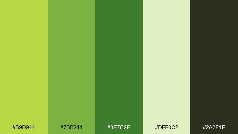
HEX: #B9D944 #7BB241 #3E7C2E #DFF0C2 #2A2F1E
Mood: crisp, sporty, outdoors
Best for: running event poster
Crisp and sporty, it brings the scent of freshly cut grass and bright daylight. The light green highlights feel fast and energetic, while the darker greens keep the layout readable from a distance. Pair with bold condensed type and clean grid alignment for a race-ready look. Tip: use the pale green as a background tint to soften the contrast without losing impact.
Image example of fresh cut grass generated using media.io

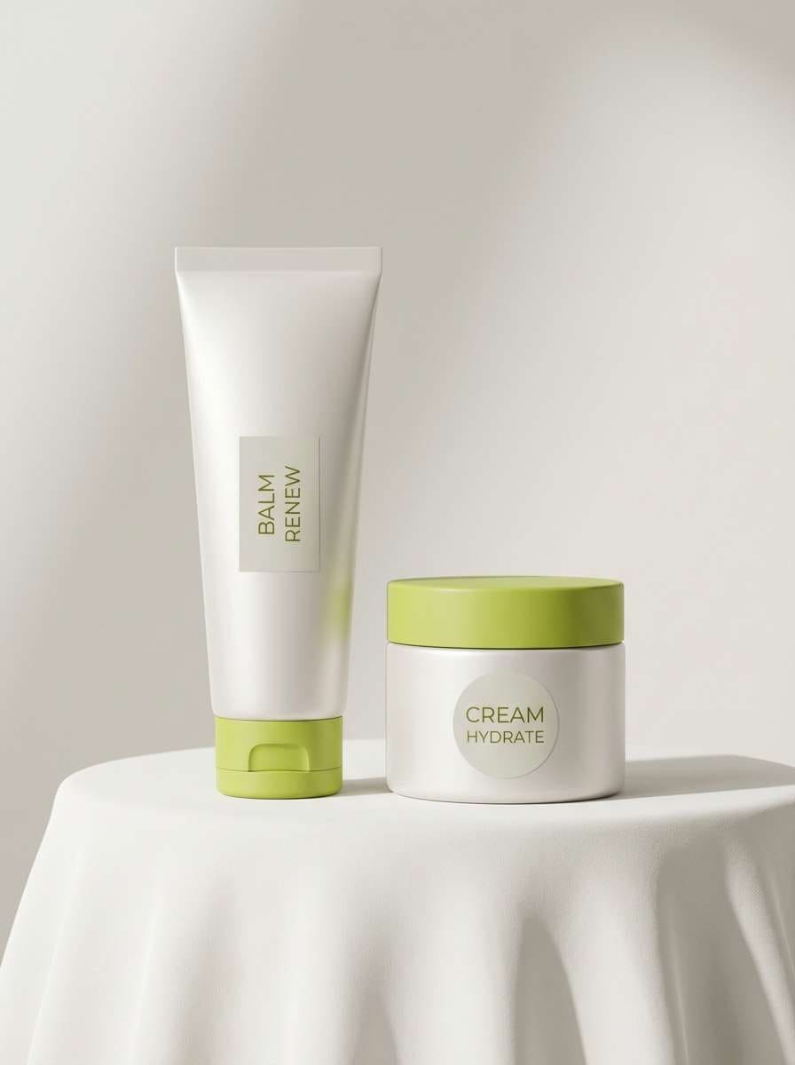
13) Pearl and Peridot
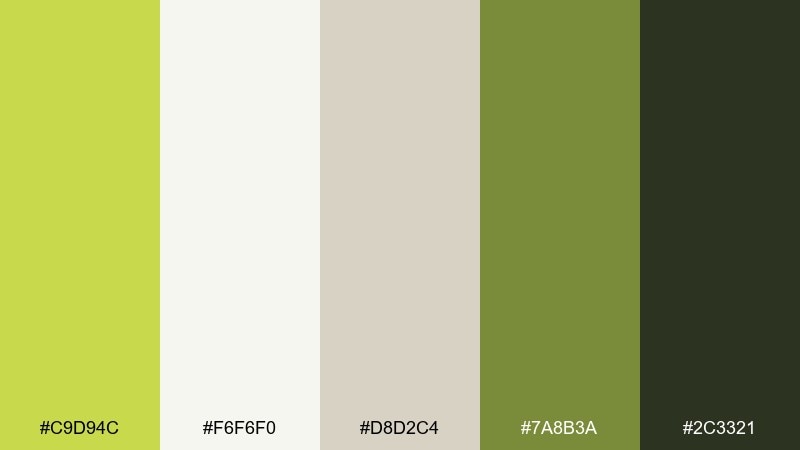
HEX: #C9D94C #F6F6F0 #D8D2C4 #7A8B3A #2C3321
Mood: clean, airy, quietly elegant
Best for: skincare packaging and website
Clean and airy, it feels like pearl light, fresh botanicals, and a minimalist bathroom shelf. This peridot color palette is a strong fit for skincare, spa brands, and calming product pages where trust matters. Pair the pearl whites with olive text for a soft premium look, and keep the lime as a small highlight on key benefits. Tip: use plenty of negative space so the green reads like a crisp accent, not a block of color.
Image example of pearl and peridot generated using media.io
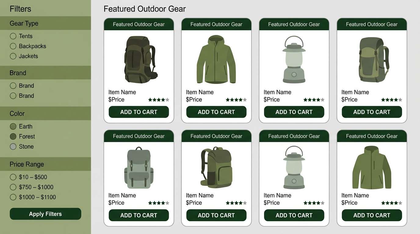
14) Modern Moss
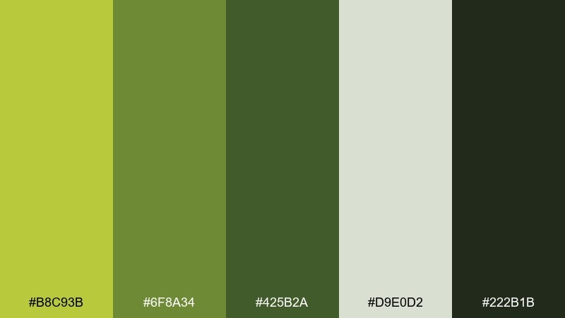
HEX: #B8C93B #6F8A34 #425B2A #D9E0D2 #222B1B
Mood: grounded, modern, mature
Best for: outdoor gear ecommerce UI
Grounded and modern, it recalls mossy bark, durable fabric, and trailhead signage. The muted light gray-green makes a practical background, while the deep tones hold product names and prices. Pair with high-quality product photos and simple iconography for specs and materials. Tip: keep buttons in the lighter green so the interface stays approachable.
Image example of modern moss generated using media.io
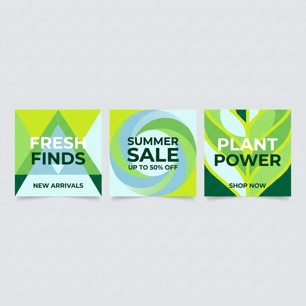
15) Glacier Lime
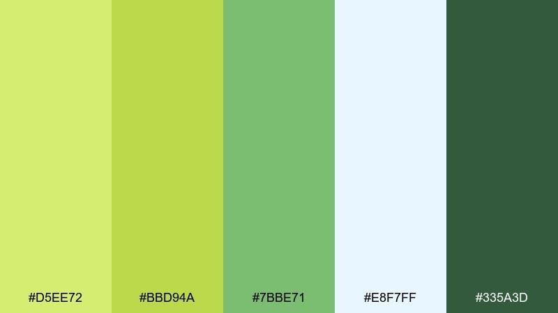
HEX: #D5EE72 #BBD94A #7BBE71 #E8F7FF #335A3D
Mood: cool, clean, refreshing
Best for: summer campaign social graphics
Cool and refreshing, it feels like icy air, bright citrus, and clean water. The hint of frosty blue keeps the greens feeling crisp instead of heavy. Pair with bold sans headlines and simple geometric shapes for fast-scrolling social posts. Tip: use the pale icy tone as a backdrop to make the lime pop without looking fluorescent.
Image example of glacier lime generated using media.io
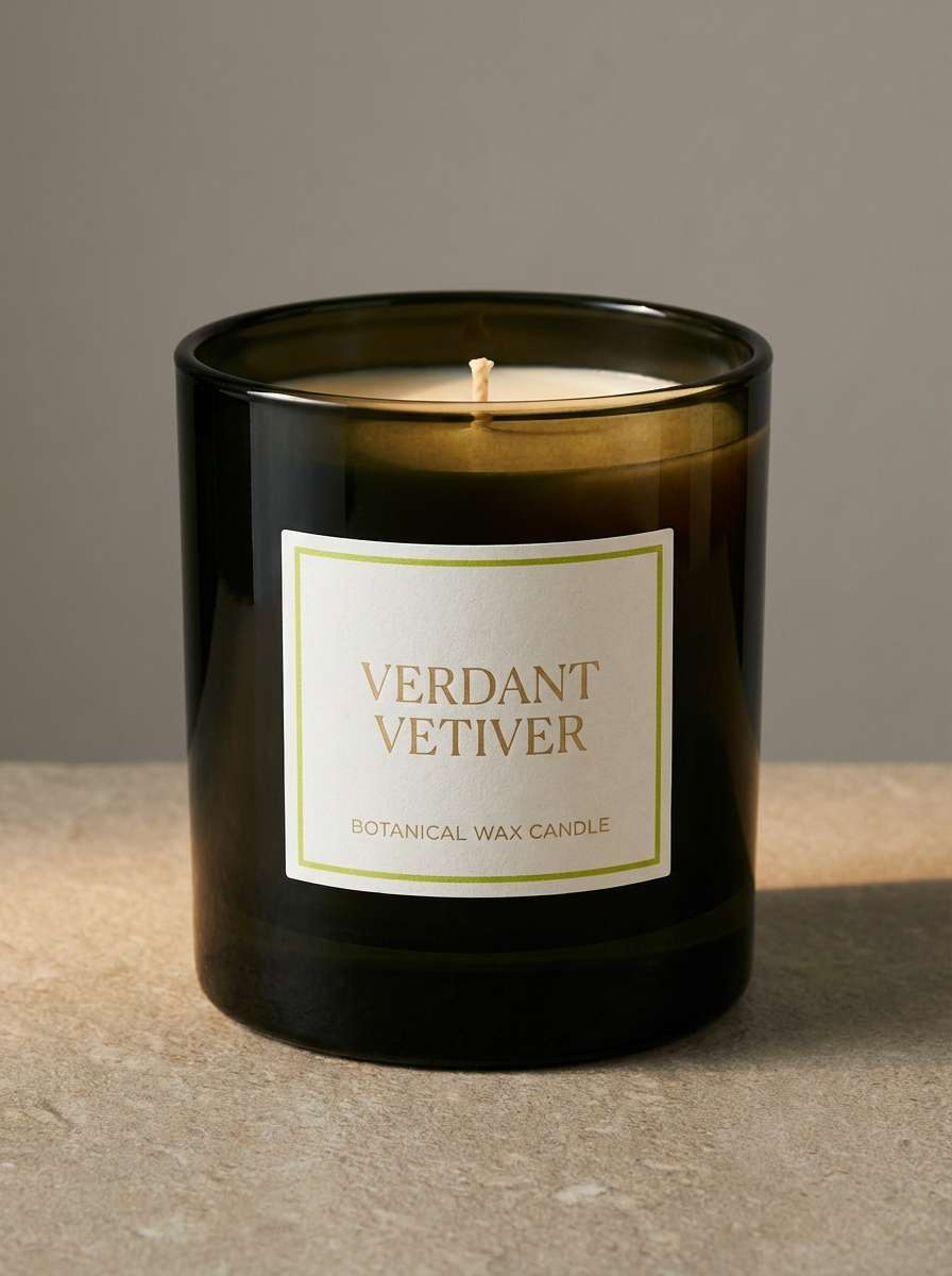
16) Botanical Noir
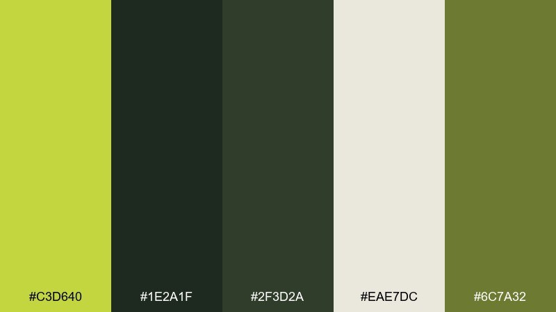
HEX: #C3D640 #1E2A1F #2F3D2A #EAE7DC #6C7A32
Mood: moody, dramatic, botanical
Best for: luxury candle packaging
Moody and dramatic, it suggests night gardens, glossy leaves, and candlelit shadows. The near-black greens make the lime feel precious, like a spotlight on the label. Pair with minimal serif type and subtle embossing to elevate the look. Tip: keep the cream tone for ingredient text to ensure it stays legible on dark packaging.
Image example of botanical noir generated using media.io
17) Sunlit Orchard
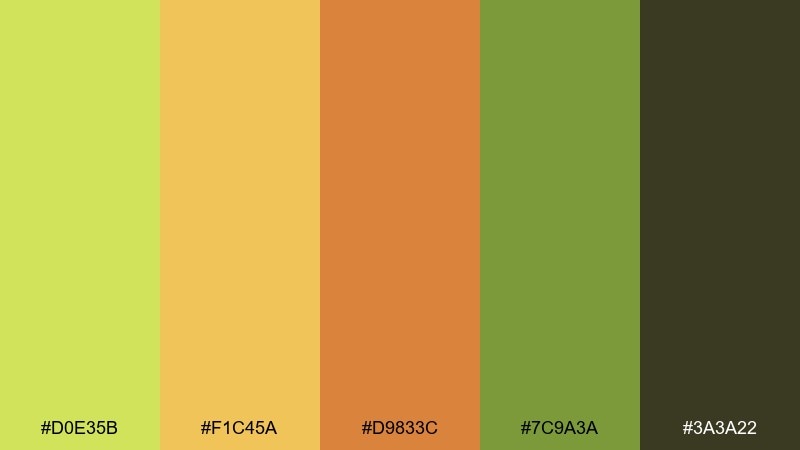
HEX: #D0E35B #F1C45A #D9833C #7C9A3A #3A3A22
Mood: cheerful, sunny, harvest-fresh
Best for: farmers market flyer
Cheerful and sunny, it feels like fruit stands, golden light, and a warm breeze through trees. These peridot color combinations pair beautifully with honey and apricot for seasonal promos and event graphics. Keep the green as the main header color, then use the orange for price tags and callouts. Tip: add simple produce icons in the dark olive to tie everything together.
Image example of sunlit orchard generated using media.io

18) Coastal Peridot
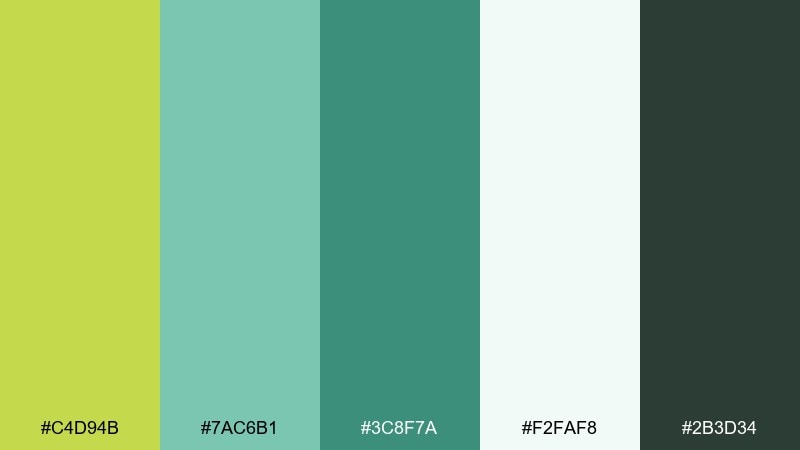
HEX: #C4D94B #7AC6B1 #3C8F7A #F2FAF8 #2B3D34
Mood: breezy, clean, coastal
Best for: resort booking website hero
Breezy and clean, it brings sea glass, coastal plants, and fresh air into one calm mix. The teal-leaning greens make the lime feel more relaxed and travel-friendly. Pair with large typography, airy spacing, and simple line icons for amenities. Tip: use the light aqua-white tone behind booking forms to keep inputs obvious.
Image example of coastal peridot generated using media.io
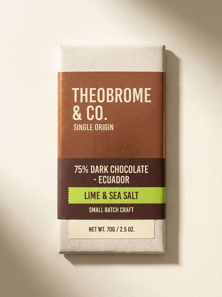
19) Copper Leaf
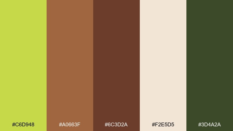
HEX: #C6D948 #A0663F #6C3D2A #F2E5D5 #3D4A2A
Mood: autumnal, rich, earthy
Best for: craft chocolate packaging
Autumnal and rich, it evokes copper leaves, cacao shells, and warm paper. The brown spectrum gives the green a sophisticated, earthy edge that suits artisanal foods. Pair with textured illustration and gold-foil style accents for a premium shelf presence. Tip: keep the light cream for nutrition info and small type so it stays readable.
Image example of copper leaf generated using media.io
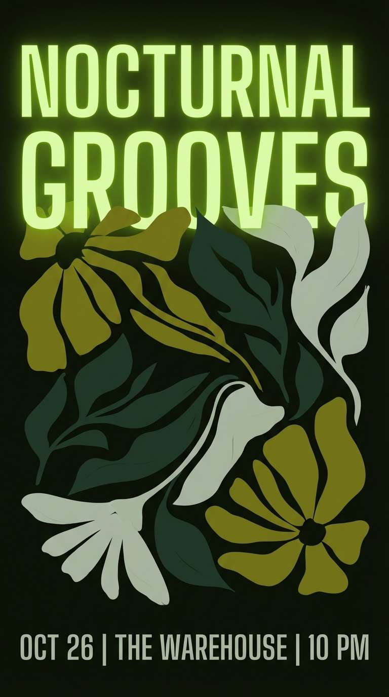
20) Night Bloom
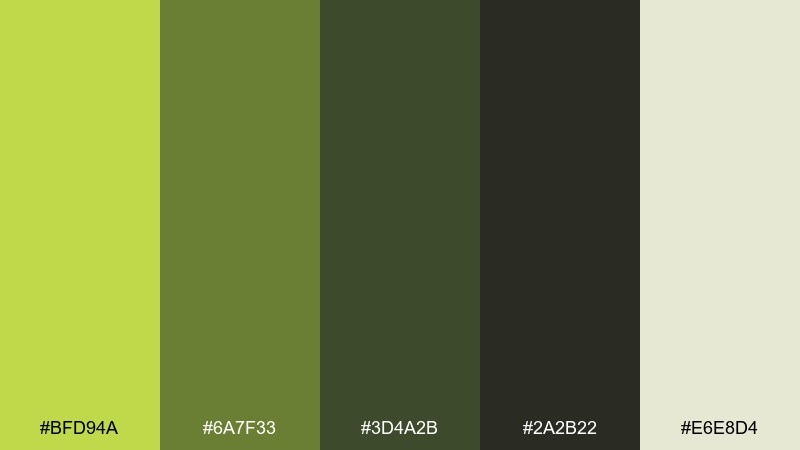
HEX: #BFD94A #6A7F33 #3D4A2B #2A2B22 #E6E8D4
Mood: mysterious, modern, cinematic
Best for: music event poster series
Mysterious and cinematic, it feels like neon blooms against a midnight street. The near-black base makes the lime read like a glowing highlight, perfect for bold titles and dates. Pair with high-contrast typography and simple abstract shapes to keep it modern. Tip: use the pale gray-green sparingly for secondary details like venue and lineup.
Image example of night bloom generated using media.io
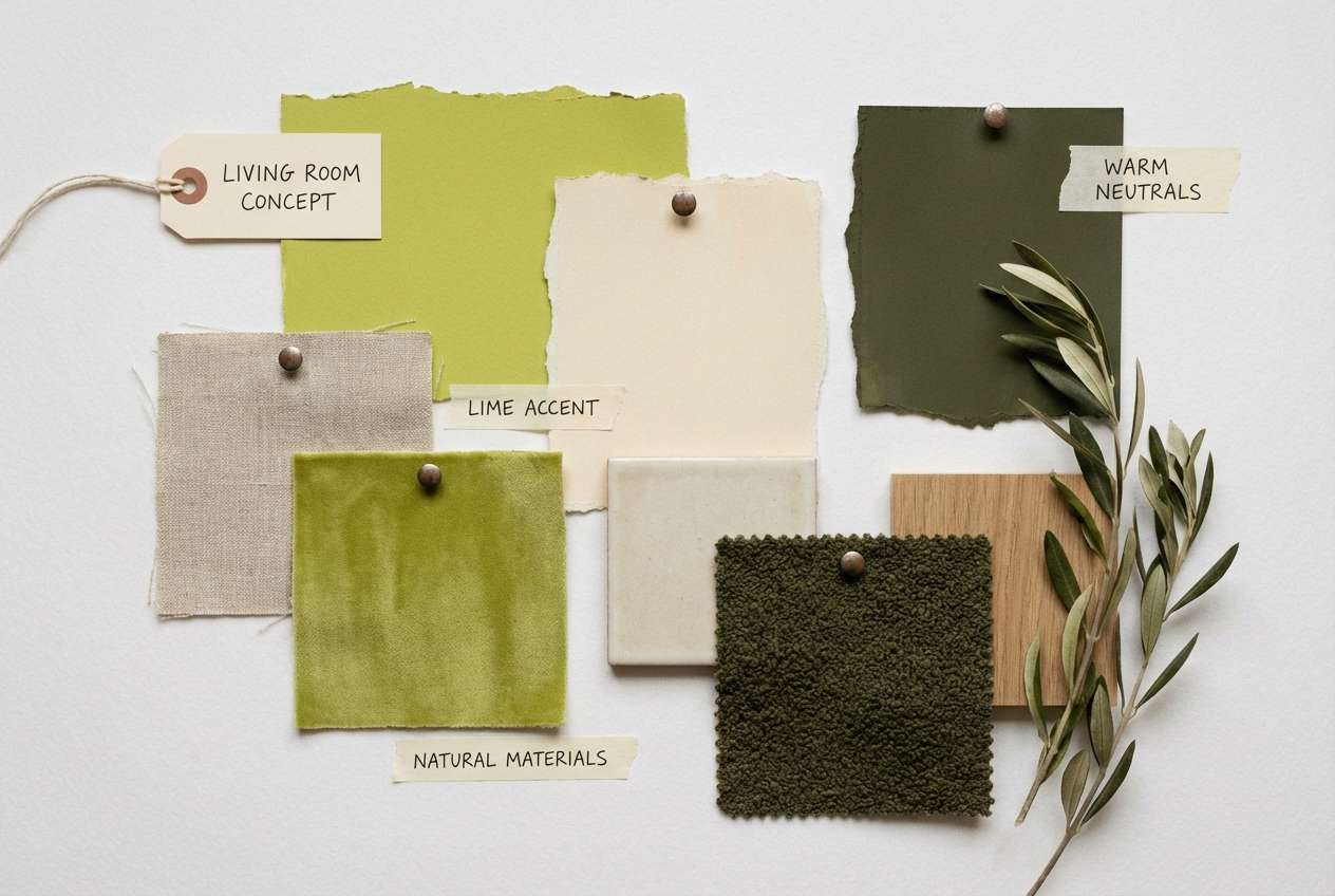
What Colors Go Well with Peridot?
Peridot pairs best with calm neutrals (warm cream, pearl white, greige) when you want a clean, modern look that still feels natural. These backgrounds help peridot read as an accent instead of overwhelming the design.
For contrast and legibility, use deep forest greens or near-black greens for headlines, icons, and outlines. This keeps peridot bright while maintaining a premium, grounded structure.
For more character, add warm companions like terracotta, copper, honey yellow, or cocoa brown. These colors turn peridot from “fresh” into “harvest,” “handmade,” or “retro,” depending on how much warmth you introduce.
How to Use a Peridot Color Palette in Real Designs
In UI, treat peridot as a focus tool: use it for primary buttons, toggles, success states, and key numbers, then lean on off-whites and soft gray-greens for surfaces. Keep large peridot blocks limited unless the design is intentionally bold and sporty.
In branding and packaging, peridot works well as a freshness cue—great for food, skincare, wellness, and eco products. Pair it with textured creams, subtle shadows, and deep olive typography so the label stays readable and refined.
For posters and social graphics, peridot shines in high-contrast compositions. Combine it with near-black greens for dramatic type, then add one warm accent (apricot, copper, or clay) for punch and hierarchy.
Create Peridot Palette Visuals with AI
If you have HEX codes but need on-brand mockups fast, generate visuals that match your peridot color scheme using text prompts. This is ideal for testing packaging directions, UI hero concepts, or campaign tiles before committing to a full design pass.
Start with one palette above, reuse its prompt, then swap the subject (poster, bottle, website, mood board) while keeping the same lighting and background style. You’ll get a cohesive set of images that “feel” like the same brand.
When you find a look you like, iterate by adjusting one variable at a time—contrast, texture, or accent color—so your peridot stays consistent across outputs.
Peridot Color Palette FAQs
-
What is the HEX code for peridot green?
Peridot isn’t a single standardized HEX value, but it’s commonly represented as a yellow-green in the #BFD94A to #C9D94C range. In this article, palettes use peridot-like limes such as #C7D84B and #C9D94C. -
Is peridot closer to lime or chartreuse?
Peridot usually sits between lime and chartreuse: it’s bright like lime but with more yellow warmth (a chartreuse lean). The exact feel depends on how much yellow is present and what neutrals or dark greens you pair with it. -
What neutral colors match a peridot color palette?
Warm cream, pearl white, light greige, and soft gray-green are the easiest neutrals to pair with peridot. They keep the palette airy and help maintain readability in UI and print layouts. -
What dark colors work best for text with peridot accents?
Deep forest green, near-black green, and dark olive work especially well because they keep the overall look botanical and cohesive. They also provide strong contrast against bright peridot for accessible type and icons. -
Can I use peridot for a luxury brand?
Yes—use peridot as a small highlight, and build the base with deep greens, charcoal-leaning tones, and plenty of whitespace. Palettes like Emerald Accent or Botanical Noir show how peridot can feel premium instead of playful. -
How do I keep peridot from looking too neon?
Reduce the surface area of the brightest lime, add warm neutrals (cream/linen), and include a muted olive or sage to soften the overall impression. Using peridot mainly for accents (badges, lines, small shapes) also keeps it controlled. -
How can I generate peridot palette images for my project?
Use an AI text-to-image tool and describe your subject plus the mood, background, and lighting—then keep your palette consistent across prompts. You can copy a prompt from any palette above and iterate on the scene while retaining the peridot color scheme.


