

A countryside color palette blends earthy greens, hay neutrals, weathered woods, and skywashed blues to create designs that feel calm, honest, and lived-in. It’s a reliable direction for anything that needs warmth without looking overly trendy.
Below are 20 countryside palette ideas with HEX codes, plus AI image prompts you can use to visualize each look for branding, UI, packaging, and invitations.
In this article
- Why Countryside Palettes Work So Well
-
- meadow morning
- barnwood & cream
- hedgerow sage
- wildflower lane
- riverstone dusk
- harvest field
- misty pasture
- orchard picnic
- cottage quilt
- heather hill
- stone fence neutral
- sunlit haystack
- pine cabin
- rainy lane
- vintage tractor
- lavender breeze
- clay pot garden
- brookside blues
- golden wheat & moss
- twilight farmhouse
- What Colors Go Well with Countryside?
- How to Use a Countryside Color Palette in Real Designs
- Create Countryside Palette Visuals with AI
Why Countryside Palettes Work So Well
Countryside palettes feel instantly familiar because they’re built from materials we see in nature and daily rural life: grasses, soil, stone, timber, fog, and sun-faded paint. That familiarity makes designs feel approachable and trustworthy.
They’re also versatile for contrast. You can go light and airy with cream and misty greens, or richer and more heritage with barnwood browns and deep evergreens—without losing the “pastoral” vibe.
Finally, countryside color schemes tend to age well. Muted greens, warm neutrals, and softened blues look refined across print and screens, which is ideal for brands that want longevity.
20+ Countryside Color Palette Ideas (with HEX Codes)
1) Meadow Morning
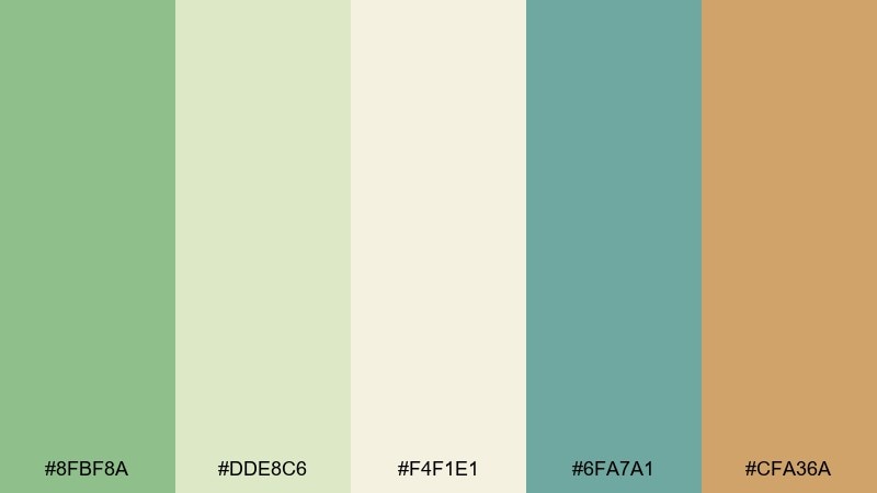
HEX: #8FBF8A #DDE8C6 #F4F1E1 #6FA7A1 #CFA36A
Mood: fresh, airy, optimistic
Best for: wellness landing page UI
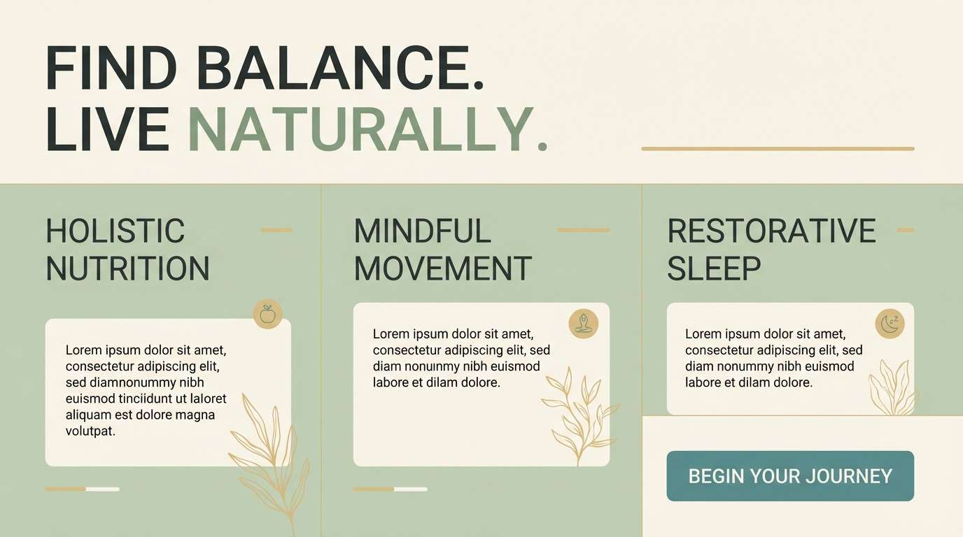
Fresh and airy like dew on new grass, these tones feel clean without turning clinical. Use the soft green as your primary surface and keep the cream for breathable negative space. The muted teal makes a calm link and icon color, while the warm straw shade works well for subtle highlights. Tip: reserve the straw accent for key CTAs to keep the page feeling light.
Image example of meadow morning generated using media.io
Media.io is an online AI studio for creating and editing video, image, and audio in your browser.

2) Barnwood & Cream
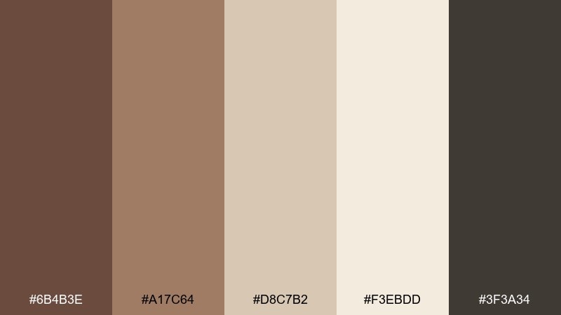
HEX: #6B4B3E #A17C64 #D8C7B2 #F3EBDD #3F3A34
Mood: warm, grounded, heritage
Best for: coffee bag packaging
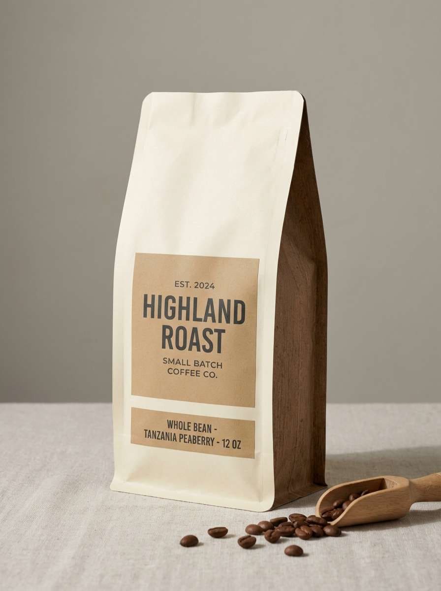
Warm and grounded like aged timber and sunlit canvas, this mix reads honest and handcrafted. Put the deep barnwood brown on typography and logos for instant structure. Use cream as the main background, then layer the tan and walnut shades for badges, borders, and texture cues. Tip: add a matte finish and keep contrast high so small text stays crisp.
Image example of barnwood & cream generated using media.io
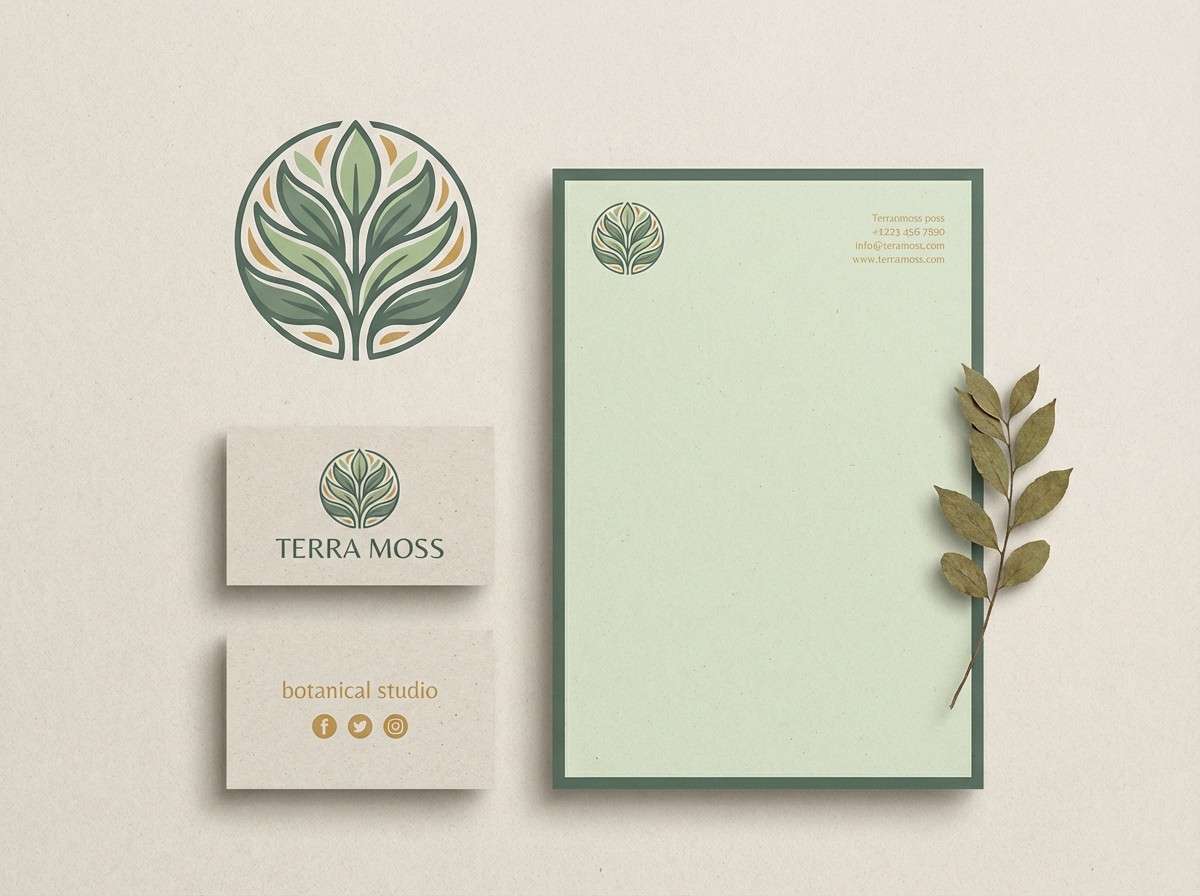
3) Hedgerow Sage
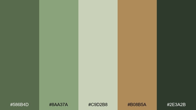
HEX: #586B4D #8AA37A #C9D2B8 #B08B5A #2E3A2B
Mood: quiet, natural, earthy
Best for: eco brand identity kit
Quiet and natural like a shaded hedge line, these greens feel steady and mature. Lead with the darker sage for wordmarks, then use the lighter greens for secondary backgrounds and stationery. The muted ochre-brown brings just enough warmth for seals, icons, or pattern details. Tip: pair with uncoated paper textures to keep the identity feeling authentic.
Image example of hedgerow sage generated using media.io
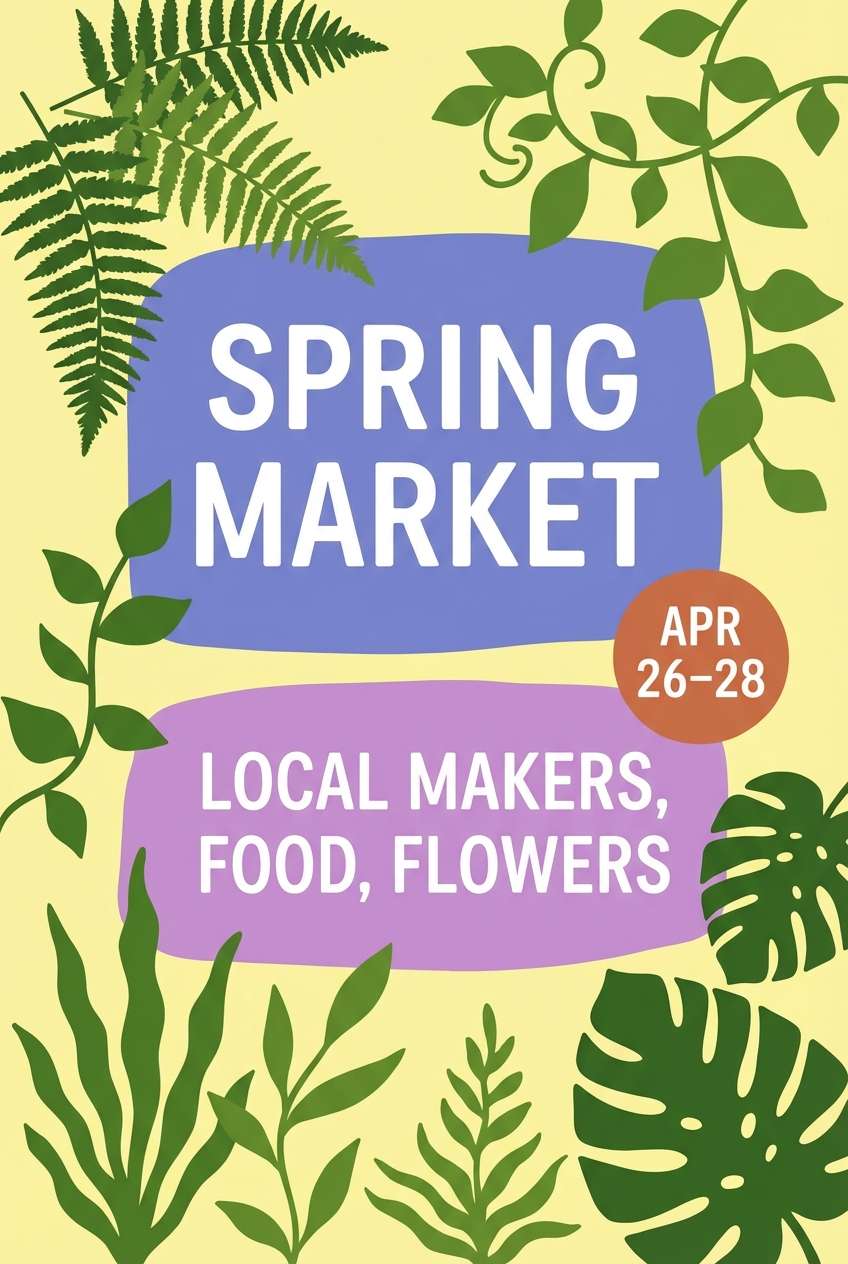
4) Wildflower Lane
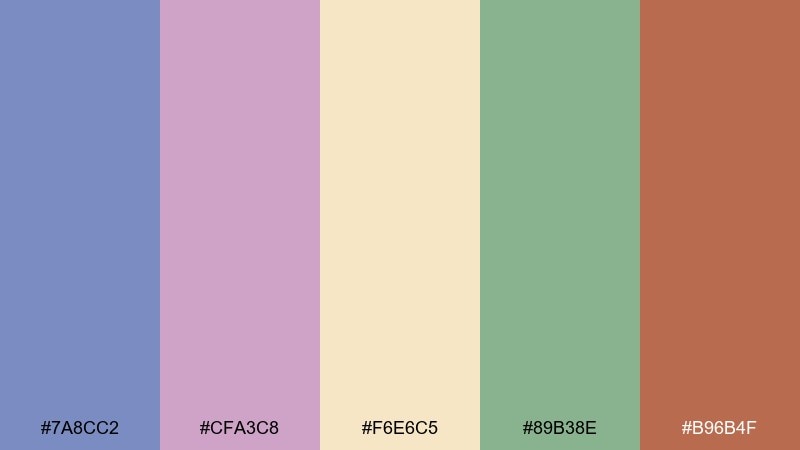
HEX: #7A8CC2 #CFA3C8 #F6E6C5 #89B38E #B96B4F
Mood: whimsical, soft, storybook
Best for: spring market poster
Whimsical and soft like blooms along a dirt path, this set feels friendly and inviting. Try these countryside color combinations for posters that need charm without looking overly cute. Use buttercream as the base, then let periwinkle and lilac carry the headline and graphics while the leafy green balances the warmth. Tip: keep the terracotta as a small accent for dates and callouts.
Image example of wildflower lane generated using media.io
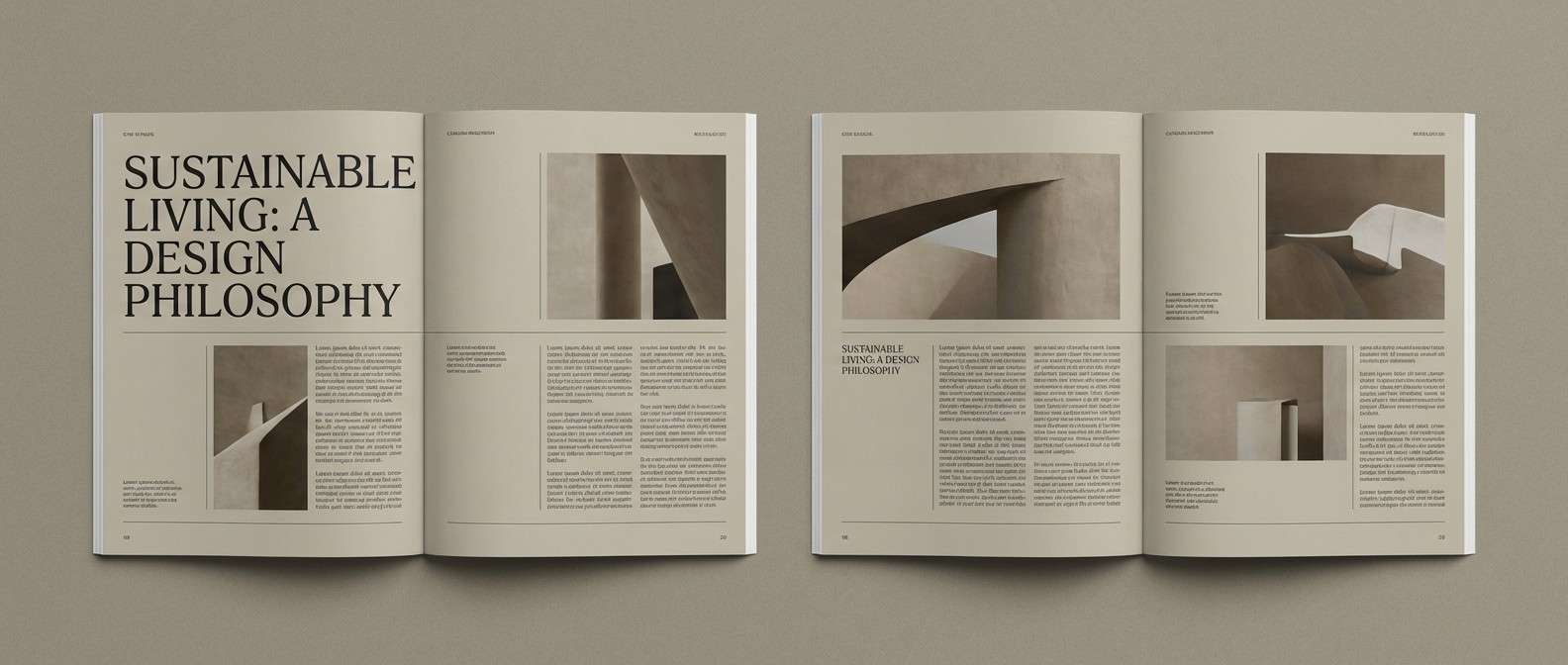
5) Riverstone Dusk
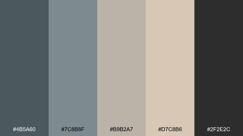
HEX: #4B5A60 #7C8B8F #B9B2A7 #D7C8B6 #2F2E2C
Mood: moody, calm, refined
Best for: editorial magazine spread
Moody and calm like smooth stones at twilight, these neutrals feel modern and editorial. Use the near-black for headings and strong rules, then let the slate and warm greige carry body text and captions. The sandy beige is ideal for pull quotes or sidebars where you want soft contrast. Tip: add generous margins so the palette reads intentional, not gloomy.
Image example of riverstone dusk generated using media.io
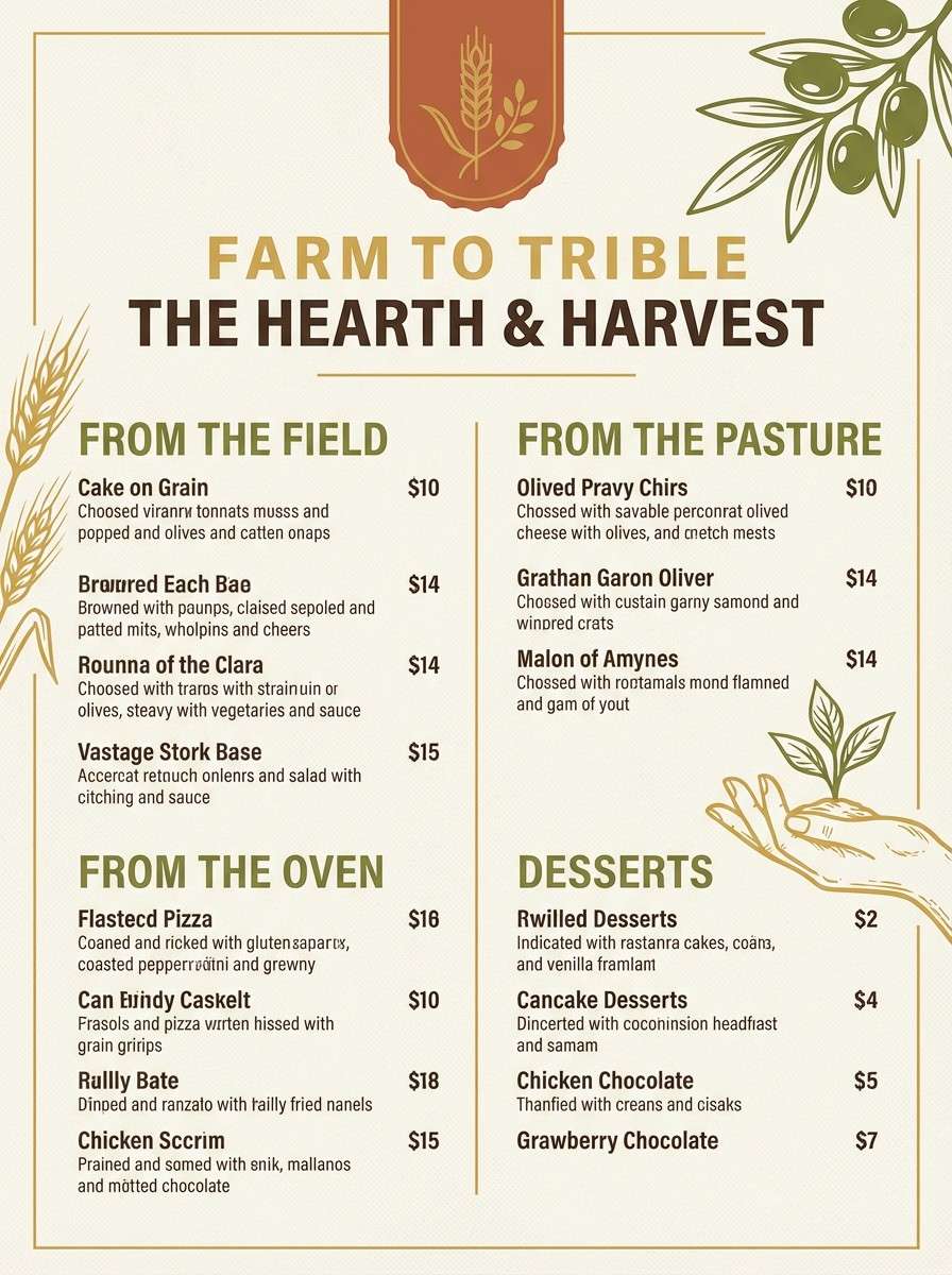
6) Harvest Field
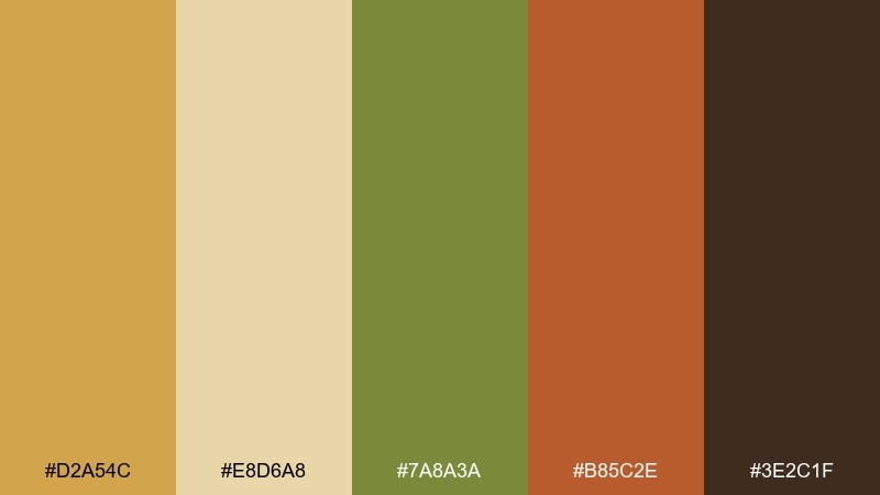
HEX: #D2A54C #E8D6A8 #7A8A3A #B85C2E #3E2C1F
Mood: hearty, sunbaked, rustic
Best for: farm-to-table menu design
Hearty and sunbaked like late-season fields, these colors bring appetite and warmth. Put the wheat gold on headers and section dividers, then use the pale grain as the menu background. The olive green keeps the palette from feeling too orange, while the terracotta adds a tasty accent for specials. Tip: use the dark cocoa for body copy to keep readability strong on textured paper.
Image example of harvest field generated using media.io
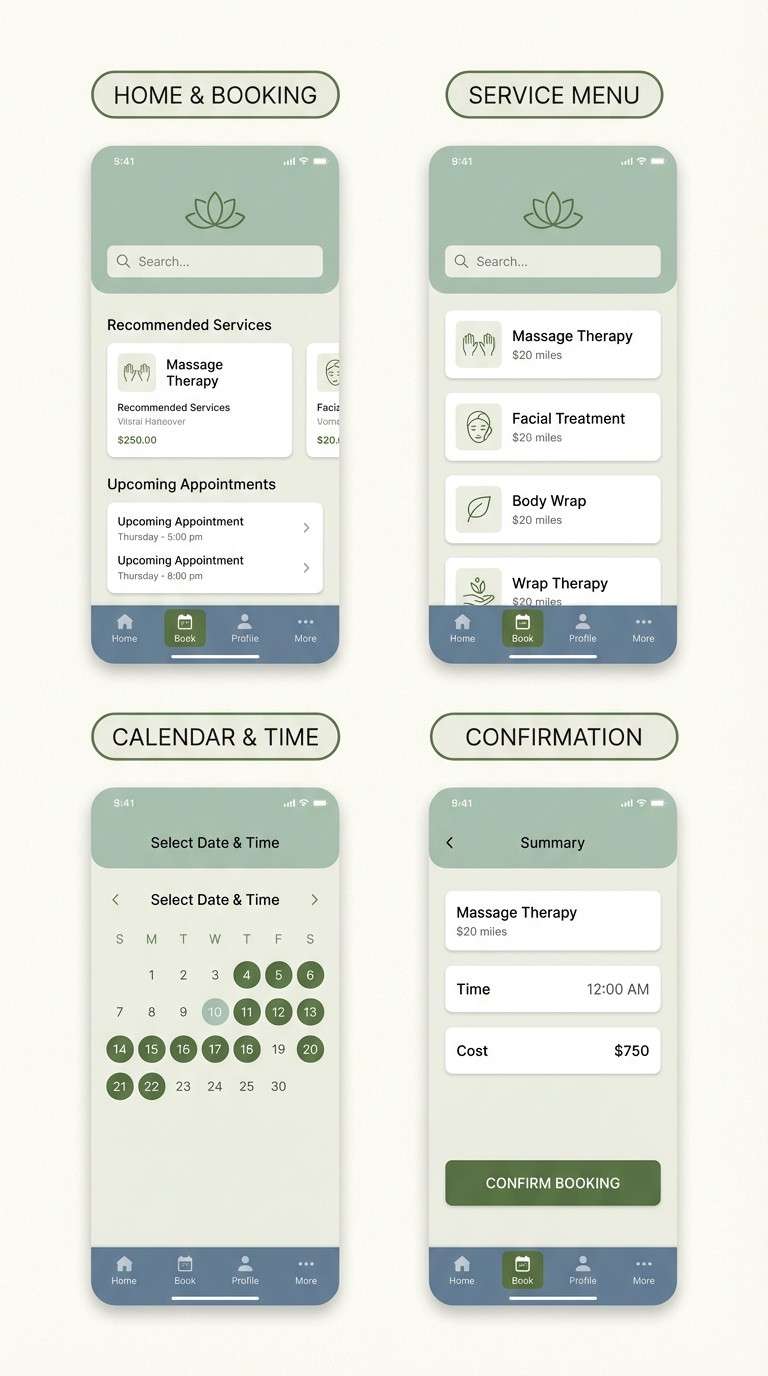
7) Misty Pasture
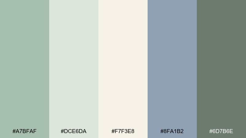
HEX: #A7BFAF #DCE6DA #F7F3E8 #8FA1B2 #6D7B6E
Mood: gentle, cool, soothing
Best for: spa appointment app UI
Gentle and cool like fog sitting over open grass, these shades feel restorative. In a countryside color palette like this, the pale off-white keeps screens bright while the mist green reduces visual stress. Use the blue-gray for tabs and secondary buttons, and save the deeper moss for active states and small labels. Tip: keep shadows soft and low-contrast so the UI stays serene.
Image example of misty pasture generated using media.io
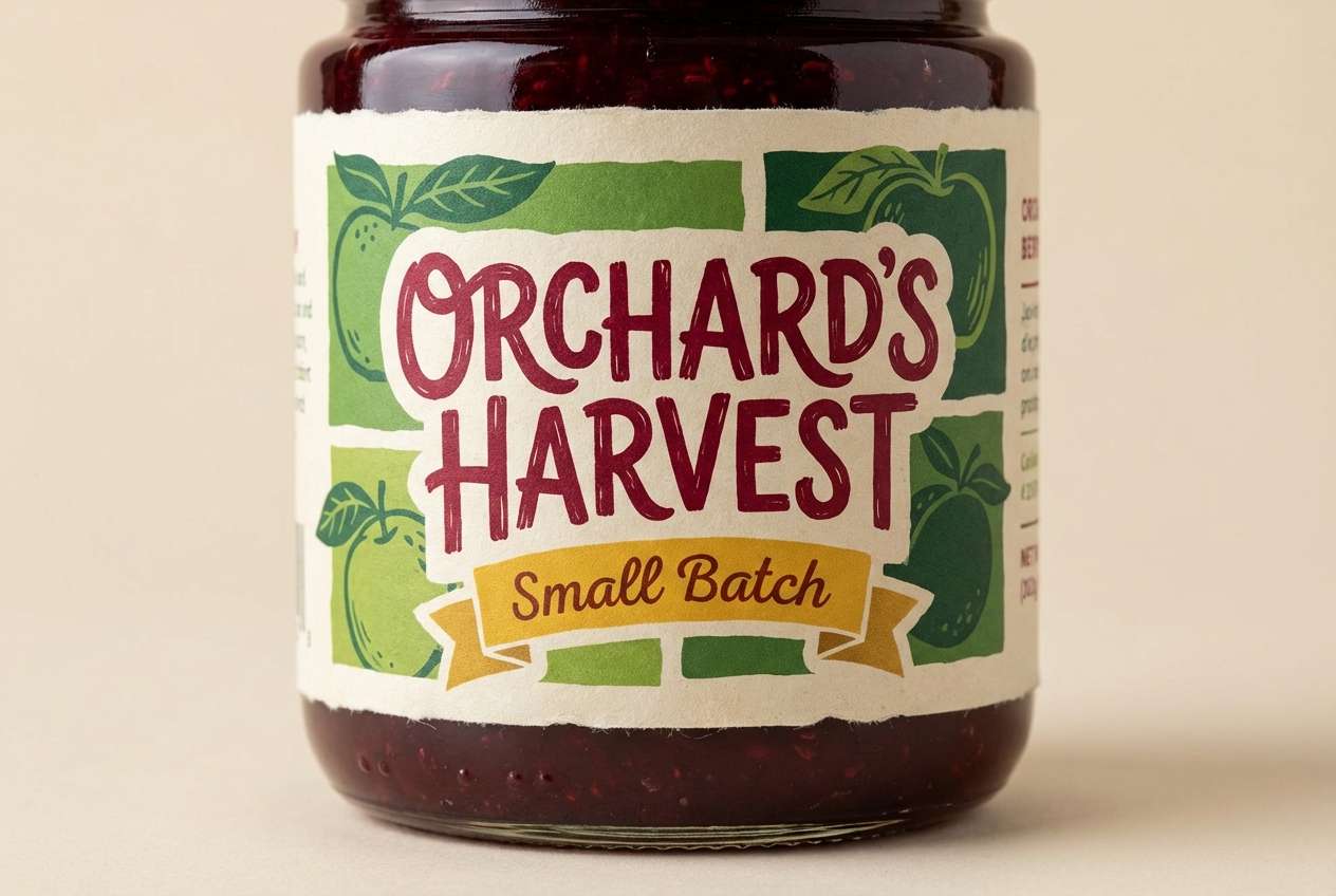
8) Orchard Picnic
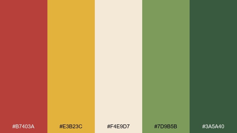
HEX: #B7403A #E3B23C #F4E9D7 #7D9B5B #3A5A40
Mood: cheerful, inviting, sunny
Best for: jam label design
Cheerful and inviting like fruit baskets under trees, this mix feels homemade yet bold. Use the cream as your label base so the red reads juicy rather than harsh. The golden yellow is perfect for small bursts like flavor notes, and the greens keep the design feeling fresh. Tip: outline small text with the deeper green for legibility on bright accents.
Image example of orchard picnic generated using media.io
9) Cottage Quilt
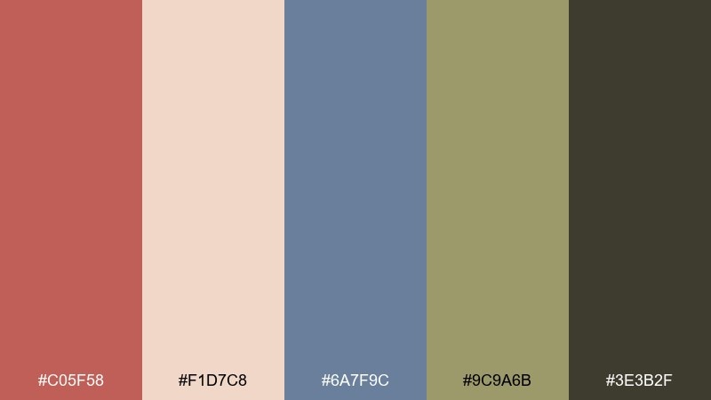
HEX: #C05F58 #F1D7C8 #6A7F9C #9C9A6B #3E3B2F
Mood: cozy, nostalgic, handmade
Best for: craft fair flyer
Cozy and nostalgic like patchwork fabric, these tones feel warm and personal. Let the blush-peach act as the main field, then layer dusty blue and olive for blocks and borders. The muted coral is great for a headline that stands out without shouting, and the dark brown anchors small details. Tip: add simple stitched-line motifs in the dark brown for a handmade finish.
Image example of cottage quilt generated using media.io

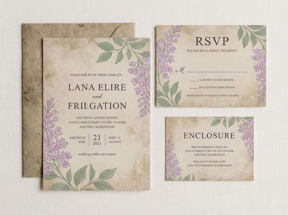
10) Heather Hill
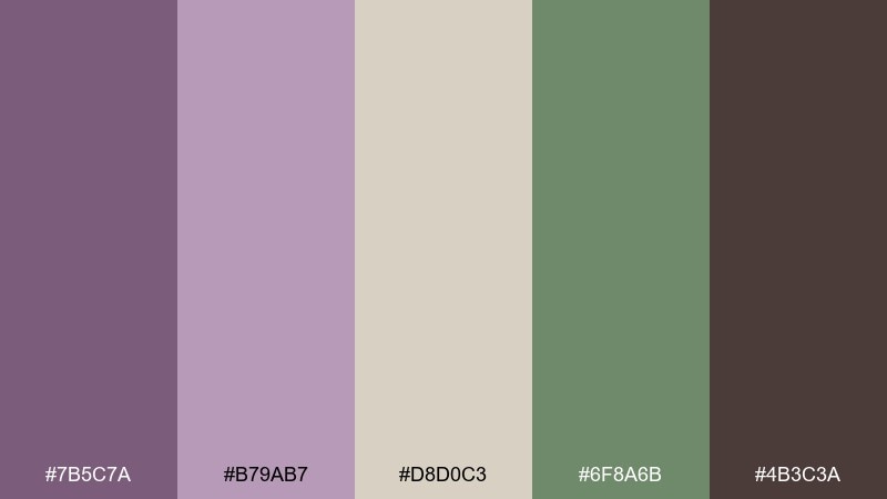
HEX: #7B5C7A #B79AB7 #D8D0C3 #6F8A6B #4B3C3A
Mood: romantic, muted, relaxed
Best for: wedding invitation suite
Romantic and muted like heather on rolling slopes, these shades feel soft but grown-up. Use the warm stone color for paper and backgrounds, then bring in lilac for florals and monograms. The sage green adds balance, while the deep plum-brown keeps type readable and formal. Tip: keep metallics minimal and let the lilac carry the elegance.
Image example of heather hill generated using media.io
11) Stone Fence Neutral
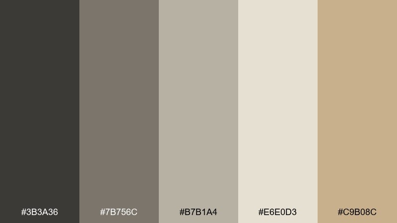
HEX: #3B3A36 #7B756C #B7B1A4 #E6E0D3 #C9B08C
Mood: minimal, steady, timeless
Best for: portfolio website UI
Minimal and steady like stacked stone and sunbleached mortar, this set feels quietly premium. Use the lightest neutral for backgrounds and the charcoal for headings to keep contrast clean. The mid grays are ideal for cards and dividers, while the sand tone adds warmth to hover states or small icons. Tip: combine with generous whitespace and a single serif headline font for a modern rustic edge.
Image example of stone fence neutral generated using media.io
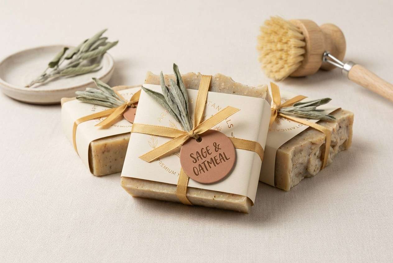
12) Sunlit Haystack
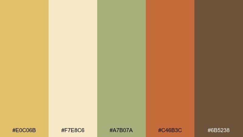
HEX: #E0C06B #F7E8C6 #A7B07A #C46B3C #6B5238
Mood: golden, friendly, pastoral
Best for: artisan soap packaging
Golden and friendly like sun on dried grass, these colors feel comforting and approachable. Make the pale cream the main wrap, then use wheat gold for brand blocks and pattern bands. Sage adds a clean, botanical cue, and the clay-brown notes bring warmth for scents or variants. Tip: keep the clay accent small so the packaging stays bright and clean.
Image example of sunlit haystack generated using media.io
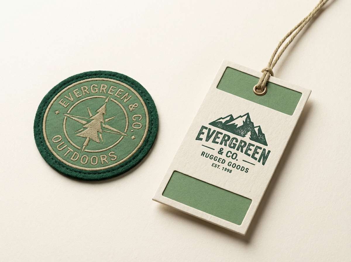
13) Pine Cabin
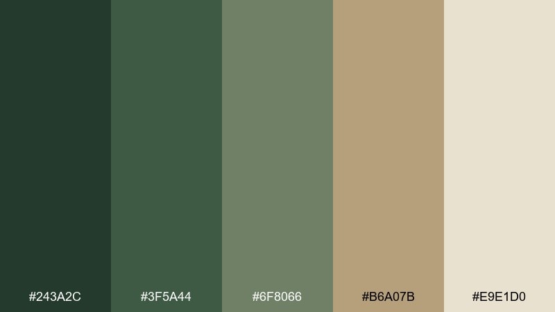
HEX: #243A2C #3F5A44 #6F8066 #B6A07B #E9E1D0
Mood: woodsy, sturdy, calm
Best for: outdoor gear brand logo and tags
Woodsy and sturdy like pine boards and canvas tents, this set is built for rugged branding. Use the deep evergreen as the hero color for the logo and tag type. The lighter greens support secondary panels, while the khaki and warm off-white keep the look approachable. Tip: emboss the evergreen on kraft stock to emphasize durability.
Image example of pine cabin generated using media.io
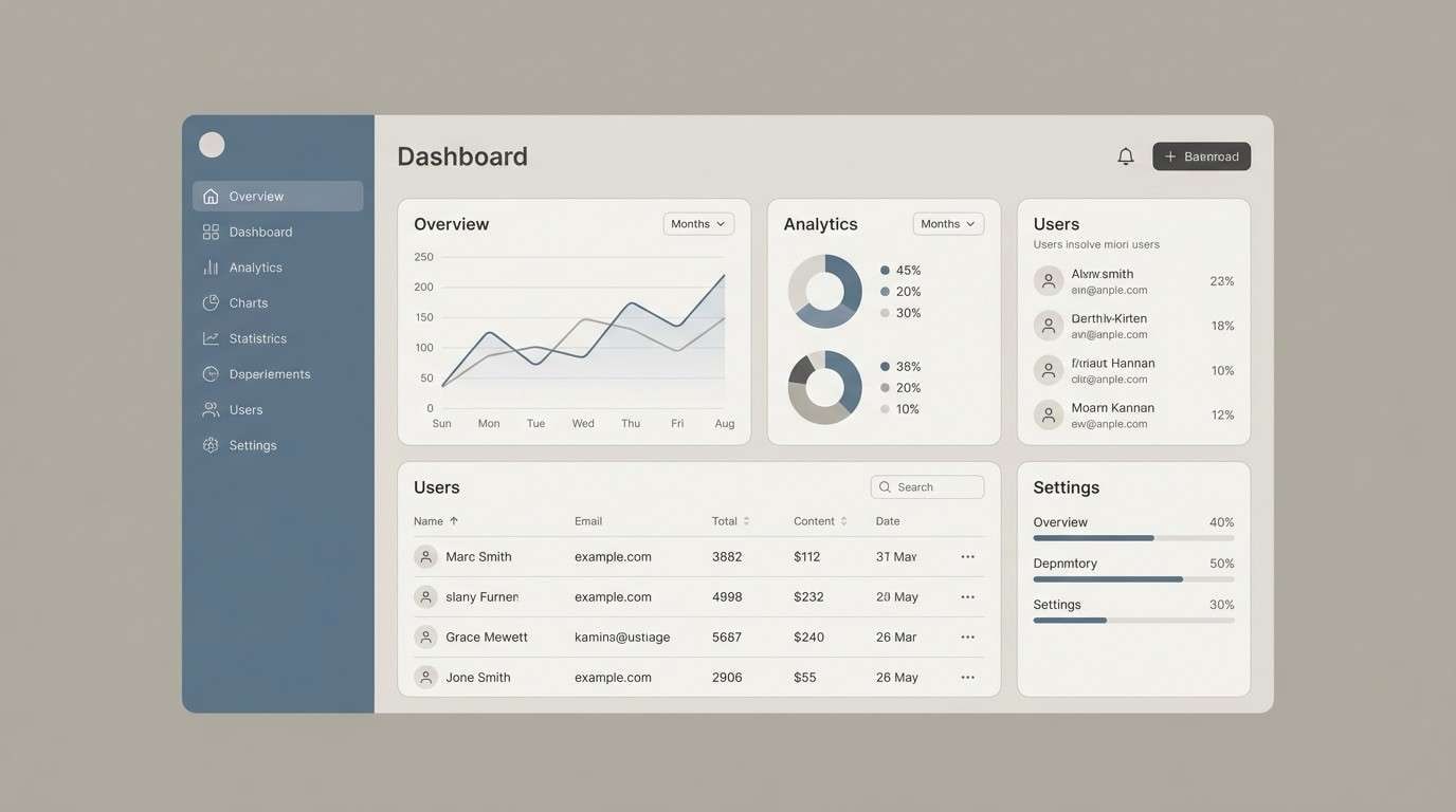
14) Rainy Lane
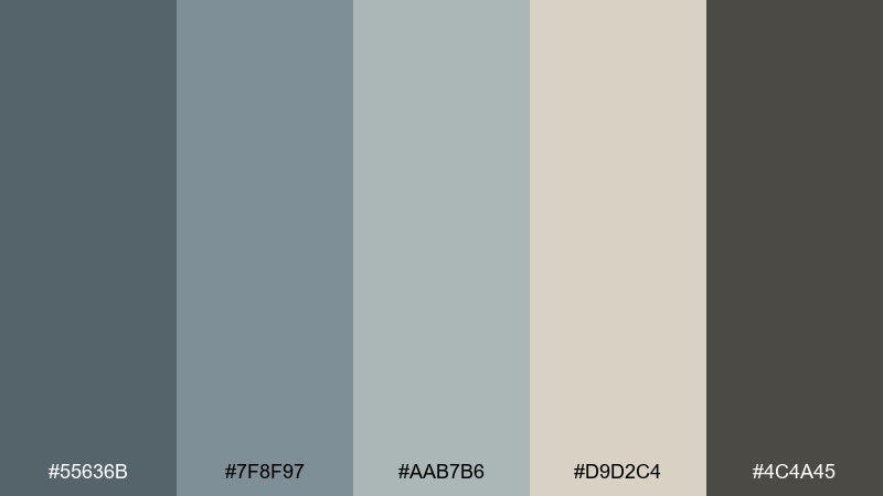
HEX: #55636B #7F8F97 #AAB7B6 #D9D2C4 #4C4A45
Mood: cool, reflective, modern
Best for: SaaS dashboard UI
Cool and reflective like wet gravel and low clouds, these tones feel focused and professional. Use the soft warm gray as the dashboard base to avoid stark white glare. Layer the blue-grays for panels, charts, and navigation, then rely on the deep graphite for text and key icons. Tip: add one small warm accent color outside the palette only for critical alerts to keep hierarchy clear.
Image example of rainy lane generated using media.io
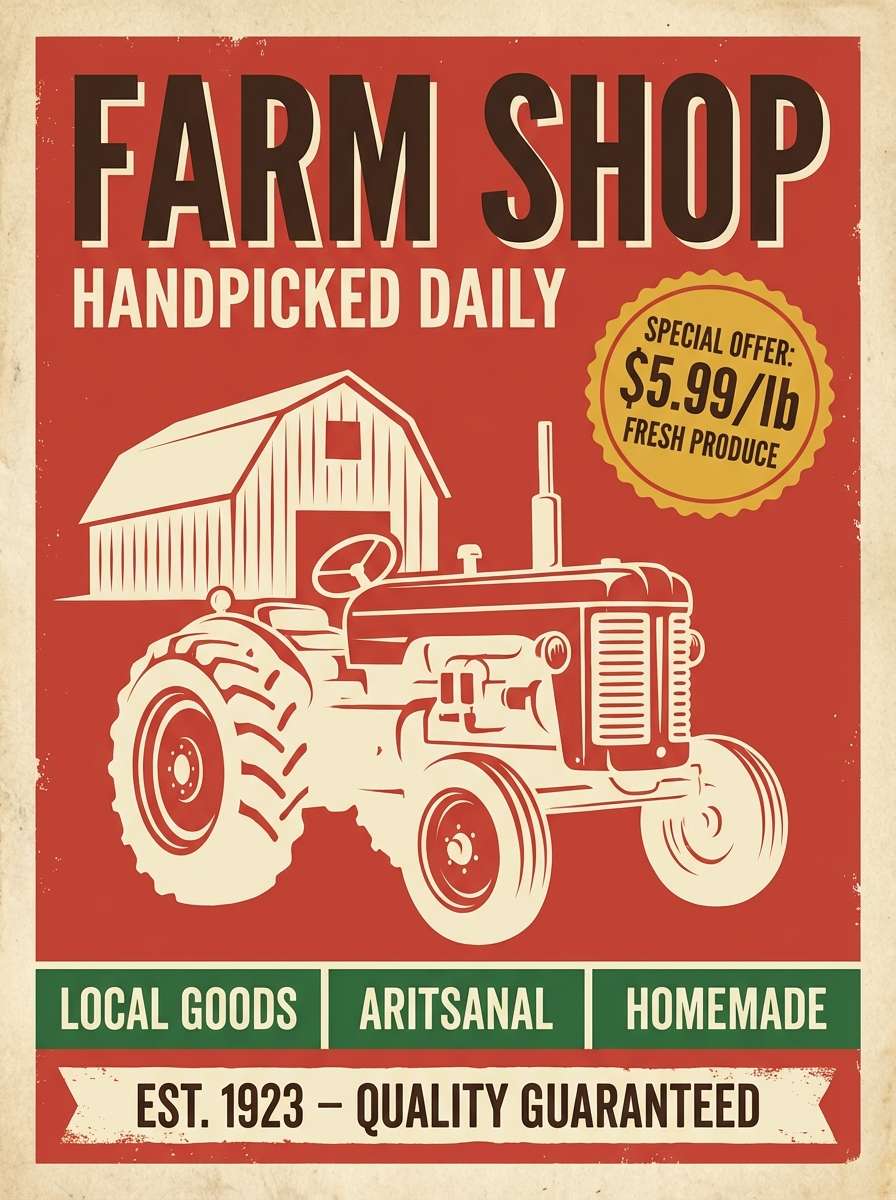
15) Vintage Tractor

HEX: #C13F2D #F2C14E #2F5D50 #E9E2D0 #3A2E2B
Mood: bold, nostalgic, hardworking
Best for: retro farm shop poster
Bold and nostalgic like painted metal and worn signage, this mix has real character. These countryside color combinations work best when you let the red lead and keep the cream as breathing room. Use the golden yellow for badges and price tags, and ground everything with the deep green and espresso brown. Tip: use chunky display type and limit gradients to keep it authentically retro.
Image example of vintage tractor generated using media.io
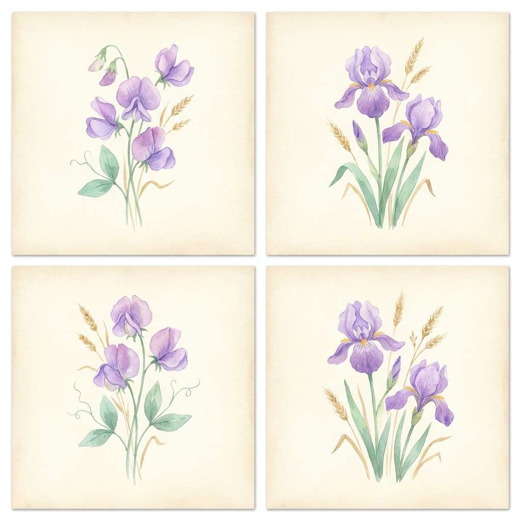
16) Lavender Breeze
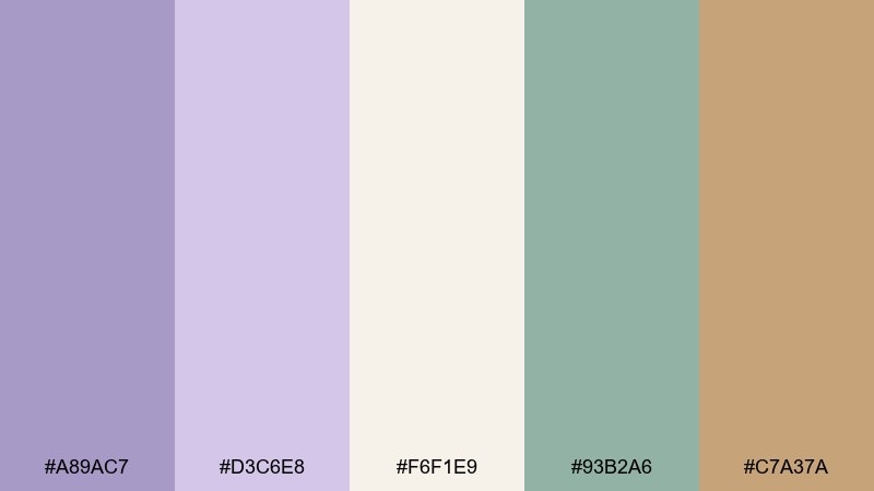
HEX: #A89AC7 #D3C6E8 #F6F1E9 #93B2A6 #C7A37A
Mood: dreamy, light, calming
Best for: botanical watercolor set
Dreamy and light like lavender drifting in a warm wind, these hues feel airy and comforting. Let the pale cream be your paper tone, then use lilac and soft violet for petals and washes. The gentle mint-sage keeps the composition fresh, while the wheat tan adds natural warmth to stems or labels. Tip: keep edges soft and use lots of water to preserve the breezy mood.
Image example of lavender breeze generated using media.io
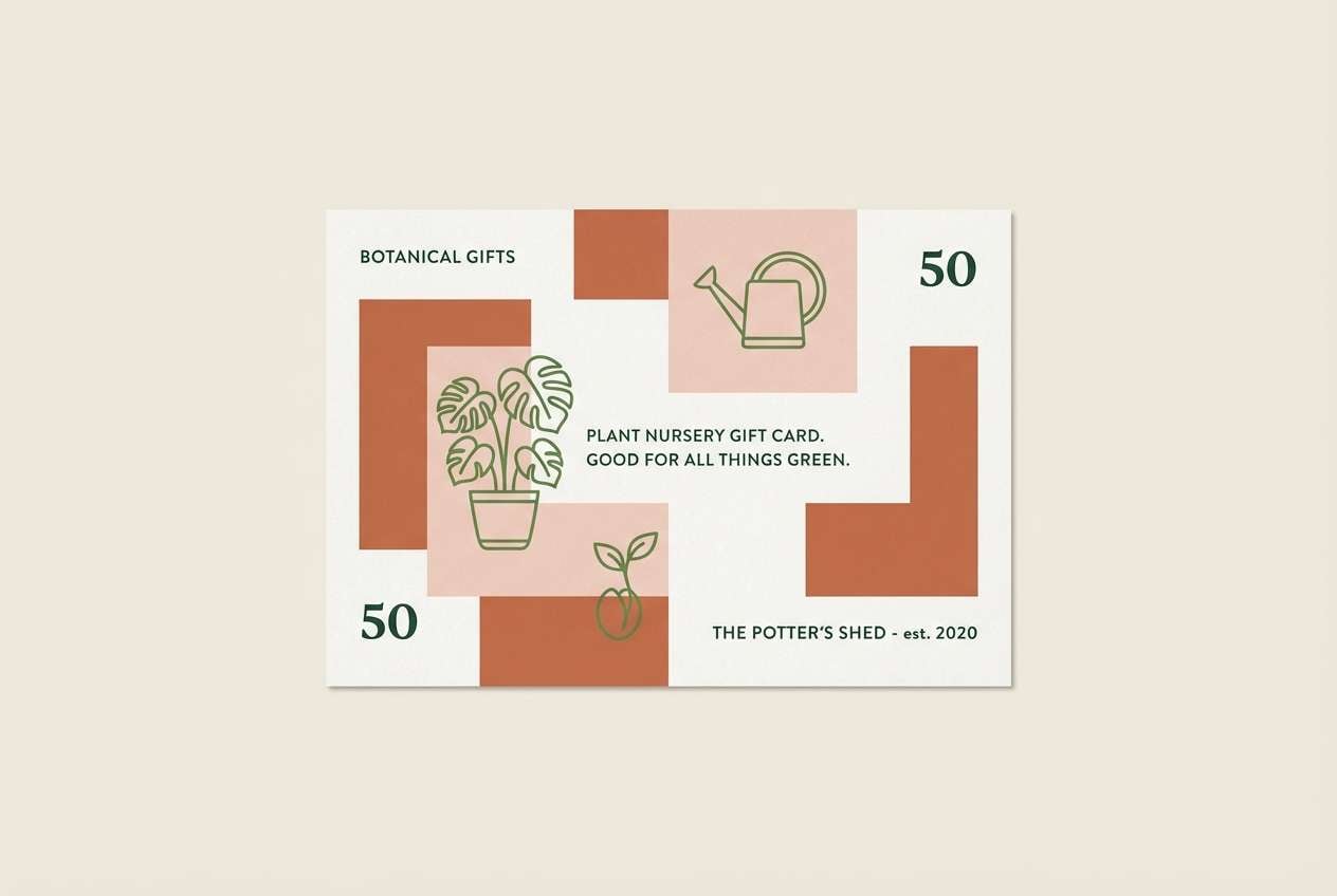
17) Clay Pot Garden
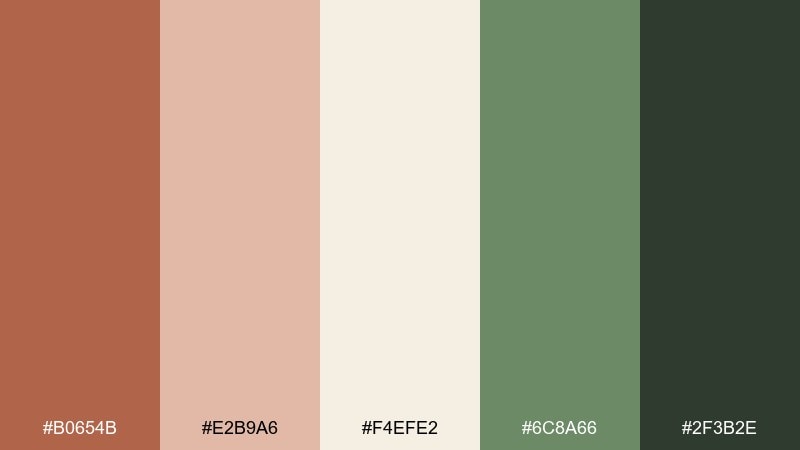
HEX: #B0654B #E2B9A6 #F4EFE2 #6C8A66 #2F3B2E
Mood: earthy, cozy, handmade
Best for: plant nursery gift card
Earthy and cozy like terracotta pots on a potting bench, these tones feel welcoming and tactile. Use the warm off-white as the base so the clay and blush shades can add personality without overpowering. The leafy green works well for illustrations, borders, or small icons, and the deep forest anchors fine print. Tip: add a simple stamped pattern in the blush tone to suggest texture without clutter.
Image example of clay pot garden generated using media.io
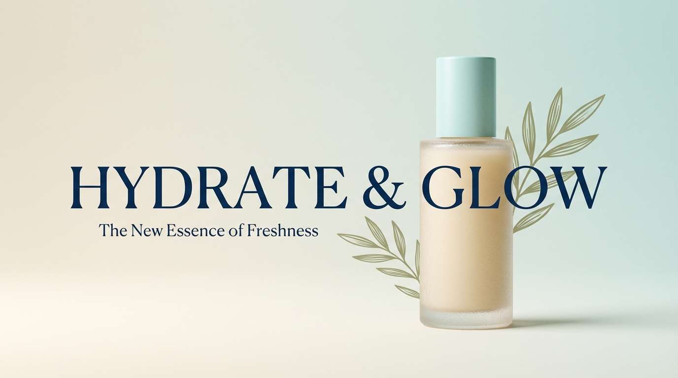
18) Brookside Blues
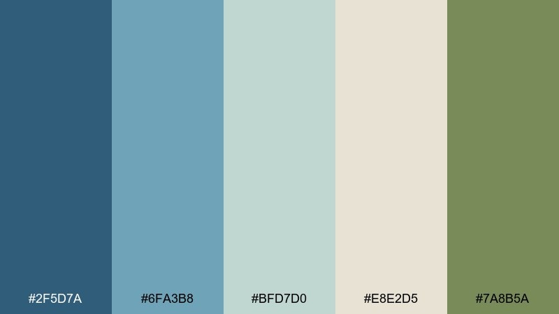
HEX: #2F5D7A #6FA3B8 #BFD7D0 #E8E2D5 #7A8B5A
Mood: refreshing, clean, balanced
Best for: skincare product ad
Refreshing and clean like water over smooth rocks, these blues feel crisp without turning icy. A countryside color palette like this shines in product ads where you want clarity and trust. Use deep blue for headlines, then let the pale aqua and warm cream create soft contrast for labels and claims, with olive as a natural accent. Tip: keep the background bright and avoid heavy shadows to maintain a fresh finish.
Image example of brookside blues generated using media.io
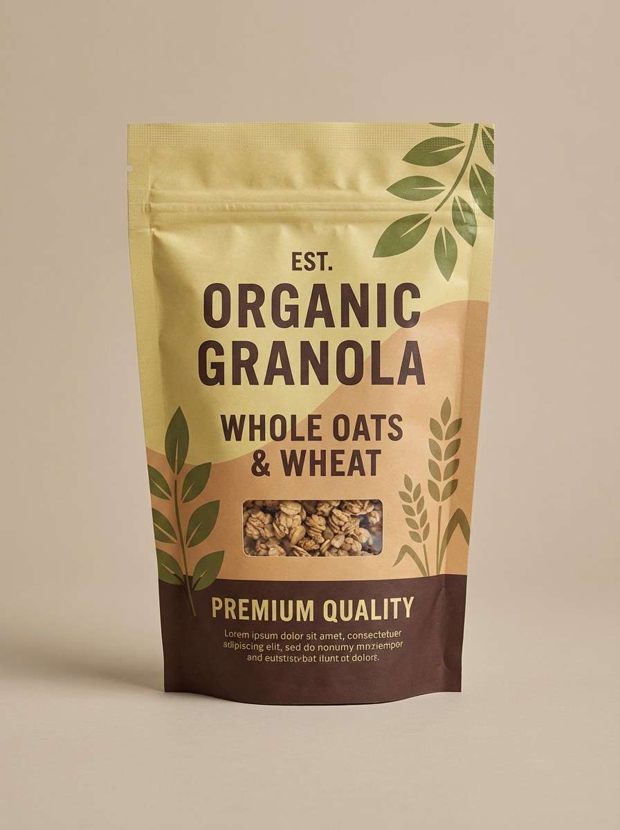
19) Golden Wheat & Moss
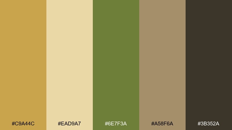
HEX: #C9A44C #EAD9A7 #6E7F3A #A58F6A #3B352A
Mood: sunny, organic, grounded
Best for: organic granola packaging
Sunny and organic like grain and mossy stones, these colors feel wholesome and real. Use the pale oat tone as your main packaging field to keep the label light and readable. The wheat gold can highlight flavor cues, while moss green supports organic claims and icons. Tip: pair with simple line illustrations and let the dark brown handle all text for consistent contrast.
Image example of golden wheat & moss generated using media.io
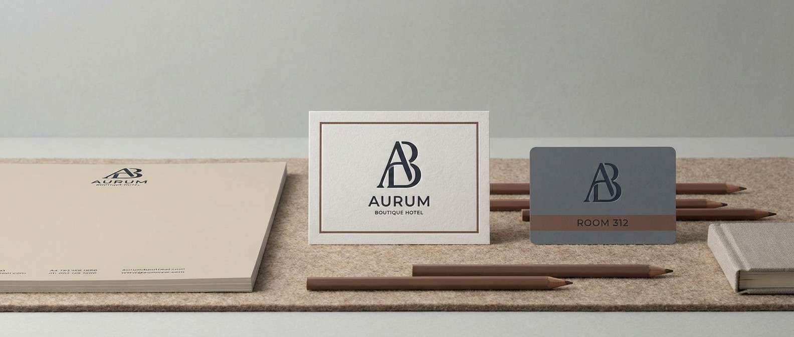
20) Twilight Farmhouse
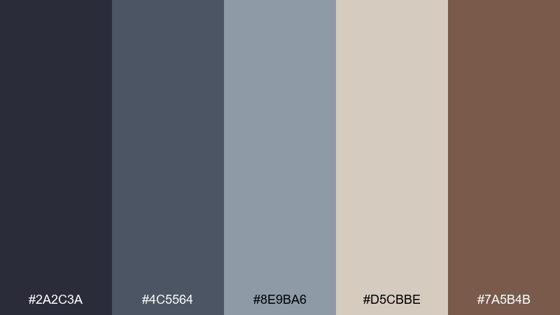
HEX: #2A2C3A #4C5564 #8E9BA6 #D5CBBE #7A5B4B
Mood: cozy, evening, sophisticated
Best for: boutique hotel branding
Cozy and evening-toned like porch lights at dusk, this palette feels refined and welcoming. Use the deep navy-charcoal for the primary mark and signage, then rely on the slate and misty gray for supporting layouts. The warm beige keeps everything hospitable, while the cocoa brown adds a heritage touch for patterns and trims. Tip: combine with serif typography and subtle paper grain to enhance the boutique feel.
Image example of twilight farmhouse generated using media.io
What Colors Go Well with Countryside?
Countryside tones pair best with muted, slightly dusty colors: sage and olive greens, warm creams, oatmeal and stone neutrals, weathered blues, and clay or terracotta accents. This keeps the look natural rather than overly saturated.
If you need stronger hierarchy, add one deep anchor color like charcoal, espresso brown, or deep evergreen. It improves readability and gives layouts a “crafted” structure without breaking the rustic vibe.
For a softer, more romantic direction, introduce gentle lilacs or mauves alongside warm stone and sage—great for stationery, lifestyle brands, and calm editorial designs.
How to Use a Countryside Color Palette in Real Designs
Start with a breathable base: cream, warm off-white, or pale grain tones work especially well on packaging and UI because they reduce glare and feel friendly. Then layer two mid tones (sage, warm tan, slate) for sections, cards, and supporting shapes.
Reserve your boldest color—tractor red, wheat gold, terracotta, or deep blue—for small accents like CTAs, badges, icons, and key labels. This keeps the overall design calm while still guiding attention.
Texture is the secret weapon: uncoated paper, subtle grain, stitched lines, or minimal line illustrations can reinforce the countryside mood even in clean, modern layouts.
Create Countryside Palette Visuals with AI
If you want to preview how a countryside palette looks on a poster, UI screen, label, or invitation, generating quick mockups can save hours. Start with one palette and describe the format, typography vibe, and where each color should dominate.
Keep prompts specific: mention the dominant background color, the accent color for badges or buttons, and the overall style (vector, realistic studio shot, watercolor, editorial). You’ll get more consistent results across variations.
Use Media.io to turn these palette prompts into ready-to-share visuals for brainstorming, client decks, and A/B style directions.
Countryside Color Palette FAQs
-
What is a countryside color palette?
A countryside palette is a set of nature-forward, rural-inspired colors—think sage and olive greens, hay and cream neutrals, weathered blues, wood browns, and clay accents—used to create a calm, rustic, approachable look. -
Are countryside color schemes good for modern UI design?
Yes. Use off-white or warm gray backgrounds, muted greens or blue-grays for navigation, and a single earthy accent (straw, terracotta, sand) for CTAs to keep the UI modern, readable, and soothing. -
What’s the best accent color for a rustic countryside palette?
Terracotta, straw gold, and orchard red are popular accents. Choose one and keep it limited to highlights (buttons, badges, key labels) so the palette stays natural and not overly loud. -
How do I keep countryside colors from looking dull?
Anchor the palette with a deep contrast color (charcoal, espresso, deep evergreen) and use plenty of negative space. Small high-contrast type and a controlled accent color will make muted tones feel intentional. -
Do countryside palettes work for packaging?
They work especially well for packaging because they imply craft, freshness, and authenticity. Cream bases with wood browns or leafy greens are easy to print and stay readable on textured stocks. -
What fonts pair well with countryside palettes?
Try a clean sans for body text plus a single serif for headlines to create a modern rustic edge. For more heritage or farmhouse vibes, use a sturdy serif with restrained decorative details. -
Can I generate countryside palette mockups with AI?
Yes. Use a text-to-image tool and specify the design type (menu, label, UI), which colors are dominant, and the style (vector, studio shot, watercolor) to quickly visualize the palette in context.


