

Pear is a modern yellow-green that feels fresh, optimistic, and surprisingly versatile. It can read playful and bright, or muted and premium, depending on what you pair it with.
Below are 20 curated pear color palette ideas with HEX codes, plus practical tips for branding, UI, print, and ads.
In this article
Why Pear Palettes Work So Well
Pear sits between green and yellow, so it carries “natural” cues (growth, wellness, eco) while still feeling sunny and attention-grabbing. That balance makes it a strong accent color for modern brands and interfaces.
It also pairs smoothly across seasons: brighter pear reads spring/summer, while olive-leaning pear tones feel grounded for fall packaging and editorial layouts. With the right neutrals, pear can look either playful or premium.
In UI, pear is especially effective for status, highlights, and primary actions because it’s high-visibility without the harshness of full neon green. When anchored with charcoal, deep forest, or warm creams, it stays readable and polished.
20+ Pear Color Palette Ideas (with HEX Codes)
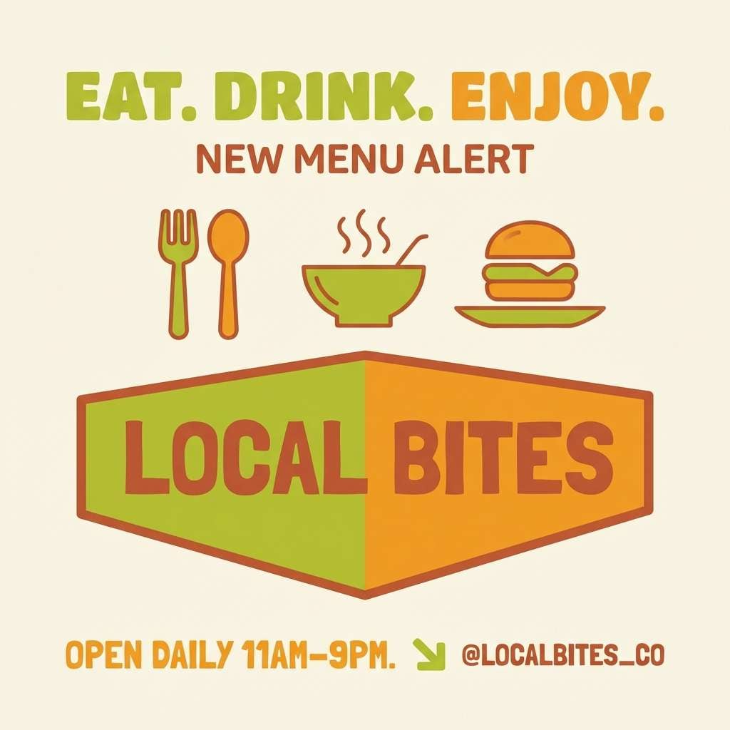
1) Orchard Glow
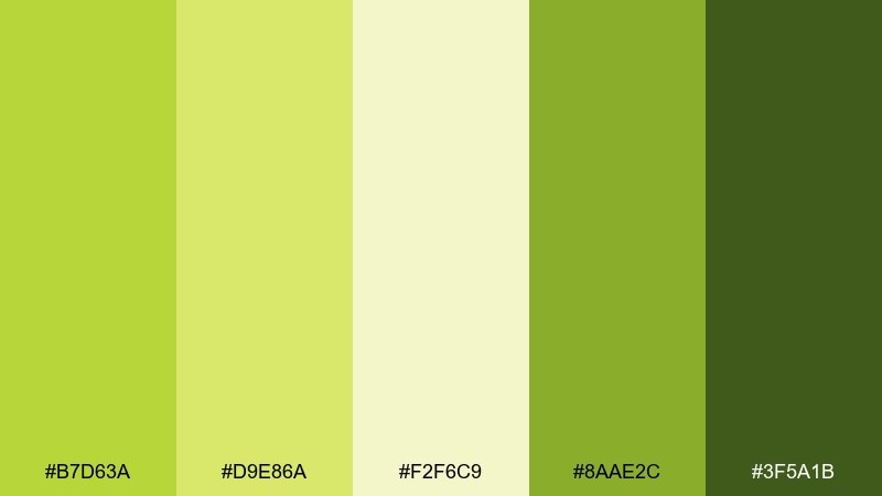
HEX: #B7D63A #D9E86A #F2F6C9 #8AAE2C #3F5A1B
Mood: fresh, optimistic, sunlit
Best for: brand identity and landing pages
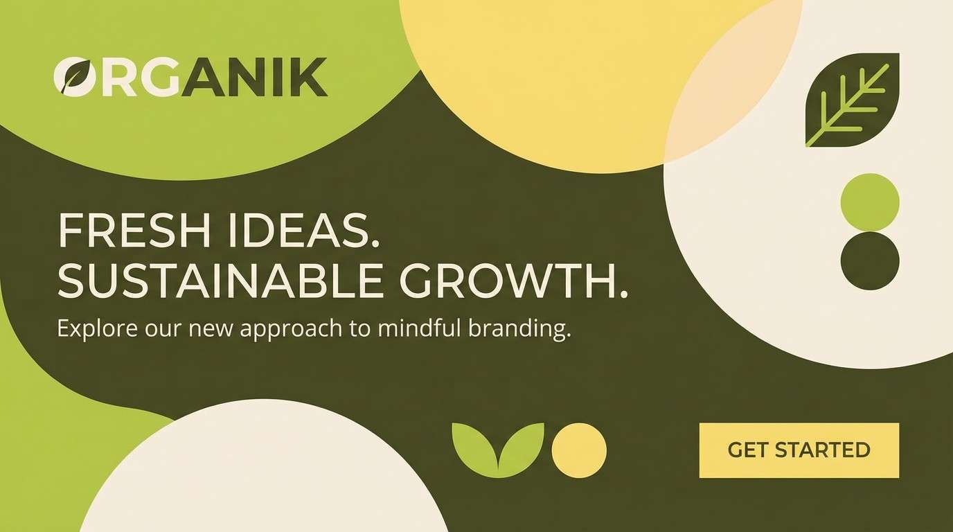
Fresh and sunlit, it feels like morning light moving through a pear orchard. This pear color palette works best when you let the bright yellow-green lead and keep the deeper greens for headers and CTAs. Pair it with warm white space and subtle grain textures to avoid a flat digital look. Usage tip: reserve the darkest green for accessibility-friendly text and icons.
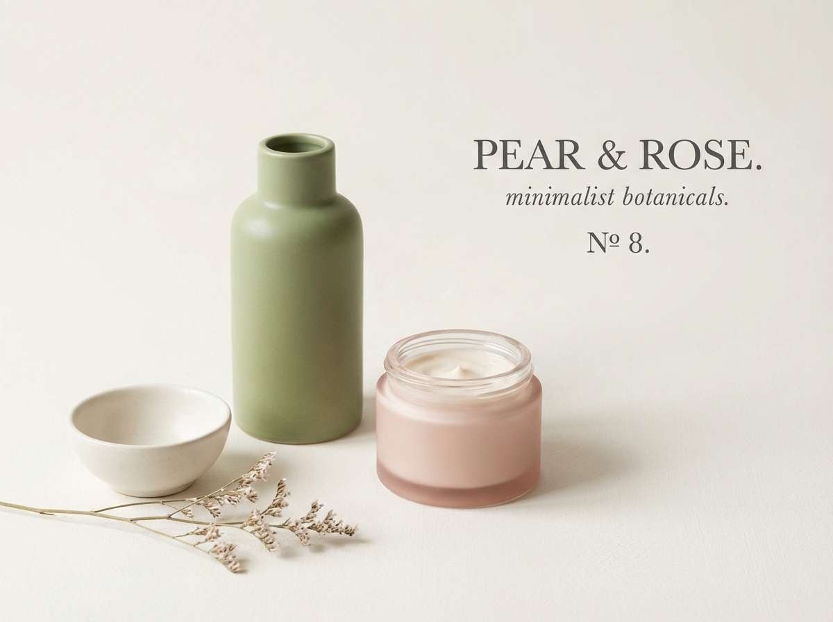
Image example of orchard glow generated using media.io
Media.io is an online AI studio for creating and editing video, image, and audio in your browser.

2) Ripe Rustic
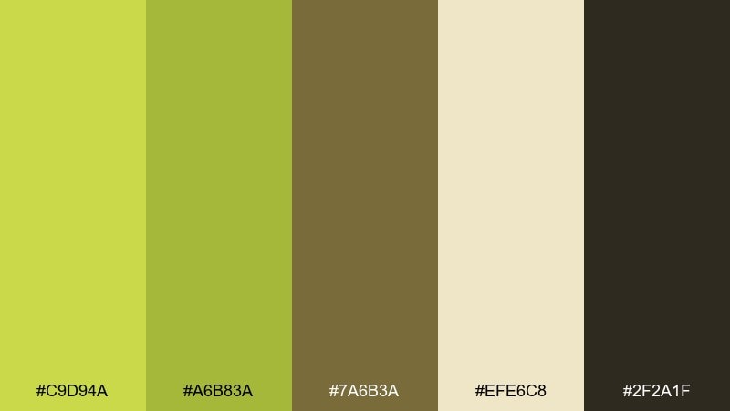
HEX: #C9D94A #A6B83A #7A6B3A #EFE6C8 #2F2A1F
Mood: earthy, grounded, artisanal
Best for: coffee shop menus and craft packaging
Earthy and grounded, it brings to mind market stalls, paper labels, and sun-dried herbs. Use the tan and deep brown for type and framing, then let the green tones highlight prices or key callouts. It pairs naturally with recycled paper textures and matte finishes. Usage tip: keep the brightest green to small accents so the palette stays artisanal, not sporty.
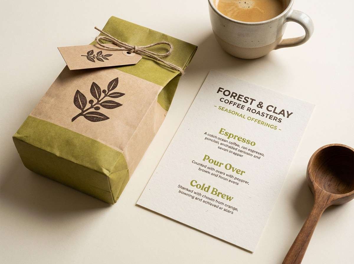
Image example of ripe rustic generated using media.io
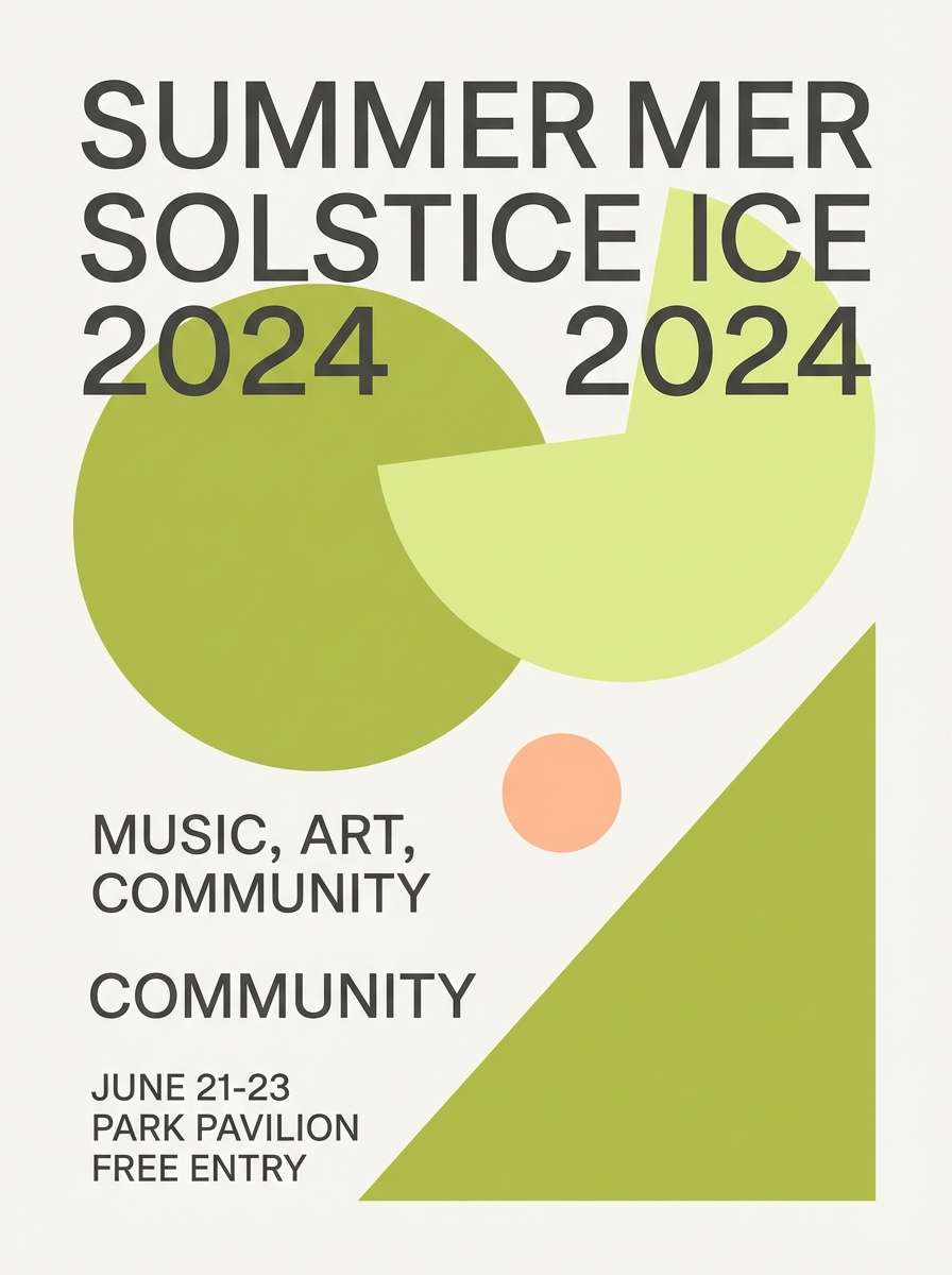
3) Pear Sorbet
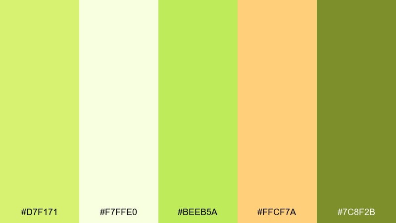
HEX: #D7F171 #F7FFE0 #BEEB5A #FFCF7A #7C8F2B
Mood: playful, airy, sweet
Best for: summer event flyers and cafe promos
Playful and airy, it reads like a chilled dessert on a warm day. These pear color combinations shine in bold blocks of lime and creamy white, with a small peachy accent for warmth. Use it on flyers where you want cheerful energy without going neon. Usage tip: put the peach tone behind short headings, not body copy, to keep readability crisp.
Image example of pear sorbet generated using media.io
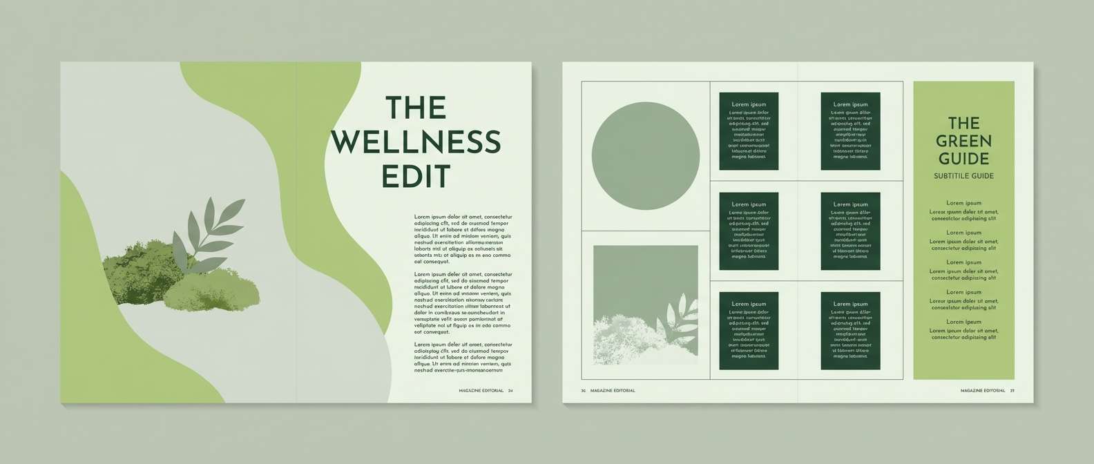
4) Sage Orchard
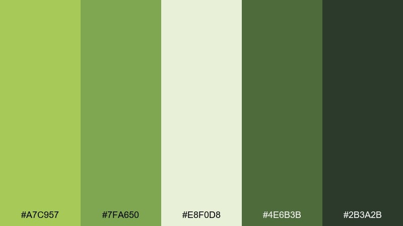
HEX: #A7C957 #7FA650 #E8F0D8 #4E6B3B #2B3A2B
Mood: calm, natural, balanced
Best for: wellness brands and editorial layouts
Calm and natural, it evokes soft leaves, herbal tea, and quiet routines. The muted greens make long-form pages feel rested, while the pale sage keeps sections open and breathable. Pair it with warm neutrals and minimalist photography for a modern wellness feel. Usage tip: avoid pure black text; use the deep forest shade for a softer reading experience.
Image example of sage orchard generated using media.io
5) Citrus Linen
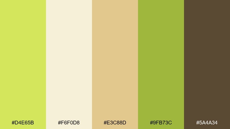
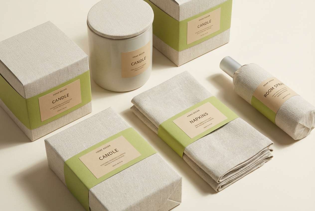
HEX: #D4E65B #F6F0D8 #E3C88D #9FB73C #5A4A34
Mood: warm, airy, approachable
Best for: home decor branding and ecommerce
Warm and airy, it suggests linen curtains, sunlit kitchens, and gentle citrus notes. As a pear color scheme, it works beautifully when the creamy tones take up most of the canvas and the greens become highlights. Pair it with natural product photography and soft shadows to keep the look premium but friendly. Usage tip: use the brown sparingly for small labels, icons, and price tags.
Image example of citrus linen generated using media.io
6) Garden Party
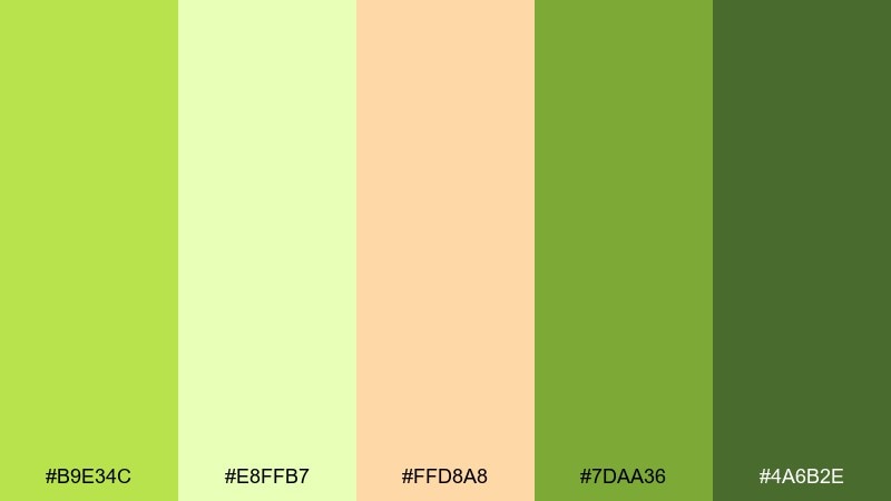
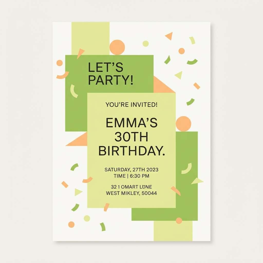
HEX: #B9E34C #E8FFB7 #FFD8A8 #7DAA36 #4A6B2E
Mood: bright, friendly, celebratory
Best for: birthday invitations and picnic posters
Bright and celebratory, it feels like bunting, lemonade, and fresh-cut grass. Let the pale lime act as your background and bring in the deeper greens for borders and type. The soft apricot keeps the look welcoming and helps skin-tone photography feel natural. Usage tip: set headings in the darker green and avoid thin fonts on the light lime.
Image example of garden party generated using media.io
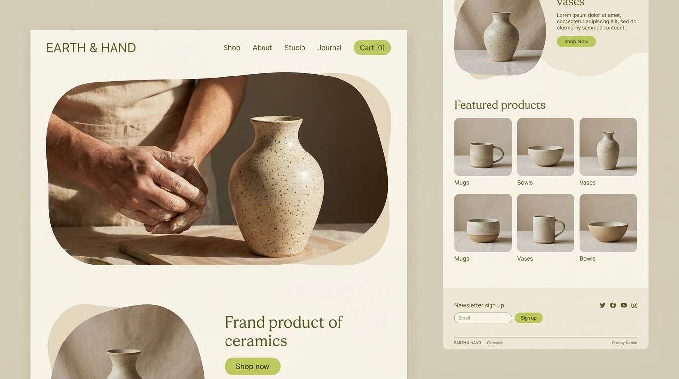
7) Lime Clay
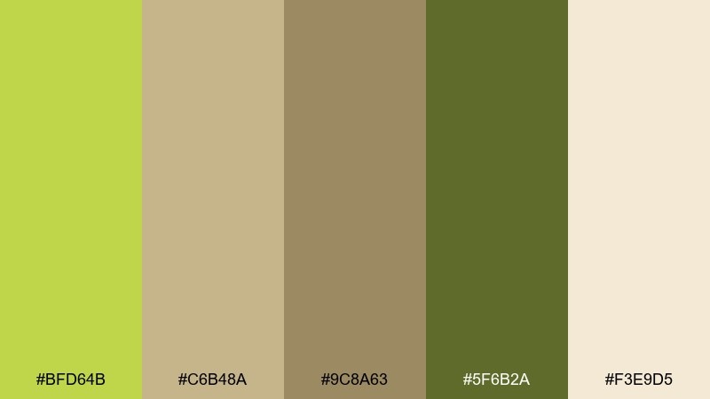
HEX: #BFD64B #C6B48A #9C8A63 #5F6B2A #F3E9D5
Mood: organic, muted, handcrafted
Best for: ceramics brands and lifestyle websites
Organic and muted, it brings up handmade clay, studio shelves, and soft daylight. These pear color combinations feel most convincing when the creams and beiges dominate, with green used as a signature mark. Pair it with tactile photography and simple line icons. Usage tip: keep hover states subtle by shifting from beige to the lighter green rather than adding new colors.
Image example of lime clay generated using media.io
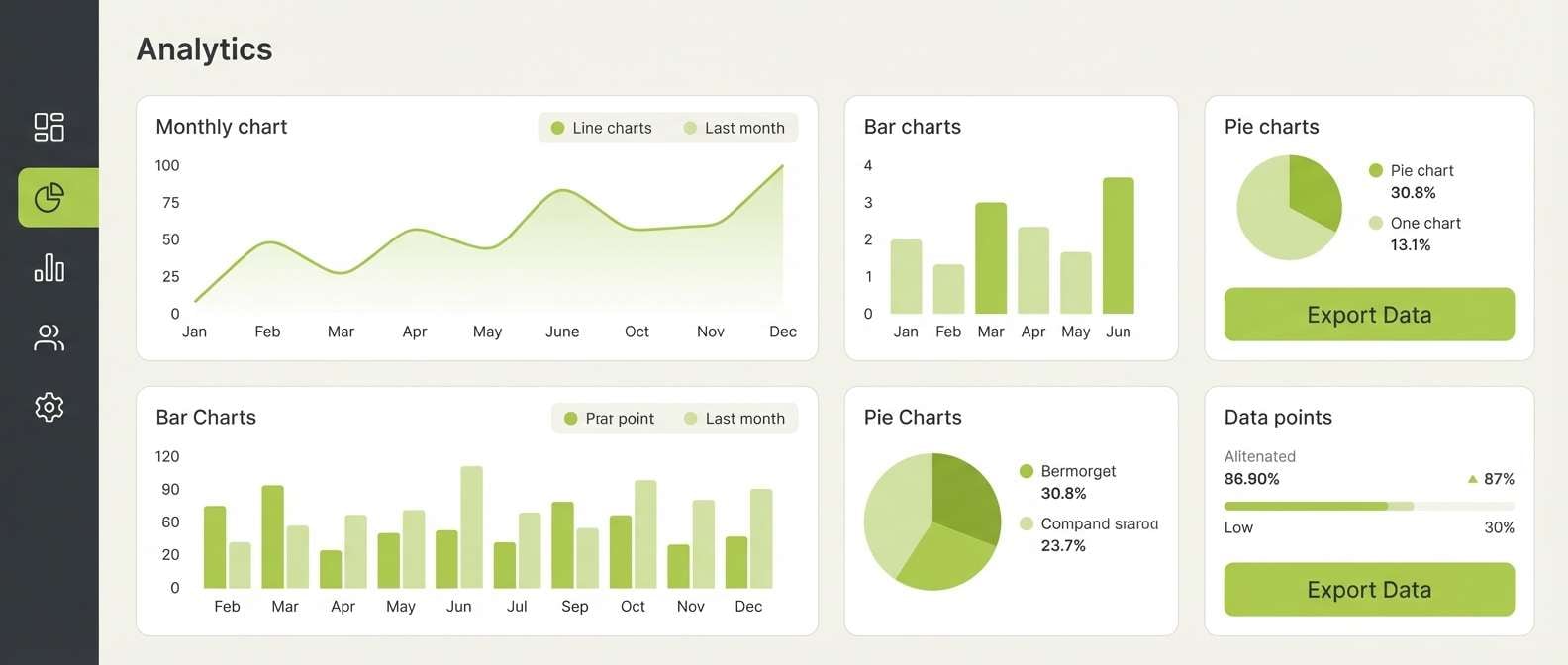
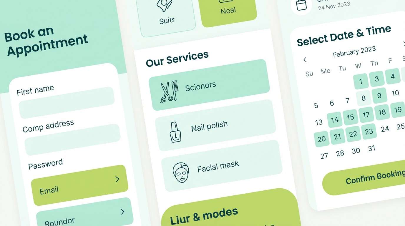
8) Pear Charcoal
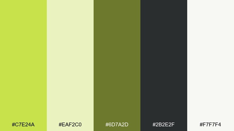
HEX: #C7E24A #EAF2C0 #6D7A2D #2B2E2F #F7F7F4
Mood: modern, crisp, high-contrast
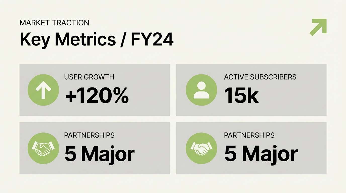
Best for: dashboard UI and data visuals
Modern and crisp, it feels like a clean studio with one bold pop of color. The charcoal anchors charts and navigation, while the pear-green accent makes key metrics instantly scannable. Pair it with lots of whitespace and thin grid lines for a sharp, professional look. Usage tip: limit bright green to one primary action and one highlight state to avoid visual noise.
Image example of pear charcoal generated using media.io
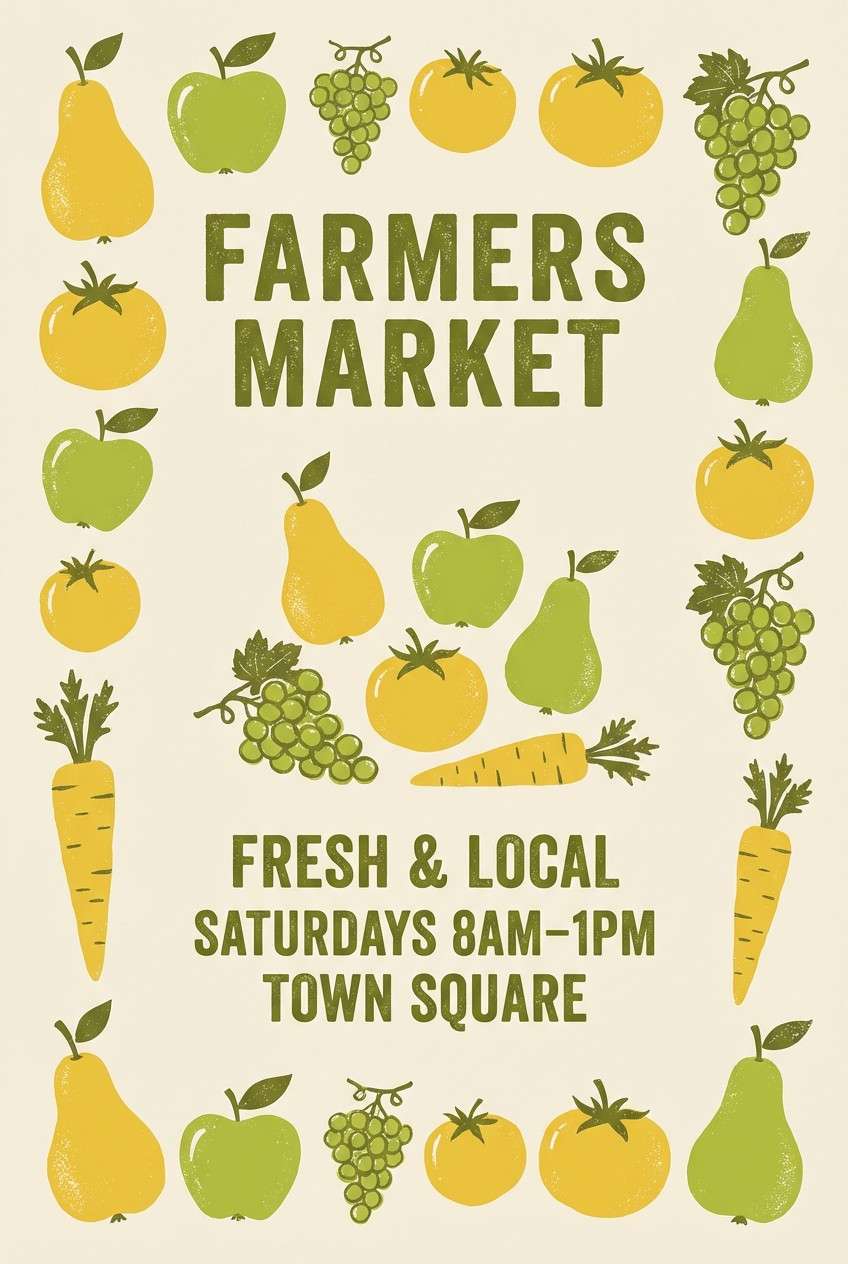
9) Golden Orchard
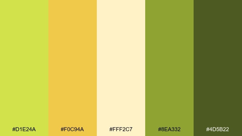
HEX: #D1E24A #F0C94A #FFF2C7 #8EA332 #4D5B22
Mood: sunny, nostalgic, harvest-like
Best for: farmers market posters and labels
Sunny and harvest-like, it suggests late-afternoon light and fruit stands stacked high. A pear color palette like this looks great when the buttery yellow takes the spotlight and the olive tones handle text and outlines. Pair it with vintage illustration styles or stamped label graphics. Usage tip: print tests matter here, so slightly thicken lines when using the darker green on textured paper.
Image example of golden orchard generated using media.io
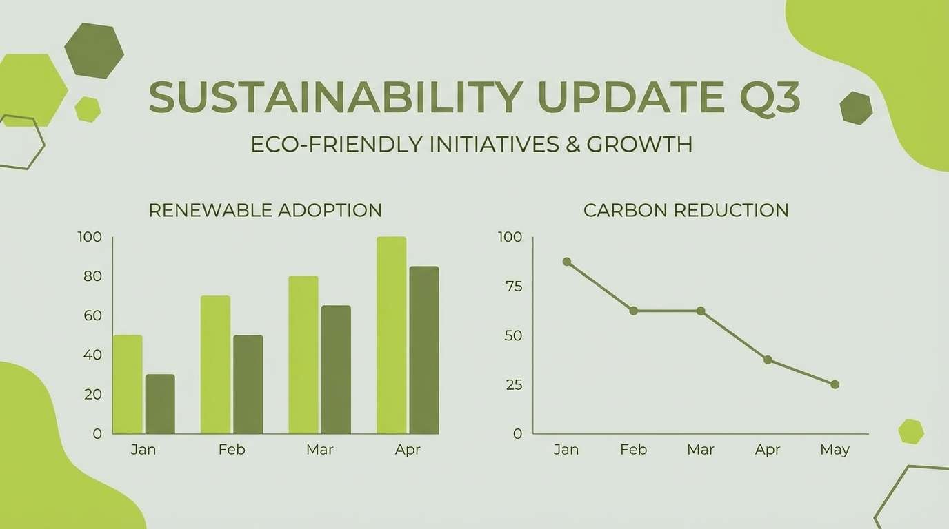
10) Foggy Pear
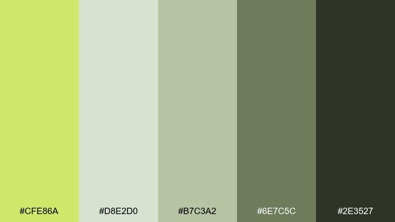
HEX: #CFE86A #D8E2D0 #B7C3A2 #6E7C5C #2E3527
Mood: soft, quiet, minimal
Best for: presentation templates and reports
Soft and quiet, it feels like early fog over fields with a gentle green glow underneath. Use the pale gray-green for slide backgrounds and the deeper moss tones for headings and charts. It pairs well with simple iconography and plenty of spacing. Usage tip: keep charts to two series colors plus neutrals for a calm, executive-ready deck.
Image example of foggy pear generated using media.io
11) Pear Blossom
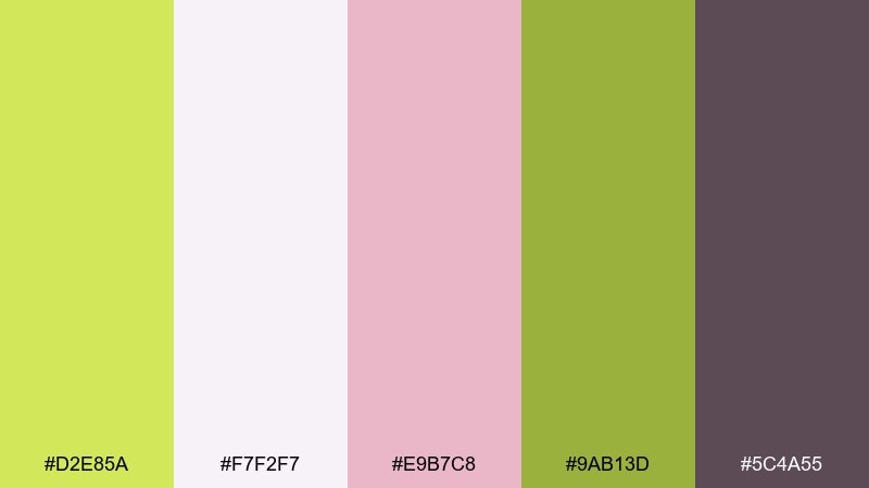
HEX: #D2E85A #F7F2F7 #E9B7C8 #9AB13D #5C4A55
Mood: romantic, light, springtime
Best for: beauty promos and social ads
Romantic and springtime-soft, it brings to mind petals drifting over fresh greenery. These pear color combinations turn especially elegant when you let blush pink support the green instead of competing with it. Pair it with clean serif headlines and close-up product photography for a modern beauty feel. Usage tip: use the mauve only for small text or outlines so the palette stays airy.
Image example of pear blossom generated using media.io
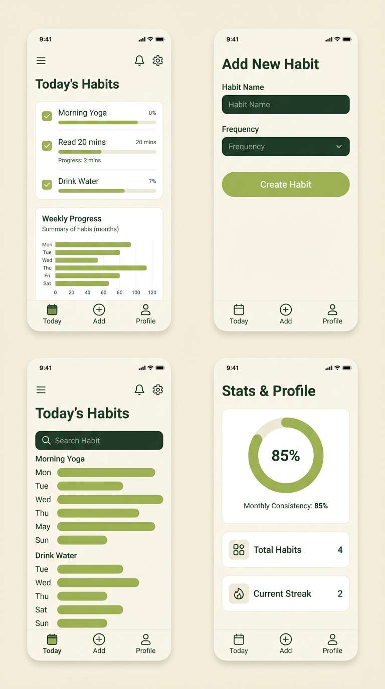
12) Matcha Pear
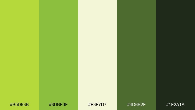
HEX: #B5D93B #8DBF3F #F3F7D7 #4D6B2F #1F2A1A
Mood: energizing, earthy, focused
Best for: fitness apps and habit trackers
Energizing yet earthy, it feels like matcha foam, clean routines, and a focused mindset. Use the light cream as the main surface and reserve the darker tones for navigation and progress states. It pairs well with geometric icons and simple charts that reward consistency. Usage tip: keep primary buttons in the brighter green and secondary actions in the mid green for clarity.
Image example of matcha pear generated using media.io
13) Soft Neon Pear
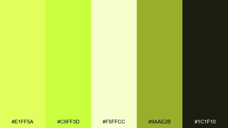
HEX: #E1FF5A #C9FF3D #F5FFCC #9AAE2B #1C1F10
Mood: bold, youthful, punchy
Best for: music promo posters and streaming covers
Bold and punchy, it reads like neon signage softened by a creamy glow. Let the brightest green hit only the title and a few graphic elements, while the deep near-black handles contrast. It pairs nicely with chunky typography and simple silhouettes. Usage tip: add subtle grain to the brightest areas to prevent banding in digital exports.
Image example of soft neon pear generated using media.io

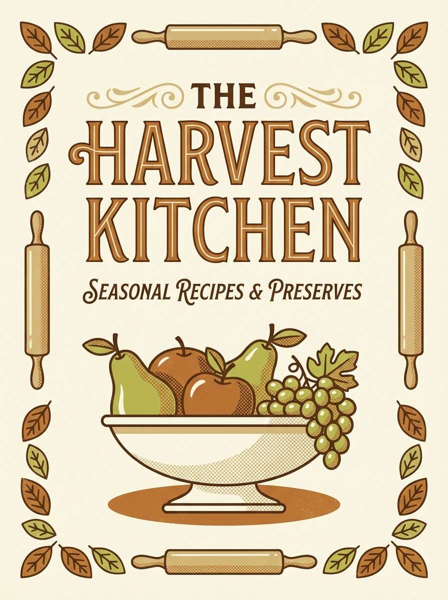
14) Antique Fruit Bowl
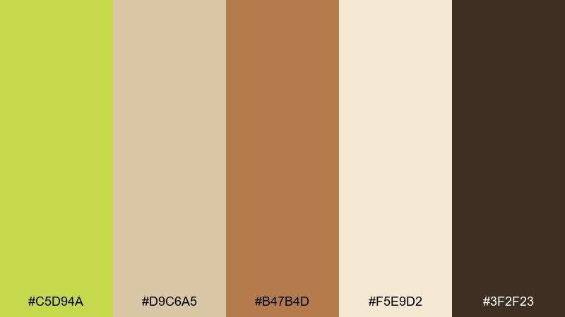
HEX: #C5D94A #D9C6A5 #B47B4D #F5E9D2 #3F2F23
Mood: vintage, cozy, curated
Best for: recipe blogs and cookbook covers
Vintage and cozy, it feels like a well-loved cookbook and a fruit bowl on a wooden table. The creamy base keeps layouts readable, while the warm brown adds a classic, editorial backbone. Pair it with serif type and hand-drawn ingredient icons. Usage tip: use the green for section tabs or recipe categories to guide scanning.
Image example of antique fruit bowl generated using media.io
15) Pear Mint Cream
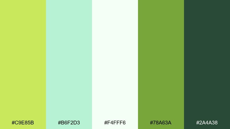
HEX: #C9E85B #B6F2D3 #F4FFF6 #78A63A #2A4A38
Mood: clean, refreshing, spa-like
Best for: salon booking sites and wellness apps
Clean and spa-like, it suggests mint water, soft towels, and a bright reception area. Use the near-white as your main surface, then layer the mint and pear greens for friendly depth. It pairs well with rounded UI components and soft drop shadows. Usage tip: keep form fields neutral and use green only for success states, buttons, and key highlights.
Image example of pear mint cream generated using media.io
16) Urban Orchard
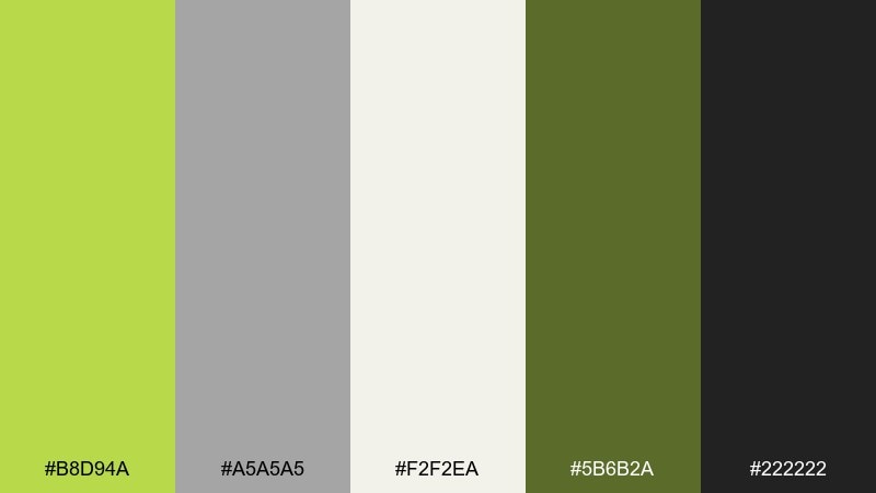
HEX: #B8D94A #A5A5A5 #F2F2EA #5B6B2A #222222
Mood: sleek, urban, confident
Best for: tech branding and pitch decks
Sleek and urban, it feels like concrete, glass, and one unexpected green accent. The grayscale keeps things serious, while the pear tone adds memorability without looking playful. Pair it with sharp typography and simple line charts for a modern business vibe. Usage tip: use the green as a single highlight color across the deck for consistency from slide to slide.
Image example of urban orchard generated using media.io
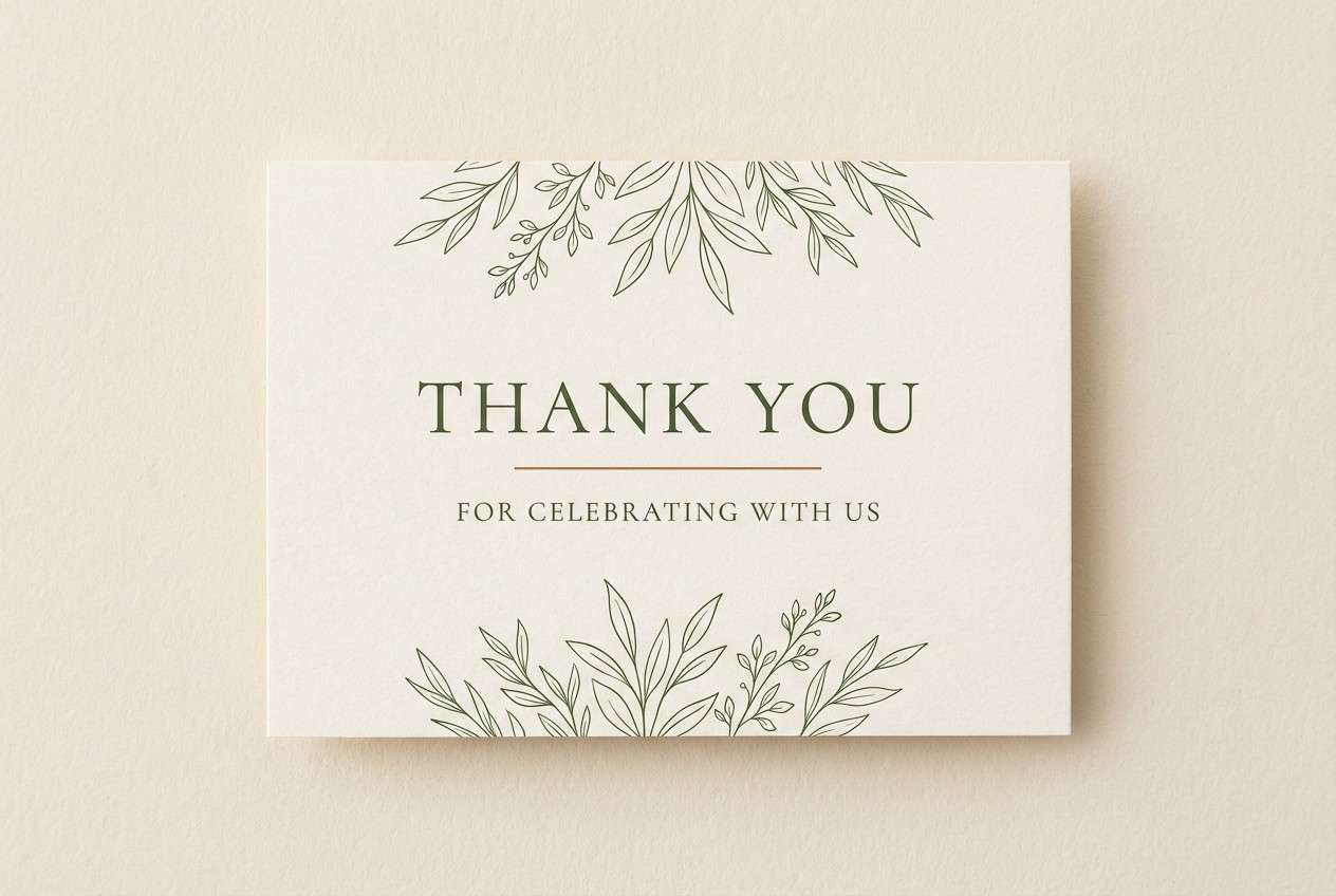
17) Sunlit Veranda
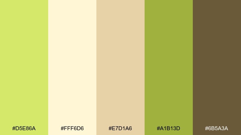
HEX: #D5E86A #FFF6D6 #E7D1A6 #A1B13D #6B5A3A
Mood: welcoming, soft, sun-warmed
Best for: wedding stationery and thank-you cards
Welcoming and sun-warmed, it recalls golden hour on a veranda with soft florals nearby. Let the creamy yellow be your paper tone and use the mid greens for botanical details or monograms. It pairs beautifully with letterpress textures and elegant serif type. Usage tip: keep the brown for a thin border or small footer to maintain a light, romantic feel.
Image example of sunlit veranda generated using media.io
18) Night Garden
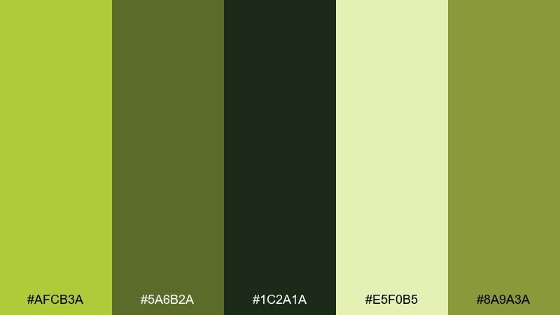
HEX: #AFCB3A #5A6B2A #1C2A1A #E5F0B5 #8A9A3A
Mood: moody, botanical, dramatic
Best for: luxury candle labels and perfume packaging
Moody and botanical, it feels like leaves after rain under low light. The near-black green makes packaging look premium, while the pale green adds a gentle glow for legibility. Pair it with gold-foil details or embossed textures for a luxe finish. Usage tip: keep the pale tint behind small text to avoid harsh contrast against the dark base.
Image example of night garden generated using media.io
19) Pear Spice Market
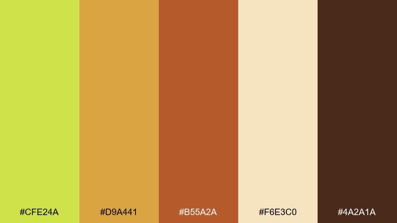
HEX: #CFE24A #D9A441 #B55A2A #F6E3C0 #4A2A1A
Mood: warm, flavorful, energetic
Best for: restaurant branding and food promos
Warm and flavorful, it evokes spice jars, toasted citrus, and lively street markets. The green keeps it fresh, while the orange and terracotta add appetite appeal. Pair it with bold photography and simple icon sets for menu categories. Usage tip: use terracotta for small highlights only, so the overall look stays balanced and not overly autumnal.
Image example of pear spice market generated using media.io
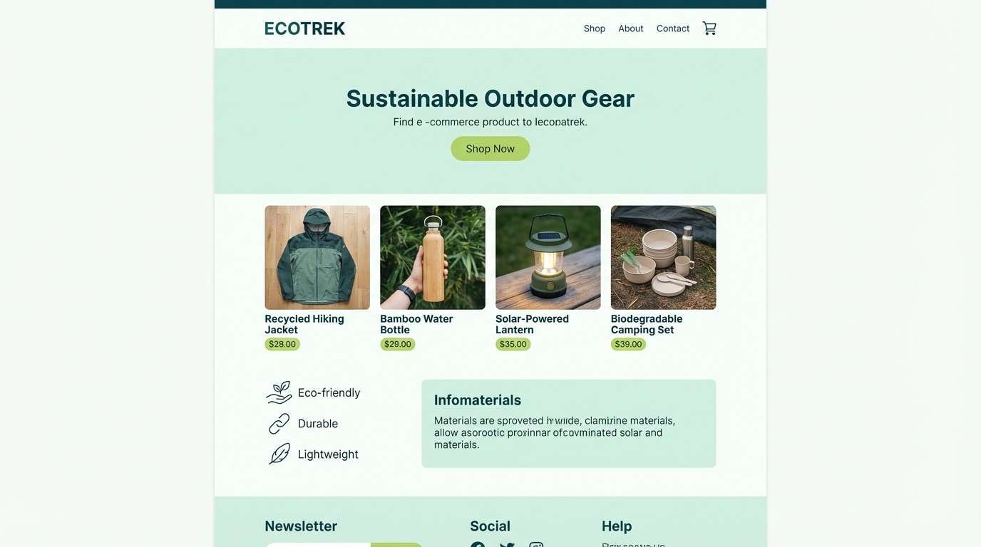
20) Alpine Pear
HEX: #BFE65B #C7E6D8 #EAF7F2 #7AA63A #2F5A4A
Mood: crisp, airy, outdoorsy
Best for: eco brands and outdoor product pages
Crisp and airy, it feels like mountain air with bright green trailside plants. The cool minty notes help the greens look modern and eco-forward rather than citrusy. Pair it with clean product photography and plenty of white space for a breathable layout. Usage tip: use the deep teal-green for headings to keep hierarchy clear without heavy black.
Image example of alpine pear generated using media.io
What Colors Go Well with Pear?
Pear pairs naturally with warm neutrals like cream, linen, tan, and soft beige—these keep the palette friendly and “real-world” for packaging, lifestyle brands, and print. If you want a harvest or vintage mood, add warm browns and terracotta.
For modern UI, pear looks sharp with charcoal, near-black green, and cool grays. This approach gives you contrast for accessibility and a clean structure for dashboards, data visuals, and product pages.
If you want a softer, trend-forward look, combine pear with blush pink, mauve, or mint. Those supporting hues keep pear from feeling too sporty and can push it toward beauty, wellness, or event design.
How to Use a Pear Color Palette in Real Designs
Start by assigning roles: use a light neutral as the main background, a deep green/charcoal for text, and keep pear as your primary accent. This makes layouts feel intentional and helps you control contrast.
In branding, pear works best as a “signature highlight” on logos, badges, and key labels rather than as an all-over fill. In print, test on the actual paper stock—pear can shift warmer or duller depending on texture and ink density.
For ads and social creatives, reserve the brightest pear for the hook (headline, price, or CTA) and keep supporting elements muted. You’ll get high attention without turning the whole design into neon.
Create Pear Palette Visuals with AI
If you already have HEX codes, the fastest way to validate a pear color scheme is to generate realistic mockups—landing pages, packaging, posters, or UI screens—before you commit to production.
With Media.io’s text-to-image tool, you can paste a prompt, describe the layout and lighting, and quickly iterate until the palette feels right for your brand. This is especially helpful for testing “pear + neutral” balance and contrast.
Once you like the direction, generate a few variations for different formats (square posts, 16:9 hero images, and 9:16 stories) to keep your campaign consistent.
Pear Color Palette FAQs
-
What color is “pear” in design?
Pear is typically a yellow-green (often brighter than olive and less neon than lime). In branding and UI, it’s used as a fresh accent that still feels natural. -
Is pear green good for websites and UI?
Yes—pear is great for buttons, highlights, and status states when paired with solid neutrals (off-white backgrounds and charcoal or deep green text). For accessibility, keep enough contrast and avoid using pear for long body text. -
What neutral colors work best with pear?
Cream, warm white, light beige, and soft gray-green keep pear looking modern and premium. For stronger contrast, charcoal and near-black green are reliable anchors. -
What are the best accent colors with pear?
Blush pink and mauve create a soft spring feel, mint makes it clean and spa-like, and warm orange/terracotta adds appetite appeal for food branding. -
How do I keep pear from looking too neon?
Use pear in smaller areas (CTAs, icons, headers) and let muted neutrals dominate the canvas. Adding subtle grain or texture also helps bright pear tones feel less “digital flat.” -
Can I use pear for print designs?
Absolutely, but do a quick print test—pear can shift depending on paper color and finish. Slightly thicker lines and deeper text colors (olive/forest/charcoal) improve legibility on textured stocks. -
How can I generate pear palette mockups quickly?
Use Media.io’s AI text-to-image generator to create instant mockups (packaging, posters, UI screens) from prompts. It’s a fast way to see how your pear color combinations behave under different lighting and layouts.


