

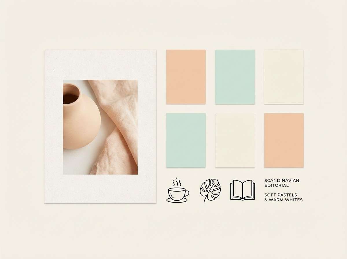
Peach mint is a modern pastel pairing that feels warm, clean, and instantly approachable. It brings together the friendly glow of peach with the refreshing calm of mint—ideal for brands that want to look soft without feeling bland.
Below are 20 peach mint color palette ideas with HEX codes, plus practical tips for using them across UI, print, packaging, and social design.
In this article
- Why Peach Mint Palettes Work So Well
-
- sorbet garden
- coastal brunch
- vintage gelato
- botanic studio
- apricot breeze
- minted clay
- soft retro pop
- nordic pastels
- cafe macaron
- sunlit nursery
- tropical minimal
- peachy spa day
- modern editorial
- terracotta mint
- wedding pastel
- market fresh
- ui calm mode
- art print serenity
- evening peach mint
- creamy lagoon
- What Colors Go Well with Peach Mint?
- How to Use a Peach Mint Color Palette in Real Designs
- Create Peach Mint Palette Visuals with AI
Why Peach Mint Palettes Work So Well
Peach brings warmth, friendliness, and human energy; mint adds cleanliness and a cooling, modern feel. Together, they create a balanced pastel scheme that can read playful or premium depending on the dark accent you pair them with.
This duo is especially effective for wellness, beauty, food, and lifestyle designs because it suggests freshness without relying on harsh contrast. You can keep layouts airy with soft tints, then add structure using charcoal, deep teal, or warm browns.
Peach mint palettes also photograph well: they complement skin tones, product textures, and light backgrounds. That makes them a reliable choice for social posts, packaging mockups, and UI hero sections.
20+ Peach Mint Color Palette Ideas (with HEX Codes)
1) Sorbet Garden

HEX: #FFB8A2 #FFD9CF #9EE7D5 #55BFAE #2F3A3F
Mood: fresh, friendly, clean
Best for: wellness branding and social posts
Fresh sorbet tones and leafy mint air give this set a bright, optimistic feel. It works beautifully on wellness branding, skincare socials, and light packaging where you want softness without looking childish. Balance the sweetness with the charcoal for type and icons, then let mint do the heavy lifting for backgrounds. For a cohesive peach mint color palette, keep gradients subtle and reserve the darkest shade for headlines only.
Image example of sorbet garden generated using media.io
Media.io is an online AI studio for creating and editing video, image, and audio in your browser.

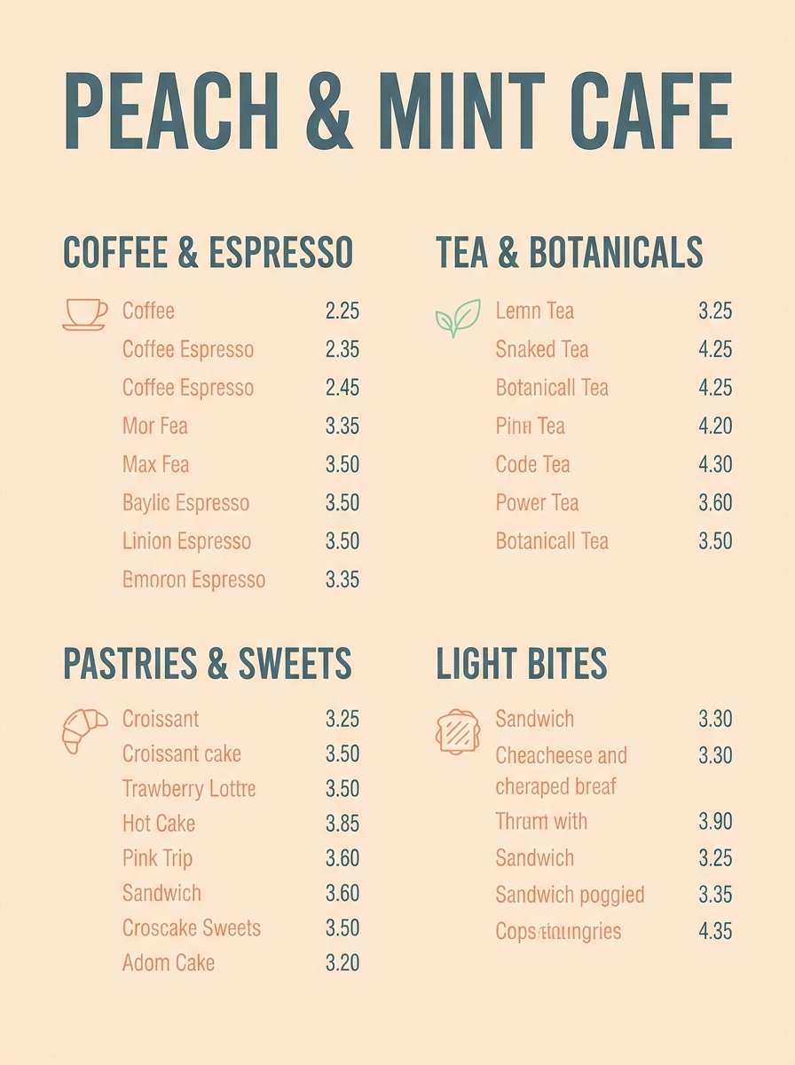
2) Coastal Brunch
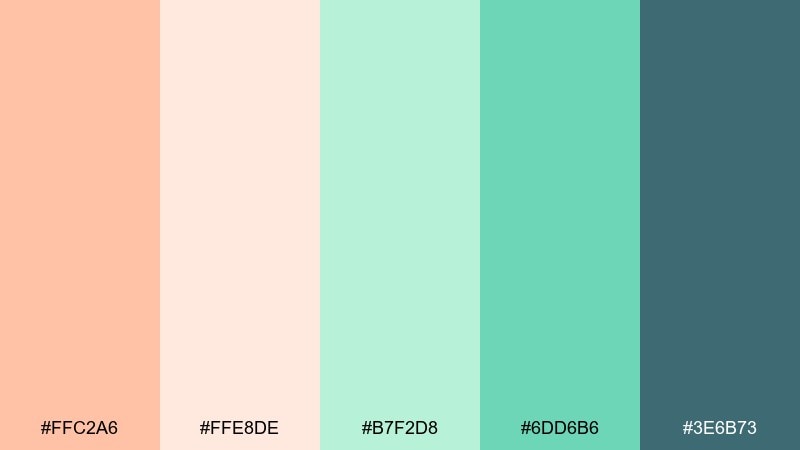
HEX: #FFC2A6 #FFE8DE #B7F2D8 #6DD6B6 #3E6B73
Mood: easygoing, airy, seaside
Best for: cafe menus and lifestyle branding
Airy peach and seafoam read like a late morning by the water, relaxed and inviting. Use the pale blush as breathing room, then anchor sections with the deep slate teal for navigation and prices. This mix shines on menus, loyalty cards, and small-format print where contrast matters. Tip: keep the slate teal at 10 to 15 percent coverage so the palette stays light.
Image example of coastal brunch generated using media.io
3) Vintage Gelato
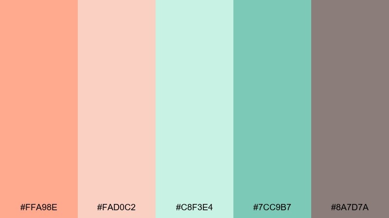
HEX: #FFA98E #FAD0C2 #C8F3E4 #7CC9B7 #8A7D7A
Mood: nostalgic, soft, approachable
Best for: boutique packaging and retro posters
Nostalgic gelato pastels meet a warm taupe that feels like old paper and storefront signage. The taupe is ideal for outlines, barcodes, and small text while the mint range carries the modern freshness. Try it on boutique packaging, retro event posters, or artisanal food labels. Usage tip: pair taupe with the darker mint for legible callouts on light peach panels.
Image example of vintage gelato generated using media.io
4) Botanic Studio
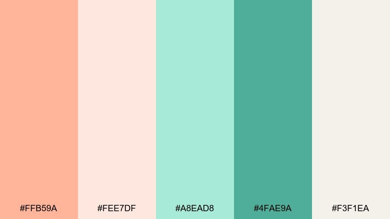
HEX: #FFB59A #FEE7DF #A8EAD8 #4FAE9A #F3F1EA
Mood: calm, botanical, light
Best for: watercolor illustrations and stationery
Calm botanical light comes through in the creamy paper tone and mint greens, with peach like a blush of petals. It is a natural fit for stationery, journaling pages, and gentle illustration work. Keep the deeper green for stems, borders, and small emphasis elements, and let the cream carry most of the page. Tip: add texture with watercolor washes so the pastels do not look flat.
Image example of botanic studio generated using media.io
5) Apricot Breeze
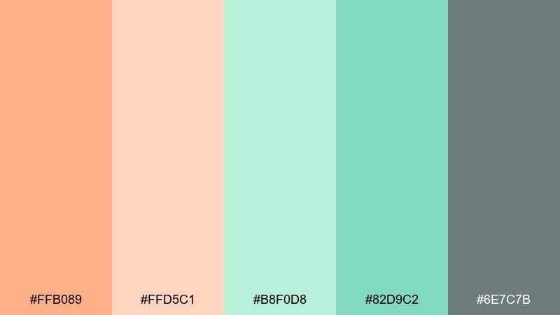
HEX: #FFB089 #FFD5C1 #B8F0D8 #82D9C2 #6E7C7B
Mood: light, breezy, modern
Best for: blog headers and hero sections
Light apricot and mint read like warm air through linen curtains, clean but not sterile. Use the pale peach for generous whitespace and the darker mint for buttons and key links. The muted gray-green makes a smart supporting text color when pure black feels too harsh. Tip: set your primary CTA in darker mint and keep secondary actions in the gray-green.
Image example of apricot breeze generated using media.io
6) Minted Clay
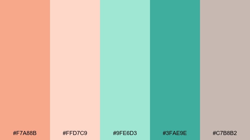
HEX: #F7A88B #FFD7C9 #9FE6D3 #3FAE9E #C7B8B2
Mood: earthy, balanced, understated
Best for: ceramics shops and lifestyle brands
Earthy clay peach and cool mint create a grounded, handmade vibe. The dusty warm neutral keeps everything feeling mature, especially on product pages and lookbooks. Use the deeper teal-mint for logos and stamps, then build supporting areas with the pale peach. Tip: print pieces look best with uncoated stock to match the natural mood.
Image example of minted clay generated using media.io
7) Soft Retro Pop
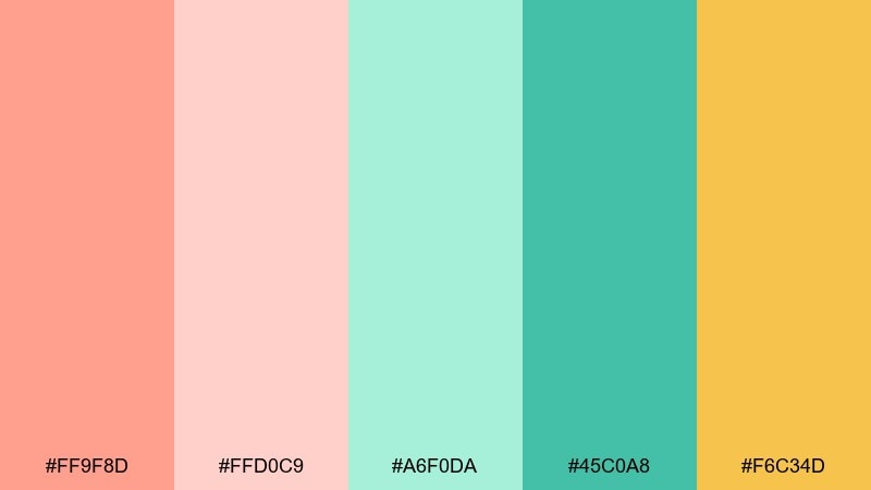
HEX: #FF9F8D #FFD0C9 #A6F0DA #45C0A8 #F6C34D
Mood: playful, punchy, upbeat
Best for: event flyers and creator thumbnails
Playful candy peach and bright mint get a sunny boost from the warm yellow, like a retro summer playlist. These peach mint color combinations are perfect for flyers, creator thumbnails, and upbeat promo graphics where you want quick attention. Keep type in the deeper mint, then use yellow as a highlight for dates or badges. Tip: limit yellow to small bursts so it stays energetic, not overwhelming.
Image example of soft retro pop generated using media.io

8) Nordic Pastels
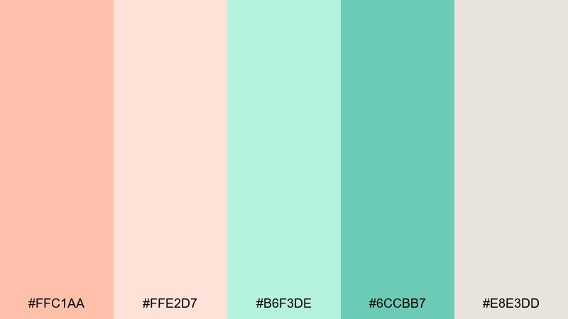
HEX: #FFC1AA #FFE2D7 #B6F3DE #6CCBB7 #E8E3DD
Mood: minimal, cozy, airy
Best for: interiors mood boards and blogs
Minimal Nordic softness comes through in the warm blushes and clean mint, like sun on pale wood. The off-white is ideal for background blocks and image frames, keeping everything airy. Use the darker mint for section headers and small UI details on mood boards. Tip: stick to lots of negative space so the pastels feel intentional, not washed out.
Image example of nordic pastels generated using media.io
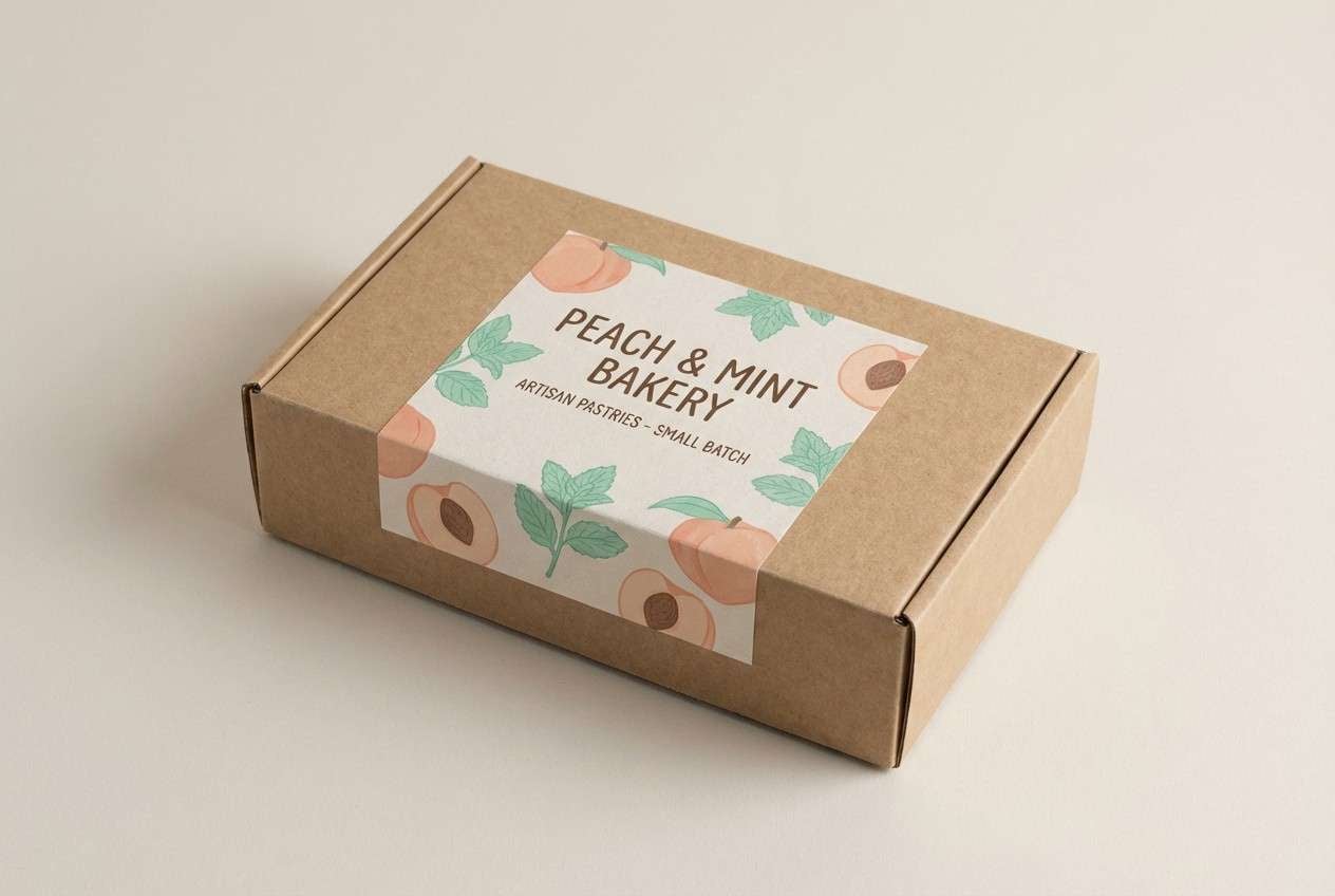
9) Cafe Macaron
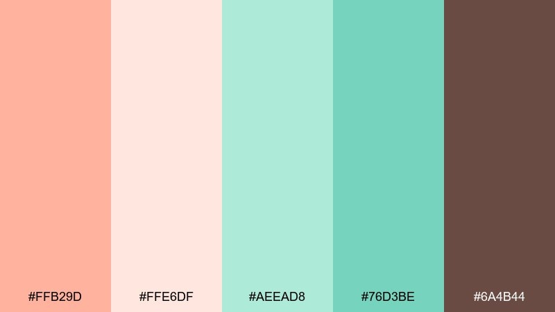
HEX: #FFB29D #FFE6DF #AEEAD8 #76D3BE #6A4B44
Mood: warm, inviting, artisanal
Best for: bakery branding and packaging labels
Warm macaron peach and creamy blush feel freshly baked, while mint keeps it crisp and modern. The coffee brown brings contrast for logos, ingredient text, and stamp marks. It is a strong choice for bakery branding, labels, and gift cards where you need cozy color without going too dark. Tip: set small text in brown and reserve mint for secondary panels and icons.
Image example of cafe macaron generated using media.io
10) Sunlit Nursery
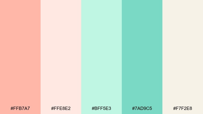
HEX: #FFB7A7 #FFE8E2 #BFF5E3 #7AD9C5 #F7F2E8
Mood: gentle, comforting, cheerful
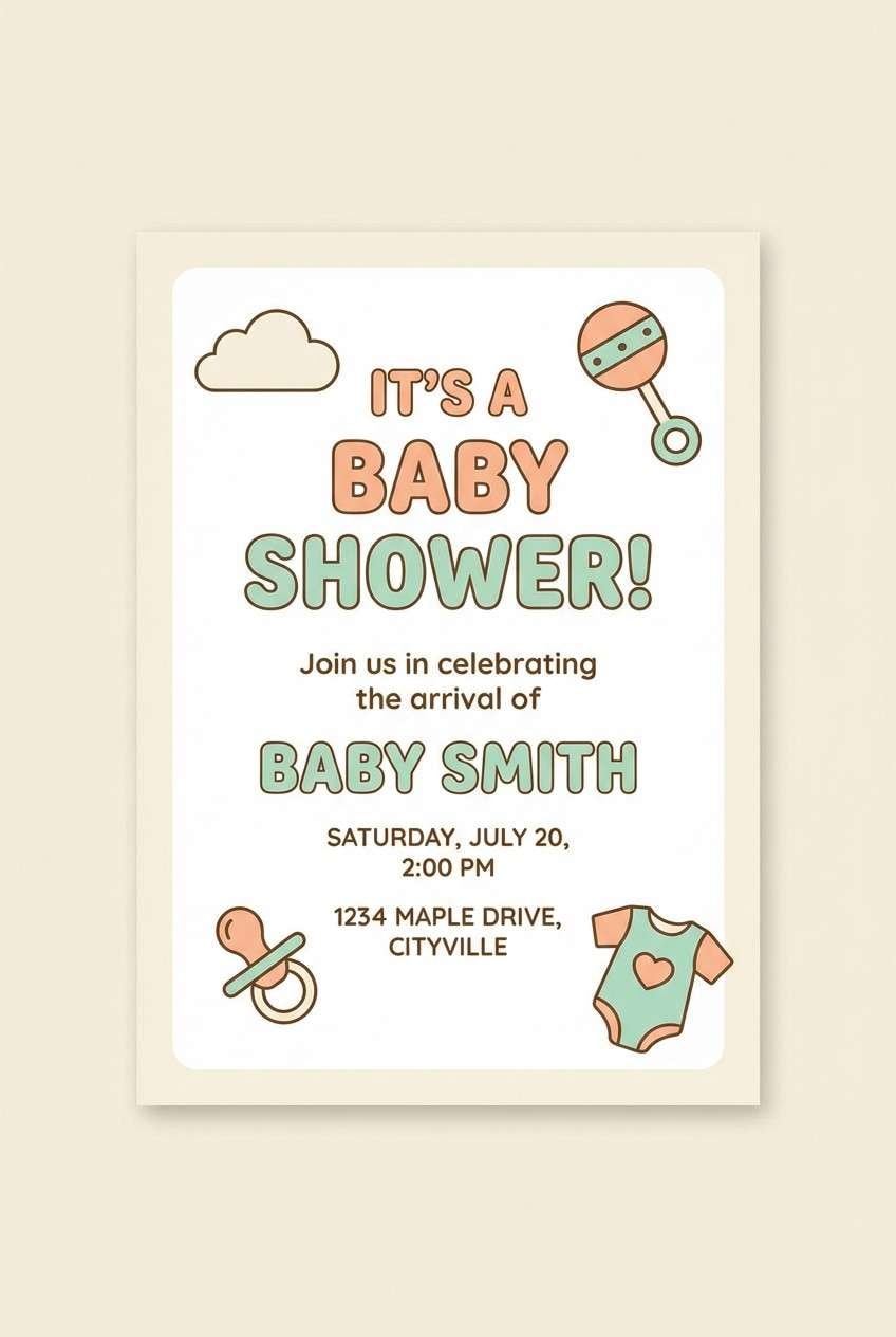
Best for: baby shower invitations and nursery decor
Gentle sunlight and soft textiles come to mind with these warm peaches and airy mints. The cream base keeps layouts calm for baby shower invitations, nursery prints, and milestone cards. Use the darker mint sparingly for names and dates to maintain a soothing feel. Tip: add rounded shapes and wide margins to match the comforting tone.
Image example of sunlit nursery generated using media.io
11) Tropical Minimal
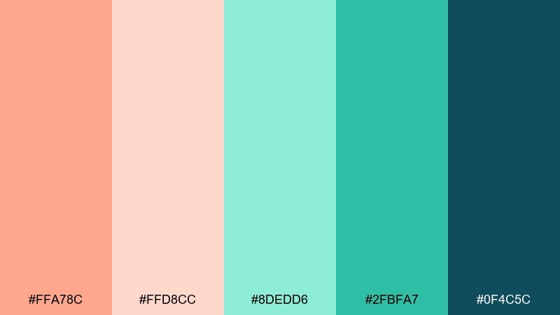
HEX: #FFA78C #FFD8CC #8DEDD6 #2FBFA7 #0F4C5C
Mood: crisp, bold, contemporary
Best for: app onboarding and tech branding
Crisp tropical freshness shows up in the vivid mint and deep teal, with peach acting like a friendly welcome note. This set works well for onboarding screens, fintech dashboards, and modern tech branding that wants warmth without losing clarity. Use deep teal for headers and navigation, then place mint on interactive elements for easy scanning. Tip: keep peach to hero illustrations or empty states so the interface stays focused.
Image example of tropical minimal generated using media.io

12) Peachy Spa Day
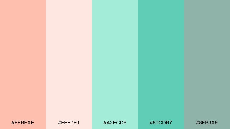
HEX: #FFBFAE #FFE7E1 #A2ECD8 #60CDB7 #8FB3A9
Mood: relaxing, clean, soothing
Best for: spa brochures and service pages
Relaxing spa tones blend soft peach towels with cool mint water, creating instant calm. The muted green-gray is perfect for body text and fine print where you want softness but still need readability. Try it on service menus, brochures, and booking pages with simple iconography. Tip: use mint for dividers and section headers to guide the eye without harsh lines.
Image example of peachy spa day generated using media.io
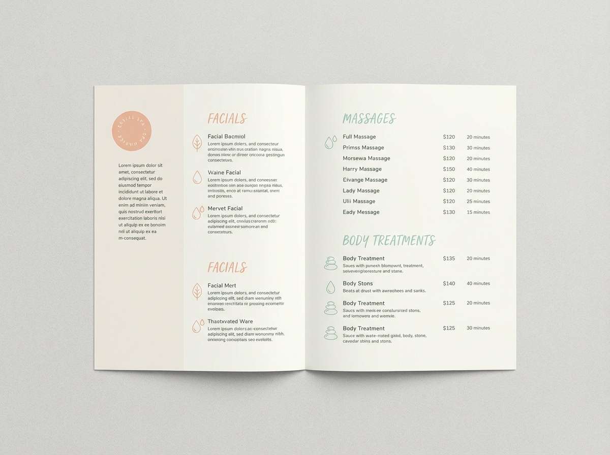
13) Modern Editorial
HEX: #FFB199 #FCE1D9 #9BE4D1 #3E9F93 #1E2A2F
Mood: sleek, confident, editorial
Best for: magazine layouts and portfolio sites
Sleek editorial contrast pairs blush peach with crisp mint, then lands on near-black for a confident finish. It is ideal for magazine spreads, portfolio sites, and lookbooks where typography needs to lead. These peach mint color combinations look best when the dark shade is used for headlines and the teal-mint for pull quotes. Tip: keep body text on the pale blush to reduce glare and maintain warmth.
Image example of modern editorial generated using media.io
14) Terracotta Mint
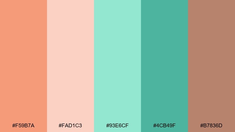
HEX: #F59B7A #FAD1C3 #93E6CF #4CB49F #B7836D
Mood: earthy, creative, sunbaked
Best for: home decor brands and craft packaging
Sunbaked terracotta warmth meets cooling mint, like a studio table near an open window. The clay-brown accent makes it easy to add depth on tags, patterns, and small packaging details. Use the lighter peach for large panels and let mint carry secondary brand elements. Tip: add simple geometric patterns in the clay accent to boost the handmade feel.
Image example of terracotta mint generated using media.io
15) Wedding Pastel
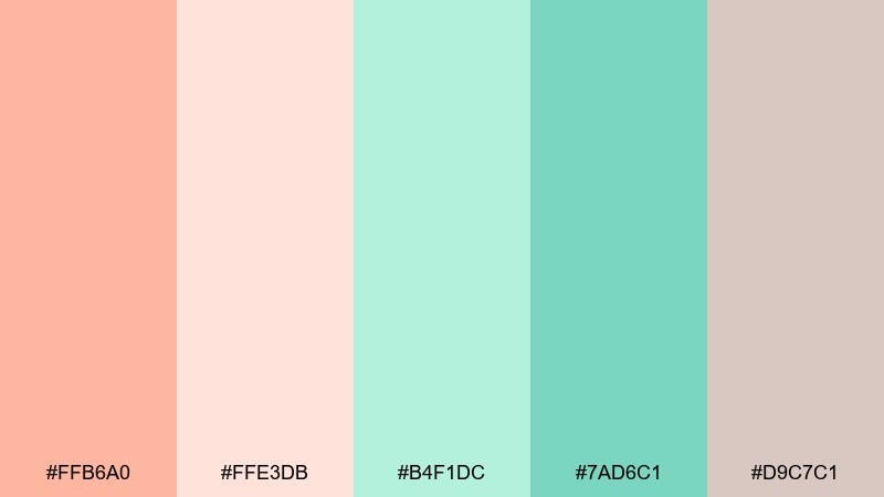
HEX: #FFB6A0 #FFE3DB #B4F1DC #7AD6C1 #D9C7C1
Mood: romantic, soft, elegant
Best for: wedding invitations and ceremony signage
Romantic blush and airy mint feel like silk ribbons, fresh florals, and candlelight. The dusty neutral adds sophistication for monograms, borders, and small details on print. For a peach mint color palette that looks elevated, keep the layout minimal and let the paper-like neutral do the quiet work. Tip: choose foil or letterpress only for the darkest mint to avoid muddy contrast.
Image example of wedding pastel generated using media.io
16) Market Fresh
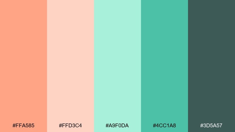
HEX: #FFA585 #FFD3C4 #A9F0DA #4CC1A8 #3D5A57
Mood: zesty, wholesome, energetic
Best for: farmers market posters and food labels
Zesty peach and crisp mint feel like fresh fruit stands and herb bundles. The deep green-gray supports strong readability for pricing, ingredients, and small badges. Use the bright mint for freshness cues on food labels, while peach leads the hero area or product name. Tip: add a thin deep-green border around peach blocks to sharpen contrast in print.
Image example of market fresh generated using media.io

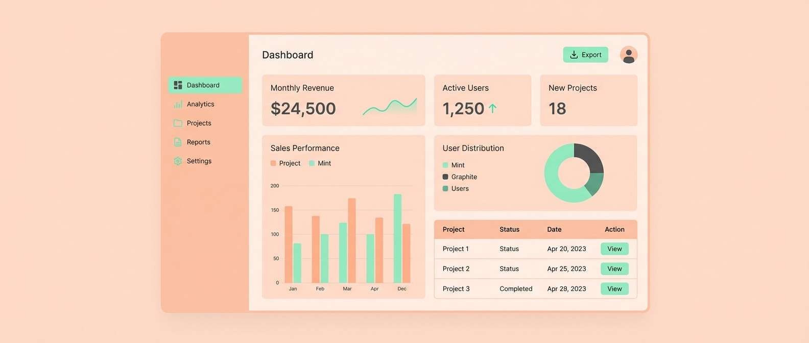
17) UI Calm Mode
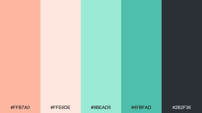
HEX: #FFB7A0 #FFE6DE #9BEAD5 #4FBFAD #2B2F36
Mood: calm, clear, modern
Best for: dashboard UI and SaaS components
Calm clarity comes from the soft peach base and cool mint controls, with a deep graphite for structure. It is a strong peach mint color scheme for dashboards where you want friendly visuals but serious legibility. Use graphite for navigation and charts, then mint for toggles, sliders, and success states. Tip: keep peach as the main canvas color and avoid large mint backgrounds to prevent visual fatigue.
Image example of ui calm mode generated using media.io
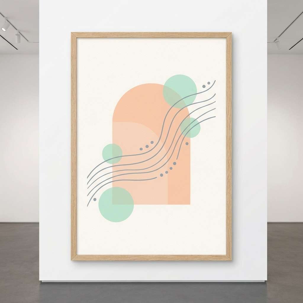
18) Art Print Serenity
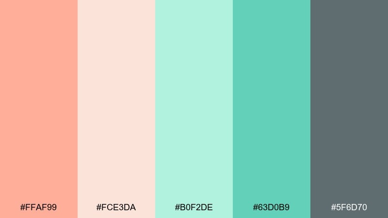
HEX: #FFAF99 #FCE3DA #B0F2DE #63D0B9 #5F6D70
Mood: serene, artistic, airy
Best for: minimal art prints and wall decor
Serene airy pastels feel like a quiet gallery wall, with mint as the cool breath and peach as the gentle glow. The smoky gray-blue supports line art and captions without stealing attention. Use the deeper mint for focal shapes and keep everything else soft and spacious. Tip: print on matte paper and keep outlines thin so the colors stay delicate.
Image example of art print serenity generated using media.io
19) Evening Peach Mint
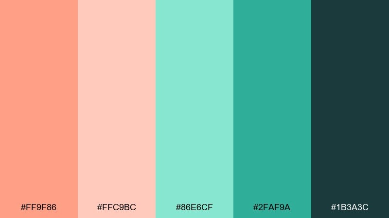
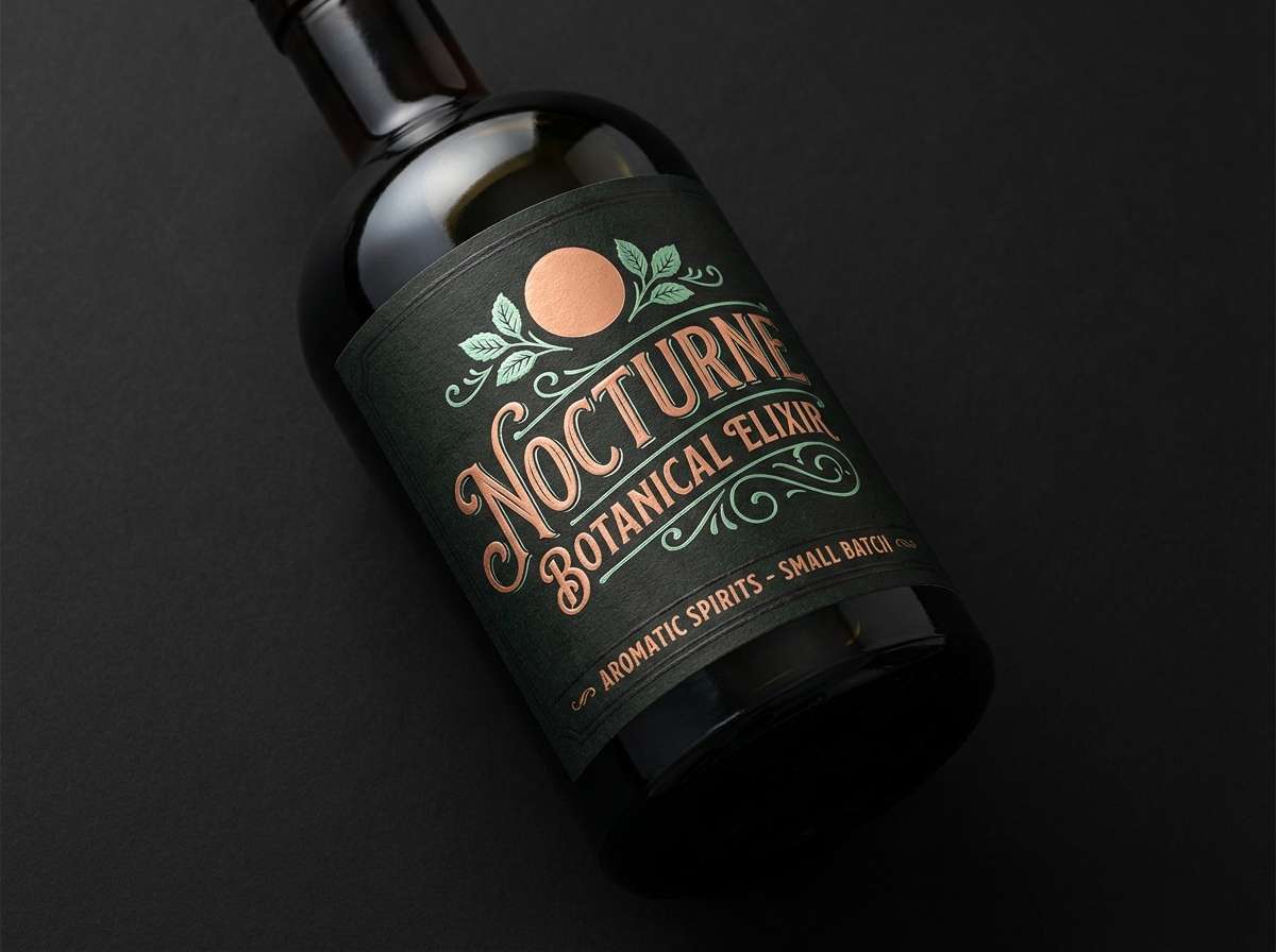
HEX: #FF9F86 #FFC9BC #86E6CF #2FAF9A #1B3A3C
Mood: moody, stylish, high-contrast
Best for: night event promos and cocktail branding
Moody evening contrast turns the peach into a warm glow against deep green-black, like neon reflected on glass. This peach mint color combination is excellent for night event promos, cocktail labels, and punchy social ads. Let the dark shade dominate, then use peach for headlines and mint for secondary highlights and icons. Tip: add subtle grain or gradient in the dark background to avoid banding on screens.
Image example of evening peach mint generated using media.io
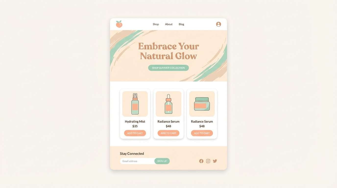
20) Creamy Lagoon
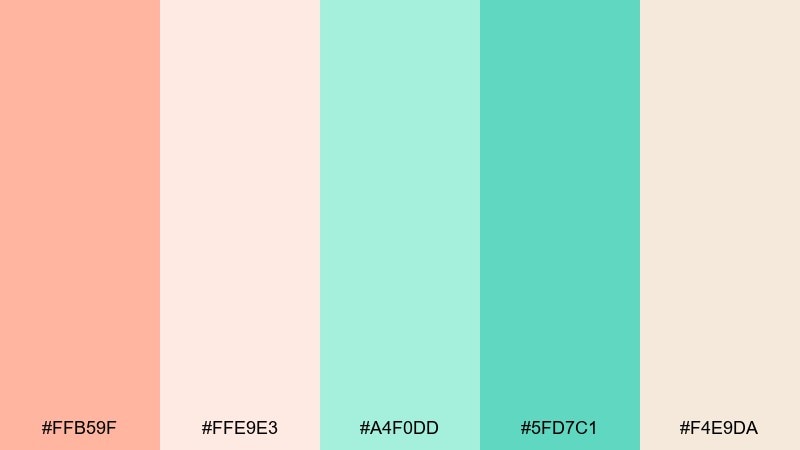
HEX: #FFB59F #FFE9E3 #A4F0DD #5FD7C1 #F4E9DA
Mood: dreamy, soft, uplifting
Best for: beauty landing pages and summer ads
Dreamy lagoon pastels feel like sunlit water and creamy gel textures, bright but gentle. The two creamy neutrals give you plenty of space for photography and long-form copy. Use the brighter mint as a clean accent for buttons and offer tags, while peach leads banners and product highlights. Tip: keep shadows warm and subtle so the palette stays airy rather than gray.
Image example of creamy lagoon generated using media.io
What Colors Go Well with Peach Mint?
For clean contrast, pair peach mint with charcoal, graphite, deep teal, or near-black. These darker anchors keep pastel UIs and print layouts readable while still feeling soft and friendly.
To warm it up, add coffee brown, warm taupe, creamy off-white, or a dusty neutral for a handmade, artisanal look. For extra pop, a small amount of sunny yellow or coral can add energy without breaking the calm tone.
If you want a cooler, more modern vibe, introduce slate blue, muted cyan, or soft gray-blue. These neighbors help mint feel more “tech” while peach stays welcoming.
How to Use a Peach Mint Color Palette in Real Designs
Start with a light peach or cream as your main background, then use mint for interactive elements like buttons, toggles, highlights, and badges. Reserve the darkest color for navigation, icons, and headings so the hierarchy stays clear.
In print and packaging, keep large areas in the lightest tint to avoid muddy pastels, then add definition with a darker outline color (taupe, brown, or deep teal). This improves legibility for ingredients, pricing, and small labels.
For social graphics, use peach for the headline area and mint for accents, borders, or stickers. If you include photography, keep shadows warm and subtle so the palette stays bright and airy.
Create Peach Mint Palette Visuals with AI
If you want to see these HEX codes in action, generate quick mockups like menus, landing pages, packaging labels, or posters—without building a full design file first. AI visuals are a fast way to test balance, contrast, and vibe.
Try multiple prompts with the same palette (for example: “skincare packaging,” “app onboarding,” or “wedding invitation suite”) to confirm the colors stay consistent across different contexts. Then refine with stronger typography contrast if needed.
Peach Mint Color Palette FAQs
-
What does a peach mint color palette communicate?
Peach mint typically communicates warmth + freshness: friendly, clean, calm, and modern. It’s popular for wellness, beauty, food, and lifestyle brands that want a soft, approachable look. -
Are peach and mint considered complementary colors?
Not strictly. They’re closer to a soft warm/cool contrast rather than direct complements. That’s why the pairing feels balanced and easy on the eyes, especially in pastel tones. -
What’s the best text color on peach mint backgrounds?
Use charcoal, graphite, deep teal, or dark brown for reliable readability. Pure black can look harsh on pastels, so slightly softened dark tones often feel more premium. -
How do I keep a peach mint palette from looking too “baby” or childish?
Add a strong dark anchor (near-black, deep teal, slate) and reduce saturation. Also use more negative space, cleaner typography, and limit bright accents to small details. -
Is peach mint good for UI design?
Yes—especially for calm dashboards, onboarding screens, and friendly SaaS branding. Keep mint mainly for interactive states and use a dark neutral for navigation and body text. -
What accent colors work with peach mint besides neutrals?
Sunny yellow, muted gold, slate blue, or smoky gray-blue work well. The key is using accents sparingly so the palette stays airy rather than busy. -
How do I print peach and mint accurately?
Pastels can shift in print, so request a proof and consider uncoated stock for a softer look. Use darker outlines for small text and avoid extremely light mint on white if you need crisp contrast.
Next: Azure Color Palette


