

Azure is a vivid blue that instantly signals clarity, momentum, and trust. In digital products and branding, it reads “modern” without feeling cold, especially when paired with soft neutrals or warm accents.
Below are 20 azure color palette ideas with HEX codes, mood notes, and practical use cases—plus AI prompts you can reuse to generate matching visuals in Media.io.
In this article
- Why Azure Palettes Work So Well
-
- coastal azure breeze
- midnight harbor
- skyglass minimal
- tropical lagoon pop
- arctic clear
- vintage sailcloth
- tech dashboard blue
- playful candy blue
- deep sea contrast
- soft nursery sky
- corporate calm
- azure and apricot
- garden poolside
- retro sports stripe
- luxe velvet night
- clean medical ui
- sunset over water
- concrete and azure
- celestial nebula
- artisan ceramic
- What Colors Go Well with Azure?
- How to Use a Azure Color Palette in Real Designs
- Create Azure Palette Visuals with AI
Why Azure Palettes Work So Well
Azure sits in the “clean, high-energy” zone of blue—bright enough to feel fresh, yet familiar enough to communicate reliability. That makes an azure blue palette a safe default for UI, SaaS, and brand systems where confidence matters.
It’s also extremely flexible: push it toward cyan for playful, tropical vibes, or deepen it with navy and slate for premium, data-heavy interfaces. With the right neutrals, azure stays readable and polished across screens and print.
Because it naturally draws attention, azure works best when you decide early what it represents (primary actions, links, highlights) and then keep that meaning consistent throughout your design.
20+ Azure Color Palette Ideas (with HEX Codes)
1) Coastal Azure Breeze
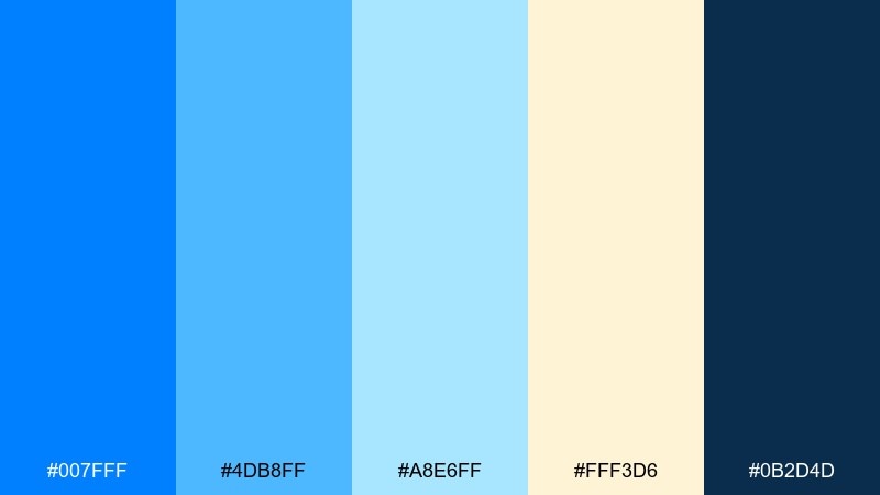
HEX: #007FFF #4DB8FF #A8E6FF #FFF3D6 #0B2D4D
Mood: airy, coastal, uplifting
Best for: travel landing page hero
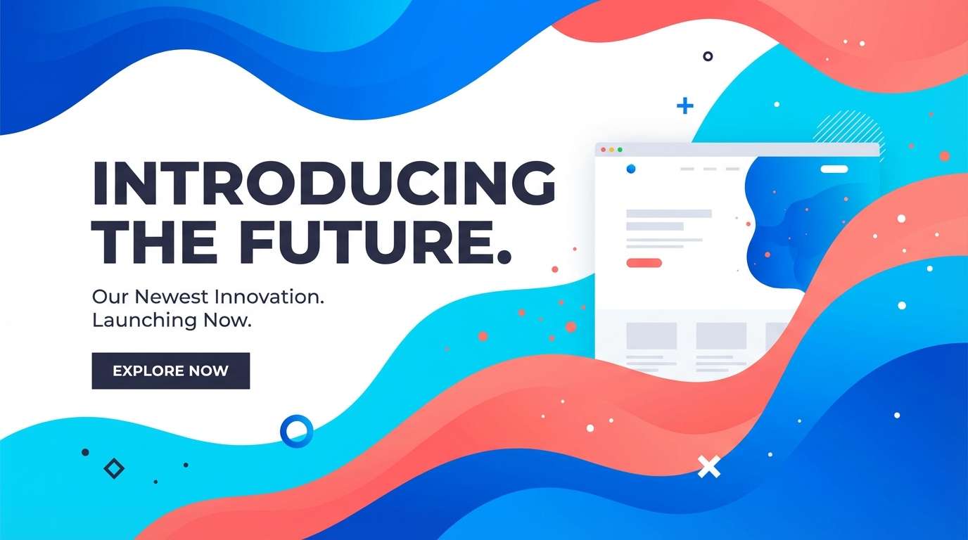
Airy and sunlit, these azure tones feel like clear water against warm sand and deep navy shadows. They work beautifully for travel, hospitality, and lifestyle pages where freshness matters. Pair the bright blues with the cream as breathing room, then anchor sections with the navy for readability. Usage tip: keep #007FFF for primary buttons and reserve #A8E6FF for large soft gradients.
Image example of coastal azure breeze generated using media.io

Media.io is an online AI studio for creating and editing video, image, and audio in your browser.

2) Midnight Harbor
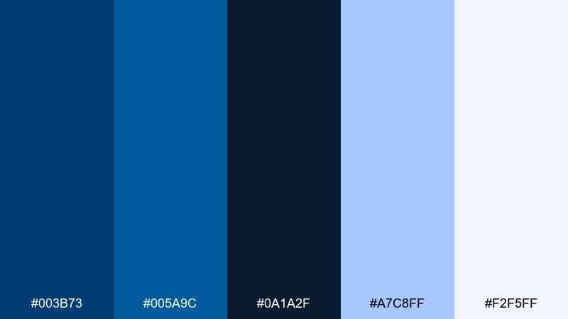
HEX: #003B73 #005A9C #0A1A2F #A7C8FF #F2F5FF
Mood: moody, nautical, premium
Best for: finance app onboarding screens
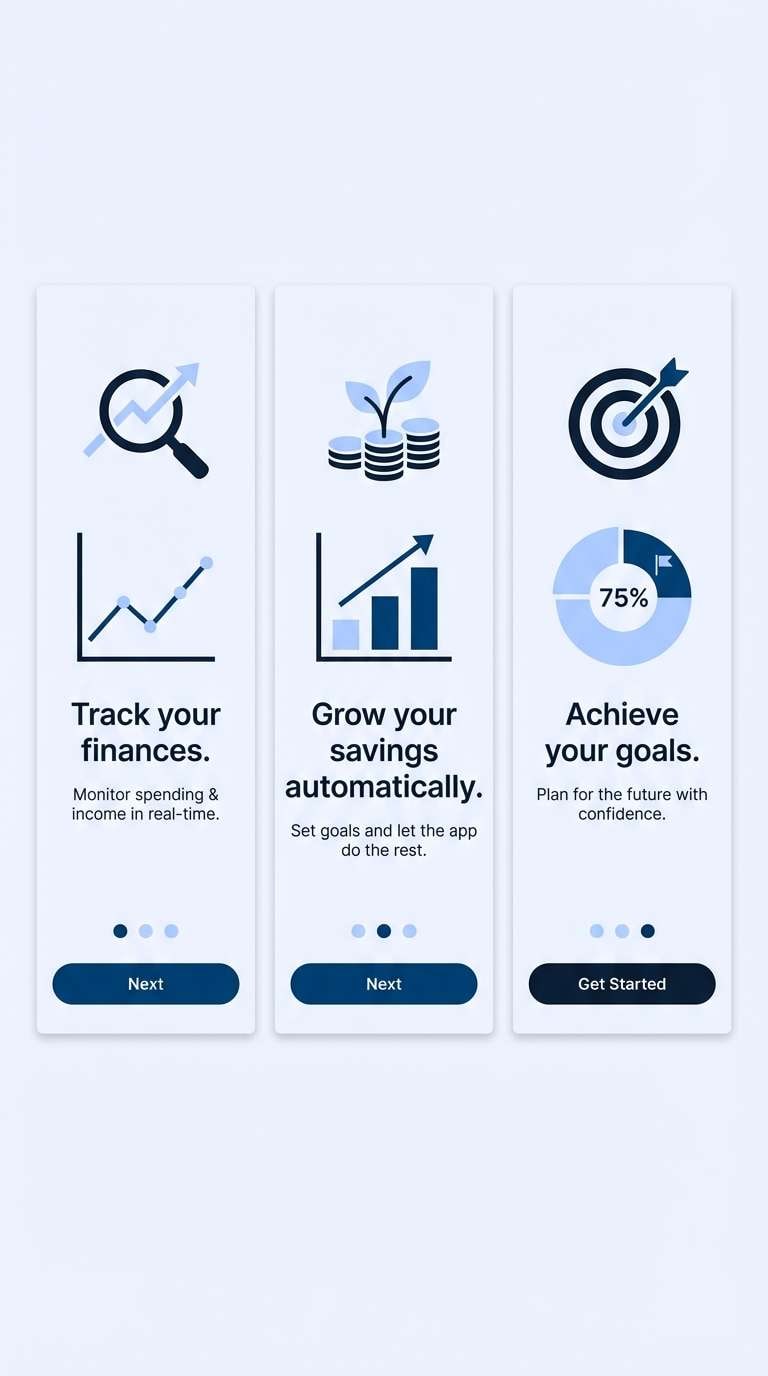
Moody harbor blues evoke late-night city reflections and confident calm. The dark base is ideal for fintech and data-heavy onboarding where contrast and trust are essential. Balance the deep tones with the pale tints for card surfaces and gentle highlights. Usage tip: use #A7C8FF sparingly for progress indicators so it reads as guidance, not noise.
Image example of midnight harbor generated using media.io
3) Skyglass Minimal
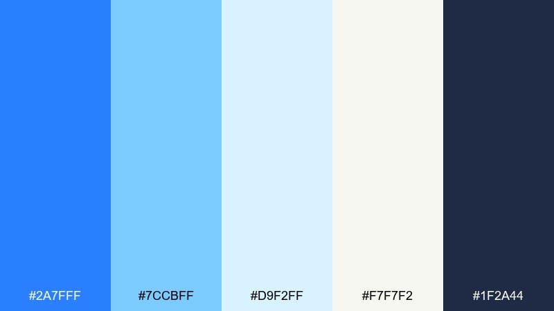
HEX: #2A7FFF #7CCBFF #D9F2FF #F7F7F2 #1F2A44
Mood: clean, modern, weightless
Best for: saas marketing website sections
Clean and weightless, these azure blue color combinations feel like sunlight through glass and polished interfaces. They shine on SaaS pages, product tours, and documentation layouts that need clarity. Pair the soft blues with off-white for background structure, then use the inky slate for headings. Usage tip: keep #2A7FFF as the single strongest accent to avoid a washed look.
Image example of skyglass minimal generated using media.io

4) Tropical Lagoon Pop
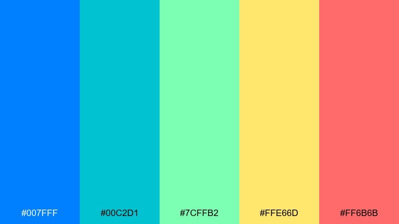
HEX: #007FFF #00C2D1 #7CFFB2 #FFE66D #FF6B6B
Mood: playful, tropical, energetic
Best for: summer event poster
Playful and tropical, this azure mix feels like lagoon water, citrus sunlight, and a punchy coral accent. It is perfect for summer campaigns, festival posters, and bold social graphics where you want instant energy. These azure color combinations work best when you pick one warm accent per layout and let the blues do the heavy lifting. Usage tip: use #FFE66D for headlines on deep blue shapes to keep contrast cheerful and readable.
Image example of tropical lagoon pop generated using media.io

5) Arctic Clear
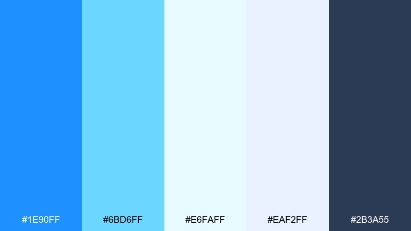
HEX: #1E90FF #6BD6FF #E6FAFF #EAF2FF #2B3A55
Mood: crisp, cool, refreshing
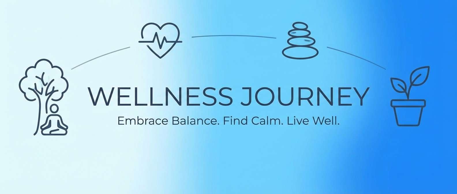
Best for: wellness blog header and icons
Crisp and refreshing, these blues feel like glacier air and clean water. They fit wellness content, hydration branding, and calming blog visuals that need a bright but gentle presence. Pair the icy lights with the slate for typography and simple icon strokes. Usage tip: keep backgrounds in #E6FAFF or #EAF2FF to reduce glare while staying luminous.
Image example of arctic clear generated using media.io
6) Vintage Sailcloth
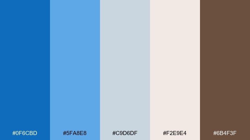
HEX: #0F6CBD #5FA8E8 #C9D6DF #F2E9E4 #6B4F3F
Mood: nostalgic, maritime, grounded
Best for: heritage brand packaging label
Nostalgic and grounded, these azure tones evoke weathered sailcloth, faded denim, and warm wooden details. They suit heritage packaging, coffee labels, and craft goods where authenticity is the message. Use the warm brown as a sparing accent for stamps and emblems, while the blues carry the main brand field. Usage tip: print-friendly layouts look best when #F2E9E4 acts as the label paper base.
Image example of vintage sailcloth generated using media.io

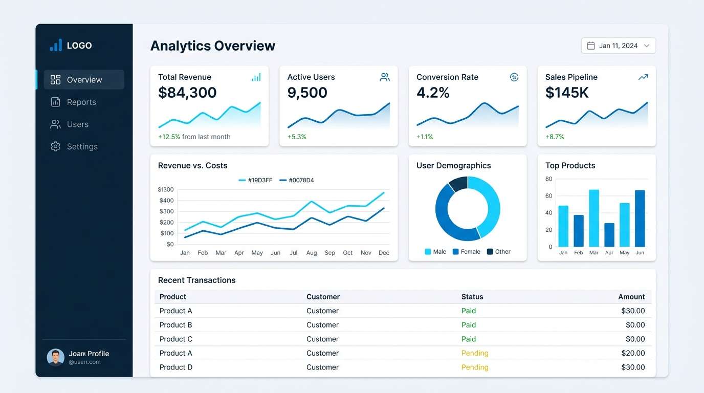
7) Tech Dashboard Blue
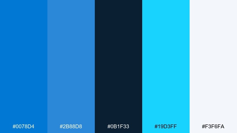
HEX: #0078D4 #2B88D8 #0B1F33 #19D3FF #F3F6FA
Mood: focused, techy, high-contrast
Best for: analytics dashboard UI
Focused and technical, this azure color palette feels like glowing charts in a dark control room. It is made for dashboards, admin panels, and dense data views that need crisp hierarchy. As an azure color scheme, it reads best when the navy is the canvas and the bright cyan is reserved for key metrics. Usage tip: limit #19D3FF to one chart series so alerts and highlights do not compete.
Image example of tech dashboard blue generated using media.io
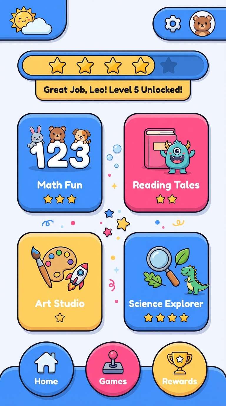
8) Playful Candy Blue
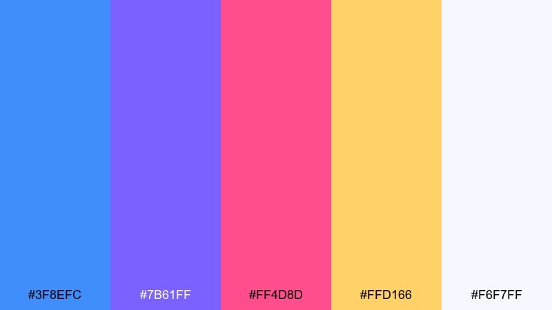
HEX: #3F8EFC #7B61FF #FF4D8D #FFD166 #F6F7FF
Mood: fun, youthful, bold
Best for: kids learning app UI screens
Fun and youthful, these colors feel like candy wrappers and bright sticker packs. They are great for kids apps, playful startups, and social content that needs punch without looking messy. Keep the off-white as a consistent background to keep the UI readable, and use the warm yellow for friendly callouts. Usage tip: assign one accent per component type, such as pink for badges and purple for secondary buttons.
Image example of playful candy blue generated using media.io
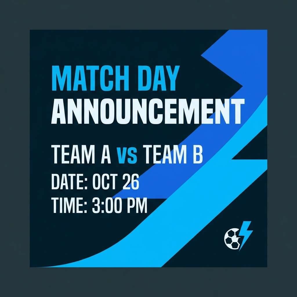
9) Deep Sea Contrast
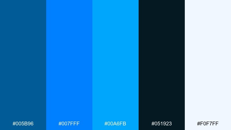
HEX: #005B96 #007FFF #00A6FB #051923 #F0F7FF
Mood: dramatic, modern, crisp
Best for: sports brand social templates
Dramatic and crisp, these blues evoke deep water with sharp light cutting through. They work well for sports graphics, tech announcements, and high-impact social templates. Use the near-black for bold type blocks and let the brighter blues carry motion lines and highlights. Usage tip: keep #F0F7FF for text on dark panels to avoid the harshness of pure white.
Image example of deep sea contrast generated using media.io
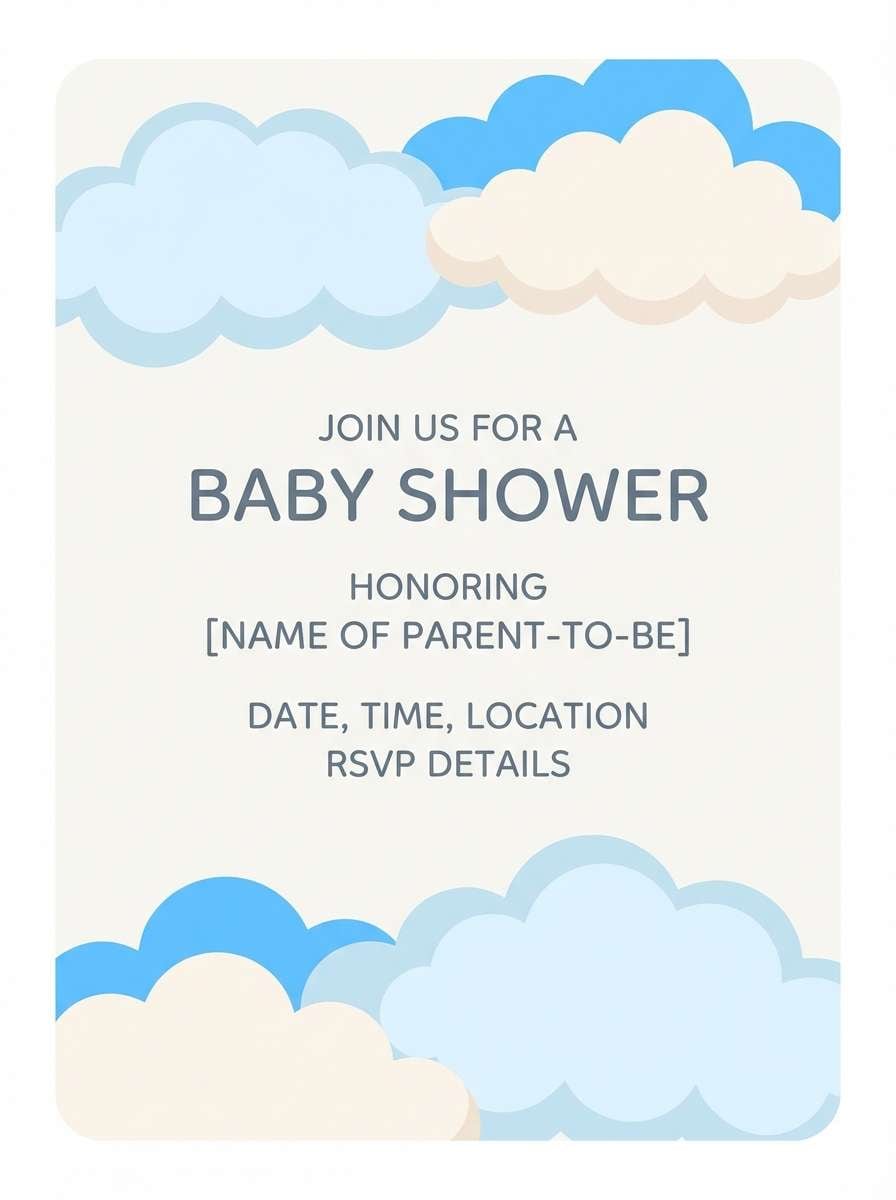
10) Soft Nursery Sky
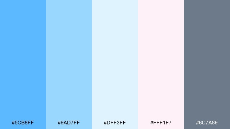
HEX: #5CB8FF #9AD7FF #DFF3FF #FFF1F7 #6C7A89
Mood: gentle, comforting, dreamy
Best for: baby shower invitation
Gentle and dreamy, the azure color palette feel like cotton clouds with a blush-tinted sunrise. It is ideal for baby shower invites, nursery décor printables, and soft lifestyle branding. Pair the blush with the lightest blue for a sweet balance, then use the gray for body text so it stays legible. Usage tip: keep typography simple and rounded to match the calming color story.
Image example of soft nursery sky generated using media.io
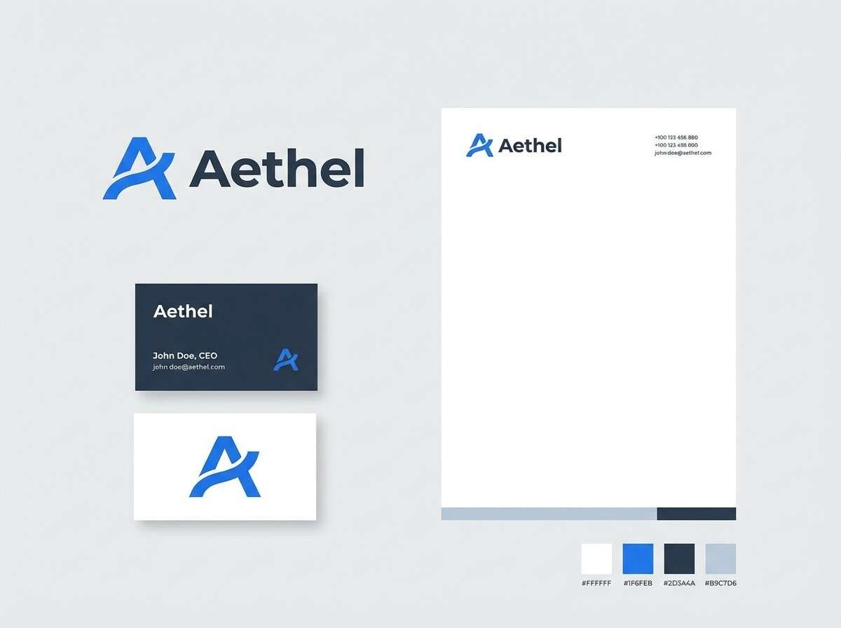
11) Corporate Calm
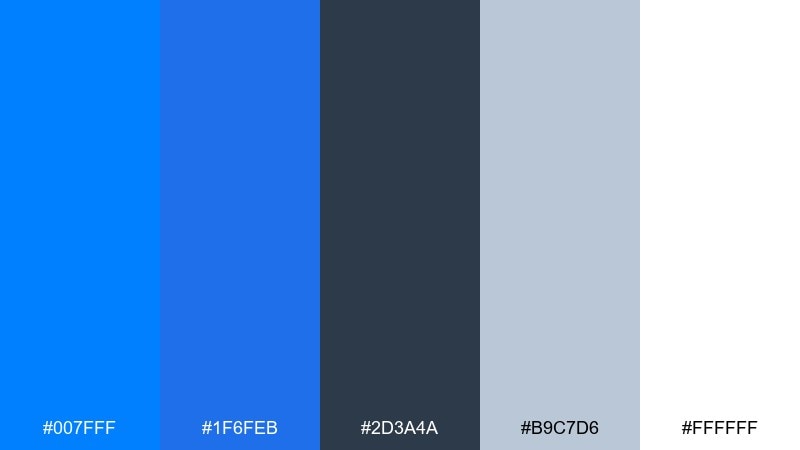
HEX: #007FFF #1F6FEB #2D3A4A #B9C7D6 #FFFFFF
Mood: professional, steady, trustworthy
Best for: consulting brand identity
Professional and steady, this azure set suggests competence, clear thinking, and a polished presentation. It is a strong fit for consulting, B2B services, and clean corporate identity systems. Use the slate for text and dividers, while the brighter blue signals actions and key messages. Usage tip: for a consistent azure color palette, set #1F6FEB as your primary brand blue and reserve #007FFF for small emphasis moments.
Image example of corporate calm generated using media.io
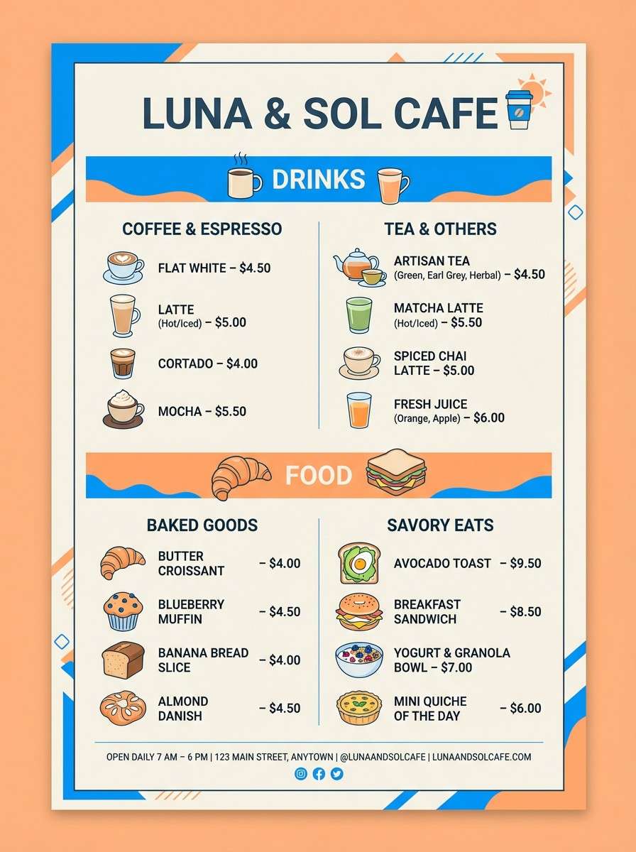
12) Azure and Apricot
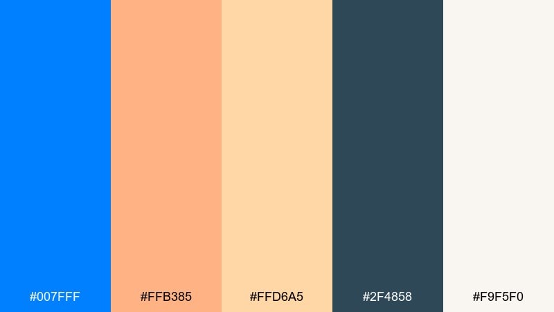
HEX: #007FFF #FFB385 #FFD6A5 #2F4858 #F9F5F0
Mood: welcoming, sunny, balanced
Best for: cafe menu flyer
Welcoming and sunny, the cool blue meets apricot warmth like shade and afternoon light. It suits cafés, brunch spots, and friendly local businesses that want modern charm without feeling sterile. This azure color combination looks best when the apricot is used for highlights and the deep teal handles typography. Usage tip: keep #F9F5F0 as the paper-like background so the warm accents feel natural in print.
Image example of azure and apricot generated using media.io
13) Garden Poolside
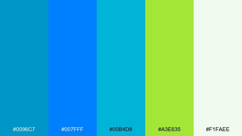
HEX: #0096C7 #007FFF #00B4D8 #A3E635 #F1FAEE
Mood: fresh, outdoorsy, lively
Best for: spring sale email header
Fresh and outdoorsy, these azure color combinations feel like pool water beside new leaves and bright morning air. They are great for spring promotions, garden brands, and eco-friendly messaging that needs extra pop. Use the soft minty white as a calm base, then add green sparingly for calls to action or price tags. Usage tip: keep blues for most shapes and let the green act as a single highlight color to avoid visual clutter.
Image example of garden poolside generated using media.io

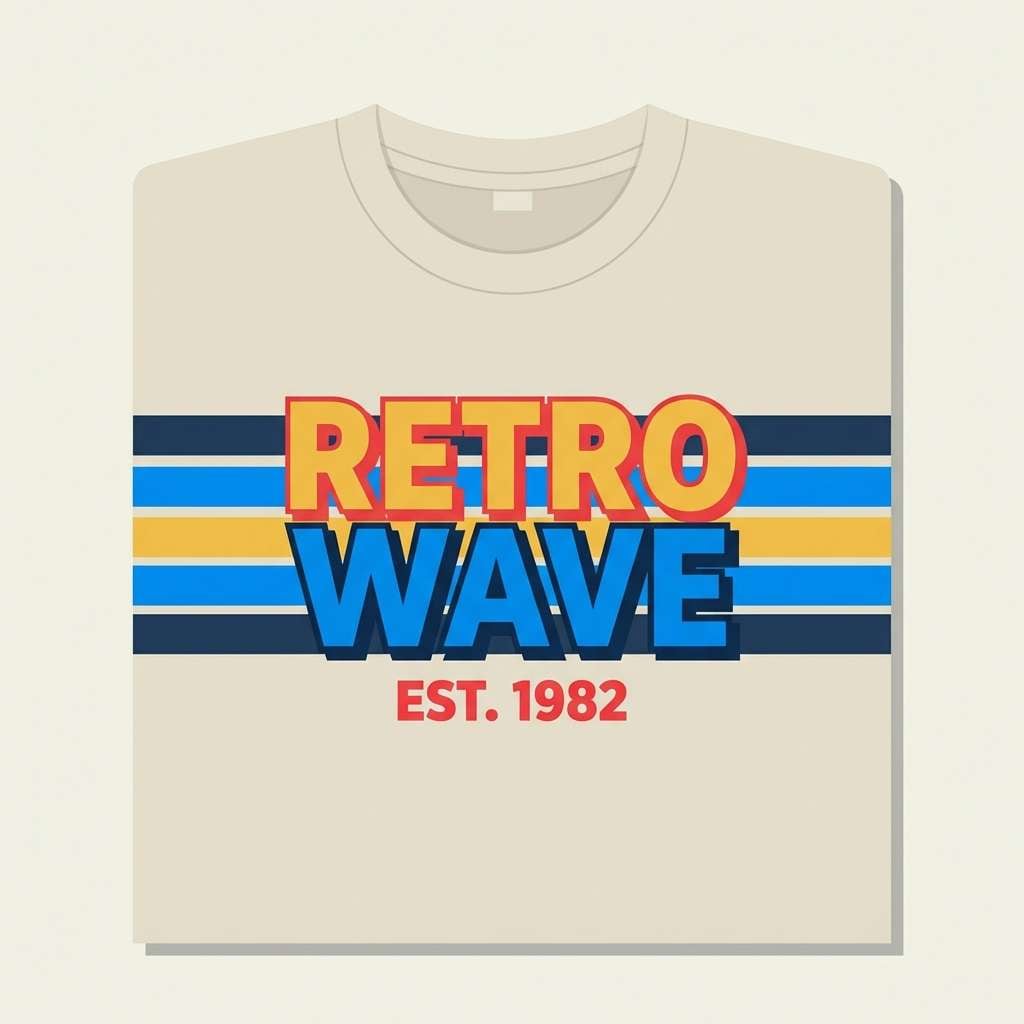
14) Retro Sports Stripe
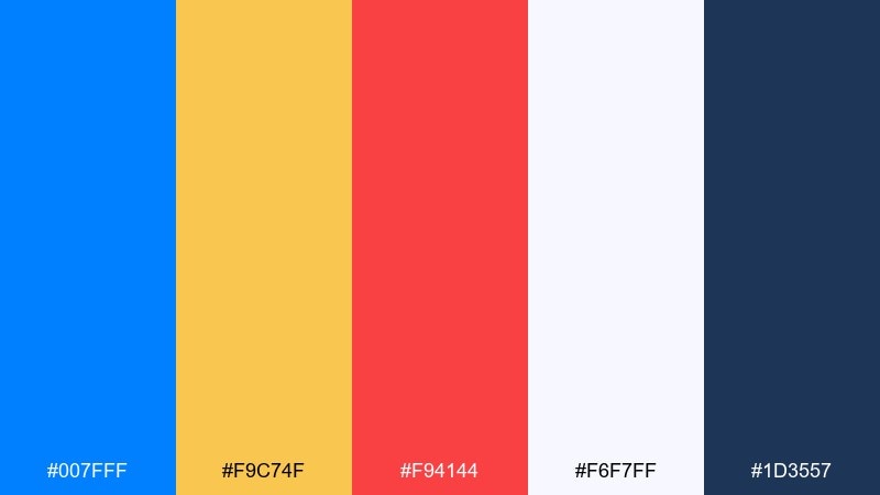
HEX: #007FFF #F9C74F #F94144 #F6F7FF #1D3557
Mood: retro, sporty, confident
Best for: team merch t-shirt graphic
Retro and confident, this azure color palette channels classic jersey stripes with a bold primary blue. It works for team merch, tournament posters, and energetic brand drops. Use the navy for outlines and type, while the red and gold add punch in small blocks or stripe accents. Usage tip: keep the warm colors at under a third of the layout so the design stays cohesive.
Image example of retro sports stripe generated using media.io
15) Luxe Velvet Night
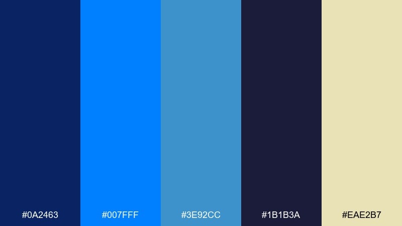
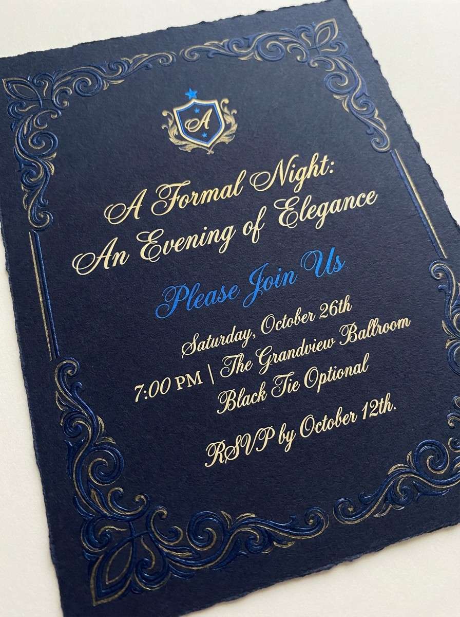
HEX: #0A2463 #007FFF #3E92CC #1B1B3A #EAE2B7
Mood: luxurious, dramatic, elegant
Best for: night event invitation
Luxurious and dramatic, these azure colors feel like velvet curtains lit by a cool spotlight with a soft champagne glow. They are ideal for night events, gallery openings, and premium launches. Let the dark indigo carry the background, then use the pale gold for refined details like borders or monograms. Usage tip: set #007FFF only on key elements such as RSVP buttons to keep the look upscale.
Image example of luxe velvet night generated using media.io
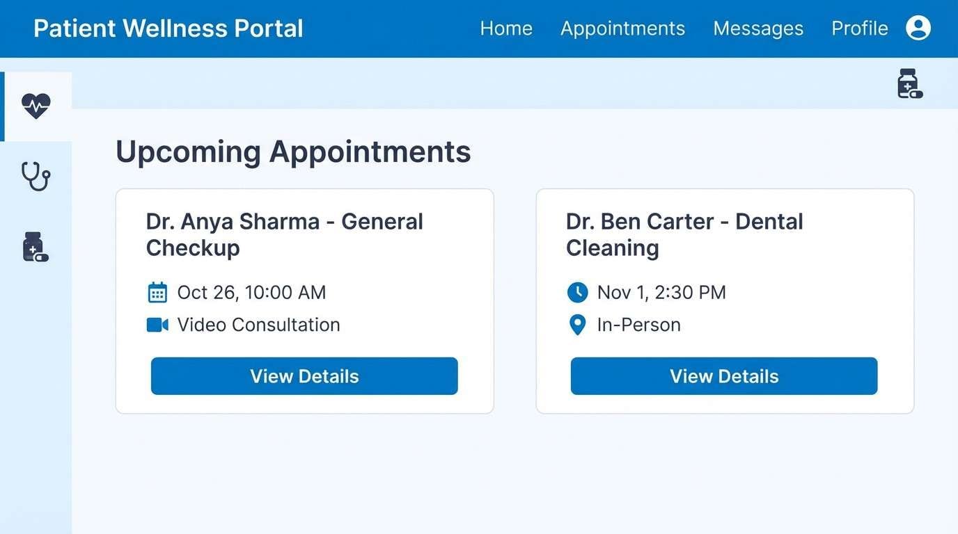
16) Clean Medical UI
HEX: #0078D4 #37B9FF #E6F4FF #2E3A59 #F8FBFF
Mood: clinical, reassuring, clear
Best for: healthcare portal UI
Clinical and reassuring, this azure blue color palette feels like bright daylight, clean surfaces, and calm guidance. It fits patient portals, appointment flows, and health dashboards where clarity reduces stress. Pair the light blues with near-white panels for separation, and use the navy for accessible text contrast. Usage tip: keep #37B9FF for secondary highlights so primary actions remain consistent in #0078D4.
Image example of clean medical ui generated using media.io
17) Sunset Over Water
HEX: #007FFF #00B2FF #FF7A59 #FFD1BA #2B2D42
Mood: optimistic, warm, cinematic
Best for: product launch banner
Optimistic and cinematic, the blues read like open water while the coral tones bring in a sunset glow. It is ideal for launch banners, promo headers, and hero sections that need warmth without losing clarity. These azure color combinations look strongest when the dark slate is used for type and the coral is reserved for one focal badge or button. Usage tip: use #FFD1BA as a soft backdrop behind coral text to avoid harsh contrast.
Image example of sunset over water generated using media.io
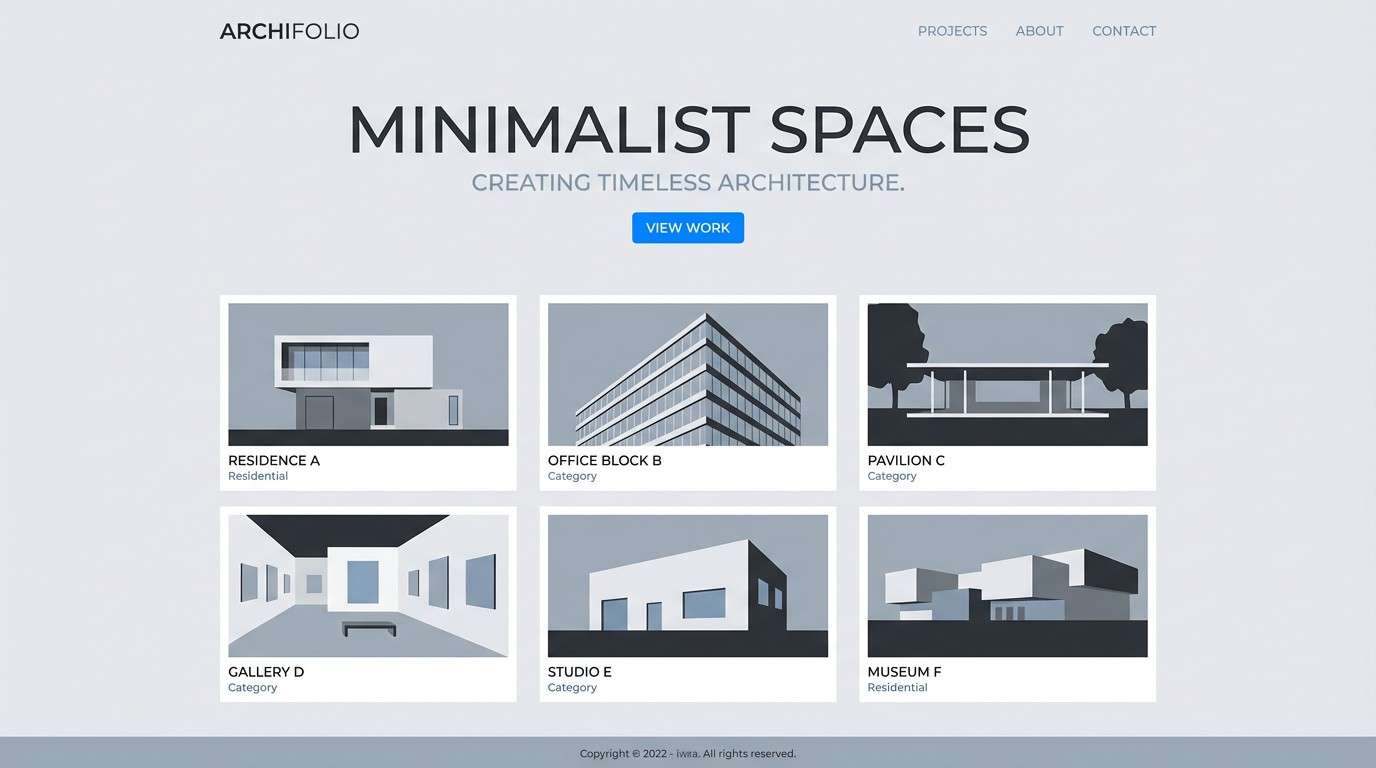
18) Concrete and Azure
HEX: #007FFF #5E6C7B #A7B1BC #E8EAED #2A2F36
Mood: urban, neutral, modern
Best for: architecture portfolio website
Urban and modern, these azure blue color combinations evoke concrete, steel, and a sharp blue sky line. They are a great fit for architecture portfolios, industrial brands, and minimalist case studies. Let the grays dominate your layout for a gallery feel, then bring in the blue for links, hover states, or section markers. Usage tip: keep imagery slightly desaturated so the blue accents stay intentional and refined.
Image example of concrete and azure generated using media.io
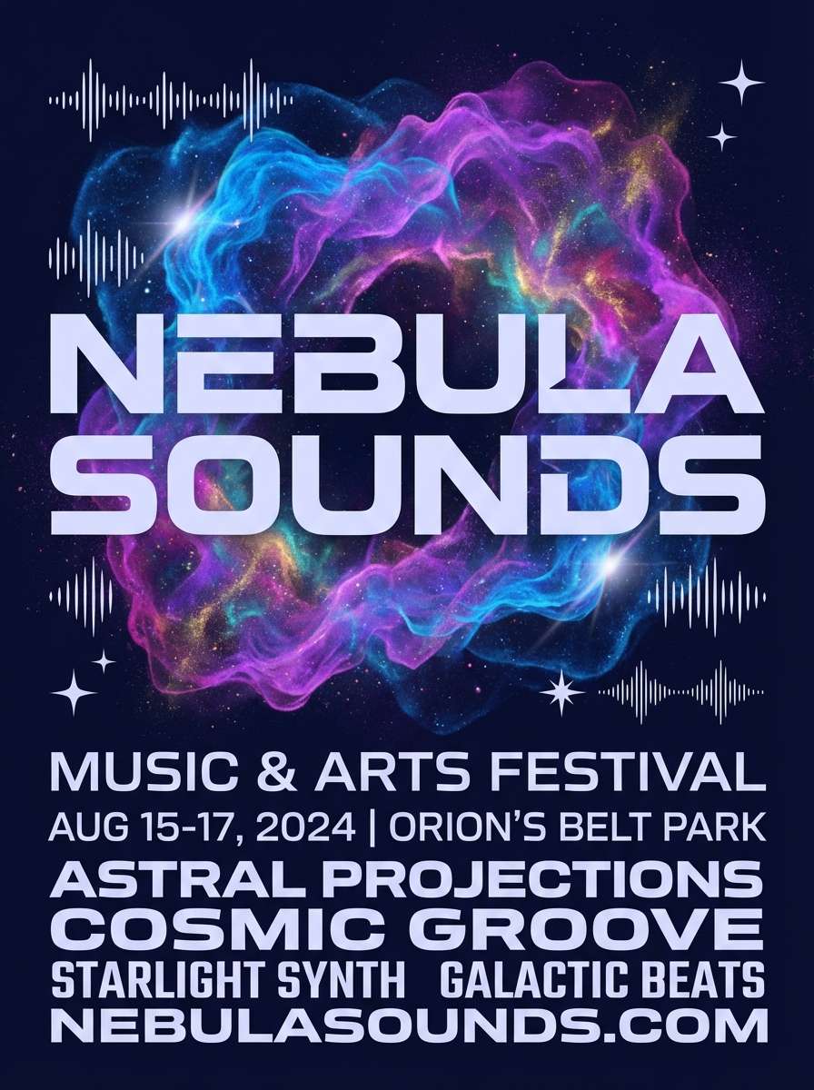
19) Celestial Nebula
HEX: #007FFF #4C6FFF #A855F7 #0B1026 #E6E8FF
Mood: cosmic, creative, futuristic
Best for: music festival flyer
Cosmic and creative, the electric blues and violet feel like a nebula against a deep night sky. This azure color palette is perfect for music flyers, digital art promos, and futuristic editorial graphics. Use the dark navy as the stage, then layer blue-to-violet gradients for energy and depth. Usage tip: set small text in #E6E8FF and avoid pure white so the glow stays soft.
Image example of celestial nebula generated using media.io
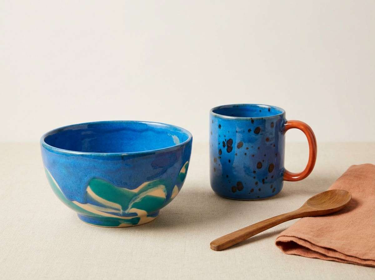
20) Artisan Ceramic
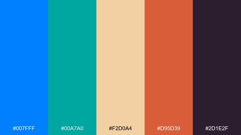
HEX: #007FFF #00A7A0 #F2D0A4 #D95D39 #2D1E2F
Mood: handcrafted, earthy, vibrant
Best for: ceramics shop product ad
Handcrafted and earthy, the cool blues meet clay, glaze, and kiln-warm terracotta. It is a strong choice for artisan shops, ceramics, and handmade marketplaces that want color without feeling loud. Pair the cream and teal for backgrounds and patterns, then use terracotta for price tags or small callouts. Usage tip: keep the deep plum for logos and fine outlines to make the ad feel premium.
Image example of artisan ceramic generated using media.io
What Colors Go Well with Azure?
Azure pairs naturally with clean neutrals like white, off-white, and cool grays when you want a modern UI color palette with strong hierarchy. Deep navy, slate, and charcoal also make azure feel sharper while improving contrast for text.
For warmth, reach for apricot, coral, terracotta, or soft gold—these sit opposite the blue family and add “human” energy without overpowering the scheme. If you want a fresh outdoorsy look, lime or leafy greens can work as a single highlight color alongside azure tones.
When in doubt, pick one dominant azure, one dark anchor for typography, one light background tint, and one warm accent. That keeps the system consistent across components and layouts.
How to Use a Azure Color Palette in Real Designs
Start by assigning roles, not just colors: choose one azure for primary actions (buttons/links), a darker tone for headings and icons, and a pale tint for backgrounds or cards. This keeps your branding colors consistent even as layouts change.
In UI, avoid using multiple bright blues as competing accents—reserve the highest-saturation azure for interactive states and key metrics. For print, soften contrast by using warm off-whites instead of pure white, and test how your blues reproduce on coated vs. uncoated paper.
Finally, validate accessibility: check contrast for text, focus rings, and data viz labels. Azure can be very bright, so pairing it with a deep slate often improves readability without dulling the look.
Create Azure Palette Visuals with AI
If you already have HEX codes, you can generate on-brand mockups and marketing images by describing the layout (poster, UI screens, banner) and calling out your key colors. Prompts work best when you specify style (flat vector, realistic studio, minimal UI) and aspect ratio.
Use one palette per visual, then iterate by changing only one variable at a time—like typography style, background texture, or the amount of whitespace. That helps you keep the azure color scheme consistent while exploring different moods.
Media.io makes it easy to go from palette idea to usable creative assets in minutes.
Azure Color Palette FAQs
-
What is the HEX code for azure?
A common “azure” reference is #007FFF, but azure tones vary from deeper blues (e.g., #005B96) to brighter, lighter tints (e.g., #A8E6FF) depending on the palette and use case. -
Is azure closer to blue or cyan?
Azure is primarily blue, but it leans slightly toward cyan compared with classic deep blues. Shifting it toward cyan makes it feel more playful and tropical; shifting toward navy makes it feel more premium and technical. -
What colors pair best with azure in branding?
Neutrals (white, off-white, cool gray) and dark anchors (navy, slate) pair best for consistent branding. Warm accents like coral, apricot, terracotta, or soft gold add contrast and approachability. -
How do I keep an azure UI palette from looking “too bright”?
Use one saturated azure for primary actions, then rely on pale tints for large backgrounds and a dark slate/navy for text. Limiting bright accents to a few components (buttons, links, highlights) keeps the interface calm. -
Does azure print well?
Yes, but bright blues can shift depending on paper and ink. For more reliable results, use an off-white base, avoid extremely light tints for thin text, and request print proofs—especially for large azure fields. -
What is a good complementary accent for azure?
Warm oranges and corals are classic complementary accents for azure because they add contrast without clashing. Examples include apricot (#FFB385) or coral (#FF7A59) used sparingly for badges, highlights, or calls to action. -
Can I generate azure palette mockups with AI?
Yes—describe the design type (UI screens, poster, hero banner), specify your dominant HEX colors, and include a style cue (flat vector, minimal, realistic studio). Media.io can generate variations quickly so you can test what feels best.


