

Pastel violet brings a modern softness that feels both creative and calm. It’s a go-to choice for branding, UI, and print when you want gentle emotion without losing clarity.
Below are 20 pastel violet color palette ideas with HEX codes, plus real-world usage tips and AI prompts you can reuse to generate matching visuals fast.
In this article
- Why Pastel Violet Palettes Work So Well
-
- lilac milk tea
- orchid sunrise
- frosted berry
- violet sage calm
- dusty mauve studio
- lavender linen
- sweet iris blush
- periwinkle cloud
- plum macaron
- amethyst whisper
- violet ocean foam
- soft aubergine night
- lilac citrus pop
- heather stone neutrals
- floral stationery
- cosmic lilac gradient
- modern spa minimal
- bridal lilac pearl
- playful candy violet
- museum editorial violet
- What Colors Go Well with Pastel Violet?
- How to Use a Pastel Violet Color Palette in Real Designs
- Create Pastel Violet Palette Visuals with AI
Why Pastel Violet Palettes Work So Well
Pastel violet sits in a sweet spot between playful and premium. It carries a gentle “creative” signal while staying softer than saturated purple, so it feels modern in both digital and print.
Because it’s naturally light, pastel violet pairs easily with clean neutrals (ivory, oat, cool gray) and still leaves room for small high-contrast accents. That makes layouts feel airy, structured, and easy to read.
It also adapts across moods: romantic with blush, botanical with sage, futuristic with mint and gradients, or editorial with charcoal and metallic accents. With the right contrast choices, it’s surprisingly versatile.
20+ Pastel Violet Color Palette Ideas (with HEX Codes)
1) Lilac Milk Tea
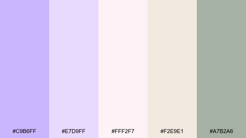
HEX: #C9B6FF #E7D9FF #FFF2F7 #F2E9E1 #A7B2A6
Mood: cozy, creamy, gentle
Best for: cafe menu design and cozy brand identity
Cozy and creamy like warm milk tea under soft window light, these lilac tones feel welcoming and calm. Use it for cafe menus, bakery packaging, and lifestyle branding that needs a quiet premium touch. Pair the violet with the oat and blush shades for most surfaces, then keep the sage as a small accent for stamps or icons. Tip: reserve the deeper neutral for type to maintain readable contrast.
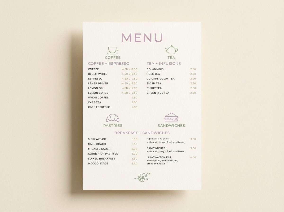
Image example of lilac milk tea generated using media.io
Media.io is an online AI studio for creating and editing video, image, and audio in your browser.

2) Orchid Sunrise
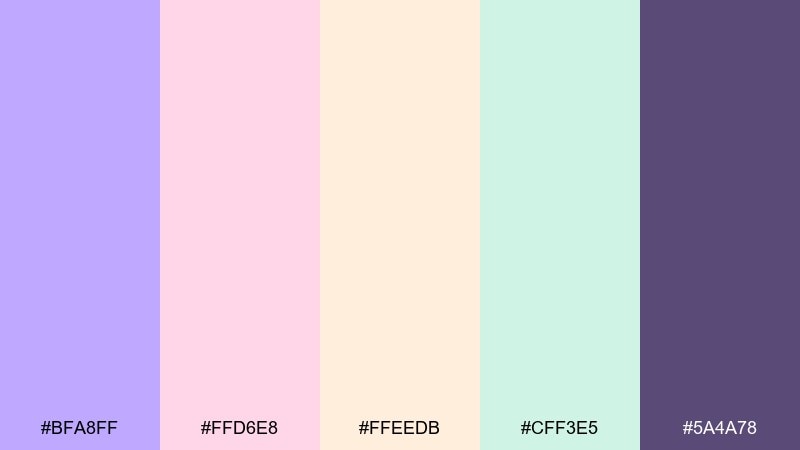
HEX: #BFA8FF #FFD6E8 #FFEEDB #CFF3E5 #5A4A78
Mood: bright, optimistic, airy
Best for: spring campaign posters and social ads
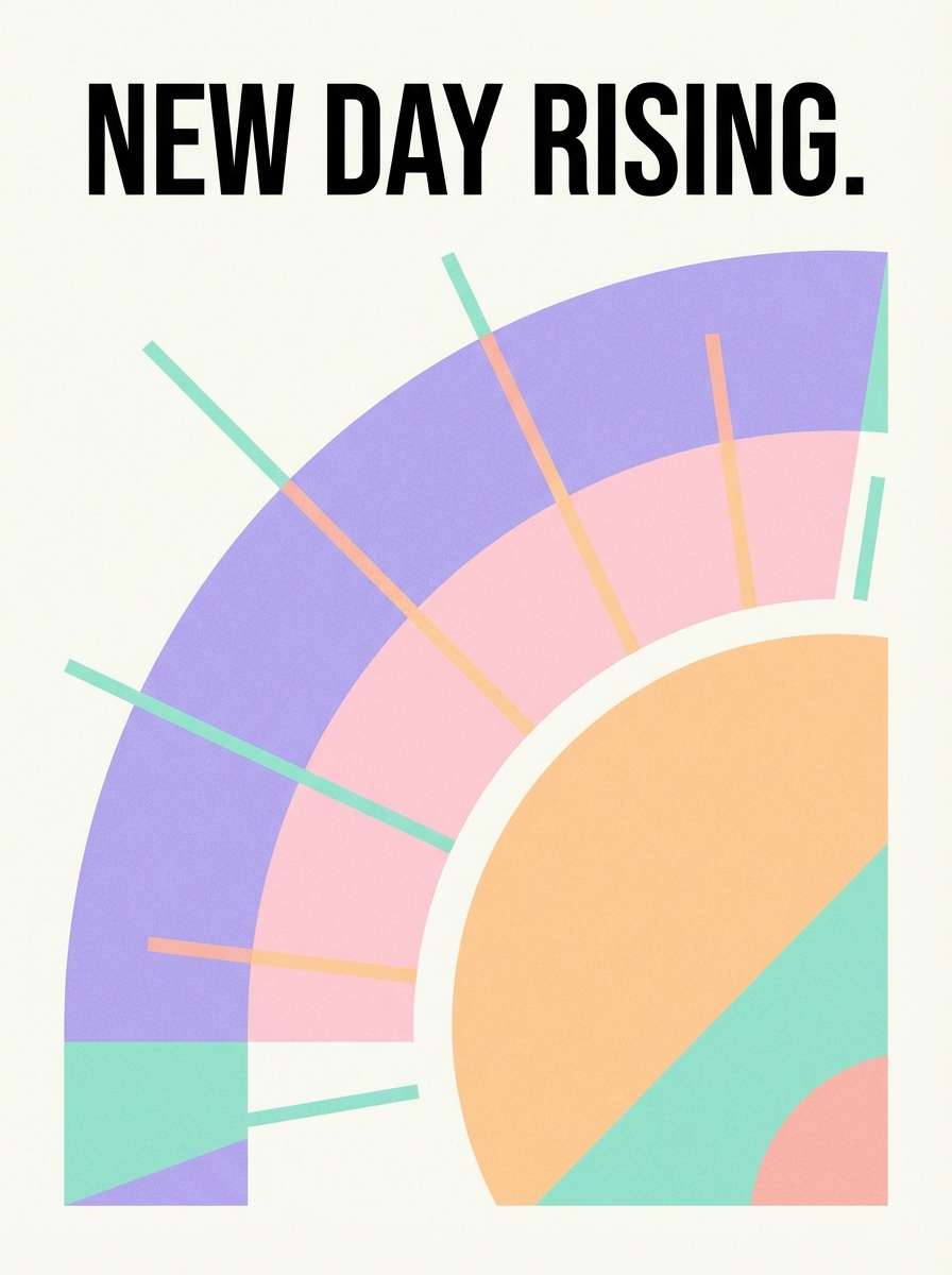
Bright and uplifting like an early sunrise through sheer curtains, this mix feels fresh without turning loud. It works beautifully for spring promos, event posters, and cheerful social graphics. Let the peach and pink do the heavy lifting, then anchor layouts with the deep orchid for headlines. Tip: keep backgrounds light and use the teal as a small highlight to guide clicks.
Image example of orchid sunrise generated using media.io
3) Frosted Berry
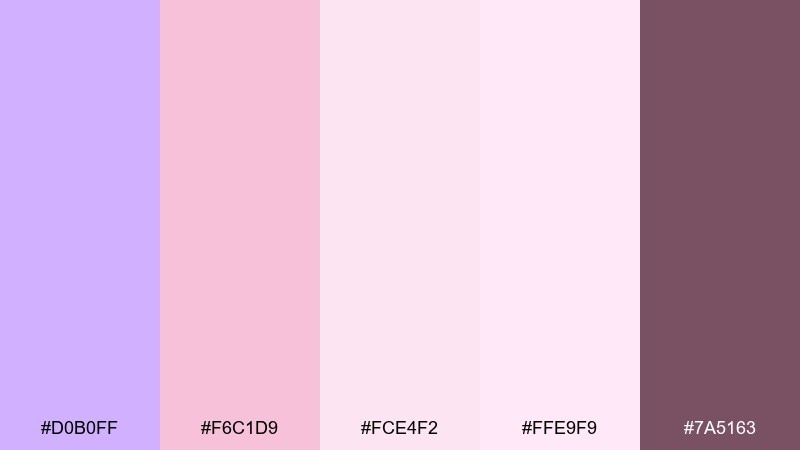
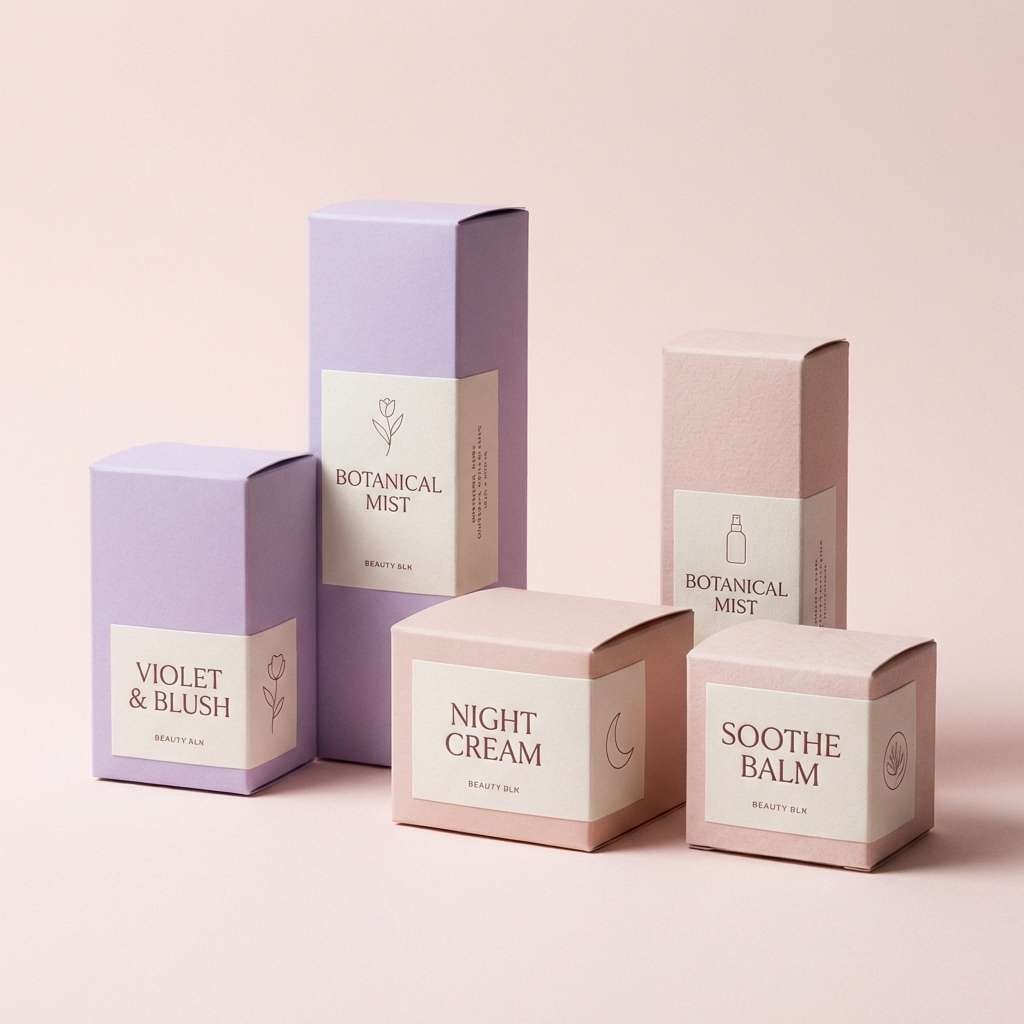
HEX: #D0B0FF #F6C1D9 #FCE4F2 #FFE9F9 #7A5163
Mood: sweet, romantic, dessert-like
Best for: beauty packaging and boutique e-commerce
Sweet and romantic like frosted berries on a porcelain plate, these rosy violets feel indulgent yet light. The pastel violet color palette fits cosmetics, perfume labels, and feminine product photography overlays. Pair the palest pinks for backgrounds and product panels, then use the berry brown for logos and small text. Tip: add generous white space so the colors read airy instead of sugary.
Image example of frosted berry generated using media.io
4) Violet Sage Calm
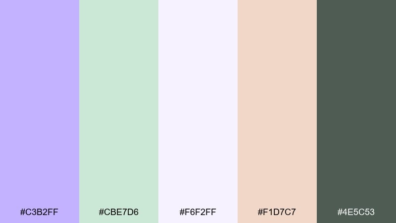
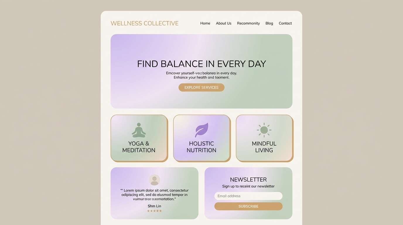
HEX: #C3B2FF #CBE7D6 #F6F2FF #F1D7C7 #4E5C53
Mood: calm, natural, balanced
Best for: wellness brands and spa web design
Calm and botanical like a quiet spa room with fresh herbs, this pairing balances soft violet with green. Use it for wellness landing pages, meditation apps, and natural skincare branding. Keep the off-white as your main canvas, then layer sage blocks behind cards and buttons. Tip: use the dark green-gray only for key headings to avoid a heavy look.
Image example of violet sage calm generated using media.io
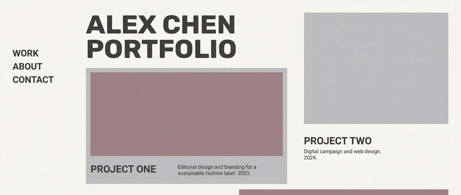
5) Dusty Mauve Studio
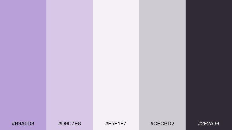
HEX: #B9A0D8 #D9C7E8 #F5F1F7 #CFCBD2 #2F2A36
Mood: editorial, muted, refined
Best for: portfolio websites and creative resumes
Muted and editorial like a design studio moodboard, these dusty mauves feel quietly confident. They suit portfolios, case-study pages, and modern resumes where the work needs to stay front and center. Use the near-white for background, the mauves for section dividers, and the charcoal for typography. Tip: keep accent usage minimal so the palette stays sophisticated.
Image example of dusty mauve studio generated using media.io
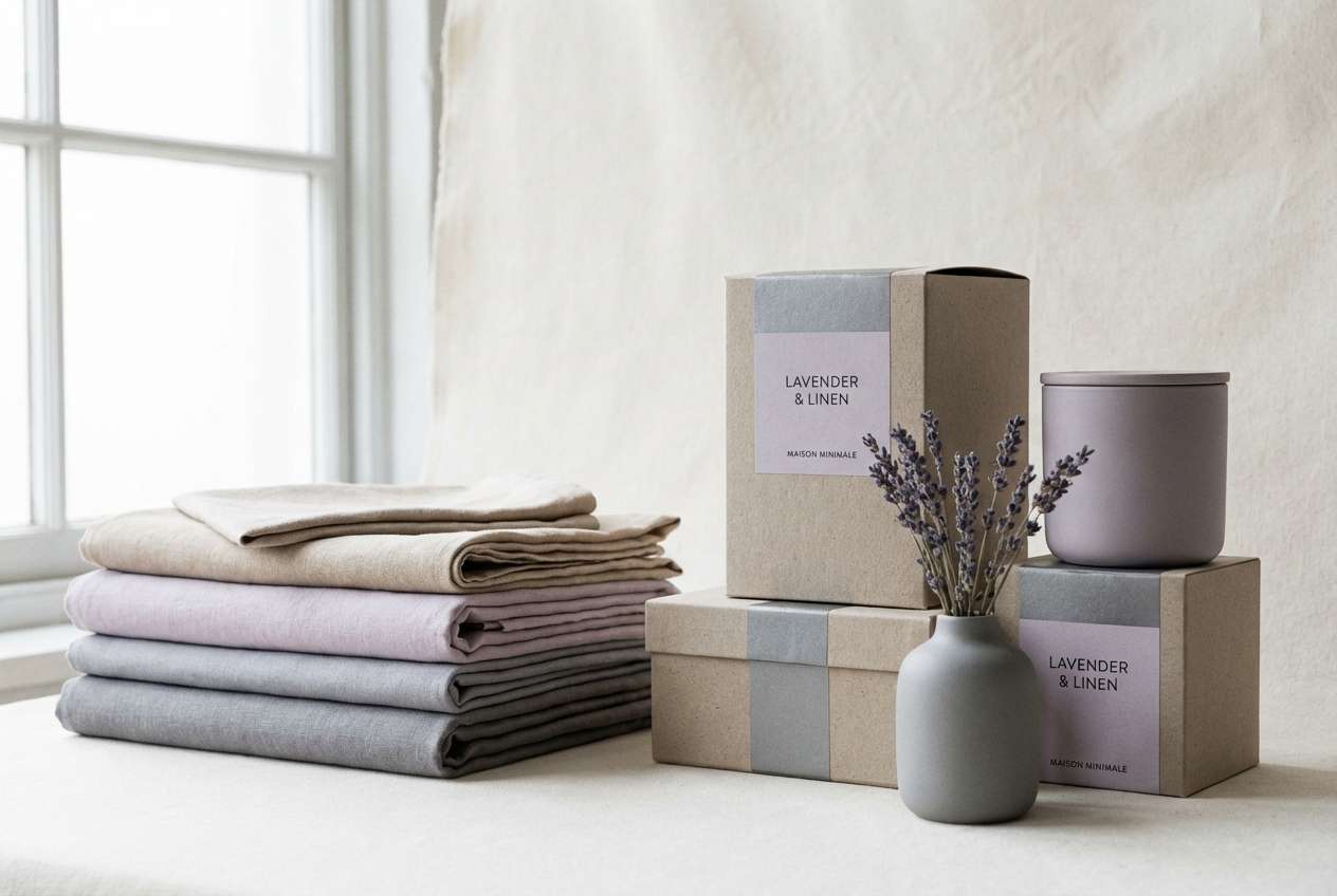
6) Lavender Linen
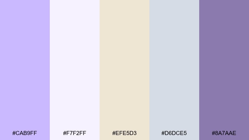
HEX: #CAB9FF #F7F2FF #EFE5D3 #D6DCE5 #8A7AAE
Mood: soft, clean, airy
Best for: home goods branding and product listings
Soft and airy like freshly washed linen, these tones feel clean and organized. For pastel violet color combinations that stay neutral-friendly, lean on the linen beige and cool gray as your base. The deeper lavender works well for labels, category tags, and subtle borders in product listings. Tip: keep shadows light and avoid pure black so the look stays gentle.
Image example of lavender linen generated using media.io
7) Sweet Iris Blush
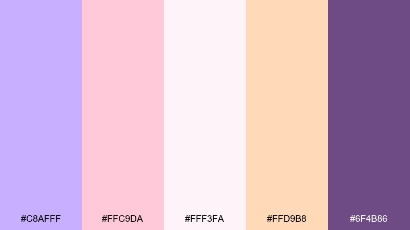
HEX: #C8AFFF #FFC9DA #FFF3FA #FFD9B8 #6F4B86
Mood: playful, sweet, inviting
Best for: birthday invitations and party flyers
Playful and sweet like iris petals and cotton candy, this mix brings friendly energy. It shines on birthday invites, party flyers, and kids brand graphics where warmth matters. Use the blush and cream for large shapes, then add violet for headings and the deep purple for small details. Tip: limit the peach to highlights so it reads as a cheerful pop, not noise.
Image example of sweet iris blush generated using media.io

8) Periwinkle Cloud
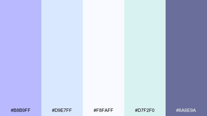
HEX: #B8B9FF #D9E7FF #F8FAFF #D7F2F0 #6A6E9A
Mood: cool, airy, serene
Best for: SaaS dashboards and onboarding screens
Cool and serene like clouds over a calm horizon, these blueshift violets feel trustworthy and light. They work well for dashboards, onboarding, and settings screens where clarity matters. Keep the icy whites for background and panels, then use periwinkle for primary actions and the slate for text. Tip: add subtle gradients between the light blues for depth without clutter.
Image example of periwinkle cloud generated using media.io

9) Plum Macaron
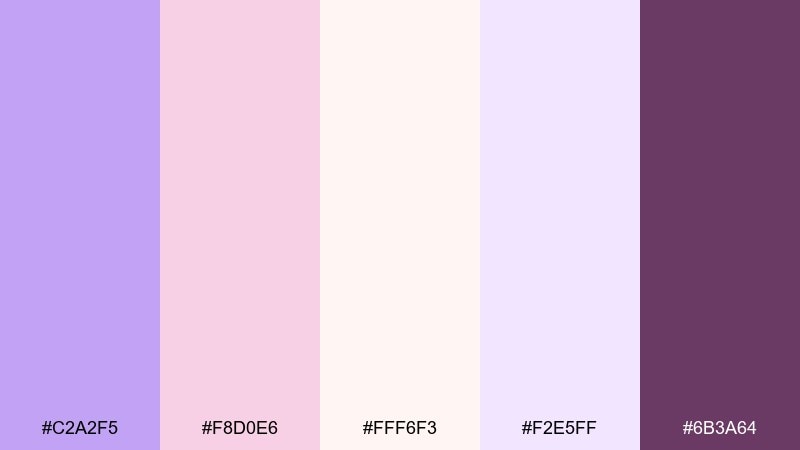
HEX: #C2A2F5 #F8D0E6 #FFF6F3 #F2E5FF #6B3A64
Mood: dessert chic, charming, boutique
Best for: patisserie branding and gift cards
Charming and boutique like a plum macaron box, this palette feels sweet but polished. Use it for patisserie branding, gift cards, and small-batch product labels. Pair the creamy off-white with the lilac for most surfaces, and bring in the deep plum for logos and pricing. Tip: keep typography elegant and slightly spaced to maintain the premium vibe.
Image example of plum macaron generated using media.io
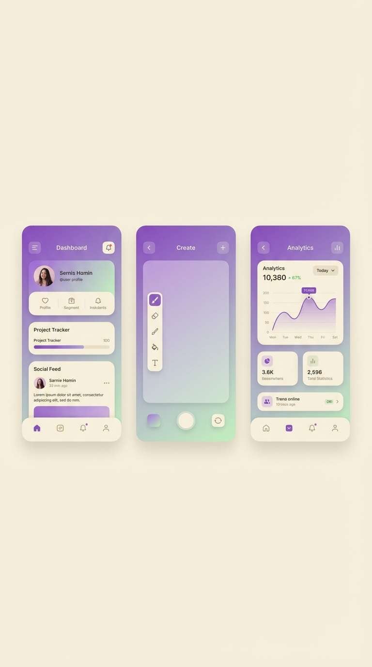
10) Amethyst Whisper
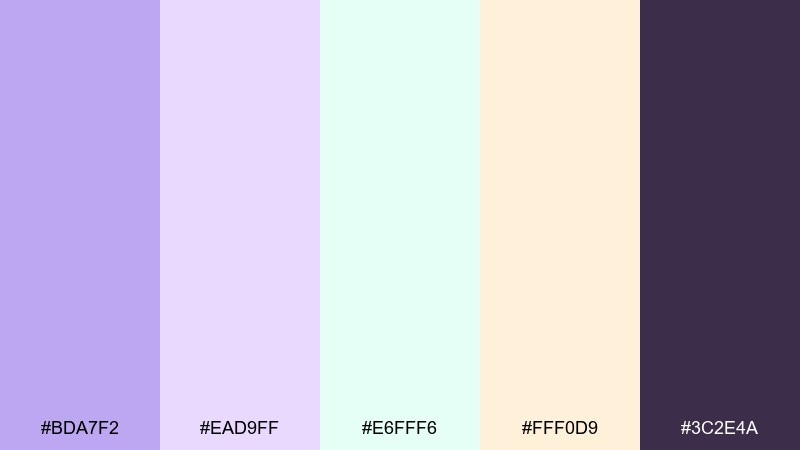
HEX: #BDA7F2 #EAD9FF #E6FFF6 #FFF0D9 #3C2E4A
Mood: dreamy, modern, slightly magical
Best for: app UI themes and creator branding
Dreamy and modern like an amethyst glow in soft fog, these tones feel creative and calm. The pastel violet color scheme works nicely for UI themes, creator kits, and minimalist branding systems. Use the mint and cream to keep screens bright, and reserve the deep purple for navigation and key states. Tip: test contrast on buttons early, especially when violet sits on cream.
Image example of amethyst whisper generated using media.io
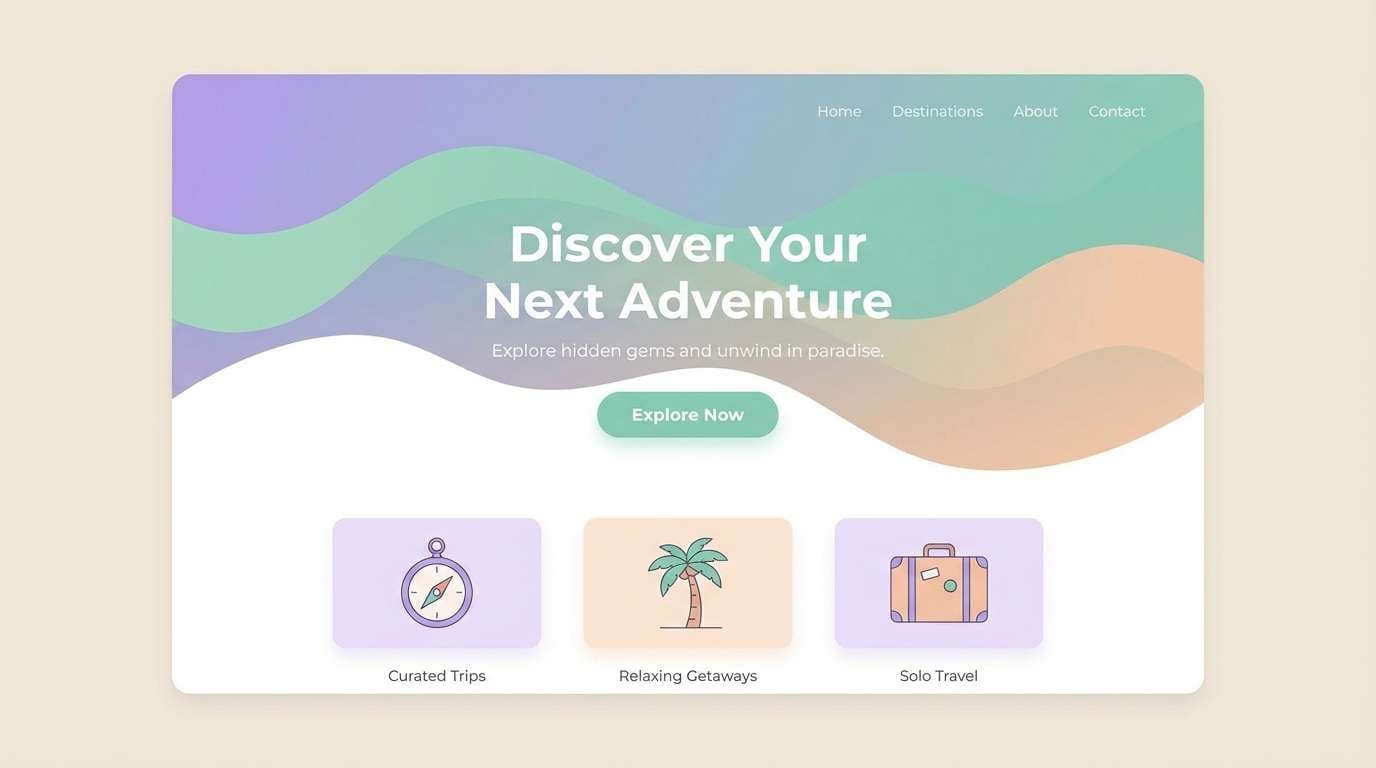
11) Violet Ocean Foam
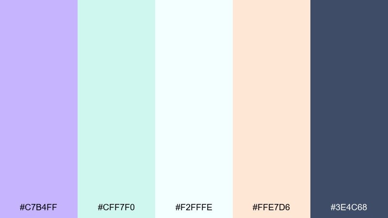
HEX: #C7B4FF #CFF7F0 #F2FFFE #FFE7D6 #3E4C68
Mood: fresh, coastal, relaxed
Best for: travel landing pages and summer promos
Fresh and coastal like ocean foam under a violet sky, this mix feels breezy and open. It suits travel landing pages, summer promotions, and light lifestyle blogs. Keep the near-white and seafoam as the base, then use violet for CTAs and the deep blue-gray for readable headings. Tip: use peach as a small highlight for badges or price tags.
Image example of violet ocean foam generated using media.io
12) Soft Aubergine Night
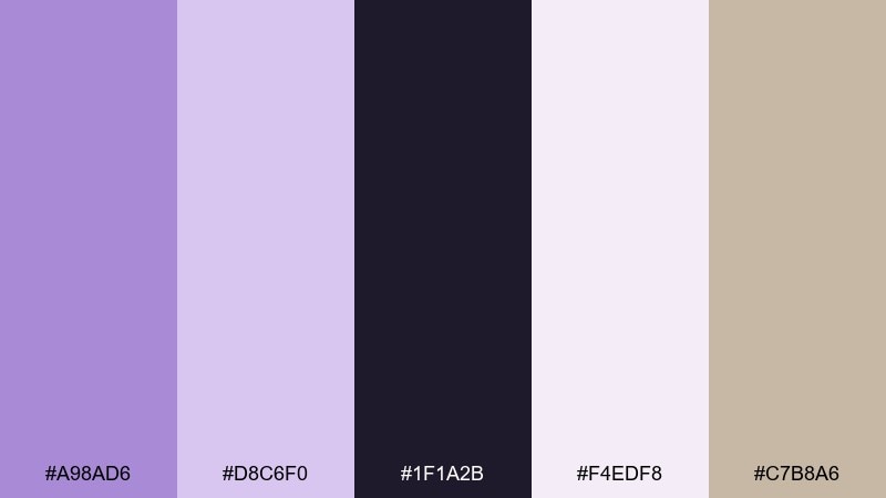
HEX: #A98AD6 #D8C6F0 #1F1A2B #F4EDF8 #C7B8A6
Mood: moody, elegant, night-sky
Best for: night event posters and luxury promos
Moody and elegant like velvet at midnight, these aubergine notes add drama without losing softness. Use it for night event posters, luxury promos, and premium email headers. Let the pale lavender and off-white carry the layout, then punch in the deep night shade for titles and borders. Tip: keep body copy on the light background and use the dark only in short bursts.
Image example of soft aubergine night generated using media.io
13) Lilac Citrus Pop
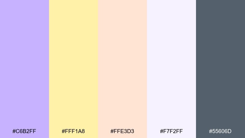
HEX: #C6B2FF #FFF1A8 #FFE3D3 #F7F2FF #55606D
Mood: zesty, fun, energetic
Best for: summer product ads and snack branding
Zesty and fun like citrus slices in sparkling water, this pairing adds energy to soft violet. It works for summer product ads, snack packaging, and upbeat social posts. Use the butter yellow for attention-grabbing badges, while lilac and off-white keep the overall look clean. Tip: keep the slate for typography so the bright accents do not compete with readability.
Image example of lilac citrus pop generated using media.io
14) Heather Stone Neutrals
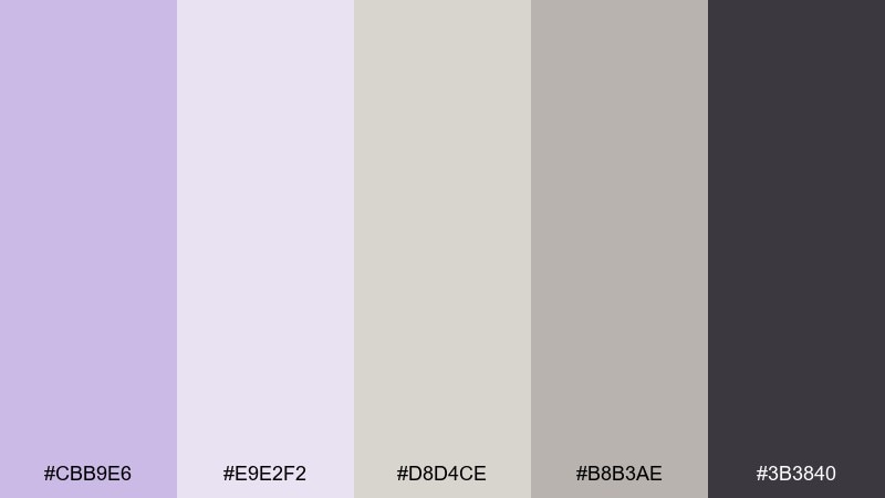
HEX: #CBB9E6 #E9E2F2 #D8D4CE #B8B3AE #3B3840
Mood: minimal, grounded, timeless
Best for: interior design lookbooks and catalogs
Grounded and timeless like heather fabric against smooth stone, these neutrals keep violet understated. They are ideal for catalogs, lookbooks, and interior design presentations. Use the light lilac-gray as a background wash, then layer warm grays for sections and spacing. Tip: set long text in the charcoal to preserve a calm, readable rhythm.
Image example of heather stone neutrals generated using media.io
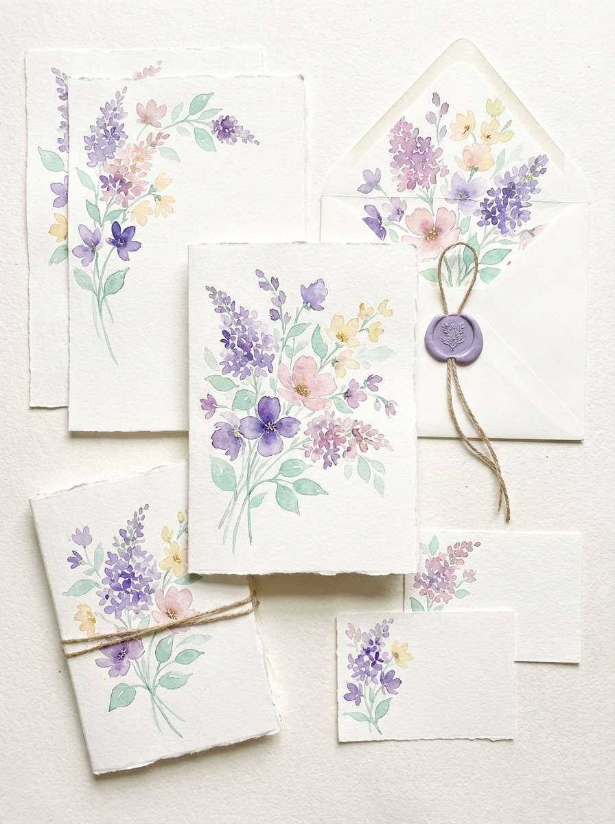
15) Floral Stationery
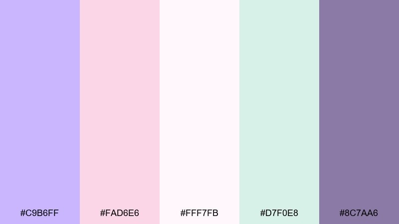
HEX: #C9B6FF #FAD6E6 #FFF7FB #D7F0E8 #8C7AA6
Mood: delicate, handcrafted, romantic
Best for: watercolor floral prints and stationery sets
Delicate and handcrafted like pressed petals on textured paper, these hues feel romantic and light. Great for watercolor florals, stationery sets, and gentle thank-you cards. Let the near-white paper tone dominate, then paint in lilac and blush blooms with a mint wash for balance. Tip: keep outlines minimal so the colors stay soft and airy.
Image example of floral stationery generated using media.io
16) Cosmic Lilac Gradient
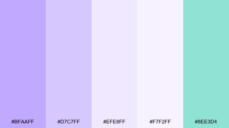
HEX: #BFAAFF #D7C7FF #EFE8FF #F7F2FF #8EE3D4
Mood: ethereal, modern, futuristic
Best for: tech hero banners and gradient backgrounds
Ethereal and futuristic like a soft nebula glow, these lilacs are made for gradients. Use them in hero banners, tech presentations, and modern landing pages where you want depth without harsh contrast. Blend the violets across large background shapes and drop mint in small UI highlights for a crisp edge. Tip: add subtle noise to gradients to prevent banding on screens.
Image example of cosmic lilac gradient generated using media.io

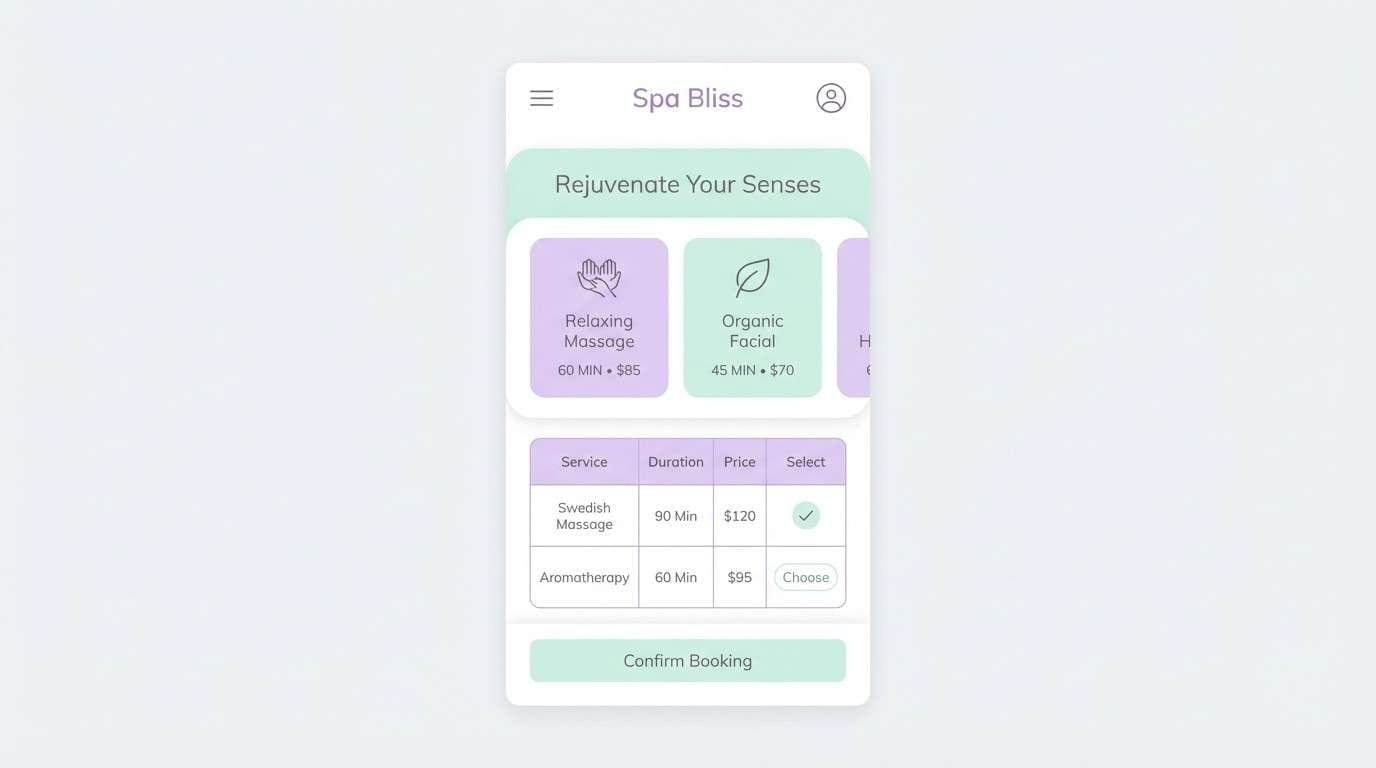
17) Modern Spa Minimal
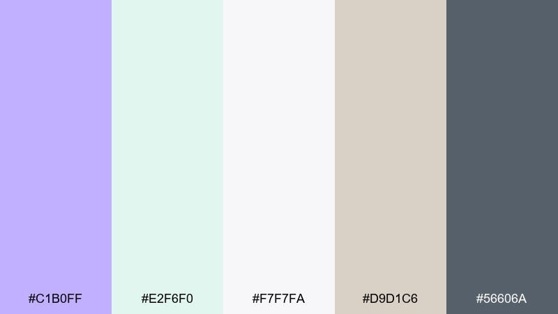
HEX: #C1B0FF #E2F6F0 #F7F7FA #D9D1C6 #56606A
Mood: fresh, minimal, restorative
Best for: booking apps and service pricing pages
Fresh and restorative like a minimalist spa lobby, this mix feels clean and confident. Use it for booking apps, service pricing pages, and calm email templates. Let the soft gray-white handle most backgrounds, then bring violet into key buttons and status highlights. Tip: keep the blue-gray for text and icons so the interface stays crisp.
Image example of modern spa minimal generated using media.io
18) Bridal Lilac Pearl
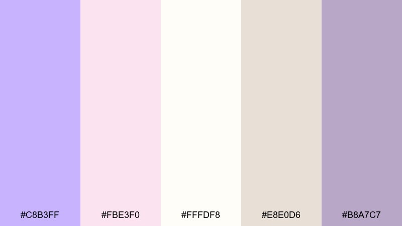
HEX: #C8B3FF #FBE3F0 #FFFDF8 #E8E0D6 #B8A7C7
Mood: elegant, delicate, celebratory
Best for: wedding invitations and bridal branding
Elegant and delicate like lilac petals and soft pearls, these tones feel timeless and celebratory. They are perfect for wedding invitations, bridal boutiques, and ceremony programs. Use the ivory as your primary background, then layer lilac and blush for borders, monograms, and floral motifs. Tip: choose one accent shade for foil-style details so the layout stays refined.
Image example of bridal lilac pearl generated using media.io
19) Playful Candy Violet
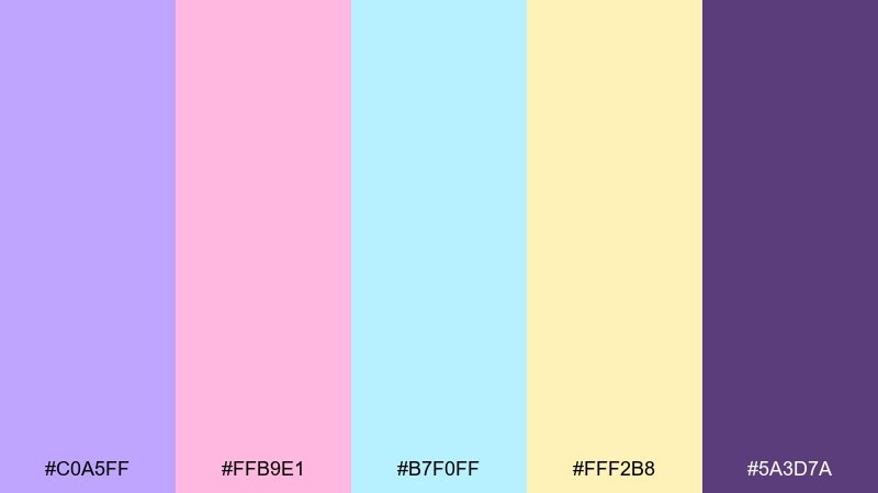
HEX: #C0A5FF #FFB9E1 #B7F0FF #FFF2B8 #5A3D7A
Mood: bold, youthful, upbeat
Best for: youth brand ads and playful UI accents
Bold and youthful like candy wrappers and bubblegum, this mix is made to grab attention. For pastel violet color combinations with extra pop, balance the bright pink and aqua with plenty of light space. Use violet for main shapes, then sprinkle yellow only on icons or small CTAs to avoid overwhelm. Tip: keep the deep purple for short headings so the design stays readable.
Image example of playful candy violet generated using media.io

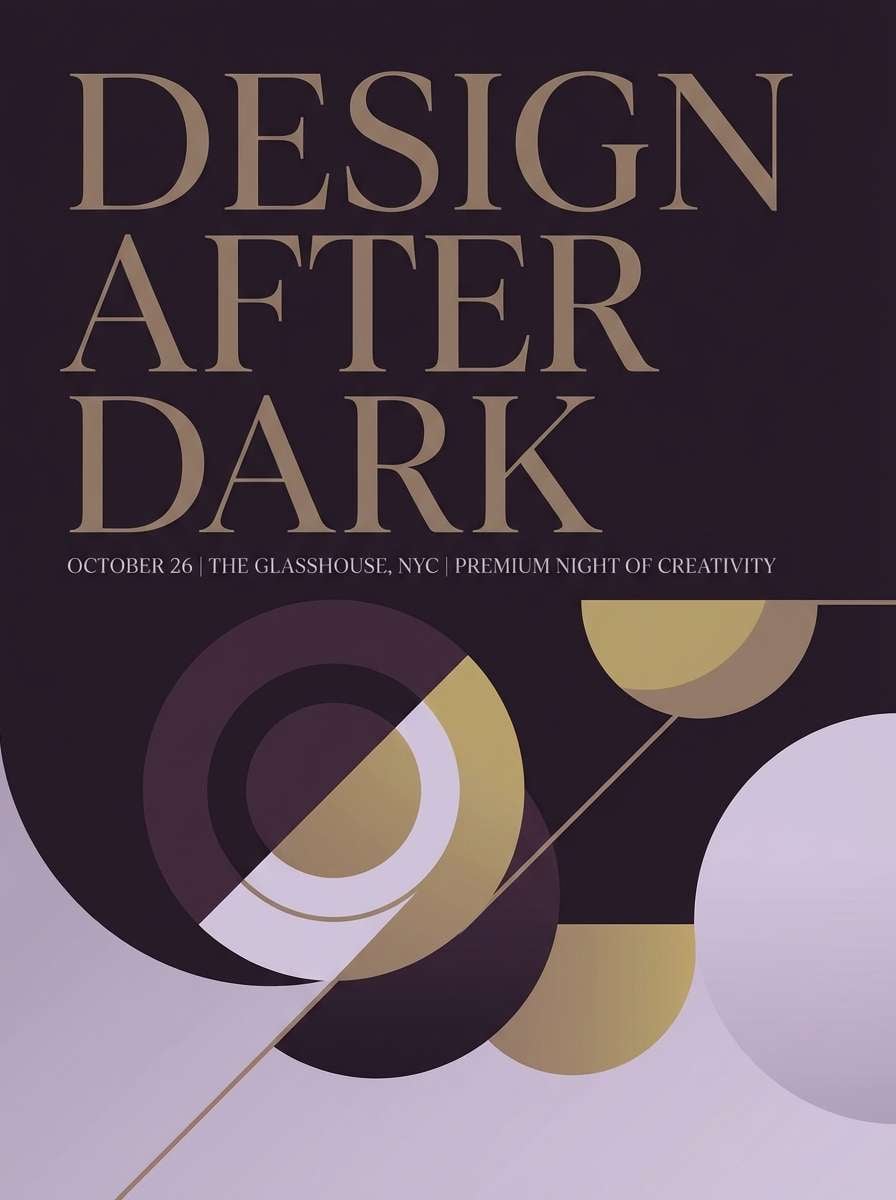
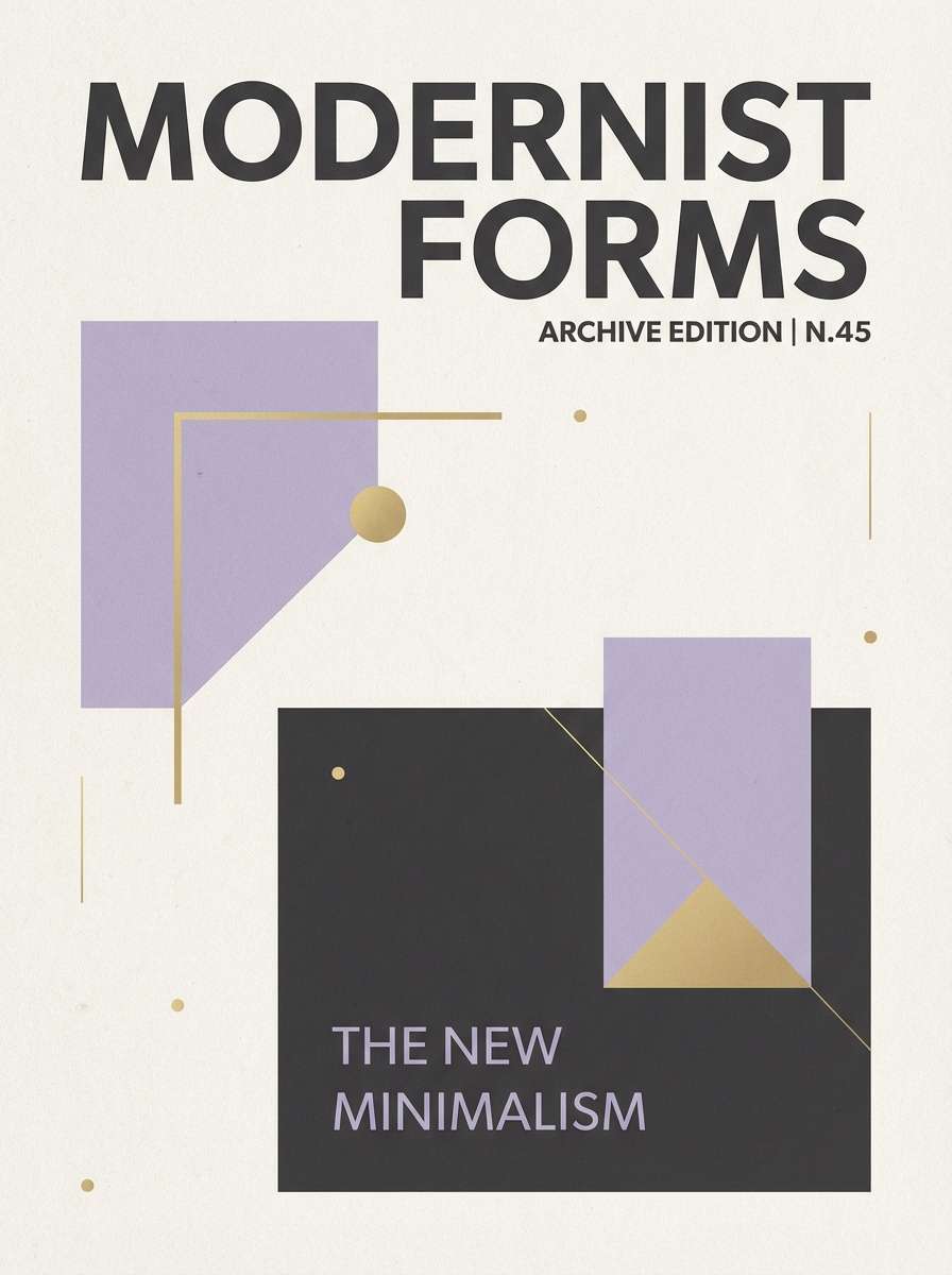
20) Museum Editorial Violet
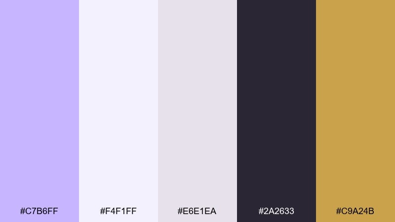
HEX: #C7B6FF #F4F1FF #E6E1EA #2A2633 #C9A24B
Mood: artful, premium, curated
Best for: magazine layouts and exhibition posters
Artful and curated like a gallery wall under warm spotlights, this set mixes soft violet with deep ink and a gold accent. It works well for magazine layouts, exhibition posters, and premium brand stories. Use the pale lavender as the page base, keep charcoal for typography, and save the gold for small rules or stamps. Tip: avoid large gold blocks and let it act like jewelry, not paint.
Image example of museum editorial violet generated using media.io
What Colors Go Well with Pastel Violet?
Pastel violet pairs naturally with soft neutrals like ivory, oat, and warm gray, which keep the overall look airy and premium. These combinations work well for backgrounds, packaging bases, and clean page layouts.
For fresh contrast, try mint/seafoam or pale aqua; they add a crisp, modern lift without overpowering violet. For more structure and readability, anchor the palette with charcoal, slate, or deep plum in small doses.
If you want cheerful energy, pastel violet also plays nicely with butter yellow or peach accents. Keep those brighter hues limited to badges, icons, or small CTAs so violet remains the main mood-setter.
How to Use a Pastel Violet Color Palette in Real Designs
Start by assigning roles: one light neutral as the main background, pastel violet as the signature brand color, and a dark neutral for typography. This keeps designs calm while still feeling intentional.
In UI, use violet for primary buttons or selected states and reserve deeper shades for navigation or headlines. For print, pastel violets look best with generous whitespace, slightly softened blacks (charcoal), and subtle texture to avoid a “flat” feel.
Always check contrast early, especially when violet sits on cream or blush. A small shift toward a darker violet or deeper neutral can dramatically improve accessibility without changing the palette’s softness.
Create Pastel Violet Palette Visuals with AI
If you already have HEX codes, you can turn them into consistent visuals by describing the layout (poster, packaging, UI), lighting, and materials, then calling out the palette as the dominant color direction. Using the same prompt style helps your brand assets stay cohesive across campaigns.
Media.io makes it easy to generate on-brand images for moodboards, ads, thumbnails, and product mockups directly in your browser. Reuse the prompts above, swap the subject, and keep the color language consistent for fast iteration.
When refining results, adjust only one variable at a time (composition, background tone, or accent color placement). This keeps your pastel violet theme stable while you explore variations.
Pastel Violet Color Palette FAQs
-
What is the HEX code for pastel violet?
A common pastel violet HEX is #C9B6FF. Many “pastel violet” variations shift slightly warmer (more lilac) or cooler (more periwinkle) depending on the palette. -
Is pastel violet the same as lavender or lilac?
They’re close, but not identical. Lavender often leans cooler and more bluish, while lilac tends to feel slightly pinker; pastel violet sits between them and can be tuned either way. -
What colors pair best with pastel violet for branding?
For clean branding, combine pastel violet with ivory/off-white and a charcoal text color. For a softer lifestyle feel, add blush or oat beige; for modern freshness, add mint/seafoam accents. -
How do I make pastel violet look more modern in UI design?
Use violet as an accent or primary action color on a near-white background, and keep typography in slate/charcoal. Subtle gradients (violet-to-lilac) and minimal shadows help it feel current without becoming too sweet. -
What’s a good contrasting text color on pastel violet backgrounds?
Try deep neutrals like #2F2A36, #2A2633, or #3C2E4A (charcoal/plum-ink tones). They keep contrast readable while matching violet’s mood better than pure black. -
Does pastel violet print well?
Yes, but it’s important to proof because light violets can shift in print. Use a slightly deeper supporting violet for critical elements and avoid ultra-light tints for small text or thin lines.


