

Pale magenta sits in that sweet spot between pink and purple—soft enough to feel airy, but saturated enough to look intentional in modern design. It’s a go-to when you want warmth, romance, or a gentle “premium” vibe without going full bubblegum.
Below are 20+ pale magenta color palette ideas with HEX codes you can copy fast, plus practical tips and AI prompts for creating matching visuals for branding, UI, and print.
In this article
- Why Pale Magenta Palettes Work So Well
-
- blush orchid
- cotton candy mauve
- rose quartz satin
- vintage cosmetics
- lavender macaron
- sunset peony
- soft neon pop
- muted berry neutrals
- art deco magenta
- scandi magenta
- wedding bouquet
- kawaii sticker ui
- editorial beauty spread
- minimal product label
- spring botanicals
- night bloom contrast
- warm terracotta pairing
- cool gray balance
- metallic champagne accent
- playful gradient
- herbal tea comfort
- studio portrait backdrop
- What Colors Go Well with Pale Magenta?
- How to Use a Pale Magenta Color Palette in Real Designs
- Create Pale Magenta Palette Visuals with AI
Why Pale Magenta Palettes Work So Well
Pale magenta is flattering in both digital and print because it reads as soft, but still has enough chroma to feel “designed” rather than accidental. It can look romantic, calm, playful, or editorial depending on what you pair it with.
It also plays nicely with neutrals: warm creams make it feel luxe and bridal, while cool grays make it feel structured and UI-friendly. Add deep plum or near-black for accessibility and contrast when you need crisp type.
Finally, pale magenta is an easy bridge color—helpful when you want to connect pink tones with purple tones in one system, especially across brand assets, packaging, and social templates.
20+ Pale Magenta Color Palette Ideas (with HEX Codes)
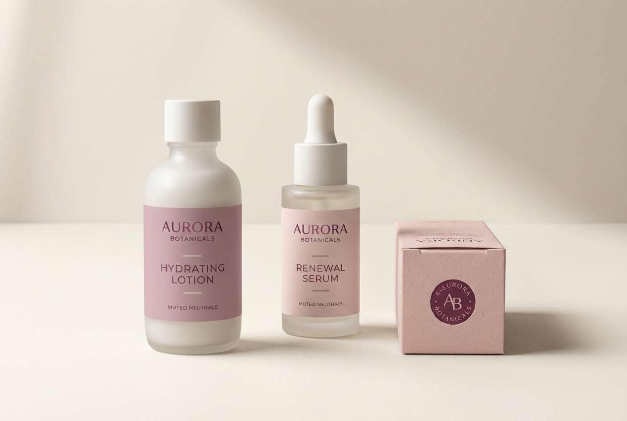
1) Blush Orchid
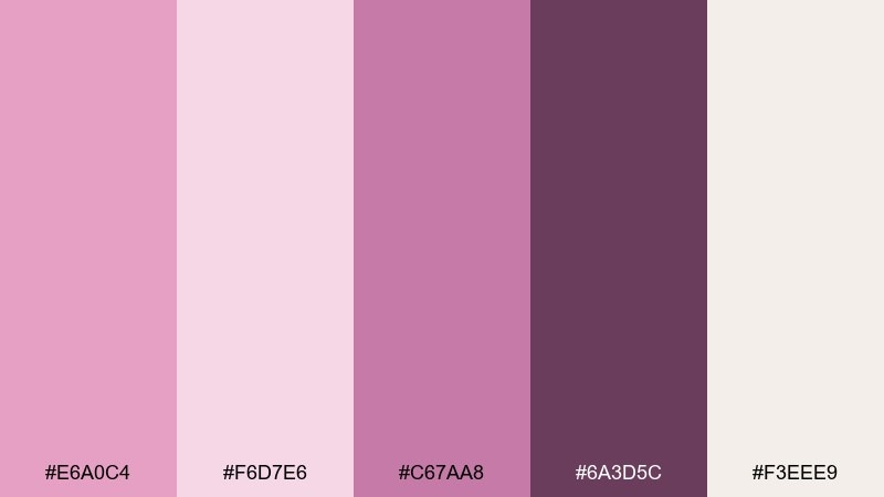
HEX: #E6A0C4 #F6D7E6 #C67AA8 #6A3D5C #F3EEE9
Mood: romantic and airy
Best for: boutique skincare branding kit
Romantic and airy like orchid petals on a sunlit vanity, these tones feel soft yet polished. Use this pale magenta color palette for logos, packaging, and social templates where you want warmth without looking sugary. Pair the deeper plum as your type color and keep cream as the main background for a premium look. Tip: reserve the darkest shade for small typography and outlines to keep the light pinks feeling clean.
Image example of blush orchid generated using media.io
Media.io is an online AI studio for creating and editing video, image, and audio in your browser.

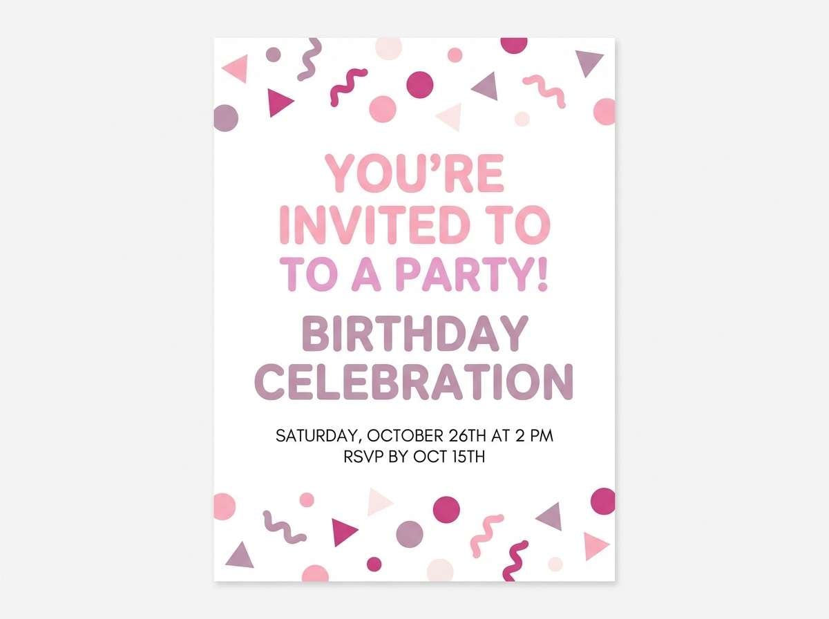
2) Cotton Candy Mauve
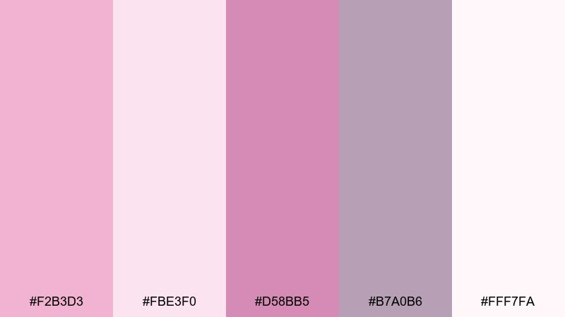
HEX: #F2B3D3 #FBE3F0 #D58BB5 #B7A0B6 #FFF7FA
Mood: playful and sweet
Best for: birthday invitation design
Playful and sweet, like spun sugar clouds at a spring fair, this mix keeps things light and celebratory. The mauve-gray gives you an easy neutral so the pinks do not overwhelm the layout. Use it for invitations, party signage, or cute promo graphics with rounded type. Tip: add plenty of white space and let one pink be the hero color, with the rest supporting as highlights.
Image example of cotton candy mauve generated using media.io
3) Rose Quartz Satin
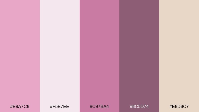
HEX: #E9A7C8 #F5E7EE #C97BA4 #8C5D74 #E8D6C7
Mood: calm and refined
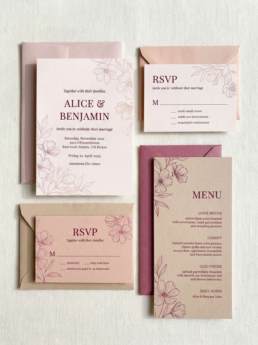
Best for: wedding stationery suite
Calm and refined, these shades feel like satin ribbon and rose quartz in soft morning light. The warm beige keeps everything grounded, while the berry tone adds readable contrast for names and dates. It works beautifully for wedding menus, place cards, and thank-you notes with delicate serif type. Tip: print the light pinks on uncoated stock to keep them looking velvety instead of glossy.
Image example of rose quartz satin generated using media.io
4) Vintage Cosmetics
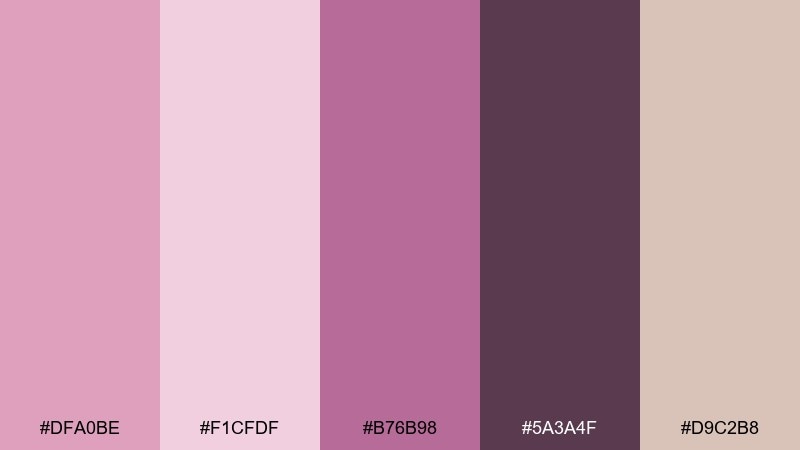
HEX: #DFA0BE #F1CFDF #B76B98 #5A3A4F #D9C2B8
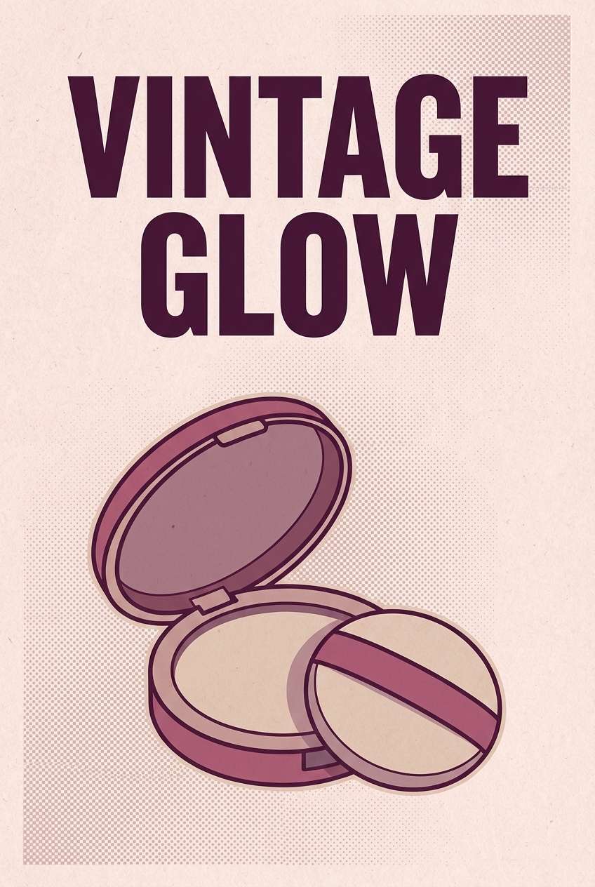
Mood: nostalgic and glamorous
Best for: retro beauty poster
Nostalgic and glamorous, it evokes powder compacts, velvet cases, and classic dressing-room lighting. The dusty mauves make the pink feel mature, while the near-black plum gives you punchy headlines. Use it for retro posters, beauty campaigns, or a throwback editorial cover. Tip: keep gradients subtle and lean on grain or halftone textures for a true vintage finish.
Image example of vintage cosmetics generated using media.io
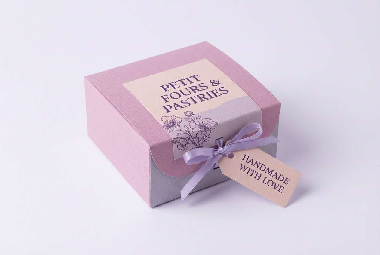
5) Lavender Macaron
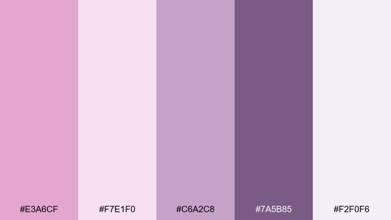
HEX: #E3A6CF #F7E1F0 #C6A2C8 #7A5B85 #F2F0F6
Mood: dreamy and delicate
Best for: bakery packaging label
Dreamy and delicate, these colors feel like macarons in a pastel display case. The lavender-leaning neutrals cool the pink and keep it from reading too bubblegum. Use it on bakery labels, gift tags, and small pattern wraps with simple line icons. Tip: set ingredient text in the dark violet and avoid thin strokes so it stays readable on pale backgrounds.
Image example of lavender macaron generated using media.io
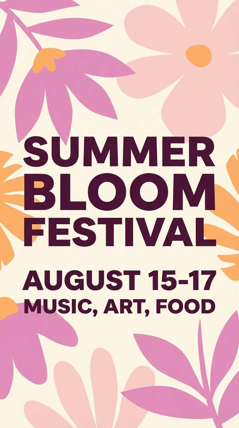
6) Sunset Peony
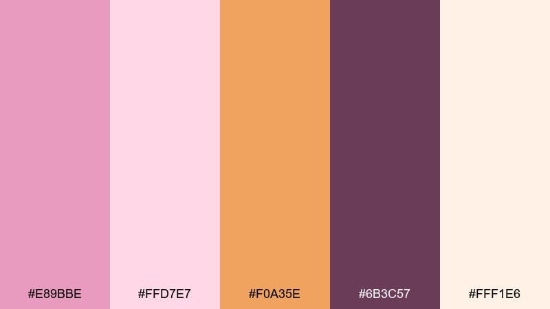
HEX: #E89BBE #FFD7E7 #F0A35E #6B3C57 #FFF1E6
Mood: warm and optimistic
Best for: summer event flyer
Warm and optimistic, it looks like peony petals catching golden-hour light. These pale magenta color combinations shine when you add the apricot pop as a call-to-action or date highlight. Use it for summer flyers, social event graphics, or festival schedules where you want friendly energy. Tip: keep the apricot to 10 to 15 percent of the layout so the pink stays the main story.
Image example of sunset peony generated using media.io
7) Soft Neon Pop
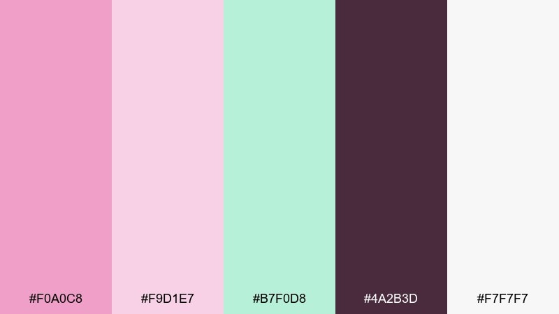
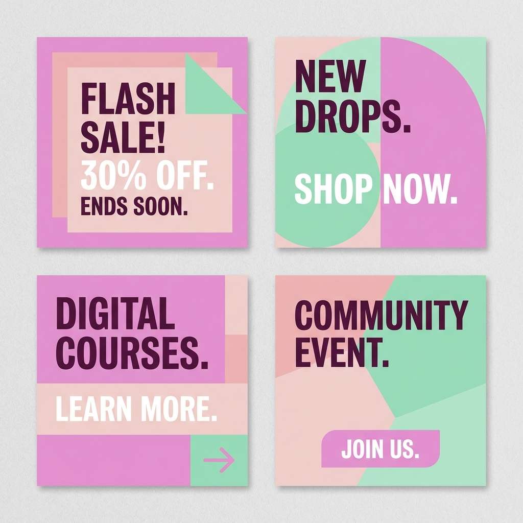
HEX: #F0A0C8 #F9D1E7 #B7F0D8 #4A2B3D #F7F7F7
Mood: fresh and upbeat
Best for: social media promo tiles
Fresh and upbeat, it feels like a pop playlist with a pastel glow. The mint accent adds modern contrast and makes the pink look cleaner and more digital-friendly. Use it for promo tiles, short-form video covers, or sale announcements with chunky type. Tip: put mint behind key numbers and keep body text in the deep plum to avoid low contrast.
Image example of soft neon pop generated using media.io
8) Muted Berry Neutrals
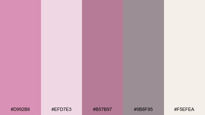
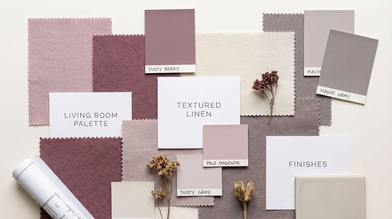
HEX: #D992B6 #EFD7E3 #B57B97 #9B8F95 #F5EFEA
Mood: soft and grounded
Best for: interior mood board
Soft and grounded, it brings to mind dried florals, linen upholstery, and cozy afternoon light. The warm off-white and gray-mauve make it easy to build a calm board without losing character. Use it for interior mood boards, lifestyle blog graphics, or calm ecommerce banners. Tip: treat the berry shade as an accent for buttons or headings, not large background blocks.
Image example of muted berry neutrals generated using media.io
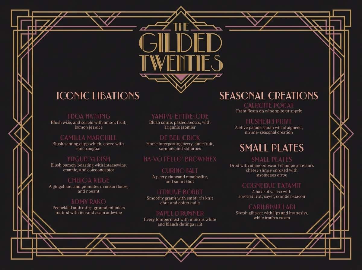
9) Art Deco Magenta
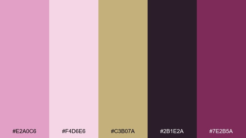
HEX: #E2A0C6 #F4D6E6 #C3B07A #2B1E2A #7E2B5A
Mood: luxurious and dramatic
Best for: cocktail bar menu
Luxurious and dramatic, it recalls velvet booths, gold trim, and late-night jazz. A pale magenta color scheme looks especially rich when you pair it with antique gold and near-black. Use it for menus, packaging, or posters where contrast and elegance matter. Tip: set the background in the dark tone and use the blush as negative space to frame key sections.
Image example of art deco magenta generated using media.io
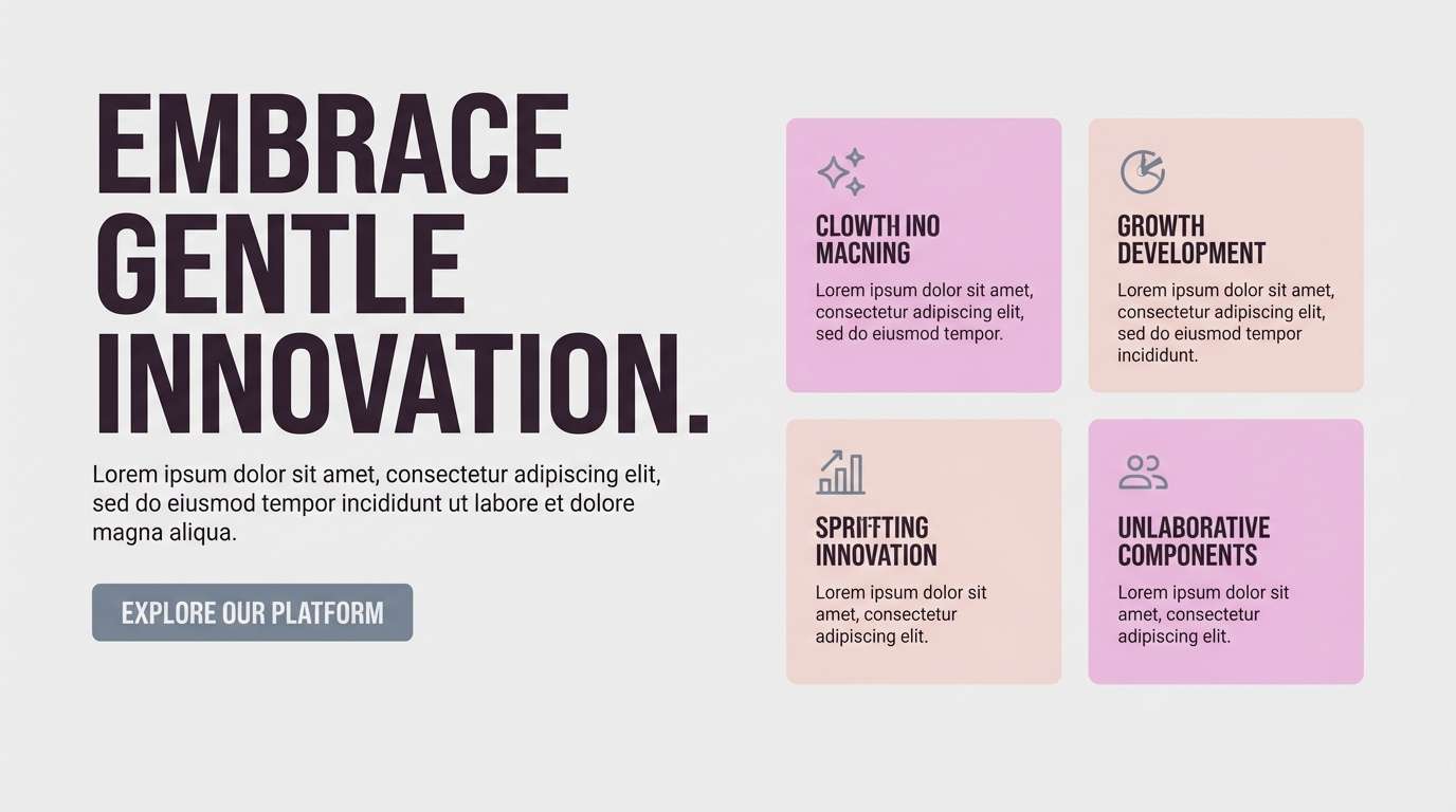
10) Scandi Magenta
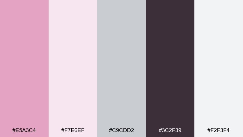
HEX: #E5A3C4 #F7E6EF #C9CDD2 #3C2F39 #F2F3F4
Mood: minimal and modern
Best for: website hero section
Minimal and modern, these tones feel like a bright Scandinavian studio with a blush accent wall. Cool grays tame the pink and help your layouts look crisp and structured. Use it for website hero sections, portfolios, or product landing pages with plenty of whitespace. Tip: keep buttons in the deep charcoal-plum and use the light pink as a soft backdrop for photos or copy blocks.
Image example of scandi magenta generated using media.io
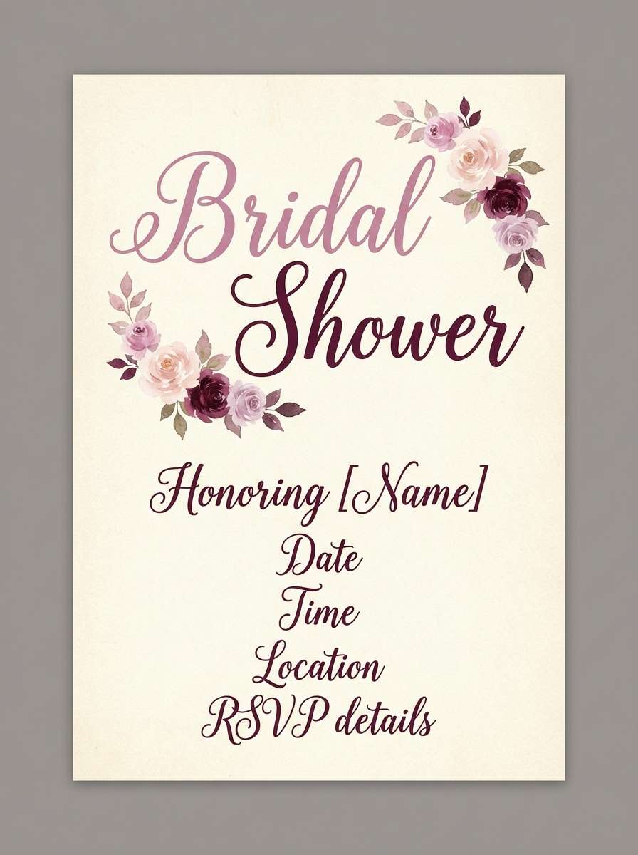
11) Wedding Bouquet
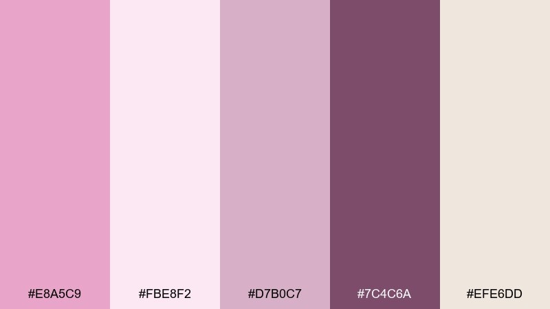
HEX: #E8A5C9 #FBE8F2 #D7B0C7 #7C4C6A #EFE6DD
Mood: tender and celebratory
Best for: bridal shower invitation
Tender and celebratory, it feels like fresh bouquet wraps and handwritten notes. The dusty lilac-pink adds softness, while the wine tone keeps names and details readable. Use it for bridal shower invitations, welcome signs, or thank-you cards with delicate floral motifs. Tip: match paper to the warm neutral so the pinks print true and do not turn overly cool.
Image example of wedding bouquet generated using media.io
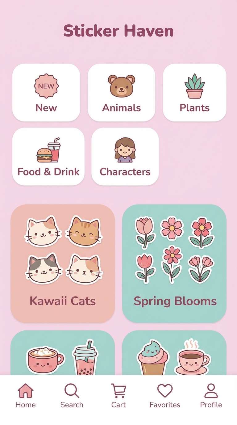
12) Kawaii Sticker UI
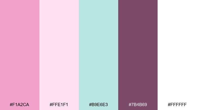
HEX: #F1A2CA #FFE1F1 #B9E6E3 #7B4B69 #FFFFFF
Mood: cute and friendly
Best for: sticker shop app UI
Cute and friendly, it brings bubble tea vibes and glossy sticker sheets to mind. This pale magenta color palette works well for UI when you anchor it with plenty of white and use teal as the small surprise accent. Use it for a sticker shop app, onboarding screens, or playful dashboards with rounded components. Tip: keep primary text in the muted berry so the interface stays accessible on pale backgrounds.
Image example of kawaii sticker ui generated using media.io
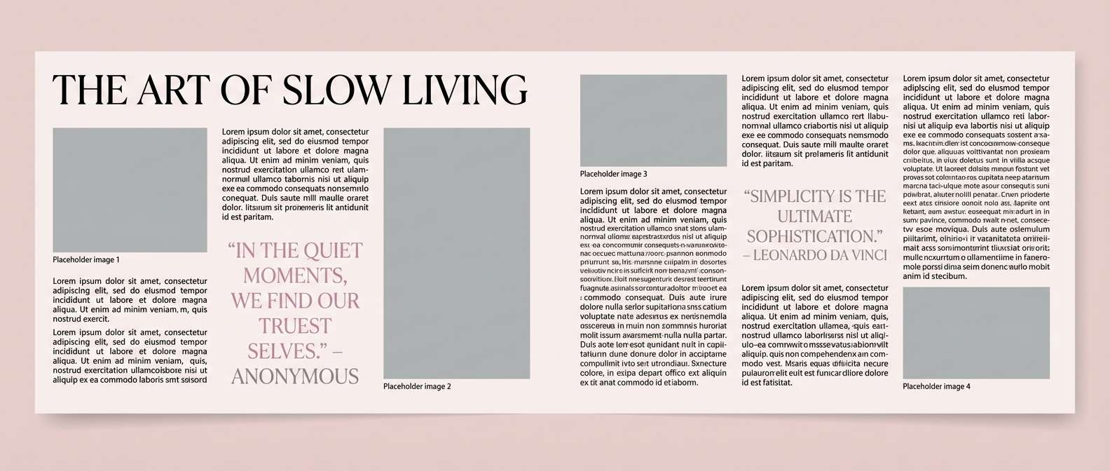
13) Editorial Beauty Spread
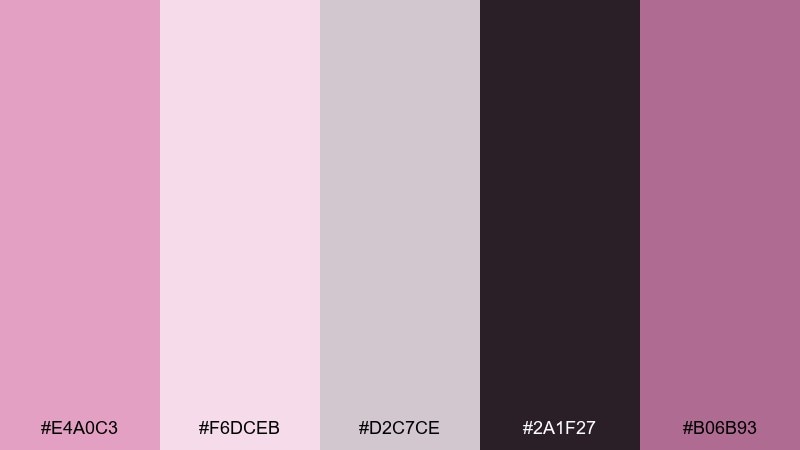
HEX: #E4A0C3 #F6DCEB #D2C7CE #2A1F27 #B06B93
Mood: sleek and editorial
Best for: magazine layout design
Sleek and editorial, it feels like a high-fashion beauty spread with soft blush lighting. The near-black gives your headlines authority, while the dusty mauves keep photography looking cohesive. Use it for magazine layouts, lookbooks, or portfolio case studies with large typography. Tip: apply the mid magenta as pull-quote highlights and keep body copy in near-black for clarity.
Image example of editorial beauty spread generated using media.io
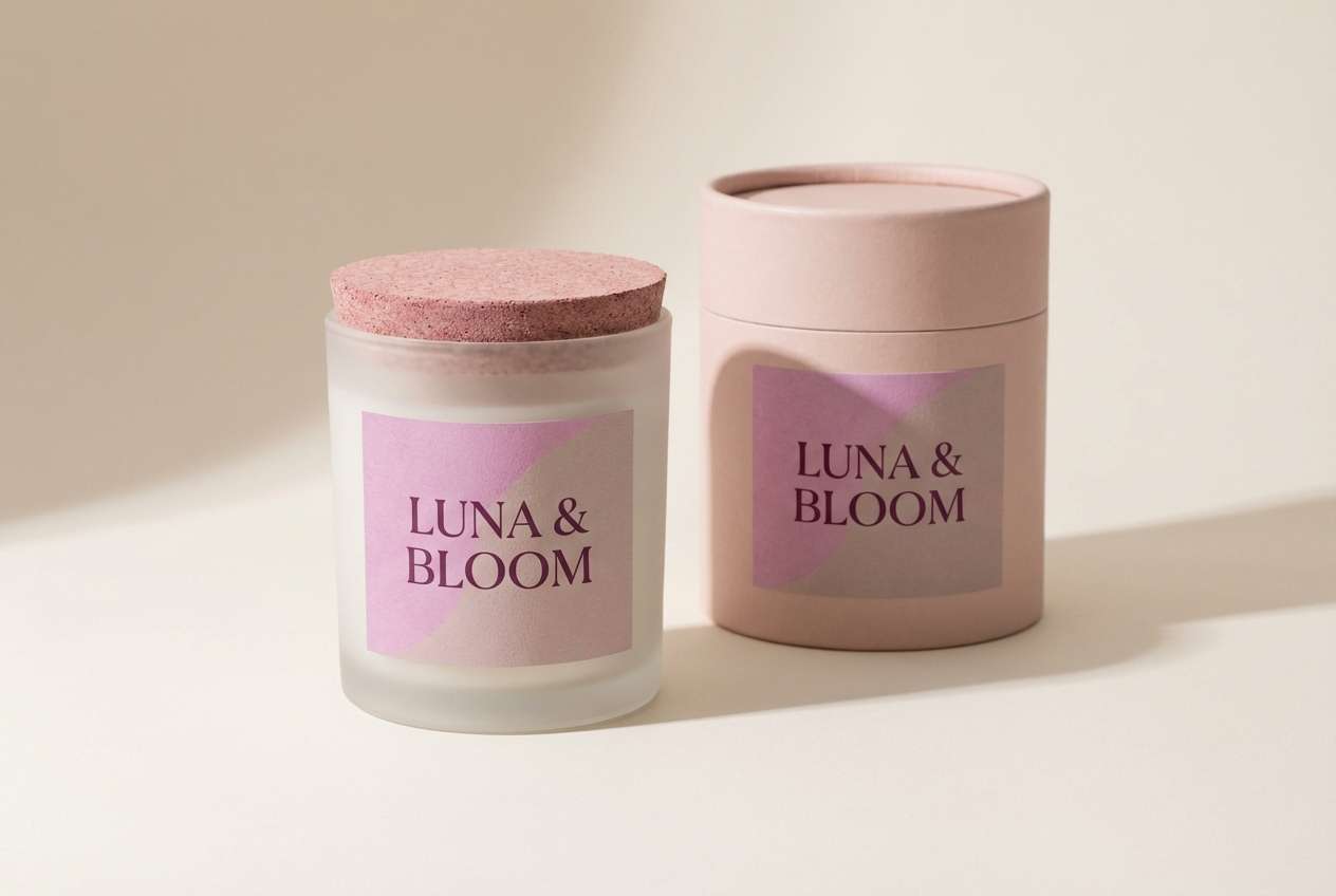
14) Minimal Product Label
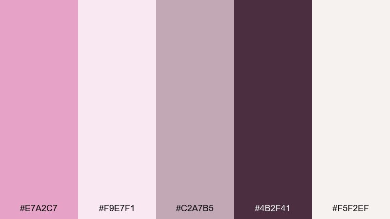
HEX: #E7A2C7 #F9E7F1 #C2A7B5 #4B2F41 #F5F2EF
Mood: clean and premium
Best for: candle label and packaging
Clean and premium, it suggests a quiet boutique shelf with softly tinted glass. The warm off-white and muted taupe-pink keep the look minimal, while the deep plum handles fine print well. Use it for candle labels, soap wraps, or small-batch product tags. Tip: print the label on textured stock and use the darkest shade for all text to avoid muddy contrast.
Image example of minimal product label generated using media.io
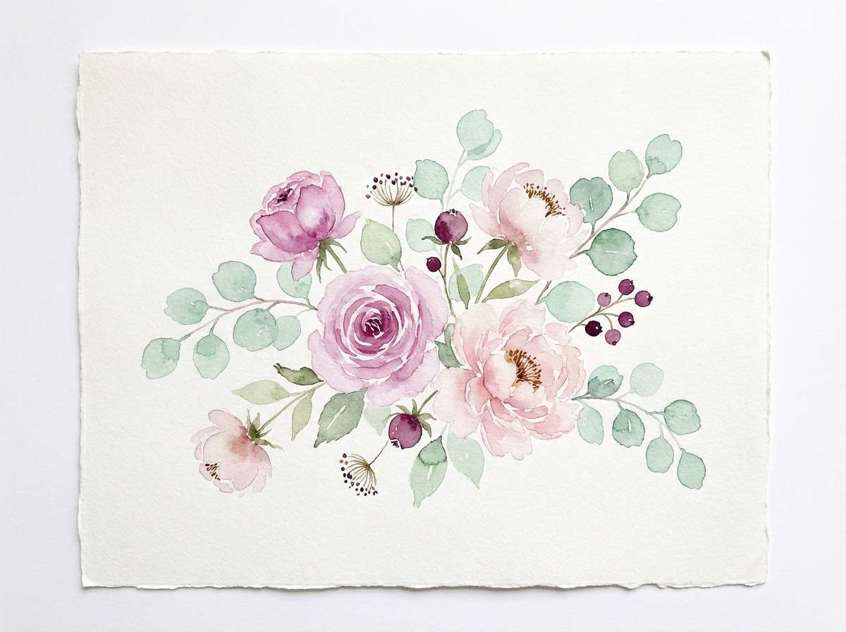
15) Spring Botanicals
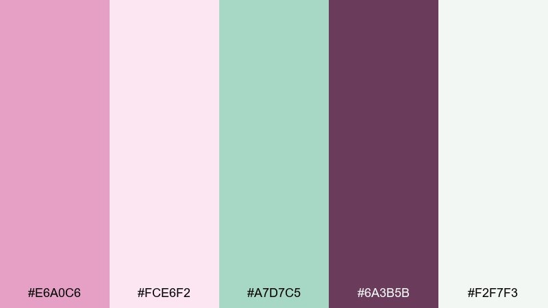
HEX: #E6A0C6 #FCE6F2 #A7D7C5 #6A3B5B #F2F7F3
Mood: fresh and botanical
Best for: watercolor floral illustration
Fresh and botanical, it feels like new leaves and pink blossoms after rain. The gentle green supports the pink-purple tones and makes the whole set feel natural rather than candy-like. Use it for spring illustrations, greeting cards, or eco-friendly brand assets. Tip: let the green appear in small stems and shadows, keeping the florals mostly in blush and pale magenta tones.
Image example of spring botanicals generated using media.io
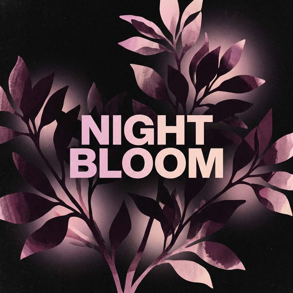
16) Night Bloom Contrast
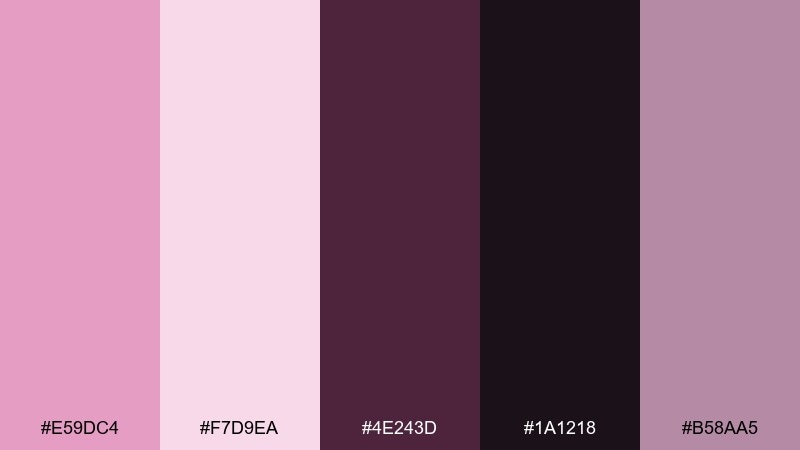
HEX: #E59DC4 #F7D9EA #4E243D #1A1218 #B58AA5
Mood: moody and romantic
Best for: album cover artwork
Moody and romantic, it brings to mind night-blooming flowers against deep velvet shadows. The near-black and plum create dramatic contrast that makes the pinks glow. Use it for album covers, event posters, or cinematic brand visuals. Tip: place the light blush behind the title area only, so the rest can stay dark and atmospheric.
Image example of night bloom contrast generated using media.io
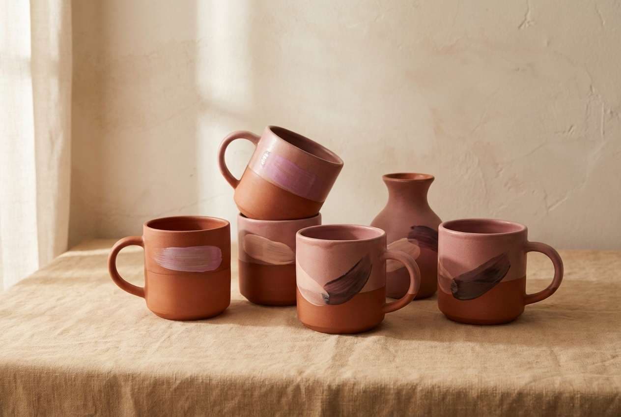
17) Warm Terracotta Pairing
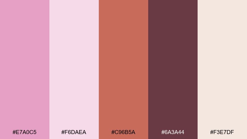
HEX: #E7A0C5 #F6DAEA #C96B5A #6A3A44 #F3E7DF
Mood: earthy and inviting
Best for: ceramics product ad
Earthy and inviting, it feels like hand-thrown pottery with a blush glaze. Terracotta adds warmth and gives the pink a more artisanal, grounded edge. Use it for ceramics ads, handmade marketplaces, or craft fair signage. Tip: shoot products on the warm neutral and bring in pale magenta as a backdrop card or label color for a cohesive set.
Image example of warm terracotta pairing generated using media.io
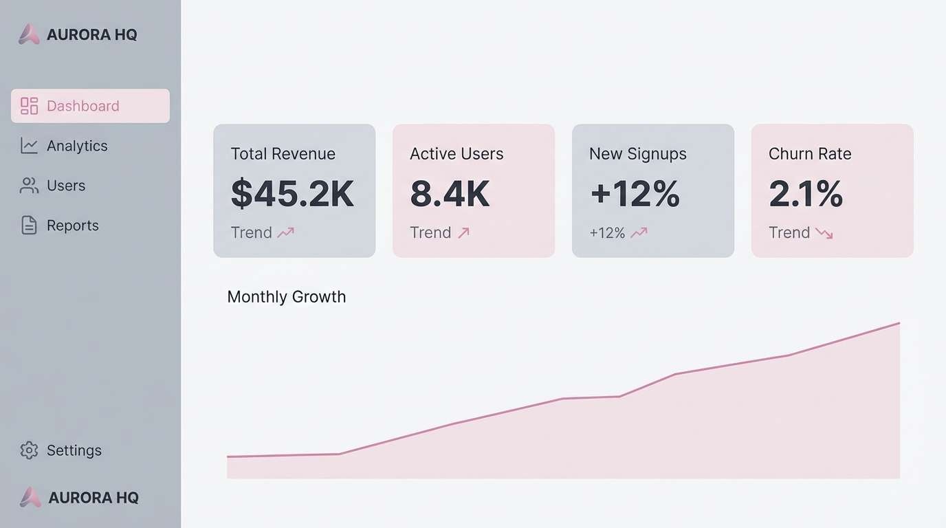
18) Cool Gray Balance
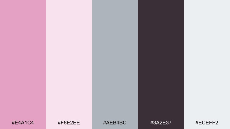
HEX: #E4A1C4 #F8E2EE #AEB4BC #3A2E37 #ECEFF2
Mood: balanced and professional
Best for: SaaS dashboard UI
Balanced and professional, it reads like a calm workspace with a soft pink accent instead of loud status colors. These pale magenta color combinations are especially effective when gray handles structure and the pink is reserved for highlights and selected states. Use it for SaaS dashboards, analytics views, or settings pages with dense information. Tip: keep charts mostly grayscale and use the magenta accent only for the key metric you want people to remember.
Image example of cool gray balance generated using media.io
19) Metallic Champagne Accent
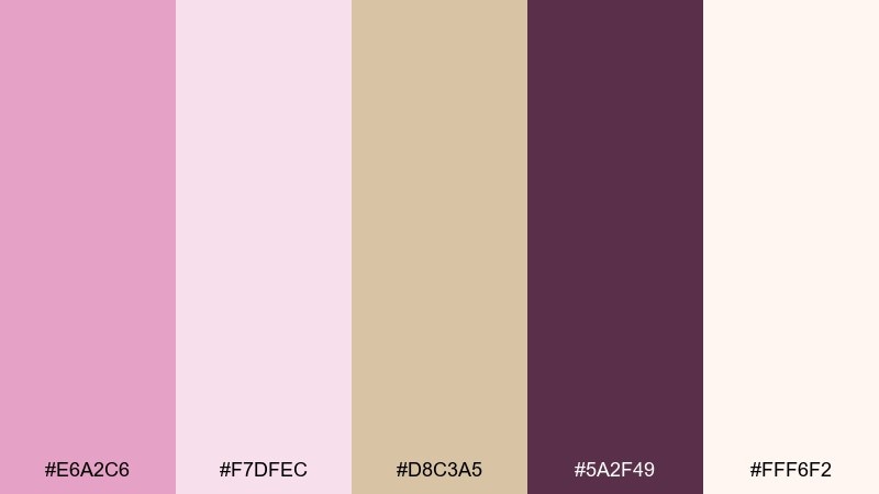
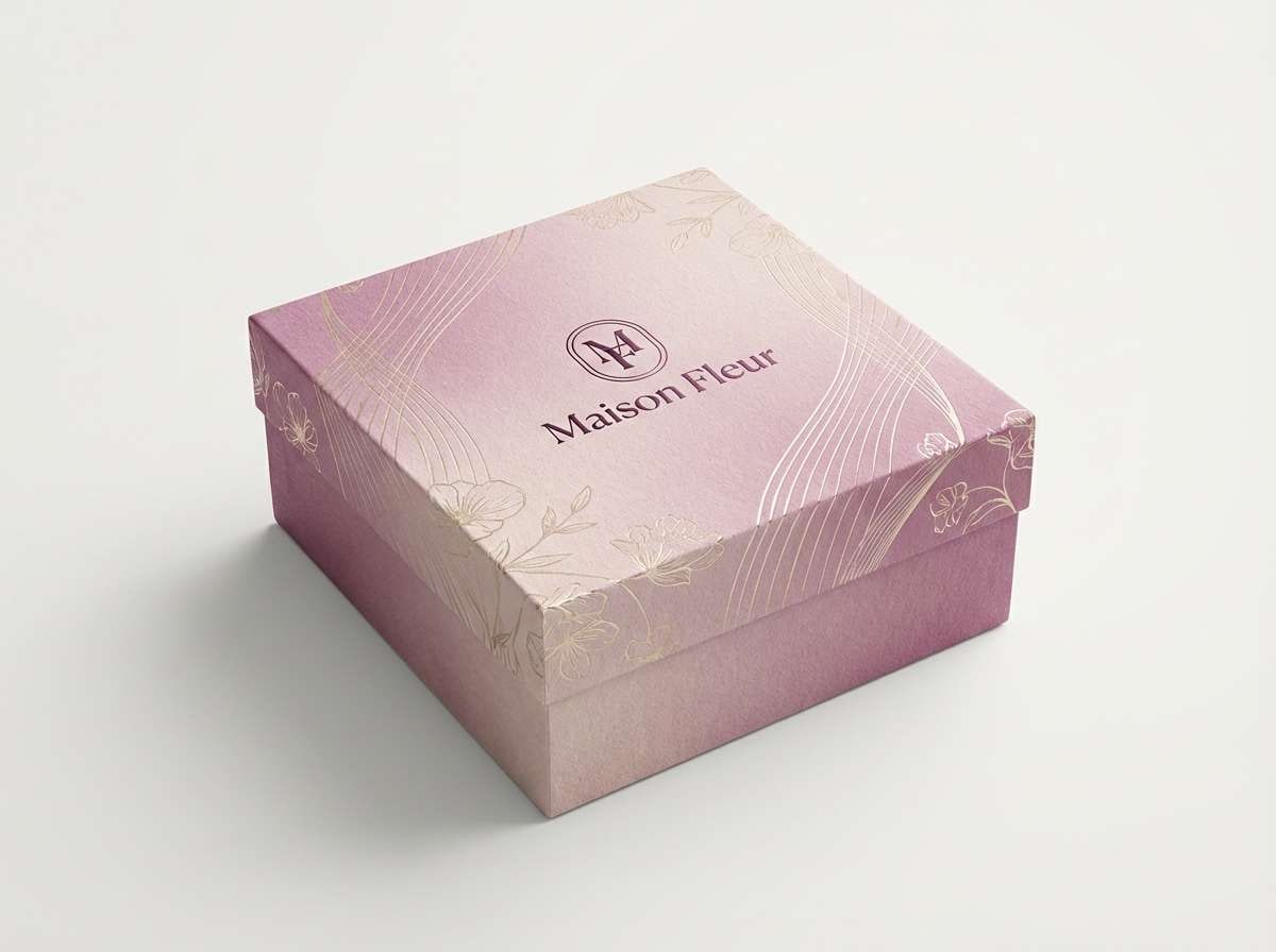
HEX: #E6A2C6 #F7DFEC #D8C3A5 #5A2F49 #FFF6F2
Mood: glossy and celebratory
Best for: luxury gift box design
Glossy and celebratory, it suggests champagne foil and blush ribbons on a gift box. The champagne beige acts like a metallic stand-in, making the pinks feel more upscale. Use it for luxury packaging, holiday gift sets, or premium membership cards. Tip: keep the background light and add the deep plum to small brand marks so the design stays sharp.
Image example of metallic champagne accent generated using media.io
20) Playful Gradient
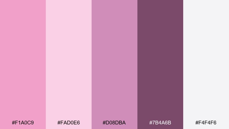
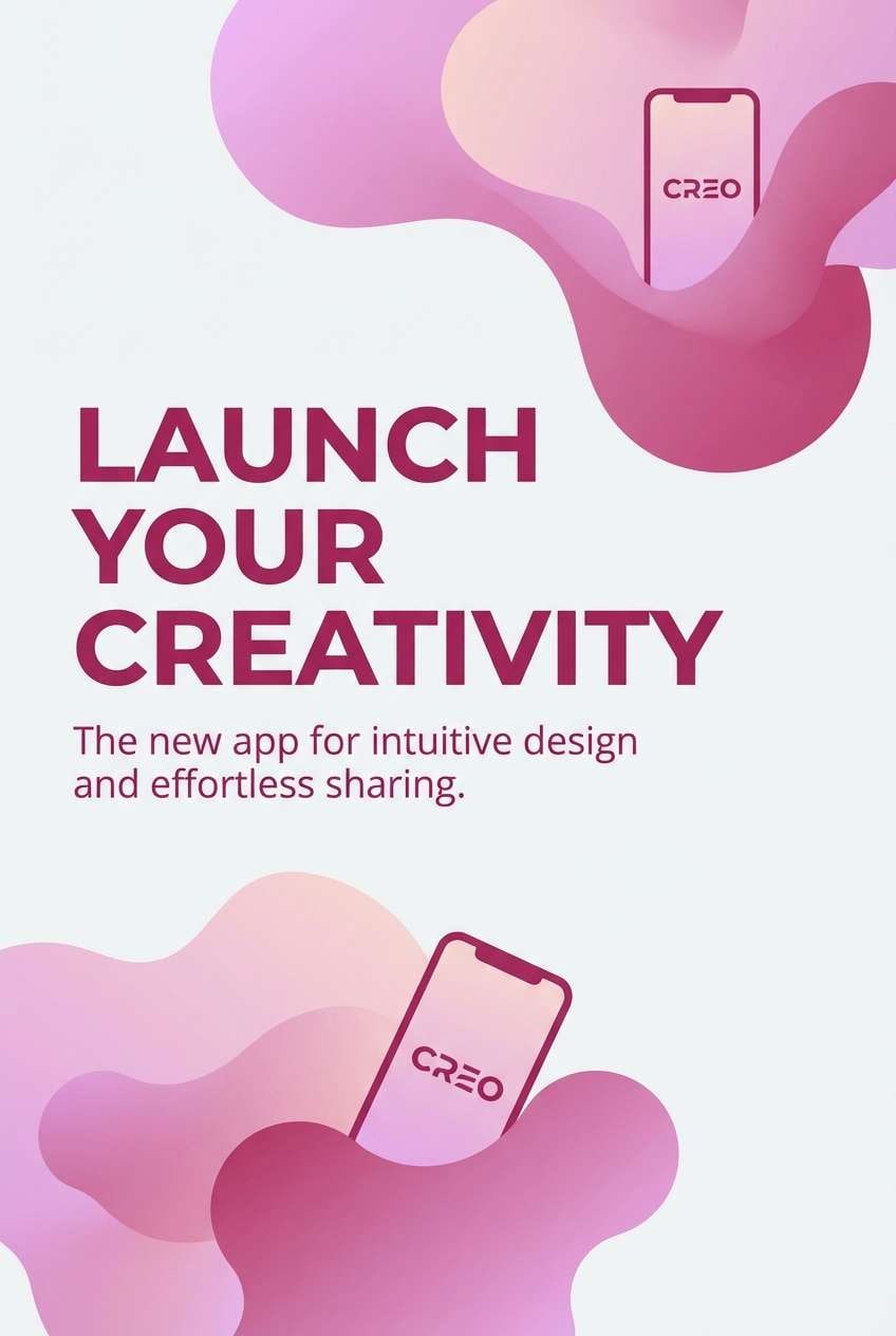
HEX: #F1A0C9 #FAD0E6 #D08DBA #7B4A6B #F4F4F6
Mood: bright and creative
Best for: app launch poster
Bright and creative, it feels like a smooth gradient wash across a polished poster. The mid magenta and berry tones help gradients look intentional rather than washed out. Use it for app launch posters, feature announcements, or conference signage with bold type. Tip: build the gradient from the two lightest shades, then use the berry for crisp text and icon strokes.
Image example of playful gradient generated using media.io
21) Herbal Tea Comfort
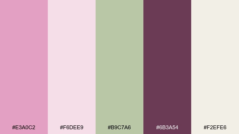
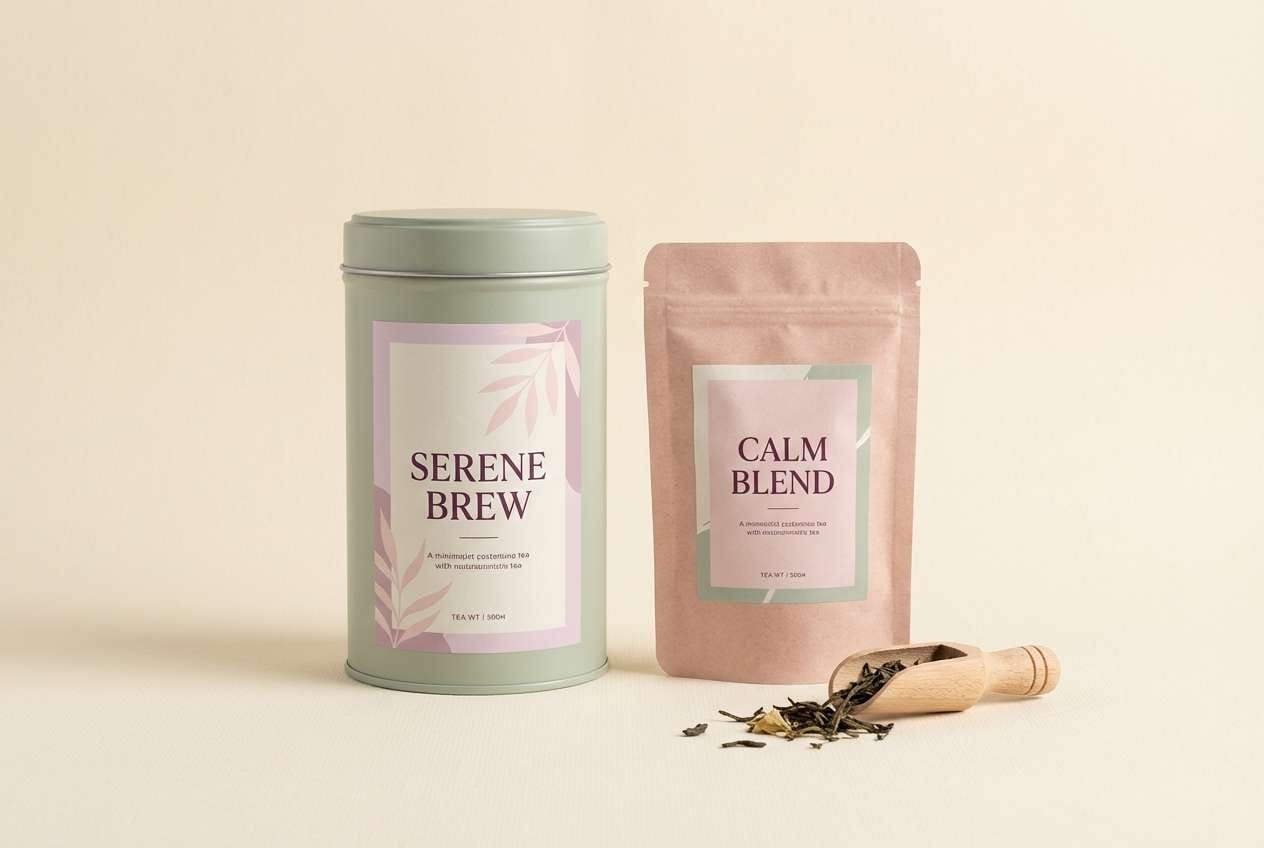
HEX: #E3A0C2 #F6DEE9 #B9C7A6 #6B3A54 #F2EFE6
Mood: cozy and soothing
Best for: tea packaging design
Cozy and soothing, it evokes a warm mug, dried herbs, and a soft pink label on a pantry shelf. The sage tone keeps the palette from feeling overly sweet and adds a natural, calming cue. Use it for tea packaging, wellness blog graphics, or subscription box inserts. Tip: set ingredient lists in the deep plum and keep the blush for brand blocks and small icons.
Image example of herbal tea comfort generated using media.io
22) Studio Portrait Backdrop
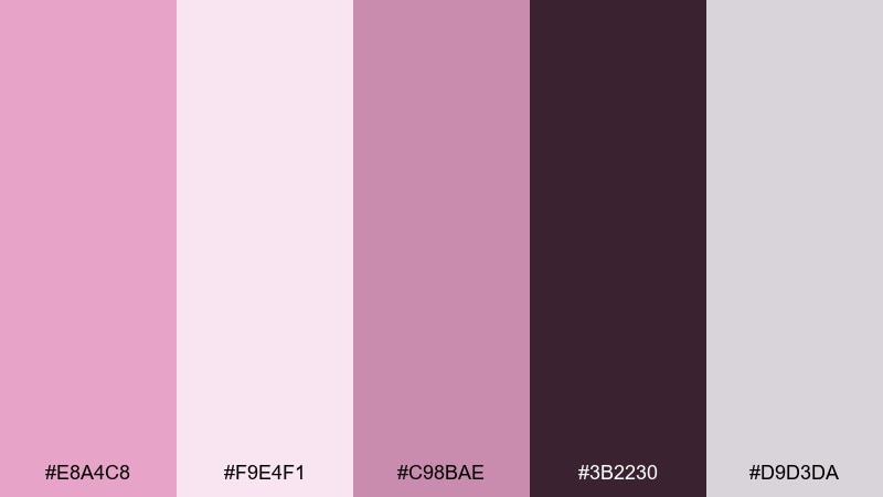
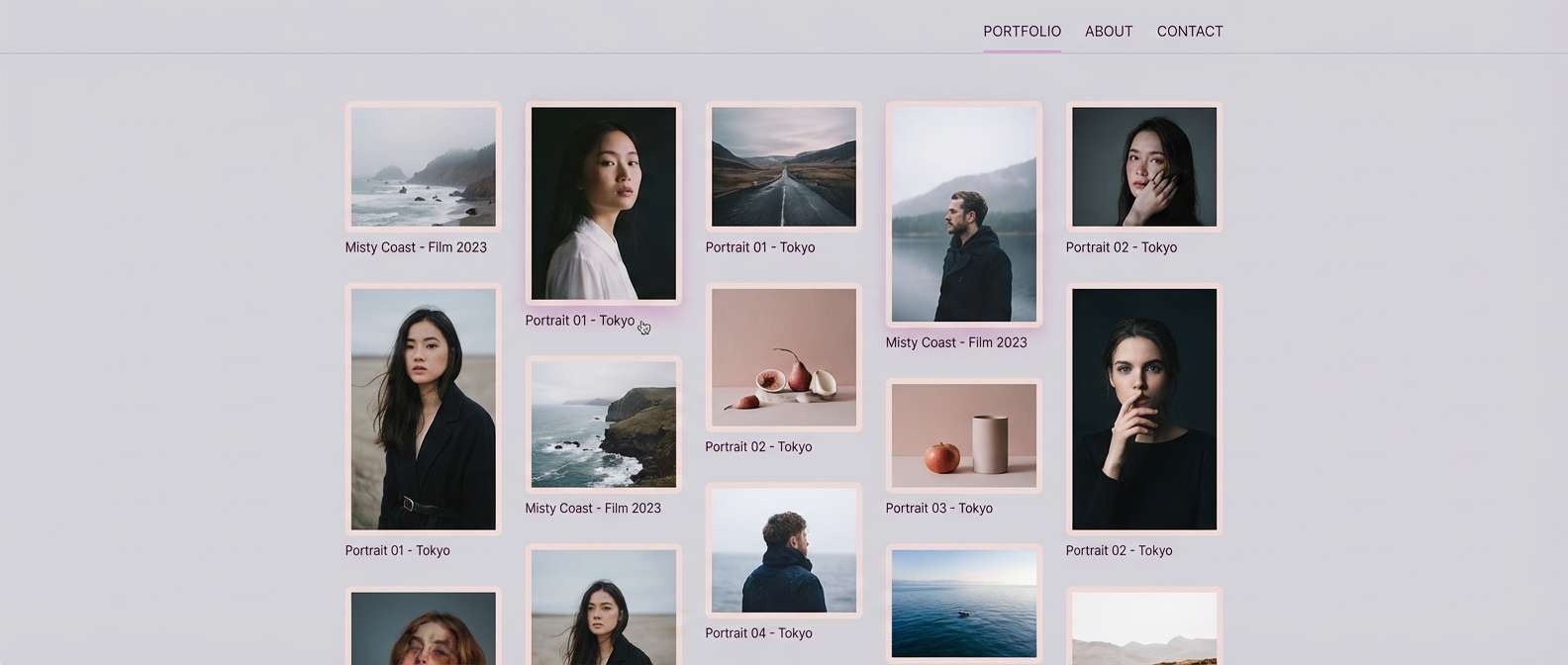
HEX: #E8A4C8 #F9E4F1 #C98BAE #3B2230 #D9D3DA
Mood: soft and cinematic
Best for: photography portfolio website
Soft and cinematic, these shades resemble a tinted studio backdrop with gentle shadows. The cool gray-lilac gives your layout breathing room while the deep plum supports strong navigation contrast. Use it for a photography portfolio, case study pages, or gallery UI where images need to stand out. Tip: keep interface elements muted and let the mid magenta appear only on hover states and tags.
Image example of studio portrait backdrop generated using media.io
What Colors Go Well with Pale Magenta?
Pale magenta pairs beautifully with warm neutrals like cream, beige, and soft off-white when you want a romantic or premium look. These combinations keep the palette bright while preventing the pink-purple tones from feeling too cold.
For a more modern, UI-friendly direction, balance pale magenta with cool grays and a deep charcoal-plum for text. This helps maintain clean hierarchy and readable contrast across components.
If you want more energy, add a restrained accent like mint/teal, apricot, terracotta, or antique gold. Keep accents small so pale magenta stays the “main character” color.
How to Use a Pale Magenta Color Palette in Real Designs
Start by choosing one pale magenta as your primary brand accent, then assign a deep plum/near-black for typography and outlines. This instantly improves legibility and makes soft backgrounds look intentional instead of washed out.
In UI, use pale magenta for selected states, badges, and highlights—not for long blocks of body text. In print (like invitations and labels), test on uncoated or textured stock to keep blush tones looking velvety rather than glossy.
To keep the palette cohesive across photos and graphics, apply a gentle blush tint or consistent shadow color (often a mauve-plum). This makes mixed assets feel like one system.
Create Pale Magenta Palette Visuals with AI
If you already have HEX codes, the fastest way to validate a palette is to generate realistic mockups (packaging, posters, UI screens) and see how the colors behave in lighting, shadows, and typography.
With Media.io’s text-to-image tool, you can paste a prompt like the examples above, then iterate quickly—swap “cream background” for “cool gray,” adjust the mood, or change the aspect ratio to match your platform.
Once you find a direction you like, reuse the same prompt structure to generate a consistent series for brand kits, social tiles, and product visuals.
Pale Magenta Color Palette FAQs
-
What is the HEX code for pale magenta?
Pale magenta isn’t a single fixed HEX value; it’s a range of light magenta-leaning pinks. In the palettes above, common pale magenta anchors include shades like #E6A0C4, #E8A5C9, and #F1A0C9. -
Is pale magenta more pink or purple?
It sits between pink and purple. If you add warm neutrals (cream/beige), it reads more pink; if you add cool grays or violet shadows, it shifts more purple. -
What colors complement pale magenta best?
Great complements include warm cream/off-white, cool gray, deep plum/charcoal for contrast, and small accents like mint/teal, apricot, terracotta, or antique gold. -
How do I keep pale magenta designs from looking too “sweet”?
Use pale magenta as an accent rather than a full background, anchor typography with deep plum or near-black, and add structure with cool grays or muted mauve neutrals. -
Is pale magenta good for UI and accessibility?
Yes—when used correctly. Avoid pale magenta for body text on light backgrounds; instead, use a dark plum/charcoal for text and reserve pale magenta for highlights, selected states, and decorative surfaces. -
Does pale magenta print accurately?
It can shift depending on paper and ink. Uncoated or textured stock usually keeps blush tones soft and “velvety,” while glossy stock can make them look brighter; always run a test print for invitations and packaging. -
How can I generate matching images for my pale magenta palette?
Use a text-to-image generator and describe the scene (product, poster, UI), lighting, and dominant colors. Reuse a consistent prompt format and tweak only one variable at a time to keep a cohesive series.


