

Columbia blue (#9BC4E2) is a soft, airy blue that instantly makes designs feel open, calm, and modern. It’s light enough for backgrounds, but still colorful enough to become a memorable brand tint.
Below are 20 columbia blue color palette ideas with HEX codes—built for UI, branding, posters, weddings, and interiors—plus prompts you can use to generate matching visuals.
In this article
Why Columbia Blue Palettes Work So Well
Columbia blue sits in the “safe but not boring” zone: it’s gentle, readable, and broadly appealing, which makes it easy to use across branding, UI, and print. It feels clean like sky tones, but warmer and softer than stark icy blues.
Because it’s relatively light, it pairs naturally with whites and off-whites for spacious layouts, and it also takes on character when grounded with deep navies, charcoals, or dark teals. That contrast is what turns a pastel blue palette into a professional system.
It also plays well with warm accents—sand, terracotta, rust, peach, and golden yellows—so you can add energy without losing the calm baseline.
20+ Columbia Blue Color Palette Ideas (with HEX Codes)
1) Harbor Mist
HEX: #9BC4E2 #1E3A5F #F6F1E7 #A8CBB5 #2B2F36
Mood: calm, coastal, polished
Best for: brand identity and website hero sections
Calm coastal air and early-morning docks come to mind, with cool blues softened by cream and sea-glass green. Use the navy as your anchor for headers and logos, then let columbia blue carry backgrounds and large surfaces. Pair it with off-white for breathing room and charcoal for readable body text. Tip: keep the green as a small accent for buttons or icons so the palette stays crisp.
Image example of harbor mist generated using media.io
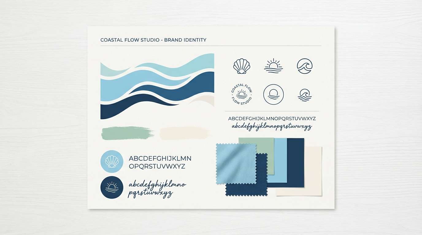
Media.io is an online AI studio for creating and editing video, image, and audio in your browser.

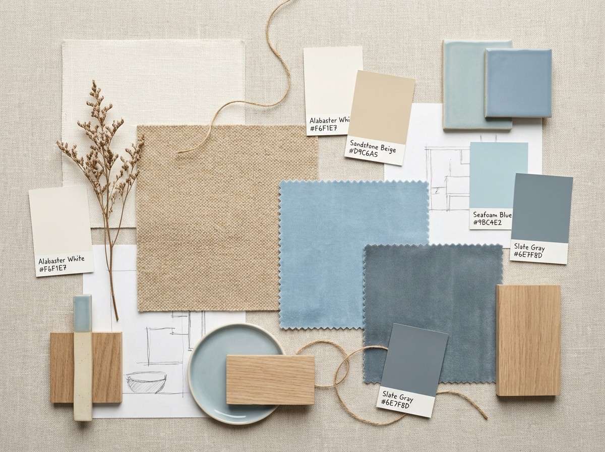
2) Coastal Linen
HEX: #9BC4E2 #D9C6A5 #F6F1E7 #6E7F8D #3C3F44
Mood: soft, airy, natural
Best for: interior moodboards and lifestyle blogs
Soft linen, sun-bleached driftwood, and a pale blue horizon set a relaxed tone. Let the warm sand and cream do the heavy lifting for walls, backgrounds, and negative space, then layer in columbia blue as a gentle feature color. The slate gray keeps the look grounded for captions, borders, and small UI elements. Tip: repeat the sand tone in 2 to 3 spots to make the blue feel intentional, not random.
Image example of coastal linen generated using media.io
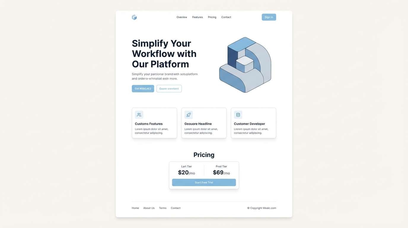
3) Skybound Minimal
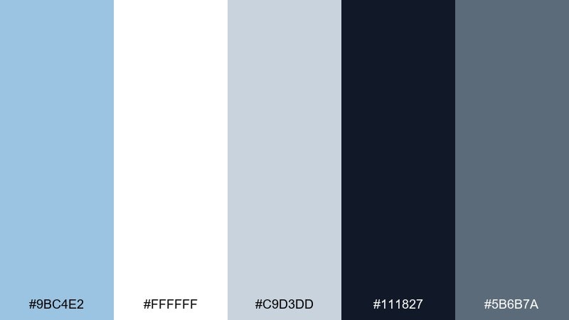
HEX: #9BC4E2 #FFFFFF #C9D3DD #111827 #5B6B7A
Mood: minimal, modern, weightless
Best for: SaaS landing pages and UI systems
Minimal and weightless like open sky, this mix feels clean without turning sterile. A columbia blue color palette works best here when white stays dominant and the blue becomes the brand tint for highlights and panels. Use near-black for type and slate for secondary labels to keep contrast accessible. Tip: reserve the blue for interactive states so it reads as meaning, not decoration.
Image example of skybound minimal generated using media.io
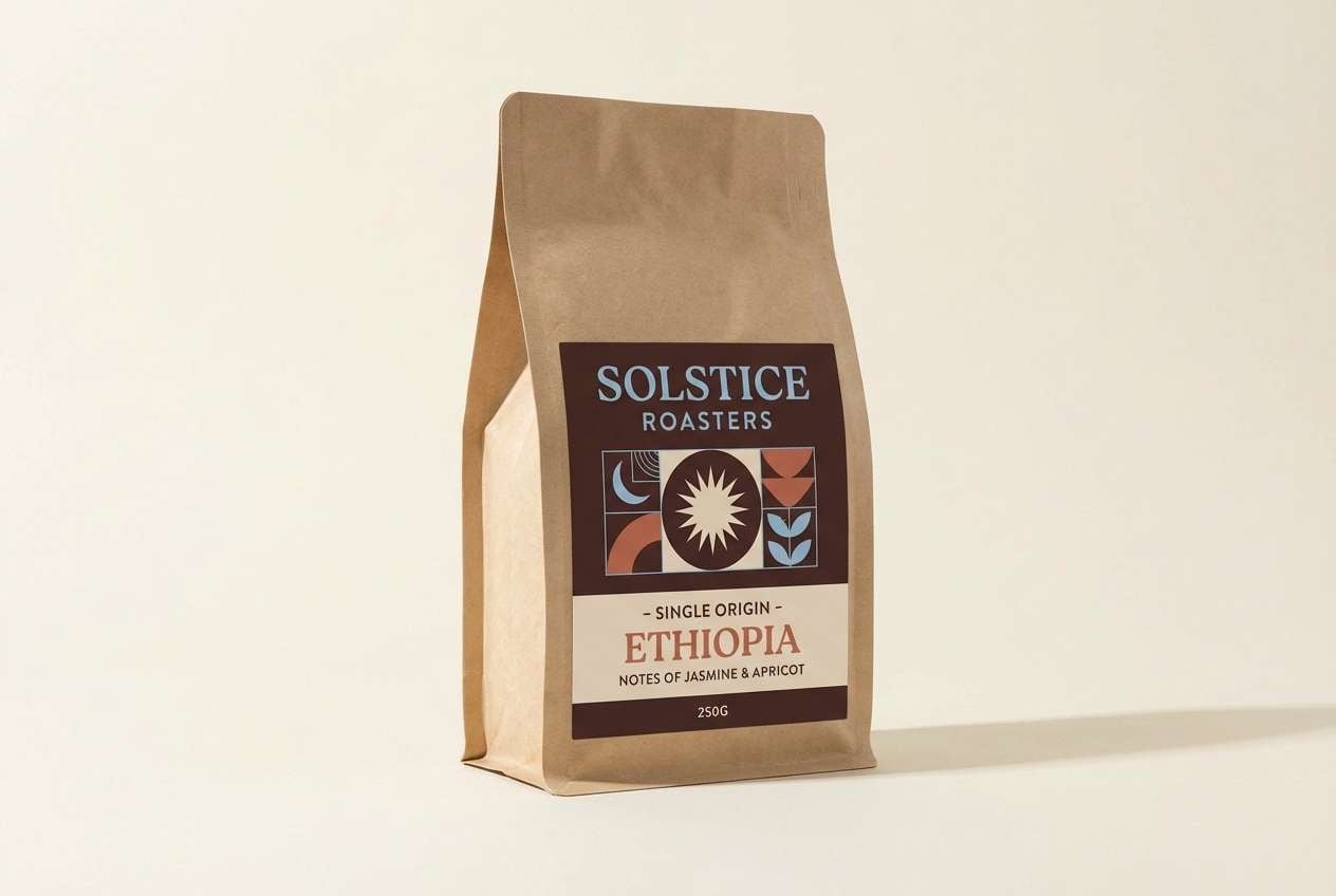
4) Powder Blue Espresso
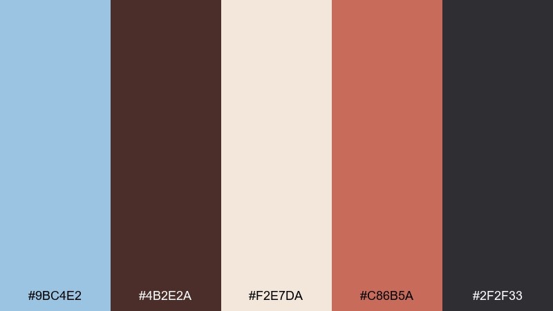
HEX: #9BC4E2 #4B2E2A #F2E7DA #C86B5A #2F2F33
Mood: cozy, boutique, contrasty
Best for: coffee packaging and cafe menus
Cozy and boutique, this pairing feels like a warm latte beside a cool ceramic mug. The espresso brown adds depth that makes the blue look cleaner, while the creamy beige keeps everything approachable. Use the terracotta as a small punch for callouts or flavor badges. Tip: keep the brown for type and outlines to avoid muddy midtones.
Image example of powder blue espresso generated using media.io
5) Spring Glasshouse
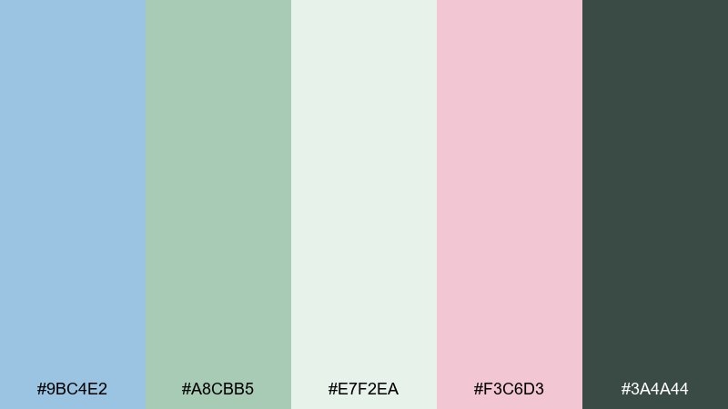
HEX: #9BC4E2 #A8CBB5 #E7F2EA #F3C6D3 #3A4A44
Mood: fresh, botanical, gentle
Best for: botanical illustrations and spring campaigns
Fresh and botanical, it evokes a glasshouse morning with dewy leaves and soft petals. The pale mint and airy off-green make a soothing base, while the blush pink adds a friendly, modern charm. Use the deep green sparingly for stems, outlines, or headline contrast. Tip: keep backgrounds light so the blue and pink stay delicate rather than loud.
Image example of spring glasshouse generated using media.io
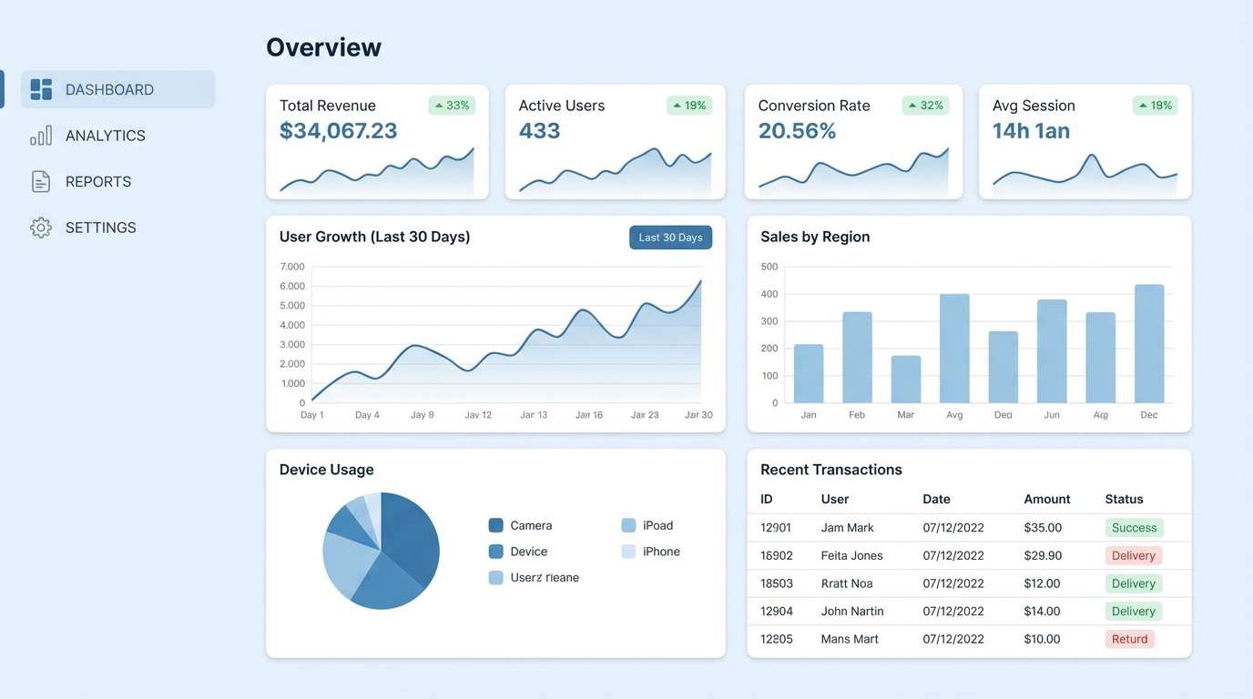
6) Arctic UI
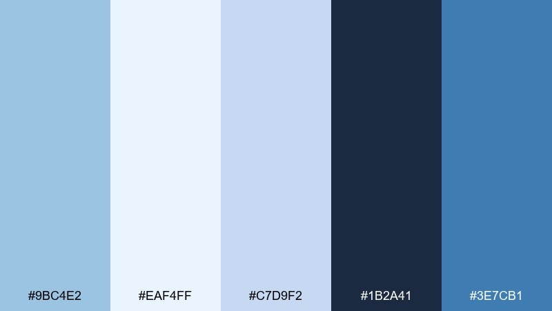
HEX: #9BC4E2 #EAF4FF #C7D9F2 #1B2A41 #3E7CB1
Mood: crisp, icy, tech-forward
Best for: dashboard UI and data visualizations
Crisp and icy, it feels like clean air and bright winter light. Use the pale blues for surfaces and cards, then keep the deep navy for text and chart axes. The stronger blue works well for active states and data highlights without looking neon. Tip: stick to two blue intensities in charts to prevent visual noise.
Image example of arctic ui generated using media.io
7) Heritage Denim
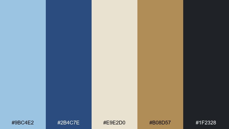
HEX: #9BC4E2 #2B4C7E #E9E2D0 #B08D57 #1F2328
Mood: classic, sturdy, Americana
Best for: workwear branding and editorial layouts
Classic and sturdy, it recalls worn denim, brass hardware, and cream canvas. For columbia blue color combinations that feel timeless, let the deep indigo take the lead and use the lighter blue as a faded highlight. Bring in warm brass as an accent for badges, dividers, or small icons. Tip: keep the canvas tone wide to balance the heaviness of the dark blues.
Image example of heritage denim generated using media.io

8) Blossom Breeze
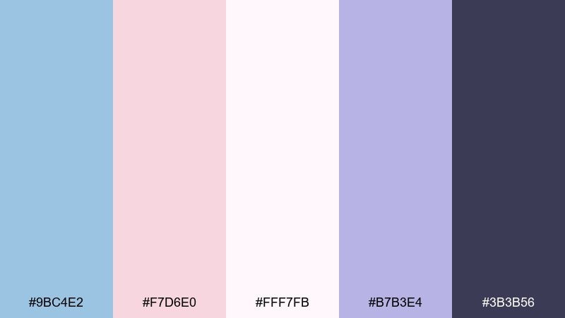
HEX: #9BC4E2 #F7D6E0 #FFF7FB #B7B3E4 #3B3B56
Mood: romantic, light, dreamy
Best for: beauty branding and social posts
Romantic and dreamy, it feels like petals drifting through a cool spring breeze. The blush and soft lavender make the blue look even more gentle, while the deep plum keeps typography elegant. Use the near-white as the main canvas so the pastels read cleanly on screens. Tip: keep gradients subtle and avoid adding extra saturated colors.
Image example of blossom breeze generated using media.io
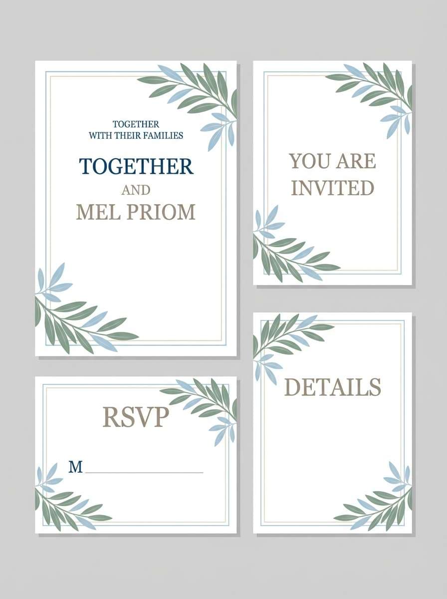
9) Seaside Wedding
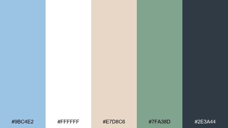
HEX: #9BC4E2 #FFFFFF #E7D8C6 #7FA38D #2E3A44
Mood: elegant, breezy, celebratory
Best for: wedding invitations and event stationery
Elegant and breezy, it brings to mind ocean air, white linens, and soft greenery. A columbia blue color palette like this shines on stationery when white stays dominant and the blue appears in borders, monograms, or watercolor washes. Use the sand tone for warmth and the deep slate for crisp text. Tip: print the blue slightly lighter to keep it airy on textured paper.
Image example of seaside wedding generated using media.io
10) Museum Poster
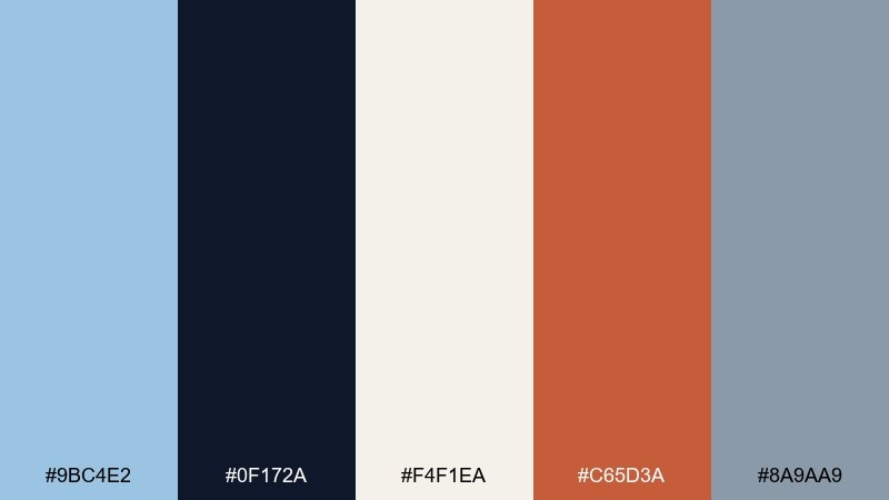
HEX: #9BC4E2 #0F172A #F4F1EA #C65D3A #8A9AA9
Mood: editorial, confident, cultured
Best for: event posters and exhibition graphics
Editorial and confident, it feels like a gallery wall with a bold title card. Let the off-white behave like paper, then use the dark ink tone for big type and grid lines. The warm rust brings energy without fighting the cool blue. Tip: keep the rust limited to one focal element, like a date block or a single shape.
Image example of museum poster generated using media.io

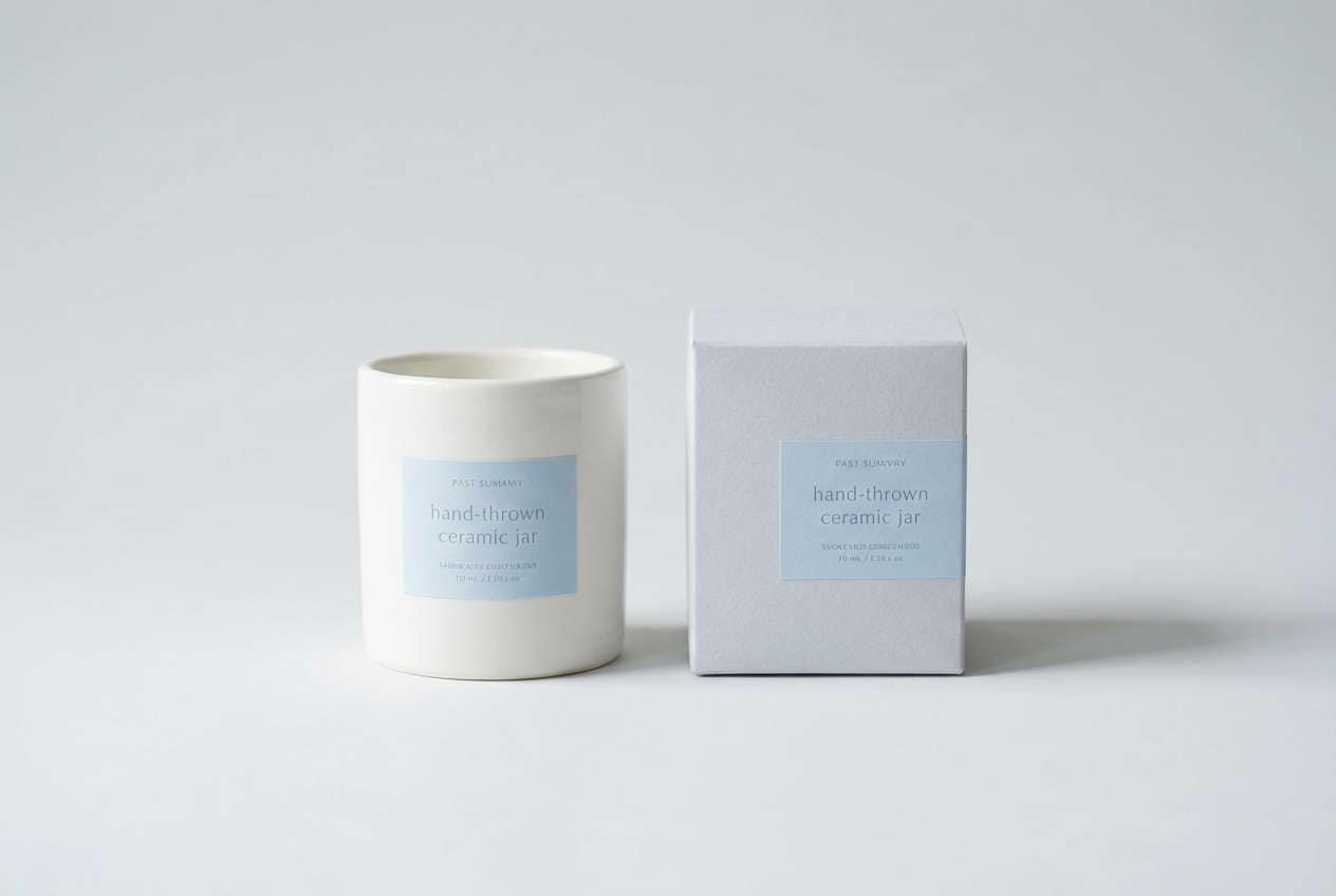
11) Cloudy Ceramic
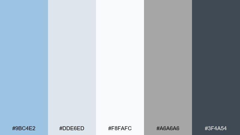
HEX: #9BC4E2 #DDE6ED #F8FAFC #A6A6A6 #3F4A54
Mood: quiet, clean, modern
Best for: product photography backdrops and catalogs
Quiet and clean, it resembles glazed ceramic and a cloudy sky after rain. Use the light grays and near-white as your base to create a premium, minimal product feel. Add columbia blue for small brand moments like tags, seals, or feature highlights. Tip: keep shadows soft so the pale tones stay smooth and not harsh.
Image example of cloudy ceramic generated using media.io
12) Tech Calm
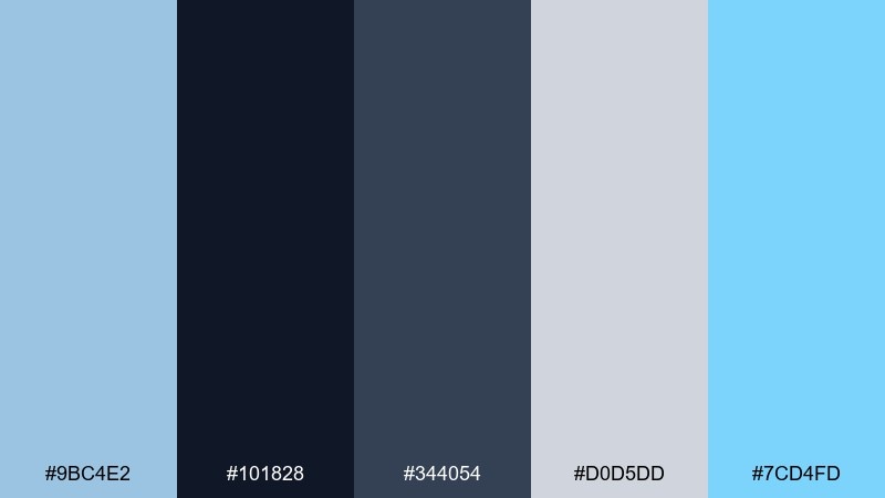
HEX: #9BC4E2 #101828 #344054 #D0D5DD #7CD4FD
Mood: professional, calm, clear
Best for: B2B UI kits and onboarding screens
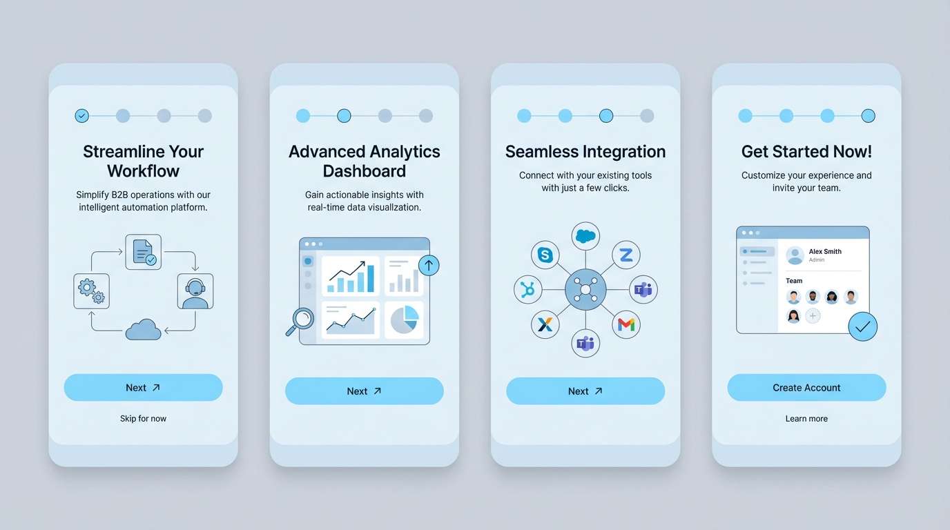
Professional and calm, it reads like a clear workflow with just enough color to guide attention. The dark slate provides excellent contrast for type, while the light gray keeps panels and separators tidy. Use the brighter aqua as a micro-accent for success states or subtle highlights. Tip: avoid using the aqua on large backgrounds so it does not overpower the softer blue.
Image example of tech calm generated using media.io
13) Nordic Cabin
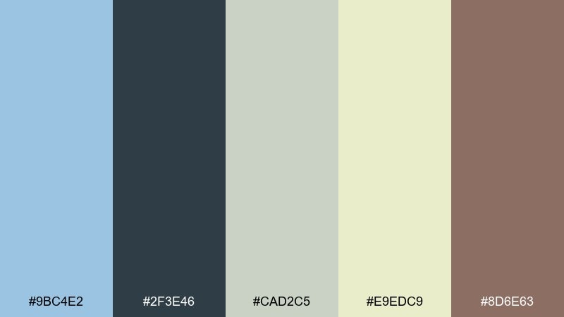
HEX: #9BC4E2 #2F3E46 #CAD2C5 #E9EDC9 #8D6E63
Mood: cozy, muted, outdoorsy
Best for: rustic branding and cabin rental listings
Cozy and muted, it suggests wool blankets, pine air, and pale winter daylight. The greens and warm cream create a natural base, while the blue brings in that cold, fresh atmosphere. Use the brown as a wood-like accent for icons or section headers. Tip: keep saturation low across visuals so the mood stays calm and authentic.
Image example of nordic cabin generated using media.io

14) Poolside Pop
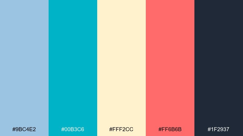
HEX: #9BC4E2 #00B3C6 #FFF2CC #FF6B6B #1F2937
Mood: playful, sunny, energetic
Best for: summer promos and social media ads
Playful and sunny, it feels like pool tiles, cold drinks, and a bright towel in the sun. The cyan adds a sharper splash next to the softer blue, while buttery yellow warms the whole set. Use the coral for one clear call to action and keep the rest supportive. Tip: pair large color blocks with dark text to keep ads readable at small sizes.
Image example of poolside pop generated using media.io

15) Quiet Library
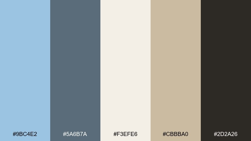
HEX: #9BC4E2 #5A6B7A #F3EFE6 #CBBBA0 #2D2A26
Mood: thoughtful, academic, refined
Best for: editorial sites and course platforms
Thoughtful and refined, it evokes paper pages, soft desk light, and a calm study corner. Use the parchment tones for backgrounds and content sections, then apply the blue for links, tags, and gentle section headers. Deep brown-black works well for long-form text without looking harsh. Tip: keep the blue consistent across interactions so users learn the pattern quickly.
Image example of quiet library generated using media.io

16) Retro Aviation
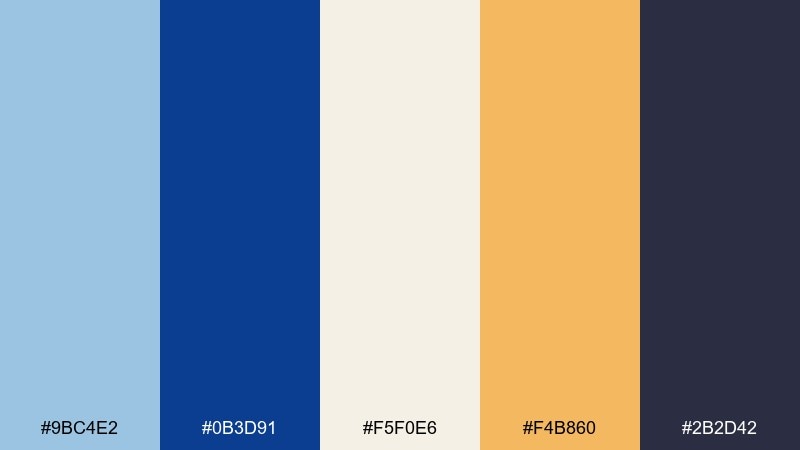
HEX: #9BC4E2 #0B3D91 #F5F0E6 #F4B860 #2B2D42
Mood: optimistic, retro, adventurous
Best for: travel posters and merch graphics
Optimistic and adventurous, it channels vintage travel posters and clear flight-day skies. Use the deep blue for bold titles and silhouettes, then let the lighter blue fill large areas like sky gradients. The warm golden accent adds that retro warmth without turning the palette too sweet. Tip: keep shapes simple and flat to match the poster vibe.
Image example of retro aviation generated using media.io

17) Rainy Window
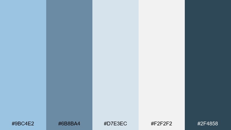
HEX: #9BC4E2 #6B8BA4 #D7E3EC #F2F2F2 #2F4858
Mood: moody, serene, reflective
Best for: wellness apps and meditation pages
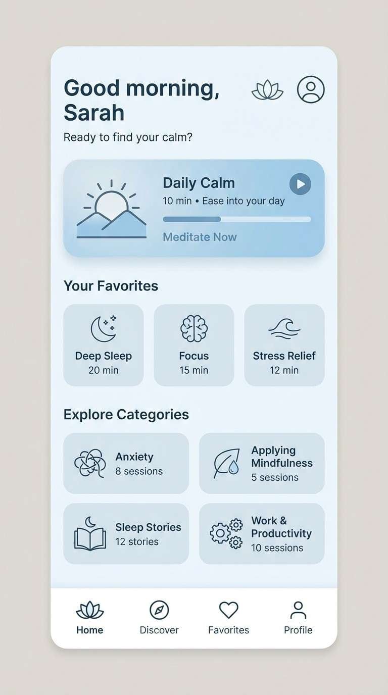
Moody yet serene, it feels like rain streaks on glass and a quiet afternoon. The layered blue-grays create depth without drama, which is ideal for calming interfaces. Use the darkest teal-blue for key text and navigation, and keep the rest soft for long reading sessions. Tip: add generous spacing so the muted tones do not feel heavy.
Image example of rainy window generated using media.io
18) Oceanic Gradient
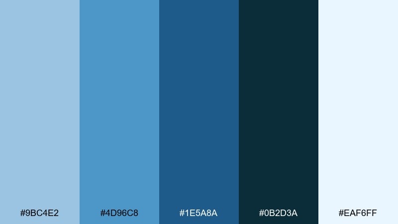
HEX: #9BC4E2 #4D96C8 #1E5A8A #0B2D3A #EAF6FF
Mood: deep, immersive, modern
Best for: hero gradients and tech branding
Deep and immersive, it moves from light sky tones into darker ocean depths. Use the gradient blues for hero banners, background panels, or motion graphics where color can carry the mood. Keep the near-white for crisp overlays and legible UI on top of darker sections. Tip: test contrast on the mid-blue to ensure buttons stay visible.
Image example of oceanic gradient generated using media.io

19) Alpine Morning
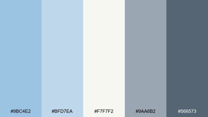
HEX: #9BC4E2 #BFD7EA #F7F7F2 #9AA6B2 #566573
Mood: fresh, quiet, outdoors
Best for: outdoor brands and travel blogs
Fresh and quiet, it suggests alpine air and pale morning light over distant ridgelines. Keep the off-white and misty blues as the main field, then use the grays for structure and readable text. This mix works especially well for large photography overlays where subtle color tints matter. Tip: apply the darkest gray to only the most important labels to maintain the airy feel.
Image example of alpine morning generated using media.io

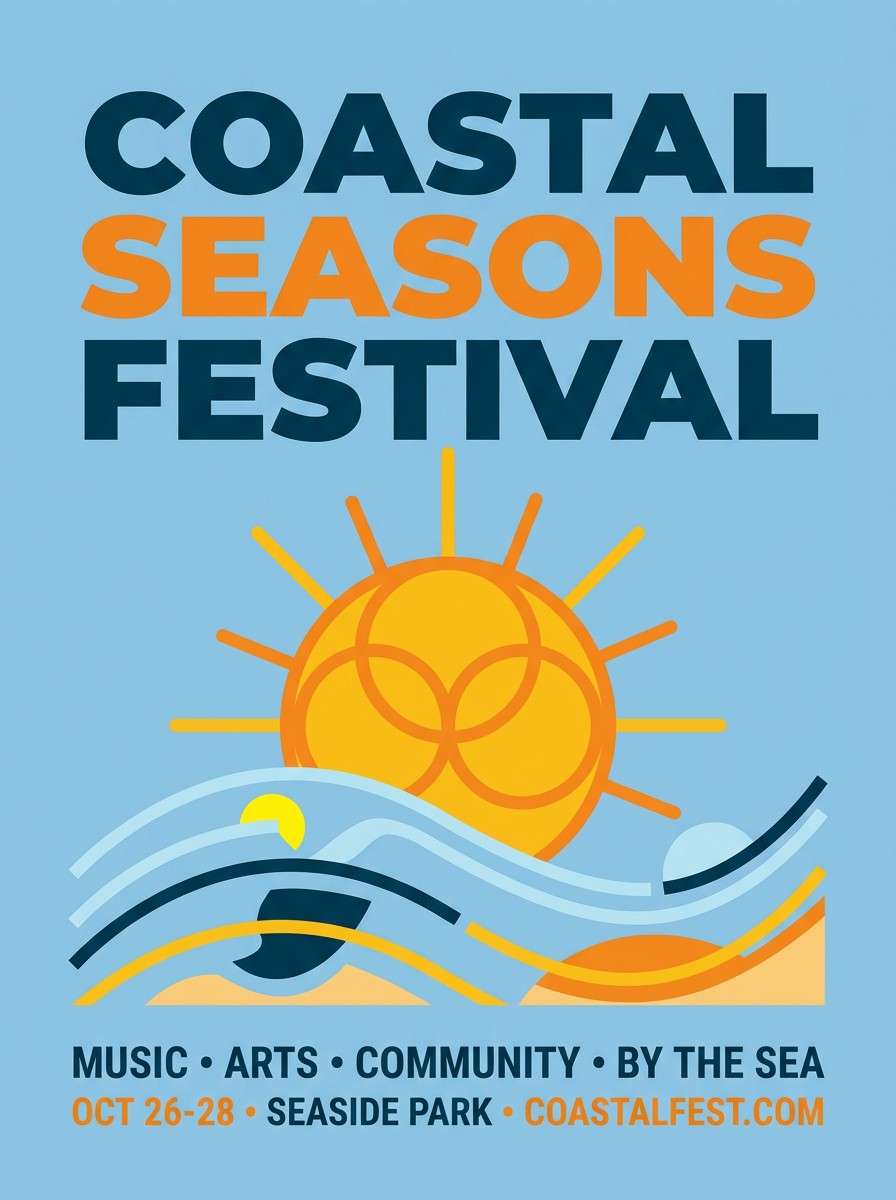
20) Sunset Pier
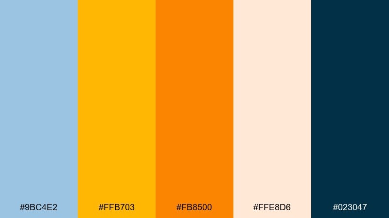
HEX: #9BC4E2 #FFB703 #FB8500 #FFE8D6 #023047
Mood: warm, upbeat, coastal
Best for: festival flyers and seasonal campaigns
Warm and upbeat, it looks like late sun hitting a pier while the sky stays cool and pastel. For columbia blue color combinations with real contrast, let the deep teal handle text and outlines, then bring in the golden tones for headlines and highlights. The soft peach keeps transitions smooth between cool and warm. Tip: use the brightest orange for one focal element so it reads energetic, not chaotic.
Image example of sunset pier generated using media.io
What Colors Go Well with Columbia Blue?
Columbia blue works beautifully with deep anchors like navy, ink, charcoal, and dark teal—these add clarity for typography and give the palette structure. If you want a cleaner, “tech” direction, pair it with cool grays and bright white.
For warmer, lifestyle-friendly combinations, mix columbia blue with sand, linen cream, taupe, terracotta, rust, and peach. These warm neutrals keep the blue from feeling too cold, especially in interiors, packaging, and print.
To add a modern accent, choose one energetic pop—coral, golden yellow, or aqua—and keep it limited to CTAs, badges, or key data highlights.
How to Use a Columbia Blue Color Palette in Real Designs
In branding, use columbia blue as a “surface color” (backgrounds, panels, hero sections) and reserve a darker tone for logos and headings. This keeps the look airy while maintaining legibility and hierarchy.
In UI, treat columbia blue as an interaction cue: links, focus states, toggles, and selected tabs. Balance it with neutral cards (off-white/light gray) and a near-black text color to hit accessibility contrast.
In decor or event design, keep large areas light (white/cream) and let columbia blue appear in repeatable elements—ribbons, place cards, ceramics, cushions—so the scheme feels intentional and cohesive.
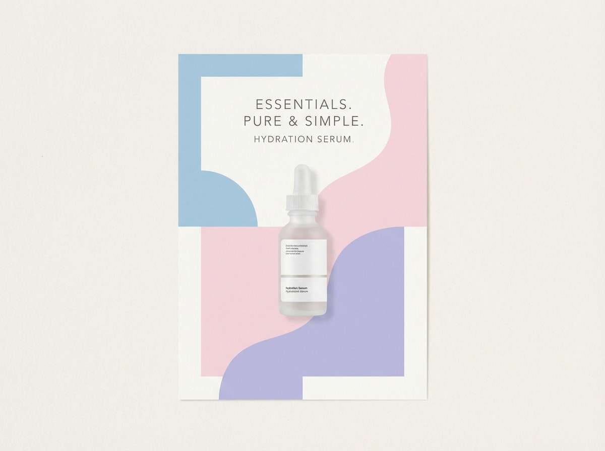
Create Columbia Blue Palette Visuals with AI
If you already have HEX codes, you can turn them into consistent mockups, posters, UI screens, or moodboards by generating images from text prompts. This is especially useful for testing different “vibes” (minimal, coastal, editorial, romantic) without building full comps first.
Start with one clear subject (e.g., “dashboard UI,” “invitation suite,” “packaging label”), then list your dominant colors and accents. Keep prompts specific and avoid adding extra saturated colors unless you want a louder result.
Use Media.io to generate fast, on-brand visuals you can refine into final assets.
Columbia Blue Color Palette FAQs
-
What is the HEX code for columbia blue?
A common HEX value for columbia blue is #9BC4E2, a soft, airy pastel blue often used in modern UI and coastal-inspired designs. -
Is columbia blue warm or cool?
Columbia blue is generally a cool color, but it feels approachable because it’s light and slightly softened, especially when paired with cream or sand neutrals. -
What neutral colors pair best with columbia blue?
Top neutrals include white, off-white/ivory, light gray, and deeper anchors like charcoal or ink navy for readable text and structure. -
What accent colors look good with columbia blue?
Warm accents like terracotta, rust, peach, and golden yellow add energy, while aqua or sea-glass green keeps the look fresh and coastal. -
Can I use columbia blue in a professional brand palette?
Yes—pair it with a strong dark anchor (navy/charcoal) and keep layouts mostly neutral. Use columbia blue for highlights, backgrounds, and secondary brand moments to stay polished. -
How do I keep columbia blue readable in UI design?
Use a dark text color (near-black or deep navy) on columbia blue backgrounds, and reserve the blue for interactive states. Always check contrast, especially on mid-blue surfaces. -
What kind of projects suit a columbia blue color scheme?
It’s a great fit for SaaS and dashboards, wellness apps, wedding stationery, lifestyle blogs, and coastal or minimal product branding.


