

Orchid sits in that sweet spot between purple and pink, so it can feel romantic, modern, calm, or electric—depending on what you pair it with.
Below are 20 orchid color palette ideas with HEX codes, plus practical ways to use them for branding, UI, events, packaging, and home accents.
In this article
- Why Orchid Palettes Work So Well
-
- velvet bloom
- lilac latte
- neon orchid pop
- orchid sage balance
- dusty mauve minimal
- twilight petals
- berry orchid jam
- orchid copper glow
- garden party
- midnight orchid
- porcelain orchid
- orchid seafoam
- retro orchid
- orchid storm
- sunset orchid
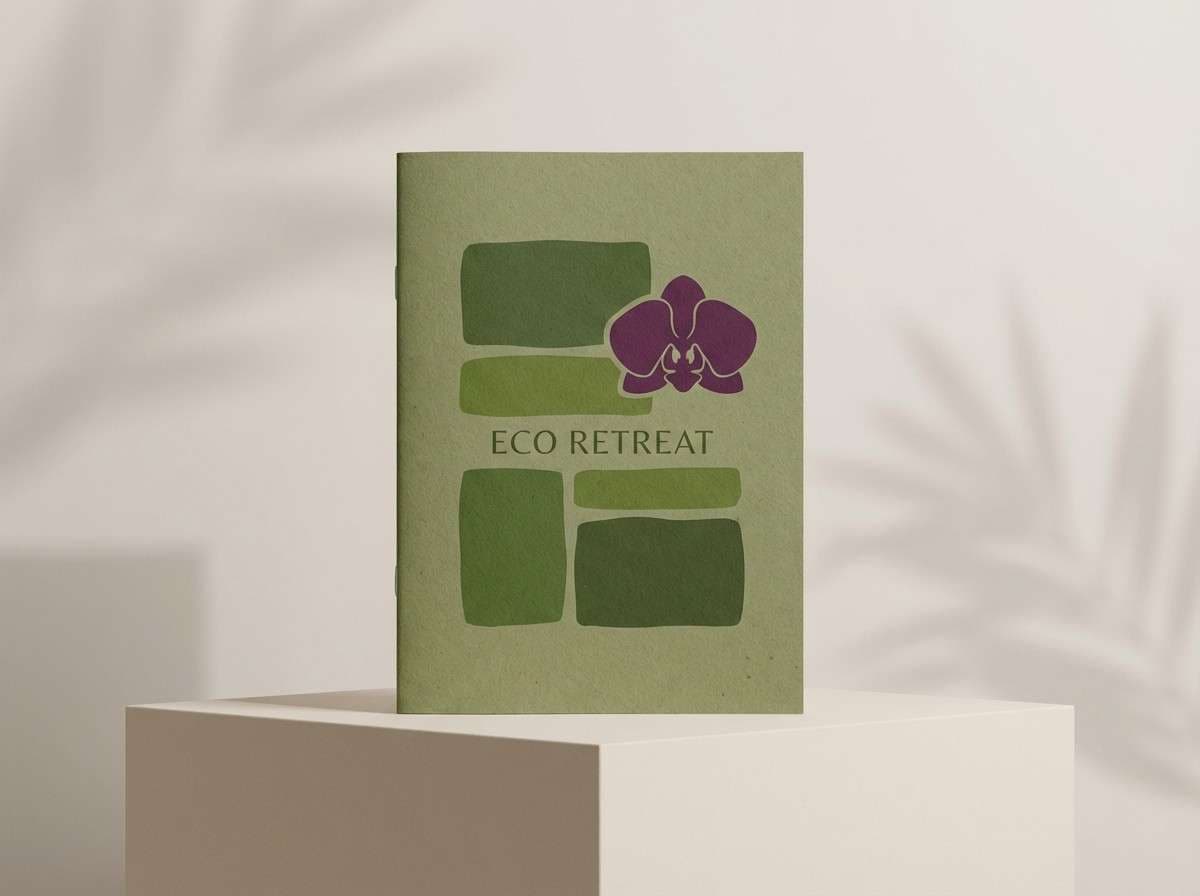
- orchid moss cabin
- orchid denim
- rose orchid wedding
- tech orchid gradient
- orchid clay
- What Colors Go Well with Orchid?
- How to Use a Orchid Color Palette in Real Designs
- Create Orchid Palette Visuals with AI
Why Orchid Palettes Work So Well
Orchid is naturally expressive: it can read luxurious and premium in deeper plum mixes, or playful and youthful when pushed toward neon pink. That range makes it easy to adapt across industries without losing its signature personality.
It also pairs beautifully with both warm and cool neutrals. Creams, taupes, and cocoa browns soften orchid for approachable branding, while slate, charcoal, and near-black make it pop with high-contrast clarity.
In UI and print, orchid performs well as an accent because it’s vivid without being harsh. Used sparingly for buttons, badges, or highlights, it adds energy while keeping layouts readable.
20+ Orchid Color Palette Ideas (with HEX Codes)
1) Velvet Bloom
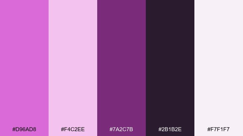
HEX: #d96ad8 #f4c2ee #7a2c7b #2b1b2e #f7f1f7
Mood: luxurious, romantic, nighttime florals
Best for: beauty branding and premium product ads
Luxurious and velvety like petals under soft spotlight, these tones feel romantic without turning sugary. Use this orchid color palette for cosmetics, fragrance, and boutique branding where you want high contrast and a polished finish. Pair the deep plum with the near-white tint for legible type, and let the bright orchid sit in logos or hero elements. Tip: reserve the darkest shade for headlines and outlines to keep the pinks looking vivid.
Image example of velvet bloom generated using media.io
Media.io is an online AI studio for creating and editing video, image, and audio in your browser.

2) Lilac Latte
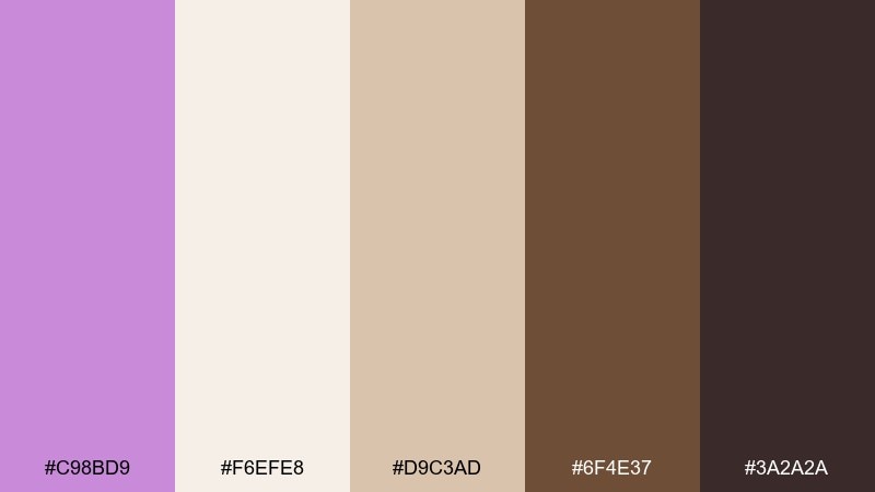
HEX: #c98bd9 #f6efe8 #d9c3ad #6f4e37 #3a2a2a
Mood: cozy, grounded, café chic
Best for: coffee shop menus and lifestyle branding
Cozy and mellow like a warm drink by the window, this mix balances floral sweetness with roasted depth. The creamy off-white keeps layouts airy while the brown anchors navigation, labels, and pricing. Pair it with kraft paper textures or matte finishes for an approachable premium feel. Tip: use the lilac as a highlight color for calls to action so it pops against the latte neutrals.
Image example of lilac latte generated using media.io
3) Neon Orchid Pop
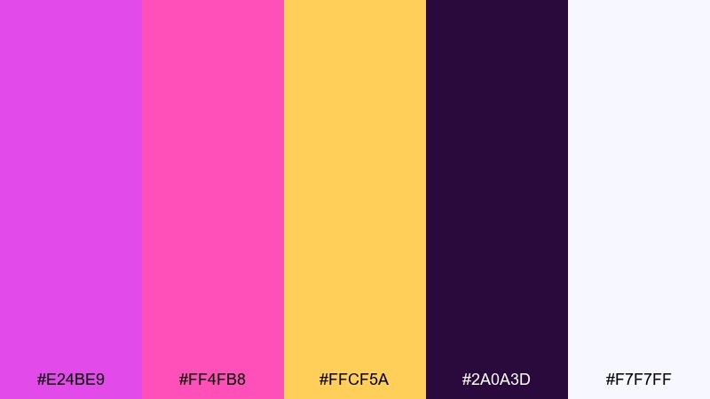
HEX: #e24be9 #ff4fb8 #ffcf5a #2a0a3d #f7f7ff
Mood: electric, playful, nightlife energy
Best for: event posters and social media promos
Electric and punchy like club lights on glossy petals, this palette is built for attention. These orchid color combinations work best on big type, bold shapes, and short headlines where contrast does the heavy lifting. Pair the hot pink and orchid with the dark violet background, then use the yellow as a sparing accent for dates or ticket buttons. Tip: keep gradients subtle and let flat blocks of color carry the impact.
Image example of neon orchid pop generated using media.io

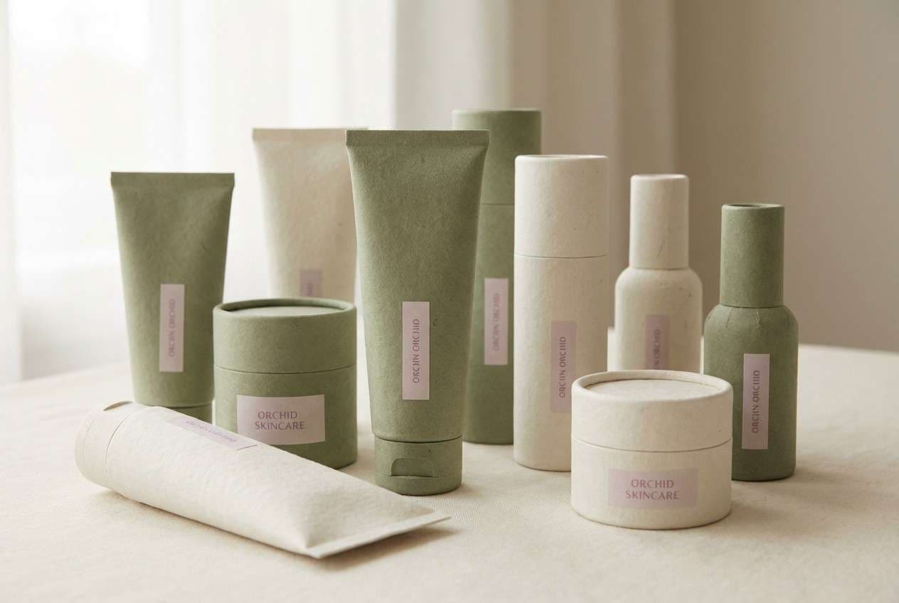
4) Orchid Sage Balance
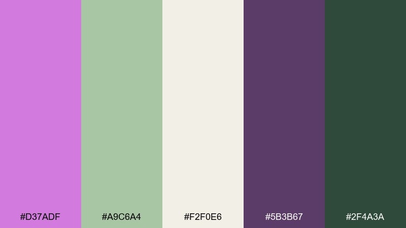
HEX: #d37adf #a9c6a4 #f2f0e6 #5b3b67 #2f4a3a
Mood: fresh, calm, botanical modern
Best for: wellness brands and sustainable packaging
Fresh and calming like a greenhouse morning, the orchid and sage pairing feels modern and grounded. This orchid color scheme shines on natural products, spa services, and eco-forward packaging where you want softness without losing credibility. Pair the cream base with sage blocks for structure, then use orchid as a friendly highlight for badges and key claims. Tip: print on uncoated stock to keep the greens looking organic.
Image example of orchid sage balance generated using media.io
5) Dusty Mauve Minimal
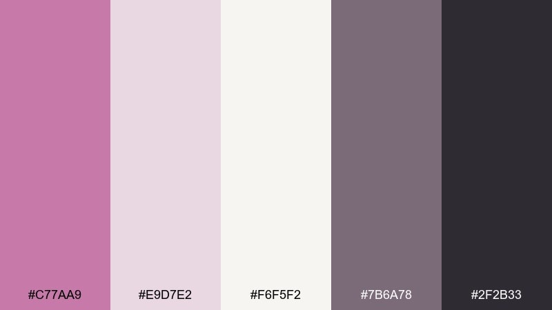
HEX: #c77aa9 #e9d7e2 #f6f5f2 #7b6a78 #2f2b33
Mood: soft, editorial, understated
Best for: portfolio websites and minimalist brands
Soft and powdery like dried petals pressed in a notebook, these tones feel quiet and intentional. The warm off-white supports generous whitespace while the charcoal keeps typography crisp. Pair the mauve with delicate line art, serif headlines, or monochrome photography for an elevated look. Tip: use the muted purple as a hover state to add polish without visual noise.
Image example of dusty mauve minimal generated using media.io
6) Twilight Petals
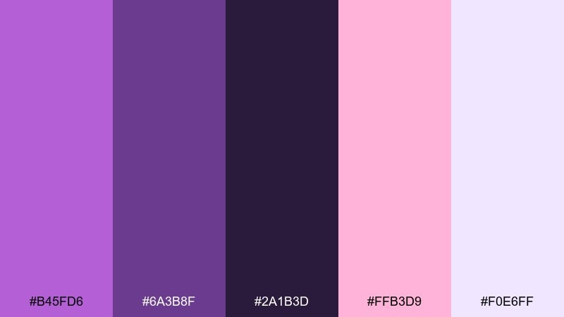
HEX: #b45fd6 #6a3b8f #2a1b3d #ffb3d9 #f0e6ff
Mood: dreamy, dusk, romantic drama
Best for: book covers and cinematic posters
Dreamy and dramatic like petals at dusk, this mix leans into deep purples with a gentle blush glow. It works well for fantasy fiction, romance launches, and visual campaigns that need mood and mystery. Pair the pale lavender with bold imagery, then let the dark violet frame titles and credits. Tip: keep the blush as a small highlight so it reads like a spotlight, not a wash.
Image example of twilight petals generated using media.io

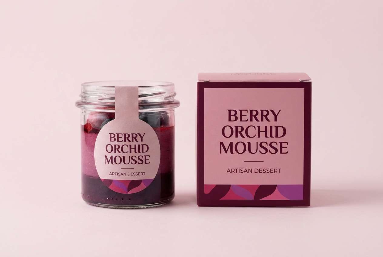
7) Berry Orchid Jam
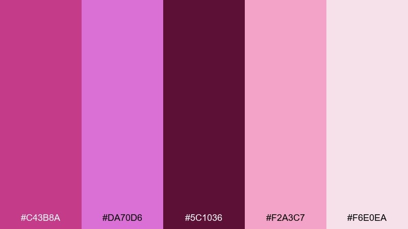
HEX: #c43b8a #da70d6 #5c1036 #f2a3c7 #f6e0ea
Mood: sweet, bold, berry-rich
Best for: dessert packaging and café promotions
Sweet and bold like berry jam on warm toast, these pinks feel deliciously saturated. Use the deeper wine tone for labels and nutrition details, with the orchid and berry shades driving the hero color. Pair it with simple sans-serif typography to keep the look contemporary and clean. Tip: add a small area of the palest tint to prevent the design from feeling too heavy.
Image example of berry orchid jam generated using media.io
8) Orchid Copper Glow
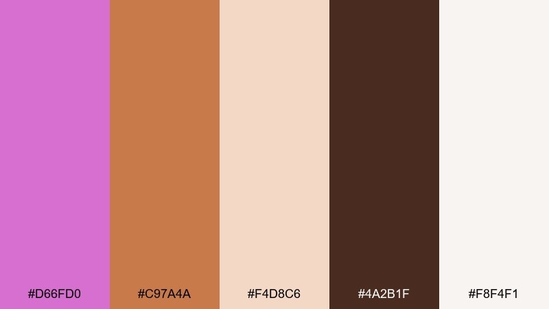
HEX: #d66fd0 #c97a4a #f4d8c6 #4a2b1f #f8f4f1
Mood: warm, metallic, boutique luxe
Best for: jewelry ads and seasonal campaigns
Warm and glowing like candlelight on satin, the orchid and copper pairing reads instantly upscale. The copper and deep brown create a rich base, while the blush and near-white keep it light enough for elegant layouts. Pair it with metallic foil accents, embossed details, or serif typography to amplify the premium feel. Tip: use copper for small highlights only, so it feels like jewelry rather than background paint.
Image example of orchid copper glow generated using media.io
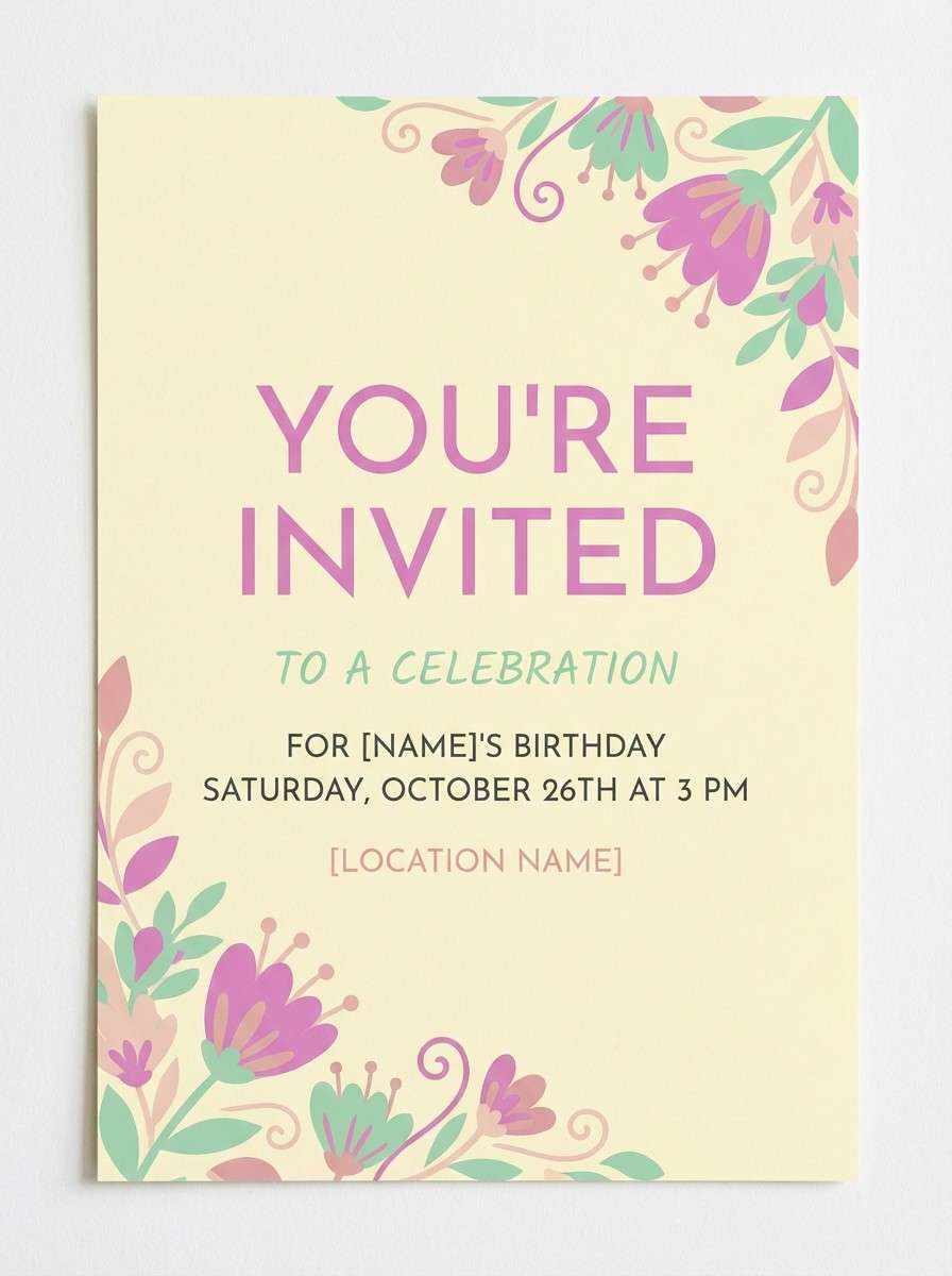
9) Garden Party
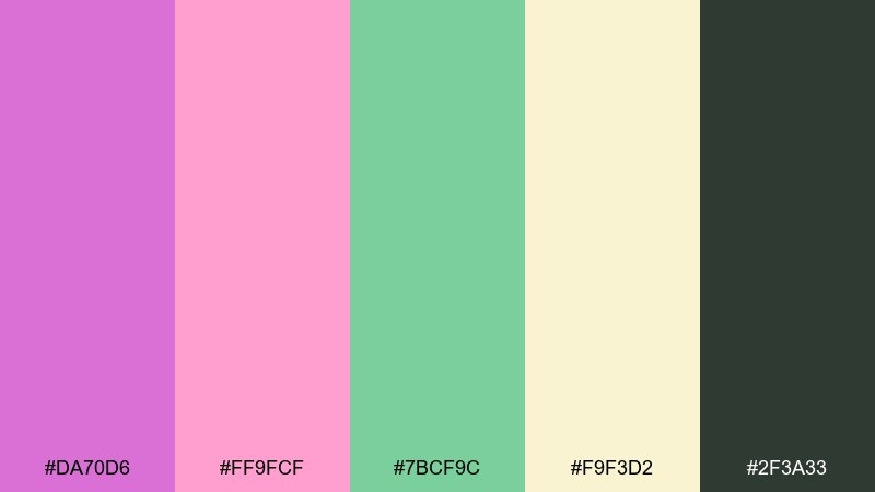
HEX: #da70d6 #ff9fcf #7bcf9c #f9f3d2 #2f3a33
Mood: bright, festive, springtime
Best for: party invites and floral event branding
Bright and breezy like a spring table set outdoors, these tones feel cheerful and social. The green adds freshness that keeps the pinks from leaning too sweet, while the soft yellow warms everything up. Pair it with hand-drawn florals or playful icons for invitations and event signage. Tip: use the dark green for text to keep readability strong on light backgrounds.
Image example of garden party generated using media.io
10) Midnight Orchid
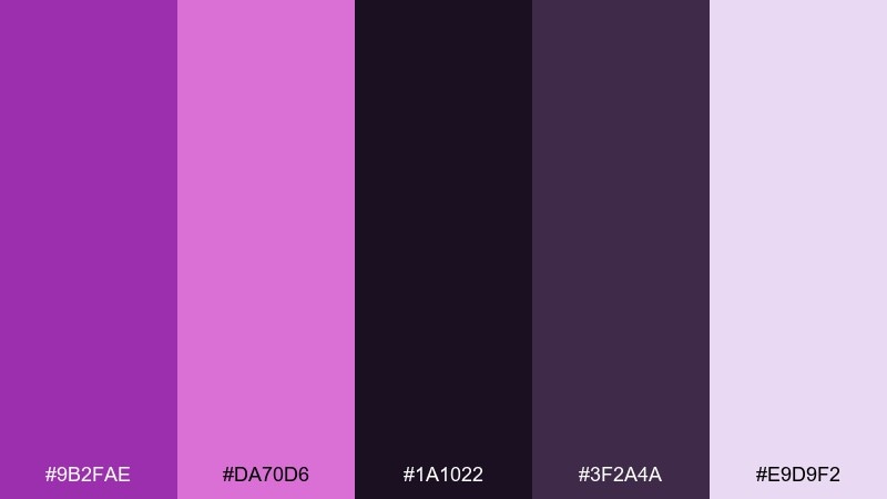
HEX: #9b2fae #da70d6 #1a1022 #3f2a4a #e9d9f2
Mood: mysterious, modern, high-contrast
Best for: music branding and dark mode UI
Mysterious and sleek like neon against midnight air, these purples are made for high contrast. Use this orchid color palette in dark mode interfaces, album art, or nightlife branding where the glow effect matters. Pair the near-black base with light lavender for body text, then reserve the bright orchid for key actions and badges. Tip: keep saturation strongest on small elements so the UI stays comfortable to read.
Image example of midnight orchid generated using media.io
11) Porcelain Orchid
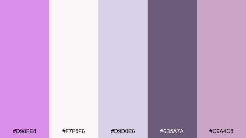
HEX: #d98fe8 #f7f5f6 #d9d0e6 #6b5a7a #c9a4c8
Mood: airy, refined, clean elegance
Best for: wedding stationery and minimalist interiors
Airy and refined like painted porcelain, these tints feel elegant and calm. The gentle lavender-grays are perfect for stationery, soft editorial layouts, and serene home accents. Pair it with textured paper, thin linework, and warm lighting to keep the look inviting. Tip: print the mid-purple sparingly for monograms and small separators so the design stays light.
Image example of porcelain orchid generated using media.io
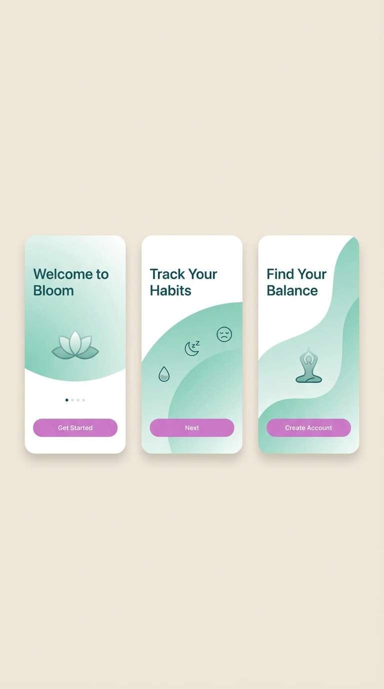
12) Orchid Seafoam
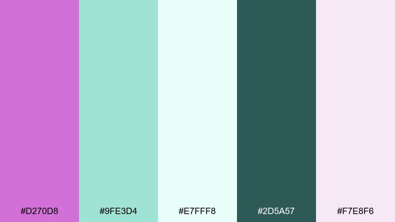
HEX: #d270d8 #9fe3d4 #e7fff8 #2d5a57 #f7e8f6
Mood: fresh, spa-like, coastal calm
Best for: wellness apps and skincare landing pages
Fresh and spa-like like seafoam beside pastel blooms, this mix is light yet confident. The seafoam and deep teal create a clean structure, while the orchid adds a friendly, human warmth. Pair it with rounded UI components and plenty of white space for a soothing flow. Tip: use the deep teal for form labels and accessibility contrast, and keep orchid for primary buttons.
Image example of orchid seafoam generated using media.io
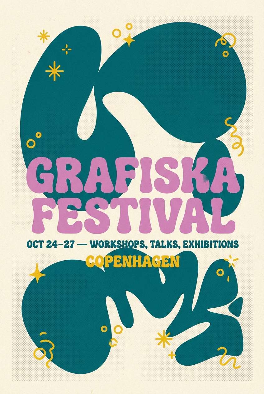
13) Retro Orchid
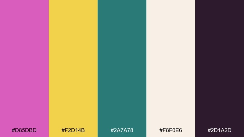
HEX: #d85dbd #f2d14b #2a7a78 #f8f0e6 #2d1a2d
Mood: retro, cheerful, graphic
Best for: festival flyers and vintage-inspired branding
Retro and cheerful like a screen-printed poster, these colors feel bold and graphic. The teal and yellow provide a playful counterpoint that keeps the pink from dominating the layout. Pair it with chunky typography, halftone textures, and simple shapes for a true throwback vibe. Tip: keep the dark plum as a single ink for outlines so everything stays cohesive.
Image example of retro orchid generated using media.io
14) Orchid Storm
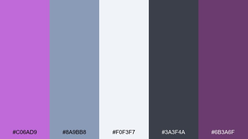
HEX: #c06ad9 #8a9bb8 #f0f3f7 #3a3f4a #6b3a6f
Mood: moody, cool, sophisticated
Best for: corporate decks and modern editorial layouts
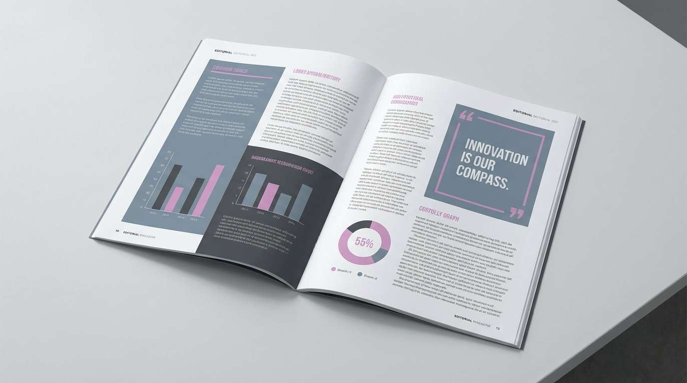
Moody and cool like a stormy sky over purple blooms, this set feels composed and professional. The slate blue and charcoal support charts, tables, and long-form reading without feeling boring. Pair it with clean grids, sharp photography, and restrained accents for a confident presentation style. Tip: use the orchid shade as a single accent color for key metrics and section headers.
Image example of orchid storm generated using media.io
15) Sunset Orchid
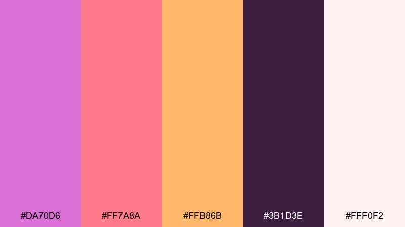
HEX: #da70d6 #ff7a8a #ffb86b #3b1d3e #fff0f2
Mood: warm, optimistic, sunset glow
Best for: travel ads and summer campaigns
Warm and optimistic like a sunset fading into purple haze, these hues feel energetic and friendly. Orchid color combinations like this are ideal for travel promos, seasonal launches, and splashy hero banners. Pair the coral and orchid for gradients, then ground the layout with the deep violet for text and logos. Tip: keep the pale blush as breathing room around headlines so the warm tones stay vibrant.
Image example of sunset orchid generated using media.io

16) Orchid Moss Cabin
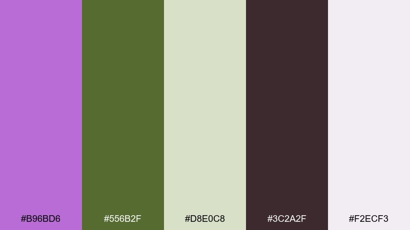
HEX: #b96bd6 #556b2f #d8e0c8 #3c2a2f #f2ecf3
Mood: earthy, rustic, nature-forward
Best for: outdoor brands and eco retreats
Earthy and rustic like wildflowers near a forest cabin, this mix feels grounded and real. The moss greens bring a natural backbone, while the orchid adds a welcoming touch for accents and highlights. Pair it with textured photography, wood tones, and simple icon sets for a cozy outdoor identity. Tip: use the pale green as a section background to keep pages from feeling too dark.
Image example of orchid moss cabin generated using media.io
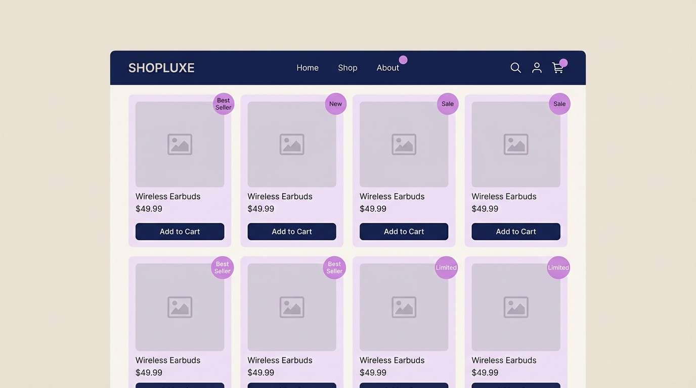
17) Orchid Denim
HEX: #c86ad6 #3a4f8f #1f2a44 #e9e2f2 #8a7aa1
Mood: cool, confident, modern casual
Best for: streetwear lookbooks and ecommerce UI
Cool and confident like denim with a bright floral twist, this palette feels modern and wearable. The deep navy tones provide strong contrast for product listings, while the orchid keeps the brand memorable. Pair it with clean product photography and simple typographic hierarchy for a sharp ecommerce experience. Tip: use the pale lavender as card backgrounds to soften the dark blues.
Image example of orchid denim generated using media.io
18) Rose Orchid Wedding
HEX: #d77ad8 #f7c6d9 #fff6f4 #b48ea2 #4a2a3a
Mood: romantic, soft, timeless
Best for: wedding invites and reception details
Romantic and soft like blush roses with a purple shimmer, these tones feel timeless for celebrations. The creamy white keeps everything bright, while the deeper plum adds elegance for monograms and small headings. Pair it with floral line illustrations and warm metallic accents for a refined finish. Tip: print the darkest shade only for key text to preserve the airy mood.
Image example of rose orchid wedding generated using media.io

19) Tech Orchid Gradient
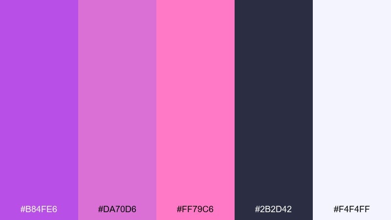
HEX: #b84fe6 #da70d6 #ff79c6 #2b2d42 #f4f4ff
Mood: futuristic, glossy, creative tech
Best for: startup landing pages and app hero sections
Futuristic and glossy like a neon gradient on glass, this set feels made for modern tech. Use it for hero sections, feature callouts, and illustration-based UI where color can do the storytelling. Pair the deep indigo for navigation with a magenta-to-orchid gradient for primary CTAs. Tip: keep body copy in the near-white and limit gradients to one focal area per screen.
Image example of tech orchid gradient generated using media.io

20) Orchid Clay
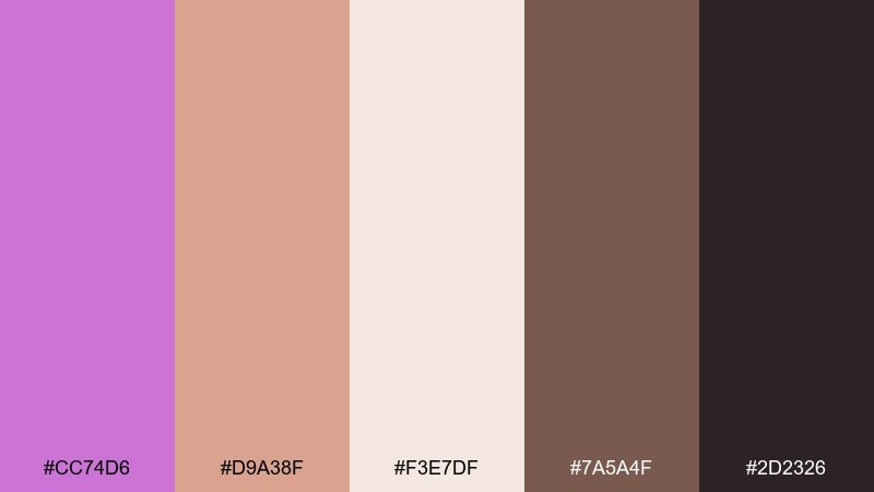
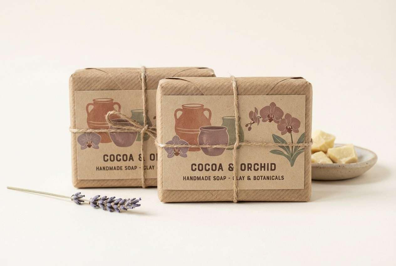
HEX: #cc74d6 #d9a38f #f3e7df #7a5a4f #2d2326
Mood: warm, artisanal, earthy chic
Best for: handmade goods packaging and craft brands
Warm and artisanal like glazed pottery beside fresh blooms, these tones feel handmade yet modern. The clay and cocoa shades create a comforting base, while the orchid keeps the brand from looking too rustic. Pair it with paper textures, stamp-style icons, and simple layouts for a craft-forward identity. Tip: use the light cream as your main background so the earthy tones stay readable and fresh.
Image example of orchid clay generated using media.io
What Colors Go Well with Orchid?
Orchid pairs cleanly with neutrals like warm white, cream, dove gray, and charcoal—these let orchid stay expressive without overwhelming the layout. For a richer, more premium feel, combine orchid with cocoa, espresso, or deep plum.
If you want a fresh, modern contrast, try orchid with sage, mint, or seafoam; the green family keeps orchid from reading too sugary. For high-impact graphics, add small hits of yellow or gold to create bright focal points.
For dark mode or nightlife vibes, build around near-black, deep violet, or indigo, then use orchid as the accent color for buttons, highlights, and glow effects.
How to Use a Orchid Color Palette in Real Designs
In branding, treat orchid as the signature accent: use it in a logo mark, packaging band, or social templates, while keeping most backgrounds neutral. This keeps the brand memorable and makes print production easier.
For UI, reserve orchid for primary actions (buttons, toggles, active states) and pair it with high-contrast text colors for accessibility. If you’re using gradients, keep them limited to hero areas so the interface doesn’t feel noisy.
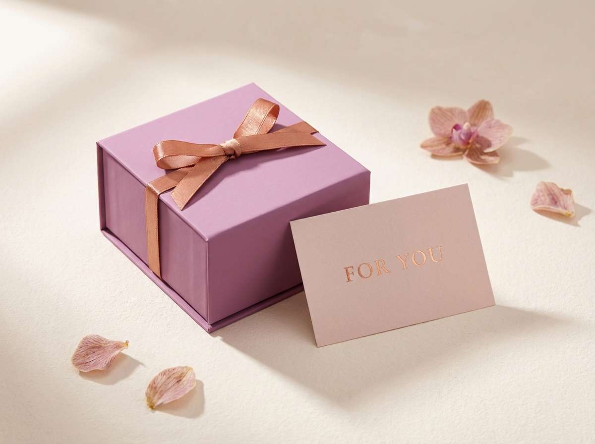
For weddings and events, orchid looks best alongside soft tints (blush, lavender-gray, warm white) with one deeper shade for typography. That creates a romantic mood while keeping signage and stationery readable.
Create Orchid Palette Visuals with AI
If you want to see an orchid color scheme in context—packaging, posters, UI screens, or invitations—generate fast mockups using AI prompts. It’s a quick way to test whether a palette feels “luxury,” “fresh,” or “nightlife” before you design.
Start with one palette above, then describe the product, setting, lighting, and style (minimal, retro, editorial, etc.). Keep one main accent (orchid) and let the neutrals handle most of the surface area.
When your draft images look right, reuse the same prompt structure to build a consistent set for ads, landing pages, and social posts.
Orchid Color Palette FAQs
-
What is the HEX code for orchid?
A commonly used web “orchid” is #DA70D6. Many orchid palettes also use nearby tints and deeper plums depending on the mood. -
Is orchid more purple or pink?
Orchid sits between purple and pink. In design, it can lean pink with warm neutrals (cream, blush) or lean purple with indigo/charcoal backgrounds. -
What colors go best with orchid for a modern look?
Try orchid with charcoal, cool gray, slate blue, or deep indigo for a modern, editorial feel. Add a near-white background for clean spacing and readability. -
What’s a good contrasting color for orchid?
Deep greens (teal, forest, moss) and near-black violets create strong contrast. For high-energy contrast, use a small yellow/gold accent with restraint. -
How do I use orchid in a brand palette without it feeling too sweet?
Anchor it with darker tones (plum, espresso, charcoal) and keep orchid as an accent rather than a full background. Matte textures and minimal typography also help. -
Does orchid work for dark mode UI?
Yes—orchid accents pop against near-black or deep violet surfaces. Use orchid for primary actions and pair with light lavender/near-white text for comfortable contrast. -
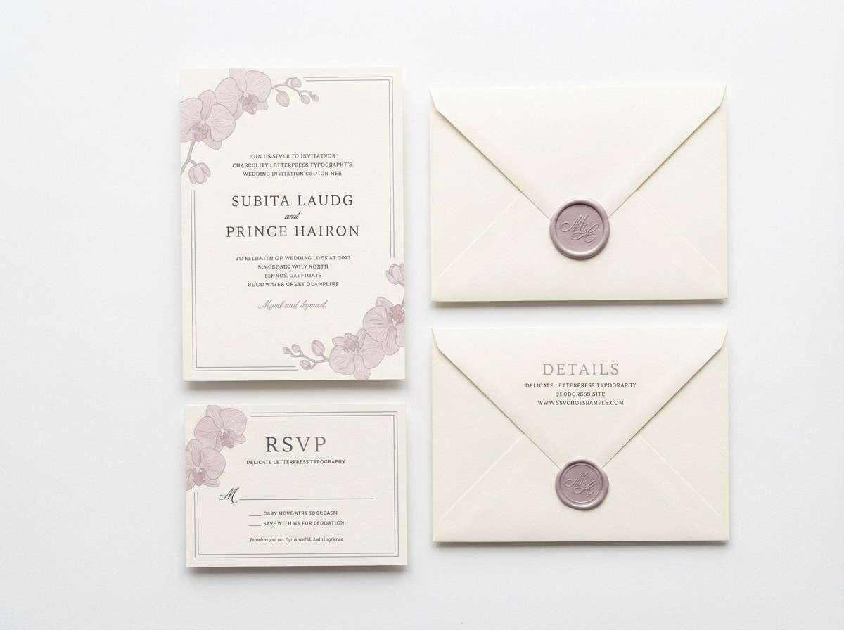
Which orchid palette is best for weddings?
Soft mixes like Porcelain Orchid or Rose Orchid Wedding work well for stationery and signage because they stay light, romantic, and readable.


