

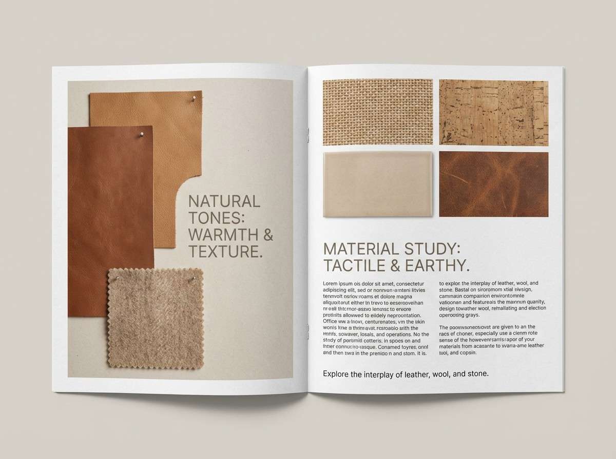
Coffee brown (#6f4e37) is a warm, grounded neutral that instantly adds comfort and credibility. It reads natural (wood, leather, cocoa) while still feeling premium when paired with clean light tones.
Below are curated coffee brown color palette ideas for branding, packaging, UI, and interiors—each with HEX codes and an AI image prompt you can reuse.
In this article
Why Coffee Brown Palettes Work So Well
Coffee brown sits in a sweet spot: darker than tan (so it feels stable and “serious”), but warmer than charcoal (so it stays inviting). That balance makes it a reliable anchor for brand systems and layouts.
It also plays nicely with both warm and cool accents. Creams, blush, caramel, and terracotta amplify coziness, while blue-grays, teals, and sage greens modernize the look for web and product design.
Finally, coffee brown pairs beautifully with texture—paper grain, matte packaging, wood, and leather. Even simple designs feel richer when you let brown carry the “material” impression.
20+ Coffee Brown Color Palette Ideas (with HEX Codes)
1) Espresso Cream
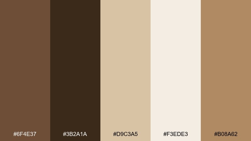
HEX: #6f4e37 #3b2a1a #d9c3a5 #f3ede3 #b08a62
Mood: warm, grounded, premium
Best for: brand identity for coffee shops and craft brands
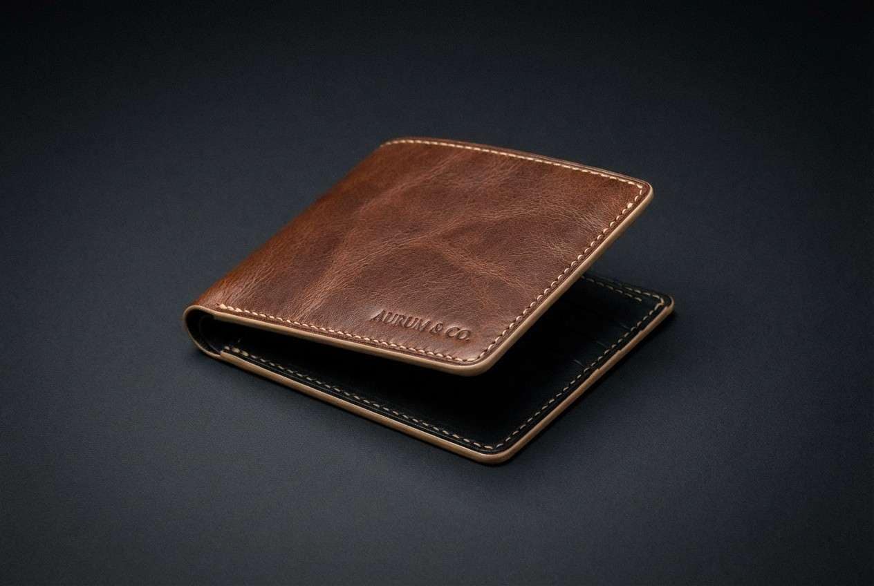
Warm and grounded like fresh espresso swirling into steamed milk, this set feels premium without being flashy. The dark roast base balances beautifully with creamy neutrals for logos, labels, and stationery. For a polished look, keep cream as the background and use the deepest brown for type. Add the caramel tan as a small highlight to make the coffee brown color palette feel more dimensional.
Image example of espresso cream generated using media.io
Media.io is an online AI studio for creating and editing video, image, and audio in your browser.

2) Mocha Mist
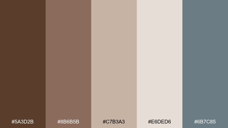
HEX: #5a3d2b #8b6b5b #c7b3a3 #e6ded6 #6b7c85
Mood: soft, calm, airy
Best for: cafe menu design and lifestyle blogs
Soft and calm like a morning fog drifting through a quiet cafe, these tones read gentle and welcoming. The misty blue-gray cools down the mocha browns so layouts feel modern rather than rustic. Use the light taupes for large sections and reserve the deeper brown for headings. A subtle blue-gray rule line or icon set is an easy way to add structure.
Image example of mocha mist generated using media.io
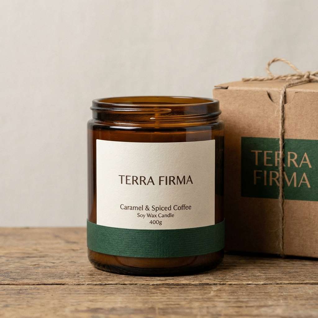
3) Caramel Cedar
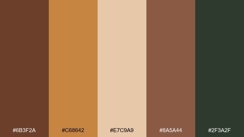
HEX: #6b3f2a #c68642 #e7c9a9 #8a5a44 #2f3a2f
Mood: rustic, aromatic, outdoorsy
Best for: candle labels and rustic packaging
Rustic and aromatic like caramelized sugar on warm cedarwood, this mix feels handcrafted and cozy. The deep green grounds the browns, giving you coffee brown color combinations that work beyond autumn-only vibes. Use caramel as the hero color on a label, then anchor copy in the darker roast tones for readability. A matte paper finish and simple line art will keep it elevated.
Image example of caramel cedar generated using media.io
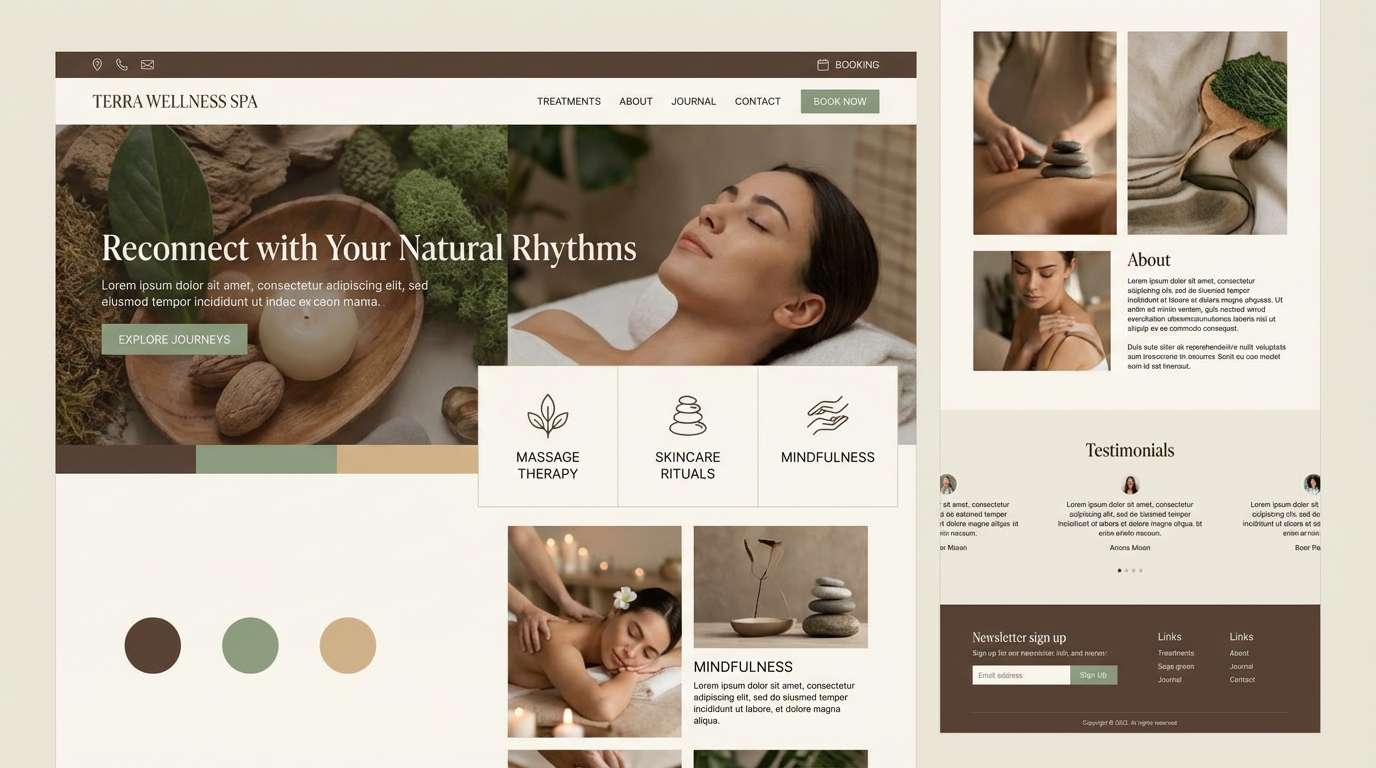
4) Cocoa Sage
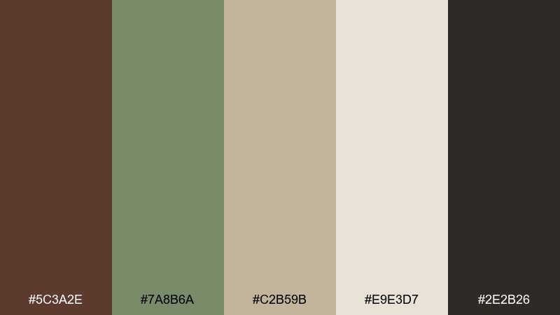
HEX: #5c3a2e #7a8b6a #c2b59b #e9e3d7 #2e2b26
Mood: natural, balanced, restorative
Best for: wellness website UI and spa branding
Natural and restorative like a quiet tea room with sage bundles and cocoa-toned woods, these colors feel balanced. The sage green keeps the palette fresh while the deep near-black adds contrast for buttons and headlines. Use the light sand tone for spacious sections to avoid heaviness. Pair with soft rounded typography for a calm, modern finish.
Image example of cocoa sage generated using media.io
5) Latte Blush
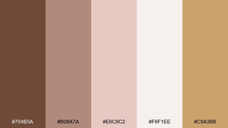
HEX: #704b3a #b08a7a #e6c9c2 #f6f1ee #c9a36b
Mood: romantic, soft, inviting
Best for: wedding invitations and stationery
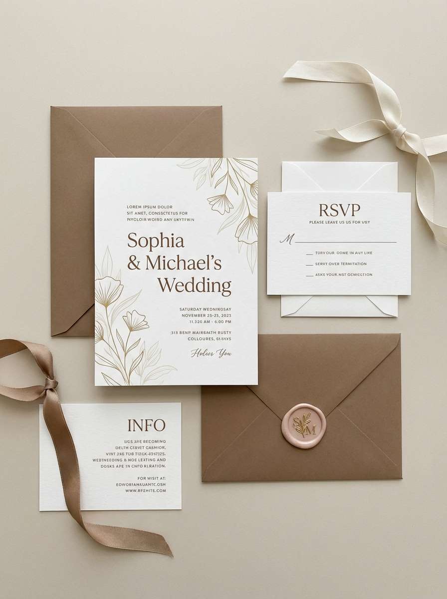
Romantic and airy like rose petals on a latte foam swirl, this palette feels sweet but still grounded. Blush and cream create an elegant base, while the coffee-toned brown keeps typography crisp. Use gold-tan sparingly for monograms, borders, or wax-seal accents. For print, choose an off-white paper to make the blush look richer.
Image example of latte blush generated using media.io
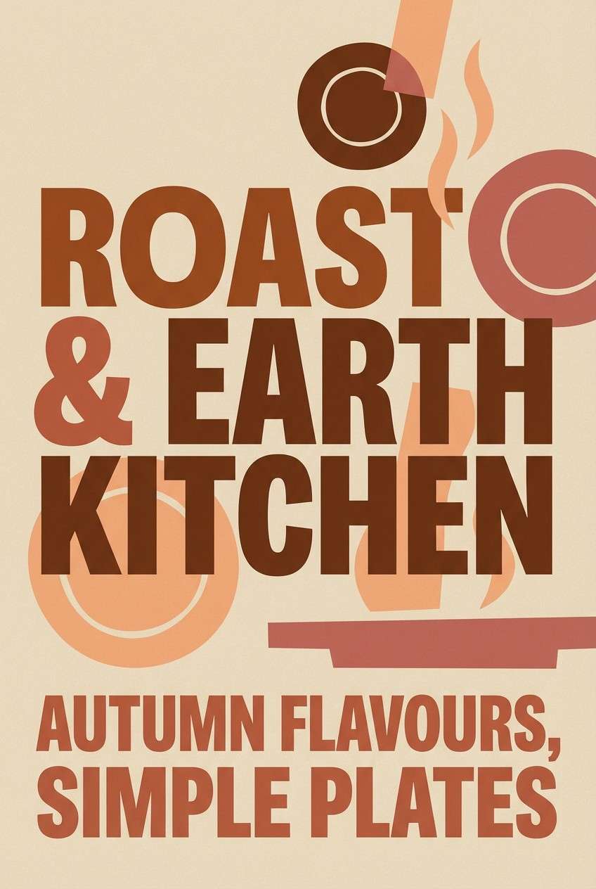
6) Roasted Clay
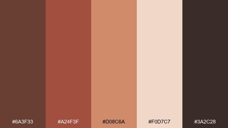
HEX: #6a3f33 #a24f3f #d08c6a #f0d7c7 #3a2c28
Mood: bold, earthy, energetic
Best for: restaurant posters and seasonal promos
Bold and earthy like clay pots near a roaring oven, these tones bring instant appetite appeal. The terracotta-red gives you a strong accent without overpowering the darker browns. Use the pale peach as negative space so text and food imagery can breathe. A good trick is to reserve the darkest shade for pricing and calls to action.
Image example of roasted clay generated using media.io
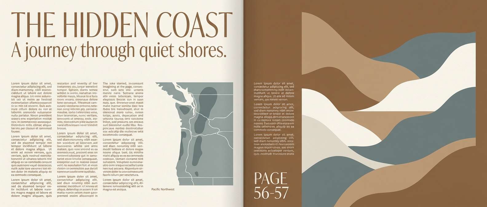
7) Hazelnut Harbor
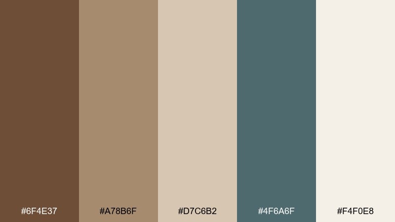
HEX: #6f4e37 #a78b6f #d7c6b2 #4f6a6f #f4f0e8
Mood: coastal, relaxed, refined
Best for: travel editorials and blog headers
Relaxed and refined like driftwood, hazelnut shells, and a cool sea breeze, this mix feels quietly upscale. The muted teal-gray adds a coastal contrast to warm browns without turning the look nautical. Use the light cream for page backgrounds and teal-gray for subheadings or pull quotes. Keep imagery slightly desaturated to match the calm tone.
Image example of hazelnut harbor generated using media.io
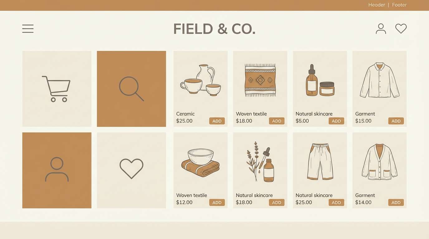
8) Toffee Linen
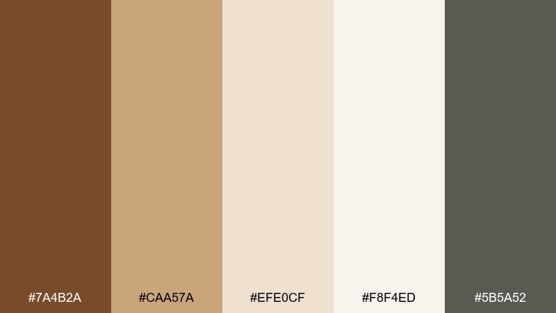
HEX: #7a4b2a #caa57a #efe0cf #f8f4ed #5b5a52
Mood: minimal, clean, comfortable
Best for: home decor moodboards and ecommerce
Clean and comfortable like sunlit linen and warm toffee, this palette is made for minimal styling. The soft neutrals keep product pages bright while the gray-brown adds understated structure. Use toffee as the primary accent for buttons or price tags, and keep body text in the deeper neutral. Pair with natural textures like paper grain or subtle fabric patterns.
Image example of toffee linen generated using media.io
9) Walnut Noir
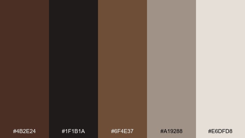
HEX: #4b2e24 #1f1b1a #6f4e37 #a19288 #e6dfd8
Mood: luxury, dramatic, modern
Best for: luxury product ads and fashion branding
Dramatic and modern like walnut wood against black lacquer, this set reads instantly luxurious. The near-black gives strong contrast while the warm neutrals prevent the design from feeling cold. Use the light beige as a spotlight color for key copy blocks or badges. For maximum impact, keep backgrounds dark and let texture do the talking.
Image example of walnut noir generated using media.io
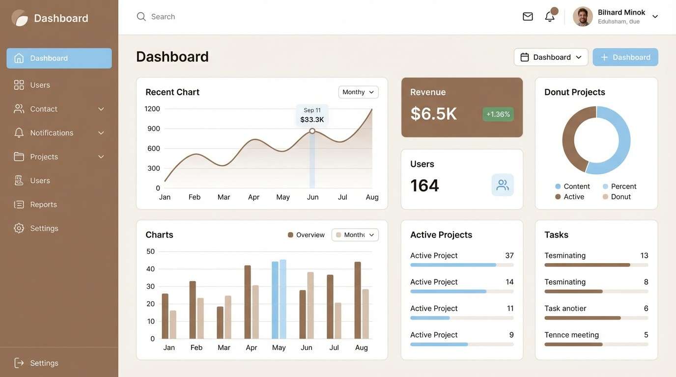
10) Cappuccino Sky
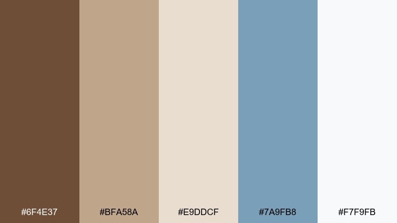
HEX: #6f4e37 #bfa58a #e9ddcf #7a9fb8 #f7f9fb
Mood: fresh, friendly, contemporary
Best for: dashboard UI and SaaS landing pages
Fresh and contemporary like a cappuccino enjoyed by a bright window under a pale sky, these colors feel approachable. The airy blue adds clarity and helps charts, tabs, and states stand apart from warm neutrals. Use the off-white for main surfaces, then bring in brown for navigation and emphasis. Keep the blue for interactive elements so users learn it as the action color.
Image example of cappuccino sky generated using media.io
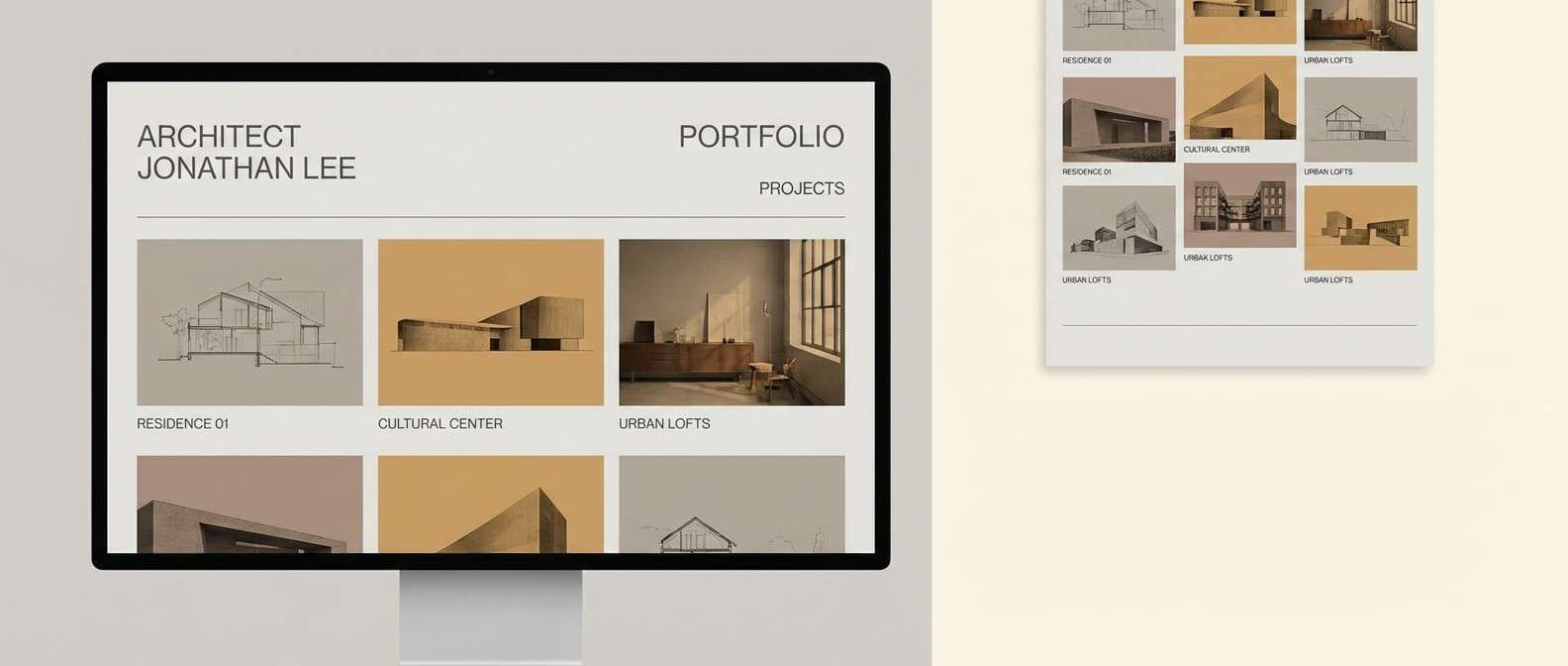
11) Burnt Sugar Stone
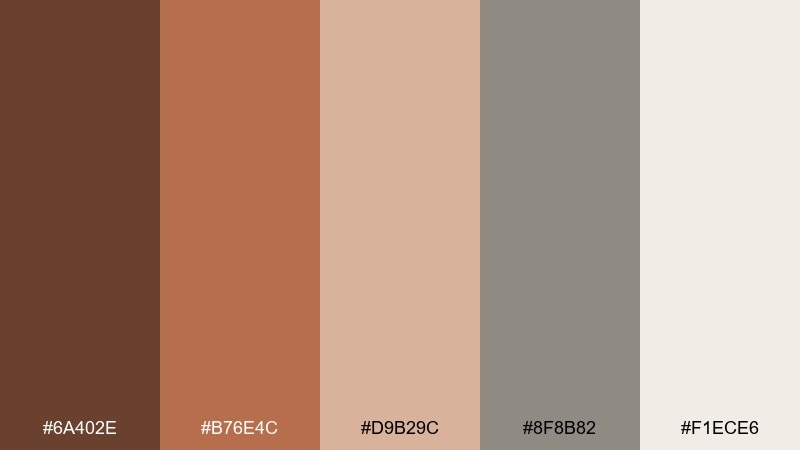
HEX: #6a402e #b76e4c #d9b29c #8f8b82 #f1ece6
Mood: architectural, mature, grounded
Best for: architecture portfolios and studio sites
Architectural and grounded like burnt sugar glazing over warm stone, this palette feels mature and confident. The stone gray keeps layouts structured while the browns add warmth to imagery and typography. Use the light neutral as a canvas and let the brick-like accent highlight project titles. Works especially well with black-and-white photography and fine-line diagrams.
Image example of burnt sugar stone generated using media.io
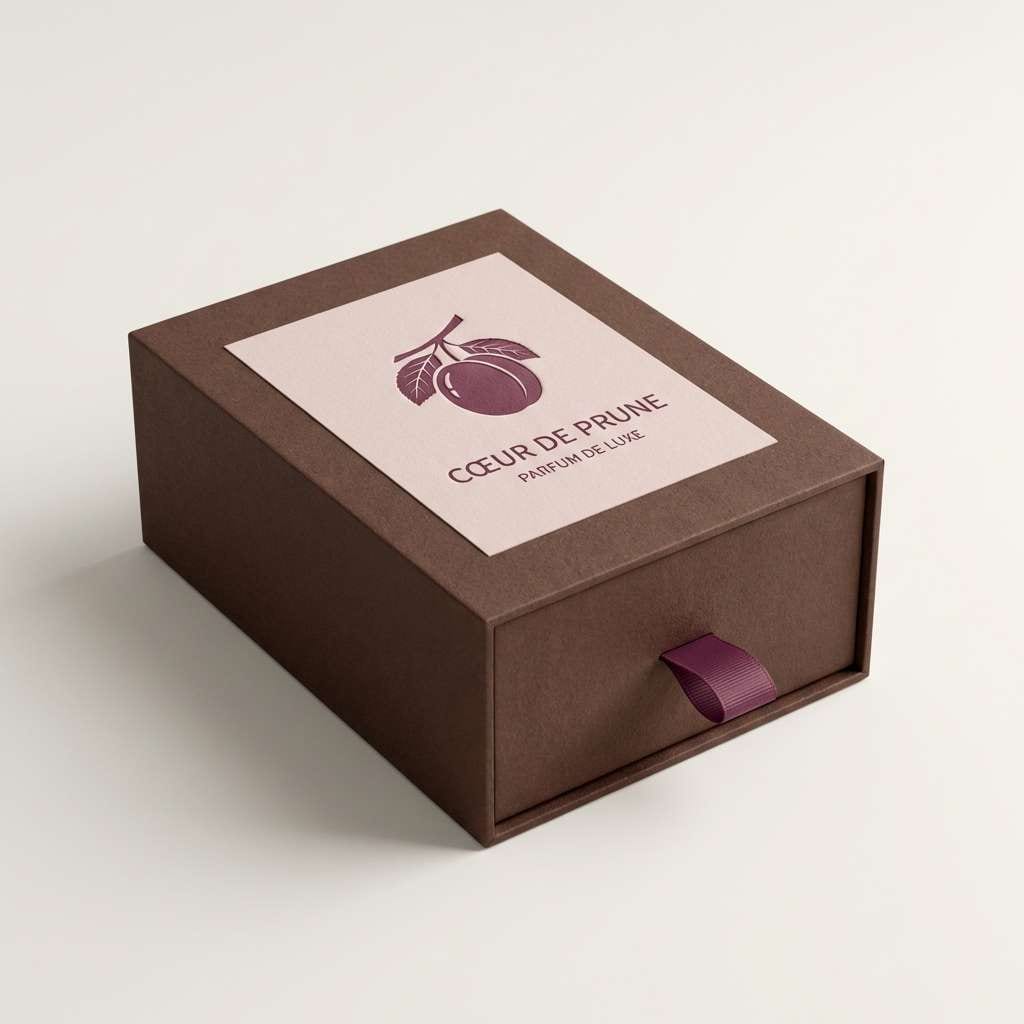
12) Chocolate Orchid
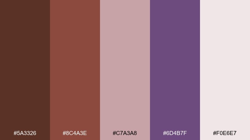
HEX: #5a3326 #8c4a3e #c7a3a8 #6d4b7f #f0e6e7
Mood: sensual, boutique, artistic
Best for: beauty packaging and boutique promos
Sensual and artistic like dark chocolate paired with orchid petals, this mix feels boutique and expressive. The plum-violet adds a luxe twist while blush keeps it soft and giftable. These coffee brown color combination ideas shine on cosmetic boxes, fragrance labels, and social promos. Tip: use plum for accents only, and let the browns handle readability and structure.
Image example of chocolate orchid generated using media.io
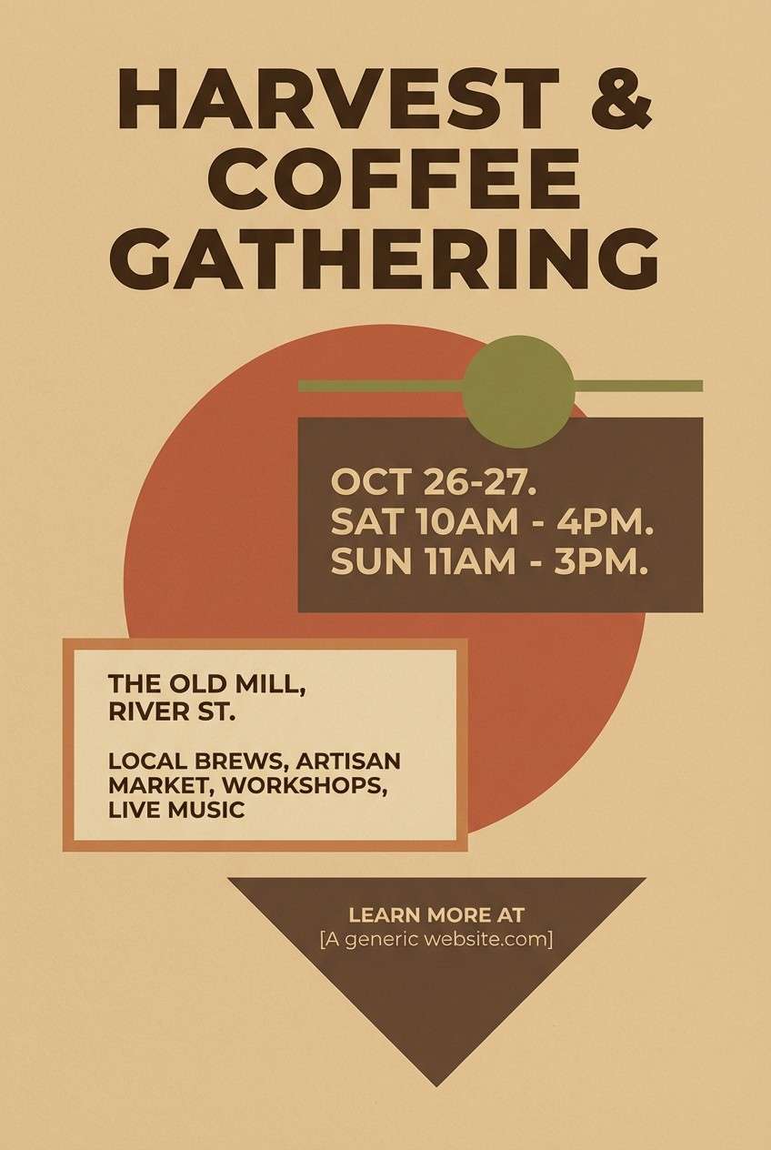
13) Café Terracotta
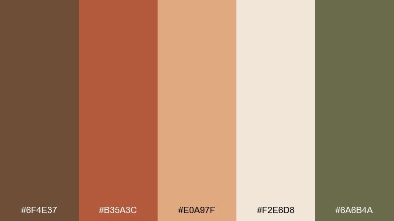
HEX: #6f4e37 #b35a3c #e0a97f #f2e6d8 #6a6b4a
Mood: sunbaked, lively, artisanal
Best for: autumn event flyers and market posters
Sunbaked and lively like terracotta tiles outside a corner cafe, this set feels artisanal and social. The warm orange-brown accent adds energy without tipping into loud neon. Use the pale beige for background space, then layer terracotta for headers and badges. Olive-khaki works nicely for secondary details like dates, rules, and icons.
Image example of café terracotta generated using media.io
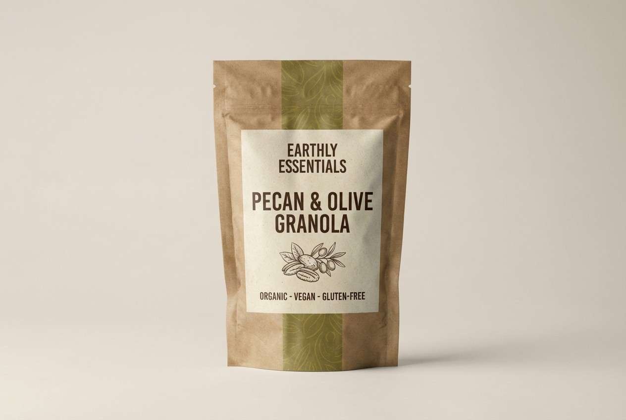
14) Pecan Olive
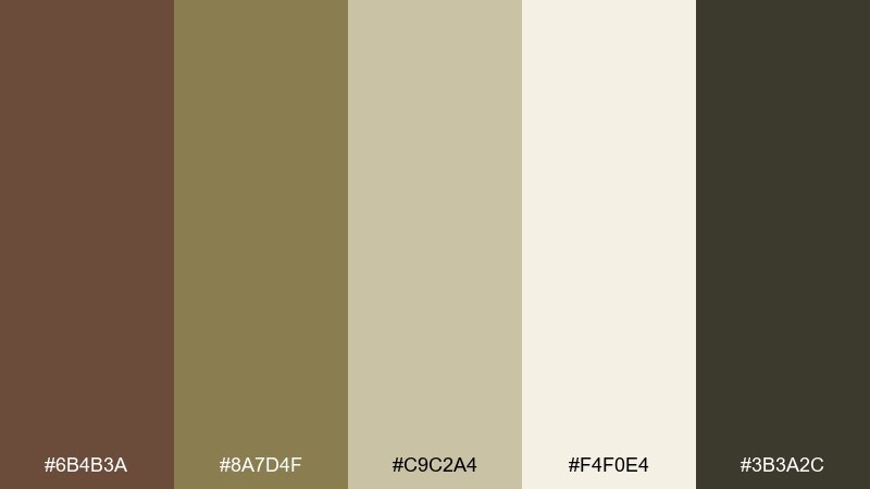
HEX: #6b4b3a #8a7d4f #c9c2a4 #f4f0e4 #3b3a2c
Mood: organic, earthy, trustworthy
Best for: organic food labels and eco packaging
Organic and trustworthy like pecans, dried herbs, and recycled paper, these tones feel honest. Olive and sand keep the brown grounded in nature, making it perfect for ethical brands. Use the light cream for the label field and the deep neutral for ingredient text. A small olive seal or stamp detail can add authenticity without clutter.
Image example of pecan olive generated using media.io
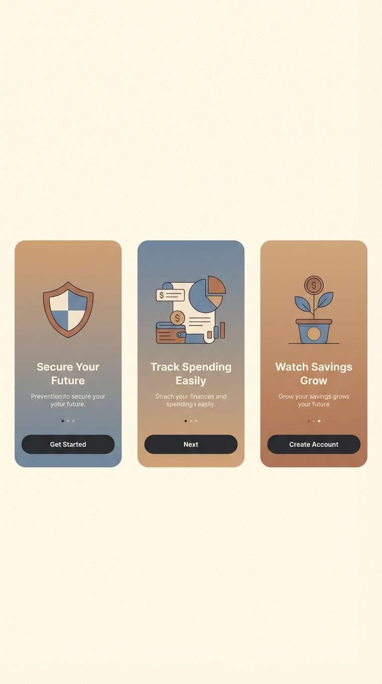
15) Brown Butter Bluegray
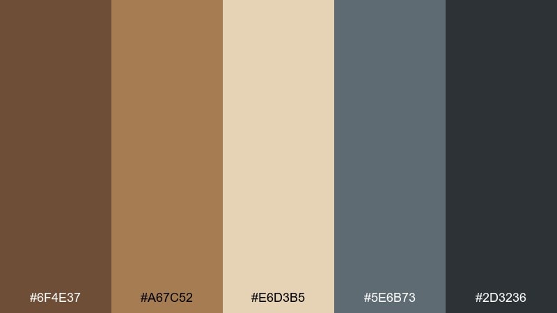
HEX: #6f4e37 #a67c52 #e6d3b5 #5e6b73 #2d3236
Mood: modern, confident, balanced
Best for: app onboarding screens and fintech UI
Modern and confident like browned butter on a cool stone plate, this mix balances warmth with restraint. The blue-gray brings a tech-forward edge, turning the coffee brown color palette into something sleek for product design. Use cream for surfaces, blue-gray for navigation, and reserve the darkest shade for primary CTAs. Tip: keep icons monochrome so the accent colors stay intentional.
Image example of brown butter bluegray generated using media.io
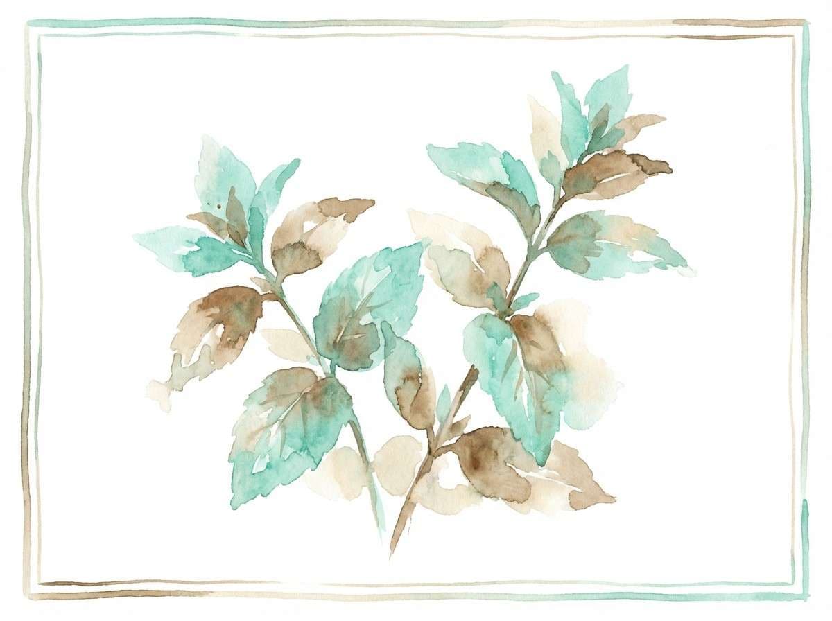
16) Macchiato Mint
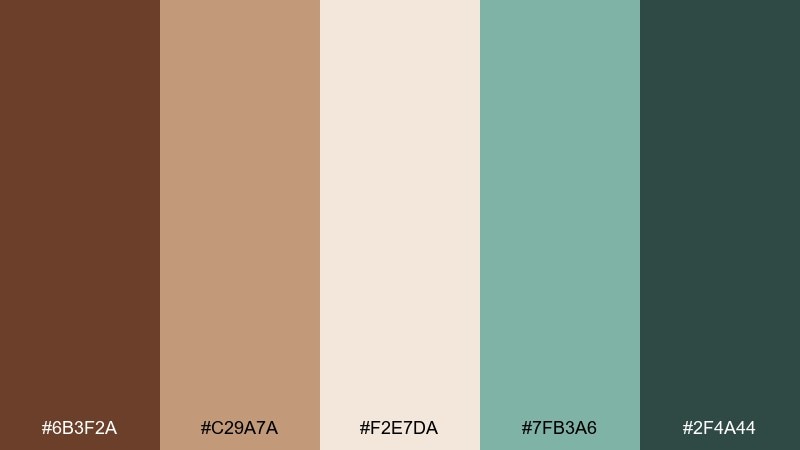
HEX: #6b3f2a #c29a7a #f2e7da #7fb3a6 #2f4a44
Mood: fresh, playful, uplifting
Best for: spring stationery and botanical art
Fresh and uplifting like mint leaves beside a macchiato, these colors feel light and cheerful. The teal-mint brings a botanical twist that pairs well with airy neutrals and warm browns. Use mint for illustration fills and keep the deeper green for outlines or headings. A textured paper background helps the palette feel handcrafted.
Image example of macchiato mint generated using media.io
17) Umber Sunrise
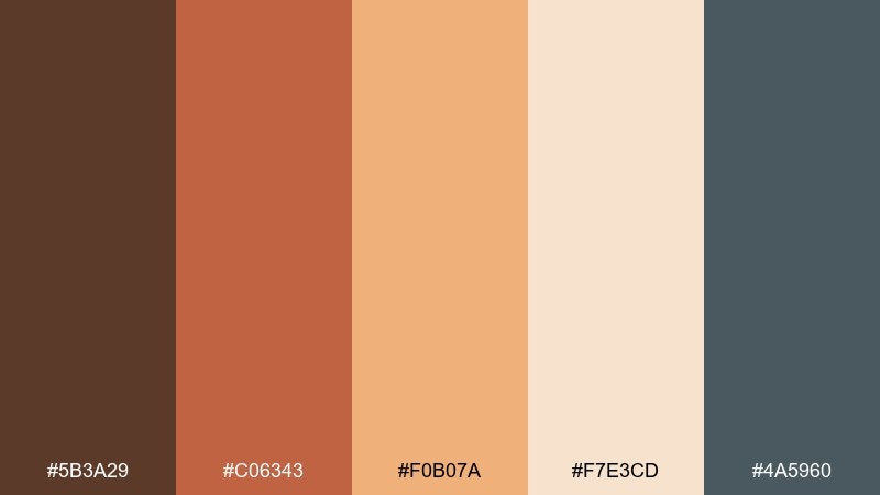
HEX: #5b3a29 #c06343 #f0b07a #f7e3cd #4a5960
Mood: optimistic, warm, social
Best for: bakery social posts and promos
Optimistic like sunrise light hitting warm umber walls, this palette is made for feel-good promos. The peach and apricot shades add sweetness that complements baked goods and friendly typography. Use the slate tone for overlays and captions to maintain contrast. Keep gradients subtle so the warm colors stay appetizing.
Image example of umber sunrise generated using media.io

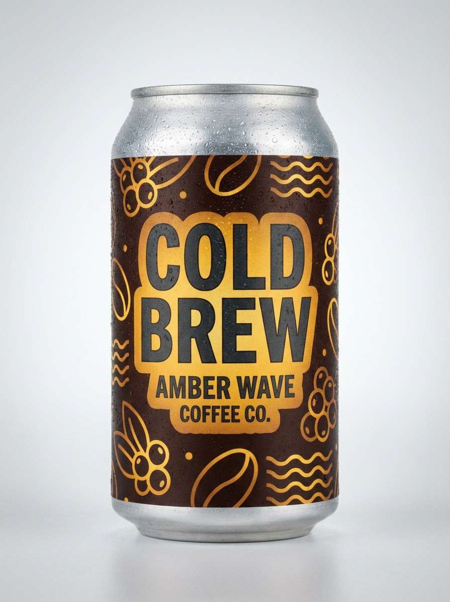
18) Amber Pop
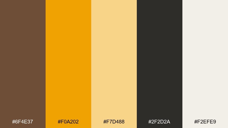
HEX: #6f4e37 #f0a202 #f7d488 #2f2d2a #f2efe9
Mood: bold, punchy, modern
Best for: cold brew can packaging and ads
Bold and punchy like amber syrup catching the light, this set is built for attention. The bright golden accent creates coffee brown color combinations that feel modern, not muted. Use charcoal for type and outlines, then let amber lead on badges, flavor icons, or limited-edition callouts. Keep the background light to make the contrast snap in feeds and on shelves.
Image example of amber pop generated using media.io
19) Vintage Leather
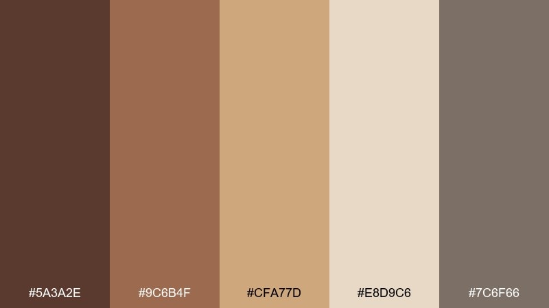
HEX: #5a3a2e #9c6b4f #cfa77d #e8d9c6 #7c6f66
Mood: nostalgic, tactile, classic
Best for: interior brochures and craft catalogs
Nostalgic and tactile like worn leather and antique paper, this palette feels classic and human. The mid browns create a comforting base, while the soft beige keeps spreads readable. Use the warm tan for headings or section tabs to guide scanning. A subtle grain texture will amplify the vintage vibe without looking dated.
Image example of vintage leather generated using media.io
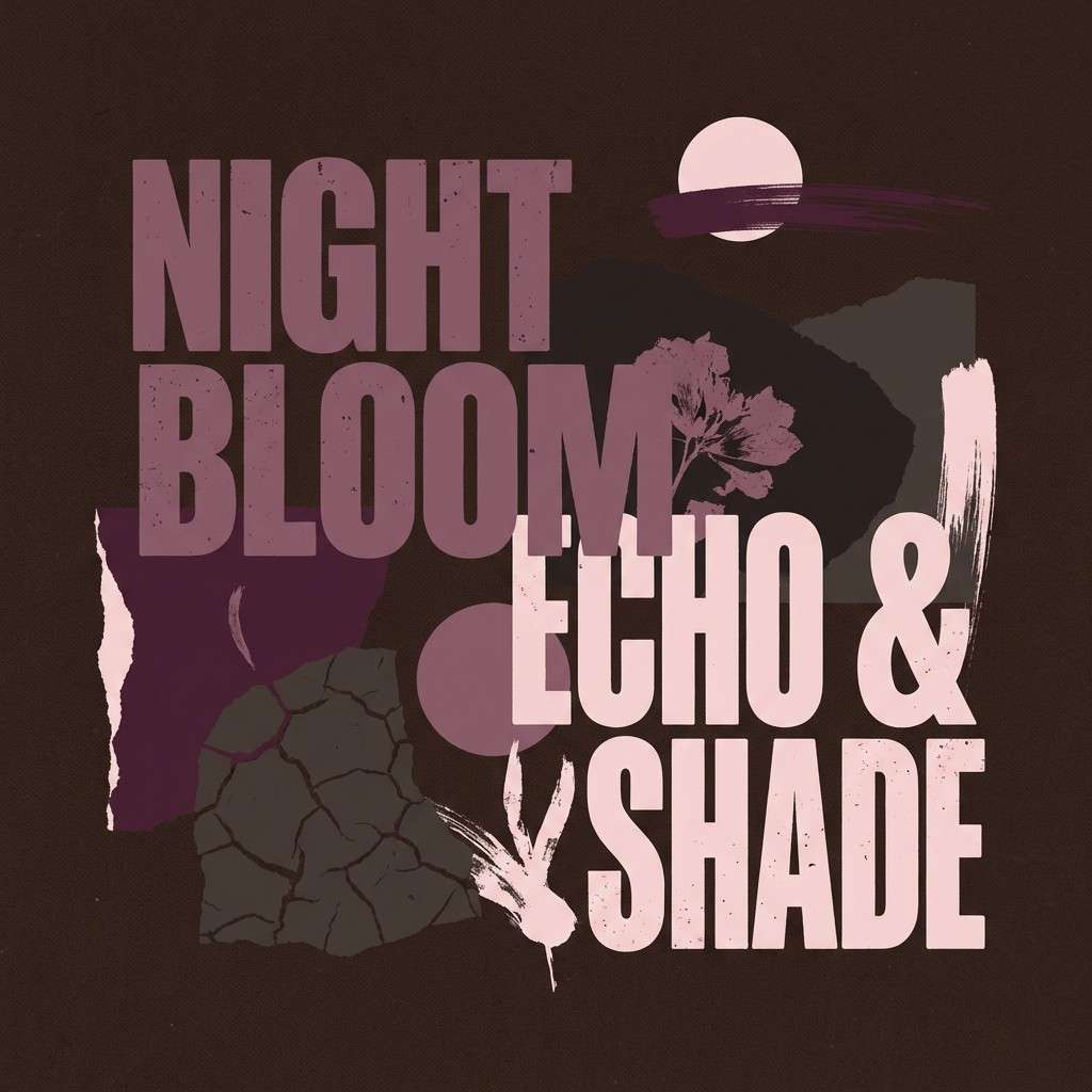
20) Dark Roast Plum
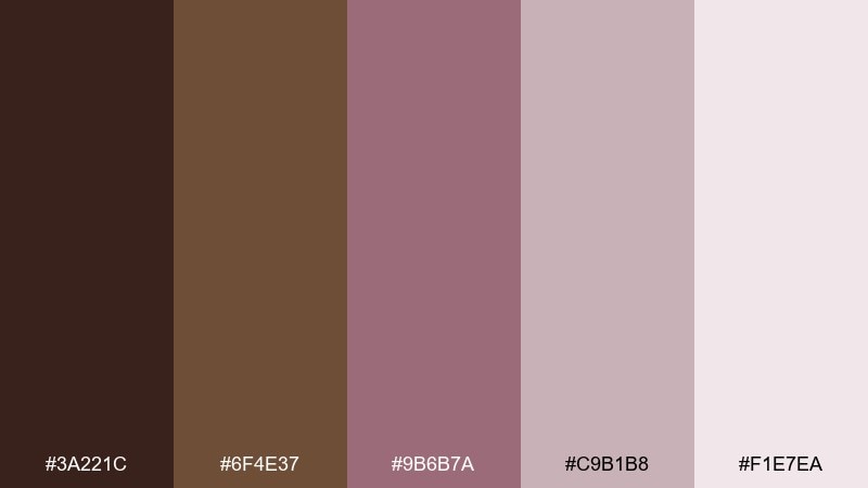
HEX: #3a221c #6f4e37 #9b6b7a #c9b1b8 #f1e7ea
Mood: moody, romantic, editorial
Best for: album covers and moody posters
Moody and romantic like dark roast coffee with a hint of plum, these shades feel editorial and expressive. The dusty pinks soften the deep browns, making it work for music artwork, poetry zines, or boutique posters. Use the darkest shade for the main background and keep type in the lightest pink for clarity. A minimal grain overlay can add depth without introducing extra colors.
Image example of dark roast plum generated using media.io
What Colors Go Well with Coffee Brown?
Light neutrals are the easiest match: cream, ivory, sand, and warm gray keep coffee brown from feeling heavy while improving readability. They also make brown look more “premium” by contrast.
For accents, go warm (caramel, amber, terracotta, blush) to lean cozy and artisanal, or go cool (sage, teal-gray, sky blue, blue-gray) to make coffee brown feel modern and UI-friendly.
If you need drama, pair coffee brown with near-black and a pale highlight. The dark-on-dark look works especially well for fashion, luxury goods, and editorial designs.
How to Use a Coffee Brown Color Palette in Real Designs
Start with roles: use a light neutral as the background, coffee brown for headers/navigation, and a darker roast (or charcoal) for body text to maintain contrast. Keep one accent color for CTAs, badges, or icons.
In packaging and print, coffee brown looks best with matte finishes and subtle texture. Pair it with cream fields for legibility, and use caramel/amber sparingly to signal flavor, warmth, or “limited edition.”
For interiors or moodboards, mix coffee brown with natural materials (wood tones, stone grays, linen whites). A single cool accent (sage or blue-gray) prevents the palette from skewing too rustic.
Create Coffee Brown Palette Visuals with AI
If you have a palette but need visuals fast—mockups, posters, label concepts, or UI hero images—AI can help you explore directions without rebuilding assets from scratch.
Reuse the prompts above, then tweak keywords like “minimal,” “premium,” “studio lighting,” or specific items (menu, candle, can) to match your project. Keep your HEX palette nearby so your final design stays consistent.
Generate a few variations, pick the strongest composition, then refine the text and layout in your design tool for a polished final result.
Coffee Brown Color Palette FAQs
-
What is the HEX code for coffee brown?
A common coffee brown HEX is #6f4e37. It’s a warm, medium-dark brown that works well as a base color in brand systems and packaging. -
Does coffee brown work better with warm or cool accents?
Both. Warm accents (caramel, terracotta, amber) feel cozy and artisanal, while cool accents (sage, teal-gray, blue-gray) make coffee brown look more contemporary—especially in UI. -
What background color pairs best with coffee brown text?
Use soft light neutrals like cream, ivory, or warm off-white for the cleanest readability. Avoid pure white if you want a softer, more premium feel. -
How do I keep a coffee brown palette from looking “too rustic”?
Add a cool counterbalance (blue-gray or muted teal), keep typography modern, and use plenty of light negative space. Minimal layouts make brown feel sleek instead of vintage. -
Is coffee brown a good color for logos?
Yes—especially for food, craft, wellness, and premium goods. It communicates warmth and trust, and it reproduces well in print when paired with cream or beige. -
What is a strong CTA color with coffee brown in web design?
Try amber/gold for high visibility, or a soft sky blue for a modern “action color.” Keep CTA usage consistent so users learn what’s clickable. -
Can I generate coffee brown palette mockups with AI?
Yes. Use a text-to-image tool, describe the design context (label, UI, poster), and include lighting/material cues (matte paper, studio shot). Then iterate until the composition fits your brand.
Next: Glaucous Color Palette


