

Orange pastel blue palettes blend sunny warmth with airy calm, making designs feel welcoming without getting loud. The result is a soft contrast that reads clearly across print and screens.
Below are 20 curated palette picks with HEX codes, plus practical ways to apply peach-and-sky pairings in branding, UI, packaging, and invitations.
In this article
- Why Orange Pastel Blue Palettes Work So Well
-
- creamsicle coast
- porcelain sunrise
- soft signal
- apricot lagoon
- sherbet stationery
- calm citrus clinic
- seaside spritz
- sunset playroom
- retro poolside
- coral cloud editorial
- peach ice pop
- misty harbor app
- tangerine linen
- dawn over tiles
- orange blue minimal
- powdered citrus bake
- soft beacon slides
- coastal tech poster
- blossom breeze botanicals
- urban sorbet banner
- What Colors Go Well with Orange Pastel Blue?
- How to Use a Orange Pastel Blue Color Palette in Real Designs
- Create Orange Pastel Blue Palette Visuals with AI
Why Orange Pastel Blue Palettes Work So Well
Pastel orange brings warmth, optimism, and a human touch, while pastel blue signals trust, clarity, and calm. Together, they create a balanced “friendly + reliable” feel that fits everything from lifestyle brands to modern UI.
Because both sides are softened, the contrast feels airy rather than harsh. That makes it easier to layer backgrounds, cards, and highlights without overwhelming the layout or fighting photography.
This pairing also supports strong hierarchy: use deeper blue/ink tones for readable typography, then reserve the orange for key actions or focal badges. The palette stays light, but your message still lands.
20+ Orange Pastel Blue Color Palette Ideas (with HEX Codes)
1) Creamsicle Coast
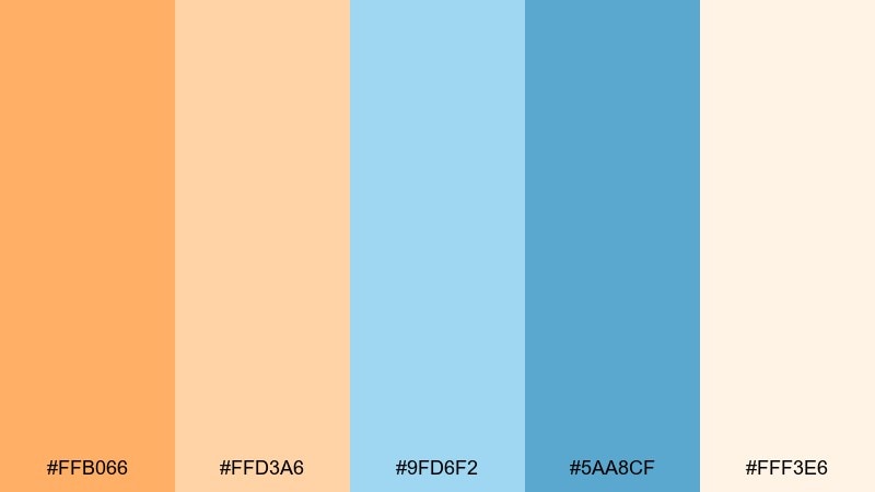
HEX: #ffb066 #ffd3a6 #9fd6f2 #5aa8cf #fff3e6
Mood: breezy, sunny, carefree
Best for: travel poster design
Breezy and sun-warmed, it feels like boardwalk shade meeting bright seaside light. Use the deeper blue as your headline anchor and let the peachy oranges carry icons or stamps. Pair with clean off-white space and a simple sans serif to keep it crisp. Tip: reserve the brightest orange for one focal badge so the layout stays airy.
Image example of creamsicle coast generated using media.io
Media.io is an online AI studio for creating and editing video, image, and audio in your browser.

2) Porcelain Sunrise
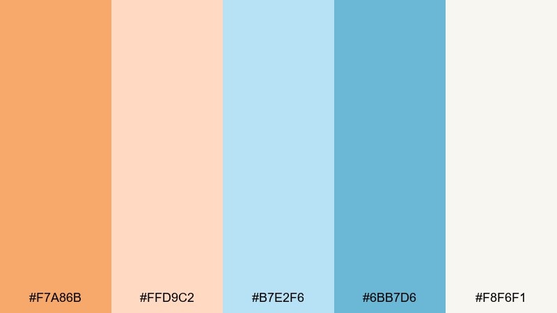
HEX: #f7a86b #ffd9c2 #b7e2f6 #6bb7d6 #f8f6f1
Mood: romantic, light, refined
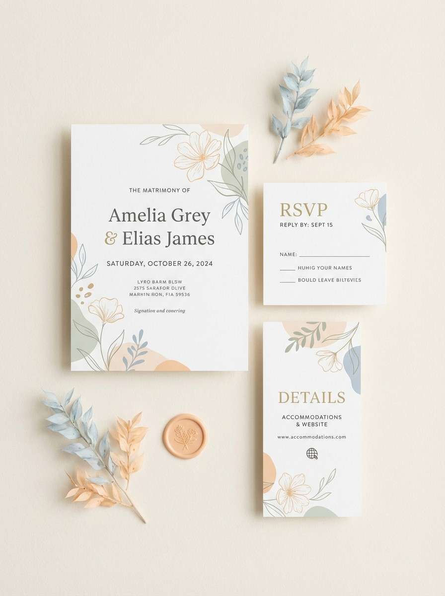
Best for: wedding invitation suite
Romantic and delicate, it evokes sunrise reflecting on glazed porcelain. The pale blue works beautifully as a quiet background wash, while apricot highlights names, monograms, or envelope liners. Pair with warm neutrals and thin line rules to keep everything elegant. Tip: use the saturated teal-blue sparingly for RSVP details so readability stays high.
Image example of porcelain sunrise generated using media.io
3) Soft Signal
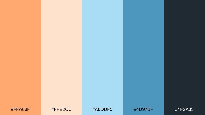
HEX: #ffa86f #ffe2cc #a8ddf5 #4d97bf #1f2a33
Mood: clean, confident, friendly
Best for: saas dashboard ui
Clean and confident, it feels like a friendly status light that never shouts. This orange pastel blue color combination is ideal for dashboards where alerts need warmth without anxiety. Use navy for text, pastel blue for surfaces, and keep orange for primary buttons or critical badges. Tip: ensure orange elements never compete with each other by limiting them to one action per screen.
Image example of soft signal generated using media.io
4) Apricot Lagoon
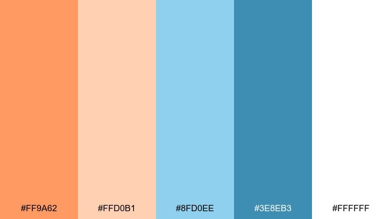
HEX: #ff9a62 #ffd0b1 #8fd0ee #3e8eb3 #ffffff
Mood: fresh, spa-like, uplifting
Best for: skincare product packaging
Fresh and spa-like, it suggests clean water with a warm apricot glow. Let the pale blue drive the label background and use orange for a single brand mark or scent callout. Pair with white space and subtle matte finishes for a premium feel. Tip: keep typography dark and minimal so the pastel tones stay calm, not busy.
Image example of apricot lagoon generated using media.io
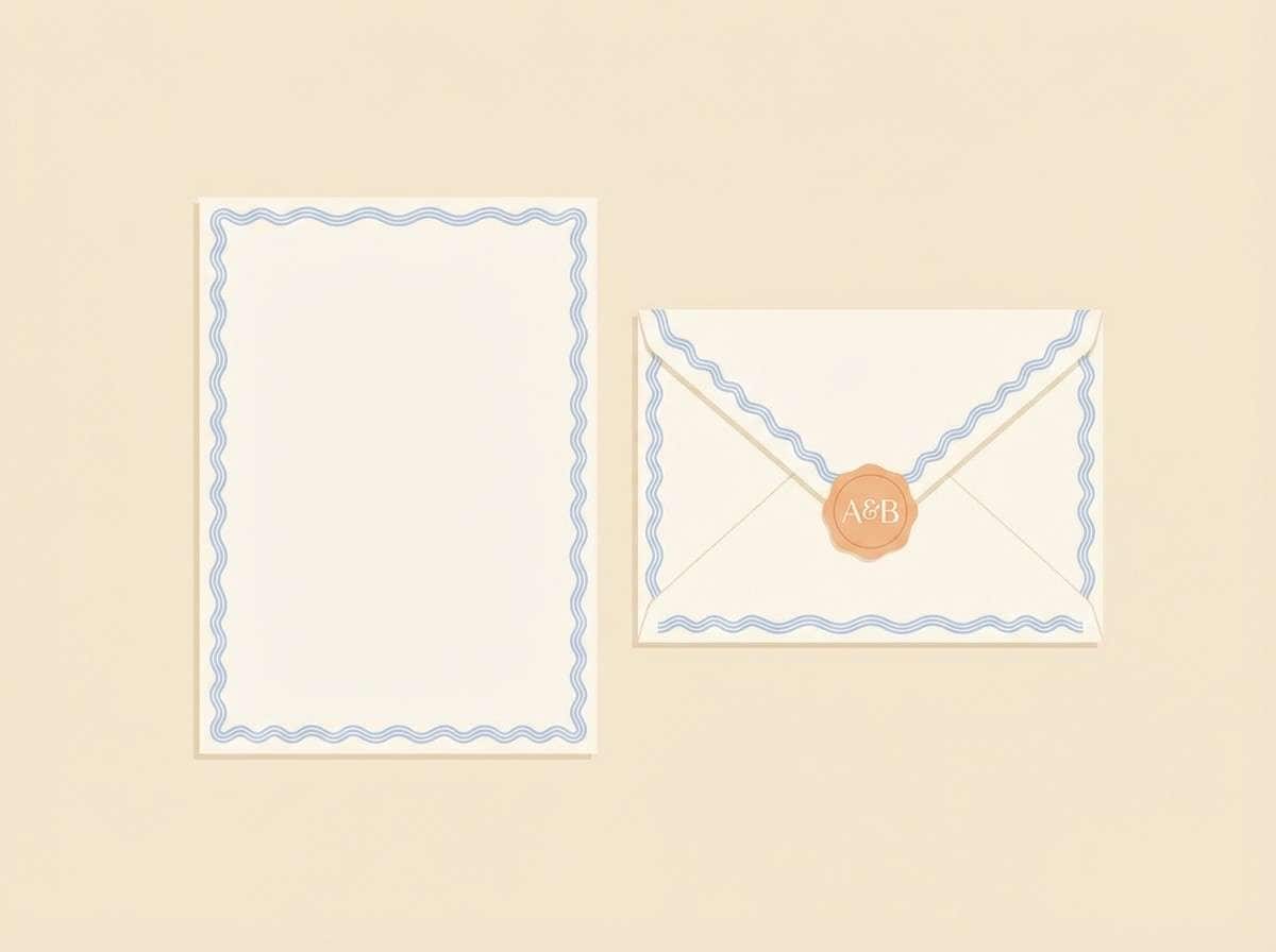
5) Sherbet Stationery
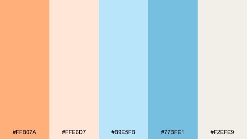
HEX: #ffb07a #ffe6d7 #b9e5fb #77bfe1 #f2efe9
Mood: sweet, neat, optimistic
Best for: stationery set design
Sweet and tidy, it feels like a fresh stack of note cards beside a citrus drink. Use the creamy neutral as the base paper tone and bring in pastel blue for borders, icons, or small patterns. Orange works best as a signature accent for monograms, seals, or section headers. Tip: repeat one small motif in blue to unify the set across cards and envelopes.
Image example of sherbet stationery generated using media.io
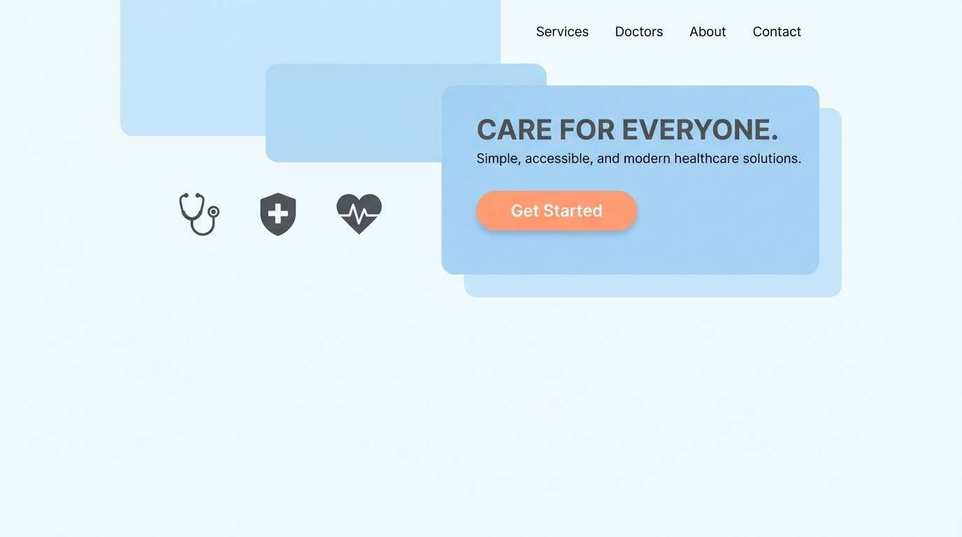
6) Calm Citrus Clinic
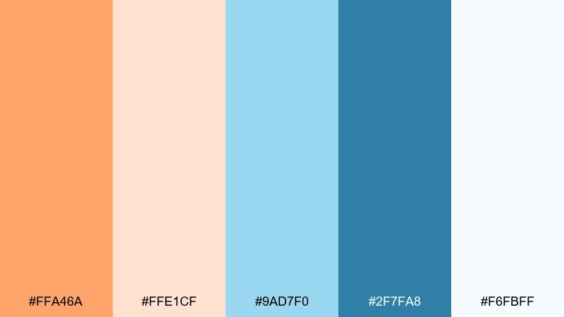
HEX: #ffa46a #ffe1cf #9ad7f0 #2f7fa8 #f6fbff
Mood: reassuring, clean, modern
Best for: healthcare landing page ui
Reassuring and bright, it reads like a clean clinic with a warm welcome. This orange pastel blue color scheme works especially well for healthcare because it balances trust and approachability. Use blue for sections and cards, then apply orange to appointment buttons and small success states. Tip: keep form fields light and consistent so the orange calls to action remain the clearest cue.
Image example of calm citrus clinic generated using media.io
7) Seaside Spritz
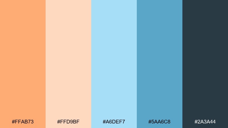
HEX: #ffab73 #ffd9bf #a6def7 #5aa6c8 #2a3a44
Mood: sociable, coastal, appetizing
Best for: cafe menu design
Sociable and coastal, it brings to mind a sparkling drink beside a bright pool. Use pastel blue as a menu background or sidebar, then let orange highlight specials and prices. Pair with charcoal text for legibility and add thin dividers in the softer peach. Tip: keep food photography minimal or duotone so the palette stays the star.
Image example of seaside spritz generated using media.io
8) Sunset Playroom
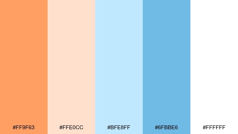
HEX: #ff9f63 #ffe0cc #bfe8ff #6fbbe6 #ffffff
Mood: playful, gentle, kid-friendly
Best for: kids nursery wall art
Playful and gentle, it feels like soft blocks and a sunset glow through sheer curtains. Use the lightest tones for big shapes and keep the brighter orange for small stars, dots, or a single character. Pair with rounded lettering and lots of breathing room to stay soothing. Tip: repeat the same blue in two elements to avoid a scattered look.
Image example of sunset playroom generated using media.io

9) Retro Poolside
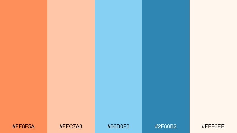
HEX: #ff8f5a #ffc7a8 #86d0f3 #2f86b2 #fff6ee
Mood: retro, upbeat, summery
Best for: social media promo template
Retro and upbeat, it channels pool tiles, sun lotion, and a peachy soda. Orange pastel blue color combinations shine in social posts when you need instant energy without harsh contrast. Make pastel blue the background, set product or event text in the deeper blue, and use orange for stickers and offer tags. Tip: keep only one bold sticker shape per slide so the feed stays clean.
Image example of retro poolside generated using media.io
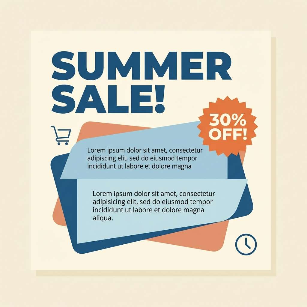
10) Coral Cloud Editorial
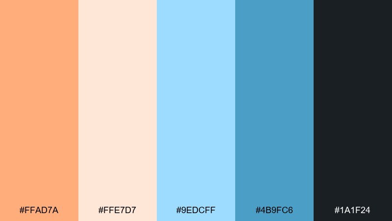
HEX: #ffad7a #ffe7d7 #9edcff #4b9fc6 #1a1f24
Mood: editorial, airy, polished
Best for: magazine spread layout
Airy and polished, it feels like a fashion spread lit by soft morning window light. Use the pale peach as margins and highlights, with pastel blue blocks for pull quotes or section openers. Pair with high-contrast black typography and restrained rules for a premium editorial vibe. Tip: keep color to 20 percent of the page so the layout still reads sophisticated.
Image example of coral cloud editorial generated using media.io
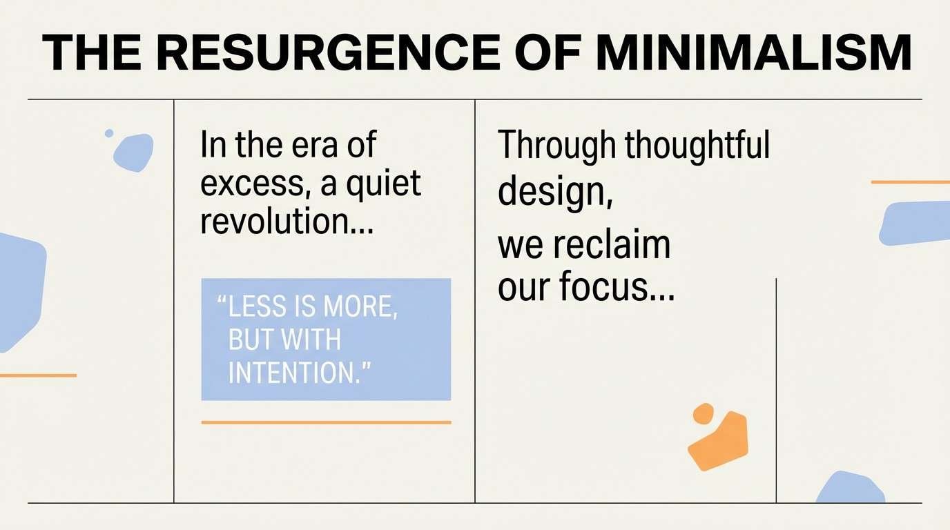
11) Peach Ice Pop
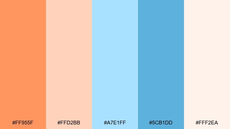
HEX: #ff955f #ffd2bb #a7e1ff #5cb1dd #fff2ea
Mood: fun, bright, energetic
Best for: summer event flyer
Fun and bright, it suggests sticky ice pops and a clear blue sky. Let orange lead the headline for instant attention, then cool it down with blue for secondary info and graphic shapes. Pair with playful condensed type and a clean cream background for readability. Tip: add a single blue frame around the content to make the flyer feel intentional, not loud.
Image example of peach ice pop generated using media.io

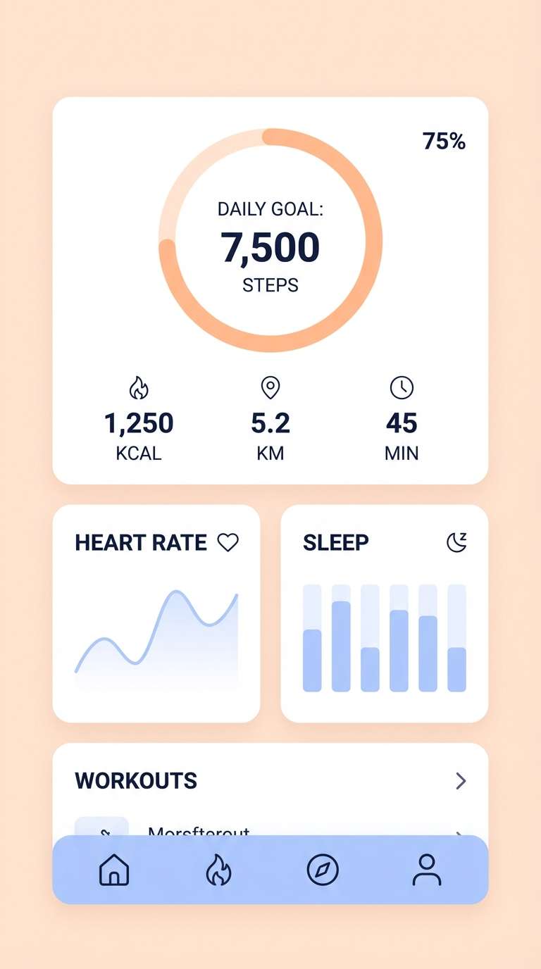
12) Misty Harbor App
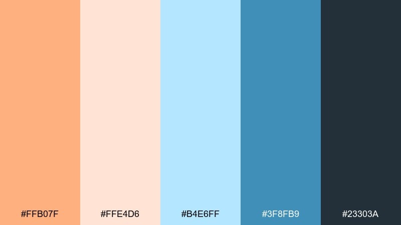
HEX: #ffb07f #ffe4d6 #b4e6ff #3f8fb9 #23303a
Mood: calm, focused, dependable
Best for: fitness app ui
Calm and focused, it feels like early harbor mist with a warm glow on the horizon. Use the deep blue for navigation and charts, then bring in orange for progress highlights and key streaks. Pair with light peach surfaces to soften screens that are heavy on metrics. Tip: keep orange reserved for achievements so users learn the visual language quickly.
Image example of misty harbor app generated using media.io
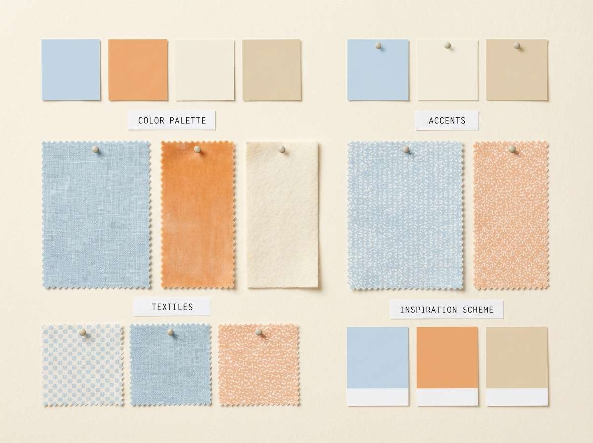
13) Tangerine Linen
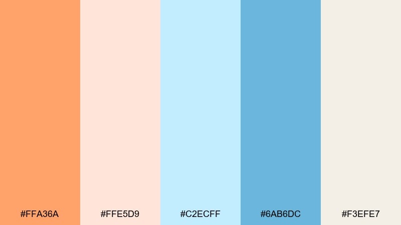
HEX: #ffa36a #ffe5d9 #c2ecff #6ab6dc #f3efe7
Mood: homey, soft, relaxed
Best for: interior mood board
Homey and soft, it evokes sunlit linen, pale tile, and a bowl of citrus on the counter. Use the creamy neutrals as your base and let pastel blue appear in fabrics or painted cabinetry accents. Orange works best as a small decor pop like a vase or cushion. Tip: keep materials matte so the pastel tones read warm and lived-in.
Image example of tangerine linen generated using media.io
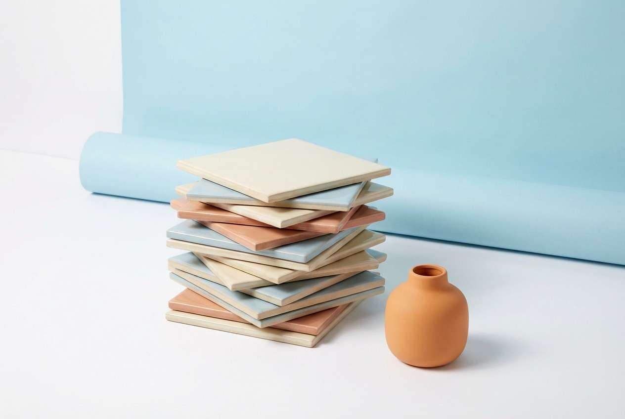
14) Dawn Over Tiles
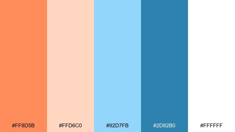
HEX: #ff8d5b #ffd6c0 #92d7fb #2d82b0 #ffffff
Mood: fresh, graphic, contemporary
Best for: ceramic product ad
Fresh and graphic, it feels like sunrise bouncing off glossy tile. Use blue as the dominant backdrop for a clean, modern look, then let orange edge details add warmth. Pair with white negative space and sharp product silhouettes for a premium catalog vibe. Tip: keep the strongest blue for typography so the ad stays readable at a glance.
Image example of dawn over tiles generated using media.io
15) Orange Blue Minimal
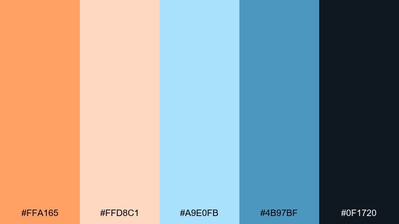
HEX: #ffa165 #ffd8c1 #a9e0fb #4b97bf #0f1720
Mood: modern, crisp, brand-ready
Best for: logo and brand identity
Modern and crisp, it gives the feeling of a pared-back studio with a single warm spotlight. An orange pastel blue color palette like this works best with simple geometry and strong spacing. Use the dark ink tone for the wordmark, pastel blue for backgrounds and patterns, and orange as a signature accent. Tip: test the logo in one-color first, then reintroduce orange only where it adds meaning.
Image example of orange blue minimal generated using media.io
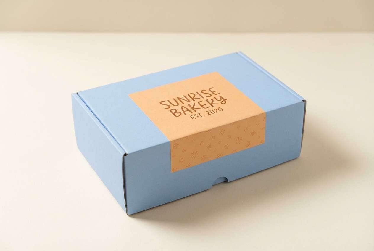
16) Powdered Citrus Bake
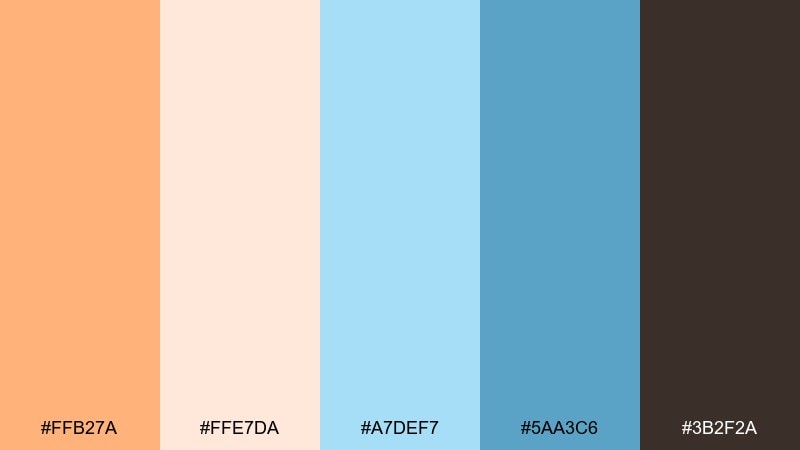
HEX: #ffb27a #ffe7da #a7def7 #5aa3c6 #3b2f2a
Mood: cozy, sweet, approachable
Best for: bakery packaging
Cozy and sweet, it feels like powdered sugar on a warm pastry with a cool drink on the side. Use pastel blue for the main box color to stand out in a display case, and bring orange into seals, flavor labels, or patterns. Pair with a chocolate-brown type for warmth and easy readability. Tip: keep patterns subtle so the package still looks premium from a distance.
Image example of powdered citrus bake generated using media.io
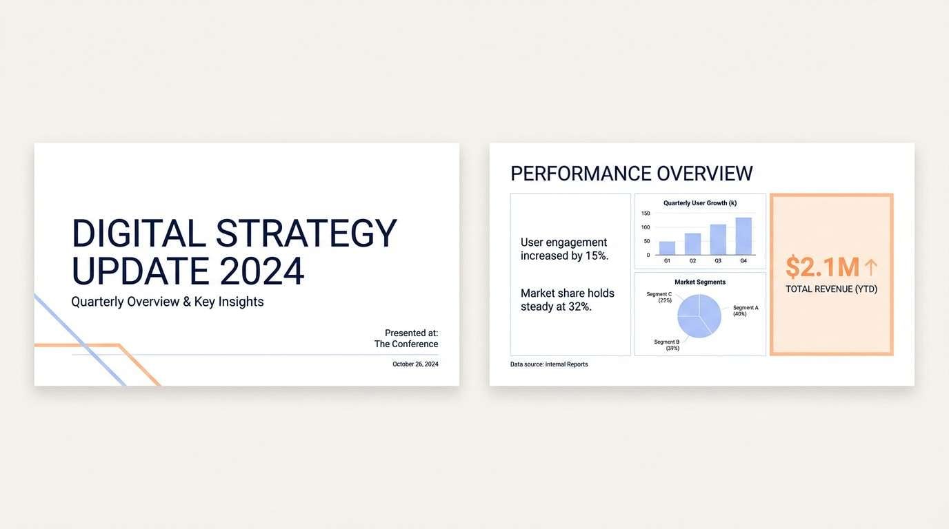
17) Soft Beacon Slides
HEX: #ff9d66 #ffd8c7 #b5e6ff #438fba #101820
Mood: clear, upbeat, professional
Best for: presentation deck
Clear and upbeat, it reads like a friendly beacon guiding attention through a story. Use pastel blue for section dividers and charts, then highlight key numbers in orange to drive the narrative. Pair with a dark background only for title slides to add contrast and drama. Tip: keep orange to one highlight per slide so your audience instantly knows what matters.
Image example of soft beacon slides generated using media.io
18) Coastal Tech Poster
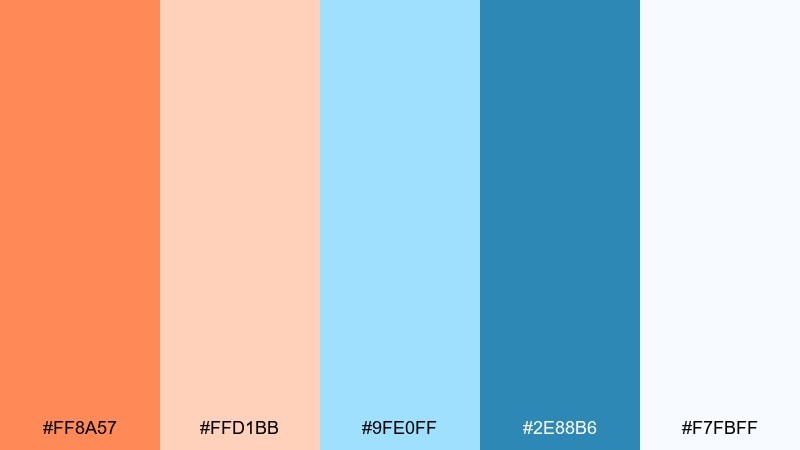
HEX: #ff8a57 #ffd1bb #9fe0ff #2e88b6 #f7fbff
Mood: innovative, inviting, bright
Best for: conference poster design
Innovative and inviting, it feels like coastal air meeting sleek modern type. Orange pastel blue color combinations work great for tech events because they look friendly without losing clarity. Use blue for the main field and grid, then place orange on the keynote tag and QR callout. Tip: keep the smallest text in the darker blue so it stays sharp at poster distance.
Image example of coastal tech poster generated using media.io

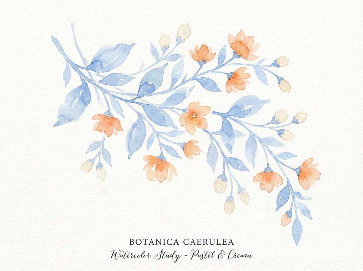
19) Blossom Breeze Botanicals
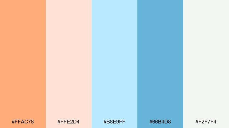
HEX: #ffac78 #ffe2d4 #b8e9ff #66b4d8 #f2f7f4
Mood: springy, delicate, artistic
Best for: watercolor botanical print
Springy and delicate, it recalls petals drifting over clear morning water. Use the pale blue as a wash behind leaves and keep orange for a few blooms so the composition feels balanced. Pair with soft green-gray pencil lines or very light neutrals to stay natural. Tip: let the background remain mostly white so the watercolor edges feel breathable.
Image example of blossom breeze botanicals generated using media.io
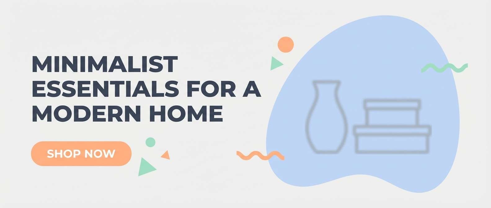
20) Urban Sorbet Banner
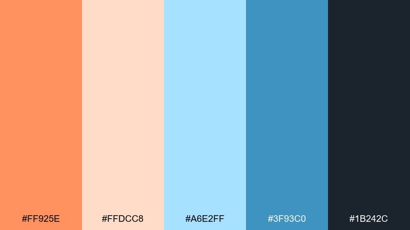
HEX: #ff925e #ffdcc8 #a6e2ff #3f93c0 #1b242c
Mood: bold, modern, sales-ready
Best for: ecommerce hero banner
Bold and modern, it feels like a storefront window catching late-day light. An orange pastel blue color palette like this gives you strong contrast while staying soft enough for lifestyle brands. Use pastel blue for the hero background, set typography in the deep slate, and reserve orange for the primary shop now button. Tip: add a small peach gradient behind the button to create depth without introducing new colors.
Image example of urban sorbet banner generated using media.io
What Colors Go Well with Orange Pastel Blue?
Warm neutrals like cream, ivory, and soft beige keep the palette breathable and help pastel tones look intentional rather than sugary. They also create clean negative space for typography and UI components.
For contrast, add an ink or slate tone (deep navy, charcoal, near-black) to improve readability on light blues and peaches. This gives you a reliable text color while keeping the overall vibe light.
If you want a coastal or spring feel, subtle green-grays or muted sages pair naturally with pastel blue. Keep greens desaturated so they support the orange-blue relationship instead of competing with it.
How to Use a Orange Pastel Blue Color Palette in Real Designs
Start with a base: pastel blue for backgrounds and large surfaces, then layer peachy neutrals for cards, panels, and whitespace. This approach keeps pages calm and makes your layout feel structured.
Use orange as a “signal” color for the most important element: primary button, price highlight, badge, or progress milestone. Pastels still benefit from restraint—too many orange accents can flatten hierarchy.
For print and packaging, pick one dark anchor (navy/charcoal/brown) for text and barcodes, then use orange and blue for brand cues and flavor/variant systems. This keeps shelves and mailers readable at a distance.
Create Orange Pastel Blue Palette Visuals with AI
If you want to preview how these HEX codes look in real layouts, generate mock visuals first—posters, UI screens, packaging, or invitation suites—before committing to final design production.
With Media.io Text-to-Image, you can turn a palette idea into consistent examples quickly, then iterate prompts to match your brand style (minimal, retro, editorial, or playful).
Use your favorite palette above, copy its prompt style, and adjust the subject (menu, app screen, label, banner) while keeping the same orange and pastel blue balance.
Orange Pastel Blue Color Palette FAQs
-
What does an orange pastel blue color palette communicate?
It blends warmth (orange) with calm trust (blue), creating a friendly, optimistic look that still feels reliable. That’s why it’s common in wellness, lifestyle branding, and modern UI. -
Which color should be the main background: pastel blue or pastel orange?
Pastel blue usually works best as the dominant background because it feels spacious and supports readable contrast with darker text. Pastel orange is strongest as an accent or secondary surface. -
What’s a good text color for pastel orange and blue designs?
Use deep navy, charcoal, or near-black for body text and small UI labels. These ink tones keep accessibility high while still fitting the soft palette. -
How do I keep orange accents from overpowering the design?
Limit orange to one primary action per screen (or one focal badge in print). Repeat it consistently in the same role (CTA, price, highlight) so it reads as a clear signal. -
What neutrals pair well with orange pastel blue palettes?
Cream, off-white, and warm gray help the palette feel airy and premium. They also reduce visual noise when you’re using patterns, icons, or photography. -
Is orange pastel blue suitable for professional brands?
Yes—add a strong dark anchor (navy/charcoal) and keep layouts minimal. The pastel tones can feel polished and brand-ready when spacing and typography are disciplined. -
Can I generate marketing visuals that match my palette quickly?
Yes. Use Media.io Text-to-Image with a prompt that specifies flat/vector or studio style, then keep the same HEX-inspired colors across iterations for consistent creative.


